Dear readers of the CLINTEL newsletter, friends, donators,
Since 2018 we (Marcel Crok and three colleagues) are investigating the homogenization of daily temperatures by KNMI. This homogenization – introduced in 2016 – had the result of removing a lot of tropical days (days with T > 30 degrees Celsius) and heatwaves in the period 1901-1950.
We published about this in a lengthy Dutch report in 2019. That report was ignored by KNMI and the media. We just went on and tried to publish it in a peer reviewed Journal. At the first Journal it was rejected after review. We revised and improved the paper and submitted it to another Journal. We had to wait almost 1.5 years but this week it has been published.
We hope you enjoy the paper. We made it open access which is quite costly nowadays (2200 euros). If you like our work we would welcome your donation. You could also become Friend of Clintel.
Below you find our press release with a link to the paper.
Thanks,
Marcel Crok
Press Release: KNMI scrapped too many tropical days in De Bilt

KNMI temperature corrections give a distorted picture of climate change in the Netherlands, especially for very warm days and heat waves
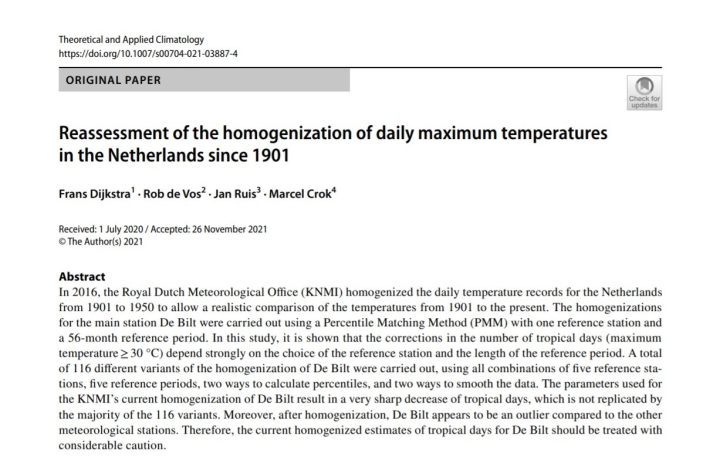
The KNMI has removed too many tropical days from the period 1901-1950. This is the opinion of four Dutch researchers in a paper published today in the scientific journal Theoretical and Applied Climatology. The error arose because KNMI used only one station to correct De Bilt. The paper shows that the corrections become more reliable when using more stations and a longer comparison period.
In 2016, the KNMI corrected all daily measured temperatures at the KNMI main stations (Groningen/Eelde, Maastricht/Beek, Vlissingen, Den Helder/De Kooy and De Bilt) for the period 1901-1950. This was necessary because of station relocations and adjustments to the measurement set-ups. At four stations, measurements in an overlap period were used to make the corrections. No such measurements were available for De Bilt, so it was decided to correct De Bilt using the Eelde station, which lies 150 kilometers northeast of De Bilt. For the period 1901-1950, this drastically reduced the De Bilt tropical days—days exceeding 30 degrees Celsius—from 164 to 76. As a result, many heat waves also disappeared from the records.
A group of independent researchers, partly funded by the CLINTEL Foundation, tried to reproduce the temperature corrections for De Bilt in 2019 and they concluded in a voluminous report (in Dutch) that there had to be a significant over-correction of the number of tropical days. They have now repeated their analyses using the same data and with similar statistical analyses as the KNMI used. Their findings were published this week in the scientific journal Theoretical and Applied Climatology.
Outlier
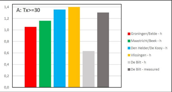
In Figure 2 of the paper it can be seen clearly that De Bilt has become an outlier because of the KNMI’s corrections:

Figure 2 from the paper: ratio of tropical days 1906-1949 compared to 1952-1995 at the five main stations after the KNMI corrections. In dark gray the original measurements of the KNMI, in light gray De Bilt after the corrections of the KNMI.
Here the ratio of tropical days is shown for the periods 1906-1949 and 1952-1995. A number greater than 1 means that more tropical days occurred in 1906-1949 than in the equally long period 1952-1995. This is the case at the other four main stations, but De Bilt deviates considerably.
Sensitivity
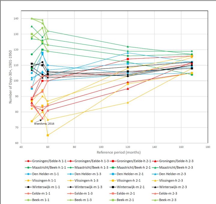
The researchers examined the effect of a number of choices made by KNMI during the statistical procedure. These include the choice of reference stations, the length of temperature series, the calculation of the statistical distribution of the highest daily temperatures per month and the way in which outliers in the data are smoothed out. This shows that almost all choices made by KNMI lead to a greater decrease in the number of tropical days before 1950. Figure 3 of the paper illustrates the problem:

Figure 3 from the paper: number of tropical days after correction based on 116 variants. KNMI only showed the outcome labelled Brandsma, 2016 in the figure.
The y-axis shows the number of tropical days remaining in De Bilt after the temperature corrections. There were originally 164. It can be clearly seen that the choice made by KNMI (Brandsma, 2016 in the figure, leading to 76 tropical days) is at the lower end of the range of the 116 variants considered by the researchers.
By using longer comparison periods, the method does converge towards a narrower range, from 104-119 with a median of 113. This is considerably higher than the 76 according to the KNMI. The researchers are not saying that this number is therefore the correct number. This is merely what you would get if you applied the method used by KNMI more closely.
It is remarkable that the various choices to be made are not described in the KNMI technical report on temperature corrections. Thus, KNMI has not shown how sensitive the results are to the assumptions made.
Properly performed corrections of the daily temperatures at De Bilt are important for, among other things, assessing climate change in the Netherlands. With the applied correction on the daytime temperatures of De Bilt in the first half of the last century, this is not possible. An alternative could be to leave the historical data unchanged and derive climate trends from the individual data of all stations.
References:
Frans Dijkstra, Rob de Vos, Jan Ruis, Marcel Crok (2021)- Reassessment of the homogenization of daily maximum temperatures in the Netherlands since 1901 – Theoretical and Applied Climatology, 10 pages. https://link.springer.com/article/10.1007/s00704-021-03887-4
Frans Dijkstra, Rob de Vos, Jan Ruis, Marcel Crok (2019) – Het raadsel van de verdwenen hittegolven, second edition, October 2019, 93 pages.
Frans Dijkstra (2017) – Commentaar op de homogenisatie van de dagelijkse temperaturen van de KNMI hoofdstations – Meteorologica December 2017, pages 4-7
About CLINTEL
The Climate Intelligence Foundation (CLINTEL) was founded in March 2019 by Emeritus Professor of Geophysics Guus Berkhout and science journalist Marcel Crok. Since then, CLINTEL has rapidly grown into a global organization in 36 countries with 23 ambassadors. CLINTEL wants to engage in a fundamental discussion with leading scientific organizations on energy and climate.
The shortest summary of CLINTEL’s vision is the World Climate Declaration with the message “there is no climate crisis”. This declaration has now been signed by over 950 scientists and experts.
Note:
More information: Marcel Crok
From: Climate Intelligence Foundation (CLINTEL)
Websites:
https://clintel.nl
https://clintel.org
https://resinbeeld.nl
The shortest summary of CLINTEL’s vision is the World Climate Declaration with the message “there is no climate crisis”.
________________________________________
Bingo! CO2 is NOT a problem.
This bogus “homogenization” has happened to a lot of places around the world, seriously distorting the records in favor of alarmism.
Data that has been “homogenized” or in any way “fixed”, is no longer data, it has become someone’s opinion of what the data should have been.
When the BOM here in Oz took some heat because of their homogenisation antics, we were told the method was ‘world class’.
When concern was raised that ‘world class’ or not, the issue remained, they decided to have a little enquiry.
Who did the enquiry?
The BOM, of course.
Yes, Jo Nova has covered the Oz temperature farce. Here in the US we cannnot even get an enquiry, despite mountains of evidence.
Normal science: “if the data don’t support your theory, change your theory.”
Climate science: “if the data don’t support your theory, change your data.”
Climate Scientology, not climate science.
climatastrology
CliSciFi
KNMI efforts to cool the past to control the future is Orwell’s central thesis in 1984.
‘He who controls the past controls the future. He who controls the present controls the past.’
.
Good work
“It is remarkable that the various choices to be made are not described in the KNMI technical report on temperature corrections. Thus, KNMI has not shown how sensitive the results are to the assumptions made.”
It all comes down to “assumptions”. That seems to be a huge theme in climate sceance.
Indeed, figure 2 of the IPCC AR6 Science SPM shows that the models assume that all drivers of climate change are human. Figure 1b claims to prove that climate change is human because that is the only way these models can make it happen. So their “proof” is just a restatement of their assumptions.
Their real argument is thus this: “Assuming only humans can cause climate change we find that climate change is caused by humans.”
Perfectly circular.
Thanks for this paper.
The Netherlands like most West European “nations” have become vassal states of the EU which in turn bows to the U$ “elite”. Same formula: dominate the MSM and social media and dangle fat job promises to all upholders of the pillars of state.
So if a Michael E. Mann tells them to “fix” the local data to the desired curve their only question is “How much”?
It’s a bit desperate for them when they have to keep revisiting the historic data to give it a few tweaks to keep the graphs going up on the right side. It would be much easier to just print the graphs tilted.
they have no choice. water freezes at 32F and represents a hard stop for them. It’s tough telling people it never got below 40F last winter when the lakes froze over.
Statistics do not explain; that is the job of REAL science, usually done away from computers.
Otherwise it is all conjecture.
Sadly, now that the dead hand of politics has taken over, there is total confusion in general perceptions right across the board, with hysteria leading the way.
Not completely. Polls still show about half of Americans to be AGW skeptics. And now that real costs are looming the skepticism is increasing. Alarmism is going to hit a political wall.
“This was necessary because of station relocations and adjustments to the measurement set-ups. ”
Another study I would love to see done is what prompted each station move globally and what the resulting T changes did to the overall record. A similar practice has been elimination of large numbers of stations, notably in the US.
Global Warming proponents have shown shown they are prepared to game the system and all the ‘degrees of freedom’ they have at their disposal to manipulate the records are used. NIWA in New Zealand was taken to court and they had to admit that their work was tainted. Their neighbor meteorological organization in Australia may be the worst.
I began to suspect that ‘station moves and discontinuance of stations became part of the fiddlers toolbox in a response by Nick Stokes to a comment I had made in which I showed that the Capetown S Af raw data and that for Paraguay (as well as NH locations) had almost identical traces as those of the USA -high 1930s 40s Ts and the 35yr deep cooling period of the late 40s to1980. Nick mentioned the station moves for the drastic changes in the appearance of the adjusted end results.
Here is Capetown raw Ts:

And here is after adjustment by GISS:

They move a station because the area around the old station has become built up.
Then they adjust the data from the new station so that it matches the old station.
Yeah, but…!!
The only place a CO2 crisis shows up is in the bogus, bastardized Hockey Stick temperature record.
The actual data shows it was just as warm in the recent past as it is today and there is no unprecedented warming today.
This does not fit the Human-caused Global Warming narrative, so the alarmists distort the data with their computers to make it look like today is the hottest time in recorded history.
Throw away the bogus Hockey Stick charts and the CO2 crisis goes away.
Gary Pearse
Maybe this helps:
This is the monthly output of what I found in GHCN V3 (unadjusted and adjusted variants).
Manifestly, there was no intention to manipulate anything.
The differences were:
Jan 1857 – Mar 1888: 1.88 °C
Apr 1888 – Oct 1960: 1.18 °C
Nov 1960 – Jul 2019: 0.00 °C (end of the GHCN V3 series)
Such things have happened at many many places (one I remember is Prague, Czech Republic). Mostly it is due, as mentioned above, to station relocations.
You can’t see such things when looking at a 5 year moving average.
(Where do you have them from? They can’t fit very well to the original data 🙂 )
You were fooled by the adjustments of large blocks by the amounts stated. 1930s high was pushed down ~1C and the 35yr “Ice Age Cometh from late 40s to 1979 raised up by over half a degree on the most recent end. This took natural variability out of the readings.
Steven Mosher cunningly used this sleight of hand to say many more stations were cooled than warmed. He’s a very smart guy and knew he was BSing us.
The exercise wasnt just to make the present look warmer. Rather, it was to remove the 1930’s 20th Century ‘high’ formed before CO2 had shown signifigant growth in the atmosphere, and to remove a deep cooling after the very warm period when CO2 was galloping upwards. Both of these periods were used by sceptics to debunk the simple “climate control knob” theory – hence, they had to go.
Now you, Bindidon have only two choices: you are either a clever BS trickster or easily fooled.
Gary Pearse
” Now you, Bindidon have only two choices: you are either a clever BS trickster or easily fooled. ”
I am no clever BS trickster let alone would I be fooled by anything.
You were simply not able to understand a bit of what I wrote.
Sorry for having unnecessarily tried to explain you what you thought be BS.
I have lost one hour of precious time with you. Won’t happen again!
The data are the data. “Corrections” is code for manipulations. Or as we used to say in the Navy, “Baffle ’em with bullshit”. If the notion that actual real world data are in need of “correction” then the argument thereafter is to ignore the data and only depend upon faked up modelling designed to prove a falsity.
Can someone please explain, in sound engineering language, i) what homogenization is? and ii) why it is needed?
Thanks,
/Johan
The idea is that some stations’ data need adjustment because of inconsistent time of day the readings were taken and some stations had to be moved to new locations and they had to adjust old records to account for different elevations, latitude, etc. which seems fair but trust in this work by activist proponents of Catastrophic Anthropogenic Global Warming has been found to be misplaced!
They have also taken large numbers of stations out of service (that don’t support warming). More recently, they have robotic algorithms that continuously make hundreds of tiny “corrections” to essentially all stations! When you plot differences you find that these, on average cool the past and warm the present. They also push down the Ts of the highest temperatures that were during the 1930s to mid 40s and erase the 35 year decline in temperatures to 1980, because they showed considerable natural variability that was stronger than the purported CO2 effect. There is much more. They correct for urban heat island effect (UHI) but the answers they get are still too warm as shown by stations in rural areas that are running cooler than their adjusted UHI stations.
We’ve got Colonel Sanders looking after our chickens!
The basic unsound claim is that temperature changes are relatively uniform over large areas, hence “homogeneous”. Given the chaotic nature of weather, including on large scales, this simply cannot be true. Chaotic activities tens to hundreds of miles apart cannot be synchronous. Nor can their averages be synchronous because they display what are called “strange statistics”, which means the averages also oscillate chaotically.
Some more or less valuable explanations are given here:
https://data.giss.nasa.gov/gistemp/history/background.html
And as we can see in the comments above, many people confound graphs based on absolute temperatures with those based on anomalies (departures from a mean with removal of seasonal dependencies aka ‘annual cycle’).
A typical example is the difference between
On the first graph, you see the 1930’s atop; on the second one, the 2000’s are higher.
KNMI know that the Iceman cometh and they are desperate to cool the past history of any temperature record that they can get their hands on, by any means possible.
Marcel et al at Clintel,
Some of us have been looking at temperature homogenization in Australia since about 1990. Some of our main findings are applicable to all countries. Your data from Holland is a prime candidate for methods such as regressing T against local rainfall to discern observations that are probably adjusted invalidly.
Please see Dr Bill Johnston’s blog bomwatch.com.au. Rainfall regression theory,methodology and results are all clearly given and shown for stations like Townsville, Charleville, Cape Leeuwin and Amberley.
You will surely get further support and validation of for your work if you apply such methods.
On the subject of changes to counts of hot days, Chris Gillham has a web host site named waclimate.net with a large number of stations whose counts of hot days have been adjusted in questionable ways.
Geoff S