Reposted from NOT A LOT OF PEOPLE KNOW THAT
OCTOBER 13, 2021
By Paul Homewood
For years NOAA have included this page on the tornado section of their website:

One of the main difficulties with tornado records is that a tornado, or evidence of a tornado must have been observed. Unlike rainfall or temperature, which may be measured by a fixed instrument, tornadoes are short-lived and very unpredictable. If a tornado occurs in a place with few or no people, it is not likely to be documented. Many significant tornadoes may not make it into the historical record since Tornado Alley was very sparsely populated during the 20th century.
Much early work on tornado climatology in the United States was done by John Park Finley in his book Tornadoes, published in 1887. While some of Finley’s safety guidelines have since been refuted as dangerous practices, the book remains a seminal work in tornado research. The University of Oklahoma created a PDF copy of the book and made it accessible at John Finley’s Tornadoes.
Today, nearly all of the United States is reasonably well populated, or at least covered by NOAA’s Doppler weather radars. Even if a tornado is not actually observed, modern damage assessments by National Weather Service personnel can discern if a tornado caused the damage, and if so, how strong the tornado may have been. This disparity between tornado records of the past and current records contributes a great deal of uncertainty regarding questions about the long-term behavior or patterns of tornado occurrence. Improved tornado observation practices have led to an increase in the number of reported weaker tornadoes, and in recent years EF-0 tornadoes have become more prevelant in the total number of reported tornadoes. In addition, even today many smaller tornadoes still may go undocumented in places with low populations or inconsistent communication facilities.
With increased National Doppler radar coverage, increasing population, and greater attention to tornado reporting, there has been an increase in the number of tornado reports over the past several decades. This can create a misleading appearance of an increasing trend in tornado frequency. To better understand the variability and trend in tornado frequency in the United States, the total number of EF-1 and stronger, as well as strong to violent tornadoes (EF-3 to EF-5 category on the Enhanced Fujita scale) can be analyzed. These tornadoes would have likely been reported even during the decades before Doppler radar use became widespread and practices resulted in increasing tornado reports. The bar charts below indicate there has been little trend in the frequency of the stronger tornadoes over the past 55 years.


It is absolutely clear that the number of strong tornadoes has declined since the 1970s.
Alarmingly, however, this page has been “disappeared”, and the link now comes up with this:

https://www.ncdc.noaa.gov/societal-impacts/tornadoes/
There is no discussion whatsoever of changes in reporting methodology, or any of the detailed work done by earlier scientists.
All we have is the chart, along with a table, which dishonestly claims that tornadoes have become progressively more common.
Fortunately Wayback still has a copy of the original web page, and I also have it on file.
It is blindingly apparent that NOAA found their original assessment far too inconvenient, something that should be kept out of the public domain at all cost.
To be fair, it is problematic comparing historical data with today’s, when reporting methodology and techniques have changed so much.
But this does not stop NOAA from pretending they know what global temperatures were 150 years ago, or comparing current hurricane trends with pre-satellite counts, or claiming to know the size of the Greenland ice cap in the 1930s!
But if the historical data for tornadoes is so unreliable, how can they possibly justify publishing graphs like this every month?

https://www.ncdc.noaa.gov/sotc/tornadoes/202108
This is not “scientific”. It is fraud, pure and simple.
Maybe Zeke Hausfather and his crony factcheckers might care to investigate! There again, pigs might fly.
1984 was not supposed to be a guide.
Well all classic fiction is now being revisited and revised according to progressive post-JudeoChristian a-morals; for instance with the movies Malificent and Cruella – who was bad was in fact good and vice versa. So we can expect the same with a new 1984 and an environmentally conscious Napolean the pig. 4 legs good, 2 legs bad – or was it the other way around? The shire-horse was the villain since he generated the most CO2 – got what he deserved.
Sorry – I’m talking about Animal Farm!
Not Congress?
I read “1984” before 1984. As we approached 1984, I hit the time for me to register for the Selective Service. With my name now on a list to be called up in a draft, politics and world events became more important to me. The Falklands War began, and I started thinking, “was 1984 going to arrive and pick me up and throw me into in a World War?”
As a “democrat,” I of course hated “fascist” “NAZI” Reagan, and was scared. I was afraid the totalitarian world portrayed in “1984” was going to become a real thing right in front of my eyes, despite all of us Liberals hating the CIA, labeling all Reagan supporters as “fascist,” etc.
I was young and naive.I matured.
However, not until I began exploring the hullaballo over Global Warming, by first stumbling upon Watts’ “surfacestations.org,” and then finding WUWT, circa 2008, did I realize that we were seeing the Powers that Be using “1984” as an instruction manual!
Sure, we can debate how to balance having a secure election and simultaneously having elections be very accessible. Sure, we can debate how much deficit spending can we do before the inflation is worse than the economic gains.
But this re-writing history stuff is too much. We are literally seeing Winston carrying out his job of revising “incorrect” history lest anyone get the wrong impression that our Uniparty might be wrong about anything.
WUWT readers: **If you have not read “1984,” you must.. Also, “Brave New World,” to understand two ideas: people no longer coming from and belonging to parents/family, the overriding emphasis on “quality of life” as the leading goal of government / society, and the idea of a Team Of Experts (trust the science), rather than We The People, being in control of society.
Eric Blair “George Orwell” worked for the BBC during the war. He had also been a nonStalinist socialist during the Spanish Civil War, fighting on the side of the POUM, a socialist militia.
The more one knows of the history of the era, the more 1984 is commentary on recent history and then current events (Stalin was still alive and in power).
Actually, both books were based on his (disillusioning) experiences fighting with the “socialist” groups in the Spanish Civil War. He didn’t dream these things up, he experienced them first hand, as he tried to fight for a kind Socialism, and found nearly everyone else, on both sides, was only interested in power and control.
Orwell did not write “Brave New World”. That was Aldous Huxley.
Sure, not Brave New World, 1984. Animal Farm and 1984 both came from his very disillusioning experiences with Socialism in the Spanish Civil War, where he found that the people who called themselves Socialists were as totalitarian as those who called themselves Fascists. The story remains the same today. 🙁
Nor, of course, Brave New World where the children are taught sex-play starting in grade 1.
The United States tornado database is maintained by the SPC and can be downloaded from here.
https://www.spc.noaa.gov/gis/svrgis/
In the 80’s I remember the news following a tornado in a helicopter for several minutes. The tornado never touched a home and just spun in a big field. One wonders how many tornadoes existed that were never counted.
Probably quite a few.
We had an outbreak of weak tornadoes in Oklahoma this week. These were the kind that would spin up into a tornado and then dissipate, and then spin up into a tornado again a couple of miles farther along, and some would do this several times.
We had a storm chaser out birddogging one of these tornadoes in his pickup truck, and it was dark and the area was rainwrapped and the chaser pulled off to the side of the highway and told us on his dashcam that he thought he was inside the tornado but could not see it, and about that time debris started flying across in front of his truck which confirmed that he really was inside the tornado. Happily, it was not very strong, about 70mph winds so nothing bad happened to the chaser.
One thing about living here, if there’s a tornado out there, there will be somebody chasing along behind it telling us just where it is and what it’s doing. They all have dashcams and broadcast in real time.
There is definitely a large under count bias early in the record that must be corrected for a proper analysis.
As this article states , undercounting mainly affects small tornadoes. Big ones leave a clear trail of destruction and can bee seen from miles away.
Uh, no. Large tornadoes are many times masked by rain or dark. And the clear trail of destruction is only obvious if someone sees it. In the vast Central Plains such a trail of destruction isn’t seen for months sometimes. By then the path of destruction has been at least partially erased by regrowth of grass and farmers/ranchers seeing the destruction that is left seldom report what they see to the authorities, especially if there is no destruction of structures or loss of livestock (i.e. no insurance claims involved).
Don’t be fooled by movie representations of large tornadoes. They are seldom accurate.
You are not addressing the issue. You might be able to regenerate the plot yourself (And appears to be a mornings work the way the data is present. A separate file for headings?) but only back to 1950, without the information that should be mentioned with the newer page.
It’s only ever been since 1950. The old page got it’s data from the same source…the SPC and was subject to the same limitation. The SPC recently changed their file format which might explain the change on the NCDC side.
I looked at EF2+, EF3+ and EF4+ in 2010. Pretty clear which way it’s going.
https://climategrog.wordpress.com/tornado_compare_ef234/
The airbrush campaign continues in this Administration. Nonconforming data must report to the ministry of truth immediately.
In Lysenko’s time, the USSR used India Ink to back out articles that ran counter to the narrative. So, it was not all that uncommon to ask the library for a scientific journal and find the pages inked out.
Amazing how reality can just be made to vanish if the political will is there.
The problem I see is that the process is ad-hoc among agencies, so maybe it is time for a central, cabinet level agency to coordinate all of this?
Yes, I accounted for the possibility you are being sarcastic. This is for all those who don’t recognize that.
At U.C. Berkeley, in the mid 60s, science journals (mainly chemistry and biology) were missing complete pages for articles on the chemistry and/or biological effects of various drugs, especially those that altered perception. A small group of us, having discovered this is a couple of journals. used indexes to locate more articles in a variety of other issues/magazines, which also turned out to be missing. Possibly it was censure, possibly other students had located the article earlier and simply took the pages. Information on the mystery proved unavailable from any source we could access.
A more mysterious find, a couple of years later, was in (or not in) the psychology library. I read a letter, or an editorial, or something not a research paper, that made some hard to believe comments about a recently published article in this same, or another, journal printed two or three month earlier. They were about a paper on a device to automatically induce extreme suggestibility.
Some research with this device had been reported that was claimed to be virtually 100% effective in inducing an extremely suggestible state in everyone that came within range. There was no information about just how this was achieved; that wasn’t the point of the comments, but it was clear that many people could be exposed at the same time, such as a crown walking through a building’s lobby. The comments were, if I remember correctly, about the ethics of the testing that had been reported.
The claim was that it had been secretly tested in a few public places where device exposure was followed by information exposure. The information (suggestions) altered behavior of a very large percentage of the exposed individuals.
Anyway, that issue was missing from the library. The library desk said the journal should be in the library, there was no record of it going out, its absence was mysterious. No matter, it could be ordered. Some weeks later I was told it could not be located anywhere else either. The library assistant claimed to have never run across such a problem before.
Having worked with hypnosis, and had some very good subjects, it was easy for me to believe that even unlikely seeming suggestions can be taken to heart by a fair number of people, but these were all willing subjects undergoing a number of individual (not crowd) experiments. While a highly effective mass hypnosis machine seems very unlikely, if it exists it might explain how some unreasonable but widely held beliefs are established and maintained. Then again, humans in general seem very tribal and willing to unquestioningly accept whatever authority demands.
This (the mid 1960s) was an era where research with drugs like LSD became officially forbidden, even though the same drugs were generally available on the black market. A few researchers, whose work had suddenly been terminated, went public about their displeasure, saying they had learned to produce consistent experiences in people under controlled conditions (not the wild “trips” of teenage users). They believed these drugs held promise to obtain significant insights and benefits.
There were also chemicals coming out of brain research that were supposedly not on the black market. Mentioned in reputable publications, these substances were supposed to induce exactly the same response in everyone (e.g. extreme fear of some particular thing, which need not be present). Supposedly all chemical structure, manufacturing information, etc. was classified top secret.
There were also electronic devices that were forbidden and classified, such as a sleep inducing machine that reportedly put people into an extremely deep sleep where they required only a couple of hours rest instead of a normal night’s worth. This was supposedly being widely used in the Soviet Union. One of its uses was to treat mentally ill persons although what that might have meant in the Soviet Union is open to speculation.
Being interested, I tried to follow up on how to make such a device but ran into brick walls. I talked to a few people in experimental psychology who where doing feedback training (e.g. learn to control your own autonomic processes) by using a device that monitors, say heart rate or brain wave pattern, and feeds you an audible signal of what these are doing. People can learn to control what they are listening to by mentally trying to speed up or slow down, or otherwise modify, whatever they are monitoring.
These researchers were aware of the sleep control device and a few were quite frustrated by the regulations. It was officially possible to apply for permission to do research with the device, but none of them, or anyone they were able to contact, had ever been approved.
While this started somewhat on topic: altering or censoring previously published information, it stirred up some old memories. My point in going over them is that for those in power to attempt to control what people are aware of is nothing new.
It is deliberate obfuscation with clear intent to deceive
Besides disappearing data NOAA also changes data. For some reason about 4 years ago I saved a the graph of the May October Max Temperature for Los Angeles. Hmmm, what does it look like today. Here’s the the Then & Now comparison:
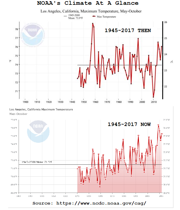
Why NOAA changed the data is a matter of opinion,
that it has been changed is a matter of fact.
Did NOAA not provide any rationale?
It does seem that these graphs are becoming more like cartoons to supplement a fairy tale.
I haven’t attempted to find out at this point, previous queries at NASA and Colorado University’s Sea Level Group does get a response, but it’s just a big word salad. I expect that NOAA is no different. Here’s the link to their contact page:
https://www.ncei.noaa.gov/contact
Several years back, I explored this topic of temperature data set changes.
One approach or justification for changing temps is as follows.
one. you assume there are temps that are inaccurate.
two. you assume that you can find them by this method. if you have two weather stations that are trending one way, and a third, mid-way between the two geographically, that is not having the same trend, then you assume the first two are accurately reflecting the prevailing trend, and the third is failing to do so, for whatever reason.
three. you assume you need to apply corrections to erroneous temp data.
four. having “found” the errant thermometer, determine what it should have been saying all along.
Five. correct those temps.
six. save the data.
–What I do not know is whether, once you have fixed the data from this one thermometer, is what happens next. Can its data, now assumed to be correct, be used to identify another thermometer that may not be trending the right way, and so repeat this “correction?”
Word Salad: Here, I have briefly but clearly explained the rationale and the method for “adjusting a temperature reading. If I can do it, so can those in charge of these data sets. They fail to do so logically out of weak skills or by design.
But they do not. Myself, I can rule out “weak skills.” It does not take that much to report this accurately, briefly, and clearly.
By design.
Comparing data between stations is nonsense. Where I live, just 13 miles apart, I’ve seen temp difference of up to 27F. Each station is its own entity, and can’t be compared or averaged with others.
We used to have our weather channel that would report two stations, one at a historic, downtown site, the other, longer standing station at the airport. As you can imagine, the downtown site has significant UHI effects showing through and its temperature differences were as much as 3-4 C during the day and upwards of 10 C at night. Those stations, like the ones you mentioned, are very close and comparisons are utterly useless – in this case the stations are only about 10km apart (6 miles). A classic case of warming attributable to urbanization and that is without noting any changes that may have occurred near the airport station itself.
Our weather channel no longer reports multiple stations or frankly much useful information itself. Instead of an abundance of local information, we now see a rotation of hundreds of stations across the country. The channel is run by Environment Canada.
Over a period of years I’ve seen consistent differences of up to 10 degrees F during the summer at places only a few miles apart. I have been unable to see any differences in construction, density, etc. that might account for the temperature differences. Apparently it doesn’t take much to make a difference.
DING! DING! DING!
We have a winner. Nor can one assume that their “trends” of change over time should be the same at different stations. Yet they do these types of things all the time, pretending they are “improving” the “data,” when in reality what they are doing is producing something that is not “data” at all.
“Data” = instrument readings. Anything that alters said readings is not “data,” and is as useful in telling us anything as the landing points of darts thrown at a wall covered in random numbers by monkeys.
3a: Assume that the mid-point stations do not have a microclimate that is different from the two closest stations that appear to be in agreement.
3b: Don’t bother to try to confirm with ancillary data that all the other mid-point station meteorological data are consistent with the two closest stations in agreement.
I pointed out here that a station in outback Australia had exactly the same data as another 200km away, the only two close to each other in a very large area, in BEST. They seemed to have used a combination of the two because neither had a good enough record to know the anomaly from the base period. It was corrected to have a warming trend, a clear indicator of a problem. That station then went missing from the GISS database as well.
It’s not just a dubious assumption that it can be done, there is no concern at al that it’s being done properly.
The reasons for changing never seem to include any research about WHY there is a difference. A new mall a mile away, shading by a tree, a river channel change, on and on. A short term wasps nest that was fixed in a short time?
What is worse, the very fact that they are classed as errors is an indictment of the ethical operation of the station as detailed in the NWS manuals. Has anyone ever checked calibration records at these stations. Was the “less than two year” calibration standard followed or were all the station managers asleep?
Why was the error not caught locally? Were the managers too stupid to realize they had a problem? Were maintenance schedules ever examined to see what they showed? Were site surveys done and recorded as specified or were the managers out drinking behind the building instead?
This whole process reeks of fabricated data based on someone’s opinion rather than scientific investigation of what was happening at any of these stations. Most importantly was each change over time done just wily nilly? It’s real easy to say, “Oh, we spotted an error and then readjust ALL past data. That’s what checking calibration records could resolve.
Homogenization adjustments are not intended to correct errors in the thermometer readings, they’re intended to make station records, well, more homogenous, so that local site effects or non-climatic trends aren’t being over sampled.
…except Step 2, compare closely (geographically) situated readings has devolved into, compare each thermometer record to models, if it fails to match, the thermometer is incorrect…
A few people have published their own studies of multiple stations in a fairly large region, where all the actual recorded data shows a definite long cooling trend at each station. Now the official “corrected” record show warming trends for every station.
A few years ago NOAA “corrected” the record for Iceland, which has one of the world’s longest running weather data record. The country’s chief meteorologist published a “thank you” to NOAA for pointing out that not only had Iceland not yet learned to correctly measure temperatures but that the extreme privation experienced by the entire population a few years back, when no supply ships could get in for a couple of months due to extremely heavy sea ice, was completely unnecessary. The corrected record showed there could not have been any significant freezing that year; contrary to everyone’s beliefs, temperatures were too high, thus there should not have been any shortages of food and fuel.
NOAA changed the temp chart …it was flatter back around 2000 but apparently they wanted it to better follow CO2 and cooled the past for a better fit…call your Congress people and ask for defunding of these lying agencies…why pay taxes for harmful lies? Tony Heller has documented this temp fraud.
I’m sure they went back in time with better thermometers and re-measured all the temperatures. How else could they possibly explain changing historical temperatures? I’m sure their algorithms don’t recalculate historical temperatures on some statistical basis using today’s readings and homogenization.
One of the things I find so utterly irritating is how they throw the people that managed those stations under the bus by changing their measurements. I expect that the individuals managing the stations had far more integrity than anyone these days owing to the simple fact that it would be tremendously embarrassing to have been caught out doing something wrong. These days people feel no shame and could care less. Integrity, for many, is pointless now. Then, not so much.
I just added a post very similar to yours. I should have read everything before posting.
It is as common misconception that adjustments are being performed to “correct” station readings. Without additional evidence, the temperature recorded at a station is assumed to be correct (GHCN does some quality control like looking for series of duplicate readings or readings outside the range of global norms and flags those). The adjustments are intended to homogenize a network that is inconsistent across time and space so that it can be used to create a global or regional climate index. If the question you wanted to answer was, “what was the day’s high temperature at the location of Station X on October 15, 1987?” You’d want to use the unadjusted station value. If instead you want to answer the question, “how has the climate of north American changed over the past century?” you’d need to have a homogenous station network, so you’d want to use the adjusted data.
That’s so old school. Today it’s ..recalculate historical temperatures based on comparison to models. If there’s a variation, the model is always right….
The adjustments to GTA are not the result of homogenization of station data. Commenting on that leads to them showing evidence that you are wrong when it really shows that GTA are even dodgier.
There answer is “our algorithms are working”.
There has been a great deal of reporting on specific changes of temperature data over the last six to ten years. Most often the modifications make the past colder, changing, for instance, a 30 year cooling trend in to a 30 year warming trend. NOAA isn’t the only government agency to do this.
There is so much more red in the new graph that the only thing I’m missing is a hammer and a sickle in the top left corner.
I have tables from different years from 2007 I saved at the time for my little spot on the globe (plus one for 2002 from TheWayBackMachine) of record highs and lows for the day.
I compared the 2007 table with the 2012 table. Lot’s of changes.
(If
still worked, I’d put it up.)
Lot’s of odd things. A record for a day set in, say, 1932 in the 2007 list might still appear as the record high in the 2012 list but it is now a degree or two lower.
A new record for a day in 2012 is lower than the record for the day in 2007.
It looks like about 10% of the record highs and lows are not what they used to be.
(And that’s after Hansen got his hands on them!)
Worse yet, NOAA and NASA can’t even agree which year is the hottest.
No tornado data from before 1945/ 1950 with US government subsidized entities?
I smell a rat, no a bison!
More than likely – a jackass. 🙂
“Tornadoes were no thing of the past.”
David Viner
march 20,2000 the independent
The wildfire data going back to 1900, or perhaps a little earlier, which showed a steep decline over time in the acreage burned until, I think 1985. In that year changes were made in the fire prevention and treatment philosophy. Burning, at least in the western US, began to increase year by year, as it still is doing, but the increase is very slow compared to the decrease of at least 85 prior years. Almost immediately the Biden administration began, all data prior to the turning year of 1985 was removed from the official web site.
When lies are all you have screech them as loud as you can. Destroying USG documents is a crime, why is no one being charged? I know! Just call them domestic terrorists and point the FBI at them. Works to silence parents at school board meetings.
The FIB is overseen by Comrade Merry Garlics’s DOJ. Do you really think the FIB is going to investigate anyone that supports the leftist’s message and agenda?
Just lie, works for the left. As long as you keep shouting “Black Lies Matter!” they can’t touch you.
It is indeed true that comparison over years is tricky.
Nick, your link is to a Heartland page – Climate At A Glance.
Thanks.
My compliments Nick on your lightning-fast removal of the link you originally posted here to The Heartland Institute’s “Climate At A Glance” Project, which showed the since-removed NOAA graphs.
They were informative, so why did you edit your comment to undo your good work Nick?
Here’s what Nick ‘disappeared’ from his earlier comment after I pointed out he had put up a link to a (book, hiss) Heartland site –
https://climateataglance.com/climate-at-a-glance-tornadoes/
If the climate crisis crowd had a real case (they don’t) they wouldn’t have to disappear inconvenient data.
Data “adjustments” would become smaller and smaller over time as there is little justification in continuing to adjust data after all data has already been adjusted and data collection became computerized over 40 years ago. What data adjustments that do need to be made would just as likely adjust recent temperatures downward (UHI effect, data infilling).
Of course, that’s not what’s happening. The only explanation is that the climate crisis narrative is being dishonestly promoted.
If they had a real case for a good many things they propagandize about they would not have to shout their emotional garbage over and over again while classifying actual records.
Maybe Nick made a mistake 😉
His original comment was a bit of snark along the lines of –
“these ‘disappeared’ graphs are there for anyone who wants to find them. You just have to look.”
Accompanied by a link that was labeled NOAA.
Except that link went to Climate At A Glance.
Yes carelessness, but one that did not need correction.
As all politicians ultimately discover-
it’s not the mistake that damages your credibility, it’s the lame attempt at cover-up.
Acknowledging that it is “tricky,” it should therefore be done with great caution and only when there is strong, defensible reasons for changing actual observations. Even infilling or interpolation should be done with caution and trepidation.
I think there are no strong defensible reasons for changing actual observations.
Anything substituted for actual observations is NOT “data,” by definition, and should not be represented as such.
You can point out reasons why observations may not be directly comparable and add “error bars” to show the inconsistencies of measurements of one variety as compared with others, but making up numbers not actually taken from any instrument is not an “observation” and is not a “data point.”
Recently did some reading on data ethics. The proper thing to do is DISCARD data that is considered an outlier or wrong. But, this would mess with “long records” needed to obtain satisfactory error bars in the anomaly analysis. What should be done is to stop the record and discard past data. Start a new record and move on.
If you have a list of heights of some group of people and you see one that is obviously an mistake, you don’t correct it give you an average that you want, you either remeasure if you can or simply throw it out!
Changing data without investigation is simply fabricating data. You can’t call it anything but that. It is not allowed in metrology training, i.e., changing readings on one device to match another device. In many cases it is also breaking the law. If you think it is wrong you have it calibrated. That is the reason for calibration intervals.
Too many folks here call it removing errors. It is NOT. Call it what it is, fabricating new data.
Hallelujah! Mr. Stokes, you and I can finally agree on something!
Related – Inconvenient USCRN data disappeared by NOAA? In May 2021, I created the attached image summarizing US temperature anomalies from the Climate Reference Network by copying the graph from NOAA’s website. After the “Hottest June on Record” hype, I went back to update the USCRN graph but found that I could only select anomaly date by month. To recreate the attached image, I had to download 12 data sets (one for each month), combine them, and prepare an updated graph – hardly transparent or easy access to the data. If someone can find the combined data, please note location.
Regards.
The tendency to give one month in the table is annoying but ancient. Just above the table header (black) there should be a button saying “Download All Months/Years:“. That will give a comprehensive CSV file.
Thanks Nick. Under “Time Series” there is also an option for plotting all months. The format changed and it wasn’t obvious to the most casual observer (me).
What’s up with the older version using 1954 for its start year when the data is also available for 1950-1953?
Also, what’s up with the older version omitting 2015-2019?
“as well as strong to violent tornadoes (EF-3 to EF-5 category on the Enhanced Fujita scale) can be analyzed. These tornadoes would have likely been reported even during the decades before Doppler radar use became widespread and practices resulted in increasing tornado reports.”
This just isn’t true. So much of the country is unpopulated, even today let alone prior to Doppler, that EF-3 to EF-5 tornadoes can go unnoticed by human eyes, again even today. If Doppler doesn’t catch it then it doesn’t get counted, even today. Admittedly, with population growth reports have probably gone up but there are still vast areas in the US that never get visited by humans, at least on a regular basis. Documenting what caused destruction three, four, or a twelve months ago is mostly speculation.
I don’t have a problem with what these analyzers did with the EF-3 to EF-5 tornadoes but even this must be used with an understanding of the uncertainty associated with it.
Uncertainty? What’s that? 🙂
Leftists cannot win a fair argument or election. That is why they cheat. What else do you expect?
Yes, I noticed the deletion of this graph, so I downloaded their data and made my own graph. This is the result (the data only goes up to 2019).
The reason why the all-tornado graph is invalid, is given to us by NOAA themselves. As they say, there was insufficient detection and reporting of smaller tornadoes, in earlier decades, due to a lack of communication and weather radar.
Ralph
So what does an actual scientist do when the data is not fit for purpose? I’d think they don’t publish at all as it is meaningless in regard to the scientific method.
Compare that to what government agencies do and there’s your answer.
Real or real-real? They adjust the data to force conformance, or introduce a “god” factor, say CO2, to explain divergence from expectation.
Not publishing data when it does not support the hypothesis is as bad a practice as any other fabrication. The result is less data from which to try to understand how things really work.
If the GWPF disappeared a graph from their website that showed an increasing trend in some kind of annual weather disaster the climate-monkeys would be all over various thermaggedonist websites screeching about “Big Oil censorship”.
However, have we heard anything from the climate cabal about the NOAA disappearing data? Er, no
Visible north polar vortex blockage throughout the stratosphere.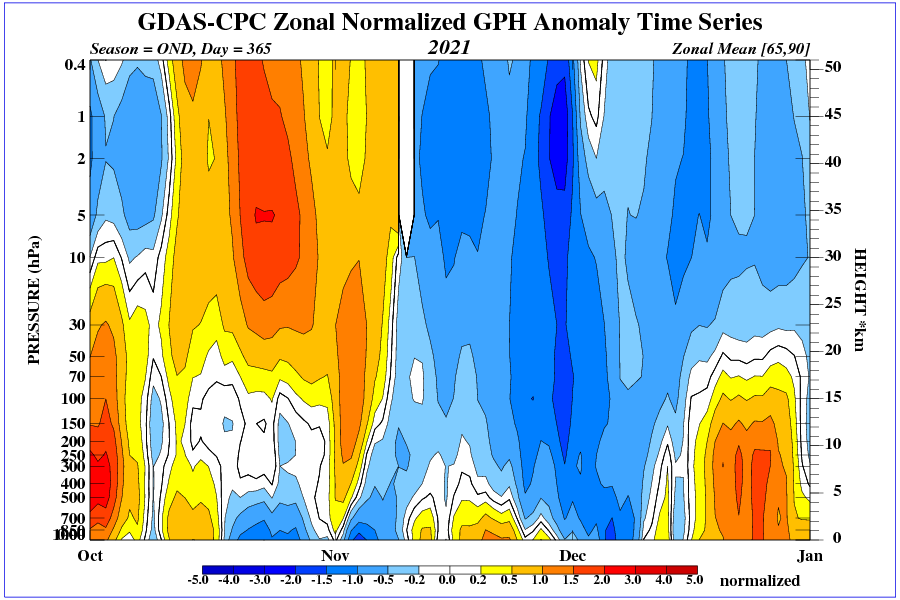
The start of winter will be unusual.
He who controls the past…..
Any attempt at counting tornados in a consistent way faces numerous difficulties, whether classified by strength or otherwise. So it is trivial to find a method that gives more than other, and almost impossible to apply any single method consistently. For example, consider the tornado(s) — one or several, who knows — that hit the Nashville TN area (where I live), on March 3, 2020, traveling at 40 to 50 miles per hour west to east.
It (or they, or better yet “the storm system”) did damage along narrow line that ran almost perfectly West to East for about 70 miles (Nashville to Cookeville) but the tornado(s) touched down only in certain places. Does each short 1000 to 2000 foot “scar” of damage on the ground count as a single tornado.
So, the criteria for counting has to consider whether the funnel cloud rises up more than X feet off the ground, not to make say 3 scars into 3 tornados. But how does any doppler radar (or any future high-tech instrument) detect the “full disappearance” into the cloud, and then re-emergence of a funnel could, but WITHOUT hitting the ground ? Is that a new tornado?
Then even if it does hit the ground and “touches” just enough “stuff” on the ground to do some easily noticeable damaged (but “touches” only for 1, 2, 3, 5, 10 or 15 seconds), clearly each such event is NOT a different tornado. But what if the such events are separated by 5 or 10 minutes and, or 5 or 10 miles. They surely might be considered separate tornados, but clearly one big system, tracing out just ONE “dotted line” on the ground.
A good start is to acknowledge that historical data are probably a lower-bound on weak tornadoes, and if a correction is attempted, it should increase past frequency.
Yes, we had low-powered tornadoes the other day and they would spin up into a tornado for a few minutes and then they would pull back up into the clouds, and then the front would move along a few miles and the same rotation location would spawn another tornado, and one of the tornadoes did this over and over.
This skipping around of tornadoes would only apply to low-powered tornadoes, I would think. The really strong ones stay on the ground.
There is no doubt that tornadoes are more closely watched today then in the past….there are tornado chasers.who try to get close and make videos…live doppler radar is often available…the “gubment” has portable doppler in a truck…some of the tornado chasers have been killed…tornadoes are very unpredictable.
We don’t need no stinkin’ data amigos.
It appears they may have redefined “tornado”. The previous graph was for ‘strong to violent”, the new just “tornadoes”. Are dust devils “small tornadoes”?
The NOAA officials who support this behaviour are a disgrace to science. They lack any shred of integrity, and are fully deserving of contempt by all individuals who value truth and the service of their fellow citizens. They will end their careers without an ounce of self respect when they consider how they compromised their ethics to keep that government pay-check. That said, the individuals with real power who created all the incentives to lie and who punished integrity are the true villains and the one deserving of society’s most severe sanctions.
They are merely trying to support the government that pays them.
Of careers and bonuses in the mainstream. Avoiding cancellation at the fringe.
“The NOAA officials” have changed careers. They are former scientists who have become political appointees whose job description implicitly requires defending the the ‘official’ positions on climatology.
Publishing this here is not enough, but it is a start. Not recommending following Gavin Schmidt into a restroom or even wearing a bison hat in the Captiol, but …
Picturing Gavin Schmidt wearing a bison hat… *shudder*
He has worn a jackass hat for years/decades.
Observation is a requirement of doing science. Doing science is difficult. Soothsaying is way easier, that’s why government agencies do that instead.
Point events can span hours, days, even weeks, without retained observable physical evidence outside of a limited frame of reference. Inference is part and parcel of modern science. Models/hypotheses posing as evidence is another. Temperature anomalies measured as fractions is another yet. It’s a brave new world.
Nonsense. The scientific method has not changed. Inference is assumption and opinion, not observation.
No actual scientist would ever say “It’s worse than we thought” if they were basing their claims on observation.
They are now publishing a count of all tornadoes instead of just the F3+. This clearly distorts the data because weaker tornadoes used to be so unreported. In other words, they found a way to show the data to support their agenda without adding in any caveats.
I note their new system does not allow you to choose a tornado strength, thus hiding the inconvenient data.
Again, typical liberal behavior. It should be called fraud and the people behind it fired.
How about, it is fraud? There. FIFY
From the article: “This is not “scientific”. It is fraud, pure and simple.”
It’s the very same thing with the bogus, instrument-era Hockey Stick charts.
NOAA changes the past to fit the Human-caused Climate Change narrative. It’s pure fraud, seeing as how we have records of the temperatures before NOAA bastardized them. The same with these tornado charts.
The fraudsters are very brazen, as in this case.