Guest essay by Eric Worrall
Steve McIntyre is at it again, dissecting questionable climate science. If you thought Michael Mann’s original climate hockeystick was interesting, with its intriguing apparent use of upside down proxies and apparent data deletions, check out McIntyre’s deep dive into the product of an entire team of climate scientists who think like Mann.
The IPCC AR6 Hockeystick
Although climate scientists keep telling that defects in their “hockey stick” proxy reconstructions don’t matter – that it doesn’t matter whether they use data upside down, that it doesn’t matter if they cherry pick individual series depending on whether they go up in the 20th century, that it doesn’t matter if they discard series that don’t go the “right” way (“hide the decline”), that it doesn’t matter if they used contaminated data or stripbark bristlecones, that such errors don’t matter because the hockey stick itself doesn’t matter – the IPCC remains addicted to hockey sticks: lo and behold, Figure 1a of its newly minted Summary for Policy-makers contains what else – a hockey stick diagram. If you thought Michael Mann’s hockey stick was bad, imagine a woke hockey stick by woke climate scientists. As the climate scientists say, it’s even worse that we thought.
…
It’s hard to know where to begin.
The idea/definition of a temperature “proxy” is that it has some sort of linear or near-linear relationship to temperature with errors being white noise or low-order red noise. In other words, if you look at a panel of actual temperature “proxies”, you would expect to see series that look pretty similar and consistent.
But that’s not what you see with the data used by the IPCC. You’d never know this from the IPCC report or even from the cited articles, since authors of these one- and two-millennium temperature reconstructions scrupulously avoid plotting any of the underlying data. It’s hard for readers unfamiliar with the topic to fully appreciate the extreme inconsistency of underlying “proxy” data, given the faux precision of the IPCC diagram.
…
Read more: https://climateaudit.org/2021/08/11/the-ipcc-ar6-hockeystick/
Plenty more where that came from, well worth a few minutes read.
One of the most fascinating finds McIntyre interprets as a new attempt to “hide the decline”, though he has grave concerns about the entire reconstruction which was snipped. Read his full article to delve into the details of this latest episode of alarmist data torture.
What can I say, as long as we keep paying them, they will keep on producing.
Is that top figure in AR6??
They’ve crawled all the way back to Mickey Mann’s hockey stick!
Despicable and disgusting, pure fraud.
It’s criminal and tragic that they are destroying the palaeo climate record and replacing it with agenda-serving fiction.
Yes. That is SPM.1. It is not from MBH98/99 though. In fact, it doesn’t utilize any MBH data or even tree rings at all. It’s based on an entirely different reconstruction methodology.
Ugg…this is the 3rd place in the blog comments here I’ve botched this up. SPM.1 does use tree ring proxies for the most recent 2000 years. It is the period prior to that in which tree ring proxies are not used. I’ll try to be more careful in this regard in the future.
You made an honest mistake, you acknowledged it and corrected it – that puts you miles ahead of most climate enthusiasts! Kudos.
Thanks. I appreciate that. Really. My biggest fear though is posting something incorrect and no one says anything and it sits there for all of eternity. Either way posting and engaging in debates on here is really good way to learn about the climate. Mistakes are par for the course.
Zombie Stick. Undead Climate Science.
The marriage of Bernie Madoff to Bernie Sanders.
Cute! Thanks.
Whatever happened to the Medieval Warm Period (circa AD 900-1100) in the AR6 hockey stick graph? Most of the more honest proxy reconstructions show the MWP as warmer than the present.
If the AR6 writers think it’s so much warmer now than during the MWP, why don’t they go live in Greenland to escape the heat, like the Vikings did? They could get beachfront property there for much cheaper than in Florida, which (according to them) will soon be underwater. Somehow, the real estate market, including former president Obama (who said he would stop the seas from rising), is ignoring their warnings!
The MWP isn’t especially discernable in SPM.1 because that is showing a global temperature reconstruction which includes the whole Earth; not just the land areas on the periphery of the North Atlantic. To analyze the MWP proper you need to switch back over to North Atlantic or with slightly less discernability NH reconstructions.
Funny, how a warm period that shows up in proxies from all over the planet, becomes a N. Atlantic only phenomena when that is what the warmunists need.
They needed to get rid of the MWP, and they worked hard until they did.
It was always a North Atlantic phenomenon. Hubert Lamb who pioneered the research and even coined the term (or more precisely the variation Medieval Warm Epoch) in 1965 said so. You can read about what Lamb actually said here. We now know that it was likely the result of the ebb and flow of the AMOC.
The MWP proper does not show up in proxies from all over the world. Different sites certainty have periods of higher temperatures, but they were not synchronous. When one region is cooling another is warming and vice versa. This is the effect of ENSO, SOI, ocean currents, and other cyclic processes in the climate system moving the heat around. When you composite the temperature into a global reconstruction like what Marcott et al. 2013, Kaufman et al. 2020, and others did you see that the global temperature does not exhibit the same bump during the MWP proper period as it evident in more localized reconstructions like for the NH or more specifically the North Atlantic region.The LIA is a bit different though. That was a global event though the magnitude was higher in the NH and especially the North Atlantic region. That’s why it shows up in the SPM.1 figure.
The resolution of the proxies is not high enough to catch those things as century spanning periods as they do with the MWP.
Therefore, this argument is not valid for the interpretation of MWP signals from the southern hemisphere as only local isolated phenomena.
The didn’t start and stop at the same time, however they did have significant overlaps.
You just have to ask the people who left the PAGES2K consortium after 2013.
Here’s a comparison of their recent temperature reconstruction of NH to the PAGES2K 2019 paper:
Obviously, they come to very different results.
If I have to believe somebody’s honesty than it is people who abandon their very good chance to keep publishing in high impact journals cause they are more about the data than their career.
The 1992 United Nations Framework Convention on Climate Change committed the nations of the earth to reducing CO2.
Here we are 29 years later and emissions have never been higher.
Climate Science in action. Their prescription hasnt worked in 29 years. So now it is code red and the solution proposed is to double up the medicine.
To fix what ails us, the very brightest climate scientists tell us the solution is to take even more of the medicine that hasnt worked for 29 years.
“as long as we keep paying them, they will keep on producing.”
Eric – it isn’t possible to stop their funding. But what about alternative funding? It would be interesting to crowd source funding for qualified scientists to start from scratch and do it properly.
The IPCC is a One Trick Pony. They know only one song. Can see only one solution. Their medicine bag contains 100 identical bottles of asprins and nothing more.
Emissions are going to keep rising. 29 years of failed international agreements confirm this. The solution is how to best take advantage. When life gives you Lemons learn to make Lemonade.
Years ago during the first Arab oil embargo the notion of “Peak Oil” was all the rage.
What quickly became apparent is that peak oil only affects cheap oil. Expensive oil is never in short supply for long.
I basically agree with you. However, it is the cheapness that provides the economic ability to improve the standard of living. Expensive energy doesn’t offer that ability.
Where is the Medieval Warm Period around A.D. 1000 in that graph?
Also, the error bars are laughable.
The bump in temperature around the North Atlantic isn’t discernable in the graph because that is a graph of the global temperature. To see the MWP you need to switch back to a graph focused on the North Atlantic or to a lesser degree the NH.
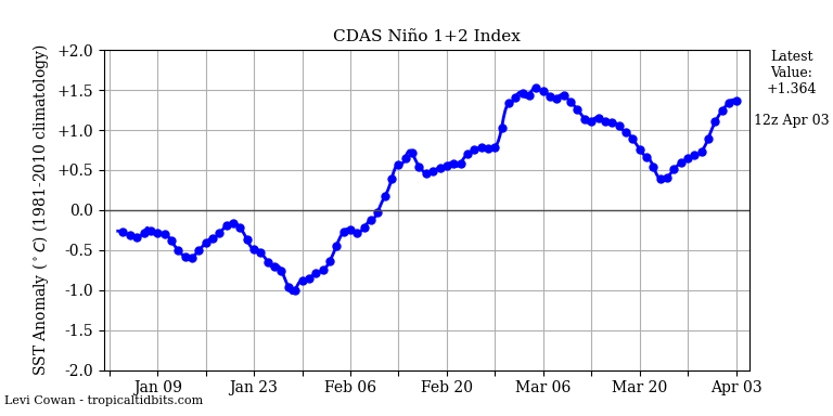
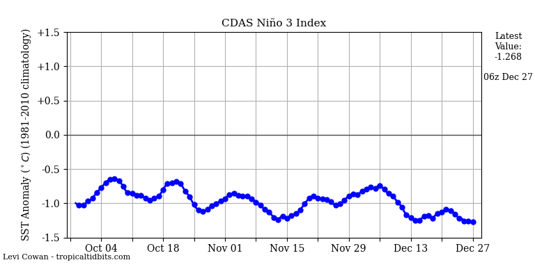
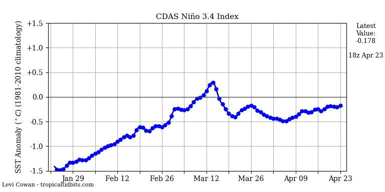
Another wave of cold water will reach the central Pacific.


I’m just overjoyed to see Steve McIntyre writing about these things again.
I’ll enjoy reading his works at my leisure.
As Steve McIntyre writes
“””Precisely why local Cape Ghir (offshore Morocco) temperatures were going down is somewhat of a quandary. Rather than figuring out this quandary, Neukom and the woke just turn the series upside down, following the example of Upside Down Mann by orienting the series according to its correlation with target instrumental temperature, even in their “CPS” reconstruction – a technique that is normally resistant to opportunistic flipping of proxies to enhance HS-ness of a final reconstruction.”””
some methods flip data and uses downtrending data to reinforce a warming trend.
I keep wondering at what stage a scientific unethical behavior like this becomes criminal.
And what could be a likely procedure to stop it in a US court?
The ubiquitous K-T atmospheric heat budget shows 63 W/m^2 LWIR upwelling from the surface.
This value appears TWICE!
Once sourced from the net, net solar energy 161 that arrived from the sun. Since it is not shown it must have slipped behind the sofa.
Second as part of the theoretical, “what if?” calculation for a BB at the surface temperature of 16 C used to calculate emissivity, i.e. 63/396=0.16.
When the music stops the solar 66 has chair in which to sit.
The calc’d 66 does not.
The greenhouse effect is a fifth grade math error.
Nick, this has been gone over by a lot of people and is not easy.
Nonetheless the figures do sort of balance and not in the way you are looking at it?
absorbed at Earth’s surface 161 from sun
Absorbed in earths atmosphere and clouds 78.
Total in 239.
Loss by latent heat and thermals 97. to the atmosphere
Now contains 175 W.
Now 161- 97 leaves 63 W at the surface having to make its way back to space by eventual radiation
But the temperature of the earth surface is 15C which BY SB means it has to be 396 W of energy to be radiated.
This demands an estimated back radiation of some 333 W from the GHG. to warm it, not to radiate to space!!!
Of the 63 left to go back to space 40 goes out direct IR.
The last 23 W goes into the atmosphere to make its way back out from the surface via both clouds and atmosphere.
Altogether 198 W in the atmosphere [plus 40 direct out makes the outgoing 238]
This is not made out clearly in the diagram
Which shows 30 of the 198/199 going out from the clouds and the other 169 going from the atmosphere.
There is 396 surface radiation from the energy in the system leaving the earths system only 63 watts of this is going to go back into space.
There is no extra 333 W of energy created from nothing.
The surface has to reach this temperature to radiate enough of its energy to the higher CO2 and H2O which by the way are radiating the 239 W from molecules at much lower temperatures than a 239 W earth surface would reach as it is much higher up and spread out it is much colder.
The GHG effect is real.
The assumption that warming atmospheres mean more heat retention is wrong.
No 0.9 retention.
The heat comes in and goes out CO2/H2O determine which layer is hot.
I haven’t read the report yet (I did read much of the previous ones) but it sure sounds like the IPCC has decided to completely abandon reality. At least the previous ones acknowledged that things weren’t changing as rapidly as predicted, if at all.