By P Gosselin on 14. February 2021Share this…
Southeast Greenland sea surface temperature was warmer than today in the 1940s, scientists find.
A team of Danish scientists led by David Wangner published a paper a year ago about the results of a Greenland sediment core from Skjoldungen Fjord, near the Thrym Glacier, which allowed sea surface temperatures to be reconstructed.
Hat-tip: Die kalte Sonne.

Map of the Skjoldungen area. The core location is indicated by a red star. Image: Wangner et al.
The core covers the past 200 years (1796–2013). The scientists find that the SST record compares well with other alkenone‐based reconstructions from SE‐Greenland and thus features regional shelf water variability.
Today some scientists like claiming the present is warmer than at any time in the past 1000 years and suggest the Greenland ice sheets are rapidly melting. But the results of the core reconstruction show that it was warmer in the past, some 80 years ago.
Warmer 80 years ago
The reconstructed SSTs in fact “show high amplitude fluctuations between 5°C and 12°C, especially during the 20th century”.

As the reconstructed sea surface temperatures in the area show, it was just as warm or warmer back in the 1940s. The period of 1915 – 1950 was at a similar level as today, thus nothing unusual is happening currently.
The authors also say that even though the meltwater production may have been influenced by climate, the glacier margin position and iceberg calving remained relatively constant in the 20th century.
Models poorly reflect Greenland
The Danish scientists are now requesting that Greenland glaciers be better taken into account in climate models and say that the unusual warmth of the early 20th century is related to a complex interaction between two major oceanic cycles: the AMO and the NAO.
Good catch and posting of this report. Remember the 1930’s in the USA were the Dust Bowl years, when a lot of drought and heat records were set. Again, we see the lack of an anomaly signal detectable against the background of normal climate variance.
Didn’t Ford start producing SUVs in the 30’s? That explains a lot.
The Dust Bowl was more a creation of the ENSO cycle in a La Niña phase than the AMO or NAO. You’re absolutely right, though, that there is no signal for Gorebull Worming in their data! It’s almost as if the climate variations we’ve been experiencing over the last fifty years are controlled by the sun and the major oceanic cycles; just like the rest of history!
It would be nice if these researchers would not encourage more modeling!
That’s the money quote.
There is nothing wrong with modeling a process as a way of trying to understand it better. The problem is that most modelers and the MSM treat the models as though they are reality instead of the experimental, simplified, mathematical characterizations that, while almost certainly wrong, may have some limited usefulness. The real problem is the MSM hyping something that they don’t understand as a way of promoting their agenda.
Not quite.
Climate models are composed of multiple fallacies, fantasies and failures throughout all levels.
A) Weather and climate are chaotic systems.
B) Earth, Solar radiance, Atmosphere interactions are poorly understood.
C) Earth, Solar radiance, Atmosphere interaction complexity is ignored in favor of skeletal models where opinions drive the design and function of skeletal assumptions.
D) Models are programmed according to the Confirmation Bias of prejudiced government departments.
E) Models are used by these government agencies to force citizens to ‘make the right choices’…
Climate models have not improved in decades.
Nor will they until the government departments decide to fix all portions of their models; officially seek model certification; Emphasize that the results are “What if Models not reality“!
When government employees discard all “multi-model” means and averages would be the first sign that climate science is finally advancing.
There’s nothing bad about modeling if your models are an accurate representation of the subject matter. This is where climate science goes wrong. They get the first part of the science right. The following experimental data shows a comparison of radiation between our current atmosphere and one with 100% CO2.
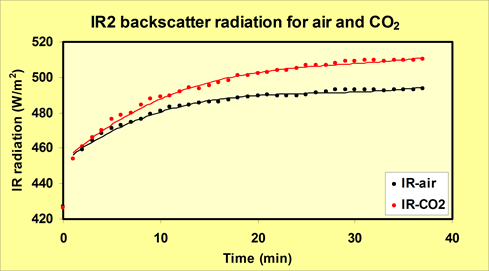
The problem with models is they turn all that extra radiation into heat. But, that is not what happens. Here is what happens in the reality.
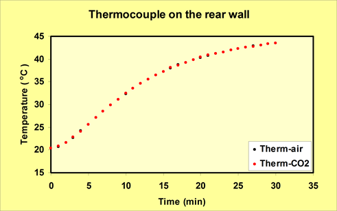
Where did the energy go? This is the crux of the matter. It was absorbed by the back wall but the heat capacity of solid matter is 500-1000 times greater than air. Hence, the heating is minimal. Now, had they let the experiment run longer you would have seen a little more heating. But since the temperature change itself in so small the amount would be trivial.
On planet Earth the heat source eventually goes away for awhile. We call that night. During this period the surface will cool to the dew point temperature. Any extra energy still collected by the surface will simply radiate away. It might take a few more minutes but that is it.
Some of the energy would increase evaporation but most of that would get carried high in the atmosphere before the heat is released also negating the warming of the surface.
It is this inaccurate modeling of the feedback processes that causes the models to fail.
Models are also useful in helping you figure out what the limits of your knowledge are and what it is you don’t yet understand about a complex system.
Models are especially useful in pushing a political agenda.
So is formal logic and rhetoric. Should we stop using them as well?
I was taught models were to drive the design of experiments, not be the experiment.
I believe models can help you look in the right boxes to design your experiments, but as you say they are not the experiment themselves. People make the mistake in thinking that modeled output is data. It is not … at least not empirical data. At best, the range of possible projections can be useful to set the limits of your search, but when the lowest projections are already higher than observations, you know you have problems.
Climate models are based on a fantasy that does not exist. Nothing in them approaches reality.
The global energy balance is set by two processes that are thoroughly independent of CO2. The formation of sea ice that limits ocean surface water to -2C and thereafter dramatically reduces heat loss. The formation of convective instability in the tropics that limits open ocean surface temperature to 30C and results in heat loss above that temperature.
The consequence is easily observed every day of every year:
Average global surface temperature is simply the arithmetic mean of the two limits:
Average Global Surface Temperature = {30 + (-2)}/2 = 14C
So simple anyone with a grade school education can calculate it.
Nothing that CO2 does will change the energy balance on Earth. The “greenhouse effect” is pure fantasy.
Very Intriguing. Could you possibly expound on it further?
This fits well with the Greenland aerial survey of 1938 by the Danes. That showed glacier melt similar to today
I don’t know why we’re still voicing surprise about “contrarian” findings such as these.
Our surprise should be about why the academic, political, bureaucratic and media classes always seek to bury these findings.
Don’t forget that some of them are world class cherry pickers! I think Mickey Mann could probably bring in the crop from the whole Pacific Northwest if he had the gumption!
It is sad to be living in a era where Political Science is actually part of the science curriculum in almost every university! Apparently Orwell underestimated Progressive religiosity!
By my Mark I eyeball estimate, it looks like the data points have a temporal resolution of about two years. I’m just curious, not being an expert, or even a novice, in sediment cores, but do these cores really have that temporal resolution?
Glacial varves can usually be delineated to a single year, and differentiate the melting season from the frozen season. Being in a fiord may result in some mixing, thus lowering the temporal resolution.
Clyde,
Got it, thanks for the response.
Interestingly, that graph looks a lot like NASA GISS N.Am record as published by Hansen in 1988, before it gradually morphed into a warming trend.
You know what I see there, in the top figure/graphic/picture and how to create it?
Take yourself a loooong look at ENSO, to cover as many Ninos as you can – go way waaaay back in ENSO time
Then, plot them on a long sheet of elastic/stretchy paper and then, stretch it.
Basically, play the ENSO record back at half, quarter or even one-tenth speed.
Do your best to preserve the higher harmonics
IOW, things akin to ENSO are happening all over the place in around the large oceans and in all seriousness, how could they not?
Thus trade, or prevailing, winds routinely gather up large pools of warm water in far flung corners of far flung oceans and, with tedious monotony, routinely collapse.
And those collapses/avalanches/tsunamis of warmer than average water will bounce around on the surface of the ocean, whichever ocean, just like the ball in a pinball machine until all their heat is gone.
By which time another one may have started, and another and another and all the time interacting with the reflections of previous events.
A peak of the ripple from a previous event might certainly be the ‘spark’ for another or the trough would delay the start.
Are you up to using a computer to predict how any game of pinball will go?
Even more to the point, how do those waves, ripples, peaks and troughs represent either a warming world or a cooling one?
Certainly to my mind, El Nino is a cooling event – a large pool of stored (trapped in the climate vernacular I s’pose) warm water is dispersed over a very wide area and dissipates energy that was previously stored in a deep warm pool in the Western Pacific.
But, how many pools are there. Why assume just one?
Nino is an energy loss event. Yes the temp goes up but that is exactly how you know it is an energy dumper.
Yet modern science only sees the high temperature – to then assert that we are doomed – and NOT the loss of energy which, if it continues, means that we REALLY ARE doomed
sigh
From the article: “As the reconstructed sea surface temperatures in the area show, it was just as warm or warmer back in the 1940s.”
The reconstruction also shows the cold periods of the 1910’s and the 1970’s in their proper perspectives. Just like the US surface temperature chart:
Hansen 1999:
But Tom that graph finishes at 2000. Here is a more up to date picture and no 1940 was not as war as today.
https://www.epa.gov/climate-indicators/climate-change-indicators-us-and-global-temperature
It has warmed a bit more after the AMO went positive in the 1990s. No sign of any dangerous warming at all. The AMO will switch back soon. Looking forward to all the excuses.
Simon, just mentally attach the UAH satellite chart onto the end of Hansen 1999, and you will have the current temperature profile of the Earth, that being that it was just as warm in the Early Twentieth Century as it is today.
The year 1998, is on both charts, and Hansen says 1934 was 0.5C warmer than 1998, and since 2016 and 1998 are statistically tied for the hottest years in the last 25 years, that would mean that 1934 was also 0.5C warmer than 2016, so that means we are currenly in a temperature downtrend since 1934.
Here’s the UAH satellite chart:
Btw, in order to get the UAH chart to appear as a picture in the comment, I had to add an “s” to the http, address.
That sounds like quite a bit of sticking and pasting and hobbledy gigging. Why not just look at the graphs that have the complete time series… like the ones I sent you?
A MASSIVELY distorted and tortured once-was-data series..
that bears little resemblance to what was actually MEASURED
“Why not just look at the graphs that have the complete time series… like the ones I sent you?”
Because they are bogus, bastardized, modern-era Hockey Stick charts and I think all Hockey Stick charts are computer-generated science fiction created to promote the Human-caused Climate Change scam. I see no reason to treat a Hockey Stick chart as legitimate.
You treat Hockey Stick charts as legitimate because that is the only “evidence” you can provide that goes along with the Human-caused Climate Change narrative, but you are wasting your time trying to sell it here.
I treat Regional surface temperature charts as legitimate because they consist of actual temperature readings recorded by actual human beings, no computers involved.
The Regional charts present a completely different picture of the world’s temperature profile than does the bastardized Hockey Stick chart. The Regional charts show the Earth has nothing to worry about from CO2. Just the opposite of what the Hockey Stick chart shows.
All the Regional charts agree with each other more or less by showing that it was just as warm in the Early Twentieth Century as it is today. None of the unmodified Regional temperature charts resemble the “hotter and hotter” temperature profile of the bastardized Hockey Stick chart.
The Hockey Stick chart is all alone in the world. No actual temperature readings confirm this chart. In fact, just the opposite, actual temperature readings put the lie to the bogus Hockey Stick chart.
That’s my reasoning.
So your rebuttal is to show a bastardized Hockey Stick chart?
Here’s how to recognize a bastardized, fraudulent Hockey Stick chart. It is any chart that does not show the Early Twentieth Century as being as warm as today.
If the chart doesn’t show the Early Twentieth Century warming, then it is worthless garbage.
And simple-one pulls a chart of HEAVILY ADJUSTED data out of his ass.
How about we look at actual MEASURED data.
And non-urban data
We could also look at the percentage of very hot days
Hansen shows what was once the REALITY.
UAH shows 1980 as 0.1C anomaly and 2020 as 0.32C anomaly, so warming since 1980, about 0.22 warming since then.
So STILL way below the 1940s peak in Hansen’s own data. !
UAH does not represent anything related to the surface temperature. It measures something way up in the atmosphere near cloud base. It is biased high compared with the tropical moored buoys.
I await Version 7 of UAH that removes the current bias.
Think about – there is no doubt that the Pacific moved into La Nina last July and yet UAH is still showing an anomaly above zero. UAH still shows a positive anomaly in the Nino34 region – it’s rubbish as an indicator of surface temperature trends.
Actually UAH shows “Tropical Oceans” with a negative anomaly, and covers a much larger area than Nino34.
Do you have specific data for the UAH Nino34 region ?
Trends on land are very similar to the only pristine data set in the world.
There is still an above normal patch in the Indian Ocean tropics which will be increasing the UAH “Tropical Oceans” value
https://climatereanalyzer.org/wx/DailySummary/#t2anom
Do you have Nino34 UAH data specifically..?
This link gives the UAH for Nino34 region:
http://climexp.knmi.nl/data/itlt_60_-170–120E_-5-5N_n.png
A clear upward trend although it has gone slightly negative for the last two months.
This is the BoM Nino34 anomoly:

It has been negative since the middle of 2020.
Australia is definitely experiencing the La Nina phase.
No, only the 2015 El Nino/Big Blob shows in the UHA graph as causing any upward trend. All pretty close to zero trend before that if not for that deep dip in 1989
UAH has the same pattern as BoM since July 2016.
Peak anomaly around start of 2019 was LESS than in BoM, about 0.7 vs nearly 1.0,
It is understandable that the atmosphere responds slightly less than the surface.
We see the same thing with USCRN vs UAH USA48.
Let’s see what next month comes out with.
Would be interesting to know the reference periods for each of the anomalies.
The trend for UAH over the Nino34 region is up 0.0103 per year to end of 2020. The surface level data in the same region has zero trend for the same period.
If UAH continues with its bias it will be higher by 1 degree by 2080 in the Nino34 region. That simply cannot happen on the ocean surface. So UAH is clearly biased if it is aiming to be representative of the surface temperature.
Just the 2015 El Nino causing that trend value., otherwise UAH is pretty flat.
Look at what is happening,
… calculated linear trends can be deceptive.
And extrapolating out 60 years.. seriously ! ?
In a couple of months UAH will have less trend and will gradually ease back to zero as we get further from the 2015/16 El nino/Big Blob.
It is already 40 years so up by 0.4C; almost half way there. Nothing that happens in the next few months is going to bring it back ti zero.
If it is supposed to relate to the surface temperature then the bias needs to be removed.
The nature of a bias is that it just drifts further from reality. It will just keep getting worse until corrected again. Then it becomes an embarrassment. So be careful not to have faith in rubbish data.
Chop it at the 2015 El nino.
Not much slope at all.
Sorry you have to keep using El Nino events to prove a positive trend..
A classic standard AGW con trick.
I agree, if you chop out the high point then you get closer to zero trend – not particularly convincing b definitely deceptive.
Attached is the actual surface Nino34 temperature trend to the end of 2020 – zero trend and no need to chop off the high bits.
UAH is showing a strongish negative in the Pacific, just basically zero in the rest of the tropical oceans.
https://www.nsstc.uah.edu/climate/
Why try to change the topic to global, especially using JUNK, mostly fabricated data.
Even the IPPC agrees that Greenland was warmer in 1940
What technical measurement was used to back out the temperature? Something to do with Alkenone?
This coincides with un-adjusted temperature data from Greenland
And all around the Arctic for that matter
Even with Jones data
It looks like we have a consensus among the charts: It was just as warm in the Early Twentieth Century as it is today.
Therefore, CO2 is a minor player when it comes to being a control knob of the temperature of the Earth’s atmosphere.
But when you look at global graphs they tell a different story from selected ones.
http://berkeleyearth.org/wp-content/uploads/2020/01/2019_Time_Series.png
If you don’t like Berkeley (even though “some” skeptics said they would accept whatever Berkeley presented) here are all the major data sets together. Ain’t no way 1940 was as warm as today.
https://en.wikipedia.org/wiki/Instrumental_temperature_record#/media/File:20200324_Global_average_temperature_-_NASA-GISS_HadCrut_NOAA_Japan_BerkeleyE.svg
That’s anomalies constructs, not recorded temps.
So what? Still tells the story of a warming world, and that the 1940’s were no where near as warm as today globally. And the thing is because those records are so similar, they tell an even more compelling story.
WRONG, it shows the MANIFEST ADJUSTMENTS associated with the AGW scam.
They bear ABSOLUTELY ZERO RESEMBLANCE to reality
MOST of the SH is ocean, and had BASICALLY ZERO DATA before about 2003.
Only land areas with data are Southern Africa
And Australia
http://www.warwickhughes.com/agri/188209t.gif
Again, highlighting your GROSS IGNORANCE
They are all based on the same CORRUPTED data set, simpleton. !
simpleton. yet again.. those fabrication are all based on the same massively adjusted non-data.
Proof of that please Fred?
Grow up, simpleton
You eiother haven’t been paying any attention
.. or are just monronically DUMB..
They tell a compelling story alright – to morons. Why do think they are all the exactly the same?
Mike
Firstly they are not the same and secondly they are similar because that is what you would expect from quality data.
You really are a SIMPLETON
All those are based on the same HIGHLY ADJUSTED ONCE-WAS-DATA.
Are you SO IGNORANT that you didn’t know that !!!
“Ain’t no way 1940 was as warm as today.”.
..
Again the UTTER BS and mindless simpleton attempt to change the topic.
The topic is Greenland and the Arctic
And as shown below, global fabrications before the satellite era are ALL based on highly corrupted NON-DATA, bear no resemblance to REALITY, and are totally MEANINGLESS.
I commented on Toms comment re 1940. Keep up Fred.
Tom says…..
You really are the most dim and incompetent little trollette… EVAH !
Stay in the slow lane, simpleton. !
Come on, simpleton.
Show us where the temperature readings for the bulk of the Southern Hemisphere before 2003 (ARGO) came from.
Antarctica COOLING,
Australia, Warmer around 1880-1920 than now,
South Africa warmer in the 1940s.
There is NO OTHER DATA for the lower half of the world
Even Phil Jones admitted it was “mostly made up”
So where did they get their CRAP fabrication from ?????
You have been FOOLED by a fantasy fabrication.
Some skeptics said they would accept his work because they accepted the lies he had been spreading. However once they got a look at his work, the problems with it were many and serious.
BTW, I love the way alarmists declare that only properly cooked data is valid.
Records from all over the planet put the 30’s as being as warm and warmer than today.
Muller was NEVER a skeptic, ALWAYS a con-man
With the whole heap of totally CRAP data they use…
…. they can manufacture basically ANYTHING THEY WANT.
“Muller was NEVER a skeptic, ALWAYS a con-man”
Well he conned Mr Watts then. Funny how when you don’t agree with something Fred it is always a conspiracy. No wonder you were so happy to believe Trump was robbed of the election.
Poor simpleton, always so easy to prove you IGNORANTLY wrong.
Here is Muller from 2003 .. obviously NEVER A SKEPTIC.
You only have to look at the people he hired to know the “fix” was on.
Its not a conspiracy IF ITS REAL, simple slimon.
…. no matter how much you close your eye, put your fingers in your ears and go “la-la-la” like a loon.
And Mr Watts was WARNED by several people..
.. but didn’t listen.
http://www.populartechnology.net/2012/06/truth-about-richard-muller.html
NEVER was as skeptic !!!!.
Nothing but a self-aggrandizing CON-MAN
No wonder a simpleton like you would fall for it.
And here he is suggesting Carbon capture in 2008
Only a complete “believer” would even bother with that..
And paying India and China to “cut back” on CO2 emissions
This Muller guys is on Klimate Kool-Aide + steriods..
A raving AGW NUTTER. even before the CON of BEST.
You got a link to those quotes Fred?
Again in 2008
NOT A SKEPTIC, no that Mickey Mann is.
I don’t claim to know Muller’s intentions when he started. However, the people who developed the procedures and calculations necessary to arrive at the poor results either didn’t know what they were doing (likely) or were consciously trying to arrive at supporting info for the hockey stick. Whether he participated in a con or not I do not know. But, I do know whether it was purposeful or not it is junk data.
Wasn’t Judith Curry on the team?
What is your point? Be careful of argumentative fallacies about using an appeal to authority.
My point is she is respected round here.
“But when you look at global graphs they tell a different story from selected ones.”
Yes, we know, and we know why, too.
The “global” graphs are figments of the Data Manipulator’s imaginations.
They are created to promote Human-caused Climate Change. They don’t match the real temperature profile of the world shown by the regional surface temperature charts.
The Regional surface temperature charts show the world is not overheating and CO2 is not a problem. The fraudulent Hockey Sticks show just the opposite, as you pointed out.
Tom
“The “global” graphs are figments of the Data Manipulator’s imaginations.”
If you really believe that then you need to prove where the adjustments are crooked. Skeptics seem to meet a dead end when they try. All adjustments are documented, justified and explained.
Garbage graphs. All the same because they all suck from the same teat. 2000 was exactly the same temp as 1958 not half a degree higher.
You are only seeing data manipulation, not the real trends. The use of anomalies removes a huge amount of variance seen in the absolute temps. Made up temps to fill in missing areas. And I could go on.
The real giveaway is when you plot local station’s trends of absolute temps and begin to combine them into regional trends. You immediately see how UHI has been smeared all over the place. You can also see how there are no very high trends to offset those places with no warming and even cooling trends.
The sum of the parts simply must add up to the whole in this case and they do not.
I have neither the time nor the inclination to go deeply into why these “hockey sticks” have the trends they do. I suspect several statistical errors are being compounded to give spurious trends.
I have neither the time nor the inclination to go deeply into why these “hockey sticks” have the trends they do….
And yet you are happy to say they are questionable? Interesting.
You assume I have never done that. I’ll give you one simple example to address. Why are anomalies not rounded to the precision of the measurements they come from? This violates a fundamental practice in metrology and science. Explain it if you can.
Jim
It makes no difference whether you use anomalies or temperature data. They both show the same warming. You are just shuffling the deck chairs.
Good to see actual temperature on the chart rather than anomalies.
The application of the concept of anomalies is just buying into the fraud surrounding Climate Change. If a difference is so imperceptibly small on a standard Centigrade scale then creating an anomaly of the difference and expanding the scale a 100-fold to exaggerate the difference is deceptive.
It’s not only deceptive, it doesn’t even follow accepted scientific practice as it is used with significant digits. The measurement uncertainty is so high they won’t even calculate it, they just proclaim the “error of the mean” is sufficient to insure the number is accurate.
But, the error of the mean is only strictly justified when the same instrument is used to measure the same thing multiple times.
There is an old joke that the analog NTSC standard stood for “Never Twice the Same Color.” You only get one chance to measure a Tmax at a particular station on a given day.
Even the IPCC agrees
Who let that data out unmolested? Heads will ROLL! We all know data has to be manipulated BEFORE the public can be allowed to see it. Who knows what the public might think if they see uncurated data. We must do a better job of manipulating the science!