Guest Post by Willis Eschenbach
I’ve read comments from several folks claiming that despite the COVID lockdowns reducing emissions, there’s been no corresponding decrease in the airborne CO2. Here’s a typical claim, complete with graphic, saying that this proves that human emissions aren’t the reason for the gradual increase in airborne CO2.
The COVID shutdown reduced man’s emissions of CO2 by about 20%. Yet the growth of CO2 in the atmosphere then was almost EXACTLY what it was during preceding years.

What didn’t change was natural emissions. So much for Willis’s [saying] “it’s man made”, and settled science.
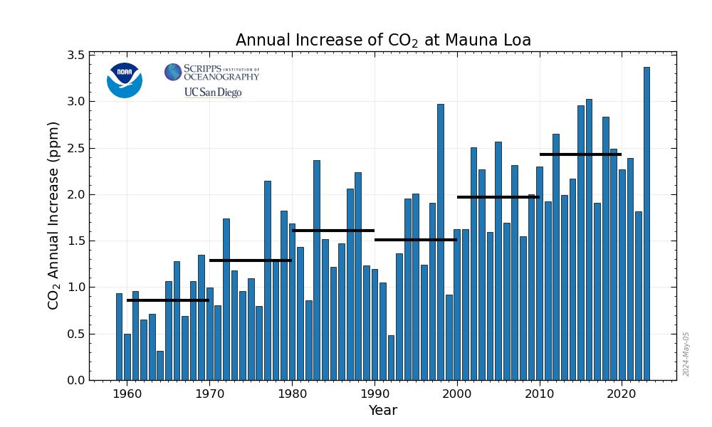
Hmmm … y’all who know me know that I’m a data guy. So I thought I’d take a look at the situation. I reasoned that a “year-over-year” comparison would be much more valuable than the more general graph above. A year-over-year comparison is a graph showing, for each month in the record, how much the CO2 level increased over the same month in the previous year. If we want to understand changes in CO2, we need to look at changes in CO2, not the absolute values the commenter used above. Airborne CO2 has been growing at about 2.5 ppmv per year or so. Figure 1 shows recent data detailing the year-over-year growth in airborne CO2.

Figure 1. “Year-over-year” analysis of airborne CO2. Each data point shows how much the airborne CO2 increased over the same month a year previous. Units are parts per million by volume (ppmv). Data is from the CO2 station on Mauna Loa mountain on the Big Island. Photo is of Mauna Kea in Hawaii, the other major mountain on the Big Island.
Hmmm … didn’t really expect that the variation would be quite that large. The big peak in the middle is from the El Nino/La Nina of 2015-2016. The peak and drop at the start if from the Nino/Nina of 2009-2010. What causes the other variations is far from clear. What is clear is that the values vary from smallest to largest by no less than four hundred percent, from an annual increase of less than one part per million by volume (ppmv) to an increase of over four ppmv … a large natural variation.
Next, we have to ask the question the commenter who I quoted above didn’t ask—just how much would we expect the CO2 to change due to the lockdowns?
Now, the author of the comment above says there’s been a 20% decrease in 2020 emissions … but that makes my Bad Number Detector start ringing. In general, carbon emissions for the globe, as well as the resulting changes in global atmospheric CO2 levels, are a linear function of global Gross Domestic Product (GDP). The GDP is the sum of all of the goods and services produced during the year.
And as you’d expect, if we increase the amount of stuff we make, we increase the CO2 emissions correspondingly. (For the math inclined, global annual carbon emissions ≈ 6.3 Gtonnes + .4 * global GDP (trillions of constant 2010 $).
Looking around the web, I see estimates for the lockdown-caused drop in 2020 GDP of from 4.5% up to 5.3%. And since emissions and the resulting atmospheric levels are a linear function of GDP, that would mean that the year-over-year CO2 increase should be smaller by something on the order of five percent.
This lets us calculate what the increase in CO2 would have been if there were no lockdowns. Over 2020 you’d expect CO2 emissions, and thus the resulting annual airborne CO2 increase, to have been 5% greater if there had been no lockdowns.
So to be very conservative in our estimate, let’s say the lockdowns actually decreased emissions by twice that, or 10%. If we use ten percent as our figure, our results will be solid.
So … what would the Figure 1 graph above look like without that 10% drop in 2020 emissions? Figure 2 shows that result. Just for interest’s sake, I’ve also added what a 20% difference in emissions would look like. That’s four times the actual ~ 5% change expected from the drop in GDP.
Of course, up to 2020 there is no change …

Figure 2. As in Figure 1, but with lines added showing a 10% (yellow) and a 20% (orange) increase in CO2 no-lockdown emissions would look like.
Again … hmmm. Gotta say, in a system that variable, a 10% or even a 20% difference is not distinguishable from the background. I mean, any one of those three lines is totally believable.
Conclusions
My main conclusion is that despite the huge, almost incalculable human cost of the lockdowns, the change in the rate of increase of CO2 is lost in the noise … which certainly doesn’t prove anything either way about whether the increase is human-caused.
My other conclusion is that this should give great pause to those who are blithely recommending totally restructuring the global economy to replace fossil fuels … look at the real-world costs of the lockdowns all around you, and look at the meaningless CO2 benefits in the graph above. Not worth doing on any planet.
My best wishes to all in this most curious year of 2020, can’t be over soon enough for me,
w.
PS—For those wondering about a CO2 observatory on the side of an outgassing volcano, see my post Under The Volcano, Over The Volcano.
PPS—When you comment, please quote the exact words you are discussing. I can defend my own words. I can’t defend your interpretation of my words.
Hi Willis,
A popular paper with estimates of emissions changed by the lockdown was “Near-real-time monitoring of global CO2 emissions reveals the effects of the COVID-19 pandemic. Nature Communications, 2020; 11 (1) DOI: 10.1038/s41467-020-18922-7.” (This was facilitated by Potsdam Institute for Klimate, which an Internet search will show is a strictly correct and objective research team, for there are nearly no criticisms of its work). They arrived at a global CO2 reduction of 8.8% for the first 6 months of 2020. They did not mention if this was detectable or detected by measurement of the air.
Coming to your graphs, yes, there is variation in the year-on-year data. This has an interplay with your equation (global annual carbon emissions ≈ 6.3 Gtonnes + .4 * global GDP (trillions of constant 2010 $) which, as I am forever complaining, lacks an expression of uncertainty. Here, the uncertainty seems so large that the equation is unreliable for purposes such as forecasting. The core of this story is why these year-on-year figures are so variable.
You note that “The big peak in the middle is from the El Nino/La Nina of 2015-2016” but I have troubles guessing which mechanisms you might have in mind. The year-on-year methodology gives a peak like you show in two broad ways, from a rise in the later year or from a fall in the previous year. Any views on which it is here?
On May 22, I wrote a piece for WUWT about measurement of CO2 in air, one sentence being “If accuracy is expressed in customary terms of a normal distribution with 95% of measurements falling within the 2 sigmas of standard deviation either side of the mean, even a rough eyeball estimate puts the 2 sigmas at about +/- 2 ppm accuracy.”
https://wattsupwiththat.com/2020/05/22/the-global-co2-lockdown-problem/
The global climate change scene is dominated just now by calls for cessation of fossil fuel burning to reduce CO2 greenhouse emissions to the air. If a shock like an 8% reduction over 6 months is not found by measurement, this poses quite a problem for those who report on progress to “zero carbon” and invoke penalties for lack thereof. How in heck are we to know for the next decade if global reduction of CO2 emissions, by any method, is going to have any effect at all? How will any global CO2 administrative scheme work if one cannot properly measure the result?
Now, combine this with the preprint by van Wijngaarden & Happer noting that both CO2 and H2O vapour in the air are saturated with their ability to produce more heat from IR absorption (and logically, also showing little change from a reduction of current levels) and you have to wonder how much of this reporting is science and how much is politics. This is not a new problem, but still, it is annoying. https://arxiv.org/abs/2006.03098
I hope this adds to your article, Willis. Geoff S
(Edited for spacing) SUNMOD
Willis, the volumes of coal, oil and gas being consumed has been measured.
Why not use that instead of trying to guess based on GDP?
MarkW November 16, 2020 at 4:09 pm
Good question. Lack of data running all the way up to the present. Global fuel consumption values typically are a year behind.
w.
My first thought was to compare changes in energy usage to changes in GDP during past recessions and recoveries.
My second thought was that the current economic circumstances are enough different from previous recessions that it may not be possible to make a direct comparison.
According to this page, total energy spent on lighting is about 5% of all energy used.
https://www.eia.gov/tools/faqs/faq.php?id=99&t=3
I don’t see lighting broken out in Willis’s chart above, so I guess it is spread amongst several of the categories.
LED lights are continuing to penetrate the market, though the amount of change over the last 6 months is probably not enough to matter. However their spread over the last 5 to 10 years is probably enough to skew any comparison between the current “recession” and past recessions.
In my town every time a street light burns out, it is replaced with an LED unit.
We also build 1 to 3 new roundabouts a year and I know that those are reducing the amount of gas that I burn.
A quick and easy read: “Climate Miracle” by Dr Ed Berry explains why changes in emissions have very little effect on atmospheric content of CO2.
https://tambonthongchai.com/2018/12/19/co2responsiveness/ explains why the correlation of emissions to content is spurious and the detrended analysis shows now correlation.
DMA,
Both are completely wrong…
I have tried to convince Dr. Berry in many comments, to no avail: he uses the reverse of the residence time, which is only right if you have one unidirectional flow from in to out in the atmosphere.
If you have many CO2 flows, which go (seasonal) in opposite directions, you still have the same residence time (which only depends of the throughput, not the direction of the throughput), but can’t reverse the formula to estimate the output.
ChaamJamal shows that human emissions are not correlated to the detrended increase in the atmosphere, but by detrending, he removed the correlation, which is between the trends, not the noise around the trends (which is temperature correlated, not emissions correlated)…
Willis,
“And since emissions and the resulting atmospheric levels are a linear function of GDP, that would mean that the year-over-year CO2 increase should be smaller by something on the order of five percent.
…
My other conclusion is that this should give great pause to those who are blithely…”
The analysis here is good. It looks at the numbers that need to be checked. But that last conclusion doesn’t follow. The analysis says that we didn’t see much reduction in atmospheric CO2 because there wasn’t much change in emission from this event. It just didn’t happen. That says nothing about what we might achieve by actually working to reduce emissions.
“by actually working to reduce emissions.”
Now WHY would anyone sane, and with the least understanding of biology and life on Earth, want to reduce CO2 emissions ??
Yes, strive for better efficiency of use, by all means.
But reducing CO2 emissions “just because”…….. utter stupidity.
Given the destruction of human wealth that has accompanied the current decrease in CO2 emissions, only someone with a total hatred of mankind would want to increase the damage.
Yup
And if, as Nick concludes, all that destruction of wealth only had “wasn’t much change in emissions” to show for it, woe betide the world’s population if he and his ilk ever get their way regarding emissions, the destruction would be beyond apocalyptic and still have nothing to show for it beyond the massive levels of misery, death, and destruction it would cause.
Lets all return to the economy and lifestyles of the 1840’s and find out. Because that’s what is necessary to see what we might achieve. It will be a grand experiment. You first?
Poverty?
Those who view themselves as the elite, will find excuses to exempt themselves from the poverty they wish to impose on the rest of us.
Not just poverty. The misery and loss of life and lifespan that would accompany the stone age lifestyle required to reach the goal. (which still wouldn’t do a darn thing in regards to changing the worlds temperature).
Ah, but that reduction in humanity is exactly the goal of the elites. They think eliminating 13 out of 14 of us, resulting in a worldwide population of half a billion or so, is just what they need to keep THEM happy, to hell with the slaves that remain and to heaven (figuratively, for these elites are atheists) with those who are eliminated.
These prople are sick.
NOAA has a page showing annual growth rate variations for the entire observation record.
The CO2 growth rate is very variable with 1992 unusually low maybe related to the Mount Pinatubo eruption in 1991 and unusually high in 1998 coinciding with the strong El Niño in that year.
I think assuming that GDP somehow relates directly to CO2 emitted is a stretch. Yes, nations with large GDPs typically have large CO2 emissions, but it can vary widely depending on what is being produced. For example the United States GDP has been steadily increasing since 1990 (with the exception of 3 different years) and yet the CO2 emission estimates have declined a lot. Using a bad proxy means no matter what you do to the data it is meaningless.
A much better estimate of CO2 emissions would start with fossil fuels consumed, cattle raised, and burning activities. One should also add in estimates for CO2 removal as in growing more forest.
I too have looked at the atmospheric CO2 concentrations and pondered why they show no meaningful change through the lock-down. Of all CO2 entering the atmosphere it is commonly estimated that only 4% or less comes from man’s activities. This means somehow that 4% of the CO2 is magical and can push up atmospheric CO2 concentrations when 96% of the CO2 apparently does nothing. This then leads to the conclusion that if you decrease the magic 4% by 20% you SHOULD get 20% less warming – but some of the warming takes time so maybe you can’t see it in a single year. And yet, no effect has been found that I am aware of.
In reality if you took away all of man’s CO2 emissions, you would likely change the rate of rising CO2 concentrations by a small amount. The atmospheric CO2 must be balanced with that of the Oceans and it depends on local temperatures – it is likely the ocean temperatures that are changing causing an out-gassing of CO2. The lock-down simply would not matter – its changes far too small to detect.
Meanwhile plant growth is reacting to more available CO2 and taking it up. With luck, more CO2 will moderate temperatures between the equators and the poles. In short, the Earth becomes more pleasant.
Great read thanks
What is quite interesting is if you plot the whole record of YOY values back to 1959. All the big peaks correspond to 3 – 6 months after the peaks in the temperature record – which is exactly what you would expect
https://photos.app.goo.gl/Su5YMsBrP3hNDjLN6
Because there are people expecting any emissions reductions due to CV19 will affect atmospheric CO2, it’s worth noting ahead of time that any drop in ML CO2 in 2020/21 will result exclusively from a lower Niño3 region temperature, lagging by one month.
For the past 20 weeks Niño3 has been below the 25.6°C CO2 outgassing threshold I calculated last year, averaging 24.2°C, likely to be continued through winter, meaning the tropical cold tongue area is net sinking CO2 instead of outgassing, which I expect to have a small but measurable effect on ML CO2.
Look for a CO2 forecast based on these findings in December or January.
Nick and Willis; I have mentioned this before in other threads but have not got a sensible answer, PLEASE consider and reply. The theory of AGW claims GHG’s reduce Earth’s energy loss to space (OLR) (no Willis it does not delay energy loss it reduces it – see the Nimbus data) which is true. The theory further claims that as CO2 rises it will further reduces the energy loss (by about 3 watts/sqM per doubling). This causes an imbalance between energy in and energy out which causes Earth to warm. That would cause about 1 C of direct warming per doubling but the theory further claims that feedbacks – especially rising water vapour which is also a GHG are positive and will further reduce OLR causing warming – up to 3 C per doubling.
The simplest test of this theory is to check, is OLR falling as CO2 rises? The answer is NO it is not falling it is rising (NASA data since 1985). Sure one expects a rise as Earth warms but the rise should be offset/reduced by the fall due to rising CO2 and if Earth is continuing to warm, OLR must continue to be depressed otherwise what is driving the warming. But this is not the case, OLR is rising at exactly the rate one would expect from the observed warming. If reliable real world observations conflict with the basis of a theory, the theory is wrong!
The answer I have read is that actually the warming is caused by an increase in absorbed solar radiation (ASR) not by a reduction in OLR but how does rising CO2 increase ASR, there is no good theoretical basis for such a claim. It’s claimed to be all due to feedbacks again!!!! Since the solar constant is indeed very close to constant a rising ASR means Earth’s albedo is falling. The claim is now that increasing water evaporation due to rising temperature is leading to a reduction in cloudiness which indeed would reduce albedo but if more water evaporates this has to be balanced by more rainfall and rain only comes from low dense clouds so how can more rain come from less cloud? It seems to me the most basic possible check disproves the entire AGW thesis.
CO2 slows the rate at which radiation escapes.
The Earth’s temperature rises.
This causes outgoing radiation to increase.
Once incoming and outgoing radiation balance again, the temperature stabilizes.
“CO2 slows the rate at which radiation escapes.
The Earth’s temperature rises.”
The assumption here is that a CO2 concentration increase causes (low troposphere) global temperature to rise.
In order to make this assumption, we should at least observe a positive, even if weak, correlation between atmospheric CO2 concentration and low troposphere global temperature.
The problem is that’s not what is actually observed. See the cross-correlation diagram between CO2 and temperature below :
– the right part shows a positive correlation between temperature and CO2 concentration with a lag of some 10 months. This is consistent with the fact that CO2 follows temperature,
– but the left part shows, if anything, rather a negative correlation between CO2 concentration and temperature, with a lag of some 16 months. This seems to be hardly consistent with the assumption that a CO2 concentration increase induces a temperature increase.
https://youtu.be/2ROw_cDKwc0?t=546
Mark and Petit; I understand that as temperature rises OLR increases but the temperature only rises because OLR is depressed in the first place. OLR is now 2 watts/sqM higher than it was in 1985. Are you suggesting that OLR was already depressed in 1985 and is still rising back to the equilibrium level? I cant prove otherwise but even if true there is still a problem. Because while OLR rises with temperature the claim is it falls with rising CO2 and CO2 has been rising substantially since 1985. One would expect that the change in OLR would equal the rise due to rising temperature minus the fall due to rising CO2 but in fact OLR is rising at exactly the rate one would expect from the temperature rise which implies the fall due to rising CO2 is ZERO. That falsifies the theory of AGW. In which case the rise in temperature has to be due to a rise in ASR not a fall in OLR. Since the solar constant is indeed constant, that implies a fall in albedo. How does rising CO2 cause Earth’s albedo to fall?
Michael,
“The theory further claims that as CO2 rises it will further reduces the energy loss (by about 3 watts/sqM per doubling). “
Not really. It says that CO2 rise will impede IR flux, but conservation of energy says that the heat still has to get out, and that happens by warming the surface thus increasing surface upflux. At equilibrium, OLR would be unchanged. It is true that for a while, the heat required to warm the ocean shows up as an imbalance, producing a temporary dip in net OLR.
A more interesting aspect is the spectrum. Although total OLR is unchanged, there is a shift from the wavebands in which CO2 is absorbed (around 15 micron, reduced OLR) to those in the atmospheric window (8-14), which are increased by the warming surface.
This paper, Fig 2 shows the changes expected. This paper, Fig 6 shows some observations.
Nick; saying rising CO2 impedes (ie: reduces) the IR flux is the same as saying it reduces energy loss. The initial impact is to make energy in > energy out with the excess energy going into warming the planet. Of course as the planet warms OLR rises until equilibrium is re-established at a higher temperature. As you say, the dip in OLR is temporary – specifically, it lasts as long as the temperature continues to rise since that is the cause of the rising temperature. However, in this case OLR has risen by 2 watts/sq since 1985. OK, one could argue that OLR has been depressed since before 1985 and is still rising back to the equilibrium level but there is a problem. CO2 has risen substantially since 1985 and if rising CO2 depresses OLR one would expect that OLR would, at a minimum be rising slower than one would predict from the rising temperature. Infact, one would expect the rise in OLR would be that predicted from the rise in temperature minus the fall due to rising CO2 but in fact OLR is rising at exactly the rate one would predict from the temperature rise with zero fall from rising CO2.
As regards your 2nd paragraph, yes I almost agree. Infact, theoretically the notch in the OLR spectrum around 14.7 microns widens very slightly as CO2 rises and indeed the rest of the emission spectrum rises very slightly to make up the difference so that the “area under the curve” remains constant
Michael
” impedes (ie: reduces) the IR flux is the same as saying it reduces energy loss”
No. Impedes is not the same as reduces. Suppose you have a garden hose with tap set to run gently. What if you squeeze the end to impede the flow? The pressure behind the impedance rises, the flow velocity increases, and the volume flow is very little changed. And that is what happens here. The IR is impeded, the temperature rises, and the net flow is very little changed, although there is a shift in the spectrum. In elec terms, it is a high impedance (current) source.
The flow rate in your example changes with the square of the flow area; that’s not a small change.
Your analogy is incorrect. What happens when you close the hose off? Does the “volume” of water being output continue to be the same?
You need to study your physics and hydraulics some more.
Nick; at the absorption wavelengths the CO2 in the atmosphere absorbs the surface radiation. Radiation at these wavelengths is continuously emitted and absorbed throughout the atmosphere until one gets to the top of the CO2 gas column (typically the tropopause or lower stratosphere) – the last 1 -2 abs where there is insufficient CO2 above to reabsorb the emitted energy and it escapes to space. The presence of CO2 means that at the CO2 wavelengths surface radiation to space is blocked and replaced with radiation from the tropopause. Since the tropopause is colder than the surface the emission intensity is lower so overall energy loss is reduced. If CO2 concentration is increased the absorption lines broaden (they are lorentzian profiles not boxcars) so this process occurs over a slightly greater range of wavelengths ie: energy loss if further reduced. This creates an energy imbalance (more energy in than out) which causes Earth to warm thereby increasing the energy loss until the two are again in balance. The rising CO2 reduces the energy loss, the consequence is a warming of the planet which restores the balance. By the way to address your analogy, pinching the end of the pipe reduces the outflow. The result is more water into the pipe than out of it causing the pressure in the pipe to increase and thus outflow to increase until inflow and outflow are again in balance.
The process is well understood but what is by no means certain is the magnitude of the effect and that comes down very much to feedbacks. As I claim yet again, if the effect is significant then one should see OLR fall as CO2 rises or at least OLR should rise at less than the rate expected from the warming alone. The experimental data shows that OLR is rising at exactly the rate one would expect from the rise in temperature suggesting the impact of rising CO2 is negligible and that falsifies the theory of CAGW.
Everyone seems willing to debate side issues but very unwilling to address the central issue which is that the the theory of CAGW claims that rising CO2 should reduce (or impede whichever term you are comfortable with) OLR yet the experimental evidence is that there is no impact. That means the theory is wrong.
“and that happens by warming the surface thus increasing surface upflux”
UTTER RUBBISH !! Mantra driven anti-science pap !!
Michael Hammer, you say,
“The theory further claims that as CO2 rises it will further reduces the energy loss (by about 3 watts/sqM per doubling). This causes an imbalance between energy in and energy out which causes Earth to warm.” Then you seem to go on as though we should expect to actually detect a lower value of LWR radiation going out from the earth (maybe as much as 3 w/square meter less, eventually)?
Isn’t this confusing a theoretical initial forcing effect with what we should expect to see as the actual outcome of the forcing? When the forcing causes the Earth (surface and/or lower troposphere) to warm, the higher temperature *there*, this should *also* force the upper atmosphere to warm, more or less in tandem with what is going on lower down, so that the 3 watts predicted reduction is made up for with *no* deficit in power flow actually happening at steady state! That’s practically the *definition* of steady state, i.e., whatever is coming in must go out eventually. The only thing detectable when all is said and done should be the measurement of whatever temperature profile in the atmosphere is said to be needed for the long term balance to be maintained (and they do keep failing to corroborate the predicted lower atmosphere temperature profile experimentally, or so I’ve read).
Maybe I’m over simplifying here. I know I’ve read that Dr. Richard Lindzen has done some work to correlate variations in LWR with ocean temperatures, and no doubt this sort of thing goes beyond simple steady state assumptions. My point is that over the long haul, you certainly can’t expect a power imbalance to ‘stay’ imbalanced, not if the sensible or measurable result is expected to be a consistent power out at a higher temperature.
Not quite David; Sure eventually the Earth will warm until power out = power in but the claim is that Earth is warming and will continue to warm. That means we are not at steady state and if CO2 is the cause we should be seeing OLR still depressed. If you are suggesting that equilibrium has maintained continuously (which is quite possible) then the observed transient response is also the equilibrium response. Since we have achieved about a half doubling, a further rise to 560ppm would only give us about the same amount of warming again or about 1C which is hardly catastrophic. Indeed, I would claim it is barely perceptible. Maybe AGW but certainly not CAGW. Then again, OLR has risen by about 2 watts/sqM since 1985. If the Earth was in equilibrium in 1985, what has caused the warming. Can’t be a reduction in OLR since that OLR increased. The only possibility is that ASR has risen by 2 watts//sqM and the Earth has warmed until OLR has also risen by 2 watts/sqM re-establishing equilibrium but then what drove up ASR? Again I have to ask, how does rising CO2 increase ASR?
http://virakkraft.com/CMIP5_radiation.pdf
Increase ASR? Less aerosols, less ice and snow, cloudchange perhaps.
Igl; if you look at the data the surface and clear sky albedo has not changed but the cloud albedo has reduced. This suggests the warming is due to less cloud cover . Question is why. One explanation is that of Svensmark which predicts a reduction in cloud cover with a very active sun.
Another thought which occurs to me (although I have no proof) is that if particulates in the atmosphere reduce, there will be less nucleation sites. The result is that while water vapour still condenses it condenses onto fewer nucleation sites forming larger droplets. These are less absorptive of incoming solar energy (compare rain with fog for scattering and blocking light). Also, being heavier they further coalesce faster which means the time from initial condensation, forming clouds to the water falling as rain is reduced. That translates to less cloud mass for the same rainfall. Why would nucleation sites in the atmosphere reduce? Because we have become more and more environmentally aware and are taking more and more effort to reduce emissions such as sulphur dioxide and fine particulates. So maybe it is our own environmental protection measures that are causing the warming.
Three points: The speed of light is very fast, what absorbs also emits, and there is plenty of extra nighttime cooling capacity, as every night over most of the surface, the temp cools near or right to the dew point, and this happens long before dawn.
The moisture content of the surface layer of air is what determines how much cooling there will be.
Because we have day but then we have night. And that surface CO2 is then an emitter, converting kinetic motion of molecules into photons that are then radiated.
I have long had the suspicion that warmista have never spent much time outside all night long at various times of year in various places.
Wilis wrote, ” In general, carbon emissions for the globe, as well as the resulting changes in global atmospheric CO2 levels, are a linear function of global Gross Domestic Product (GDP). The GDP is the sum of all of the goods and services produced during the year.”
The fatal flaw in this entire analysis is Willis trying to apply what “In general” happens (typical cyclical economic cycle swings), with this specific 2020 case of these COVID lockdowns, international travel shutdown, and world commerce throttling. Not the same in any way shape or form to what is typical economic slowdown.
In 2020, the entire cruise line industry has shutdown, the travel/eliesure induistry is decimated, but it doesn’t show in the GDPs yet because of govt stimuli across the world.
Airlines almost completely grounded their entire aircraft fleets for months.
International ocean shipping ground to a halt.
Vacation plans were cancelled.
Business trips stopped almost completely, but business activity switched to on-line modes where they could.
You cannot make generalizations about what is happening now in 2020 to linear GDP relationships and emissions. zHigh emissions activities got severely throttled back.
Bad assumption. No cookie Willis.
Cruise ships docked, but the amount of energy consumed by all of them combined was so far below rounding error that it can be ignored completely.
International shipping has slowed, but it has not ground to a halt, nowhere close.
Air travel is down, but it has not stopped either.
Just look at any highway, traffic is down, but not by a huge amount
Many factories and businesses are closed, but on the other hand, houses that would have been empty during the day are now occupied 24/7.
I bought $1.67/gal gas in Texas last month. That says it all.
As Willis pointed out, transportation is only 14% of total energy usage. Gasoline is but a fraction of that. Gasoline use in Texas is but a very tiny fraction of all gasoline usage in the world.
The price of gas in your neck of the woods speaks to how much gasoline is being used in your neck of the world. It is meaningless when trying to figure out how energy usage over all has changed for the entire world.
It’s an indicator, just like Willis’s linear assumption. Assumptions don’t have to be perfect, by your own logic. “you are making yourself look mighty shallow” by complaining about his imperfect assumption while giving a pass and defending other imperfect assumptions. You are usually better than this.
Just look at any highway, traffic is down, but not by a huge amount
In the early days of the pandemic, yes it was by a huge amount at least in US states that “locked down”. I can personally attest to that as one of the very few people still commuting to work on a daily basis during that period. Traffic has since bounced back to near normal levels.
The change was barely noticeable where I live.
I seem to recall you saying you mentioning you were working from home during that period. Kind of hard to notice what traffic is like from your basement. For those of us on the roads in the states that were locked down the difference was extremely noticeable. It knocked my commute time down by 20% because traffic was mostly non-existent in my area during my normal commuting time.
Joel O’Bryan November 16, 2020 at 5:28 pm
Joel, always good to hear from you. I’m not “trying to apply what “’in general’ happens (typical cyclical economic cycle swings)”.
I’m applying something much more basic. This is a simple fact—to make twice the amount of stuff requires twice the amount of energy. Nothing to do with “economic cycles”.
You continue:
I’m sorry, but that’s simply not true. From here:
So the cruise lines shutdown is indeed reflected in the GDP.
Next, you say:
As I noted above, transportation is not a “high emissions activity”. It’s only 14% of the total. If it cut back by say 25%, overall that would be a decrease of 3.5% in emissions.
You close with:
Mmmm … my numbers said a reduction of from 4.5% to 5.3%, so I used 5%. The study in Nature magazine linked to above estimated the reduction at from 4% to 7% …
In addition, I looked at 10% and 20% reductions, so we could all understand what even such a large and very unlikely reduction would look like.
… tell us all again just how bad my assumptions are? And where are your numbers that are better?
w.
So what are you saying Willis –
“never bring a possibility to a data fight”?
The commercial aviation travel industry has been shutdown for months. Jet fuel demand around the world has plummeted. In the US Commercial domestic aviation was cut by close to 75% by May. 90% for international flights.
Within the last 3 months it is slowly trying to restart.
Same with maritime shipping. Thousands of container vessels sat at anchor around the world last summer, now here to go, no port to take any cargo.
Within the last 3 months, it is starting to restart.
The entire professional sports industry shutdown fan attendance at any games they still played. No fans, no airplanes trips to watch their teams. Airlines in the US got federal govt PPP money to keep paying their employees sitting at home. Same with all the stadiums around the country through the summer baseball season. No fans. No flights. No taxis. No hotels.
Amusement parks and even beaches were closed.
Your assumptions do not hold in this COVID lockdown situation where borders were closed. Entries denied. States imposed 14 day quarantines on travlers, who decided not to travel. Airlines simply shutdown.
Willis, You simply do not, from your NorCal redoubt, have any clue as to how badly the world travel economy and the high emissions related to air travel and maritime shipping have been shaken by this and the media is not reporting it.
Verifying your assumptions is your job. Not mine.
This COVID economic downturn is vastly different in scope and impact than a mere business cycle slowdown/recession.
Joel, NOTHING in your comment above shows that GDP is a poor proxy for airborne CO2. In fact, the R^2 is above 0.99 …
And while you say my “assumptions do not hold in this COVID lockdown situation”, I have used those very assumptions to get an answer that agrees with a full scientific study in Nature magazine. Funny how that works …
Meanwhile, you wring your hands and tell us how badly the economy is doing … and? What is this supposed to prove? I know the economy is doing badly. So what?
As to “verifying my assumptions”, I GOT THE RIGHT ANSWER, and you got no answer at all. None. Just piles of piffle and endless unverified, unsupported, and unreferenced claims that I don’t understand what I’m doing.
w.
Joel,
“Ocean shipping ground to a halt.”
Well, it didn’t in Central Scotland, the only major difference has been the loss of the cruise ships.
I would expect the total level of ocean shipping to roughly follow changes in GDP. If the world’s GDP falls by 3%, I would expect shipping to fall by roughly 3% as well.
Of course that assumption is just a guess, according to some I should have kept my mouth shut until I could dig up actual numbers and prove my case beyond a shadow of a doubt.
Transportation accounts for 14% of total energy usage, international air flights are a tiny, tiny fraction of that.
Yes, taking CO2 measurements on the side of an active volcano may not be optimum. But even so there is no real evidence that CO2 has any effect on climate and there is plenty of scientific rationale to support the conclusion that the climate sensitivity of CO2 is zero. The real concern is what will happen to CO2 during the next ice age. Our current burning of fossil fuels may not be enough to make sure that life makes it through the next ice age. We may need to eventually work on releasing CO2 that is currently tied up in carbonate rocks. We may have only a few thousand years before it becomes obvious that thet current interglacial period is ending.
The volcano/CO2 contamination issue evaporates with one glance at this:
I think we can detect the presence of fossil CO2 in the atmosphere from the amount of C14, which fossil carbon does not have any of. Come on people…
I thought c14 had been fount in coal, oil, gas and even diamonds.
Paul Giem, “Carbon-14 Content of Fossil Carbon,” Origins 51 (2001): 6–30
The half life of C14 is about 5700 years, therefore not present in fossil fuels.
That’s also a challenging measurement to make because of the low signal to noise. It’s been claimed, however.
Thank you Tom,GTB & Scissor
Ten half life cycles of C14 is 57,000 years not nearly long enough for fossil fuels.
So if Atmospheric CO2 increase is fossil fuel generated it should be recognisable and quantifiable in the C12:C14 ratio. and the whole issue put to bed! What am I missing?
Cheers
Mike
PS I suspect that C13 might be found in coal ,diamonds etc.
Tom,
Indeed fossil fuels have near zero 14C content, which reduced the natural 14C content of the atmosphere such that carbon dating done after 1870 needed correction tables to compensate for the loss. That worked until 1945, when humans started to use and test atomic bombs, which increased the 14C content with a doubling in 1960 when all open air tests were stopped. Since then, the 14C levels dropped back to “background”…
Another indication is the 13C/12C ratio, which is for fossil fuels a lot lower than in the atmosphere. As recent vegetation also has a lower 13C/12C ratio, it is not possible to make a differentiation between the two possible sources, but fortunately, the oxygen balance shows that vegetation is a net sink for CO2, that is preferentially for 12CO2, thus increasing the 13C/12C ratio of the atmosphere and thus not the cause of the sharp decline.
The oceans have a higher 13C/12C ratio than the atmosphere, neither the cause of the decline.
The drop in 13C/12C is in direct ratio to the emissions since 1850, both in the atmosphere and the ocean surface waters, as measured in coralline sponges:
http://www.ferdinand-engelbeen.be/klimaat/klim_img/sponges.jpg
The problem with using C14 after the start of the industrial revolution was that you had to calculate how far away your sample was from all of the known places where coal was being burned and hope that there weren’t any unknown sources as well.
It’s possible to use tables to make adjustments if your sample comes from a place that was far, far away from anyplace that had industrialized. However because of vagaries in how CO2 from those sites distributed around the globe plus estimates for how much coal was being burned were in many places little more than guesses, any ages calculated from CO2 would need much bigger error bars than ages calculated prior to the start of the industrial revolution.
Using C14 as a tool to date things doesn’t work for anything that is younger than the start of the industrial revolution. That has been known by archaeologists since the C14 technique was first developed.
The facility on the top of Mauna Loa has been tracking atmospheric CO2 levels for quite a few years, and publishes results monthly. An interesting fact is the regular seasonal variation up and down. My guess is that two factors are involved here. First of all, note that most of earth’s land mass is in the northern hemisphere. This means springtime plant growth could be one cause. The other possible cause is variation in the absorption due to temperature changes in the oceans as a result, again, of the difference in sea surface area between the hemispheres.
In all the discussion above with respect to the oceans, I didn’t see anything about the contribution of undersea volcanoes to ocean CO2.
Peter W,
Indeed it is the growth of new leaves in spring and more land mass, thus vegetation, that has the largest influence in the NH, outperforming the CO2 input of the warming ocean surface there.
In the SH, the difference is much smaller and there is only a small seasonal amplitude.
Undersea volcanoes have no influence at all: as long as these are not near surface, the ocean hydraulic pressure and the undersaturated (for CO2) deep ocean waters at the low temperatures simply dissolve all CO2 emitted. That hardly makes a difference for the whole CO2 content of the oceans (and much of it is “recycled” CO2 from carbonate deposits)…
For those claiming that I’ve made a mistake because GDP is NOT a good proxy for global emissions, here is the analysis of global emissions as a function of global GDP:
lm(formula = emissions ~ GDP)

Residuals:
    Min      1Q  Median      3Q     Max
-2.0697 -0.8486  0.1340  0.8413  2.0016

Coefficients:
            Estimate Std. Error t value Pr(>|t|)
(Intercept) 6.312616   0.310248   20.35   <2e-16 ***
GDP         0.390611   0.006931   56.36   <2e-16 ***
---
Signif. codes:  0 ‘***’ 0.001 ‘**’ 0.01 ‘*’ 0.05 ‘.’ 0.1 ‘ ’ 1

Residual standard error: 1.081 on 57 degrees of freedom
Multiple R-squared:  0.9824,	Adjusted R-squared:  0.9821
F-statistic:  3176 on 1 and 57 DF,  p-value: < 2.2e-16
Of note, the R^2 is 0.98 ... can't get much better than that.
And here is the analysis of actual airborne CO2 as a function of GDP:
Call:
lm(formula = co2ann ~ GDP)

Residuals:
    Min      1Q  Median      3Q     Max
-3.7641 -1.6217 -0.1585  2.0262  3.0696

Coefficients:
             Estimate Std. Error t value Pr(>|t|)
(Intercept) 301.95076    0.55588   543.2   <2e-16 ***
GDP           1.33105    0.01242   107.2   <2e-16 ***
---
Signif. codes:  0 ‘***’ 0.001 ‘**’ 0.01 ‘*’ 0.05 ‘.’ 0.1 ‘ ’ 1

Residual standard error: 1.937 on 57 degrees of freedom
Multiple R-squared:  0.9951,	Adjusted R-squared:  0.995
F-statistic: 1.149e+04 on 1 and 57 DF,  p-value: < 2.2e-16
The correspondence in this one is even greater, with an R^2 of 0.995.
In other words, as I said in the head post, GDP is a very good proxy for the atmospheric CO2 levels shown in the Figures above.
w.
The global emissions are estimated, and likely based on GDP – so I would expect you to find GDP is correlated with the estimated CO2 emissions. (I don’t know this as a fact, I am suggesting it could be true).
There is nothing (I can find) wrong with your math, the suspected problem I see is with the data. The fact that such a high correlation is showing should make you suspicious as well.
I feel the same about the estimates for natural emissions – frankly I would be surprised if the estimates are even close to reality.
Real man-made CO2 emissions are all about the source of power and the efficiency of production – and should only roughly correlate to how much is produced. The “noise” would overwhelm any analysis looking for a 20% change in a 4% contribution. (I suspect)
Robert of Texas,
Global emissions are not estimated, they are based on fossil fuel sales (taxes!) and cement production. The only part that is guessed is the effect of land use changes, but even if you don’t use that figure, human emissions are about twice the increase in the atmosphere…
There are a number of good papers showing that GDP and CO2 emissions are linked for any country. One of the challenges for the crazies who want to do emission control is you have to decouple that in someway and currently no country has been able to do that.
My first question is whether or not I can trust the people supplying the CO2 data and my second question is whether we are getting accurate data or highly adjusted raw data.
I have read that quite a few Mauna Loa measurements are deleted and I can only wonder how much adjusting is done to end up with a suspiciously smooth curve.
I don’t trust anything official especially when it concerns climate change.
When I see measurements that do not resemble what I expected, the first assumption I make is that the measurements are not accurate. Maybe the CO2 growth “narrative” is being managed by bureaucrats.
I’m as suspicious as anyone of climate datasets, Richard, and I say that the MLO CO2 record is one of the best records in the climate field. Well documented procedures, standards maintained, long time period with no interruptions, it’s real.
w.
The lack of a drop in the rate of increase in CO2 obviously has the Scripps Institution worried as they have stopped providing updates of the Mauna Loa CO2. As I understand it, the whole purpose in setting up the Observatory was to show the anthropogenic generated increase in CO2.
Current files are through to May-June 2020 instead of the earlier monthly updates.
Bevan Dockery,
Scripps was the first to manage the CO2 measurements at Mauna Loa, as Keeling was working there when he initiated the first measurements at the South Pole and Mauna Loa. He indeed was interested in CO2 measurements and how that was influenced by human emissions. At that time there was no link with global warming (if any, thought to be beneficial) and that was even before the “global cooling” scare.
Nowadays is is NOAA that maintains Mauna Loa and other US stations, but Scripps still uses its own independent measurements and calibraition standards at several stations.
The NOAA data are up to date (October / November 2020):
https://www.esrl.noaa.gov/gmd/dv/iadv/graph.php?code=MLO&program=ccgg&type=ts
Bevan, I fear that’s simply not true. I just checked at
ftp://aftp.cmdl.noaa.gov/products/trends/co2/co2_mm_mlo.txt
where they have the MLO data up through October … and since this is November …
w.
Thank you Willis for that information. For years I have been downloading the Mauna Loa data from the Scripps web site for comparison with the UAH satellite temperature data, unaware that it was also on the NOAA site. I now see that the ftp site gives monthly data for Mauna Loa through to October 2020 but referring to the ESRL, NOAA web site under Data only gave me a listing through to December 2019.
Could it be the forest fires coincidentally offset the lower ‘human’ emissions, if not totally, at least to some degree?
Doesn’t figure one confirm the obvious, that it’s the ocean warming and cooling that mostly controls CO2?
Big El Niño equals big spike CO2 increase
Big La Niña equals equally big trough of increase
All the rest noise
(Nodding head in agreement) Yup!
Pat from kerbob,
The El Niño / La Niña is just noise: +/- 1.5 ppmv around the trend, which is ~90 ppmv over the same period since 1960 of accurate measurements. Mostly zeroing out after 2-3 years.
A warming ocean surface is good for 16 ppmv/K CO2, that is all. The rest of the increase is from about 200 ppmv human emissions over the same period…
Looking at this from the other direction, and Im not confident to do the math, but Im curious. If the stated objective to make us all “safe” is to reduce CO2 levels to say 300ppm, over, say, 100 years, and the relationship to GDP is as you surmise, what would the global GDP have to reduce, in percentage terms, to achieve that objective? Im not asking if it would have any effect at all on temperature at all, just how much pain to achieve the alarmist stated objective of reducing CO2.
Second, given that figure, and allowing current GDP per capita of say, I dont know, Indonesia, then how many people do we have reduce the population to achieve that global GDP.
And, how, exactly, do we reduce the population to that level. On a basic, human level, who chooses who lives, dies, or is sterilized? Because, at even a modest GDP per capita, that is the brutal reality of what is being proposed.
Wait for the next emergency from the WHO to suggest your answer?
Good analysis Willis, but…
You call the “human cost of the lockdowns” “almost incalculable”, but when “looking around the web, I see estimates for the lockdown-caused drop in 2020 GDP of from 4.5% up to 5.3%.”
So, not really uncalculable, in fact quite calculable and in about the same ballpark as the GFC.
For the US and many other places the worst of the pandemic is ahead of you. Short, sharp lockdowns have, so far, helped save Australia from enduring what the US is about to: an uncontrolled epidemic, the overwhelming of hospitals, their ICUs and their staff and the resulting rationing of health care. Oklahoma, Montana and South Dakota are there: their ICUs are already full, and cases are rising exponentionally.
Oklahoma has about 918 ICU beds. Based on best available data, we estimate that 62% (569) are currently occupied by non-COVID patients. Of the 349 ICU beds remaining, 362 are needed by COVID cases, or >100% of available beds.
https://covidactnow.org/us/oklahoma-ok?s=1330330
Is a few percentage points of GDP too large a price to pay for that? Time will tell. I just hope your medical staff start getting vaccinated in early in December and not January or February when they’ll be dropping like flies.
The steep fall in emissions in 2009 As a result of the GFC, was reflected in neither global temperature or CO2, suggesting quite strongly that human emissions are an also ran in the global carbon budget, not a driver
Howard, did you not read Willis’ guest post? Your “steep fall in emissions” was “not reflected” for precisely the same reasons.
You miss the point, the fact that it’s “not reflected” shows that it’s not the big deal, climate driver that you and your fellow travelers pretend that it is. it’s barely a blip on the radar of the climate, otherwise it would be very noticeably reflected.
Why would anyone think “Human cost” is synonymous with ‘economic cost”?
Are you aware that people are abusing drugs more, committing suicide more, forgoing needed medical care more, becoming depressed, despondent, out of touch with friends and family…
Have you looked at birthrates?
At marriage rates?
Divorces?
You think the human cost of lockdowns is equal to some government reported GDP figures?
I feel sorry for you if you are truly this shallow and small minded.
BTW…average age of death of a covid patient = 78 years old>
Average age of death of everyone, before there was any such thing as covid = 78 years old.
Dropping like flies?
GMAFB!
Between 3 and 4 million people die every year in the US.
Infectious diseases have always been a principle cause of human mortality, and one of the main limitations to human lifespan.
So far there is little to suggest anything other than that mostly what has happened is a lot of people who were old and sick have died somewhat sooner and of something other than what would have been the case anyway.
And now we have two out of two vaccines for which we have some phase 3 data, showing 90% or better efficacy.
In the US alone, we have at least 3 more vaccine candidate drugs in phase 3 clinical trials, and over 170 more of them in other stages of testing and development.
I think I am seeing a trend: People who are climate alarmists are not just a bunch of Nervous Nellie’s about the weather, they are frightened pansies in general.
Most kittens I have known are about a million times braver than the average leftist.
Dang, I left out a whole clause in this sentence:
“So far there is little to suggest that mostly…”
Should read:
“So far there is little to suggest anything other than that mostly…”
Sorries.
Nicholas McGinley November 17, 2020 at 7:30 am
Fixed. I hate typos and brain freezes, my own or anyones. And since WordPress doesn’t offer the option to edit your words … for WUWT, I’m it.
w.
Thank you Willis.
I tend to type faster than I should, and hit send without a careful re-read.
So far there is little to suggest that mostly what has happened is a lot of people who were old and sick have died somewhat sooner and of something other than what would have been the case anyway.
Indeed. The most vulnerable to dying from COVID are the ones that are most vulnerable to dying. Certainly a tragedy for the loved ones they leave behind, to be sure. But if we’re brutally honest it’s a tragedy that, in many cases, was waiting to happen in the near future from other causes anyway.
The simple fact is the mortality rate for COVID is relatively low (about 0.6% according to Dr Fauci). Less than 0.1% of the US population as a whole has died from it and a large part of those deaths being among the percentage of the population most likely to have died in the near future anyway. That’s not to belittle the loss of life, merely to put it into perspective.
Most kittens I have known are about a million times braver than the average leftist
My cat, who runs and hides whenever anyone new comes in the house, is braver than the average leftist.
It does take a certain detachment to discuss such things objectively.
But there is no other way to discuss such matter in a rational way.
And it is this very unease people feel when the subject arises, that lets the unscrupulous politicians use such an event to take such obscene political advantage of the situation.
As for those mortality statistics, it needs to be pointed out that the overall rates include the numbers from the earliest stages of the event, when death rates were much higher.
Even without know the precise amount of actual cases, we know that the cases we are aware of is only some fraction of the actual number of cases, which if it were known would lower the death rate still further.
So given that there are more cases than anyone can specify exactly, and the fact that those who are hospitalized with severe cases are much more likely to be saved, given the huge advances in supportive care, as well as the full suite of therapeutic drugs now available, the chances of a person dying from any given exposure is far lower than it was thought to be initially, and lower than the actual overall rate at the outset of the event.
IOW, if the actual overall mortality rate to date is 0.6%, the rate for those infected today is much lower than that, maybe by half.
I also want to point out that the data released for the vaccine efficacy represents a lower limit on efficacy, since the protocols being used call for only testing people who become symptomatic after being inoculated with the vaccine candidate drug.
It is unclear if they are taking into account the fact that without vaccine, as many as half of those who become infected will have any symptoms, and working this into these initial estimates of efficacy.
If they are not doing so, it may be the case that the efficacy is actually much higher, especially since vaccines tend to greatly reduce case severity of those who become infected despite the vaccination. So there may be, for example, a 75% rate of asymptomatic cases among those who have been given the vaccine.
So here is a summary of what has been disclosed regarding the Moderna phase 3 clinical trial:
The trial enrolled 30,000 healthy volunteers, which were randomized into two groups, with one group getting two doses of the drug, and the other group getting two injections of a saline placebo. The study was quadruple blinded (Participant, Care Provider, Investigator, Outcomes Assessor).
https://clinicaltrials.gov/ct2/show/NCT04470427?term=moderna+vaccine&draw=2&rank=9
So the study intended to wait until a total of 161 (IIRC) confirmed cases of COVID had occurred and then two months of follow up had been achieved.
The interim results just released involved the first 85 confirmed cases of COVID in the two arms, combined. IOW, 95 cases among the 30,000 total volunteer cohort.
I believe that this particular study divided the volunteers evenly, 15,000 getting drug, 15,000 getting placebo.
Of these 95 cases, 90 occurred in the placebo group.
5 occurred in the vaccinated group.
11 of the 95 cases were deemed severe, as predefined in the study protocol.
All of the 11 severe cases were among the placebo group.
No severe cases occurred in the vaccinated group.
15 of the 95 cases were in people older than age 65.
The interim analysis also included safety data that was being compiled by an independent, NIH-appointed Data Safety Monitoring Board (DSMB).
This review reported that there were zero significant safety concerns.
Patients were actively solicited for any adverse events, which include absolutely anything that might have been experienced by any of the 30,000 over the study period, whether thought to be related to the study drug injection or not.
What are called grade 3 adverse events are what is described as severe adverse events.
These include things like pain at the injection site, rash, redness, soreness, fatigue, or a headache. Not exactly what anyone would consider a severe event normally. Any vaccination can be expected to cause a red, hot, sore spot where the injection is given. This is simply an indication that the body is mounting an immune response to the injected antigen.
This is a quote from the press release of the incidence of these events:
” Grade 3 (severe) events greater than or equal to 2% in frequency after the first dose included injection site pain (2.7%), and after the second dose included fatigue (9.7%), myalgia (8.9%), arthralgia (5.2%), headache (4.5%), pain (4.1%) and erythema/redness at the injection site (2.0%). These solicited adverse events were generally short-lived.”
In other words, the worst thing anyone had was what any vaccine injection normally causes.
And only a small number reported these, when asked.
Personally, to me, this is about as good as it gets.
5 out of 15,000 who got the vaccine had any symptoms, and none of those had severe symptoms.
90 of the unvaccinated group of 15,000 had symptoms, and 11 of those had severe cases of COVID.
So, IMO, saying the vaccine is 94.5% effective is rather an understatement.
It was 100% effective at preventing a severe case, which are really the only cases anyone has to worry about.
Beyond that, it did not say how many of the 5 cases in the vaccinated arm were mild and how many moderate.
It may be the 5 all had the mildest of cases.
We have to wait until the full report is published to get more info of that sort.
It may turn out to be the case that none of the 5 ever reached a viral load which made them infectious to others.
We will have to wait and see.
That would not by atypical if something like that occurred.
Also not known is how many in either group had completely asymptomatic cases.
I am not sure if some plan exists to test the entire 30,000 at the end to see how many have antibodies and thus determine how many asymptomatic cases there were in each cohort.
Here is the Moderna press release, and a link to their press page on their website:
https://investors.modernatx.com/news-releases/news-release-details/modernas-covid-19-vaccine-candidate-meets-its-primary-efficacy
There are many more press releases which I have not read through yet:
https://investors.modernatx.com/news-releases
Dang, another typo:
“The interim results just released involved the first 85 confirmed cases of COVID in the two arms, combined.”
Should say 95 confirmed cases.
I said that the study was done on 30,000 healthy volunteers.
By this I meant none of them had covid, and none had antibodies indicating a previous exposure.
IOW…all were susceptible to the infection.
Burt they were not per se a bunch of healthy, hale and hearty individuals.
These are the sorts of people used in phase 1 and 2 trials, when all that is being assessed is if the medicine is tolerated, and then if it elicits an immune response and if so how powerful is that response.
In fact, it seems Moderna went out of their way to test on people with significant comorbidities, and a large number of elderly volunteers were also selected.
See here:
“The Phase 3 COVE study was designed in collaboration with the FDA and NIH to evaluate Americans at risk of severe COVID-19 disease and completed enrollment of 30,000 participants ages 18 and older in the U.S. on October 22, including those at high risk of the severe complications of COVID-19 disease. The COVE study includes more than 7,000 Americans over the age of 65. It also includes more than 5,000 Americans who are under the age of 65 but have high-risk chronic diseases that put them at increased risk of severe COVID-19, such as diabetes, severe obesity and cardiac disease. These medically high-risk groups represent 42% of the total participants in the Phase 3 COVE study. The study also included communities that have historically been under-represented in clinical research and have been disproportionately impacted by COVID-19. The study includes more than 11,000 participants from communities of color, representing 37% of the study population, which is similar to the diversity of the U.S. at large. This includes more than 6,000 participants who identify as Hispanic or LatinX, and more than 3,000 participants who identify as Black or African American.”
Typically, at the end of such trials, those who got placebo are given the real stuff, or at least are offered the chance to get it if they want it.
If at some point it becomes clear that the drug is very effective, many clinical trial protocols are set up to allow for the DSMB to step in and halt the trial and order that the actual drug be given to everyone in the study.
That would be almost always true when the study is assessing a cure for a disease that all of the volunteers have, like was the case for phase 3 hepatitis C drugs.
How typical of a progressive, the reduce “human cost” to just dollars and cents of GDP.
Loydo November 16, 2020 at 11:45 pm
Jeez, Loydo, nitpick much? “Almost incalculable” is both figurative and accurate. For example. The number of domestic violence incidents, and the amount of child abuse, have both gone through the roof during the pandemic. (Note: since you seem unable to recognize figurative terms like “almost incalculable”, I guess I have to point out for you that they didn’t really “go through the roof”. The roof is fine. They just increased greatly.)
In any case, since you claim these human costs are “quite calculable”, what is the value of all of the increased number of children beaten up by frustrated parents during the pandemic?
w.
Well said Willis.
The intangible costs in the lives of those being subjected to these lockdowns is indeed beyond any reckoning.
And for what?
We are getting a real hard look at where nannystate-ism can and will take us all, if we let them get away with it.
Hey Lloydo,
Instead of some fear porn website, how about you look at actual health department data from the actual state.
There is not going to be any uncontrolled epidemic.
Hospitals are not overwhelmed.
People are not dying at ever increasing rates.
In fact, the death rate is very low and dropping fast compared to the number of cases, or compared to the early days of the outbreak last Winter and Spring.
Oklahoma, since you mentioned it as an example, has about 4 million people.
Since the pandemic began, deaths in the whole state of people WITH covid stands at 389 per million at last report.
89 in the past week, which is down 17% from the previous week.
How many people die in a week from any cause at any time out of 4 million people?
1000 per week is typical.
In that state, in 2016, 20 people died every week from drug overdoses.
There are individual counties in which 1 to 3 people die every DAY from strokes alone.
See, that is how fear porn works.
Hardly anyone every thinks or talks about how many people are in a hospital on any given date in any given place, or how many people die every day, and what they typically die of.
People at end of life stage do not typically just fade gradually away.
What happens is they get sick from something that a younger healthier version of themselves would shrug off with little difficulty.
But at end of life stage, things that tend to cause pneumonia in those who are frail or otherwise ill from multiple comorbidities, are very often the final straw. In normal times, someone who is old and weak who gets the flu, or a cold, and then gets pneumonia and dies, is called “natural causes”, and no one loses much sleep over it. Most typically.
Because, you see, we all die.
It is the one thing we all have in common.
But many people have forgotten how to do “death”.
With no real guiding principles in life, no religion, no God, no real reason for living except to have stuff and do stuff, death seems out of place.
It is not. It is normal.
None of this is to say that no one should care, or that only old sick people are dying.
People always care when someone dies.
People have always died for things that seem to make no sense, when they are too young, or it is so sudden it is a shock, or from things that rarely kill a healthy person.
Every day is a crap shoot, for everyone, all the time.
And since most people rarely pay attention to death statistics or hospitalization rates, it is easy to scare the bejeebus out of people by constantly talking about deaths and hospitals full of people.
The fact remains that less than one person in a hundred have died of this infection here in the US.
And that is overall, since the start.
It only includes the number of known cases.
But at least half and maybe more recently, even know they ever had covid.
Most of the rest have mild illness akin to a sniffle for a day to a week.
Some more have a moderate case…they get pretty sick but do not need to be hospitalized.
As is always the case, everywhere, ever. People get sick, they feel crappy, and then they feel better.
And a small percentage get real sick and need to be hospitalized.
In Oklahoma, that amounts to a cumulative total of 254 people out of every 100,000 in the state, since this all started.
Since this outbreak started, 1481 in Oklahoma have died.
400 were over the age of 85.
405 were between 75 and 84.
390 were between 65 and 74.
187 were between 55 to 64.
49 were 45 to 54.
And a total of 40 people under 45 years of age have died all year WITH covid.
Out of 4 million people.
In this age range, those under 45 years old, over 10 times as many have died of suicide, and over 20 times as many have died of drug overdoses, in this same time period.
But no one ever talks about that.
No one tunes into the news to see how many people died in accidents, or slipped in the bathroom and died of a subdural hematoma, alone.
We have had riots that went on for days across the whole country, over one criminal who was killed while resisting arrest, or some other such circumstance, while no one bats an eyelash over the 40 who were shot and ten of whom were killed in Chicago alone in that same weekend in May that started that all.
This is fear porn. This is the politics of outrage.
Focus on something, find someone to blame, omit all context, and just keep repeating it, over and over.
It would take a daily encyclopedia of news reports to write one paragraph about everyone that dies every day in a country the size of the US.
Page 8 in this report from last week in OK details the age distribution of new cases, and of new deaths.
Thousands and thousands of cases in the younger age cohorts.
Far few cases in the elderly brackets.
But deaths?
Zeros down the list in younger age brackets, one death in the 35-44 group, zero again in the 45-54 group, and then 12, 20, 23, 12, in the brackets above 55.
Over 72% have at least one significant comorbidity. Not things like being overweight or elevate blood pressure.
No, over 72% have known cases of chronic heart disease or failure, diabetes, chronic renal failure, chronic lung failure, chronic liver failure.
Most of the other 28% were probably none to healthy either, but good data on everyone is often hard to come by.
Some people just never go to the hospital until they are literally dying, and some not even then.
Fear porn, that is all this is.
You claim there are only 918 ICU beds in the whole state, but that is a lie from a feaqr porn site, or else pulled out of nowhere by a liar, who knows who…maybe you?
.
Did it occur to you to wonder how often the beds in a state like Oklahoma are full?
How many beds are occupied on the average day before this started?
I am 100% sure you never wondered and never looked it up.
Here in Florida we have a number of individual hospitals that have far more than 1200 beds.
Shands in Gainesville has 1048 beds and 260 of them are ICU beds.
Jackson in Miami has 1658 beds and 190 are ICU.
Advent Health in Orlando has 1332 beds and 200 are ICU.
Those are three of the over 300 hospitals with beds and over 200 with ICU units here in Florida.
Yes, we have more people, five times the population of Oklahoma, over 21.7 million people.
But we have 6,137 active ICU beds in our state…and those are only the ones for adults.
We have 59,271 hospitals beds for adults here in Florida!
Actual public health professionals in Oklahoma say there are plenty of beds, and they would have to have at least 100,000 cases in 14 days to go over capacity.
They have had nothing like that.
We have had people since this began making all sort of projections about how things were going to be, and in nearly every case, nothing like what the panic mongers warned of ever occurred.
This time will be no different.
Just like there has been published info on vaccine trials and Warp Speed production ahead of test results has promised that hundreds of millions of doses would be made by this months and far more by year end and billions of doses by the end of 2021.
And of course panic mongers like Fauci said even as recently as a month ago that it would be the end of next year before vaccinations might be even starting.
We will have enough to vaccinate 120 million people by Christmas just with the two vaccines already about to get an EUA.
Oklahoma in fact has over 5000 beds.
There are over 17% of the ICU beds in the state still unoccupied.
What you are missing is that the numbers of places with capacity filling up are just some metro locations.
And that these facilities have what is called a “surge plan”.
Some people are concerned at this point they will have to activate such plans at some point.
What they will do if they become full, a big if, is transport some people to outlying areas.
And it is not like no one can be taken out of the state if there was a need.
We have a whole country here!
The best health care in the world.
It used to be rare for people to live to be 85 or 90, but now we have many millions of people that old.
And most of them live even if they get a severe case.
Less than one in 12 cases are ever hospitalized, and the average stay is about a week. Slightly longer for the oldest patients.
The data is available.
You just need to stop Toobin your brain with that fear porn and you can find it.
https://www.claremoreprogress.com/news/oklahoma-icus-approach-capacity-activate-surge-plans/article_9b6bf398-c9de-11ea-9faf-e32db75aa7c8.html
And you know what else…we have medivac here in the US, helicopters and planes in every city and every county that do nothing but fly people from where they are, to where they need to be for proper care.
I had a coworker who was injured on the job when I worked for a lake management company a bunch of years back. They landed a helicopter next to the lake he was working at and flew him out of there to the roof of a hospital 100 miles away near where he lived. He was fine…missed a week or two of work.
Lloydo…maybe do fear porn where you live.
I suspect other people here are as immune to it as I am.
Oh, and in case you doubt my numbers…here is OK data for the past week and some cumulative data…not fear porn but state health department data:
https://coronavirus.health.ok.gov/sites/g/files/gmc786/f/2020.11.13_weekly_epi_report.pdf
Florida hospitals and ICU beds, several sources:
https://www.sun-sentinel.com/coronavirus/fl-ne-coronavirus-florida-hospital-bed-capacities-tracker-20200403-tasn7rj2vncsjivrg75wb6gqkm-htmlstory.html
https://www.clickorlando.com/news/local/2020/04/03/coronavirus-heres-how-many-hospital-beds-are-available-in-florida/
The next thing that is going to happen is, vaccines will get EUAs, and they will be immediately shipped to hotspots and the army is gonna set up mass vaccinations locations.
At that point, with over 90% efficacy, the whole pandemic will go away.
Over a few months the whole country will get vaccinated, or at least everyone who is not too stubborn or hard headed to protect themselves.
And with even a large fraction of the populace immune, transmission rates will drop to very low levels and there will be no more pandemic.
Back before about 1960-1965, rates of death from infectious diseases was never as low as what has happened this year even with a pandemic with initially no known effective treatments.
And no one locked down or lived in fear.
And when vaccines were developed in the 20th century, long entrenched and widespread diseases were stamped out virtually overnight.
Nowadays, we are so used to not having to worry about infectious diseases, large numbers of people never even consider getting the vaccinations we have available for everyone.
Sell crazy somewhere besides the US Lloydo…we are full up.
No one is buying the fear porn except nitwits.
“At that point, with over 90% efficacy, the whole pandemic will go away.”
Go away like “With the heat”?
I had to stop reading your bollocks right there. Your own links show:
Tampa General Hospital, Asult ICU availability = 0%.
Heart attack? Sorry try somewhere else.
Wait, you looked at a list with 31 pages of hospitals on it for one state, saw one with 0% open beds, and decided…what?
That if someone has a heart attack in Tampa they have no place to go?
You must live in a very crappy place.
Or else you are dump as bog of hammers.
Or you are simply a dishonest person who gets off on making utterly disingenuous arguments
I am thinking, maybe all three.
Why are you not showing us how you were right about Oklahoma, using actual information, which I just showed you how to obtain?
Instead you change the subject to a non sequitur and make a nonsensical statement about health care in the US.
The US has the third largest population of any country on Earth.
And do you know how many people who have heart attacks in the past ten years where told they were out of luck after an ambulance dropped them off and sped away?
None.
That does not happen here.
Load levelling is routine procedure here.
Doctors are very grim about the situation, because they are doctors.
After talking about beds filling up for ten minutes, the conversation turns when one says, we are getting near the point we will have to open up overflow ICUs.
And how many hospitals are in Tampa?
I lived there for over five years, and I can tell you, there are a lot.
People do not get told to go somewhere else in an emergency.
They got these things called radios, and phones, and they take people where they need to be.
No one HAS to go to one particular hospital.
Hillsborough County alone has 14 OTHER hospitals.
And rights across the bridges from Tampa General are all the hospitals in Pinellas county.
Polk county to the East.
Sarasota county to the South.
Pasco County to the north.
You have a confused, frightened, tiny mind, which cannot keep multiple facts in mind at the same time, apparently.
I think you must be thinking of where you live when you imagine a scenario where someone with a heart attack arrives at a full hospital and is turned away.
And why do you call it “my” link?
It is a newspaper website that has a handy guide to hospital beds in Florida.
You think ambulance drivers know less than newspaper websites?
Before they even arrive at the site of a 911 call, they are fully aware of all the hospitals nearby.
There are nearly unlimited resources for transportation and care of the sick and injured in the US.
Because we do not have a fully implemented version of rationed care here.
We do not let retards who do not know j*ck sh*t drive ambulances, or handle 911 calls, or route patients to the appropriate place for the circumstance.
I have some news for you Lloydo, which has seemingly escaped your attention: You are always wrong, and have always been wrong, and will continue to always, always, always be wrong, about every single thing you say.
Period.
It is the only thing you know how to do.
And I, will be correct every time I tell you that you are wrong.
Why do you think you know things, when a simple thing like the availability of medical care is beyond your ken, even while you are looking at a webpage which does nothing else but show where medical care can be found?
I have stopped wondering why people like you are so willing to make a fool of yourself for no actual reason.
You may get your wish though, if the leftist maniacs get their way, and put the government in charge of all health care in our country, and ruin it like has happened in other places.
Places where they are able to save people with something like a treatable cancer, but then are told that they are too old and it is not worth the money.
Places where they insist a baby must stay where it is and die rather than be transferred to another place where they think they have a way to save the babies life.
And where an entire bureaucracy goes to court and argues for weeks that the baby must not be transferred to where they say they have a treatment, because they think nothing can be done, and therefore the baby must die.
Under no circumstances can they permit the parents to take their baby somewhere that it has a chance to be saved.
People like you are not in charge of things to that extent here.
Yet.
But we knw y’all have a plan and are working on it.
If you can get off planet and build a civilisation in the asteroid belt*, it would pay you to leave behind a ruin. Then you won’t get any competition as Ruler of the Universe for a thousand years.
JF
Insert tongue in cheek smiley here.
*Dicky Branson can make the tea.
If the lockdown meant 5% of total GDP. Then a complete stop of our industrial civilisation (100% of GDP) would be about 20 times the difference between no lockdown and lockdown traces, which would correspond to about -4 ppmv on the graph. This would mean that the whole “man-made” part is about equivalent to the natural variability of around 4 ppmv which is there anyway. Add to this, that the water and CO2 bands are highly saturated, so these gases will not be able to contribute to any more “warming.” This more or less proves that man has no real influence on the climate.
An increase of about 4ppm per year is what is usually attributed to man made CO2 emissions.
The big problem with your analogy is that natural variation goes up by 4ppm per year, then down 4ppm per year over the course of a year.
The 4 ppm per year from man adds up year after year.
For some strange reason the analysis is missing completely some brutal truths:
In Moment Of Brutal Honesty, JPMorgan Says Economic Disaster And More Lockdowns Will Be Great For Stocks
https://www.zerohedge.com/markets/moment-brutal-honesty-jpmorgan-says-economic-disaster-and-more-lockdowns-will-be-great
You see QE, Quantitive Easing, massive money pumping has already during lockdowns provided a financial bonanza, not to Main Street of course. Even Pres. Trump said billions were not put into the economy.
The Great Reset of the Davos crowd is all about finance “after” COVID.
JPM brutality quote :
“And so, for all those wondering why the powers that be – certainly should Biden win the presidency – are rushing to enforce another full-scale lockdown of the economy, the answer is simple: they want to get even richer. Meanwhile, all those tens of millions of Americans who will certainly lose their jobs again, and all those proprietors of small and medium businesses who will see their companies snuffed out… well, for a handful of ultra rich to get even richer, others have to lose it all.”
That is not JPM’s words. JPM did not say the words you just attributed to them. You are quoting Tyler Durden’s words (author of the article you linked to) as he attempts to poorly interpret what JPM said. When you have to lie about the source of a quote, it puts your own integrity and intelligence in question.
JPM’s brutality, couched in words Mnuchin would like of course :
Full excerpt includes :
“It also means that the virus resurgence and the reemergence of lockdowns and growth weakness could bolster the above equity upside via inducing more QE and thus more liquidity creation.”
Get it?
After all JPM are the Oracle of Finance, and like Delphi, required a team to interpret their mummery. Not easy.
Yeah, the oracle of Delphi…except when they are not.
How many of the major reversals and other moves have they telegraphed to you over the past 20 years?
Nicholas you have to remember bonbon, bless him, is a conspiracy nut and LaRouche disciple. He grabs onto any article that he thinks supports his world view, even if he has to misinterpret it or, as in this case, misattribute the words in it. This isn’t the first time that he’s been caught out in mischaracterizing a link he’s posted.
And Tyler Durden is a team of about 13.
So? JPMorgan is a company with over 200K employees. Still doesn’t change the fact that you *FALSELY* attributed the words of “Tyler Durden” to “JPMorgan”. And your continued lack of acknowledgement of what you did suggests you did so deliberately and with malice rather than simply out of mere ignorance.
What you are not getting is when you falsely attribute a quote, it reflects badly… on *you*. Either you misattributed deliberately (IE set out to deceive) or you did so out of ignorance (couldn’t tell the difference between a biased interpretation and an actual quote) is bad enough but then to not even acknowledge your error when it’s pointed out to you speaks volumes about you, none of them good.
Figure 1 is very closely matched by the degrees C SST Anomaly in Nino 3.4 Region (5N -5S, 120-170W) 2010- current , which suggests to me sea surface temperature relates to outgassing rates of CO2
“Hmmm … didn’t really expect that the variation would be quite that large. The big peak in the middle is from the El Nino/La Nina of 2015-2016. The peak and drop at the start if from the Nino/Nina of 2009-2010. What causes the other variations is far from clear.” – Willis E.
Almost all this observed variation can be explained by global temperature change, particularly sea surface temperature (SST) change across the equatorial Pacific Ocean. Century-scale volcanoes El Chichon (1982) and Pinatubo (1991+) significantly impact the correlation.
https://www.woodfortrees.org/plot/esrl-co2/from:1979/mean:12/derivative/plot/uah6/from:1979/scale:0.22/offset:0.14
The consequence of this close relationship is that global atmospheric Surface and Lower Tropospheric Temperatures lag equatorial SST’s by about one year in the modern data record.
Kuo et al (1990) and Keeling (1995) both observed that CO2 changes lag temperature changes but that reality has been carefully ignored by climate alarmists for decades. CAGW = “cart before horse”.
Willis
You say
“And as you’d expect, if we increase the amount of stuff we make, we increase the CO2 emissions correspondingly. (For the math inclined, global annual carbon emissions ≈ 6.3 Gtonnes + .4 * global GDP (trillions of constant 2010 $).”
Is this formula based on a calculation based on energy used globally and then and measuring that against GDP to give a figure that sounds right, or using the CO2 data and dividing that by GDP with a 6.3 frig factor? Where did the 6.3 come from?
What I’m trying to say is the formula based on CO2 atmospheric data and GDP data making it a self fulfilling prophesy, or is it based on energy used and how much CO2 is produced by burning coal,oil and natural gas?