Guest Post by Willis Eschenbach
Today I saw some scary headlines. I post them up along with snippets of the stories. First, from the BBC:
Greenland and Antarctica ice loss accelerating
Earth’s great ice sheets, Greenland and Antarctica, are now losing mass six times faster than they were in the 1990s thanks to warming conditions.
“That’s not a good news story,” said Prof Andrew Shepherd from the University of Leeds in the UK.
Next, from the NASA Jet Propulsion Laboratory (JPL)
Greenland, Antarctica Melting Six Times Faster Than in the 1990s
The two regions have lost 6.4 trillion tons of ice in three decades; unabated, this rate of melting could cause flooding that affects hundreds of millions of people by 2100.
Finally, from LiveScience:
Ice loss in Antarctica and Greenland increased sixfold in the last 30 years
The rapid ice loss puts the world right on track for the ‘worst case’ climate scenario.
Hmmm, sez I, the dreaded “worst-case” climate scenario … so I went to find the data. The articles are in Nature magazine, links are here (paywalled, I got the DOI and used it over at SciHub to get the papers). The study is done by a group of scientists who are part of a project called the “ice sheet mass balance inter-comparison exercise” (IMBIE).
Here is their money graph regarding Antarctica:

Figure 1. From Mass balance of the Antarctic Ice Sheet from 1992 to 2017. The purple at the bottom is the overall total loss for Antarctica
And here’s the corresponding graph for Greenland:

Figure 2. From Mass balance of the Greenland Ice Sheet from 1992 to 2018. Click to expand. Dark blue is the overall total loss for Greenland
OK, both of those look scary enough.
So I downloaded the data. Kudos to the Imbie folks who did the study. The data’s all available on two Excel spreadsheets, freely available here. Figure 3 shows my graph of their data corresponding to the “Antarctica” part of Figure 1:

Figure 3. Cumulative ice mass loss, Antarctica. The photo is penguins on surreal ice.
And Figure 4 shows the corresponding data from Greenland:

Figure 4. Cumulative ice mass loss, Greenland. Note the different vertical scales. Greenland loses more ice than Antarctica.
YIKES! The ice loss looks like it’s falling off of an ice cliff …
So those agree with the IMBIE study, and they are both adequately terrifying.
Having seen that, I thought “how does this compare to the total ice mass in the Greenland and Antarctica ice sheets? Their ice volumes are not exactly known but are on the order of thirty million cubic kilometres in Antarctica and a tenth of that, three million cubic kilometres, in Greenland.
Now, one cubic kilometre is about 0.95 gigatonnes of ice. Using those figures, I added the monthly Greenland ice mass loss shown in Figure 4 to the total mass of the ice in Greenland. That gives me the monthly total amount of Greenland ice. Figure 5 shows that result.

Figure 5. Monthly change in Greenland ice mass as calculated but not graphed by the IMBIE team.
See the blue/black line across the top? Yep, that’s the change in Greenland ice. The net change is so small that you can’t really see it even in a quarter century plus of data. It’s about five-thousandths of one percent (0.005%) of the total Greenland ice mass per year … be still, my beating heart.
And here’s the corresponding plot for Antarctica:

Figure 6. Change in Antarctic ice mass as calculated but not graphed by the IMBIE team.
As before, the blue/black line across the top is indeed the change in the total ice mass of Antarctica. The thing is, all of that terrifying ice loss shown in Figure 3 represents a total loss of three ten-thousandths of one percent (0.0003%) of the Antarctic ice mass per year … lost in the noise.
Next, the media, and to a lesser extent the scientists, waste a bunch of ink hyperventilating about the effect on sea-level rise. They imply, but don’t state, that this is increasing the overall rate of sea-level rise. However, what they fail to note is that in fits and starts, the polar ice caps have been melting since we came out of the last glacial period … so the effect of polar meltwater is not new. Meltwater has been included in the sea level rise data for centuries. And as I’ve shown here, we’re not seeing any acceleration in the rate of sea-level rise in the longest and best tide gauge records we have.
Finally, here’s probably the biggest thing that the studies revealed. Figure 7 shows the monthly ice loss from Greenland and Antarctica combined.

Figure 7. Total combined monthly ice loss from Antarctica and Greenland
Notice anything curious about that chart? I mean, other than the fact it has a map of Greenland, Antarctica, and the US in the background?
Yep, you’re right. In 2011, it started going the other way. The great ice caps were losing more and more ice each year from 1992 to 2011. By 2011 they were losing about fifty gigatonnes of ice each month.
In that year, something changed. Since 2011, Antarctica and Greenland have recovered to where the loss is less than half of the maximum loss of fifty gigatonnes per month. Seems to me that things are getting colder, not warmer as all the headlines are shouting. Most recently the loss is only on the order of twenty gigatonnes per month.
And why is that? Why is the rate changing? Why is even the sign of the rate changing, from more ice lost each month to less ice lost each month? And why did that change occur nine years ago, and not seven years or eleven years ago?
Simple answer. We don’t know.
Oh, they tell you in the studies that it’s from “ocean-driven melting” or the “North Atlantic Oscillation” or ” atmospheric circulation favoured cooler conditions” or that the “spatial pattern of accelerating mass changes reflects the geography of NAO-driven shifts in atmospheric forcing” … but those are just mechanistic correlations and relations. When they say “ocean-driven melting”, they’re just saying that when the water is warmer the ice melts more. Which is trivially true, and doesn’t answer the simple question—why did the trend reverse nine years ago, and not eleven years ago, or seven years ago, or not at all?
We don’t know.
My best to all,
w.
As Is My Wont: I ask people that when you are commenting please quote the exact words that you are discussing. This way, we can all understand just who and what you are referring to.
If Greenland and Antarctica ice fields were Schroeder’s cat he/she would be getting fatter.
Thank you for not putting penguins in your Greenland graphs.
I was tempted to do that very thing to see if anyone noticed …
w.
Alternately, you could have put polar bears on your Antarctic graphs. 🙂
No Polar Bears down South, Lottsa Penguins
Really?
No penguins in the arctic because the polar bears ate them, centuries ago. Antarctic has penguins because they learned to adapt and ate all the polar bears, at least that’s what I tell the grandkids.
Do you mean to tell us that the entire Antarctic population of polar bears has been wiped out by (sob) CO2-induced global warming?
Oh the humanity!!!
I am honestly surprised no one has taken some polar bears to Antarctica and penguins to the Arctic.
Of course, a land predator in Antarctica would be a Very Bad Thing for penguins.
I must say that the people responsible for these articles are absolutely lying and there is no excuse for it. Inexcusable.
Lies, Damned Lies, and Statistics! Said Mark Twain… or whomever coined the phrase. Holds true today too.
Thank you for displaying the appropriate context on these lies of omission Willis.
“I must say that the people responsible for these articles are absolutely lying and there is no excuse for it. Inexcusable.”
Yes, it is no wonder there are millions of people who are scared about the Earth’s climate because of distortions of the truth by scientists and the news media.
They all give the impression that the ice quantity is getting smaller when the exact opposite is the truth, the ice is increasing.
Here’s my advice to the fearful: When you read some sensationalized report about CO2 and the Earth’s climate in the news, come to WUWT and you will probably find a more detailed examination of the subject which will probably ease your fears.
What does this say for the scientists who published this study? They have to know very well that they are distorting the picture. They have to know that ice is increasing, not decreasing. Yet they tell us it is decreasing. They have completely distorted the truth, apparently, deliberately.
This Human-caused Climate Change scam has corrupted a lot of people, for one reason or another. It’s a terrible stain on climate science and science in general.
The melt is decreasing. So the ice is getting less more slowly – perhaps trivially slowly.
They are paid to lie…It is how funding is generated
A 20 year chart on ice sheets that have been there in excess of 2.5 million years. That fact alone should reveal to anybody with a brain that panic is not required quite yet.
They’re not lying, they’re stating the measured/estimated losses in ice.
What they’re no doing, as Willis has shown, is put these losses into context.
Lying by omission I believe it is called.
“Figures don’t lie, but liars figure.”- Unknown
You could have tried Polar Bears in Antarctica.
Penguin flightlessness appears to have evolved in New Zealand, ~62 Mya, during the balmy Paleocene Epoch.
https://www.youtube.com/watch?v=HMArjGQwLvY&t=2s
Their flying ancestors were related to albatrosses, shearwaters and petrels. Sacrificing flight for improved swimming and diving ability has clearly been a successful move on their part.
You must be wrong.
All of the smartest alarmists have been telling me that any changes in temperature result in species extinctions.
Now you’re trying to tell me that animals can change their characteristics over long periods of time to adapt to different environmental conditions? Somebody should write a book about that!
Yup. World climate was perfect and nothing changed or went extinct until manmade CO2 took off after WWII. Never mind that for the first 32 years after 1945, Earth cooled dramatically.
A quick quiz question. In which hemispheres do you find penguins?
Where is Pittsburgh?
Which one?
A few of them live on some islands north of the equator near the Galapagos. About 99% of penguins live in the SH, while 90% of humans in the NH.
They’re also found in the Western and Eastern Hemispheres. So … North, South, East, West. What’d I leave out?
Next question: Standing on the South Pole, which direction is north?
Yes.
Each direction is North of course, just like to the activists who are on the Left Pole and anything said contrary to their beliefs is right wing.
Down
OK then which direction is East and West?
All
down
I guess I should give up on putting sardines in the bird feeder, then?
I was hoping to attract some penguins to our backyard. I thought maybe the woodpeckers were scaring them off. Seems not to be the case.
John I did not know that! Seriously 90% of humans live in the northern hemisphere. So why does Australia cop so much flack for our part in destroying the world with our CO2 emissions? We only have a population of 25 million!
We are lucky enough to have small numbers of penguins living around our coastline, and we don’t get any snow or ice anywhere on the coast.
Small penguins.
We used to call them fairy penguins RoHa, but the PC brigade put a stop to it. How sad is that, it was a perfect and beautiful description.
Because it’s not about the emissions, but the control.
Oz could increase its emissions without having any measureable effect on the GHE.
SH is 81% water, and much of the land is covered with mile-thick ice. Good for penguins. Not so much for humans. NH is 61% water.
Much more than 99%, more like 99.99 %. A very few Galapagos Penguins do live just north of the Equator.
Robert B: Both. I gave taken photos of them on the Galápagos Islands, which of course sit astride the equator.
I thought it was a good trivia question. Still Wondering why some of the above replies.
eastern and western
You got things off to a great start, good job JP.
I didn’t set my alarm last night, so I’m not alarmed.
I am retire, alarms don’t have mush use to me anymore.
I love the look of rationality in the morning.
Looks like – honesty.
Thanks as always Willis. 👍
How dare you! Basing an argument upon rational thought and honesty rather than subjective preconceived hysteria. Oh, the humanity!
Much appreciated.
Thanks Willis, your a good writer, logically sound and a breath of fresh air. You have added a lot to this web site through the years.
“You have added a lot to this web site through the years.”
Yes, he has. Willis has added a lot of truth to the website and to our lives with his contributions. This article is a typical example of his debunking of the scaremongering. Somebody has to do it. Right, Willis? 🙂
Not gonna debunk itself …
w.
Note that the vast, thick East Antarctic Ice Sheet, repository of a majority of the fresh water on Earth, isn’t losing mass at all.
The EAIS quit retreating over 3000 years ago, after the Minoan Warm Period.
There has been no warming at the South Pole since records have been kept there.
The much smaller West Antarctic Ice Sheet covers erupting subglacial volcanoes.
Ugh…. the unfounded alarmism is criminal fraud.
Scaremongering is the rule of the times, so might as well quadruple-down on climate crap too. Get it while the gettin’ is good…..
Great stuff as usual – you old sea salt you Wills.
Being135, now come on make your mind up – the wee lassie says the world will end in 9 years (I’ ll be 87 then) so why should we worry about a bout of Chinese Flu.
Should the y-axis in figure 5 be: “Total Ice Mass (Million Gigatonnes”?
Meanwhile, Antarctic sea ice yesterday was tied with 2016 and well above 2017, 2018 and 2019, although below the record high min and max of 2014 and also high min of 2015. IOW, it has recovered nicely from the two freak WX events of the Super El Nino year 2016, which lowered it below average for the satellite era.
And at the moment, Antarctic sea ice extent is right on its 30-year average.
And if you look at the rate of growth this year , it appears to be far faster than in most previous years.
Alarmists will have a lot explaining to do if that rate keeps up. But that never stopped them before.
not explaining … deflecting, rationalizing, and then changing the scanario.
This is mostly natural variation at work and within a very, very tiny range compared to the volume of polar ice which is one of the main points of the post. What would be more surprising is if the ice mass balance remained unchanged over longer periods of time. And it is, except for the tiny amount we now think we can measure beyond any margin of error. I would expect it to be slightly increasing or decreasing over long periods of time just naturally as it always has, and we will certainly know more about natural variation in the decades to come. Until we understand natural variation much more, all of this is pure speculation.
The one thing we surely don’t need to panic about is rising sea levels. Even if there was a slight acceleration in our current ‘normal’ sea level rise, it will be on the scale of centuries and there is no guarantee that this slight beneficial warming we have had the last 150+ years will even last. But let us hope it does, since the small incremental warmth is much better than the average of the LIA temps just 200-300 yers ago.
IMHO, we should be aiming for a slow and steady gradual increase in CO2 concentration to 560 ppmv, which would be about a doubling of atmospheric CO2 concentrations since pre-industrial levels which would in theory only give us about an additional 1 degree C increase in temps. That is a mighty insurance policy on any natural variation that perhaps sees a 1.5 degree C in cooling over the next century which would be much more of a problem than some slight warming, mainly at night in the polar regions during winter. Just a little less cold making for a slightly increased global ‘average’ temp is not the same as the entire planet warming equally everywhere. Hopefully the world gets a grip about panicking after this current crisis is over, and the angst over dangerous climate change becomes more rational and subdued.
Earthling2 says:
The one thing we surely don’t need to panic about is rising sea levels.
Yeah, that has to be the lamest “scare” of all. SLR a couple inches a century? OMG!!! Run for the hills!
Seriously tho, if someone is actually scared about that, they’re always free to walk away from the ocean. But stop whining about it.
Thanks for all your work divining perspective. I like the take that if the ice sheet loss is what drives sea level, then how much ice was there 4Kya when the seas were six feet higher? In the long term, all the ice we are seeing is new, and it fluctuates above and below an increasing trend line over the last several thousand years.
Most people do not believe me when I repeat your sea level fact.
After they “google my ass” and find out the truth, not a single one has apologized for saying I was full of crap.
The X Files had it wrong, the truth IS NOT out there.
Nice work Willis!
Willis,
Thank you. For your inquisitive mind and your time, energy, and skepticism. I always appreciate your point of view even if I disagree with the conclusions at times …on rare occasions. You ask great questions. And then you attempt to find the answers with what we know to date. Nicely done…again.
Greg in CA
Fig. 5 ordinate is mislabeled.
Thanks, amigo, fixed.
w.
Good post, Willis–well documented, illustrated, and conclusive! Always nice to hear “the rest of the story!”
Something needs to be done about the sensationalistic Marxist Media! Perhaps exposing them is the only way!
“ice sheet mass balance inter-comparison exercise” (IMBIE).
IMBIE?
They had to have known they were setting themselves up to be called imbeciles. If not, they truly are.
Regards.
Bob
PS: Thanks for putting those losses in perspective, Willis.
Regards,
Bob
Ice-sheet Mass-Balance Inter Bull-dust Exercise.
IMBIBE.
I’ll drink to that – a lo-o-o-ong tonic, with quinine!
And, if I may, I would like to second Bob T’s thanks!
Auto
Bob, Good on ya for the IMBiEcile comment.
Willis,
I was just wondering if there was a peak in either AMO or AO near 1990 and a nadir near 2011, because that would match up with your Figure 7. You did, in fact, wonder why the ice melt direction appears to shift in 2011 and I want to address that.
I think I found a NOAA chart that agrees well with Figure 7. It shows the winter months of January through March standardized AO Index:
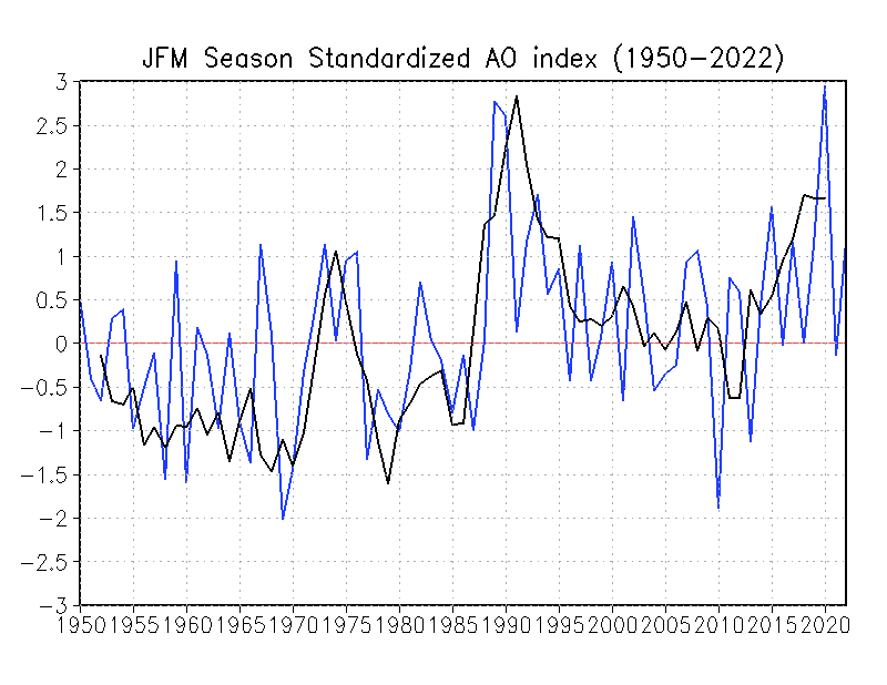
As for answering what influences the AO, well that’s another topic altogether, but there is accumulating evidence of polar winds having a relationship with geomagnetic field strength and that is modulated by (who would have guessed this?)…the Sun.
That USA map laid on the south pole – WOW! that is a lot of ice.
You ask “Why” and correctly answer “We don’t know”
If someone sends me a lot, and I mean 7 figures, of money, I will conduct a study to find out. I don’t know the answer because I haven’t decided what it will be yet, but when I do I’ll prove it using Earl Grey tea leaves and chicken wishbones.
Well it’s as good as some of the stuff you see churned out by some of the gravy train drinkers.
My best to you and your family from locked in Falkirk on a lovely crisp sunny March day. Stay safe.
I think you left the “million” out of the tonnes in the Greenland graph
Harlech castle sea gate, built 1000 years ago with paintings of it in use.
4 metres above present high tide….
We just went through Harlech … hang on … OK, see here for the discussion.
w.
Hi Willis,
In your linked reply you say that the UK wasn’t covered in ice. Not all of it but there was a fairly large ice sheet over Scotland and Northern England. Check out The Parallel Roads of Glen Roy, Gleann Ruaidh, created by ice-dam lakes in the Younger Dryas. Since the turn of the century there’s been some interesting research on tectonic activity in the Younger Dryas, something to do with isostatic rebound of the lake shorelines not agreeing with other published data; but I’ve only read newspaper reports.
True … but I also pointed out that even if postglacial rebound in that area were as large as Sweden, which it’s far from, it still doesn’t move the castle much vertically.
w.
In the same area check out Cantre’r Gwaelod.
Yeah, I went to Grammar School (High School equivalent) in Yorkshire and we learned about the carving of the beautiful Yorkshire Dales through glaciation, although it seems like the higher hills (which are not actually all that high on a scale of things) were not covered in the most recent glacial times:
https://en.wikipedia.org/wiki/Geology_of_Yorkshire
I also spent a lot of time more recently further south in Shropshire, and got fascinated by the geology of the lovely lakes around Ellesmere close to the Welsh border, also formed by recent glaciation.
In response to the disappearance of glaciers from Scotland 12,000 years ago, Scotland is rising and the south of England is sinking. From glacial rebound.
This is routinely trousered as sea level rise by Sassenachs in the south of England. Stranded beaches 3-4m above current Scottish sea level get less (i.e. zero) attention.
Yep, I became a skeptic when Dr. Mann tried to erase the Medieval Warm Period (MWP) with his fraudulent hockey stick.
One proof that the MWP was global is the lower world wide glacier extent and, as you point out, the resulting higher sea level.
King Edward built several castles on the North Wales coast, including Harlech, to enable re-supply by sea during sieges. None of the others is separated from the sea today, but there are shifting sands at Harlech.
‘Coastal landscape with a vast dune system of international importance’.
Morfa Harlech National Nature Reserve is one of the most important actively growing dune systems in Britain and one of only a handful in Wales. Dunes like these with bare sand areas are becoming increasingly rare.
https://naturalresources.wales/days-out/places-to-visit/north-west-wales/morfa-harlech-national-nature-reserve/?lang=en
I believe the inordinate axis of Figure 5 is labelled incorrectly.
Amazing how all of these dire warning are shown on a graph specifically constructed and scaled to prove the worst case scenario is upon us.
..with a floating x and y axis…you can show anything
just look at what they do with temp
I am pretty sure those are the same people making the current Coronavirus graphs.
I never thought I would say this – but hopefully they soon return to making fake global warming graphs!
What about the North hemisphere snow mass ?
Whatever happens, the models predicted it, it’s bad and it’s the fault of capitalism!
All that snow portends disastrous floods! Because of more water vapor in the air, the models forecast this catastrophe, due to climate change. Although of course the models also predict extreme drought.
Well doneWillis. Timely. To the point. Penetrating. Accessible. Nicely written. Quietly devastating.
Who could ask for anything more?
As a non scientist but educated and interested, Willis you are a “breath of fresh air”. Please keep going.
Realism must outway the distortion!u
Roger Welsh, well put. I often compare Wills to the late great John Daly. Another self educated scientist who put the charlatans to shame.
Interestingly both have sea going experiences. It would be immodest for me to compare my involvement in the global warming scam to theirs, but I was one of those tossing a bucket over the side to measure sea water temps many many moons ago.
Being a radio op. on Obs Ships makes me a global warming realist.