Guest Post by Willis Eschenbach
After considering the tide gauge records around Fairbourne in my last post, I wanted to look at a larger picture. Remember that we’ve been repeatedly told that acceleration in sea level rise is not just forecast, it’s actually occurring. I wrote about some of these claims in my post entitled “Accelerating The Acceleration“. Plus we’ve been deluged, if you’ll excuse the word, with endless cartoons and memes and movies and earnest predictions about the Statue of Liberty going underwater, cities being drowned, islands being overtopped by the sea, and the like. And not only that, but we’re assured that we can see and measure the acceleration in both the tide gauge and the satellite sea-level records.
So I went to get the satellite sea-level records from the University of Colorado. But when I plotted them up, I realized that they stopped in 2018. I couldn’t find anything on their website that explained why. Here’s their data.

Figure 1. University of Colorado sea-level record. Note that it is a splice of four satellite datasets that all seem to be in quite good agreement.
I wanted more up-to-date records, so I went to the AVISO site. That’s the French group that is keeping the original satellite records.
I did have to laugh, though, when I looked around the AVISO site and found the following graph:


Figure 2. All nine available satellite sea-level records
YIKES! I truly had no idea that it was all this bad. It seems the good folks in Colorado have simply picked some convenient records from the group above, spliced them together, and called it a valid record fit for all purposes.
I, on the other hand, would say that this is enough data to maybe give us a trend with lots of uncertainty … but teasing acceleration out of that farrago? Don’t make me laugh.
However, I figured I’d look at the AVISO “Reference” dataset. This is the dataset shown in green above. It is basically identical to the Colorado dataset, but it extends to the end of 2019. So I analyzed it.
Now, I’ve recently started to use a sea-level analysis method I developed myself. It’s based on a lovely kind of analysis called “Complete Ensemble Empirical Mode Decomposition” (CEEMD). I described CEEMD in a 2015 post called “Noise Assisted Data Analysis“.
What the CEEMD method does is to identify and remove, one by one, the underlying cycles in the dataset under analysis. And at the end of the CEEMD analysis what’s left is called the “Residual”. It’s what remains when all identifiable cycles have been removed.
Of course, the method can’t identify the cycles that are nearly as long as the dataset itself or longer. So for example, from my last analysis, I looked at 40 to 50 year long datasets. Here’s an example, this one is 44 years long.


Figure 3. A CEEMD analysis of the tidal data from Fishguard, Wales.
As you can see, this has not removed a cycle that’s on the order of 33 years long—too long to resolve in a 44-year dataset.
And this demonstrates a huge problem with trying to determine if the rate of sea level rise is accelerating. It’s well known that the tides have very long-term cycles of fifty years and more. But as I pointed out in my post called “Accelerating The Acceleration“, the people who produced the “US Sea Level Report Card” cut the tidal data short. They removed everything before 1969 … which guarantees that the signal will still contain cycles. And that, in turn, guarantees that any conclusions that they come to will be meaningless.
The other problem is that in the “US Sea Level Report Card”, they don’t even attempt to remove the tidal cycles at all. They foolishly think that you just need to check and see if the raw data is accelerating … but instead, they end up simply measuring some long-term tidal cycle or other.
With that as prologue, I decided to look at the longest sea-level records and see if there is any acceleration. We have a few of these that have 100 to 150+ years of data. This is long enough to remove most of the long-term tidal cycles. As above, I used the CEEMD method to remove the cycles, leaving just the underlying residual. To start with, I looked at the sea-level data for Cuxhaven in Germany. It’s a 176-year dataset.
So just what longer-term sea-level cycles are being removed by the CEEMD method? Here are the empirically-determined groups of cycles that make up the Cuxhaven sea level data:


Figure 4. Periodograms of the groups of cycles removed from the Cuxhaven sea level data by the CEEMD method.
As you might expect, there are a number of short-term cycles between one and five years. There is also energy in cycles that peak at eight, seventeen, and twenty-nine years or so. Note that one of the largest cycles is up near fifty years … highlighting the foolishness of a) not removing the persistent long-period tidal cycles, and b) using short-length datasets to try to determine if there is acceleration.
Finally, note that there is still some energy in cycles longer than fifty years. This is why we need very long datasets in order to determine if there is acceleration.
So what’s left as a residual once we remove all of those cycles from the Cuxhaven data? Here’s the result:


Figure 5. CEEMD analysis of the sea level data from Cuxhaven, Germany. Black/white line is the original Cuxhaven data.
As you can see, there is no sign of acceleration in the Cuxhaven sea level data. Remember that we’ve been warned for the last thirty years that sea level would be accelerating and cities would be drowning … but it appears that the ocean didn’t get the memo.
Let me demonstrate how badly folks are going wrong by using shorter-term data and not removing the underlying tidal cycles from the original data. Here’s the previous graph, plus a Gaussian smooth in blue of the post-1950 original data.


Figure 6. As in Figure 5, but with a 19-year FWHM centered Gaussian smooth of the post-1950 original data.
Now, if all that we had was the 68 years of the post-1950 data, and in addition, we didn’t remove any underlying cycles, we’d look at the blue gaussian smooth and come away firmly convinced that the sea level was running level from 1950 to about 1975, and that it had accelerated since then … none of which is true. That’s just one of the underlying longer-term tidal swings that are removed by the CEEMD method. And unfortunately, scientists around the planet are all too frequently mistaking those tidal swings for an underlying acceleration.
Unwilling to stop there, I looked at a number of the few other long-term sea level datasets we have. As you might expect, most of them are from Europe. Here’s a 170-year dataset from Wismar in Germany.


Figure 7. CEEMD residual analysis. Black/white line is the actual data.
Again, there’s no sign at all of any acceleration in the Wismar data.
And below, without much in the way of comments, are a number of the other long-term sea-level datasets. In all cases, the black/white line with dots is the original data.


I don’t see the rumored acceleration in those plots. I’d also say that the early data from IJmuiden is very suspect … next, some data from the US.


Note the larger trend in Baltimore, which is known to be the result of land subsidence along most of the US east coast.


And to close out this section, here’s the longest uninterrupted sea-level dataset I know of, that of Stockholm in Sweden, two hundred and seventeen years long …


You can see how the earth in Sweden is still rebounding from being covered with trillions of tons of ice during the most recent glaciation. The land is actually rising faster than the ocean … go figure.
So those are the majority of the long tidal datasets. I gotta say, I am simply not seeing the acceleration claimed by the boffins. I don’t know just how they’ve calculated their results, but the best long-term datasets that we have simply don’t show the acceleration that they claim to find.
In closing, let me circle back to where I started, with the spliced AVISO satellite sea level data. Here’s what the AVISO and the Colorado folks are combining to get their final data:


Figure 8. The four satellite sea-level records chosen by Colorado and Aviso from the nine extant satellite sea-level records.
I gotta say … given that the satellite sea level is supposed to be accurate to tenths of a millimetre per year, why are there such large differences between the different satellite records?
In any case, here is the same data, with a black line showing their final dataset created by combining those four datasets.


Figure 9. The four satellite sea-level records chosen by Colorado and Aviso from the nine extant satellite sea-level records, along with their combined record which is shown in black.
Hmmm … and finally, here is the CEEMD analysis of that combined record.


Figure 10. CEEMD analysis of the AVISO / Colorado satellite dataset. It is composed of four different satellite datasets spliced together. Midpoints of the splices are shown by the vertical red dotted lines.
Now, is there acceleration in that record?
Well … regarding the question of whether there is acceleration shown in that spliced satellite record, I’ll say the three most important words that any scientist can ever say:
We. Don’t. Know.
We don’t know for a few reasons. The first is that it’s a spliced dataset, and the changes in the trend line all occur at and after the splices. Makes a man suspicious, particularly given the differences in the initial individual datasets.
The second is that the record is only 27 years long, so we really don’t have enough data to draw many conclusions. This is particularly true since the variations from a straight line are quite small.
Third, the rise was right along the linear trend line up until 2005. So there was no acceleration before that time. Then the rate of rise started decreasing around 2005 … deceleration rather than acceleration? Why? And then, according to the spliced dataset, it started rising faster around 2011. Again, why? Assuredly those three, first a straight line, then deceleration, then acceleration, are unlikely to be caused by a monotonic rise in CO2. Nor do they conform with any expected pattern of acceleration.
Finally, as with many other tidal records shown above, the satellite seems to be “porpoising” above and below the trend line. There’s no clear acceleration anywhere in the record.
DISCUSSION AND CONCLUSIONS
The long-term tide gauge datasets are all in agreement that there is no acceleration, neither in the early nor in the recent parts of the records. Yes, they often porpoise a bit above and a bit below the trend line, but there is no evidence of any CO2-caused recent increase in the rate of sea-level rise.
The satellite dataset, on the other hand, is a splice of a selected four of the nine available satellite sea-level datasets. The changes in trend seem to be associated with the splices. Unfortunately, this spliced record is both too short and too fractured to draw any conclusions about acceleration.
Here, it’s 12:24 AM and a gentle and lovely rain is falling … first rain in five weeks, and the forest is happy. I’m happy too, drought is not my friend.
My best regards to everyone,
w.
PS—As is my custom, I ask that when you comment you quote the exact words that you are discussing. That way we can all be clear on both who and what you are talking about.
2nd Paragraph….”stopped at 1918″. 2020?
Thanks, fixed.
“…So I went to get the satellite sea-level records from the University of Colorado. But when I plotted them up, I realized that they stopped in 1918…”
2018 I presume…
Thank you for bringing clarity to the complete lack of clarity on this topic.
I have suspected there was more to this than the people at the University of Colorado, no matter how well intended, have been letting on. I am also extremely skeptical that the satellites can measure sea level to the millimeter on a consistent basis.
One problem we have in the geosciences is we keep proclaiming we can do things that we can do on occasion but cannot do consistently in a quality manner. This is confirmation that the problem extends beyond meteorology.
1918 ->2018
When your second paragraph mentioned the satellite data “stopping in 1918”, it made a fun start to my day! Thanks!
“…stopped in 1918..” …2018…
Willis, satellite records “that stop in 1918” would be some kind of Twilight Zone deal. Maybe 2018?
Opening paragraph: did you mean 2018?
Mr. Eschenbach,
In the second sentence of your second paragraph appears, “…they stopped in 1918.” I suspect this is a typo and the intended date is 2018.
Respectfully,
John Garrett
O Barmy knew! Why else would he buy a mansion three feet above sea level?
Now, explain why Harlech castle sea gate is 4 metres above present sea level. Stable land 1000 years old. My guess is volcanoes under WAIS.
I’m happy to be corrected, Chas, but my understanding is that Harlech castle is now distant from the sea because siltation filled in the shoreline and extended it outwards, and NOT because the castle and the surrounding land has levitated … hang on …
Yeah, that’s what happened. It was at the shoreline, but the river delta filled in the area.
w.
Harlech. Brings to mind a great scene in a great movie (Zulu 1964):
Willis & Chas.
The fact that the sea gate at Harlech castle is now 4m above current sea level is due to Britain tilting down to the south-east. This can be seen because on the east coast there is considerable subsidence and erosion (complicated by erosion due to the North Sea and the extraction of ground water under London) and simultaneous rising fo the land on the western side. See Pendine Sands, etc.
Fascinating article, anyway, Willis.
This is a common thing. See the following:
(from Wikipedia] The Büyük Menderes River (historically the Maeander or Meander, from Ancient Greek . . . is a river in southwestern Turkey.
Map of the river’s mouth and the evolution of silting of Miletus Bay during Antiquity
LINK
I am not sure that explains it all Willis.
The Harlech port is above the current sea level, and no amount of siltation can raise the port. It can extend the shoreline, but not raise the port.
The same is true across the Med, where Greek and Roman ports are generally above the current sea level. I don’t know how much the Med basin may have raised over the last two millennia, but on the surface it does appear that Roman sea levels were higher than now.
This is true of western Anatolia and in Spain. I noted a Roman-cut sea-channel in Xavia, Spain, which used to deliver sea water to inland salt pans. But the current level of that channel is a meter above the present high tide, and it would not function today.
Ralph
Hey, Ralph, good to hear from you.
Regarding Harlech, a couple of points.
The port is still there. From Google Earth, you can see the boats.
Next, here’s a reconstruction of the “sea-gate”. Note that the castle doesn’t extend all the way to the ocean. Instead there’s a wooden structure going down.
Finally, here’s the castle today. Much of the surrounding wall has fallen down, but the sea gate is still visible.
The photo is taken from the area that has silted in at the foot of the castle.
So no, I’m sorry, but I’m NOT ascribing that to some mysterious fall in the sea level. Consider—if the sea level actually had fallen by 4 metres since the 1200s, we’d see evidence of it all over the world, not just at one obscure castle.
Finally, I don’t think that it’s from the post-glacial rebound. Several reasons. One is that the UK didn’t get covered with glaciers during the last glacial. Second, those places that did (like Stockholm) are still rising. Third, Stockholm is rising on the order of 6 mm/year. That’s about a half metre since the castle was built … not enough to move it the claimed 4 metres vertically.
Short answer? I think the castle has NOT moved vertically and the sea level has NOT gone down. I think it is a combination of siltation moving the beach horizontally, and people mistakenly thinking that the sea gate shown in the picture was originally at water level (it wasn’t).
Sorry …
w.
Willis,
It’s not clear from the photo where the water level was, it could have been considerably lower.
“One is that the UK didn’t get covered with glaciers during the last glacial.”
Not all of it. no. There was an ice cap on the Pennines and Scotland and another on the northern part of Ireland. That twisted Britain, with the west side being dragged down following Ireland and Scotland.
“Second, those places that did (like Stockholm) are still rising.”
So is Harlech.
Third, Stockholm is rising on the order of 6 mm/year. That’s about a half metre since the castle was built … not enough to move it the claimed 4 metres vertically.
Stockholm isn’t Harlech (and vice versa). As I said, we don’t know what the actual water level was, so we are somewhat in the dark.
I agree with you on the effect of the siltation, however the land has risen too. Here’s a map, Harlech is in the green (rising) region.
“One is that the UK didn’t get covered with glaciers during the last glacial. ”
Sorry Willis, that statement is flat out wrong.
The south east of England including London is current sinking because of the removal of ice from the highlands of the northwest of these islands (Scotland, Wales, Cumbria etc.) Icecap loading on land creates a “rim bulge” around the icecap. During glacial times the ice load depresses the centre and the surrounding ice free land is uplifted. Remove the ice and central rebound occurs, but the surrounding rim bulge deflates and so the formerly uplifted peripheral area sinks.
Glacial rebound and sea‐level change in the British Isles
https://onlinelibrary.wiley.com/doi/abs/10.1111/j.1365-3121.1991.tb00166.x
Ralph
You are correct. I went on a dig at Harlech castle many years ago. It was built at the very end of the MWP when sea levels were generally higher as can be seen in various places including st michaels mount and Harlech.
The sea levels subsequently dropped during the colder centuries that followed and undoubtedly the river exacerbated the situation by dropping silt. it’s a big and often muddy river
I would say that we currently have around one foot or two foot lower sea levels than in the epoch of sea castle building and the same applied in roman times! as can be seen in the forts of the Saxon shore in southern England.
All this complicated by a dividing line whereby some land levels are rising whilst others are falling
Tonyb
Harlech Castle was built in the Medieval Warm period. 1282 -1290. Perhaps sea levels were higher then?
I appreciate you bringing the facts to light and I’m not surprised at your findings. It seems to be a never ending task to find the truth when it comes to any aspect of so called AGW,
I think the greatest thing about Willis’s posts is not that he refutes the political movement of Catastrophic Anthropogenic Global Warming (CAGW) directly, but that he refutes the quality of the science purported to “prove” to us that catastrophe is coming and it is our fault. The oh-so-complex system of oceans and atmosphere of the Earth contains a chaotic, uncertainty component that will forever limit how narrow measurements of this system and their standard errors can be. Which means that only measurements over a great deal of time, eg a century time scale, is going to reveal the basic truths about something as supposedly one dimensional as the sensitivity of the climate to CO2.
On the issue of sea level trends alone, one might chime in that we know that the El Niño/La Niña cycle alone can shift the sea level east and west in the Pacific Ocean by at least tens of centimeters as a matter of wind-induced water flow. And we know that must produce secondary effects all over the Pacific as a matter of gravitation-induced flow, shifting the water north and south as the water seeks to level. And that these effects all take time…..hence never reach equilibrium, because the winds shift faster than the water can redistribute. This produces an element of chaos or uncertainty in sea levels that cannot be zeroed out in accurate measurements of the the sea level of the whole world.
This does not mean that seal level cannot be measured. Tidal gauges do that in sea ports the world wide. But attempting to peg a number for the world’s sea level at any point in time accurate to mm’s is simply not possible.
Long term, as with the world’s temps since the Little Ice Age, the seas appear to be steadily rising on a multi-decadal scale….as one would predict from some ice melting and the expansion of warming water.
The CAGW-ers will have to look elsewhere to find the so far elusive proof of CO2 effects on the climate.
Excellent comment, kwinterkorn. My thoughts exactly.
The people who claim the mantle of science are doing very poor science in service to ideology.
The people who do quality science are dismisses as bought and paid for industry scammers .. that is the argument – attack the purveyors, not the science. Because the science is true and unassailable.
It is like the old lawyer joke:
“When the facts are on your side, pound the table and shout ‘the facts!’.
When the law is on your side, pound the table and shout ‘the law!’
But when neither the facts nor the law are on your side, just pound the table and shout.”
Willis and/or ctm,
There is a typo in the above article’s second paragraph, immediately above Figure 1: “1918” should be replaced by “2018”.
It currently reads:
“So I went to get the satellite sea-level records from the University of Colorado. But when I plotted them up, I realized that they stopped in 1918. I couldn’t find anything on their website that explained why. Here’s their data.”
I wonder what applying your technique to the difference between the spliced record and the raw satellite data would show? The large positive offset between their combined dataset and the latest (and presumably best) Jason catches the eye.
Hi, Willis, good post.
You can also learn a lot here:
https://phzoe.wordpress.com/2020/03/04/dumbest-math-theory-ever/
Thanks, Zoe.
You can also learn a lot here.
Or here.
Or here, for that matter.
My best to you,
w.
I’ll stick to empirical evidence, and you can stay in ideological math land.
On a 1 to 10 scale of rational technical analysis, Willis is a 10, and Zoe’s claims of “silly”, “unbelievable”, “fallacy” and “geothermal” are not on scale…reading her/his stuff is half an hour you will never get back….
My favorite insult is that I must be a man because women are stupid and unoriginal. Is that what you’re implying?
Zoe Phin March 8, 2020 at 12:42 pm
Say what? He said absolutely nothing of the sort. YOU are the one falsely bringing sex into the discussion. Paranoid much?
w.
“reading her/his stuff”
Willis, your reading comprehension is poor.
So, because he didn’t know your sex, he used his/her. And you come up with some weird implication? Not.
I suppose it’s hard to tell with my name and photo. Not.
There’s no photo here. Get off it already.
Jeff,
“Zoe’s claims of “silly”, “unbelievable”, “fallacy” and “geothermal””
Shows visit to my site, which has photo.
You ever met a guy named Zoe?
In the Colorado combined graph, figure 9, why is the black line presented to the public always higher than the JASON-2 and JASON-3 data and usually higher in the JASON-1 data? The line matches up perfectly with the TOPEX data.
That part is understandable, Wade. They’ve adjusted the various datasets so that they match at the period of each of their overlaps. If you do that starting with the earliest one (TOPEX) the others need to be shifted upwards. If you started with the most recent one (Jason-3) it would match and the black line would be offset from the TOPEX data.
My question is more basic. Given that all of those are supposed to be ground-truthed and verified against e.g. known elevations like lake levels … why are they all so different to begin with?
w.
You have a typo in the 2nd paragraph, “I realized that they stopped in 1918” should be 2018.
Good report and analysis, Willis. When will mainstream scientists ever get around to analyzing signal to noise, with cycles removed, data, and declare there’s nothing to worry about on a global scale. Locally, watch out, but globally no pasa nada. Have a great day.
One question:
I understand that all these satellite measurements are calibrated against some reference points. They are not just measurements based on the orbit isn’t it?
So against what positions are these values calibrated? How valid are those points of being ‘stationary’?
My understanding is that they are calibrated against lake levels, and tidal levels in bays and estuaries.
w.
Thanks for the answer Willis, especially as it was not directly on topic!
I think I understand how the 3mm+ rise came up, when tide gauge average shows less. All one needs is the right reference frame.
This results in a bend line when one shows the previous sea level rise studies and splicing on those the satellite measurements. Thus any longer time evaluation for oscillations is made impossible with this data set, one has to give up on satellite measurements for such study.
Well anyhow splicing different data sets together is a bad idea…
Nice stuff Willis
You say;
“You can see how the earth in Sweden is still rebounding from being covered with trillions of tons of ice during the most recent glaciation. The land is actually rising faster than the ocean … go figure.”
This point really needs to be emboldened, put in capitals and highlighted. Very many records that are old come from Europe and are subject to isostatic action and the land is either rising or falling as a result.
General subsidence of land -or it rising for other reasons such as volcanic action- also needs to be taken into account.
So when a convenient graphic is put together by such as Colorado it really ought to come with health warnings as there are so many caveats that an ‘average’ -as with so many things climate- misses out the interesting nuances.
BTW did you ever find out why Colorado appeared to bow out of the game in 2018?
tonyb
tonyb March 8, 2020 at 10:38 am
No clue.
w.
The data was not alarming enough.
The same happened with Cryosphere Today , their web site was a collection of over excited claims decorated with various pics. When the Arctic “canary” failed to keel over and has recovered somewhat since the trough in 2012, they lost all interest and just left all the alarmist claims in place with no data updates.
tonyb
Something else to consider is that with the high-latitude isostatic rebound, and the land rising out of the seas, that means the volume of the northern ocean basins is decreasing. The water that formerly covered the land then has to be accommodated by a world-wide ocean basin that is smaller! Thus, one can expect that sea level should rise everywhere as a fixed volume of water has to be ‘shoehorned’ into a smaller ‘container.’
Eventually, I’d expect that the ocean basins would sink a little under the added weight of the now melted former ice sheets. If their weight was enough to push down the land as ice, it’d be no different as water.
If course, this will take a long time, so there will be a temporary rise in sea levels. In reality, it will never reach equilibrium but will oscillate on time scales that we humans have little chance of observing directly.
While there is some truth to that, when the skeptics point out that the Holocene Optimum had sea levels higher by 1-2 meters globally, they reply with the opposite argument that the oceanic basins also are readjusting from 400 feet average lower ocean depth, and the oceanic crust is also depressing from the melted ice age glacier water, which adjusts the entire global gravitational geoid which is also still changing, along with isostatic rebound and or depression, including that the formerly covered glacial regions are also rebounding over what is now ocean that used to have a lot of ice on it and is now covered by water. Which would also cause more water displacement to the global ocean raising sea levels. While perhaps the entire oceanic crust is slightly depressing due to more water volume. Is it a moot point in the scheme of things? I don’t know.
Given that the earths crust is essentially thinner somewhat over the global ocean, and the ice sheets were much heavier locally over mostly thicker crust land, it is nearly impossible to exactly know what is happening globally since 400 feet of less oceanic water over the global ocean thinner crust is less weight per sq mile than the ice sheets that occupied a lot less land area, being 2 miles thick over a thicker crust. It can get quite complicated because everything changes everything.
Which is what really matters in the final analysis is that sea level is mostly a local affair. And then there are the long term lunar cycles, and so on and so forth. It is good meditation exercise pondering all this every day and brings me great calm, knowing there is no catastrophic ocean rise coming anytime soon, even in the next century or two.
This is a splendid and exhaustive post. Gratitude for your realism and explanations of each move you made.
“I don’t know just how they’ve calculated their results, …”
Well, I suggest the boffins owe you as much diligence to show their data and method as you have done here. How can we get that to happen?
General comment: When charts and ‘stories’ of sea level rise reach the public, a common slant is to “allow” people to confuse “rise” with “acceleration.” Many times I see no effort to include a sentence that calls out this differentiation – happy to allow the public to panic over rise, when there is no acceleration. Hello, this is the Holocene, there is still residual rise.
Willis,
Thank you for yet another really excellent post. Application of CEEMD to the datasets of global SLR appears to be very beneficial to this topic. And I very much appreciate your conclusion that “we don’t know” . . . it is a rare scientist that will admit such without simultaneously asking for additional funding for “better understanding”.
I would just add that multi-year barometric pressure pressure variations over certain geographic areas may be a significant contributor to the 1-10 year (maybe even longer?) cyclic “noise” (“porpoising”)revealed by your CEEMD.
That is a very convincing detailed analysis, Willis.
Hi Willis,
“But when I plotted them up, I realized that they stopped in 1918.”
I think you mean 2018.
Also some typos in the place names Delfzijl and IJmuiden.
Difference between Hoek van Holland and Maassluis can also be subsidence or due to Maassluis being more inland by about 8 miles. Maassluis might also not be suitable anymore as it is behind the Maeslantkering, a flood barrier.
Thanks ,a very informative post. !
Correction :
Two of the Dutch stations have incorrect names:
-IJmudgen = IJmuiden
-Delfzigl = Delfzijl
True. But I’d have to redo the graphs, which would take a while … aw, what the heck. After all, my motto is:
Fixed.
w.
Willis,
One can see an excellent demonstration of glacial rebound in the northern Ohio River valley by looking westward from the top of the bluffs near the river. The land there is a level plain as far as the eye can see, and the river and streams feeding it have cut the valley as the land rose.
A question about your analytic method: is there any way to create a “raw” data set in which your method would expose an acceleration in the rise? IOW, what would the tidal gauge data have to look like for there to actually be an acceleration?
Willis you’re too kind……someone had to put effort into it to make it show acceleration
Latitude March 8, 2020 at 11:24 am
Seems doubtful. My rule of thumb is:
I suspect they were unaware of the deleterious effects of short tidal datasets, and of the necessity to remove the inherent tidal cycles.
w.
they had to pick and splice those data sets to get that answer…
..and they had to do in exactly that order to show an increase
that’s not an accident…they know cycles when it’s convenient for them to know it…obviously and they used them
pick any tide gauge, and it’s obvious why they started at that date too >
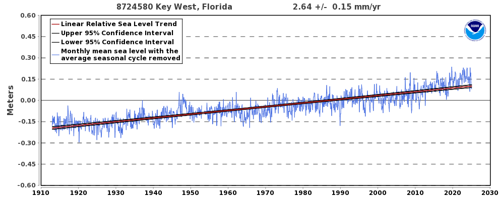
Willis says:
My rule of thumb is: Never ascribe to malice what is adequately explained by ignorance and/or stupidity…
I dunno, that might’a been true in the past, but nowadays, especially concerning anything climate…..
Beng, I think it’s true re climate as well. I think that most climate scientists truly believe the cr@p that they’re selling … which is harder to fight than malice and duplicity.
w.
Here is a global map of sea level height change.
I feel that those who think greenhouse gases create such a pattern are not quite right in the head.
Geothermal and cloud cover changes seem much more sensible.
Thanks, Zoe. I saw the other day that Dr. Roy Spencer said the pattern could be from incorrect adjustment for water vapor … who knows?
w.
Sure. If you’re theory fails at prediction then others did improper adjustments. So would the “corrections” change the fact some some sea level is rising while other is falling?
The global map of sea level height changes are stated on the linked graphic to be over a 22 year period.
Therefore, it is surprising to see that there are many regions where an accumulated -7 cm of sea surface change is located immediately (say, within 500 km) to an adjacent region of +7 cm sea surface change over this long period.
Also, why are there distinct, generally-latitudinal, persistent bands of significant sea surface height change (particularly east of Japan, China and the Philippine Islands; less so East of North Carolina, US, extending longitudinally as far east as to be south of Greenland)?
These sea surface height variations DO NOT correlate with the mapped variations of the Earth’s surface gravitation field (ref: https://en.wikipedia.org/wiki/Gravity_of_Earth ).
There is something not quite right (i.e., an uncorrected factor) in the sea surface change data as presented in the graphic. The above-noted variations, on the order of centimeters over hundreds of kilometers, do not seem to explained by winds, land uplift/subsidence, geothermal/ocean temperature variation, barometric pressure variations, or gravitation field variations over 22 years . . . what else is left?
Gordon, bear in mind those long, 50-year cycles in sea level height, as well as many cycles that are somewhat shorter. Think of these as water slowly “sloshing” in the ocean basins and the differences in sea level become somewhat more understandable.
w.
Thanks, I understand. But my particular concern re: Zoe’s linked graphic is the more “pinpoint” features . . . those (again, centimeters of surface change over hundreds of km of surface distance as determined over 25 years) are hard for me consider as “sloshing”.
Gordon,
Stop thinking an listen to Willis. He knows the desired conclusion.
Zoe, I have no “desired conclusion”. I’m simply pointing out things that I think may be responsible for SOME PART of what we’re seeing. Not all. Some part. I’ve pointed out two things. Water vapor, and slow sloshing (actually not super slow, 25 years) of water in the basins.
Now, if you have other things that you think are responsible, how about you stop with the ugly personal accusations and let us know what those other things are.
w.
OK, fair enough Willis.
You stick to tidal sloshing and water vapor error accusations, and I’ll stick with cloud cover and geothermal changes.
Zoe Phin March 8, 2020 at 8:41 pm
Zoe, I don’t “stick to” anything. I offered up a couple of possiblities. But as Paul Samuelson said,
w.
Paul Samuelson was a Keynsian retard who thought the Soviet economy would overtake the US just as it was about to collapse. He argues against his betters that thought the Soviet economy was like 5-10 times smaller. The Soviets multi-counted their production stream. He should have known better, like his wiser colleagues.
So thanks for admitting you’re like him.
Willis Eschenbach March 8, 2020 at 11:49 pm
Zoe Phin March 9, 2020 at 5:02 am
Once again, Zoe is totally unwilling to deal with the actual ideas, so she attacks the man … this is getting quite boring.
w.
Actually, Willis, I attacked Keynesianism and all its retarded followers. What’s wrong with that? It’s an attack on a brain dead ideology.
Zoe Phin March 9, 2020 at 9:28 am Edit
What’s wrong with that? You accused me of being “stuck on” some claim. In response I put out this idea for discussion, which well describes my own scientific philosophy:
But instead of discussing or attacking the IDEA, you predictably reverted to your go-to diversionary tactic, which is to attack the MAN and not even mention the idea under discussion.
And that’s why it is absolutely no fun to try to discuss anything with you. Instead of responding to what someone actually said, you attack them with all kinds of ugly accusations and drag the conversation in some totally meaningless direction.
w.
Zoe posted (March 9, 9:28 am): “It’s an attack on a brain dead ideology.”
Careful, Zoe, there is growing evidence of “the pot calling the kettle black” here.
Not quite, Gordon. There is no growing EMPIRICAL evidence against me. My empirical evidence was dismissed. You’re free to inhabit the same fantasy land as Willis and Samuelson.
I am of the belief that questions should not be asked by someone unwilling to do a little research on their own toward finding an answer to the question being posed.
Therefore, I went to one major NASA website that reports global sea surface height (https://www.nasa.gov/mission_pages/hurricanes/features/seasurface_heights.html ) and found an image

) of global sea level height variations that is stated to be from a single day, 30 December 2008. This image also presents many similar sea-surface height “fine structure” variations (aka “residuals”) that I questioned in my OP regarding a similar graphic (linked above) that is stated to cover a 22 year interval.
So, this “single day” image (it might reflect just the time required for Jason-1 orbits to accumulate the full Earth coverage shown) would further rule out many postulated causes of the features that I questioned above. It would appear to rule out sloshing variations having a greater-than-one day period. Also, I cannot believe that effects of clouds or water vapor would result in such similar features existing between the two images being referenced.
The NASA linked website does go so far as to state:
“Sea surface heights are one component helpful to hurricane forecasters, as higher seas indicate warmer waters (that power storms) while lower seas indicate cooler waters (such as those in La Nina events in the eastern Pacific).”
and
“Jason-1 completed its seventh year on orbit on December 7, 2008. From its vantage point 1,330 kilometers (860 miles) above Earth, this follow-on to the highly successful Topex/Poseidon mission has provided measurements of the surface height of the world’s ocean to an accuracy of 3.3 centimeters (1.3 inches).
So, even though the nice color maps have height scales indicating cm-scale resolution, viewers should keep in mind the accuracy of the asserted surface height changes may be three times worse (+/- 3 cm), and the accuracy itself probably varies spatially.
Bottom line, while I have a hard time believing ocean thermal expansion changes can create centimeters of surface elevation change over just hundreds of kilometers of surface distance (is horizontal thermal equilibration in the open oceans really that slow?), that is NASA’s top level explanation. Perhaps there is a geophysical/climate explanation for how the underlying ocean thermal variations can be so stable as to produce the fine, bead-like, longitudinal bands and structures that appear to have such great persistence over time.
Gordon Dressler March 9, 2020 at 2:13 pm
Sorry, Gordon, but that’s not true. Imagine a basin of water sloshing back and forth with say a four-second period. Now take a photo of it … does that “rule out sloshing variations having a greater-than-one” photo’s time period?
Nope. They’ll show up in the photo, despite the sloshing having a period a thousand times longer than the time required to take the photo.
Regards,
w.
Basin sloshing, similar in surface form to a vibrating drumhead, will have certain characteristic modes of oscillation (aka, eigenvalues). Yes, first- and second- and third- and maybe even forth-order modes certainly would be captured by day or less duration “snapshots” . . . but these should be reflected as very large areas of the world’s major ocean basins (Pacific Ocean, Atlantic Ocean, Indian Ocean, and Southern Ocean) showing large areas of higher-than-median surface height with approximately equal areas of each ocean basin having offsetting lower-that median surface height. But this is not what is seen in the NASA global images.
Instead, most of the world’s oceans display relatively small localized area’s of plus and minus displacements. In particular, there are the very fine, bead-like like structures that are predominately in latitudinal bands, to which I referred earlier. That they maintain their approximate positions over the two separate NASA images, referenced above, is strong indication that they are note traveling displacement waves (“sloshing”), but are more akin to standing surface waves . . . assuming such features are even indicative of physical long period surface displacements on water.
NASA implies pretty strongly that the small scale surface height features are due to localized difference in surface water temperature (i.e., a thermal expansion effect). If I go across the extremes of the color banding given in the 22-year global surface height difference plot, equivalent to approximately 14 cm of net ocean surface height difference and assume this was a static condition, I calculate that this would be equivalent to approximately the thermal expansion in the top 10 m ocean depth below surface for a temperature in that volume increasing uniformly by 6 C from cold to hot. I guess I can see that something on this order is possible over distances of hundreds of kilometers, BUT the apparent geographical persistence of areas of such high temperature gradients remains troublesome to me.
Gordon Dressler March 9, 2020 at 7:33 pm
Thanks, Gordon. While what you say would be 100% true in a circular ocean that slopes evenly to the center, real oceans have channels, seamounts, coastal shelves, fjords, islands, surface currents, midwater currents, bottom currents, thermohaline circulation, underwater canyons, and subsea mountain ranges.
In addition, we’re not talking sloshing at a single frequency. There are tidal cycles with various periods from annual to 75 years or more, all of them constructively and destructively interfering with each other.
As a result, the surface displacements from the sloshing are NOT simple, symmetrical, or easily analyzable.
Let me start by reposting the graphic under discussion:
As you say, standing waves are an expected result of the sloshing … but again, not simple, symmetrical standing waves.
Please be clear. I’m NOT saying that all of the variations in sea level are the result of the sloshing. I’m saying it is one of the many causes of the variations.
For one thing, the wind has a huge effect on ocean heights—we see the extreme effects of this in the El Nino/La Nina alteration, which has an effect on the height of tides all across the Pacific. The La Nina “dishes out” the surface area along the equator, moving it due west, where it piles up … as you can see in the graphic above. There’s further discussion of this issue here.
Now, the effect of the Nino/Nina pump is to move the warm water from the Equatorial tropics to the poles. Since it’s doing this by physically pushing the water, and the warmer water is expanded, it results in generally higher sea levels in the western Equatorial Pacific and along the east coasts of Asia and Australia.
Next are the effects of currents. Where they collide the water tends to pile up. In addition, where they hit the continents they raise the water level.
We also have vortices (eddies). We have a long eddy train that is clearly visible in the graphic above peeling off of the southern tip of South Africa. Like any whirlpool, they tend to be lower in the middle and higher at the rim. We can also see eddies off the southern tip of South America, as well as off the east coast of the US due to the Gulf Stream.
Then there are geostrophic currents, which are circular currents that pile up water above the surrounding sea level height.
Finally, there’re simple temperature differences. You can see the warmth of the Gulf Stream near the US east coast, for example, with the cooler waters just sound of the Stream.
In short, as with many things regarding the ocean … there are no simple answers.
My best to you,
w.
Willis, thank you very much for your comprehensive reply, which explains several of my issues with the reposted NASA image.
In particular, I had neglected to consider the interaction of persistent ocean currents with the topology of the ocean floor, and that this itself could set up standing surface waves (analogous to the patterns of water flowing over rocks in a shallow stream) as well as the shedding of vortices. These factors are consistent with—and alone could fully account for—the latitudinal bands of the fine-structure, bead-like, surface height variations that exist in various latitudinal bands, which I was questioning.
This is a much more satisfactory answer than highly localized, steep gradients in water temperature.
I also admit that I greatly oversimplified the complex patterns that would eventually (asymptotically) develop from varying frequencies of “sloshing” in the highly asymmetric (both in vertical and horizontal extent) ocean basins of Earth.
Our discussions have been very educational for me. Thank you for expending your personal time to make it so!
Likewise, my best wishes to you.
Judging by the eastern and western portions of the Pacific Ocean, the sea level height changes seem to reflect more episodes of La Niñas than El Niños.
Interesting post Willis. I hope I’m not misreading your log scales again but isn’t that a peak near 29, not 24y ?
As far as how tacking all these pieces together goes, I’m very suspicious about what is going on around 2013. Just like they mess with everything they get their hands on they seem to have “homegenised” some increase in to the data.
Claiming to get long terms trends for this kind of inhomogenous mess of short record from different platforms some with little to not cross-calibration period, it just a case of getting the result you “expect”.
I gave up on satellite altimetry years ago, it was obvious it had not objective scientific value in terms of climate.
True re 29 vs 24, good catch, fixed.
w.
That Fishguard Wales looks like ocean cycles (60-65 years).
“Well … regarding the question of whether there is acceleration shown in that spliced satellite record, I’ll say the three most important words that any scientist can ever say:
We. Don’t. Know.”
Yes Willis “We. Don’t. Know.” is certainly not use anywhere enough by to day’s so called “scientist”. Where this hebris comes from is either to little knowledge or just a big ego. One of my father’s axioms of life was. “Are you sure you understand all that you know about this”? Something a lot of educated people need to be asked regularly.
AVISO:
So the already mangled data “adjusted from biases” ( probably their own ) are only available a pics.
No chance of any validation or reproducing the same results.
Secret science is NOT science, it is cult belief and religion.
Willis.
I wonder what effect the isostatic rebound in the north will have on sea levels in the rest of the world.
You have land all across the north, from Sweden to Canada and on to Russia, that is rising at 400mm per century according to your graph. That is displacing a huge amount of water into lower latitudes, which must surely raise sea levels across the rest of the world.
So how much of the recorded sea level rise is simply caused by isostatic rebound displacement??
Ralph
My new favorite article on fake global sea level acceleration.
The sea level monitoring by hundreds tide gauges, among them many are as old as one century or older, is the frailest Achille’s heel of the CAGW hoax.
And also because its very, very difficult to “adjust” the older values lower as they do with temperature. Sea levels Leave all sorts of records for us thankfully.
Thanks, Willis. Well done.
Regards,
Bob
Thanks, Bob, your approval is valued.
w.
About 50 years ago I learned that the Gulf of Bothnia was getting shallower and piers had to be extended every X years. Years later I learned there are inland lakes, once at sea level, with creatures now adapted to the fresh water.
The “Swedish High Coast” and Skuleskogen National Park would be on my travel list – if I had a travel list.
Thanks Willis.
That “1918” date is getting a lot of media attention via comparison of the “Spanish Flu” to the new flu.
There is a place in Sweden called Ratan.
http://www.ratan.se/sevart/mareograf.htm
21 aug. 1774 a pupil of Linné made a water level mark there, in the stone.
That mark is today some 8 feet above sea level.
Not sure how I missed that one. The sea level there is currently dropping at -7.72 mm per year. 1774 to the present is 246 years. IF the drop around Sweden was constant (as it appears to be since 1800), that’s a 6.2 foot drop, in good agreement with your number.
No acceleration there either … go figure …
w.
“No acceleration there either”
That IS an interesting point.
It would be deceleration with land rising smoothly (ie at a consistent rate per year) and sea levels supposedly accelerating.
It is very interesting that is not observed. It can only mean that suddenly the rate of land rise has accelerated to completely match the increased rate of sea level rise. 😉
Willis,
Excellent post; clear and informative with lots of examples to peruse! If only more college professors were as erudite and excited about their subjects as you! I am beginning to believe that sending kids off to college today is like giving your toddlers over to a pack of wolves to be reared; they will likely not return home and if they do they see you as prey, not parent.
I noticed you live above the California coast. I have a childhood friend who lives in Kneeland and one who lives in Gualala; what a beautiful area to explore. I particularly miss the abalone and fresh salmon! Are you a Mendocino, Sonoma or Humboldt County man? Thanks again! Bravo! Encore!
Thanks, Abolition. I live in Sonoma County about six miles (10 km) straight inland from Bodega Bay, my erstwhile home port as a commercial fisherman.
w.
The first sea level observations ever made in the world began in 1679 in Brest (France).
Continuous tide gauge records started in 1807 in this place under Napoleon’s reign.
“The completeness and the accuracy of the Brest sea level time series dating from 1807 make it suitable for long-term sea level trend studies.”
https://link.springer.com/article/10.1007%2Fs10236-005-0044-z
Sadly, there are gaps in the Brest record, from 1833-1845, 1857-1859, and 1944-1952.
Sigh …
w.
Speaking of acceleration, how about in the opposite direction?
https://agupubs.onlinelibrary.wiley.com/doi/epdf/10.1029/2019GL085814
Courtesy of Judith Curry
Regarding the CU Sea Level Research Group [CSLRG] pronounced SEE-slurg they have changed their data over the years. here’s a sampling of each year:
2004_rel1.2
cu2004_rel3.0
2005_rel5
2006_rel3
2008_rel4
_2009_rel3
2010_rel2
2011_rel4
2012_rel4
2013_rel8
2014_rel5
2015_rel4
2016_rel4
2018_rel1
Nothing for 2017 and 2019
The WayBack Machine is wonderful (-:
Here’s what some of those CSLRG time series look like when plotted out:


All of those plots should have fallen on top of one another unless there were adjustments/corrections.
The obvious question, is what’s going on?
Wow, I didn’t think that would post with all those links (-:
Outstanding work Steve, I’ve just taken a copy of all that.
I noticed whole sale manipulation in C.U. data years ago , that is when I realised analysing the data was a waste of time and stopped taking it seriously.
I was looking at the data to see if there where any identifiable patterns but when I downloaded an update hoping for some updates I found the whole structure of the data had changed. It was like the 2004 and 2005 versions on your graph.
Another dataset had been destroyed by the climate zealots.
So maybe this is why they need all those ice sheet collapse and catastrophic sea level rise scenarios.
A tacit admission that willis is right, that the data from tidal guages and altimetry aren’t doing the job.
https://tambonthongchai.com/2020/03/06/west-antarctic-ice-sheet-collapse/
The dip in the SLR in 2011 was attributed to the Australian rainfall deluge.
https://www.climatecentral.org/news/floods-in-australia-briefly-slowed-sea-level-rise-study-finds-16373
Does anyone think that can’t happen again? OR happens a few times every century? Probably.
====
Willis,
As for the “Reference” line in Figure 2 and Figure 9, the AVISO site says:
“Reference” products are computed with the T/P-Jason-1-Jason-2-Jason-3 serie (sic) for the time series and with merged datasets for the maps;”
What I find curious (or rather “dubious”) is that since the Reference plot is above BOTH the Jason-2 (ends 2017), Jason-3 (starts 2016), and the Saral/AltiKa (which isn’t used for Reference) data lines from about 2012 onwards and then to get an acceleration post-2013, just what the Hell is the Reference based on? Homogenization? In-filling? Fake Data manipulations?
Really, I can’t see how “Reference” after 2013 can be above the underlying Jason 2/3 data? Do they explain that anywhere else?
Joel, see my comment above. They’ve simply aligned the overlaps, from oldest to newest.
w.
Willis, you seem to unusually trusting in this regard. With the amount of noise on all those records they have a lot of choice about exactly what bits they align. They also do not even say how they do it, neither do they provide the individual datasets so that anyone can check and reproduce their work.
If you want data you have to work ground up from low level gridded datasets. In fact I don’t think you can even register for access now unless you are with an accredited academic institution.
That kind of belligerent obfuscation gives me zero confidence in their sausage making processes and scientific integrity.
I’m surprised you seem to accept it at face value.
Greg, I neither trust it nor accept it at face value. From the head post:
and
w.
The rise in ocean level is a shore thing.
Can any one explain the port which Thor Heyerdahl excavated in India, dating back about 6000 years?
The current location of the site is about 600 feet above sea level.
How did all those people get across the Bering Strait 13,000 years ago? Was there a land bridge?
Note well: water which freezes on land (Greenland, Antartica) lowers the amount of liquid water available. Water which melts raises the sea level (consider the American ice sheet).
We really do not have good data.
Mathman, I find nothing about such a Heyerdahl excavation. Link?
w.
Excellent post, many thanks to WE. There is plenty of evidence of glaciation in England even as recently as 10,000 years ago. Boulder clays containing Scandinavian rocks for instance. The heave of London clay, when unloaded in an excavation, is the result of precompression under ice sheets. My flat in Muswell Hill was near the southern extent of the moraine in that area. https://www.geolsoc.org.uk/ks3/gsl/education/resources/rockcycle/page3585.html https://www.locallocalhistory.co.uk/gd/gdpage06.htm
Thank you for an informative and easily understood article. I believe there are a few tide gauge records from the Southern Hemisphere that go back more than 100 years. Your analysis applied to them would be interesting. I had not heard of a fifty year tidal cycles before. Are these related to orbital variations of the earth and or moon or something else?
Newcastle & Sydney, Fort Denison 1 & 2 Australia, have the longest records. The latter back to the 1880s. Freemantle to the 1890s, Mumbai (India) into the 1870s – however missing data from 1995-2005, Aukland (NZ) goes for around 100 years from 1900-2000.
The Fremantle (correct spelling) harbour tide gauge near Perth, Western Australia, is one of Australia’s longest-recording gauges, and shows a steady rise of 1.7mm a year.
Graeme, the problem with the Fremantle record from my perspective is that the record has a number of gaps, in 1910, 1917, 1925, and a nearly one-year gap in the 1940s. The CEEMD analysis requires that there be no gaps in the record. This is why I have only a small number of records that fit the criteria of being both long and uninterupted.
Best to you,
w.
“I gotta say … given that the satellite sea level is supposed to be accurate to tenths of a millimetre per year, why are there such large differences between the different satellite records?”
That’s the question. It’s easy to see potential problems in satellite altimetry. Estimating wave heights for example. The Jason 3 product handbook devotes about 6 pages to discussing potential error sources. https://www.ospo.noaa.gov/Products/documents/hdbk_j3.pdf But it’s really hard to see any problem(s) that shouldn’t (mostly) average out over time. So we’re left wondering why the satellite estimates of SLR are so much larger than the tidal gauge estimates.
Tidal gauges have their own lengthy list of potential and actual problems BTW. They sink. Or clog up. Or are damaged and have to be rebuilt. Or move (without documentation) when the pier they are mounted on is torn down. Or are replaced by gauges using different technologies that aren’t in exactly the same place.
I’m not sure that either satellites or tidal gauges are trustworthy on the scale we’d need to actually compute a valid (small) acceleration in sea level rise.
It does seem pretty clear that water moves around quite a bit on timescales of months, years, decades. And we’re dealing with VERY small changes. And sometimes it moves onto land. And the rates of sea level change from water stored on land either as liquid or ice returning to the sea probably aren’t constant.
I’ve been trying from time to time to find out if there is a reliable method of identifying small accelerations in noisy data. Not coming up with much. I’m beginning to think that its genuinely impossible to do so. If there is a way, it probably doesn’t involve fitting a quadratic to the data — which seems to be where claims of acceleration originate. Even some firmly committed climate alarmists doubt that fitting to a quadratic will work. or is a good idea.
Anyway, another nice article. Thanks.
” … I’m not sure that either satellites or tidal gauges are trustworthy on the scale we’d need to actually compute a valid (small) acceleration in sea level rise. … ”
—
But do we even need to?
I would say we don’t. Genuine climate change within the geological history record is often determined by the up or down directions of a sea level trend reversing and going back the other way. Normally by more than 5 meters to 100 meters. There are 50,000 0.1 mm ‘changes’ in a 5 meter change and 1 million of them within a 100 meter change.
This is a UN-IPCC cAGW inspired pondering of decimals of sub-millimeter changes. Even multi-millimeter levels of change can be put aside as noise in the timeline of genuine planetary climate-change. I’ll become interested in sea level change when it reverses direction. Or if the change in the change increases by two orders of magnitude over the period of a decade. That would maybe mean something. Sorry, but the whole topic of measuring sea level on this level over these time scales is becoming neurotic.
The rate at which a 5 meter change in sea level occurs is telling us the real time-scale upon which genuine planetary climate-change occurs, and it isn’t even close to the arbitrary “30 years” (utter nonsense) of the ‘satellite era’. These are clearly weather cycle noise and the sea level change over 30 years globally, is laughable within the context of the known climate-change trends.
Known climate-change trends have a characteristic range in time-scale, and it isn’t anything like what the IPCC and fellow-travelers of the AGW gravy-train claim. They claim it only to insinuate something different (human-esque) is Shirley occurring, but the truth is that nothing out out of the ordinary has occurred, or is looking like occurring.
Have another look in it in century or so, but so stop playing their game in the interim. We need to scoff at them and this absurd CO2 neurosis pushing this accelerated sea-level change garbage.
WxCycles: You certainly have a point. But I think the key question is “how much Sea Level Change can humanity tolerate without altering its (incorrect) assumption that sea levels are immutable”? Right now, we’re doing sort of OK if you ignore occasional massive damage from storm surge where we’ve built stuff that mostly doesn’t have to be right on the waterfront a bit too close to the sea. But if the current one inch per decade becomes, for example, five inches per decade, that genuinely will be a major economic problem. And we might have to do something intelligent to accommodate it. Doing intelligent things isn’t necessarily humanity’s strong point.
The link below shows my analysis of the Brest results. A quadratic fit gives an acceleration of 0.0128mm/yr2 and a sinusoidal curve with a 1000 year period results in a +/-450mm amplitude.
You pays your money and takes your choice but 200 years is probably too short a period to judge.
https://drive.google.com/file/d/1ze31aDw8jO7NswELha83VfQgYHE4m97C/view?usp=sharing
” I am simply not seeing the acceleration claimed by the boffins.”
You misspelled buffoons. 🙂
That’s funny!
Willis: Thanks for this exceptional report. Have you considered publishing some or all of this in a magazine or, even better, a reviewed journal?
I appreciate the kind words, Forrest, always good to hear from you. My experience with the journals has not been good. I kind of gave up on them after one journal shared my research with Michael Mann, and he subsequently published it as his own … see here for the ugly details.
I also feel like I have to give myself a lobotomy to write in the blocked, stultifying style preferred by the journals.
My biggest success was when Craig Loehle and I teamed up to write up my research on extinctions. I said he could have first author if he did the hard part, which for me is all the writing and the negotiations with the journal. He did a sterling job, it’s gotten over a hundred citations.
Now, if you or someone else wants to make the same deal, I have a number of my posts that really should be journal articles, including this one … let me know.
My best to you,
w.
Willis
I hope that you thing again about publishing your work.
Two possible options for you:-
1. Join Research Gate (its free).
https://www.researchgate.net/
2. Use Science Publishing Group. You pay for publication of your work but you retain the copyright.
http://www.sciencepublishinggroup.com/home/index
There’s an enormous inconsistency in how “acceleration” is defined by different people in “climate science.” Tacitly using various smoothings of data (yes Virgina, linear trends smooth the critical high frequencies), virtually none of them express the basic mathematical definition. Thus it’s more a matter of looking with all the wrong metrics than in all the wrong places.
The on-going multi-billion dollar effort to measure sea level using satellite altimetry and also gravity analysis is a great demonstration of killing a fly with a nuclear weapon.
The analysis of short data strings is very iffy, as correctly pointed out above, especially when seeking nonlinear trends. Further, the removal of the long term trends is rivaled by the difficulty to remove short term trends since the short term trends are far larger than the 1-3 millimeters/year trend (above).
To wit, the various tides range from 12 hours to 18.6 years, with amplitudes from 5 centimeters to over 10 meters, meteorological effects from winds-storms, evaporation-precipitation, ocean surface topography, El Nino Southern Oscillation, Kelvin-Rossby waves, seasonal water balance between oceans seasonal variations in the slope of the ocean surface, river runoff-floods, and seasonal water density changes cause sea level variations from 5 centimeters to 5 meters, seiches are up to 5 m, tsunamis and related earthquakes are up to 10 meters. ALL these effects are MANY times larger than the sea level trends and bury the trend in noise at all time scales out to 20 years.
There is ‘Balm in Gilead’: a FAR simpler, highly accurate method which has none of the model dependent assumptions required in determining sea level rise from satellite altimetry – gravity data:
Measure the amount of land lost or gained at all coast lines of the world.
Satellite imagery is highly precise, requires no model assumptions, is readily available to anyone with an internet connection, AND there are suitable algorithms to automate the analysis, as noted in the Nature paper referenced here.
DOI: 10.1038/nclimate3111,NATURE CLIMATE CHANGE, pg 810-813, VOL 6 | SEPTEMBER 2016,www.nature.com/natureclimatechange
In this paper, with a very small error, it was determined that a NET 13,000 km2 of coastal land was added globally in the past 35 years, during which time satellite imagery was available.
This result is a surprise to many. The sea level is apparently rising according to the satellite and tidal gauge data, so How can there be MORE land? The implicit assumption is that a RISE of sea level MUST cause a LOSS of land. That is obviously NOT a correct assumption.
The straightforward measurement by satellite imagery shows the assumption of land loss was incorrect over the past 35 years. That is the time frame of the satellite measurements of sea level rise which are extremely difficult to disentangle from all the competing effects. Will this gain of land continue? THAT is a prediction and the information to make the prediction is not available since the data lies in the future.
Climate models all predict flooding of the large cities on the coastal plains and the inundation of Pacific and Indian Ocean islands. The counter example to those assertions is available from measurement.
One should ask what land is being lost and why? The excellent two decade study, here: https://news.nationalgeographic.com/2015/02/150213-tuvalu-sopoaga-k, shows that Pacific and Indian Oceans islands are not sinking, UNLESS being sunk by people strangulating their normal nourishment mechanisms.
Bangkok, Thailand is a prime example of a coastal city where the ground water is being removed at such a high rate that buildings are disappearing, floor by floor. It is the same effects as long known in the Central Valley of California.
In the LONG term, the sea is likely to fall, if and when the Earth enters a new glaciation. The downward trend of temperature over the past 6000 years, if it continues, would reverse the thermal increase of the sea level, and would reverse the melting of Greenland ice. Those effects should mean more land, but not a better climate to support large numbers of humans.
I would use a place that isn’t tectonically active or on a plate. The best place I can think of is at Honolulu US base. It has a very long timeline in the a massive basalt structure in the middle of the ocean so little in the way of large cycles and with being a military base good equipment and procedures.
https://tidesandcurrents.noaa.gov/sltrends/sltrends_station.shtml?id=1612340
Changing rivers, sediment compaction and large buildings adding compaction would typically put a small increase in gauge reading that isn’t sea level rise.
Keith, Honolulu results are shown above. The cycles which have been removed by the CEEMD method are shown below.
Regards,
w.
Honululu isnt on a plate but is an active location. The Hawaiian chain is effectively sinking as you see by the older islands , where there is no volcanic activity, with less elevation above SL. The newest island with volcanic activity is growing faster than its sinking Same occurs with many volcanic islands in pacific they sink into the ocean crust until all thats left is an surrounding reef with sand islets
When I realized that glaciers are already displacing their mass in magma I relaxed… I mean, seriously do people not understand physics?
It’s like panicking about “catastrophic fat level rise” as your chilli slowly cooks… the fat isn’t gonna somehow climb over the edge of the pot.
Now about that solar wind converting atmospheric oxygen to water… that’s a real apocalyptic catastrophy.
Two questions that puzzle me and I never really see addressed in any of the discussions.
Is Thermal Expansion that must occur at different rates around the Globe, and would be dependent on local as well as global conditions, taken into account? Has it any relevance?
Is any linear transfer of heat into the land mass present and does it occur at a rate that would have any relevance viz-a-viz temperature in particular this time?
I should have added via conduction in the linear transfer of heat question.
David, sea level rise from thermal expansion is called “steric” sea level rise. Anny Cazenave has done lots of work on this, e.g. here. A search of Google Scholar for “steric sea level” will find lots.
As to the conduction of heat ocean to land, the heat flow generally goes the opposite way due to very small amounts (<< 1 W/m2) of geothermal heat, as well as heat from hot water coming up through subterranean vents particularly along the spreading areas of the seafloor. w.
Many thanks Willis.
It is interesting that all the “residual” curves show a levelling off at the end of the record; from about 2000. It could be a result of how the residual is created. However the same occurs in the very precise record maintained by the Australian BoM of a number of coastal stations.
If you look at the trend after 10 years from 1991 to 2001 there is quite rapid rise:
http://www.bom.gov.au/ntc/IDO60201/IDO60201.200112.pdf
Broome is the front runner at 25.0mm/yr.
Then move on almost 20 years to 2020:
http://www.bom.gov.au/ntc/IDO60201/IDO60201.202001.pdf
Broome is a much more modest 5.3mm/yr.
I have not actually plotted any of the data over the almost 30 year record but, by observation, it appears that the rate of rise is decelerating at most of the stations positioned around Australia.
Rick, this is the same pattern I found in my look at the four stations around Fairbourne in my last post.
w.
Thanks a lot!
NOAA has a similar graph but focusing on 50 years.
Many stations but not all as good as the German.
But one is a beauty-Sidney: https://tidesandcurrents.noaa.gov/sltrends/sltrends_station.shtml?plot=50yr&id=680-140
It would be fine to have other periods than 50 years on this.
Ps I am glad for the rain in Your vicinity.
Swedish Met Office (SMHI) supports your findings and their official graph (land rise adjusted) shows a clear deceleration in the last 10-15 years. So, scientifically -all talk of “melting faster” is robustly debunked.
Oh so easy to comment . The complexity makes this subject matter impossible (moon. Sun. Gravity. Tides. Volcanos.earthquakes. the mass of water land movement and ignorance)
Willis, I’m hoping to pique your curiosity. From the charleston-sc.gov website we have the following. “Per NOAA tide gauge data, Charleston has experienced 1.07ft of sea level rise in the last 100 years. Notably, this rate is non-linear as almost half of the total amount of sea level rise in the last 100 years has been in the last 20 years, (approx. 0.5 ft). That means that the rate of sea level rise is increasing faster now than in the past”. The City of Charleston’s planning explicitly assumes 2-3 ft of relative sea level rise will take place between 2015 and 2065.
Charleston harbor has a continuous 100 year tide gauge record. The relative sea level rise seems to be driven by three components: absolute sea level rise (≈50%); very long term isostatic rebound (≈20%); groundwater pumping subsidence throughout the last 100+ years (≈30%). Although the record displays a number of multi-year accelerations and decelerations, published statistical analyses carried out in the last few years such as Parker & Ollier (2017) and Houston & Dean (2011) showed no residual acceleration in the Charleston record as a whole. This was also the finding for the other long record US tide gauges. Multi-year changes in the rate of absolute sea level rise off Charleston may well be influenced by natural phenomena such as changes in the position/speed of the Gulf Stream, changes in the position of the Bermuda High, etc. Although the shortness of the record might prove a handicap to identifying longer cycles, I believe another of your CEEMD analyses might not only give an updated perspective on whether there is an acceleration/deceleration in the residual but also, for the first time, bring much needed light to bear on cycles which seem to be contained in the record.
We are nothing if not a full-service website. Here you go:
This is an excellent example of the problems with the standard method of determining acceleration. Even using the full dataset, you can see that the sea level is still porpoising up and down. And if you look at the periodograms, you can see that there is still energy out at 75 years.
And if we just took the period from say 1950 to the present it would look like acceleration … but it seems much more probable that in the next 20 years or so the yellow line will return to the trend.
Regards,
w.
Full service indeed, Willis. Many thanks!!!!
About that suspicious start of IJmuiden’s record:
Maybe it has sumtin to do with opening of the Noordzee-canal, constructed between 1865 and 1876, ceating a new bay near IJmuiden.
https://en.m.wikipedia.org/wiki/North_Sea_Canal
Questions from a curious neophyte. I’m such a rookie I don’t even know if these are valid/dumb questions.
Is there a measurable balance/imbalance from geo “rebound” such as Sweden and subsidence in other places in the world?
Is apparent SL impacted by any mass imbalance and displacement of water?
Thanks
Sorry, but why are you trying to find out sea levels in places where there are tides. Why not Check places at the equator where they are flat? If they rise there, it would be noticeable, and it isn’t.
Just saying.
Steve, there are indeed what are called “amphidromic points” where there is no tidal action … in theory. However, they are generally in the middle of the ocean … and when they occur near land, you still get tides. Go figure.
See here for details, here’s a quote from that link (emphasis mine):
Good question,
w.
Willis Eschenbach
March 9, 2020 at 12:17 pm
Willis, many thanks for that link…what an amazing world we live in!
Many thanks also for your many articles on sea level rise over the years. I feel this this the probably the most important work you do (along with emergent phenomena) as the lack of acceleration is absolutely something all warmists must address (but don’t) if their theories are to have any credibility at all. As noted above it is the true Achilles Heel for them.
Keep up the good work. We all learn so much from your posts and this site in general.
Great analysis, Willis–no sign of acceleration anywhere, so why do some alarmists predict an acceleration when none has been observed?
Also, it’s interesting that sea levels are rising at 1.44 mm/yr at Wismar, Germany and declining at 3.9 mm/yr at Stockholm, Sweden. Wismar is at the southern end of the Baltic Sea, and Stockholm is about 250 miles to the north, along the same Baltic Sea!
Little Greta Thunberg will be delighted to see your graph of the sea level in Stockholm. If coastal cities are flooding twelve years from now (as she predicts), she’ll still be high and dry in Sweden! How dare you, Greta?
Willis,
The correct spelling of the Dutch names is much appreciated.
May be the early data from IJmuiden are affected by construction works. IJmuiden came into existence in 1876 when the North Sea Channel was officially opened.
My pleasure, Teerhuis. Indeed, there is something wonky going on with the IJmuiden data … and even after removing the cycles, it’s still the one with the biggest “acceleration” in the bunch. Of course, it’s not acceleration at all … but the standard type of analysis generally done for acceleration absolutely says that it is.
And this reveals another problem with the usual type of analysis—tidal datasets that are corrupted may not be removed, and if they remain in, they bias the outcome.
Best to you,
w.
Here’s a eemd implementation from Codeforge.
http://www.codeforge.com/read/242764/rcada_eemd.m__html
Thanks, Jim. It’s worth noting that there is EEMD and CEEMD, with the “C” standing for “Complete”. It’s complete because when you add all the CEEMD empirical mode results together, it reconstructs the original data exactly.
w.
Neah Bay Washington also has an interesting tidal history which I assume is the result of it’s proximity to a subduction zone. Just points to the difficulty of establishing a sea level baseline.
Interesting post, Willis.
The variation (relative to the trend) in some of the residual plots bears a visual resemblance to the ocean temperature record with increases in the 1900s to 1940s followed by decreases through the 1960s with resumed (somewhat smaller) increases thereafter. Couldn’t this partially account for the possible longer 30+ year cycles you have mentioned inthepost?
Thanks, Roman, always good to hear from you. Interesting thought. Let me take a look at that. The problem is that our info about the ocean is so poor. Also, significant height changes would presumably require very deep warming … lemme think …
OK. Volumetric thermal expansion of water is 0.000166 at 10°C. So if the water is warming in the mixed layer, which averages about 100 m deep, the sea level will rise about 16 mm per degree. And that is certainly in the right order of magnitude for the variation from the linear trend.
Seems like if I average all of the deviations from the linear trend, if there’s a resulting regular deviation that would more likely be from temperature than from tidal cycles … I’ll get back to you on that question.
Regards,
w.
In regard to the drop in sea levels in 2011, 2010-11 saw record floods in most rivers that flow out to sea in Eastern Australia especially SE Qld and the Murray River-Darling system. BOM data showed sea levels on the Australian Coast continued to rise about the usual rate. Rainfall records were not high enough to account for all of the evaporation that would have caused the drop in sea level.
We here in Australia have established the acceleration in sea level rise according to extracts from the following paper: ” Sea-Level Rise from the Late 19th to the Early 21st Century” John A. Church • Neil J. White.
Abstract: We estimate the rise in global average sea level from satellite altimeter data for
1993–2009 and from coastal and island sea-level measurements from 1880 to 2009. For 1993–2009 and after correcting for glacial isostatic adjustment, the estimated rate of rise is 3.2 ± 0.4 mm year-1 from the satellite data and 2.8 ± 0.8 mm year-1 from the in situ data. The global average sea-level rise from 1880 to 2009 is about 210 mm. The linear trend from 1900 to 2009 is 1.7 ± 0.2 mm year-1 and since 1961 is 1.9 ± 0.4 mm year-1. There is considerable variability in the rate of rise during the twentieth century but there has been a
statistically significant acceleration since 1880 and 1900 of 0.009 ± 0.003 mm year-2 and 0.009 ± 0.004 mm year-2, respectively. Since the start of the altimeter record in 1993, global average sea level rose at a rate near the upper end of the sea level projections of the Intergovernmental Panel on Climate Change’s Third and Fourth Assessment Reports. However, the reconstruction indicates there was little net change in sea level from 1990 to 1993, most likely as a result of the volcanic eruption of Mount Pinatubo in 1991.
Acknowledgments: This paper is a contribution to the Commonwealth Scientific Industrial Research
Organization (CSIRO) Climate Change Research Program. J. A. C. and N. J. W. were partly funded by the Australian Climate Change Science Program. NASA & CNES provided the satellite altimeter data, PSMSL
the tide-gauge data.
There you have it the work of 2 experts in the field of sea level rise. Actually I could not believe my eyes when I saw their figures for accelerating sea level rise. According to that the rate of sea level rise would go from 2.8mm/year for 1993 to 2009, to 3.7mm/year for 2093 to 2109. The sea level rise during that time would be approximately 300mm.