This article on Grist (h/t to James Taylor, The Heartland Institute) tries to point out how “terrible” the last decade was due to “climate change”. They write:
As this hottest-on-record, godforsaken decade draws to a close, it’s clear that global warming is no longer a problem for future generations but one that’s already displacing communities, costing billions, and driving mass extinctions. And it’s worth asking: Where did the past 10 years get us?
The seven charts below begin to hint at an answer to that question. Some of the changes they document, like the concentration of carbon dioxide in the atmosphere and the number of billion dollar disasters that occur each year, illustrate how little we did to reduce emissions and how unprepared the world is to deal with the warming we’ve already locked in.
https://grist.org/climate/we-broke-down-the-last-decade-of-climate-change-in-7-charts/
We can also provide 7 charts that illustrate the last decade of climate change, and they tell a different story.
What they say: 1. Atmospheric carbon dioxide rose by about 25 parts per million.
There’s no disputing that ambient CO2 has gone up in the atmosphere, however, that isn’t necessarily a bad thing. NASA, for example has this to say about the effects of that increased CO2 in study about CO2 and greening derived from satellite data.
From a quarter to half of Earth’s vegetated lands has shown significant greening over the last 35 years largely due to rising levels of atmospheric carbon dioxide, according to a new study published in the journal Nature Climate Change on April 25 2016
“We were able to tie the greening largely to the fertilizing effect of rising atmospheric CO2 concentration by tasking several computer models to mimic plant growth observed in the satellite data,” says co-author Prof. Ranga Myneni of the Department of Earth and Environment at Boston University.
“The greening over the past 33 years reported in this study is equivalent to adding a green continent about two-times the size of mainland USA (18 million km2)…”
https://www.eurekalert.org/pub_releases/2016-04/bu-cfg042216.php

Source: http://www.nature.com/nclimate/journal/vaop/ncurrent/full/nclimate3004.html
It seems the Earth’s biosphere is responding to increased CO2 in a positive way, that’s also undeniable.
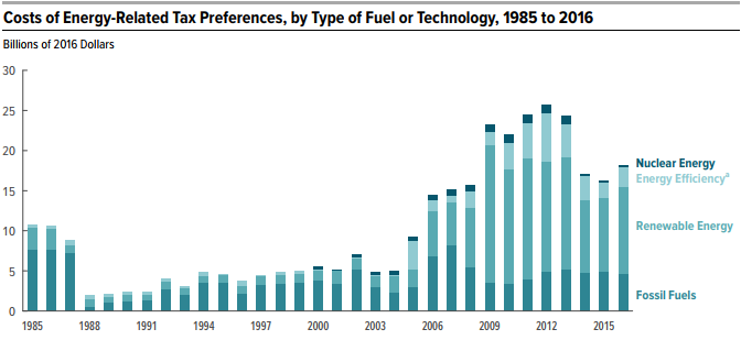
What they say: 2. Climate change got expensive.
They cite this graph (produced by the Grist magazine):

And they say:
One of the best-established consequences of global warming is that it makes natural disasters, like fires and floods, more frequent and severe. In the 2010s, the costs of this consequence came into sharp focus as billion-dollar disasters struck the United States again and again.
But, that’s not true when you look at normalized weather disaster costs:

Dr. Roger Pielke Jr. makes note of this in Why Climate Advocates Need To Stop Hyping Extreme Weather
It appears that 2019, is on track to continue the record of good news. Robert Muir-Wood of RMS, a leading catastrophe modeling firm, wrote a month ago “Almost three months ago we passed a remarkable record in catastrophe loss. And yet no one seems to want to celebrate it. No banner headlines in the newspapers. . . The first half of 2019 generated the lowest catastrophe insurance loss for more than a decade.” Muir-Wood labelled 2019 “the year of the kitten.” With two months left, cross your fingers.
What they say: 3. More people accept the basic premises that it’s getting hot and that it’s our fault.
Well, you might think that if you believe the highly adjusted temperature data published by NASA GISS and [University of East Anglia’s Climate Research unit] on climate (ground zero for the embarrassing and revealing Climategate affair in 2009).
But when you look at unadjusted data, such as is produced by the state-of- the-art United States Climate Reference Network (USCRN) operated by NOAA, you get a wholly different idea about temperature over the last decade:

Source: https://www.ncdc.noaa.gov/temp-and-precip/national-temperature-index/time-series?datasets%5B%5D=uscrn¶meter=anom-tavg&time_scale=12mo&begyear=2005&endyear=2019&month=12
That’s right, in the contiguous US, the temperature for 2019 was actually lower than for the start of the decade at 2010. The two peaks in 2012 and 2016 were from naturally caused El Nino events in the Pacific ocean. Granted, the USA isn’t the world, but the USA routinely gets blamed for all of the climate woes of the world, so the comparison seems a fair one. But really, where’s the climate crisis?
What they say: 4. But there’s a widening partisan divide when it comes to worrying about the environment.
Well that’s true, Conservatives generally think things through and look at fact based evidence compared to the liberal side, which seems to “feel” issues far more than they critically examine them.
But when people of all stripes worldwide are polled about it, such as the United Nations does, it comes in dead last as a concern:

It seems people worldwide would rather have education, food, honest government, better roads, and reliable energy than they would some climate action.
What they say: 5. Coal continued its death spiral.
Citing a Grist produced graph of data from the US Energy Information Administration (EIA) that they say depicts a “death spiral” for coal use, they say coal is on the way out.

While that data is true, what they aren’t showing you is the rest of the story from the EIA:

What is really going on here is that natural gas is replacing coal because it is more efficient, less expensive to maintain, and has a smaller footprint. It’s really a market driven business decision rather than a nod to environmental concerns.
What they say: 6. Solar skyrocketed, but fossil fuels still dominate.
Once again they cite a graph they produced from EIA data, and once again, it doesn’t tell the whole story.

Gosh, it looks like the entire USA is being powered by solar energy! Hurray for environmentalism! Inconveniently, the reality is far different:

While renewables, including solar, have made gains, they still lag behind fossil fuels such as natural gas, crude oil, and coal in energy production in the USA. Without baseload (grid) generation by coal and natural gas, solar wouldn’t even work, since almost all solar installations are grid-tied – meaning that if the grid doesn’t have electricity, solar power can’t feed to it.
What they say: 7. While coal flatlined, the price of renewables dropped precipitously.
I wonder what the price of renewables would be if they weren’t propped up by your tax dollars? According to EIA data, fossil fuels are still far less expensive:
And there there’s this analysis.
The EIA estimates the two largest federal tax credit programs benefiting wind and solar paid out a combined $2.8 billion in 2016. These funds came through a tax credit worth 2.4 cents per kilowatt hour of power produced, as well as a deduction equal to 30 percent of a facility’s installation costs.
These two tax credits are set to expire at the end of 2021, though a permanent 10 percent investment tax credit for solar and geothermal installations would remain.
https://www.insidesources.com/us-still-subsidizing-renewable-energy-to-the-tune-of-nearly-7-billion/
That doesn’t include state tax credits, which are also substantial.
While some people at Grist believe there is more to worry about from climate change issues this past decade, the undeniable fact is We’ve Just Had The Best Decade In Human History.

How inconvenient for the eco-worriers at Grist.
Anthony Watts is former television meteorologist and Senior Fellow for Environment and Climate for The Heartland Institute. He operates the most viewed website on climate in the world, WattsUpWithThat.com
Firstly, a UK facility not “England’s”.
More importantly that Hadley Centre is not related to the University of East Anglia’s “Climatic Research Unit”, which was at the heart of ClimateGate.
It really pulls the rug on such propaganda efforts if you can’t get your facts straight and liable the wrong people. Now our host is fellow at Heartland , it is a shame they don’t make use of his experience and knowledge. I’m sure Anthony would not let such a blunder pass.
fixed
…Hadley Centre is not related to the University of East Anglia’s “Climate Research Unit”….
from: https://en.wikipedia.org/wiki/HadCRUT :
The Climatic Research Unit had as an early priority the objective of filling gaps in available information “to establish the past record of climate over as much of the world as possible, as far back in time as was feasible, and in enough detail to recognise and establish the basic processes, interactions, and evolutions in the Earth’s fluid envelopes and those involving the Earth’s crust and its vegetation cover”….From 1989 this work proceeded in conjunction with the Met Office Hadley Centre for Climate Prediction and Research, and their work demonstrated global warming of almost 0.8 °C over the last 157 years.[8]
(my bold). But it is indeed true that significant inaccuracies can make you liable to libel the wrong people.
The global temperature anomaly HadCRUT is a collaboration.
One of the climategate emails “Observations do not show rising temperatures throughout the tropical troposphere unless you accept one single study and approach and discount a wealth of others. This is just downright dangerous” was from Peter Thorne of the Hadley Centre to Phil Jones. Included because it was critical of what was going on rather than damning of Thorne but still, Hadley Centre was a part of the farce.
Anthony,
Very good post. This should be disseminated throughout every school in the nation from kindergarten through graduate school!
Students also need to know:
Green plants are happier and healthier with more CO2 plant food in the atmosphere, backed up by thousands of scientific studies.
And our planet is roughly two degrees C. warmer than in the 1690s, when it was too cold for people living at that time … and they would have been thrilled with a +2 degree C. warming overnight in the 1690s, if that was possible.
The harm already done, and the harm expected, from global warming is nothing more than a leftist fantasy — no harm has been done.
Our planet supports the most life when it is warm, and has lots of CO2 in the atmosphere — only a fool, or a leftist (I repeat myself) would ignore climate history, and want a colder planet, with less CO2 in the air for plants.
The current climate is the best our planet has had for at least 800 to 1,000 years, since before the Little Ice Age centuries began.
There’s no climate crisis now, and no crisis coming — the climate has been getting better, for about 325 years so far.
A real climate crisis would be when the current Holocene inter-glacial ends, and the planet gets colder, for perhaps 100,000 years.
Of course that’s real climate science, which is far beyond the understanding of leftists.
They can only handle one climate variable: Carbon dioxide
And one temperature direction: Warmer
And one climate prediction: A coming climate crisis.
A prediction they have been repeating since the late 1950s, like trained parrots.
(I hope I have not insulted parrots)
OK, but apart from more wealth, less poverty, less child mortality, longer lives, less weather mortality, less deaths from pollution and more homosexuality …. what have fossil fuels REALLY done for us?
Mobility…
Yes, transgender (i.e. homo, bi, neo) is trendy. So are female rent-a-wombs and male sperm depositors. As well as dodo dynasties. The chambers are still Planned with unworthy human lives. Some sequestered, others cannibalized for clinical profit. There has been great progress in the last cent century.
“n.n February 8, 2020 at 7:12 am
Yes, transgender (i.e. homo, bi, neo) is trendy. So are female rent-a-wombs and male sperm depositors. As well as dodo dynasties.
The chambers are still Planned with unworthy human lives.
Some sequestered, others cannibalized for clinical profit. There has been great progress in the last cent century.”
____________________________________
Companies want your” unworthy human livesc. In fact, companies want 100% trained workers.
The best 50% are accepted in the company.
The remaining 50% trained then are defamed as deplorables. That’s live.
____________________________________
The percentages of / living / accepted / deplorable / unworthy / human lives will not change so soon. Kismet.
I get the tongue-in-cheek tone of your question, but nonetheless one honest reply is: since widespread use in farming, manufacturing and transportation industries, probably eliminated 90% or more of all manual labor in all non-third world countries.
It was a Monty Python reference.
And along with 90% of all manual labour, goes slavery, which was just about the only way to be wealthy in bygone years.
Oh Greg, really? Homosexuality?
Eny fule kno that green is just gay
A tongue on cheek her, methinks?
Peak stuff.
Malthus, and later the Club of Rome, postulated that we would run out of certain necessary materials and society would collapse. Buckminster Fuller countered that, because of improving technology, we are able to do more and more with less and less.
(I just love that quote by Al Gore and I use it a lot.)
The greenies seem to think things would be better if we lived like wild chimpanzees. Actually, by most measures, the environment is better off when it is husbanded by prosperous people who can afford not to desecrate it.
Peak stuff is happening. It matters. It’s a good thing. The necessary condition is that technology keeps improving and that requires a robust economy fueled by cheap energy.
Under Peak Stuff in the graph above, it mentions More From Less by Andrew McAfee. It looks like a good read.
McAfee mentions the four horsemen of the optimist: technology, capitalism, a concerned public, and responsive government. It’s a great bon mot. I hope it catches on.
Right on CommieboB!
I would suggest however that two of your optimist cavalry, concerned public and responsive govt., are still in the stable shouting at each other: “open the door! give me a saddle,” etc. while Fear and Greed the twin horsemen of the pessimists are rampant in the countryside.
Cheers
Mike
This should be compulsory reading for all educators.
Not sure how you can get it to them, though, never mind how to get them to pass it on. Most of them would be fired if they put this to their classes.
In “6” in the chart “U.S. Primary Energy Production by Source (1950-2018)”
Renewables are ~11% to ~12%?. Does this include Hydro since there is no separate line? If so what is percentage of renewables net of hydro?
THANKS for all your work.
Hydro runs at roughly 10 to 11%
I always wonder how much of ‘hydro’ actually is recycled coal, gas, nuclear, whatever. I mean, pumped up when demand is low.
None. Pumped storage is a storage mechanism, it isn’t a source of energy.
One would never guess this listening to the Marxstream Media…
Rule of thumb:
If you heard it from a greenie source (environmentalist) organization, it is most likely fake news and quite likely an outright lie.
Watermelons, truly evil people.
It’s almost astounding that these renewable folks never mention the obvious energy freight train coming down the tracks : molten salt modular nuclear reactors. But India and China and Russia are well aware of this game changing technology which will arrive in the next 10 years and replace all forms of electricity generation. And will be cheaper and safer to boot. And since it can be fueled by Thorium (as well as spent nuclear), the technoogy will never run out of fuel. Renewable advocates are incredibly ignorant of future technologies.
Wind is a 16th century technology.
Excellent and knowledgeable observation amidst all that puerile bickering about what is ‘good’ and what is not. Yes, Thorium generators have been around for some time, yes, they ARE the solution, imho. They have been suppressed, because those who really own and run this stupid human circus on the planet, are still profiting and living off the current medieval technologies. So as long as these parasites and their offspring are around, the future shall follow the past. Sadly.
Energy is no solution, it’s the myopic grasping at a straw for someone needing a rope. Oil has value because it is easily contained & a barrel of oil does 4 years of man-hours work. Humans have never controlled their population so over-use of resources is inevitable. Aside that, it is a fossil-fueled civilization which gives you the materials, the infrastructure to produce the thorium non-solution in the first place. You might as well be trying trade your cow for some magic beans.
I wonder what that 30% tax credit translates into in terms of cents per kWh.
substitute every USA graph….for the same graph about China….India…etc
..and then try to convince Americans we should give a flying
Yes, especially world use of Coal, it certainly doesn’t follow the US trend.
godforsaken
And the Green blight shall cover the land. Thou shalt not deny Profitsy. The mortal gods are indeed displeased.
So far, the “warming” has brought us -20C plus temps, “keeper” snow, etc. here in Barrie, Ontario. This a normal winter here. I would really hate it if global “cooling” descended upon us.
“But when you look at unadjusted data, such as is produced by the state-of- the-art United States Climate Reference Network (USCRN) operated by NOAA, you get a wholly different idea about temperature over the last decade”
It is data from a different place. The difference is not due to adjustment. If you look at the same period, same place with adjusted data from USHCN or ClimDiv, you get the same result as USCRN.
Well, I’m open to reason, Mr. Stokes. Can you give a couple of specific examples?
What about compared to GISS?
Yes, once USCRN came out, they had to use it as a guide.
USCRN has controlled the “adjustments” of ClimDiv to levels of reality.
No warming in USA except for a slight bulge through the last El Nino.
Nick–
UAH shows a trend of 0.0267 C/year for the 2005-2019 period in the contiguous US (US 48). Does RSS produce an estimate for the US 48? If so, a nice test would be to compare the slopes from the USCRN to those from RSS and UAH.
“UAH shows a trend of 0.0267 C/year”
That’s a very high trend (2.67°C/Cen), a complete contrast to the surface figures shown. But then again, it is a different place again, and satellite measures are also unreliable. RSS numbers are here.
“That’s a very high trend (2.67°C/Cen)”
There’s no reason to think such a trend will last that long.
There is every reason to think that trend will continue for decades.
Why? Even in the last century, no “trend” has lasted longer than about 2 decades.
Wow a whole 2 deg in 100 years that isn’t remotely scary enough to redistribute the worlds wealth. Half the readers and voters won’t even see 1degree you really have to work to get it up.
For Nick if it makes no difference why adjust it at all, other than apparently it makes it “Nick Stokes Right(tm)” as defined by Nick.
The people who don’t get alarmed because such small changes in global temperature are not scary, live in this fantasy world where ice does not change to water above 32 degrees F. They expose their stupidity by assuming everyone must know, as they do, ice gradually melts between 32 degrees F & 45 degrees F. I suppose the dew point is not really a point for them as well. Perhaps an avalanche or a boat capsizing happens in slow motion in their reality. One can only imagine such madness.
“There’s no reason to think such a trend will last that long”
The point is that the surface measures (including USCRN, described here as state-of-the-art) show little trend over that period.
It doesn’t surprise me, of course. I don’t have much faith anyway in UAH, but it emphasises that it is measuring a different place – a distinction too often ignored here.
“The point is that the surface measures (including USCRN, described here as state-of-the-art) show little trend over that period.”
Again that’s because you’ve averaged everything together. That’s a no-no when dealing with intensive properties.
Thanks NIck for the RSS data
Results of the same regression on the monthly data: (2005 Jan thru 2019 December):
RSS: 0.0244 degrees C/year
UAH: 0.0261
The satellite slopes agree within 1% or so. (Too bad–I was hoping for a large difference showing one agreed better with ground truth, the CRN network being the only ground data I believe.)
What is the actual slope of the USCRN data?
I make the CRN trend since 2005 at 2.8°C / century, very similar to UAH.
If you limit this to the last decade, as the article does, then the trend increases to 3.1°C / century.
Of course none of this is statistically significant, but you certainly don’t “get a wholly different idea about temperature over the last decade”.
Given how variable climate “disasters” are, 10 years is way too short to declare a trend.
Even without all the other problems inherent in that chart.
2010’s best decade metrics are impressive.
But how much better would they have been if the effort and money used to prevent catastrophic climate change had been redirected toward more productive efforts?
To: Relative Permeability,
Thank you for the enlightened question.
“Coal continued its death spiral.”
One thing about shallow thinkers, they assume that any trend that they approve of, will continue forever.
“While renewables, including solar, have made gains, they still lag behind fossil fuels such as natural gas, crude oil, and coal in energy production”
In addition to the subsidies, you also have to include the cost of mandates.
Utilities are required by law to buy all the wind and solar that is produced. Period. This means that fossil fuel plants have to be ramped up and down making them less efficient and more costly.
“While renewables, including solar, have made gains, they still lag behind fossil fuels such as natural gas, crude oil, and coal in energy production”
Renewable drivers, yes. As for photovoltaics etc., they are limited by the Green blight factor. As well as that photovoltaic panels and wind turbine gauntlets cannot be reasonably, cleanly, safely isolated from the environment.
.
The Grist article promises evidence in support of this claim then provides nothing. No evidence of communities being displaced, increase costs or mass extinctions. Just the fact that CO2 has increased a bit and global temperature is a few tenths of a degree warmer than it used to be. Neither of these changes is has been shown to cause real problems. The rest of the Grist points are related to popular opinion and decline in the use of coal for electricity generation. But the warmists want coal use to stop, so listing it as evidence for the above statement is ridiculous.
The fact that the Grist article uses misleading graphics and false claims is just typical of warmist propaganda.
“The two peaks in 2012 and 2016 were from naturally caused El Nino events in the Pacific ocean.”
No El Nino in 2012. That warm year was due to a very early spring across much of the US northern tier. This melted snow early which enhanced the warming. Having warmer temperatures at that time of year was extremely nice. Wish it happened every year.
‘… the 2010s as a turning point in our civilization’s approach to climate change. The growth of renewable energy and rapid retirement of coal-burning power plants this decade illustrate that crucial changes to the world order are currently well underway …’ (grist).
As they say: ‘don’t tell me, show me’:
The graphs in item 6 show solar increase as 1000% whereas ‘Renewables’ grew from approx 8 to 12 quads.
Increasing solar by 10 times only resulted in improving renewable output by 1/2.
If ‘renewables’ is not just solar, the use of solar is even worse for the increased installations.
‘A fool and his money are soon parted’ seems apt.
“hottest-on-record, most godforsaken decade”
Sheesh!
Selective statistics.
It is time again to refer to the wisdom of the financial markets:
The old definition of a promotion:
“At the beginning, the promoter has the vision and the public has the money.
At the end of the promotion, the promoter has the money and the public has the vision.”
Everyone needs to stop with the US data thing. I know for 300 million of the world’s citizens, the US is still considered the center of the world, but there is 98% of the rest of the global surface and atmosphere still to consider – I can’t use ANY of these data for any my discussions with hysterics if they are only US data. This is a global issue that needs global data. I’m not a cherry picker, so this doesn’t help in the slightest.
“Everyone needs to stop with the US data thing. I know for 300 million of the world’s citizens, the US is still considered the center of the world, but there is 98% of the rest of the global surface and atmosphere still to consider”
The U.S. data looks just like data from other regional surface temperature charts, so it’s not just a U.S.-centric thing.
If every regional chart has the same temperature profile, then that profile is the temperature profile of the Earth not just the United States.
Here’s some examples in the form of Tmax charts, note how all of them show that it was just as warm in the recent past as it is today, which tells us CO2 is not a major player in the Earth’s climate:
Tmax charts
US chart:
China chart:
India chart:
Norway chart:
Australia chart: