
Guest post by Kevin Kilty
Introduction
This short essay was prompted by a recent article regarding improvements to uncertainty in a global mean temperature estimate.[1] However, much bandwidth has been spilt lately in the related topic of error propagation [2, 3, 4], and so a small portion of this essay in its concluding remarks is devoted to it as well.
Manufacturing engineers work to improve product design, make products easier to manufacture, lower costs, and maintain or improve product quality. Among the tools they use to accomplish this, many are statistical in nature, and these have pertinence to the topic of the surface temperature record and its interpretation in the light of climate model projections. One tool I plan to present here is statistical process control (SPC).[5]
1. Ever Present Variation
Manufactured items cannot be made identically. Even in mass production under the control of machines, there are influences such as wear of the machine, variations in settings, skill of operators, incoming material property variations and so forth, which lead to variation in a final product. All precision manufacturing begins with an examination of two things. First, there is the customer specification. This includes all the important product parameters and the limits that these parameters must stay within. Functionality of a product suffers if these quality measures do not stay within limits. Second is the process capability. Any manufacturer worth the title will know how the process used to make products for a customer varies when it is in control. This leads the manufacturer to an estimate of how many products in a run will be outside tolerance, how many might be reworked and so forth. It is not possible to estimate costs and profits without knowing capability.
2. Process Capability and Control
If a manufacturer’s process can produce routinely within the specifications, perhaps only one in a hundred items, or one in a thousand or three in a million (six sigma) outside of it, whatever is cost effective and achievable, then the process is capable. If it proves not capable one might ask what cost in new machinery would make it capable, and if the answer is not cost effective one might pass on the manufacturing opportunity or have someone more capable handle it. When a process is in control, it is operating as well as is humanly possible considering one’s capability. A process in control is an important concept to our discussion.
3. Statistical Process Control
Statistical process control (SPC) is mainly a process of charting and interpreting measurements in real time. Various SPC charts become a tool through which an operator, potentially someone of modest training, can monitor a process and adjust it or stop it if indications are that it is drifting out of control. There are many different possible control charts, but a common one is the X −bar chart so named because the parameter being monitored and recorded on the chart is the mean attribute of a sample of manufactured items. Often it is paired with an R chart which shows the range within the same measurements. R is often used in manufacturing because it is capable of showing the same information about variation as say, standard deviation, but with much less calculation. Let’s discuss the X −bar chart. Figure 1 shows an example of a paired set of charts.[5]

Figure 1. A pair of control charts for X-bar and range. The X-bar chart shows measurements exceeding control limits above and below, while the range shows no increase in variability. We conclude an operator is unnecessarily changing machine settings. Source [5].
The chart begins with its construction. First, there is a specified target value for the process. A process is then designed to achieve this target. Then some number of measurements are taken from this process while it is known to be operating as well as is humanly possible – i.e. in control. Measurements are gathered into consecutive groups of fixed number, N (five and seven are common), and the mean of the means, and range of the means is calculated. Dead center horizontally across the chart is the target value then horizontal lines are placed above and below at some multiple of the process standard variation, measured by range or standard deviation. These are known as the process control limits (upper and lower control limits respectively UCL, LCL).
At this point one uses the chart to monitor an ongoing process. Think of charting as recording a continuing sequence of experiments. On a schedule our fixed number of manufactured items (N) are removed from production. The mean and range of some important attribute is calculated for this sample and the results plotted on their respective charts. The null hypothesis in each experiment is that the process continues to run just as it did during the chart creation period. As work proceeds the sequence of measured and plotted samples show either a pattern that is expected of a process in control, or a pattern of unexpected variations which suggest a process with problems. Observation by an operator of an unlikely pattern, such as; cycles, drift across the chart, too many points plotting outside control limits, or hugging one side of the chart, is evidence of a process out of control. An out of control process can be stopped temporarily while the process engineer or maintenance find and rectify the problem. One thing worth emphasizing is that SPC is a highly successful tool for handling variation in processes and identifying problems.

Figure 2. “…Comparison of a large set of climate model runs (CMIP5) with several observational temperature estimates. The thick black line is the mean of all model runs. The grey region is its model spread. The dotted lines show the model mean and spread with new estimates of the climate forcings. The coloured lines are 5 different estimates of the global mean annual temperature from weather stations and sea surface temperature observations….” Figures and description: Gavin Schmidt[6].
4. Ensemble of Models
Let’s turn attention to the subject of climate. The oft cited ensemble of model projections is something like a control chart. It represents a spread of model projections carefully initiated to represent what we believe is a future path of mean earth temperature with credible additions of CO2. It is not a plot of the full variation that climate models might conceivably produce, but rather more controlled variation of our expectations given what we know of climate and the differential equations representing it when it is in control. It is this in control concept that makes the process control chart and the projection ensemble similar to one another. The resemblance is even more complete with an overlay of observed temperature.

Figure 3. The grey 95% bounds of Figure 2 redrawn in skewed coordinates (blue/orange) to look more like a control chart. The grey lines indicate the envelope of observations. Black line is target.
This ensemble became controversial once people began placing observed temperatures on it. Schmidt produced one in a blog post in 2015.[6] Figure 2 shows it. What the comparison between observed and projected temperature showed, initially, was a trend of observed temperature across the ensemble. Some versions of similar graphs have observed temperatures departing from projections entirely.[7] Figures 3 and 4 show Figure 2 rotated into skewed coordinates to look more like a control chart monitoring a process. Schmidt states that Earth temperature are well contained within the ensemble – especially so after accounting for some extraneous factors (Figure 4). Yet, this misses an important point. The measurements in Figure 3 trend in an unlikely way across the ensemble, and have gone to running along the lower limit. After eliminating the trend in Figure 4 the comparison still shows observed temperatures hugging the lower end of the projections. Despite being told often that the departure of observations from the center of the ensemble is a non-issue, with each new comparison some unlikely features remains to fuel doubt. It is difficult to avoid concluding that what is wrong is one of the following.
(1) The models do run too hot. They overestimate warming from increasing CO2, possibly because of a flawed parameterization of clouds or some other factor.
(2) The observations are running too cool. What I mean is there are factors external to the models which are suppressing temperature in the real world. The models are not complete. Figure 2 from Realclimate.org takes exogenous factors into account. Yet, note that while the inclusion of these factors reduces the improbable trend across the diagram, it leaves the improbable tendency to cling to the lower half of the diagram, which suggests item 1 in this list again.
(3) The models and observations are of slightly different things. The observations mix unrelated things together, or contain corrections and processing not duplicated in the models.

Figure 4. The dashed (forced) 95% bounds of Figure 2 redrawn in skewed coordinates (blue/orange) to look more like a control chart. The grey lines indicate the envelope of observations. Black line is target.
These charts present data only through 2014, but while observed temperatures rose into the target region of the chart with the recent El Nino, they have more lately settled back to the lower part of the chart. It takes an extraordinary event to push observations toward the target region. One more observation about these graphs seems pertinent. If as Lenssen, et al, claim the 95% uncertainty bounds of the global mean temperatures are truly as small as 0.05C, then the spread in the various observations is, at times, unlikely itself.
Our little experiment here cannot settle the question of whether models run too hot, but two of our three possibilities suggest they do. It ought to be important to figure if this possibility is the truth.
5. Conclusion
The first draft of this essay concluded with the previous section. However, in the past few weeks there has been a lengthy discussion at WUWT about propagation of error, or what one could call propagation of uncertainty. The ensemble of model results is, in one point of view, an important monitor (like SPC) of health of our planet. If we believe that the assumptions going into production of the models are a true representation of how the Earth works, and if we are certain that our measurements represent the same thing the ensemble represents, then we arrive at the following: A trend across our control chart toward higher values suggests a worrying problem; a trend across the chart toward lower values suggests otherwise. But without some credible measure of bounds and resolution, no such use is reasonable.
One response of the climate science community to the apparent divergence of observations to models is to argue that there really is no divergence because the ensemble bounds could be widened to show true variability of the climate, and once this is done the ensemble limits will happily enclose observations. Or, they argue, there is no divergence if one takes into account exogenous factors ex post. But in my view arguing this way makes modeling pointless because it removes one’s ability to test anything. There is certainly a conflict between the desire to make uncertainties small, thus making a definitive scientific statement, and a desire to make the bounds larger to include the correct answer. The same point Vasquez and Whiting make here [8] …
”…Usually, it is assumed that the scientist has reduced the systematic error to a minimum, but there are always irreducible residual systematic errors. On the other hand, there is a psychological perception that reporting estimates of systematic errors decreases the quality and credibility of the experimental measurements, which explains why bias error estimates are hardly ever found in literature data sources….”
is what Henrion and Fischoff [9] found to be so in the measurement of physical constants over 30 years ago. Propagation of error plays an important role in the interpretation of the bounds and resolution of models and data. It is more than just initiation errors being damped out in a GCM. But to discuss its pertinence would make this post too long. Perhaps we‘ll return in a week or two when that topic cools off.
6. Notes:
(1) Nathan J. L. Lenssen, et al., (2019) Improvements in the GISTEMP Uncertainty Model. JGR Atmospheres, 124, 6307-6326.
(2) Pat Frank https://wattsupwiththat.com/2019/09/19/emulation4-w-m-long-wave-cloud-forcing-error-and-meaning/
(3) R.C. Spencer, https://wattsupwiththat.com/2019/09/13/a-stovetop-analogy-to-climate-models/
(4) Nick Stokes, https://wattsupwiththat.com/2019/09/16/how-errorpropagation-works-with-differential-equations-and-gcms/
(5) AT&T Statistical Quality Control Handbook, Western Electric Co. Inc., 1985 Ed.
(6) RealClimate, NOAA temperature record updates and the ‘hiatus’ 4 June 2015, Accessed September 18, 2019.
(7) Ken Gregory, Epic Failure of the Canadian Climate Model,
https://wattsupwiththat.com/2013/10/24/epic-failure-of-the-canadianclimate-model/
(8) Victor R. Vasquez and Wallace B. Whiting, 2005, Accounting for Both Random Errors and Systematic Errors in Uncertainty Propagation Analysis of Computer Models Involving Experimental Measurements with Monte Carlo Methods, Risk Analysis, Volume25, Issue 6, Pages 1669-1681.
(9) Henrion, M., & Fischoff, B. (1986). Assessing uncertainty in physical constants. American Journal of Physics, 54( 9), 791– 798.
“The models do run too hot. They overestimate warming from increasing CO2, possibly because of a flawed parameterization of clouds or some other factor.”
Well the AMO warmed since 1995 and that reduced low cloud cover and increased lower troposphere water vapour, and the warm AMO phase is a direct response to weaker solar wind states. So the climate system has negative feedbacks with an overshoot almost as large as the CO2 driven warming projections.
https://www.linkedin.com/pulse/association-between-sunspot-cycles-amo-ulric-lyons/
Fortunately, Reality is finally beginning to intrude upon the dangerous global warming meme.
Curry, 2017 in “Climate Models for the layman” says:
“GCMs are not fit for the purpose of attributing the causes of 20th century warming or for
predicting global or regional climate change on time scales of decades to centuries,
with any high level of confidence. By extension, GCMs are not fit for the purpose of
justifying political policies to fundamentally alter world social, economic and energy
systems…..”
Scafetta et al 2017 states: “The severe discrepancy between observations and modeled predictions……further confirms….that the current climate models have significantly exaggerated the anthropogenic greenhouse warming effect”
Hansen et al 2018 “Global Temperature in 2017” said “However, the solar variability is not negligible in comparison with the energy imbalance that drives global temperature change. Therefore, because of the combination of the strong 2016 El Niño and the phase of the solar cycle, it is plausible, if not likely, that the next 10 years of global temperature change will leave an impression of a ‘global warming hiatus’.
Page, 2017 in “The coming cooling: usefully accurate climate forecasting for policy makers.” said:
” This paper argued that the methods used by the establishment climate science community are not fit for purpose and that a new forecasting paradigm should be adopted.”
See http://climatesense-norpag.blogspot.com/2019/01/the-co2-derangement-syndrome-millennial.html
Here are the First and Last Paragraphs
“A very large majority of establishment academic climate scientists have succumbed to a virulent infectious disease – the CO2 Derangement Syndrome. Those afflicted by this syndrome present with a spectrum of symptoms .The first is an almost total inability to recognize the most obvious Millennial and 60 year emergent patterns which are trivially obvious in solar activity and global temperature data. This causes the natural climate cycle variability to appear frightening and emotionally overwhelming. Critical thinking capacity is badly degraded. The delusionary world inhabited by the eco-left establishment activist elite is epitomized by Harvard’s Naomi Oreskes science-based fiction, ” The Collapse of Western-Civilization: A View from the Future” Oreskes and Conway imagine a world devastated by climate change. Intellectual hubris, confirmation bias, group think and a need to feel at once powerful and at the same time morally self-righteous caused those worst affected to convince themselves, politicians, governments, the politically correct chattering classes and almost the entire UK and US media that anthropogenic CO2 was the main climate driver. This led governments to introduce policies which have wasted trillions of dollars in a quixotic and futile attempt to control earth’s temperature by reducing CO2 emissions………..
The establishment’s dangerous global warming meme, the associated IPCC series of reports ,the entire UNFCCC circus, the recent hysterical IPCC SR1.5 proposals and Nordhaus’ recent Nobel prize are founded on two basic errors in scientific judgement. First – the sample size is too small. Most IPCC model studies retrofit from the present back for only 100 – 150 years when the currently most important climate controlling, largest amplitude, solar activity cycle is millennial. This means that all climate model temperature outcomes are too hot and likely fall outside of the real future world. (See Kahneman -. Thinking Fast and Slow p 118) Second – the models make the fundamental scientific error of forecasting straight ahead beyond the Millennial Turning Point (MTP) and peak in solar activity which was reached in 1991.These errors are compounded by confirmation bias and academic consensus group think.”
See the Energy and Environment paper The coming cooling: usefully accurate climate forecasting for policy makers.http://journals.sagepub.com/doi/full/10.1177/0958305X16686488
and an earlier accessible blog version at http://climatesense-norpag.blogspot.com/2017/02/the-coming-cooling-usefully-accurate_17.html See also https://climatesense-norpag.blogspot.com/2018/10/the-millennial-turning-point-solar.html
and the discussion with Professor William Happer at http://climatesense-norpag.blogspot.com/2018/02/exchange-with-professor-happer-princeton.html
Not sure which way the models run, but nature is about to run cold. In 6 days area temps in Northern California are going to drop 20 degrees F for the daytime highs, and the lows in the mid 30s F. This will be the earliest drop in temps in the 8 years I have lived in these mountains. Temps this low normally do not start until late October/early November. Plus there have already been several rains with another storm heading in soon. I remember back in the 1950s in particular, where there would be years where the rains started in September, generally meant a very wet/snowy winter for the West Coast. … https://www.weatherbug.com/weather-forecast/10-day-weather/douglas-city-ca-96052
goldminor
“Not sure which way the models run, but nature is about to run cold.”
California is a little bit of the US, and the US is a little bit of the Globe.
Dir you notice that in Germany (another little bit of another little bit of the Globe), we had two consecutive very warm summers which both followed an extremely mild winter?
But at the time we experienced a June with 3.5 °C above norm, Spain was 2.5 °C below, with corners like Sevilla with 6 °C below mean.
Here it’s colder, there warmer… imho solely the average counts. For June, the global GHCN daily station average was at 0.44 °C above the mean of 1981-2010.
The West Coast is a big player in NH weather patterns, but particularly for the US. Rains coming off of the Pacific move through here first before crossing the entire nation. So that makes California weather only a little bit of the climate puzzle?
West Coast weather is very important because the Pacific Ocean is very important to the climate of the NH.
goldminor
If there is something about what we Europeans always will be wondering about, then it is this typical americanocentrism shown by Northern Americans.
What you wrote, anybody living in the UK could have written as:
“The United Kingdom is a big player in NH weather patterns, but particularly for Europe. Rains coming off of the Atlantic move through here first before crossing Western Europe. So that makes the United Kingdom weather only a little bit of the climate puzzle?
UK weather is very important because the Atlantic Ocean is very important to the climate of the NH.”
Sorry, goldminor… Both are equally wrong.
The USA and (the land parts of) the NH have few in common, apart from the fact that they show warming since the 1980’s.
California and Alabama have few in common as well, apart from the fact that they show warming since the 1980’s as well.
When you collect monthly station data and compute anomalies, you see that while of the 1000 topmost anomalies in the US, about 100 are from the year 2000 and above, over 400 of the 1000 topmost anomalies in Russia and Siberia are within that time period.
This is one of these ‘details’ which let you think that the influence of what happens at the US West Coast on Russia and Siberia probably is marginal.
“California and Alabama have few in common as well, apart from the fact that they show warming since the 1980’s as well.”
Why is Alabama considered to be part of the Southeast “global warming hole”, at least as late as 2018?
Tim Gorman
“… at least as late as 2018?”
Hmmmh.
https://drive.google.com/file/d/1nROCdxNCDHKntx_N1kvb8OFOB7f6TLcm/view
Trend for 1979-2019: 0.18 °C / decade
Trend for 2000-2019: 0.35 °C / decade
I have absolutely no idea what anomaly your graph is based on. Average temp perhaps? If it is average temperature then how do we know if the anomalies are going up because of increasing maximum temperatures or moderating minimum temperatures? If maximum temperatures are not going up then how can it be *warming*?
go here:
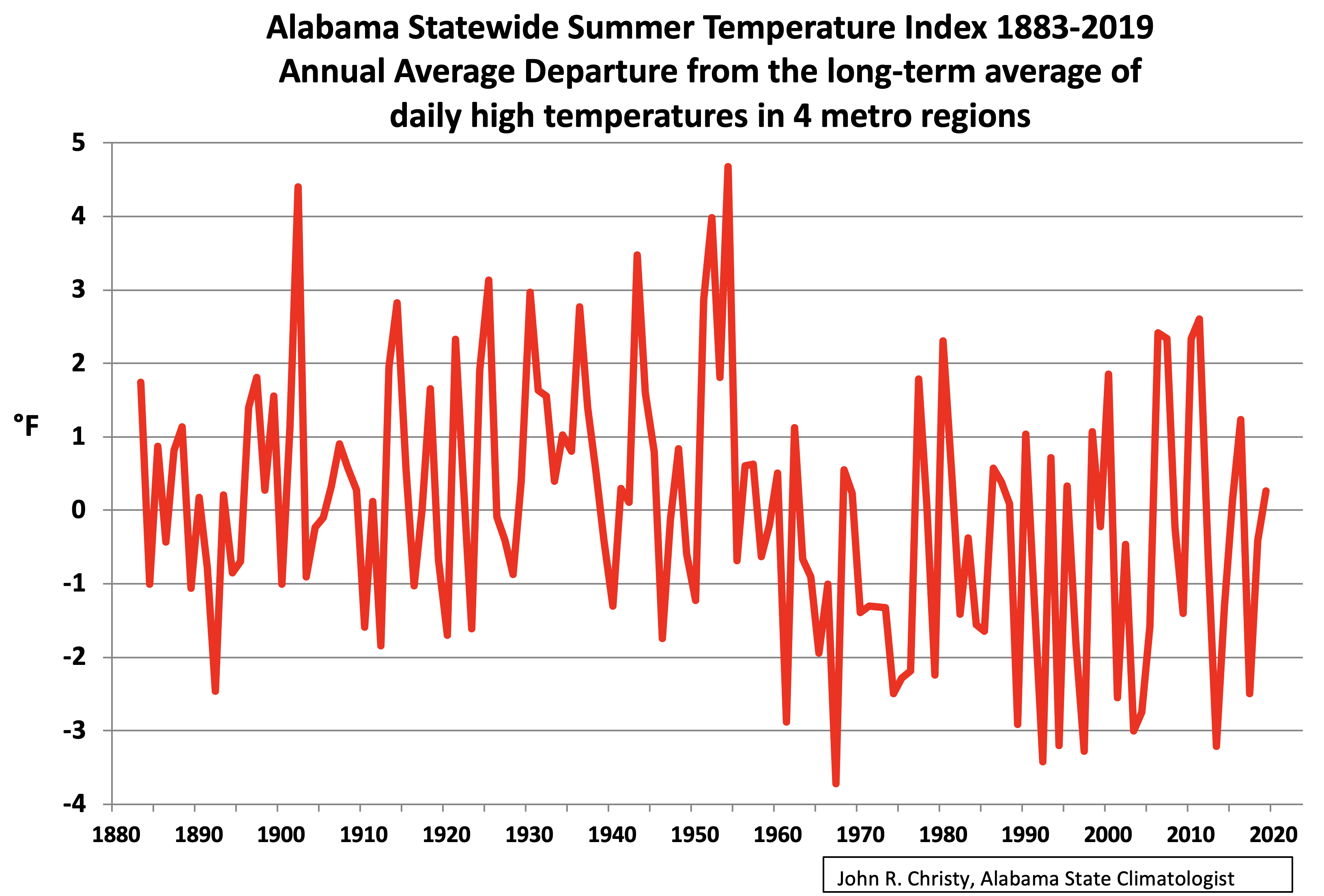
If you look closely the maximum summertime temperature in Alabama is *lower* today than in 2005. Alabama has seen almost a decade of cooling. And current maximum temperatures are *far* below those in the 30’s and the 50’s.
It’s why the entire southeast is classed today as a global warming hole. There is *no* global warming in that area.
Tim Gorman [2]
I forgot to mention a ‘little detail’:
Trend for 1900-2019: -0.03 °C / decade
Sources for graph & trends:
ftp://ftp.ncdc.noaa.gov/pub/data/ghcn/daily/
Tim Gorman
1. “I have absolutely no idea what anomaly your graph is based on.”
Maybe you shoud have had a closer look at the graph. Left to the y axis, you see ‘Anomalies wrt mean of 1981-2010. { OMG, we are in the US here! I forgot to mention ‘in °C’ 🙂 }
John Christy did by no means show Alabama’s average temperature as I did. So you can’t compare the two graphs.
Didn’t you see ‘summer’ and ‘daily high’ in the title? Mr Christy manifestly restricted the data to summer maxima, the very best way to show ‘no warming’.
Btw: It’s so typical that people like you ask me what baseline I’ve chosen, but do not worry about which one Mr. Christy did!
2. “If maximum temperatures are not going up then how can it be *warming*?”
Here you see how Mr Christy’s graph should have looked like:
https://drive.google.com/file/d/1bzJ0jb254vQe8Y9HZmKRFhop5sJ7B-wV/view
namely by showing an average of all monthly minima compared with an average of all monthly maxima.
Nearly everywhere in the world, the maxima increase less than do the minima. The minima increase is the mean reason for warming, or, better: for less cooling, namely during the winter months.
For Alabama as well: while the maxima show for 1979-2019 0.13 °C / decade, the minima show 0.24 °C / decade. And for 2000-2019, the difference is even greater: 0.23 °C / decade for the maxima, and 0.60 °C / decade for the minima.
This is something you will only detect when using anomalies in which the seasonal dependencies are removed (what Roy Spencer calls ‘the annual cycle’).
Please note: I don’t feel the need to convince you, let alone would I try to show any trace of AGW.
Rgds
J.-P. D.
“Maybe you shoud have had a closer look at the graph. Left to the y axis, you see ‘Anomalies wrt mean of 1981-2010. { OMG, we are in the US here! I forgot to mention ‘in °C’ 🙂 }”
I looked at the graph. It *still* doesn’t tell me if the anomalies are associated with average temperature, maximum temperature, or minimum temperature. As I keep saying, if the anomalies are associated with the average temperature then they are meaningless for determining if the region is actually getting hotter, i.e. maximum temperatures are rising.
“John Christy did by no means show Alabama’s average temperature as I did. So you can’t compare the two graphs.”
Again, average temperatures are meaningless when it comes to determining if a region (or even the globe) is getting warmer. It’s nice for you to admit you are using *average* temperatures.
“Didn’t you see ‘summer’ and ‘daily high’ in the title? Mr Christy manifestly restricted the data to summer maxima, the very best way to show ‘no warming’.”
If it is getting hotter because of CO2 increases, summertime temperatures would be the *best* place to see it! Remember, the claim is that the globe will become a cinder after 2035. That can only happen when maximum temperatures go up and the best time for that to happen is in the summer!
“Btw: It’s so typical that people like you ask me what baseline I’ve chosen, but do not worry about which one Mr. Christy did!”
I *told* you what his graph shows. And it is using the baseline most likely to show that global warming is causing maximum temperatures to go up.
“Here you see how Mr Christy’s graph should have looked like:”
Redo your graph using the mean from 1900-1960. The graph I gave you isn’t based on an arbitrary mean. It shows actual maximum temperatures from about 1883 to 2019. And it shows the maximum temperatures are *not* going up in Alabama.
“Nearly everywhere in the world, the maxima increase less than do the minima. The minima increase is the mean reason for warming, or, better: for less cooling, namely during the winter months.”
Then why so much hoopla over the Earth burning up by 2035? Minima going up won’t cause this to happen! It’s why I keep saying that averages lose data and give an totally misleading picture of what is happening! Increasing minima mean fewer deaths from cold weather, less energy use (*exactly* what the AGW alarmists say needs to happen!), and more food for more people!
“This is something you will only detect when using anomalies in which the seasonal dependencies are removed (what Roy Spencer calls ‘the annual cycle’).”
Oh, malarky! You will see it by plotting the actual minimum temperatures and the actual maximum temperatures! Exactly what I’ve done since 2002 at my location by collecting five minute data on a 24/7/365 basis. Maximum temps are moderating, e.g. we had ZERO 100degF days this summer, while minimum temperatures are moderating. I don’t need any “anomalies” to show this. You merely have to graph maximum and minimum temperatures for each day!
Tim Gorman
I lack the time for a more detailed answer, and we are more and more running off topic. But I at least want to show you how wrong you are when writing
“Maximum temps are moderating, e.g. we had ZERO 100 deg F days this summer…”
Nobody having an idea of how weather stations are constructed would compare them with a home thermometer.
I just downloaded the newest GHCN daily station (absolute) data for Alabama, and here you can look for your ‘Southeast Global Warming Hole’.
Below are, for Alabama in the years 1995 till 2019, the number of days with a temperature having exceeded 37.8 °C ~ 100 F:
1995: 237
1996: 32
1997: 3
1998: 157
1999: 336
2000: 872
2001: 0
2002: 25
2003: 0
2004: 4
2005: 16
2006: 444
2007: 1167
2008: 70
2009: 70
2010: 513
2011: 526
2012: 409
2013: 0
2014: 39
2015: 109
2016: 77
2017: 2
2018: 12
2019: 216
For 2019, the 216 days for example were registered by 48 different stations (of 107 active during the year).
*
I also have a private thermometer ‘station’, Tim Gorman.
Judas Priest guy! Did you actually bother to look at the numbers you posted? 2019 is far below the number of 100degF days seen in the years of 1995 to 2000 and from 2006 to 2012.
And *you* think Alabama is *warming*? What do you call what happened from 2006 to 2012?
And you didn’t even include what happened during the 30’s and the 50’s! Talk about cherry picking! This data matches well with the graph I pointed you to which showed maximum temperatures in Alabama.
BTW, I don’t live in Alabama. I live in a different global warming hole!
Tim Gorman
“Did you actually bother to look at the numbers you posted?”
Of course I did! And i looked at the 1930’s and above all at the 1950’s as well. I just wanted to show you that the sequence is not far from random.
It is absolutely evident to me that if we wanted to compute the average daily maxima per station per year in Alabama (or in your own warming hole), one would obtain something more or less similar to this graph made by John Christy, and presented in July 2018 at Roy Spencer’s blog:
http://www.drroyspencer.com/wp-content/uploads/US-extreme-high-temperatures-1895-2017.jpg
This is exactly what you need – as a person who refuses to accept average temperatures, let alone anomalies computed out of them.
So let us stay at these maxima you seem to so appreciate so much.
A commenter asked Roy Spencer in the same thread about a similar graph for the Globe.
I myself was interested to do that using the GHCN daily data set, because it contained at that time worldwide over 35,000 temperature measurement stations (over 40,000 today).
Below is a graph showing nearly the same for GHCN daily as Prof. Christy did out of the USHCN record (but using of course °C instead of F):
https://drive.google.com/file/d/1qGV5LfKw_lFKNdZMlq15ZHz6sA1CA294/view
If we perform a grid average of the data, isolated stations within CONUS get a relatively louder voice compared with those in the overrepresented warmer corners, and you obtain this, showing even a slight cooling compared with Prof. Christy’s graph:
https://drive.google.com/file/d/16XwogXkjltMuSzCdC5mPKqC1KNev4ayy/view
And here is a last graph showing, out of the same data set, the situation for the Globe:
https://drive.google.com/file/d/1TFdltVVFSyDLPM4ftZUCEl33GmjJnasT/view
No comment, Sir.
Rgds
J.-P. D.
“This is exactly what you need – as a person who refuses to accept average temperatures, let alone anomalies computed out of them.”
What do you think that graph shows? The entire period from about 1930 to 1980 showed having mostly above 4 days. 2010 to 2015 has been mostly below 4 days. Where’s the warming? Even the inset in the graph says: “No significant trends. 11 of the 12 hottest years occurred before 1960.” Again, where’s the warming you said was there?
Your graphs show the *entire* CONUS as cooling? And yet the globe graphs shows the world as warming? And you use the term “global warming”? How can it be “global” if a major portion of the land mass is cooling? Far too much of the temperatures around the globe are *estimated”. I have a hard time believing the data. Especially when if you look at the cooling degree days in places like Asia and Africa and see them on a decline over the past three years. Cooing degree days (and heating degree days) are used by engineers to size cooling and heating infrastructure. It costs *money* if they oversize or undersize the infrastructure . If I am buying air handlers for someplace in Kenya and the cooling degree days are going *down* I’m not going to oversize it just because someone has guessed that the temperature there is going up because of global warming!
Tim Gorman
“Your graphs show the *entire* CONUS as cooling? And yet the globe graphs shows the world as warming? And you use the term “global warming”? How can it be “global” if a major portion of the land mass is cooling?”
Here you once again show this typical, childish-looking American self-centrism.
CONUS, a major portion of the land mass? How is it possible to write such a nonsense, Mr Gorman?
Earth’s total land mass is 150 million km². CONUS, that’s no more than small 8 million km², i.e. about 5 % (FIVE PERCENT) of the total!
Incredible. But wait, it’s still going on with this strange americanocentrism:
“Far too much of the temperatures around the globe are *estimated”.
You very probably never processed any temperature station data set into time series, let alone sea ice or sea level data. Right?
Feel free to start into the job, Mr Gorman: here it is:
ftp://ftp.ncdc.noaa.gov/pub/data/ghcn/daily/
When you will have finished that job, Mr Gorman, we can compare our results.
Until then, your comments give me the feeling to be losing my time.
Rgds
J.-P. D.
“Earth’s total land mass is 150 million km². CONUS, that’s no more than small 8 million km², i.e. about 5 % (FIVE PERCENT) of the total!”
But it is CONUS that has the most measuring stations spread across that land mass. Huge swaths of Asia, Africa, and South America get their temperatures estimated by just copying over a single station that can be hundreds of miles away!
Nor did you address the fact that if 5% of the Earth’s landmass is cooling why is it called “global” warming?
“You very probably never processed any temperature station data set into time series, let alone sea ice or sea level data. Right?”
How does that mean that much of the temperature data is not estimated, i..e guessed at?
“Until then, your comments give me the feeling to be losing my time.”
I suggest you start looking at the cooling degree data around the world for the past three years. I have posted a lot of samples of on this web site over the past two years. Again, a wide sample of stations in Asia, Africa, and South America show fewer cooling degree days as a trend. It can’t be warming and cooling degree days going down.
(PS sea level? What about it? Apparently tidal guages show no acceleration of the rising of the seas)
I keep wondering how many GCMs are adjusted and run again and again until they achieve the “correct” results, which are then published as “data”.
Meantime, the models that don’t support the narrative are quietly sent down the memory hole, or rejected by pal review referees.
Has anyone out there in academia seen any examples of this?
Anna Keppa
Sorry, but the history of Science shows more trial and error than anything else.
That’s what makes Science so credible: to be able to backtrack out of any blind-alley.
IF the worry is about “The World is on Fire”, then ONLY the high T should be considered, not the “average” T..( In Canada, warmer nights would be a welcome thing, especially if you don’t have a significant other to put a “log on the fire” ! : )
While not related to the GCM issue it is perhaps appropriate to give a h/t to Edwards Deming who through statistical process control helped enable the Japanese post-war manufacturing led boom.
Bottom line: the models are consistently wrong in one direction.
If they were race horse models, the modelers would have gone broke long ago by betting that slow horses would magically run fast.
The alarmunists wish to alter economies and impose restrictions based on models which are consistently wrong. Billions of people are and will continue to suffer needlessly because world leaders are betting on bad models.
This is not a scientific problem that can be solved by fine tuning the models with new code or fudge factors. This is a political problem. Dictators and their would-be ilk imposing impoverishment is not a math issue; it is a tyranny issue.
That’s Hy Pitt.
A model makes an argument and it can be shown that in the case of today’s climate models this argument is logically unsound. The argument on which a public policy is based should be logically sound but many people believe quite passionately that a public policy should in this case be based upon a logically unsound argument!
These climate models, or scenarios, or simulations are not a statistical process. The simulations propagate a set of assumptions. Each model has different assumptions. If they happen to all be similar, then that just means everyone is using a similar set of assumptions. They are “correct” if they are useful in their predictions. In that sense, only one model is “correct” in that it will most closely predict what you are trying to model (temperature) and the others are less correct. Certainly it can be the case that none of the models are useful and so none would be correct.
Just because a model matches past reality by being “tuned” to match it, does not make it useful. A number of years ago, I noticed a graph of world-wide cigarette consumption that had a familiar shape. So, I compared it to the global temperature graphs. I found that worldwide cigarette consumption had a better correlation to global temperature than any of the climate models.
Somehow, I did not win a Nobel prize for this.
(I would doubt that the cigarette-global temperature correlation is still good, but if anyone wants to look it up, go ahead.)
Societal Norm:
In stating that “a model makes an argument” I’ve adopted an epistemological point of view. Adoption of
this point of view makes it possible for a debater to ask and answer the question of whether the argument that is made by one of today’s climate models is “sound” or “unsound” through the use of deductive reasoning. Through the use of this kind of reasoning can be proven that the argument that is made by a modern climate model is unsound. Through the use of this kind of reasoning it can also be proven that it is only a sound argument that makes predictions. As the arguments that are made by today’s models are unsound, they are incapable of making predictions. Neither. the term “correct” nor the term “useful” has a precise philosophical meaning. Thus, to use these terms in making an
argument muddies the philosophical waters.
” After eliminating the trend in Figure 4 the comparison still shows observed temperatures hugging the lower end of the projections. “
I disagree with this contention. They have occasionally dipped to the lower end, but I don’t agree that this puts them out of control. The omission of post-2014 data is serious. There are only about 7 years of the prediction phase of CMIP5, and it happened that three of those, 2011-2013, formed a cold spell. This is not an improbable event, and insignificant in the span. Showing just four of those prediction years when eight are available is seriously misleading. The updated charts are here (CMIP 5) and here (CMIP 3). For CMIP 5 vs GISS and C&W, years 2015-2017 are at or above Gavin’s mean corrected for known exogenous events. 2019 will be above, probably the second warmest year in the record.
The use of SPC methodology is tricky. The limits are not estimates of the variability of Earth temperatures, but a scatter of target variation. There is no reason why they should be the same. Th envelope of model paths is expressing cumulative variation rather than year-to year.
Hi Nick,
If the measured temperatures are not the same beast as the model estimates and should not be compared in serious work, don’t tell me.
Tell the people who use them in the ways that you advise against. Why not use “wrong” rather than “tricky”?
Indeed, with your better-than-usual involvement with the whole GCM/CMIP methodology, I would be expecting you to be shouting reservations from the roof tops. Shouts like “Do not use these model outputs to inform policy. They are not data. They are not validated. “.
Yet, your voice is strangely soft. Why? Geoff S
Geoff,
I’m warning on naive application of SPC methods. That is not a failure of the models. In SPC you measure an observed variable (here Earth surface temp) against bounds of its expected variation. That is not what we have here.
Nick, I would really like to understand why its legitimate to average a bunch of successful and failing models in order to get a projection. As in the spaghetti charts.
Why are we not simply throwing out the ones that do not deliver accurate testing predictions, and rely on the ones that have a successful record?
This is such an obvious point that there must be some reason for it, whether good or bad. But what is it?
I want to say that in any other field our emphasis would be to filter out the models till we get one that works best. However I have the impression that in this case we are sticking with a bunch we know do not work, and then deriving an average from the ones that work and the ones that don’t.
Is this really what we are doing? And if so, why?
“Nick, I would really like to understand why its legitimate to average a bunch of successful and failing models in order to get a projection. As in the spaghetti charts.”
Well, it’s mostly onlookers who want to average. CMIP just publishes the results.
But it’s far too soon to be judgemental about failing models. They have only been forecasting about 7 years (CMIP5). It’s a bit like deciding on an investment fund looking only at their performance last quarter.
What again???
Only forecasting for seven years is the fragility? So it’s better to use an older and less advanced assemblage of models because they have been forecasting for more years, even if they have been producing worst data? What are you trying to say here?
Nick, Based on what you said here and above after my comments, sorry to seem rude but I do recommend you to get to the basics and, at least, read this:
https://www.ipcc.ch/site/assets/uploads/2018/02/WG1AR5_Chapter09_FINAL.pdf
The implications of this are a bit startling.
We do not know enough to decide whether some of the models are better than others. But they vary quite widely in what they predict. So if this is right, if current performance is no guide to the long term value of the models, then what makes us think the ensemble or the average of them is right?
The point is that if 7 years is too little to rule out the fitness of the very warm models, or to rule in the very cool ones, its also too short to rule out any of them, so averaging cannot be a legitimate procedure.
We keep on being told that the modelling is fine and that its somehow ignorant to worry about relying on them for policy. But what you’re really saying is that the uncertainty is massive and the future course unpredictable from the models, because we have multiple incompatible wildly different forecasts and no way to tell which is likely to be correct.
They cannot be fit for guiding public policy if there is this much uncertainty about their value.
“They cannot be fit for guiding public policy if there is this much uncertainty about their value.”
+1
“But what you’re really saying is that the uncertainty is massive”
No. I’m saying that there is very little time elapsed since the prediction was made. That isn’t a knock on the prediction. All predictions, good or bad, start at zero time, and it takes a while before you can decide whether they are doing well or not, based on comparison with the thing being modelled.
For the umpteenth time, GCMs predict climate, not weather. What happened in that seven years is mostly weather.
But, Nick, you are saying that all of them, despite their wildly different predictions, are pretty much as good or bad as each other, for all we know.
The implication of what you are saying is that they cannot be valid guides to public policy.
Consider the basic logic of it. The argument starts by saying that they vary wildly and that averaging them cannot be sensible, rather what we should be doing is rule out the ones that have failed to make confirmed predictions.
To which you reply, no, we cannot rule any of them out since too little time has passed to validate them. This implies we have no way of validating any of them. The fact that some are making correct predictions does not validate those ones, the fact that some are getting it wrong does not falsify those either. It may be that there will be very litle warming, or it may be there will be a lot. The models do not help us.
This is because in the time available we have not seen climate changing, we have seen fluctuations in weather, which the models were never expected to predict.
Your logical problem is that in refusing to rule out the failing, ie hot-running, ones, you have used an argument which equally applies to the apparently correct ones. You have discredited the lot of them for use in public policy.
Your argument leads to a position which is very different from that of almost all the activist arguments and the coverage in the activist press. In terms of public policy it would amount to saying we have to wait until some of the models are validated before we embark on public policy prescriptions which are justified by the predictions of some of them. It says that there is no point panicking about the predictions of any of the models, and that the ensemble averaging is a process which adds no value. GIGO.
I think this is a valid position, but its surprising to hear an argument from you that confirms it.
Michel
“This implies we have no way of validating any of them.”
It doesn’t imply that. It just implies that you cannot yet validate them by comparison with earth observations during the forecast period. This was always going to be so, regardless of the intrinsic utility of the models. You just have to wait to achieve that.
Again, compare with an investment situation. You have put some money in various funds. After three months, some are doing better than others. Should you shift your money to the ones that are doing best? If not, does that men that investing is hopeless, because you don’t already know which option is best?
“You have discredited the lot of them for use in public policy.”
Just totally illogical.
““This implies we have no way of validating any of them.” It doesn’t imply that. It just implies that you cannot yet validate them by comparison with earth observations during the forecast period. ”
If you can’t validate them then you simply don’t know whether they are valid or not. Uncertainty heads toward infinity.
If you can’t validate them against reality then you can’t evaluate them by comparing them to themselves. You have no benchmark against which t measure validity. If the uncertainty associated with them is large then it should be obvious that any claimed resolution level is just as uncertain!
“After three months, some are doing better than others.”
You’ve added something to the argument that doesn’t exist for the climate models. You can measure if the investments are doing well or poorly. You state you can’t do that for the climate models. The situations are not the same.
I have finally found a paper which addresses this: “Challenges in combining projections from multiple climate models”
https://journals.ametsoc.org/doi/pdf/10.1175/2009JCLI3361.1
After you boil this down, its basically concluding that the method of averaging the results of a series of mutually inconsistent and individually unverified models is useless and not legitimate. The Emperor is naked, even in the peer reviewed literature. There may be reasons for the policies the alarmists are advocating, but they are not to be found in the models or their ensemble averages.
My reference to this was in ‘Alice Thermopolis’ comment here
https://quadrant.org.au/opinion/doomed-planet/2019/09/relax-weve-already-seen-the-worst-of-global-warming/
The point stands. If we have no validated models, whether because we cannot distinguish good from bad, or because insufficient time has elapsed to validate, we do not have any basis for public policy in modelling.
Its a classic sign that we are in the grip of hysteria, when such mad and unscientific procedures are defended by such illogical arguments. Metaphysics: the invention of bad reasons for what we believe on instinct.
Nick, arguments from analogy never prove anything. But if you want to take your finance analogy to the point where its realistic, this is how it would be.
You have a number of models to the future of some financial market over a ten year period. It could be shares, commodities, bonds, whatever. They are inconsistent, some showing huge gains, others huge losses. They have not existed for long enough to be tested against the performance of the markets they try to predict.
You do not have to invest in any of these markets. You can simply hold cash or Treasuries risk free.
However, you are at the moment sitting having coffee with a salesman, who explains to you that while none of the models have been validated, owing to the time factor, and they vary wildly in what they predict, he has found a method of extracting reliable predictions from them.
All you do is average them. That is, you have a bunch of models none of which have been validated, and which are collectively inconsistent. You have no idea which if any are good ones, because there has not been enough time for testing. But, says the salesman, buy what the average says now, its a sure thing, you can count on getting the return which the average predicts.
Yes, very interesting, you say. What is your commission?
You cannot logically argue for using in public policy the average of a set of models none of which individually have been validated. The only logical answer is, come back to me when you have one or more that you have validated. Till then, hold fire. As Hippocates said, first do no harm.
“All you do is average them. That is, you have a bunch of models none of which have been validated, and which are collectively inconsistent. “
Yay! An index fund.
“You cannot logically argue for using in public policy the average of a set of models none of which individually have been validated.”
So who uses (or publishes) that average? Mainly sceptics, or people responding to sceptics. And what does validated mean, when you can’t check predictions against observation?
The main thing to think about is the growth of information. At year zero (2011) all you know about the models are the fundamentals, plus how they have fared with backcasting. At year 1, you know what they predicted for that year. But they aren’t initialised to make such predictions (they were initialised to at least a century back). So getting that year right is just flukey. And so to the second year, and so on up to seventh. You really haven’t learnt a whole lot more than you began with about the ability of the models to predict climate. That is why it would be premature to start dropping them.
Way back in 1972, I accepted a new job in mineral exploration in Australia. My first significant official act as Chief Geochemist was to write and circulate a manual on quality control of chemical analysis of mineral samples. This was a natural act in the sense that abundant literature guided the methods and everyone regarded it as necessary and logical.
Exploration geochemistry has a big difference wrt climate models. In geochem, we are ever on the lookout for anomalous values because of their potential for high information content, while climate people seem intent on burying them. (They even have different, home-made uses for “anomaly”). Nonetheless, the methods of charting quality control that you describe are essentially the same as those in my 1972 manual. I cannot understand the widespread ignorance of the several important roles of proper error analysis among climate researchers. Pat Frank says outright that none he has met knew the difference between accuracy and precision.
I would go so far as to claim that proper error analysis before publication of climate papers could have reduced their numbers to a fifth of what we have. Error analysis can easily show if a paper needs to be killed at birth. Better sooner than later.
There are several lovely analogies that I have in mind for error analysis, but I am not pushing them because too many analogies already at several WUWT threads have just added to confusion. Confusion should have been eradicated by education. Geoff S
I recently took a different tack in analyzing climate model accuracy. I treated all the runs in the CMIP5 archive as if they were alternative prediction algorithms and ran a Kaggle-like prediction contest. Not a single one could beat a linear trend over a 15 year forecast horizon. They systematically predict too much warming. Part of the evaluation period was actually before the submission date for CMIP5 so this isn’t very confidence inspiring:
https://possibleinsight.com/climate-models-as-prediction-algorithms/
I then went ahead cataloged the other evidence I could find against climate model accuracy. Annoyingly, there is a paper titled “No evidence of publication bias in climate change science.” But what it actually says is, taking into account 1042 estimates from 120 different journal articles produces an unbiased average climate sensitivity estimate of 1.6 deg C. It’s just the top journals and the headline numbers published in abstracts that are biased, not the literature as a whole.
The title should have been “Consensus of 1042 estimates 120 studies puts climate sensitivity at 1.6 deg C.” Which is pretty much the ballgame if the IPCC thinks 1.5 deg C is the goal.
Kevin Dick:
You’re missing the point that the climate models don’t actually predict.
So, climate models shouldn’t factor into any trillion dollar decisions. Got it, thanks!
Kevin Dick
CMIP5 is predicting climate not weather. Therefore, you can’t learn anything from a 15-year period. You have to run a minimum of 30 years, preferably longer. But, nobody will just sit around and let 30 years pass to see the results. (Even if someone were to re-visit the prediction after 30 years, they would discount them as being archaic models.) There will soon be new predictions released, and the clock will be set back to zero. Then, as new updates are made in the models, they will be re-run, and again the clock will be re-set to zero. Not unlike Zeno’s arrow, it will never reach the target. By the time that the public gets wise, the original programmers will be retired or dead and not accountable for their unverifiable efforts. /sarc off
Clyde Spencer:
Ditto to my message to Kevin Dick.
The crying shame is before all this has happened the climate nazis will have spent hundreds of trillions of dollars that came out of people’s pockets.
I’ve made this point over the years a few times. The absolute value of the temperature of the model is not the error bar you should be looking at. You should be looking at the error of fitted trends which is much smaller but more pertinent. One reason is that the start location of the testing is rather arbitrary from the models perspective but also climate model sensitivity isn’t based on a single point in time but rather is an integrated response over time.
Basically, the trend is vastly more important than the absolute value at a specific time as we are very interested in the magnitude of the rate of increase in atmospheric heat energy caused by CO2.
“Basically, the trend is vastly more important than the absolute value at a specific time as we are very interested in the magnitude of the rate of increase in atmospheric heat energy caused by CO2.”
How do you determine the direction of the trend if the uncertainty in the output swamps the accuracy of the output?
Kevin Kilty
It’s a bit late for a comment, but in French we love to say “mieux vaut tard que jamais”.
At a first glance, it looked interesting to read the opinion about models vs. observations from an engineer’s point of view. Thanks for that.
*
But I’m a bit disappointed, of course not because you presented a graph out of a head post in RealClimate
http://www.realclimate.org/images/compare_1997-2015.jpg
without mentioning its context and explaining what the dashed envelope lines were for.
That is business as usual.
*
More important imho is that no reference was made in your guest post to what is known since years, namely that a statistical bias falsifies the comparison between models and observations: while most models average air temperatures above land AND ocean surfaces, ocean’s observation data is based on water temperatures just below sea surfaces.
According to Cowtan & al. in their article “Robust comparison of climate models with observations using blended land air and ocean sea surface temperatures”
https://agupubs.onlinelibrary.wiley.com/doi/full/10.1002/2015GL064888
this bias accounts for up to 38% of the model/obs difference for the period 1975-2014, when model outputs are compared with HadCRUT4 (see Table S1 in the supplement).
It is evident to me that they considered only 36 models for which a correct comparison was technically possible (unfortunately, neither article nor supplement do explain which models were rejected, apart from three due to spurious behavior).
{ Of course: you could argue that it is not correct because a production control can not work if the chaff has previously been separated from the wheat. But keeping the bad models all the time isn’t a better way over the long term. }
How the bias looks like nevertheless is well shown here:

and the corrected comparison of model output with HadCRUT looks like this:

BUT… even when looking at the graph with the updated forcings (minor volcano eruptions etc), we still see that the models disconnect from the observations. Nevertheless, it is a fairer look.
It would be interesting to extend Cowtan & al.’s work (it’s now 4 years old) with today’s data together with a model forecast till say 2030.
A proper use of the model specification corner in KNMI’s Climate Explorer or directly at IPCC should make this possible.
How would then your control charts look like?
Regards
J.-P. D.