Guest essay by Kip Hansen
 What we call a graph is more properly referred to as “a graphical representation of data.” One very common form of graphical representation is “a diagram showing the relation between variable quantities, typically of two variables, each measured along one of a pair of axes at right angles.”
Here at WUWT we see a lot of graphs — all sorts of graphs of a lot of different data sets. Here is a commonly shown graph offered by NOAA taken from a piece at Climate.gov called “Did global warming stop in 1998?” by Rebecca Lindsey published on September 4, 2018.

I am not interested in the details of this graphic representation — the whole thing qualifies as “silliness”. The vertical scale is in degrees Fahrenheit and the entire range change over 140 years shown is on the scale 2.5 °F or about a degree and a half C. The interesting thing about the graph is the effort of drawing of “trend lines” on top of the data to convey to the reader something about the data that the author of the graphic representation wants to communicate. This “something” is an opinion — it is always an opinion — it is not part of the data.
The data is the data. Turning the data into a graphical representation (all right, I’ll just use “graph” from here on….), making the data into a graph has already injected opinion and personal judgement into the data through choice of start and end dates, vertical and horizontal scales and, in this case, the shading of a 15-year period at one end. Sometimes the decisions as to vertical and horizontal scale are made by software — not rational humans — causing even further confusion and sometimes gross misrepresentation.
Anyone who cannot see the data clearly in the top graph without the aid of the red trend line should find another field of study (or see their optometrist). The bottom graph has been turned into a propaganda statement by the addition of five opinions in the form of mini-trend lines.
Trend lines do not change the data — they can only change the perception of the data. Trends can be useful at times [ add a big maybe here, please ] but they do nothing for the graphs above from NOAA other than attempt to denigrate the IPCC-sanctioned idea of “The Pause”, reinforcing the desired opinion of the author and her editors at Climate.gov (who, you will notice from the date of publication, are still hard at it hammer-and-tongs, promoting climate alarm). To give Rebecca Lindsey a tiniest bit of credit, she does write “How much slower [ the rise was ] depends on the fine print: which global temperature dataset you look at”…. She certainly has that right. Here is Spencer’s UAH global average lower tropospheric temperature:

One doesn’t need any trend lines to be able to see The Pause that runs from the aftermath of the 1998 Super El Niño to the advent of the 2015-2016 El Niño. This illustrates two issues: Drawing trend lines on graphs is adding information that is not part of the data set and it really is important to know that for any scientific concept, there is more than one set of data — more than one measurement — and it is critically important to know “What Are they Really Counting?”, the central point of which is:
So, for all measurements offered to us as information especially if accompanied by a claimed significance – when we are told that this measurement/number means this-or-that — we have the same essential question: What exactly are they really counting?
Naturally, there is a corollary question: Is the thing they counted really a measure of the thing being reported?
I recently came across an example in another field of just how intellectually dangerous the cognitive dependence (almost an addiction) on trend lines can be for scientific research. Remember, trend lines on modern graphs are often being calculated and drawn by statistical software packages and the output of those packages are far too often taken to be some sort of revealed truth.
I have no desire to get into any controversy about the actual subject matter of the paper that produced the following graphs. I have abbreviated the diagnosed condition on the graphs to gently disguise it. Try to stay with me and focus not on the medical issue but on the way in which trend lines have affected the conclusions of the researchers.
Here’s the big data graph set from the supplemental information for the paper:
Note that these are graphs of Incidence Rates which can be considered “how many cases of this disease are reported per 100,000 population?”, here grouped by 10-year Age Groups. They have added colored trend lines where they think (opinion) significant changes have occurred in incident rates.

[ Some important details, discussed further on, can be seen on the FULL-SIZED image, which opens in a new tab or window. ]
IMPORTANT NOTE: The condition being studied in this paper is not something that is seasonal or annual, like flu epidemics. It is a condition that develops, in most cases, for years before being discovered and reported, sometimes only being discovered when it becomes debilitating. It can also be discovered and reported through regular medical screening which normally is done only in older people. So “annual incidence” may not a proper description of what has been measured — it is actually a measure of “annual cases discovered and reported’ — not actually incidence which is quite a different thing.
The published paper uses a condensed version the graphs:

The older men and women are shown in the top panels, thankfully with incidence rates declining from the 1980s to the present. However, as considerately reinforced by the addition of colored trend lines, the incident rates in men and women younger than 50 years are rising rather steeply. Based on this (and a lot of other considerations), the researchers draw this conclusion:

Again, I have no particular opinion on the medical issues involved…they may be right for reasons not apparent. But here’s the point I hope to communicate:

I annotate the two panels concerning incidence rates in Men older than 50 and Men younger than 50. Over the 45 years of data, the rate in men older than 50 runs in a range of 170 to 220 cases reported per year, varying over a 50 cases/year band. For Men < 50, incidence rates have been very steady from 8.5 to 11 cases per year per 100,000 population for 40 years, and only recently, the last four data points, risen to 12 and 13 cases per 100,000 per year — an increase of one or two cases [per 100,000 population per year. It may be the trend line alone that creates a sense of significance. For Men > 50, between 1970 and the early 1980s, there was an increase of 60 cases per 100,000 population. Yet, for Men < 50, the increased discovery and reporting of an additional one or two cases per 100,000 is concluded to be a matter of “highest priority” — however, in reality, it may or may not actually be significant in a public health sense — and it may well be within the normal variance in discovery and reporting of this type of disease.
The range of incidence among Men < 50 remained the same from the late 1970s to the early 2010s — that’s pretty stable. Then there are four slightly higher outliers in a row — with increases 1 or 2 cases per 100,000. That’s the data.
If it were my data — and my topic — say number of Monarch butterflies visiting my garden annually by month or something, I would notice from the panel of seven graphs further above, that the trend lines confuse the issues. Here it is again:
[ full-sized image in new tab/window]
If we try to ignore the trend lines, we can see in the first panel 20-29y incidence rates are the same in the current decade as they were in the 1970s — there is no change. The range represented in this panel, from lowest to highest data point, is less than 1.5 cases/year.
Skipping one panel, looking at 40-49y, we see the range has maybe dropped a bit but the entire magnitude range is less than 5 cases/100,000/year. In this age-group, there is a trend line drawn which shows an increase over the last 12-13 years, but the range is currently lower than in the 1970s.
In the remaining four panels, we see “hump shaped” data, which over the 50 years, remains in the same range within each age-group.
It is important to remember that this is not an illness or disease for which a cause is known or for which there is a method of prevention, although there is a treatment if the condition is discovered early enough. It is a class of cancers and incidence is not controlled by public health actions to prevent the disease. Public health actions are not causing the change in incidence. It is known to be age-related and occurs increasingly often in men and women as they age.
It is the one panel, 30-39y , that shows an increase in incidence of just over 2 Cases/100,000/year that is the controlling factor that pushes the Men < 50 graph to show this increase. (It may be the 40-49y panel having the same effect.) (again, repeating the image to save readers scrolling up the page):
Recall that the Conclusion and Relevance section of the paper called this “This increase in incidence among a low-risk population calls for additional research on possible risk factors that may be affecting these younger cohorts. It appears that primary prevention should be the highest priority to reduce the number of younger adults developing CRC in the future.”
This essay is not about the incidence of this class of cancer among various age groups — it is about how having statistical software packages draw trend lines on top of your data can lead to confusion and possibly misunderstandings of the data itself. I will admit that it is also possible to draw trend lines on top of one’s data for rhetorical reasons [ “expressed in terms intended to persuade or impress” ], as in our Climate.gov example (and millions of other examples in all fields of science).
In this medical case, there are additional findings and reasoning behind the researchers conclusions — none of which change the basic point of this essay about statistical packages discovering and drawing trend lines over the top of data on graphs.
Bottom Lines:
- Trend lines are NOT part of the data. The data is the data.
- Trend lines are always opinions and interpretations added to the data and depend on the definition (model, statistical formula, software package, whatever) one is using for “trend”. These opinions and interpretations can be valid, invalid, or nonsensical (and everything in between)
- Trend lines are NOT evidence — the data can be evidence, but not necessarily evidence of what it is claimed to be evidence for.
- Trends are not causes, they are effects. Past trends did not cause the present data. Present data trends will not cause future data.
- If your data needs to be run through a statistical software package to determine a “trend” — then I would suggest that you need to do more or different research on your topic or that your data is so noisy or random that trend maybe irrelevant.
- Assigning “significance” to calculated trends based on P-value is statistically invalid.
- Don’t draw trend lines on graphs of your data. If your data is valid, to the best of your knowledge, it does not need trend lines to “explain” it to others.
# # # # #
Author’s Comment Policy:
Always enjoy your comments and am happy to reply, answer questions or offer further explanations. Begin your comment with “Kip…” so I know you are speaking to me.
As a usage note, it is always better to indicate who you are speaking to as comment threads can get complicated and comments do not always appear in the order one thinks they will. So, if you are replying to Joe, start your comment with “Joe”. Some online periodicals and blogs (such as the NY Times) are now using an automaticity to pre-add “@Joe” to the comment field if your hit the reply button below a comment from Joe.
Apologies in advance to the [unfortunately] statistically over-educated who may have entirely different definitions of common English words used in this essay and thus arrive at contrary conclusions.
Trends and trend lines are a topic not always agreed upon — some people think trends have special meaning, are significant, or can even be causes. Let’s hear from you.
# # # # #
It would be interesting to see these temperature graphs presented on a couple of other charts: one would be a chart where the y-axis presents temperature over the range of what humans might call “comfortable.” My definition of a comfortable range would be in the neighborhood of 50degF to 95degF.
Another graph would have the y-axis presenting temperature over the range within which life at/near the surface of Earth lives well, omitting outliers like life/temperatures at the sea bottom near volcanic vents.
Eric Hines
Eric ==> I have provided both over the years — try this essay: Almost Earth-like..
If that doesn’t satisfy, let me know.
Eric,
These graphs might be of interest.
https://www.therightinsight.org/Wichita-Revisited
Since I have lived just outside of Wichita most of my life, I can add a few qualifiers to those graphs.
I assume the data was taken from the weather station at what is now Eisenhower airport. Nowadays the airport is basically “in town”. Pre-1970s it was not. The area around the airport is now nearly surrounded by Malls and suburbs. I would postulate that the data presented is contaminated by a large UHI due the urban development over the time frame shown. I am about 12 miles from down town and see as much as 5°F. Unfortunately, local TV and radio started reporting temperatures from either their studio backyards “in town” or from the “Old Town” area which is basically a refurbed downtown brick warehouse district.
al
A couple of years ago I realised that the words and meanings used in statistics today were not the same as I had learned 50 years ago. Seeing as how I was reading a lot about climate here and elsewhere I decided the best thing would be to do a course in R2 and get up to date.
This was my conclusion too :-
“If your data needs to be run through a statistical software package to determine a “trend” — then I would suggest that you need to do more or different research on your topic or that your data is so noisy or random that trend maybe irrelevant.”
Since then I have not taken much notice of anything that requires “nuanced statistical manipulation” to make its point.
Thanks for the reinforcement Kip.
Ernest Rutherford may or may not have said “If your experiment needs statistics, you ought to have done a better experiment”. Regardless of who said it, I took it to heart through my career. One problem that much research in general and medical research in particular suffers from is the failure to define what constitutes a biologically significant effect before the experiment is undertaken. This contributes to the silliness of an increase from 2 cases per 100,000 to 3 cases per hundred thousand being described as a 50% increase when in fact it is a 0.001% increase. A favourite trick of alarmists everywhere.
BCBill ==> Yes, exactly right. I wrote something along those lines in an essay: ”
“MCID: Minimal Climatically Important Difference” . There is a link to the medical research paper on the issue.
My brother used to work at a bank, and their customer service survey results were the same. It would infuriate my brother when they would get lectured about poor customer service when the ‘poor’ results were caused by a single responder giving a “3 our of 5” star rating.
Exactly right. Which leads to very unlikely and not very important things being given huge prominence because it’s far easier to “double” the risk of a rare thing than a common thing.
I once knew someone who had worked in education research. Her comment was “if you need statistics to detect an educational effect, it isn’t worth having.”
Keitho ==> Thanks for that…it is not that statistics are “bad” or invalid — it is that far too many researchers are using very complex statistical software packages without really understanding what the software is doing — then “believing the results”. William Briggs has a lot to say on this topic.
not understanding the tools being used : this is particularly true of ordinary least squares fitting of a linear model ( a linear “trend” ).
where the abscissa ( x axis ) is time it is usually reliable but is very often used with two error laden variables where it does NOT give the best fit to the data. Eg. radiation change vs temp change to estimate climate sensitivity.
Users click on “fit trend” and arbitrarily assume that the result is meaningful because “the computer did it”.
The other problem with the graphs Kip shows is there is no uncertainty shown. As the article says, they not showing what they claim to show. They have a data base of diagnoses and treat this as synonymous with the actual occurrence rate in the general population. This is obviously an ESTIMATION of the actual occurrence rate which involves biases and inherent uncertainty.
The change in male < 50 rates maybe well within the uncertainty of the measurement but no indication of the uncertainty is given or discussed.
https://climategrog.wordpress.com/2014/03/08/on-inappropriate-use-of-ols/
Greg ==> Yes, very nice — they are estimating the “incidence rate” (really the discovery and reporting rate) and using statistically derived trend lines over sparse data as if it were real data — the very small changes may well not be real.
A. k. a. “law of large numbers”:
“where the abscissa ( x axis ) is time it is usually reliable”
Not for most proxy records. And if it is not reliable ordinary line regression cannot be used. Or rather it can be used, but will give wrong results.
Kip—I recognize a lot of what Briggs writes on in your writing also. I agree with both of you much of the time. Statistics are overused and improperly used a great deal of the time. There are times and places where they are handy, of course. Just not as many cases as we see them used.
Trying to explain this to true believers in AGW can one torn apart. I once wrote a blog post (on my blog) concerning the fact that trend lines can suddenly change directions, you can “properly” add many different variations of trend lines, etc. A rather irate reader ridiculed the entire post because it didn’t fit the trend line he believed in.
Sheri ==> I have been writing about this for several years — this is just the latest from an example from JAMA.
If you wish a bit of amusement on the issue, read my Button Collector series.
https://dotearth.blogs.nytimes.com/2013/10/09/on-walking-dogs-and-global-warming-trends/
https://wattsupwiththat.com/2013/10/17/the-button-collector-or-when-does-trend-predict-future-values/
https://wattsupwiththat.com/2018/01/04/the-button-collector-revisited-graphs-trends-and-hypotheses/
You must read the comments as well, at least my replies to people.
Sheri ==> PS: a link to your blog?
https://watchingthewatchersofdeniers.wordpress.com/2013/04/19/fun-with-graphs/
That’s the graph article. I don’t link to the blog because of the “d” word. I kept getting thrown into moderation.
Sheri ==> Thanks — appreciate the link to your work.
” it is that far too many researchers are using very complex statistical software packages without really understanding what the software is doing”
That may be the case sometimes, but in “climate science” we’ve seen willful manipulation of statistics until the “correct” result is obtained. Such as grossly overweighting one set of data in order to minimize the effects of all the rest. (*cough* Mann, Briffa, at al *cough*)
And as a humble layperson, I just have to be guided by my sense of whether someone is trying to make a confident case for decisions based on “poofteenths” of variations.
Hence my CAGW skepticism.
Funny how the case confidently being made is to spend more money studying the issue. The whole “belief strongest when living depends on it” thing.
I use the term 1/1064 th true…
As a physician and a former member of a screening committee (where efforts were made to reign in over-zealous screening programs that can actually do more harm than good), I can propose one potential reason for the perceived increased incidence in younger people. If the tendency to screen for a disease (look for it in people systematically when they have no symptoms), even in lower risk populations is increasing there will always be more of the “disease” found and in many cases what is found is actually a less aggressive and in some cases benign version of the disease that would never lead to illness and yet does now lead to medical/surgical interventions because screeners can’t tell “benign” from dangerous cases. I fully agree with the point that adding trend lines and trying to find patterns that may just be random noise is a problem, and one which is rife in medical literature. Researcher are rewarded for finding things, getting grants, publishing papers, and attaining prominence, but not necessarily for accurately portraying the limitations of their data.
Andy Pattullo ==> The researchers on Canadian CRC incidence rates did try to address these issues, at least they were willing to discuss them in the paper — but I do still feel they have been ‘fooled” into alarm by trend lines. Note that they were LOOKING for trends all along.
+10 :<)
You post reminds me of the Skeptical Science escalator animation:
I had the same thought. True believers only accept ONE trend line—the one that shows what they want to believe.
Wow. With very little training and spreadsheet skills, I could cause the exact same data to turn that graph on its head to show how alarmism is used in graphic representation.
Regarding “Trend lines do not change the data — they can only change the perception of the data. Trends can be useful at times [ add a big maybe here, please ] but they do nothing for the graphs above from NOAA other than attempt to denigrate the IPCC-sanctioned idea of “The Pause””: The trend line drawn for 1998-2012 is not hiding or distracting from The Pause. NOAA’s choice of data is. It uses the infamous ERSSTv4 or a successor thereof for its SST subset, thanks to Thomas Karl. A much flatter trend line would be the result if HadCRUT4, the dataset preferred by IPCC , was used instead.
Donald ==> I used Spencer’s lower trop as the foil for NOAAs propaganda. There are other data sets, and there was quite a kerfuffle over Karl’s “Pause Buster” paper. — Start here and follow the links back in time.
Did you hear about the mathematician who was pulled over for DWI? He was told never to drink and derive.
Dan ==> Thank you, I needed a laugh.
A similar thought from 2007: https://hallofrecord.blogspot.com/2007/02/global-warming-its-how-you-say-it.html
(Note: may not link correctly in Safari)
Bruce ==> Works for me in Firefox. Thanks for posting it.
We were warned in school that derivatives (first differentials or dy/dx’s) were inherently less accurate than the underlying data–“there’s slop in the slope.” What we’re looking at above, incident rates, are already derivatives. Assigning trend lines to the derivatives is compounding the felony, taking the slopes of the slopes. What does that say about the meaningfulness of the trend lines?
Jorge: “We were warned in school that derivatives (first differentials or dy/dx’s) were inherently less accurate than the underlying data”
I don’t agree. Certainly velocity (i.e. the first derivative of position) is not less accurate than the underlying position data. And acceleration (i.e. the second derivative of position) is not less accurate than the underlying position data.
A derivative is a trend line all on its own. It gives you the trend of the underlying data. Velocity is a trend of position. Acceleration is a trend of velocity.
“I don’t agree with that. The first derivative with position is with respect to *time*, and time has errors as well as position.”
Then the error lies in the measurements of time and position, not with the derivative itself. Read what I said again.
“Certainly velocity (i.e. the first derivative of position) is not less accurate than the underlying position data.”
The same thing applies to time. The first derivative is not less accurate than the underlying time data.
If there is uncertainty in the “time” dimension ordinary line regression will give faulty results. Google “regression dilution”.
This is one of many pitfalls in statistics that climate scientists are happily ignorant of.
jorgekafkazar ==> I think it menas that they have used too many statistical procedures to arrive at slopes they feel are valid because of (what Briggs calls) “wee-Ps”. They may have fooled themselves into being alarmed about rising rates.
In this context, see the latest “sea level rise acceleration” paper .
Kip, I am someone who has used statistics at university and at work, and is rather passionate about it.
For this essay, I just want to thank you, and virtually shake your hands. Can’t be written better than that. KUTGW!!!
Giorgio ==> Thank you, sir. I seldom get support from real statisticians.
Kip,
Do you have data to support that contention? 🙂
Clyde ==> see any of my links to older essays on trends and predictions, the Button Collector series, etc. Plenty of evidence of lack of support….such lack doesn’t mean I’m not right, of course, nor does it discourage me.
Excellent discussion, thanks. But I don’t agree 100%. Sometimes you need to draw trend lines, but how and when should depend on a specific purpose for a specific audience. I run into client situations where, if I don’t draw a trend, they will fixate on specific data points. But then again, I’m hired to make conclusions from the data, so it does have a specific purpose, for a specific audience. (FYI, I work in telecom).
Mark ==> Ah, you are using trend lines “rhetorically” — to convince others of your opinion about the data (your opinion may be perfectly valid, of course).
When I was in the web design business, I often used clashing blocks of color when I wanted to demonstrate a new structured page — otherwise the VPs would focus on the color scheme or the titles — I wanted them to see the shapes!
Kip:
Did you want them to see just shapes, or did you want them to see spatial relationships among objects?
Actually I’m using trend lines to argue for a specific information latency contained in the data, so it’s not so much trend-line vs not trend-line that is valid as it is the selection of variables, and frequently it’s not just variables, it is latent factors
again, great article, thanks for the work in pulling it together
“One doesn’t need any trend lines to be able to see The Pause”
Never mind numbers – “I know it when I see it”. The problem is, what do you do when others don’t see it? Especially if they don’t look only at UAH?
The whole point about the pause, is that it exists if you want it to exist – just like the whole “mnmde warming” trend exists ONLY if you want it to exist.
People who understand data and 1/f type noise, know that neither is significant. But people like you who don’t understand 1/f type noise can’t help but seeing the pause (when we show it to you) … just as you can’t help but seeing the “manmade warming” … neither are there in any meaningful sense, that’s the whole point of the pause.
What does it matter … it’s a correlation on a graph of data …. it tells you next to nothing in science terms.
You can argue whatever you like from it but just don’t expect a real scientist or engineer type to believe you.
Nick ==> The point is that there are many data sets that purport to reveal the changes in “global temperatures”.
There is no sense re-fighting “The Pause Wars” here in comments.
UAH is one of the many well accepted data sets of global temperatures, and I use it to show that, “Yes, Rebecca” is more than one data set — and UAH Lower Trop shows The Pause — no artificial trend line needed.
Kip,
I agree with Nick, if you want to be able to claim that the Pause existed then you need a
better proof than “I can see it in the data”. Trends lines and all the other statistical methods
you seem to dislike exist so that there is a semi-objective answer to questions like “was there
a pause”. Trends are also extremely useful if you want to make predictions using the available
data. If somebody asks you how many people will be born in the next 10 years in a particular
area (needed for planning schools, hospitals, etc) how would answer that question without
looking at trends and extrapolating? The answer wouldn’t be perfect but it would be better than just guessing.
Actually, trying to predict population in a given area *is* pretty much guess work. I used to work in long range planning for a major telephone company. We tried all kinds of tricks to guess population in an area in order to determine central office siting and sizing. You were far better off just asking local real estate agents and construction permit people where the population was going to grow and where it wasn’t. If you don’t believe me just ask the city planners for Detroit how badly they missed their population guesses for the various areas in the city.
Plotting population growth only allows you to make a “projection” for the future and projections are not predictions. The past is not the future in almost all of reality.
Tim ==> And how many new residential lines are they installing each week now?
I moved on from that job long ago. Neither of my two sons have landlines nor do any of their friends. I’m sure, however, that central office siting still has to be done because populations do move. And some percentage of that population will still want landlines. It still boils down to past trends are terrible at forecasting in the face of confounding variables.
Tim ==> Yes, glad to hear it. My point in asking is that the trends of past demand for land lines could not have predicted the massive shift to cellular telephones. Drawing trend lines from the past into the future would have resulted in horribly failed predictions.
Izaak ==> There are valid Forecasting Principles and they have little to do with simplistic trend lines. Using straight “trend lines” projecting into the future is invalid and unlikely to produce a valid forecast — see all of the failed forecasts of The Club of Rome, etc.
Forecasting future population numbers is a very complex undertaking — and linear trend lines are absolutely useless for the task.
Kip,
Using straight lines to predict the future is the basis of all modelling — it is
just the same as a first order Taylor series expansion. And again such models
become more and more accurate as the time period becomes smaller and worse and worse as the time period becomes larger. Using a linear trend I can get a reasonable guess for the population of a region next year but it is not going to be accurate for next century.
Izaak: “Using a linear trend I can get a reasonable guess for the population of a region next year but it is not going to be accurate for next century.”
Actually you can’t. Ask the city planners in Detroit how well that works. Ask the city planners in New Orleans how well that works. There are too many confounding external factors to even predict a year into the future for any specific population area. Take a look at the population loss in New York. That is not linear at all, it is of a higher order. If you based your population forecast for next year based on the population loss this year you would not get a reasonable guess at all.
Izaak ==> “:Using straight lines to predict the future is the basis of all modelling —” yes, and that is where things go very very wrong.
Izaak,
If all trends are linear, drawing a line to project future values may have some chance of giving an accurate prediction.
But what if the data records values of a parameter that varies in a cyclical way?
Under this scenario, drawing a trend line out into the future, or even to make sense of what has been recorded in the past, is guaranteed to be wrong.
Perhaps the most glaringly obvious example of this is when trends in sea ice are drawn on graphs that all begin in 1979.
If one instead compares a graph of the AMO, or of unadjusted temperatures recorded at Reykjavik Iceland, it becomes quite apparent that one is looking at a portion of an oscillation cyclical pattern.
Forcing a linear fit to a sine curve is an inanity
Here’s a good reason for trend lines…
Satellites and Global Warming: Dr. Christy Sets the Record Straight
David ==> Dueling opinions…..
Better than Dueling Banjos!
David ==> Have you ever seen this performed by real banjo players — I have and it is electrifying!
But, David, are any of the trends, no matter which you think most valid, actually relevant over the next 50 to 100 years vis a vis anything that happens in the world outside politics or psychological disturbances?
We won’t know until we get there…
Nick, it’s hard to see or not see a meaningful trend in less-than-perfect data when we don’t have a model of the system that resembles reality. Most of the climate models overpredict the warming. Most of the models cannot reproduce today’s climate using eight decades of historical data as the training set. You also can’t take the predictions from all these different models and average them and pretend that it is meaningful. They all use different physics, parameters, and assumptions. You can’t average apples and oranges and expect a result that will have predictive value, which is what we really are after. To do so is intentionally misrepresenting the results of the models.
Trend lines are bad, we definitely agree on that. One point that you miss is that all data points should have error bars of some sort. Coming from physics the standard is one sigma, it may be different in other fields, but they absolutely need to be included. How else can you determine if there is anything like a real signal and not just fluctuations due to random noise.
I suspect if they put reasonable error bars on their attempts to derive average global temperatures, they would show the possibility no global warming at all for the last thirty years, just outliers during the El Niño years.
One sigma is only a measure of statistical variance. Each data point should also include bars indicating a measurement error component. I think in most cases those errors will far exceed the trend lines.
Paul ==> No argument there. In regards to the CRC paper itself, there are a lot more stats and sigmas and all that than shown here in this essay. The authors do discuss possible confounders, etc, and have CIs on some of the other numbers they produce.
In CliSci — graphs tend to be “errorless” — sea level to 0.05 mms, no error bars, etc.
Funny how the case confidently being made is to spend more money studying the issue. The whole “belief strongest when living depends on it” thing.
Link within this did not work
“trends based on P-value is statistically invalid.”
Steve ==> Here it is :
https://wmbriggs.com/post/27088/
Works for me from the essay. If it still gives you trouble, go to Briggs’ blog and search the title “Using P-Values To Diagnose “Trends” Is Invalid”
What gets me are those amorphous clouds of data that then get lines drawn through them. One wonders what the point is. The trend line has approximately zero predictive ability. Are they trying to demonstrate causality? Just because you can calculate a non-zero correlation doesn’t mean anything in the face of a data blob.
If you have some a priori knowledge of the system you’re looking at, things change. Then, given enough data, you can extract a signal. That’s not what I’m objecting to though. What I’m objecting to are the papers that generate a slope and a correlation from a data blob. If they gather more data, it will have a different slope and a different correlation. That’s why we have the replication crisis. Calculating a trend and a correlation from a data blob proves nothing except possibly that the researcher has a copy of Matlab.
Commie ==> Well, we all know (or should know) that trends do not reveal anything like CAUSE — they can not do so. And correlation of two trends likewise.
Does working more hours cause a drop in productivity per hour? Or does the drop in productivity per hour cause people to work longer hours?
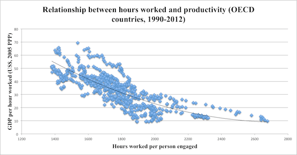
https://www.mic.com/articles/84709/8-charts-to-show-your-boss-to-prove-that-you-can-do-more-by-working-less
They should have posted the equation and r2… 😉
Personally, I goof off a lot, so I can work long hours without a drop in productivity.
Or that higher salaries (=GDP per capita) force employers to use more efficient methods.
commieBob
And, the R-squared value for the trend line through the “amorphous cloud” will quantitatively verify that there is almost no predictive value.
Unless you’re looking for amorphous clouds… 😉
Sometimes, you’re just looking for a subtle trend on the edge of an amorphous cloud.
https://cseg.ca/technical/view/successful-avo-and-cross-plotting
http://www.rock-physics.com/papers_downloads/RPA_simm_et_al_2000.pdf
Trend lines are fine if they are displayed correctly and add useful information, such as smoothing out seasonal variation or showing a long term trend to linear data. The problem arises when people abuse it, such as applying linear trend lines to non-linear data, or extend trend lines beyond the data points, implying a forecast that is likely very poorly thought through and with no confidence intervals.
WR2 ==> While I think you are pragmatically correct: There are those (possibly me among them) that think that trend lines are simply a form of Ultimate Smoothing — smoothing an entire data set into one single straight (or curved in some cases) line. The scientific value of smoothing data sets is in question. In the end, the “smoothed” data must not be confused with the real data — it is not the data — the data is the data. The smoothed version is something else altogether.
Smoothing does not “add useful information” — smoothing actually takes away informational detail and fools us into believing that the resulting “trend” better represents the data. Not everyone agrees with this view.
Trend lines can be use to illustrate a rhetorical point.
Well done Kip.
Anthony ==> Thank you — let me know if you hit the NorthEast Coast.
As William M. Briggs (statistician to the stars) wrote a few years ago “just LOOK at the data”.
Looking at it, I can see the so called global mean temperature is lower now than it was in 1998, and the world didn’t go to hell in a hand-cart then either.
I also have a general rule of thumb which states that the more advanced the level of statistics needed to make a claim, the less significant that claim is. It is a rule that works as well in climate science as it does in pharmaceutical development. No fancy statistics were needed to show that penicillin worked.
Kip
I disagree. The trend line gives an indication of where we are going when looking at a particular parameter, especially versus time. In fact, everything we measure in chemistry and physics depends a lot on the correlation coefficient and the particulars of the trendline.
e.g. in AAS (atomic absorption spectrophotometry) we feed the instrument with standards of known
concentration and read the absorption at a certain chosen wavelength. Depending on the strength of the correlation coefficient at the chosen wavelength we decide to go – or no go – with the trend line for the analysis of a sample of unknown concentration….
HenryP ==> We certainly disagree — but probably because we are talking of different things we both are calling “trend lines”. This issue is pretty well covered in the essay and following comments (search comments for my answers). The Button Collector. There is a follow-up The Button Collector Revisited .
You are talking about the mostly-linear output of known physical/chemical processes — it is the process that produces the future values based on its internal physics/mathematics. What you “see” from the known predictable process when turned into a graphical representation, you are calling a trend line . . . . though it is far from a statistically determined trend.
..but you do it within the range of the known calibration standards. Extending beyond the range of available data is perilous.
“The trend line gives an indication of where we are going when looking at a particular parameter”
Not with cyclic data it doesn’t if it is a straight line.
Osborn ==> Trend lines do not apply to the future….only to the past. It is possible that a trend might continue….and then again, it might not… which of those — continues or does not continue — is not determined by the current trend.
“Trend lines do not apply to the future….only to the past. It is possible that a trend might continue….and then again, it might not… which of those — continues or does not continue — is not determined by the current trend”
People who trade stocks learn this lesson early. 🙂
Tom ==> Yes, sir! They sure do….ask me about investing on oil wells sometime.
@Kip/ Michael/A C Osborn
I show another example:

Rainfall versus time. Measured at a particular place on earth, it is of course looking highly erratic measured from year to year. Not a high correlation…
But the point in showing the straight trend line was to prove a relationship over time i.e. the 87 year Gleissberg cycle.
Henry ==> Your data points already show what is really there — no long term trend. Further analysis (by whatever method you’ve used) seems to reveal a cycle represented by the points in th elower graph — adding the line overlays your opinion or your hypothesis — which the data may or may not support. The line is not evidence of any sort — it is just an illustration of what you wish others to see.
Unfortunately I never had a statistics course in my college in the 50’s when I took electrical engineering. However it had become the trend to teach it when I got out and went to work at a large computer company in 1960. They had an excellent 6 month “new engineer” training program for all newly hired engineers at the time that took up half of each day with various subjects they thought important to their business. One of them was statistics. The instructor was excellent and cautioned us about drawing conclusions from statistical analysis by emphasizing assumptions and also confidence limits, something I don’t hear mentioned much today. The text book he used (I don’t remember the title) had a anonymous quote on the title page that I have remembered all these years:
“Figures don’t lie, but liars figure”
Fergie ==> Yes, I do not mention CIs, etc here, but I did in “Uncertainty Ranges, Error Bars, and CIs“.
CliSci is full of “errorless” quantities — GAST, SLR, “anomalies of all sorts.
I did read your “Uncertainty — ” et al. A great article.
Judging from all the comments that article and this one created, it appears that a wide “Uncertainty Band” exists around the science community as to how valid any data analysis is that has been analyzed using statistics!
Keep up the good work.
Fergie
Fergie ==> Thanks — it certainly kicks up a lot of controversy when I write about it.
Nice post.
Here’s a reminder of how the IPCC tried to mislead readers in its AR4 report, 2007, by drawing short-term and long-term trend lines to make it look as though warming was accelerating:
https://wattsupwiththat.com/2010/04/12/the-new-math-ipcc-version/
Paul ==> Yes, all sorts of tricks used to fool themselves and others. It is the desperate need to show how things are getting worse that drives many of them.
If you start in a time that was called “the little ice age” and you can’t drag anything better out of the numbers over 150 odd years than a wobbly line that goes up a bit maybe, then I suggest that we don’t have much to worry about.
“A chart is an inaccurate representation of a partially understood truth.”
– Shoghi Effendi
In the case of most of what passes for “climate science,” I think we would need to correct that to read:
“A chart is a grossly inaccurate misrepresentation of a mostly misunderstood reality.”
In opposition to Kip Hansen again, and a lot of others, again.
In Spectroscopy, the parameter of interest is proportional to the slope of the line, in many cases. The more points we have, the more accurately the line can be determined and the better our analysis. This is true in many other fields as well. Kip Hansen’s prohibition rules out large swaths experimental chemistry, and drives a truck through a bunch of other fields.
Of course we know our systems, and are well past trying to draw inferences about cause and effect based on a trend line. We are using our lines for quantitative information about our system.
Kip Hansen says we should not do this.
OK, henceforth I will never again draw a trend line over my data. Instead, I shall draw a regression line, and go on my merry way.
Analytical spectroscopy has been around longer than Kip Hansen has, so I think I will keep with the standards of analytical spectroscopy.
If somebody else wants to misuse or abuse their data or mislead their readers, that is on them. (Heaven Forbid, someone attempts to mislead us using poor data techniques! Who would have thought???)
Am I really supposed to change the way I do things because some clown is allegedly misusing trend lines?
The data is the data, we are told. But we also see that The Trend Is The Trend and The Quest Is The Quest!
TonyL ==> It is possible that you are confusing/conflating two different things that “look” the same but are quite different — the trajectory of a cannonball can be fairly confidently predicted based on simple Newtonian physics and, when drawn on a graph, can be confused with a “trend line” (a curving one). You speak of the “slope of the line” which is a parameter of how your data is changing over some other parameter — all this based on a known physical process that that (at least quasi-) linear output. I suspect that you are not calculating a trend line — but something that looks similar.
See my comment above
You are not graphing a trend but a function.
Trend lines *are* functions.
“Trend lines *are* functions.”
But not necessarily the same function the data actually represents.
Phoenix44 ==> Yes — that is what he is doing.
On our SCADA system at work I’ve made lots of trends. But I’ve never made one to prove a point. I’ve made them to accurately give a picture of what was happening. Some are only referred to once or twice a year but they are useful.
I’ve never tried to put a trend line on them. Not sure if I could. I can’t imagine what good one would do.
Now, I have seen trends here of models projections vs actual observations with a line on them. But that line was the average of all the models, not “trend line’ as you’re talking about.
Technically, the data *are* the data. Datum is singular, data are plural… 😉
Trend lines are just equations. Some data sets are amenable to linear regressions, some clearly exhibit a logarithmic or exponential function. Some data sets exhibit no trends at all.
The biggest pitfall is over-fitting, particularly with polynomial functions – Often irresistible.
Again, it all depends on the time series. Some sequences clearly can be linearly extrapolated or interpolated… Some can’t be.
Again, this depends on the data set. The trend line can actually be the function of how one variable affects another… AKA the cause.
That’s not usually done to define a trend. It’s done to make the signal more coherent. Sometimes it works, sometimes it makes hockey sticks.
P-value is used to assess marginal significance, the probability of a given event. Again, it all depends on the data.
The purpose of graphing data is to demonstrate the mathematical relationship between two or more variables, or lack thereof. The equation generated by the trend line is the mathematical relationship. The r2 value (“goodness of fit” or “explained variance”) tells you how well the equation explains the data.
Here is the obligatory XKCD, made me chuckle….
https://www.xkcd.com/2048/
a_scientist ==> XKCD nails it!
The beauty of all those fitted trend lines, is that they are all through the same data points !
Look closely.
XKCD nails it — as usual. (Though I think he is misguided an AGW)
Dave ==> Too much to disagree with — the essay stands on its own merits regarding trend lines.
See my other comments to those who insist they use trend lines doe some useful and sound purpose, and the Button Collector series here at WUWT.
Kip,
You made some interesting points… But almost all of your conclusions were either flat-out wrong or over-generalizations.
Here are a couple of real world examples of why “eye-balling it” isn’t as good as a mathematical trend line:
The pressure gradient is a linear regression – a trend line. You shoot at least 3 pressure points in a reservoir, plot them on a graph, and plot a linear regression. The slope of the trend line is the pressure gradient. While it’s easy to distinguish salt water from oil/gas on a resisitivity log, it’s not always easy to distinguish oil from gas. That’s one of the reasons we take pressures in potential pay sands.
Here’s a check shot survey from a well in the Gulf of Mexico…
Let’s say you’re drilling a well to a seismic anomaly near this well, but deeper. Let’s say your target is at 4,355 ms… What’s the most accurate way to forecast the depth at 4,355 ms? You’ll be shocked to learn that it’s a linear regression: a trend line.