Darwin Temperatures; What is going on?

By Bob Irvine

Darwin Australia is one of only two temperature stations in an entire NASA grid and, therefore, has a disproportionate influence on the NASA-GISS global temperature reconstruction. The other station used by NASA in this grid is Gove (Stn. # 014508). Gove only goes back to 1985 which leaves Darwin as the only station in this grid that dates back to the early part of the 20th century.

Jennifer Marohasy has been an absolute warrior in pursuit of the Australian Bureau of Meteorology (BOM). She has doggedly confronted their bureaucratic maze and called out their consistent and brazen manipulation of Australian temperature data. Her blog post on the recent changes to historical Darwin temperatures is copied below.

https://jennifermarohasy.com/2019/02/changes-to-darwins-climate-history-are-not-logical/

I have used a couple of her plots and added a few of my own in this post.
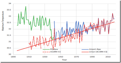
Fig. 1, Mean maximum annual temperatures as measured at the Darwin Post Office (014016) and airport (014015) shown with the new remodeled ACORN-SAT Version 2, which is the new official record for Australia.

Apart from the obvious mismatch with the early Post Office data, the period from about 1940 to the late 1070’s has also been lowered by about half a degree.

The difference between the raw Darwin temperatures and the official BOM temperature in Fig. 1 is quite stark and clearly needs to be looked at.

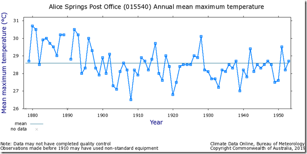
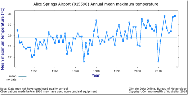
There are only three series that extend from 1910 to the present that are anywhere near Darwin.

They are Richmond which is about 1800km away. Marble Bar about 1800 km away and Alice Springs about 1400 km away. Minimally homogenized Darwin raw temperatures, that allow for the station move, have been overlaid on the raw Richmond series and this is followed by the other two series below.

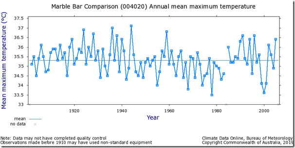
Fig. 2, Annual mean maximum temperatures as measured at Richmond, Qld, charted with a minimally homogenized series for Darwin that combines the post office and airport series into one continuous temperature series making adjustments only for the move to the airport.

clip_image006

clip_image008

Fig. 3, Marble Bar and Alice Springs Temperature series. Marble Bar and Richmond show no significant warming while Alice Springs shows warming from 1910 but very little warming from 1880 to the present.

Presumably these three series were used to homogenize Acorn-Sat version 2 (Darwin) to now show nearly 2.0C warming from 1910 to the present. They are the nearest series to Darwin that cover this period. It is simply inconceivable that Marble Bar and Richmond temperatures could have fallen slightly over this period while Darwin temperatures rose by an astounding 2.0C as BOM are now saying. This is especially true when we consider that Darwin raw temperatures also show a small decline in temperature over 100 years or more.

AUSTRALIAN ADJUSTMENTS

There are 62 Australian locations that have raw temperature data going back to or close to 1910. The station data can be found at; http://www.bom.gov.au/climate/data/

Most of these locations have continuous station numbers and should, therefore, be a valid record for the period and place specified. To quote the BOM;

The Bureau of Meteorology station number uniquely specifies a station and is not intended to change over time, although on very rare occasions a station number may change or be deleted from the record (usually to correct an error). Generally, a new station number is established if an existing station changes in a way that would affect the climate data record for that site (measured in terms of air temperature and precipitation). Significant station moves are an example of this.”

1. Out of these 62 locations there are 25 locations that strictly cover the period 1910 to 2010.

a. Their station #s are; 015540/015590, 38003 R, 9510 R, 031010/031011, 9518 R, 90015 R, 048030/048027, 9534 R, 55023 R, 94029, 012039/012038, 10579 R, 10073, 86071, 076077/076031, 9581, 10111 R, 28004, 30045 R, 26026 R, 66062, 33047 R.

Their average Max. trend is 0.07C/Decade. Their average Min. trend is 0.09/Decade. Total average trend 0.08C/Decade.

2. A subgroup of these 25 stations are 11 rural stations. They are marked “R” above.

Their average Max. trend is 0.04C/Decade. Their average Min. trend is 0.09C/Decade. Total average trend 0.065/Decade.

In 2012 the BOM homogenised this data and added approximately 50 shorter more recent homogenised series to these to come up with an increase in the mean temperature for Australia since 1910 of 0.95°C or 0.095°C/Decade. This was calculated as the mean of the increase in maximum temperature of 0.8°C and the increase of 1.1°C in the minimum temperature. This homogenised data set is known as Acorn-Sat 1.

It can be seen that the BOM homogenisation process and the addition of the extra series has increased this raw trend.

When data that strictly covers 1910 to 2010 is used then this increase is from 0.8 to 0.95.

When rural data that does not include a UHI affect is used then this increase is from 0.65 to 0.95.

These figures from the raw data are very close to the global averages.

In January 2019 the BOM increased their increase from 1910 to 2018 for Australia from 0.95 to 1.23C. This is nearly double the rural raw data figure to 2010 above. This is an outlier when compared to global trends and is known as Acorn-Sat 2.

In June 2015 the Acorn-Sat Report of the Technical Advisory Forum explained these changes as follows;

The effect of homogenisation

The chart below (Fig 4.1) shows the difference in mean temperature anomalies between the homogenised ACORN-SAT and unadjusted AWAP datasets for Australia. Since 1960, there is a noticeable convergence between the raw and adjusted datasets, which most likely reflects the relative increase in the observing station network density over time.

The Forum considers that its own recommendations will deliver improvements to the management and communication of the ACORN-SAT dataset. There is a clear trend increase in both the raw and homogenised temperature data, and the temperature patterns exhibited in a variety of other datasets have a similar character. It is not currently possible to determine whether these improvements will be reflected in an increased or decreased warming trend that has been broadly observed across a range of different datasets.

7 clip_image012
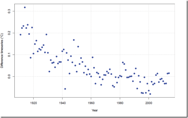
Fig 4.1: Scatter plot of the difference between ACORN-SAT and AWAP mean temperature anomalies

http://www.bom.gov.au/climate/change/acorn-sat/documents/2015_TAF_report.pdf

Australian Climate Observations Network (Acorn-Sat)

Report of the Technical Advisory Forum. June 2015

It is clear from their Fig, 4.1 that they have artificially cooled temperatures significantly before 1960. This report was done in 2015 and comments on Acorn-Sat version 1 from 2012. Acorn-Sat 2 has doubled this artificial cooling of historical temperatures.

The “Forum” commentary does not attempt to discuss this artificial historical cooling and focuses entirely on the post 1960 period that matches reasonably well. This appears to be a little disingenuous. It is also clear that the measured temperature since 1980 has been artificially warmed slightly. The overall affect of these adjustments is exaggerated 20th century warming that suspiciously gives support to the global warming meme.

P.S. Confirmation bias at its very best (or worst).

clip_image013

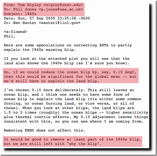
Fig. 4, Climategate email di2.nu/foia/1254108338.txt

Bob Irvine.
0 0 votes
Article Rating
134 Comments
Oldest
Newest Most Voted
Inline Feedbacks
View all comments
April 2, 2019 2:28 pm

There is a station in Australia with data that goes back to 1880s, fortunately no one bothered to correct its data, and gues what? it shows natural temperature variability in sync with and correlated to solar magnetic cycle.
http://www.vukcevic.co.uk/Echuca.htm

climanrecon
Reply to  vukcevic
April 3, 2019 7:18 am

The official name of that station is Echuca Aerodrome, reflecting the fact that it is now at an aerodrome, but obviously wasn’t in the 1880s, it was in the town. My analysis, and metadata summarised by Simon Torok in his thesis, reveals several changes at that station, in 1885, 1925, and between 1974 and 1985, as well as much poor monthly Tmin data between 1888 and 1907. Here is the monthly Tmin data, compared with the regional average, the raw data was “anomalously” warm (relative to conditions at the current location) in the past:

comment image?w=840

climanrecon
Reply to  vukcevic
April 3, 2019 10:10 am

Sorry, probably none of the changes made to the station would have any effect on the correlation you have found.

April 2, 2019 2:31 pm

We live in the “manipulacene”.

Don
Reply to  Robert Kernodler
April 2, 2019 3:51 pm

I think somebody else already dubbed it the “Adjustocene” 🙂

MarkW
Reply to  Don
April 2, 2019 5:56 pm

I adjust, therefore I am.

iain russell
Reply to  Robert Kernodler
April 2, 2019 3:56 pm

!! Corker, cobber!!

observa
Reply to  Robert Kernodler
April 3, 2019 4:54 am

Fiddle-scene.

commieBob
April 2, 2019 2:32 pm

Cook’s constant reigns supreme in weather data. That’s because the unadjusted data is inconvenient for the CAGW narrative. Here’s a link to a classic WUWT story, “Unadjusted Data of Long Period Stations in GISS Show a Virtually Flat Century Scale Trend”. Googling shows that there are plenty of WUWT stories about inappropriate adjustments to Australian data as well. Thank goodness for unadjusted raw data.

Tom Abbott
Reply to  commieBob
April 2, 2019 3:55 pm

“Thank goodness for unadjusted raw data.”

It looks like the data manipulators at NASA are trying to tamper with the unadjusted data now.

https://realclimatescience.com/2019/03/nasa-tampering-with-reykjavik-raw-temperature-data/#comments

commieBob
Reply to  Tom Abbott
April 2, 2019 5:08 pm

You should be able to get photocopies or scans of the original station logs via FOI. Thank goodness for FOI.

Rob_Dawg
April 2, 2019 2:36 pm

Jennifer is a goddess and needs our continuing support.

Regards, the post. “obvious mismatch with the early Post Office data, the period from about 1940 to the late 1070’s has also been lowered by about half a degree.”

“1970s” perhaps. Minor edit.

Thanks to WUWT and JM for fighting the good fight.

Reply to  Rob_Dawg
April 2, 2019 6:11 pm

A goddess? Can we give her burnt offerings? Maybe just warmed offerings. But not too warmed, and certainly not with their warming adjusted.

Rob_Dawg
April 2, 2019 2:41 pm

Somewhat tangent but I must confess to infinite amusement at the growing list of fuzzy descriptions. We have the the “blip” the “blob” and the “pause.” How many others? Perhaps Josh can lend phantasms to our ideations.

April 2, 2019 2:45 pm

Has there ever been a official inquiry into how the Australian Met. people
use the raw data , to then come up with warmer figures. ?

MJE VK5ELL

David Stone
Reply to  Michael
April 2, 2019 3:36 pm

There was an attempt made to investigate the BoM in 2015. Unfortunately the PM at the time, Tony Abbott was “deposed” by his own party and replaced by a pro climate change leader in Malcolm Turnbull, investigation abandoned. Ahhhh the evil power of the climate change movement, it’s made Australian politics rotten right to the top.

RichardX
Reply to  David Stone
April 4, 2019 12:02 am

Tony Abbott was ridiculed in the MSM for saying that CAGW was ‘crap’. Malcolm Turncoat, the turd that cannot be polished, is very wealthy and was heavily invested in renewable energy. He also positioned himself as a devout believer in renewables. The MSM ran a campaign to destroy Tony Abbott and promote Turdbull, knowing that his spectacular incompetence in politics would lead to the defeat of the conservative coalition.

Bruce Clark
April 2, 2019 3:14 pm

As a lay person, I can’t comment on the science but this looks dodgy. Surely the equipment used at each location was fit for purpose at that time and so the data is as good as could possibly be. If the equipment was not fit for purpose, then the BoM must be considered incompetent. If a break occurs due to a location change or equipment upgrade surely the data should should be preserved as individual data sets. If for any reason there is a need to combine two data sets then surely this can be done without manipulation of either set. Show them both with a clear demarcation showing the join and the reason why.

Secondly I would like to point out to anyone contemplating a visit to Alice Springs. Do NOT use the above annual maximum temp chart as a guide. Temperatures in the Australian outback frequently exceed 100F (38C) in summer and can plummet to freezing at night. The concept of an annual average maximum of 26.5 to 31.5C is misleading and dangerous. The outback is a county of extremes, averages are misleading.

Prjindigo
Reply to  Bruce Clark
April 2, 2019 4:56 pm

The equipment used has a margin of error of about 0.15°C per 10°C when the temp rises and about 1.3°C per 10°C when the temperature drops… thats why stations included wet bulb thermometers.

If I could go back in time I’d mandate that two thermometers for both systems of reading be mandated at all times with regular interval interleaved swaps.

James in WNC
Reply to  Prjindigo
April 3, 2019 7:36 am

A man with two watches?

April 2, 2019 3:19 pm

“Presumably these three series were used to homogenize Acorn-Sat version 2 (Darwin) ”

No. Never presume. The station catalogue at http://www.bom.gov.au/climate/data/acorn-sat/stations/#/23090 lists comparison stations (used for detecting discontinuities) and comparative stations (used for making adjustments). Richmond, Alice, and Marble Bar are not used. You should also read the research paper “justifying” version 2 adjustments at http://www.bom.gov.au/climate/change/acorn-sat/documents/BRR-032.pdf .
Acorn 1 adjustments at Darwin were a crock, Acorn 2 are worse. As they are nearly everywhere. I have analysed 76 of these so far and it’s not pretty. See https://kenskingdom.wordpress.com/2019/04/01/acorn-sat-2-0-tasmania-may-the-farce-be-with-you/ and previous posts.
Cheers

legend
Reply to  Ken Stewart
April 2, 2019 4:25 pm

good on you, Ken. I like the website.

RicDre
April 2, 2019 3:32 pm

“Apart from the obvious mismatch with the early Post Office data, the period from about 1940 to the late 1070’s has also been lowered by about half a degree.”

I’m guessing that is supposed to be “from about 1940 to the late 1970’s”.

troe
April 2, 2019 3:44 pm

Where would the quality control in science research that Dr. Ridd calls for take place. In your Parliament, our Congress, or at the elders council around the campfire. That really isn’t happening. Better to destroy the weed by cutting off it’s food supply. Rebuild from there.

Chris Hanley
April 2, 2019 3:56 pm

The Australian temperature homogenization process goes back to 1996:
“… back in 1996 Simon Torok and Neville Nicholls published the first homogenised dataset for Australia, building on the work of Phil Jones and others …”:
https://ipa.org.au/publications-ipa/in-the-news/price-electricity-rising-not-sure-temperatures
This is a link to Simon Torok’s PhD thesis: The development of a high quality historical temperature data base for Australia:
https://minerva-access.unimelb.edu.au/handle/11343/39449
He figured in Climategate emails.
Simon Torok went on to work at the Tyndall Centre for Climate Change Research and latterly with the University of Melbourne School of Earth Sciences and runs a website called ‘scientell’.

Reply to  Chris Hanley
April 3, 2019 9:59 am

Simon Torok and Neville Nicholls published the first homogenised dataset for Australia, building on the work of Phil Jones and others

Well there’s yer problem….

April 2, 2019 4:13 pm

Note that Tom Wigley was speculating on “corrections” for the blip. It is quite clear that the blip is a recorded data error and needs correcting because it does not match the model output; such conceit.

Loren Wilson
April 2, 2019 4:16 pm

That e-mail is damning. Talk about cherry-picking. To you supporters of CAGW, this is reason #2 why I don’t believe anything your side presents. It’s don’t trust, verify.

Caligula Jones
Reply to  Loren Wilson
April 2, 2019 5:47 pm

Now, now, don’t get all huffy, just because you don’t understand a highly scientific term such as “blip”.

Zig Zag Wanderer
April 2, 2019 4:16 pm

Once again we see that Australia had not warmed at all, apart from by adjusting history.

There are only three series that extend from 1910 to the present that are anywhere near Darwin.

They are Richmond which is about 1800km away. Marble Bar about 1800 km away and Alice Springs about 1400 km away.

Apart from highlighting the ridiculousness of homogenisation in Australian temperature data, this also highlights how unimaginably vast Australia is. For example, most people believe Uluru is near Alice Springs in the centre of Australia. In fact it’s a two day drive away (on dirt).

prjindigo
Reply to  Zig Zag Wanderer
April 2, 2019 4:58 pm

Europeans… lol.

Guy says to New York cabby “take me to see the Rocky Mountains”

Every time I hear the story I hope the cabbie ran the meter while explaining the problem

Reply to  prjindigo
April 2, 2019 6:16 pm

I used to live in northern NY. People heard “NY” and said “Hey, Russ, I’m going to be in New York City next week. I should pop up and visit you.” I had to explain to them that I was as far from NYC as San Francisco is from Los Angeles.

ozspeaksup
Reply to  prjindigo
April 3, 2019 3:57 am

true and similar,
worked at Adelaide Hilton many yrs ago.
staff room hilarity as tale told of 2 americans who wanted to do a bus day tour…to Ayers Rock

Reply to  ozspeaksup
April 3, 2019 5:50 am

Americans are not immune.

This I got from a stranger in LA –
“Wow. You come from England? Do you know my uncle?”

Yirgach
Reply to  mothcatcher
April 3, 2019 9:38 am

Old New Jersey joke:

I’m from Jersey.
I’m from Jersey too!
What exit?!?

OweninGA
Reply to  mothcatcher
April 3, 2019 12:32 pm

Did something similar when assigned to Louisiana. Neighbor moving into the apartment next door had a Maryland plate on his car as I did on mine. As we talked he mentioned that his wife was from Scotland. My response was “wow, I bet she grew up with my wife.” Of course my wife is from the small rural outpost of Scotland, Maryland (pop 200) and he meant the country of James VI up there north of England. (She is Glaswegian)

OweninGA
Reply to  prjindigo
April 3, 2019 6:19 am

It’s just tourists in general. I had to explain to a guy in the UK that his itinerary for his US vacation sounded like a great adventure, but was impossible to do in a week. He was going to fly into Orlando and spend two days at Disney with the kids, rent a car and drive out and spend a day at the Grand Canyon, another day in Las Vegas and finally a day at Disneyland in Anaheim and fly back from Los Angeles. He didn’t originally tell me the one week part – I told him that was a great 3 week to month long trip and he didn’t understand what I was saying. I asked him if some American told him they were going to fly into London, rent a car, spend two days sight seeing in London then drive to Paris to spend a day looking at the sights there, then drive to Berlin to see those sights and finally drive to Moscow to look at the Kremlin in a week if he would think it doable. That was when the light started to come on. Then I told him that London to Moscow was about 1,000 mile shorter than Orlando to Anaheim.

Of course, Americans don’t even know how big America is. Most of us really don’t have a clue about the size of Australia (and then you throw those metric units in there and our eyes glaze over). I only know because of military planning. Every time we planned an exercise with our Australian friends, the logistics got complicated by distances that commanders invariably underestimated. The worse part is after planning three exercises, I never got to go. Australia is still on my bucket list and I plan to spend about 3 months seeing as much as possible. (If I have to spend 24 hours on an airplane, I am definitely getting my money’s worth!)

Kemaris
Reply to  OweninGA
April 3, 2019 7:22 am

Last year I drove to Maryland by way of Texas for some construction work. Going back to California, I made it in three days driving about 16 hours a day and crashing at rest stops in Indiana and Wyoming. My God, there’s a lot of flyover country out there.

Darrin
Reply to  OweninGA
April 3, 2019 9:28 am

No kidding even Americans don’t know how big the US is, I don’t know how many times I’ve run into people that have no concept as I’ve traveled around. Here’s one example:

I was in the Navy with another Oregonian, I’m from Western Oregon and He came from an Oregon/Idaho border town. We were talking with another guy from Massachusetts about why we joined the Navy. The Eastern Oregonian mentioned he had only visited the coast a couple of times before joining the Navy. This stunned our MA friend that someone could live in an ocean state without visiting the ocean on a regular basis. He had a hard time understanding that with stops it was an 8.5 – 9hr drive (depending on stops) to go from eastern Oregon to the coast. He could barely accept that as a western Oregonian is was still over an hour for me to reach the coast. But then Oregon is ~98.3k sq. miles vs. 10.5k sq. miles for Massachusetts that he was used to.

On a side note, my sister ran into an New Yorker in NYC that didn’t know Oregon was a state and asked where it was located. My sister told her it was between California and Washington on the west coast. The lady promptly replied there was no state between California and Washington… Our education system at its best.

Caligula Jones
Reply to  Zig Zag Wanderer
April 2, 2019 5:59 pm

Yesterday, the Canadian government “leaked” a Very Scary Climate Report that Canada is “warming” twice as fast as the rest of the world, probably to make the new carbon tax somewhat more digestible.

As mentioned, the actual data used wouldn’t fool regular WUWT readers:

https://twitter.com/RossMcKitrick/status/1113103704364908544

“Canada uses 1948 as the official start because northern coverage is so poor prior to that. It’s too bad we don’t know more about the Arctic climate in the 1930s.”

Most of the “warming”, i.e., less “colding”, was in the arctic, where we have the same issue as Australia: northern Canada is freaking HUGE, with thermometers few and very, very far between.

Reply to  Zig Zag Wanderer
April 2, 2019 7:20 pm

Sorry, one good day’s drive, on bitumen the whole way. We’re not completely in the stone age. But distances are still huge, beyond many European tourists’ comprehension.

Zig Zag Wanderer
Reply to  Ken Stewart
April 2, 2019 7:33 pm

Yes, you are quite right, I just looked it up. Maybe back when I did it there was no bitumen yet. Maybe it was a dodgy Northern Territory cabbie 😉

Reply to  Ken Stewart
April 3, 2019 12:48 am

The geography of Britain is bryond many Briton’s comprehension unfortunately.

Patrick MJD
Reply to  Ben Vorlich
April 3, 2019 2:46 am

I know many Britons that have not been outside Hampshire.

Reply to  Patrick MJD
April 3, 2019 5:59 am

Quote from someone i know:
I went to England once (Newcastle upon Tyne) I didn’t like it much.
It was a day trip.

Patrick MJD
Reply to  Patrick MJD
April 3, 2019 7:00 am

I know another;

Hampshire born, Hampshire bread. Strong in the arm and think in the head.

Peter
Reply to  Zig Zag Wanderer
April 2, 2019 7:55 pm

~ 400km doesn’t take two days to drive (except perhaps in the UK) – more like 4 hours, plus a stop for lunch at Erldunda Roadhouse. Also it has all been bitumen (paved) for quite a few years now.

But yes, people are surprised when their hotel in Alice doesn’t have a view of the rock…

Zig Zag Wanderer
Reply to  Peter
April 2, 2019 9:57 pm

Yes, it was a long time ago now.

Patrick MJD
Reply to  Peter
April 3, 2019 2:50 am

You mean 1400km? That, for some in Aus, is a round trip to the pub over a weekend.

Johnny from Oz
Reply to  Zig Zag Wanderer
April 3, 2019 3:12 am

Rubbish. Yes it’s a long drive from Alice Springs (450kms) but not two days and not on dirt….unless you deliberately choose to have an outback adventure coming from the east or west!

markl
April 2, 2019 4:22 pm

Fif 4 Climategate email di2.nu/foia/1254108338.txt ….. is as damning as anything could be to the “science” involved in the AGW scam. All of the so called “adjustments” going on around the world are orchestrated without a doubt. When I mention this in conversation I get the “conspiracy theory” response. Communicating this to the masses with a biased media gets another likewise response.

April 2, 2019 4:56 pm

Lets face it. Old thermometers were either in the wrong place, could not be read properly, were wrongly calibrated, measured a different kind of heat, were moved, had too many spider webs and they were just plain unscientific.

Reply to  Mike
April 2, 2019 6:09 pm

Worse, I personally know of one that was moved a mile from level ground to the north side of a hill, from farm land to a farm yard right next to a blacktop parking lot, and there is no record of this in the official database. Moved and treated the same is one thing. Moved with no record is far worse.

Thomas
Reply to  Russ Nelson
April 2, 2019 7:52 pm

I know one, in Ohio, that the official record says was moved 5 times, but the written record says was same place for 130 years (closed now, because no warming).

Bruce Clark
Reply to  Mike
April 2, 2019 7:22 pm

A reasonable hypothesis. How then to handle the old data, scrap it and start again with new equipment that is fit for purpose or try to blend it into the new data using some algorithms?

Do we start again with new equipment and measure daily temps from carefully selected and representative locations across the country and across the whole world for that matter. Not airports, not post offices, not parking lots, not industrial estates.

Do we forget about surface temperature due to all the possible conflicts and errors and concentrate on the satellite measurements? Surface temps might be OK for local daily weather purposes but are they good enough to calculate a Global Average Temperature?

Greg Cavanagh
Reply to  Bruce Clark
April 3, 2019 7:33 pm

Drop the entire thing. Averaging surface temperatures over a spinning planet produces a useless value. It’s adding up winter + summer + mountains + deserts; for what? a single averaged value?

It’s junk.

John Adams
Reply to  Greg Cavanagh
April 5, 2019 2:55 pm

+10^

Carl Friis-Hansen
Reply to  Mike
April 2, 2019 11:59 pm

I do not object to some stations being badly calibrated, maintained and read. Other stations may be very well calibrated, maintained and read.
In the 1960’s I helped a few times recording the daily readings of max, min, sun hours, pressure, etc. for the Danish Meteorologic Institute. It was on a remote island, and it was the lighthouse master who was responsible. People back then took pride in doing a proper work, and the instruments appeared to be of good quality and well maintained. Stevenson Screen repainted when needed and faulty instruments changed ASAP.
I do not know the meteorologic culture of Australia, but would be surprised if it was different from the Danish.
Old thermometers are made out of glass, and glass is somewhat fluent and could therefore loose some of it’s precision over time. The same thing can be said about the electronic bridge with Pt100Ω used today.
Not sure what the long term deterioration in the two scenarios are, but assume about 0.1°K per decade. So if a station does not have a service record showing re-calibration at a regular bases, I would not believe the data either. In virtually all industries regular calibration is taken very serious.
You are probably correct, but I doubt you can generalize.

April 2, 2019 6:07 pm

Lookit, you guys, we know the earth is warming. How do we know it’s warming? Because of the greenhouse effect. There’s definitely more CO2 in the atmosphere. This is a fact It’s a greenhouse gas. The greenhouse effect is well understood and is settled science. It’s not a theory. More CO2 INEVITABLY means more warming. So, since we know it’s warming, any actual measurements that don’t show warming, no matter how reliable they *ought* to be, are clearly, obviously, certainly and without a doubt WRONG and need to be corrected to show the proper amount of warming.

Because science is never wrong.

Anybody who denies this is a denier.

Reply to  Russell Neil Nelson
April 2, 2019 7:08 pm

”How do we know it’s warming? Because of the greenhouse effect”.
No that is suspected not ”known”

”There’s definitely more CO2 in the atmosphere. This is a fact It’s a greenhouse gas.”
A bit more of not much is still not much

”Because science is never wrong.”
No but scientists often wrong.

”any actual measurements that don’t show warming, no matter how reliable they *ought* to be, are clearly, obviously, certainly and without a doubt WRONG and need to be corrected to show the proper amount of warming.”

And what’s the ”proper” amount of warming?

I can show you a pristine reading from Macquarie Island showing – for all intents and purposes – no warming.

Reply to  Mike
April 2, 2019 8:35 pm

Mike, I suggest you invest in a new sarcasm sensor.

Reply to  Jeff Alberts
April 2, 2019 9:38 pm

Yes after I wrote that I thought…this can’t be serious! But Russell put his case so alramistly 🙂

Reply to  Russell Neil Nelson
April 2, 2019 7:55 pm

/sarc/ tag needed

Michael Carter
Reply to  Ken Stewart
April 2, 2019 10:31 pm

Nope – any nit could pick it up. Well written I say

🙂

M

bit chilly
Reply to  Michael Carter
April 3, 2019 1:19 am

Michael Carter, the www. is a broad church, read Poe’s law to know why a sarc tag is always needed.

Peter Charles
Reply to  Michael Carter
April 3, 2019 2:51 am

Believe it or not I have actually had almost identical arguments made to me on several occasions by people that actually believe what they are saying or more correctly parroting. Some even have a scientific or technical background.

OweninGA
Reply to  Peter Charles
April 3, 2019 8:06 am

The scientists who parrot this stuff do so because they don’t have time to look at the root data and do a basic analysis. They know THEY would never manipulate experimental data to meet their theory’s needs, so they assume climate scientists wouldn’t either.
Also, as most academics have been thoroughly indoctrinated in Marxist thought, the whole CACC idea supports a whole slew of preconceived political notions so those “scientists” will never be bothered to look.

Reply to  Michael Carter
April 3, 2019 5:30 pm

I have read almost word for word arguments put forth by alarmists even on this forum so if unfamiliar with a particular poster, you can easily be taken in. My post further up however is easily recognized as sarcastic because of the ”humour” included.
In other words…you are wrong. 🙂

Mr.
April 2, 2019 6:19 pm

Climate “science” for the government wallahs involves little other than continuous jiggery-pokery of recorded temps & rainfall.
Competent statisticians can make a case for any position from any given set of numbers.
The problem for western civilisation now, as I see it, is that a bunch of totally amateur statisticians in the guise of “climate scientists” are trying to pull the wool over the voters in all western democracies.
And they’re succeeding, more’s the worry.

Mike Middlebrooke
April 2, 2019 7:26 pm

Who controls the past controls the future: who controls the present controls the past.
-Orwell, 1984

April 2, 2019 7:32 pm

I would never think of Australia as being representative of change in the Southern Hemisphere. It appears as unique as its flora and fauna. I could not help but notice especially in the last year, that neither South America not South African temps follow what happens in Australia. Yet Australia is used as the poster child for climate/weather patterns in the SH as if the other 2 land masses were of no consequence. That can not be right.

yarpos
Reply to  goldminor
April 2, 2019 8:47 pm

A landmark poem written in the late 1800’s by an english girl who had returned to the UK has an often quoted verse:

I love a sunburnt country,
A land of sweeping plains,
Of ragged mountain ranges,
Of droughts and flooding rains.
I love her far horizons,
I love her jewel-sea,
Her beauty and her terror
The wide brown land for me!

Such it has been for a very long time and as commented , not very indicative of anywhere else.

Reply to  yarpos
April 2, 2019 9:35 pm

+10

Patrick MJD
Reply to  yarpos
April 3, 2019 2:43 am

Like the Scandinavian girl recently, she was very impressionable.

Slacko
Reply to  yarpos
April 5, 2019 6:10 am

That’s “rugged” not “ragged.” Sheesh!

IAN BOLTON
Reply to  yarpos
April 13, 2019 4:51 pm

Dorothea Mackellar was born in Sydney, (Point Piper) on 1 Jul 1885, and died on 14 Jan 1968 at Paddington, Sydney (not very far from her birthplace.

“My Country” (original title “Core of My Heart”) was written in London about 1905, and was originally published in the London Spectator.

English girl? Bah, humbug!

But the point is well taken. The Australian climate is one of extremes, and some of these extremes appear to be cyclic – droughts in particular.

Ve2
April 2, 2019 7:33 pm

Completely without shame, completely without morals.

Steven Mosher
April 2, 2019 7:50 pm

“Darwin Australia is one of only two temperature stations in an entire NASA grid and, therefore, has a disproportionate influence on the NASA-GISS global temperature reconstruction. ”

err no. take that grid out. answer doesnt change
take that grid and cool it. answer doesnt change.

Patrick MJD
Reply to  Steven Mosher
April 3, 2019 2:52 am

Is Mosher getting more and more irrelevant these days?

LdB
Reply to  Patrick MJD
April 3, 2019 6:16 am

Apparently Mosher has an answer just it isn’t really relevant to anything and you can’t test it because he won’t make a prediction. However he is certain he has an answer which is a bit like 42 … the trick is to know the question for his answer.

Patrick MJD
Reply to  LdB
April 3, 2019 6:41 am

It’s *

angech
Reply to  Steven Mosher
April 4, 2019 12:35 am

“err no. take that grid out. answer doesn’t change
take that grid and cool it. answer doesn’t change.”

I guess in the global scheme of things, as only one of 20,000 raw temps becoming 60,000 adjusted temps
it has no noticeable effect on the answer.

If however the adjustments here affect other stations and the other stations are having similar adjustments done then there might be a fraction of a change?
Or more.
Especially since Australia has a disproportionately large number of real southern hemisphere land raw observations.

The comment, though germane and true might be somewhat lacking in empathy and sincerity.

Steven Mosher
April 2, 2019 8:03 pm

“There are only three series that extend from 1910 to the present that are anywhere near Darwin.

They are Richmond which is about 1800km away. Marble Bar about 1800 km away and Alice Springs about 1400 km away. Minimally homogenized Darwin raw temperatures, that allow for the station move, have been overlaid on the raw Richmond series and this is followed by the other two series below.”

first clue to do the job correctly you dont need entire overlaps. here is a sampling of stations that all have substantial overlap starting from the begining of the record. There are more. you just have to look

WYNDHAM PORT 433km
HALLS CREEK 728km
TENNANT CREEK POST OFFICE 825km
DERBY POST OFFICE 938km

MrZ
Reply to  Steven Mosher
April 3, 2019 2:08 am

Steven and others.
In relation to your comment and if you have 10 minutes can you review this method.
Excuse the broken English.

http://cfys.nu/videos/Overview.avi

Reply to  Steven Mosher
April 3, 2019 6:14 am

And you still can’t use one to check the other for errors, consistency, whatever. The temp at one location is an intensive variable of that location.

David L Hagen
April 2, 2019 8:28 pm

Excellent effort to Test All Things.
PS Please fix typo from: “1940 to the late 1070’s” to “1940 to the late 1970’s”

angech
April 2, 2019 8:51 pm

Site information Site name: DARWIN Site number: 014015 Latitude: 12.42 °S Longitude: 130.89 °E Elevation: 30 m Locality: Darwin, NT First year of available data: 1910

The airport site (014015) has been operating since February 1941. An automatic weather station was installed on 1 October 1990 and became the primary instrument on 1 November 1996. The site moved about 900 m east (along the southern edge of the airport) on 7 August 2001, with observations at the original site
continuing under the station number 014040 until June 2007.

I used a Flood Map : Water Level Elevation Map to confirm the 30 meter elevation at the airport but still find it very hard to believe. From personal experience the Rapid Creek which runs towards the airport and I nearly drowned in as a child should be close to sea level and the roads from there into the airport have no noticeable elevation. I would find it hard to imagine at absolute most a 15 M elevation. Still it is what they claim.
The old site would have easily been 30 meters being as one has a very steep road up from the wharf to the street where the old post office was.

April 2, 2019 9:37 pm

O/T …the new MEI came out today, … https://www.esrl.noaa.gov/psd/enso/mei/

snikdad
April 3, 2019 12:47 am

In his book 1984, George Orwell says: “He who controls the past, controls the future; and he who controls the present, controls the past.”

Phoenix44
April 3, 2019 12:55 am

I go back to basic logic. If I have a very large data set with random errors in it, then I would expect that the errors would cancel each other out in producing an average. That’s one of the reasons for using averages, and why taking lots of measurement of something and averaging them gives you a better result. So if I try and adjust the errors, the average SHOULD NOT CHANGE, if the errors are random.

The average should only change if there are systemic errors that mean the data errors are more often in one direction than the other.

So if these are random errors, there is no point in undertaking this exercise. If they are systemic errors, you should show the problem. And if you find your error corrections of random errors are moving the average, then you know either you are biased or you have a systemic error.

Mike
Reply to  Phoenix44
April 3, 2019 5:33 pm

Well put and I agree.

Reply to  Mike
April 4, 2019 7:53 am

Mike

you can easily pick up the change when measuring and recording was physical observation as opposed to when it became automatic.

griff
April 3, 2019 1:35 am

Australia: continuing record temperatures, continuing droughts – interrupted by truly exceptional extreme weather events such as recently in Queensland.

bush fires in Tasmania and a complete change to Tasmanian climate.

This is just an attempted distraction from a plainly obvious climate shift across Australia.

Patrick MJD
Reply to  griff
April 3, 2019 2:37 am

It is? I’d like to see this shift because it suggests to me you know what that shift is. Looks like Australian climate to me!

There is one thing, I know what the climate is like here. You have never lived here.

Reply to  griff
April 3, 2019 2:59 am

“This is just an attempted distraction from a plainly obvious …” data manipulation farce.

knr
Reply to  griff
April 3, 2019 3:12 am

most of which seems to be occurring the in past which does indeed seem to experience ‘climate shift ‘ !

Melbourne Resident
Reply to  griff
April 3, 2019 4:41 am

I live in Melbourne – the climate is currently cooling – in fact we have an early autumn after a dry cool summer – gee – get over it – the Queensland weather events were not exceptional – for Queensland – go read Nevil Shute – and that was in the 1950s

LdB
Reply to  griff
April 3, 2019 6:12 am

Oh noes it’s a climate shift across Australia and yet we have more issues with real problems that even in an election cycle no-one except a few Greenies and the leftist media cares. The only two parties that can form government in Labour and Liberal both have token climate action policies and the Green vote will make up around 10-11% if they are lucky.

angech
Reply to  griff
April 4, 2019 12:18 am

Griff,
Stop lying.
“Half a century on from Tasmania’s worst natural disaster, what have we learned from Black Tuesday?
About Black Tuesday:
110 separate fires were burning in south-east Tasmania
It was 39 degrees Celsius
Throughout the day winds reached 110kph
Using today’s rating, the fire warning was “catastrophic”
On February 7, 1967, dozens of fires across south-east Tasmania developed into a firestorm, and within a few hours 64 people were dead, 900 injured, 7,000 homeless and tens of thousands of hectares burnt.
The spring of 1966 in Tasmania had brought with it heavy rainfall and “prolific vegetative growth” followed by “abnormally dry conditions”, according to a report from the committee tasked with investigating the fire and its causes.
The summer of 1966-67 was the driest since 1885″

knr
April 3, 2019 3:14 am

“Who controls the past controls the future; who controls the present controls the past,” in George Orwell’s 1984?
A warning for some , ‘instructions’ for others .

Tom Abbott
April 3, 2019 3:41 am

Who needs global averages?

All you have to do is look at unmodified local and regional temperature charts and you will see that the 1930’s were just as warm as today. And this shows up on every continent and both hemispheres.

That’s all we need to know to understand that the Earth is not experiencing unprecedented warming which means the CAGW narrative is a fiction.

People in the 1930’s could read a thermometer. Massaging these figures with a computer just gives data manipulators the chance to change the historical record and make a new record that supports the CAGW fraud.

We have two sets of records: the unmodified temperature records, and the bastardized, computer verions of these records.

Let’s go with the Old School records. The new computer-manipulated records are not fit for the purpose.

This will have the added benefit of relieving us of having to hear how legitimate all these changes to the temperature record are.

Anthony Banton
Reply to  Tom Abbott
April 3, 2019 5:46 am

“All you have to do is look at unmodified local and regional temperature charts and you will see that the 1930’s were just as warm as today. And this shows up on every continent and both hemispheres.”

You keep saying this, as though magically it will become true.
It wont …..

http://www.realclimate.org/images//GISS-adjustments.jpg
http://www-users.york.ac.uk/~kdc3/papers/homogenization2015/temps_by_adj.png

EdB
Reply to  Anthony Banton
April 3, 2019 6:34 pm

According to Tony Hellers work, the 1930’s were indeed warmer for the continental USA. If you disagree, please go and correct him on his blog.

EdB
Reply to  Anthony Banton
April 3, 2019 6:49 pm

What BS that GISS is. Where do they magically find the ocean temperatures going back in time? As Phil Jones said “we made it up”.

Geoff Sherrington
April 3, 2019 3:58 am

As an observant old Aussie scientist, I can claim to observe only two signs from climate change in the last 50 years.
1. We have breed, collected overseas and exhibited species of the flowering genus Camellia. Fifty years ago, it was less common so see the abundance of large, dark green leaves that we see today ceteris paribus.
2. The formerly-mentioned Sherrington teeth hypothesis indicates enlargement and whitening of human teeth, specially front, top teeth, of those now aged 30 or under. Geoff

Geoff Sherrington
April 3, 2019 4:17 am

Tom,
Sadly, I am finding more indications that some quality control and adjustments were made by supervisors after the original observers inked in their numbers. Not hard to find the occasional cross out with new number. Also, there are maybe too many cases where several Australian stations show sharp daily data break points on the last couple of days of the calendar year – try Dec 1956 for Charleville, Longreach, Gayndah, Bourketown, Normanton, Bourke, Cobar. I use first differences of daily Tmax raw data. But this might be weather, hard to tell. Also, the formal Cwth Year Books and CSIR reports of the 1950s have temperature summaries so different to raw that some form of early adjustment to one or the other is a logical first explanation.
So, treat raw with a sceptical eye until the above oddities are explained. Geoff

April 3, 2019 4:45 am

https://documentcloud.adobe.com/link/track?uri=urn:aaid:scds:US:42f86fb5-bd3a-4bce-a1d2-2e33fe3fa66b

ja, ja.

You got it all wrong: it is globally cooling.

At least that is what I found in 2015

Bindidon
April 3, 2019 5:00 am

Tom Abbott

“All you have to do is look at unmodified local and regional temperature charts and you will see that the 1930’s were just as warm as today. And this shows up on every continent and both hemispheres.”

“We have two sets of records: the unmodified temperature records, and the bastardized, computer versions of these records.”

This is not correct. And as the head posts talks about Australia, here is the top 30 list of a descending sort of the daily temperatures for Australia

ASN00076077 MILDURA POST OFFICE 1906 1 7 50.7
ASN00017043 OODNADATTA AIRPORT 1960 1 2 50.7
ASN00005008 MARDIE 1998 2 19 50.5
ASN00017043 OODNADATTA AIRPORT 1960 1 3 50.3
ASN00076077 MILDURA POST OFFICE 1906 1 6 50.1
ASN00078077 WARRACKNABEAL MUSEUM 2018 1 19 50.0
ASN00011008 MUNDRABILLA STATION 1979 1 3 49.8
ASN00011004 FORREST AERO 1979 1 13 49.8
ASN00006072 EMU CREEK STATION 1998 2 21 49.8
ASN00048013 BOURKE POST OFFICE 1903 1 4 49.7
ASN00048013 BOURKE POST OFFICE 1878 1 13 49.7
ASN00074128 DENILIQUIN (WILKINSON ST) 1878 1 12 49.6
ASN00017123 MOOMBA AIRPORT 2013 1 12 49.6
ASN00038002 BIRDSVILLE POLICE STATION 1972 12 24 49.5
ASN00018201 PORT AUGUSTA AERO 2019 1 24 49.5
ASN00076077 MILDURA POST OFFICE 1906 1 24 49.4
ASN00076077 MILDURA POST OFFICE 1904 12 31 49.4
ASN00074128 DENILIQUIN (WILKINSON ST) 1863 1 5 49.4
ASN00018103 WHYALLA (NORRIE) 1960 1 2 49.4
ASN00017031 MARREE COMPARISON 1960 1 2 49.4
ASN00011016 MADURA STATION 1971 1 7 49.4
ASN00006072 EMU CREEK STATION 1998 2 16 49.4
ASN00004035 ROEBOURNE 2011 12 21 49.4
ASN00018044 KYANCUTTA 1939 1 9 49.3
ASN00017123 MOOMBA AIRPORT 2014 1 2 49.3
ASN00004106 MARBLE BAR 2018 12 27 49.3
ASN00052026 WALGETT COUNCIL DEPOT 1903 1 3 49.2
ASN00048013 BOURKE POST OFFICE 1878 1 19 49.2
ASN00018044 KYANCUTTA 2019 1 24 49.2
ASN00017043 OODNADATTA AIRPORT 1960 1 1 49.2

Anybody can find this data in the GHCN daily dataset:
ftp://ftp.ncdc.noaa.gov/pub/data/ghcn/daily/

but it is not quite easy to process :-(.

As you can see, Tom Abbott, there is no visible predominance of the 1930’s in this top30: 1939 occurs at position 24, and the next appearances of any year of that decade are at positions 68, 153, 154, 194 and so on.

Conversely, years after 1999 appear 7 times in the list (and 45 times within the top 100).

This is raw, raw data. No adjustments were made, only suppressions due for example to incorrect handling of Fahrenheit temperature measurements in the USA (and in very early Australian records) which were silently transmitted as Celsius. You can detect them through sudden bumps in the daily data (unless you are at -40).

No: I’m not a warmist.
I like to keep a correct look at data sets.

MrZ
Reply to  Bindidon
April 3, 2019 7:45 am

Hi Bindidon!
Remember me from discussions over at Roy’s before X-MAS?
Here is where I am at with the project.
Plan is to do the same for all major countries starting with US, Australia, UK and Germany
http://cfys.nu/videos/Overview.avi

Bindidon
Reply to  MrZ
April 3, 2019 9:26 am

Hi MrZ

Of course I do… I’ll look at your video as soon as I have time to do.
Actually I’m working on sea levels…

Regards
J.-P. D.

Robert W. Turner
April 3, 2019 6:16 am

This is why many of us claim the Earth is already cooling. Australia isn’t the only place where the raw data of the early 20th century data is magically cooled to fit the politically correct trend.

Rod Evans
April 3, 2019 7:10 am

I feel sorry for our Canadian friends. They need the world to warm by a few deg C in order to enjoy the magnificent outdoors they own. Cabin fever beyond the few months summer months when the snow has finally melted can be a real problem.
Now the world is in a cooling phase, as evidenced by all un-adjusted monitoring stations, the natural cyclical warming that has taken place over the past 35 years will be reversed and Canada will have even shorter summers. Roll on 2055 when the next warming cycle should come along….if we are lucky.

Steve O
April 3, 2019 7:19 am

There’s this idea that scientists are on a quest to find truth. Well, it’s true. They are. But when their academic status and prestige become dependent on their publicly stated position being right, then they work to defend their position.

Is anyone on the alarmist side is criticizing Tom Wigley and Phil Jones for trying to fit the data to their theory rather than the other way around? If they believe that the data is unreliable enough such that impactful adjustments are justified, then the data is unreliable enough that spending trillions of dollars is not justified,no matter what the conclusions.

April 3, 2019 9:23 am

Looking at data from more than 50 years ago and comparing it with data from now is like comparing apples with pears.

for the following reasons, i.e how they worked 50 years ago:

1) the accuracy of the thermometer was at best 0.5 degrees but probably worse than that at many stations.
2) physical observation, a few times a day (what happened if someone got sick?), versus continuous automatic observation now
3) physical writing/ reporting of results, a few times a day, versus continuous recording by a computer now,
4) mercury thermometers were not re-calibrated every year, as they should have been as per current protocol, versus thermo couples that are calibrated every year. The error due to this is in fact quite substantial.

There is something else that is wrong with all current data sets, namely they are biased towards the NH and nobody thought of establishing a good balance between Nh and Sh.

If everyone did it right, taking into account a few basic principles in the sampling of weather stations they all should in fact get the same result as I got, at least for the past 45 years…

https://wattsupwiththat.com/2019/04/02/darwin-temperatures-what-is-going-on/#comment-2671568

Caligula Jones
Reply to  henryp
April 3, 2019 10:08 am

Yes, but the True Believers will counter with: “but we have SO much data that over time, all these small discrepancies will be evened out…”

There are numerous charities concerning illiteracy. Very many public services concerning reading. Libraries. Etc.

Serious question: has anyone every even heard of such resources being put into learning MATH?

As I keep saying, people are almost proud of innumeracy (in the old days, it was “hehe, I can’t even balance a checkbook” – do they still have those). They would never admit to being illiterate. Although “being dyslexic” is as overused as “on the autism spectrum” is now…

Reply to  Caligula Jones
April 3, 2019 10:42 am

Cal
If they did it right they would find it is globally cooling. And it is quit simple really.
Click on my name to read my report.

knr
Reply to  henryp
April 3, 2019 2:34 pm

Much of the historic data and some of the current data in this area is of the type ‘better than nothing ‘ and that is before we get to magic tree rings and other proxies which are ‘a little better than nothing ‘
Its one of the reason that today despite of the amount of computing power they throw at the tasks , they still get weather forecasts wrong on a regular basis .
If you where consider what the experimental design would look like, to take these measurements in a scientifically valid manner, and then compare that to what is actual done , just how big a gap would there be?

Bindidon
April 3, 2019 10:12 am

Bob Irvine

“Darwin Australia is one of only two temperature stations in an entire NASA grid and, therefore, has a disproportionate influence on the NASA-GISS global temperature reconstruction.”

Sorry, your attitude is not quite correct.

Simply because you underestimate the major role of the grid mechanism, which is to attenuate unduly dominance of those corners in the Globe where stations are historically overrepresented: the USA, and to a somewhat lesser extent, Europe and Japan.

When gridding, you move from a situation where 18000 US stations compete with 18000 stations outside of the US and therefore 6 % of land surface are represented by 50% of the stations, to a situation where 200 US grids compete with 2000 grids outside of it. The same holds of course when looking at other overrepresented places.

But even locally, this has the advantage that in a grid, even a station or two in Darwin will be better represented in that grid than if they had to compete with all Australian stations and the grid interpolations all around.

The difference in the US is visible: look at two graphs showing the averaged daily maxima per station per year in the CONUS,

– without gridding
https://drive.google.com/file/d/1qGV5LfKw_lFKNdZMlq15ZHz6sA1CA294/view
and
– with gridding
https://drive.google.com/file/d/16XwogXkjltMuSzCdC5mPKqC1KNev4ayy/view

MrZ
Reply to  Bindidon
April 3, 2019 2:35 pm

Bindidon,

Please watch the video when you have time. It is about gridding and other things. Dealing with official data.

davetherealist
Reply to  Bindidon
April 3, 2019 5:13 pm

so by your own charts, gridding is making the results warmer and actual data shows cooling. Gridding is the same as guessing. 1 station cannot represent 1/2000 of the earth in an equation. There is often a 10-15 degree difference from one side of my town to the other. Do you propose that the high for the town for that day is the average between the 2 spots? or do you keep the warmer temperature produced inland just a few miles? Its all guesswork , infilling and very unscientific. Gridding is garbage. 1 station = 1 station and the records shall remain untouched. but that’s not how warmunist operate. when historical records are adjusted to fit a theory its fraud.

1sky1
April 3, 2019 1:47 pm

The fantastic notion that poorly coherent records from stations considerably more than 1000 km apart can be used effectively to “homogenize” any data series is a staggering example of analytic nonsense. It’s even more egregious than calling the time-series of discrepancies shown in Figure 4.1 a “scatter plot.” Who can take such sorry incompetence seriously?

Bindidon
April 3, 2019 3:08 pm

henryp

I read your comments above.

1. “You got it all wrong: it is globally cooling.”

From your personal standpoint, using no more than a few dozens of arbitrarily chosen stations: no wonder!
But… there are quite a lot more of them on Earth.

GHCN daily for example has nearly 36000. Even if we would take out all located in the US, there would still remain 18000 outside of that country.

2. “There is something else that is wrong with all current data sets, namely they are biased towards the NH and nobody thought of establishing a good balance between Nh and Sh”

No: it is not wrong. You are measuring land temperatures, and that NH has more of them than the SH doesn’t play any role because the SH has an enormous sea surface overhead.

If you wanted to equilibrate NH and SH at land level, you then would have to do the same job for SST: this is nonsense.

Here is a graph showing, for all available stations, TMAX and TMIN temperature anomalies wrt the mean of the reference period 1981-2010:
https://drive.google.com/file/d/1ESDd0LROc53jvSm1rZFhjkaQqif7tZ5R/view

Trends as usual in °C / decade.

1. 1895-2018
— tmax 0.06 ± 0.003
— tmin 0.11 ± 0.003
2.1980-2018
— tmax 0.30 ± 0.01
— tmin 0.20 ± 0.01
3. 1990-2018
— tmax 0.26 ± 0.01
— tmin 0.20 ± 0.01
4. 2000-2018
— tmax 0.32 ± 0.02
— tmin 0.22 ± 0.03

What we see here is what many bloggers and commenters have explained ad nauseam: the long term trends for minima are higher than that for maxima. This is even more visible when looking at absolute value plots: the minima plots often cross the maxima plots in recent periods.

*
I have nothing against a moderate global cooling: excessive global warming clould lead in a more or less near future to considerable temperature drops where I live.

But.. as opposed to yours, the data I present here does not show cooling at all.
What about using many many more samples, henryp?

EdB
Reply to  Bindidon
April 3, 2019 5:20 pm
Bindidon
Reply to  EdB
April 4, 2019 12:46 am

Who would ever trust in what appears on one of the web’s most tricky pages?
You?

Bindidon
Reply to  EdB
April 4, 2019 2:08 am

But coming back to your question without the underlying polemic concerning Pierre Gosselin, I can only say you:
– look at hte worldwide maxima in the chart above, there are peaks in the 1930’s but the 1920’s were warmer;
– what you expected to see you will rather find when you look at the yearly maxima averages in the US. Then you see 1934 and 1936 at the top, if I well remember.

Bindidon
April 3, 2019 3:25 pm

Bob Irvine

Below the plot you pasted from Dr Mahorasy’s February guest post, I read:

“Mean maximum annual temperatures as measured at the Darwin Post Office (014016) and airport (014015) shown with the new remodeled ACORN-SAT Version 2, which is the new official record for Australia.”

Would it be possible to obtain links to the ACORN-SAT data (V1 and V2) for the two Darwin stations?

I did not see any link to such data, and would like to compare it with the raw GHCN daily data:
https://drive.google.com/file/d/162erQtCxHaXR3FaPKZqSR5mMSL1ceh_P/view

Thanks in advance.

Bindidon
Reply to  Bindidon
April 3, 2019 3:32 pm
RichardX
April 3, 2019 11:26 pm

Bureau Of Mendacity up to its usual tricks. They seem to me to have a compulsion to “homogenise” data from one weather station with data from another one hundreds of miles away in a very different climatic area. One that comes to mind was data from somewhere in the Victorian ski country being ‘homogenised’ by data from a hot, dry, area a few hundred kms away. Cold, wet area vs hot, dry area. That will work.

I’m also disturbed by their utter contempt for the early weather people that were dedicated to measuring the temperature accurately. Their thermometers might not have been able to read the temperature every millisecond to a millionth of a degree, but their readings are the most accurate raw data we have. Dismissing their data is a very ignorant act. Most scientists I’ve spent time with have a very strong respect for their forbears. Not the BoM.

Bindidon
April 4, 2019 1:17 am

dave the ‘realist’

A. The grid average data shows for the US, in comparison with the direct station average,
– a big decrease of maxima above 35 °C per station per year;
– a small increase above 40 °C.

You claim exactly about the inverse of what I have shown.

B. That worldwide an increase is shown that is not visible in a direct station average is evident: it is due to the fact that the direct average is entirely dominated by the 18000 US stations.

1. US without gridding
https://drive.google.com/file/d/1qGV5LfKw_lFKNdZMlq15ZHz6sA1CA294/view

2. Globe without gridding
https://drive.google.com/file/d/1GMuNs9ptRzDd7KxFQbKv0o5ySR5VNc9b/view

(1) and (2) look nearly identical, what is completely wrong. The Globe does NOT show like little 6 % of its land surfaces!

3. Globe without gridding, but without the US stations
https://drive.google.com/file/d/1UcLK3usYjICeHeAsAb5ivcusW0Y0EdNe/view

4. Globe with the US stations, but with gridding
https://drive.google.com/file/d/1TFdltVVFSyDLPM4ftZUCEl33GmjJnasT/view

Now you have a situation where 200 US grids are compared with 2000 Globe grids: that is 10 % instead of 50 %.
Is that SO DIFFICULT to understand, dave?

Maybe you should learn to read charts correctly, and to think a bit before writing agressive replies having nothing to do with what I wrote? Thanks in advance.

April 4, 2019 7:31 am

Bindidon says

But.. as opposed to yours, the data I present here does not show cooling at all.

https://drive.google.com/file/d/1ESDd0LROc53jvSm1rZFhjkaQqif7tZ5R/view

Henry says

You are [still] wrong because you are sampling the weather stations the wrong way….

you are also looking at results from the wrong time…you cannot compare apples with pears?
i.e.

https://wattsupwiththat.com/2019/04/02/darwin-temperatures-what-is-going-on/#comment-2671741

Now, I am willing to lead you in the right direction, but I m sure I have tried this before but you are not interested.
If you did it right you should get something like this.

https://documentcloud.adobe.com/link/track?uri=urn:aaid:scds:US:42f86fb5-bd3a-4bce-a1d2-2e33fe3fa66b

at least, that is what it looked like in 2015.

Why don’t you duplicate my results and let me know what it looks like now?

On a side note,
must say that your graph does not really prove man made global warming.

You tell me why?

Bindidon
Reply to  henryp
April 4, 2019 12:01 pm

henryp

“You are [still] wrong because you are sampling the weather stations the wrong way….”

Which wrong way?

*
“you are also looking at results from the wrong time…you cannot compare apples with pears?”

Which wrong time? I published above the trend for the same periods as you did:

2.1980-2018
— tmax 0.30 ± 0.01
— tmin 0.20 ± 0.01
3. 1990-2018
— tmax 0.26 ± 0.01
— tmin 0.20 ± 0.01
4. 2000-2018
— tmax 0.32 ± 0.02
— tmin 0.22 ± 0.03

Which apples and pears do you mean?

The only difference between us is that
– while you deliberately have picked a little set of stations (less than 100 worldwide!!!)
– I preferred to take more data, namely out of 9500 stations located in about 1800 grid cells of 2.5 degree each.

*
“On a side note, must say that your graph does not really prove man made global warming. ”

I never pretended that this graph would show man made warming.

You were the one who pretended the world to be cooling, and I contradicted your opinion because from my point of view it was based on a too small sampling set.

Reply to  Bindidon
April 4, 2019 12:25 pm

bindidon says
1) Which wrong way?
2) Which wrong time?
3) Which apples and pears do you mean?

Henry
1) the right way is [and I repeat]
a) equal stations nh and sh
b) all stations balanced to 0 latitude [or as close as possible]
c) all stations 70% at sea and 30% inland
d) to avoid bringing in longitude as a variable (why?) , rather look at the derivatives of the least square equations giving you the speed of warming/ cooling
e) setting out the speed of warming against time gives you the acceleration of warming/ cooling

if you did it right you should get the same result as I did?

2) not before 1970’s

3) https://wattsupwiththat.com/2019/04/02/darwin-temperatures-what-is-going-on/#comment-2671741

Good luck!
Let me know what you find?
BW
Henry

Reply to  henryp
April 4, 2019 12:30 pm
Frank
April 6, 2019 1:50 pm

Bob Irvine: A belated comment: Temperature change since about 1970 is critical. Temperature change before then is fairly irrelevant, because it wasn’t driven by forcing from rising GHGs. A good chunk of the warming from 1920-1945 is assumed to be unforced/internal variability. Net forcing gradually rises to about 0.7 W/m2 over almost a century by 1970 and the another 1.6 W/m2 over the next 40 years (and probably 2.0 by the end of the current decade). The CAGW is all about climate sensitivity – how much warming is being produced by how much forcing. That’s transient climate sensitivity. When ocean heat uptake is subtracted from forcing, you can get ECS.

Is the temperature in Darwin before 1950 going to make a big difference? Maybe. If the planet were 1.0 degC warmer (or cooler) sometime before 1970 than it was in 1970, then our ideas about the major drivers of climate change will need to include unforced variability as well as well as anthropogenic forcing. If the planet were 0.5 degC warmer (or cooler) sometime before 1970 than it was in 1970, then forced warming since 1970 could be anywhere between 0.4 and 1.4 degC, and not the 0.9 degC that goes into calculations of climate sensitivity.

comment image