A Guest Post By Bob Tisdale
This is a long post: 3500+ words and 22 illustrations. Regardless, heretics of the church of human-induced global warming who frequent this blog should enjoy it. Additionally, I’ve uncovered something about the climate models stored in the CMIP5 archive that I hadn’t heard mentioned or seen presented before. It amazed even me, and I know how poorly these climate models perform. It’s yet another level of inconsistency between models, and it’s something very basic. It should help put to rest the laughable argument that climate models are based on well-documented physical processes.
INTRODUCTION
After isolating 4 climate model ensemble members with specific characteristics (explained later in this introduction), this post presents (1) observed and climate model-simulated global mean sea surface temperatures, and (2) observed and climate model-simulated global mean land near-surface air temperatures, all during the 30-year period with the highest observed warming rate before the year 1950. The climate model outputs being presented are those stored in the Coupled Model Intercomparison Project Phase 5 (CMIP5) archives, which were used by the Intergovernmental Panel on Climate Change (IPCC) for their 5th Assessment Report (AR5). Specifically, the ensemble member outputs being presented are those with historic forcings through 2005 and RCP8.5 (worst-case scenario) forcings thereafter. In other words, the ensemble members being presented during this early warming period are being driven with historic forcings, and they are from the simulations that later include the RCP8.5 forcings.
First, we’ll identify the 30-year period with the highest observed warming rate before 1950.
For climate model outputs, after presenting the multi-model mean, I first present the outputs of all 81 ensemble members (individual climate model simulations) to give you an idea of the lack of agreement among the ensemble members during the identified early warming period. Then we’ll isolate (1) the ensemble members with the highest and lowest global mean surface temperatures during that early warming period and (2) the ensemble members with the highest and lowest trends in global mean surface temperatures during that period. Those four model-ensemble members will be used for the model-data comparisons described above; i.e. global sea surface temperatures and, separately, global land near-surface air temperatures.
Last, I compare modeled global sea surface temperatures with modeled marine air temperatures and list the temperature difference for each of the ensemble members presented in this post. Would it amaze you to discover the temperature difference between modeled global sea surface temperatures and marine air temperatures is not consistent? It amazed me.
Those readers who are not aware of how poorly climate models simulate the primary metric of climate change—global mean surface temperature—will likely be surprised by these results.
Note: I’m presenting four different metrics in this post. To make it easier for readers, I’ve added an additional identifier to the illustrations. In them, immediately above the left-hand corner of each graph, I identify (underlined in parentheses) whether the graph is presenting data or climate model outputs for (Land+Ocean) surfaces, (Ocean Only) surfaces, or (Land Only) surfaces. [End note.]
THE CHOSEN 30-YEAR PERIOD
Figure 1 presents a model-data comparison that shows the 360-month (30-year) trends in observed and climate-model-simulated global mean land+ocean surface temperatures. It may look familiar to many of you. I used to present the same graph (without most of the notes) in my monthly Global Surface Temperature and Lower Troposphere Temperature Updates, cross posts at WattsUpWithThat are here. As noted at the bottom of Figure 1, The Period Ending about 1945 Has The Highest Observed Warming Rate before 1950. The Data Trend Is More Than 3 Times Higher Than the Trend for the Climate Model Hindcasts for that Period!
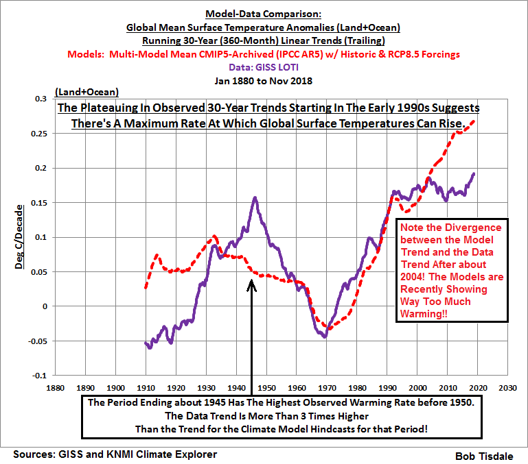
Figure 1
Figure 1 gives you an initial idea of how poorly the climate models simulate global surface temperatures during the early 20th Century warming period of 1916-1945. Note that the GISS Land-Ocean Temperature Index (LOTI) data indicate global surfaces [ warned as] warmed at a rate of about +0.15 Deg C/decade for the period of 1916 to 1945, while the model outputs indicate they should have warmed at a much lower rate of about +0.05 deg C/decade if global temperatures were dictated by the forcings that are used to drive the number-crunching models. Apparently multidecadal changes in global surface temperatures in the real world are not dictated by the forcings that drive the fantasy world models. Because the models, which are forced primarily by numerical representations of anthropogenic greenhouse gases, can’t explain the warming during that period, then the additional two-thirds of the warming that actually occurred during that period must have occurred naturally. That of course raises the question: If two-thirds of the warming during period of 1916-1945 occurred naturally, is Mother Nature responsible for two-thirds of the observed warming during the latter part of the 20th Century and into the early 21st Century? The fact that the models better align during the latter warming periods is immaterial, because climate models are tuned to that period, so the models cannot be verified or validated then. The models can only be verified or validated—or invalidated, if you prefer—during periods outside of those they are tuned to, like the early warming period of 1916 to 1945.
A note for newcomers: The graph in Figure 1 is not how global mean surface temperature data are normally presented, so a graph like this may be confusing if you’re not familiar with it. For those requiring an explanation, first note the Title Block where the third line reads “Running 30-Year (360-Month) Linear Trends (Trailing)”. Also note the units of the y-axis (the vertical axis) shown to the left of the graph. The units are Deg C/Decade, not simply Deg C. In other words, we’re illustrating trends in the graph: how quickly or how slowly global surfaces warmed or cooled over those 30-year periods. The surface temperatures were rising if the data points are positive or falling if the data points are negative. The greater a positive [negative] data point is, the faster the surface temperatures were rising [falling] over the 30-year period. Conversely, the closer a data point is to zero, the slower the surface temperatures were rising (positive data points) or falling (negative data points) over the 30-year period. Also note the word “Trailing” in the third line of the title block. That means the trend for every 30-year (actually 360-month) period is shown in its final month. The x-axis, of course, is time in years.
If a series of data points is growing farther and farther away from zero with time, that means the 30-year trends are accelerating. Conversely, if a series of data points is growing closer and closer toward zero with time, that means the 30-year trends are decelerating. That is, if the values are still positive, a drop with time in 30-year trends does not mean the surface temperatures are cooling. It shows that they are still warming but at a slower rate. To be showing cooling, the data points have to drop into negative values.
[End note.]
Figure 2 presents the 30-year trends in the GISS Land-Ocean Temperature Index (LOTI) data, using annual data. The fact that the 30-year period with the end year of 1945 has the highest 30-year warming rate before 1950 is clearer in Figure 2 than Figure 1.

Figure 2
In light of that, for the remainder of this post, I’m presenting data and the outputs of climate model simulations of the global mean surface temperatures (land+ocean, ocean only, and land-only) for the 30-year period of 1916 to 1945.
And for the remaining graphs in this post, I’m presenting normal time-series graphs, in which the units are degrees Celsius.
Later, after isolating four climate model ensemble members, I’ll present model-data comparisons of (1) global land near-surface air temperatures and (2) global sea surface temperatures. Then, to end the post, I compare modeled marine air temperatures and sea surface temperatures for each of the 4 ensemble members.
A CLOSER LOOK AT OBSERVATIONS-BASED DATA
Figure 3 presents the annual global mean land+ocean surface temperature anomalies with data from Berkeley Earth—data here—and from NASA Goddard Institute for Space Studies (GISS)—data here. To better align the two datasets during this period, I’ve referenced the anomalies to the period of 1916-1945, so you can see the subtle differences between the two datasets.

Figure 3
The Berkeley Earth data have a slightly higher trend (+0.166 deg C/decade) than the GISS data (+0.153 deg C/decade).
CLIMATE MODEL OUTPUTS
As stated in the Introduction, the climate model outputs being presented are those stored in the Coupled Model Intercomparison Project Phase 5 (CMIP5) archives, which were used by the United Nations’ entity called the Intergovernmental Panel on Climate Change (IPCC) for their 5th Assessment Report (AR5). The models being presented are those with historic forcings through 2005 and RCP8.5 (worst-case scenario) forcings thereafter. The model outputs are available to the public through the KNMI Climate Explorer, specifically through the Monthly CMIP5 scenario runs webpage. (Thank you, Geert Jan van Oldenborgh, for that wonderful tool.)
Initially in this post, I’m presenting the climate model simulations of near surface air temperatures (identified as TAS at the KNMI Climate Explorer) for the latitudes of 90S-90N, and the longitudes of 180W-180E, in other words, globally.
Then after isolating the model ensemble members with the coolest and warmest outputs and the highest and lowest trends, we’ll compare observed and climate model simulations of global sea surface temperatures during the early warming period. At the KNMI Climate Explorer, the climate model simulations of sea surface temperatures are identified as “TOS”, assumedly for Temperature Ocean Surface. Then we’ll use the simulations of near surface air temperatures again but isolate the land masses with the land/sea masking feature at the KNMI Climate Explorer.
You’ll note that I’ve identified the RCP forcings the modelers used after 2005 (RCP8.5) even though we’re looking at the climate model outputs for the 30-year period of 1916 to 1945. I’ve done this for persons who want to verify my results. The reason: The CMIP5 archive and the KNMI Climate Explorer contain the outputs of climate model simulations (runs) from the same models with the historic forcings through 2005 but with different RCP forcings after 2005. The simulations of global mean surface temperatures may be different with each model run; in fact, they’re likely different. So I wanted to make sure that anyone verifying the results was looking at the same model outputs.
BUT THE DATA EXCLUDE ANTARCTICA DURING THIS PERIOD WHILE THE MODELS INCLUDE ANTARCTICA
Anyone with a good understanding of the instrument temperature record will realize that little to no observations-based data exist for Antarctica before the early 1950s, so the Berkeley Earth and GISS datasets shown in Figures 1, 2, and 3 exclude observations from Antarctica. On the other hand, the climate model outputs presented in Figures 5 through 8 of this post are for the global land-ocean surfaces (90S-90N) so they do include Antarctica.
If that concerns you, see Figure 4. It presents the trends and period-averaged temperatures for the multi-model mean of the simulations of global land+ocean surface air temperatures from the models stored in the CMIP5 archive, for the period of 1916-1945, including and excluding Antarctica and the Southern Ocean. Also presented are the trend and period-averaged temperature for Antarctica and the Southern Ocean.

Figure 4
With or without Antarctica and the Southern Ocean, the trends of model-mean are basically the same. The difference is only one one-thousandths of a degree Celsius per decade (0.001 deg C/decade). The period-averaged temperatures are different, as one would expect with the cold continent of Antarctica. That is, without Antarctica and the Southern Ocean, modeled global mean near-surface air temperatures are a little more than 2 deg C higher than if they are included.
That explains why I did not present the data in Figure 3 above in observed (not anomaly) form…what the climate science industry would call absolute temperatures. Factors are available online to convert the Berkeley Earth and GISS global mean surface temperature data from anomalies back to the observed (not anomalies) form, but those factors are for the base period of 1951-1980, a period during which data from Antarctica are included. I didn’t want to bother with an additional anomaly-to-not-anomaly factor for the data during 1916-1945 when Antarctic data are excluded.
The models, as you shall see, don’t need any additional help from me to look horrible.
Enough with the backstory…
THE INITIAL PRESENTATIONS OF THE CLIMATE MODEL OUTPUTS
Figure 5 presents the multi-model mean of the simulations of annual global mean land+ocean near-surface air temperatures. We present the multi-model mean because it represents the consensus (better said, the groupthink) of the climate modeling groups for how global near-surface air temperatures should have warmed IF (big if) they were dictated by the forcings that drive the models. The curve in Figure 5 is the same curve as the light-blue one in Figure 4, but it looks much more dramatic in Figure 5 because of the tighter range of temperatures in the y-axis.

Figure 5
As discussed and illustrated earlier, the Berkeley Earth and the GISS observations-based data indicate global mean surface temperatures warmed at a rate that was more than 3 times faster than hindcast by the models for the period of 1916-1945. That’s a pretty horrendous display of modeling capabilities. In plain words, the disparity between the observed and modeled global mean surface warming rates during this early 20th Century warming period indicates that the climate-science industry has no idea whatsoever about what causes global surfaces to change over multidecadal periods, none whatsoever.
As noted in red in Figure 5, a multi-model mean can be misleading, inasmuch as it gives the false impression of an agreement among models in terms of temperatures and trends. See Figure 6. The multi-colored spaghetti graph in Figure 6 presents the curves of all 81 ensemble members that make up the multi-model mean in Figure 5.

Figure 6
As is obvious, the span of the period-averaged global mean surface temperatures of the climate models stored in the CMIP5 archive, with historic and RCP8.5 forcings, is greater than 3 deg C. The models surely have the actual surface temperatures surrounded, whatever they actually are during this period. That 3-deg C span indicates the modelers have no idea what the global mean surface temperature is supposed to be during this period.
Figure 7 displays ensemble members with the warmest, coolest, and 2nd coolest simulated global mean surface temperatures. They are the ensemble members identified at the KNMI Climate Explorer as GISS-E2-H p3, FGOALS-g2, and IPSL-CM5A-LR EM-1. Specifically:
- GISS-E2-H p3 is Warmest with a period-averaged global mean surface temperature of 15.4 deg C,
- FGOALS-g2 is Coolest with a period-averaged global mean surface temperature of 12.2 deg C, and,
- IPSL-CM5A-LR EM-1 is 2nd Coolest with a period-averaged global mean surface temperature of 12.4 deg C.
The difference in the period-averaged global mean surface temperatures, between the GISS-E2-H p3 (warmest) and FGOALS-g2 (coolest) ensemble members, is 3.2 deg C.

Figure 7
Note: The top 6 warmest models during this period are all products on the Goddard Institute for Space Studies (GISS). [End note.]
Now consider this: the 3+ deg C difference between the coolest and warmest models is about three times higher than the 1-deg C global warming that is said to have taken place since the end of the newly defined (by the IPCC) “pre-industrial” times.
The reason for presenting the 2nd coolest ensemble member: Later I break the models simulations of global mean surface temperatures down into their ocean and land components. And, as we know, the ocean portion of the observations-based global mean surface temperature record relies on sea surface temperature data, not marine air temperature data. Unfortunately, the KNMI Climate Explorer does not include the ocean surface temperature (TOS) output of the FGOALS-g2 ensemble member with historic and RCP8.5 forcings. It does include, however, the ocean surface temperature output of the 2nd coolest model IPSL-CM5A-LR EM-1, which will be our reference cool model in the following sections.
Note: The 6 GISS ensemble members with historic and RCP8.5 forcings are ranked 1st to 6th warmest, out of the 81 ensemble members with that mix of forcings. Now consider in climate models that (1) higher surface temperatures produce more evaporation and, in turn, more water vapor in the atmosphere, and (2) water vapor is a greenhouse gas. Does the GISS Model E2 need warmer than actual surface temperatures in order to produce the politically motivated high future warming?
[End note.]
In the spaghetti graph in Figure 6 above, it was impossible to see the wide range of trends for the climate-model-simulated global mean surface temperatures during the period of 1916 to 1945. Figure 8 includes the ensemble members with the highest and lowest trends in simulated global mean land-ocean near-surface air temperatures for the period of 1916-1945, based on the 81 ensemble members in the CMIP5 archive with historic and RCP8.5 forcings. They are identified at the KNMI Climate Explorer as IPSL-CM5A-LR EM-2, and CMCC-CMS. As relating to trends:
- IPSL-CM5A-LR EM-2 is the ensemble member with the highest trend, a warming rate of +0.151 deg C/decade, which is in line with the observations, and,
- CMCC-CMS is the ensemble member with the lowest trend, a cooling (yes, cooling) rate of -0.055 deg C/decade, which obviously is the wrong sign.

Figure 8
The IPSL-CM5A-LR EM-2, and CMCC-CMS will be the other two reference ensemble members for the land and ocean breakouts that follow.
Note: To expand on the discussion of trends, the multi-model mean (the consensus—a.k.a. groupthink—of the modeling groups) showed a trend of 0.05 deg C/decade for this early warming period, but the trends of the individual ensemble members ranged from +0.151 deg C/decade to -0.055 deg C per decade. Additionally, 6 other ensemble members had negative trends. That is, the outputs of those six model runs indicated that global cooling should have been occurring during this period, if Earth’s surface temperatures were dictated by the forcings that drive the models. These are more examples of the horrendous modeling skills from the climate-science industry! [End note.]
OBSERVED AND MODELED OCEAN SURFACE TEMPERATURES DURING THIS EARLY WARMING PERIOD
For references during this sea surface temperature breakout, we’re using HADISST1 data from the UK Met Office (UKMO) Hadley Centre and NOAA/NCEI’s updated “pause-buster 2” ERSST.v5 data, both of which are available at the KNMI Climate Explorer. The UKMO HADISST1 and NOAA “pause-buster 2” ERSST.v5 datasets are the sea surface temperature reconstructions that extend back past the period of 1916 to 1945 and that are presented in observed form, what the climate science industry calls “absolute” temperatures.
We’re limiting the latitudes to 60S-60N to eliminate the polar oceans with their sea ice. This is done because the data suppliers and modeling groups may account for sea ice differently. We also know that climate models do a terrible job of simulating sea ice area during the satellite era (See Figure Intro-8 and Figure Intro-9 on page 22 of my free ebook On Global Warming and the Illusions of Control-Part 1 here, 25MB in .pdf format.), so it’s best not to include the polar oceans in this discussion of sea surface temperatures. The Arctic Ocean (at 15,558,000 km2) and Southern Ocean (at 21,960,000 km2) represent roughly 10% of the surfaces of the global oceans (at 361,900,000 km2). (The source or the ocean-surface-area data is the NOAA webpage here.) So, using the latitudes of 60S-60N, we’re including roughly 90% of the surfaces of the global oceans.
Figure 9 presents the observed global (60S-60N) sea surface temperatures and warming rates based on our two reference datasets, during the early 20th Century warming period of 1916-1945. The period-average temperatures are similar, at roughly 20 deg C. The warming rates during this period are also similar, roughly +0.145 deg C/decade, with NOAA’s “pause-buster 2” sea surface temperature data having the higher warming rate at +0.155 deg C/decade…and the UKMO HADISST1 data having the lower trend at +0.135 deg C/decade.

Figure 9
The multi-model mean of the simulations of global (60S-60N) sea surface temperatures of the models stored in the CMIP5 archive with historic and RCP8.5 forcings is presented in Figure 10.

Figure 10
Knowing how poorly those same models simulate observed sea surface temperatures during the satellite era, I was surprised to see the modeled period-average global (60S-60N) sea surface temperatures as presented by the multi-model mean was similar to the observations. Then again, the simulated warming rate from the models is much too low at +0.038 deg C/decade. Observations show the surfaces of the global oceans, excluding the polar oceans, warmed at a rate that was approximately 3.5 to 4 times higher than modeled.
Figure 11 presents the outputs of the GISS-E2-H p3, and IPSL-CM5A-LR EM-1 simulations of global (60S-60N) sea surface temperatures with the models using the historic and RCP8.5 forcings, for the period of 1916 to 1945. The difference in period average temperatures for the GISS-E2-H p3 and IPSL-CM5A-LR EM-1 ensemble members is about 2.8 deg C.

Figure 11
Then again, and as expected, the difference in the trends of simulated global (60S-60N) sea surface temperatures is eye opening. See Figure 12. The IPSL-CM5A-LR EM-2 ensemble member shows that the global ocean surfaces should have warmed at a rate of +0.105 deg C/decade during the 30-year period of 1916-1945, which is noticeably less than observed, and the CMCC-CMS shows they should have cooled at a rate of -0.037 deg C/decade.

Figure 12
Considering that data indicate the surfaces of the ocean warmed at a rate of about +0.145 deg C/decade, those are pathetic modeling efforts.
OBSERVED AND MODELED LAND NEAR-SURFACE AIR TEMPERATURES AND TRENDS DURING THIS EARLY WARMING PERIOD
As noted earlier, observations based datasets do not include observations from Antarctica during this period. Regardless, I used the KNMI Climate Explorer to determine the observed global mean land near-surface air temperature anomalies for the latitudes of 60S-90N, eliminating Antarctica and any question of its influence on this presentation. And, because the GISS Land-Ocean Temperature Index (LOTI) dataset includes sea surface temperature data, I used the ocean masking feature of the KNMI Climate Explorer to extract only the land near-surface air temperature anomaly data for Figure 13, which compares that data to the Berkeley Earth (land only) surface temperature anomaly data.

Figure 13
I’ve used the period of 1916-1945 as reference for anomalies to better align the two datasets, so you can better see the differences. The Berkeley Earth data have a noticeably warmer trend at a rate of +0.177 deg C/decade, while the GISS data with oceans masked show a trend of +0.146 deg C/decade.
Then again, as shown in Figure 14, according to the model mean of the models stored in the CMIP5 archive with historic and RCP8.5 forcings, the global mean land near-surface air temperatures, excluding Antarctica, should only have warmed at a rate of +0.067 deg C/decade during this period. In other words, in the real world, from 1916 to 1945, global mean near-surface air temperatures for land masses warmed at a rate that was 2 to 2.5 times faster than the fantasy worlds of the average climate model ensemble member with this mix of forcings.

Figure 14
Note: I used the ocean-masking feature of the KNMI Climate Explorer to acquire the land-only portion of the climate model outputs. [End note.]
As shown in Figure 15, according to the IPSL-CM5A-LR EM-2 ensemble member, land near-surface air temperatures should have warmed at a rate of +0.212 deg C/decade, which is higher than observed, while the CMCC-CMS ensemble member shows a cooling trend of -0.054 deg C/decade. Remarkable!

Figure 15
Last but not least, as illustrated in Figure 16, we have the GISS-E2-H p3 with a period-average near-surface air temperature of 13.6 deg C and the IPSL-CM5A-LR EM-1 showing 11.1 deg C, for a span of 2.5 deg C. Well, with luck, they’ve got the actual near-surface air temperatures for the land masses surrounded, whatever they are.

Figure 16
IMPORTANT NOTE
Some readers may have recalled a temperature difference of 3.0 deg C between the GISS-E2-H p3 and IPSL-CM5A-LR EM-1 ensemble members when looking at global land+ocean near-surface air temperatures during this period as shown in Figure 7, while the temperature difference between those models for the ocean sea surface temperatures was 2.8 deg C (Figure 11) and, for land near-surface air temperatures, the difference was 2.5 deg C (Figure 16). Hmm. Something might not seem right to you. Don’t worry. Figure 11 presents modeled sea surface temperatures, while Figure 7 includes near-surface air temperatures for the oceans and land masses and Figure 17 shows near-surface air temperatures for land masses. And, sea surface temperatures and near-surface air temperatures are not the same…or consistently different in the models.
To set your mind at ease, Figure 17 presents the global (60S-60N) near-surface air temperatures for the oceans, what I’ve called Marine Air Temperature, which is not to be confused with the observations-based dataset Nighttime Marine Air Temperature or NMAT, which only includes observations at night. The difference in simulated Marine Air Temperatures between the GISS-E2-H p3 and IPSL-CM5A-LR EM-1 ensemble members is 3.2 deg C, which is more in line with what’s expected.

Figure 17
[End note.]
AND NOW FOR SOMETHING COMPLETELY…AMAZING
[Sorry, members of Monty Python, “And now for something completely different” just didn’t work.]
In Figures 18 to 22, I present the modeled global (60S-60N) sea surface temperatures and marine air temperatures (near-surface air temperatures with the land-surfaces masked). The curves for sea surface temperatures are solid and the marine air temperatures are dotted. In all cases, the marine air temperatures are cooler than the sea surface temperatures. The temperatures and temperature differences between the two, however, are not consistent, as you shall see.
Figure 18 includes the simulated global (60S-60N) mean sea surface temperature and marine air temperature of the multi-model mean of the climate models stored in the CMIP5 archive with historic and RCP8.5 forcings. According to the model-mean, which represents the group-think of the modeling groups, the marine air temperatures for the global oceans, excluding the polar oceans, should be 1.3 deg C cooler than the sea surface temperatures during the period of 1916-1945.

Figure 18
The two ensemble members from IPSL included in this post—IPSL-CM5A-LR EM-1 and IPSL-CM5A-LR EM-2—show a temperature difference of 1.6 deg C. See Figures 19 and 20.

Figure 19
# # #

Figure 20
Figure 21 includes the model-simulated temperatures for the two ocean metrics from the GISS-E2-H p3. Apparently, the GISS modelers believe the temperature difference between Marine Air Temperatures and Sea Surface Temperatures should be 1.1 deg C, not 1.6 deg C like the modelers who prepared the IPSL ensemble members.

Figure 21
But the modelers who prepared the CMCC-CMS ensemble member, as shown in Figure 22, believe the temperature difference between Marine Air Temperatures and Sea Surface Temperatures should be 0.8 deg C.

Figure 22
There you have it. More inconsistencies from the climate modeling groups.
AND NOAA SAYS
The following quote is from the NOAA Climate Models primer webpage. It is the opening two sentences under the heading of “Climate Models and How They Work” (my boldface):
Climate models are based on well-documented physical processes to simulate the transfer of energy and materials through the climate system. Climate models, also known as general circulation models or GCMs, use mathematical equations to characterize how energy and matter interact in different parts of the ocean, atmosphere, land.…
Really? NOAA had the audacity to write that nonsense that “Climate models are based on well-documented physical processes…”, and yet, as we’ve just seen, the climate modeling groups can’t agree on a simple temperature difference between two interacting and coupled variables that physically touch one another, which are the surfaces of the global oceans and the near-surface air immediately above them.
BOTTOM LINE
Judith Curry wrote as the opening paragraph of her post Early 20th century global warming:
A careful look at the early 20th century global warming, which is almost as large as the warming since 1950. Until we can explain the early 20th century warming, I have little confidence IPCC and NCA4 attribution statements regarding the cause of the recent warming.
Thank you, Judith. I won’t be as PC.
For the early 20th Century 30-year warming period of 1916-1945, climate models are consistently horrible and consistently inconsistent at simulating the primary metric of human-induced climate change, which is global mean surface temperature.
And, surprisingly, based on those horrendous excuses for climate models, we’re supposed to believe their crystal-ball like prognostications of future global mean surface temperatures and other climate metrics!!?? Fat chance of that happening with anyone who has a spark of common sense. If only more persons understood how poorly climate models simulated global mean surface temperatures—the primary metric of human-induced climate change—the human-induced global warming scare might just disappear into the past like the Y2K scare. Then again, the global warming/climate change scare has nothing to do with science; it is simply global politics at its worst, masquerading as science.
That’s it for this post. Enjoy yourself in the comments and have a wonderful remainder of your day.
STANDARD CLOSING REQUEST
Please purchase my recently published ebooks. As many of you know, last year I published 2 ebooks that are available through Amazon in Kindle format.
- Dad, Why Are You A Global Warming Denier? (For an overview, the blog post that introduced it is here.)
- Dad, Is Climate Getting Worse in the United States? (See the blog post here for an overview.)
And please purchase Anthony Watts’s et al. Climate Change: The Facts – 2017.
To those of you who have purchased them, thank you. To those of you who will purchase them, thank you, too.
Regards,
Regarding Marine Air Temperature observations-based data, I should have included the following in the post to head off questions.
There are no observations-based datasets for Marine Air Temperature for the global oceans (60S-60N) during this time period. There is a Nighttime Marine Air Temperature dataset but that’s no help.
There are, however, TAO project buoys for the equatorial Pacific and they supply both Marine Air Temperature and Sea Surface Temperature data, with monthly data running continuously since 1992 at the KNMI Climate Explorer. That’s for another post.
Regards,
Bob
Bob, Can you give us an answer on exactly what is the global mean Marine Air Temperature? We are always being told that it is slightly cooler than the SST. Your model study gave the diff between the two as ranging from 0.8 to 1.6 C
Also I don’t trust any of those datasets knowing that NOAA, GISS , Berkeley , and the MET office handled them.
Mr. Tisdale
You have provided so many numbers.
I am now attempting to add them up !
One crucial number is missing:
— In how many years is the world
going to end from climate change?
Some people are saying 12 years.
They are fools.
My calculations show
11 years, 6 months and 4 days
+/- 0.1 days.
My only serious comment is that
I believe anyone who uses
surface data for statistical analyses,
when satellite data, with far less
infilling, are available (since 1979),
is “anti-science”.
Surface data include a majority
of wild guesses by pro-warming biased
government bureaucrats with science degrees,
and a minority of adjusted measurements,
with the adjustments too often creating “global
warming” out of thin air.
Satellite data can be verified by weather balloon data.
Surface data are a mess,
perhaps good enough
for “goobermint work”,
but there’s no way to verify
if the huge amount of infilling
is even in the ballpark of reality.
Why would any climate change skeptic
use surface data for any years when
UAH weather satellite data are available ?
My climate science blog:
http://www.elOnionBloggle.Blogspot.com
Whoever thinks that climate models are able to simulate the real system, is very, very delusional.
I’ve looked into the climate models source code. From the software engineer point of view, they are pure crap.
From the physicist point of view, they are worse than pure crap.
They are so crappy that I found a bug in one simple climate model (used for some peer review article that was not retracted, but was used for climastrological propaganda a lot) which substituted the optical thickness for CO2 computation with… H2O: https://github.com/ddbkoll/PyRADS/issues/2
Climate models are like Socialism … neither has been done … right … yet. The Next model will be perfect! Yeayyyy comrades !!!
I saw a model once that showed Wolfman attacking Dracula! Ouch!
Only cool catwalk models raise temperature by negligible 0.1C.
They raise my temperature FAR higher!
Wow, a lot of data and despite its complexity well presented and explained. Needs some pondering and re-reading on my part. Thanks, Bob, for holding on to it, always appreciate your interventions.
Nitpick typo; warmed?.
Thanks, ATheoK , fixed it.
Regards,
Bob
Many thanks to you, Bob! That is another excellent article.
Great post, Bob, and presented in a politically incorrect style that gets straight to the point. As I remember, the IPCC was only charged with assessing the anthropogenic (CO2) impact on global warming, climate change, climate disruption, etc, and not studying the more general topic of climate. Therefore it looks like the whole mess is geared to a disaster finding, and the associated re-distribution of wealth. Many geologists visit this website (thanks Anthony) and we are totally dependant on results, ie, I have studied the geology and drill right here. Nothing like standing by the drill hole going into the target zone and seeing what your prediction scores! Maybe the NOAA forecasters should be made to stand outside in Chicago with the expectation of a mild Winter?
Ron, to add to your comment, in other words, the IPCC was founded to support the political agendas.
Regards,
Bob
Yeah, what you are refering to is the UN Framework Convention on Climate Change. It’s ther terms of reference of the IPCC. Tim Ball explains why the terms of reference are important, not just with regards to the IPCC but in any government “investigation”.
PS : thank you Bob
All one has to do is read the original mission for the IPCC to understand what their goal is. It’s to prove AGW and nothing more.
“Those readers who are not aware of how poorly climate models simulate the primary metric of climate change—global mean surface temperature—will likely be surprised by these results.”
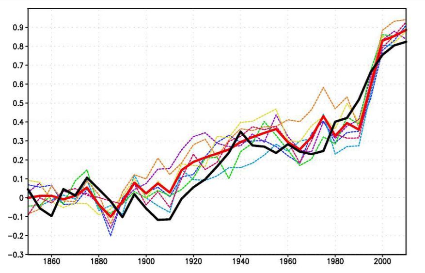
See https://www.theguardian.com/environment/climate-consensus-97-per-cent/2017/jul/24/study-our-paris-carbon-budget-may-be-40-smaller-than-thought#comment-102837192 from about 18 months ago for an indication of “prior art” for your Figure 1 (the other 21 are WAY beyond my capabilities though !).
As I put it “way” back then (July 2017) :
“… you can use a 30-year (360-month) “sliding window” to calculate the evolution in TRENDS from 1890 onwards … and compare them to the trends for the datasets of actual temperature measurements !
Doing this reveals reasonably good correlation from ~1960 to ~2005, but divergence from the CMIP5 climate models from 1890 (/ 1910 for GISS and NCEI) to 1960 and since 2004/5.”
For some reason the target audience at the time did not appreciate what I was trying to say …
Figure 1 is an awesome match.
its funny bob when you look at absolute temps you expand the axis to make trends look flat.
when comparing models to observations you do the opposite
pretty shady
Bob also quotes the actual values of the trends. Not “shady” at all.
Jimmy Haigh. Steven Mosher comments on my posts to make me laugh. He does a great job of it…making me laugh.
Regards,
Bob
That is among the most stupid comments I have seen from Mosher.
The graph in figure 1 is clearly expanded so the graph takes up the most vertical space which makes sense with what you are trying to do.
Figures 8,9,10 & 15 you could argue could be expanded vertically a bit to give a bit more detail but they aren’t bad.
The problem with the apparent agreement in Figure 1 is that the “model” line is an average of many models. If I selected just some of the models and repeated the exercise, the model line would not agree any more. Therefore, the models are all wrong, and the modelers had to resort to averaging a lot of wrong models in hopes that the average would do what they wanted. Real scientists go back and fix the model.
Instead of averaging the results of all the models, I wonder the IPCC doesn’t simply throw out the top 50% of models that have the warmest (and most incorrect) trends.
Ha. Just kidding.
I don’t ever wonder about that at all.
Steve O
I am not sure why funders of models that are running so hot continue throwing money at them. Clearly they don’t work. Ask for the money back.
My darker view interpretation is that they are retained in order to keep the “model mean” up, alarming, underlying a set of claims of danger. Without the models that obviously don’t work well enough to inform policy, the rest provide an interesting diversion for a Sunday afternoon but not enough to overthrow our long term search for new and powerful electricity generation technologies.
Has anybody explained why the annual rate of temperature rise shown in the GISS LOTI graph (Fig. 2) between 1925 and 1945 is slightly greater than between 1968 and 1991 when the concentration of carbon dioxide and annual increase was much greater in the latter period? Until the models explain this inescapable fact the current hypothesis of human driven climate change is a nonsense!
Thanks Bob for a thorough forensic investigation. Someone here remarked the other day that models are validated by training them against the central portion of a dataset, then seeing how well they replicate the end portions. You are the first to subject CMIP5 models to such scrutiny on the first part of 20th century temperatures. You leave no doubt that tuning climate models to the 1976-1998 rise renders them incapable of reproducing the 1915-1945 temperature pattern. That is invalidation.
Your first chart is also unusual and revealing. By showing the rates rather than the temperatures (or anomalies), the chart demonstrates how the models find it almost impossible to show cooling (rates below zero), no doubt due to the CO2 sensitivity built in. And it’s interesting to see even the ever-changing GISS LOTI showing a plateau since 1998 (no acceleration in warming rates).
Interesting. Of course the biases of the programmers will affect the model outputs. Models are just opinions about how the world works written in computer code.
I wonder if the group that makes the model is a significant factor in the range of the model output? Ae the programmers biases outweighing the physics?
Good post.
Related question –
Why do the projected temperature plots derived from the models have any “wobble” in the plots?
I understand the starting point and the projected rate of warming. What other factor are the GCMs using (that is predictable in the shorter term) to derive their plots?
pillage, the temperature plots are an output from running the many processes in the model, some of them computed and some from tunable parameters. For example, INMCM5 produces this hindcast compared to Hadcrut4.
For a look at the model complexities see my synopsis: https://rclutz.wordpress.com/2018/10/22/2018-update-best-climate-model-inmcm5/
Sorry, left off the graph legend:
“Figure 1. The 5-year mean GMST (K) anomaly with respect to 1850–1899 for HadCRUTv4 (thick solid black); model mean (thick solid red). Dashed thin lines represent data from individual model runs: 1 – purple, 2 – dark blue, 3 – blue, 4 – green, 5 – yellow, 6 – orange, 7 – magenta. In this and the next figures numbers on the time axis indicate the first year of the 5-year mean.”
No, I understand the wobbles in the hindcasting. The model has its parameters, and we add an “unpredicted” event like Mt. Pinatubo erupting in 1991 to show some cooling against the model.
Why do the model plots of future temperatures have periods with flat slopes (or even brief periods of cooling)?
I can see that result in a single Monte Carlo run where you have natural variability like an El Nino in your runs. However, the sum of the runs (which I believe is what gets published) should not show this.
For example, see Hansen’s Scenario A in his 1988 testimony. It literally plots a temperature data point for each year in the future up to 2019.
[I am not attempting to debate. I am just asking a question, and I don’t recall any discussion that covers this point.]
I think if you look at the blocks inside the model, you find they include natural forcings in the form of various oscillations, e.g. AMO, ENSO, Arctic ice extents etc.
Also the models have been damped down to prevent chaotic model behaviour.
You quote Judith Curry saying the early 20th-century warming was “almost as large” as warming “since 1950.” I’d like your best estimate of a few things, please.
How much was the early 20th century warming (using which data set)?
How much was the warming “since 1950”?
Grant, I’m sure you can do it yourself. I have no need to waste my time with something so simple.
Have fun.
Adios,
Bob
Answer the question Bob.
How can you and Judith honestly claim that the early 20th Century warming is almost as much as as large as the warming since 1950?
Data, Simon.
Hi there Mr. Foster
What brings you here?
No one believes any longer your ‘statistical’ origami?
Looking forward seeing you more often, don’t you know, decent comments don’t get censored here.
BOOM!
nice touch vuk!
Do you smell something burning?
Oh, nevermind.
It’s just Tamino.
I think you mean that no denier wants to make a close examination of the data, as Tamino does. He asked a fairly straightforward question, that Mr Tisdale must have (surely) known the answer to, assuming he actually checked Judith Curry’s claim, but instead knew he was on to a loser, so completely avoided the question. I’m sure that he’d be happy to get an answer from anyone else willing to examine the data (and mention which data that is).
Y’know, for being “skeptics”, there’s often a weird aversion to actually looking at the data here.
Skeptics don’t chase after shiny objects. You know, those things thrown out to distract and mislead?
https://judithcurry.com/2019/01/23/early-20th-century-global-warming/
Apparently it is too cold for trolls to just be hanging-out under bridges these days.
Bob, we’ve become accustomed to the use of the Global Average Temps (or Global Mean Surface Temps) figure – whatever use they may be – but is there anywhere to be found ‘Global Average CO² Emissions’? I ask because, afaik, when activists quote CO² emissions they tend to quote what Mauna Loa measures, which can only be relevant to Hawaii, I’d have thought.
That is nothing for Nick Stokes and I quote him directly
“You could just ask anyone who understands the simple algebra of feedback. You can have positive feedback up to a limit without runaway.”
For most of the rest of us a feedback greater than 1 is actually the definition of runaway but in Climate Science anything can happen.
The only way to have positive feedback without runaway is to have a power supply that is already maxed out. Not terribly linear at that point!
“For most of the rest of us a feedback greater than 1 is actually the definition of runaway”
There are plenty of positive numbers between 0 and 1.
Very true, Nick. But there are no positive numbers between 0 and 1 that equal to 3X H2O amplification of CO2. Or am I wrong in asserting that 3 is greater than 1? Or would you rather discuss what is is?
The simple algebra of feedback sayd that gain = A/(1-f)
So f=2/3 is the positive number that gives gain 3x.
Bob,
You might be aware that I dispute Curry’s claim of early 20th century warming being “almost as large” as warming “since 1950.” The fact that you quoted it, and thanked her for her statement, suggests that you agree with her claim. Is that correct?
So I asked you, how much you estimate those quantities are. What I’m getting at is this: do the numbers *you* come up with support or oppose such a claim?
Some of my readers will suspect that your response is your way of avoiding the issue.
What part of adios didn’t you understand, Grant? Because you obviously do not understand Spanish, I’ll translate for you. Adios means good-bye. Get it now?
Grant, you wrote, “You might be aware that I dispute Curry’s claim of early 20th century warming being ‘almost as large’ as warming ‘since 1950.’ The fact that you quoted it, and thanked her for her statement, suggests that you agree with her claim. Is that correct?”
Sorry, Grant, I haven’t visited your blog in years. You belabor simple things to the point of absurdity.
Apparently, Grant, you failed to read the rest of what I wrote after I quoted Judith. In total it read:
Did that clear up for you which sentence in Judith’s opening paragraph I was referring to, Grant?
You, Grant, concluded your comment with, “Some of my readers will suspect that your response is your way of avoiding the issue.”
Why would I care what some of your readers think, Grant? I don’t. My audience here dwarfs yours at your blog.
Adios, and, again, Grant, that means good-bye,
Bob
This looks distinctly like avoiding an uncomfortable question because you don’t like the truthful answer.
Answer the question Bob. You are just digging a bigger hole for yourself.
If you oppose Dr. Curry’s (who is a qualified and highly respected climate scientist) statement it is your job to verifiebly prove it wrong, simply take a lesson from Nick Lewis, else you just vying for attention since no-one of note cares about nonsense of your ironically named ‘open mind’ blog.
He did prove it wrong. His latest posting on his blog even does that yet again. And don’t start insulting his blog, or him; it won’t hurt anyone here to have a quick read of one of two posts that show clearly why Judith Curry’s statement is, well, misleading. If anyone can see where he has gone wrong, I’m sure he’d be glad to take that on board and do appropriate re-analysis. That’s what scientists do.
I don’t read his blog and have no intention of doing so. When I proved him wrong elsewhere, Foster resorted to a vulgar personal attack to unacceptable degree, so that Gavin Schmidt decided that Foster overstepped accepted decency and deleted all his comments. Foster went off with his tail down and despite being a regular there didn’t come back for quite a while.
How convenient that the comments were deleted. I guess we’ll never know how you proved Tamino wrong. If you did, it is unlikely to have been a major error that brought down the accepted science of human caused climate change, but Tamino can be wrong, since he is human. Do you ever think you might be wrong?
Those who fail to learn from the history of failed environmental catastrophe predictions are doomed to repeat them, or be fooled by them (or both).
Such as? And I’m talking of those backed up by science and of those where nothing was done to mitigate the problems.
Fascinating. Some of the desperate rationalization around the pause suggested that anomalies lasting as long as the pause were outside the resolution of the models but we could rest assured that over the long term (not sure how long) the models would align with reality. Would the desperados try to apply the same ‘logic’ here?
Bob,
Something that I would liked to have seen would have been error bars on the graphs. However, I imagine that you didn’t have much to work with. It seems that climatologists are unacquainted with the concept of ‘uncertainty.’
Thank for all the work!
Clyde: I surveyed the trend view at Nick Stokes for some information on error bars / confidence intervals. The typical 95% confidence interval for 30 year trends was +/-0.03 or +/-0.04 K/decade. So the 0.15 K/decade warming rate for the 30-years ending in 1945 is significantly different from the model predicted warming rate of 0.05 K/decade.
What does a discrepancy this size mean? We live on a planet were fluctuation in heat exchange between the deep ocean and the surface can result in 0.3 K of warming or cooling in a little more than six months. We call these fluctuations El Ninos and La Ninas and they are a form of “internal” or “unforced” variability or “chaos”. Normally cold deep water upwells off the coast of Equatorial South America and is carried westward on trade winds as it gradually warms, making the Eastern Equatorial Pacific far cooler than the Western. When those winds change and upwelling slows, the Eastern Equatorial Pacific becomes much warmer and that heat is spread around the planet by surface winds and convection. We know a lot about ENSO, because we have seen it happen many times.
For the 30 years ending in 1945, we observed 0.1 K/decade more warming than expected (0.15 vs 0.05), which totals 0.3 K of unexpected warming. That took us from cooler than expected to warmer than expected. Given what happens during an El Nino in less than 1 year, 0.3 K of unexpected warming over 30 years is not implausible as unforced variability. We simply don’t have as many examples of this form of unforced variability as we do of El Ninos. If you look at the proxy record for 100 centuries of the Holocene, there is nothing unusual about this event. If half of the warming is considered recovery from a period of unusual cold in the early 1900’s, then the event is half as big.
Judith Curry is right when she says that the warming ending in 1945 and the warming over the last half century both need to be considered as possible examples of unforced variability. However, you won’t find many examples of nearly 1 K of warming in a half century in the Holocene proxy record, especially following another warming period that ended the LIA.
Well, of course, it’s just possible that the warming we’ve seen is natural variability but we do know that GHGs cause warming, as well as being a feedback. The general scientific consensus is that human behaviour has contributed considerably to warming (and Judith Curry doesn’t dispute this), so there must be an underlying trend, as well as natural variability around that trend. But that natural variability is also not magical; there are reasons for that variability, some understood, some not. It really isn’t very scientific to call some warming a “recovery from a period of unusual cold” unless one states the causes of that recovery.
Mike, are you paid to spout misleading nonsense? Your posts are like the results of the scratching in the ground of my wife’s chickens; a bunch of dust. It is usually meant to conceal.
Bob Tisdale uses observations. If you disagree with those observations, say so. Otherwise, sciency-sounding stuff is just that; B.S.
Mike Robert’s post are insightful, concise, and spot on. You Mr. Dave Fair cannot fathom reality. Tisdale cherry picks any/all of his observations. If you can’t see that, I suggest you take a refresher course in Climatology 101,
David, you know nothing about me, do you? Where do you come from? What is your background? Are you paid for your drive by snark? Most believe that snark is no substitute for intelligence, education and experience.
Bob Tisdale is a truly outstanding human being. If you would but take a little time and visit his blog, Climate Observations, you would get some needed education. But, then again, profiting from such education would take intelligence and experience. Prove to us WUWT denizens that you are up to the challenge!
Dave Fair you are correct, not only do I know nothing about you, I do not care to know anything about you. You seem to confuse an “outstanding human being” with an an accomplished scientist. Have you ever wondered why you cannot find anything about Tisdale’s background?…….. might it be because he has none? There are a lot of “outstanding human beings” that suck at science. There are also a lot of “despicable human beings” that are really good at science.
Uh, David, you seem to be going off the rails. Please give us some idea of your problem with Bob Tisdale’s OBSERVATIONS. He may be a nobody, but his OBSERVATIONS carry truth.
Please identify your “There are also a lot of “despicable human beings” that are really good at science.” Are they those that were involved in turn-of-the-20th Century Eugenics? Or are you referring to Hitler’s Dr. Josef Mengele? Do you even understand the meanings of the words you string together?
I am beginning to suspect that you confuse “science” with “appeals to authority.” Bob Tisdale exhibits the traits of a true scientist; he focuses on data and doesn’t try to prognosticate the unknowable future.
David Dirkse
Broad brush ad hominem attacks also go by the name of ‘cheap shots.’ If you have specific complaints, the proper thing to do is to list the specific complaints along with supporting evidence. Anything less than that is akin to Cherry Picking.
Mr. Fair, Tisdale’s observations are tainted with his root hypothesis, namely that the current warming the earth is experiencing is due to ENSO. The problem with his root hypothesis is that ENSO is not a source of energy. So Tisdale highlights data that supports his pet hypothesis which in fact is flawed from the start for the reason I have provided to you. All ENSO is doing is moving energy from one place to another, and is not a cause of warming.
Mr. Spencer, mind your own business.
David, Bob Tisdale’s observations are just that; observations. One cannot ignore valid observations just because one disagrees with the conclusions drawn by others. Bob Tisdale did not create the data.
Your diversion into ENSO is just that; diversion. What specific objections do you have to Bob’s observations presented in this specific post?
N.B. Diversion is a favorite of warmista Trolls.
Tisdale’s observations are cherry picked to support his preconceived hypothesis.
Show us the cherry picking, David!
Otherwise, go ad hom elsewhere.
Also Mr. Fair, it would help your cause if you did not engage in subtle ad-hominem attacks (i.e. warmista troll.)
Fair enough, David; my bad.
Now, you respond to my requests for you to specifically criticize any of Bob’s actual observations and their comparison with UN IPCC climate model outputs.
“Show us the cherry picking”
….
All data prior to 20th century is missing.
Uh, David, read the title of the piece.
Are you aware that it is an analysis of the fidelity of UN IPCC climate models with observations over the period 1916 – 1945?
Any response to Bob Tisdale should consider what he presented, not some unrelated agenda.
For example Mr. Fair: https://icoads.noaa.gov/
..
Data goes back to 1800.
Ditto my previous comment.
Show Me The Beef!
“read the title of the piece.”
…
Yup, Tisdale excluded all data prior to 1900.
…
You caught the “cherry” too!!
David, you have become insufferably tiresome.
Life is too short to spend time dealing with jackasses.
To quote the great Bob Tisdale: Adios! [Forever]
Mr. Fair, can you please tell me who said, “When you resort to name calling, you’ve lost the arguement?”
…
Apparently he was correct, and you have lost.
David Dirkse
You hypocritically said, “Mr. Spencer, mind your own business.” Were you minding your own business when you criticized Dave Fair? Not hardly! This forum is, historically, pretty much a free-for-all. If you comment, you can expect to receive comments. That is how it is structured. I think that your reality check got lost in the mail.
Mike wrote: “Well, of course, it’s just possible that the warming we’ve seen is natural variability but we do know that GHGs cause warming, as well as being a feedback.”
Based on the absence of precedent for nearly 1 K of warming in a half-century during the Holocene, I’d say that it’s just possible that some FRACTION of the warming we’ve seen is UNFORCED (internal) variability but we do know that GHGs cause warming. Natural variability is a somewhat ambiguous term that encompasses both unforced variability (chaos) and “naturally-forced” variability – volcanos, changes in solar TSI, and more speculative changes in “solar activity”. For the past century, we have a pretty good idea that “naturally-forced” variability didn’t play an important role, leaving unforced variability as the only explanation for most of the excess warming in the 30-years ending in 1945 (0.15 instead of 0.05 K/decade or a total of 0.3 K).
Instead of showing us the multi-model mean hindcast warming, I would have preferred to see the observed change in forcing ((W/m2)/decade) and have the vertical scale for the forcing expanded or shrunk to produce the best fit for the observed warming. Lewis and Curry say that TCR is 1.3 K/doubling or about 0.38 K/(W/m2). If so, then 0.4 (W/m2)/decade would be even on the vertical scale with 0.15 K/decade. This would let us see the relationship between forcing change ((W/m2)/decade) and temperature change (K/decade) without the baggage and confusion added by climate models. This would be conceptually simple, but tricky in practice, since there are a lots of difference forcings to choose from and the aerosol indirect effect is far too negative if you use ERF’s from models.
What good is typing
surface temperature output of the 2nd coolest
with nd in 2nd
superscript.
That’s not only superfluous – it’s plain wrong.
Bob: I find the variation between MAT and SST in various models intriguing. The rate of sensible heat transport from the ocean to the air depends on wind speed and the temperature difference between these two compartments. Assuming models do predict an appropriate amount of sensible heat transport, differences ranging from 0.8 degC to 1.6 degC, must represent a two fold difference in the parameter controlling sensible heat transport.
I’ve heard that MAT has been rising more rapidly than SST lately. Since models calculate global warming in terms of MAT, not SST, this is being used to explain why the climate sensitivity based on models is higher than EBMs. Recent MAT vs SST data would be interesting.
Just for Grant / Tamino. Even the IPCC’s preferred data-base just loves their adjustments don’t they Grant?
They’ll even go back to adjusting down 1860-1880 and 1910 -1940 to try and keep their BS alive. But what is it that motivates these BS merchants do you think?
Here’s the BBC’s Q&A of Dr Phil Jones in 2010 after the Climategate scandal. This is question A below and his answer.
He lists 4 warming trends and if we test those SAME trends today we find that the two earlier trends have been adjusted DOWN and the two later trends have been adjusted UP, although the 1975 to 1998 trend not so much.
But the longer 1975 to 2009 trend has today been adjusted up from 0.161c/dec ( 2010 interview) to now 0.193c/dec. Here’s the BBC link.
So no statistically significant difference just 8 years ago, (between the 4 warming trends) but since changed through their adjustments.
http://news.bbc.co.uk/2/hi/science/nature/8511670.stm
Q&A: Professor Phil Jones
“Phil Jones is director of the Climatic Research Unit (CRU) at the University of East Anglia (UEA), which has been at the centre of the row over hacked e-mails.
The BBC’s environment analyst Roger Harrabin put questions to Professor Jones, including several gathered from climate sceptics. The questions were put to Professor Jones with the co-operation of UEA’s press office.
A – Do you agree that according to the global temperature record used by the IPCC, the rates of global warming from 1860-1880, 1910-1940 and 1975-1998 were identical?
An initial point to make is that in the responses to these questions I’ve assumed that when you talk about the global temperature record, you mean the record that combines the estimates from land regions with those from the marine regions of the world. CRU produces the land component, with the Met Office Hadley Centre producing the marine component.
Temperature data for the period 1860-1880 are more uncertain, because of sparser coverage, than for later periods in the 20th Century. The 1860-1880 period is also only 21 years in length. As for the two periods 1910-40 and 1975-1998 the warming rates are not statistically significantly different (see numbers below).
I have also included the trend over the period 1975 to 2009, which has a very similar trend to the period 1975-1998.
So, in answer to the question, the warming rates for all 4 periods are similar and not statistically significantly different from each other”.
“Here are the trends and significances for each period:
Period Length Trend
(Degrees C per decade) Significance
1860-1880 21 0.163 Yes
1910-1940 31 0.15 Yes
1975-1998 24 0.166 Yes
1975-2009 35 0.161 Yes”
See York Uni tool ( Cowton etc) link here for HAD Crut 4 global. Had Crut 4 global is the longest and preferred data-set of the IPCC.
http://www.ysbl.york.ac.uk/~cowtan/applets/trend/trend.html
Bob,
Something that would be interesting to see is the results of the models as monthly averages of the non reflected solar energy, Pi, black body equivalent emissions of the surface, Ps, at its reported temperature, T, and the emissions at TOA, Po, for constant width (i.e. 2.5 degree) slices of latitude. To calculate average temperatures, convert temperature to emissions with SB, average the emissions over time/space and convert the result back to a temperature. Average power densities are simple time/space averages. Is this something that would be easy to extract from the CIMP modeling?
The satellite data shows a nearly constant ratio of 1.62 between Ps and Po across slices from pole to pole. This leads to an average relationship between T and Po, given by Po = (1/1.62)*o*T^4, where o is the SB constant. The monthly averages from satellite data match this to within a few percent and yearly averages match even better. Since this ratio is mostly insensitive to the surface temperature, it’s a reasonably constant proxy for the sensitivity expressed as incremental surface emissions per incremental solar forcing since in the steady state,
Pi = Po.
Interestingly enough, while the monthly averages vary more widely for the relationship between the net solar input, Pi, and the surface temperature, T, the yearly averages per slice closely conform to the relationship,
Pi + Pa = o*T^4, where Pa = (1 – 1/1.62)*o*Te^4 and Te is the value of T where Pi == Po.
Note that Pa is mostly independent of T and mostly constant across slices from pole to pole. This is unexpected as Pa should be dependent on the average T per slice and not the average T of the planet which seems to suggest cooperation between slices of latitude towards achieving a common global goal beyond just balancing the input and output power at TOA.
One possibility is that the goal is that the steady state equilibrium is the 1.62 ratio itself, which would be the case this was actually the golden ratio of 1.618034… and not just close by coincidence. The implication being that if incremental CO2 increased the minimum amount of absorption by the atmosphere, the atmosphere would chaotically self organize in a way to achieve the required average absorption of surface emissions, 2*Pa, in order to maintain the golden ratio relating Ps and Po.
The measured data is in this plot, where Pi and Po are along the X axis and T is along the Y axis. The green line is the prediction of Po vs. T and the magenta line is the prediction of the relationship between Pi and T based on the above equations and where Te = 287K when Pi = Po = 239 W/m^2. Each small dot is 1 month of data for a 2.5 degree slice of latitude. The red dots are Pi vs. T and the yellow dots are Po vs. T. The large dots are the averages per slice across 3 decades of data.
http://www.palisad.com/co2/tp/fig2.png
I would be very surprised if the results from the models looked anything at all like the data. I would go as far as suggesting that rather than curve down as in the plots, the relative relationships will curve up. I’ve noticed that the relationship between Po and T has the least deviation from month to month of any other relationship between any of the other couple of dozen measured and derived climate variables I’ve examined and seems to be closely coupled to whatever is establishing the steady state equilibrium. At the very least, the average relationship between Ps and Po from the models should be relatively constant.
“To calculate average temperatures, convert temperature to emissions with SB, average the emissions over time/space and convert the result back to a temperature. Average power densities are simple time/space averages.”
This is clearly wrong because of Holder’s inequality. See Ned Nikolov’s paper on this. The paper where he spelled his name backwards. Whatever you think of the gravity pressure theory, the math of Holder’s inequality is solid.
Alan,
Holder’s inequality has nothing to do with calculating the average radiant emissions of the surface which is all that I’m doing. W/m^2 are what’s important, converting to an EQUIVALENT temperature is only because many want to see a temperature, rather than emissions, even though radiant emissions are what’s relevant to the radiant balance and the corresponding sensitivity.
Joules are Joules and can be linearly averaged. This is a fundamental consequence of the First Law.
If Holder’s inequality would apply to anything, it would be attempting to linearly average temperatures.
This topic makes me wonder what the actual global average surface temperature is.
Considering the globe is heading for a climate catastrophe by 2100 due to an increase in average surface temperature of 0.5K over the present global average temperature, it would be nice to have agreement on the current average temperature to better than 0.1K as that represents about 20 years of heating toward the apocalypse.
It should be reasonable to get the present global average temperature from all the measuring authorities involved in collating such data.
I have seen a figure from NOAA of 287.6K but the date of that reading was not given. If that is present day temperature then the apocalypse occurs at 288.1K. Clearly it is damn important that we get agreement because we are getting close.
Thinking about it, any global average surface temperature should always be quoted with the date or period of averaging so there is a consistent basis for comparing.
To put the 0.5K in perspective, I determined that a rock always facing the sun receiving solar flux of 1360W/sq.m would have an average surface temperature of 159K. That compares with the global area average temperature of the moon at 197.3K. The difference of 37.3K is due to the rotation of the moon and thermal inertia of the rock. By comparison a perfectly conducting spherical black body would have a temperature of 278K. If the surface of the perfectly conducting planet was a grey body with an emissivity of 0.92 (typical of ocean water), the average surface temperature would be 284K.
The “greenhouse” gas fairy tale with its 255K mythical surface 5km above the planet, contrived albedo of 0.8 and atmospheric blanket holding 33K warmer is a great yarn. From a scientific perspective, it has nothing to do with the surface temperature on Earth.
Actually analysing data from climate models give then undeserved credibility. Any credibility is a sad joke on mankind.
And there is the Holder inequality problem.
RickWill,
It depends on what you want the average to represent. Considering that the temperature is linearly proportional to stored energy, a linear average of temperature would result in the temperature of the result if all the matter at different temperature was instantly and uniformly mixed together where no energy was lost (or emitted) during the mixing process.
Relative to the radiant balance and the corresponding radiant sensitivity, what matters is the EQUIVALENT temperature corresponding to the average emissions. In this case, you need to linearly average the Stefan-Boltzmann emissions corresponding to the temperature of each component and convert the result back to a temperature using the SB Law.
The difference isn’t very much considering the nominal temperatures involved with the climate, but when talking about tenths of a degree trends, it becomes very important.
For example, if there are 2 equal size pools of water, one a 280K (348.5 W/m^2) and another at 300K (459 W/m^2). If the two pools are instantly mixed together, the resulting temperature will be 290K which will emit 401 W/m^2. However; the average emissions of the two bodies is 403.75 W/m^2 with a corresponding EQUIVALENT average temperature of 290.5 K. The difference between the 2 kinds of averages gets larger as the difference between the temperature of the 2 pools of water increases.