I think I see some issues with this, but I had some preliminary vetting done to clear it for posting. Would love to see Mosh’s take~ctm
By Mark Fife,
I have been convinced for a long time there is something wrong with the theory of global warming. My initial response was based upon two factors. The first being in my youth I was a voracious reader. I was fascinated with history, archeology, and science. My interests varied wildly through the years. At times I was interested in the ancient peoples of South America. At other times I was interested in the Viking explorations. Obviously, the greatest wealth of actual historical material comes from Europe. Cutting to the point here, it seems obvious to me we are fortunate to be living in times where the climate is exceptionally good relative to what our ancestors endured in the past as well as what we have seen in the more recent past. I am old enough to remember the 60’s and I surely do remember the 70’s.
The other factor is the idea that CO2 going from 0.028% to 0.04% of the atmosphere would wreak doom and destruction upon the Earth just sounds ludicrous. What affect would that have on the emissivity or the heat capacity of a given volume of a gas mixture? I would think less than the measurement error and bias involved in trying to measure the difference.
Because of this, and because I am a real nerd when it comes to such things, I have been studying the issue as much as I can. What I found is the record of actual measurements is so poor, the majority are next to worthless. There are very few high-quality records which span the time frame necessary to put the current climate in its proper perspective. The rest are too short, too incomplete.
I have experimented with stringing different sets of data together, but that always creates uncertainty in the results. Unless two stations are reporting simultaneously for a good length of time you simply do not know how the two records relate. If you don’t have enough history from a single station you have no idea if it is warming from a relative cold period to a relatively normal. How do you even define what a normal range is?
I have long wondered how climatologists put all the fragments of data together to create such incontrovertible charts of impending doom to within 0.1° C going back to 1880. Especially when so few records go back that far. To be sure, I have confronted numerous climatologists and people claiming to be part of the group of people working on the data and models. I get nothing but generalities to my specific questions. Do you do area weighted averages? Have you applied spatial statistics? Did you see the study on starfish? That and silence. They just stop responding.
Though few in number, there are good quality, long term temperature records. What do they have to tell us about Global Warming or Climate Change and the role of CO2?
To begin putting this all together, I will look at the Central English Temperature records. According to HadCet, the data has been adjusted to account for urban heat island affects. I assume it has also been maintained to account for differing measurement devices. In any event, I am assuming it is as correct as they can make it.

The annual averages in the CET record show what has overall been a steady increase with shorter duration fluctuations since the lowest point of what is termed the Little Ice Age, which also corresponds to the Maunder Minimum. The Maunder Minimum is thought to have ended in 1715. The Little Ice Age is considered to have ended in 1850. This average warming has been 0.27° C per century.

When looking at the warmest month of each year the overall pattern remains the same as the annual average, except warming has only been 0.16° C per century.

Now looking at the coldest month of each year the over all pattern is again the same as the annual average, except warming has been 0.38° C per century.
It would seem to me milder, shorter winters would be a good thing. Especially compared to conditions around 1700.
I was fortunate to find two long term records from the Icelandic Met office. I also had the longest record from Greenland from a previous look at the GHCN network data. Let’s see how those records compare to the CET record. The graph below shows the absolute annual temperatures.

The following graph shows all four stations as temperature anomalies from their 1897 to 2007 stations average, which is the time frame where all four stations were reporting.

All four stations agree quite well in terms of the overall pattern. There is some variation in how much cooling or warming was experienced, which I would expect.

This graph shows the average of the four stations with the maximum and minimum annual average temperatures recorded amongst the four stations per year. It also shows a rolling five-year average. 95% of the annual averages fall within ± 1.0° C of the overall average.
As an aside, I will show the correlation of these temperature records to the record of CO2. The correlation coefficient of the overall average is .52 and that of Greenland is -.18.


I will now present the same type of data for the five longest records from the USHCN. The methodology of transcribing the data from absolute to relative anomalies is the same. Each station is shown relative to its 1874 to 2014 average.


As in the prior graph, these stations all follow the overall average within ± 1.0° C 90% of the time.
Now I will look at how well the average of the CET, Iceland, and Greenland records and the average of five long term records from the US match.

As shown in the graph above the two patterns are very similar, but there are significant differences. There are times when the amount of cooling and warming between the two is obviously different. Again, I would think that is the expected result. What was not expected, at least by me, is the timing of changes is out of phase. It appears the 30’s warming arrived and ended earlier in the US than in the other three locations. It also appears the 70’s cooling period ended earlier in the US. The following graph showing rolling five-year averages of the two averages demonstrates this apparent difference. It is a shame there are no records from the US prior to 1871.

As before, this is the correlation of the US long term station average to CO2. The correlation coefficient in this case is a definitive 0.14.

The question at this point is does it make sense to combine these long-term US station records with those of Iceland, Greenland, and the CET. The answer is yes and no. The combined average will create a reasonable approximation of the temperature record where the years being recorded are the same, but you will lose the data before 1871. The US record just doesn’t go back as far. When looking at records within a region the variation between stations stays within ± 1.0° C 90% of the time for over 120 years. However, when you combine two regions that boundary now becomes ± 3.5° C.
Based upon this limited look at just two regions it does make sense to combine records within a region where the records are similar as is the case here. Had one of these records been as dissimilar as the two overall regional averages it would not. The more dissimilar such records or averages of records are the less sense it makes to combine them into an average.
I am now going to take a brief look at the results from a previous study of records from Australia, which was covered in a previous article. Australia holds the only long-term records I have seen from the GHCN or any record set contained in the Berkeley Earth source data page in the Southern Hemisphere. I am only going to show those results from rural or small urban areas where the urban heat island affect is not evident.
At this point it should be obvious combining these records with those of the US and those from Iceland, Greenland, and the CET would not yield any useful information. The pattern of change is clearly and obviously different.

The correlation of this record from Australia to CO2 is as follows. The correlation coefficient is 0.14, which would indicate there is no correlation.

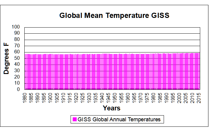
let’s see how these records compare to the GISS temperature record. All records are shown as temperature anomalies from their post 1960 average.


There are obviously substantial differences between the GISS temperature record and the long-term records I have presented. Lacking a detailed explanation of how GISS combined the many disparate and discontinuous records I can only speculate as to why those differences exist.
Now I am going to look at how well the GISS temperature record correlates to CO2. This is perhaps the most telling piece of evidence which shows just how different that record is from the long-term records both individually and as regional averages. The GISS record has a correlation coefficient of .92, which indicates a near perfect correlation. I would imagine many would find that near perfection to be suspect in and of itself as it would indicate there are no other major impactors of temperature. Which seems unlikely to say the least. This is in comparison to the individual records which range from .54 to -.18, which would seem a more reasonable outcome.

Conclusions:
We have looked at quality, long term records from three different regions. Two of these are on opposite sides of the North Atlantic, one is in the South Pacific. The two regions bordered by the North Atlantic are similar, but not identical. The record from Australia is only similar in that temperature has varied over time and has warmed in the recent past.
In all three regions there is no evidence of any strong correlation to CO2. There is ample evidence to support a conjecture of little to no influence.
There is ample evidence, widely shown in other studies, of localized influence due to development and population growth. The CET record has a correlation of temperature to CO2 of 0.54, which is the highest correlation of any individual record in this study. This area is also the most highly developed. While this does not constitute proof, it does tend to support the supposition the weak CO2 signal is enhanced by a coincidence between rising CO2 and rising development and population.
The efficacy of combining US records with those records from Greenland, Iceland, and the UK may be subject to opinion. However, there is little doubt combining records from Australia would create an extremely misleading record. Like averaging a sine curve and a cosine curve.
It appears the GISS data set does a poor job of estimating the history of temperature in all three regions. It shows a near perfect correlation to CO2 levels which is simply not reflected in any of the individual or regional records. There are probably numerous reasons for this. I would conjecture the reasons would include the influence of short-term temperature record bias, development and population growth bias, and data estimation bias. However, a major source of error could be attributed to the simple mistake of averaging regions where the records simply are too dissimilar for an average to yield useful information.
The final question, which I hinted at early on in this article, is how well these records reflect what we know of the history of people in these various regions. The regional records which I have put together appear accurate, based upon history. The cold period corresponding to the Maunder Minimum has been well documented in both Europe and in North America. The warm period of the 1930’s extending into the 1940’s is also well documented, not only in Europe and North America but also in other parts of the world at the end of the 2nd World War. The 1970s cooling which affected America and Europe has also been well documented. In Australia there are accounts of severe heat waves in the 1800’s, such as the 1896 heat wave. According to records and personal accounts Australia experienced a severe drought at the end of the 1800s into the beginning of the 1900s and another drought at the end of WWII in the 1940s. By all accounts, working conditions in the late 1800s in Australia were particularly brutal because of hot conditions for factory workers.
Based upon a purely historical perspective the GISS temperature simply does not reflect the very real, well documented history of changes in climate in all three regions. The long term regional based averages I have presented do a much better job of describing what is known to history.
Mark,
Who vetted your post?.
Have you sent it to any relevant scientific institutions?.
I live in Paraguay. Temps here have been 2 to 10 C below normal for six months I think WUWT really needs to revisit the Solar cycle meme which has been at 0 sunspots for months. NASA reported that November 2018 high atmospheric temps are declining dramatically lately but apparently this does not affect earth temps. Would like to have solar expert views on this because in the past it relates to ice ages.
“I have long wondered how climatologists put all the fragments of data together to create such incontrovertible charts of impending doom to within 0.1° C going back to 1880. Especially when so few records go back that far. To be sure, I have confronted numerous climatologists and people claiming to be part of the group of people working on the data and models. I get nothing but generalities to my specific questions. Do you do area weighted averages? Have you applied spatial statistics? “
I can’t see the point of these posts. You could read one of the many papers on the topic, eg Hansen and Lebedeff, 1987. GISS publish their code. You could even read WUWT, where I explain how I and others do it (with link to my code and explanation). Yes, we do use area weighting, in some form. What do you mean by “spatial statistics”? The problem is classic spatial numerical integration.
And then there are the endless special cases picked out. Trend of the coldest months in the CET, etc. And of course that isn’t the same as GISS global, or whatever. No surprises there. The special cases don’t agree with each other, let alone GISS. That is why people look for the most inclusive measure.
There is a spatial sampling aspect that goes well beyond such classical concerns. To obtain time-series of global temperatures, we need sufficiently dense sampling geographically to cover all the (coherence-wise) non-homogeneous climatic zones. Otherwise, natural spatial variability is aliased into unrealistic geographic dimensions. Unfortunately, no data base is available that provides reliable such coverage for the years prior to the advent of satellite sensing.
“There is a spatial sampling aspect”
There is. It is described in the literature under the heading of sampling error or coverage uncertainty, eg Brohan et al, 2006. My own take on that is here. There are far more stations than you really need, so you can look at all kinds of subsets to see how much station choice matters. And you can cull stations to about 500, in all sorts of ways, and get consistent answers.
Brohan et al. treat spatial sampling uncertainty in a very cursory, simplistic manner. Your “take” pertains not to my fundamental point, but only to the question of the consistency of sampled anomaly results for a given month as the number of available station records is culled. Neither addresses the critical issue of how REPRESENTATIVE the available station records are of ACTUAL spatial variability of ENTIRE time-series throughout the globe. It goes well beyond mere numerical consistency of results and involves questions of data bias inherent in available station records, which are seldom obtained outside urban centers of one size or another.
Let’s see if I have this straight, because what you describe is what I assume. This is what you said.
“I’ll illustrate with a crude calculation. Suppose we want the average land temperature for April 1988, and we do it just by simple averaging of GHCN V3 stations – no area weighting. The crudity doesn’t matter for the example; the difference with anomaly would be similar in better methods.
I’ll do this calculation with 1000 different samples, both for temperature and anomaly. 4759 GHCN stations reported that month. To get the subsamples, I draw 4759 random numbers between 0 and 1 and choose the stations for which the number is >0.5. For anomalies, I subtract for each place the average for April between 1951 and 1980.
The result for temperature is an average sample mean of 12.53°C and a standard deviation of those 1000 means of 0.13°C. These numbers vary slightly with the random choices.
But if I do the same with the anomalies, I get a mean of 0.33°C (a warm month), and a sd of 0.019 °C. The sd for temperature was about seven times greater. I’ll illustrate this with a histogram, in which I have subtracted the means of both temperature and anomaly so they can be superimposed:”
When you say “For anomalies, I subtract for each place the average for April between 1951 and 1980” are you saying you take an average for April from 1951 to 1980 for each station and subtract that from the 1988 April average for each station? I want to be clear here. Because that is what you should do. If you were to subtract the April average from all sampled stations or all stations, either way would make no difference at that point, you would be doing nothing more than translating your original average by a more or less random number.
Now you say that would give you the average anomaly for the month. Now what that means depends upon what you meant above, but I am going to assume you performed that calculation properly. In which case what you calculated would be an average temperature delta from each stations 1951 – 1980 average. Yes, you could make some kind of inference, depending upon sampling density, as to how that might relate to what happened around the world.
However, your discussion on the standard deviation is totally wrong. The standard deviation you want isn’t between the station averages or the station anomalies. You want the standard deviation of the resulting set of temperature deltas. You are counting oranges to see how many apples you have.
What you should have is a statement like “On average for our sample set, temperatures rose from a 1951 – 1980 baseline by 1.2° C with a standard deviation of 1°. Hence we conclude 90% of stations would fall within 1 ± 1.7° C with a 90% confidence interval of ± 1/SQRT(1000) for the average, assuming you sampled 1000 stations. Obviously I just made numbers up, but that is the output you should have.
In that manner you would be quantifying the true variability of what you are looking at.
And of course you should at a minimum take a look at a histogram of the temperature deltas to make sure what you are looking at is at least approximately a normal distribution. Because your results depend upon that for any validity they may have.
And if you do that for any decent sampling you will of course find half the stations you will find more variance than you probably expect.
Now, you will also have another problem. You should find a lot of stations in 1988 did not have complete records for 1951 – 1980. How would you handle those?
What about those with no record at all between 1951 – 1980?
Mark,
“are you saying you take an average for April from 1951 to 1980 for each station and subtract that from the 1988 April average for each station?”
Yes.
“You want the standard deviation of the resulting set of temperature deltas.”
I’ve said what I want “a standard deviation of those 1000 means of 0.13°C”. That is an estimator of the standard error of the mean, or at least the component due to sampling error. And that is the simple, direct way to measure it. Actually take samples and look at the spread of results. There is no requirement that the means are normally distributed, although they probably are.
“Hence we conclude 90% of stations”
No. Again I’ve said what I am calculating. It is the standard error of the global mean. Nothing to do with 90% of stations. Or any assumption about sqrt(1000). And I did say, upfront “I’ll illustrate with a crude calculation”. It is not a good way to compute a global average. But it does show the reduction in variability you get when you use anomalies. That would be similar with proper area weighting.
“How would you handle those?”
I explained how I do it in the link you quoted from (least squares). I think it is the best way. But many people do use a fixed interval to avoid having anomaly base values themselves take up part of the trend. Then they use other methods (for stations not in that interval) based on estimating from neighbouring stations, maybe incorporating comparative information where there is time overlap. These methods have names like Reference Stations Method (GISS), “First Difference Method”(Peterson), etc.
I don’t think you understand what I am saying. See my other replay. That might bring some understanding. I have actually completed the exercise for 1988 and 1998. I think you will enjoy it.
Here is an example from the GHCN data. There are 3174 stations with complete records from 1951 to 1980 which also have records from 1988.
On average these stations warmed by 0.34° C from their 1951 to 1980 baseline with a standard deviation of 1.17° C. 90% would fall between -1.58° C and 2.27° C. The maximum was 13.87° C and the minimum was -15.27°. The 90% confidence interval for the population mean is ± 0.02° C, because the sample size is quite large.
The underlying distribution isn’t precisely normal, but it is centrally tended and reasonably normal enough so the 90% population estimate is pretty accurate. If I were so inclined I could no doubt model the population a bit more accurately with a T distribution.
Now when I do the same thing for 1998 I get an average increase of 0.74° C with a standard deviation of 1.45°, meaning 90% would fall within ± 2.4° C. The number of stations drops to 2408, but that is still enough to get a 90% confidence interval of ± 0.02° C for the mean.
However, the distribution of the data is now decidedly not normal. The highest difference is over 27° C. The minimum is -7° C. There are some obviously out of line changes.
Now here is something interesting. I graphed the top 25 highest gainers. Every single one of them is absolute junk. By the graphs each one has a serious discontinuity which occurred suddenly. A sudden jump of 10° or 6° in one year indicates the station was moved or something.
I researched 10 long term stations in Australia, pulled up the box on Google satellite. 7 of the 10 had been hopelessly compromised. A couple were in courtyards next to AC units.
Now that is the real name of the game. To do a data analysis right you can’t just pistol whip a pile of numbers. You have to dig in deep and make sure your not just shoveling manure. That means examining everything you use. If your data is crap your analysis is crap.
And that is why I very carefully screen the data I use to make sure it makes sense and it isn’t a steaming pile of crap.
“You have to dig in deep”
I don’t think you have dug deep enough to figure out the flags in GHCN V3. I am sure all the outlying values you cite would have been flagged. I reject any flagged data.
Generally we are at cross purposes here.I chose the method of repeatedly sampling half the data, and calculating the spread of means. That is independent of any assumptions about normality (or iid). I did it so that I could use the same method for raw temperatures and anomalies. You have calculated a single mean with standard error, based on an iid assumption. In fact the numbers should be area weighted, which certainly busts iid. They would be correlated too.
But anyway, as I said from the outset, it is a very poor way of calculating global average anomaly. You have to do proper integration.
Did you notice everyone including Steve misssed the biggest elephant in the room in your second paragraph
“The other factor is the idea that CO2 going from 0.028% to 0.04% of the atmosphere would wreak doom and destruction upon the Earth just sounds ludicrous. What affect would that have on the emissivity or the heat capacity of a given volume of a gas mixture? I would think less than the measurement error and bias involved in trying to measure the difference.“
Add in the very active atmospheric water into the gas mixture and the measurement error is immense.
These discussions remind of Dr. Ole Humlum’s comments regarding Gistemp:
Dr. Humlum:
“Based on the above it is not possible to conclude which of the above five databases represents the best estimate on global temperature variations. The answer to this question remains elusive. All five databases are the result of much painstaking work, and they all represent admirable attempts towards establishing an estimate of recent global temperature changes. At the same time it should however be noted, that a temperature record which keeps on changing the past hardly can qualify as being correct. With this in mind, it is interesting that none of the global temperature records shown above are characterised by high temporal stability. Presumably this illustrates how difficult it is to calculate a meaningful global average temperature. A re-read of Essex et al. 2006 might be worthwhile. In addition to this, surface air temperature remains a poor indicator of global climate heat changes, as air has relatively little mass associated with it. Ocean heat changes are the dominant factor for global heat changes.”
As example of Gistemp instability, he provides this climate4you graph:
Of course, taking GISS temperature fluctuations in the context of a typical year’s fluctuations shows there’s not much warming in relative terms:
It is illuminating to review the history of the thermometer when reviewing the temperature instrumental record.
1593- thermoscope invented by Galileo. Un-scaled, un-calibrated.
1612-Santorio Santorio added a scale, still un-calibrated.
1654-Grand Duke of Tuscany, Ferdinand II created an enclosed alcohol instrument, scaled but un-calibrated.
1714-Fahrenheit first modern thermometer, the mercury thermometer with a standardized scale.
1742-Celsius invents ‘reversed’ centigrade scale w/ boiling point at 0.
1744-Linnaeus reverses Celsius scale with freezing point as 0.
1745-First known use of Celsius scale in scientific communication.
1848-Kelvin invents his scale with 0 being absolute lowest temperature, -273.15 °C.
1867-First practical medical thermometer.
1948-CGPM and CIPM adopt Celsius scale as international standard.
Any time I see a temperature record that extends back into the 1600’s I emit a loud ‘Guffaw’ followed by a snort. The ‘instrumental record’ is only slightly less tenuous than ‘proxy temperature reconstructions’.
In 1750 how many people in the entire world possessed accurate thermometers, let alone recorded temperatures in any kind of a standardized way? 1775? 1800?
There is no need to attribute errors in the record to malice. Sh*t Happens. Just don’t try to spin it into gold. On the other hand,
Mess With The Data and you are Messing With The Scientific Method.
“Mess With The Data and you are Messing With The Scientific Method.”
wrong
when the measurements of the orbit of the planets of jupiter contradicted newtons theory of gravity, the observations were adjusted. ask why?
Willis etc, so what about the Vinther et al 2006 Greenland study ( note Jones and Briffa listed as co authors) using instrumental data from the late 18th century until the then present day.
Certainly doesn’t seem to be any CAGW there either if you look at their Table 8 of the study. Anyway what will happen when the AMO changes back to the cool phase or has that started in 2015 as some scientists have asked recently? So what do you make of this very long Greenland instrumental record and the decade by decade table 8? I can’t find any post 1950 warming that seems to point to any scary CAGW, but perhaps I’m missing something? Anyone have a comment about Vinther et al.
https://crudata.uea.ac.uk/cru/data/greenland/vintheretal2006.pdf
There was an article a few years back which pointed out how good quality stations had all been “homogenized”, turning no warming trend into a significant warming trend.
Did I miss something in the reading or did Mark miss entirely the most obvious reason GISS correlates so well with CO2?
That is, their data set was DESIGNED to so correlate because that’s the agenda they are running.
The comments section on the emails article is not working properly so I want to post this here to get it down before it disappears this is a quote taken from Raymond Bradley in 2000:
But there are real questions to be asked of the paleo reconstruction. First, I should point out that we calibrated versus 1902-1980, then “verified” the approach using an independent data set for 1854-1901. The results were good, giving me confidence that if we had a comparable proxy data set for post-1980 (we don’t!) our proxy-based reconstruction would capture that period well. Unfortunately, the proxy network we used has not been updated, and furthermore there are many/some/ tree ring sites where there has been a “decoupling” between the long-term relationship between climate and tree growth, so that things fall apart in recent decades….this makes it very difficult to demonstrate what I just claimed. We can only call on evidence from many other proxies for “unprecedented” states in recent years (e.g. glaciers, isotopes in tropical ice etc..). But there are (at least) two other problems — Keith Briffa points out that the very strong trend in the 20th century calibration period accounts for much of the success of our calibration and makes it unlikely that we would be able be able to reconstruct such an extraordinary period as the 1990s with much success (I may be mis-quoting him somewhat, but that is the general thrust of his criticism). Indeed, in the verification period, the biggest “miss” was an apparently very warm year in the late 19th century that we did not get right at all. This makes criticisms of the “antis” difficult to respond to (they have not yet risen to this level of sophistication, but they are “on the scent”).
I’m not sure I agree with this. The 1700-1900 linear trend is essentially flat, i.e there is no trend. Even if the trend is extended to 1950 it still only shows a temperature increase of 0.2 deg. It’s only when the late 20th and early 21st century is included that a 0.8 deg increase is detected.
The inclusion of the early maunder minimum period confuses things a bit ( though the temp readings a probably a bit suspect) but even then it’s clear there is an acceleration in the late 20th/early 21st century.
Regarding the correlation regional temperatures to CO2, I’m not sure I’d expect a correlation. There is a lot more noise in regional data. Ocean oscillations and other factors result in periods of regional climate changes around the world. The CET record, for example, frequently shows year to year changes of +/- 1 deg. This is not seen in any of the global datasets.
“Based upon this limited look at just two regions it does make sense to combine records within a region where the records are similar as is the case here. Had one of these records been as dissimilar as the two overall regional averages it would not. The more dissimilar such records or averages of records are the less sense it makes to combine them into an average.”
Err wrong.
You miss the whole point of a spatial average.
The goal of a spatial average is to be able to predict values where you didnt sample with minimum error.
Start with the simple case where you have 1 data point in the plane or on the sphere. You can of course use that single point to estimate the entire surface and when you check whether it is accurate as a predictor you will find out how well it predicts. Now, add a second station. You dont check for consistency, if you only average in consistent values ( texas sharpshooter much?) then you wont be increasing your predictive power. In fact you probably want to do the opposite of what you suggest to reduce your error of prediction.
Remember the goal of spatial stats. Predict the unsampled from the sampled
(hint, create some hold out data to test your approach)
Lastly, please stop doing correlations to c02 until you understand what you are doing
Here is a direct comparison of AGW theory with data in terms of temperature trends.
https://tambonthongchai.com/2018/09/08/climate-change-theory-vs-data/
I see a lot of 100 years in between peaks in the historical graphs. If this is accurate, I would say we are at a peak right now and due for a flattening out ( like we are having at the moment) followed by a dip.
With respect to the correlation of GISS temperatures and CO2 this post has a correlation coefficient of only .92.
Tony Heller has already done this earlier. His correlation coefficient is .98 which shows how much they manipulate the data. See:
https://realclimatescience.com/100-of-us-warming-is-due-to-noaa-data-tampering/
Exactly.
GISS is a sadly disgrace, take away their adjustments and the correlation is gone.
Tony has done a good work to show how they continuously change the past. I guess they reprocess the data again and again through their model until it fits the narrative, each iteration bringing them closer to their target.
Reprocessed BS.
I stopped long ago to give them any credibility.
The only logical think to do is to defund and close this waste of money.
In addition, Steve McIntyre did a post a few years ago showing how many tines the temperature record has been “adjusted” in the last decade or so. WUWT may have done a similar post.
The adjustments are very consistent – downward for over 20 year ago and upward in the last 20 years. This is also shown clearly in the above post at Realclimatescience.
incorrect.
the last update to GHCN v4 halved the adjustment effect
Half of these correlations appear to violate the assumption of linearity of the data. If one is going to use statistics, one should know how to do it right.
More explanation needed.
This is late to the post, but it is germane to the topic.
I challenge anyone to show statistically that the anomalies by month from this NOAA page have any statistical relationship to CO2.
https://www.ncdc.noaa.gov/temp-and-precip/national-temperature-index/time-series?datasets%5B%5D=uscrn&datasets%5B%5D=climdiv&datasets%5B%5D=cmbushcn¶meter=anom-tavg&time_scale=1mo&begyear=1895&endyear=2018&month=1
The point of this post is that there is something wrong with our conception of how CO2 affects atmospheric temperature. You can argue about how best to fiddle with our lack of information. You can discuss Mr. Mosher’s personality and acuity. None of this addresses the blindingly obvious problem that by every proxy, temperature has driven CO2 concentration for the last 5 million years. Termperature still controls the recent variability around the trend in rising Atmospheric CO2. CO2 does not control the recent variability around the trend in temperature.
Rather than try to justify our misconception of how CO2 affects atmospheric temperature by limiting the scope to the boundary layer and epicycles of ever more arcane statistics and parameters; we should focus on correcting our misconception.
100%
I was waiting for someone to remark on this.
Most of the CO2 that we see is due to the temperature recovery from the Little Ice Age (LIA) with a lag of 300 years . Coincidentally, a much smaller amount is being added by humans. It’s an accident that warmists, the IPCC and their much-amplified propaganda machine have taken advantage of.
Well, let me try to rise to this challenge just for fun. Please forgive me, I’m a layman and first time poster of this sort of thing. I don’t mean this seriously, just as an example, and I hope I do the example correctly.
I used your noaa temperature deviation data (the third column in your link) from 1959 to 2017 because that period matches the Mauna Loa CO2 period.
During this period, whenever CO2 was less than 355 ppm, the mean and standard deviation of the temperature deviations (in degrees F) were -2.30 and 3.32.
Whenever CO2 was greater than 355 ppm, the mean and standard deviation of the temperature deviations (in degrees F) were 0.43 and 2.29.
A two-sided non-paired t-test comparing the two data sets gives a p-value of 0.0005.
This shows that, when CO2 concentration is “low”, so is the temperature deviation. And when CO2 concentration is “high”, so also is the temperature deviation. And the difference between the two mean temperature deviations is “statistically significant”.
Here’s what I can see wrong with what I did. And I’m sure there are other things wrong, too, these are just the obvious ones to me.
– I data dredged to get the 355 ppm value. Done just for fun and as an example, like I said.
– The data values in each group of bifurcated data were not independent, a requirement of the t-test. I’m sure the temperature deviations from year-to-year are correlated in some sense, although that is not obvious from the time plot.
How is this at all useful? Maybe just as an example of the misuse of statistics via data dredging which I suspect takes place a lot with the study of climate data.
I hope I haven’t detracted from everyone’s conversation too much.
JI
You do raise an interesting question. That is, can we expect the temperature change with a doubling of CO2 to be constant, or might it change with temperature?
The important question that needs to be answered is whether (when smoothed to allow for large year to year variations due to weather) the data from one small area of the globe is a reasonable proxy for global temperature. Certainly most of the long running temperature records show roughly the same pattern i.e. early century warming, followed by slight cooling mid century followed by warming after circa. 1975. However it is unfortunate that (apart from Australia) all the long term records are from areas surrounding the North Atlantic, and so could be unduly influenced by the Atlantic Multi Decadal Oscillation. In an ongoing discussion I’m having with an alarmist he claims that these regional records are not a good proxy due to the AMDO. Can anyone help me out by finding a long running data set from somewhere not bordering the Atlantic. I thought that there might be one from Japan or China, but couldn’t find one on their respective national meteorological websites. If areas not influenced by the Atlantic show a similar pattern then it supports the claim that any regional data set is a reasonable global proxy. My view is that regional data sets are a reasonable global proxy over the last 100 years, and it is therefore reasonable to assume that Greenland ice core data is a good proxy for global temperatures going back 1,000’s of years and the medieval warm period, roman warm period etc. were global and the current warm period is merely a continuation of that cyclical warming and cooling
From the article:
“The GISS record has a correlation coefficient of .92, which indicates a near perfect correlation. I would imagine many would find that near perfection to be suspect in and of itself as it would indicate there are no other major impactors of temperature. Which seems unlikely to say the least. This is in comparison to the individual records which range from .54 to -.18, which would seem a more reasonable outcome”.
I would not defend GISS, however my reasons are completely different to those. A much higher correlation coefficient IS what I would expect, for the world average, compared to any other regional record, because the world has atmospheric currents and ocean currents redistributing heat all the time and they are not static, they change, so the relationship between the temperature at a given place and the planetary average temperature can change. Some places warm while others cool based on the redistribution of the heat by those currents. However, redistribution of heat will only marginally affect the average of the planet (compared to how it affects the regional average). When the planet keeps more of the heat it receives, it is expected to warm. The planetary average will do so more consistently than any regional average. Hence the correlation to one of the things that we know help the planet keep more heat, will be better.
To me this is all moot.
Trying to figure “global temperature changes” from 8 ft off the planet’s surface is just so much ridiculous science, it’s not even funny.
That data might be useful in agriculture, but humans and animals survive wide ranges of temperatures, some plants will thrive better than others in different temperature ranges, as will some animals, but none of this will lead to a dead planet.
Imagine the millions of humans that could have life extending and saving electricity right now if we had spent all this money wasted on green energy helping those people instead?
Humans can be so dumb..
This result seems reasonable. And I think I know why. Let’s take seed plots. Start with plots all over the US. Take data. Over time encroach upon seed plots and allow a significant number of plots to be abandoned, especially in areas not close to urban centers. There is no way you can say anything intelligible about calculated anomalies over time. You have changed your research design in important ways that has allowed degradation in variable control.
This reminds me of the previous mishmash of solar data in which variable control had become seriously degraded. To correct these degradations, solar scientists focused on just a few fairly well controlled data series and made sure to control for variables that had gotten out of control. The result is now a defensible data series that more likely reflects true solar variability.
So too could we clean up the temperature data. We don’t need to combine data from poorly controlled sensors with better controlled sensors. We need only to find a select few with a well documented history of quality control, anomolize the data, and go forward with those sensors, protecting them on a national basis to prevent variable degradation from returning to the national data set.
Correlation statistics can be extremely misleading: http://amoleintheground.blogspot.com/2018/10/thoughts-on-climate-change-part-8-tale.html
The 200 year + or – data sets used in all of the analysis, both pro global warming and anti global warming, given the time since the last ice age and the age of the earth, are insignificant. Therefore all of the analysis are null and void. One supper volcanic eruption will toss the earth into a Nordic Winter. Get a life guys and gals.;-)
So there’s a “tend to support the supposition the weak CO2 signal is enhanced by a coincidence between rising CO2 and rising development and population.”
And maybe there’s a “tend to support the supposition the weak CO2 signal is enhanced by a coincidence between rising CO2 and” mountain bike conquests too.
Lots of labor ahead.