No surprise there.
But there are also periods when reported shorter-term global warming and global cooling have been decreased.
Guest Post by Bob Tisdale
This post discusses changes to a global surface temperature dataset from the Goddard Institute of Space Studies (GISS) that is based solely on land-surface air temperature data. We’re going to compare the global surface temperature anomalies from the 1987 Hansen and Lebedeff paper Global Trends of Measured Surface Air Temperature to the current version of the same dataset from GISS, their meteorological station-based data, a.k.a. “dTs”.
Because we’re discussing Hansen and Lebedeff (1987), we’ll also take a look at their analysis of the impacts of the heat island effect on land-based global surface temperature data.
IMPORTANT: While the dTs global surface temperature dataset presented in this post is not the “official” dataset from GISS, the comparisons will provide us with rough idea of how land surface air temperature data have changed in 30 years: a 1987 vintage edition versus the current generation.
BACKGROUND
We recently presented and discussed the differences between “raw” global surface temperature and the end products from data suppliers. See the posts:
- Do the Adjustments to Sea Surface Temperature Data Lower the Global Warming Rate?
- UPDATED: Do the Adjustments to Land Surface Temperature Data Increase the Reported Global Warming Rate?
- Do the Adjustments to the Global Land+Ocean Surface Temperature Data Always Decrease the Reported Global Warming Rate?
In the two posts above that included land surface air temperature data, I provided an initial note:
If you’re expecting the adjustments to the land surface temperature data to be something similar to those presented by Steve Goddard at RealScience, you’re going to be disappointed. Steve Goddard often compares older presentations of global land+ocean data to new presentations so that we see the change in data from a decade or two ago to now. Example here from the April 8, 2016 post here. But, in this post, we’re comparing recent “raw” land surface temperature data to the current “adjusted” data, which is another topic entirely.
This post is more like the comparisons at RealScience.
INITIAL NOTES
The GISS surface air temperature data presented in this post is the version that excludes ocean-based (sea surface) temperature data, where GISS extends land surface air temperature data from islands and continental land masses out over the oceans. See Figure 1, which is the temperature change map (based on local linear trends) for the period of 1880 to 1985 from Hansen and Lebedeff (1987).

Figure 1
Keep in mind, because GISS extends data out over the oceans this is also not truly land-only data. That is especially true at high latitudes of the Northern Hemisphere where polar amplification (both positive and negative) will impact the results. See the trend maps in Plate 2 of Hansen and Lebedeff (1987).
The data presented in this post is not the “official” often-reported Land-Ocean Temperature Index (LOTI) data from GISS.
As noted on the GISS Surface Temperature Analysis (GISTEMP) webpage:
Note: LOTI provides a more realistic representation of the global mean trends than dTs below; it slightly underestimates warming or cooling trends, since the much larger heat capacity of water compared to air causes a slower and diminished reaction to changes; dTs on the other hand overestimates trends, since it disregards most of the dampening effects of the oceans that cover about two thirds of the earth’s surface.
The data included in Hansen and Lebedeff (1987) run from 1880 to 1985. See their Table 1. So the global long-term data presented in this post will end in 1985. The source of the current version of the GISS dTs data is here.
Hansen and Lebedeff (1987) also broke the data down into three periods (warming from 1880-1940, cooling from 1940-1965, and warming from 1965-1985) so comparisons will also be provided for those periods.
With the exception of three graphs (Figures 3, 9 and 11), the temperature anomalies are referenced to standard GISS base years of 1951 to 1980. I’m showing differences between datasets in Figures 3 and 9, so I’ve used the full term of the data (1880-1985) for anomalies so not to skew the results. And in Figure 11 the data have been shifted to zero the trend lines at the start of the graph to help highlight the different warming rates between the current and 1987 versions of the GISS dTs data.
Enough background…
LONG-TERM TREND COMPARISON
Figure 2 includes the current version of the annual GISS dTs global land-based surface temperature anomalies for the period of 1880 to 1985 and the original version from Hansen and Lebedeff (1987). The newer land-only data have a noticeably higher warming rate than the original data from Hansen and Lebedeff (1987). Based on the linear trends, the original data show a reported global warming of +0.54 deg C from 1880 to 1985, while for the newer data the reported global warming is +0.73 deg C, almost 0.2 deg C higher.

Figure 2
And for those interested, Figure 3 shows the difference between the original GISS dTs data and the current version…with the original subtracted from the current. As noted earlier, I’ve used the full term of the data (1880 to 1985) for the base years for anomalies so not to skew the results.

Figure 3
The changes to the land surface temperature data decreased the reported warming from 1880 to the mid-1930s, but there was an even greater increase in the reported warming from the mid-1930s to 1985 as a result of the changes…thus the increase in full-term warming.
THE THREE PERIODS SELECTED BY HANSEN AND LEBEDEFF (1987)
I noted above that Hansen and Lebedeff (1987) also broke the data down into three periods: a warming period from 1880-1940, a global cooling period from 1940-1965, and a warming one from 1965-1985. Referring to their Figure 6, they wrote:
The smoothed global temperature increases by about 0 .5 deg C between 1880 and 1940, decreases by about 0.2 deg C between 1940 and 1965, and increases by about 0.3 deg C between 1965 and 1980.
The choice of 1965 for a breakpoint is odd. It follows the 1963/64 eruption of Bali’s Mount Agung, and according to climate models (see illustration here) there was a severe temporary downtick in global surface temperatures at that time as a result of the volcanic eruption. If a skeptic was to choose that year as a breakpoint, someone would claim it was cherry-picked. Note also in Figure 2 how the impact of the 1976 Pacific Climate Shift stands out like a sore thumb. Regardless, we’ll use 1965 as a breakpoint for consistency with Hansen and Lebedeff (1987).
EARLY WARMING PERIOD: 1880 TO 1940
For the period of 1880 to 1940, Figure 4, the current GISS dTs data show a noticeably lower warming rate than the original data from Hansen and Lebedeff (1987). Based on the linear trend, the reported global temperature increase from 1880 to 1940 was +0.58 deg C, but with the current data, the reported global land-based surface temperature increase was +0.48 deg C, about 0.1 deg C less.

Figure 4
MID-20TH CENTURY COOLING PERIOD: 1940 TO 1965
Figure 5 compares the current and original versions of the GISS land-based global temperature (dTs) anomaly data for the global cooling period of 1940 to 1965. There is a striking difference in the cooling rates. During the cooling period of 1940 to 1965, the current version of the GISS dTs data show only a slight cooling of -0.04 deg C based on the linear trend, but the original data showed a much more pronounced cooling of -0.17 deg C.

Figure 5
LATE WARMING PERIOD: 1965 TO 1985
It should come as no surprise that the current version of the GISS land surface-based global temperature (dTs) anomaly data has a noticeably higher warming rate than the original version for the period of 1965 to 1985. See Figure 6.

Figure 6
Based on the linear trends, over that short 21-year period of 1965 to 1985, the reported increase in global temperatures was +0.42 deg C for the original dTs data, but with the current data, the increase was +0.52 deg C, about 0.1 deg C more. That’s a chunk over a short 21-year period.
HANSEN AND LEBEDEFF (1987) ON THE HEAT ISLAND EFFECT
I thought you might be interested in the Hansen and Lebedeff (1987) discussion of the heat island effect. They write:
An additonal [sic] issue or uncertainty about the derived global temperature change is the following: How much of the change is a result of the growth of urban heat island effects? There is abundant evidence that the growth or development of urban areas is a significant contributor to local temperature trends [Mitchell, 1953; Landsberg, 1981; Cayan and Douglas, 1984; Karl, 1985; Kukla et al., 1986]. We obtained an estimate of the magnitude of urban influence on the global temperature change of the past century by eliminating from the data set all stations associated with population centers which had more than 100,000 people in 1970. The usefulness of the test is based on the assumption that even though the urban heat island effect exists for all city sizes, the effect generally increases with population this assumption is supported by empirical studies, e.g., Mitchell [1953]. We used Table E of Davis [1969] to identify population centers exceeding 100,000 people. Elimination of all stations within these population centers reduced the number of stations by about one third.
Removal of the city data reduced the magnitude of the global and hemispheric warmings, as illustrated in Figure 13. For example, the global temperature change in the past century was reduced from 0.7 deg to 0.6 deg C, where these numbers represent the difference between the mean 1980-1985 temperature and the mean 1880-1885 temperature. We subjectively estimate that complete correction for urban heat island effects should not reduce the global warming in the past century, defined as the temperature difference between 1980-1985 and 1880-1885, to less than about 0.5 deg C.
Basically, Hansen and Lebedeff (1987) have guesstimated that a “complete correction for urban heat island effects” for the period of 1880 to 1985 would show that the heat island effect increased global warming roughly 0.2 deg C above 0.5 deg C, or phrased differently, that roughly 0.2 deg C of the reported 0.7 deg C global warming from 1880 to 1985 was due to heat island effect.
My Figure 7 is Figure 13 from Hansen and Lebedeff (1987).

Figure 7
Note how correcting for the heat island effect would have increased, not decreased, the global cooling from 1940 to 1965. Also note that the correction for the heat island effect would decrease the warming rate from 1880 to 1940, which is consistent with the decrease shown in Figure 4. Due to the similarities of the “all stations” and “excludes cities” data from 1965 to 1985, there is basically no change in trend during this period due to heat island effect according to Hansen and Lebedeff (1987).
For my Figure 8, using the x-y coordinate feature of MS Paint, I’ve replicated the smoothed “excludes cities” data from Hansen and Lebedeff’s Figure 13, and included the 5-year running mean of the Hansen and Lebedeff global dTs data. Also shown in the replica are the linear trends (1880 to 1985) for the “all stations” and “excludes cities” data based on their 5-year running means.

Figure 8
Based on the linear trends, for the period of 1880 to 1985, the reported increase in global temperatures was +0.57 deg C for the “all stations” dTs data from Hansen and Lebedeff (1987), but with the “excludes cities” data, the increase was +0.44 deg C, or about +0.13 deg C of the +0.57 reported global warming for that period was due to heat island effect. Then again, Hansen and Lebedeff believed the heat island effect, if accounted for with a “complete correction”, would have an even greater impact.
In Figure 9, I’ve subtracted the “excludes cities” data from the “all stations” data to show the possible impacts of the heat island effect on global land surface only temperature data based on Hansen and Lebedeff (1987). So not to skew the results, as noted earlier, the anomalies were referenced to the full term of the data.

Figure 9
The largest permanent uptick occurred from about 1908 to the early-1910s (immediately before World War I). There were then multidecadal variations until the mid-1940s, after which the heat island effect grew at a relatively consistent rate until the late 1960s. From the late 1960s to the late 1970s, the difference between the “all stations” and “excludes cities” data decreases slightly, before accelerating until the end of the data. Sadly, the data end there.
ADDITIONAL ADJUSTMENTS
Much has changed since 1987 with how GISS determines global mean temperature anomalies. Data from many new land surface stations have been added, (sea surface temperature data have been included for their Land-Ocean Temperature Index) and new methods were developed to account for anticipated biases. GISS currently uses land surface air temperature (and sea surface temperature) data from NOAA, which have also been adjusted.
GISS recently added a History of GISTEMP webpage. See it for a more-detailed discussion of the changes to the GISS global temperature data.
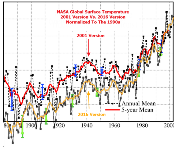
That history webpage from GISS includes a graph (their Figure 3) of how their Meteorological Station Data, a.k.a. “dTs” data, smoothed with 5-year running means filters, have changed with time. That graph is interactive, allowing you to highlight the vintage of the data and zoom in. But a version with all of the colors intensified is available here. I’ve included it as my Figure 10. The various generations of the dTs data are also available from GISS here as zipped text and .csv files.
GISS writes regarding their Figure 3 on that history webpage:
For historical reasons we also maintain a calculation of the anomalies that would result if one only used the meteorological station data. This estimate is not affected by issues in ocean data processing, but because the land is warming faster than the ocean, it has a larger trend than the land-ocean index that is now our standard product. That too has been remarkably stable over the years:

Figure 10 (Color-Intensified Version of Figure 3 from GISS History Webpage)
Clearly, the 2016 version has the highest long-term warming rate.
“[R]emarkably stable”? Figure 11 is similar to Figure 2, comparing the current version of the GISS land surface-based global temperature (dTs) anomaly data and the original Hansen and Lebedeff (1987) version for the period of 1880 to 1985. But in Figure 11, I’ve shifted the data so that the trend lines intersect with zero at 1880. That helps to highlight the different warming rates between the current and 1987 versions of the GISS dTs data. Sorry, GISS, that doesn’t appear to be “remarkably stable” to me. We must have different definitions of “remarkably stable”.

Figure 11
CLOSING
In this post we examined the differences between the current version and the original version of the land surface-based global surface temperature anomaly data presented in the 1987 paper by Hansen and Lebedeff. As noted in the opening, the dTs global surface temperature dataset presented in this post is not the “official” dataset from GISS, but the comparisons provided us with rough idea of how land surface air temperature data have changed in 30 years: 1987 versus now.
Between the 1987 version and the current version, adjustments to the GISS Meteorological Station Data, a.k.a. “dTs”, have increased the long-term warming rate from 1880 to 1985 (Figures 2 and 11) and increased the short-term warming rate from 1965 to 1985 (Figure 6).
Between the 1987 and current versions, the adjustments to the GISS dTs data decreased the warming rate from 1880 to 1940 (Figure 4) and decreased the cooling rate from 1940 to 1965 (Figure 5).
We also discussed the initial look by Hansen and Lebedeff (1987) on the impacts of heat island effect on land-based global surface temperatures.
Next we’ll look at the many versions of the GISS Land-Ocean Temperature Index. (Thanks, Gavin, for adding that GISS History webpage with all of the links to past generations of the GISS data.)
These are the Obama Era adjustments to temperature.
The result, since the beginning and end points are about equal, is that there is no change to the trend from the 1880s but much the early 20th century warming has been pushed into the post 1975 period to make that period look like it was warming faster than the first 1/2 century.
I’m not fooled.
Thanks PA, useful graph. Note the strongly increasing negative adjustments from 1920 to 1940. Like you say, a pretty obvious attempt to rub out the inconvenient earlier warming which was just as strong as the so-called AGW of late 20th c.
The whole exercise has been to adjust, correct and homogenise the observed data to conform to a preconceived hypothesis.
“I’m not fooled.”
Maybe not, but you are paying for it.
NO. If you want a measure of change in heat content use SST not fruit-salad mix of land and sea.
In truth even land + sea exaggerates the warming since land has about half the specific heat capacity of water, so the 30% contribution of land is twice as strong as it should be.
In short you can not meaningfully add land and sea dTs together.
https://judithcurry.com/2016/02/10/are-land-sea-temperature-averages-meaningful/
If you want to know how much land temps respond to the unfathomable mix of radiative “forcing”, look at land. If you want to know how much the oceans change look at SST. Don’t make fruit salad my mixing apples and oranges and putting it in a blender.
If you want a calorimeter to estimate the total radiative forcing the best you can do is SST, though it is obviously not fully complete it is best we’ve got, unless you are only interested in post 2003 in which case look at OHC data.
The whole reason for the prominence of these fictitious land + sea databases is the fact that they exaggerate warming. There is not such thing as an “average temperate” : temperature is not an additive quantity.
THAT is the what the “basic physics” tells us. Let’s read that again TEMPERATURE IS NOT AN ADDITIVE QUANTITY.
LOTI, HadCRUFT and the rest are fiction. Physically meaningless statistics, not physical science.
“If you want to know how much land temps respond to the unfathomable mix of radiative “forcing”, look at land. If you want to know how much the oceans change look at SST. Don’t make fruit salad my mixing apples and oranges and putting it in a blender. ”
in short this is complete b0ll0cks Greg. Land temps respond to more than radiative forcings.
Trying to Isolate out ocean influence, fail, NOAA tried this with their “2015 hottest year”
Copy paste warrior shows up within minutes.
After quoting GISS, Greg write, “NO. If you want a measure of change in heat content use SST not fruit-salad mix of land and sea…”
Nowhere in the quote you provided does GISS mention heat content. They’re discussing surface temperatures. Also, sea surface temperature does not represent heat content.
never mind Greg.
One thing Bob.
You should really discuss SOURCES when you discuss GISS.
In the end GISS doesnt do very much. Same with CRU.
GISS :
1. Ingest from NOAA and a couple other sources
2. They QC a little bit
3. They adjust for UHI
So data changes are upstream mostly.
Also, based on time frame you have to detail the various versions of NOAA data they use
in the end GISS is just an aggregator of data.
Seems to me that Hansen’s treatment of Heat island effects is designed to deflect from the truth. Its the small semi rural growing towns of less than 100,000, and the Airports that will have the biggest increase in dT of heat island effect over time, and will contribute most to the “warming”
Hansen’s criteria for rural is less than 14 people per sq km.
Next. if you compare airports versus non airports.. there is no difference.
Bob you clearly pointed out things that have been nagging at me for a year. I think you have made a good point, and that point is GISS is not reliable.
We were all aware of the adjustments, but the usual conspiracy theory nonsense gets thrown about by the hyperbolic warmists, and out and out liars. You’d detailed the changes and issues clearly and broke it down, no conspiracy theory to be found with this post.
Good work
PA exactly, the data appears to have been adjusted to match the IPCC CO2 growth since 1880.
We are at a point now where it is literally “all warming is man, all cooling is natural” veiled arguments.
As Steve McIntyre recently said “expect them to attack like white blood cells”.
Berkeley Earth already covered this and confirmed the surface data, plus confirmed urban heat islands weren’t skewing it.
http://berkeleyearth.org/summary-of-findings/
And in detail:
http://www.scitechnol.com/2327-4581/2327-4581-1-104.pdf
and what data sets did they use?
14 different data sources.
The vast majority is GHCN DAILY DATA.
in the UHI study there were 36000 stations
15000 were very rural
21000 were not very rural.( small rural and urban)
very Rural was defined by Modis500 satellite data. basically we found No signs of human influence
( pavement , buildings ) within 10 km of the site. These 15K sites had basically zero population from the beginning of the record to the end.
basically 15K sites that havent had any buildings or people for the entire record.
Not very rural 21K stations. These stations showed Some human building within 10Km of the site.
7000 of these stations had populations of 1-10 people per sq km. the median population of the 21K
stations was 31 people per sq km in 1900. By 2005 the median population of the 21K stations is
31people per sq km. For comparison, Tokoyo has 6000 people per sq KM. As an example
Tokoyo shows 3C of warming per century in raw data…. 1C of warming after we run our adjustment code.
When I try follow the data info I get page not found lol
http://berkeleyearth.org/dataset/
http://berkeleyearth.org/source-files/
or log into the SVN
Ironically it is fine for Berkely to accept Charles G. Koch Charitable Foundation assistance.
If that was on a paper against AGW the paper would have been “discredited”
Oh the hypocrisy
UHI should compare delta T with delta P. Berkley compared delta T with P. Why did they not see this? Because they got the answer they were looking for. Observer expectation effect.
Don’t expect to get the right answer with the wrong math.
Problems with Berkeley Earth are well documented.
ah more blog science..
MarkW
May 20, 2016 at 7:10 am
Problems with Berkeley Earth are well documented.
——————–
Berkeley Earth temp adjustments seems to be the dodgiest ones, and Mosher seems very proud of it…..
Way to go Mosh….
The basic conclusion, if looked carefully, is that the product of these adjustments shows clearly that it completely relies in arbitrary selectivity and cherry-picking, to a point that the short term temp measurements in the further past are treated and considered as better and more accurate measurements than closer to present modern measurements of short term temps……more than any other adjustments from other such authorities………
Less impact in the past and more to the present……..
Please Mosh say that this is wrong….
cheers,
To paraphrase Jim Butler at NOAA “A CO2 jump from El Nino at Mauna Loa is scary but it’s El Nino.
El Nino warming managed to affect CO2 growth, yes warming leads CO2 growth. Fancy that.
No Jim it’s evidence warming drives CO2 growth
Then why has CO2 continued to increase during the pause?
Integral lag
translation of the article: “cool the past warm the present”.
Nothing new under the sun.
Conclusion, warming rate less than claimed, matches CO2 growth less, and warming drives CO2
well in there Bob. Expect the following desperate attempt to shoot this down with unprovable arguments and misdirection
Trends are different if UHI affects Tmin rather than Tmax, meaning that Taverage has some conflicting variables. It really is better to plot Tmax and T min separately and not analyse Taverage. You will be led to different interpretations.
I’ve looked at detailed Australian data for a decade now. The quality of data on the transcription sheets of the observers, plus the low station density, is not adequate to do in-depth comparison of early data. By the same token, it is open licence for official cherry picking, with abundant excuses to accept or reject data that does not ‘fit the desired pattern’. If indeed that is done. Depending on whether one is commercial or academic, the realistic commercial error envelope around Australian data up to about 1980 would be about +/- 1 deg C. The commercial envelope is meant to be like the one calculated by researchers with no skin the game.
So, Bob, for some of the data at least, you can make just about whatever graph you like.
It might help a little to add in large numbers of observations from other sites to get a version of the ‘law of large numbers’ to work, but it does not cope with systematic errors which have a bias in one direction, as is often the case to be found by looking at data day by day, station by bloody mindless station.
Mosher might drop by to say that for his best temperature ouvre, adjustments to raw lead to less warming. Well, an error is an error. You have to look at the magnitude of adjustments, preferably in degrees as measured and not anomaly style, to ensure that error envelopes include that range. Like in your fig 3, you have a range of +/- 0.15 on your anomaly difference graph, so that’s a base to which other errors can be added. Then you have another +/- 0.1 deg for conversion F to C, then another +/- 0.2 deg C from UHI. See how you can get near to +/- 1 deg C? Then you assume temperature adjustment changes to be selected and applied for either long-term gradual style or short term abrupt, when usually you have no idea of which applies. Did a shade tree grow for decades, did it decay in decades or in a day of chain sawing? So you adjust the temperature without asking too much about how this affects strict physics where people raise it to the power of 4 and so on. The objections to homogenisation are many.
One of them is that it is very hard to know for my country Australia, whether the data provided to GISS have already been homogenised, and whether GISS processes homogenise more.
You could write a book about objections of a purist to this kiddy math homogenisation.
You can’t make a silk purse from a sow’s ear, before you even start to fiddle.
we know from thousands of experiments done in other fields of science, that unless the adjustments and the underlying methodology are double blind, it is inevitable that adjustments will increase error, not remove error.
it is plain that temperature adjustment have not employed double blind experimental controls. the people designing the adjustments have “peeked” at the results to evaluate the results of the adjustments, to see if they are working as they expected.
At the moment they “peeked” at the results they invalidated the experiment. they have introduced their sub-conscious bias into the temperature data, rendering the results unfit for purpose.
No argument that the adjustments reduced error holds any water. The simple fact is that the adjustment process has violated experimental controls required to prevent induced bias, and the temperature data is no longer fit for purpose.
Jennifer Marohasy definitely pointed out bogus homogenisation of certain stations that never changed over time, perfect stations that had data altered
“You could write a book about objections of a purist to this kiddy math homogenisation.”
actually “you: could not. well maybe a nonsense book.
Nah I’d rather write a book about a bunch of modelers and statisticians who think they can measure the earth’s temperature to within a 10th of a degree.
I’d call it “fools gold”.
Ironically 90% of what you say is complete gibberish, baseless nonsense based on nothing empirical
It is easy to fiddle with the temperature trends but such fiddling is really irrelevant because AGW is not just a theory about temperature trends but a theory that temperature trends are caused by fossil fuel emissions and that they can be attenuated by changing the rate of fossil fuel emissions.
That relationship would be a lot harder to fiddle because it just isn’t there.
http://papers.ssrn.com/sol3/papers.cfm?abstract_id=2725743
interesting paper. Spurious correlation due to comparing T to CO2, but GHG theory says that delta T varies with (ln) delta CO2. Climate science is using the wrong test. A test that can be shown to result in spurious correlations.
“In the climate change example shown in Figure 1 we find that the annual rate of fossil fuel emissions is always positive and never negative. When this constraint is entered into our Monte Carlo simulation significant changes are observed in the results as shown in Table 2 and Figure 7.
The results show that when Δx is always positive, the spurious correlations tend to be larger and more common. As the bias for positive changes in Δy is increased to 2% and higher, almost perfect positive correlations between cumulative values are quickly attained even though the correlations between Δx and Δy remain at zero. These results indicate that the there is a greater probability of spurious correlations between cumulative values when Δx is always positive and a greater certainty that correlations between cumulative values do not contain useful information about the relationship between Δx and Δy.”
Nit pick. I think you mean delta ln(CO2).
for example: the distance your car travels is strongly correlated with the amount you push the brake pedal. the more you press the brake pedal, the further your car is likely to have travelled.
it is only when you compare the acceleration of the vehicle to the change in position of the brake pedal that you discover that the correlation is spurious.
Bob,
Hansen and Lebedeff were working before the big GHCN project of the 1990’s, so they had much fewer stations. GHCN now has 7280 stations in total; here is Fig 4 from H&L
http://www.moyhu.org.s3.amazonaws.com/2016/5/hansleb.png
“This post is more like the comparisons at RealScience.”
No, Steve Goddard doesn’t bother about whether he’s comparing land stations with land/ocean.
GHCN now has 7280 stations in total
==========
yeow! that big pulse of stations added and removed will play hell with the data analysis. depending on method chosen you could get pretty much any result you wanted. huge opportunity for experimenter bias to creep in undetected.
yes.
Skeptics complained about data selection.
So they asked us at Berkeley earth to PLEASE use ALL the data.. Not just NOAA data.
So we did
We went back to sources: Daily sources.
And we compiled everything from scatch.
And we got the same answer.
And now skeptics say..
Wait wait… dont use all the data.. use only the rural
So we did.
And we got the same answer
And the skeptics say… wait wait… only use this data or that data..
And I think too funny, its like Mann and bristlecone pine trees.. only in reverse
Steven M says:
Skeptics complained about data selection.
Which ‘skeptics’? Can you name them?
Tell Heller that then.
You are using his number of stations argument ironically
Climate science routinely violates a fundamental principle of experimental controls. If you don’t get the results you want with method 1, switch to method 2. Repeat until you get the desired answer then stop. Only publish the results of the final method N. Hide the results of methods 1 through N-1 that are screaming at you that method N is biased.
Put a fancy name on the method, like “tree ring calibration” to hide the statistical nonsense and spurious correlations. The Public cannot determine if Expert 1 or Expert 2 is correct. Even the Experts don’t know for sure, so long as methods 1 through N-1 remain hidden.
Nick, the graph here from the new GISS History webpage includes dTs (1981 & 1987) and LOTI data:
http://data.giss.nasa.gov/gistemp/history/output/history_loti.png
Nick says, “Hansen and Lebedeff were working before the big GHCN project of the 1990’s, so they had much fewer stations. GHCN now has 7280 stations in total; here is Fig 4 from H&L”
Thanks for the graph, Nick. I mentioned in the post, under the heading of ADDITIONAL ADJUSTMENTS:
Much has changed since 1987 with how GISS determines global mean temperature anomalies. Data from many new land surface stations have been added…
Cheers.
Nothing like 7280 stations – all adjusted to produce a warming trend – it is robust adjustment trend.
Like Reykjavik Iceland. Raw is red and Adjusted is green. Cooling turned into warming.
http://s32.postimg.org/96azqdp51/Reykjavik_Raw_and_Adjusted.png
7280 more examples at:
ftp://ftp.ncdc.noaa.gov/pub/data/ghcn/v3/products/stn-vs-net/ghcn/
yes.. Thats why a better strategy is to start with DAILY DATA that is not adjusted.
we did that.
Opps we got the same answer
no you altered the national met data of countries and filled it in with your own versions.
There’s a word for that
“no you altered the national met data of countries and filled it in with your own versions.
There’s a word for that”
yes in a side by side comparison with national MET data ( for countries that do compilations)
we show LESS WARMING than the official versions.
Opps.. you didnt know that mr random nameless coward from the internet
It is against US Federal law to tamper with US Federal property. Wonder if this applies? If historical data is actually replaced in the archives it may. If the original data is maintained and the “adjustments” applied, maybe not.
It will be interesting if Trump gets elected how much the Justice department may go after a lot of the people shielded by Obama’s DOJ.
Maybe they faked pictures of the holocaust while they were at it
Now you just show your true colours, comparing challenging lies from your camp with Holocaust denial is as low as you can get and an insult to any survivor you muppet, this is where I’d wring your neck if you were in range you smarmy clown
Apologies Anthony and all. Little over the top there, though I have a good person reason to despise such use of the Holocaust.
Mosher you are coward, spew that garbage behind an internet connection. Anyone who’s used such cack to my face didn’t have a happy ending.
Nonetheless it’s not a reason for me to be aggressive on here, it is not my intent.
Cowards really get my back up
*reason
too funny
Mark_Helsinki…
An anonymous commenter.. too scared to use his real name…
says that cowards get his back up
How does he live with himself?
Maybe they faked pictures of the holocaust…
Well, some folks fake pictures of themselves as Nazis:
Interesting discussion of “adjusted” data.
You call it what ever you want.You use what ever science you want .Temps appear to rise after the death of Tesla.Tesla was reported to boast that he could manipulate the weather.After he died all his research was taken.You make up your own mind as to what was done.
Dunno about that mate, bit of a stretch, that’s putting it mildly, but the Geoengineering they are talking about, has at least in part being going on for a few years.
How has this impacted high level clouds that trap heat, unlike low level which block energy
Anyone that doubts this, what people have been saying is happening for at LEAST 5 years, is exactly what they are proposing now, hardly coincidence.
Making adjustments to temp data is going on at the reader level as well. Locally i have noticed the adjustments on local temp gauges. All temp data is revised. This is a practice that has gone on as long as i have been watching these station near me. Gov, and or it’s agencies, can not ever be trusted.
I heard that Christy and Spencer adjust their data too!!!!
maybe they are spies for the warmists?
Glenn beck said so but the tweet was erased
For the umpteenth time:
Adjusting temperatures is acceptable, if there is a good reason/rationale given.
But there are at least three caveats:
• ALL the original, raw data should be made available, and all adjustments must be explained every step of the way.
• When publicizing the result of the ‘adjustments’, the summary should clearly explain that the headline refers to the final adjustments, not to the original data.
• Error bars should be included in all results.
Too often a headline blares: HOTTEST MONTH EVAH!!
Then when we read the fine print, “Evah!!” refers to only the past few decades. Most of the public is unaware that global temperatures have been more than 10ºC higher than now, without causing the same catastrophes predicted by the alarmist faction for a mere 2º rise in temperatures.
Anyone who believes there isn’t an agenda behind many of the ‘adjustments’ is too credulous and naive to be commenting here. That agenda paves the way for the passage of a carbon tax law, which would confiscate immense revenues from the public.
Furthermore, those taxes would substantially lower the average person’s standard of living, while ballooning the enforcement bureaucracy. But carbon taxes would not lower global temperatures by even 0.000001ºC. They would do nothing with regard to global temperatures.
Getting a carbon tax passed is the government’s motive for misrepresenting the temperature records. I’m not saying B.E.S.T. does the same thing; I don’t know. But anyone who followed the EPA’s dog and pony show leading up to its declaring CO2 a “pollutant” knows they misrepresented the true situation. CO2 is no more a pollutant than H2O.
But a “carbon” tax is a very easy way to levy a tax on all goods and services, since those all emit CO2, either in their manufacture, or transportation, or energy use during production.
That’s the basis for the “dangerous man-made global warming” scare: the government (including the UN) intends to take a large part of your income, but you will get nothing good in return for what it will cost you. Nothing.
Unlike you sly lot they dont have an agenda, they aren’t feeding off the tax payer like you hoards of bloodsuckers if not you personally, are you scabbing tax payer money?
too funny
“• ALL the original, raw data should be made available, and all adjustments must be explained every step of the way.”
You just condemned roy spencer.
No, I didn’t. I condemed government agencies and the self-serving bureaucrats who run them.
One thing that a lot of people forget, or try hard to hide, is that whenever you make adjustments to the raw data, you have to increase the error bars. These guys try to pretend that their magical “adjustments” actually reduce the error bars.
According to one of Bob’s previous articles the long term trend in the adjusted GISS global land and ocean surface data (1880 – 2015) is slower than the trend in the raw global land and ocean surface data: ?w=640&h=540
Why would NASA be adjusting temperature data to make the long term warming trend seem slower than that seen in the raw data?
If recent adjustment to GISS have raised the long term warming compared to the older estimate, then this is only bringing GISS more into line with the trend already seen in the raw data.
“These guys try to pretend that their magical “adjustments” actually reduce the error bars.”
err no. but nice try.
generally what you say is true. In the past the uncertainty due to adjustments was not propagted into final uncertainties ( they are tiny). That’s one of the reasons why we did our adjustments the way we did them.
top down.
Our monthly error is about three times the size of CRU estimates.
Bob,
How do the adjusted GISS data (both versions) compare to the raw global land and ocean data you posted in this article a few weeks back? https://bobtisdale.wordpress.com/2016/05/07/do-the-adjustments-to-the-global-landocean-surface-temperature-data-always-decrease-the-reported-global-warming-rate/#more-10790
You noted then that the adjusted GISS data showed ‘less’ warming than the raw data over the period 1880 to 2015 (0.069 C/dec for GISS and 0.078 C/dec for raw).
It’s how it is adjusted, ie to match CO2. Centered on 1960 which is when IPCC say we have an influence plus to show lower temp when CO2 was lower
Again from Bob’s previous article, this chart shows global land/ocean surface temperature trends since 1975: ?w=640&h=540
It shows that the GISS trend since 1975 is 0.174 C/dec versus the raw trend of 0.172 C/dec. The latest GISS adjustments to the global land/ocean surface temperature record have raised the warming rate by a whole 0.002 C/dec!
So even an overall lower raw (if it is actually raw) is irrelevant, temp matching CO2 levels is what it is all about
Karl’s pause buster is yet more of the same
And satellite data was “good” until GISS started adjusting data. Then when they diverged, Satellite data is bad mmkay
http://www.drroyspencer.com/wp-content/uploads/UAH_LT_1979_thru_April_2016_v6.png
Considering the uncontaminated UAH satellite temperature chart above, and the fact that the Climate Change Gurus, in their Climategate emails, said the decade of the 1930’s was hotter than 1998, my question is: How do those two facts square with any chart in this article (an example below)?
None of the charts show the 1930’s as hotter than 1998, so Hansen’s 1987 model must be using bastardized data, too. Am I wrong?
This chart includes a plot of the raw data since 1880 (purple line): ?w=640&h=540
As you can see, even the raw data show that the 1930s were much cooler than recent decades, at least on a global scale.
DWR54 wrote: “As you can see, even the raw data show that the 1930s were much cooler than recent decades, at least on a global scale.”
I posted a 1981 Hansen surface temperature chart that shows the 1930’s as being hotter than subsequent years. The NCAR chart shows it, too.
I posted it a few minutes ago, but it hasn’t shown up yet.
TA
“I posted a 1981 Hansen surface temperature chart that shows the 1930’s as being hotter than subsequent years. The NCAR chart shows it, too.”
______________
Thanks. I look forward to its appearance. Are you sure it wasn’t a US only based chart?
Ya, you are wrong.
[explain why, Mr. “Show the data and Code”, otherwise your argument is nothing more than emotional -Anthony]
His arguments are always emotional, and disingenuous. Like Schmidt, another smug horrible human being
“None of the charts show the 1930’s as hotter than 1998, so Hansen’s 1987 model must be using bastardized data, too. Am I wrong?”
Note how anthony lets any speculation slide by moderation..
[Reply: Do you prefer censorship? -mod]
Speculations and assertions that fit his bias.
you might as well invite Goddard back to post, you let him sock puppet with impunity
is it any wonder that people dont take this seriously any more?
is it any wonder that serious discussion goes to places like Judith’s
No. its pretty clear.
Of course in the old days rank speculation about crimes and fraud would not get past moderation.
never at a place like climate audit and rarely at WUWT..
but now… ya.. we didnt land on the moon and all the data is cooked.
Oh wait… Watts 2010 used cooked data.. will watts 2016(7)(8)(??) use the data that WUWT readers swear is cooked?
[Oh jeez Mosher, moon landing? cooked data? Goddard is sock-puppeting? You are off your nut. You’ve just shot your own credibility to hell. -Anthony]
It is not the earth that is being cooked, it is the data.
Figures don’t lie. Liars figure.
Arrest them all,, its the new WUWT motto
How many examples would you like, of climate alarmists threatening skeptics with imprisonment or worse?
I have a folder full of examples. I’ll match you three for one, and still have plenty in reserve.
http://realclimatescience.com/wp-content/uploads/2016/05/2016-05-09054903.png
This 1981 temperature chart is the Hansen chart you should be using in your comparisons. See how Hansen shows the 1930’s as hotter than any subsequent year.
Where’s the database for that chart?
And even in 1981, Hansen was modifying the temperature data to make the 1930’s look cooler. Compare the NCAR chart to Hansen’s 1981 chart.
The ENSO data page here at WUWT is becoming more and more dysfunctional.
Almost no page is refreshing automatically.
On clicking, one or two of them show up to date images.
Most show NOT FOUND e.g.
http://www1.ncdc.noaa.gov/pub/data/cmb/teleconnections/eln-5-pg.gif
I guess now that temperatures are falling steeply its not too surprising to see technical problems like this pop up. But I would have expected at least a show of effort, at a site like this, to overcome these problems.
Or are you being leaned on to keep away images like this from the sheeple:
http://weather.unisys.com/surface/sst_anom.gif
That’s funny – the embedded images shown are again way out of date.
Nick Stokes has pointed out that WordPress caches images from links to HTTP sources and only displays the cached image even when a newer image is available at the source (which I noticed recently as well). He says the only way to avoid this problem in WordPress blogs, including comments, is to use an HTTPS URL to the image if it is available (not all websites support HTTPS). Links to images with HTTPS URLs should stay current in WordPress (and by the way thanks Nick for the info).
The Hansen and Lebedeff (1987) temperatures have a better fit to the CMIP5 models from about1900 till about 1960 then the adjusted temperatures do.
you cannot simply compare them.
They right way to do it would be to mask the CMIP5 using the locations from the 1987 data.
too funny