As you’ll soon see, there was an eye-catching uptick (+0.25 deg C) in the GISS global Land-Ocean Temperature Index (LOTI) data from September to October 2018. We’ll have to wait for next month’s update to see if it also appears in the NOAA and Met Office datasets.
This post provides updates of the values for the three primary suppliers of global land+ocean surface temperature reconstructions—GISS through October 2018 and HADCRUT4 and NOAA NCEI (formerly NOAA NCDC) through September 2018—and of the two suppliers of satellite-based lower troposphere temperature composites (RSS and UAH) through October 2018. It also includes a long-term model-data trend comparison, which shows a number of major flaws in the climate models used by the IPCC for their 5th Assessment Report.
NOTE: As noted in the post A Quick Post before the Monthly Global Surface and TLT Temperature Updates, I’ve added two graphs to this post. You’ll find them near the end. [End note.]
This is simply an update, but it includes a good amount of background information for those new to the datasets. Because it is an update, there is no overview or summary for this post. There are, however, simple monthly summaries for the individual datasets. So for those familiar with the datasets, simply fast-forward to the graphs and read the summaries under the headings of “Update”.
INITIAL NOTES:
I took a hiatus from blogging for almost two years. During my absence, in July 2017, RSS (Remote Sensing Systems) revised their lower troposphere temperature data with their version 4.0 data. See the RSS webpage FAQ about the V4.0 TLT Update for more information. We briefly discussed the impacts of these changes recently in the post The New RSS TLT Data is Unbelievable! (Or Would That Be Better Said, Not Believable?) A quick Introduction (Cross posted at WattsUpWithThat here.) Dr. Roy Spencer also discussed the revised RSS v4.0 TLT data in his post Comments on the New RSS Lower Tropospheric Temperature Dataset, which was cross posted at WattsUpWithThat here.
IMPORTANT NOTE: The recent revisions to the RSS Lower Troposphere Temperature data may have brought the warming rate of their data more into line with climate model projections globally, but in the all-important tropics, the revisions had little impact on the disparity between models and data, as discussed and illustrated in Dr. Roy Spencer’s post Warming in the Tropics? Even the New RSS Satellite Dataset Says the Models are Wrong. [End important note.]
Back in 2016, we discussed and illustrated the impacts of the adjustments to surface temperature data in a number of posts:
- Do the Adjustments to Sea Surface Temperature Data Lower the Global Warming Rate? (WattsUpWithThat cross post is here.)
- UPDATED: Do the Adjustments to Land Surface Temperature Data Increase the Reported Global Warming Rate? (WattsUpWithThat cross post is here.)
- Do the Adjustments to the Global Land+Ocean Surface Temperature Data Always Decrease the Reported Global Warming Rate? (WattsUpWithThat cross post is here.)
The NOAA NCEI product is the new global land+ocean surface reconstruction with the manufactured warming presented in Karl et al. (2015). For summaries of the oddities found in the NOAA ERSST.v4 “pause-buster” sea surface temperature data see the posts:
- The Oddities in NOAA’s New “Pause-Buster” Sea Surface Temperature Product – An Overview of Past Posts
- On the Monumental Differences in Warming Rates between Global Sea Surface Temperature Datasets during the NOAA-Picked Global-Warming Hiatus Period of 2000 to 2014
Even though the changes to the ERSST reconstruction since 1998 cannot be justified by the night marine air temperature product that was used as a reference for bias adjustments (See comparison graph here), and even though NOAA appears to have manipulated the parameters (tuning knobs) in their sea surface temperature model to produce high warming rates (See the post here), GISS also switched to the new “pause-buster” NCEI ERSST.v4 sea surface temperature reconstruction with their July 2015 update.
IMPORTANT NOTE 2: NOAA recently updated their “Pause-Buster” ERSST.v4 sea surface temperature data to the “Pause-Buster2” ERSST.v5. See the post A Very Quick Introduction to NOAA’s New “Pause-Buster 2” Sea Surface Temperature Dataset ERSST.v5. The WattsUpWithThat cross post is here. [End important note 2.]
The UKMO also recently made adjustments to their HadCRUT4 product, but they are minor compared to the GISS and NCEI adjustments.
We’re using the UAH lower troposphere temperature anomalies Release 6.0 for this post as the paper that documents it has been accepted for publication. And for those who wish to whine about my portrayals of the changes to the UAH and to the GISS and NCEI products, see the post here.
The GISS LOTI surface temperature reconstruction and the two lower troposphere temperature composites are for the most recent month. The HADCRUT4 and NCEI products lag one month.
Much of the following text is boilerplate that has been updated for all products. The boilerplate is intended for those new to the presentation of global surface temperature anomalies.
Most of the graphs in the update start in 1979. That’s a commonly used start year for global temperature products because many of the satellite-based temperature composites start then.
We discussed why the three suppliers of surface temperature products use different base years for anomalies in chapter 1.25 – Many, But Not All, Climate Metrics Are Presented in Anomaly and in Absolute Forms of my free ebook On Global Warming and the Illusion of Control – Part 1 (25MB).
And I’m also continuing to present the model-data 30-year trend comparison using the GISS Land-Ocean Temperature Index (LOTI) data.
We’ll start the updates with the surface temperature-based datasets.
GISS LAND OCEAN TEMPERATURE INDEX (LOTI)
Introduction: The GISS Land-Ocean Temperature Index (LOTI) reconstruction is a product of the Goddard Institute for Space Studies. Starting with the June 2015 update, GISS LOTI had been using the NOAA Extended Reconstructed Sea Surface Temperature version 4 (ERSST.v4) for ocean surface temperature data, the pause-buster reconstruction, which also infills grids without temperature samples. More recently, since September 2017, GISS LOTI has been using the NOAA Pause-Buster2 Extended Reconstructed Sea Surface Temperature version 5 (ERSST.v5). For land surfaces, GISS adjusts GHCN and other land surface temperature products via a number of methods and infills areas without temperature samples using 1200km smoothing. Refer to the GISS description here. Unlike the UK Met Office and NCEI products, GISS masks sea surface temperature data at the poles, anywhere seasonal sea ice has existed, and they extend land surface temperature data out over the oceans in those locations, regardless of whether or not sea surface temperature observations for the polar oceans are available that month. Refer to the discussions here and here. GISS uses the base years of 1951-1980 as the reference period for anomalies. The values for the GISS product are found here. (I archived the former version here at the WaybackMachine.)
Update: The October 2018 GISS global temperature anomaly is +0.99 deg C. According to the GISS LOTI data, global surface temperature anomalies made a sizeable and very-noticeable uptick since September, a +0.25 deg C increase.

Figure 1 – GISS Land-Ocean Temperature Index
NCEI GLOBAL SURFACE TEMPERATURE ANOMALIES (LAGS ONE MONTH)
NOTE: The NCEI only produces the product with the manufactured-warming adjustments presented in the paper Karl et al. (2015). As far as I know, the former version of the reconstruction is no longer available online. For more information on those curious NOAA adjustments, see the posts:
- NOAA/NCDC’s new ‘pause-buster’ paper: a laughable attempt to create warming by adjusting past data
- More Curiosities about NOAA’s New “Pause Busting” Sea Surface Temperature Dataset
- Open Letter to Tom Karl of NOAA/NCEI Regarding “Hiatus Busting” Paper
- NOAA Releases New Pause-Buster Global Surface Temperature Data and Immediately Claims Record-High Temps for June 2015 – What a Surprise!
And:
- Pause Buster SST Data: Has NOAA Adjusted Away a Relationship between NMAT and SST that the Consensus of CMIP5 Climate Models Indicate Should Exist?
- The Oddities in NOAA’s New “Pause-Buster” Sea Surface Temperature Product – An Overview of Past Posts
- On the Monumental Differences in Warming Rates between Global Sea Surface Temperature Datasets during the NOAA-Picked Global-Warming Hiatus Period of 2000 to 2014
Introduction: The NOAA Global (Land and Ocean) Surface Temperature Anomaly reconstruction is the product of the National Centers for Environmental Information (NCEI), which was formerly known as the National Climatic Data Center (NCDC). NCEI merges their new “pause buster2” Extended Reconstructed Sea Surface Temperature version 5 (ERSST.v5) with the new Global Historical Climatology Network-Monthly (GHCN-M) version 3 for land surface air temperatures. The ERSST.v5 “pause buster2” sea surface temperature reconstruction infills grids without temperature samples in a given month. NCEI also infills land surface grids using statistical methods, but they do not infill over the polar oceans when sea ice exists. When sea ice exists, NCEI leave a polar ocean grid blank.
The source of the NCEI values is through their Global Surface Temperature Anomalies webpage. Click on the link to Anomalies and Index Data.)
Update (Lags One Month): The September 2018 NCEI global land plus sea surface temperature anomaly was +0.78 deg C. See Figure 2. It made a minor uptick (an increase of about +0.04 deg C) since August 2018.

Figure 2 – NCEI Global (Land and Ocean) Surface Temperature Anomalies
UK MET OFFICE HADCRUT4 (LAGS ONE MONTH)
Introduction: The UK Met Office HADCRUT4 reconstruction merges CRUTEM4 land-surface air temperature product and the HadSST3 sea-surface temperature (SST) reconstruction. CRUTEM4 is the product of the combined efforts of the Met Office Hadley Centre and the Climatic Research Unit at the University of East Anglia. And HadSST3 is a product of the Hadley Centre. Unlike the GISS and NCEI reconstructions, grids without temperature samples for a given month are not infilled in the HADCRUT4 product. That is, if a 5-deg latitude by 5-deg longitude grid does not have a temperature anomaly value in a given month, it is left blank. Blank grids are indirectly assigned the average values for their respective hemispheres before the hemispheric values are merged. The HADCRUT4 reconstruction is described in the Morice et al (2012) paper here. The CRUTEM4 product is described in Jones et al (2012) here. And the HadSST3 reconstruction is presented in the 2-part Kennedy et al (2012) paper here and here. The UKMO uses the base years of 1961-1990 for anomalies. The monthly values of the HADCRUT4 product can be found here.
Update (Lags One Month): The September 2018 HADCRUT4 global temperature anomaly is +0.60 deg C. See Figure 3. It basically remained the same since the prior month, with a teeny +0.01 deg C uptick from August to September 2018.

Figure 3 – HADCRUT4
UAH LOWER TROPOSPHERE TEMPERATURE ANOMALY COMPOSITE (UAH TLT)
Special sensors (microwave sounding units) aboard satellites have orbited the Earth since the late 1970s, allowing scientists to calculate the temperatures of the atmosphere at various heights above sea level (lower troposphere, mid troposphere, tropopause and lower stratosphere). The atmospheric temperature values are calculated from a series of satellites with overlapping operation periods, not from a single satellite. Because the atmospheric temperature products rely on numerous satellites, they are known as composites. The level nearest to the surface of the Earth is the lower troposphere. The lower troposphere temperature composite include the altitudes of zero to about 12,500 meters, but are most heavily weighted to the altitudes of less than 3000 meters. See the left-hand cell of the illustration here.
The monthly UAH lower troposphere temperature composite is the product of the Earth System Science Center of the University of Alabama in Huntsville (UAH). UAH provides the lower troposphere temperature anomalies broken down into numerous subsets. See the webpage here. The UAH lower troposphere temperature composite are supported by Christy et al. (2000) MSU Tropospheric Temperatures: Dataset Construction and Radiosonde Comparisons. Additionally, Dr. Roy Spencer of UAH presents at his blog the monthly UAH TLT anomaly updates a few days before the release at the UAH website. Those posts are also regularly cross posted at WattsUpWithThat. The UAH lower troposphere temperature product is for the latitudes of 85S to 85N, which represent more than 99% of the surface of the globe. UAH uses the base years of 1981-2010 for anomalies.
The UAH lower troposphere data are now at Release 6. See Dr. Roy Spencer’s post here. Those Release 6.0 enhancements lowered the warming rates of their lower troposphere temperature anomalies. See Dr. Spencer’s blog post Version 6.0 of the UAH Temperature Dataset Released: New LT Trend = +0.11 C/decade and my blog post New UAH Lower Troposphere Temperature Data Show No Global Warming for More Than 18 Years, both of which were published 3 years ago in 2015. The UAH lower troposphere anomaly data, Release 6.0, through October 2018 are here.
Update: The October 2018 UAH (Release 6.0) lower troposphere temperature anomaly is +0.22 deg C. It rose noticeably since September (an increase of about +0.08 deg C).

Figure 4 – UAH Lower Troposphere Temperature (TLT) Anomaly Composite – Release 6.0
RSS LOWER TROPOSPHERE TEMPERATURE ANOMALY COMPOSITE (RSS TLT)
Like the UAH lower troposphere temperature product, Remote Sensing Systems (RSS) calculates lower troposphere temperature anomalies from microwave sounding units aboard a series of NOAA satellites. RSS describes their product at the Upper Air Temperature webpage. The RSS product is supported by Mears and Wentz (2009) Construction of the Remote Sensing Systems V3.2 Atmospheric Temperature Records from the MSU and AMSU Microwave Sounders. RSS also presents their lower troposphere temperature composite in various subsets. See the webpage here. Also see the RSS MSU & AMSU Time Series Trend Browse Tool.
Note: As discussed in the initial notes of this post, RSS also released their version 4 of their lower troposphere temperature anomaly data, the monthly values of which can be found here.
Update: The October 2018 RSS lower troposphere temperature anomaly, Version 4, is +0.53 deg C. It rose a bit (an uptick of +0.04 deg C) since September 2018.

Figure 5 – RSS Lower Troposphere Temperature (TLT) Version 4 Anomalies
COMPARISONS
The GISS, HADCRUT4 and NCEI global surface temperature anomalies and the RSS and UAH lower troposphere temperature anomalies are compared in the next three time-series graphs. Figure 6 compares the five global temperature anomaly products starting in 1979. Again, due to the timing of this post, the HADCRUT4 and NCEI updates lag the UAH, RSS, and GISS products by a month.
I’ve discontinued the comparisons starting in 1998 and 2001. As expected, the global temperature responses to the 2014/15/16 El Niño effectively ended what was known as the global warming hiatus and brought those extremely short-term trends more into line with the models.
Because the suppliers all use different base years for calculating anomalies, I’ve referenced them to a common 30-year period: 1981 to 2010. Referring to their discussion under FAQ 9 here, according to NOAA:
This period is used in order to comply with a recommended World Meteorological Organization (WMO) Policy, which suggests using the latest decade for the 30-year average.

Figure 6 – Comparison Starting in 1979
###########
Note also that Figure 6 lists the trend of the CMIP5 multi-model mean (historic through 2005 and RCP8.5 forcings afterwards), which are the climate models used by the IPCC for their 5th Assessment Report. The metric presented for the models is surface temperature, not lower troposphere.
AVERAGES
Figure 7 presents the average of the GISS, HADCRUT and NCEI land plus sea surface temperature anomaly reconstructions and the average of the RSS and UAH lower troposphere temperature composites. Because the HADCRUT4 and NCEI products lag one month in this update, I’ve only updated this graph through September. What’s really obvious is that the recent update to the RSS TLT data has brought the trend of the average TLT data more into line with the trend of the average of the surface temperature data. See the graph here for a full trend comparison with the older version of the RSS TLT data. Sorry, that’s the last one I have on file.

Figure 7 – Averages of Global TLT Anomaly and Land+Sea Surface Temperature Anomaly Products
MODEL-DATA COMPARISON – 30-YEAR RUNNING TRENDS
One of the best ways to show how poorly climate models simulate surface temperatures is to compare 30-year running trends of global surface temperature data and the model-mean of the climate model simulations of it. See Figure 8. In this case, we’re using the global GISS Land-Ocean Temperature Index for the data. For the models, once again we’re using the model-mean of the climate models stored in the CMIP5 archive with historic forcings to 2005 and worst case RCP8.5 forcings since then. See the post On the Use of the Multi-Model Mean for a discussion of its use in model-data comparisons.

Figure 8
There are numerous things to note in the trend comparison. First, there is a growing divergence between models and data starting in the early 2000s. The continued rise in the model trends indicates global surface warming is supposed to be accelerating, but the data indicate little to no acceleration since then. Second, the plateau in the data warming rates begins in the early 1990s, indicating that there has been very little acceleration of global warming for more than 2 decades. This suggests that there MAY BE a maximum rate at which surface temperatures can warm. Third, note that the observed 30-year trend ending in the mid-1940s is comparable to the recent 30-year trends. (That, of course, is a function of the new NOAA ERSST.v5 data used by GISS.) Fourth, yet that high 30-year warming ending about 1945 occurred without being caused by the forcings that drive the climate models. That is, the climate models indicate that global surface temperatures should have warmed at about a third that fast if global surface temperatures were dictated by the forcings used to drive the models. In other words, if the models can’t explain the observed 30-year warming ending around 1945, then the warming must have occurred naturally. And that, in turns, generates the question: how much of the current warming occurred naturally? Fifth, the agreement between model and data trends for the 30-year periods ending in the 1960s to about 2000 suggests the models were tuned to that period or at least part of it. Sixth, going back further in time, the models can’t explain the cooling seen during the 30-year periods before the 1920s, which is why they fail to properly simulate the warming in the early 20th Century.
One last note, the monumental difference in modeled and observed warming rates at about 1945 confirms my earlier statement that the models can’t simulate the warming that occurred during the early warming period of the 20th Century.
MONTHLY SEA SURFACE TEMPERATURE UPDATE
I haven’t published a monthly sea surface temperature update since October 2016, with the most recent update found here. The satellite-enhanced sea surface temperature composite (Reynolds OI.2) used to be presented in global, hemispheric and ocean-basin bases in those posts. I may start updating them again regularly in the near future. Then again, I may not. It depends on if there’s enough call for it by visitors.
RECENT RECORD HIGHS
We discussed the recent record-high global sea surface temperatures for 2014 and 2015 and the reasons for them in General Discussions 2 and 3 of my most recent free ebook On Global Warming and the Illusion of Control (25MB). (And, of course, the record highs in 2016 are lagged responses to the 2014/15/16 El Niño.) That book was introduced in the post here (cross post at WattsUpWithThat is here).
TWO NEW GRAPHS
I’ve added two graphs to these updates. The new graphs are being added for a simple reason: to provide different perspectives on the increases in global temperatures since 1979.
The graphs are of Berkeley Earth global land+ocean surface temperature data and RSS global lower troposphere temperature data, both in absolute (not anomaly) form. That way they include the annual cycles in temperatures, which are far greater than the warming that’s occurred since 1979, based on their linear trends.
I’ve added the new graphs as follow ups to the post Do Doomsters Know How Much Global Surface Temperatures Cycle Annually? (WattsUpWithThat Cross post is here). I knew the RSS TLT data existed in absolute form, but, sadly, I forgot to include it in the “Doomster” post, so I will be including it in the monthly updates along with the Berkeley Earth surface temperature data.
Figure 9 presents the Berkeley Earth global land+ocean surface temperatures in absolute form, with land surface air temperature data for Arctic sea ice (data here). This is created by adding the “Estimated Jan 1951-Dec 1980 monthly absolute temperature (C)” listed there to their respective monthly anomalies. The trend line is as determined by EXCEL for the absolute data, but the trend value is determined by EXCEL from the anomaly data (not illustrated). I use the anomaly data for the trends for a simple reason: with anomalies, I don’t have to worry about the start and end months to account for the impacts of the seasonal cycles on the trends. The 3.6-deg C span of the average annual cycle (for the period of 1979 to 2017) is listed in the title block.

Figure 9
Figure 10 presents the RSS global lower troposphere temperature data in absolute form. That data are available to the public in easy-to-use formats from the KNMI Climate Explorer, on their Monthly Observations webpage, specifically the RSS MSU 4.0 TLT, webpage. There, the TLT data are presented in K, not deg C, the latter of which we are much more familiar, so I added 273.15 to the monthly K values to convert to deg C. As listed in the title block, the span of the average annual cycle (for the period of 1979 to 2017) is 2.6-deg C. The trend for the RSS TLT data is included in the trend comparison graph, not included in this post (example here).

Figure 10
Of course, in both cases, as mentioned above, the new perspective shows that the average annual cycles in the global surface temperature data and in the global lower troposphere temperature data are much greater that their respective rises in global temperature from January 1979 to October 2018, based on the linear trends. And as is shown in the post Do Doomsters Know How Much Global Surface Temperatures Cycle Annually?, the annual cycle in the Berkeley Global Land-Ocean Surface Temperature data is much greater than the long-term rise in global surface temperatures, based on the linear trend, from 1850 to present. Yet, according to the newly published and written-by-foolish-politicians Summary For Policymakers of the IPCC’s SR15, a 1.5 deg C rise in global average surface temperatures from the new “pre-industrial” base period of 1850 to 1900 is somehow supposed to cause gloom and doom for the Earth and its occupants. How pathetic can those bureaucrats get in their efforts to scare global residents into submitting to their political agendas?!!!! It’s not working here. We can only laugh at their pitiful efforts.
STANDARD CLOSING REQUEST
Please purchase my recently published ebooks. As many of you know, this year I published 2 ebooks that are available through Amazon in Kindle format:
- Dad, Why Are You A Global Warming Denier? (For an overview, the blog post that introduced it is here.)
- Dad, Is Climate Getting Worse in the United States? (See the blog post here for an overview.)
Regards,
Bob
Great data Bob! Thanks for the work you do!
Indeed – easy to understand why Bob took two years off from blogging — he needed to rest so that he could do this.
Would love to see temps between arctic and antarctic circle since warm polar regions in their cold seasons likely skewing temps,
Temperature not a linear measure of energy. Consequently, my stance on this is that the quantification of water vapor is the true climate metric, though I suspect it would not raise near the alarm the constant drumbeat of warm warm warm does, If one looks at the DMI site you can see what I am speaking about, how warm the arctic is in its cold season and the amount that has to add.. Using global temperatures as the climate metric to me is akin to saying someones uniform determines how good he or she is at their sport. Water vapor change quantification and affect on temperatures ( much more where its cold and dry) is where I think this should go, Never happen, would expose a) the antics of the oceans as huge b) re-enforce the role of water vapor vs co2 c) would not be great enough to raise alarm. d) may lead to the idea that less zonal potential energy due to decreased gradients may be a positive thing, I can go on and on ( including I think the chance we can get longer seasonal lead times in forecasts, but I have to watch this snowstorm ( the first of many I think this winter, which will also be blamed on climate change
Joe,
Thanks for much for your insight. I watch your daily updates and weekend ones, thanks for that. Local Meteorologist John Belski pointed out that weatherbell has the best winter forecast and has for several years. Looks like the US model is totally goofy for the eastern USA.
thanks and God Bless
Shrinking Joe etc:
Generally I agree with your views on the influence of water; but mine are more specific.
Gravity ( mainly constant) determines pressure. Pressure determines the temperature at which evaporation of water commences and thereafter the rate of evaporation at constant temperature. ( not strictly true but near enough). At the surface of the earth this results in a constant temperature of 100 C at boiling, which is just one specific point in the graph covering altitudes up to the tropopause. The mean or median of these temperatures results in the global temperature, depending , of course, where and how measurements are taken.
The rate of evaporation responds to the energy input received. (note that the kettle boils faster as you turn up the heat.) A smidge of CO2 is not going to make any difference.
Overall: I am happy that providing my kettle continues to boil at 100 C I have no fears about global warming. After all the Earth’s temperature has been remarkably constant over thousands of years to within some 1% of a norm on the kelvin scale.
All due to the remarkable properties of water and the convenient gravity and solar orbital position we enjoy. (OK challenge the 1% ; but don’t be pedantic)
My priority is cheap energy; but you cannot these days rely on scientists for this. You need Engineers . They are the pragmatic ones able to deliver the goods.
Yes its the high anomalies ( guesses in the main) in the 16% of the NH which is ‘arctic’ which accounts for all the uptick in October. A complete load of steaming BS.
“Would love to see temps between arctic and antarctic circle since warm polar regions in their cold seasons likely skewing temps..”
Good idea (sarc). Just take out the area where warming is most pronounced and the data will show less warming.
how many people live in the arctic snape ? how many of them would like to see it colder in winter time (sarc) 😉
bit chilly
How many people live on the ocean? Should we have a separate product based on population density?
My guess is the skeptics on this forum wouldn’t like the results.
ye, it would show the uhi effect more clearly. global warming is so far down everyones priority list when it comes to things to worry about it’s not even on the list.
There has been no net warming in the Antarctic in recorded history (employing alarmist rhetoric) and no net warming in the Arctic since 1938 (HadCRUT4) and the Arctic T trend has closely followed the Annual Atlantic Multidecadal Oscillation (AMO) index, so far:
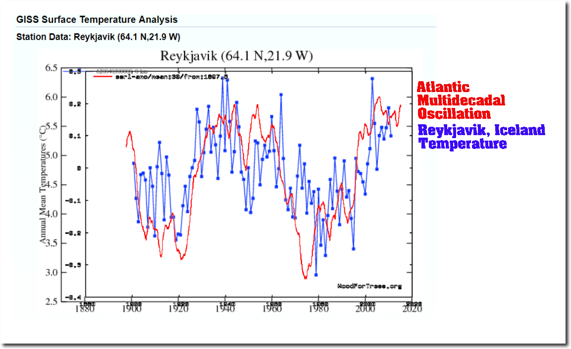
Chris, “and no net warming in the Arctic since 1938 (HadCRUT4)…”
So why the link to Reykjavik, which isn’t even in the arctic?
Pretty petty, my reference for Arctic net warming was HADCRUT4, as far as Arctic T – AMO correlation Reykjavík is near enough.
The Americans, the British and the French can’t be trusted.
You completely missed Joe’s point on the role of water vapour.
Chris
The arctic is a big place, so a time series for one city, not even in the arctic, doesn’t cut it.
What if I claimed, “since 1930, the arctic has been warming 0.4 F /decade”, and used Fairbanks, Ak. as evidence?
https://www.ncdc.noaa.gov/cag/city/time-series/USW00026411/tavg/12/12/1895-2018?base_prd=true&firstbaseyear=1901&lastbaseyear=2000
I guess I’ll just have to go with the old “one thermometer will cover a radius of 1,200 miles” meme. That would seem to cover just about any scenario one could dream up, temperature-wise.
Shrinking Joe says, “Would love to see temps between arctic and antarctic circle since warm polar regions in their cold seasons likely skewing temps…”
Joe, tomorrow morning I’ll email you a comparison graph using the GISS LOTI data from 1979 to present with one curve covering the latitudes of 90S-90N and the other excluding the poles with the latitudes of 60S-60N.
As for now, I’m going outside to make some snow angels.
Have fun,
Bob
Liar! We all know that it cannot snow ever again as Climate Change has melted everything!
I’ll go make sand angels on the beach in your honor, though…:)
Hi Bob
Could you please also post it here.
As an educated guess most of the uptick for October is in the high NH latitudes.
Thanks
Joe, Water Vapor is indeed the sine qua non. Actually, the major part of energy radiated to space comes either from water vapor or directly from the surface. If you’re thinking about radiation to space as seen from space, erase O2, N2, CO2, methane from your mind and visualize only the water vapor and, where it’s really dry, the surface.
I know I’m not teaching you anything Joe, just reinforcing you.
https://www.goes.noaa.gov/nhem/nhem-nwpac-ir2.html
The dark places is where the radiation is coming from.
Joe and Bob – Will Jankowski, our polack-american practical atmospheric scientisr, reckons too that the daily evapouration-condensation cycle covers it all. Hard to disagree……Brett
I definitely think WV is an important influence on the area of the planet that shows the greatest anomaly-namely the Arctic. It essentially oscillates between an ice covered wasteland of ultra cold “continental” type temps and a “marine” influenced temp environment.
Since there is permanent ice at the North Pole and we are in an interglacial, we should not be surprised. The far North is basically at a fairly critical balance point between minimal ice and glaciation. It stands to reason that it is pretty swingey.
Bob Tisdale, thank you for the update and Welcome Back!
Bob be de man!
Bob, you are a powerhouse! Thanks for all the good work.
I found large cumulative changes to both GISS & NOAA data from 2017 to 2018 versions:
Where did it start? GISS uses GHCN-v3 and ERSST v5. Did they change in one year?
Correction, the NOAA change is 0.27 from 11/2017 to 9/2018 versions.
Bob, as you say, simply unbelievable. How many H-bombs would it take to add enough energy to the planet to raise the average temperature from 15 to 15.25 degrees C in just one month? Where did all that extra heat come from? Where did it accumulate?
Robber
The heat came from the tropical – mid latitudes and went to the arctic, because of atmospheric barriers preventing it heading south. Look at ocean heat profiles during same period.
Regards
Expect a similar outcome for November.
The following link takes you to a charting page on the National Climate Data Center that allows you to graph data back to 1895 month by month. It also includes the data from the Reference Network starting in the early 2000s. It gives the actual data as well as the graphs. What I find interesting is that about the only thing I see in most months is an AMO signal. It would be interesting to do a time series analysis of the data month by month after detrending for the AMO. Looking at the data, I really don’t see much of a trend. (sorry about not making it linkable)
https://www.ncdc.noaa.gov/temp-and-precip/national-temperature-index/time-series?datasets%5B%5D=uscrn&datasets%5B%5D=climdiv&datasets%5B%5D=cmbushcn¶meter=anom-tavg&time_scale=1mo&begyear=1895&endyear=2018&month=10
Bob in your span of the average cycle (3.6C) I cannot see the month that is coldest or warmest. Asking because I was told that the cycle is actually hottest when the earth is farthest from the sun. Very counter intuitive.
Is this correct and is it because of the larger NH land mass and if true, how?
angech, January is coolest and July is warmest. See the graphs here…

…from the “Doomster” post here…
https://bobtisdale.wordpress.com/2018/11/05/do-doomsters-know-how-much-global-surface-temperatures-cycle-annually/
Cheers,
Bob
Reports are coming in of record-breaking early winter snows in the US. For example, https://wtop.com/weather-news/2018/11/more-snow-than-expected-thursday-meteorologists-explain/slide/1/
Dataset temps way up, snow coming very early and intense. For example, in the real world is this: https://weather.com/storms/winter/news/2018-11-14-winter-storm-avery-impacts
The recent revisions to the RSS Lower Troposphere Temperature data may have brought the warming rate of their data more into line with climate model projections globally,
Model predictions built around the CO2 story are clearly leaking into the “instrumental” temperature data. A good way of making model predictions safe – use the same models to create the measurements.
Fewer and fewer climate scientists understand the difference between models and observations. Mosh tells us that all observations involve a model, for instance.
You could equally say that recent revisions to the UAH Lower Troposphere Temperature data may have taken the warming rate of their data more out of line with climate model projections globally.
It remains unclear which processing method, that used by RSS v4 or that used by UAH v6 on the same base data, is more accurate. Both are published in peer reviewed papers, but at least one of them must be wrong. What is clear, from Bob’s fig. 6 for example, is that the warming rate in RSS is closer to that seen in the surface data sets than is UAH since 1979.
But UHA is closer to radiosondes. Who to believe on accuracy?
So we keep hearing, but only from UAH. Which radiosondes are they talking about? In NOAA’s RATPAC data global temperature change for 700-400 mb (approx. TLT) since 1979 is +0.2 deg C per decade. That’s much closer to RSS than UAH. Have Spencer and Christy ever specified which balloon data series they are referring to?
RATPAC data here: https://www1.ncdc.noaa.gov/pub/data/ratpac/ratpac-a/
Remarkable that all these events took place during a month of increasing temperature anomaly:
https://www.iceagenow.info/cold-san-antonio-shatters-102-year-old-record/
https://www.iceagenow.info/double-the-average-amount-of-snow-for-d-c-this-winter/
https://www.iceagenow.info/record-cold-wipes-out-vineyards-in-was-south/
https://www.iceagenow.info/untimely-snowfall-damages-apple-crop-in-srinagar-says-times-of-india/
https://www.iceagenow.info/loveland-ski-area-has-more-snow-so-far-this-season-than-ever-in-its-80-year-skiing-history/
https://www.iceagenow.info/early-cold-and-snow-take-morocco-by-surprise/
https://www.iceagenow.info/end-october-snow-in-parts-of-france-not-seen-since-100-years/
“Remarkable that all these events took place during a month of increasing temperature anomaly:”
Not at all.
Snow is not an indicator of cold anomalies.
It is not an indicator of global or even hemispheric temp trends
It is an indicator of increased WV in air-masses that abut against cold air-masses, whether because the cold air-mass has been displaced further than usual or because warmer/moister air has come up against said cold air-mass..
You do know what the Clausius Clapeyron relation tells us?
https://floridaweatherwatchblog.wordpress.com/category/record-setting-weather/
Bob,
Re fig. 8, is there any reason why you are using 30-year running trends, or indeed trends at all, to compare models with observations? You used to compare them as temperatures or temperature anomalies, unless I’m mistaken. Why the change?
Snow records continue to accumulate. https://boston.cbslocal.com/2018/11/15/boston-weather-snow-snowiest-decade-northeast-storms-weatherbell-trends-beyond-the-forecast/
Yes, yes – it’s called weather.
Have a look here to see where it’s currently wamer/colder than the average ….
https://climatereanalyzer.org/wx/DailySummary/#t2anom
From the article: “In other words, if the models can’t explain the observed 30-year warming ending around 1945, then the warming must have occurred naturally. And that, in turn, generates the question: how much of the current warming occurred naturally?”
This question goes right to the heart of the debate.
The current warming must be natural, until proven otherwise, and the current warming certainly has a precedent in the natural warming that culminated in the hot 1930’s (hotter than 2016 by 0.4C), because the warming is of the same magnitude in both cases, so no extra energy was necessary to add to the climate system to raise the current temperatures to current levels, that amount of energy was already available in the 1930’s, when CO2 was not a significant factor.
Bob you hit on good themes in the paragraph under Figure 8, ideas that I’ve used in my solar-climate work.
The temperature takes a finite amount of time to respond under any energy input, so by definition there will always be a theoretical ‘maximum rate of warming’ for the surface, and in practice for solar-energy driven OHC accumulation.
The maximum rate of warming for the ocean is bounded by the maximum rate in incoming solar energy, which, over the solar cycles we know of, varied by a fairly certain and small amount. I found it is the accumulation of these small solar energy changes that drive the climate on decadal/solar cycle scales. The general rate of warming or cooling is somewhat well-defined as a result, with the main unknown always being the duration of rising to declining or high vs low solar activity, which altogether defines the direction temperature moves, the inflection points, and trends.
I noticed several years ago in the GISP ice core reconstruction that the rate of warming for our current post-LIA spike resembles many similar rates of increase as earlier Holocene temperature spikes, so my hypothesis is a similar solar process repeats irregularly.
the record highs in 2016 are lagged responses to the 2014/15/16 El Niño
Thank you for saying this. The attribution for the great ENSO goes to solar activity:
ENSO development, long-term ocean warming/cooling, and the “pause” all depend on the amount of incoming solar energy over time wrt the solar warming threshold, the ‘solar anomaly’ zero point I empirically determined in 2014 of 120sfu F10.7cm, 94 v2 SSN, and 1361.25W/m^2 SORCE TSI, as shown in the solar collage images.
Bob, the historical data from GISS and NOAA look to have been altered without explanation between the current versions and versions from less than 12 months ago, which look to be new changes coming after ERSST5 changes. Comment?
Bob
It appears that there is a maximum rate of the two meter warming. The controlling factor is the ability of the atmosphere to adsorb water vapor from the key low lattitude evaporation area’s. Transport away from these areas has a limit. If it was 100% efficient no matter what volume of vapor was available the average temperature would be lower.
The high spikes in the annual temperature trend are the result of where that evaporation goes to.
Regards
Yes Ozonebust it’s true tropical evaporation helps regulate temperature via clouds/water vapor, clouds which take a finite amount of time to move on beyond the tropics and/or dissipate. The high spikes occur from ENSOs which load the atmosphere with water vapor, like you said, but they mainly occur from the build-up of solar cycle energy via OHC accumulation.
We also can’t forget the amount of time it takes for the sunlight absorbed and converted to sensible heat down to hundreds of feet to upwell. This deeper ocean heat takes weeks to months to upwell before adding to the surface temperature and evaporation.
Ie, the SC24 TSI peak in Feb/March 2015 preceded the Feb 2016 ENSO spike by one year.
The largest part of the temperature signal comes from the ocean heat content; atmospheric water vapor is a rider. OHC is the highest correlated variable with solar activity in the group, the rest follow it:
By far the greatest source of heat and energy into the oceans is the Sun measured at sea level. By far the greatest varying and the most powerful variable that mitigates the amount of solar input into the oceans is water vapor in the atmosphere sourced from the oceans. I entirely agree with Joe B.. Water vapor should be in any algorithm that would serve as a proxy for temperature. But even then, nailing down water vapor would be harder than nailing jello to a tree.
CO2 is a mite on an elephant.
A humble suggestion, and a genuine offer to help.
Acronym-heavy posts like this one should either a) include a glossary, or b) include links to the definitions. I write as a retired professional journalist who was trained to define acronyms on first use, and more generally to write in an accessible style.
WUWT is a superb resource. I realize that it attracts a readership that’s familiar with the terminology and the context, and can place all of them in relation to each other. But that’s not the entire readership. There are others (raising hand) who read only occasionally, and whose eyes glaze over.
GISS, UAH, HADCRUT … it goes on. And on. And on and on and on and on. It’s hard to overstate just how confusing this all is. I personally have a long background in untangling complex topics and making them accessible to intelligent non-specialists. There are some techniques for doing this, and they work well.
Rather than simply be a critic, I hereby volunteer to help. I have followed WUWT for about five years. It is an outstanding site, warts and all, but it could be a good deal better and more effective. If those who run WUWT would like some help along these lines, they should say so. Tell me how to get in touch, and I will do so.