By Nick Stokes,
There is much criticism here of the estimates of global surface temperature anomaly provided by the majors – GISS, NOAA and HADCRUT. I try to answer these specifically, but also point out that the source data is readily available, and it is not too difficult to do your own calculation. I point out that I do this monthly, and have done for about eight years. My latest, for October, is here (it got warmer).
Last time CharlesTM was kind enough to suggest that I submit a post, I described how Australian data made its way, visible at all stages, from the 30-minute readings (reported with about 5 min delay) to the collection point as a CLIMAT form, from where it goes unchanged into GHCN unadjusted (qcu). You can see the world’s CLIMAT forms here; countries vary as to how they report the intermediate steps, but almost all the data comes from AWS, and is reported at the time soon after recording. So GHCN unadjusted, which is one of the data sources I use, can be verified. The other, ERSST v5, is not so easy, but there is a lot of its provenance available.
My calculation is based on GHCN unadjusted. That isn’t because I think the adjustments are unjustified, but rather because I find adjustment makes little difference, and I think it is useful to show that.
I’ll describe the methods and results, but firstly I should address that much-argued question of why use anomalies.
Anomalies
Anomalies are made by subtracting some expected value from the individual station readings, prior to any spatial averaging. That is an essential point of order. The calculation of a global average is inevitably an exercise in sampling, as is virtually any continuum study in science. You can only measure at a finite number of places. Reliable sampling is very much related to homogeneity. You don’t have to worry about sampling accuracy in coin tosses; they are homogeneous. But if you want to sample voting intentions in a group with men, women, country and city folk etc, you have inhomogeneity and have to be careful that the sample reflects the distribution.
Global temperature is very inhomogeneous – arctic, tropic, mountains etc. To average it you would have to make sure of getting the right proportions of each, and you don’t actually have much control of the sampling process. But fortunately, anomalies are much more homogeneous. If it is warmer than usual, it tends to be warm high and low.
I’ll illustrate with a crude calculation. Suppose we want the average land temperature for April 1988, and we do it just by simple averaging of GHCN V3 stations – no area weighting. The crudity doesn’t matter for the example; the difference with anomaly would be similar in better methods.
I’ll do this calculation with 1000 different samples, both for temperature and anomaly. 4759 GHCN stations reported that month. To get the subsamples, I draw 4759 random numbers between 0 and 1 and choose the stations for which the number is >0.5. For anomalies, I subtract for each place the average for April between 1951 and 1980.
The result for temperature is an average sample mean of 12.53°C and a standard deviation of those 1000 means of 0.13°C. These numbers vary slightly with the random choices.
But if I do the same with the anomalies, I get a mean of 0.33°C (a warm month), and a sd of 0.019 °C. The sd for temperature was about seven times greater. I’ll illustrate this with a histogram, in which I have subtracted the means of both temperature and anomaly so they can be superimposed:

The big contributor to the uncertainty of the average temperature is the sampling error of the climatologies (normals), ie how often we chose a surplus of normally hot or cold places. It is large because these can vary by tens of degrees. But we know that, and don’t need it reinforced. The uncertainty in anomaly relates directly to what we want to know – was it a hotter of cooler month than usual, and how much?
You get this big reduction in uncertainty for any reasonable method of anomaly calculation. It matters little what base period you use, or even whether you use one at all. But there is a further issue of possible bias when stations report over different periods (see below).
Averaging
Once the anomalies are calculated, they have to be spatially averaged. This is a classic problem of numerical integration, usually solved by forming some approximating function and integrating that. Grid methods form a function that is constant on each cell, equal to the average of the stations in the cell. The integral is the sum of products of each cell area by that value. But then there is the problem of cells without data. Hadcrut, for example, just leaves them out, which sounds like a conservative thing to do. But it isn’t good. It has the effect of assigning to each empty cell the global average of cells with data, and some times that is clearly wrong, as when such a cell is surrounded with other cells in a different range. This was the basis of the improvement by Cowtan and Way, in which they used estimates derived from kriging. In fact any method that produced an estimate consistent with nearby values has to be better than using a global average.
There are other and better ways. In finite elements a standard way would be to create a mesh with nodes at the stations, and use shape functions (probably piecewise linear). That is my preferred method. Clive Best, who has written articles at WUWT is another enthusiast. Another method I use is a kind of Fourier analysis by fitting spherical harmonics. These, and my own variant of infilled grid, all give results in close agreement with each other; simple gridding is not as close, although overall the method often tracks NOAA and HADCRUT quite closely.
Unbiased anomaly formation.
I described the benefits of using anomalies in terms of reduction of sampling error, which just about any method will reflect. But there is care needed to avoid biasing the trend. Just using the average over the period of each station’s history is not good enough, as I showed here. I used the station reporting history of each GHCN station, but imagined that they each returned the same, regularly rising (1°C/century) temperature. Identical for each station, so just averaging the absolute temperature would be exactly right. But if you use anomalies, you get a lower trend, about 0.52°C/century. It is this kind of bias that causes the majors to use a fixed time base, like 1951-1980 (GISS). That does fix the problem, but then there is the problem of stations with not enough data in that period. There are ways around that, but it is pesky, and HADCRUT just excludes such stations, which is a loss.
I showed the proper remedy with that example. If you calculate the incorrect global average, and then subtract it (and add later) and try again, you get a result with a smaller error. That is because the basic cause of error is that the global trend is bleeding into the anomalies, and if you remove it, that effect is reduced. If you iterate that, then within six or so steps, the anomaly is back close to the exactly correct value. Now that is a roundabout way of solving that artificial problem, but it works for the real one too.
It is equivalent to least squares fitting, which was discussed eight years ago by Tamino, and followed up by Romanm. They proposed it just for single cells, but it seemed to me the way to go with the whole average, as I described here. It can be seen as fitting a statistical model
T(S,m,y) = G(y) + L(S,m) +ε(S,m,y)
where T is the temperature, S,m,y indicate dependence on station, month and year, so G is the global anomaly, L the station offsets, and ε the random remainder, corresponding to the residuals. Later I allowed G to vary monthly as well. This scheme was later used by BEST.
TempLS
So those are the ingredients of the program TempLS (details summarized here) which I have run almost every night since then, when GHCN Monthly comes out with an update. I typically post on about 10th of the month for the previous month’s results (October 2018 is here, it was warm). But I keep a running report here, starting about the 3rd, when the ERSST results come in. When GISS comes out, usually about the 17th, I post a comparison. I make a map using a spherical harmonics fit, with the same levels and colors as GISS. Here is the map for October:

The comparison with GISS for September is here. I also keep a more detailed updated Google Earth-style map of monthly anomalies here.
Clive Best is now doing a regular similar analysis, using CRUTEM3 and HADSST3 instead of my GHCN and ERSST V5. We get very similar results. The following plot shows TempLS along with other measures over the last four years, set to a common anomaly base of 1981-2010. You can see that the satellite measures tend to be outliers (UAH below, RSS above, but less so). The surface measures, including TempLS, are pretty close. You can check other measures and time intervals here.

The R code for TempLS is set out and described in detail in three posts ending here. There is an overview here. You can get links to past monthly reports from the index here; the lilac button TempLS Monthly will bring it up. The next button shows the GISS comparisons that follow.
Nick,
When you start with CLIMAT or ERSST, you cannot deduce much about accuracy, because there have already been mistakes made before then.
Whereas you claim that most stations from Australia use Automatic Weather Station data, AWS, there are errors in that also. Witness our year-old discovery that BOM were setting a cold minimum temperature and witness the debate – far from resolved – about why BOM use recording times for AWS temperatures that do not comply with international standards, like the use of a 1-second integration. But these errors might be small compared with what is perhaps the largest source of error in the methodology now used, namely the selection of which stations will go into the CLIMAT files. You are familiar with past assertions that historically, if you use stations from cold places, then drop them in favour of stations in hotter places, you will change the apparent warmth of the record, its trend and so on down the road to poor data. I have not seen a refutation of the claims that this dropping of stations has been answered. It is likely the cause of the difference between the oft-quoted early Hansen graph showing a big temperature dip roughly 1945-75, compared with the latest reconstructions from which the dip has been disappeared.
Even more fundamentally, in the case of the dog that did not bark, I have for a year now been repeatedly asking your BOM for a figures or figures that the BOM use to express total uncertainty in temperature data. I have asked, inter alia, if you say that a new temperature sets a new record, how much different from the former record-holder has it to be, to be statistically significantly different. The answer, after about 5 emails, has been … crickets.
(Of course I am not suggesting that you, Nick, are responsible for BOM conduct, but a neutral acientist should be aware of it and calling out problems from their beginnings.)
Can I suggest to you that an analysis of uncertainty about numbers, such as you are presenting here, has little meaning unless you include expression of the fundamental uncertainty in the numbers? When I write uncertainty, I mean primarily the old saws of accuracy and precision as taught to science students for the 50 years before 2000, at least to my poor understanding of what is lately taught about this fundamental concept. See the Nic Lewis comments about the Resplandy et al ocean heat paper. The error they made, overall, was to neglect formal error analysis (or to do it poorly). So I suggest that your contribution here might benefit from formality also.
Later, I have more to say about how and why standard deviations change in the ways you illustrate, plus how incorrect it is to assert that by using the anomaly method you are increasing the quality of the data you are tormenting. Later.
Cheers Geoff.
Geoff,
Speaking of “crickets,” Stokes hasn’t replied to my concerns expressed last night about the issues of precision and uncertainty.
Sometimes people think they are so smart, that they outsmart themselves.
Nick, an intelligent man, has tricked himself into believing this isn’t a religion, when all evidence illustrates it as exactly that.
These people are religious, period.
Nick,
There are dozens more comments I could make about your essay, but I shall be selective.
Here is one. You write ” For anomalies, I subtract for each place the average for April between 1951 and 1980.”
That procedure is only valid if the factors that cause variation in the 1951-80 period are the same as those for the rest of the series. To me, that is a hard test to pass. It would be wrong to assume that all was well.
Geoff.
During 1951-1976 the Southern Oscillation was mainly on the La Nina side of neutral, meaning cooler and wetter conditions for most of the world. Surely that should rule it out as a sensible period over which to average the data.
(I know, it’s a bit like claiming the the pre-industrial temperature should be calculated from 1850-1900 data, which for land-based data meant data mainly from Europe, which was recovering from the Little Ice Age at the time.
Testing 1,2, 3
Dear Mod or Moderator,
I’ve tried my comment on the test page and it went up but I can’t seem to paste the same comment here. I’ve tried twice, shall I try again?
cheers,
Scott
Nick, first, thanks for your contribution. Most interesting.
Next, a question. You say:
My question relates to something that I rarely see addressed—the uncertainty of the anomalies. The problem, which you haven’t addressed in your comments, is that people generally do NOT carry the uncertainty through the procedure of calculating any given anomaly.
In that procedure, you calculate the mean value for each month, and subtract that month’s mean value from all of the records for that month.
However, what is NOT generally carried forward is the standard error of the mean value for the month. For example, you have not included this error in your calculations described above.
Comments?
w.
Right to the heart of the matter as usual, Willis. 🙂
When one brings up measurement errors, people in the field just gaze off into the distance and start whistling.
“Averaging” temperatures is a filtering operation that removes high variability terms. The reduction of calculated standard deviation is the result simply of removing higher variability terms. There is no actual reduction in uncertainty. The standard deviation of 0.13°C includes the higher variability terms. The standard deviation of 0.019 °C does not. In either case, a smoothing operator has no effect on other error terms such as measurement error, which cannot be reduced by appealing to statistical miracles.
“Averaging” temperatures is a filtering operation that removes high variability terms. The reduction of calculated standard deviation is the result simply of removing higher variability terms.
As the illustration: Below the chart with 2 temperature signals superimposed on each other (Darrington, WA). Blue curve is the daily temperature sampled every 5 min round the clock. Red curve is the monthly average of daily (Tmin+Tmax)/2.
Subhourly and monthly temperatures.
Willis,
“The problem, which you haven’t addressed in your comments, is that people generally do NOT carry the uncertainty through the procedure of calculating any given anomaly.”
There was an interesting discussion some years ago at
Climate Audit, going into some detail on this. It was about Marcott et al, where they had graphed the uncertainty and people were perturbed by the anomaly effect. It was rather different in that paleo case, because the base period was relatively short, and the low resolution created a lot of autocorrelation (and so a “dimple”), so the error was relatively more significant. The interesting aspect is that the anomalies are reduced in uncertainty within the anomaly base period (because the mean being subtracted is correlated with the data) but increased outside.
However, these are small (and quantifiable) effects. They are reduced by the usual damping of noise by the process of taking a 30 year average. And as I mentioned elsewhere in the thread, it isn’t even a damaging uncertainty. The reason is that the base average is subtracted from all the temperatures, so error won’t affect trends or other shape features of the profile. It could be as if the error for GISS corresponded to using a 1952-81 period when you thought you were using 1951-80. Would that really matter?
There is a rather specific effect that is small but does matter, which is month to month fluctuation. This is smoothed in the base period, but still has persistent effects. I have tabulated these and their corrections here.
“For example, you have not included this error in your calculations described above.”
The way I deal with the whole process is by fitting a linear model for both the global average G and the offsets L (which are subtracted to create anomalies) jointly. So the residuals give you the estimate of error of both L and G, and you can unravel all that by studying the matrix that the model generates. That can give you a lot of information about the modes; I’ve written on that here.
You are still ignoring the measurement errors and glossing over their effect on the results.
If i average 54 degrees and 54 degrees obtained from devices that are 5% accurate and have a precision of +- 0.5 degrees, what are the possible values of an average temperature, i.e. a baseline?
Now the third day has a reading of 55 degrees from an instrument with identical accuracy and precision. What is the range of the anomaly?
Please explain how anomalies can remove these measurement errors by averaging.
Here is my hypothesis. You keep proposing that the average of a large set of data reduces the error. To me it reduces the error of the average, not the average of the error.
You were probably raised in the digital era, not the analog era. To many of us who were raised in the analog era some of these things are second nature. Just one example, if a power plant’s generator was off by 0.001% how many seconds per day would be lost/gained on a clock using a synchronous motor designed for 60 Hz? How many Hz would a transmitter at 1 Mhz be off when using an oscillator set by using a fully analog oscilloscope synced to a 60 Hz power line that was off by 0.001%? We learned that accuracy and precision are important things and can’t be wiped away through statistics. I couldn’t average a +0.001% and a -0.001% and say, hey look I have an accurate average!
Jim,
“Please explain how anomalies can remove these measurement errors by averaging.”
Anomalies don’t reduce measurement error; they reduce sampling error.
“To me it reduces the error of the average”
Yes. It’s the average that we are calculating.
“can’t be wiped away through statistics”
Statistics predated digital (so did I).
@willis
The error in the mean temp value includes a fixed calibration error, which is subtracted out when the anomaly is computed. For example, an uncalibrated mercury thermometer might have an absolute error of several degrees, but still be fairly accurate for computing _temperature differences_. So I think that is why taking anomalies does reduce uncertainty under certain conditions. The largest part of the error seems to be correlated with the mean value itself, which is subtracted out (as Nick pointed out).
So, has anyone validated the use of anomalies to compute mean values for climate parameters by applying a post-analysis step which adds the computed mean anomalies back into the mean temperatures, and then analyze any resulting errors? For example, if two adjoining regions had distinct mean temps, say 18C and 16C but shared a common anomaly of +1C, then we should see 17C and 15C in the mean base interval values, for comparison. Does that make sense?
Willis,
I think that you have missed some of the comments. The monthly temperature is NOT an arithmetic mean, but it is instead, a mid-range calculation of the average of two diurnal extremes. One is not justified in applying a standard error of the mean to a mid-range ‘average!’ A mid-range value does not have a frequency distribution or probability distribution function. Therefore, there is little that can be said about statistical significance.
Willis,
I think that you have missed some of the comments. The monthly temperature is NOT an arithmetic mean, but it is instead, a mid-range calculation of the average of two diurnal extremes.
Some time ago had a look into NOAA USCRN data. If I remember correctly, for their monthly temperature series they average (arithmetic mean) daily (Tmin+Tmax)/2. So, it’s sort of averaging of daily mid-range values. Not sure how other temperature series are constructed, whether it’s also averaging of mid-range daily values or they actually use mid-range monthly values (i.e. monthly [Tmin+Tmax]/2). That would be bizarre, I would say.
Paramenter,
Unfortunately, the exact procedure is rarely addressed. That is why I asked Stokes to verify my understanding of the procedure. There is too much going on behind the curtain! Whether an average of mid-ranges, or mid-ranges of averages are used, or different agencies use different procedures, it is all rather sloppy! What is needed is a standard that all involved agree to abide by, and make it widely available. Unfortunately, the use of mid-range temperatures at any stage of the calculations has unwanted consequences that are cavalierly ignored.
( https://en.wikipedia.org/wiki/Mid-range )
Hey Clyde,
Clarity on procedures is required indeed. I reckon Nick kindly confirmed that our understanding is correct. So, the procedure is as follows:
1. Compute daily (Tmin+Tmax)/2
2. Per each month average (arithmetic mean) daily (Tmin+Tmax)/2
3. Computed that way monthly averages are basic ‘unit blocks’ for any large scale climatic analysis as calculating baseline anomalies.
Whether an average of mid-ranges, or mid-ranges of averages are used, or different agencies use different procedures, it is all rather sloppy!
It is. My constant impression is that they believe that having hundreds thousands of records and applying anomalies to them causes that all noise (measurement uncertainty, rounding errors, spatial sampling problems, poor historical records, etc.) somehow vanish.
Thanks for mid-range values definition (used in climatic industry) – even sloppy Wikipedia says:
‘The mid-range is rarely used in practical statistical analysis, as it lacks efficiency as an estimator for most distributions of interest, because it ignores all intermediate points, and lacks robustness, as outliers change it significantly. Indeed, it is one of the least efficient and least robust statistics.’
But – do not worry. Averaging it and applying anomalies converts mud into the gold!
Paramenter,
You said, “2. Per each month average (arithmetic mean) daily (Tmin+Tmax)/2”
That is not my understanding. It is my understanding that the monthly ‘average’ is obtained from averaging all the daily highs, averaging all the daily lows, and then calculating the mid-range value from those two numbers!
Paramenter,
P.S.
The situation gets worse! Those 12 monthly mid-range anomalies are then used to calculate an annual mean for the station. The general rule of thumb for statistical significance is 20 to 30 samples, not 12!
“It is my understanding that”
That does happen. There is an example of a B-91 form here, where the max’s and min’s are averaged (and no mention of TAVG). But it could well be done the other way too; you get the same arithmetic answer if all data is present. It can make a difference if there are days with max but no min entered, or vice versa; it depends on how missing data is handled.
“Those 12 monthly mid-range anomalies are then used to calculate an annual mean for the station”
Yes. What else? The months are not statistical samples from the year. The year does not acquire statistical significance or otherwise from the fact that you have decided to divide it into 12 months.
Nick,
Those annual means, composed of 12 calculated mid-range anomalies, are then used to create a 30-year baseline and a recent annual time-series, where parametric statistics are used unjustifiably to pronounce how much hotter this year is compared to last year. You should be glad that your bank doesn’t handle your money so carelessly and with so little regard for standard accounting practices!
This is why you are so frustrating. You never admit that there is anything wrong in the ‘counting house,’ and always come to the defense of those who are guilty of behaving cavalierly. It isn’t “turtles all the way down,” it is sloppy work all the way down!
This is the heart of the problem of attempting to calculate global temperature.
Essentially two important differences are conflated and then glossed over.
Spatial sampling is a three dimensional problem, while anomalies may deal – nominally (per-say!) – with altitude issues, they don’t deal with directionality, or more accurately, the symmetry of the two dimensional temperature distribution.
It is assumed that because anomalies are used, the temporal correlation between any two points will have the same spatial scale in any direction. However, spatial anisotropy in the coherence of climate variations has been well documented and it is an established fact that the spatial scale of climate variables varies geographically and depends on the choice of directions. (Chen, D. et al.2016).
The point I am making here is completely uncontroversial and well know in the literature.
What Nick and all climate data apologists are glossing over is that despite the ubiquity of spatial averaging, its application – the way it is applied particularly – is inappropriate because it assumes spatial coherence. But climate data has long been know to be incoherent across changing topography. (Hendrick & Comer 1970).
In layman’s terms (Although I am a layman!) station records are aggregated over a grid box assuming that the fall-off or change in correlation between different stations is constant. So conventionally, you would imagine a point on the map for your station and a circle (or square) area around it overlapping other stations or the grid box border. However, in reality this “areal” area is actually much more likely to be elongated, forming an ellipse or rectangle stretched in one direction – commonly and topographical north/south in Australia.
But it is actually worse than this in reality because unless the landscape is completely flat, coherence will not be uniform. And that is an understatement because to calculate correlation decay correctly, spatial variability actually has to be mapped in and from the real world.
Unfortunately, directionality would be a very useful factor in the accurate determination of UHI effects, due to the dominant north/south sprawl of urban settlement. Coincidentally, all weather moves from west to east and associated fronts with their troughs and ridges typically align roughly north/south.
The other consequence of areal averaging is that it is a case of the classical ecological fallacy, in that conclusions about individual sites are incorrectly assumed to have the same properties as the average of a group of sites. Simpson’s paradox – confusion between the group average and total average – is one of the four most common statistical ecological fallacies. If you have the patience, it is well worth making your own tiny dataset on paper and working through this paradox as it is mind blowing to apprehend!
What I believe this all means is that the temperature record is dominated by smearing generally and a latitudinal smearing i.e east/west particularly. And this means for Australia and probably the US as well, that the UHI effect of north/south coastal urban sprawl is tainting the record.
Either way, if real changes in climate are actually happening locally, then this local affect will be smeared into a global trend – by the current practice – despite or in lieu of any real global effect.
So, yes I do think the globe has warmed since the LIA or at least the last glaciation but I don’t believe it is or can be detected in any of the global climate data products.
Scott,
+1
“But climate data has long been know to be incoherent across changing topography.”
Hendrick and Comer was about rainfall, which is of course dependent on orography. But there are no fancy assumptions about directional uniformity. Just that the best estimate for a cell is the average of the stations within, if gridding.
Hendrick and Comer characterised the spatial variations in daily precipitation in terms of inter-station correlations.
They derived a spatial correlation function and used it to determine the required rain gauge density and configuration for their desired accuracy.
The problem of accurately representing the spatial variability of climate variables arises frequently in a variety of applications, such as in hydrological studies. Such spatial variability is usually quantified as the spatial scale of correlation decay.
I made a notes about this a while ago but I think I was actually quoting Chen, D. et al*. but I first read about correlation in Hansen & Lebedeff (1987) where right at the get go – three lines in – they blurt out their very necessary assumption that stations separated by less than 1000km are highly correlated.
They did make an attempt to understand and quantify intrasite correlation as did Jones et al (1986). It is known that correlation among sites is affected by such factors as a grid box’s location (Haylock et al. 2008), orientation and weather patterns (Hansen and Lebedeff 1987), seasonality (Osborn and Hulme 1997) and site density and homogeneity.**
*Chen, D. et al. Satellite measurements reveal strong anisotropy in spatial coherence of climate variations over the Tibet Plateau. Sci. Rep. 6, 30304; doi: 10.1038/srep30304 (2016).
**Director, H., and L. Bornn, 2015: Connecting point-level and gridded moments in the analysis of climate data. J. Climate, 28, 3496–3510, doi:10.1175/JCLI-D-14-00571.1.
***The spatial structure of monthly temperature anomalies over Australia. David A. Jones and Blair Trewin, National Climate Centre, Bureau of Meteorology, Melbourne, Australia
Nick,
You remarked, “Hendrick and Comer was about rainfall,…” But that rainfall has important consequences for temperature. Consider a moist air mass moving up over the Sierra Nevada mountains (or any NS mountain chain). It will cool at the wet (or intermediate, initially) adiabatic lapse rate. It will commonly release the moisture as precipitation, and then when the dried air-mass descends on the other side of the crest, it will warm at the dry adiabatic lapse rate. Thus, two weather stations, even at the same elevation on opposite sides, will not only be expected to have different temperatures, but the rate of change will be different because of the different lapse rates. Clearly, the method of interpolating temperatures across topographic barriers will provide poor results — and it is because of orography!
While it may be that “the best estimate for a cell is the average of the stations within, if gridding” it leaves a lot to be desired and one should be careful not to have undue confidence in the accuracy.
The focus on temperature as the single variable of interest has a fatal flaw, that being the poor quality of the instrumentation and particularly the siting. We know from Anthony’s crowd survey that the fraction of stations meeting all the criteria for accurate measurement of temperature is on the order of 2%, as I recall. Stations that meet most of the criteria bring us up to 11 or 12%. Most stations were not designed to measure temperature as a climate variable. They are in airports to help pilots and flight controllers.
The only system that was designed to measure temperature as a climate variable is the USCRN, with triplicate measurements using best equipment. But that is only about a dozen (?) years old and only in the US at 2% of the global surface area. So global land-based temperatures do not meet basic scientific criteria.
This leaves satellites, but RSS and UAH have made different choices about which satellite instruments they trust, and thus we have RSS 4.0 trends about 50% higher than UAH v6.
I conclude that temperature is not a useful variable. Energy would perhaps be better, but I don’t think we have a proper handle on the total energy leaving the earth. But suppose we can measure energy in and energy out with some accuracy. Then we might say that if energy in is greater than energy out we are warming. However, to get good mixing in the ocean might require 1000 years, so it would not necessarily be true that an imbalance in energy over periods of a year or a decade or even a century can give us a picture of the actual trend.
This leaves models based on physical mechanisms. But we know the model resolution is far below what is needed to deal with, say, thunderstorms. See Christopher Essex on that. Not to mention the overestimation problem that has become evident in recent years, even to the IPCC.
Maybe a few extra centuries of observations would give us a better picture of where we are going, or maybe we would just find that we are in a chaotic process and can’t really predict anything at all.
Keep in mind state changes that don’t have to affect the total internal kinetic energy of a defined sample of matter, even if the total energy does change. I’ll also say that we shouldn’t conflate the thermodynamic temperature, which is a proxy for the internal kinetic energy, and a color or brightness temperature. Those will conform if and only if the energy source for the radiation is a conversion of internal kinetic energy, and even then, unless the radiation is broadened, so to speak, radiation does not have to transfer power.
1. If the adjustments make little difference, why is there so much time, effort and money spent on them? The people doing so seem to think it makes a significant difference…
2. You claim the difference is small, but in a narrative where a few tenths of a degree over a century supposedly spells catastrophe, a little difference isn’t so little.
3. That the SD of the anomalies gives you a smaller number than the SD of the temps not relevant. What is relevant is which gives a better measure of what the change in the energy balance of the earth is. After all, is that not what we’re trying to understand? Is the rise in CO2 is causing a change in energy balance purported to be 3.7 w/m2 per doubling of CO2 plus feedbacks? If that is the goal, then both temps and anomalies are not fit for purpose because w/m2 varies with T^4, so an anomaly of 1 degree at -40 C has a completely different value than an anomaly of 1 degree at +40 C.
“why is there so much time, effort and money spent on them”
Well, is there? It seems to me it’s mostly dome with Matthew Menne, Williams and a bit of computer time. A lot of people then use them; it doesn’t cost anything. But you don’t have to. I’m sure more time and effort goes into complaining about the adjustments than into making them.
The basic issue is that you know that various non-climate things have influenced temperature measurement (station moves etc). Chances are that it will all balance out, but it mightn’t. So they work it out. Turns out that it does balance, pretty much, but you can’t be sure till you’ve tried. And I’m sure that if they didn’t do anything about it, they would be criticised for that too.
As to energy balance of the earth, that has quite a few aspects. Global average anomaly is one aspect that we can actually calculate, and should be done correctly. It’s a building block.
Karl had to write a whole paper to justify adjustments to the Argo Buouys. Adjustments come from a lot more than just the source you claim.
The point you missed was that the adjustments ARE significant, which is why they are done, so your claim that they make little difference is at best misleading.
As for energy balance, no, if it was a building block, then all temp readings would be converted into w/m2 and THEN the same trending and anomaly analysis applied. The building block you’ve used over represents the arctic regions, high altitudes, and winter, which under emphasizing the rest.
Two quotes from the essay:
…I find adjustment makes little difference…
And:
I used the station reporting history of each GHCN station, but imagined that they each returned the same, regularly rising (1°C/century) temperature. Identical for each station, so just averaging the absolute temperature would be exactly right. But if you use anomalies, you get a lower trend, about 0.52°C/century. It is this kind of bias that causes the majors to use a fixed time base, like 1951-1980 (GISS).
Over time the adjustments made to existing data (maybe that isn’t what the essay was talking about) do make a difference.
This graph
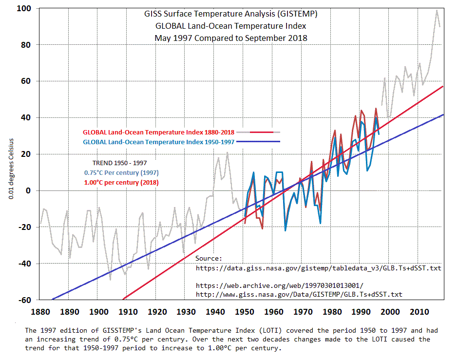
compares the change to the trend due to adjustments/corrections made to the data since 1997 and shows that the 1950-1997 trend depicted as it was in 1997 was 0.75°C/century and by 2018 that adjustments have increased that 1950-1997 trend to 1°C/century.
This graph
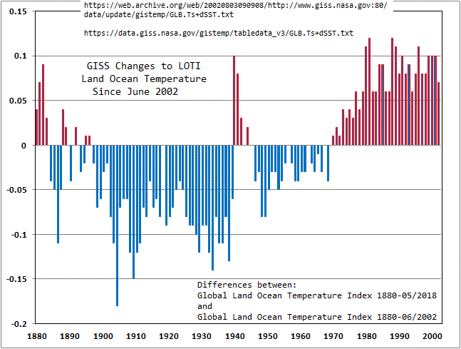
shows the distribution of positive and negative adjustments over the period 2002-2018. One can’t but notice that all adjustments (Annual average) to data since 1970 are positive. (Why is that?)
Links to data used in the above graphs:
1997
2002
Current
Anomalies are a good and valid method of comparing changes to “What it was then to what it is now.” However, changing the anomalies as reported decades ago doesn’t make a lot of sense. Every month GISS changes monthly entries on their Land Ocean Temperature Index including those that are over 100 years old. The results of that over time finally affect the overall trend as shown in the graphs linked above.
Can anyone link to the method used to post an image on these boards? Obviously it can be done”
LdB November 14, 2018 at 10:54 pm
The “Test” link on the WUWT header says:
If WordPress thinks a URL refers to an image, it will display the image
Ha ha – does that have a familiar ring to it or what (-:
Well anyway I’d like to post images instead of the just the links.
Steve,
“Obviously it can be done”
I don’t think it can (except by people with special permissions). What you linked to is a movie, which does still work.
If you look at an old post that used to show images in comments, they aren’t visible now.
I don’t think it can (except by people with special permissions).
After my post I groaned when yes I noticed it was a YouTube link. Yes I noticed that Willis E. can post images and as you said, I wondered if he has a special handshake or whatever to get his stuff posted and I don’t.
Nice of you to ignore the graphs and comments of my top post.
Top post? Well, the first one compares the earliest of GISS land/ocean with current. It only goes back to 1950, because that is as far as GISS could go at the time. And that was with some difficulty. From Hansen’s 1999 paper:
“We use the SST data of Reynolds and Smith [1994] for the period 1982 to present. This is their “blended” analysis product, based on satellite measurements calibrated with the help of thousands of ship and buoy measurements. For the period 1950-1981 we use the SST data of Smith et al. [1996], which are based on fitting ship measurements to empirical orthogonal functions (EOFs) developed for the period of satellite data. “
There is plenty of scope for improvement there, and they have improved.
As to the pattern of adjustments pointed out – that is mainly from the adoption of adjustments like TOBS, which has a warming effect for known reasons.
But the real test of all this should be not going back to early calculations with limited data, but to compare what we now know, with and without adjustment. That is why doing a complete calc along those lines is the proper answer to the effect of adjustment.
Thanks for the reply. The GISSTEMP LOTI product continues each and every month to monotonously change about 25% of the monthly entries from 1880 to present. The September 2018 edition of LOTI compared to the August 2018 edition changed 26.4% of the data. So what’s going on? Are they still bumping it up due to the Time of Observation?
Going all the way back to that 1997 edition there have been over 80,000 adjustments.
This past month there were 440 changes and 65 of them were to data from 1880 to 1900. Of those 65, 54 were negative and 11 were positive.
For the past 20 years of data (1999-2018) August vs. the September edition there were 96 positive changes and only one negative.
This sort of thing goes on nearly every month.
“So what’s going on? “
Flutter. The algorithm is somewhat unstable, in that if one reading goes up, it tends to push the next one down, and so on. I think it is a fault, but seems to balance out, so it doesn’t affect the spatial average. I’ve shown typical patterns in that link.
Nick Stokes November 15, 2018 at 9:31 pm
“So what’s going on? “
Flutter. The algorithm is somewhat unstable, in that if one reading goes up, it tends to push the next one down, and so on. I think it is a fault, but seems to balance out, so it doesn’t affect the spatial average. I’ve shown typical patterns in that link.
“… I think it is a fault…”
I think there’s something wrong too.
“…but seems to balance out…”
It seems to me that the one chart shows all adjustment since 1970 is upwards, the other shows an increase in the trend over the last two decades.
Steve there is plenty of code around for your PC they are IIR and FIR filter components you can also use MathLAB.
If you want a reasonably easy starter
https://www.embedded.com/design/configurable-systems/4025591/Digital-filtering-without-the-pain
The climate data sequence I can get hold of is pretty short so the tricky part is to make it longer for certainty is to modulate that data on a signal on various carrier waves. Ideally you pick frequencies that are likely to be there so for climate data you organize yearly cycles. So you can do say 1 year to 1000 year cycles. So the complication is you need to train the analysis so you end up with an optimal match filter. However even a badly trained filter is probably not as bad as Nick Stokes.
If you want some ideas Ligo has this issue of cyclical natural interference. The Ligo filters have some decent semi-layman resources on it. So this is the dumbed down way Ligo does a matched filter
https://www.gw-openscience.org/tutorial_optimal/
It gets more complicated than that but that is good enough for students to run the code on data themselves. The full Ligo filter details are discussed in the calibration detail.
https://dcc.ligo.org/public/0143/T1700318/001/LIGO_SURF_Progress_Report_2.pdf
LdB November 15, 2018 at 11:40 am
Steve there is plenty of code around …
I have no idea what your trying to tell me.
Steve, it’s worse than we thought.
a·nom·a·ly əˈnäməlē/ noun
1. something that deviates from what is standard, normal, or expected.
I guess for those that don’t get the big picture, anomalies make sense. But I started as a geology student, and ended up as a climatology student. So my perspective is a bit larger than most “climate experts”, who seem to think that the tail end of this interglacial is somehow the standard by which all climates should be compared. What I learned through my education is that there is no “normal” in climate or weather (except for change), and IMHO, claims that there is a “normal” climate is simply ignorance (and possibly something sinister).
Bingo (2)
Nick Stokes, thank you for your essay.
davidmhoffer
It’s a fair question, but the fact is that it really does make very little difference to the overall trend. Anyone can check this for themselves, as Nick and others have been saying for years.
This really answers your first question. They have to be as meticulous as possible, given the possible policy implications and consequent scrutiny they are under. Ironically, the care taken to get it things as close to ‘right’ as possible has left the scientists open to allegations of malicious tampering.
Re 3: surely a change in temperature is a reflection of a change in energy balance in any system? This is true whether you’re measuring the temperature (which is just a measure of the rate at which the molecules jiggle) of water in a warming pot or the temperature of air in the atmosphere. If the temperature is rising or falling in any system over the long term, then it’s a fair sign that the energy balance of that is changing.
Just how much ‘luck ‘ does it take to find that all adjustments to past data end up supporting ‘one view ‘ when you statistical you would expect a mixture of supportive and unspportive ?
The bottom line is one type of results offer grant money and career enhancement, another may see you blacklisted and you losing grant money. Has a human being with bills to pay, which do you think is the most ‘attractive ‘ We have seen with the recent ‘ocean warmer ‘ paper , how easy it not to ask to many question when you get the results you ‘need’ .
Then can you explain why the adjustments produce a trend effectively no different from the raw data?
The question is not if there is a trend but is it a trend that exceeds natural variation and is it wholly or partially due to the addition of CO2 to the atmosphere? It is a major jump to say the baseline should be from last century rather than the last interglacial or that CO2 is the main driver of warming without any empirical evidence physically linking the two.
DWR54,
Easy to answer. The tests that have been done are not comprehensive. They compare before and after of how large the temperature adjustment was, how long the adjustment lasted, but never AFAIK, the leverage effect from whether the adjustments were made close to or far from the pivot point where original and adjusted cross.
You solve very little using a simple count of number of ups versus number of downs.
Geoff
The need to give a value to anomaly comes about because you are UNABLE to offer an an accurate and precise measurements of that you are claiming to represent .
Its is a sign of weakness at a rather basic level in your data collection method and not a indication of ‘settled science ‘
The same for many proxies , where you can throw has much statics at it as you like , but the bottom line remains that they used because ‘they are better than nothing’ which is the alterative , not because the data is valid and of high quality .
Nick
You cannot get a correct weighting of stations unless ALL [terra] stations surveyed are balancing out together to zero latitude. Since most of your stations are all in the NH you get a totally incorrect result.
I did this balancing act with my data sets and find that the earth is in fact cooling, not warming.
{you can click on my name to read my final report]
Why do NOAA USCRN readings arrive so late. It’s now 15 November but they still only have readings up to September. They are lagging over 6 weeks behind. I thought these readings were automatically collected.
Your link is showing October data (0.2°F anomaly).
But only September is there. DIY: Change the final month from October to September. The data does not change.
The time scale is set to ‘previous 12 months’ leading to October 2018. Set it to 1 month. October 2018 is there.
I have a problem with the period you use as reference for the anomaly 1951-1980.
It was during a period when the climate was cooling .
In the mid of the period some even asked how to avoid the coming ice age.
How looks a map with the anomaly compared to the period 1921-1950?
“How looks a map with the anomaly compared to the period 1921-1950?”
Probably no different at all. In the end. it comes down to the addition or subtraction of a single number to all temperatures. That number can’t include information about people possibly fearing ice ages. It just shifts everything a bit.
It’s not that simple in implementation. There are 12 numbers, not one. But that still doesn’t incorporate detail of what was going on in the period. And as I’ve emphasised, the anomalies are formed by offsetting at sites, not globally. But in the end, the offsets still add to a single (or 12) number(s).
I think Nick’s careful and patient contribution is very worthwhile reading as are the many thoughtful responses. Stepping back, what I see is that there remain real worries about the vast exaggerations of immediate dooms with which we have now been threatened for nearly forty years and yet these have not only failed to materialise but we have seen positive benefits from the small and gradual temperature increases.
Worse, the hysterical claims have led to an outrageous misuse of world resources which should have been used to tackle much more pressing health and poverty issues. They are also been used to drive the most regressive tax policies against poor people worldwide along with disastrous and harmful energy policies.
Of course none of this in Nick’s fault, nor that of anyone who is prepared to genuinely debate on a reasoned basis the possibility that our industrial processes are potentially going to cause a big problem. But like several contributors I still see the causation link or mechanism that is driving CO2 alarmism as tenuous at best, especially as the latest estimates of CO2 sensitivity are getting lower and lower outside of the echo chamber that is the IPCC.
Hi Nick!
I think it is ok to assume that if there is UHI affects in the GHCN record those are introduced gradually and smaller before 1950 than 1980. A majority of the older station set is depending on infills for a common baseline period. If we infill with data from a period that is artificially warmer we will amplify this error. Since the baseline average is pushed higher our historical anomaly will show cooler than it actually was. UHI is one example average latitude is another that impacts in the same direction.
Wouldn’t setting a stations “anomaly base” at first overlapping years with neighbours in same or close by grid cells be less biased?
Hear is a quesiton , why do we think ariports offer a good representation of their wider area given that they are often a very different enviroment to that wider area ?
And the reason this matter is that often its airport based mesurment , taken not to be used in wider usage but to deal with air movements , that are used in such modeling .
Another case of using single mole hill proxies to tell us about mountain range facts ?
Matz,
“Wouldn’t setting a stations “anomaly base” at first overlapping years with neighbours in same or close by grid cells be less biased?”
That refers to the problem of stations without data in a prescribed base period. Methods like reference station method do something like that. But the method I use avoids that completely.
Actually your method (as examined from your R-code) does not consider this at all it just skips over (=avoids as you stated). Could very well be that I am overestimating its importance but it is still a factor.
With possible lack of proper English “it must be more accurate to chain the measurements with a common overlap base than to extrapolate an average in the far future using Least Square calculated including very remote stations”.
Aligning stations within a grid cell at the first common year (per month) I get a drift. Stations that are initially aligned deviates more and more over the years. I think this captures UHI and other environmental circumstances that are otherwise lost using Least Square extrapolation.
I know by now that you are very smart Nick so you can translate my language shortcomings but I give an example anyway.
If me and my neighbor Bob on the high hill next to me both installs thermometers to measure the temperature trend we are better off syncing them the first few days (individual anomaly base) than calculating a common average over a later 30 year period especially if Bob died and stopped reporting after 15 years.
Like others, Nick, my response is so what? Nobody’s denying the earth is warming. It’s the cause that matters and there, I’m afraid, I’ve never seen any conclusive evidence that it’s Carbon-related. Anyone who does any form of statistical modelling will be very aware of the problems created by numerous variables, to say nothing of the complexities involved with climate.
So, my question is how do you go from this to the conclusion that trillions need to be spent to reduce carbon emissions? Big decisions require big proof and that, I’m afraid, doesn’t exist when it comes to what, exactly, is driving warming.
The real question is: do we even want a global temperature.? A more meaningful metric would be a temperature for each continent, and for each season, so we know what is happening to us, and to our regional environment.
R
I am always impressed by Mr. Stokes erudition and his willingness to post on WUWT.
Looking at his histogram (but without doing the necessary calculations) it appears that the blue and red distributions differ significantly. Perhaps he could state what distribution he assumes for each when calculating the means and standard deviations and whether he has analysed the distribution of the errors.
“Perhaps he could state what distribution he assumes for each”
Thanks. I don’t assume a distribution – it is an empirical histogram of 1000 random samplings. The sampling is done effectively by coin tosses, and is the same for temperature and anomaly.
I am not happy with averaging or merging data. You throw away a lot of information and probably adulterate good data with bad data. I would like to see the temperature history from a number of well maintained stations scattered about the globe. Time of taking the readings is also very important. From these I could my own conclusions. has anybody published this work?
the answer is the same
Indeed. Wrong answers across the board.
Andrew
New research now shows that the creators of the CO2 greenhouse theory forgot quantum mechanics. Oops!
This new study brings in the quantum aspect, using Raman spectroscopy. What they discover is that both oxygen (O2) and nitrogen (N2) in certain quantum states also absorb and emit infrared. As one would expect from common sense. So “CO2 exceptionalism” is false: it is not the main IR interacting gas in the atmosphere. Its IR radiative role is in fact insignificant due to CO2’s low abundance of 0.04%.
http://notrickszone.com/2018/11/12/real-world-spectral-measurements-show-the-greenhouse-theory-is-wrong-all-gases-are-ghgs/
For CAGW this is game over.
Any who choose to criticise this study, please address the actual substance of the study, the quantum mechanical and Raman spectroscopy; rather than just falling back on traditional CAGW back radiative tropes. Thanks.
Try reading Willis Echenbach’s post in the thread on your link.
Raman scattering is a very weak effect. That’s one reason it wasn’t discovered until intense artificial light sources were developed, it wasn’t observed using sunlight as a source. Most research using Raman uses lasers as the light source. Also the Raman cross section depends on the 4th power of the inverse of the wavelength, that means that light at 300nm is ~6 million times more effective than at 15 micron so even the weak effect would be mainly due to the UV end of the sun’s spectrum. This is a bogus paper written by someone who doesn’t understand the Raman effect. He also attempts to describe the role of N2 in a CO2 laser and gets that wrong too.
I like that he cited YouTube
So I am going to go on the other side that whole article is stupid .. actually beyond stupid.
If you want the dumbed down problem Raman spectroscopy is really good at pulling a few trace signals out of a forrest of other signals, that is why it is used for detecting impurities. So if I used it to detect a trace amount of of drugs in a shipment does the act of me finding the signal mean the whole shipment is pure drugs. Can I even say anything definitive about the stuff that doesn’t show in my test.
In the article he treats the Raman Signal as the only important thing, the question you may want to ponder is what interactions won’t show up on the Raman Signal.
Anyhow this all has a very well known background and it has been calibrated, so if you really want to understand this area start here and comment after you at least get the basics.
https://ocw.upc.edu/sites/all/modules/ocw/estadistiques/download.php?file=29408/2011/1/52892/ors_7_raman-3729.pdf
Nick – Slightly off topic perhaps, but I’m curious if you can offer an answer.
A few years ago, when gathering some data to make a point, I found an hourly temperature chart for a single day in Denver. The afternoon temperatures dropped 30 F in a single hour. This prompted me to question what polling the temperature of moving air masses from fixed stations actually provides us. Rather than averaging the daily averages of temperature stations to produce a “Global Average temperature”, I want to know how much heat energy is in the atmosphere for a single point in time. This would mean that we’d average all temperature station readings for the exact same time. Some readings would be in day and some would be in night. If possible we could do this hourly such that there are 24 global averages over a single day since the Earth is rotating.
I understand we won’t be able to derive these values from historical records, so we would need to start these new set of records and wouldn’t be able to derive trends for quite some time. However, we’d be more accurately tracking global heat energy, right?
That is an expensive proposition. Not only temperatures on the ground level, but also up to some 20(?) kilometers.
Curious George: “expensive proposition”
Are temperature stations capable of binding a time-of-day to each temperature reading? If so, then it shouldn’t be that expensive to get started (no retrofitting required), it would just be matter of querying for the set of readings that correspond to the requested point in time.
With our current method of averaging daily averages, it’s possible for the numbers to show a trend in the opposite direction of actual global heat content.
you would also need to know atmospheric water content.
Thomas,
“This would mean that we’d average all temperature station readings for the exact same time.”
That is actually an interesting question when I average reanalysis data, which is timed every six hours. What actually is a day, and where? I think reanalysis is actually the answer to your query. It involves a degree of modelling, but it is what tries to convert instantaneous temperature (and other) samplings into a continuum view which would give a measured heat content. I think no matter how many readings you take, some modelling will be needed to get a heat content measure.
Thank you for responding Nick.
Thanks for the post, Nick. Very enlightening, and the links are great.
@Mosher
mind you
I think the way I did it, by looking at the derivatives of the speed of warming/cooling
you eliminate the need of adjusting for altitude and longitude.
54 stations, 27 each HS was apparently enough.
Click on my name to read my final report.
There is much criticism here of the estimates of global surface temperature anomaly provided by the majors – GISS, NOAA and HADCRUT. I try to answer these specifically, but also point out that the source data is readily available, and it is not too difficult to do your own calculation.
GIGO
Anomalies are made by subtracting some expected value…
GIGO
The End
Gator,
Actually, anomalies can be created by subtracting any constant value that reduces the magnitude of the temperatures. One could just as easily subtract the lowest temperature in the time series. Making the constant a function of average historical temperatures adds an element of physicality that makes interpretation easier. You could just as easily subtract 5pi and call the result an anomaly.
Anomalies assume a “normal”. There is no “normal” in climate temperature, or weather. So no, you cannot create anomalies for climate, temperature, or weather.
It is a matter of understanding English, and has zero to do with math.
Now, if you were referring to anomalies in human body temperature, you would have a valid argument.
Gator,
It is largely semantics. Anomaly was probably a poorly chosen descriptor, although like so many other things, such as “ocean acidification,” it may have been done purposely. The more common “delta” would probably have been better.
And words matter, the pen is mightier than the sword. And if this scheme wasnot hatched intentionally, the alarmists have still most definitely used this lemon of a vehicle to its fullest. I see it in comments here from those who should know better, they think in terms of “normal” when it comes to our climate. It is polluting the science, does nothing to further our understanding of what is driving changes, and has intelligent people arguing over how many angels can dance on the head of a pin (I had a less flattering description in mind, and moderated myself).
We need this exercise like we need the average global phone number I mentioned earlier. Fun for the Math Club, but I’d rather discuss meaningful subjects.
Clyde,
The purpose is not to reduce magnitude but rather to convert from absolute to delta readings. Stations delta changes will follow closely even if they are several km apart (they state up to 500km) or at different altitudes. If you live in the valley and I live on top of the mountain close to you my thermometer will constantly show colder than yours. However if we both subtract our average base temperature our deltas will match pretty well, especially as averages over longer time periods. Moreover if my thermometer was constantly off by 1 degree for some technical reason that problem would be cancelled out.
In my comment to Nick above I raise one issue related to accurately calculating the base temperature. If that is off all interpretations are also off.
Yet if the baseline was determined by using your thermometer, it would be wrong and give wrong anomalies for both. Remember it is not the math, it is the values that are wrong.
The other problem is changing past data. What do we know about the past that justifies changing the reading. Because there was a step change? That could either be due to a piece of equipment or due to a change in who was doing the reading. Who read it wrong? The first person or the second? And a followup question is why the continuing changing? Once changed, further changes would seem to be inappropriate.
Jim,
Not sure I am following here…
The average base temperature is individual per station. Errors in my thermometer does nor affect Clyde’s. By subtracting my average I can focus on my delta changes and those would be pretty similar to Clyde’s. Same if Clyde has an error he would only report the delta changes and hence filter any of his errors.
You might have compared your cars speedometer with a GPS. It is usually showing a couple of km/hr more than the GPS. If I want to arrive earlier at my destination I add a few km/hr to my speed visible in both speedometer and GPS. Calculating the ETA will be different but the time saved will be the same for both.
MrZ,
Yes, there are good reasons for working with anomalies. However, I think something that you overlooked is that in the end, we want to know what the ground temperature actually are, not what the ground anomalies are. Because some thermometers have inaccuracies that exceed the precision, using them to calculate the baseline will bias the baseline. When we add that biased baseline back to an anomaly, the station temperature will not be correct. The whole thing is the proverbial can of worms because so little attention is paid to errors and uncertainties.
MrZ
I don’t think that I said that the purpose of anomalies was to reduce magnitude, rather that the magnitude reduction was a consequence, which affects variance.
Yes, it has been claimed that anomalies have a high correlation. However, considering microclimates created by topography, relative humidity changing with topographic uplifting of air masses, prevailing winds, and typical storm tracks, I’d be very surprised to see anyone demonstrate that the correlations are isotropic. That is, as someone above pointed out, I would expect the correlations to be very anisotropic, with the directional anisotropism varying with seasons and storms. This strikes me as being another of the many unexamined assumptions that underlie the data processing of temperatures.
Clyde,
I am with you here. You loose resolution using anomalies especially when presenting. Please follow my comments to Nick above. My issue this time is how to arrive at a common anomaly base period and what implications that might have.
I must admit though that Nick has proved me wrong on several occasions. He knows the math by heart and what level of impact our rejections have in terms of relevance. I find it fascinating to learn from him.
Clyde,
A+
“I’d be very surprised to see anyone demonstrate that the correlations are isotropic. – Clyde Spencer”
You are spot on and Nick is playing dumb – as per his only comment on this above – because he is on record discussing it:
I commented about Hansen being wrong in his seminal paper here:
https://wattsupwiththat.com/2018/04/18/an-interesting-plot-twist-call-it-an-anomaly/#comment-2332118
I said among other things:
cheers,
Scott
Scott and Clyde!
Isotropic was not in my limited English vocabulary I think you are saying it’s not linear. I have grouped stations based on base temperature in 5 degree groups and the colder the more/larger fluctuations. So not isotripic!?
Ok?