We’ve covered this topic before, but it is always good to mention in again. Howard Goodall asks this on Twitter:
“Ever wondered why climate scientists use anomalies instead of temperatures? 100 years of catastrophic warming in central England has the answer.”
He provides a link to the Central England Temperature data at the Met Office and a plot made from that data, which just happens to be in absolute degrees C as opposed to the usual anomaly plot:

Now compare that to the anomaly based plot for the same data from the Met Office:

The CET anomaly data is here, format example here.
Goodall has a point, that without using anomalies and magnified scales, it would be difficult to detect “climate change”.
For example, annual global mean NASA GISS temperature data displayed as an anomaly plot:

Source: https://data.giss.nasa.gov/gistemp/graphs/
Data: https://data.giss.nasa.gov/gistemp/tabledata_v3/GLB.Ts+dSST.txt
Now here is the same data, through 2016, plotted as absolute temperature, as you’d see on a thermometer, without the scale amplification, using the scale of human experience with temperature on the planet:

h/t to “Suyts” for the plot. His method is to simply add the 1951-1980 baseline temperature declared by GISS (57.2 deg F) back to the anomaly temperature, to recover the absolute temperature, then plot it. GISS provides the method here:
Q. What do I do if I need absolute SATs, not anomalies?
A. In 99.9% of the cases you’ll find that anomalies are exactly what you need, not absolute temperatures. In the remaining cases, you have to pick one of the available climatologies and add the anomalies (with respect to the proper base period) to it. For the global mean, the most trusted models produce a value of roughly 14°C, i.e. 57.2°F, but it may easily be anywhere between 56 and 58°F and regionally, let alone locally, the situation is even worse.
What is even more interesting, is the justification GISS makes for using anomalies:
The GISTEMP analysis concerns only temperature anomalies, not absolute temperature. Temperature anomalies are computed relative to the base period 1951-1980. The reason to work with anomalies, rather than absolute temperature is that absolute temperature varies markedly in short distances, while monthly or annual temperature anomalies are representative of a much larger region. Indeed, we have shown (Hansen and Lebedeff, 1987) that temperature anomalies are strongly correlated out to distances of the order of 1000 km.
And this is why, even though there are huge missing gaps in data, as shown here: (note the poles)

Note: Gray areas signify missing data.
Note: Ocean data are not used over land nor within 100km of a reporting land station.

GISS can “fill in” (i.e. make up) data where there isn’t any using 1200 kilometer smoothing: (note the poles, magically filled in, and how the cold stations in the graph above on the perimeter on Antarctica, disappear in this plot)

Note: Gray areas signify missing data.
Note: Ocean data are not used over land nor within 100km of a reporting land station.

It’s interesting how they can make the south pole red, and if it’s burning hot, when in reality, the average mean temperature is approximately -48°C (–54.4°F):

The source: https://data.giss.nasa.gov/cgi-bin/gistemp/stdata_show.cgi?id=700890090008&dt=1&ds=5
Based on GHCN data from NOAA-NCEI and data from SCAR.
- GHCN-Unadjusted is the raw data as reported by the weather station.
- GHCN-adj is the data after the NCEI adjustment for station moves and breaks.
- GHCN-adj-cleaned is the adjusted data after removal of obvious outliers and less trusted duplicate records.
- GHCN-adj-homogenized is the adjusted, cleaned data with the GISTEMP removal of an urban-only trend.
ADDED: Here is a map of the GHCN stations in Antarctica:

Source: https://data.giss.nasa.gov/gistemp/stdata/
It’s all in the presentation.
NASA GISS helps us see red in Antarctica (while erasing the perimeter blues) at -48°C (–54.4°F), thanks to anomalies and 1200 kilometer smoothing (because “temperature anomalies are strongly correlated out to distances of the order of 1000 km”).
Now that’s what I call polar amplification.
Let the Stokes-Mosher caterwauling begin.
Polar noise amplification.
Even though they know that Antarctica’s western pennisula is not representative of the rest of the continent, they continue to use it as if it were. Can’t get the scary reports needed to capture the big grants without it.
Exactly! It is a peninsula and therefore more affected by ocean temperatures. Meanwhile,in the Arctic, the temperatures vary between marine temperatures when there is more open water and colder , more “continental” temperatures when the ice is more extensive. We assume that the open water is the result of atmospheric warming when , in fact it is the cause!
“Polar noise”…..obviously……they lost a huge dark purple area NE of Finland
…and another blue area in the middle of Canada
How do you lose a dark purple area that big?
They all suffer from protanopia?
It appears from above that only peak warm events have been counted as anomalies; “(note the poles, magically filled in, and how the cold stations in the graph above on the perimeter on Antarctica, disappear in this plot)”. Using the same logic trough cold stations could also be counted as anomalies with peak hot stations removed? Perhaps if a graph was plotted using only trough cold anomalies it may show a different picture – although the absolute temperature graph appears to show the true picture.
Quote “GISS can “fill in” (i.e. make up) data where there isn’t any using 1200 kilometer smoothing:”
It’s called spreading the crap around and is a legitimate data analysis method for any respectable climate scientist.
Enjoy a 1200 Kilometer Smoothy today! “Mann, is it good!”
It’s the hottest concoction in Climate Science blender magic…
and recommended by 12 out of 9 climate seancetists!
J Mac
Just a mere twelve out of nine . . . . ?
I thought we have all been indoctrinated [or commanded by ukase] that we must A L W A Y S use 97 out of any number [smallish number; 97 out of some 14,000 doesn’t look so good for honest reporting).
So –
’97 out of 9 Climate seanceists’ do not violently dispute your smoothie taste, Mann’.
Ommmmmmmmm, Peace, Mann, and pass the gasper. (I Guess)
Auto
[NB Mods, I am sure you notice a small centi-whiff of /SARC.
Quite right too!
Even I know that 97 out of nine leave 88 seanceists without proper funding!]
1200 Kilometers is the distance from Cleveland, Ohio. to Charleston, SC.
1200 Kilometers is the distance from Charleston, SC to Key West, Florida.
Making up data over a distance of 1200 Kilometers by smoothing is fraud.
AKA smear.
“respectable climate scientist”
Now there’s an oxymoron if I ever heard one.
“1200 kilometer smoothing….” Global chicanery, to truly create ‘man made global warming’.
Anomalies suggest there is a “normal” climate, and the purveyors of this idea get to decide what “normal” is. Pure fantasy.
a·nom·a·ly əˈnäməlē/ noun
1. something that deviates from what is standard, normal, or expected.
Defending anomalies is just another excuse for picking cherries.
It has nothing to do with there being a “normal” temperature in the sense that the temperature should be at some standard level.
A temperature anomaly is just the deviation from a defined reference period. Also from Sheriff (pg 207):
“Normal” is simply the baseline against which you are measuring anomalies.
The word “normal” should never have been adopted. It gives people the idea that things should always be “normal”. We should use average instead. A normal is only a valid term for average when the data are normally distributed. In Alberta in the winter we generally have two temperature regimes, cold when the flow is from the Arctic and mild when the flow is from the Pacific. It is seldom “average” or normal. Meteorologists here like to say that it is not normal to be “normal”.
Ohio is similar, about a 10 or 15°F difference between Gulf of Mexico/tropical air, and air from Canada.
The problem is that people have bastardized the word “normal.” The assumption is that normal is good or right and that anomalies are abnormal, bad or wrong.
Darn cold Canadian air :-).
Our temperature change was brought to light by that genius De Caprio when he said he witnessed climate change first hand after being in a Chinook. Temperatures can rise 20C when a Chinook blows in across the Rockies. What would the “normal” temperature for the day have been in that case??
De Caprio is an anomaly… His mental deficiency deviates well below the normal low IQ level of Hollywood greentards… 😉
+1 Max Dupilka
And calling anything to do with climate or weather “normal” is ignorant, or extremely dishonest. It is an attempt to frame contemporary conditions as “abnormal”, and has nothing to do with climate science. It is an alarmist shelter from reality.
No. It is not. The use of temperature anomalies in no way implies that contemporary conditions are abnormal. The aversion to the use of temperature anomalies is simply ignorance of how geophysical data are normally interpreted.
The use of Hockey Stick reconstructions and breathless headlines about “the warmest year on record” are attempts to frame the contemporary conditions as so abnormal that it’s a climate crisis.
This is dishonesty…
http://www.climatecentral.org/news/2016-declared-hottest-year-on-record-21070
This is honest science…
https://www.sciencedaily.com/releases/2017/01/170104130257.htm
Both articles relied on temperature anomalies because that’s the only statistical way to handle global temperature changes.
2016 was 0.02 °C warmer than 1998… As either a temperature anomaly or as an actual globally averaged temperature. It would have also been 0.02 K warmer than 1998. In all three cases it would have been well-within the margin of error.
Dr. Christy’s article is factual and un-alarming, despite his description 1998 and 2016 as “anomalies, outliers.” 1998 and 2016 were anomalous temperature anomalies… Yet… “‘The question is, does 2016’s record warmth mean anything scientifically?’ Christy said. ‘I suppose the answer is, not really.'” Anomaly ≠ Bad.
The Climate Central article takes a similar temperature anomaly and builds a climate crisis out of it. Alarmism = Bad.
David Middleton April 18, 2018 at 11:29 am “2016 was 0.02 °C warmer than 1998”
Just read that absolute nonsense a few times, 0.02 °C, over an 18 year period from multiple satellites from how many kilometres from the surface.
Yeah Right.
Maybe you should actually try reading it…
The margin of error is 5 times the 0.02 °C difference between 1998 and 2016.
Semantics count – ask any propaganda expert. “Normal” is interpreted as “proper” – “anomaly” is interpreted as “not proper.” (To non-technical people, who are the alarmist’s audience.)
“Normal” should only be used where the “proper” value is determined. Such as, say, the PSI at a wellhead – an “anomaly” outside of the “normal” range is a cause for concern. A difference from the arbitrarily determined baseline – which is what the “global temperature” is – is not, because your arbitrarily determined baseline temperature cannot be equated to the “normal” temperature.
Technical people don’t tailor their language for non-technical people.
“Normal” is simply the absence of an anomaly.
The “arbitrarily determined baseline” is simply a climatology reference period.
Source Baseline period
GISTEMP Jan 1951 – Dec 1980 (30 years)
HADCRUT4 Jan 1961 – Dec 1990 (30 years)
RSS Jan 1979 – Dec 1998 (20 years)
UAH Jan 1981 – Dec 2010 (30 years)
http://www.woodfortrees.org/notes
Most use a 30-yr reference period because that is the generally accepted period for defining “climate normals.”
https://www.ncdc.noaa.gov/news/defining-climate-normals-new-ways
Climate Normal = 30-yr Average
Temperature Anomaly = Deviation from 30-yr Average
Sigh. David, technical people adjust their language to non-technical people (or non-technical in their particular expertise, anyway) if they wish to communicate with those people. As in the other side coming away from the conversation or article with an understanding at least close to what the technical person understands.
A non-technical person will understand that the “normal” operating temperature of my Cavalier engine is between 130 and 140 Fahrenheit. They will understand that an “anomaly” from that temperature is significant – a problem somewhere.
Transfer that understanding to the “normal” temperature of the Earth. They then perceive a problem where there is none.
Which is actually intentional, not accidental, not a “failure to communicate.” The doomsayers are communicating exactly what they want to – a lie.
As I said, technical people don’t tailor their language to non-technical people because it is pointless.
Science and engineering depend on the precise use of language. “Normal” and “anomaly” have precise scientific definitions. This is one of the very few areas in which the “Climatariat” aren’t being dishonest.
“Technical people don’t tailor their language for non-technical people.”….true
But their target audience is not technical and for the most part can’t think their way out of a wet paper bag……
“The assumption is that normal is good or right and that anomalies are abnormal, bad or wrong.”…exactly
Medical anomalies
Anomaly: Any deviation from normal, out of the ordinary. In medicine, an anomaly is usually something that is abnormal at birth.
My target audience is never the scientifically impaired. Nor is the correct usage of the words “normal” and “anomaly” intended to confuse the scientifically impaired. It is standard scientific, mathematical, statistical nomenclature.
David Middleton,
““The question is, does 2016’s record warmth mean anything scientifically?” Christy said. “I suppose the answer is, not really. Both 1998 and 2016 are anomalies, outliers, and in both cases we have an easily identifiable cause for that anomaly: A powerful El Niño Pacific Ocean warming event.”
I don’t think this was any more honest. It was impossible to Christy to know that the 2016 temps were not part of a trend only a few months into 2017. Besides, one can’t simply say “it’s El Nino” as if they are unaffected by climate change. Christy was confronted with two record-breaking El Ninos in a row. Maybe it was fluke, maybe it was solar cycle, maybe influenced by humans, but the honest answer would have been, “It’s too soon to say.” All scientists should get better at saying, “I don’t know.” Everyone should.
I don’t know what happened this winter, for example. The climatological explanations I’ve heard make sense to me, but they, too, are AFAIK hypotheses. To say with certainty that the odd winter was a sign of AGW is just as ridiculous as saying with certainty it wasn’t.
The thing is Kristi, when dew point drops after an El Nino, there is zero delay in temps, it falls instantly.
That shows there’s zero capacitance of heat storage in the arm, it’s all wv.
David, an anomaly is by definition something that is abnormal. It is dishonest to use anomalies in climate science.
What I would like to see is temperature data for 1000 different places around the globe unaffected by the urban heat problem(in other words no temp from airports allowed). When you use actual temperature data for one local,no matter how far back you go, you always find no warming. There is no warming for Ottawa Canada in last 146 years. There is no warming in Central England in last 230 years. There is no warming in Augusta Georgia site of the Masters golf tournament in 83 years. Dr Willie Soon found no warming using actual temperature data in the rural ares of the world. How many 1000’s of other local sites around the world have shown no warming?
None do, some vary between states, but as far as a true warming trend, nope. Follow my name if you’re interested in data from 10 or 20 thousand stations.
I used to be able to pull up individual station data off NASA’s website. The data came along with photos of the actual station, allowing users to edit out UHI affected stations. I selected stations far away from urban and marine influences, and found zero warming since the late 19th century. In fact, most stations showed a slight cooling trend.
A deviation from the norm? Abnormal carries different connotations, imo.
Yes, “abnormal” suggests there is a “normal”, which of course there isn’t.
I took my first climatology course after many years of studying geology, and I was shocked to hear my climatology professor talk about climates as if they were “stable”. IMHO, all climatology students should be required to study geology first, to get a better perspective of our dynamic planet.
gator69,
In common, layman’s usage, “an anomaly is… something that is abnormal.” Common usage of a term is typically imprecise. However, David provided what are accepted uses in technical applications.
So Are you saying that there is no warming for 1000’s of individual stations? If that is so and is what I suspected then this whole global average anomaly temperature stat is bogus.
As has been stated before, a global average temperature is about as useful as a global average phone number.
I’m sorry, but I studied geology and climatology, and have a remote sensing degree. Alarmists have infected the language, and the use of anomalies is meant to confuse and confound. There is no reasonable excuse for using anomalies. I refuse to adopt the methods and language of frauds, no matter how many times they try and tell me these are not the droids I seek.
Alan Tomalty,
There is statistically significant warming over the last 230 years, at the rate of about 0.44C / century.
Well I am not going to worry about .44C in a century. If you look at the 4 graphs you can easily tell that CO2 has nothing to do with that .44C. What a hoax!!!!!!!!!!!!!!!!!!!!!!!!!!!!!!!!!!!!!!!!!!!!!!!!!!!!!!!!!!
You weren’t talking about what worried you, but your claim that there had been no warming ove rthe last 230 years.
The 0.44 / century is spread over 230 years. Nearly all that has been since 1900, and over 2 C / century since 1970.
About 50 years. What was it from 1890 to 1940? Looks like about 2 C / century!
And how much difference is there in the urbanization of this area?
Starting to look like this is more of the same warming trend that started before the Co2 levels started rising.
Same as it ever was.
gator69, when someone claims there has been ‘no warming for 18 years’ it is all based on anomalies. And only anomalies, the 1998 high anomaly specifically.
gator69, when someone claims there has been ‘no warming for 18 years’ it is all based on anomalies.
And using anomalies to torture climate data until it confesses is still wrong.
There are no “normals” in climate. Period. End of story.
gator69, your claim was ‘there is no reasonable excuse for using anomalies’, except you use anomalies whenever it suits your purpose, ie – no warming for 18 years.
gator69, your claim was ‘there is no reasonable excuse for using anomalies’, except you use anomalies whenever it suits your purpose, ie – no warming for 18 years.
Please show me one comment of mine that endorses anomalies. Glad to see that you also reject them.
🙂 you’re a regular at Tony Hellers where you even commented on his ’25 years no global warming’ post which he bases on the 1998 anomaly, except you did not mention anything there about anomalies being absurd measures.
Did I endorse anomalies? No.
Anomalies have no business in climate science.
Glad we both agree.
Glad you agree there was no global warming ‘pause’ gator69.
Glad we agree there is no there there. Just arrogant number crunchers who think they can come up with meaningful trends and averages for a massively chaotic system.
gator69, Your reply makes no sense. Every year has a high and low temperature anomaly. You earlier claimed you did a study of US weather stations, deleting ones w what you call ‘UHI effect’, and found the US is cooling. How did you come to that conclusion w/o using high/low anomalies and their accompanying trend lines?
What call UHI? LOL
Lou, your incessant BS tires me. If you cannot figure out how to see a temperature trend without using anomalies, nobody on this Earth can help you understand what you fail to grasp.
What I call UHI? (was the actual amused reaction to your “comment”)
Damn new iPhone!
Russ R
Looks are deceptive. 1890 – 1940 is 0.96 C / century.
Good job on moving the goalposts. It was Alan Tomalty who was insisting you had to use individual loaction data sets like CET and claimed there was no warming over 230 years. The general idea of CET was to avoid UHI, but how well it does this is debatable. I just like the way so many sceptics promote the CET when it suits their purposes, and then point out how corrupt it is when it doesn’t.
The warming from the lows around 1890 to around 1940, is about 1.0 C in the above chart. That is close enough to 2.0 / century to indicate that it can happen with men producing insignificant amounts of CO2, compared to the last 50 years. If you want to argue we caused that earlier warming, make your case.
I bring up UHI when it is a potential issue, creating a local artificial bias in the data. This is one of those times. It says more about your bias, that you think that is “moving the goalposts”.
“The warming from the lows around 1890 to around 1940, is about 1.0 C in the above chart.”
If you are basing your trend on the difference between the smoothed values for 1890 and 1940, a better question might be what caused the big drop in temperatures between 1860 and 1890. Most of the warming you are seeing is just that big cooling event disappearing and returning to more typical temperatures.
Natural variations in the climate. Solar was low. Most likely AMO was negative, and it allowed more cold air into the area, and pushed the mild gulf stream weather further south. CET is quite far north for the climate it has. It has warming that is not common for that latitude. If the warming is absent, the temperature will drop closer to other land that is maritime but north of 50*.
The oceans have a tremendous heat capacity compared to the atmosphere. A small increase in cloud cover can reduce the amount of heat the oceans absorb, and the atmosphere gets less heat from the 70% of the planet that is covered with water. A place like CET would be very susceptible to that.
If you roll two dice enough times you will get some low probability totals. The same thing happens with the climate when all the variables are contributing to a large anomaly, either positive or negative. Most of the time there is a mixture of positive and negative that keep it closer to the “higher probability” state.
Russ R,
Exactly. All good arguments why using the CET as a proxy for global temperatures makes no sense. And also explains why you cannot compare the rate of warming over two different periods – especially if you ignore the actual trend and only focus on the difference between start and the end points.
A moving AVERAGE gives a trend. Just because it is not the straight line you like, does not change the fact that it is averaging the data, just as a straight line trend does. You can make a good case that it shows more information, because it shows you the nuance of how quickly things change, or how static they are during various sections of the period in question.
Well you can’t compare the rate of warming over two different periods, because it destroys you preconceived notions. Everyone else that wants to know what is really going on, can and should compare rates of warming of different periods. That is how science works. Find out what the variables where doing, both in strength and duration, and then compare the results. It’s called “analysis” and it’s what we did before we let computer models tell us how things work.
Maybe if they actually used data, I would be a bit more confotatsble with all the torture.
It’s really cute that you folks think you can come up with meaningful numbers and trends by bastardizing data beyond recognition. Keep fooling yourselves, I refuse to play along.
What arrogance. Our climate is a massively chaotic system that refuses your silly attempts at defining it.
The same technique is used in other areas, but it is called a “difference”, ie difference from the baseline. The word “anomalies” is used in climate “science” because it suggests that there is something wrong. This is one way you can tell the difference between science and propaganda.
The articles posted by David Middleton are about 3 different data sets. In the UAH satellite data set of temperatures of the lower troposphere (weighted at 4 kilometers altitude) the difference between 1998 and 2016 global av temp is only 0.02C.
For the surface records (a few meters above the ground), the difference between the 2 years is:
NOAA
1998: 0.58
2016: 0.81
=0.23 difference
GISS
1998: 0.63
2016: 0.99
=0.36 difference
These values clear the annual margin of error of 0.1C (margin of error is pretty much the same for both surface and satellite records).
For the surface records at least, 2016 was clearly warmer than 1998, even allowing for the 95% uncertainty envelope. Not so for the UAH satellite record.
Just to set the story straight based on the references supplied by David Middleton (UAH, NOAA and GISS).
And UAH’s weighted 4 kilometers equals 13,000 + feet or more than 2 1/2 miles high. The highest capital city on earth is La Paz at a little over 11,000 feet. Not many folks live at 13,000+ feet on this planet. Just a comment on height and measurements.
I have been asking for years for temperatures only to be plotted with the four seasons and absolute degrees C. But climate scientists don’t want to do that.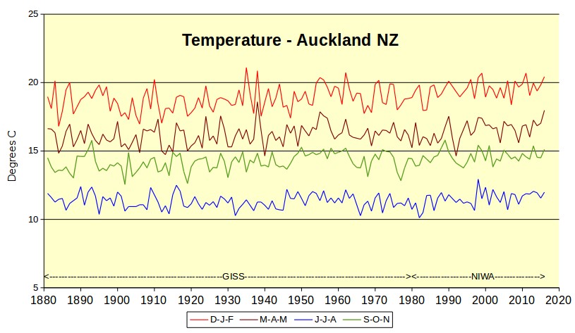
Here are Auckland temperatures from 1880 to 2017.
Yes there’s a tiny steady increase over 100 years.
From the end of the little ice age.
In one sense, you have pointed out one of the (somewhat valid) reasons for using anomalies – seasonal differences. If you are comparing annual temperatures, this doesn’t matter, but doing monthly plots the seasonal difference swamps everything else.
Your approach of separate seasonal plots gives more information than an annuals average for each year, but the more information you have on a figure the harder it is to make a sweeping statement about the end of the world…..
climate is ALL about seasons, you know. So a process that make them disappear doesn’t help us understand climate, quite the opposite. Suppose some place gets +2°C. Well, is that +2°every day? or +4° during spring and fall, with winter and summer unchanged? or the opposite?
Anomalies do not help, they hinder understanding.
RobP,
The seasonal variations are a good reason for reporting the variance or standard deviation along with the arithmetic mean for global temperatures. Standard deviation provides an estimate of the magnitude of the seasonal variations in temperatures.
I pulled the biannual change due to axial tile for insolation and divided the day to day change in temperature by it, for a effective sensitivity.
https://micro6500blog.wordpress.com/2016/05/18/measuring-surface-climate-sensitivity/
jayman
The increases in the 1930’s, and 80s onward (MWP) are primarily caused by increased atmospheric transport bearing heat from the tropics on the way to south pole. The same goes for high NH latitudes.
Looks like the 1930-1940 period is the high point. Just like the northern hemisphere.
Jaymam, that is almost certainly a spliced record from a bunch of different sites in Auckland. If that is the case then you need to look into how the splicing was done and the nature of the comparator sites that were used to generate the splices. The actual Auckland temperature may be flatter than it appears from your graph, even before you factor in a substantial urban heat island effect.
There isnt any increase from 1930 highs
jaymam
April 18, 2018 at 9:16 am
Many thanks for the interesting presentation…do you have a reference for it or have you compiled the data yourself? Do you have access to similar plots for Tauranga, Wellington, Dunedin, etc?
Do you know just what is the reason for the change from GISS data to NIWA at 1980?
All I am suggesting is that graphs show more information if plotted with four seasons rather than just annually.
I got the Auckland data from GISS years ago, and it has now gone from their website. It finished at 1990. I got the more recent data from NIWA. The data overlaps between 1980 and 1990 and both sources are very similar.
The NIWA data is daily temperatures that I have converted to 3 monthly averages. My old computer and I are not really up to doing other sites as well. I live in Auckland. The other data is available at the NIWA site if you have much spare time.
Gosh, this is arrant nonsense. Just because the increase looks tiny to you doesn’t mean that the increase is insignificant in terms of the effect on habitat for humans and other species. That skeptics keep harping on about this shows that they have no argument against the 99.4% consensus.
jaymam, your Auckland chart shows almost +3*C for winter. That equals +5.*F for 138 years. Not tiny.
LouMaytrees winter temperature has increased by about 0.2 degrees C over 130 years. Not 3 degrees.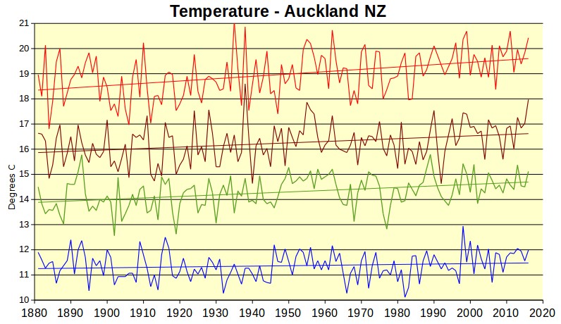
jaymam, your 2nd graph shows a rise from 18.4*C to 19.7*C, a rise of + 1.3*C in 130 years, and NOT what you claim. Your 1st graph showed an even larger increase. The first one shows a rise of + 2 to +3*C, not .2*C. You should learn how to read a temperature graph.
LouMaytrees you were referring to winter (“your Auckland chart shows almost +3*C for winter. “)
Winter is the blue graph originally labelled as JJA (June July August). Auckland is in the southern hemisphere, if you didn’t know.
The two graphs are identical except that the second one is spread out more and has trend lines.
The whole year trend is about 1 degree for 100 years, i.e. +0.01 degree per year.
Much of the rise would be the urban heat island effect. The thermometer is now at Auckland Airport, where jet planes have been used since 1966. In 1880, the start of the graph, nobody had any planes at all.
jaymam, of course you folks are upside down there. This does not change the fact that your DJF graph shows +1*C warming for the century not the .2*C you clamed earlier. And you can say what you will about UHI at the Auckland airport but the rest of NZ shows the same +1*C temperature rise for the century so its not just an Auckland ‘UHI effect’.
LouMaytrees, you said “jaymam, your Auckland chart shows almost +3*C for winter.”
Please explain where you got the +3*C from. Winter (the blue graph) increased by 0.2 degrees C over the graph.
You should learn how to read a temperature graph.
jaymam, my bad but we went over this in my last reply where D-J-F was corrected for my screw up/overlook and misread of your response about summertime/wintertime months down under. Apologies for that. If you want i’ll try to explain again. In your less descript first graph, it shows D-J-F temps to start around 18*C and end over 20*C, which is what I replied about. I also stated it looks like a rise of “almost 3*C” (as noted also in that reply – or almost 5*F, which is between 2 – 3*C equally). That was my disproportionate point, D-J-F does not seem like a tiny increase via your 1st graph, as well as overall for all 4 seasons imho.
As the above Auckland temperature graph is about to disappear from the image host, here is the Auckland temperature graph from 1880 to 2017.
“Indeed, we have shown (Hansen and Lebedeff, 1987) that temperature anomalies are strongly correlated out to distances of the order of 1000 km.”
I don’t understand this sentence. Are they saying that after filling in the temperatures according to what they think is correlation they then find they correlate? Well yes. Either you have the data or you do not. If you don’t and are using a methodology to fill it in, there is literally no sense to then claim that your methodology correlates with your methodology.
And if they are using actual data, what are they talking about?
Phoenix44: They used actual data, which for a great many places they have much closer than than that. They empirically evaluated the correlations among stations at multiple distances. It’s not theoretical, it’s empirical. Read their actual paper. See also NOAA’s page Global Surface Temperature Anomalies.
Tom, this may be useful along the same latitude and elevation, but is definitely not so along lines of longitude, for example between Florida and Quebec. It’s use in the polar regions is scientific dishonesty. In the Arctic, where “weather” and ocean currents are confounding elements, and in the land mass of Antarctica, this observation is not established.
I don’t think you’d consider planting orange groves in New York or Ohio. A talking points education doesn’t serve you well. A little thinking of your own is good for both the fruit business and a lot of other things.
Gary Pearson: Those correlations were calculated in all directions—360 degrees. You can get those data for free and do the calculations yourself to verify. Also, you are not understanding what anomalies are. Each anomaly is for an individual station, calculated as the difference between that individual station’s temperature at that time of interest, and that same station’s temperature at the “baseline” time period.
Studying correlation between two stations is all fine and good. However it tells you nothing about what is happening between the two stations. That’s why infilling of stations hundreds, much less 1200 miles apart is worthless at best, deceptive at worst.
Exactly, you can get thunderstorms that pass between stations 100 miles apart, missing both, sure that weather, but you get enough “weather”, and it starts affecting climate. Plus, we see a 10 or 15 degree F difference being north or south of the jetstream, the dividing line between gulf tropical air, and canadian air, now imagine that line shifting north or south between stations across the continent, again, you get enough of that, and your infilling with very different temperatures, all because you didn’t measure anything at all.
Enjoy a 1200 Kilometer Smoothy today! “Mann, is it good!”
It’s the hottest concoction in Climate Science blender magic…
and recommended by 12 out of 9 climate seancetists!
Whoops! Posted to the wrong comment string…
feel free to post that comment wherever you like j mac, it won’t ever get old 🙂
Tactics similar to starting and ending all graphics at points chosen to support your agenda as well as using scale for emphasis. Notice the little ice age was normal temperature but the medieval warm period did not exist.
Right on Rocky, they also started the present warming period measurement from the depths of a cold period that had some of the same climateers fearing an new ice age. It was far below the 1930s hot period. Ditto the measurement of ice extent starting from one of the highest ice areas of the 20th Century. It is likely still above the extent of the 1930s when newspaper articles were worrying about the plight of the seals.
Here’s an interesting article in WUWT, which shows that it’s easier to determine global temperature anomaly than a meaningful overall global temperature.
https://wattsupwiththat.com/2014/01/26/why-arent-global-surface-temperature-data-produced-in-absolute-form/
Another strawman?
A) WUWT post articles of interesting science and other fields.
B)
” Bob Tisdale / January 26, 2014
The title question often appears during discussions of global surface temperatures. That is, GISS, Hadley Centre and NCDC only present their global land+ocean surface temperatures products as anomalies. The questions is: why don’t they produce the global surface temperature products in absolute form?
In this post, I’ve included the answers provided by the three suppliers. I’ll also discuss sea surface temperature data and a land surface air temperature reanalysis which are presented in absolute form. And I’ll include a chapter that has appeared in my books that shows why, when using monthly data, it’s easier to use anomalies.”
Congratulations Klipstein, you just posted and introductory question title. Where Bob Tisdale fully explains why anomalies are used.
That article does not state anomalies, as used by NOAA, MetO or BOM are accurate or correct.
I would like the alarmists to show me one place on earth that has shown an increase in absolute temperature over the entire dataset history using daily lows and daily highs. I have looked at several places and they all show no warming EX; Ottawa Canada 146 years of data.)
Love the maps of actual reporting stations v. reported temperature anomalies. A very interesting example of infill.
Sounds like nobody has ever proven that the 1000km rule applies at the poles, that’s just an assumption. It’s just as likely the anomalies don’t in fact correlate out at the poles
sounds like nobody has ever proven that the 1000km rule applies anywhere, actually.
And anyway you just don’t need this silly rule. When you have data, use it, when you don’t, just leave it blank, and you have a solid process.
For instance. People living together DO have weight anomaly correlated. But do you know of a doctor who would calculate the weight of your spouse out of your observed anomaly? That’s what these “climate scientist” do.
It’s worse than this even, since in the case of BEST, they create a “climate” field, it’s no longer a measurable temperature. To do an actual like for like comparison, you have to take the out of band test data, process it into their field, and then they cut the difference off from the field value calling that weather.
It’s made up data being compared to different made up data.
Now tell me that’s going to give anything other than it’s all working as expected.
Seriously people, read the paper. I had the same doubts and so I checked it. The idea is simple, if you track the temps at different stations some correlate quite well. This doesn’t mean the temps are the same, just that they change at roughly the same rate over time. So if there is 80 years of data with a strong correlation and you’re missing 10 years of data you can get a good infill that is reasonably accurate.
If this wasn’t true then you’d have to find a good reason for the sudden stop in correlation.
While the correlation is good out to 1,000 km it’s less accurate on longitude than latitude. Rather than a circle it’s best to think of a horizontal lozenge shape. And the paper makes this quite clear too.
Like I said, I didn’t think it was right either, so I checked. Not just using their chosen stations, but others as well.
It looks good on paper, then if you ponder, it makes no senseat all. Then you remember the “data” the alarmists use, and it all starts to make perverted sense again.
So amazing that all their adjustments and methods always make it look warmer.
@John B April 18, 2018 at 4:30 pm
“So if there is 80 years of data with a strong correlation and you’re missing 10 years of data you can get a good infill that is reasonably accurate.”
It all depends on the use. That’s ok to plan your vacation. This is NOT ok to claim you are measuring world temperature.
Data is data, filled-up estimates are NOT data and shouldn’t be treated as if they were.
So then, it should be clear that any product using these estimates is NOT a measure. Not at all. it is not data, and cannot be use for no science.
Basically, these temperature products are just lying, pretending to measure the world when then don’t. period.
All the more so that there is a proper procedure fur such missing data.
“Seriously people, read the paper. I had the same doubts and so I checked it. The idea is simple, if you track the temps at different stations some correlate quite well. This doesn’t mean the temps are the same, just that they change at roughly the same rate over time. So if there is 80 years of data with a strong correlation and you’re missing 10 years of data you can get a good infill that is reasonably accurate.”
Your conclusion doesn’t follow from the premise. A correlation value only tells you how close your two variables cluster around a line of an unspecified slope. So, merely knowing a correlation value will not give you enough information to determine how much to increment (infill) missing data in B’s series based on A’s series. You can go ahead and perform that adjustment, but you will have no actual idea about how accurate it is.
“So, merely knowing a correlation value will not give you enough information to determine how much to increment (infill) missing data in B’s series based on A’s series. You can go ahead and perform that adjustment, but you will have no actual idea about how accurate it is.”
They don’t do that. The point of spatial correlation is just to know how densely you have to sample. They aren’t using it to change the sample values.
“They don’t do that . . . They aren’t using it to change the sample values.”
If your point is that the cited Hansen paper didn’t do that, you’re right. That paper did something sillier, which is extrapolate station data out to regions not having station data at all, on the clearly post-hoc justification that there was some minimal spatial correlation greater than 0.3. Note, for example, that nothing in that paper’s large-area temperature calculations were at all affected by the latitude limitations on the correlation data they compiled. Also note that the effect of their methodology was to take a small set of extremely correlated, dense station data in urban areas – representing essentially the same information – and greatly dilute far-away rural station data in regions with few stations in a rural sub-box, by by using each one of those densely-packed, correlated, urban stations to repeatedly adjust the few rural stations.
Also, from what I understand, NASA at least, still uses a distance-weighted average of surrounding stations, like what was described in Hansen’s paper, to infill. Other temperature data gatekeepers may do something similar.
“The point of spatial correlation is just to know how densely you have to sample.”
That’s not strictly true. You can compute spatial correlation over a first time interval, but you can’t just assume that the spatial correlation holds over any time interval beyond what you used for the correlation calculations. After all, since climate is constantly changing, either naturally or due to anthropogenic causes such as CO2, agriculture, deforestation, etc., these climate changes may very well affect the correlation coefficients. Also, Hansen’s paper itself proved that spatial correlation was a function of space, e,g, latitude, so using the empirical correlation data from one region to justify the stretching of station data to regions not covered by stations at all seems highly questionable.
Kurt,
“Other temperature data gatekeepers may do something similar.”
There are no gatekeepers here. The data is public. NOAA, NASA etc calculate global averages. Mark Fife is using their data to try to do that too. So could you. I do it every month.
“which is extrapolate station data out to regions not having station data at all”
Every calculation of a global average is entirely based on extrapolation, as is virtually everything we measure about the world. We have at best some thousands of thermometers, and we know the temperatures in their bulbs (or wires etc). The rest is inference, and it is based on the existence of correlation, which Hansen quantifies.
“Also, from what I understand, NASA at least, still uses a distance-weighted average of surrounding stations, like what was described in Hansen’s paper, to infill.”
NASA doesn’t infill, at least not explicitly. They sum (area-weighted) cell averages. You can say this is equivalent to integrating an interpolation if you like (I do). But weighted sum is all it is.
” these climate changes may very well affect the correlation coefficients”
You can check. But they don’t need to know the correlation coefficients to compute the average. They just need an upper bound for the size of cell they can average over. Generally reckoned at 1200 km, though for most of the world there is enough data to go well below that.
Nick – this little back-and-forth started on issue of whether correlation coefficients as low as 0.3 and as high as 0.5 were sufficient to be able to use temperature anomalies from one station, to reliably represent temperature anomalies as far as about 750 miles away. To put that in context, that’s the distance between Portland, Oregon and the middle of Montana, Given the limited information represented in a correlation coefficient, other than the academic issue of showing a correlation, that range is not nearly high enough to provide any kind of reliably quantified information at that distance.
On this issue, all you seem to do is dance around it with semantic games about who infills, or what it means to infill, or come up with a the begging-the-question response that avoids the central issue. You say, for example, that the “point of spatial correlation is just to know how densely you have to sample.” How densely to sample for what purpose?
If my object is to sample a voice recording and just get a tone that’s within the bounds of the recording – any tone – I only need to sample once. If my object is to reliably reproduce all human-audible frequencies in the recording I have to sample at 44.1 kHz. If my object is to reproduce it exactly I have to confirm the recording is of a repeating oscillation and sample at twice the frequency of that oscillation. You pretend as if spatially averaging temperature data over an area is just an abstract exercise devoid of any useful purpose.
You say that “[t]hey just need an upper bound for the size of cell they can average over.” Well, if that’s all, they can just arbitrarily pick an upper bound, which I assume is what you mean when you say that this upper bound is “generally reckoned” at 1200 km. But if “general reckoning” is all that’s required, why go through the exercise of computing correlation coefficients, unless it’s just window dressing to make something arbitrary seem scientific. And it sure seems that this was what the Hansen paper was doing, given that their spatial averaging technique picked the 1200 km boundary, not on the basis of the correlation coefficients, but instead just to drive up the area of the globe that could be said to be “represented” by the station data set.
Exactly. The poles are special. They are like the crown of your head, where the hair swirls around. It’s like extrapolating the straight hair on the sides of your head over the top, which only works if you have a comb-over. The Earth is not so vain.
you only have to look at weather systems within the arctic on earth null school to see infilling over that distance is nonsense.
“Sounds like nobody has ever proven that the 1000km rule applies at the poles”
It doesn’t even work in Australia.
Kurt,
Could you pinpoint for interested parties which calculations/confidence intervals in the paper are at fault for assessing maximum usable cell size (1000-1200 sq/km), and explain exactly how they went wrong?
The problem is much greater than presented, here although this article is very valuable. I spoke at length with Hubert Lamb about Manley and how he reconstructed the CET because he knew him and communicated with him. It was part of a larger discussion about the dates of onset and end of the Medieval Warm Period (MWP) and the Little Ice Age (LIA)
My interest was because I was dealing with a variety of records of different length, method, instrumentation, location and time period, which is exactly what Manley used to create his single CET record. Manley, to my knowledge, never recorded his methods, techniques, processes, or assumptions in his publications. Lamb told me that to his knowledge that information was never recorded anywhere.
I know from my work the range of error of estimates created by such diverse problems and suggest it effectively makes the record and graph created a very crude, best guess, estimate of temperature and temperature trend for a large region that has been variously and significantly impacted by the urban heat island effect. The only thing you can say with certainty is that when compared with other proxy data the record confirms the existence of the LIA that the “hockey stick” rewrite of climate history tried to eliminate.
When I first heard of the “hockey stick,” I was suspicious, but told myself I would investigate with an open mind. Having majored in environmental studies, I was quite aware of MWP and LIA, and when I read Mann’s own work, I discovered fraud in about 15 minutes time or less. First, he gives a range of accuracy of his data, which is prudent. But if one plots the highs over time and the lows over time, it is difficult to see a hockey stick. And the second thing I noticed is that MWP and LIA had disappeared entirely from his graph, and I can only think that the reason for that was that they undermined the point he was trying to make. That is not science, but fraud. Later I read Steve MacAulliffe’s analysis, that went into greater and more precise analysis including Mann’s use of 4 different proxies used. I highly suspect he chose his proxies to fit his pre-determined conclusion.
Unfortunately, to this day, fraud passes for science.
McIntyre instead of MacAuliffe?
Tim,
I have read Hubert Lamb’s “ Climate,History and the Modern World”.
Correct me if I am wrong but he states from his life long research that the Medieval Warm Period was up to 2 degrees Celsius warmer than the late 20th Century Warming.
Like most readers here I am sceptical of the hockey stick reconstruction.
What reason if any was given by mainstream climate scientists for the overturning of Lamb’s lifelong endeavours and his view on this issue?
I should say I have also read Mark Steyn’s “ A Digrace to the Profession” concerning the hockey stick litigation and the views of 100 plus scientists from both sides of the divide on that issue.
I don’t have the book, but a search on google books oulls up a quote from Lamb saying that based on the distribution of Medieval vinyards in England, “the average summer temperatures were probably between 0.7 and 1.0 C warmer than the twentieth-century average in England, and 1.0-1.4 C warmer in central Europe.”
Look at the data above and think about a long drive along an interstate highway that is so straight that you can see the highway disappearing off into the horizon fifty or more miles away in a perfectly straight line. I-80 from Lincoln to Grand IS NE is a good example. Have driven this road many times. It looks like the engineers took a ruler and laid it on the map. With that in mind think about how often you move the steering wheel. Consider the fact that every tim the wind blows perpendicular to the direction of travel you will adjust the wheel, Every time you go past a clump of trees, a bluff, hill, bridge with a solid retaining wall you will adjust the steering wheel again. You pass a truck, a truck passes you. Many, many times per minute and as many as five to ten degrees at times. Attach a rheostat and measure the variation. Convert this to degrees of rotation and then Plot theses numbers to two or three decimal points. BUT, in the end you went 50 miles or more in exactly one compass direction and only did so BECAUSE you constantly shifted the position of the steering wheel. Amazing how this graph will look almost identical to the graph of Anomalies.
Yes, I’ve always viewed the whole “anomaly” process, combined with the ridiculous “scales” used in the temperature anomaly “graphs” as a subterfuge game to make a “climate change catastrophe” mountain out of a reality molehill.
The real importance of anomalies is that in their defining that a change has occurred that then gives one the ability to potentially deduce “Why the change”, imo.
See Nick Stokes’s informative comment on another thread.
+1
Where is Nick, when he needed most?! 🙂
I don’t care about a global mean temperature anomaly. I want to know 1 place on earth that shows warming over the entire industrial period by taking daily highs and daily lows. I have examined several Ex: Ottawa Canada for 146 years that shows no warming. And please don’t provide an airport location.
Also, you can’t get meaningful answers averaging temps, it ruins the t^4 power relationship. The right solution involves converting temp into a flux, fluxes you can average, after which you convert the flux back to a temp.
Looks something like this.
Here is what the MET say about that-
“NASA GISS assumes that temperature anomalies remain coherent out to distances of 1200km from a station”
assume
əˈsjuːm/Submit
verb
3rd person present: assumes
1.
suppose to be the case, without proof.
“suppose to be the case, without proof”
No, it is proved, by measurement. The 1987 paper is here. There correlation diagram is here
People should note the 1,000 klm is chosen because that’s roughly where correlation hits .5. Remember that it’s not that the temps are the same, but they change at the same rate between the two stations.
I never thought I’d be defending Hansen, but as odd as the paper sounds, it’s correct.
looks like a lot of non correlation to me. Nick you just proved our point We skeptics were right and you were wrong.
.5 correlation isnt good enough
Nick you must know that this is not the case in reality and has been disproved particularly for Australia.
Hansen’s focus was on the isotropic component of the covariance of temperature, which assumes a constant correlation decay in all directions. “In reality atmospheric fields are rarely isotropic.”*
Even the BOM has pointed out that for Australian weather:
The real world problem of accurately representing the spatial variability (Spatial coherence) of climate data has not yet been resolved:
And this is a huge problem in my opinion because NASA’s GISS, NOAA’s NCDC the CRU and the satellites follow the convention of averaging measurements within spatial areas and reporting those averages. The fact that gridded products aggregate measurements to create areal averages from point-level data is – of course – very well known and discussed in the literature:
*Chen, D. et al. Satellite measurements reveal strong anisotropy in spatial coherence of
climate variations over the Tibet Plateau. Sci. Rep. 6, 30304; doi: 10.1038/srep30304 (2016).
**Jones, D. A. and Trewin, B. 2000. The spatial structure of monthly temperature anomalies over Australia. Aust. Met. Mag. 49, 261-276.
National Climate Centre, Bureau of Meteorology, Melbourne, Australia
***The anisotropy of temperature anomalies!
****Director, H., and L. Bornn, 2015: Connecting point-level and gridded moments in the analysis of climate data. J. Climate, 28, 3496–3510, doi:10.1175/JCLI-D-14-00571.1.
An excellent explanation is the post “Absolute Temperatures and Relative Anomalies” at RealClimate. Then (or instead) read the more recent post “Observations, Reanalyses and the Elusive Absolute Global Mean Temperature”.
(Tom, I wrote most of this before I saw your posts, need to stick it somewhere. I think it may be easier when the basics are in the thread. Thank you for saying something! It needs to be highlighted, an important point)
Anthony, I think the math in this post is wrong. There is an error in the mathematical treatment of anomalies. The dull, flat graph is incorrect, I believe. (It’s also a way of hiding whatever variation is there. …And how is one supposed to compare a graph of seasonal absolute temperatures with annual anomalies?)
Where did you see that 57.2 is “the 1951-1980 baseline temperature declared by GISS” ? Is the other blog your evidence? I’ve never seen a number associated with a baseline.
As Tom put it, “Each anomaly is for an individual station, calculated as the difference between that individual station’s temperature at that time of interest, and that same station’s temperature at the “baseline” time period.”
Imagine stations X, Y and Z have an annual mean of 12 C for the period 1951-1980. In 1997, station X has an annual average of 14 C, station Y a mean of 10, and Z a mean of 12.2. Compared to the baseline mean for all stations (12 C), at X, the anomaly would be (14 C- 12 C) = 2 C, while the same temperature at Y would have an anomaly of -2 C and .Z would be 0.2 C.
Wide difference! You see that and think there is huge variation in temperature change from station to station.
But it’s not meaningful. It’s WRONG. Each station could have a very different mean for the base period simply due to geography, and that has to be accounted for. A record in Lima is not comparable to a record in Ottawa. So the baseline FOR THAT STATION must be subtracted from its mean temp in each year FOR THAT STATION, and that is its mean temperature anomaly for that year. It is those yearly anomalies that are then averaged across stations to get the annual mean global anomaly.
Is that clear to everyone? This is how I figured it must be, it’s the only way that makes sense, so I was glad when Tom gave a concise definition confirming it. Please point them out if you see errors – they are entirely my own.
This is how to identify trends over a wide range of sites without them getting washed out by the variation that is inherent in the data set (due to latitude, altitude, landscape, etc.). If you think about the colors on a map of temperature change, for instance, it’s much more meaningful to see temperatures in Phoenix compared to earlier Phoenix rather than to earlier mean temps of the whole globe.
Anomalies are a very useful data treatment.
(I suppose one might also use this matrix of data that includes location, temperature anomalies and time, and build an algorithm to look for abrupt changes at particular stations that are not echoed in stations around them. This would be a way of looking for problems due to site changes, for example. Does that make sense?)
Somehow I must have missed all those announcements by NASA and NCDC about a current year having the highest ever “temperature anomaly” ever recorded. When NASA says that in “99.9% of the cases you’ll find that anomalies are exactly what you need,” I guess they mean that the 0.1% exception to the rule is reserved for the times when NASA needs a statistic that’s scarier to the public when expressed in mean temperatures instead of mean anomalies.
The point of Anthony’s post is that what physically matters is not the temperature anomaly, but the actual temperature. You’re right that, for the purpose of statistical analysis, anomalies can often be more useful to extract trends to, for example, get rid of seasonal biases when tracking temperature variations on a monthly basis, like what UAH does.
But Anthony was right to be skeptical of NASA’s too-broad justification for using anomalies. They say that “monthly or annual temperature anomalies are representative of a much larger region.” Not in the tropics they aren’t. Go to the link provided in the NASA blurb and you’ll see that. And even in other regions, it would be more accurate to say that monthly or average temperature anomalies are “linearly correlated” over a larger region than are absolute temperatures. The absolute temperature has to be just as correlated over the same region that the anomalies are linearly correlated, it’s just that the DC offset makes the correlation not fit a line so that it can be represented by the standard correlation coefficient. And even more importantly, the useful correlation between two stations to allow one station’s data, even anomaly data, to be used to “represent” another station probably only exists over the same area that the absolute temperature data would be highly linearly correlated. Any area beyond where one station’s average annual absolute temperature ceases to be correlated is going to be too far to rely on the correlation to adjust the data without knowing something else unique about the landscape or the weather patterns, otherwise you have to guess or make assumptions about the slope of the linear correlation to figure out how much to adjust one station’s data using the other station’s.
I find it interesting that the brown areas (>4 C anomalies) for March 2018 are mostly on a band running from eastern Turkey, through northern Iran, Kazakhstan, Afghanistan, and a few other “stans” into western China, which is a sparsely populated area with few weather stations available. There are other brown areas in northern Labrador and northern Alaska, neither of which are urban centers, which also have few weather stations. Yet GISS magically fills these in as huge areas with >4 C anomalies, based on very little data.
There are also large areas of the Sahara Desert and Amazonia with no data, and all of that gets filled in with positive anomalies, as well as the entire Arctic Ocean.
If we’re dealing with anomalies, or change in temperature with respect to a baseline, then the correct method for handling areas with no data is to assume the anomaly is zero there, so that what we don’t know doesn’t affect the average either up or down.
The correct way to deal with these area is to treat them as out of scope (which they are, literally!). Zero would affect the average, too.
“March 2018 are mostly on a band running from eastern Turkey, through northern Iran, Kazakhstan, Afghanistan, and a few other “stans” into western China, which is a sparsely populated area with few weather stations available”
There are quite a lot (see below). But the key thing is the coherence. There may only be dozens of stations, but they all agree. That isn’t a coincidence; you see it in most of these maps. That is the meaning of correlation. If sampled stations agree, it is very reasonable to expect that the places between will be similar.
Here (from here) is a plot of that band of warmth in March 2018. It shows the stations, and the color shading is by triangle mesh between them, so that the color is right for each location, and shaded between. If you go to the link, you can see the triangles. There are at least fifty stations in that region, all reporting similar warmth. That cannot be coincidence. There really was a band of warmth. And a band of (ralative) cold to the north.
Yeah, except that the spatial variability of climate anomalies has long been know to be incoherent! (See my comment above):
*Jones, D. A. and Trewin, B. 2000. The spatial structure of monthly temperature anomalies over Australia. Aust. Met. Mag. 49, 261-276. National Climate Centre, Bureau of Meteorology, Melbourne, Australia
“A band of warm”??? Is that how synoptic meteorology is now described?
Surface temperatures do only make sense when they are related to the weather that creates them. In themselves they mean nothing, thus a perfect subject to discuss ad nauseam but hardly science.
As for the “relative” cold -it is funny how warm is warm but cold is only relative…- it is cold relative to a “climatology base”. So this persistent cold air mass negative anomaly shows that Polar air masses are still generated colder and not warmer to climatology, all this in a supposedly warming world???
Steve Zell,
And if one of the station temperatures used for interpolation is wrong, it contaminates a very large area, whereas, if it was just one station out of a list it would have minimal impact.
Significantly, the antarctica big temperature break upwards after 2000 would have been slid back down to match the lower 2000 temperature if BEST’s algorithm had been applied as it does for “breaks” in the other direction!
I question the use of this automatic algorithm holes bolus. I also think that these temperature Mechanics have proven themselves to be dishonest and agenda driven enough (Hansen erasing the heat of the dustbowl years which still held the record even in 1998, Karlization of the dreaded Pause, Etc., Ozzie and NZ shenanigans) that they would actually initiate station moves and thermometer changes selectively to be able to make all these adjustments as an act of temperature shepherding.
What is the percentage of area used for Antarctica fill-in? If Antarctica is 4 degrees warmer over a net 5% of the planet, doesn’t that alone raise the global average temperature .2 degrees? If removed, is there any increase at all?
Antarctica covers more like 3% of the global surface area or almost 9.5% of the land surface area, but there woud still be an effect…
Why the hot water east of South America? The lands to the west aren’t hot. General downwelling atmospheric currents heating with conpression? If upwelling warm water, from where?
Check out Joe Bastardi’s El Nino Tweet: https://twitter.com/BigJoeBastardi/status/985210660261974025
If absolute temperatures are plotted it should be in Kelvin since this is what is used in thermodynamics.
There you go. Scary isn’t it?
No, it’s well regulated, and we’re arguing about ripple. Very little ripple at that!
Temps are being defined by the vapor pressure pressure of water, at this level of solar TSI.
Oh, you know why it should be in K?
Because the reference ground temp is 3.7K, not 0C, but even -40C
Yes. Using statistics you can air-brush any sets of data to an image that speaks a thousand words. Deciding how many of these words are lies is an entirely different matter.
Psychodelic views of the the globe can be artistically intriguing; but best not to take them any further in scientific terms. Similarly beware any graph that uses anomalies. —:Totally destructive of perspective and wide open to bias.
Off thread perhaps; but it appears that the whole Paris Agreement/Disagreement seems to be based on a forecasted anomaly. No one will forecast the Actual temperature in 2100.
When international minds become addled we are in trouble.
When counting beans …… well, it matters how you display said beans.
Kinda like a photo of the fish you caught. Stretch out your arms and presto! —— the fish looks bigger. It fools some and makes others laugh!
To the author: Your first two graphs are misleading. You ask us to “…compare that (absolute temperatures) to the anomaly based plot for the same data from the Met Office”
Your first graph of absolute temperatures extends from 1770 to present; the Met Office graph extends from 1917 to the present.
If you wish to compare them, shouldn’t you plot the two graphs over the same time intervals?
Not to mention the next 2 graphs…
One showing the GISS anomalies, with a vertical scale spanning about 1.5 degrees C, allowing the changes in the anomalies to be seen clearly.
The next graph, of actual temperatures (and in degrees F, surprisingly, since this is a comparison), has a vertical scale spanning 160 degrees F. It’s hardly surprising all the annual variations appear microscopically small.
I wonder what the point was?