In honor of Google’s latest diversity kerfuffle, I continue with my diversity initiative on WUWT with a guest post by Nick Stokes.~ctm
By Nick Stokes,
There is an often expressed belief at WUWT that temperature data is manipulated or fabricated by the providers. This persists despite the fact that, for example, the 2015 GWPF investigation went nowhere, and the earlier BEST investigation ended up complementing the main data sources. In this post, I would like to walk through the process whereby, in Australia, the raw station data is immediately posted on line, then aggregated by month, submitted via CLIMAT forms to WMO, then transferred to the GHCN monthly unadjusted global dataset. This can then be used directly in computing a global anomaly average. The main providers insert a homogenization step, the merits of which I don’t propose to canvass here. The essential points that you can compute the average without that step, and the results are little different.
The accusations of data corruption got a workout with the recent kerfuffle over a low temperature reading on a very cold morning at Goulburn, NSW in July, so I’ll start with the Bureau of Meteorology online automatic weather station data. I counted recently a total of 712 such stations, for which data is posted online every half hour, within ten minutes of being measured. You can find the data by states – here is NSW. You can find other states from the bar at the top, under “latest observations”. Here is a map of the stations in NSW in this table:

For context, I have marked with green the stations of Goulburn and Thredbo top which had temperatures of below -10C flagged on that very cold morning in July. On that BoM table, you can see stations listed like this (switching now to Victoria):

I switched because I am now following a post from Moyhu here, and I want a GHCN station which I could follow through. But it is the same format for all stations. This data is from 4 December 2016, and I have highlighted in green the min/max data that will flow through (unchanged except for possible quality control flagging) to GHCN unadjusted. It shows for Melbourne Airport, the most recent temperature (22.4) at 7pm, various other data, and then the min and max, along with time recorded. The min is incomplete; it showed the latest 7pm temperature, but would no doubt be lower by 9am the next day, which is the cut-off. The max probably wouldn’t change. You can see the headings by linking to the page here.
If you click on the station name, it brings up a full table of the half-hourly readings for the last three days, in this style:

Apologies for jumping forward to now (7 Aug), but I didn’t record this back in December. It shows the headings relevant to the above too; the top line is present (a few minutes ago), going back. Now you can see that this has to be automated; no-one is hovering over this stream of data with an eraser. If you click on the “Recent months”, it brings up the following table (an extract here, and we’re back in Dec 2016):

That was taken at the same time (just after 7pm, 4 Dec), and you’ll see that it shows the minimum attributed to Sunday 4th (before 9am), at 9.1, but not yet the max. If you look below that table you’ll see a list of the last 13 months linked, for which you can bring up the complete table. Here is what that Dec 2016 table now looks like:

…
The max of 31.7 is there; the min went down to 15.7. The other data hasn’t changed. Further down on that page, as it appears now, are the summary statistics for the month:

At the end of Dec 2016, that was transmitted to the WMO as a CLIMAT form, which you can see summarized at the Ogimet site

…

You can see that the min and max are transmitted unchanged. The mean of the two has also been calculated and is marked in brown. If you want further authenticity, that site will show you the code that the met office transmitted.
Finally, the CLIMAT form is transcribed into the GHCN unadjusted file, which you can see here. It’s a big file, and you have to gunzip and untar. You can also get a file for max and min. Then you have a text file, which, if you search for 501948660002016TAVG (which includes the Melb code) you see this line:
![]()
There is the 19.5 (multiplied by 100, as GHCN does). The other numbers will appear in the GHCN TMAX and TMIN files.
You can even go through to the adjusted file, and, guess, what, it is still unchanged. That is because homogenization rarely modifies recent data. But older data may be. GHCN unadjusted does not change, except if the source notifies an error. There are quality controls, which don’t change numbers, but may flag them.
There have been endless articles at WUWT about individual site adjustments, but no-one has tried to calculate the whole picture of the effect of adjustment. With the unadjusted vs adjusted files, it is possible to do that. I have been calculating a global anomaly every month, using the unadjusted GHCN data with ERSST. The June result is here; there is an overview page here, with links to the methods and code. This post compares the result of unadjusted vs adjusted GHCN; the difference is small. Here from it is a plot from 1900 to start 2015 showing TempLS (my program) unadjusted (blue) vs adjusted (green) and GISS (brown), 12 month running man. It’s an active plot, so you can see more details at the linked site.

If you want more convenient access to the station data, I have a portal page here. The heading line looks like this:
![]()
The BoM AWS link takes you to this page, listing all station names with links to their current month data page. BoM also posts the metadata for all their stations, and that link takes you to this page, which lists all stations (not just AWS, and including closed stations) with links to metadata. The GHCN Stations button links to this page, which links to the NOAA summary page for each GHCN station by name, or if you click the radio buttons, to station annual data in various formats.
Summary
I have shown, for Australia (BoM) at least, that you can follow the unadjusted temperature data right through from within a few minutes of measurement to its incorporation into the global unadjusted GHCN, which is then homogenized for global averages. Of course, I can only show one example of how it goes through without change, but the path is there, and transparent. Those who are inclined to doubt should try to find cases where it is modified.
The entire point of all this anal temperature focus is that alarmists try to draw a line between reportedly increasing temperatures and global warming. Since this theory is fundamentally flawed it’s all just a bunch of sound and fury signifying nothing.
And now for something completely different.
The fundamental premise of the atmospheric radiative greenhouse theory is that the earth without an atmosphere is 33 C colder than with. (255 K cold, 288 K warm)
This is incorrect.
Any object in the path of the sun’s expanding photosphere, 1,368 W/m^2 at the earth’s average orbital distance, i.e. the moon, the international space station, satellites, will be exposed to an equivalent radiative temperature of 394 K, 121 C, 250 F. That’s hot, sort of.
So, what would the earth be like without an atmosphere?
At 394 K the oceans would boil away removing the giga-tons of pressure that keeps the molten core in place which then pushes through the thin ocean floor flooding the surface with dark magma, reducing albedo and increasing BB emissivity. With no atmosphere, a steady rain of meteorites would pulverize the surface to dust same as the moon. No clouds, no vegetation, no snow, no ice and a completely different albedo, certainly not the current 30%. The earth would be much like the moon with a similar albedo (0.12) and large swings in surface temperature from lit to dark sides. An albedo of 0.12 produces a radiative balance of 1,203 W/m^2 and an equilibrium temperature of 382 K, 109 C, 228 F. The naked earth would be hotter by 94 C not colder by 33 C.
The earth’s atmosphere and albedo do not keep the earth warm, they keep it cool.
http://writerbeat.com/articles/14306-Greenhouse—We-don-t-need-no-stinkin-greenhouse-Warning-science-ahead-
http://writerbeat.com/articles/15582-To-be-33C-or-not-to-be-33C
http://writerbeat.com/articles/16255-Atmospheric-Layers-and-Thermodynamic-Ping-Pong
Nicholas:
Why do you continue to spam unrelated threads with drivel that only serves to display your complete ignorance?
The moon, even though it has significantly lower Bond albedo (solar reflectivity) than the earth does, has an average surface temperature of 196K (-77C), far lower than the earth’s average of 288K (+15C).
You are comparing a supposed peak temperature for the moon of 382K (one that is actually never reached anywhere on the moon, even on the equator at “noon” — where it actually only reaches about 365K) with earth average temperature. Apples and oranges.
Ten-year-olds understand the difference, and understand why half of the earth or moon is not exposed to the sun at any given time (it’s called night!). Why can’t you???
But the moon has no atmosphere, has no oceans and has a different speed of rotation.
It is by no means a like for like comparator.
Nicholas:
Why do you continue to spam unrelated threads with drivel that only serves to display your complete ignorance?
The moon, even though it has significantly lower Bond albedo (solar reflectivity) than the earth does, has an average surface temperature of 196K (-77C), far lower than the earth’s average of 288K (+15C).
You are comparing a supposed peak temperature for the moon of 382K (one that is actually never reached anywhere on the moon, even on the equator at “noon” — where it actually only reaches about 365K) with earth average temperature. Apples and oranges.
Ten-year-olds understand the difference, and understand why half of the earth or moon is not exposed to the sun at any given time (it’s called night!). Why can’t you???
[Pasted in the wrong comment above. Moderator — feel free to delete above repeated comment.]
Richard:
It was Nicholas who brought up the comparison, wrongly claiming that the moon was hotter than the earth.
He also wrongly attributes claims about the greenhouse effect to concern just the presence of an atmosphere, which means he doesn’t understand the claims at all.
Nikolov and Zeller, much beloved by Nicholas and his ilk, claim that since the moon is SO MUCH colder than the earth, the GHE cannot be responsible for the difference.
Which is it?
https://springerplus.springeropen.com/articles/10.1186/2193-1801-3-723
The genesis of RGHE theory is the incorrect notion that the atmosphere warms the surface. Explaining the mechanism behind this erroneous notion demands RGHE theory and some truly contorted physics, thermo and heat transfer, energy out of nowhere, cold to hot w/o work, perpetual motion.
Is space cold or hot? There are no molecules in space so our common definitions of hot/cold/heat/energy don’t apply.
The temperatures of objects in space, e.g. the earth, moon, space station, mars, Venus, etc. are determined by the radiation flowing past them. In the case of the earth, the solar irradiance of 1,368 W/m^2 has a Stefan Boltzmann black body equivalent temperature of 394 K. That’s hot. Sort of.
But an object’s albedo reflects away some of that energy and reduces that temperature.
The earth’s albedo reflects away 30% of the sun’s 1,368 W/m^2 energy leaving 70% or 958 W/m^2 to “warm” the earth and at an S-B BB equivalent temperature of 361 K, 33 C colder than the earth with no atmosphere or albedo.
The earth’s albedo/atmosphere doesn’t keep the earth warm, it keeps the earth cool.
****************
https://science.nasa.gov/science-news/science-at-nasa/2001/ast21mar_1/
“The first design consideration for thermal control is insulation — to keep
heat in for warmth and to keep it out for cooling.”
“Here on Earth, environmental heat is transferred in the air primarily by
conduction (collisions between individual air molecules) and convection
(the circulation or bulk motion of air).”
Oops! WHAT?! Did they forget to mention RGHE “theory?” Global warming? Climate change? Bad scientists!
Oh, wait. These must be engineers who actually USE science
“This is why you can insulate your house basically using the air trapped
inside your insulation,” said Andrew Hong, an engineer and thermal
control specialist at NASA’s Johnson Space Center. “Air is a poor
conductor of heat, and the fibers of home insulation that hold the air still
minimize convection.”
“”In space there is no air for conduction or convection,” he added. Space
is a radiation-dominated environment. Objects heat up by absorbing
sunlight and they cool off by emitting infrared energy, a form of
radiation which is invisible to the human eye.”
Uhh, that’s in SPACE NOT on EARTH where radiation rules.
“Without thermal controls, the temperature of the orbiting Space
Station’s Sun-facing side would soar to 250 degrees F (121 C), while
thermometers on the dark side would plunge to minus 250 degrees F
(-157 C). There might be a comfortable spot somewhere in the middle of
the Station, but searching for it wouldn’t be much fun!”
121 C plus 273 C = 394 K Ta-dahhh!!!!!
Shiny insulation keeps the ISS COOL!!!! Just like the earth’s albedo/atmosphere keeps the earth COOL!!! NOT hot like RGHE’s BOGUS “Theory.”
Nicholas:
You just continue your wearisome practice of copying and pasting the same tired nonsense, and never responding to any critiques of your posts. I don’t think you’re capable of reasoned technical argument — it seems to be beyond you. This type of behavior has gotten many people banned before.
Excellent exposition.
Yes, and I notice a couple of interesting things on the 1900-2015 chart.
1. The rise in temp from around 1970 to now is around 1.5 per century
2. The rise from around 1910-1945 visually appears to be the same
3. The rise over the whole period is under 1.0 degree per century.
I won’t get into whether the trends were ‘tampered with’ but this record at least makes me ask, “What’s the big deal over the rising temperature trends?”
Nick
There are lots of sceptics here who will be only too keen to find cases in which the apparently transparent process you have highlighted has been modified. This is an ideal opportunity for them to do so.
(I think this might be a short thread…)
In Nick’s graph, there is a ~.15 deg difference between unadjusted and GISS in the early 1900s, zero in recent years. That’s ~15% of the total change. Thanks, Nick, for showing that GISS does indeed corrupt the data.
Mike,
GISS uses the GHCN adjusted data. They add their own adjustment for UHI. But I should also say that the graph shows a calculated average anomaly. Some of the difference will be due to different methods (mine vs GISS). The green and blue curves are done with the same methods, and give a better picture of the effect of adjustment alone.
Nick, I fear that you are missing the point about BOM data adjustments. They know that there is a closely controlled account of recent data. The main issue is raw data of the past gets cooled to turn what was in many cases a cooling over the last century into a pronounced warming.
Showing that there is nothing happening to recent years’ data is basically a straw man.
Nick – I accept that there is little difference between your unadjusted and adjusted data, and should have said so. And, BTW, thanks for posting your article. But it does show in no uncertain terms, corruption in GISS. The vast majority of stations are affected by UHI, and UHI almost always biases temperatures increasingly upwards over time, yet GISS adjusts the other way!
“Showing that there is nothing happening to recent years’ data is basically a straw man.”
Exactly!
“And, BTW, thanks for posting your article. But it does show in no uncertain terms, corruption in GISS. The vast majority of stations are affected by UHI, and UHI almost always biases temperatures increasingly upwards over time, yet GISS adjusts the other way!”
1. The vast majority of stations are not affected by UHI. I love the way skeptics just assert stuff
2. To judge the magnitude of GISS adjustment UHI adjustment, just read Hansen 2010. figure 3
https://pubs.giss.nasa.gov/docs/2010/2010_Hansen_ha00510u.pdf
Mosh, Anthony Watts found that only 11% of the sites are even as good as merely OK. The vast majority of stations are affected by UHI. Just because Hansen claims that it’s insignificant doesn’t make it so. And your BEST homogenization does not correct for a gradual measured temperature increase not related to climate.
Mosh – to judge the accuracy of anything from Hansen, measure the current water level at his old office and compare it to his predictions
1. The vast majority of stations are not affected by UHI. I love the way skeptics just assert stuff
I don’t love it when either side in this just asserts stuff. But it is what it is.
I find that UHI does appear to have an effect on offset. But not so much on trend (assuming siting conditions remain constant). A well sited urban station will typically warm (or cool) slower than a poorly sited rural site. Ironically, that “urban cool park” nonsense we were hearing awhile back reflects this exact same phenomenon. (Yet instead of enjoying the cool park, their solution was to make it an uncool park. Ah, the homogenized memories.)
Only about one in ten of the USHCN stations we are covering are urban. But, ironically, urban stations are significantly more likely to be well sited than rural stations. Go figure.
Don’t think mesosite. Think microsite. Microsite is the New UHI.
“Mosh, Anthony Watts found that only 11% of the sites are even as good as merely OK. The vast majority of stations are affected by UHI. Just because Hansen claims that it’s insignificant doesn’t make it so. And your BEST homogenization does not correct for a gradual measured temperature increase not related to climate.”
Ah NO he didnt.
Anthony has applied the “guides” that LeRoy developed for “rating” stations.
However, that rating guide was never feild tested adequately.
That is they never set up rating 1 through rating 5 stations and ACTUALLY field tested for differences.
I talked with LeRoy’s partner. He set up a Small test of 4 stations.
CRN 4 had a BIAS of .1C
not 4C…. .1C
As for UHI There are over 15000 stations that have zero population. Guess what?
they also warm as fast as the urban stations
“Mosh – to judge the accuracy of anything from Hansen, measure the current water level at his old office and compare it to his predictions”
I can tell you didnt look at the chart.
Very Often here Skeptics cry that GISS adjusts data.
1. GISS IMPORT ADJUSTED DATA FROM NCDC.
NCDC does the adjusting
not GISS
NCDC
NCDC
NCDC.
2. The only adjustment Hansen does is a small one for UHI. See figure 3.
NOTE. This is NOT an argument about the accuracy of the judgements. It is an argument
about
WHO
DOES
WHAT
ADJUSTING.
The code is there. I fought to get it released. it shows you exactly what is done and who does what
And none of you clowns can bother to read or understand it
“I find that UHI does appear to have an effect on offset. But not so much on trend (assuming siting conditions remain constant). A well sited urban station will typically warm (or cool) slower than a poorly sited rural site. Ironically, that “urban cool park” nonsense we were hearing awhile back reflects this exact same phenomenon. (Yet instead of enjoying the cool park, their solution was to make it an uncool park. Ah, the homogenized memories.)
Only about one in ten of the USHCN stations we are covering are urban. But, ironically, urban stations are significantly more likely to be well sited than rural stations. Go figure.
Don’t think mesosite. Think microsite. Microsite is the New UHI.”
###########################
Well it will be cool when you actually release the site classifications.
The biggest issue is the definition of “urban”. Oke and his protege developed a new classification system
( along with field measurements) based on the Local climate Zone, essentially you end up with about a dozen different kinds of urban areas, and they all have different characteristics.
At some point one hopes that people would actually do controlled field tests to validate the LeRoy scale
Mosher states: To judge the magnitude of GISS adjustment UHI adjustment, just read Hansen 2010. figure 3
I would suggest that a better place to look is at Figure 3 in Hansen et al 1981 paper, published in Science Volume 213. See:
http://notrickszone.com/wp-content/uploads/2017/01/NASA-NH-Temperatures-Hansen-81.jpg
In that paper Hansen whilst commenting on figure 3 stated:
Whoops, formatting error. I re-post.
Mosher states:
I would suggest that a better place to look is at Figure 3 in Hansen et al 1981 paper, published in Science Volume 213. See:
http://notrickszone.com/wp-content/uploads/2017/01/NASA-NH-Temperatures-Hansen-81.jpg
In that paper Hansen whilst commenting on figure 3 stated:
Hansen refers to the NAS 1975 plot (set out below) and to the Jones and Widgely 1980 paper which concludes similar to the NAS plot, and the NCAR 1974 plot.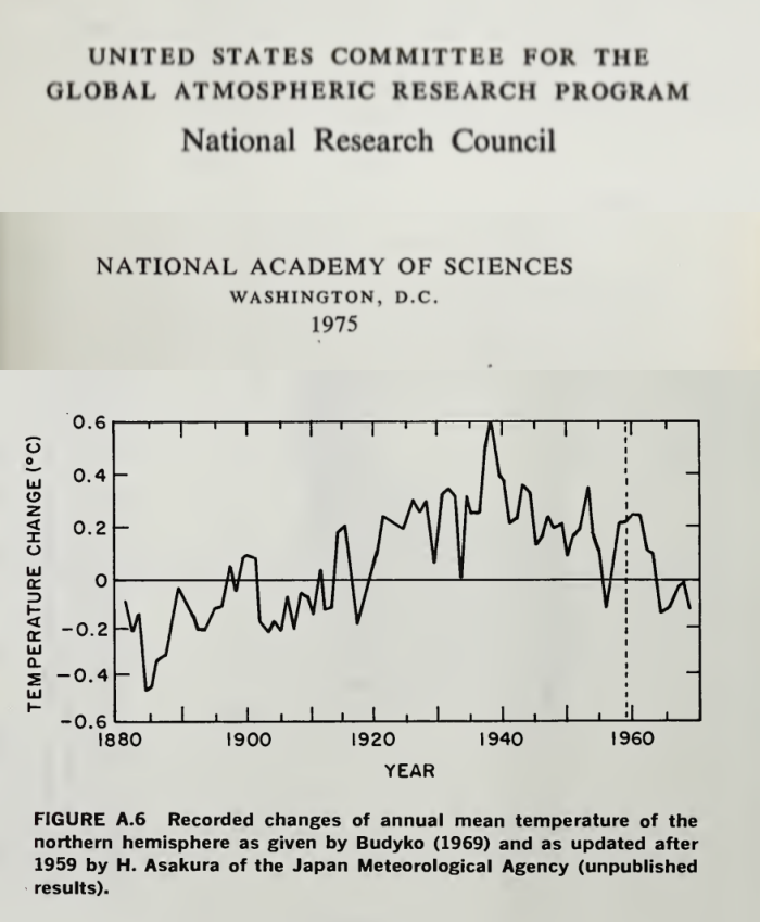
Now have a look at how GISS have erased the 1940 blip and have eradicated the 0.5degC of cooling, as per the Climategate emails that openly discuss the need to get rid of the 1940s blip and in which Phil Jones goes as far as saying that most of the Southern Hemisphere data is made up.
Richard,
“Now have a look at how GISS have erased the 1940 blip and have eradicated the 0.5degC of cooling”
Where? The first plot you showed was extra-tropical NH, the second was NH, and based on few stations. What GISS are you comparing to?
“Phil Jones goes as far as saying that most of the Southern Hemisphere data is made up”
No, he didn’t. He said that normals between 40S and 60S were mostly made up. I think he was exaggerating. But normals are not the data. They are “made up” because they don’t have long records. It’s desirable to have long records so you know what is normal, but if you don’t, it doesn’t invalidate the data you have now.
Mosher wrote: “At some point one hopes that people would actually do controlled field tests to validate the LeRoy scale.”
Even this won’t tell us what we need to know. The bias at a station doesn’t necessarily bias the trend obtained from that station. If micro, meso, or megapolis effects constantly make the reading at a station 1 K higher than it should be, the trend from that station will be unbiased. The only thing that matters is CHANGING bias. The quality of station siting today doesn’t tell us that local bias has changed.
The best way to avoid local site biases if to look at temperature on windy days, when the thermometer will be sampling well mixed air.
Essay When Data Isnt gives many specific examples for NOAA, NASA, HadCrut, Aus BoM, and even MeteoSchweiyz. US, Europe, Australia, New Zealand. Even (in footnote 26) BEST station 166900, unarguably the best kept, most expensive, mostnpristine weather station on Earth, the South Pole Amundsen Scott station. BEST turned no change into warming by eliminating 26 months of record cold using its logically flawed regional expectations algorithm.
Too funny.
There are several stations at the same location. One “Clean Air” has raw data that shows a warming
rate of 62 C per century. Of course the regional expectation adjusted this down.
Steven, are you missing a decimal point?
There’s been complaints about temperature rigging at Goulburn and to refute those claims Nick shows us a specific case where some data at Melbourne Airport hasn’t been rigged.
Well I’m convinced!
No, I showed how data from a BoM GHCN station gets transmitted unchanged to the GHCN unadjusted database. I can’t do that with Goulburn. Its data doesn’t go anywhere.
I am not sure how many people here believed that temperature data was being intentionally manipulated by providers. It would be extremely difficult to hide such an effort. Indeed, the problem with automatic stations in Australia was discovered as soon as it was cold enough to reveal the problem. If that was intentional, it was really stupid It is far more likely that it was a technical mistake that is being corrected immediately.
The real manipulation is taking place in climate studies, where the raw data is adjusted, not in the raw data.
And I would say my chief complaint is adjusting data from decades ago….at possible justification is there for it? How can we possibly know for sure if the adjustments are correct?
I guess that is really my concern – rarely do adjustment make the present colder and the past hotter – they always work in the other direction. If the errors were random, wouldn’t we see random series of adjustments?
” If the errors were random”
But they aren’t. They are due to causes. One was TOBS in the US, where observation times gradually shifted from evening to morning. Another is the improvement of shelters (use of CRS) around 1900 in some places, but later in others. More protection from radiation has a cooling effect.
Sorry Nick but no one living today has any idea, over hundreds of years, when the readings of the various thermometers were taken. I know when they were supposed to be measured but people don’t always do what they are supposed to do. These historical measurements are also taken with a thermometer that is graduated in single degrees so all of them are + or – 1 degree for accuracy. All of these measurements are taken with different devices so you cannot average these measurements together to increase the significant figures so all historical readings are still plus or minus 1 degree. Using that level of accuracy there has been no significant warming at all. Once you adjust it, it is not data anymore. will start listening to all of you doom mongers when you manage to get at least one forecast of impending catastrophe correct. So far I am waiting.
Matt Bergin
I entirely agree.
How many tea boys, cabin boys, amah’s, punkawalla’s or drunken scientists were sent out to badly maintained Stephen screens in the blistering heat, freezing cold or pissing rain to take a measurement from a dodgy thermometer, on time, every day 24/7/365.
It just didn’t happen to any reliable degree.
The Adjustments will never be “correct”
What you can prove is that an algorithm properly designed can Reduce the error
easy to prove in fact skeptics suggested the very kind of tests we use to show the algorithm works
Nick Stokes -”If the errors were random” But they aren’t. They are due to causes.
Then explain why you have to keep Adjusting the Adjustments, year after year, month after month. Can’t you guys get it right the 1st time?
Page 8 of 48 – http://www.climate4you.com/Text/Climate4you_May_2017.pdf – With Chart of the constant changes.
Diagram showing the adjustment made since May 2008 by the Goddard Institute for Space Studies (GISS), USA,in anomaly values for the months January 1910 and January 2000.
Note: The administrative upsurge of the temperature increase from January 1915 to January 2000 has grown from 0.45 (reported May 2008) to 0.69oC (reported June 2017). This represents an about 53% administrative temperature increase over this period, meaning that more than half of the reported (by GISS) global temperature increase from January 1910 to January 2000 is due to administrative changes of the original data since May 2008.
“Then explain why you have to keep Adjusting the Adjustments, year after year”
The averages aren’t adjusted as such. The individual stations are, and there are 7280 of them in GHCN. Adjusting any one of them will change the average.
Climate4you has been flogging that graph for ages. It is the difference between two particular months, cherry-picked of course. The main change came when GISS shifted from doing its own homogenisation to using the new data (based on pairwise matching) from NOAA. There was also the introduction of ERSST V4.
“Nick Stokes -”If the errors were random” But they aren’t. They are due to causes.
Then explain why you have to keep Adjusting the Adjustments, year after year, month after month. Can’t you guys get it right the 1st time?”
For us its simple. Adjustmenst are calculated from the data and the metadata. Long ago NCDC admitted ( in emails I got under FOIA ) that the metadata system needed a huge clean up. As that data changes ( looking at historical records ) the adjustments will change.. here and there .. not much to see.
As More OLD DATA is digitized the past estimates will change.
One thing that will change your adjustments is finding out that 2 stations you THOUGHT were different
were actually the same station. or two you thought were the amse are actually different.
There is no “getting it right” there is only getting it better. new methods, more data, different answer.
Ask the satellite guys Christy and Spencer. They have HUGE changes version to version
Nick, Steven etc just argued the adjustments have not really changed anything. Great so having convinced themselves of that can we just use the raw data in future discussions. The problem with homogenization of any science data is you can remove and mask out important features which show up in the anomalies (radio astronomy and particle physics is full of that).
Basically you seem to be doing the homogenization to try to create a “realistic rate of change” which is about the same science value as a “realistic rate” of population growth on Earth. Both of those are loaded with problems if you try to drag them forward 100 years and if you want to discuss either scientifically you need to discuss the background stories.
So this leads to the point your homogenized data gives you a rate .. so what now?
I have no problem with accepting that there is some rate from past to now. However as a scientist I also know Earth has a feedback stabilization mechanism so I need to exercise care if I try to project that rate forward as a year on year value. As with any feedback system you need to get some movement before it can react, okay we have measured a movement. I exercise the same care when I try to project Earth population forward 100 years because there may be factors that make it not sustainable and I am aware of that.
Mosh, “What you can prove is that an algorithm properly designed can Reduce the error
easy to prove in fact skeptics suggested the very kind of tests we use to show the algorithm works”
“however, the Forum concluded that it is likely to remain the case that several choices within the adjustment process remain a matter of expert judgment and appropriate disciplinary knowledge.”
http://www.bom.gov.au/climate/change/acorn-sat/documents/2015_TAF_report.pdf
That kind of algorithm?
Nick Stokes:
I appreciate your efforts here and I wonder if I could get your answer to a general question about the integrity of scientific methodology when it comes to temperature adjustments.
As everyone knows, sometime around 2013 there started to be this meme of a hiatus in global warming, because the temperature record for several years was tracking below the aggregate model projections. It became noticeable enough that climate researchers started to explain it.
When Karl et al published their 2105 paper, they specifically presented it as addressing this issue: “Much study has been devoted to the possible causes of an apparent decrease in the upward trend of global surface temperatures since 1998…..These results do not support the notion of a “slowdown” in the increase of global surface temperature.” http://science.sciencemag.org/content/348/6242/1469
Everyone knows all of this, of course. I bring this up as the background to this question: If the prospective temperature record had instead been tracking the models fairly closely, would Tom Karl have gone through the same process of retrospectively discovering and correcting “artifacts of data biases” in the NOAA temperature record? Is there a risk here of post hoc data adjustments that are biased in one direction, even if the adjustments themselves appear reasonable? It’s a question about basic scientific methodology.
MPassey,
Karl’s paper was actually using data that had accumulated, and was described by
John Kennedy in 2011, among others. There had been over nearly three decades a shift from ship-based SST measurement to buoys. As data is gathered, with GPS now, it is possible to make direct comparisons between measurements in close to the same point in time/space, taken by ships and buoys. By the time Kennedy wrote, several tens of thousands of such coincidence events had been monitored, and it was clear that buoys on average registered about 0.12°C cooler. That is small, but can’t be ignored. An adjustment had to be made, given the change in measurement mix. Karl’s paper made the connection of that cooling with the apparent hiatus.
It didn’t make a huge difference to trends overall, and now that buoys are dominant, it won’t have much effect in future. It seems it was only a touchy point because of the strong affection some have for the “pause”.
The latest ERSST V5 actually reduces modern trends.
I don’t know why you are going on about buoys here. Karl et al was about “correcting” daytime SST using NMAT. This inplicitly assumes that any climate change ( of whatever origin ) has identical effects on noctural minima as it does on daytime maxima in the marine environment.
Not only is that unproven , hence an invalid assumption, it is almost certainly wrong. There is already published work which finds that “global warming” affects the cooler end ( winter or night time ) more than the hotter extremes.
Greg,
From Karl.s paper
These networks of observations are always undergoing change. Changes of particular importance include (i) an increasing amount of ocean data from buoys, which are slightly different than data from ships; (ii) an increasing amount of ship data from engine intake thermometers, which are slightly different than data from bucket seawater temperatures; and (iii) a large increase in land-station data, which enables better analysis of key regions that may be warming faster or slower than the global average. We address all three of these, none of which were included in our previous analysis used in the IPCC report (1).
First, several studies have examined the differences between buoy- and ship-based data, noting that the ship data are systematically warmer than the buoy data (15–17). This is particularly important because much of the sea surface is now sampled by both observing systems, and surface-drifting and moored buoys have increased the overall global coverage by up to 15% (supplementary materials). These changes have resulted in a time-dependent bias in the global SST record, and various corrections have been developed to account for the bias (18). Recently, a new correction (13) was developed and applied in the Extended Reconstructed Sea Surface Temperature (ERSST) data set version 4, which we used in our analysis. In essence, the bias correction involved calculating the average difference between collocated buoy and ship SSTs. The average difference globally was −0.12°C, a correction that is applied to the buoy SSTs at every grid cell in ERSST version 4. [IPCC (1) used a global analysis from the UK Met Office that found the same average ship/buoy difference globally, although the corrections applied in that analysis were equal to differences observed within each ocean basin (18).] More generally, buoy data have been proven to be more accurate and reliable than ship data, with better-known instrument characteristics and automated sampling (16).
They don’t “correct” daytime SST using NMAT. The rather limited use of NMAT has been in calibrating different kinds of measurement (mostly ship) against each other where there are simultaneous NMAT readings (at night).
…. If there had been no hiatus, would Hansen have researched and have published a Paper to explain that the fall off in temperature rises during this period was due to increasing Chinese particulate carbon and sulphates emissions, i.e. Solar Gloom? Would many others have similarly been researching to find an alternative explanation?
The Karl paper is a load of horse manure. You cannot compare/combine sea temperatures with land thermometer air temperatures. They don’t relate. You are comparing apples and oranges, and combining them to present some type of global temperature trend is ludicrous.
One of the big issues with trusting the data is the adjustment of past temperatures, not of current temperatures.
“One of the big issues with trusting the data is the adjustment of past temperatures”
Homogenization is done in going from the GHCN unadjusted file to the adjusted file. I am describing the process leading to the GHCN unadjusted file, which does not change past values.
Nick,
You remarked, “That is because homogenization rarely modifies recent data. But older data may be.” Could you comment further on why older data may get ‘special’ treatment?
Right. So you didn’t address the the actual issue; you went for a strawman argument.
And since you started your analysis with this:
Clyde,
Firstly, adjustment is made relative to present. As you go back in time, if an adjustment is needed, due to station move or some such, it affects the numbers going back in time from that point, not forward.
But modern data gathered by an AWS process like this is unlikely to need adjustment, unless there were a move or change that nowadays (here at least) would be clearly recorded.
Nick,
So are you telling me that historical temperatures are ONLY changed when a documented change such as site or enclosure can be shown to have created a change?
Clyde,
“So are you telling me that historical temperatures are ONLY changed”
No. Homogenisation is done (by GHCN) based on the observations, on a balance of probabilities basis. As always, the objective is a best estimate. Sometimes data will be changed when it shouldn’t have, sometimes real changes will be missed. You have to try your best to get it right. Data doesn’t get a presumption of innocence.
“Data doesn’t get a presumption of innocence.” Only homogenization algorithms do.
Odd how the homogenization seems to alway lower the older temperatures which allows present temperatures to remain unadjusted while increasing the temperature difference between earliest and latest readings. Do that enough times and you get a pretty good increase in temperatures over time.
Nick,
You said, ” Data doesn’t get a presumption of innocence.” It probably should! Unless you have good evidence that something has changed, such as the site or instrumentation, changing it may be hiding real information.
“Odd how the homogenization seems to alway lower the older temperatures which allows present temperatures to remain unadjusted while increasing the temperature difference between earliest and latest readings. Do that enough times and you get a pretty good increase in temperatures over time.”
Actually not. SST older temperatures ( 70% of the globe) are warmed.
For land it will depend on the region. in the usa the past is warmed, on other continents it is cooled.
In anomaly space it doesnt matter which end you change ( current or past)
““Data doesn’t get a presumption of innocence.” Only homogenization algorithms do.”
Actually just the opposite.
We ( NCDC, Berkeley and others) all tested their algorithms in a double blind study.
BEST in fact was formed in part because some of us didnt believe in the NCDC approach.
“Nick,
So are you telling me that historical temperatures are ONLY changed when a documented change such as site or enclosure can be shown to have created a change?”
No because THAT would mean you trusted the metadata.
You cannot trust the metadata to
A) capture every change
B) record every change correctly
So instrumenst can be changed with no record, the wrong location can be reported, the wrong instrument can be recorded.
Today there a dozens of GHCN stations that have lat lons that position them in the ocean.
or stations that are reported to be an airport where there is no airport, or not at an airport when they
are at one.
Metadata can help, but in the end you have to weigh all possibilities.
It seems the that hard part of being a climate scientist these days is not predicting future temperatures but predicting past ones.
Nick, “As you go back in time, if an adjustment is needed, due to station move or some such, it affects the numbers going back in time from that point, not forward.”
http://jennifermarohasy.com/wp-content/uploads/2016/02/Fig1-1.jpg
http://jennifermarohasy.com/wp-content/uploads/2016/02/Fig2.jpg
Courtesy: http://jennifermarohasy.com/2016/02/12910/
Except to perhaps cool the past.
sorta with Clyde who replied below
amazing how just after 2009cop the graphs n data for the 3 hottest places in aus 1930s all got removed from Bom sites
kicking myself for not being smart enough to copy paste them wayback then.
marble bar eucla and ? hmm qld longreach from memory
that aside
Nick seeing as BOM can do 9 to 9am
which makes an absolute bollicks of actual DAILY rainfall amount let alone temps
dont you think its bloody odd and needs to be sorted to 12am to 12am so a decent and truthful DAYS records are IN that days reports
i am getting damned angry trying to track the real rainfall i get in a day adding half the prior days recordings to it is driving me nuts
and of course its reported late also
when rivers are likely to flood those delays can be VERY costly to us rural folks especially
Pete, A quote from Zeke Hausfather explains adjusting the past:
“The reason why station values in the distant past end up getting adjusted is due to a choice by NCDC to assume that current values are the “true” values. Each month, as new station data come in, NCDC runs their pairwise homogenization algorithm which looks for non-climatic breakpoints by comparing each station to its surrounding stations. When these breakpoints are detected, they are removed. If a small step change is detected in a 100-year station record in the year 2006, for example, removing that step change will move all the values for that station prior to 2006 up or down by the amount of the breakpoint removed. As long as new data leads to new breakpoint detection, the past station temperatures will be raised or lowered by the size of the breakpoint.”
There is the additional issue of pairwise or regional homogenization. Pielke Sr. years ago demonstrated empirically that nearby stations differ both in absolute values and in trends due to difference in the terrain underlying. On that basis, it is bogus to change readings at one place to synchronize with somewhere else. And as proven repeatedly the process almost always leads to higher trends.
https://rclutz.wordpress.com/2017/07/27/man-made-warming-from-adjusting-data/
Ron,
Further, temperature changes globally appear to only have significant changes in steps. It is unfortunate that NCDC uses steps as the only criteria for homogenization changes. I would recommend only making changes when a change in site, enclosure, instrumentation, or surroundings can be documented. NCDC might well be corrupting data that could provide important insights on how climate behaves.
This strikes me as being akin to calculating the standard deviation of many observations, removing those with a SD greater than two sigma, recalculating the SD, and again removing ‘outliers.’ One ends up chasing their tail and having a data set very different from what they started with. That is, the mean and standard deviation will be very different.
The nice think is you get the same answer if you use a method that does NOT always change the past.
our method doesnt preferentially change past values. How does that compare to NCDC..
same answer
It sure does get the same result, when it works like this:
Hear me, Nick. When you play with homogenization, you are playing tossup with a mathematical hatful of nitro. Just fail to account for one systematic error, and you’ll be scraping your pairwise off the ceiling.
false.
It depends on the size of the systematic error.
The cool thing is you can get the same answer by doing the homogenization using a blind method.
its rather like Leifs method for corrrecting sun spots and like christys method for correcting for diurnal
changes. basically data driven.
AND you can prove that it doesnt corrupt perfect ( CRN) stations
Yes, it totally does depend on the size of the error, so it does.
But no method, blind or not, is going to help on whit if it does not account for the error.
AND you can prove that it doesnt corrupt perfect ( CRN) stations
I must infer from that comment that you haven’t compared CRN and USHCN trends from 2005 through 2014.
I beg your pardon for my English, but it seem to me that this post relate to the news about limiting temperature below -10°C in the Goulburn weather station.
I look at the link you cited and I was not able to see any “lower temperature” under -10°C.
I’ve I misunderstood the problem, read the wrong data or what?
Mariano,
Goulbourn data for July is here. It starts out like this:
I’ve ringed the reading that attracted attention.
Thank you. My fault! I looked at Goulburn TAFE.
Well the ‘kerfuffle’ was about what happens to a reading below -10C.
You see, some say it was going to be treated as spurious and ‘corrected’ to -10C.
There was quite a ‘kerfuffle’ about smart cards and programming.
http://joannenova.com.au/2017/08/bom-had-smart-cards-to-filter-out-coldest-temperatures-full-audit-needed-asap/
Things are still rolling, as it appears old records are being binned
http://joannenova.com.au/2017/08/another-bom-scandal-australian-climate-data-is-being-destroyed-as-routine-practice/
Now, sure, its now reading -10.4, but would it have done but for all the ‘kerfuffling’?
But wait…there’s more
“Graham Lloyd has picked this up and adds more in The Australian in “Temperatures Plunge after BOM orders fix”. Jen Marohasy saw a -10.6C temperature disappear from the Thredbo recording last month, but now, after the BOM’s rushed fix, Thredbo has already reached -10.6C this week in the official record. The Bureau’s CEO, Andrew Johnson said they had replaced equipment that was “not fit for purpose”. Which begs the question that if thermometers were not fit to record cold temperatures, what purpose were they fit for? Politically correct thermometers? Thermometers to justify Renewable Energy Subsidies and ARC Grants?
Want to avoid answering basic questions — call a review!
Graham Lloyd asked the BOM about the smart cards, but got no answer:
The BoM declined to comment ahead of the internal review.
“The findings of a review into this matter will be made available after completion,” a BoM representative said. “We do not intend to publish detail prior to that.”
Since when did a review become a reason not to explain a supposedly scientific process? Either there are smart cards there, or not. There are limits set (or not). And there is hopefully a record of the real raw temperatures recorded somewhere…”
So the problem is trust.
The answer is “Trust Us’.
In the meanwhile who does the average scientist believe?
With this article the fix is in.
When one does science raw data, is sacred.All derivations are calculated from it.
The data collected is part of the bedrock of observational science.
When this is corrupted it alienates the observant and attracts people to the ‘science’ who do not know
how to measure.
It prevents not only peer review but also specialist review that is open and repeatable, the other
cornerstone of science.
One way of not answering a question in climate science is to flood the questioner with data.
The problem for the scientist is ‘whose data is this, is it reliable?’
Sadly BOM showed us it is not.
and what about the amount of concrete and bitumen at Melbourne Airport, Olympic Park or Laverton say since 1900. All the BoM temperature anomaly is revealing is the steady increase in the UHI in areas increasingly built up then projecting that as being global. There is a relationship to CO2 emissions no doubt but its not the ‘greenhouse effect’. Nick’s piece misses the point methinks, which is that the BoM data set is not fit for purpose to contribute to a proper global temperature trend. Ditto the sea surface set but for different reasons. I do not trust BoM for that reason. There is no way such an outfit can plead ‘duuhh – we didn’t think of that’. Lets say that the BoM stations are fine for the local temperature, telling it like it is but that does not make them fit for the global anomaly (essentially a trend parameter) purpose.
Leave BoM aside and think of the potential site location issues around the planet. Only a select set of sites could be considered as fit for the global anomaly task. That BoM and its counterparts do not use only properly sited stations goes directly to their credibility. Add to that this fetish for sexed up science communications as feedstock to the msm ( exemplar bar none in Oz being Peter Hannam at ‘F&$k Facts’ aka Fairfax) and this is all ready about the credibility of witnesses. Spare us the pet expert testimony.
Komrade
I’m glad someone has bought up this point. I find it perplexing that in world which over the last 150 years cities have gone from a small but growing populations to massive concreted metropolises any historical adjustments should be up not down to enable comparison with modern data. The very real impact of UHI is missing from these adjustments. The crazy thing is that when you are making policies that cost billions of dollars on less than a degree or two of warming these ill advised adjustments are so damaging. The more recent adjustments if any are actually irrelevant the damage has already been done.
Thankyou. Nice to have “how it’s done” resources like this available. It would be interesting to see how many of the sources internationally offer such transparent access to the end to end data stream.
As Nick Stokes wrote, the problem is not the present temperatures but the historical temperatures. For example the latest GISS version 2016 shows about 0.5 Celcius more warming from 1880 to 2016 than the previous version. It is simply too much. The homogenization of raw temperature data and calculating averages is not that difficult. The Americans went to the Moon in 1969. Now the history of GISS temperature versions show that they are not capable to calculate the average temperature of the Earth. What is going on? Why should I rely on the latest GISS version when all the versions so far have been wrong?
“For example the latest GISS version 2016 shows about 0.5 Celcius more warming from 1880 to 2016 than the previous version.”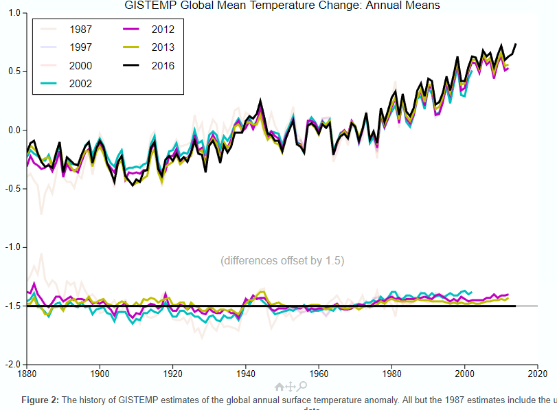
It’s not nearly so much. GISS has a history page here with an active plot showing old versions. I’ve highlighted recent versions below:
That bureaucrats alter “data” without justification isn’t a belief. It’s a fact, ie a repeated observation. NOAA even changes its “data” before reporting it, then “adjusts” it more.
The whole system is totally corrupt and only new personnel dedicated to science rather than political ideology can change it. But the damage done to raw data can’t be repaired. Hence, honest recording in future will “cause” cooling automatically.
Thanks for that U.S. surface temperature chart comparison, Latitude. NASA charlatans turned a temperature downtrend from the 1930’s into a dishonest temperature uptrend.
The 1999 chart is the true global temperature profile, with the 1930’s being as hot or hotter than subsequent years. This temperature profile is seen all over the world in unmodified temperature charts. The Hockey Stick chart profile is a completely different profile which was created to promote the CAGW narrative.
Look at this unmodified temperature chart from Finland, halfway around the world from the U.S., yet it has the same temperature profile as the NASA 1999 U.S. chart with the 1930’s being as hot or hotter than subsequent years. It looks nothing like the Hockey Stick chart. And there are numerous other examples of this same profile from around the world.
The only problem Latitude is that Nick points to a page with ACTUAL DATA
you flash pictures with no link whatsoever to any data.
the graphs you falsh are of different data, using different methods, and they dont even have the same
scales.
We could have an intelligent conversation about the ACTUAL changes they made, but Not unless you present the actual data.
Thank you Latitude. Until someone produces a record explaining exactly HOW and WHY the US record you linked was changed so dramatically I will ignore all claims of very minor adjustments. THOSE ARE NOT MINOR.
The same is true for the NH and SH records at the peak of the ice age scare.
Beyond that, whatever the cause of the surface warming it is not and cannot be GHG until the troposphere is warmer then the surface.
Mosh..in all these years…I’ve never seen you so lame…
Both of those graphs were made by NASA/GISS….using NASA/GISS data….their own data…their own graphs
(like you don’t know how to right click) lame lame lame lame lame…and no one is falling for it doodoo
“…and they dont even have the same
scales.”
At any scale, a downward trend is down.
And an upward trend is up.
And at any scale, reversing this trend direction is still a reversal of the direction.
Piling strawmen on top of a fluffy pillow of lies.
We have a name for that sort of argumentation where I come from.
BTW, I would love it if the effect of scaling was removed by making all climate related graphs show the entire temperature scale.
All of the trends are then very difficult to discern from a straight line.
Oh, and also BTW…the scale is identical in the two flashing graphs.
It shifts because the alterations were so huge it was off the scale of the first one. But test that.
Click the link.
Then hold your mouse cursor over any line on the graph as it flashes.
If you hold it right at 1.0 on the first one, it will still be at 1.0 on the second one.
The horizontal scale is likewise identical.
Mr. Mosher, you make stuff up and hurl accusations that do not stand up to even mild scrutiny.
Seriously.
The graph is exactly what it says it is…and you should admit it, or say nothing.
Since you already said something, the least you could do is admit you were completely and 100% wrong about everything you said here.
Welcome to NASA’s cool magic show! We make the cooling disappear! Now you see it, now you don’t (applause)
you know……Mosh used to at least put some effort into his “stories”…if you stood back far enough and squinted…he could sound at least plausible
Here lately it’s like he’s given up…posts drive by comments….that are so lame they are obvious to a 2 yo
Great! System normal! We are in an interstadial warm period and by golly it should be warmer with little ticks up and down during this peak period that mean nothing compared to the big swings. Check. The Earth should be greening. Check. The oceans should be in net discharge mode with sea level slowly rising. Check. The climate should on average be wetter than when it is in a stadial period. Check. Flora and fauna should be flourishing. Check. People should not be complaining about this wonderful warming climate. Oops.
People should understand that there might be slight differences (likely much less than a degree F or C) between temperature data processes which show overall warming anyway, because those slight variations just don’t matter in the long run. What we should be worried about are the people who DO think this warm period is not supposed to happen and is something we should try to fix!!!
Lordy.
Yes! Thank you Pamela.
LOL..Pam that was great!…..and spot on!!
Interglacial. Interstadials are during glacial intervals.
We are in a glacial epic in which we oscillate between stadial cold and interstandial warm periods.
https://pdfs.semanticscholar.org/3ef7/02054d1719e80561f023265bae522c953c77.pdf
The Pleistocene was a glacial epoch. The Holocene has its own epoch, but is really just another interglacial.
As I said, interstadials occur during glaciations. Interglacials occur between glaciations.
I refer you to Cronin’s 1999 “Principles of Climatology”. Within glaciations, colder stadials generally endure for a thousand years or less, while warmer interstadials for less than ten thousand years, interglacials for more than ten thousand and glacials for about one hundred thousand (now known to be the average of ~82 and ~123 thousand years, not recognized in 1999).
The Bølling Oscillation and the Allerød Oscillation, where not clearly distinguishable in the stratigraphy, are taken together to form the Bølling/Allerød interstadial, and dated from about 14,700 to 12,700 years before the present. The Holocene Interglacial is usually dated from around a millennium after that, ie 11.7 to 11.4 Ka.
The ice cores demonstrate stadial and interstadial periods. These are the ones I refer to. The terms have been confused by many as to what constitutes a glacial versus stadial period, and what constitutes an interglacial versus an interstadial period. Welcome to the confusion.
http://lgge.osug.fr/IMG/fparrenin/articles/barker-science2011.pdf
Hallelujah!!
+lots
It doesn’t matter about all the wrangling over data adjustments.
The very gradual warming is natural. That is all.
And warmer is better.

Cold is death.
I recall a recent article in a popular fake news publication (which used to actually have a reputation as being a reliable source of information) in which the writer breathlessly warned that if the Earth got tremendously hotter than it has ever been, there may be some places where the heat could kill a person.
This writer seemed unaware that there large swaths of our planet which have just that…fatal temperatures…permanently across huge areas, and seasonally across much of the habitable terrain…and it is not heat which is the killer…it is cold
Just look at which parts of the earth have fatal temps, and which are the parts which people flock to when it gets nippy outside.
Is there anyone who vacations at the poles?
I will give everyone a reminder:
http://jtpedersen.net/blog/wp-content/uploads/2009/04/frozen-penguin-2.jpg
Without sensitive instruments, a person cannot even detect the amount the Earth is supposed to have warmed over the past hundred + years.
Very good summary.
I remember reading a comment on an article quite a few years ago at WUWT…
“And even if we COULD control the world’s thermostat…who gets to choose the temp?”
“…who gets to choose the temp?”
Anyplace I have ever lived, it is the one paying the bills, not the freeloader who is past their welcome.
“”…who gets to choose the temp?””
“Anyplace I have ever lived, it is the one paying the bills, not the freeloader who is past their welcome.”
So, all government employees are barred from the playing field, but private sector janitors and carpenters and machinists…get control of the rudder and sheets. Got it.
But, really, NS’s article is a baby step in the correct direction. More separately.
“So, all government employees are barred from the playing field,”
Who is talking about being barred from any playing fields.
The issue is who gets to spend your money: You, or someone with a political axe to grind?
If you like to have your life controlled by other because they have wowed you with some fake credentials…good for you.
Leave the rest of us out of it.
Welcome to GISP’s cool reality show! We show the cooling is real! Now you see it, now you see it (applause)
http://jonova.s3.amazonaws.com/graphs/lappi/gisp-last-10000-new.png
Welcome to Vostok’s cool reality show! We show the cooling is real! Now you see it, now you see it (applause)
http://www.changecollege.org.uk/img/Vostok.jpg
The problem, Nick, is that this does not address all the possible points of data correction or corruption. I want to believe the best about the integrity of those in charge of the data (I wont even mention points of physical corruption such as the Urban Heat Island effect or proximity to airports), but when there are literally billions of dollars on the line it is difficult to do so.
I stopped believing in AGW and the integrity of those who do so on the day I saw the infamous commercial from the U.K. where the teacher blew up the heads of non-believing children. My physical and moral revulsion to what I saw caused me to question a lot of things that day.
But for the sake of argument, let us assume there is no data manipulation, correction or corruption. Let us assume that it is truly warmer today then the at any point since we began keeping records. Let us also assume that there is no need for upper or lower error bounds. Let us even further assume that CO2 is the primary cause of AGW. If we implement the Paris Treaty, will this temperature go down? If we switch to 100% renewables will this temperature go down? If we take away every car, shut down all the airlines, remove all the AC units, implement a 1 child per family policy, make everyone become vegans, and eliminate capitalism will the temperature go down?
And if it does go down, is it proof that we were suffering from AGW?
Will we go to a magical norm, where it is neither colder nor warmer than normal? Where there is no temperature change from year to year, decade to decade or century to century?
Yeah, you have no idea.
Your wider points are entirely valid. But Nick’s piece, which only goes to a small part of the chain of reasoning, is well done and clearly explained, and what we should recognize more than anything else, really does credit to this site. Not an echo chamber, but one that recognizes diversity of views.
The problem Michel, is that stuff like this is a red herring. Nick takes a small period of time in a small portion of the earth to show that data manipulation is not occurring. When I read this, I appreciate his willingness to communicate but it still bothers me.
Why, upon reading this, does it bother me?
Because a discussion about data manipulation should be forefront in our minds and should be studied by people on both sides of the divide. All of the groups putting forth data should be studied and checked. I would think that anyone who calls themselves a scientist would acknowledge it is in the best interest of science that data be as accurate as possible. Where data is obtained in different manners, like should be averaged with like (that’s the accurate way to handle data) and data obtained in a different way should be averaged separately.
When a small portion of data is presented and the attitude is “hey look this isn’t manipulated so ergo no data is manipulated” then that just concerns me.
Really Nick (if you bother to read this), nothing personal, but by presenting this information are you telling us that no data at all is being manipulated?
Or are you just saying, “look the data I see isn’t manipulated, but I can’t make a leap in logic as to the rest.” I can respect that.
Andrew,
“by presenting this information are you telling us that no data at all is being manipulated?”
I’ve looked at a lot of it, and it seems straight forward. All I can say is, if you think it is manipulated, you should be able to find out where. It’s all out there.
Hi Nick,
“All I can say is, if you think it is manipulated, you should be able to find out where.”
Could you explain the example of Darwin airport with no site changes but with 0.72 C per century cooling being adjusted to 1.2 C per century warming.
https://wattsupwiththat.com/2009/12/08/the-smoking-gun-at-darwin-zero/
Thanks,
Carl
Carl,
See below.
When nick makes valid points, rather than admit the fact, you just make up crap about airports.
Warming trend at airports is no diffferent than non airports.
That is nonsense. The differences between maximums and minimums at the non-airport sites will be greater than at the UHI impacted sites.
Quite right spren. I have been watching daily aircraft movements and checking temperatures. When our regular Easterlies and South Easterlies blow across the runway from the parking apron direct to the BoM instruments. This shows a spike for a couple of minutes only of around 1C at the times aircraft land and taxi to the apron, several times a day. Four new helicopter pads and 15 giant helicopters now operate alongside the BoM instruments, further adulterating the real temperature. Perhaps it should be AHI instead of UHI.
https://pindanpost.com/2016/03/26/jet-fueled-temperature-rises-for-broome/
https://pindanpost.com/2015/12/14/airport-heat-islands-artificial-maximum-temperatures/
That would be using your data. I guess you are saying Watts’ study is wrong then for comparison of well sited stations. Care to tell us where his study went wrong.
“I want to believe the best about the integrity of those in charge of the data…”
Not me.
That sounds silly.
I want to know the truth.
As scientists…as taxpayers, we have that responsibility…we have the right.
Class diversity. Discrimination between individuals based on the color of their skin, their sex (i.e. male or female), etc. is logically and by definition racist, sexist, etc. A bigoted (i.e. sanctimonious hypocrisy) philosophy normalized by the Pro-Choice Church and its progressive (i.e. monotonic) liberal (i.e. divergent) acolytes.
Still, denying individual dignity is a far cry from denying evolution of human life from conception. I wonder how many people actually believe in spontaneous human conception; in social justice adventures that commit mass a-bortion and force global refugee crises.
I’m a bit lost as to how this relates to Australian temp readings…?
Obviously posted to the wrong thread.
“I have been calculating a global anomaly every month, ”
I suppose if it pays the bills , why not.
Stop immediately! You are using power! What if the authorities find out?
Thanks, and very welcome.
With this post you have put clear blue water between yourselves and Ars Technica, Real Climate and the Guardian, none of whom would ever feature an article by a known skeptic, all of whom are mired in a morass of censorship of opposing views and endless cries of ‘fossil fuel funded denier’.
Thanks also to Nick for continuing to comment and participate in the face of sometimes very unfortunate and rude replies. His patience is commendable. His presence enriches the site greatly, and while I often differ from him, I always read his comments with interest.
True. Whilst I invariably disagree with comments Nick makes, he is always unfailingly polite and that should be commended.
Yeah, the good manners of people who are running cover for criminals never fails to warm the cockles of my heart.
A very useful post, Nick, with useful links…..thanks!
There is so much data available out there and that’s perhaps a large part of the problem. Once upon a time, we’d have been content to record it, use it for historical comparisons and identify extreme events and suchlike to fill a column in a newspaper and comment on the unpredictable nature of weather. Now, thanks to computers, we build models and make extrapolations and projections as if we actually understand what the underlying processes are. Hubris, I’m afraid.
That is not my understanding of what a large part of the problem is.
If that was a large part of the problem, there would not be much of a problem.
Airport stations are placed to measure conditions at the runway — hopefully a worst case so we can accurately asses the risk to flight based on density altitude and wait for a cooler time of day if necessary.
The Surface Stations project documented anomolies in many other stations.
If we can use one pristine station for carbon dioxide, why not use one pristine station for temperature.
The more we talk about process, the less we talk about outcomes, and the costs/benefits of our actions.
OK Nick, the temperatures are fine. Things are warming up a little bit. They might get as warm as they were in the MWP. Then again, they might cool down, as they did in the Little Ice Age, or heaven forfend, enough to put us into another cold period, which has been the dominant ‘climate’ of the last few hundreds of thousands of years, and not that friendly to life as we know it
There is an implicit thought here that if you can convince us your temperature series are valid, all the other claims of the CAGW advocates are valid.
Put simply, if a few degrees of temperature rise make folks so unhappy, why do northerners vacation in the Caribbean and retire to Florida. We are going to completely cycle our infrastructure in less than 100 years anyhow, and we will naturally cope with temperature, sea level, and other changes in the natural course of things.
Back to my airport. We tend to wonder that the change of life that is supped to accrue as the temperature varies a few tenths of a degree. The adibatic lapse rate is 4 deg/1000 feet, so I can cool 8 degrees
by climbing 2000 feet. Folks who live on a hill live in a different climate. I live in the temperate zone. I can change my average by moving north or south a few hundred miles. Assertion that we’ll not be able to adapt to temperatures changing makes no sense. The flora and fauna adapt along with us. We grow different plants in different regions. The plant mix has changed here as the temperature has cooled over several decades, probably a local effect.. .
So I’ll stipulate your damn temperatures, and call BS on the implied conclusions.
We have comapred all the pristine stations in the US ( CRN) to the :shitty: stations.
NO differrence.
[I call BS on that – Anthony]
Steve
Gives us the data that you looked at.
Not me.
Give them an inch, and they’ll take not a mile but our money, freedom, security, prosperity and hope for a better future.
“So I’ll stipulate your damn temperatures…”
Not me.
Give them an inch, and they’ll take not a mile but our money, freedom, security, prosperity and hope for a better future.
Thank you Nick for this, and Charles. This policy is focussing the debate rather well. Anthony has always had an open invitation to proponents of looming disaster to submit articles, but either direct invitation has been the best way to go or the time is right for this.
Well if the unadjusted is truly that close in all land based stations, the data keepers have have shot themselves in the PR foot for no gain. It has long been my contention that if we are facing an existential threat, that a hundred scattered stations around the globe would be, without adjustment, sufficient an early warning system. We would see if we are departing seriously from 0.6C/ century (we aren’t) relatively quickly. Hundredths of a degree adjustments are expensive foolishness and raise scepticism that can’t be good for morale or sober policymaking.
Paul Homewood found Paraguay and Ecuador traces grandly adjusted for GHCN and a Capetown raw record that even had the familiar wiggles of the global pause – further proof that a) you don’t need so many hands in making the broth and that b) for disaster warning, you don’t need many stations at all.
The fact that 70% of the globe is water does offer up a playground for fiddling that hasn’t been ignored, too. Since the satellite temperatures over land are frequently argued to be close to surface station results, logic would cry out for this record to be the source for ocean temperatures. Do the rejected or neglected buoys validate satellite readings?
Similarly for SLR. If the fear is we are going to be struggling with a 3m rise, why are we running down to the sea with micrometers?The tide guages, whether relative sea levels vary up or down because of crustal movements are more than adequate to give us long lead time to deal with it. It presently seems steady at ~2mm/yr. The adjustment is only to 3mm with allowances for ocean basin volumetric changes from isostasy which makes the silly situation of official sea level standing above the actual water surface.
“Of course, I can only show one example”
Nick,
There is no “of course” in climate science. One example doesn’t prove anything, either.
Andrew
It traces the path. The opportunity is there for doubters to show where the supposed “fiddling” is done.
Approximately 66% of global surface temperature data consists of estimated values…….
https://wattsupwiththat.com/2015/09/24/summary-of-ghcn-adjustment-model-effects-on-temperature-data/
“It traces the path.”
Tracing a path for one thing doesn’t mean the path is universal.
Andrew
You have a theory it is not universal.
Prove it.
One case will do
This was a well thought out article that demonstrates there is no massive conspiracy among (at least) Australian temperature monitors. However, it misses a related problem – sampling errors. Let’s grant the history record back to 1900 for NSW as shown in your figure. I have a difficult time believing the border between South Australia and the Northern Territories has as accurate a record. Similar for Siberia, the Northwest Territory of Canada, Mongolia, central portions of the Sahara Desert, interior rain forest in Brazil, central Greenland, the South Pole, and so on. In fact I would suggest that we have an excellent historical record for land area within 200 miles of the ocean or major sea (Mediterranean, Caribbean, etc) but not much else. I doubt the South Atlantic, South Pacific, South Indian or any of the Pacific is well sampled before 1950. So when we compare global averages to the past we limit the past to coastal land. I could accept that a sampling is an accurate measure of the whole except that the sampling needs to be unbiased. Since our historical sample is biased to places where people lived I don’t think we can compare to the past. Maybe I’m wrong, I’m open to correction. So in that vein – The Pacific Ocean is as large as the 6 occupied continents put together, and had very little shipping across it in 1900. How well do we know the temperature of the Pacific Ocean in 1900?
“Adjusted data” is an oxymoron. Scientists who introduce their own fallible judgment into “improving” measurements are corrupting the entire process and rendering it useless.
If data is no good, the only option is to throw it out. Trying to unscramble the egg just creates a mess and ruins breakfast.
Gary……you are naive to think that reasoned, logical methodology has any merit in the race to obtain portions of a Trillion Dollar plus industry.
I get a little bit of a kick out of all the people and money spent on the minutia involved with climate on both sides of the fence. It is all a shell game and most have lost sight of the pea.
A very recent WUWT Post on ‘Dodgy Greenhouse Data’ is an example. For decades the amount of CO2 and Greenhouse gasses have been used a propaganda to convince the public of CAGW (50% of public doesn’t know the meaning of individual letters), yet the veracity and collection method of GHG’s is completely unverified.
OT, but ctm did open with a reference to Google’s ‘diversity kerfuffle’: CNS ran a much more sympathetic story, which I think would be a lot more accurate than the Daily News version. The Daily News version reads like a totally PC distortion.
The CNS version is at http://tinyurl.com/yckx66ro
The Google boss’s statement confirmed that the engineer’s comments were accurate.
The “adjustments” are, indeed, not particularly large. However, they have a subtle goal: to make the series appear to be less variable and more in line with the AGW hypothesis. :large
So, while advocates can legitimately feign dismay to criticism on the grounds that linear trends drawn through the data have actually decreased with adjustments, it is a sleight of hand – the adjustments are erasing the features that show the warming is not actually strongly correlated with CO2 concentration.
Bartemis,
This one graph says more than all the hand waving and discussions and excuses and lame reasoning, all put together.
It tells the whole story, to anyone honest and paying attention.
“It tells the whole story, to anyone honest and paying attention.”
It tells nothing, because Goddard did his usual stuff of subtracting the averages of two different sets of stations, and saying that the result is due to adjustments. It isn’t. A substantial part is just due to their being different places and times.
But it also makes no sense. I can see a conspiracy theory that has people making the temperatures align with CO2 rise. But why on earth align temperature adjustments?
So, they were different places and times, and it still wound up a straight line?
That makes even less sense and is even less likely.
But have you guys not said over and over that it matters almost not at all which stations one uses?
That one set is as good as another?
Separately,
If the ones from one set were not comparable, how is it justifiable for NASA to say that the newer set is representative?
He used their numbers.
Are you saying at some point NASA just threw out the stations they had been using and selected some other ones?
And the new set just happened to show the opposite trend from the ones everyone used prior…even James Hansen, who made the first one and was the father of the whole meme?
But that does not concern you…just trying to discern the pattern among the sum of all of the adjustments…that is not allowed because it is apples and oranges?
As for your last question…are you kidding?
The whole reason we are here is because a group of people have the political motivation to prove that CO2 is the temperature control knob of the atmosphere…that we can adjust it by controlling emissions.
The obvious motive is the force the graph of temp trend to match the level of CO2 in the air. To correlate them.
Tony was the first person to think of graphing it this way///I am sure that the people responsible were horrified that someone figured it out who had the knowledge to use the data to make their own graphs.
It is his skill at creating software that allowed him do it.
To most of us…it is just a huge database of numbers.
My areas of knowledge do not include how to do this, but like a lot of things, you do not have to know how to do it to know what it means when you see it.
But I do not believe for a second that you are incredulous and cannot understand why this line appears.
I never saw any response or heard from you when RGB from Duke and Werner Brozek wrote the post here that analyzed the chance of this correlation arising at random or spontaneously.
It is more likely to win both of the lotteries on just two tickets than for that to be the case.
This reminds me of a “Chain of Custody” whereby there are a series of hand-offs of evidence and each must follow proper protocols (including sign off). So at least THIS data seems to be aggregated from each station and collected properly. What is missing is each station’s formal practice, then any down line attempt to use this data including the methods, justifications, and processes used to change it or derive answers from it. At any point corruption of clean data can occur (either on purpose or by accident).
Strict CoC is only necessary in fields where corruption and mistakes are deemed likely to influencing the outcome- by corruption I include the misuse of statistical methods and bad analysis which is may just be sloppiness. It is the fault of the practitioners in the field of “Climate Science” that no one believes them anymore. All data is eyed with great skepticism.
To fix this, practitioners in “Climate Science” will have to be more careful with their data and analysis. They need to understand and separate facts from the model derived outputs commonly used in place of facts. They need to answer questions from skeptics with respectful language. They need to possess a more open mind where uncertainty allows a conversation to occur, not be shut down. In short, they need to transform their practice from a self-contained religion into a normal science based one.
Nick
Thank ŷou for posting this. I do admire your integrity and wish there were more people like you at this site which otherwise can often be a bit of an echo chamber.
It’s not often we agree on things but as you know I am sceptical about the widespread corruption of raw data. My main point of contact is with the met office and I find it faintly ridiculous that as soon as I leave there the scientists such as Richard betts rub their hands and say ‘ right he’s gone, now we can get on with doctoring the data.’
Having investigated historic temperatures for many years I do however have a problem with comparing like for like between now and previous eras.
When you realise instruments were hauled to observers by mule or that observers were often untrained, used different times of day to take temperatures, used a variety of screens, that a mercury reading may be different from an alcohol one on a thermometer, that readings were often added in days after the event, that instruments were moved or urbanisation crept up on them, then it becomes very difficult to say with certainty that the same place has become notably warmer in the last 100 , 500 or 1000 years.
Certainly in my neck of the words we can trace the ups and downs of temperatures over the centuries and I would find it very difficult, based on evidence such as tree elevations, known crop elevations, harvesting dates eyc, to say that the climate was warmer today than at various points in the past. Similarly, glacier advances and retreats in such places as the alps can be followed with some certainty due to the works of such people as Le Roy Ladurie.
So all in all I do not think anything remarkable is happening and certainly do not believe that weather is as extreme as it has been at periods over the last 1000 Years.
Keep up the good work but let us put all this into the context of the Holocene, rather than just the last few decades
All the best
Tonyb
Thanks, Tony,
Yes, I agree that this relates to the very modern period only. I think past numbers are accurately preserved in GHCN unadjusted (and Daily, ISTI etc), but they were indeed gathered in more difficult circumstances.
I will second those thanks. I always wondered how the “harvest” is collected. Thank you for an informative post. I am a little disappointed that others glossed over your caveat with regard to limiting your post to gathering the raw data only, but that’s life.
Another problem, and this has to do with confirmation bias. Adjustments are sought that tend to produce results favoring the AGW hypothesis. They are not sought if they would tend not to do so.
If you go looking for something, you will generally find it. These corrections to BOM figures may be insignificant, but how many other such corrections could legitimately be found if the principals were actually looking for them?
So, while adjustments favoring the outcome one way may be legitimate on their own, they are not being counterbalanced by unfavorable ones, and as a whole are thereby not legitimate.