From NASA Goddard:
Earth’s global surface temperatures in 2017 ranked as the second warmest since 1880, according to an analysis by NASA.
Continuing the planet’s long-term warming trend, globally averaged temperatures in 2017 were 1.62 degrees Fahrenheit (0.90 degrees Celsius) warmer than the 1951 to 1980 mean, according to scientists at NASA’s Goddard Institute for Space Studies (GISS) in New York. That is second only to global temperatures in 2016.
Video: Earth’s surface temperatures in 2017 were the second warmest since since 1880, when global estimates first become feasible, NASA scientists found. Global temperatures 2017 were second only to 2016, which still holds the record for the hottest year; however, 2017 was the warmest year on record that did not start with an El Nino weather pattern, as the previous two years did. In a separate, independent analysis, NOAA scientists found that 2017 was the third-warmest year in their record. The minor difference is due to different methods to analyze global temperatures used by the two agencies, although over the long-term the records remain in strong agreement. Music: Sojourner Rover by Craig Warnock [PRS], Lee Ahmad Baker [PRS], Sean Hennessey [PRS]
In a separate, independent analysis, scientists at the National Oceanic and Atmospheric Administration (NOAA) concluded that 2017 was the third-warmest year in their record. The minor difference in rankings is due to the different methods used by the two agencies to analyze global temperatures, although over the long-term the agencies’ records remain in strong agreement. Both analyses show that the five warmest years on record all have taken place since 2010.
Because weather station locations and measurement practices change over time, there are uncertainties in the interpretation of specific year-to-year global mean temperature differences. Taking this into account, NASA estimates that 2017’s global mean change is accurate to within 0.1 degree Fahrenheit, with a 95 percent certainty level.
“Despite colder than average temperatures in any one part of the world, temperatures over the planet as a whole continue the rapid warming trend we’ve seen over the last 40 years,” said GISS Director Gavin Schmidt.
The planet’s average surface temperature has risen about 2 degrees Fahrenheit (a little more than 1 degree Celsius) during the last century or so, a change driven largely by increased carbon dioxide and other human-made emissions into the atmosphere. Last year was the third consecutive year in which global temperatures were more than 1.8 degrees Fahrenheit (1 degree Celsius) above late nineteenth-century levels.

Phenomena such as El Niño or La Niña, which warm or cool the upper tropical Pacific Ocean and cause corresponding variations in global wind and weather patterns, contribute to short-term variations in global average temperature. A warming El Niño event was in effect for most of 2015 and the first third of 2016. Even without an El Niño event – and with a La Niña starting in the later months of 2017 – last year’s temperatures ranked between 2015 and 2016 in NASA’s records.
In an analysis where the effects of the recent El Niño and La Niña patterns were statistically removed from the record, 2017 would have been the warmest year on record.
Weather dynamics often affect regional temperatures, so not every region on Earth experienced similar amounts of warming. NOAA found the 2017 annual mean temperature for the contiguous 48 United States was the third warmest on record.
Warming trends are strongest in the Arctic regions, where 2017 saw the continued loss of sea ice.
NASA’s temperature analyses incorporate surface temperature measurements from 6,300 weather stations, ship- and buoy-based observations of sea surface temperatures, and temperature measurements from Antarctic research stations.
These raw measurements are analyzed using an algorithm that considers the varied spacing of temperature stations around the globe and urban heating effects that could skew the conclusions. These calculations produce the global average temperature deviations from the baseline period of 1951 to 1980.
NOAA scientists used much of the same raw temperature data, but with a different baseline period, and different methods to analyze Earth’s polar regions and global temperatures.
The full 2017 surface temperature data set and the complete methodology used to make the temperature calculation are available at:
https://data.giss.nasa.gov/gistemp
GISS is a laboratory within the Earth Sciences Division of NASA’s Goddard Space Flight Center in Greenbelt, Maryland. The laboratory is affiliated with Columbia University’s Earth Institute and School of Engineering and Applied Science in New York.
NASA uses the unique vantage point of space to better understand Earth as an interconnected system. The agency also uses airborne and ground-based monitoring, and develops new ways to observe and study Earth with long-term data records and computer analysis tools to better see how our planet is changing. NASA shares this knowledge with the global community and works with institutions in the United States and around the world that contribute to understanding and protecting our home planet.
and so what?
Exactly! It’s been warming up since about 1700. Why wouldn’t the latest year be the warmest?
Sounds like just so much Hot Air
I found it fascinating to see how cold it was in the 1930s by comparison in the US during this animation. It is ignorance of that type that makes their whole “smoke screen” so transparent.
+/-0.31F
They covered up the major portion of the US with a text blurb during the 30’s.
Still no numbers? How MUCH warmer? What is confidence level? What is the global average temperature? Tired of this crap!
NASA say they are sure it is accurate to within 0.1F, or I guess +/-0.05F.
NOOA say +/-0.29F, although curiously the NH is +/*0.31F ad when they merge the databases it improves.
And to battle this is going to take reducing CO2 emissions. The technology of Carbon Capture Utilization needs to be applied in a big way. https://youtu.be/RQRQ7S92_lo
It’s good for the Environment as well as the Economy!
Why would we want to battle something that is so good for the planet?
Why would you want to extract Plant Food from the ecology
Sid, how many CCU systems have you installed?
Sid, the video says that the co2 is made in to three sludges — calcium carbonate — the thickest — on top, bio-fuel — thinner — in the middle and bio-fertilizer — the thinnest — on the bottom. Please explain:
a. how thicker (i.e. heavier) sludges float on the top.
b. how use of bio-fuel use will not result in co2 exhaust
c. how calcium carbonate (used in cements) will not outgas co2
d. how bio-fertilizer places on soil and exposed to the sun will not outgas co2
So spray an amine on CO2 and it reacts with it. So what? This is hardy worthy of a patent.
Better to add hydrogen to CO2 and make hydrocarbons. They can be made at a lower price than conventional methods eg CSG, drilling etc. Then capture the CO2 from that process and do it again. The power can be sourced from off grid solar and wind or on-grid coal at off peak times.
All this works, it simple to make and is proven. It needs NO government subsidy other than a credit for the transformed carbon. This credit would be passed down the supply chain. It involves no money unless the CO2 is not reused. Its easily measured. At that point its up to each state. Some will charge for the CO2, others not charge. This is a political decision.
In spite of NOAA’s propaganda film; they have yet to prove CO2 effects on temperature are measurable.
NOAA is unable to demonstrate this warming period is, in any way, remarkable and different from previous warming trends.
N.B. NOAA’s claim regarding temperatures since 1880.
• a) Tell us all about how temperatures were measured in most parts of Africa, portions of Australia, S.E. Asia, Mojave desert, Black Rock desert, Mongolia, and at both polar regions?
• – i) It wasn’t!
• – Comparing today’s temperatures to most of the past is not a legitimate comparison. Forget apple compared to oranges! NOAA’s fake comparison is akin to comparing mollusks to hominoids.
• b) Even today, after NOAA removed thousands of uncooperative inconvenient thermometers from NOAA’s temperature measurement network; especially those cooler reading thermometers at higher latitudes, higher altitudes and obstinately cooler rural sites.
• – i) NOAA installed a modern temperature network… almost. A large majority of temperature sensors are located at urban airports. All of that tarmac and jet engines is so helpful when recording temperatures unaffected by urban environments… Not!
• c) Then there is NOAA’s temperature smudging, where NOAA smears a preferred thermometer reading as if that temperature is identical up to 1200km away. NOAA, also performs that task for other global sites lacking thermometers.
• d) 1880 is a period that was warming since the LIA ended. Today, that warming continues from the LIA!
• – i) It’s called cherry picking! NOAA happily ignores temperature reconstructions for earlier warmer periods during the Holocene; just so NOAA can support CAGW; or actually, the political movement dependent upon CAGW.
• – ii) Even with recognizing that 2017 is during a warming period following the LIA;
• – NOAA is unable to claim “warmest”, “2nd or 3rd warmest” without NOAA “adjusting” past and current temperatures.
• – NOAA, ignores their own temperature sensor network issues! NOAA does not measure, track or record error rates intrinsic to their temperature recording process. If proper error bars were tracked and displayed, it is unlikely that NOAA’s alleged temperature records could be stated within several degrees accuracy.
The difference between 1880’s alleged CO2 portion of the atmosphere, e.g. 280ppm; and today’s CO2 atmospheric portion, i.e. 400ppm works out to 1.2 molecules per ten thousand atmospheric molecules.
Yet, alarmists are panicking? Whatever for?
Water vapor is massively more abundant in the atmosphere and is infrared active over a far larger portion of infrared frequencies. Water vapor is equivalent to a whale in the atmosphere compared to a tiny CO2 mouse.
I fully support you – thanks
Dr. S. Jeevananda Reddy
are you serious? I hope you aren’t serious.
So much red where nobody lives !
And there are no, you know, thermometer thingys
Exactly! The areas where there is no instrument history have the maximum ‘adjustment’ and are liable to be the most biased.
+1
Large wind turbine operated by Terraform Power breaks in half:
https://windsor.ctvnews.ca/mobile/wind-turbine-breaks-in-half-in-chatham-kent-1.3766991
The sad part is that nobody noticed the folded over windmill (or the loss of its power generation) until a hunter just happened to notice it.
My amaryllis had the same problem two weeks ago.
I have a great carbon capture technology…
I call it ACO2RN.
Autonomous CO2 Recovery Nodule.
You just put them in the ground, and voila! Captured carbon.
LOL
On a generous day, you could assume that we know what the Earth’s temperature was back in 1880 to within 5C.
Your days are more generous than mine. Otherwise, bang on!
Did you notice the blue spot between Europe and Canada ?
https://www.nature.com/articles/ncomms14375
Observations over the 20th century evidence no long-term warming in the subpolar North Atlantic (SPG). This region even experienced a rapid cooling around 1970, raising a debate over its potential reoccurrence. Here we assess the risk of future abrupt SPG cooling in 40 climate models from the fifth Coupled Model Intercomparison Project (CMIP5). Contrary to the long-term SPG warming trend evidenced by most of the models, 17.5% of the models (7/40) project a rapid SPG cooling, consistent with a collapse of the local deep-ocean convection. Uncertainty in projections is associated with the models’ varying capability in simulating the present-day SPG stratification, whose realistic reproduction appears a necessary condition for the onset of a convection collapse. This event occurs in 45.5% of the 11 models best able to simulate the observed SPG stratification. Thus, due to systematic model biases, the CMIP5 ensemble as a whole underestimates the chance of future abrupt SPG cooling, entailing crucial implications for observation and adaptation policy.
Wait “warmer than the 1951 to 1980 mean” thats the period they use for the mean? Why that period?
Because the 60’s and 70’s were cold?
That is, the ’60s-70s were colder than the 30’s-50s. that’s the real significance.
“correction – 30s-40s”, not “30s-50s”.
This might explain why
Big Whoops.. Wrong picture completely !!!! Sorry.

I suspect that if you use a closer 30 year period, the anomalies become smaller, or they should. If all the years are increasingly warm, then the years 1981 to 2010 have a higher average than 1951-1980 and thus a smaller anomaly.
If they used a 60 period of unadjusted data, there would probably not be much anomaly at all.
Certainly less than 1ºC anomaly… well within any realistic measurement error. 😉
“Why that period?”
Because GISS has always used that base period for anomaly calculations. Because Gistemp started in the 1980’s, and changing base period causes confusion for no benefit.
Why are there two different taxpayer-supported agencies playing the same statistical games, and making the same meaningless conclusions. I thought NASA was supposed to be returning to advanced aeronautics, and space research!
And 2018 will be warmer of cooler than 2017. I’ll take the under.
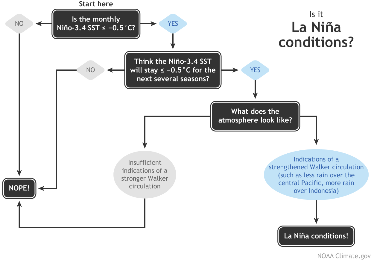
La Niña has not started yet. La Niña conditions are present, but it requires several months of La Niña conditions and certain other conditions to declare a La Niña event. They don’t appear to know what they talk about.
This is bullshit. There is no way to remove the effect of Pacific SST on the rest of the climate system, and the time it takes the extra heat from an El Niño to go through the system is variable and not well known.
Directly a lie. Summer Arctic sea ice did not decline in 2017.
NASA Goddard produces such low quality reports and science that should be disbanded.
Javier,
“They don’t appear to know what they talk about.”
Here, dated November 8 2017, is a report from NOAA headed
“La Nina moves in for the winter”
Here is BoM, 16 Jan 2018
“Weak La Niña continues over the Pacific”
“Directly a lie. Summer Arctic sea ice did not decline in 2017.”
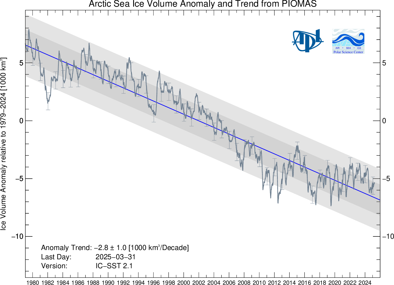
They did not say that summer ice declined (in extent). They said there was continued loss of ice. From WUWT’s sea ice page, we have:
Nick, Arctic sea is WELL above that of the MWP, and in fact, still in the top 10% of the last 10,000 years.

What we see here is a RECOVERY from the EXTREME extent of the late 1970s, that was up there with the LIA extents.

Thing is Nick, I suspect you KNOW all this full well.
Either that, or you remaining wilfully blindfolded to the facts.
Why continue to be so disingenuous, in your vain attempts to prop up the AGW FARCE?
Nick
I’m sure that even you know that there is a lag of 3 to 6 months between the onset of El Ninos and La Ninas , and an effect on atmospheric temperatures.
So why are you trying to mislead people?
Continued loss of ice?
Wake up, Nick.
It is plain from that graph that summer Arctic ice has been stable since 2007.
And why are you using the volume graph (which is not based on any actual data, but guesstimates), instead of ice area, which show September extent increasing since 2007?
http://ocean.dmi.dk/arctic/icecover_30y.uk.php
I’m sure you don’t mean to mislead, but?
“I’m sure you don’t mean to mislead,”
I am ABSOLUTELY SURE that Nick DOES intend to mislead.
“What we see here is a RECOVERY”
What you see there is a typically doctored graph from one of Kenneth Richard’s lists. It is not in Stein’s paper, which I am sure you have never read. What he has done is to extract and rearrange a panel from a plot of a single sediment core, ARA2B-1A, in the Chukchi Sea. The heading “Holocene Cover Sea-Ice Variations” is added by Richards, it is not in the original. It is measuring a composite biomarker PIP2.5. They have about one data point per century, and the last shown is at 0 bp (very approximately. As always, 0 BP is 1950 ad.
What Stein et al do say is that
“In the last four decades, the extent and thickness of Arctic seaice has decreased dramatically (e.g. Johannessen et al., 2004;Serreze et al., 2007; Stroeve et al., 2007; Cavalieri andParkinson, 2012; Laxon et al., 2013; Lindsay and Schweiger,2015), and this decrease seems to be by far more rapid thanpredicted by any climate model (Stroeve et al., 2007, 2012).The Chukchi Sea has become completely ice-free during thesummer of the last few years (Figs 2 and 3).”,/I>
“So why are you trying to mislead people?”
No, you are misleading. GISS simply said that a La Nina was starting in the later months of 2017. Javier said “They don’t appear to know what they talk about.”. I simply pointed out that what GISS said was true. You may have theories on when temperature effects may be expected, but that doesn’t change the truth of what GISS actually said.
“instead of ice area, which show September extent increasing since 2007?”
Because I am dealing with what GISS actially said, which was “2017 saw the continued loss of sea ice”. They were not talking about September extent. Javier said that was a lie, but the sea ice volume graph (on the WUWT site) clearly shows that in fact, “2017 saw the continued loss of sea ice”.
RE Nick:
***“Directly a lie. Summer Arctic sea ice did not decline in 2017.”
They did not say that summer ice declined (in extent). They said there was continued loss of ice. From WUWT’s sea ice page, we have:***
So, Nick, show us the “continued loss of ice” between 2012 and 2017>
Please…..
“So, Nick, show us the “continued loss of ice” between 2012 and 2017”
Why do you keep trying to twist their simple statement into something they didn’t say at all. They said nothing about 2012. They just said the loss of ice continued in 2017, And it did.
La Niña: A phenomenon in the equatorial Pacific Ocean characterized by a negative sea surface temperature departure from normal (for the 1971-2000 base period) in the Niño 3.4 region greater than or equal in magnitude to 0.5 degrees C (0.9 degrees Fahrenheit), averaged over three consecutive months.
(NOAA News Online, Feb. 23, 2005)
There is loss of ice every year between March and September. There is no loss September 2016 to September 2017.
Niño 3.4 has not been <-0.5° anomaly for three months yet, so no Niña yet unless they break their own rules. And so no Niña in 2017.
Ice volume is a modeled fiction. Pushed forward once extent stopped declining.
i>”La Niña”
Let’s review. GISS said “and with a La Niña starting in the later months of 2017”. You said
“They don’t appear to know what they talk about.”
NOAA said in it’s December summary (for November)
“La Niña strengthened during the past month, as indicated by an increasingly prominent pattern
of below-average sea surface temperatures (SSTs) across the central and eastern equatorial Pacific Ocean
(Fig. 1).”
It seems GISS do know what they are talking about.
“There is no loss September 2016 to September 2017.”
I showed the sea ice volume anomaly plot. It deducts seasonal variations, and shows a clear loss of ice between Sept 2016 to Sept 2017.
Dealing from the bottom of the deck, Nick?
That chart you show, ends just after 2017 begins. Virtually nothing of ice extent is shown for 2017.
Nor does your chart show new lows. Instead, what is shown is a classic bottom bounce chart as the trend reverses.
Add in that the chart begins at peak Arctic ice cycle conditions; makes it curious that alarmists and doomsayers are so unwilling to wait for several well documented sinusoidal cycles, before crying wolf.
With a little luck, Earth will not drop back into Ice Age conditions; and we warmth loving creatures can thrive under warm conditions for a long Optimum.
“That chart you show, ends just after 2017 begins. “
It isn’t my chart. It is the chart shown on the WUWT Sea Ice page.
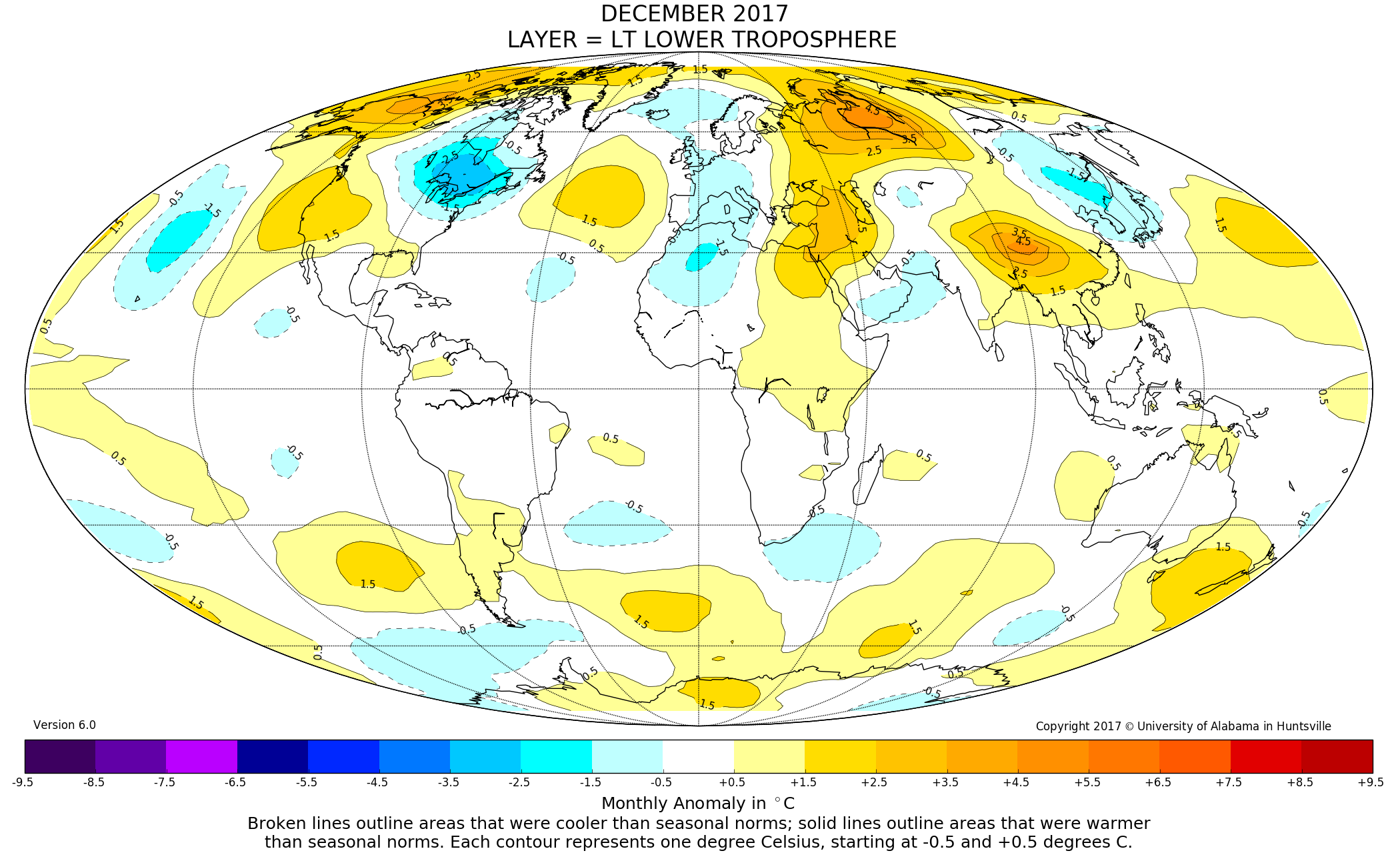
“Warming trends are strongest in the Arctic regions,”
Let’s look at UAH NoPol this century.

As always, the ONLY warming was from the NA Blob and the El Nino.
Quickly subsiding.
“It is not in Stein’s paper,”
YES IT IS, just in a different orientation

All that was done iwas to rotate, re-scale a bit and add the MWP and LIA and 20th annotation
STOP LYING, Nick.
Further backed by this graph.

I know that DENYING science is your only option now, but just STOP IT !!
“STOP LYING, Nick.”
The graph you showed is a lie. There is no indication, eithet by you or Richards, that “All that was done iwas to rotate, re-scale a bit and add the MWP and LIA and 20th annotation”. Let alone adding a false heading. And then it is all presented (by you) as “Arctic sea is WELL above that of the MWP”, instead of being just a single sediment core in a peripheral area, which has no data in the period of interest.
And you are still presenting an altered graph. The actual original was:

So you and Richards strip out the heading identifying it as core ARA2B-1A, strip the caption which its identifying information, put in fake annotations and headings, and present it as a graph of Arctic sea ice history.
And it isn’t backed up by a graph in another location near Iceland. For one thing, that does show a big dip towards 1950. It also has approx century resolution and says nothing about recent decades.
“STOP LYING, Nick.

Further backed by this graph.”
Another fake from Richard’s notrickszone list of 485 papers. It’s hard to even see what he has done here. The has taken a composite of graphs related to a sediment core MD99-2269 from a site N of Iceland. Again he has rubbed out the adjacent information, caption, and a genuine annotation. Fake annotations have been added, the x-axis transplanted, a fake heading. And he has turned it upside down. Here is the original:
You choose remarkably dishonest material to support your tedious charges of LYING.
ROFLMAO
And there it is on the right of your first chart. for EVERYONE to see
Are you WILFULLY BLIND !!!
LYING even to yourself
Purple line in your second graph.. Exactly the same.. There for ALL to see.
So hilarious at your attempts to LIE, then provide basically the same graphs they you say weren’t there.
Let’s add some more.
http://notrickszone.com/wp-content/uploads/2017/11/Holocene-Arctic-Sea-Ice-Changes-Chukchi-Sea-Yamamoto-2017.jpg
http://notrickszone.com/wp-content/uploads/2017/04/Arctic-Sea-Ice-Extent-900-AD-to-2000-AD-Kolling-2017.jpg
http://notrickszone.com/wp-content/uploads/2018/01/Holocene-Arctic-Sea-Ice-Iceland-North-Perner-2018.jpg
Keep proving me correct Nick, I thank you. 🙂
If you don’t understand that rotating and adding some notes pointing to very obvious time periods…
DOES NOT CHANGE THE DATA OF THE GRAPH AT ALL,
Then more FOOL you, Nick.
“Let’s add some more.”
More fοrgeries. At least we’re getting a good look at just how “notrickszone” and Kenneth Richard compile their lists of papers that cast doubt on global warming.
Here is the orgoinal Yamamoto graph:
Again, just one part ripped out and fake headings, annotations and axes added. The fake heading says “Holocene Arctic Sea Ice changes” but the original plot doesn’t say that. PIiP25 is not a unit of sea ice. But the joke here comes if you actually read the caption:

It isn’t Yamamoto’s result. It’s just Stein’s results for that same single sediment core, ARA2B-1A, in the Chukchi Sea.
And Kolling? well, here’s the original plot

Once again, a fake heading and annotation has been added to an extracted portion which have no foundation in the original graph, which doesn’t identify any of the things plotted with sea ice. At least it’s higher resolution, but again Kolling doesn’t claim any results beyond about 1950.
It’s so incredibly amusing observing Stokes – someone who actually understands the science under discussion, and how those of a certain ilk distort and torture the science for purpose – dismantle and absolutely own the likes of AndyG55 … yet Andy, and a few others, soldier-on with full attitude seemingly oblivious to their being revealed for what they are … Hahaaa!
[?? .mod]
Dream on sunshine.
@A C Osborn January 20, 2018 at 11:51 am
“Dream on sunshine.”
… says the poster offering this …
“Yes, it is done on an “Area” basis, smearing Temperatures over 1200km, when 2 places 1 km apart can have wildy different temperatures.
And they call it Science.”
Somebody needs a primer about the very basics of climate science … like why and how anomalies are used in measuring surface temperatures. {rolls eyes} {shakes head}
“Somebody needs a primer about the very basics of climate science”
Yes, somebody certainy does.
And it’s not A C Osborn…
Seems that JohnEF is a mathematical inebriate like Nick is.
You have zero training in maths, do you John
It is Nick who has been shown to be LYING his assets off.
Nothing wrong with any of these graphs.
The convey exactly the information of the originals.
If you can’t see that, then go back to junior high school and try again.
No they don’t. As per NOAA, la Niña requires 3 consecutive months of below -0.5° C at Niño 3.4 region, a condition that is yet to be met. Probably next month they’ll issue an statement declaring La Niña. Talking about La Niña in 2017 is premature. As usual they bend their own rules to push forward a narrative.
As far as we know that loss has only taken place in some computers, not in the Arctic.
They have no precise idea what global average temperatures were in 1880, 1940 or 1950 for that matter. How did they infill artic temps for 1880 or 1940?
Supposedly through Michael Mann’s “proxy epoxy”. Somehow they made the data stick as an actual scientific finding.
What is making sea surface temperatures drop like a hammer?
Certainly not atmospheric CO2 levels!
Here’s the new HadSST3 #s : https://www.metoffice.gov.uk/hadobs/hadsst3/data/HadSST.3.1.1.0/diagnostics/HadSST.3.1.1.0_monthly_globe_ts.txt
There’s nothing that shows ocean heat content rising beyond normal variability. ARGO data is showing that fact.
Here’s the numbers from the Tropics : https://www.metoffice.gov.uk/hadobs/hadsst3/data/HadSST.3.1.1.0/diagnostics/HadSST.3.1.1.0_monthly_tropics_ts.txt
2 year drop of 1C?
“There’s nothing that shows ocean heat content rising beyond normal variability. ARGO data is showing that fact.”
https://phys.org/news/2018-01-warmest-year-global-ocean.html
2017 was the warmest year on record for the global ocean

Heat content using 1981-2010 as a baseline? Where do you get a record for ocean heat content before ARGO data? More “fake science” using “fake temperature measurements”? Measuring before ARGO is spotty at best just like the Global surface temperature records before the 1950.
You can believe in that “fake science” all you want, but you’d be better served if you could compare the CO2 warming difference between 3 parts CO2 per 10,000 and 4 parts CO2 per 10,000 in a simple lab experiment. You have to look very hard at the thermometers to see a difference. It’s microscopic!
Most of our recent warming comes from additional ocean H2O and NOT additional CO2 rise.
And how do these datasets, at least for the continental USA compare with the USCRN?
hmmmmmm??
USCRN seems to respond slightly more to El Nino type events than the satellite data does. (sd-dev 1.12 for USCRN, against about 0.74 and 0.88 for UAH and RSS)
Before the 2015-2017 transient warm event, USCRN was basically a zero trend match with RSS ContUSA and UAH6 USA48
At the moment, USCRN runs slightly higher than the other two, and they all have a slightly +ve trend due to the 2015-2017 El Nino.

ClimDiv for USA is adjusted/calculated to be very similar to USCRN.
I love how NASA excluded El Nino years in order to get the headline “2017 Hottest Year Evah!”
Well, excluding everyone taller than me, I am the tallest man in the room.
“I love how NASA excluded El Nino years in order to get the headline “2017 Hottest Year Evah!””
And where did they say that?
They said…
https://www.giss.nasa.gov/research/news/20180118/
“Earth’s global surface temperatures in 2017 ranked as the second warmest since 1880, according to an analysis by NASA.”
“A warming El Niño event was in effect for most of 2015 and the first third of 2016. Even without an El Niño event — and with a La Niña starting in the later months of 2017 — last year’s temperatures ranked between 2015 and 2016 in NASA’s records.”
1.62 +- 0.1
So it’s probably the same as a number of other years.
I’m sorry, just how does anyone know the temperature of the Earth to a hundredth of a degree (C or F it doesn’t matter)????? We don’t so please NOAA, NASA, GISS, and everyone else, stop it!
I take anything coming out of GISS or Hadcrut with a large pinch of salt. They completely lost my trust with their constant adjustments in retrospect and ad-hoc ‘homogenisation’ hocus pocus. I am waiting for the whole raw data sets to be independently vetted and analyzed from scratch by a dedicated team of independent scientists from outside the climate inner circle who are specialists in unevenly sampled data and data with systematic errors. From the Argonne Lab or the National Institute of Standards and Technology, for instance. Until then, don’t bother.
“NASA uses the unique vantage point of space to better understand Earth”
There have been some big porkers from Climate alarmists, but this takes the biscuit!!
GISS totally ignore satellite measurements, and only use the extremely sparse, UHI contaminated and heavily adjusted surface temperatures that NOAA and HADCRUT do. (So where’s does this “separate, independent analysis from NOAA” fit in?)
Independent satellite measurements from UAH give a totally different story, showing that 1998 and 2016 were statistically tied as the hottest years since 1979.
The reality is that there has been no increase in temperatures since 1998.
Come on Anthony, fight back against these lies!
“UHI contaminated and heavily adjusted surface temperatures that NOAA and HADCRUT do. ”
and
“The reality is that there has been no increase in temperatures since 1998.”
No, the reality is that you choose the far cold outlier UAH (not forgetting the important and not of course adjusted lower V6.0) as your metric of choice.
And please show me where any UHI contaminated station data affects to even the slightest material degree the GMT estimates of GiSS, Hadcrut, Best, JMA.
This from Tony Heller shows why this is so bogus. Compare the map of the alleged anomalies and the map of where they actually have records. Remarkable how they have supposed hot spots – e.g. SW of Baja and in the Indian Ocean – where they have NO records.
Same for the Arctic where they extrapolate huge areas from almost no data. And I suspect, but do not know, that the data they do have there is compromised by site factors.
This whole thing is THE greatest scientific f r a u d in history. Just follow the money and its political aims.
https://realclimatescience.com/2018/01/2017-fakest-year-on-record-at-nasa-and-noaa/
I read here that there can be up to 20000 km of unfilled interpolated land based data
“there can be up to 20000 km of unfilled interpolated land based data”
Nonsense. But not even possible. 20000km takes you halfway around the world.
“20000km takes you halfway around the world”
Nick, I would guess Mick meant square kilometers… since that is a measurement of area. Wouldn’t you?
Say, for example, and area 500 km by 400 km. What he said was true and in some cases an underestimate. Just look at the Arctic, where all that claimed heat is not really being recorded at all.
Do you think the few real Arctic weather stations are anywhere near buildings?
“Independent satellite measurements from UAH give a totally different story, showing that 1998 and 2016 were statistically tied as the hottest years since 1979.”
Exactly.
Look at the UAH satellite chart:
http://www.drroyspencer.com/wp-content/uploads/UAH_LT_1979_thru_December_2017_v6.jpg
On the satellite chart, 2016 is the hottest year, being 0.1C hotter than 1998, and as you can see, other than 2016, the last five years have *not* been the hottest years during this 1979 to 2017 timespan. The year 1998 was hotter than all of them except 2016. There goes NASA and NOAA’s narrative out the window.
And then Hansen says the 1930’s was 0.5C hotter than 1998, which makes it 0.4C hotter than 2016, which means we have been in a temperature downtrend since the 1930’s, not an uptrend. We have been in a shortterm uptrend since about 1980, but have not equalled the heat of the 1930’s yet.
Tack Hansen’s 1999 surface temperature chart onto the UAH satellite chart (they overlap from 1979 to 1999) and you will get a good representation of what the Earth’s temperature has been doing since the 1930’s: Cooling.
NASA and NOAA act like the satellites don’t exist. We know why, because they are not nearly as scary-looking as the bogus Hockey Stick surface temperature charts that have been manipulated to present a false picture of Earth’s temperature profile, in order to sell the CAGW narrative to an unsuspecting public.
Here’s the Hansen 1999 surface temperature chart:

“Tack Hansen’s 1999 surface temperature chart onto the UAH satellite chart (they overlap from 1979 to 1999) and you will get a good representation of what the Earth’s temperature has been doing since the 1930’s: Cooling.”
Err…
That “Hansen” graph is for the US.
Not the Earth – though I know many denizens think that the US is.
Toneb, yes. But in that case the good ole US of A is heavily over-represented in the global temperature stakes.Is that a bias?
“Toneb, yes. But in that case the good ole US of A is heavily over-represented in the global temperature stakes.Is that a bias?”
If that were the case then, then you truly would have cause to complain.
But of course it’s not and cannot be.
The USA is 1.9% of the Earth’s surface and so 1.9% of global temperature data is from the US.
Sorry to burst your bubble … but it should be common sense.
That the US has a dense data network does not skew the GMT as it is done on an areal basis.
Yes, it is done on an “Area” basis, smearing Temperatures over 1200km, when 2 places 1 km apart can have wildy different temperatures.
And they call it Science.
I see they have settled on claiming the warming in the first half of the 20th century is due to “human-made emissions”. Even though the amount of our emissions was insignificant in comparison to natural sources, and natural sinks in the carbon cycle. And the IPCC has admitted as much. Although less so in recent years. It was a logical condemnation of the entire conjecture, so the hockey team has determined the best course is to claim all warming is now anthropogenic in origin. It adds a certain consistency to their claims, but gets them ever more leveraged in their faith of the ability of the magic molecule to determine “what is, what was, and what should never be”.
When you have to doctor your data and make claims that the math does not support, you have left the realm of scientific analysis, and are firmly positioned in the political science arena. Where perception is more important than reality, and feeding superstition to a willing vocal demographic is enough to keep the gravy train rolling down the tracks.
Statistically we have very real concerns of cataclysmic events that will occur in the future. But mostly they occur in geological time frames that are orders of magnitude longer than our puny existence.
The problem is none of them are linked to our behavior, and the only thing we can do is prepare.
Those solutions do not involve surrendering the production, distribution, and consumption of energy into the hands of people that currently have no legal claim to those assets. Greed and the lust for power are still powerful motivators. And when you jump on that merry-go-round it is difficult to plan a graceful exit, when it only spins faster with the passing of time.
Not only that, but at least a half of the warming is purely down to “Adjustments” as identified by NASA/NAOO?GISS themselves.
“Err…
That “Hansen” graph is for the US.
Not the Earth”
The Hansen 1999 U.S. surface temperature chart is a good proxy for the entire Earth. Much better than the bogus Hockey Stick charts.
Just about any unmodified temperature chart you look at has the same temperature profile as the Hansen 1999 chart, which shows the 1930’s to be as hot or hotter than subsequent years.
Fraudulently manipulated Hockey Stick charts do not show the 1930’s as being hotter than subsequent years. They don’t resemble unmodified temperature charts at all. What they resemble is the CO2 chart, which is the purpose of the fraudulent manipulation.
Show me an unmodified chart that resembles the Hockey Stick chart. You can’t. I can show you a lot of unmodified charts that resemble the temperature profile of the Hansen 1999 chart: hotter during the 1930’s and cooler since.
If a temperature chart profile from one part of the Earth resembles all the other unmodified temperature chart profiles, then you have to say that the one represents all of them.
Interestingly we had a cold record breaking winter at the beginning of the year, then we had Spring Frosts all over the place destroying crops, then a standard summer followed by an early onset of winter, 2 to 6 weeks early in some places followed by cold record breaking winter weather all over the world with cold springs in the Southern Hemisphere to match.
All this adds up to the 3rd hottest year on record.
“followed by cold record breaking winter weather all over the world ”
Err no.
The cold anomalies were in the Canada and the central/E US.
https://data.giss.nasa.gov/gistemp/maps/
You keep bringing up that GISS Rubbish, I am talking about real life data from around the world.
Not made up Crap from 1200Km away.
Compare and contrast
Compare and contrast what? You can choose whatever base period you want here
https://data.giss.nasa.gov/gistemp/maps/
Selecting the 1981-2010 base period gives a GISS anomaly for 2017 of 0.49 deg. The UAH anomaly is 0.38 degrees. So while they don’t totally agree they are not a million miles apart.
Giss just chooses the rise out of the coldest period in 80 or so years.
Get more RED !!
Its all just propaganda pap, you know it.
“You keep bringing up that GISS Rubbish, I am talking about real life data from around the world.”
Which is ???
The Information reported by the Individual Countries themselves. ie before NASA/GISS mangle the data.
Always good to see Australia represented where there are large areas with no data in real life. Infill anyone.
“The Information reported by the Individual Countries themselves. ie before NASA/GISS mangle the data.”
They don’t “mangle the data.
it would be straight forward to verify that conspiracy theory.
But then a conspiracy is a conspiracy precisely because there is no proof.
You do realise that that sort of thinking is bizarre (rhetorical).
Don’t you think (just as a FI) that those other countries might vehemently object? (again rhetorical sadly)
The GISS temp map comprises “real life data from around the world”.
So you give a gross misrepresentation of the facts.
NOAA:
UAH:
RSS:
http://images.remss.com/data/msu/graphics/tlt_v40/medium/global/ch_tlt_2017_12_anom_v04_0.png
NOAA baseline is ’81>’10
UAH baseline is ’81>10
RSS baseline is ’79>’98
You are obviously unaware of the Icelandic data if you think that.
GISS “Quality Controlled”, ie ADJUSTED the data that the Icelandic Met Office had already adjusted, removing the hot period in the middle of the 20th century.
You take everything they put out as gospel when it has been clearly shown to be falsified data.
Can you explain to me and everybody else on this Forum the justification for NASA/NAOO adjusting the Global Temperature for 1997 as reported by themselves in 1998 from
62.45F or 16.92C
down to
58.13F or 14.53C
Do you honestly expect us to believe that mostly the same Scientists in 1998 could actually get the calculations wrong by over 2 Degrees C.
But not just for that year but also 1995 and 1998.
“You are obviously unaware of the Icelandic data if you think that.
GISS “Quality Controlled”, ie ADJUSTED the data that the Icelandic Met Office had already adjusted, removing the hot period in the middle of the 20th century.
You take everything they put out as gospel when it has been clearly shown to be falsified data.”
What an Irony when we have you as an example and the other one posting up doctored graphs from agenda driven Blogs, when all you have to co is go to the orginating paper. Like you should do for SkS and SoD also.
And I am aware, and actually I thought that goal-post shift would crop-up
Now show me where that affects the GMST.
From Nick Stoke’s website ….
https://moyhu.blogspot.co.uk/2012/01/reykjavik-and-ghcn-adjustments.html
“No, history was not rewritten. What the folks there don’t seem to want to acknowledge is that GHCN circulates two files, described here. The file everyone there wants to focus on is the adjusted file (QCA). This, as explained, has been homogenized. This is a preparatory step for its use in compiling a global index. It tries to put all stations on the same basis, and also adjust them, if necessary, to be representative of the region. It is not an attempt to modify the historical record.
That record is contained on the other data file distributed – the unadjusted QCU file. This contains records as they were reported initially. It is generally free of any climatological adjustments. For the last 15 or so years, Met stations have submitted monthly CLIMAT forms. You can inspect these online. Data goes straight from these to the QCU file, and will not change unless the Met organisation submits an amended CLIMAT file. This is the history, and no-one is tampering with it.
The adjusted file does change, as the name suggests it may. Recently, it has been modified to use an improved pairwise comparison homogenization algorithm due to Menne and Williams. It is now (as of Dec 15 2011) used by GISS instead of their own homogenization algorithm, which makes the QCA file much more significant.”
Again show me where so small matter of Icelandic temps altered the GMST.
“Do you honestly expect us to believe that mostly the same Scientists in 1998 could actually get the calculations wrong by over 2 Degrees C.
But not just for that year but also 1995 and 1998.”
So they are in a conspiracy to commit fraud?
Quite, quite bizarre.
That map flies in the face of what the locals experienced.
https://earth.nullschool.net/#current/wind/surface/level/overlay=temp/orthographic=-76.58,50.47,451/loc=-54.670,66.277
Exactly.
Even the Satellite data does not refelct what we are actually experiencing and I have been saying so for years.
Satellites measure the Energy leaving the Earth.
GISS just make it up as they go along, as do the Australian BOM.
“That map flies in the face of what the locals experienced.”
Which “locals”
Bearing in mind that (if posted by me) is a December average, and not the extreme.
Most of the data is made up and fake using limited surface station data, especially around polar regions, southern hemisphere and Africa. NASA can claim what ever they feel like because they control it. In reality can’t compare apples with oranges and expect a reasonable like for like comparison from 1951-1980. Exaggeration of any warming planet is not science, but they have chosen this route unfortunately. There are none to compare for most of the planets surface away from North America and Europe before the satellite era.
While it is also expected to have some of the warmer global temperatures recently when there had just been a strong El Nino.
There was no observed data between 1951-1980 for data to be compared with for most regions showing red in the NH.
The natural warming trend from the little ice age continues…. until it doesn’t. Then it cools again, naturally.
The last three years were warm. It was done by the ocean, clearly shown by the SSTs which are 71% of the surface temps. But that warming is over now: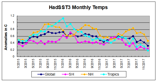
https://rclutz.wordpress.com/2018/01/18/oceans-cool-off-previous-3-years/
As I keep say, The warming has come ONLY from the oceans.
There is NO WARMING apart from the two main ocean RELEASES of energy.
And what caused that ocean warming?
Not CO2, that is for sure.
Almost certainly the series of strong solar cycles over the latter half of last century.
Changes in UV and other cause more energy to penetrate the ocean.
What became of the 1998 El Nino Spike? It clearly shows in all the NZ weather station (and satellite) data and the trend since then (coming up 20 years) is FLAT
Also: my understanding is that the International standard for establishing anomalies is based on using the period 1981 – 2010 as the baseline. Why are these 2 institutions using a different baseline?
The 2 well established factors that should be keeping alarmists awake at night are:
– There has been no significant warming for 20 years
– Over 95% of model predictions have been grossly WRONG! – proving that they are useless
Regards
M
Michael Carter
All the global surface temperature data sets show statistically significant warming over the past 20 years, 1998-2017 inclusive (all in °C/decade at 2σ (95%) confidence):-
.
GISS: 0.189 ±0.105
NOAA: 0.176 ±0.105
HadCRU: 0.145 ±0.101
The RSS satellite TLT and TTT data sets best estimates also show strong warming, but just fractionally short of statistical significance over the past 20 years.
RSS TLT: 0.142 ±0.175
RSS TTT: 0.133 ±0.167
UAH TLT satellite data is an outlier in that its best estimate suggests only modest warming in that period.
UAH TLT: 0.075 ±0.171
Source: http://www.ysbl.york.ac.uk/~cowtan/applets/trend/trend.html
why are there 3 sets of satellite data Aren’t they using the same satellites?
There is about 0.2c increase over 20 years, less than errors involved and is not significant warming. An increase of about 0.1c per decade is not significant warming and that has been mainly based on the recent strong El Nino.
http://www.woodfortrees.org/plot/rss/from:1998/normalise/plot/uah6/from:1998/plot/hadcrut4gl/from:1998/plot/gistemp/from:1998
http://www.woodfortrees.org/plot/rss/from:1998/normalise/plot/uah6/from:1998/plot/hadcrut4gl/from:1998/plot/gistemp/from:1998/plot/rss/from:1998/trend/plot/uah6/from:1998/trend/plot/hadcrut4gl/from:1998/trend/plot/gistemp/from:1998/trend
What became of the 1997/8 El Nino Spike?
It was adjusted away in the NASA/NAOO/GISS/HADCRUT data.
In the 1998 report for 1997 it was 62.45F or 16.92C
Now they say it was only 58.13F or 14.53C
2016 is 58.69F or 14.84C, so you can see why they had to do it, otherwise 2016 would be over 2 degrees C colder than 1997.
By the way the 1999 report stated that 1998 was EVEN WARMER than 1997.
So they changed the baseline used for 1995,1997,1998, 1999 and 2000 and magically removed over 2 degrees of warming.
Now that IS what you call MAN MADE WARMING.
“In the 1998 report for 1997 it was 62.45F or 16.92C”
Here …..
ftp://ftp.ncdc.noaa.gov/pub/data/extremeevents/specialreports/Climate-of-1997-Global-Temp-Index-Warmest.pdf
It says the 1997 was 0.42 above baseline (’51>’80) of 16.5 = 16.92 (as you say).
“Now they say it was only 58.13F or 14.53C”
Where?
Because here …..
https://data.giss.nasa.gov/gistemp/tabledata_v3/GLB.Ts+dSST.txt
It says it was 0.47 above (16.5) = 16.97 (not 14.53).
“2016 is 58.69F or 14.84C, so you can see why they had to do it, otherwise 2016 would be over 2 degrees C colder than 1997.”
??
From the above 2016 was 0.99 above (16.5) = 17.49 (not 14.84).
“By the way the 1999 report stated that 1998 was EVEN WARMER than 1997.”
They still do 0.62 + 16.5 = 17.12
Where on earth are getting your data from??
Scrub the absolute numbers above as was adding on the ’61>’90 base instead of the ’51>’80.
“Despite colder than average temperatures in any one part of the world, temperatures over the planet as a whole continue the rapid warming trend we’ve seen over the last 40 years,” said GISS Director Gavin Schmidt.”
Isn’t there some law that requires government officials to not tell such ridiculous unfounded whoppers?
Time to defund this garbage.
Extreme Hiatus
As a statement of fact, it can’t really be argued against. Even taking the coolest of the global data sets over the past ~40 years (since 1979), satellite data from UAH TLT, the statistically significant warming trend has continued in 2017; actually increased slightly.
From 1979 to 2016 the trend in UAH TLT was 0.113 ±0.063 °C/decade (2σ). Adding 2017 data raises this to 0.124 ±0.062 °C/decade (2σ). With the addition of 2017 temperatures, the overall warming trend in UAH TLT increased slightly and the margin of error shrank marginally too.
What’s that if not a continuation of warming?
Source: http://www.ysbl.york.ac.uk/~cowtan/applets/trend/trend.html
DWR54 – From that blunt perspective, for that whole (short) period, true enough – assuming reasonably accurate ‘adjusted’ data. You could make the same point further back, to the bottom of the Little Ice Age.
Here’s what is not fact: “continue the rapid warming trend.” Given what we know about climate history there is nothing particularly rapid about this trend.
Moreover, that suggests a continuing trend when in fact it has not been. There was the ‘hiatus’ – which was not forecast by the consensus and does not fit the CO2 rise during that period. Instead it showed that natural variability drives climate change. That, and the fact that we have been on a warming trend since the Little Ice Age, indicates that CO2 is largely irrelevant – in contrast to what Gavin constantly goes on about.
Of course, like all things now that the oceans are not boiling, that hiatus was extreme.
Extreme Hiatus
Schmidt is obviously talking in the context of the surface instrument temperature record, which is what he’s being interviewed about. Recent 40-year trends are the highest on record in all of these. There was a spurt of warming in the early part of the 20th century, but the 40-year trends centred around the mid 1920s peaked at ~ 0.13C/dec. Not until they were centred around the late 1970s or early 1980s did 40-year trends surpass the 0.15 C/dec mark, and they’ve stayed above 0.16 C/dec ever since in all data sets.
The 40-year period to December 2017 warmed at a rate of 0.182 C/dec, according to GISS, making it a tie with the 40 year period ended Nov 2010. It is reasonable therefore to state, in the context of the instrumental surface data record, that there has been a rapid warming trend over the past 40 years and that 2017 has continued it.
Wait a minute. When I first stepped into a Geology department in 1975, the “average global temperature” was reported and taught as “about” 15C. This was taught as “fact” for decades and decades and decades.
“Global Warming and Climate Change
S. K. Agarwal
A.P.H. Publ., 1 Jan. 2008 – Science – 364 pages
The earth`s atmosphere is made up of different layers. Gases such as Carbon dioxide, Methane, Nitrous oxide, chloroflurocarbons, Methyl bromide etc. make the atmosphere work like a greenhouse. These gases trap heat emitted by infrared wavelengths from the earths surface. This phenomenon is called greenhouse effect, and is responsible for the average temperature at the earth surface being 15c rather than -15 c the temperature it would be it there no atmosphere.”
This report is telling us that the “world” is warmer than 13.889C. It has risen to a whopping 14.727778C (give or take a bit one assumes). So “about” 15C.
This isn’t science. It’s nonsense.
“This report is telling us that the “world” is warmer than 13.889C. “
THis report? GISS? Where?
GISS is very firm that trying to get an accurate absolute global average is a fool’s errand.
Then they should STFU. It’s pseudoscience
“GISS is very firm that trying to get an accurate absolute global average is a fool’s errand.”
Yet they and there mate claim “hottest evah”, by tiny fractions of a degree.
Gees Nick, you have serious foot in mouth, today !!
“According to NOAA, the average temperature across the globe in 2017 was 1.51 degrees F above the 20th century average of 57 degrees F.”
They said 57F not “about” 57F. Which is 13.8889C.
Then 57 + 1.51 = 58.51
So …
58.51F = 14.727778C
As I said, when I did my BEng, BSc and MSc, the global “average” temperature was considered “about” 15C. The planet seems to have warmed at a RAPID rate o “about” 15C. Or s bit less, or a bit more.
The reason bullshit reports like this can get published is that the great unwashed don’t realise the the Cult of Warmie are just lowering the temperature of the past. When in fact “the climate” is doing nothing at all.
I’m with Mick! 🙂
i>”They said 57F”
Who said? Not the GISS report here. Even the linked NOAA report says:
“During 2017, the average temperature across global land and ocean surfaces was 1.51°F (0.84°C) above the 20th century average.”
No mention of 57°F there. So who said it?
http://www.theaustralian.com.au/national-affairs/climate/earth-colder-in-2017-after-three-years-of-recordhigh-temperatures/news-story/5d52fa989d43642419b13e5a2dcdb05c
“According to NOAA, the average temperature across the globe in 2017 was 1.51 degrees F above the 20th century average of 57 degrees F.”
You asked Niclearse
“Who said? Not the GISS report here. Even the linked NOAA report says:
“During 2017, the average temperature across global land and ocean surfaces was 1.51°F (0.84°C) above the 20th century average.”
No mention of 57°F there. So who said it?”
NOAA. It may have been removed when keen minds spotted they had lowered the temperature of the past by 1.5C (plus or minus a bit).
Now is it your contention that they are reporting the HOTTEST YEAR EVER because it is EXACTLY 1.51F over a number they don’t really know? That doesn’t make a lot of sense, like much of the “climate voodo… science”.
The average global temperature about a century ago was “about” 15C. Fifty years ago it was “about” 15C. Today it is “about” 15C. Or if you like the quasi-science offerings from the Cult of Warmie,
“about” 14.727778C (give or take a bit one assumes).
By any realistic measurement basis one can only conclude that climate change has stopped over the last few hundred years to date. Nothing at all is going on, with or without CO2.
“NOAA. It may have been removed “
Or it may never have been there, and be something that the Australian decided to add.
Nick, “The 2017 average global temperature across land and ocean surface areas was 0.84°C (1.51°F) above the 20th century average of 13.9°C (57.0°F):
https://www.ncdc.noaa.gov/sotc/global/201713
They have been reporting that 57.0°F for at least the last two years.
It is as Mark Addinall says, according to NOAA there’s nothing to worry, earth is running cooler than generally accepted earth’s average temperature, 15 degC / 59 F, derived from settled climate science. Here,s NOAA saying it, Nick.
“The average temperature across the globe in 2017 was 1.51 degrees F above the 20th century average of 57 degrees F. 2017 marks the 41st consecutive year (since 1977) with global land and ocean temperatures at least nominally above the 20th-century average. The six warmest years on record for the planet have all occurred since 2010.”
http://www.noaa.gov/news/noaa-2017-was-3rd-warmest-year-on-record-for-globe
The headlines SHOULD be reading
“Cooling trend over. Earth nearly back to average temperature”.
That would be more factual.
Mark, this is still here at the moment, but probably won’t be for much longer.
https://www.ncdc.noaa.gov/sotc/global/199713
It was their biggest ever mistake of quoting the ACTUAL temperature instead of just an anomaly, they blame the current “difference” of 2C on a Baseline change.
That is 2C, not some record broken by 0.01C or even 0.1C, 2 whole degrees of change in 20 years.
You are absolutely correct they are liars & cheats and the likes of Nick, toneb & DWR try to justify it.