by Ross McKitrick
A number of authors, including the IPCC, have argued that climate models have systematically overstated the rate of global warming in recent decades. A recent paper by Millar et al. (2017) presented the same finding in a diagram of temperature change versus cumulative carbon emissions since 1870.

The horizontal axis is correlated with time but by using cumulative CO2 instead the authors infer a policy conclusion. The line with circles along it represents the CMIP5 ensemble mean path outlined by climate models. The vertical dashed line represents a carbon level where two thirds of the climate models say that much extra CO2 in the air translates into at least 1.5 oC warming. The black cross shows the estimated historical cumulative total CO2 emissions and the estimated observed warming. Notably it lies below the model line. The models show more warming than observed at lower emissions than have occurred. The vertical distance from the cross to the model line indicates that once the models have caught up with observed emissions they will have projected 0.3 oC more warming than has been seen, and will be very close (only seven years away) to the 1.5 oC level, which they associate with 615 GtC. With historical CO2 emissions adding up to 545 GtC that means we can only emit another 70 GtC, the so-called “carbon budget.”
Extrapolating forward based on the observed warming rate suggests that the 1.5 oC level would not be reached until cumulative emissions are more than 200 GtC above the current level, and possibly much higher. The gist of the article, therefore, is that because observations do not show the rapid warming shown in the models, this means there is more time to meet policy goals.
As an aside, I dislike the “carbon budget” language because it implies the existence of an arbitrary hard cap on allowable emissions, which rarely emerges as an optimal solution in models of environmental policy, and never in mainstream analyses of the climate issue except under some extreme assumptions about the nature of damages. But that’s a subject for another occasion.
Were Millar et al. authors right to assert that climate models have overstated recent warming? They are certainly not the first to make this claim. Fyfe et al. (2013) compared Hadley Centre temperature series (HadCRUT4) temperatures to the CMIP5 ensemble and showed that most models had higher trends over the 1998-2012 interval than were observed:

Original caption: a, 1993–2012. b, 1998–2012. Histograms of observed trends (red hatching) are from 100 reconstructions of the HadCRUT4 dataset1. Histograms of model trends (grey bars) are based on 117 simulations of the models, and black curves are smoothed versions of the model trends. The ranges of observed trends reflect observational uncertainty, whereas the ranges of model trends reflect forcing uncertainty, as well as differences in individual model responses to external forcings and uncertainty arising from internal climate variability.
The IPCC’s Fifth Assessment Report also acknowledged model over-estimation of recent warming in their Figure 9.8 and accompanying discussion in Box 9.2. I have updated the IPCC chart as follows. I set the CMIP5 range to gray, and the thin white lines show the (year-by-year) central 66% and 95% of model projections. The chart uses the most recent version of the HadCRUT4 data, which goes to the end of 2016. All data are centered on 1961-1990.
 Even with the 2016 EL-Nino event, the HadCRUT4 series does not reach the mean of the CMIP5 ensemble. Prior to 2000 the longest interval without a crossing between the red and black lines was 12 years, but the current one now runs to 18 years.
This would appear to confirm the claim in Millar et al. that climate models display an exaggerated recent warming rate not observed in the data.
Not So Fast
Zeke Hausfather has disputed this in a posting for Carbon Brief. He presents a different-looking graph that seems to show HadCRUT4 and the other major data series lining up reasonably well with the CMIP5 (RCP4.5) runs.

How does he get this result?
Hausfather isn’t using the CMIP5 runs as shown by the IPCC; instead he is using data from a different archive that modifies the outputs in a way that tilts the post-2000 model trends down. Cowtan et al. (2015) argued that, for comparisons such as this, climate model outputs should be sampled in the same way that the HadCRUT4 (and other) surface data are sampled, namely using Surface Air Temperatures (SAT) over land, Sea Surface Temperatures (SST) over water, and with maskings that simulate the treatment of areas with missing data and with ice cover rather than open ocean. Global temperature products like HadCRUT use SST data as a proxy for Marine Air Temperature (MAT) over the oceans since MAT data are much less common than SST. Cowtan et al. note that in the models, SST warms more slowly than MAT but the CMIP5 output files used by the IPCC and others present averages constructed by blending MAT and SAT, rather than SST and SAT. Using the latter blend, and taking into account the fact that when Arctic ice coverage declines, some areas that had been sampled with SAT are replaced with SST, Cowtan et al. found that the discrepancy between models and observations declines somewhat.
Figure 4 in Cowtan et al. shows that the use of SAT/SST (“blended”) model output data doesn’t actually close the gap by much: the majority of the reconciliation happens by using “updated forcings”, i.e. peeking at the answer post-2000

.Top: effect of applying Cowtan et al. blending method (change from red to green line)
Bottom: effect of applying updated forcings that use post-2000 observations
Hausfather also uses a slightly later 1970-2000 baseline. With the 2016 El Nino at the end of the record a crossing between the observations and the modified CMIP5 mean occurs.
In my version (using the unmodified CMIP5 data) the change to a 1970-2000 baseline would yield a graph like this:
 The 2016 HadCRUT4 value still doesn’t match the CMIP5 mean, but they’re close. The Cowtan et al. method compresses the model data above and below so in Zeke’s graph the CMIP5 mean crosses through the HadCRUT4 (and other observed series’) El Nino peak. That creates the visual impression of greater agreement between models and observations, but bear in mind the models are brought down to the data, not the other way around. On a 1970-2000 centering the max value of the CMIP5 ensemble exceeds 1C in 2012, but in Hausfather’s graph that doesn’t happen until 2018.
Apples with Apples
The basic logic of the Cowtan et al. paper is sound: like should be compared with like. The question is whether their approach, as shown in the Hausfather graph, actually reconciles models and observations.
It is interesting to note that their argument relies on the premise that SST trends are lower than nearby MAT trends. This might be true in some places but not in the tropics, at least prior to 2001. The linked paper by Christy et al. shows the opposite pattern to the one invoked by Cowtan et al. Marine buoys in the tropics show that MAT trends were negative even as the SST trended up, and a global data set using MAT would show less warming than one relying on SST, not more. In other words, if instead of apples-to-apples we did an oranges-to-oranges comparison using the customary CMIP5 model output comprised of SAT and MAT, compared against a modified HadCRUT4 series that used MAT rather than SST, it would have an even larger discrepancy since the modified HadCRUT4 series would have an even lower trend.
More generally, if the blending issues proposed by Cowtan et al. explain the model-obs discrepancy, then if we do comparisons using measures where the issues don’t apply, there should be no discrepancy. But, as I will show, the discrepancies show up in other comparisons as well.
Extremes
Swanson (2013) compared the way CMIP3 and CMIP5 models generated extreme cold and warm events in each gridcell over time. In a warming world, towards the end of the sample, each location would be expected to have a less-than-null probability of a record cold event and a greater-than-null probability of a record warm event each month. Since the comparison is done only using frequencies within individual grid cells it doesn’t require any assumptions about blending the data. The expected pattern was found to hold in the observations and in the models, but the models showed a warm bias. The pattern in the models had enough dispersion in CMIP3 to encompass the observed probabilities, but in CMIP5 the model pattern had a smaller spread and no overlap with observations. In other words, the models had become more like each other but less like the observed data.

(Swanson Fig 2 Panels A and B)
The importance here is that this comparison is not affected by the issues raised by Cowtan et al, so the discrepancy shouldn’t be there. But it is.
Lower Troposphere
Comparisons between model outputs for the Lower Troposphere (LT) and observations from weather satellites (using the UAH and RSS products) are not affected by the blending issues raised in Cowtan et al. Yet the LT discrepancy looks exactly like the one in the HadCRUT4/CMIP5 comparison.

The blue line is RSS, the black line is UAH, the red line is the CMIP5 mean and the grey bands show the RCP4.5 range. The thin white lines denote the central 66% and 95% ranges. The data are centered on 1979-2000. Even with the 2016 El Nino the discrepancy is visible and the observations do not cross the CMIP5 mean after 1999.
A good way to assess the discrepancy is to test for common deterministic trends using the HAC-robust Vogelsang-Franses test (see explanation here). Here are the trends and robust 95% confidence intervals for the lines shown in the above graph, including the percentile boundaries.
UAHv6.0 0.0156 C/yr ( 0.0104 , 0.0208 )
RSSv4.0 0.0186 C/yr ( 0.0142 , 0.0230 )
GCM_min 0.0252 C/yr ( 0.0191 , 0.0313 )
GCM_025 0.0265 C/yr ( 0.0213 , 0.0317 )
GCM_165 0.0264 C/yr ( 0.0200 , 0.0328 )
GCM_mean 0.0276 C/yr ( 0.0205 , 0.0347 )
GCM_835 0.0287 C/yr ( 0.0210 , 0.0364 )
GCM_975 0.0322 C/yr ( 0.0246 , 0.0398 )
GCM_max 0.0319 C/yr ( 0.0241 , 0.0397 )
All trends are significantly positive, but the observed trends are lower than the model range. Next I test whether the CMIP5 mean trend is the same as, respectively, that in the mean of UAH and RSS, UAH alone and RSS alone. The test scores are below. All three reject at <1%. Note the critical values for the VF scores are: 90%:20.14, 95%: 41.53, 99%: 83.96.
H0: Trend in CMIP5 mean =
Trend in mean obs 192.302
Trend in UAH 405.876
Trend in RSS 86.352
The Tropics
In addition to the above comparison, if the treatment of Arctic sea ice is the major problem, there should be no issues when confining attention to the tropics. Also, since models project the strongest response to GHG warming in the tropical LT, this is where models and observations ought best to agree.

Again the blue line is RSS, the black line is UAH, the red line is the CMIP5 mean, the grey bands show the RCP4.5 range and the thin white lines denote the central 66% and 95% ranges. The data are centered on 1979-2000.
Trends:
UAHv6.0 0.0102 C/yr ( 0.0037 , 0.0167 )
RSSv4.0 0.0139 C/yr ( 0.0085 , 0.0193 )
GCM_min 0.0282 C/yr ( 0.0199 , 0.0365 )
GCM_025 0.0277 C/yr ( 0.021 , 0.0344 )
GCM_165 0.0281 C/yr ( 0.0207 , 0.0355 )
GCM_mean 0.0289 C/yr ( 0.0209 , 0.0369 )
GCM_835 0.0296 C/yr ( 0.021 , 0.0382 )
GCM_975 0.032 C/yr ( 0.0239 , 0.0401 )
GCM_max 0.0319 C/yr ( 0.023 , 0.0408 )
H0: Trend in CMIP5 mean =
Trend in mean obs 229.683
Trend in UAH 224.190
Trend in RSS 230.100
All trends are significantly positive and the models strongly reject against the observations. Interestingly the UAH and RSS series both reject even against the (year-by-year) lower bound of the CMIP5 outputs (p<1%).
Finally, Tim Vogelsang and I showed a couple of years ago that the tropical LT (and MT) discrepancies are also present between models and the weather balloon series back to 1958.
Summary
Millar et al. attracted controversy for stating that climate models have shown too much warming in recent decades, even though others (including the IPCC) have said the same thing. Zeke Hausfather disputed this using an adjustment to model outputs developed by Cowtan et al. The combination of the adjustment and the recent El Nino creates a visual impression of coherence. But other measures not affected by the issues raised in Cowtan et al. support the existence of a warm bias in models. Gridcell extreme frequencies in CMIP5 models do not overlap with observations. And satellite-measured temperature trends in the lower troposphere run below the CMIP5 rates in the same way that the HadCRUT4 surface data do, including in the tropics. The model-observational discrepancy is real, and needs to be taken into account especially when using models for policy guidance.
Here’s a 2014 paper by LLNL’s Ben Santer and many co-authors:
http://dspace.mit.edu/handle/1721.1/89054
They sought to “subtract out” the effects of ENSO and the Pinatubo (1991) & El Chichón (1982) volcanic aerosols, from measured (satellite) temperature data, to find the underlying temperature trends. Here’s a graph from their paper:
http://sealevel.info/Santer_2014-02_fig2_graphC_1_100pct.png
Two things stand out:
1. The models run hot. The CMIP5 computer models (the black line), which are tuned with the assumption that at least 100% of 20th century warming is anthropogenic, and an average ECS climate sensitivity of about 3.0°C per doubling of CO2, show a lot more warming than the satellites. The models predict about 0.20°C/decade warming over the 34-year measurement period, but the satellites measured only about half that. And,
2. The “pause” began around 1993. The measured warming is all in the first 14 years (1979-1993). Their graph (with corrections to compensate for both ENSO and volcanic forcings) shows no noticeable warming since then (1994-2013).
Also, although the Santer graph still shows an average of about 0.10°C of measured warming per decade, that’s partly because it starts in 1979. The late 1970s were the frigid end of an extended cooling period in the northern hemisphere, as you can see in this graph of U.S. temperatures, from a 1999 Hansen/NASA paper:
http://www.sealevel.info/fig1x_1999_highres_fig6_from_paper4_27pct_1979circled.png
(Note: much of that 1940s–70s cooling trend has been erased by subsequent adjustments.)
The fact that when volcanic aerosols & ENSO are accounted for the models run hot by about a factor of two is evidence that the IPCC’s estimates of climate sensitivity are high by about a factor of two, which suggests that a substantial part, perhaps half, of the global warming since the mid-1800s, was natural, rather than anthropogenic.
That’s consistent with a TCR sensitivity of under 1.0°C, and an ECS sensitivity of perhaps 1.5°C, which most scientists surely is not enough to worry about.
I am pleased that you posted Hansen’s 1999 US plot. The other day, I wanted to post that plot. I have the 1999 paper but could not cut and paste the plot. I have now booked marked that image.
I say that since the claim is that ENSO is neutral, and the CGMs run with that assumption.
Hence you need to remove ENSO from the satellite data to make a like for like comparison.
Instead of cutting and pasting from the document, you can do what I did:
1. display it in Adobe Reader
2. zoom in until the graph just barely fits on the screen
3. press Alt-PrtScrn to copy screen to clipboard
4. paste into MS Paint (or some other program), crop it a bit, and save the file.
5. then to make smaller versions, resize down with IrfanView (which you can get most conveniently from ninite.com).
A technical note (and a plug for WebPlotDigitizer) …
When I wrote, “The models predict about 0.20°C/decade warming” and “the Santer graph still shows an average of about 0.10°C of measured warming per decade,” above, those numbers were not from merely eyeballing the graph.
Of course I eyeballed the graph first. But then I digitized some key points in the graph, using Ankit Rohatgi’s nifty WebPlotDigitizer.
For best accuracy, you should digitize data from the biggest version of the graph that will fit on your screen. You start by loading the graph into WebPlotDigitizer, and then calibrating the axes (which takes about a minute). Then you digitize the interesting data points by clicking on them.
In this example, I digitized only four endpoints: two for the CIMP5 models trace, and two for the satellites. WebPlotDigitizer adds small red dots to the graph to show where you’ve clicked. It looks like this (except that I manually added the green arrows, to point out the four small red dots):
http://sealevel.info/wpd_plot_data_Santer_2014-02_fig2_graphC_1_133pct_digitized.png
Of course, the four data points were selected by “eyeballing,” so this approach is not as accurate as obtaining the data and doing regressions on it, but but it’s still more accurate than guesstimating the temperatures & dates at those points by eyeballing the axes.
You can export the digitized data from WebPlotDigitizer in .json format. I like to then format it using one of the many web-based “json pretty printers” to make it easier to read; here’s the result:
http://sealevel.info/wpd_plot_data_Santer_2014-02_fig2_graphC_1_133pct.json
They key part of the .json file looks something like this:
    "dataSeries": [
      {
        "name": "Default Dataset",
        "data": [
          {
            "x": 179.9353448275862,
            "y": 276.2643678160919,
            "value": [
              1979.462011074804,
              -0.3771812080536914
            ]
          },
          {
            "x": 1223.1968390804598,
            "y": 174.48275862068965,
            "value": [
              2012.9204414268106,
              0.29932885906040263
            ]
          },
          {
            "x": 179.9353448275862,
            "y": 262.6329022988506,
            "value": [
              1979.4605435654607,
              -0.286577181208054
            ]
          },
          {
            "x": 1221.3793103448274,
            "y": 209.92456896551724,
            "value": [
              2012.8659479132018,
              0.06375838926174482
            ]
          }
        ],
Note: WebPlotDigitizer is free, and runs in any modern web browser (I used Chrome).
Oops, I botched the picture link; sorry. Trying again:
http://sealevel.info/wpd_plot_data_Santer_2014-02_fig2_graphC_1_133pct_digitized.png
GCM mean = 0.0276 C/yr
UAH trend = 0.0156 C/yr
Are models overstating the warming?
0.0276 / 0.0156 = 1.77
Answer: Yes by 77%
Even Maddie Ziegler can answer that. Zeke and Gavin should just dance ballet and Maddie can be the director of GISS
If you were to detrend the satellite data to remove ENSO, you would see that the models are exaggerating warming by even more than that.
I say that since the claim is that ENSO is neutral, and the CGMs run with that assumption.,/b>
Hence you need to remove ENSO from the satellite data to make a like for like comparison.
This plot has been usefully posted above.
it comes from the Santer 2014 paper where he detrended the satellite data to remove volcanoes and ENSO.
http://sealevel.info/Santer_2014-02_fig2_graphC_1_100pct.png
The residual trend would appear to be no more than 0.1 deg C per decade, or 0.01 deg C per year..
This would update your assessment of the over warming:
Are models overstating the warming?
0.0276 / 0.01 = 2.76
Answer: Yes by 176%
If you remove ENSO, there would be no warming since 1959 using balloon data and HadCRUT4, no warming since 1979 using satellite data according to Christy et al paper (2016)
https://thsresearch.files.wordpress.com/2016/09/wwww-ths-rr-091716.pdf
Here’s a headline for a future thread revisiting this topic (and/or after a La Niña occurs):
Faked Out (by El Niño)
Funny how the name Hausfather always pops up when climate data is being adjusted/manipulated/homogenized/meddled/tampered. I hope he’s being well reimbursed for his efforts because he’s going to pay the price for it one day.
Frozen to a popsicle while protesting CAGW would be poetic justice. Or just having his feet nailed to the floorboards financially for scamming taxpayers might also work…
It makes no physical sense to calculate trends across the millennial temperature peak and inflection point at 2003-4 See Fig 4 from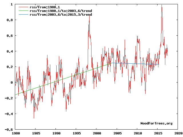
http://climatesense-norpag.blogspot.com/2017/02/the-coming-cooling-usefully-accurate_17.html
Fig 4. RSS trends showing the millennial cycle temperature peak at about 2003 (14)
The RSS cooling trend in Fig. 4 and the Hadcrut4gl cooling in Fig. 5 were truncated at 2015.3 and 2014.2, respectively, because it makes no sense to start or end the analysis of a time series in the middle of major ENSO events which create ephemeral deviations from the longer term trends. By the end of August 2017, the strong El Nino temperature anomaly had declined rapidly. The cooling trend is likely to be fully restored by the end of 2019.
Forecasts and trend calculations which ignore this turning point are clearly useless see Fig. 12
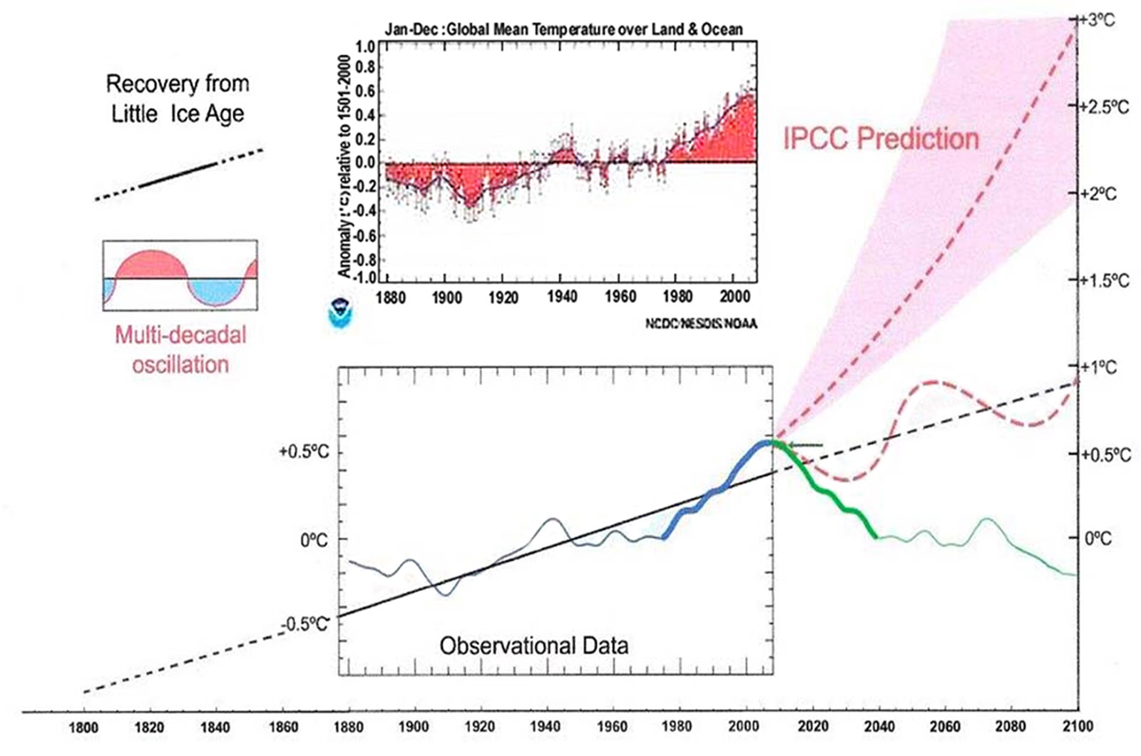
Fig. 12. Comparative Temperature Forecasts to 2100.
Fig. 12 compares the IPCC forecast with the Akasofu (31) forecast (red harmonic) and with the simple and most reasonable working hypothesis of this paper (green line) that the “Golden Spike” temperature peak at about 2003 is the most recent peak in the millennial cycle. Akasofu forecasts a further temperature increase to 2100 to be 0.5°C ± 0.2C, rather than 4.0 C +/- 2.0C predicted by the IPCC. but this interpretation ignores the Millennial inflexion point at 2004. Fig. 12 shows that the well documented 60-year temperature cycle coincidentally also peaks at about 2003.Looking at the shorter 60+/- year wavelength modulation of the millennial trend, the most straightforward hypothesis is that the cooling trends from 2003 forward will simply be a mirror image of the recent rising trends. This is illustrated by the green curve in Fig. 12, which shows cooling until 2038, slight warming to 2073 and then cooling to the end of the century, by which time almost all of the 20th century warming will have been reversed
Mr. McKitrack has certainly forgotten more science and math than I’ll never know.
But while he is analyzing the trees, I’ll look at the forest from 30,000 feet:
There are no real climate models.
There are only computer games that make wrong predictions.
Real models would make right predictions.
The people who design and play the computer games, unfortunately,
also compile the temperature actuals
… and they have made so many wild guesses (infilling and “adjustments”),
that their surface temperature data can not be trusted.
For a moment I’ll wear a dunce hat and trust the surface temperature measurements, even their absolutely ridiculous +/- 0.1 degrees C. claimed margin of error (designed for very gullible people, I suppose).
Since 99.999% of Earth’s past temperature data have no real time temperature measurements, I’ll can only look at a tiny slice of climate history — average temperature changes since 1880 (I’ll temporarily ignore the fact that there were very few Southern Hemisphere measurements before 1940).
The average temperature of our planet’s surface, a statistical compilation that is not the “climate” anyone actually lives in, has remained in a 1 degree C. range for 137 years!
That’s not a climate problem — it’s a climate blessing.
There’s more CO2 in the air since 1880 to improve green plant growth — although doubling or tripling the current CO2 level would be even better.
Nights are slightly warmer than 1880, and the Arctic is warmer.
Ho Hum.
Where is ANY real climate problem that justifies spending tens of billions of dollars making haphazard temperature measurements, and scaring people about an alleged coming climate catastrophe from harmless CO2 that will never come?
The money wasted on climate change “science” (climate change science is an oxymoron in today’s world) should have been used to help the over one billion people on our planet who are so poor they have to live without electricity!
And the help for all the people without electricity will require burning fossil fuels that leftists seem to hate.
My climate blog for non-scientists
No ads — no money for me — a public service
http://www.elOnionBloggle.Blogspot.com
Alarmist tend to believe 56.7 F. Shouldn’t be higher globally…is like wishing hypothermia on a global population.
Another year has gone by, it’s now the Fall of 2017, and it’s time once again to put up ‘Beta Blockers Parallel Offset Universe Climate Model’, a graph first posted here in the summer of 2015.
http://i1301.photobucket.com/albums/ag108/Beta-Blocker/GMT/BBs-Parallel-Offset-Universe-Climate-Model–2100ppx_zps7iczicmy.png
The above illustration is completely self-contained. There is nothing on it which can’t be inferred or deduced from something else that is also contained in the illustration.
For example, for Beta Blocker’s Scenario #1, the rise of GMT of + 0.35 C per decade is nothing more than a line which starts at 2016 and which is drawn graphically parallel to the rate of increase in CO2 which occurs in the post-2016 timeframe. Scenario #1’s basic assumption is that “GMT follows CO2 from Year 2016 forward.”
Beta Blocker’s Scenario #2 parallels Scenario #1 but delays the start of the strong upward rise in GMT through use of an intermediate slower rate of warming 2025-2060 that is also common to Scenario #3. Scenario #2’s basic assumption is that “GMT follows CO2 but with occasional pauses.”
Beta Blocker’s Scenario #3 is simply the repeated pattern of the upward rise in GMT which occurred between 1860 and 2015. That pattern is reflected into the 2016-2100 timeframe, but with adjustments to account for an apparent small increase in the historical general upward rise in GMT which occurred between 1970 and 2000. Scenario #3’s basic assumption is that past patterns in the rise of GMT occurring prior to 2015 will repeat themselves, but with a slight upward turn as the 21st Century progresses.
That’s it. That’s all there is to it. What could be more simple, eh?
All three Beta Blocker scenarios for Year 2100 — Scenario #1 (+3C); Scenario #2 (+2C); and Scenario #3 (+1C) — lie within the IPCC AR5 model boundary range; which it should also be noted, allows the trend in GMT in the 2000-2030 timeframe to stay essentially flat while still remaining within the error margins of the IPCC AR5 projections.
Scenario #3 should be considered as the bottom floor of the three scenarios; and it is the one I suspect is most likely to occur. The earth has been warming for more than 150 years and it isn’t going to stop warming just because some people think we are somehow at or near the top of a long temperature fluctuation cycle.
If I’m still around in the year 2031, I will take some time to update the above illustration to reflect the very latest HadCRUT numbers published through 2030, including whatever adjusted numbers the Hadley Centre might publish for the period of 1860 through 2015. In the meantime, I’ll see you all next year in the fall of 2018 when the topic of ‘Are the models running too hot’ comes around once again.
Beta Blocker See 8:14 post above. and
http://climatesense-norpag.blogspot.com/2017/02/the-coming-cooling-usefully-accurate_17.html
Why do you think the earth was created in 1860.?
He didn’t say ‘the earth was created’.
It is a toy model, and a funny one in my opinion. Not very many of us will be around to check how good it was compared to monkeys and darts, or, the very best climate models that the best scientists run in the best supercomputers to lead politicians. The toy model could be better. Which is scary.
Dr. Page, another thirty to fifty years worth of empirical data must be collected before any predictions being made here in the year 2017 concerning where GMT might be headed over the next hundred years can be confirmed or refuted.
As long as the 30-year running trend line shows any statistically significant warming at all, regardless of how small that upward trend might be, climate change will continue to be pushed as a major public policy issue by the progressive left.
Sooner or later, another progressive liberal will be elected president. That politician’s inaugural speech is likely to include something like, “The nightmare era of anti-science politics and of climate change denialism is over. Climate change will once again be at the very center of America’s environmental policy agenda.”
When that happens, all the work Trump’s people have done so far to reverse America’s environmental policies, and whatever more they will do before he leaves office, will itself be reversed. Bet on it.
Although I believe your predictions in the political ideologies is spot on. The more “Skeptics” that are being created has already changed the political ideologies that fewer young people think Climate Changes are as bad as the Alarmist predict. Older people have not seen the changes in their lives, because they lived through those times, when nothing the Alarmist predicted happened. That movies like what Al Gore made flopped shows more people either don’t care or have learned to ignore his BS. So the future is still less bleak than you may think.
johchi7,
Reminded that a couple of days ago TWC’s Local on the 8’s forecast a “near record high” for my area.
The forecast was for a high of 90*. The record for that day was 92* set 30 years ago. It got to 87*.
But they got to leave the desired impression.
PS They never stated what the record high (or low) actually was for that day. They haven’t done that for years.
Forecasters have dropped giving past record’s more and more. They want it to appear like this is new and never happened before. It keeps the ignorant, ignorant while maintaining the narrative of Climate Changes.
While I am only a climate dilettante, I do so appreciate a well-written article that proceeds, Walter Rudin style, with inexorable logic and clear, unambiguous language. By the time you reach the article’s conclusion you are convinced of that conclusion’s inevitability and vaguely wonder why you hadn’t seen it yourself.
Thank you Mr. McKitrick, and congratulations on an excellent article.
This is all handwaving from start to finish. Real theories make real predictions. If CMIP-5 can’t tell us actual temperatures to compare with reality, then it isn’t science.
Darned good point, talldave.
The reason those models don’t predict anything is they don’t have gas law in them. They have the Hansen’s FAKED “calculations” that refuse to use gas law to solve for gas compression/density derived warming that’s intrinsic to compressible phase matter.
Many years before the scam broke I heard Hansen’s old boss explain about Hansen’s SCAM mathematics.
Besides that the greenhouse gases cool the planet and more of them will cool it more.
Only clowns believe cold, phase change refrigerant is a heater, or that more of it is one.