A very significant post over at Dr. Curry’s blog ~ctm
From Climate Etc.
Posted on August 16, 2017 |
by Dr. Ronan Connolly & Dr. Michael Connolly
Satellite observations indicate that the average Arctic sea ice extent has generally decreased since the start of the satellite records in October 1978. Is this period long enough to assess whether the current sea level trend is unusual, and to what extent the decline is caused by humans?
This change in Arctic climate is often promoted as evidence that humans are causing drastic climate change. For instance, an April 29th 2017 article in the Economist (“Skating on thin ice”, pg 16) implied that the Arctic is melting unusually, dramatically and worryingly:
“The thaw is happening far faster than once expected. Over the past three decades the [Arctic sea ice extent] has fallen by more than half and its volume has plummeted by three-quarters… SWIPA estimates that the Arctic will be free of sea ice in the summer by 2040. Scientists previously suggested this would not occur until 2070.”
However, is the 1978-present satellite record really long enough to allow us to:
- a) Assess how unusual (or not) the recent trends are?
- b) Determine how much of the recent climate change is human-caused vs. natural?
Recently, we published a study in Hydrological Sciences Journal (HSJ) in which we extended the Arctic sea ice estimates back to 1901 using various pre-satellite era data sources (Abstract here).
HSJ have chosen this article as one of their “Featured Articles” which means that it is free to download for a limited time: here. But, if you’re reading this post after that offer has expired and you don’t have paywall access, you can download a pre-print here.
In our study, we found that the recent Arctic sea ice retreat during the satellite era actually followed a period of sea ice growth after the mid-1940s, which in turn followed a period of sea ice retreat after the 1910s. This suggests that the Arctic sea ice is a lot more dynamic than you might think from just considering the satellite records (as the Economist did above). So, in this post, we will review in more detail what we currently know about Arctic sea ice trends.
Sea ice trends during the satellite era
The Arctic and Antarctic sea ice extent satellite data can be downloaded from the US National Snow & Ice Data Center (NSIDC) here. In the graphs below, we’ve plotted the average annual sea ice extents from this satellite data for both the Arctic and the Antarctic. For comparison, we’ve also shown Arctic air temperature trends since 1900 (adapted from our HSJ article).
We can see that, yes, the average Arctic sea ice extent has generally decreased since the start of the satellite record. Although, interestingly the average Antarctic sea ice extent has generally increased over the same period. However, when we look at the much longer Arctic temperature record we can see that this is not surprising. The Arctic region has been warming since the late 1970s (when the satellite records began), but this followed a period of Arctic cooling from the 1940s to the early 1970s! In other words, if the satellite records had begun in the 1940s and if the Arctic sea ice extent is related to Arctic temperatures, we would probably have detected a period of Arctic sea ice growth.

Arctic sea ice changes during the pre-satellite era
One of the reasons there has been such interest in the satellite-based sea ice records is that the satellites are monitoring most of the planet and provide almost continuous coverage. But, people were also monitoring Arctic sea ice before the satellite era using various land, ship, submarine, buoy and aircraft measurements.
In the 1990s and early 2000s, Profs. Walsh and Chapman decided to try to combine together some of these pre-satellite measurements to extend the satellite record back to the early 20th century. You can see from the figure below, that their estimates implied that there was almost no variability in Arctic sea ice extent before the satellite era!

For many years, their “Walsh and Chapman dataset” was assumed to be fairly reliable and accurate, and it was widely used by the scientific community.
As can be seen from this clip, it even was shown in Al Gore’s 2006 An Inconvenient Truth film, although Gore seems to have been confused about what data he was showing and mistakenly claims that the Walsh & Chapman graph is based on “submarine measurements of ice thickness”.
https://www.youtube.com/watch?v=vTFuGHWTIqI
By the way, we suspect the submarine measurements Gore refers to are probably the ones from Rothrock et al. 1999 (Open access), but those measurements are a lot more limited than Gore implies, and it had already been published in 1999, so it’s unclear why Gore felt he needed to “persuade them to release it”.
However, when we looked in detail at the available pre-satellite data, we realised that there were serious problems with the Walsh & Chapman estimates.
The main problem is that the pre-satellite data is unfortunately very limited. If a ship travelled through a particular region in a given season, then they could have reported how much ice was in that region, or whether it was ice-free. But, what do you do if there were no ships (or airplanes, buoys, etc. ) in that region?
It seems that in a lot of cases when Walsh & Chapman didn’t have measurements for a given region they effectively ended up assuming that those regions were ice-filled!
For example, in the figure below, the map on the left shows the main data source used by Walsh & Chapman for August 1952. It’s an estimate of the Arctic sea ice extent that was compiled by the Danish Meteorological Institute (DMI). On the map, the red lines indicate the ice boundaries where the DMI actually had taken measurements – in this case, mostly around Greenland and eastern Canada. The white regions on the rest of the map indicate regions where “ice supposed, but no information at hand”. In other words, the DMI was guessing that there might be ice there, but didn’t know!

This period was in the middle of the Cold War and unfortunately there was very little data-sharing between the Soviet Union and western countries like Denmark. So, the DMI had almost no information for the Russian Arctic. However, as it happens, the Russians were making their own observations of the Russian sea ice using aerial reconnaissance, ships, buoys, etc. In the 21st century, some Russian scientists began digitizing this data and publishing it. The map on the right hand side shows the Russian observations for the exact same month (August 1952). The blue regions were ice-free, the white regions were ice-filled and the grey regions were regions they weren’t measuring.
Notice how all of the Siberian Arctic regions that the Russians could see were ice-free were assumed to be ice-filled by the DMI?
The Walsh & Chapman estimates assumed that the DMI’s guesses were accurate, but they weren’t!
Now, we must point out that while we were carrying out our study which used both the Russian data and the DMI data, Walsh and Chapman also updated their estimates. And, the new 2017 Walsh et al. dataset (Open access) uses the Russian dataset too.
However, as we discuss in the paper, their approach still ends up effectively assuming that most of the regions without observations were “ice-filled”! To us, this is a very unwise assumption, particularly for the earlier years when there were very few observations.
So, we realised that the pre-satellite data needs to be re-calibrated to account for the limited observations and also the changes in different data sources (airplanes vs. ships vs. buoys, etc.) for different regions and times. For a detailed discussion of our re-calibration procedure, we’d recommend reading our paper (Abstract here). But, essentially, we used Arctic temperature records from weather stations on land to ensure that the sea ice measurements from each of the data sources show a similar response to Arctic temperatures to that observed in the satellite era.
After re-calibration, we obtained the following result including error bars:

There are several points to notice:
- While Arctic sea ice has indeed been generally decreasing since the start of the satellite era, this coincidentally followed a period of Arctic sea ice growth from the 1940s to 1970s!
- Indeed, the Arctic seems to routinely alternate between periods of sea ice growth and sea ice retreat. This is quite different from the previous Walsh & Chapman estimates which implied that Arctic sea ice was almost constant before the satellite era!
- If we ignore the error bars, perhaps you could argue that sea ice extents since 2005 are lower than they have been since 1901. However, we shouldn’t ignore the error bars. We can see that the lower error bars for the pre-satellite era have been lower at several stages than the upper error bars for the entire satellite era. In other words, the recent low values are still consistent with our estimates for the pre-satellite era.
A useful test of the Global Climate Models used by the IPCC reports (called “CMIP5” models) is to see how good they are at “hindcasting” Arctic sea ice trends. A “hindcast” is a “forecast” that goes backwards in time.
Below, we compare our summer reconstruction with the average of the IPCC’s climate model hindcasts.

We can see that the IPCC climate models were completely unable to reproduce the different growth and retreat periods.
Arctic sea ice changes over the last 10,000 years
In recent years, several researchers have developed an interesting new “proxy” for Arctic sea ice cover, called “PIP-25”, which can be used for estimating long-term changes in Arctic sea ice extent. A “proxy” is a type of measurement which can be used to indirectly approximate some property – in this case, Arctic sea ice cover.
In 2007, Prof. Simon Belt and colleagues noticed that a type of algae which seems to only grow in sea ice produces a specific group of molecules called “IP-25” – see Belt et al., 2007 (link to abstract, link to Google Scholar). They found that if the sea ice in a region melts in the summer, some of this IP-25 will sink to the bottom of the ocean as part of the ocean sediment. However, if there is no sea ice, or if the sea ice remains frozen all year, then the ocean sediment for that year doesn’t contain any IP-25. They realised that if you drill an ocean sediment core for that region, you could use the presence of IP-25 as a proxy for “seasonal sea ice”, i.e., ice that only forms for part of the year.
Later, it was realised that if the IP-25 was absent you could also use the presence of certain species of phytoplankton to distinguish between periods with permanent ice cover (less phytoplankton growth because the sea ice reduces the amount of sunlight under the ice) and ice-free conditions (more phytoplankton growth). So, by combining the IP-25 and phytoplankton measurements in an ocean sediment core, you have a “PIP-25” proxy series (“P” for phytoplankton) which can distinguish between three types of sea ice cover:
- Permanent ice cover (low IP-25 and low phytoplankton)
- Seasonal ice cover (high IP-25)
- Mostly ice-free (low IP-25, but high phytoplankton)
In Stein et al., 2017 (abstract here, although the paper is paywalled), Prof. Rüdiger Stein and colleagues presented the results from two new PIP-25 ocean sediment cores (from the Chukchi and East Siberian Seas) and compared them with another two cores from earlier studies in different parts of the Arctic (one from the Laptev Sea and the other from Fram Strait).
We have adapted the maps below from Figure 2 of Stein et al., 2017, with some editing to make the locations easier to see. The maps show the location of the four cores relative to the maximum and minimum Arctic sea ice extents in 2015. The four cores are quite well distributed throughout the Arctic and so should give us a reasonable estimate of how sea ice has varied throughout the Arctic over longer time scales.
Notice that all four locations were ice-free during the summer minimum (06 September 2015), but three of the locations (the Chukchi Sea, East Siberian Sea and Laptev Sea cores) were ice-covered during the winter maximum. In other words, these three locations currently experience “seasonal sea ice cover”. The remaining location (the Fram Strait core) was still outside the ice extent even during the winter maximum (17 March 2015). So, currently that location is “mostly ice-free”. However, as we will see, the PIP-25 sediment cores suggest that these conditions have changed over time.

For the four plots below, we have digitized the PIP-25 results for the four sediment cores from Figure 10 of Stein et al., 2017. Roughly speaking, PIP-25 values below about 0.5 indicate that the region was mostly ice-free at the time (Stein et al., 2017 use the term “reduced sea-ice cover”), while values above about 0.7 indicate that the region was permanently ice-covered, i.e., it remained ice-covered throughout the entire year (Stein et al., 2017 use the term “perennial sea-ice cover”). Values between 0.5 and 0.7 indicate that the region experienced “seasonal ice coverage”, i.e., it was usually ice-covered during the winter maximum, but ice-free during the summer minimum.

As we discussed above, three of the locations (the Chukchi Sea, East Siberian Sea and Laptev Sea sites) currently experience “seasonal ice coverage” and the Fram Strait site is currently “mostly ice-free”. However, according to the PIP-25 data, over the last 10,000 years, all four of these sites have gone through extensive periods with less ice coverage as well as extensive periods with more ice coverage. In particular, all four locations seem to have experienced much less ice coverage 6,000-8,000 years ago (i.e., well before the Bronze Age) than they do today.
This suggests two points particularly relevant to our discussion:
- Arctic sea ice extents have shown a lot of variability over the last 10,000 years (at least), so we shouldn’t be too surprised that the extents have substantially changed since the start of the satellite records in 1978.
- Despite the widespread belief that the current Arctic sea ice coverage is “unusually low” (based on a combination of the 1978-present satellite records and computer model results), it seems that the coverage was actually a lot lower 6,000-8,000 years ago.
Summary
- After re-calibrating the pre-satellite data, it now transpires that Arctic sea ice has alternated between periods of sea ice retreat and growth. The satellite record coincidentally began at the end of one of the sea ice growth periods. This has led to people mistakenly thinking the post-1978 sea ice retreat is unusual.
- The results from new sea ice proxies taken from ocean sediment cores suggest that Arctic sea ice extent has varied substantially over the last 10,000 years. They also suggest that Arctic sea ice extent was actually less before the Bronze Age than it is today.
- The current Global Climate Models are unable to reproduce the observed Arctic sea ice changes since 1901, and they seem to drastically underestimate the natural sea ice variability
I would note to the authors of this paper that the Satellite record does NOT start in 1978. The National Snow and Ice Data Center has obtained satellite records back to nearly the beginning of the space era which provide a LOT more and accurate information on Arctic ice trends. Our team was involved in recovering the Infrared Radiometer data from the Nimbus I, II, and III satellites, that flew in 1964, 1966, and 1969 respectively.
I would also strongly suggest looking at the Nimbus Advanced Video Camera System (AVCS) that has also been recovered. It has almost daily Arctic ice data. I would also suggest the book NASA SP-489, Arctic Sea Ice, 1973-1976: Satellite Passive Microwave Observations. This book shows a lot of variability in Arctic ice just over a four year period in the 1970’s.
Yes, and IPCC decided after 1990 to ignore pre 1979 because there was an inconvenient truth there.
In addtion, I believe i read somewhere that Chapman cautioned against using that graph as gospel.
Does anyone know if polar ocean currents were taken into account? Just because a certain algae produces IP-25 and drops to the seabed, doesn’t necessarily mean that the algae was produced directly above where it was found in the core samples. Ocean currents could have transported it hundreds of miles away from its original surface location.
The paper is a good reminder that the pre-satelite data is nothing more than an arbitrary assumption that nothing changed before humans affected the Arctic. However, it is already clear from the detailed consistent satelite data that we are not seeing the “run-away” decline that everyone has been screaming about. It seems quite likely that there will be in increase in Arctic sea ice over the next 5 years.
https://climategrog.wordpress.com/2013/09/16/on-identifying-inter-decadal-variation-in-nh-sea-ice/
and this article makes no mention of post Chapman research collating all possible record sources, which is summarised in this article by the NSIDC’s Florence Fletterer
https://www.carbonbrief.org/guest-post-piecing-together-arctic-sea-ice-history-1850
From the conclusions of the article, summarising the research:
“Most fundamentally of all, the new dataset allows us to answer the three questions we posed at the beginning of this article.
First, there is no point in the past 150 years where sea ice extent is as small as it has been in recent years. Second, the rate of sea ice retreat in recent years is also unprecedented in the historical record. And, third, the natural fluctuations in sea ice over multiple decades are generally smaller than the year-to-year variability”
Curry’s blog also contained this statement in one of its pieces on historical ice conditions (referencing the above and then yet to be completed NSIDC research)
https://judithcurry.com/2013/04/10/historic-variations-in-arctic-sea-ice-part-ii-1920-1950/
“The 1920-1940’s arctic sea ice melt can therefore be seen as remarkable, albeit the caveats about apples and oranges need to be applied. Looking at the evidence available from each of the arctic oceans means the ice extent probably lies somewhere within that experienced during the first half of the 2000’s, but was probably not as low as 2007 and 2012.
It is anticipated that the ‘Back to 1870’ project will objectively look at the available information from all sources and put the period to 1870-and especially 1920-1940/50- into its proper context to today.”
finally we have to acknowledge a particular change in sea ice conditions, not seen in the period of the historical record – the opening of the NW passage yearly, to all forms of shipping without icebreaker support, for the past decade.
Looks like the canary is feeling a little better recently: ” I’m not dead yet ! “
For Griff: http://onlinelibrary.wiley.com/doi/10.1002/2015GL065704/full
Not everyone agrees the NW passage is open for business. In fact, in may not be for many years, if ever.
Griff, what is alarming about this in your post….
“Looking at the evidence available from each of the arctic oceans means the ice extent probably lies somewhere within that experienced during the first half of the 2000’s, but was probably not as low as 2007 and 2012.”
Sheri
Open for business – as in a regular commercial shipping route – the NW passage may not be – but it is open for navigation – which it clearly was not in the 19th and 20th centuries.
and Russia’s Northern Sea route?
that IS open for business, for longer each year without any need for ice breaker assistance…
Again, the giffiepoo slime crawls from beneath the red algae to spew false information. Proving again that giffiepoo is not here to learn, but to spread false propaganda.
You have been unable to defend that useless piece of trash alleged science each of the previous times you felt the need to throw it up.
That trash science approach to the Arctic ignored all inconvenient evidence while accepting every bit of frozen Arctic nonsense they could find.
e.g. one of the sources your fake science buddies conveniently overlooked:
Meanwhile: Multiple satellite MIRS (Microwave Integrated Retrieval System) sea ice concentration images.
There is not the massive sea ice melt giffiepoo endlessly bleated since last winter. Without a massive polar storm to disrupt sea ice in the next three weeks, this year’s sea ice minimum looks to gain substantial sea ice.
Satellite NOAA 19:
http://www.ospo.noaa.gov/data/mirs/mirs_images/n19_sice_pn_asc.png
Satellite NOAA 18:
http://www.ospo.noaa.gov/data/mirs/mirs_images/n18_sice_pn_asc.png
Satellite Metop A:
http://www.ospo.noaa.gov/data/mirs/mirs_images/m2_sice_pn_asc.png
Satellite Metop B:
http://www.ospo.noaa.gov/data/mirs/mirs_images/m1_sice_pn_asc.png
Satellite DMSP F17:
http://www.ospo.noaa.gov/data/mirs/mirs_images/f17_sice_pn_asc.png
Satellite DMSP F18:
http://www.ospo.noaa.gov/data/mirs/mirs_images/npp_sice_pn_asc.png
Trollop giffiepoo’s voice of nonsense, falsehood and sheer absurdity, debunked again!
Mod, please check the trash, black hole, bad word and spam dumps.
Two posts in this comment section, that I submitted, have vanished into the WordPress ethers without any indication of a successful or even moderated post.
Perhaps WordPress’s is trashing posts for obscure reasons again?
[Yes, rescuing Trashed posts has become almost a full time job here. Not sure why. Found your post and rescued it. -mod]
Thank you!
There is also the declassified reconaissance satellite photos (CORONA, LANYARD, ARGON and HEXAGON) from 1960-1984. For example the first satellite photograph ever retrieved, taken on August 18 1960 shows that the sea around Mys Shmidta in Chukotka was ice-free at that time.
Not to mention older USAF (and USAAF) photos. For example USAAF photographed all of Greenland in 1943 and 1946.
Many people have seen the graph of pre 1979 ice in the IPCC-FAR report
Figure 7.20: (a) Northern Hemisphere, and (b) Southern
Hemisphere sea-ice extent anomalies. Data from NOAA (USA).
Did you know it came with a discussion?
7.8.2 Sea-ice Extent and Thickness
Especially importantly, satellite observations have been used to map sea-ice extent routinely since the early 1970s. The American Navy Joint Ice Center has produced weekly charts which have been digitised by NOAA. These data are summarized in Figure 7.20 which is based on analyses carried out on a 1° latitude x 2.5° longitude grid. Sea-ice is defined to be present when its concentration exceeds 10% (Ropelewski, 1983). Since about 1976 the areal extent of sea-ice in the Northern Hemisphere has varied about a constant climatological level but in 1972-1975 sea-ice extent was significantly less.
So from IPCC, starting at a high point on the left side of the chart falsifies the slope.
Then there is March 2, 1975 & the Trib is confirming that:
The current start of Arctic Sea ice is a high point. In the last decade, the Arctic ice and snow cap has expanded 12 per cent,
There was a ‘Little Ice Age’. No scientist is forecasting a full-scale Ice Age soon, but some predict that in a few decades there might be little ice ages like the ones which plagued Europe with severe winters from 1430 to 1850.
“Wilson Smith, you missed another one.”
How are you guys embedding images in the comments???
I feel pathetic because I actually have a wordpress blog http://www.texaninkorea.com for korean war letters home, if anyone is interested.
I got no particular answers from wordpress.com except that you can’t do it as a guest that you’re not admin on.
Reply: Instructions here ~ctm
Use the link address rather than copying the image.
http://ifunny.co/fun/5USrCfo35
So wordpress can or cannot pick up a link from my desktop/computer?? Doesn’t sound like it can unless there’s some wordpress F magic under the hood.
Right-click on image. Select ‘copy image location’.
This is consistent with the common theme in the 1970’s that the Earth was heading into a new ice age. What should be done is a search of Cold War era spy satellite views of the Arctic, which the US and Russians probably still have, but have never released.
Or going back to 1925 as per US Department of Energy Report 1985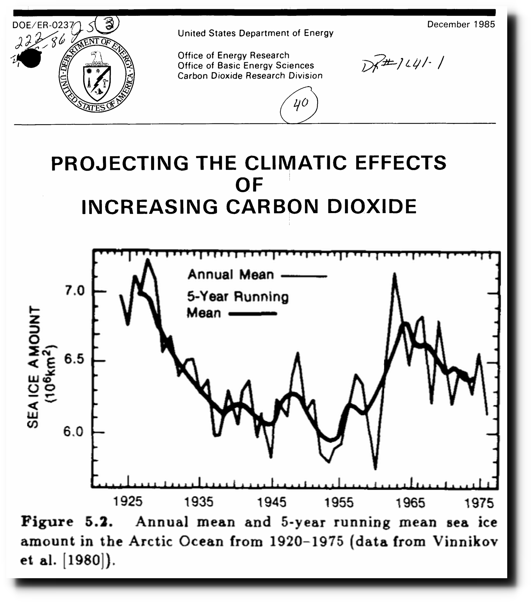
This chart is not the actual data that the original satellite data produced (I don’t know what the IPCC was doing).
It original satellite data goes from 1972 to 2002 for the Arctic and starts in 1973 for Antarctica.. This was done on the same basis, the same algorithm that is used today).
The data is here (although there needs to be a tiny bit of matching up with the 1979-on data so they are consistent but there is little difference actually).
ftp://sidads.colorado.edu/DATASETS/nsidc0192_seaice_trends_climo_v2/total-ice-area-extent/esmr-ssmr-ssmi-merged/
The University of Bremen maintains a chart of the data here:
This chart shows the last time I updated my database of the data (more than a year out of date) .
.
richard, how about links
to your source
material?
How about you providing it since you appear to have an opinion of it anyway?
I’m quite bored to the usual SkS suspects that come up here and basically just troll when had the opportunity to table their best and well-written credible science. Instead, we see some advocacy with keywords like ‘unprecedented’ which totally suck with no credibility what so ever. If you are here to turn a head of a skeptic, then ffs, please table your knowledge. If you have some.
And no, the fact something got through the peer review with totally alarmist language is not gonna convince anyone. I agree with the conclusions of the above paper, that we do NOT have outstanding, accelerating, and dangerous sea ice loss, but rather fluctuating decadal changes that do not much differ what has happened before, and which do not concern me a bit as such.
@ur momisugly Hugs
Come on, crackers345 just asked for a link to the source.
I would also like a link to the sources – from both Latitude and richard verney.
crackers345 August 17, 2017 at 6:24 pm
The source is in plain sight on the document, ie USDOE, December 1985.
Science or Fiction,
Apparently you and Hugs are both unfamiliar with the most elementary documents in the “climate change” canon.
Latitude’s Figure 7.20 is from section “7.8.2 Sea-ice Extent and Thickness” of the FAR:
https://www.ipcc.ch/ipccreports/far/wg_I/ipcc_far_wg_I_chapter_07.pdf
@science of fiction and crackers 345
You are both regular commentators on this blog, so I would have envisaged that you would have seen these plots before, because they have been posted before (by myself, and no doubt by others). If indeed you are genuinely interested in this topic, I would have thought that you would have come across them independently in the course of your own investigation/reading into the topic, for example had you actually read the IPCC reports and the historic papers published in leading journals prior to the mid 1980s (ie., at a time before the science became hijacked by activists).
The source info is actually set out if one looks at the plot one can see the source material.
The Latitude plot comes from the IPCC First Assessment Report, ie., claimed to be the gold standard. It is a plot direct from the horse’s mouth. It is ditched in the later reports and you may know that it is now difficult to get one’s hand on the First Assessment Report. It used to be linked on the IPCC website, but since the First Assessment Report contains inconvenient historic data (eg. plots showing the great variation in Northern Hemisphere temperatures with both a MWP and a LIA very different to the Mann Hockey Stick), this has been expunged.
The plot I set out came from the US Department of Energy Report of 1985, as I noted before setting out the plot. The source can be seen from the plot itself since it is a scanned copy. As can be seen, it actually comes from their Carbon Dioxide Research Division and is based upon a 1980 study paper by Vinnikov (I used to have a copy of the Vinnikov paper on a different computer which has since died. I recall that this paper was published in a Peer reviewed journal.) Don’t forget that Vinnikov was one of the lead authors of Chapter 7 of the IPCC First Assessment Report so his credentials are solid.
The fig 5.2 from the USDOE 1985 Report is not at all surprising since it fits well alongside what we know about the 20th century Northern Hemisphere temperature profile, namely that there was significant warming between 1920 to 1940 when a high was reached, and there was cooling through to the early 1970s, and there there was some modest warming such that by about 1980 the Northern Hemisphere temps were about 0.3 to 0.4 degC cooler than they were back in 1940.
This profile of Northern Hemisphere temps is seen in the 1980 Phil Jones et al paper, and in the 1981 James Hansen et all paper, and it is consistent with the Vinnikov reconstruction of Arctic ice.
When looking at a reconstruction, one needs to bear in mind that it is only a reconstruction and with any reconstruction (eg., the land based thermometer record is a reconstruction), there are always wide error bounds.
Further, when looking at reconstructions published before around 1983/85 these can be considered to be based upon our best estimation using available data, whereas after the mid 1980s the science has become hijacked and promoted by those with an agenda/activists and reconstructions made after the mid q980s need to be considered with even more circumspect because of that. One can see this in the Climategate emails where they openly discuss that the tree ring data shows no 1970s warming, the fact that Southern Hemisphere temperatures are largely made up, that there is a need to get rid of the 1940s warming/blip etc. etc. This attitude has made later stuff (they are not objective scientific reports) very unreliable.
PS. Don’t forget to look at the comment above made by DD More August 18, 2017 at 1:17 pm. The text quoted comes from Chapter 7 of the the IPCC First Assessment Report of which Vinnikov was one of 3 lead authors (C K Folland, and T R Karl being the other two).
I doubt they did for a whole slew of technical and classified reasons.
The US ones have been released. They can be viewed here:
https://lta.cr.usgs.gov/declass_1
https://lta.cr.usgs.gov/declass_2
https://lta.cr.usgs.gov/declass_3
Of course they have never been used. Might tell the wrong story…
TTY,
Do you know if there has ever been a release of weather data collected to aid ICBM launch targeting? I have a mental picture that is probably wrong, of a dedicated weather recording station at each silo/site that might be able to give, for example, surface temperatures relatively unaffected by site moves and TOBS type complications. Geoff
Once upon a time back in the early 1970s, I worked as a janitor at a major missile manufacturing company.
Several times as I cleaned one office, there would be this large magnificent coffee table book sitting on a table.
Yes, it was marked “Restricted”, “eyes only”, “Do not display”, “Do not remove from office”.
Hey, the janitor got to see and handle all of the room and trash.
Sitting at the table during dinner hour, I occasionally browsed through the book. The satellite pictures from around the world and both poles were phenomenal.
Large area shots and zoomed detail shots throughout the book; though there was near zero detail on exactly what each picture displayed.
There are records prior to the known satellite climate imagery that should be released and used.
Ignorance and uncertainty are such wonderful things — they allow you to shape them in whatever manner your pet idea allows.
Just say, “We really don’t know”, and stop with the readjustment game to fit either a pro or anti alarmist perspective.
It’s nice to know, though, that two can play this game. (^_^)
Yes you can pick one of these
1) We don’t know => so there is no reason to be alarmed without evidence
2) We don’t know => so there is a reason to be alarmed without evidence
Anyway, all I know about the Arctic suggests there is no reason to be afraid of summer sea ice extent loss, if there is loss to be expected. Rather the other way around. The belief on catastrophic Arctic summer sea ice loss is just a scare story used by activists. The lack of non-activists believing it proves its credibility requires a confirmation bias.
The temperature north of 80 usually tracks the average very closely when it is above zero C. Presumably the melting ice moderates the temperature. This year it has been low all season. That’s pretty remarkable. I have no clue what it means. link
CB-The daily temperature readings as graphed on the sea ice page show above past mean temperature for most of the year recently, rising just above 0C to match the mean only in summer. The non-summer temps are quite erratic. I believe this pattern is indicative of the mainly marine climate which is prevailing in the Arctic at this time. If there was less ice area the temps would track the longer term mean.
I believe there is an important clue in this. The loss of ice is due to rising water temps, not air temps . The open water creates the higher air temps.
So, the cycle is thus:
Open water is self-sustaining as winds disturb the surface of the relatively warm water.
This is indicative of a period of high-heat loss.
Heat loss leads to colder Arctic water.
Eventually, water temps are reduced to the point where the surface undergoes massive ice expansion.
The ice covering reduces wind disturbance and so is self-sustaining.
The ice covering greatly reduces heat loss.
The ocean once again begins to accumulate heat.
The ocean eventually warms to the point where the ice thins and winds are able to break up large areas again.
The temp change in water across this cycle may be less than 1C as it is really about the balance between ice thickness and wind. The cycle will have a large effect on N.H. temperatures as it is an important mechanism whereby Earth loses massive amounts of heat on a cycle of 30 years or more. We appear now to have nearly completed the heat dumping portion of the cycle so ice has stabilized. If we had good information on Arctic water temps (by depths and location) we could track the temp decline and get an understanding of the total amount of heat involved. But NASA, NOAA, etc. look for what they want to find, not what matters.
i believe what you have described is known as the amo john .
three, two, one —- here comes the Griff BS machine.
Griff is in the UK and so likely asleep and we get a short break from the nonsense until it stirs from it’s nest and resumes the daily GLO-BULL warming rants.
Well, if you think someone’s comments are a waste of time why do you feel the need keep mentioning his name in his absence? Thus assuring his presence for him even while he sleeps !!
If you have nothing of value to add to comments, stay silent.
Bob and Stewart,
While you may find Griff’s contrary viewpoint to be annoying, the fact is that he is cheeful, he is friendly, and he has NEVER uttered an ad hominen against anyone on this site. That makes him, despite his contrary viewpoint, a much more valuable participant than those that lack these exemplary qualities.
Make no mistake, I seldom, if ever, agree with Griff’s views but I do find his friendly and cheerful attitude to be refreshing compared to some.
I couldn’t agree more with you, Ray in SC.
Ray
You are right he’s a great guy that only Slanders every scientist that he disagrees with, posting information and attacks on their character and credentials that are absolute fabrications. I suggest you go back and research good Griffy a little.
If he was what you say I wouldn’t have an issue with him at all I would just ignore his BS or get whatever amusement I could from reading him, but you are wrong about his character.
Ray in SC August 18, 2017 at 5:56 am
Griff’s disparaging real scientists as not being scientists because the consensus attacks them is not an ad hominem?
Only one month in June, but there was virtually no difference in Arctic ice between June 2000 and June 1977. (fig.1) The Satellite and Arctic grid methods are different, but can easily be estimated to show similar coverage.
Why should this matter?
The trend of June’s (fig.2) shows June 2000 around the middle of the duration shown below. While June 1977 also represents the middle of the duration, indicates the trend after 1980 is nothing unusual to what happened before and confirms cyclic behaviour. The period during the 1970’s also had an increasing trend with 1979 around it’s maximum extent.
(Fig.1)
http://i772.photobucket.com/albums/yy8/SciMattG/SeaIceExtentJune2000vJune1977_zpsitcm5d58.png
(Fig.2)
Plus, if you look at it this graph at 100% scale it makes it look less scary.
http://m4gw.com/images/2017/Arctic-Ice-Chart.jpg
Why does anyone need to lead the eye by adding a straight line to the graph ? What is the reasoning behind the choice of a linear model to fit to the sea ice data?
Why not break it down a bit.
Looks like 2007 to 2017 is zero trend.
A certain other blog states that only skeptics draw crooked lines and they are totally wrong. Thus, a straight line is utilized by all global warming advocates. The reason is simplicity gives the result they want. I know of no valid statistical reason why a straight trend line is required. Remember, statistics can give you virtually any answer you want. That’s the beauty of it.
Another way of looking at it is that there was a downtrend from 1979-2012, and an uptrend since 2012.
Your trends are broken which makes no sense. You have more than one trend line for many dates and breaks between lines. This is nonsense. So 1996 for example has about 10 AND about 10.2 as a fit.
You’ve been struck by the “Photobucket Ransom Virus” MattG!
Is there some major detriment attached to having no arctic ice? I can see many advantages.
Where would Santa live?
markl, why Antarctica, of course. Could anyone in their “right mind” … be against having a bipolar Santa?
Johnny: In spite of your great play on words, Santa cannot live at the South Pole. The researchers and dog sled teams might stumble upon his lair—I mean workshop. He needs a place where no one goes. Which probably explains the lack of data on the Arctic ice….
Once the ice is gone there would be no reason for bored wannabes to be warning you that the ice will soon be gone.
Those bored wannabes would need to find a new boogerman.
Especially when the rest of the world is not overheating as a result of the ice melting.
But the ice declining is having an effect right now and will accelerate warming later
Completely wrong, Griff! The open water in the Arctic allows for much greater heat loss from the ocean waters. When ice conditions are higher, the ice prevents this heat loss and the Arctic ocean accumulates heat. Presently, we are losing that heat. Probably about 30 years of gaining, 30 years of losing.
Griff,
“But the ice declining is having an effect right now…”
Is not!
(your turn)
Alarmist’s think it would cause the world to heat up and cause all sort of problems, but they wrong.
Why?
It actually causes the world to cool faster because virtually all the energy at the North pole has been transferred there from the much warmer Southern locations. Water with no ice insulating it, releases energy into the atmosphere there much faster. Prevent the energy reaching the North pole and we have a situation similar to Antarctica, where little energy reaches there from the North even in Summer.
Solar energy is not concentrated enough to warm the poles, so they rely on energy from elsewhere and the biggest difference between the poles currently.
It is just one of the planets many natural negative feedbacks.
There seems to be some advantages for example in shipping, but why have 100,000 year periods cooled every time it reaches it’s peak?
It seems energy increasing in the north pole and melting sea ice was the trigger for an ice age with the right conditions. An ice age requites lot’s of precipitation to occur and fall as snow, preventing complete melting during the Summer time. What’s better on the planet then the Arctic ocean warmed up considerably, preventing formation of ice with extremely cold air around it?
Solar irradiance is important in the polar regions within a couple months of the summer solstices, even though heat also gets advected to them from parts of the wortld that get sun year-round. Note that insolation at the top of the atmosphere over one of the poles over the 24 hours centered on the summer solstice is 19% more (north) 27% more (south) than over the equator over 24 hours on one of the days of the equinox. The Arctic and Antarctic circles also get more on the summer solstice than the equator gets on an equinox. Even at the surface and year-round, the Antarctic gets anywhere from 80-100 to 120-140 W/m^2, the Arctic gets 60-80 to 100-120 with a couple little spots of 120-plus W/m^2, in comparison to the most insolated parts of the Sahara and the tropical Pacific getting 260-280 W/m^2.
And insolation at the poles averaged over the 6 month period centered on the summer solstice is almost twice the annual value, which means a little less than 160-200 W/m^2 at the North Pole and a little less than 200-240 W/m^2 at the South Pole. A little less still at the Arctic and Antarctic circles for the 6 month period centered on the relevant summer solstice. Much more for 4, 3 or 2 months centered on the summer solstice.
Notably, the Milankovitch cycles are often expressed in terms of solar irradiance at the top of the atmosphere at 65 degrees north latitude over the 24 hours centered on the summer solstice. The surface albedo feedback is highly positive (to an extent that is unsteady) in the Arctic and near-Arctic, although thankfully it gets less positive when the Arctic and near-Arctic loses sunlit seasonal snow/ice cover.
Thanks Donald, useful numbers to put things into perspective.
Matt there is another factor, well two actually. Convection. When the wind blows, as it does in those parts, with open water the latent heat of vaporisation will be transferred to the air from the water depending on the dew point of the air. This effect increases with water temperature but will occur even when the water is colder than the air. Then there is conduction, although I would expect this effect to be minor by comparison as air is not a good conductor.
With regards to your suggestion that lack of sea ice could be a trigger for a new ice age I think the point of perihelion on our calendar has relevance here. This moves along at about 40 minutes a year and has passed Northern summer solstice so now Northern summers get shorter and the distance between the Earth and the sun during summer increases. This suggests that the probability of an ice free Arctic triggering the next ice age is increasing as time goes by but might perhaps require a grand solar minimum at the same time to nudge things over the edge. It seems the best days are behind us and that warming should be the least of our concerns.
Donald given the low angle of incidence of Sunlight up North do your figures for insolation take reflection off water into account?
I found the difference between polar locations warming and cooling around 200 W/m^2. For example Iceland reaches these values in late October and cools significantly especially regarding SST’s. Regions cool as this threshold is reached further South in the NH and further North in the SH. This happens at the same time every year with no random variety. Solar irradiance although contributes a little energy below 200 W/m^2 isn’t enough to warm on the whole despite 24 hour daylight. Convection, conduction and ocean currents mainly warm locations under 200 W/m^2 from locations above 200 W/m^2. This is the main reason why Antarctica in Summer is around 20c-30c colder than the Arctic during Summer.
The energy in the ocean keeps the polar regions in the Arctic much warmer than what solar irradiance could ever contribute. If the Arctic was land-locked it would be colder than Antarctica due to lower insolation.
Imagine the massive benefits from lower sea ice levels like in the MWP.
Travel, commerce, fishing.. all without the need for ever present ice-breakers.
The huge commercial gain just from having an Arctic that was actually open to “over the top” shipping for more than a couple of months (with ice-breaker availability, would be enormous !!
Unfortunately, the RECOVERY from the extreme extent of the late 1970’s seems to have stopped, and with the AMO turning and the sleepy sun, the local inhabitants are going to have to put up with increasing sea ice again.
Well a short-cut through arctic would save lots of “carbon” transporting to chinese goods to consumers in the west.
Greg then we shouldn’t use it we need more CO2 in the atmosphere. CO2 is good for the environment.
Owen, this is a discussion worth having. Let us please accept the obvious evidence that Arctic sea ice is declining. If you want to argue “so what”, then fine, lets have it. This discussion is nt ossible if so many people are going to ignore the evidence in front of their face.
Look at the graph from paper. we know this is not evidence from alarmists – it is the interpretation that is most charitable for the skeptics. Yet it still shows a rapid decline since 1979 to levels lower than in the previous century. There is just about room to argue that if the error bars overlap, but to have the recent lows not different from the previous lows we need the error to be in the very bottom of the previous and the very highest of the recent. This is very unlikely. We can say that the recent drop – even in this evidence – is very likely to be real and only has a tiny probability of being due to error.
If we look at other reconstructions (as this is a reconstruction) we see an even greater difference. So if we look at all the evidence it is an act of supreme bias to conclude that sea ice is not at its lowest (over the last decade) over the last 150 years.
I do not consider anyone disputes that Arctic Ice (sea ice) is declining since 1979, but that does not mean that Arctic Ice is declining since it depends upon the start date.
There are multiple lines of evidence that suggest that Arctic Ice today is no less than it was back in around 1940, and may well be higher. Therein lies an issue, since if one goes back further in time there may be no decline.
No one knows what Arctic Ice will do in the near future (eg., the next 60, or so, years). Some claim that the decline from 1979 will continue unabated. Others claim that that decline is simply part of a cycle and the cycle will reverse and Arctic Ice will stop declining and will start growing.
Only the future will establish which of these two outcomes comes to pass, but when discussing matters one should not deny the past and one should not limit discussions to what has happened as from 1979 (although of course, the best data sourced from satellites comes from the 1970s onwards).
I agree the so what? debate is quite a separate debate and one which is worthy in itself
Richard
The “so what” argument is fine. Accept the evidence of decline then argue so what. However, the decline on the evidence presented here is not since 1979 but over the last 150 years. Just look at the plots. It is far more likely than not that the levels today are lower than at any time in the last 150 years. This is from a paper co-authored by Willie Soon, so it cannot be classified as from an alarmist source. All other reconstructions show the same. There is no recently published reliable evidence that says the current levels are not lower than at any time in the last 150 years. So can you accept this and then make your “so what ” argument?
“There are multiple lines of evidence that suggest that Arctic Ice today is no less than it was back in around 1940, and may well be higher. ”
No there is not. Show me one recent piece of evidence that says this. Old graphs from last century will not cut it.
richard – sea ice will decline in the
future. the science says
it will.
i wonder what u would have
said about SIE in 1979. probably
the same
thing
A couple notes on this. First, Dennis Wingo is correct that there is some early satellite data from the 1960s.
The main point though is that there is an updated Walsh climatology that reanalyzed many of the ice charts and added a lot of new data from the pre-satellite era. The data are at NSIDC:https://nsidc.org/data/g10010. Info on the trends from the data were published in a paper here: http://onlinelibrary.wiley.com/doi/10.1111/j.1931-0846.2016.12195.x/full; Figure 9 from the paper is particularly relevant here. Hopefully people can access the paper.
Finally, a note on the submarine ice thickness data. The Rothrock paper published in 1999 was based on data that was classified a few years earlier as part of a joint U.S.-Russia Environmental Working Group. Al Gore, Vice President at the time, was a major force in that project and pushed to declassify the U.S. submarine data.
Walt Meier
Senior Research Scientist
National Snow and Ice Data Center
Walt Meier
Senior Research Scientist
National Snow and Ice Data Center
–
“A couple notes on this. First, Dennis Wingo is correct that there is some early satellite data from the 1960s”.
–
The main point though is that this data was never considered and never used.
Why not?
–
Instead Chapman et al used other historical data with infilling of all unknown areas, hence increasing the amount of ice present in the past.
–
Correct ?
–
“The main point though is that there is an updated Walsh climatology that reanalyzed many of the ice charts and added a lot of new data from the pre-satellite era.”
–
again to reiterate not including the pre1970 data.
Thanks for the link to the recent Walsh paper. Sadly it stops around 2012 at the low point of the summer extents and does not show the following increase.
An unfortunate choice for a paper published in 2016. Clearly they would have had access to and been aware of more recent data before finalising their paper, so why did they chose not to include it ?
“4 March 2003
Polaris has been melting for 150 years
WWF reconstructs climate change in the Arctic
Düsseldorf (rpo). The ice of the Arctic has been on the retreat for at least 150 years. This is the result of the WWF and the Norwegian Polar Institute (NPI) in a new study.”
German source from 2003
Back to 1550, the data are available here
Follow the documentation.
polar ice has been…. of course – sorry for typo
It is anecdotal but I remember during the cold war both US and Russian subs surfaced at the North Pole (in 1959). Now, I was just a child at that time, but I would think that there had to be fairly sever melting, but not necessarily ice free, to allow that to occur.
https://www.navalhistory.org/2011/08/11/uss-skate-ssn-578-becomes-the-first-submarine-to-surface-at-the-north-pole
Skate was the first sub to surface at the Pole, in 1958. She and Nautilus had previously steamed under the Pole, but the ice was too thick to surface.
The Russians also surfaced in that time frame. The real question is: just how little is had to be there to allow the surfacing?
Leninsky Komsomol, 1962.
Skate was ’59, as you recalled, not 1958, which is when she and Nautilus steamed under the ice too thick for surfacing.
The thickness of ice a sub can break through depends upon the sub. Russian ballistic missile subs are designed to be able to handle thicker ice than any others.
Skate at the Pole, 1959. Note lack of polar bears, which meet the boats there these days:
Skate didn’t surface at the pole until 1959. That site is incorrect as has been documented here before.
https://wattsupwiththat.com/2012/03/17/submarines-in-the-winter-twilight/
It should also be noted that Skate has just busted its way through a solid 100% ice cover of about 1m thickness.
It’s not like they got the Zodiacs out and went fishing.
Ice extent is measured as >15% ice coverage.
I’m not sure what this picture is supposed to be telling us but it’s always present as “proof”. Proof of what , I’m not sure.
Finding a thin spot in the ice near the pole and busting through it in Skate is in no way equivalent to finding open water all the way from the coastline to the pole – something coming within the next decade.
Take a look at the current ice concentration – swiss cheese up there:
This is the photo of the Skate at the N Pole in March 1959, that other one may be from one of the other events on that cruise but it isn’t at the Pole.
Griff said**Skate is in no way equivalent to finding open water all the way from the coastline to the pole – something coming within the next decade.***
Griff continues his BS at every turn, but will not answer my questions.
“Griff continues his BS at every turn, but will not answer my questions.”
He’s not paid to answer questions, he’s paid to disrupt debate, plant disinformation and denigrate the credentials of scientists who are not part of the ‘consensus’.
The satellite ice data has always bothered me, whether it is the recent data from 1979 or earlier data from early satellites in the 1960s. Just like the hole in the ozone above the Antarctica we cannot know something until we can measure it or in the case of both polar regions until we actually go there directly or through remote imagery. We don’t know there were not holes in the ozone prior to humans going permanently to the Antarctica nor can we have exact estimate of sea ice at either polls until synoptic data from satellites. The CAGW crowed make such a huge deal over relatively little change or short term trends that it is vital to help the general public keep this all in perspective. Something impossible to do with the present state of the mainstream media. I cannot imagine that telling the public and having them accept it that going from an average earth temperature of 57.2 to 59.0 F is a really bad thing.
Funny you say that Edwin. In fact we have had some fairly good data since the 1950s. Dobson managed to get one of his measuring contraptions down to Hadley Bay in time for the International Geophysical Year. Reading from three years (1956-8) led him to proposed the Antarctic winter ozone anomaly, where the persistent southern vortex blocked the Brewer-Dobson ozone transportation. Ozone banks up on the outside of the vortex, while on the inside the stratospheric air becomes substantially ozone depleted (this is the dramatic phenomenon you can see in those NASA satellite animations).
Farman’s discovery of the ‘hole’ in the early 1980s was not this, but a further depletion (increasing from the late 1970s) in the spring. This is in October, after the sun returns, just before the vortex breaks up and the ozone floods back in. It was proposed that this October ‘hole’ was caused by extra stratospheric chlorine from photo-chemical destruction of CFCs. The proposed series of chemical reactions requires stratospheric polar clouds but also sunlight.
So much of the discussion since 1985 conflates the winter anomaly with the spring ‘hole’. And the size (surface area) of the anomoly/hole has often been given as indicator of the CFC destructive effect — whereas this is more to do with the size of the vortex. So we do know there was a decline of spring time ozone from the 1970s, the cause of which seems to be increased chlorine, possibly from CFCs. But this effect only occurs in the last blink of the anomaly. That the CFC-caused ‘hole’ is only final dip in the vortex depletion anomaly is rarely explained. Indeed, I have seen NASA images supposedly depicting the hole that are dated August and September. Animations often cut off before the supposed CFC effect can begin. When scientists and scientific institutions (eg NASA) show a big (i.e., large surface area) depletion in winter (August or September) and explain it as a sign of the CFC depletion effect, then I can only conclude that they are either ignorant or knowingly deceiving the public in support of a noble cause.
“the cause of which seems to be increased chlorine, possibly from CFCs”
But more likely from Mt Erebus which started erupting in 1972 and is still active:
http://www.sciencedirect.com/science/article/pii/S1352231015304246
There is good data prior to 1979 from multiple sources and nations…
The NSIDC has collated this.
We can be sure that sea ice extent lower now than at any time to earliest point they looked abck to – 1850
You mean there was more ice in the LIA? Shocking!
Griff – “extent lower now than at any time”
Not according to your “current ice concentration – swiss cheese up there:” chart and this report
The Arctic ocean is warming up, icebergs are growing scarcer and in some places the seals are finding the water too hot, according to a report to the Commerce Department yesterday from Consul Ifft, at Bergen, Norway.
Reports from fishermen, seal hunters and explorers, he declared, all point to a radical change in climate conditions and hitherto unheard-of temperatures in the Arctic zone. Exploration expeditions report that scarcely any ice has been met with as far north as 81 degrees 29 minutes. Soundings to a depth of 3,100 meters showed the gulf stream still very warm. Great masses of ice have been replaced by moraines of earth and stones, the report continued, while at many points well known glaciers have entirely disappeared. Very few seals and no white fish are found in the eastern Arctic, while vast shoals of herring and smelts, which have never before ventured so far north, are being encountered in the old seal fishing grounds.
Reports “that formerly the waters about Spitzbergen held an even summer teperature of about 3 Celsius; this year recorded temperatures up to 15, and last winter the ocean did not freeze over even on the north coast of Spitzbergen.“
Taken from Nov. 2, 1922 edition of The Washington Post: Arctic Ocean Getting Warm; Seals Vanish and Icebergs Melt. and George Nicolas Ifft [Under date of October 10, 1922] Monthly Weather Review – November, 1922.
Unless the ice melts another 7 to 8 degrees latitude by November, it will be more than 1922.
So question that needs to be asked, why didn’t the polar bears drown in 1922?
“We can be sure that sea ice extent lower now than at any time to earliest point they looked abck to – 1850”
Another porky pie, Skanky.
If you want to draw any conclusions about Arctic sea ice trends, keep in mind:
1. The satellite data begins in 1979, which happens to coincide with the end of the 1950 to 1978 cool period when sea was presumable at its maximum.
2. Decline in sea ice from 1979 to 2000 is not surprising since it coincides with the 1979 to 2000 warming.
3. Arctic temperatures over the past century have followed global temperatures and sea ice extent shows the same trends. Arctic temperatures were higher in the 1930s than at present (ie. during the 1915-1950 warm period), cooled during the 1950-1980 cool period, and warmed during the 1980-2000 warm period.
4. Comparing extent of sea ice now (at the end of a warm period) with sea ice extent in 1979 at the end of a cool period) makes no sense at all. What should be compared is extent of sea ice now with the extent of sea ice at the end of the 1915 to 1950 warm period. Unfortunately, we don’t have good data for the earlier time period. We would also like to compare the sea ice extent in 1979 at the end of the 1950 cool period with the extent in 1915, the end of the 1880 to 1915 cool period. But again, we don’t have the data.
Until we can make these kinds of comparisons, conclusions about trends since 1979 don’t mean much.
Biodata clearly shows that the current Arctic sea ice level are above those of 90-95% of the last 10,000 years
The only times it has been higher was during the LIA, and the late 1970’s
Arctic sea ice increasing in last 2,000 years. Here’s the paper where that graph came from
http://onlinelibrary.wiley.com/doi/10.1002/jqs.2929/abstract
That graph cannot be used to draw conclusions about the present situation, as it does not include the present. The zero in that graph is 1950 AD, and we know the Arctic has lost about 45% of its summer extent since 1979. That drop does not appear in the graph.
Sea ice is still VERY MUCH within the “seasonal” range.
Its chockers for all but a few months of the year.
The extent in 1979 was up there with the LIA.
If you have data that shows that the ex-Bering Straits was very low to counteract the massive growth passed Iceland…… Produce it.
The annual ave. sea ice cover dropped from 10.5 million sq. km. in 1979 to 9 million sq. km. in 2015. Around 10% drop. Do you really think that’s a bigger drop than from Little Ice Age to 1950? I don’t think so. LIA is colder than 1970s. BTW 1945 is a low point. Sea ice grew from 1945 to 1979 before it dropped 10%
“Until we can make these kinds of comparisons, conclusions about trends since 1979 don’t mean much.”
If you mean “the” trend, ie a once linear trend across the whole period you are right. Fitting an arbitrary model which reduces the whole dataset to a single figure will tell you nearly nothing about it.
If anyone is capable of doing something a bit more thorough that clicking on “fit trend” in Excel they may learn something about the nature of what is going on:
We have a lot of data both for Polar temperature and ice, and Your story has been told time and time; it was as little ice in the the twenties and thirties as to day. But this story is just complete BS, why did not Amundsen and other polarexplores just hire an Icebreaker and just steam to the Pole? Lack of imagination?
In the 1950s it was widely believed that the Arctic sea ice was retreating naturally and that it would soon disappear. This was not considered a bad thing except when in 1956 the then president of the AGU argued that this would trigger a series of changes including greater snowfall on northern lands and eventually the next ice age.
In the 1960s there were proposals to remove the bothersome sea ice in various ways, including by damming the Bering Straits and even by atomic explosions. They thought that once removed, negative feedback would keep the sea open. But attitudes were changing in the West. At this time the Soviets proposed reversing the flow of their Arctic rivers. The predicted consequence of the deprivation of fresh surface water would cause an end to sea ice. The Soviets seem to have always seen this as a good thing for their marginal agriculture regions, but in the West scientists worried that it might trigger NH climate change.
By the early 1970s there was lots of evidence (and it was widely agreed) that sea ice was expanding, which was often seen as a sign of the creeping return of an ice age little or big. Attitudes were changing in the late 1970s as many NH locations were starting to show a warming trend, and a secular north north Atlantic oscillation seemed to have turned. However, the arctic seemed to remain cool, and 1979 was considered to be particularly cold (‘coldest on record’). This was widely put to counter the AGW proponents because it was the opposite to the expected polar amplification of the CO2 warming effect.
Before the popular global warming scare took off in the late 1980s, there was concern that ice cap melt would cause sea level rise. However, already by the early 1980s the land ice melt threat was widely discounted (except West Antarctic ice cap sliding into the sea) by accepting the long-held view that (slightly) warmer temperatures could mean more snow falling on land, the growth of existing ice caps and sea level decline. However, the threat of sea level rise switched smoothly to the previously neglected thermal expansion. This moved the emphasis away from ice caps and towards sea temperature, which of course makes floating ice something of an indicator. Thus, although where land ice melt has been found it has been used to promote the scare, otherwise, and from the beginning, Arctic sea ice decline has been seen as an omen of coming diluvian catastrophe.
the ice-albedo feedback effect is happening
regardless of the source
of the melting; this paper
found
that over 1979-to-2011, it was 25% of
CO2’s forcing.
http://www.pnas.org/content/111/9/3322.abstract
Arctic ice conditions are cyclical. They are a balance between ocean temps and wind. Please have a look at my post higher up. We are near the end of the high heat loss phase of the cycle.
A tip of the hat to Matt G above. I believe we are close to being on the same page on this.
He must be a smart guy ; )
John, it’s not just the arctic sea ice that is cyclical.
http://www.wyattonearth.net/images/560_wave_regime.png
arcsib in group one is the arctic siberian ice extent.
“crackers345 August 17, 2017 at 4:38 pm
…CO2’s forcing…”
Can you explain this process of forcing?
If global warming be the alleged cause of Arctic sea ice decline since 1979, then explain please why the highest Antarctic sea ice year in the satellite record was 2014, after steady increases since 1979.
If air temperature be the cause, then why the stark difference, 180 degrees out of synch, between the two poles?
Because temperatures have risen more in the NH than in the SH. I.e., the warming isn’t global. Apparently, despite being well mixed in the atmosphere, CO2 bestows its warmth preferentially.
Eggsactry.
Just another falsification of the AGW hypothesis.
Because there is more land area in the NH than in the SH, temperatures have risen more in the NH than in the SH. Seriously Bart, you should know better than post such a stupid comment.
Not eggsactly (gloat your spelling’s atrocious… ☺), if agw brings about more warming over land than sea, then that would explain the difference. Which may well ultimately BE a falsification of agw theory. If all the excess heat eventually winds up in the oceans, then that lowers the value of ECS. This is probably what happens during the ice ages. Does anyone seriously believe that a half way to doubling of CO2 (from glacial to interglacial) outpaces the massive growth in water vapor? (that observation alone should be enough to put agw out to pasture)…
Mark, i don’t think bart is being stupid here. For reasons that i can’t quite understand yet, he doesn’t seem to see the oceans as a heat sink. It’s a point of view. (dr svalgaard pretty much thinks the same way)…
afonz, it’s pretty stupid to ignore the land/water differences between the NH and the SH when it comes to the measurement of temperatures. Ask anyone that lives adjacent to a large body of water how it affects air temps.
The separation of the NH and SH surface temperatures since ~2000:
http://www.woodfortrees.org/plot/hadcrut4sh/from:1900/mean:12/plot/hadcrut4nh/from:1900/mean:12
that is not apparent in the atmosphere:
http://www.climate4you.com/images/MSU%20RSS%20TropicsAndExtratropicsMonthlyTempSince1979%20With37monthRunningAverage.gif
i hear you, mark (i hear you)… i went back and forth with svalgaard on this very topic for about two weeks to no avail. (felt like i was busting up a block of concrete with a hammer) So, yeah, i don’t get it. Vertical mixing constantly cools the surface so we should expect heat to sink into the ocean as a result. Vast implications for AGW theory that i don’t know have been very well thought out…
bart – the southern
hemisphere is not warming
as fast because it has less
land and more ocean than the
NH.
climate models projected this.
http://www.woodfortrees.org/graph/plot/hadcrut4nh/from:1900/mean:12/plot/hadsst3nh/from:1900/mean:12/plot/hadcrut4sh/from:1900/mean:12/plot/hadsst3sh/from:1900/mean:12
Mark S Johnson @ur momisugly August 17, 2017 at 5:40 pm
“Because there is more land area in the NH than in the SH, temperatures have risen more in the NH than in the SH.”
And…? This is like an underpant’s gnome explanation:
1) More land in the NH
2) ???
3) higher rate of temperature increase
It’s obvious! No explanation needed!
Land/ocean diff doesn’t explain it, folks. The series are not divergent until about the turn of the century. So, your hypothesis founders on the agreement pre-2000.
Remember, these are anomalies we are talking about. Not absolute temperatures. At the very least, the series should be similar in form if not magnitude, if the global forcing is the same. They aren’t.
Chris, i added sea surface temps to your land + sea (above)… One has to wonder if temperatures will equalize once again as they had for most all of the twentieth century. Perhaps this is a testament to the heat sinking capacities of the oceans. (ultimately temperatures of the land and northern ocean may “sink” down once again to that of the southern ocean)…
Bart, if the warming around the turn of the millenium is exceptional, then perhaps we could see a divergence. Look at my graph at the four data sets. Implied is that nh land warms first, then nh sea, then sh land, and then sh sea. If the warming is not that exceptional, then they all stay together. Also, think for a minute that ocean temps have gotten further above equilibrium state temp (as exemplified in by derivative plot of CO2) and are thus sinking heat at a faster rate. This should also cause the divergence that we see. i’m telling you, bart, i really think this deep ocean warming thing is a disaster for agw theory. Ocean cooling acts like a negative feedback and only gets stronger the further we get above equilibrium state temps. (there may be such a thing as ‘peak’ warming)…
fonz, the deep ocean
is warming too.
here’s the latest
of many papers
http://onlinelibrary.wiley.com/doi/10.1002/2016GL070413/abstract
bart, the ocean has a much higher heat capacity
thanland. so it’s going to
absorb more of the
heat.
basic thermo.
Simple chart from 2014 showing why the Antarctic sea ice is more important.
Cracker, i agree (i think you and i have been here before… ☺). What i’m getting at is that if the heat is showing up in the ocean, then it’s not showing up at the surface. This could mean YUGE implications for the calculation of ECS which i don’t know has been accounted for. (ocean cooling acting as a strong negative feedback)…
crackers345 @ur momisugly August 17, 2017 at 7:25 pm
Which is hotter: a bucket of water at 26 degC, or a bucket of soil at 26 degC?
Bill
Very helpful images – this also shows the true size of Greenland, which is exaggerated in flattened rectangular maps.
Bill Illis August 17, 2017 at 7:31 pm
Thanks for the imagery.
Antarctic sea ice is more important among other reasons because it extends so much farther toward the equator, hence has around five times the albedo effect of Arctic sea ice.
Bartemis
“Which is hotter: a bucket of water at 26 degC, or a bucket of soil at 26 degC?”
When I see comments like this I wonder if they are actually serious questions or if the author thinks they are demonstrating something clever.
The answer is that neither is hotter as they are at the same temperature.
If Bartemis thinks there is some clever point about energy that scientists have missed it would be helpful if this was made clear. As it is, it appears that Bartemis is ignorant about temperatures and is seeking information – a laudable activity, or is ignorant about temperatures and is trying to make a point based on his or her ignorance – not so laudable.
Arctic ice is dependent on ocean temps and wind and has inherent cyclicality.
Then explain please why Arctic sea ice extent was so much less than now during the Holocene Climatic Optimum, c. 5000 years ago; the Minoan Warm Period, c. 3 Ka; the Roman WP, c. 2 Ka, and the Medieval WP, c. 2 Ka.
Hmmmm?
Thanks!
what are you
basing your claims
on?
i’ve never seen arctic
sie for thousands of
years ago………
We don’t know the Arctic sea ice extent at previous warm periods. We do know Arctic sea ice extent was very reduced at the Holocene Climate Optimum, and the most likely cause was the much higher polar insolation.
yes, due to orbital tilt -an effect not in play now, yet we see declining ice trends below what was observed in the 20th century
The world has been warming for the past 400 years, Griff. It is only logical that Arctic sea ice has been decreasing. What is more puzzling is that Antarctic sea ice has been increasing.
“The media’s credibility on Trump was lost long ago” Umm no it hasn’t. Another meaningless false statement. Check it out.
http://nsidc.org/data/seaice_index/images/daily_images/S_stddev_timeseries.png
Simon,
It’s obvious that a single event in Sept 2016 is responsible for this year’s lower Antarctic sea ice. That event was associated with the Super El Nino of 2015-16.
You manage to ignore (inGore) the inconvenient truth that from 1979 to the satellite era record high year of 2014, Antarctic sea ice grew while Arctic sea ice fell from 1979 to the record low year of 2012.
Javier,
There indeed are estimates of Arctic sea ice extent during the Medieval WP. And we know that there was less ice than now for, among other reasons, the Greenland Norse expeditions to North America.
https://notalotofpeopleknowthat.wordpress.com/2017/03/03/new-paper-indicates-more-arctic-sea-ice-now-than-for-nearly-all-of-last-10000-years/
Gloateous, two things:
1. Past observations of local ice conditions are not good enough to confidently estimate past Arctic sea ice extent. This is the equivalent of taking temperature measurements at one station in Southern Greenland and saying that it represents the whole Arctic.
2. If I remember correctly, Stein et al., 2017 use three cores for their work. Inferring whole Arctic ice extent from that is not warranted in my opinion. To complicate matters, Stein et al., graph that is shown at the link ends in the year 0 BP, which is 1950. I remind you that since 1979 we have lost one third of Arctic summer sea ice cover, that is not accounted for in that graph. Where is the huge drop?
Saying that there was less Arctic sea ice in medieval times amounts to nothing but wishful thinking.
Hi Javier,

When I first read the Stein et al. (2017) paper, I thought the exact same as you, i.e., “B.P.” usually refers to before 1950, and inferring trends for the entire Arctic from just three cores taken from two regions (Chukchi Sea and the Eastern Siberian Sea) is unwise – especially since both of those regions are relatively close to each other.
However, when we re-read the paper (and the other literature on PIP-25 proxies) a bit more carefully, we realised the study is actually a lot more interesting for several reasons. That’s why we included a summary of it in the final section of this post.
1.) In their analysis, because the start of their proxies correspond to the upper part of the sediment cores, their “Present” actually refers to nowadays, rather than the standard “Before Present = Before 1950” nomenclature.
2.) In Figure 10, they compare their two new regions (Chukchi Sea and the Eastern Siberian Sea) with two other cores from earlier studies. Here are the locations of all four cores:
As you can see, the four cores collectively cover a large portion of the Arctic.
For our post on Judith Curry’s blog (reproduced here), we digitized the data from Stein et al. (2017)’s Figure 10, and re-plotted the data in a less cluttered format for clarity:
3.) Their PIP-25 combined proxy is designed to distinguish between three types of ice conditions: i) ice-free, ii) seasonal sea ice, iii) perennial (“permanent”) sea ice cover. When we compare the current conditions for the four regions (see maps above) to the proxy estimates for now (see plots above), they match quite well, i.e., the proxies correctly estimate the three of the regions (Chukchi Sea, Eastern Siberian Sea and Laptev Sea) currently experience seasonal sea ice, while the fourth region (Fram Strait) is currently “ice-free”.
4.) Unlike a lot of proxies, e.g., tree ring widths, the general trends are quite similar for all four regions. So, the PIP-25 proxies do seem to a relatively consistent proxy. Of course, that doesn’t in itself mean that they are accurately describing the proposed characteristic, i.e., ice coverage. But, compared to many of the previous equivalent proxies, the theory and analysis seems quite promising.
Have you read the paper itself yet? Unfortunately it’s paywalled, but if you haven’t a copy and you give me an e-mail address, I could send you a pdf…
Hi Ronan,
Yes, I have access to the article, and I disagree with your interpretation. As figure 10 shows, only two of the four cores reach the 0 date, and of those two one doesn’t show any kind of decrease at the end, while we know that Arctic sea ice extent has been reduced by 34% since 1979.
There is only one possible conclusion: That the proxy obtained doesn’t accurately reproduce the present, and therefore any comparison between present and past conditions based on this study is unfounded in evidence.
Relying too much in one proxy and/or one study is a quite common mistake when discussing about paleoclimatology over the internet. We cannot say with any degree of confidence if there was more or less ice in the Arctic during the Medieval optimum. We don’t even know with confidence the Arctic sea ice state during the first half of the 20th century.
I don’t think I have ever heard of the Walsh and Chapman study. If I had, I would have dismissed it outright. You simply cannot assume a value for the majority of your area of study simply because you do not have any data! In the late 1990’s, when the Walsh and Chapman study was done, there was a lot of pressure to get rid of any indications of natural climate variability in the past, because there wasn’t any variability in the CO2 concentration in the past. You can’t sell CO2 as the main controller of global temperatures if CO2 stays the same and the temperatures goes through lots of fluctuations.
If Walsh and Chapman had submitted their work to a 5th grade science fair, they probably would have received a ‘D’ or an ‘F’ for their methodology. (If their parents stayed up the night before and put together a kick-butt display, they might have salvaged a ‘C-‘.) Fortunately for them, they weren’t doing a grade school science fair. They were submitting their work to a scientific community with an agenda, so their ridiculous paper was accepted with open arms.
Connolly & Connolly have done a much better job and have discovered much more variability, but it is probably just the tip of the iceberg. Even with just 4 samples and a proxi that can only paint a fuzzy picture at best, the variability clearly shows up. It is highly probable that the actual variability is larger than this small sample can capture.
Despite the best efforts of the scientific establishment, science marches on!
The whole thing is silly. Why wouldn’t we expect less ice cover in warmer times, and more in colder times?
All decreasing sea ice means is the temperature has risen. We already knew that. It’s not new information.
The question is, why have the temperatures risen? The AGW hypothesis is presented as an answer, but there is no evidence supporting it except models which have done a poor job forecasting trends. The null hypothesis, that it is simply a natural warming spell like others that have come and gone before, cannot be rejected.
Any warming spell is warm for a reason… there is, in short, a climate driver.
for example, at the start of the Eeemian period the arctic got more insolation in summer due to the orbital tilt of the earth, so arctic summers were ice free.
What climate driver other than human produced CO2 is there to account for the observed warming and ice melt? No orbital tilt; the sun has been in a period of declining activity…
The Sun has, in fact, been in a state of increasing activity.
Why did the temperatures rise in the 1930s and then fall?
This was before there was enough anthropogenic CO2 to cause the increase.
Why did the temperatures rise in the 1930s and then fall?
======================
a very interesting question. climate science has no answer. so they call it “natural variability”, which is very much like religious belief in miracles. An effect without a cause.
“What climate driver other than human produced CO2 is there to account for the observed warming and ice melt? No orbital tilt;”
The same climate driver that produced the observed warming from 1910 to 1940, which was equal to the magnitude of the warming from 1979 to the present. No CO2 needed back then in 1940, so why claim CO2 is needed as a driver now, when the temperature changes we are talking about are the same?
Nope! Reduced sea ice causes higher air temps. Not the other way round. Especially in the Arctic, as temps shift to a marine mode. The higher air temps are due to high heat loss from open water. We will soon be missing this mode.
got as far as the first paragraph where sea level is tied to the extent of arctic sea ice. As Archimedes showed, as long as the arctic ice floats, its existence (or not) can have NO effect on sea level.
Slightly off topic but the Arctic sailing stunt seems to have been motionless for at least today.
Significantly the site tracking the sailboat claims the voyage is *around* the north pole, not *to* the north pole.
Bug difference.
They will need to stand in line. Except for those living at the poles, we all take a voyage around the north pole every 24 hours.
I posted the below data to supplement the comment by Latitude August 17, 2017 at 4:09 pm in which he provides a plot of Arctic Ice going back to 1975.
The plot below goes back to 1925 and should be seen in conjunction with the plot set out by Latitude. One can see that in around 1940 there was less than 5 million sq km of ice, ie., even less ice than today.
The warmists like to cherry pick the 1979 date since it best suits their meme.
Following on from the point I make regarding cherry picks, the below cut is useful to gain further perspective.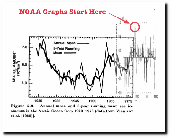
richard, late 1978 is when satellites started
recording useful data. notice how uah
data starts then?
no conspiracy
No, just very convenient for the AGW agenda.
1979 was peak cold and peak sea ice.
I’m sure the people living yup there are rather grateful for the brief respite from the extreme levels of the late 1970’s
Why does anyone wish them to have to put up with that, yet again ??
The AGW AGENDA really is anti-human.
“late 1978 is when satellites started recording useful data”
You mean politically useful data. There is a lot of older satellite data, some of it going back to 1960, and essentiall complete coverage from the early ´70s. Look here for example:
https://ntrs.nasa.gov/search.jsp?R=19870015437
Actually, the Nimbus satellite from the early 1960s took fairly good pictures of the sea ice.
Walt Meier from the NISDC went back to these pics and reconstructed September (minimum that is) 1964 Arctic and Antarctic sea ice extent. It was definitely lower in 1964 than in 1979 (more like the 1990 sea ice).
September 1964 was 6.8 million km2, similar to 1990.
http://nsidc.org/monthlyhighlights/2013/04/glimpses-of-sea-ice-past/
https://www.the-cryosphere.net/7/699/2013/tc-7-699-2013.pdf
Clearly the prior data was useful, just ignored. Also, recording atmospheric T from satellites is not as simple as visual records of sea ice.
Where’s Griff gone when we’re dissecting his dead horse?
david a – what prior data?
why does uah’s model — uah being
known as
vocal skeptics, start in late 1978?
And we know that it started cooling from the 1940s. So this begs the question, if 1964 was similar to 1990, what would say 1950 be similar with? Is the ice today, really less than it was in 1940/1950?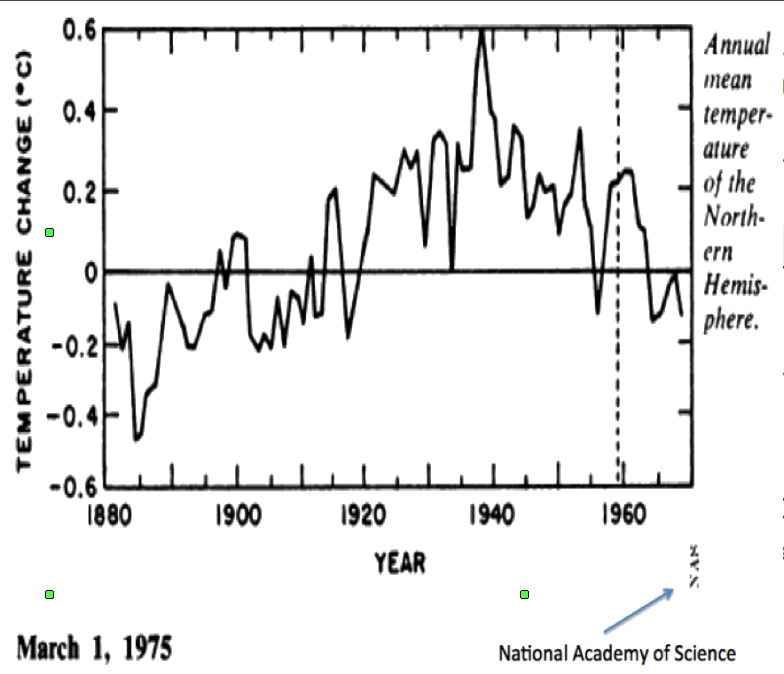
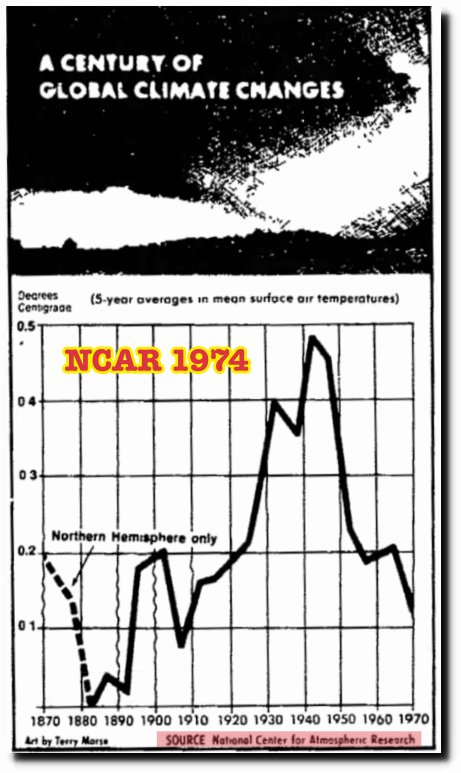
richard verney August 17, 2017 at 5:36 pm
I posted the below data to supplement the comment by Latitude August 17, 2017 at 4:09 pm in which he provides a plot of Arctic Ice going back to 1975.
The plot below goes back to 1925 and should be seen in conjunction with the plot set out by Latitude. One can see that in around 1940 there was less than 5 million sq km of ice, ie., even less ice than today.
The warmists like to cherry pick the 1979 date since it best suits their meme.
And you and a few others like to cherry pick Vinnikov’s graph even though it certainly doesn’t cover the same area as the satellite data. Of course you don’t know what area is covered either and certainly won’t make any effort to find out (it was published in a Russian journal). If it were covering the same area as the current measurements do, Vinnikov’s data say that the yearly average in 1960 was about the same as the current extent!. You also like to line it up with the early NOAA satellite data, which equates the 0 anomaly of that data to the Vinnikov data, which certainly wasn’t 6.7×10^6 km^2.
I take it that most people commenting on this site are scientifically literate which means that one should not need to spell out the basics, such as any raw data that has undergone adjustment is no longer data, and a reconstruction should be seen as a reconstruction and nothing more than that and any reconstruction comes with very wide error bounds, and it is important to compare like with like. But sometimes we simply do not have like for like data and in which case, the reader needs to be circumspect of any comparison.
For example the time series land based thermometer record is a reconstruction and should be viewed with great caution because of the wide error bounds that come with reconstructions. It also never compares like for like data since the data sample set in say 1900 is not the same data sample set 1920 which is not the same data sample set in 1940 which is not the same data sample set in 1960 which is not the same data sample set in 1980 which is not the same data sample set in 2000 which is not the same data sample set in 2016. I do not consider it necessary to set out these caveats whenever information is posted.
Vinnikov sought to make an estimation of the area of Arctic Ice over time. The satellite, via a different process, is attempting to do something similar. Everyone knows that Vinnikov did not use satellite data for his reconstruction of 1920s to 1940s, and this ought not need to be spelt out since I would expect everyone to know that this was before the first rocket was fired into space. Also there is no accepted definition of sea ice as the recent change to the DMI plots establishes.
There may well be differences in methodology, but even if this is questioned, Vinnikov shows (within the limitation of his data and methodology) the profile of Arctic Ice from which one can see that it has varied substantially between 1920 and 1975. There have been large ups and downs, and there was a lot less Arctic Ice in 1975 than there was in the late 1920s.
Even though the IPCC accepts that manmade CO2 emissions prior to the early 1950 cannot account for change, one can see from the Vinnikav reconstruction the dramatic loss in area of Arctic Ice between the late 1920s and 1954. This change is dramatic and natural, and confirms that the recent loss (1979 onwards) is not unprecedented. Don’t overlook that Vinnikov is one of the lead authors of Chapter 7 of the IPCC First Assessment Report.
Finally, I will briefly comment upon the criticism you levy at me personally. If you had read my comments, you would have noted that I often state that sceptism is a two way street and that I am equally sceptical of all evidence in support of AGW as I am of evidence that goes against AGW, and I frequently state that the data is not fit for purpose (it cannot withstand the rigours of ordinary scientific scrutiny). the reason why there is a debate on AGW (particularly cAGW) is because of unfit data. If the data was good and sound, we would not be having this debate at all. Anyone who regularly reads this site should know that the data is not fit for purpose, and once again it ought not be necessary to set out that caveat every time one sets out evidence, reconstructions or data etc.
the satellite group at uah
adjusts data all the time — huge changes
going from v5.6 to v6!
in fact, their “data” comes
from a model!
adjusting raw data is standard in
all fields of science.
When the sun has a lot of sunspot activity there are a lot more coronal mass ejections. These depending on their severity can involve the sun ejecting billions of tons of plasma into space with if they occur on the Earth facing disk, some of it penetrating Earth’s magnetic shield and giving us great auroras.
To get an idea of what is possible the X class flares on March 10-12 2012 caused Earth’s thermosphere to absorb some 26 Billion kilowatts of energy (enough to power New York for two years). Fortunately 95% of this was reradiated back into space within a couple of days.
A more interesting CME came from sunspot 1692 on March 17, 2013. It was a long duration (36 minute) M1 flare aimed at Earth’s northern hemisphere. Although again much of the energy got reradiated back into space enough of the protons were directed by Earth’s magnetic field to the North Pole where their energy (according to NASA) increased the temperature of the stratosphere by 60 deg C, which in turn was sufficient to reverse the polar vortex for a time and cause the arctic oscillation index to go below -5 for several days.
This also caused an enormous high pressure cell (1074 mb) over Greenland. This, of course, messed up the jet streams and caused an unusually cold spring in much of the Northern Hemisphere.
So the point I am making is that when the sun is very active there will be increased CME’s hitting Earth and some of their energy will affect the atmosphere above the arctic circle. When it is very inactive the atmosphere above the arctic circle will be less influenced
very interesting observation.
Except that temperatures plunged particularly low a from week earlier from around the 10th March 2013.
A little contemporaneous perspective.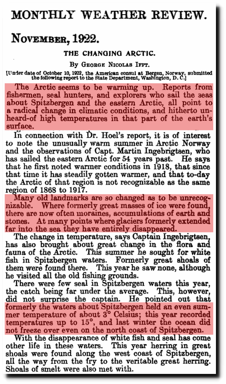
http://www.waclimate.net/climate-history.html has a convenient collection of about 70 linked newspaper stories dating back to the 1870s that report the latest climate crisis claims, many dealing with Arctic ice estimates. I chuckle that the most recent from 1974 is a research paper titled A Study of Climatological Research as it Pertains to Intelligence Problems.
Forty three years later, I don’t think the problem has been solved.
Don’t overlook that temperatures in the Arctic do not show a massive amount of warming.
http://notrickszone.com/wp-content/uploads/2017/04/Arctic-Temperatures-1920-2017-HadCRUT4.jpg
I note that the period from the 1920’s to 1940’s shows spikes of high anomalies. This is consistent with the marine environment mode being in effect. Lots of open water. So approximately 80 years later (2000) we were at the same point of this heat rejection cycle. The ice will grow over the next 40 years to a maximum similar to 1979.
Humlums graf has been tempered with, read the fine print under the graf an look up the original paper, Gillet et al.(2008) It’s much warmer in the artic, now than back in 1940.