In honor of Google’s latest diversity kerfuffle, I continue with my diversity initiative on WUWT with a guest post by Nick Stokes.~ctm
By Nick Stokes,
There is an often expressed belief at WUWT that temperature data is manipulated or fabricated by the providers. This persists despite the fact that, for example, the 2015 GWPF investigation went nowhere, and the earlier BEST investigation ended up complementing the main data sources. In this post, I would like to walk through the process whereby, in Australia, the raw station data is immediately posted on line, then aggregated by month, submitted via CLIMAT forms to WMO, then transferred to the GHCN monthly unadjusted global dataset. This can then be used directly in computing a global anomaly average. The main providers insert a homogenization step, the merits of which I don’t propose to canvass here. The essential points that you can compute the average without that step, and the results are little different.
The accusations of data corruption got a workout with the recent kerfuffle over a low temperature reading on a very cold morning at Goulburn, NSW in July, so I’ll start with the Bureau of Meteorology online automatic weather station data. I counted recently a total of 712 such stations, for which data is posted online every half hour, within ten minutes of being measured. You can find the data by states – here is NSW. You can find other states from the bar at the top, under “latest observations”. Here is a map of the stations in NSW in this table:

For context, I have marked with green the stations of Goulburn and Thredbo top which had temperatures of below -10C flagged on that very cold morning in July. On that BoM table, you can see stations listed like this (switching now to Victoria):

I switched because I am now following a post from Moyhu here, and I want a GHCN station which I could follow through. But it is the same format for all stations. This data is from 4 December 2016, and I have highlighted in green the min/max data that will flow through (unchanged except for possible quality control flagging) to GHCN unadjusted. It shows for Melbourne Airport, the most recent temperature (22.4) at 7pm, various other data, and then the min and max, along with time recorded. The min is incomplete; it showed the latest 7pm temperature, but would no doubt be lower by 9am the next day, which is the cut-off. The max probably wouldn’t change. You can see the headings by linking to the page here.
If you click on the station name, it brings up a full table of the half-hourly readings for the last three days, in this style:

Apologies for jumping forward to now (7 Aug), but I didn’t record this back in December. It shows the headings relevant to the above too; the top line is present (a few minutes ago), going back. Now you can see that this has to be automated; no-one is hovering over this stream of data with an eraser. If you click on the “Recent months”, it brings up the following table (an extract here, and we’re back in Dec 2016):

That was taken at the same time (just after 7pm, 4 Dec), and you’ll see that it shows the minimum attributed to Sunday 4th (before 9am), at 9.1, but not yet the max. If you look below that table you’ll see a list of the last 13 months linked, for which you can bring up the complete table. Here is what that Dec 2016 table now looks like:

…
The max of 31.7 is there; the min went down to 15.7. The other data hasn’t changed. Further down on that page, as it appears now, are the summary statistics for the month:

At the end of Dec 2016, that was transmitted to the WMO as a CLIMAT form, which you can see summarized at the Ogimet site

…

You can see that the min and max are transmitted unchanged. The mean of the two has also been calculated and is marked in brown. If you want further authenticity, that site will show you the code that the met office transmitted.
Finally, the CLIMAT form is transcribed into the GHCN unadjusted file, which you can see here. It’s a big file, and you have to gunzip and untar. You can also get a file for max and min. Then you have a text file, which, if you search for 501948660002016TAVG (which includes the Melb code) you see this line:
![]()
There is the 19.5 (multiplied by 100, as GHCN does). The other numbers will appear in the GHCN TMAX and TMIN files.
You can even go through to the adjusted file, and, guess, what, it is still unchanged. That is because homogenization rarely modifies recent data. But older data may be. GHCN unadjusted does not change, except if the source notifies an error. There are quality controls, which don’t change numbers, but may flag them.
There have been endless articles at WUWT about individual site adjustments, but no-one has tried to calculate the whole picture of the effect of adjustment. With the unadjusted vs adjusted files, it is possible to do that. I have been calculating a global anomaly every month, using the unadjusted GHCN data with ERSST. The June result is here; there is an overview page here, with links to the methods and code. This post compares the result of unadjusted vs adjusted GHCN; the difference is small. Here from it is a plot from 1900 to start 2015 showing TempLS (my program) unadjusted (blue) vs adjusted (green) and GISS (brown), 12 month running man. It’s an active plot, so you can see more details at the linked site.

If you want more convenient access to the station data, I have a portal page here. The heading line looks like this:
![]()
The BoM AWS link takes you to this page, listing all station names with links to their current month data page. BoM also posts the metadata for all their stations, and that link takes you to this page, which lists all stations (not just AWS, and including closed stations) with links to metadata. The GHCN Stations button links to this page, which links to the NOAA summary page for each GHCN station by name, or if you click the radio buttons, to station annual data in various formats.
Summary
I have shown, for Australia (BoM) at least, that you can follow the unadjusted temperature data right through from within a few minutes of measurement to its incorporation into the global unadjusted GHCN, which is then homogenized for global averages. Of course, I can only show one example of how it goes through without change, but the path is there, and transparent. Those who are inclined to doubt should try to find cases where it is modified.
Wonderful.
A post by Nick Stokes on raw data, GHCN AND GLOBAL AVERAGES.
–
By a master of evasion.
“Nick Stokes Tuesday, July 8, 2014 GHCN Adjustments are much larger in US than ROW. I was a little surprised that the positive bias had increased substantially, though still not huge. There has recently been a lot of talk about USHCN adjustments, and I did some plotting in my most recent post. GHCN v3 just uses USHCN, including the adjustment method, for its US data. So I thought the rise might well be partly due to the US component and TOBS. the trend differences caused by adjustment to stations with 60 years data were 0.0355 °C/decade for US, 0.0248 °C/decade for ROW, and 0.0284 °C/decade combined.”
–
His mate Zeke Hausfather says raw data is massaged,
“May 12, 2014 at 3:00 pm The difference is straighforward enough. Even if you use monthly rather than annual averages of absolute temperatures, you will still run into issues related to underlying climatologies when you are comparing, say, 650 raw stations to 1218 adjusted stations. You can get around this issue either by using anomalies OR by comparing the 650 raw stations to the adjusted values of those same 650 stations. The reason why the 1218 to 650 comparison leads you astray is that NCDC’s infilling approach doesn’t just assign the 1218 stations a distance-weighted average of the reporting 650 stations; rather, it adds the distance-weighted average anomaly to the monthly climate normals for the missing stations. This means that when you compare the raw and adjusted stations, differences in elevation and other climatological factors between the 1218 stations and the 650 stations will swamp any effects of actual adjustments (e.g. those for station moves, instrument changes, etc.). It also gives you an inconsistant record for raw stations, as the changing composition of the station network will introduce large biases into your estimate of absolute raw station records over time. Using anomalies avoids this problem, of course.”
–
His mate Mosher, wrong as usual, hence corrected
Zeke (Comment #130058) June 7th, 2014 at 11:45 am
“Mosh, Actually, your explanation of adjusting distant past temperatures as a result of using reference stations is not correct. NCDC uses a common anomaly method, not RFM.
The reason why station values in the distant past end up getting adjusted is due to a choice by NCDC to assume that current values are the “true” values. Each month, as new station data come in, NCDC runs their pairwise homogenization algorithm which looks for non-climatic breakpoints by comparing each station to its surrounding stations. When these breakpoints are detected, they are removed. If a small step change is detected in a 100-year station record in the year 2006, for example, removing that step change will move all the values for that station prior to 2006 up or down by the amount of the breakpoint removed. As long as new data leads to new breakpoint detection, the past station temperatures will be raised or lowered by the size of the breakpoint.
An alternative approach would be to assume that the initial temperature reported by a station when it joins the network is “true”, and remove breakpoints relative to the start of the network rather than the end. It would have no effect at all on the trends over the period, of course, but it would lead to less complaining about distant past temperatures changing at the expense of more present temperatures changing”
–
That about sums up the issue.
And why Nick Stokes can state a seemingly obvious truth while knowing the effect is a lie.
–
Adjustments are made all the time to raw data.
These adjustments keep the present, like today, correct after all the adjustments [homogenization] are done.
But all past data is continually changed downwards. see Zeke above.
Nick does not show this.
Mosher does not show this.
Zeke does not show this.
Yet ask Nick to show the same data as calculated 1, 2, 3 or 10 years in the past on this date and a funny thing happens.
All the data he gives today for the past is different to the same data when calculated at those past dates.
Ask him.
In one months time all the past data will be different.
Ask him.
Worse, as Zeke says, the ”RAW ” data they show is actually the adjusted down computer derived version, not the real raw data at all.
–
Notice Nick never shows the real Raw data side by side with the adjusted so called raw data or the end product that he shows.
Anyone able to put one up please.
Its posted for you to see for yourself.
http://berkeleyearth.lbl.gov/auto/Global/Raw_TAVG_complete.txt
And we did a whole post on it at Judith’s
angech, for years you ask the question about the number of stations. I give you the answer, and you then claim I never gave you the answer. or you change your question after I give you what you ask for.
I even gave you code.
I even posted code in response to your questions.
The whole point of asking people to show their work is for you to check it and then say
I checked, and yes.
or
I checked and no.
Otherwise you give skeptics a bad name. When I demanded code from Hansen and he gave it,
My demands stopped. he gave me the tools i needed to do my own checking. to see for myself.
I made him a promise. If he gave me the code I would never bother him with homework.
if he gave me his power ( his code, his tool) Then it was my responsibility to work with that.
Not to ask him to change the code, or output different options, or compile it for me.
But when Phil Jones conspires to dodge FOIA requests and threatens to delete data and emails that’s perfectly fine.
“Why should I show him my work? He is only going to find something wrong with it?”
“that’s perfectly fine”
I seem to remember that Steven wrote a book about it.
“When the BOM amends its own record (as it did at Goulburn) does it then transmit a supplemental record to GHCN?”
Normal process is for the met office to submit a revised CLIMAT form. If GHCN finds an error, they request that, else just flag the error. That happened back in April, when China submitted a March form with a whole lot of February data. Within a few days they submitted a revised form, which went promptly into GHCN (and was then used by GISS when they posted for March).
There are some spectacular errors in GHCN unadjusted, eg 86°C for La Paz, Bolivia, June 2010. It is flagged though, and doesn’t make it into the adjusted file. Clearly a decimal point issue. I guess it’s hard to get a revised form from Bolivia.
As for older records, there isn’t a CLIMAT mechanism. I expect BoM would notify GHCN, and probably the record would be flagged. The pre-1992 part of GHCN comes from a major funded project which sought, digitised and archived old records. There was no expectation that either the supplier or GHCN would maintain them. GHCN V1 was issued on DVD.
ps I should also say that BoM submits monthly records only, so fluctuations on the day won’t appear. Also Goulburn is not a GHCN or ACORN station. It isn’t used in any published average.
“Your version has a bit of a “so what if it is wrong” ring about it.”
No, the ring is “why would they do it?”. This is in response to the folk who think the BoM has staff dedicated (on a Sunday morning) to scrubbing up the records of places like Goulburn that are never going to be used for anything. And no, I don’t think they do that scrubbing for blessed stations either.
Nick Stokes has used the GISS history data page. I think that it is a kind of the problem. Here I show two figures with temperature trends from the original data sources. when it was published – not the GISS historical data page, which I do not trust.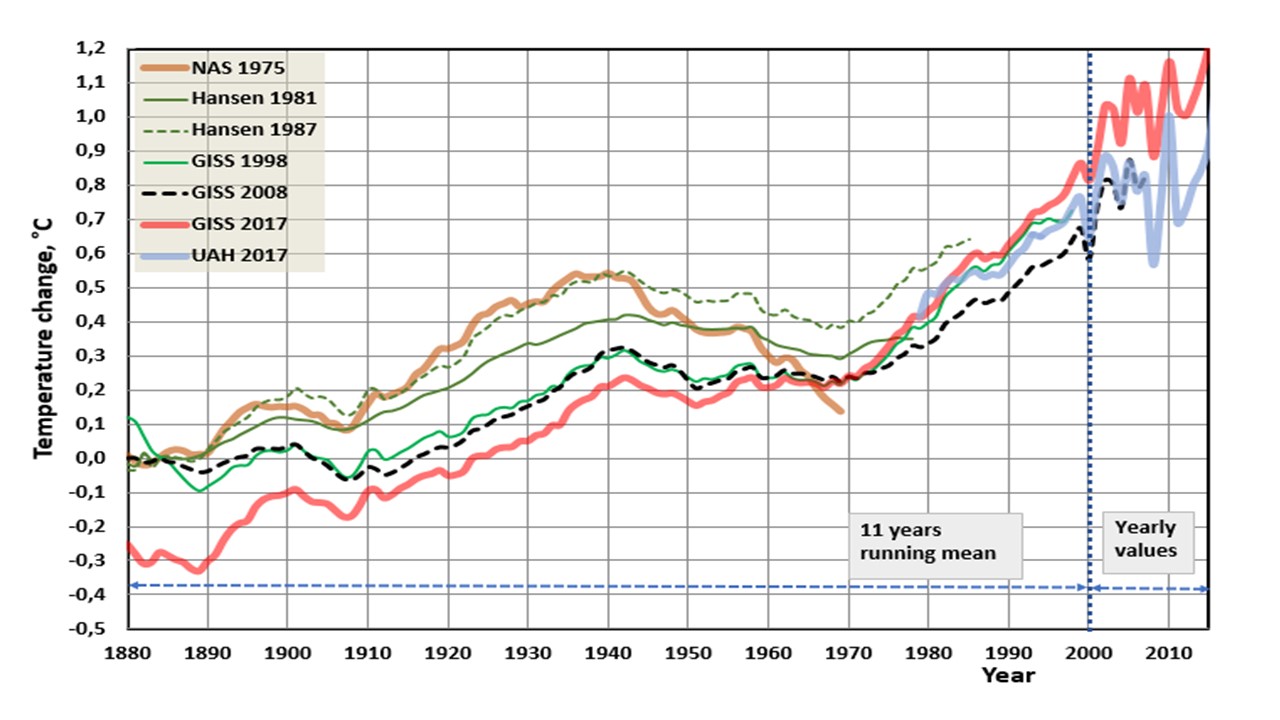
I think that the NAS (National Academy of Sciences) and UAH data are the most trustworthy data sets. The NAS data publication was composed by the committee and the chairman was Verner E. Suomi. Suomi is a Finnish word meaning Finland – my home country.
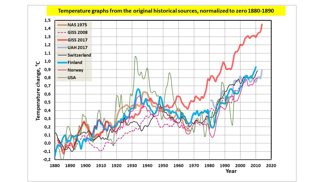
Her is another figure showing temperature graphs of some other countries.
Dr. Antero Ollila
“I think that the NAS (National Academy of Sciences) and UAH data are the most trustworthy data sets.”
But data of what? NAS and GISS 1981 are of NH, land only (and very few stations). UAH is troposphere. Hansen 1987 was based on met stations only, no SST. GISS since 1998 is land/SST. There is no use comparing such disparate things.
The GISS History page gives you not only graphs, but the numerical data (as text or CSV). You can check at least some of that with the Wayback machine, and also of course with the plots of the time..
FUnny guy Dr. Antero Ollila
Doesnt post data and distrusts those that do.
if we played skeptic to the “good” doctor we would ask for
His data sources and proof that he actually hasnt altered them.
“And just compare GISS 2008 to GISS 2017. Why there’s around a half a degree of manufactured global warming right there!”
Is the Kremlin whispering this? It came up here above too. And as I showed there, it is nothing like the truth.
“Nick, Aveollila stated his sources. He says that his graphs “
Where? I see no graphs or sources for that.
And none from you either. Where do you get that “half a degree”?
Aveollila says that he prefers his graphs to GISS. I far prefer GISS. I did my own, using a Wayback download of a 2005 GISS TS+SST file, and a copy I have of a 2015 file. Here is the difference plot, subtracting 2005 from 2015
And here is an extract from the GISS history file above, with 2016-2002
Very similar,and nothing like a 0.5 degree difference in warming. In fact, since 1880 not much change.
“Nick, it’s a shame you couldn’t locate the “official” GISS graphs as published in the same years as Aveollila (2008 and 2017). As I understand his point he is saying that GISS records are unreliable and subject to arbitrary amendment after the fact.”
Well, you could try. The fact is that I got the 2005 data from the WayBack machine (here), as posted in 2005. GISS can’t amend that. And I plotted it, and it matches the GISS history page for 2002 vs 2017 (the big changes were around 2011). The 2015 data is from a file I stored at the time, but it is negligibly different from current.
GISS data begins in 1880, and according to the polot I showed, there has not been anything like a 0.5deg increase in warming due to version change since then. In fact, from 1880 to now, in that plot, very little.
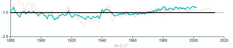
I showed a GISS history page plot on this thread here, with a link to source. It’s an active plot, and you can select years. This plot is an extract from that, showing the difference between old versions and current. The faint colors show those years, blue-green is 2015-2005. You can check the original, or look at the plot upthread.
“What does your second graph (the green and pink one) actually show?”
Again I refer to the full plot above, of which this is a fragment. It shows the difference between GISS as published in 2017, and in 2002, but displaced down by 1.5C (to fit the layout of that graph). My comparable graph shows the diff between 2015 and 2005.
GISS History page. All will be revealed.
“It is the veracity of the GISS history”
You asked what the pink curves are. I have said many times that the plot comes from the GISS history page. That will tell you these answers. It’s much better to go to the source, since it is an active plot.
Forrest Gardener said: “Oh Nick. It is your answers I am seeking. Your refusal to answer even simple questions about YOUR graphs can only serve to reduce your credibility.”
No, it serves to undermine yours, not his.
For anyone who is interested in the National Academy of Science (NAS) plot of 1975 and the Hansen 1981 plots, I posted these at richard verney August 9, 2017 at 1:16 am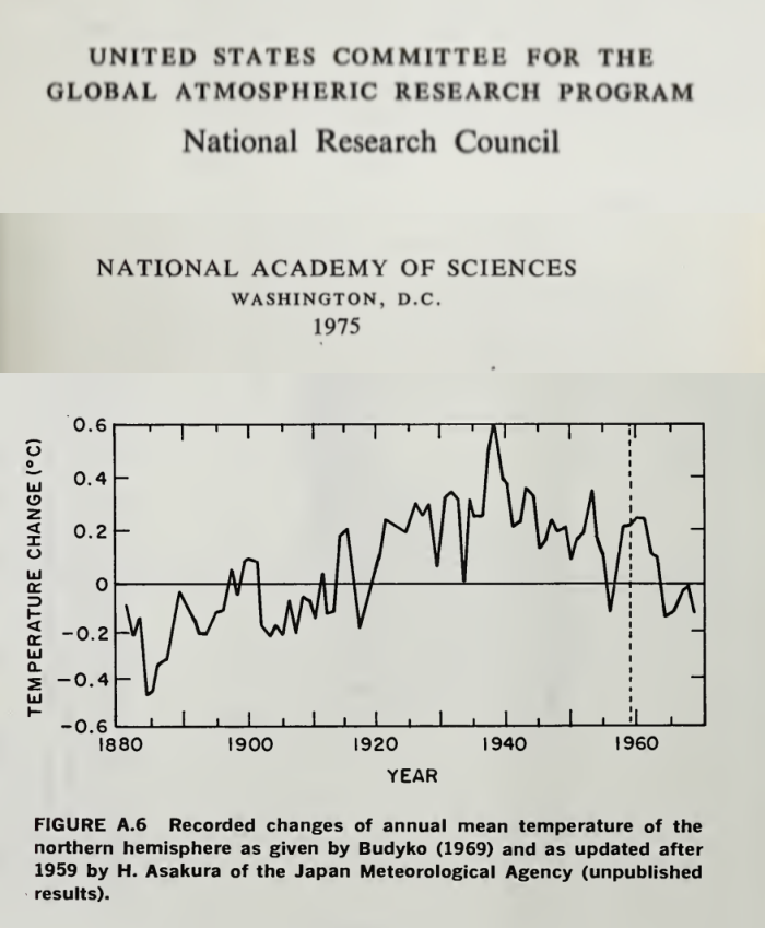
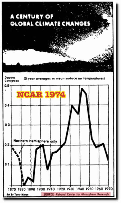
For ease of reference, I set it out again:
I also set out the NCAR 1974 plot:
These are Northern Hemisphere plots. The Southern Hemisphere is too sparsely sampled and there is all but no historic data of the Southern Hemisphere, a point Made by Phil Jones & Widgley in their 1980 paper, and noted by Hansen in his 1981 paper. Indeed, in the Climategate emails, Jones went as far as saying that most of the Southern hemisphere data is largely made up,
“That is because homogenization rarely modifies recent data.”
When it should adjust for a blatant jump in maximum temperatures when switching to AWS.
Maximum temperatures are usual higher than half hour readings, by degrees sometimes. You occasionally see max readings almost a degree higher than minutes either side.
Minimum temperatures in arid regions vary a lot with differences if degrees in the short distance to the ground. How is it possible that 3 minimum readings are the same and 0.1° above the old record for August?
http://www.bom.gov.au/jsp/ncc/cdio/weatherData/av?p_nccObsCode=123&p_display_type=dailyDataFile&p_startYear=2014&p_c=-1156224100&p_stn_num=076031
For a comparison, the nearest station had a lot more variation
http://www.bom.gov.au/jsp/ncc/cdio/weatherData/av?p_nccObsCode=123&p_display_type=dailyDataFile&p_startYear=2014&p_c=-442182359&p_stn_num=047016
-2.6°C was the new Aug record for that station.
“How is it possible that 3 minimum readings are the same and 0.1° above the old record for August?”
How is it impossible? They were all very cold mornings. It doesn’t seem to be due to any aversion to breaking the record – the following morning was lower at -3.1.
Eventually. Don’t you think another -2.3 would have been taking things too far?
You keep dreaming up more and more implausible conspiracies. So they tried to hold up the record (why?) in Mildura, only to then let it happen. But in the Lake Victoria site you linked, there seemed to be no such reluctance. The record was set without apparent hindrance.
The kerfuffle is that there was cutoff on minimum temperatures. I wouldn’t read too much into it if it were only two days but three and 0.1 degree above the old record is too unlikely to be a coincidence. Add to that a couple of other examples of BOM doing this and you dismiss it as implausible conspiracy theory.
Because scientists are so honest?
“you can follow the unadjusted temperature data right through from within a few minutes of measurement to its incorporation into the global unadjusted GHCN, which is then homogenized for global averages”.
Ah the irony, an article about non-adjustment that dutifully ends in an homogenization adjustment.
“With the unadjusted vs adjusted files, it is possible to do that. I have been calculating a global anomaly every month, using the unadjusted GHCN data with ERSST. ”
Homogenisation makes individual stations more like what the temperature for the area is estimated to be. The latter pretty much determines the global anomaly. It actually damning that the large changes to stations makes such a little difference. This was highlighted by a similar plot for Australia where large areas do not have actual data but places like Warburton (only station in an area for a few percent of Australia’s total) has only estimated data for the base period. Apologies for not having the link but it was pointed out that year after year, the daily temps were exactly the same for that site.
Law of large numbers.
The LLN only applies when one has many measurements of the same thing. If one took 5000 simultaneous measurements of temperature at a site, one would be justified in using the LLN. Having one-time measurements at 5000 different sites does not allow the use of the LLN.
If I measure the length of a board 5000 times, I can use the LLN to determine the precision of the mean of the measurements. I can’t measure 5000 different boards one time and use the LLN to claim that I know the length of the “average” board to the same level of precision.
You need stationarity.
“The LLN only applies when one has many measurements of the same thing.”
That’s not true. It applies whenever there is cancellation. It applies to polling, for example, where you average many different peoples’ responses. The uncertainty of the mean drops proportional to 1/sqrt(N).
“It applies whenever there is cancellation. ”
Show that is the case. Data has been homogenized and estimated by gods?
Aah, polling!
Well, pollsters are never wrong, so obviously their methodology is flawless.
“data ceases to be data when it is altered”
In fact what is homogenised is not the original reading. It is the monthly average, already a calculated result. And there are properly different ways of calculating that average. TOBS, for example, takes account of the fact that some of the results written down for a particular day really belong to an adjacent day.
But the real point is that for use in computing a global average, a station is taken as representative of a region. That is a choice, and can be varied. If you think that station is, at that time, not representative, you can use other data.
“what comes out of a computer is never data”
What comes out of a computer is the result of a calculation, eg monthly average.
It’s great that they developed such advanced technology in ~1900. Half-hourly automatic weather stations uploading to a global database and all that.
Nick, you’ve restored my faith in the climate record by proving how robust the record is going back so far in time.
Nick: A few points and questions. First, the GHCN data for Melbourne Int Ap only goes back to Jan 1970. How did you get a plot of those temps back to 1900 to compare?

Second, I checked the GHCN data for the first four days of December 2016 with your table, and they matched perfectly. However, when I ran the average TMIN and average TMAX for the month, I got 12.3C and 26.0C, while the CLIMAT report showed 12.7C and 26.3C. That’s quite a difference. How do you account for it? Here is the table of figures as reported from GHCN for Melbourne in December 2016:
Date	TMIN	TMAX

1-Dec-16     9.1	24.6

2-Dec-16	  10.8	22.7

3-Dec-16	    6.5	23.2

4-Dec-16	    9.1	31.7

5-Dec-16	  15.7	22.1

6-Dec-16	  11.4	21.2

7-Dec-16	    7.1	28.4

8-Dec-16	  15.1	23.4

9-Dec-16     8.2	18.3

10-Dec-16 10.9	19.3

11-Dec-16  11.7	20.9

12-Dec-16    7.8	33.0

13-Dec-16  16.4	35.9

14-Dec-16  14.5	19.9

15-Dec-16    9.0	19.7

16-Dec-16    7.9	24.1

17-Dec-16   12.6	21.5

18-Dec-16     6.7	18.6

19-Dec-16     5.5	30.9

20-Dec-16   13.8	23.2

21-Dec-16     9.6	20.4

22-Dec-16   13.8	22.0

23-Dec-16   11.7	32.0

24-Dec-16   14.6	34.9

25-Dec-16   13.5	36.6

26-Dec-16   25.5	30.0

27-Dec-16   16.7	28.0

28-Dec-16   18.7	38.2

29-Dec-16   19.2	31.2

30-Dec-16   16.0	25.2

Average	    12.3    26.0
I hope the formatting doesn’t get too screwed up in the above. God help me if I need the break tag…
Finally, I’ll present the scatter plot of the GHCN data for the Melbourne Int AP, GHCN station id ASN00086282. First, I’ll explain my methodology. I grabbed the ASN00086282.dly file from the GHCN site here. You’ll see the data goes back only to 1970. I used a Perl script to extract the TMAX, TMIN, and TAVG records into a tab-delimited file, and then used sqlldr to load the file into an Oracle database. Once there I deleted all of the temp records with -999,9 values and those with qflags with any failed flag present.
I then extracted the monthly averages for the entire record using the query:
with table_of_averages as (select t1.id, to_char(t1.timestamp,'MON-YYYY') as month, round((t1.temp+t2.temp)/2,1) as TAVG

                  from ghcn_temps t1 join ghcn_temps t2 on t2.id = t1.id and t2.timestamp = t1.timestamp

                  where t1.id = 'ASN00086282' and t1.data_type = 'TMIN' and t2.data_type = 'TMAX'

                  order by t1.timestamp)

select month||chr(9)||round(avg(tavg), 1) as mAvg from table_of_averages

group by month order by to_date(month, 'MON-YYYY');
That gave me the average of each TMIN and TMAX grouped by month. I then took the average of those monthly average over the period JAN-1981 through DEC-2010 to get my baseline, which was 14.7C. To get the monthly anomaly, I subtracted this baseline from each monthy TAVG. The results were interesting.
The standard deviation for the entire period JAN-1970 through DEC-2016 was 3.99C. Pretty wicked large. The minimum anomaly was -7.4C and the maximum was 9.6C.
Finally, I attach my scatter plot for the monthly anomaly with the monthly averages and a 13-month moving average. It sure looks a lot less scary than what we usually see.
I am sure that Nick and Mosh have seen Latitude’s flash graph as many times as I have. If I were trying to refute the proposition that continuing data adjustments have altered trends, I would begin by trying to show that the flash graphs are bogus for some reason. Good luck with that.
Wrong burden of proof.
The changes in GISS ( actually noaa) between 1999 and 2017 are related to data and methods.
1. The 1999 data that Noaa provided to giss was grossly inferior. read the history of v2 adjustments.
2. The methods have also changed.
As for changing trends? Yes, the last change to GISS methods ( 2010) LOWERED TRENDS
that is because they realized they overdid their previous “adjustments” and toned it down … committing fraud is hard work …
Sorry, but the bulk of the changes that made the 1930s cooler than the 1990s occurred before 2010. I have seen a flash graphs that predates 2010 that shows that clearly. There is a simple way to have honest science and that is to keep zealots away from control of the data.
“1. The 1999 data that Noaa provided to giss was grossly inferior. read the history of v2 adjustments.
2. The methods have also changed.”
Inferior, as in gave results that were very damaging to The Cause.
And the methods have changed alrighty.
That part is 100% for sure.
Changed from reporting what the temperature was at the time and place it was recorded, to making crap up and pretending it is the real world.
Thank you for writing the article.
Lets take some of the earliest estimates of global temperature we have.
NOT by a climate scientist, but by a steam engineer.
https://www.climate-lab-book.ac.uk/2013/75-years-after-callendar/
Hi Nick,
“All I can say is, if you think it is manipulated, you should be able to find out where.”
Could you explain the example of Darwin airport with no site changes but with 0.72 C per century cooling being adjusted to 1.2 C per century warming.
https://wattsupwiththat.com/2009/12/08/the-smoking-gun-at-darwin-zero/
Thanks,
Carl
“Could you explain the example of Darwin airport with no site changes”

Actually, that was my first ever Moyhu post, in 2009. One of the graphs has gone missing, but it’s mostly still there. There was a major site change in the move to the airport. But as I shoiwed there, if you look at all the adjustments (that was GHCN V2), the histogram of changes to trend looks like this:
It’s pretty symmetric. If you go cherry-picking, you can find ones like Darwin. Or like Coonabarabran, where it goes even more the other way:
Nick: A few points and questions. First, the GHCN data for Melbourne Int Ap only goes back to Jan 1970. How did you get a plot of those temps back to 1900 to compare?

Second, I checked the GHCN data for the first four days of December 2016 with your table, and they matched perfectly. However, when I ran the average TMIN and average TMAX for the month, I got 12.3C and 26.0C, while the CLIMAT report showed 12.7C and 26.3C. That’s quite a difference. How do you account for it? Here is the table of figures as reported from GHCN for Melbourne in December 2016:
Date	TMIN	TMAX

1-Dec-16     9.1	24.6

2-Dec-16	  10.8	22.7

3-Dec-16	    6.5	23.2

4-Dec-16	    9.1	31.7

5-Dec-16	  15.7	22.1

6-Dec-16	  11.4	21.2

7-Dec-16	    7.1	28.4

8-Dec-16	  15.1	23.4

9-Dec-16     8.2	18.3

10-Dec-16 10.9	19.3

11-Dec-16  11.7	20.9

12-Dec-16    7.8	33.0

13-Dec-16  16.4	35.9

14-Dec-16  14.5	19.9

15-Dec-16    9.0	19.7

16-Dec-16    7.9	24.1

17-Dec-16   12.6	21.5

18-Dec-16     6.7	18.6

19-Dec-16     5.5	30.9

20-Dec-16   13.8	23.2

21-Dec-16     9.6	20.4

22-Dec-16   13.8	22.0

23-Dec-16   11.7	32.0

24-Dec-16   14.6	34.9

25-Dec-16   13.5	36.6

26-Dec-16   25.5	30.0

27-Dec-16   16.7	28.0

28-Dec-16   18.7	38.2

29-Dec-16   19.2	31.2

30-Dec-16   16.0	25.2

Average	    12.3    26.0
I hope the formatting doesn’t get too screwed up in the above. God help me if I need the break tag…
Finally, I’ll present the scatter plot of the GHCN data for the Melbourne Int AP, GHCN station id ASN00086282. First, I’ll explain my methodology. I grabbed the ASN00086282.dly file from the GHCN site here. You’ll see the data goes back only to 1970. I used a Perl script to extract the TMAX, TMIN, and TAVG records into a tab-delimited file, and then used sqlldr to load the file into an Oracle database. Once there I deleted all of the temp records with -999,9 values and those with qflags with any failed flag present.
I then extracted the monthly averages for the entire record using the query:
with table_of_averages as (select t1.id, to_char(t1.timestamp,'MON-YYYY') as month, round((t1.temp+t2.temp)/2,1) as TAVG

                  from ghcn_temps t1 join ghcn_temps t2 on t2.id = t1.id and t2.timestamp = t1.timestamp

                  where t1.id = 'ASN00086282' and t1.data_type = 'TMIN' and t2.data_type = 'TMAX'

                  order by t1.timestamp)

select month||chr(9)||round(avg(tavg), 1) as mAvg from table_of_averages

group by month order by to_date(month, 'MON-YYYY');
That gave me the average of each TMIN and TMAX grouped by month. I then took the average of those monthly average over the period JAN-1981 through DEC-2010 to get my baseline, which was 14.7C. To get the monthly anomaly, I subtracted this baseline from each monthy TAVG. The results were interesting.
The standard deviation for the entire period JAN-1970 through DEC-2016 was 3.99C. Pretty wicked large. The minimum anomaly was -7.4C and the maximum was 9.6C.
Finally, I attach my scatter plot for the monthly anomaly with the monthly averages and a 13-month moving average. It sure looks a lot less scary than what we usually see.
James,
“How do you account for it?”
Well, something has gone wrong with your input. There are 31 days in December. Somehow your addition has left out the 27th, and relabelled the days following. The BoM data is here. The line missing is
27 Tu 16.7 28.0
” To get the monthly anomaly, I subtracted this baseline from each monthly TAVG. The results were interesting.”
You aren’t doing the anomalies right. You have to do an average for each month, and subtract from each month the anomaly for that month. That error is why you have a big seasonal effect in the anomalies.
Sorry, it is the 29th that is omitted, the line
29 Th 24.9 34.7
Since this is about 12° above the average (max and min), omitting it brings the average down about 12/30=0.4.
Nick: Thanks, I see my parsing error now. I’ll get that fixed. I think I get what you mean about the anomalies now, too. I’ll rerun my numbers later today.
“If you think that station is, at that time, not representative…”
And there is the source of the bias, right there, plain as day, spoken aloud.
Great sequence of postings.
I think it’s pretty clear from the multitude of references above that the data HAS been tampered with and is pretty much worthless now.
What’s good is that, with the latest satellite sets being under such close scrutiny, there is no longer room for the cheats to operate…maybe this explains the “Pause”?
Nick Stokes,
Thanks for your efforts here but I remain unconvinced by the data on a number of fronts. I preface my comments by saying I believe BOM does not deliberately tamper with data in any preconceived way and it does follow world best practice.
This leads to my first question: who is there to say that world best practice is indeed “best practice?” What are the objective tests?
You do allude to the recent BOM -10.4 C change to 10C. We still don’t really know the reason irrespective of what world best practice was being followed.
Now take a specific example Jan 7th, 2016:
Perth City, West Australia and
Swanbourne (a suburb of Perth within 8km of the central T station, 16m height difference for the T station):
Perth was 37.5C at 11.30am, peaked at 2pm showing 41.2C. By 11pm it showed 31.3C
Swanbourne 39.2C at 11.30am (peaked), was down by 2pm to 29.5C . By 11 pm it was 25.7C.
So the T diverged by more than 11C for two stations within 8km of each other and maintained a high difference throughout the day. So what was Perth’s avg T for the day? What gets entered into the books and passed on to the worldwide database!!?
I don’t make a habit of checking for this but have seen similar on other occasions. Anyone knowing the geography of Perth will readily understand why it can happen (Swanbourne is on the coast, Perth CBD is inland say 8km; varied sea breeze will be a main factor).
What does it say about the credibility that GISS projections and homogenization of T within 1200km is appropriate? Pure junk in my view. Unless specific physicality can be used to explain adjustments they are simply an excuse for self fulfilling “fixes.” I do have experience in iterative “homogenizing” in a different field where data drift in a specific direction is almost inevitable despite statistical dampening.
Ultimately all this is neatly captured by Tony Heller where he found that adjustments correlate exceptionally well with CO2 changes with an R2 of 0.98.
TonyM,
“What gets entered into the books and passed on to the worldwide database!!?”
Well, that’s easy. Neither. The current GHCN station is Perth Airport.
As you say, the fluctuation is just the famous Fremantle doctor. But none of this goes into the databases either. What does is the monthly average. And the sea breezes will have an effect, but smoothed out, and rather small. And in this case, not much at the airport.
But what counts for analysis is change. If they put the station at Fremantle, it would be cooler in summer. But there’s no reason to think the anomaly or trend would change. They are trying to measure climate.
On correlation, I plotted below some 1937-2016 trends, unadjusted GHCN. Here is a snapshot of the SW.
WA s big, and these places aren’t close. Perth to Kal is 600 km. Here are the trends in C/cen (quite high):
Perth 2.933
Albany 3.39
Cape Leeuwin 2.46
Kalgoorlie 3.79
Geraldton 3.99
Not perfect correlation, but not bad.
Nick Stokes,
Thank you for your thoughts.
Don’t know where you are getting your numbers but they certainly conflict with mine straight from BOM – unadjusted I assume. Perhaps if you simply look at the changes rather than generate linear trends it may be clearer (I will group and average two years at a time; my data is consistent with the means shown by BOM).
Albany:
1880 & 1881: max 18.2C, min 12.5C
1937 & 1939: max 20C, min 11.7C (there is no reading for 1938)
2015 & 2016: max 19.9C, min 12.9C
I would concede 0.75C incr per century against your trend of 3.39C from 1937.
Perth Airport: (no data prior 1945)
1945 & 1946: Max 24C, min 11.6C
2015 & 2016: max 25.3C, min 12.6C
I would concede 1.6C per century vs your trend of 2.93C
Kalgoorlie -Boulder Airport (no annual data prior 1943):
1943 & 1944: Max 25C, min 10.9C
2015 & 2016: max 25.7C, min 12.4C
I would concede 1.5C increase per century vs your trend of 3.8C.
The template to get my data is:
http://www.bom.gov.au/climate/data/index.shtml
If we can have such different views from similar data-sets then is it any wonder that there is such conflict in this area. Further I am not convinced that there is any role for homogenization. That was very much part of the thrust of showing such a disparity between sites only 8 kms apart. If data is to be changed then it should be be justified by the specific physics and not based on some generalized statistical massaging which from memory only had an R2 of just over 0.5.
I have not looked at the other sites in your set but I doubt if we will be any closer in trends.
TonyM
Sorry, you are right, or at least I was wrong. I had clicked on he wrong choice on my gadget. When I get the right one, I get these numbers:
TonyM
The last comment posted prematurely. Actually for an odd reason – WordPress seems to respond oddly to entering whitespace in edit mode within <pre. tags. Anyway, I’ll resume…
Sorry, you are right, or at least I was wrong. I had clicked on he wrong choice of trend years on my gadget. When I get the right one (1937-2016), I get these numbers C/Cen:
Albany doesn’t have a trend. the gadget allows up to, I think, 10% missing years, which probably accounts for the posting of some places that don’t quite go back to 1937.
Anyway, I think the point about correlation stands. I’ll redo the image I posted for WA. It’s actually a bit more uniform.
All I want is to use RAW unadjusted data
What we require is good quality data. One cannot make a silk purse with a sow’s ear, and the land based thermometer data set is a sow’s ear. We need to get back to basics so that we can work with good quality data.
All stations in the network should be audited along similar lines to the surface station project. That is the first task that BEST should have undertaken. It is not a task that should have been left to citizen scientists 9who have only so far looked at the US, and found the majority of stations sorely wanting)..
The best/prime 100/150 station in the Northern Hemisphere should be selected. These would be stations where there has been no station moves, no change in nearby land use, no advance of UHI, the best maintenance of screen and equipment, and which have the best practices and procedures (including record keeping).
These prime stations should then be retrofitted with the same type of LIG thermometer as used by the station in question in the 1930s/1940s calibrated in Fahrenheit or Centigrade, as appropriate for each individual station, and we should then observe temperatures using the same practice and procedure as used by each individual station, as the case may be. This will include the same TOB as applicable at each individual station.
In this manner, we will obtain RAW data for the period say 2017 to 2022 which can then be compared directly to the RAW data collected by that station in the 1930s/1940s without the need to carry out any adjustments whatsoever to RAW data.
There would be no attempt to constitute a Northern Hemisphere wide data set, or a country data set. Instead, RAW data from each station would simply be compared to the historic RAW data from that very station. The comparison would be on an individual station by individual station basis.
We would then be able to compile a list showing how many stations show no significant warming since that station’s historic highs of the 1930s/1940s, and how many stations show some warming, and the order of such warming.
I envisage that if we were to undertake such an experiment/observation, it would show that the vast majority of stations show no significant warming from their historic highs of the 1930s/1940s such that we could safely conclude that the Northern Hemisphere is about the same temperature today as it was in the 1930s/1940.
This type of experimentation would give us a quick check on whether the warming in the thermometer data set is likely nothing more than the way that data set has been compiled (with poorly sited stations, station drop outs, the shift to ever increasing number of airport stations, the drop out of high latitude stations etc) and/or incorrect adjustments for TOB, UHI, and station fill ins etc.
Why use 1930s/1940 as the RAW data reference point? The reason is twofold.
First we know that there was warming between 1920 to 1940 and that the 1930s/1940 were a high point.
Second, some 95% of all manmade CO2 emissions have taken place after 1940 so this will show whether there is any temperature increase coincident with these emissions. If there is little, or no temperature increase (at the prime stations selected), then whilst this will not prove that CO2 has no warming effect, it would at the very least suggest that Climate Sensitivity if any at all is low.
Richard V,
“I envisage that if we were to undertake such an experiment/observation, it would show that the vast majority of stations show no significant warming from their historic highs of the 1930s/1940s”,/i>
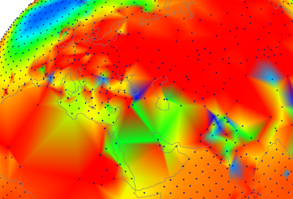
A raw data study is done here. The WebGL plot shows individual station trends, with shading to indicate interpolated trend, but with the color correct at the station. You can choose unadjusted or adjusted GHCN, and a variety of periods, but it sounds like you want 1937-2016, which is an option (button labelled un_1937-2016). You can click on or near any station to make it show the trend there.
Here is a screenshot of N America. It’s actually a good lesson on why TOBS adjustment is needed. Nothing is adjusted anywhere. US except for west is mostly blue – negative trend. But across the border in Canada, and even in Alaska, where the COOP system didn’t apply, the trend is uniformly positive.
And here is a screenshot of part of the Old World, again without TOBS issues. Again unadjusted, so a few stations are outliers. But overwhelmingly the station trends are positive and fairly uniform.
Sorry, I don’t know why that last plot didn’t show. It does if you click on it. But I’ll try again
.
Great visuals. But I don’t see patterns related to well mixed CO2-related Anthropogenic Global Warming. I see warming and cooling related to short and long term weather pattern variations typical of Earth;s oceans and quasi-permament atmospheric pressure systems. Am I missing something?
Thanks Nick for responding to me. I will look at the site.
However, one of the problems is that today’s equipment is not the same as the equipment used in the past, and has a materially different response time to any temperature variation. The inopportune passing of a cloud, or short rain shower can make a difference. the equipment today has a different standard of calibration compared to that of the past, and that too leads to problems/issues.
I want to replicate, as best possible, the past. That requires not simply using the same type of equipment and TOB as used in the past (on a station by station basis), but also ensuring that there is no material site change; that there is nothing that may pollute the data when comparing RAW data with historic RAW data.
What one wants to achieve is to obtain the best quality data where there is no need to make any adjustments whatsoever to the data, and in that manner, there can be no argument on the consequence of data adjustments (data ceases to be data once it has undergone adjustment – a point that you quite rightly seemed to accept above) and whether those adjustments were apposite.
What I am suggesting is a different paradigm to the way in which the data is collected and looked at. If you like, merely to act as a SANITY CHECK.
One of the problems with the land based thermometer time series data set is that we are never comparing apples with apples. It is impossible to see whether there has been any change in temperature between 1920 and 1940, or between 1940 and 1980 because we are never looking at the same sample.
The set sample in 1880 is not the SAME set sample as that used in 1900 which in turn is not the SAME set sample as used in 1920 which in turn is not the SAME set sample as used in 1940 which in turn is not the SAME set sample as used in 1960 which in turn is not the SAME set sample as used in 1980 which in turn is not the SAME set sample as used in 2000 which in turn is not the SAME set sample as used in 2016. Because of this variation in samples, the time series data set is worthless. It tells us nothing of significance about what has really happened over time. It is no more valid than assessing how the height of males has varied over time when using data collection the 1900s from a sample of US men, in 1920 from a sample of Italian men, in 1940 from a sample of Finish men, in 1960 from a sample of Spanish men, in 1980 from a sample of Dutch men. if the constitution of the sample changes over time, one can draw no valid conclusion from the data set, and therein lies one of the significant problems with the land based thermometer time series data set.
One of the issues is that we need an identical sample set so that we can make a valid comparison between now and then. We need to be able to compare apples with apples, if we are to be in a position to draw any worthwhile conclusions. This is one important reason why I suggest obtaining and using an identical sample set (ie., say the 150 best sited/most prime stations) and then retrofit these with the same type of historic equipment and employ the same historic practice etc.
You are absolutely right. BEST screwed up. They should have gone about their task in a completely different manner. They ought to have adopted a fundamentally different approach, ie., employed a completely different principle to the assessment of temperatures. Science is about experimentation, observation and data. In a numbers game, purity and quality of data is paramount. BEST ought to have extrapolated the best data, rather than working with the crud, and using a different algorithm to try and make a silk purse out of what is a sow’s ear. In effect, BEST simply took the same type of approach as used by the other agencies, and so it is not surprising that they show a similar outcome. One would expect this.
There is no need to look at the Southern Hemisphere. The fact is that the Southern Hemisphere is so sparsely sampled that there is no worthwhile data of the Southern Hemisphere. Even today, it is sparsely sampled, but historically (especially prior ARGO) it is useless. In the Climategate emails, Phil Jones went as far as saying that the Southern Hemisphere data is largely made up. Further, the majority of people live in the Northern Hemisphere and it is here that we have the best historic data, so we should, at any rate in the first instance, only look at the Northern Hemisphere.
All I want is to use RAW unadjusted data That eliminates data handling/data adjustment error, but obviously one needs to make sure that the RAW data is good quality data, ie., data that does not require adjustment.
What we require is good quality data. One cannot make a silk purse with a sow’s ear, and the land based thermometer data set is a sow’s ear. We need to get back to basics so that we can work with good quality data.
All stations in the network should be audited along similar lines to the surface station project. That is the first task that BEST should have undertaken. It is not a task that should have been left to citizen scientists (who have only so far looked at the US, and found the majority of stations sorely wanting)..
The best/prime 100/150 station in the Northern Hemisphere should be selected. Steven Mosher has often stated that data from 50 stations would be sufficient, and I consider that 100 to 150 would be an ideal set size. These would be stations where there has been no station moves, no change in nearby land use, no advance of UHI, the best maintenance of screen and equipment, and which have the best practices and procedures (including record keeping).
These prime stations should then be retrofitted with the same type of LIG thermometer as used by the station in question in the 1930s/1940s calibrated in Fahrenheit or Centigrade, as appropriate for each individual station, and we should then observe temperatures using the same practice and procedure as used by each individual station, as the case may be. This will include the same TOB as applicable at each individual station.
In this manner, we will obtain RAW data for the period say 2017 to 2022 which can then be compared directly to the RAW data collected by that station in the 1930s/1940s without the need to carry out any adjustments whatsoever to RAW data.
There would be no attempt to constitute a Northern Hemisphere wide data set, or a country data set. Instead, RAW data from each station would simply be compared to the historic RAW data from that very station. The comparison would be on an individual station by individual station basis.
We would then be able to compile a list showing how many stations show no significant warming since that station’s historic highs of the 1930s/1940s, and how many stations show some warming, and the order of such warming.
I envisage that if we were to undertake such an experiment/observation, it would show that the vast majority of stations show no significant warming from their historic highs of the 1930s/1940s such that we could safely conclude that the Northern Hemisphere is about the same temperature today as it was in the 1930s/1940.
This type of experimentation would give us a quick check on whether the warming in the thermometer data set is likely nothing more than the way that data set has been compiled (with poorly sited stations, station drop outs, the shift to ever increasing number of airport stations, the drop out of high latitude stations etc) and/or incorrect adjustments for TOB, UHI, and station fill ins etc.
Why use 1930s/1940 as the RAW data reference point? The reason is twofold.
First we know that there was warming between 1920 to 1940 and that the 1930s/1940 were a high point.
Second, some 95% of all manmade CO2 emissions have taken place after 1940 so this will show whether there is any temperature increase coincident with these emissions. If there is little, or no temperature increase (at the prime stations selected), then whilst this will not prove that CO2 has no warming effect, it would at the very least suggest that Climate Sensitivity if any at all is low.
As I mentioned above, there is no need to look at the Southern Hemisphere. It is mainly ocean, and there is simply inadequate historic data on it. But obviously if one wants to look at say the 20 most prime stations in Australia, that could be done as a separate task. One would need to carefully consider whether it is possible to conduct this experiment using data as far back as the end of the 19th century since it appears that it was very warm in Australia towards the end of the 19th century.
Nick:
The adjustments for Darwin airport occurred from about 1940 to 1990. An adjustment of 2 C over 50 years is about 0.4 C per decade. Your graph shows it as about 0.22. Did you divide by the full 80 or 100 years even though the adjustment was over 50 years? The warmists can point to the warming in the last half of the 20th century and you can say the adjustment over 100 years wasn’t so bad. I notice the Coonabaraban adjustments are over 100 years. Can you reverse engineer the Darwin adjustments? Do you have access to the program that produced a neat stepwise adjustment?
Also, you said the adjustments don’t account for UHI. Given that most sites are now in cities and airports, wouldn’t UHI be the biggest effect requiring adjustment? Since UHI makes recent readings higher, even if all other adjustments are legitimate, just ignore UHI would give a distorted picture.
Carl,
Adjustment is just adjustment. It’s usually a step change (or several). You can always pick out a subrange to get a steep slope. That is really cherry-picking. The histogram I showed has trends over the full data period of each station.
No, I can’t reverse engineer the Darwin adjustment. It was in any case with V2 GHCN. The datasheet for V3 Darwin is here. The adjustment seems to be rather less. It shows very clearly the dip about 1940-2 which is the period of wartime disruptions which eventually led to the transfer to the airport site in, I think, 1945. There were substantial site modifications in this period.
Nick,
Point taken. Thanks for taking the time to provide so much information. I would say that the Australian BOM figures might be much better than the US figures where Hansen et al had so much influence. In particular, I hope Anthony Watt’s photo collection of US sites couldn’t be replicated here.
My main issue with Global Warming has always been the second part of the theory: that a small warming due to the greenhouse effect would cause a major warming due to positive feedback. A system that has been as stable as the earth’s climate, even allowing for long periods of glaciation, can’t have strong positive feedback.
My other issue is that the theory assumes a steady upward climb. The fact that after adjustments and ignoring the UHI, there has been no warming since 1998 would invalidate that. Skeptics don’t have to explain the “highest ever” plateau. Warmists have to first explain the unpredicted pause, and then show why the small rise in the 20th century is different from the Medieval Warm Period, Roman or Egyptian warm periods.
I remain skeptical because the various adjustments all seem to be one way. The strangest is that the sea levels need to be adjusted upwards because the land is now rising but it wasn’t before.
Nick
As I see it, there are two possible approaches. We have a lot of data, but we know that there are a lot of issues/problems with the data. So what do we do?
We can either:
1. Assess the data, try and identify the problems/issues and consider what adjustments need to be made to deal with the issues/problems hoping by making these adjustments to improve the data., Or
2. We can discard any data where there are identifiable issues/problems and make a small set of only good quality data that is so good that it needs no adjustment whatsoever.
There are pros and cons with both approaches. The first approach is a larger set, but when you adjust data it is no longer data.n The second approach results in a smaller sample but the data remains data.
Thus the issue all boils down to whether the second approach will result in a sample set of sufficient size for the purpose to which it is being put. In my opinion, if we disregard the polluted data/the data where there are known issues and use only the data which is pure and of good quality we are left with a sufficient size of sample set. For that reason, I favour the second approach over the first approach.
Nick
You are a consummate mathematician, in fact one of the most qualified who comment on this site, so you must readily appreciate the problem that comes with a time series data set that has undergone the following changes;
And also look at how there has been a significant change/trend towards airport stations:
http://notrickszone.com/wp-content/uploads/2017/02/NOAA-Data-Manipulation-Urban-Bias-Airport-Temperature.jpg
Further, airports in the 1920s and 1940s are nothing like airports today. So even if an airport station was in the data set in 1940 and remains in the data set today, the airport in the 1940s may have had a grass runway, a very small terminal, and no cargo terminals etc. the Heathrow airport of today is nothing like the Heathrow airport of 1930s/1940.
https://realclimatescience.com/alterations-to-climate-data/
So much for Nick Stokes the fraud’s endless evil.
Nick Stokes,
It is common knowledge that Sydney and Melbourne are having more, longer, hotter heatwaves because of global warming.
That is, until you inspect the original data and the ACORN-SAT homogenised as well. You get these results, that show no such thing:
http://www.geoffstuff.com/are_heatwaves_more_severe_version2.pdf
Instead of trying to show a path through data, why not start with whether the story about the data is credible or not?
Geoff.