By Larry Kummer. Posted at the Fabius Maximus website.
Summary: News stories, in both local and national media, tend to describe climate change as a simple and omnipresent phenomenon. It’s not. Here we look at the surprising trends in US temperature and precipitation, and northern hemisphere snowfall.

There has been global warming during the past two centuries. But activists tend to attribute everything, anywhere, to warming. That’s not accurate. Warming is a complex phenomenon, not an omnipresent force.
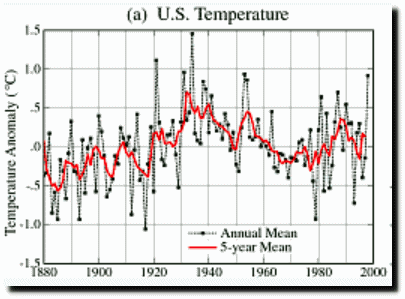
Look at the history of the continental US, with one of the longest and most accurate records in the world. It has warmed during the era of human-dominated warming (“more than half of the observed increase in {temperature} from 1951 to 2010 is very likely due to the observed anthropogenic increase in {greenhouse gases}”, per the IPCC’s AR5) at a rate of 0.30°F per decade (0.17°C) — oddly similar to the 0.33°F per decade (0.18°C) since the record began in 1895. But it has not done so smoothly, as activists often imply.
See this is graph of February temperatures, with the blue line showing flattish trend during the 25 years from 1983 to last month…

What does this graph tell us?
- Temperatures are volatile from year to year over small areas (the 48 states are 1.6% of the Earth’s surface). Both sides play the game of Record HIGH here! Record LOW there! Let’s be too smart for that.
- Ditto for temperature trends. Neither the flattish US February trend for 1983-2017 nor the steep cooling in February 1998-2017 of -0.61°F per decade (-0.34°C) proves global cooling. Nor does the steep warming of 9.7°F per decade (-5.4°C) of February 2010-2017 warn us of imminent incineration.
- Climate change is complex. That’s why we have the iPCC (almost forgotten by journalists) and the major climate agencies to explain to us what is happening.
Another example of our complex climate.
As the world warms do we get more snow and rain — or less? Alarmists spin simple stories attributing all droughts to climate change. But precipitation in the US has increased: “Over the 121-year period of record (1895-1915), precipitation across the CONUS has increased at an average rate of 0.16 inch per decade.”
Looking at the season just ended, Winter 2017 (Dec-Feb) in the continental US was the eighth wettest on record. Winter snow extent in the northern hemisphere was the ninth largest since 1967, and has been increasing at roughly 2% per year since 1967 — as shown on this graph.

What does the IPCC’s AR5 report say about droughts?
From the Summary for Policymakers…
“Increases in intensity and/or duration of drought since 1950: low confidence on a global scale, likely changes in some regions. Assessment of a human contribution to observed changes: low confidence.”

Conclusions.
Climate change is not a simple phenomenon, as often described by activists and journalists. They attribute all kinds of local or regional changes — such as in agriculture, diseases, animal populations and migrations. What they seldom do is show that the responsible factor (e.g., temperature or precipitation) has actually changed. That would often ruin the story.
Global warming is not a universal explanation for weather. There are large variously in climate change from region to region, due to poorly understood reasons. Extremes of weather are even more difficult to understand — they are a constant of history, with large decadal and even century-long cycles. Reducing these to simple stories is propaganda, not science.
For More Information
For more information about this vital issue see the keys to understanding climate change and these posts about the propaganda of climate change…
- Important: climate scientists can restart the climate change debate – & win.
- How we broke the climate change debates. Lessons learned for the future.
- A story of the climate change debate. How it ran; why it failed.
- Science into agitprop: “Climate Change Is Strangling Our Oceans”.
- Ignoring science to convince the public that we’re doomed by climate change.
- Put the stories about record 2016 warming in a useful context.
- A look at the future of global warming. Our political response depends on its trend.
My climate is changing. Spring is almost here.
We have great evidence that the wamunistas’ house of cards is breaking down.
Dilbert creator Scott Adams recently demonstrated, “You warmists are showing a lot of similarities to investment scammers. I’m with you, but you are discrediting the message.”
http://blog.dilbert.com/post/154082416051/the-non-expert-problem-and-climate-change-science
Also see
http://motls.blogspot.com/2017/03/scott-adams-sees-through-15-of-20-main.html
If a hip, cool guy that millenials follow undermines the catastrophic anthropogenic global warming scam, it may start a snowball cascade.
Motl’s mobile site is much more readable.
http://motls.blogspot.com/2017/03/scott-adams-sees-through-15-of-20-main.html?m=1
Spinning a simple story…
Even given no evidence either way whether average global temperatures are either rising, falling or staying roughly the same, let alone what is causing any such changes or even what the long term overall beneficial or detrimental effects will be, then there has been no reason, whatsoever, for the world, and particularly the western world, spending the £billions that have been spent on reducing CO2 emissions.
Frankly, with all the adjustments that we have seen to the measurements, I simply do not trust the data any more. If the “as recorded” temperature fields were easily accessed, I could put more trust in them. As it is, we have seen those go down the bit hole in general. Unless and until I can download and analyze the original data, conclusions based on these fields are very suspect.
Yes, I will state up front, that I do believe that the surface temperature increased over a lot of the 20th century. How much and why is a different matter all together.
Even the hallowed BBC cannot or will not reconcile
1. their weather forecasters’ remarks every day that their forecast temperatures will be 1-2 degrees lower in rural areas, and
2. Their on going preaching of CAGW/Climate Change evidenced by these same weather station records.
Weather Stations are predominantly in urban areas, or even if once in rural areas have become urban because of ongoing urban sprawl. The temperature drops advised are simply because of far less, if any, heat island effects in rural areas an effect increasingly more relevant given ever increasing energy usage. Rural areas are also far more extensive than urban areas which makes average temperatures even more disproportionately over-estimated.
I believe that the main problem with UHI lies with its effects in the past, not a big deal if the homogenisers could ignore it, but they don’t ignore it, it gets detected when it ends with a move to a better location, and is then treated as being persistent, falsely cooling the past:
https://climanrecon.wordpress.com/2017/03/06/temperature-homogenisation-errors/
Your observations are correct and have been documented many times in many places. Here is the change in U.S. land use in just 1/2 century: http://eoedu.belspo.be/en/profs/vgt-north-america-exurbs.asp?section=1.4.3
(see this image: http://eoedu.belspo.be/images/VGT/exurbs-3.gif). This phenomenon as well as illogical alterations of observed data make analytical changes on the order of 1 degree per century essentially meaningless.
cooling the past:
=============
if you cool the past, what happens in the future, when today becomes the past? They will end up getting cooled as well. And all the “record” temperatures made today? They are all suspect, because they can always be changed in the future.
Which is why the number 1 rule in data quality is to NEVER adjust the past. Because once you start, there is no end to it. The data will never be correct. It can always be changed so day in the future, making all your conclusions today invalid.
If a business does it, it is called “cooking the books”. For example: No one every adjusts the annual reports for 2014 in 2016. What you reported in 2014 is what you reported, warts and all. If you later in 2016 find a mistake in the 2014 accounts, you make the adjustment to the 2016 balances. Otherwise, there would be 2 sets of 2014 books. The originals, that were used by potential investors, and the revised that the courts will use to evaluate if the investors were treated fairly. No one would trust doing business under those circumstances.
Unfortunately, most academics have never worked in business and don’t have a clew about the lessons learned by industry.
BBC is in the bag for AGW. Not so hallowed. Or is it sarcasm?
I simply do not trust … I do believe
=============
why believe what you don’t trust? “I don’t know” is a way better basis for science than “I believe”.
Everyone should stop speaking of the temperature of the earth as if it were a thing in itself. It isn’t.
The warmists and alarmists have devised various indexes comprised of all sorts of disparate data sources, finagled the raw data, passed that through a mathematical blender which is itself getting constantly finagled, and they’ve produced numerals. Each day, new numerals — lots and lots of numerals — which disagree among themselves.
There is no other field of science where so many layers of conjecture are compiled into a great big wad and then spoken of as if the whole sorry mess were a thing.
I set out to see what the stations actually measured, and I do as little selection filtering as possible, and no other adjustments.
If you want to see this, follow my name, and the reports are all here
http://sourceforge.net/projects/gsod-rpts/
“Look at the history of the continental US, with one of the longest and most accurate records in the world.”
Longest, perhaps, but most accurate? Arguably, “yes”, but with serious qualifiers surrounding the poor siting and highly “fooled around with” data.
If you consider only long term rural stations, there has been no warming over the twentieth century. link Disturbingly we have the following:
“most accurate” is mighty low bar when it comes to climate records.
JohnWho,
“but most accurate? Arguably, “yes”, but with serious qualifiers”
Imagine if someone were to list the qualifiers for the long-term surface temp instrument data from eastern Europe, central Asia, Latin America, or Africa. Or from the South Pacific. The only valid qualifier for the surface instrument data from the poles is “don’t ask”.
So “most accurate” is imo a valid statement.
Maybe a valid statement, but see Mark W above.
“Most accurate”; positive connotation … good deal
“Least inaccurate”; whole different feel to it, but also (IMO) a valid statement.
Mark,
“Most accurate”; positive connotation … good deal”
Getting emotional about quantitative factors is the fast track to chaos. Leave that for the comp literature classes deconstructing Grimm’s Fairy Tales. It has no place in discussions of science and public policy.
I’m thinking more along the lines of “most accurate” meaning “very accurate” or “tmost accurate” would mean exactly the way it sounds – “the best we have”. The best we have could then still be not so good.
So, in this case, based on the known problems with the US data, the best data we have unfortunately still isn’t nearly “most accurate/very accurate” at all.
John,
“I’m thinking more along the lines of “most accurate” meaning “very accurate””
“very” and “most” are different words because they have different meanings. What you are saying makes no sense whatsoever to me.
Pointing out the subjective nature of a specific description of a quantitative factor is not getting emotional.
As further example, please think about sorting the following with respect to a scientific review/analysis:
“Accurate”
“Most accurate”
“Least accurate”
“Inaccurate”
“Moderately accurate”
“Least inaccurate”
“Most inaccurate”
Rank in order of data that would be best to use….
Not particularly surprising for regular readers of WUWT, though it would be for many who read the MSM.
There’s also Roger Pielke’s graph of hurricanes.
The chart is for landfall hurricanes, not total hurricanes. However this is a very welcome trend. The reason for why less are making landfall would be interesting.
Could it be the strength and direction of source wind?
The reason why fewer hurricanes are making landfall is simple — thanks to satellites, we can track more hurricanes that form and dissipate over the oceans.
Christopher Landsea did a study on this and found the entire increase in tropical cyclone activity was in minimal storms which formed for only a day or two.
“Climate change is not a simple phenomenon, as often described by activists and journalists. ” Activists and journalists are not a good place to get your information. Which is why it is particularly bad for people in positions of great power and influence to get their information from a narrow selection of TV channels and activist run websites.
The quality of media reporting on science is generally very poor, as sensationalism over-rides accuracy most of the time. Some specialist popular journals such as New Scientist do a better job.
So have a go at the reporting by all means, but don’t think this means that the scientists agree with these sensationalist stories. Generally they do not like it when their results are mis-represented to sell a few more copies.
” Reducing these to simple stories is propaganda, not science.” No, it is simply journalism. That is what it does, reduce the complex to simple stories to sell papers or views. Medicine is just as badly served as climate science.
I was going to say that this leads people to mistrust the media, and I still think that’s true.
While I was doing a bit of research to see if I was right, I stumbled across this. It finds that people’s trust in experts (such as media talking heads) depends on whether they think those experts have their best interests at heart. Bingo!
commieBob. That is an interesting article. The level of belief in the expertise of the scientists was still high in that example. Do you think that is the case here with climate scientists? My interpretation from many of the comments here is that there is a very low estimation of the scientists expertise in climate science.
” My interpretation from many of the comments here is that there is a very low estimation of the scientists expertise in climate science.”
Most of these “climate scientists” don’t do research to determine if the Earth’s temperature is rising and the climate changing because humans are burning fossil fuels. No, most climate scientists do their work in related fields and *assume* that CAGW is real, and then extrapolate from there. So their science may be valid if the Earth’s atmosphere actually overheated due to CO2, but they are assuming facts not in evidence, and their science is basically speculation.
What is mostly disparaged, and really galling about climate scientists on this website is their gullibilty in accepting the CAGW dogma, when there are plenty of dissenting views they should have taken into account before going off half-cocked. Instead, they accept the CAGW narrative without question.
Climate scientists will continue speculating about this fantasy CAGW world, and realists will continue to try to bring them back to reality by reminding them that there is NO evidence that humans are causing the climate to change, and they shouldn’t just assume that there is.
seaice1-
afaics, it isn’t so much that many here doubt the expertise of climate scientists, so much as they doubt the scientists’ veracity.
It’s easy to see the inherent dishonesty in such climate science statements as “warmest *.* ever recorded”.
“when there are plenty of dissenting views they should have taken into account before going off half-cocked. Instead, they accept the CAGW narrative without question.”
Well, there are a few dissenting views, but really very few.
Alan certainly doubts their honesty rather than ability. TA I think doubts their ability to discern evidence. So a mixed bag from this small sample.
Many of the denizens of WUWT are rather well educated. As a result, it may be that they have greater respect for the expertise of climate scientists than does the general public.
I will use myself as an example. I will happily acknowledge that polar bear scientists know waaay more about polar bears than I do. Even so, I think they are wrong about what will happen to the bears if there is no summer ice. That has probably occurred several times during the current interglacial and the bears obviously survived. The scientists are wrong about that one prediction but they still have my profound respect.
“TA I think doubts their ability to discern evidence.”
Actually, they are discerning evidence that isn’t there. I imagine very many of these scientists look at the Hockey Stick Chart as their evidence that CAGW is real, and that’s as far as they take it.
They don’t consider the problems that have been raised about how the Hockey Stick was created. Without the Hockey Stick, they don’t have anything to point to as “evidence” of coming CAGW, or that it is here-and-now, as some of them profess.
If you substituted Hansen’s 1999 U.S. temperature chart for the global Hockey Stick chart, you wouldn’t have any “evidence” that CAGW is happening, instead you would have evidence that the Earth’s temperatures have been in a decline since the 1930’s. No CAGW there.
Now, I can understand why people want to accept the Hockey Stick Chart because that allows them to ignore the foundation of their science, and make money off speculating about the future based on that foundation. There being no proof that the foundation is valid, doesn’t seem to enter into their thought process.
And speaking of the Hockey Stick Chart verses Hansen’s 1999 U.S. temperature chart:
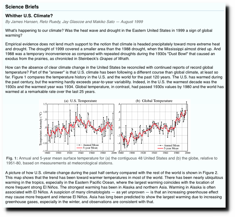
As you can see these two temperature charts have very different temperature profiles. Hansen’s chart on the left shows the 1930’s as hotter than subsequent years, including 1998 (and hotter than 2016, too). Which means that according to Hansen’s chart we have been in a temperature downtrend since the 1930’s. The temperatures from today would have to increase about 0.5C to equal the heat of the hottest part of the 1930’s.
The second chart on the right, the global temperature chart is a chart that has been manipulated by human beings to make it look like things are getting hotter and hotter for decades and we are now at the hottest point in recorded history. A very scary scenario. But it’s all a Big Lie! This “Hockey Stick Chart” does NOT resemble reality.
Reality resembles the Hansen U.S. temperature chart. Unaltered temperature charts from around the globe show the same, or nearly the same temperature profile as Hansen’s U.S. temperature chart showing the 1930”s as being as hot or hotter than subsequent years. Unaltered charts from around the globe definitely do NOT have the same profile as the global Hockey Stick Chart.
The profile of the Hansen temperature chart doesn’t scare people, the profile of the bogus, bastardized global surface temperature chart does scare people. That’s why the CAGW promoters created the scary Hockey Stick chart. We have their emails where they got together and decided to change the historic temperature records to favor a poltical objective. They have successfully deceived millions of people and caused enormous amounts of tax money to be wasted as a result.
How can anyone who has looked at this subject seriously not question the veracity of the Hockey Stick Chart? And if you don’t have the Hockey Stick chart, then what do you have to point to as your evidence that something bad is happening or about to happen to our climate? You are sunk. At least, so far. No evidence, and the evidence pointed to, the Hockey Stick Chart, is bogus and without credibility.
The “scientists” don’t have to agree. They are complicit with what the MSM screams, since it supports the CAGW ideology, and the Climatist industry. It suits them just fine.
But many climatologists have apparently green-lioghted sensationalist press releases by their colleges.
When the path to good science/good policy goes astray, one can question why there is any need at all for media involvement in the overall process.
The media essentially takes a mix of data and opinion and reshapes it in words that they prefer. One needs to question the value of doing this, for it opens the door to spin and propaganda.
In a more ideal world, the end user – who might be a maker of policy – would be scientifically literate and able to work from the original paper, bypassing the need for both the press release and all press reporting. The world is not ideal. The media reporters need not be scientifically literate or more literate than the end user. In such cases the involvement of the media is a detriment because they can then dilute, sensationalise and mislead. And they do.
It is easy to see a place for media involvement in easy social matters, like the entertainment industry, but harder to justify when there are precise scientific messages.
Maybe this is why most of my scientist friends routinely dismiss media interpretations of science as probably unreliable and not needed.
I offer no solutions here. It is up to the media to moderate its activities. If it continues to report poorly it should wither, but it seems to bounce back. I do wish for much better objectivity, especially with the parts played by the media in education of our young.
Geoff
“The media essentially takes a mix of data and opinion and reshapes it in words that they prefer. One needs to question the value of doing this,”
One should always keep in mind that you are reading or hearing a reporter’s personal opinion, which is probably strongly influenced by political ideology. So be skeptical of ALL interpretations.
If the interpreter doesn’t see the situation clearly, then his interpretations are going to be incorrect. It helps a lot in discerning the truth, if you are familiar with the subject matter the reporter is interpreting. If you are not familiar with the subject matter, then you need to get multiple opinions to sort out what is true and what is not.
“There has been global warming during the past two centuries.”
There has also been global cooling during the past two centuries. We shouldn’t forget to mention that part of the equation.
“Over the 121-year period of record (1895-1915), precipitation across the CONUS has increased at an average rate of 0.16 inch per decade.”
1895-2015 Perhaps?
Russ,
Thanks for catching that! I eagerly await our AI spell-checkers that will catch these typos. But they’ll probably be writing them, so we’ll be replaced.
It seems from a purely physics standpoint, that as global atmospheric temperatures increase, then due to the simple phenomenon of increased vapor pressure of water/increase in atmospheric relative humidity that drives increased precipitation, the climate should be getting both warmer and wetter.
The decline of so many civilisations – some say all but Egypt – after 1200BC was dramatic. We now know that the Santorini eruption occurred centuries before the Cretan collapse, and one big VEI 6-7 blow is a pretty lame explanation for the dark post-Mycenean centuries. So what happened to all those free trading communities and empires who traded tin as hungrily as we trade oil?
The climate changed, duh. Most likely things got cooler and consequently drier in critical regions (but not all), as happened at the 2200BC civilisational collapse. So you got migrations from the north, attacks by “sea peoples” etc.
Climate changes not just in cycles but it goes off on tangents. It just changes, okay? Sometimes a lot and in a hurry. The short, steep traverse from Younger Dryas to Optimum within the period of human settlements and even towns makes our present “climate change” look like a pimple on a hippo. Nobody really denies this. It’s just that mentioning it in learned circles has come to be a conversation killer and possibly a career killer.
So if today’s climate change is a pimple on a hippo, what is Michael Mann?
The only climate prediction you can make with any certainty is that it is going to get much colder for a very long time.
“continental US, with one of the longest and most accurate records in the world.”…
Which is still not saying much…….you could say all of US global warming is due to adjustments in the temp record
I know, math is hard. But, 2017 – 1982 does not equal 25!
How about ” 2017 – 1982 equals > 25″ ?
2017 – 1982 = 25 is correct.
However, the inclusive time period from 1982 to 2017 is 26 years.
Math is easy. Calendars are tricky. 😉
My calculator must be broken because it gets:
2017 – 1982 equals 35
Must be the “new math”?
We should try to get a consensus to find out what is the right answer. Because that is how science is determined! {sarcasm intended}
I vote for 35.
>>
2017 – 1982 = 25 is correct.
<<
So are we going with the broken calculator scenario, ignoring the bad math, or pretending no one will notice? (Good catch, by the way.)
Jim
Why do we pay attention to the just the averages? After all, the average of 49 and 51 is 50
and the average of 1 and 99 is also 50. Here’s NOAA’s Climate at a Glance for Maximum
summer temperatures from June through September with a trend researched to see how
far back a negative trend could be found:
http://oi63.tinypic.com/156fl8y.jpg
If you if you research the individual states, to see how far back the negative trends go the results are quite interesting:
http://oi68.tinypic.com/95vcec.jpg
Steve, can you do the same thing for winter lows?
….I distinctly remember them saying it would effect winter temps more….by making them warmer
..Ummm, warmer winters would be bad ? You must not live in the North ! LOL
We certainly have warmer winters here in Wisconsin. It rarely gets below zero Fahrenheit anymore. When I was kid we had cold snaps in Milwaukee where the daytime high was a negative number.
So far I haven’t bothered to take the time to put one together for Winter lows mostly for a lack of interest in the one I’ve done so far. One tends to think their own stuff is great until it gets thoroughly ignored (-:
I thought you made an excellent point…
Showing that winter lows are getting warmer….would nail that point
…can you do the same thing for winter lows?
All the trends would be upwards from 1895 – 2016
After all if you go through the IPCC reports they will say that the warming is night time, winter time and in the higher latitudes and altitudes. Day time, summer time, and in the Arctic not so much. And as I’ve pointed out summer time in some places not at all. The annual range and daily range of temperatures has been reduced. Storms operate off of the difference in temperatures between air masses and indeed violent tornadoes in the United States have trended down. It seems to me that we are seeing milder weather. Pretty soon the climate activists are going to have to talk about “Extreme Mildness” (-:
..that’s exactly my take on it too
It’s hard to sell “we’re all going to die” global warming…
…when all it’s doing is giving us milder winters
Steve,
That’s another example of my point — warming is not omnipresent in time and space. It occurs mostly in specific months and mostly in specific regions.
And the region with the best weather records is the United States. Maybe there’s some way to tease out the Highs and Lows for other parts of the globe, if so it would be interesting to see if similar patterns existed elsewhere.
And my point is that we seem allow the climate activists to set the agenda of using just the averages.
The UK has comparable records to the USA. Here too, the only issue is of reduced maximums and increased minimums; increasing mildness. Also the same effect with recorded rural readings; flat as a pancake.
The whole thing is about increased population centers with tarmac etc covering the ground.
The rest is garbage.
Typo:
““Over the 121-year period of record (1895-1915)”
Should be 1895-2015? or 1895-2016?
“Global warming is not a universal explanation for weather”
Brilliant
to which i might add
https://papers.ssrn.com/sol3/papers.cfm?abstract_id=2929159
It isn’t even a local explanation.
Mr Kummer, it would be an interesting point, except that the NOAA temperature record for the US has been stepped on so much all that remains is the “adjustments”. What was the real temperature in the 1930’s relative to the 1990’s? The NOAA chart makes it look cooler, which might be an artifact.
“What was the real temperature in the 1930’s relative to the 1990’s?”
According to Hansen’s 1999 chart, the 1930’s was about 0.5C hotter than 1998, which also makes it hotter than 2016. And when the critics claim this chart only represents the U.S., then look at all the other unaltered surface temperature charts available from around the world and you will see that most of them resemble the 1999 Hansen chart, showing the 1930’s being as hot or hotter than subsequent years, much more than they do the bastardized modern global surface temperature charts. We are still in a temperature downtrend from the 1930’s.
Could the 1940-1960 dip be an artifact of the thousand odd nuke tests the Us did then ???.
Earth’s carbon cycle contains 46,713 Gt (E15 gr) +/- 850 Gt (+/- 1.8%) of stores and reservoirs with a couple hundred fluxes Gt/y (+/- ??) flowing among those reservoirs. Mankind’s gross contribution over 260 years was 555 Gt or 1.2%. (IPCC AR5 Fig 6.1) Mankind’s net contribution, 240 Gt or 0.53%, (dry labbed by IPCC to make the numbers work) to this bubbling, churning caldron of carbon/carbon dioxide is 4 Gt/y +/- 96%. (IPCC AR5 Table 6.1) Seems relatively trivial to me. IPCC et. al. says natural variations can’t explain the increase in CO2. With these tiny percentages and high levels of uncertainty how would anybody even know? BTW fossil fuel between 1750 and 2011 represented 0.34% of the biospheric carbon cycle.
Mankind’s modelled additional atmospheric CO2 power flux (W/m^2, watt is power, energy over time) between 1750 and 2011, 261 years, is 2 W/m^2 of radiative forcing. (IPCC AR5 Fig SPM.5) Incoming solar RF is 340 W/m^2, albedo reflects 100 W/m^2 (+/- 30 & can’t be part of the 333), 160 W/m^2 reaches the surface (can’t be part of the 333), latent heat from the water cycle’s evaporation is 88 W/m2 (+/- 8). Mankind’s 2 W/m^2 contribution is obviously trivial, lost in the natural fluctuations.
One popular GHE theory power flux balance (“Atmospheric Moisture…. Trenberth et al 2011jcli24 Figure 10) has a spontaneous perpetual loop (333 W/m^2) flowing from cold to hot violating three fundamental thermodynamic laws. (1. Spontaneous energy out of nowhere, 2. perpetual loop w/o work, 3. cold to hot w/o work, 4. doesn’t matter because what’s in the system stays in the system)
Physics must be optional for “climate” science.
What really counts is the net W/m^2 balance at ToA which 7 out of 8 re-analyses included in the above cited paper concluded the atmosphere was cooling, not warming (+/- 12.3 W/m^2). Of course Dr. Trenberth says they are wrong because their cooling results are not confirmed by his predicted warming, which hasn’t happened for twenty years. (“All of the net TOA imbalances are not tenable and all except CFSR imply a cooling of the planet that clearly has not occurred.”) Except it also hasn’t gotten hotter.
Every year the pause/hiatus/lull/stasis continues (IPCC AR5 Box TS.3) IPCC’s atmospheric and ocean general circulation models diverge further from reality.
As Carl Sagan observed, we have been bamboozled, hustled, conned by those wishing to steal our money and rob us of our liberties. Hardly a new agenda.
>>
One popular GHE theory power flux balance (“Atmospheric Moisture…. Trenberth et al 2011jcli24 Figure 10) has a spontaneous perpetual loop (333 W/m^2) flowing from cold to hot violating three fundamental thermodynamic laws.
<<
It’s rare for one system to violate three laws of Thermodynamics. That “perpetual loop” is being driven by a large thermonuclear furnace located at about one Astronomical Unit away, on average. And there’s nothing in Thermodynamics that prevents a colder object from warming a hotter object as long as the “Total” energy transfer is from hotter-to-colder–otherwise, life on this planet wouldn’t be possible.
Jim
O.T. but a little worrisome…”headphones-explode-after-she-falls-asleep” in flight !
 ?quality=85&strip=all&w=400&h=225&crop=1
http://wtvr.com/2017/03/14/womans-headphones-explode-after-she-falls-asleep-on-flight-to-australia/
And Australia wants to build a $500.000.000.00 version of this ? N.U.T.S. !!
…Oops….$500,000,000.00….(note to self..put on glasses before typing) …
And it’s a lot more complicated than just temperature and precipitation trends.
http://koeppen-geiger.vu-wien.ac.at/shifts.htm
PDO signal.
+++++100. Best map I have seen that describes global climates.
Oops. Unfortunately the temperature data comes from CRU models….ugh.
But Neil Degrasse Tyson has put us on notice, notice I say!
“Everybody has a trend somewhere”
Let`s cherrypick and present some good stories.
For me it is meaningless to see some climate trends for less than 60 years.
So I think that the graph shows that the trend for the average US february temperatures is increasing, but I don`t see what that should mean.
Nobodys Knowledge,
“but I don`t see what that should mean.”
When in doubt, read the text.
From the summary:
Below the graph:
And the surprising news are…?
Javier,
“And the surprising news are…?”
That the picture of global warming that most people have is inaccurate. This is surprising news to them, after hearing the same story since roughly 1988 from almost everybody in the major media.
Ah, OK. It is not for us but for them, who never read WUWT.
Climate change is warming northern British Columbia, glaciers are melting, so my take is that climate change must be real. Hey a climate scientist said that so again climate change must be real.
Notice my repeating of, climate change. It was used a lot during the talk which gave the impression that climate change only happens with warming.
http://www.250news.com/2017/03/14/climate-change-undeniably-having-an-effect-on-northern-bc/
…The “CLIMATE” has been “CHANGING” for 4.5 billion years….When the climate STOPS changing, THEN, I will start worrying !!
Butch,
“When the climate STOPS changing, THEN, I will start worrying !!”
That’s an odd perspective. Climate change has badly damaged many civilizations across history, and even destroyed some. It could happen to us. It’s not something to be complacent about.
“It’s not something to be complacent about.”
Given that there’s s0d all we can do to prevent it changing, it doesn’t matter whether we’re complacent or not.
The ability to ride out the changes is however a different matter altogether.
Cat,
“Given that there’s s0d all we can do to prevent it changing, it doesn’t matter whether we’re complacent or not.”
I assuming you are trolling me. We can prevent few of the things that happen to us (we’re not gods). Most of time pubic policy prepares for events. We want to see dangers in advance (warnings), to minimize the damage, to recover faster, etc.
Mendenhall glacier has been retreating for many years. It recently uncovered the remains of a 1000 year old forest. MWP??
How is it affecting the Vancouver area? They are having one of the coldest winters in memory there. I guess that’s just weather while the Northern stuff is climate change.
“Climate change is complex. That’s why we have the iPCC (almost forgotten by journalists) and the major climate agencies to explain to us what is happening.”
Ignoring anthropogenic water vapor!
Anthropogenic water vapor is trivial. Natural water vapor is the big driver and ignored by IPCC’s mandate.
Water Vapor can’t be taxed.