Playing around with my hometown data, I was horrified when I found what NASA had done to it. Even producing GISTEMP Ver 2 was counterfactual.

Guest essay by Philip Lloyd
The raw data that is fed to NASA in order to develop the global temperature series is subjected to “homogenization” to ensure that it does not suffer from such things as the changes in the method of measuring the mean temperature, or changes in readings because of changes in location. However, while the process is supposed to be supported by metadata – i.e. the homogenizers are supposed to provide the basis for any modification of the raw data.
For example, the raw data for my home city, Cape Town, goes back to 1880:

http://data.giss.nasa.gov/tmp/gistemp/STATIONS/tmp_141688160000_0_0/station.txt
The warmest years were in the 1930’s, as they were in many other parts of the globe. There was then a fairly steep decline into the 1970’s before the temperature recovered to today’s levels, close to the hottest years of the 1930’s.
In NASA’s hands, the data pre-1909 was discarded; the 1910 to 1939 data was adjusted downwards by 1.1deg C; the 1940 to 1959 data was adjusted downwards by about 0.8 deg C on average; the 1969 to 1995 data was adjusted upwards by about 0.2 deg C, with the end result that GISS Ver 2 was:-

Being curious, I asked for the metadata. Eventually I got a single line, most of which was obvious, latitude, longitude, height above mean sea level, followed by four or five alphanumerics. This was no basis for the “adjustments” to the raw data.
Which should I believe? The raw data showed a marked drop from the 1940’s to the 1970’s, which echoed similar drops elsewhere. Time magazine covers showed the 1970’s were indeed cold.


The raw data is probably accurate. The homogenized data is certainly not. It is difficult to avoid the conclusion that “homogenization” means “revise the story line” and “anthropogenic global warming” really means “humans changed the figures”.
Prof Philip Lloyd, Energy Institute, CPUT, SARETEC, Sacks Circle, Bellville
I am of the opinion that if the data requires that much adjustment then the data is not good and needs to be remeasured. I have to take measurements all the time and if I had to apply that much adjustments to it then I would not be able to make and accurate assessment of object.
These measurements are from the past. They can’t be remeasured. They can only be adjusted to fit the objective …er… object.
The past is gone. It is past. Whatever numbers they wrote down is all we’ve got.
I seriously doubt if the all the changes in the local temperature logs that went into GISS have behind them the “boots on the ground” kind of examination that changed the hottest temp ever from Libya to Death Valley.
(Might that be the only change that wasn’t made with a keyboard?)
But you can retrofit the station with exactly the same type of LIG thermometer and can take measurements in exact accordance with the same standards and procedures of the past.
We have the raw data for the 1930s and 1940s. Why not replicate the experiment using the same equipment and methodology and we will then know how much it has warmed.
The reason for the warming can then be examined, eg., encroachment of urbanisation/uhi,etc.
If the station has moved then a retrofit is unlikely to tell us that much, but we could examine nearby stations that have not moved and retrofit those.
When you can take a single temperature site in Northern Canada, called the Garden Spot of the Arctic because it is a pocket that tends to be the warmest place up there most of the time, and then use the Garden Spot data to extrapolate the entire Arctic area, it’s for sure that the results are not worth the water that should be used to flush it away.
Richard, the fundamental problem goes back to measurement theory itself; extrapolation from empirical data simply doesn’t ever work. It is never valid. Ever. It’s a rule. Never ever, ever works. Never. Not at all. Under no circumstances. Verboten. Here Be Dragons. Closed course, do not attempt this at home.
Please keep this i mind before apologizing for the few who don’t grasp that concept.
Richard: I neglected to point out the statement I took issue with. My apologies for that. Specifically:
“but we could examine nearby stations that have not moved and retrofit those”
This is the argument for infilling and “Kriging” (which in my mind still sounds like a minority sexual fetish). We can’t generalize accurately. As Higley points out, the variability of our environment can’t be captured by statistical moments with the proposed resolution. Billions have been made by folks who bet on the idea their valley would produce better Zinfandel than the valley 20 miles down the road, and they were right (at least some of the time).
The entire idea of infilling is bogus.
Vive La Différence!
Thanks your comments.
i am not suggesting any infilling of data.
I am not suggesting compiling a global data set.
I am merely suggesting at looking at each individual station where there is concern as to the adjustments made, simply to have a reality check on whether those adjustments to raw data at that particular station are obviously wrong. This is the sort of check which any other science would have adopted.
My view is that the land based thermometer record is worthless, and is employing a system that was never intended to provide information on global temperatures. When cAGW first took hold, they ought to have conducted an audit of all stations, just like the surfacestation project, and selected only the best sited stations, free of any station moves/changes, free of encroachment of urbanisation or other nearby land use changes, those that had the best systems and practices of observation, and had the longest uninterupted record.
One would only need 10 to 20 such stations in each country, or even say just 10 countries across the Northern Hemisphere. These stations could have been retrofited with the same equipment as used in the 1930s/1940s and observations carried out in the same manner as that used in the 1930s/1940s.
One would then have two sets of raw data against which no adjustments need be made. One would simply compare each station individually, to see what if any change had occurred at that particular station. If the vast majority of the individual stations showed little warming, then one would reasonably conclude that there has been little warming in fact. It is not necessary to make a reconstruction of the entire Northern Hemisphere, and try and create a Northern Hemisphere wide anomaly data set.
Why pick the 1930s/1940s as the comparison? First, we know that this period was warm. Second, this is when manmade CO2 emissions took off; some 95% of all manmade CO2 emissions have taken place since 1940. This will therefore shed considerable light on what impact manmade CO2 emissions have made.
Most of us on this site consider that there is a problem with the data sets, but none of us know for sure. My objection is that why use data that we know is bad and then seek to adjust it to make it acceptable/good. I consider that we should have weeded out everything, and only used pristine data. But there are still two problems even with pristine sites. First, changes in equipment. Second TOB. Those two problems can largely be overcome by retrofit with the same LIG thermometers (calibrated in Fahrenheit where appropriate) and taking observations in accordance with the practice and methodology used in the 1930s/1940s. This would give us a sanity check. We have the satellite data after that (although that has its own issues).
Science is about experiment and observation. Why not do this?
There are significant metadata breakpoints for the long term Cape Town temperature series, for instance a station move in 1961:
http://berkeleyearth.lbl.gov/stations/158976
However, you don’t have to adjust historical data to construct regional and global averages.
You only have to cut the series at significant breakpoints, and let the neighbor stations carry the trend over the break…
By the way, GISS don’t even use Cape Town prior to 1942. The data is discarded in that period, probably because there are no nearby rural stations that can be used for the UHI adjustment.
https://data.giss.nasa.gov/cgi-bin/gistemp/stdata_show.cgi?id=141688160000&dt=1&ds=5
@ur momisugly richard verney – January 29, 2017 at 1:47 am
Right you are Richard V, ….. the much touted per se, US Temperature Record that is in the possession of the National Weather Service, …… is in fact, ….. not a “US near-surface temperature record” even in the wildest of one’s imagination.
The source documents that were used to CREATE the per se, bogus US Temperature Record is nothing more than a humongous collection of archived “weather reports” from the mid to late 1800’s with the data therein accepted “as is” without question or verification of its factuality,
And given the fact that 98% of those pre-1940 “daily weather report” documents were manually recorded ….. and then manually transmitted via the telegraph, the factuality of their data content is highly questionable to say the least. But 100% validity of the “data” was really not that important simply because its only purpose being to generate “one (1) to five (5) day weather forecasts”.
Read more @ur momisugly – History of the National Weather Service @ur momisugly http://www.weather.gov/timeline
Anyone that wastes their time, energy and OPM on trying to “squeeze” or ”wring” something of scientific importance out of the per se, US Historical Temperature Record is either miseducated, a nurtured delusional or a happy “troughfeeder” just doing what he/she is being paid to do.
@OR – LANGGEWENS and KIRSTENBOSCH have a similar half degree drop between 1960 and 1970. Not so obvious because of the scaling used. That drop at Capetown after 1960 is used to adjust temperatures by half a degree because of the difference with its neighbors. The whole homogenisation process is a joke.
Used to drive through the bucolic little town in Libya that had the record high. From the first time I drove through I wondered how this place had the highest temp, at one time the town had a British military barracks, always thought those guys rigged that temp.
Bartley, kriging was developed by a South African mining engineer(I believe his name was Krig) around 80yrs ago to estimate a mineral deposit’s tonnage and grade from drill hole and surface sample assays. It is used to this day and there is a large number of mines that are now mined out and proved to have verified the procedure. A priori reasoning (the kind a clever teenager who lacks empirical knowledge uses in arguing with his parents) is rarely a reliable contribution to scientific argument.
This is not said to support the most felonious scientific work the world has ever known – the hopelessly damaged temperature record. This I compare to the Taliban blowing up the thousand yr old hundred foot statue of Buddha.
“It is used to this day and there is a large number of mines that are now mined out and proved to have verified the procedure.”
The problem is that concentration is an intrinsic property. The mean of max and min temps at a particular station is not.
Verifying the procedure is getting a result that was within 5% of the final yield. We have over a third of a degree more warming from adjustments since just 2000. That is 0.1% of the average (absolute) temperature. Its 0.5% of the difference in temperatures experienced in many parts of the world.
I remember when Enron had to make some significant data ajustments…but impact of changing past temperature measurements doesn’t raise the same kind of flags…but I bet my old p-chem professor would be pissed.
Good luck with remeasuring the 1990 temperature…
I am an engineer and if I made those sorts of adjustments to raw data without complete reconciliation and explanation, I would be censured by my professional body.
I have a rule of thumb: If your adjustments are greater than the signal you claim to have found, then you haven’t found anything.
Agreed 110% ;-D
I’m sick of proclamations of “temperature has increased by [fill in the blank] degrees C SINCE [fill in the blank], as if it were (a) factual, (b) meaningful, and (c) something that humans are the cause of, and/or can do anything to stop, when (1) the so-called “data” which indicates such temperature increase is CRAP, (2) the so-called “data” ISN’T EVEN DATA any more, since it has been “adjusted,” “corrected,” “homogenized,” and [insert additional euphemisms for “manipulated with an eye towards gargantuan confirmation bias” here], (3) there is NO empirical evidence to support CAUSATION of the supposed changes, just lots of unsupported or poorly supported assumptions that (i) rising CO2 levels are due to human fossil fuel burning, (ii) rising CO2 levels are the cause of warming, when no such causal link exists in the paleoclimate studies of Earth’s history AND a significant portion of such supposed temperature change can be attributed to other natural climate drivers with even our current limited knowledge (with the remainder probably being DATA ERRORS), and (iii) the temperature rise which is small and beneficial will somehow become runaway and harmful, when (again) there is no such occurrence CAUSED BY CO2 in the paleoclimate studies of Earth’s history.
/rant
Having lived there in the past, it is cool to have a Capetonian look at the data this way – well played
Well I can tell you the weather has not changed….. every year is still the hottest, every year is still the windiest, every year is still the wetest, every year is still the worst storm,……. just for good measure every year the property prices still rocket!
Just shows what a pile of Dingo’s kidneys the historical adjustment of the temperature recoed is.
You folks don’t really eat dingo kidneys? I had to live in England for a few years and they eat beef kidney there, they call it “steak and kidney pie”. Never could understand (or appreciate) it from a culinary perspective.
But wild dog kidneys? I’m not sure, but I’m starting to think the UN should have some culinary criteria before admitting members? You folks still eat lizards?
🙂
Hey, if the French get to eat frogs (their legs, anyway), the Aussies can chow down on lizards if they wanna.
Sorry to disappoint you but from the Urban Dictionary.
“A Douglas Adams original, was used multiple times in his book “The Hitchhiker’s Guide to the Galaxy”. Usually (but not necessarily) following “a load of”, dingo’s kidneys means rubbish, bollucks, crap or bullshit. ”
som
No, its lamb kidneys. You wouldn’t fit a cows kidney in a pie!
beefsteak and lambs kidneys when I make it.
Thank you Tim, I figured they just cut them up. I sit corrected. 🙂
SOM: I rarely find truly educational material on the web. Thanks for the derivation of dingo kidneys. I’ll use that in the future. 🙂
I wonder ??? History ? historical adjustments,? what fun changing history,
In the year1466 (23 May ) Uw Ki Woon ( of North Korea ) flew a modified XY43 super, supersonic, Korean designed and built astro- jet around the world and discovered America.
And that is a fact !!
But dang it , if he would have landed and planted a flag we’d all be North Korean !
It’s good to get down to specific locations where the leftist climate activists have manipulated the data … and show the exact data with links etc where possible. So, awesome!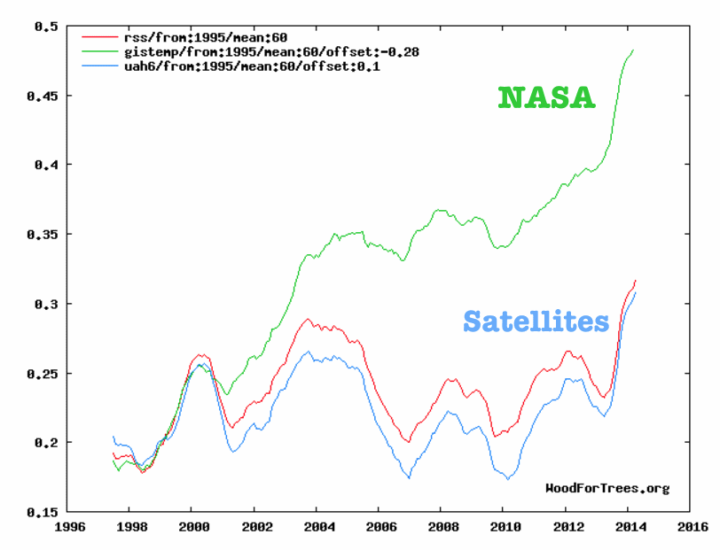
And realize that those manipulations were done for locations all over the world!
This graph shows the stark divergence between the highly homogenized & pasteurized NASA data and the uncorrupted satellite data, worldwide:
Yes, it’s always interesting to get down to specific sites. Remember Rutherglen, Victoria? Adjusted from a downwards trend to an upwards trend. http://jennifermarohasy.com/temperatures/rutherglen/
Do you look at the USCRN data?
Sorry, but Dr John and Roy have done some nefarious things, they have adjusted non-drifting AMSU satellites that don’t need adjustments.
It’s better to use UAH 5.6 in the AMSU era since it actually relies on those nondrifting satellites that don’t need adjustments..
Surface and upper air together in perfect harmony…
http://postmyimage.com/img2/945_image.png
No, O R, it is you who has done nefarious things by arbitrarily introducing an offset of 0.4 and 0.51 to the UAH plots to force them to match the GISTEMP plot. You give no scientific basis for your adjustment other than the specious claim that the UAH data didn’t need adjustments for drift. If this is true, then why does the RSS satellite series, which is not processed by “Dr. John (Christy) and Roy (Spencer)” show almost exactly the same thing as the UAH plots?
http://woodfortrees.org/plot/gistemp/from:1979/to:2017/mean:12/plot/uah5/from:1979/to:2017/mean:12/plot/uah6/from:1979/to:2017/mean:12/plot/rss/from:1979/to:2017/mean:12
Just for fun I also added HadCRUT4 to debunk the statement by Rick Mears of RSS that the terrestrial datasets are more accurate because more groups analyze them and come to the same conclusions. In fact UAH and RSS are much closer to each other than GISTEMP and HadCRUT4 are.
http://woodfortrees.org/plot/gistemp/from:1979/to:2017/mean:12/plot/uah5/from:1979/to:2017/mean:12/plot/uah6/from:1979/to:2017/mean:12/plot/rss/from:1979/to:2017/mean:12/plot/hadcrut4gl/from:1979/to:2017/mean:12
Intuitively, which is likely to be more correct: the terrestrial data which has vast swaths of infilled (fake) data to cover the oceans and the poles where there are very few measurements, or the satellite data measures 97% of the surface?
#stopdatatorture
Its nothing nefarious with my chart. Giss and UAH 6 are aligned in 1979, the first satellite year.
UAH v6 and v5.6 are spliced in 1999, the first full year with AMSU:s
You have also missed the fact that RSS no longer recommends the use of RSS TLT 3.3:
http://www.remss.com/node/5166
“The lower tropospheric (TLT) temperatures have not yet been updated at this time and remain V3.3. The V3.3 TLT data suffer from the same problems with the adjustment for drifting measurement times that led us to update the TMT dataset. V3.3 TLT data should be used with caution.”
Thus, the faulty RSS 3.3 corroborates the faults of UAH v6 in the AMSU-era 1999-2016
The AMSU drift correction in UAH v6 is NOT corroborated by nondrifting satellite concept used in UAH 5.6
The AMSU drift correction in RSS v4 is corroborated by the nondrifting UAH 5.6, and RSS own similar concepts, REF_SAT and MIN_DRIFT, that were used in the development of v4
http://journals.ametsoc.org/doi/full/10.1175/JCLI-D-15-0744.1
RSS has yet not updated the TLT to version 4.
But in the mean time it is easy to make an RSS TLTv4 with the UAH v6 formula:
TLT=1.538*TMT-0.548*TTP+0.01*TLS.
That trend would be 0.21 C/decade, a little more than UAH’s 0.12 C/decade, isn’t it? 😉
I’m wondering about a missing comment here: my answer to stinkerp, who manifestly ignores how to properly plot, within a chart, anomaly-based time series having different baseline periods.
Maybe somebody at WUWT doesn’t know as well how to do, and thinks my comment is rubbish?
Here is the correction of his second WFT chart:
http://woodfortrees.org/plot/gistemp/from:1979/to:2017/mean:12/offset:-0.431/plot/uah5/from:1979/to:2017/mean:12/plot/uah6/from:1979/to:2017/mean:12/plot/rss/from:1979/to:2017/mean:12/offset:-0.091/plot/hadcrut4gl/from:1979/to:2017/mean:12/offset:-0.293
If stinkerp had any even basic knowledge of UAH and RSS, then he would himself wonder about the strange difference between UAH6.0 and RSS3.3 in his WFT charts!
Nothing in spam folder. Sometimes comments just don’t post. It even happens to me, technology isn’t perfect, browsers sometime fail to send the data.
But, your attitude reveals the smugness behind your fake name.
Olof, you’re at it again, I see.

UAHv5.6 is a flawed dataset. Period. It’s got nothing to do with Christy and Spencer somehow not knowing or caring about MSU/AMSU issues, as you’re continually implying. Its sudden lift in mid 2005 is all due to a spurious disconnect in the data between the oceanic and land portions of it:
Christy and Spencer realised this, investigated the problem, and corrected for it. And with that, version 5.6 appropriately ended up in the dustbin, and the much improved version 6.0 took its place. As it rightfully should.
Further, you cannot compare the tropospheric temperatures with surface datasets like GISTEMP LOTI, Olof. GISTEMP LOTI gl mean is deeply flawed in that it carries within it an out-of-this-world exaggeration of Arctic warming based on brain-dead methods of extrapolating already inflated heat.
You will have to compare it to rather more sober (and reality oriented) series, like HadCRUt3 (adjusted down 0.064 K from Jan’98 due to an obvious artificial, but never noted, much less corrected (!), 0.09 K jump in the HadSST2 dataset, a result of a calibration error occurring when the UKMO changed the source of its SST data going from 1997 to 1998):
There is no discrepancy here between the troposphere and the surface, Olof.
Further, since there is no HadCRUt3 data beyond May 2014, we can extend this particular surface series by simply latching on HadCRUt4 data from this month, carefully calibrating the two datasets to fit up front:


To form what we could call the “Real HadCRUt” dataset:
This series compares very well with JMA gl:
Also with the 3rd generation “Reanalysis Mean” (NASA MERRA + ERA Interim + JRA55), gl T_2m:

While the GISTEMP LOTI gl mean series clearly doesn’t:
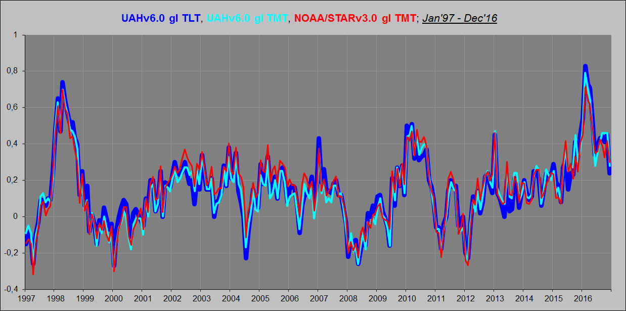
You could also compare the UAHv6.0 gl TLT with UAHv6.0 gl TMT and with NOAA/STAR v3.0 TMT, specifically from 1997 onwards, when temperatures plateaued, both at the surface, in the troposphere and in the lower stratosphere:
Not to say the least, compare it with the CERES gl LW flux data (OLR) at the ToA, from March 2000:


CERES also provide a surface temp product called MOA skin temperature, and calculate their gl surface upwelling LW flux (UWLWIR) based on this:
stinkerp on January 29, 2017 at 1:32 am
No, O R, it is you who has done nefarious things by arbitrarily introducing an offset of 0.4 and 0.51 to the UAH plots to force them to match the GISTEMP plot.
Sorry stinkerp, but you are simply wrong here. The offsets used by O R certainly are correct. These datasets have different baseline periods: 1951-1980 for GISTEMP, 1961-1990 for HadCRUT, 1979-1998 for RSS, and 1981-2010 for UAH.
Thus to show plots of all them correctly in a chart, you have to shift them by their baseline differences to a common baseline.
I prefer to use UAH’s baseline as reference, and to shift all others, by computing their mean anomaly value for 1981-2010, which becomes the (minus signed) offset in WFT:
GISTEMP LOTI: 0.431
RSS: 0.091
HadCRUT4.5: 0.293
That gives the following plot:
http://fs5.directupload.net/images/170129/er4sxi6x.png
http://www.woodfortrees.org/plot/uah6/from:1979/mean:60/plot/rss/from:1979/mean:60/offset:-0.091/plot/gistemp/from:1979/mean:60/offset:-0.431/plot/hadcrut4gl/from:1979/mean:60/offset:-0.293
http://woodfortrees.org/graph/uah5/mean:12/plot/uah6/mean:12/plot/gistemp/from:1978/offset:-0.3/mean:12
There has clearly been a pea-and-thimble trick by O R
Robert B on January 29, 2017 at 4:50 pm
There has clearly been a pea-and-thimble trick by O R
Strange indeed: O R specified a much higher offset for UAH5.6 than for UAH6.0, though both have the same baseline period.
But sorry: your WFT graph nevertheless is not quite correct: GISTEMP’s baseline offset from 1951-1980 to 1981-2010 isn’t 0.3 but… 0.43; that difference is similar to OR’s mistake, or trick if you think there was such intention 🙂
http://woodfortrees.org/plot/uah5/mean:12/plot/uah6/mean:12/plot/gistemp/from:1979/offset:-0.43/mean:12
Even more appalling is that no one can even trust NOAA to report raw data accurately. It’s criminal conspirators now put their thumbs on daily temperature readings, before their bosses cook the books further with unwarranted adjustments.
Even when they report data accurately, the criminals cannot do the math correctly.
But NOAA’s written data sure doesn’t add up right.
(1) The Climate of 1997 – Annual Global Temperature Index “The global average temperature of 62.45 degrees Fahrenheit for 1997″ = 16.92°C.
http://www.ncdc.noaa.gov/sotc/global/1997/13
(2) http://www.ncdc.noaa.gov/sotc/global/199813
Global Analysis – Annual 1998 – Does not give any “Annual Temperature” but the 2015 report does state – The annual temperature anomalies for 1997 and 1998 were 0.51°C (0.92°F) and 0.63°C (1.13°F), respectively, above the 20th century average, So 1998 was 0.63°C – 0.51°C = 0.12°C warmer than 1997
62.45 degrees Fahrenheit for 1997″ = 16.92°C + 0.12°C = for 1998 = 17.04°C
(3) For 2010, the combined global land and ocean surface temperature tied with 2005 as the warmest such period on record, at 0.62°C (1.12°F) above the 20th century average of 13.9°C (57.0°F).
0.62°C + 13.9°C = 14.52°C
http://www.ncdc.noaa.gov/sotc/global/201013
(4) 2013 ties with 2003 as the fourth warmest year globally since records began in 1880. The annual global combined land and ocean surface temperature was 0.62°C (1.12°F) above the 20th century average of 13.9°C (57.0°F). Only one year during the 20th century—1998—was warmer than 2013.
0.62°C + 13.9°C = 14.52°C
http://www.ncdc.noaa.gov/sotc/global/201313
(5) 2014 annual global land and ocean surfaces temperature “The annually-averaged temperature was 0.69°C (1.24°F) above the 20th century average of 13.9°C (57.0°F)= 0.69°C above 13.9°C => 0.69°C + 13.9°C = 14.59°C
http://www.ncdc.noaa.gov/sotc/global/2014/13
(6) 2015 – the average global temperature across land and ocean surface areas for 2015 was 0.90°C (1.62°F) above the 20th century average of 13.9°C (57.0°F)
=> 0.90°C + 13.9°C = 14.80°C
http://www.ncdc.noaa.gov/sotc/global/201513
Now for 2016 and they report average temperature across the world’s land and ocean surfaces was 58.69 Fahrenheit >> 58.69 F = 14.83°C
So the results are 16.92 or 17.04 << 14.52 or 14.52 or 14.59 or 14.80 or 14.83 using data written at the time.
Which number do you think NCDC/NOAA thinks is the record high. Failure at 3rd grade math or failure to scrub all the past. (See the ‘Ministry of Truth’ 1984).
We have no idea what the temperature of this planet is. All we can say is that the temperature of the planet lies somewhere between the warmest place on Earth and the coolest place on Earth.
I have seen papers where it has been suggested that the planet is as cool as about 12 degrees, and warm as about 18 degrees, Perhaps we can say that it is 14degC +/- 5 degC.
The 1997 and 1998 reports come with a caveat:
“Please note: the estimate for the baseline global temperature used in this study differed, and was warmer than, the baseline estimate (Jones et al., 1999) used currently. This report has been superseded by subsequent analyses. However, as with all climate monitoring reports, it is left online as it was written at the time.”
They are stupid to use a baseline estimate at all. It is very hard to get a global estimate of absolute temperature, and so it is not surprising that it changed. But the average anomaly is properly calculated.
I have raised this item on many websites many times.
It was the greatest mistake ever made by the NASA “So called” Scientists. They published for all the world to see the ACTUAL TEMPERATURE instead of just the anomalies based on their calculations and left it there.
It can’t be removed now because too many people have screenshots of the data.
They think, like NIck tried to suggest, that by adding the caveat we would be fooled in to ignoring the data and it works with anyone of the warmist persuasion, but not for anyone with a few brain cells still left to do the calculations as DD More has done.
Well done for bringing it up again.
The Berkeley Earth team publish the absolute temperature for their base period 1951-1980, both monthly and annual values.
http://berkeleyearth.lbl.gov/auto/Global/Land_and_Ocean_complete.txt
The annual average for the base period is 14.76 C, in the standard global land/ocean dataset.
The anomaly +0.938 for 2016 means that the absolute global temp was 15.698 C
“It was the greatest mistake ever made by the NASA “So called” Scientists.”
Can’t people ever get anything right? This wasn’t NASA. But it was dumb.
Forrest,
“Nick, baseline + anomaly = actual value. Your explanation is bogus.”
No, that is true only for stations. There is no baseline average normally computed – I explained here why it shouldn’t be.
the link under the first graph doesn’t work for me. Is it correct?
NASA Giss and the warmist fraud squad worldwide have taken a blow touch to the raw data. They haven’t met a raw data temp they cannot Homogenize down in the early years and UP, UP, UP in the later years. These people have no decency or even a a hint of morality and certainly not an honest bone in their body’s!!!
“Your all fired”
The “adjustments™” ALWAYS seem to do exactly the same thing..
get rid of the 1930/40 warming, create a warming trend.
Gees, its almost like they had some sort of INSTRUCTION or AGENDA from somewhere.
Or maybe its something to do with regional expectations.. (opps, that’s a different set of scammers, isn’t it.)
When you look at when the “homogenisation™” routines were invented, its almost as though they were designed specifically for this AGENDA driven purpose.
Yes, just Re-read the ClimateGate emails for the AGENDA & the INSTRUCTIONS.
I smell a rat. NIWA of New Zealand discards pre-1909 data too. What a strange coincidence.
NIWA insists that NZ’s temperature rose by 0.98degC between 1909 and 2015.
https://www.niwa.co.nz/climate/information-and-resources/nz-temperature-record
The evidence for this has not been published in a peer-reviewed scientific paper.
We learned in 2010 that NIWA had somehow lost the source data for the Temperature record.
In 2010 The Minister of Science told Parliament that NIWA would carry out a review of its work on the NZ Temperature Record and during the 2010/2011 financial year would submit the work as a paper to a scientific journal.
Well, we are coming up to 7 years since that work was meant to see the light of day. I could have completed 2 Ph.D. theses in that time.
Maggy – Have you tried to get temp data off their web site? I am not strong in IT but all I get is the name and location e.t.c of each station. No temp data. Am I not looking correctly? I recently requested the 2016 data ( 7- Stn av and anom for the year) and got no reply
@Michael Carter
You could try to access temperature data off the National Climate Database.
https://cliflo.niwa.co.nz/
Don’t hold your breath Maggy, I contracted for NIWA in and around 2001 and I have seen, first-hand, how utterly shonky their work, practices and data is.
A similar thing with Australia.
The 1880s were quite possibly the warmest period in Australia, so the 1880 data is excluded. The reason given is that there are some doubts as to the screens being used, but there is evidence to suggest that most stations had the appropriate screens.
No, screens were rare in Australia in the 1880’s. The big period for screen updating was after Federation in 1901, prior to the BoM taking over state functions.
I was hoping Nick, or anyone, would explain the Capetown adjustments.
I’ve given the NOAA sheet plots below. There were just two major adjustments. One about 1960, which was the year the new airport opened, and you see the big dive in the unadjusted graph. The new airport is inland at about 48m altitude. The other is in 1888, which is a plausible date for the introduction of a Stevenson Screen.
Nick Stokes writes
When much of the warming comes from changing where the temperature is read from …to somewhere else nearby and adjusting for the fact they may have tended to read it in the morning and now evening then I for one get a sense of just how small a change its been over the last hundred or so years. And how uncertain our measurements are.
Its just crazy how scientists can suggest that proxy measurements come within a bulls roar of uncertainty of actual thermometers when the actual thermometers are so sensitive to simple location and timing of readings.
Sounds a bit like what I was trying to say here.
https://wattsupwiththat.com/2017/01/26/warmest-ten-years-on-record-now-includes-all-december-data/#comment-2410547
This is going to be great fun to watch. Popcorn strong buy. The futures just got through the roof.
Raw Temps.

Adjusted (note the scale on the temp axis changed)
From climateexplorer (all) is the raw. (adjusted) is the adjusted.
http://climexp.knmi.nl/selectstation.cgi?id=someone@somewhere
The NOAA sheet for Capetown in here. The plots which show unadjusted, adjustments and difference are below:
Forrest,
“Nick, are the pieces of paper used to record temperatures still in existence?”
Yes. NOAA has facsimiles here.
What, pray tell, is the reason for using anomalies from an average that changes every 30 years and just using the absolute temperatures and graphing them from a degree or so below the lowest reading on record? We’re only talking about a spread of 6 degrees or so. There is some point in recentering graphs to the same starting point in an analysis or presentation. It makes the differences easier to see, the point of showing a graph.
Using broad brush formula corrections to measurements and then using the modified numbers should never be done. There is no way to show that the formula corrections produce more accurate results since there is no way to replicate the original temperature measurements with modern equipment. If the data you have is noisy, erratic,or sporadic that it what it is.
Deal with it. We do not have accurate, pristine, NASA standards data, calibrated and collected every day in a uniform manner. Before about 1980 we have messy data. That should be reflected in the analysis with using error bands instead of imaginary lines.
WMO-
“Because the data with respect to in-situ surface air temperature across Africa is sparse, a one year regional assessment for Africa could not be based on any of the three standard global surface air temperature data sets from NOAANCDC, NASA-GISS orHadCRUT4 Instead, the combination of the Global Historical Climatology Network and the Climate Anomaly Monitoring System (CAMS GHCN) by NOAA’s Earth System
Research Laboratory was used to estimate surface air temperature”
Estimations , you just can’t make it up what NOAA and Giss get up to.
“Estimations , you just can’t make it up what NOAA and Giss get up to.”
This is neither NASA nor GISS. But there is no context. What was being estimated, and why?
actually, contrary to AGW I found minimum temperatures here dropping

I also found rainfall in Potch unchanged over the past 92 years.
both results brought me to wonder why it is that the ice on the north pole is melting and NH temperatures are still rising
until I found the elephant in our room
when I went down 1km into a gold mine here
…..
maybe Philip and I can meet over coffee?
Philip: the geothermal heat flux is fairly well known and it’s not the “elephant in the room” It’s just not enough to affect climate, except locally where large masses of magma are erupted on surface. However, particulates and SO2 from large volcanic eruptions can cause global cooling for periods that may be several years.
HenryP
Can you get to the DUE conference in April at CPUT?
We will meet then.
Help me out here DUE and CPUT
Stands for?
Here’s a paradox: at specific location after location we are finding that … the 1930s was hotter than today, so perhaps everywhere locally it’s colder now than the ’30s, but globally it’s hotter now.
And there’s another paradox: wherever we are in the world it seems it’s colder or just the same as before; it’s just “globally” that’s its hotter. Like it’s colder in the US, in Australia, Europe, wherever. Except in the Arctic and “the south pacific” where no one lives they say it’s hot as h3ll. It’s always somewhere else that it’s hotter.
Another thing that CLEARLY contradicts the idea that we’ve just gone through a century of runaway warming:
Umm…do you have high and low reversed ?
Link shows 6 of 7 set cold more recently ?
YES. My bad. It should read:
By continent, all but one set their all-time cold temperature record more recently than their all-time high temperature records.
You know, I know what the problem is, you are not a climate scientist. And since you’re not, it is beyond your scope of understanding…. that explains it all. See if you were a climate scientist you wouldn’t question it at all. You’d see the temperature going up and just know that that’s right. (sarc, sarc )
Evidence of “anthropogenic” warming? ie caused by humans?
The link to the GISS data doesn’t work. There are actually four GISS iterations of raw data (two stations here and here), after removing “suspicious stations” (one station here) and after homogenization here.
However, the GISS post homogenization data is very different. For example, it starts in 1940 …
So I fear I can’t replicate any of your graphs.
Finally, the Berkeley Earth data is here. It starts in 1865.
Berkeley Earth maintains all of the raw data. If you want raw data I’d use them, although I don’t like what they do to the data after that …
w.
I’d be curious to see what happens if averages were built from the raw data by random sampling rather than adjustments/gridding/infilling. It has been my experience that the more you try and massage the data, the less it reflects reality.
w. ==> Philip Lloyd’s “raw data” graph appears to be this one , the second link you supplied, which is for station ID 141688160007


(or very nearly, re-scaled, of course, and made over into a five year moving average).
His graph (for comparison):
So that settles the first issue — missing link, raw data. It appears that he is correct (MOL-ish).
The second graph Lloyd supplies, appears to be some version of the GISS graph for station ID 141688160000:
Both stations are listed as Capetown South Africa, at the same lat-long co-ordinates.
They are dissimilar, wildly so, so something is amiss somewhere.
Addition: Berkley Earth is somewhat useless, as it fails to identify the Station ID number of its graphs. It uses the lat-long, fails to mention that there are two very divergent station records, and lists only the one that “looks right”?


Perhaps the best overall picture for Capetown is this, from Berkley Earth (though still wildly different from GISS Station id=141688160007):
which shows how unchanging the surface temperature has been in Capetown for the last century.
Compare this Berkeley graph:
Willis, did you ever get a satisfactory answer to the issue posed June 28, 2014 in Problems with the Scalpel Method
To summarize the issue presented:
For clarity: the origin of the sawtooth is a thought experiment
“In any kind of sawtooth-shaped wave of a temperature record subject to periodic or episodic maintenance or change, e.g. painting a Stephenson screen, the most accurate measurements are those immediately following the change. Following that, there is a gradual drift in the temperature until the following maintenance.” Same link: https://wattsupwiththat.com/2014/06/28/problems-with-the-scalpel-method/
The tooth of the saw is the instrument drift. The discontinuity between teeth are the points of maintenance and recalibration. The scalpel process throws away the recalibration information and retains the instrument drift as climate signal.
Sadly, Stephen, that question still isn’t answered. I saw Zeke Hausfather at the recent AGU meeting and he said they were looking at the issue … however, given that that has been the answer since June 2014, I have to confess that I figured his statement would sell at a significant discount from full retail price …
It’s too bad, because both Zeke and Mosher are good smart guys … does make a man wonder.
w.
“The first principle is that you must not fool yourself and you are the easiest person to fool.”
— Richard P. Feynman – 1974 Caltech Commencement address.
There is lots of supporting evidence for this everywhere in the world. Lots of examples in essay When Data Isn’t in ebook Blowing Smoke. Taking a step back from land temp fiddles, there are four bigger issues. 1. UHI and microsite issues (US Aurface Stations.org). 2. Lattitude creep innstation mix toward the equator. 3. Massive land regions with no quality data, like central Africa that mysteriously get infilled as warming when surrounding refions aren’t. (homewood and Heller post these illustrations frequently.) 4. Woefully inadequate SST prior to Argo, enabling Karlization.
Global warming? Probably; the last Thames ice fair was in 1814 at the end of the LIA. How much? Really hard to say. How much of whatever that warming is caused by AGW? Impossible to say because of the attribution problem.
Ruud
Your points !, 2, 3, 4 are all accepted.
Note, however, that the Thames gained two embankments – The Victoria Embankment [N Shore] and the Albert Embankment [S shore] – in the middle of the Nineteenth Century. Per Google [the peerless Google] built in the 1860s.
These dramatically narrowed the river [so increasing flow speed, and, thereby, lessening the likelihood of freezing, even in winters like 1947 and 1963]. The thoroughfare The Strand – formerly the edge of the marshy bit of the Thames is – at its closest – about 100 metres/yards inland from the Victoria Embankment, where the Thames, today is probably only 200 metres/yards wide.
But: “Global warming? Probably” – no dissent, although perhaps the 1930s were warmer than today, despite various folk with skin in the game proclaiming 2014/2015/2016 the warmest ever – EVVVAH!! (sorry, couldn’t resist) – not mentioning that – at best – these are [if the fudged data are actually accepted] only the warmest of the instrumental years.
MWP?
Roman Warm Period?
No – nor the rest.
Pernicious cherry picking from some of the watermelons.
Auto – wrapped in a blanket here in S London.
The removal of old London Bridge did at least as much – it reduced flow massively.
Rud
The Thames frost fairs were held in a variety of locations in and around London.
I attended one in the winter of 1962/3 close to the centre of london
http://www.itv.com/news/2013-01-17/walking-on-the-thames-1963s-big-freeze-in-pictures/
Mind you frost fair would be too grand a term. There were vane parked on the ice selling things like hot dogs, chips pies and sandwiches though.
The party piece were the local young bravados driving their cars across the ice from one bank to the other. To the disappointment of the crowd they all succeeded.
I also walked on the frozen river Thames some time in the early 1990’s but that was further upstream at pangbourne ‘in wind in the willows ‘country.
Tonyb
Nothing like offering a fake Time magazine cover to make a point in the original post …
http://science.time.com/2013/06/06/sorry-a-time-magazine-cover-did-not-predict-a-coming-ice-age/
Well there is “something” like it…like all of the fakes used to make a point about sea level rise, ice melting, etc.
So Time didn’t have a cover story, just an internal one. Yawn. http://www.nationalcenter.org/Time-Ice-Age-06-24-1974-Sm.jpg
Yes I’ll take note of those wise words on your link namely-
“The reality is that scientists in the 1970s were just beginning to understand how climate change and aerosol pollution might impact global temperatures. Add in the media-hype cycle — which was true then as it is now — and you have some coverage that turned out to be wrong. But thanks to the Internet, those stories stay undead, recycled by notorious climate skeptics like George Will. Pay no attention to the Photoshop. It’s the science we should heed — and the science says man-made climate change is real and very, very worrying.”
Kinda kills the very point the senior editor at Time is making when he refers the reader to another panic front page of Time to finish up with-
http://content.time.com/time/covers/0,16641,20060403,00.html
John@ef, yop. I caught that photoshop fr@ud for essay Fire and Ice, and supplied the second real Time cover proclaiming same. Plus links to non-cover Time stories. Plus links to other newspapers for all themother years.. And to counter the notion it was media, not science, links to Holdren’s book contribution on same, CIA’s brief on same, and Nixon’s WH EO setting up a government commission to study same.
Sorry, I was there, it was what we were being taught in schools.
Plenty of evidence, even if one cover is a fake.
And one fake cover doesn’t invalidate the rest in any way. how could it?
must say that my data for CT do fit the original
The fiddling with figures has been apparent at least since 2007.
https://climateaudit.org/2007/08/08/a-new-leaderboard-at-the-us-open/
Yet we are too polite, to a degree that we must spell the word fr@ud in a strange manner or risk being snipped.
I have a hope the New President may put a stop to this nonsense. Harry Truman is said to have had the motto on his desk, “The Buck Stops Here.”
I think a good new motto might be, “The Bull Stops Here.”
Fiddling is just part of the dirty tricks, which started with Hansen’s “testimony” in 1988, if not before.
IOW. a conspir@cy, sc@m, ho@x and fr@ud from the git-go.
@Caleb
“I think a good new motto might be, “The Bull Stops Here.””
I’m certain you don’t appreciate the irony of this motto …
Caleb says, “I think a good new motto might be, “The Bull Stops Here.””
Better trademark that quickly. If you don’t President Trump will.
So this chart below shows Cape Town, South Africa before the manipulators got their hands on the data, and guess what, the 1930’s are hotter than subsequent years, just like unaltered charts from all over the world that show the very same temperature profile.
Isn’t Cape Town in the Southern Hemisphere? I guess that means the heat in the 1930’s was global. The Climate Change Gurus knew this, that’s why they decided to get together internationally to skew these temperature records so they conform to CO2 emissions and to their CAGW narrative. They have been pretty thorough, haven’t they, but now they are going to get caught out on their tricks, their costly TRILLION dollar tricks.
Thanks for that chart. I’ll add it to my collection of charts that show the very same temperature profile.
That’s why they ‘homogenise’.
If the DOE announced $100 million for studies showing that global warming was NOT caused by CO2, academia would be falling all over itself to prove CO2 did not cause warming.
And 97% of them would agree that it did not….