2016: The Warmest Year on Record, with a Dip in the Second Half of the Year
2016 was the warmest year since humans began keeping records, by a wide margin. Global average temperatures were extremely hot in the first few months of the year, pushed up by a large El Nino event. Global surface temperatures dropped in the second half of 2016, yet still show a continuation of global warming. The global warming “pause”, which Berkeley Earth had always stressed was not statistically significant, now appears clearly to have been a temporary fluctuation.

Robert Rohde, Lead Scientist with Berkeley Earth, said “The record temperature in 2016 appears to come from a strong El Nino imposed on top of a long-term global warming trend that continues unabated.”
In addition, 2016 witnessed extraordinary warming in the Arctic. The way that temperatures are interpolated over the Arctic is now having a significant impact on global temperature measurements. Zeke Hausfather, Scientist at Berkeley Earth said, “The difference between 2015 and 2016 global temperatures is much larger in the Berkeley record than in records from NOAA or the UK’s Hadley Centre, since they do not include the Arctic Ocean and we do. The arctic has seen record warmth in the past few months, and excluding it leads to a notable underestimate of recent warming globally.”
Elizabeth Muller, Executive Director of Berkeley Earth, said, “We have compelling scientific evidence that global warming is real and human caused, but much of what is reported as ‘climate change’ is exaggerated. Headlines that claim storms, droughts, floods, and temperature variability are increasing, are not based on normal scientific standards. We are likely to know better in the upcoming decades, but for now, the results that are most solidly established are that the temperature is increasing and that the increase is caused by human greenhouse emissions. It is certainly true that the impacts of global warming are still too subtle for most people to notice in their everyday lives.”
Richard Muller, Scientific Director of Berkeley Earth, said: “We project that continued global warming will lead us to an average temperature not yet experienced by civilization. It would be wise to slow or halt this rise. The most effective and economic approach would be to encourage nuclear power, substitution of natural gas for future coal plants, and continued improvement of energy efficiency.”
Additional figures on Berkeley Earth’s 2016 temperature results are available at www.BerkeleyEarth.org
Source: http://berkeleyearth.org/a-second-half-dip-but-2016-hottest-on-record/
“We project that continued global warming will lead us to an average temperature not yet experienced by civilization.”
Would that be at the average temperature that allowed “civilization” to begin?
er no… obviously not: if its an average never experienced by civilisation, it was lower when civilisation started.
Our entire civilised history has been with a climate with a lower average and changing more slowly than currently.
Damn that Roman Climate Optimum, then.
Griff, please keep in mind that “recorded history” is, by any way you slice and dice it, a very insignificant fraction of the earth’s complete history. Let’s assume 4 billion years for the planet, and I will be terribly generous and give our species 200 years of accurate recording data.
Compress that 4 billion years into a single calendar year, “recorded history” starts at 1.6 seconds before midnight. Between “2” and “1”, on the way to “Happy New Year!”
Therefore we are assuming that the final 1.6 seconds of the year is representative of the entire year. This is where there is a significant FAIL with regards to the alarmists point of view.
An “average never experienced by civilisation”. And just look how civilisation is doing, it has never been so creative and prosperous in the entire history of civilization.
You mean during the Minoan and Roman warming the sea levels were 6 feet higher?
Pre civilized neolithic demographic transition (sometimes referred to as the agricultural revolution) was around 12,000/12,500BCE. So well into the Holocene. It was only when the cold receded and the planet/climate changed into one of modest warmth, that man started rapidly advancing.
But in reality, more recognizable civilizations began in Mesopotamia and Egypt some 4,000 to 5,000BCE at which time in the Northern Hemisphere it was warmer than it is today.
If one traces the cradle of civilizations, it will be seen that it is temperature dependent, with warmer areas advancing earlier than colder climes.
Everything we know about the rise of mankind and life on Earth suggests that warmth is good, and cold is bad.
Wrong on both counts.
The Minoan, Egyptian, Roman and Medieval warm periods were all warmer than today.
It’s been explained to you many times that you can’t compare rates between proxies which are 50+ year averages with modern records that record each year.
But then again, being accurate and telling the truth has never been your objective.
@Darrell Demick January 18, 2017 at 8:31 am
‘Historic’ knowledge indeed seems sorely missing with the Greenhouse believers.
Some 84 million years ago temperatures peaked at 15-20K higher then today.
No ice to be found on earth, except perhaps on mountaintops near the poles.
We have been cooling down since then, with an ice age starting some 2,5 million years ago, when the deep oceans had cooled down sufficiently to allow ice to form.
Don’t know what the dinosaurs were using to run their airconditiners…..
Please God, keep the warming going. I love it and I hate being cold. Thanks again God.
Pretty clear: “We project… will lead…” meaning so far, even 2016’s warmth hasn’t yet exceeded what has been “experienced by civilization.” In other words, they estimate it will get warmer than all of civilized history but it hasn’t yet.=
Uhhh, no … we only have reliable temperature records for just a handful of locations going back to the late 19th century. Civilization started sometime around 5,000-7,000 years ago. Therefore it is impossible to make any statement at all about temperature records for most of civilized history.
We can infer temperatures in various but limited locations based upon analogs that are assumed to reflect local temperatures, such as from ice core data in Greenland. That’s not a recorded temperature, howeer.
Civilization doesn’t “experience” the average global temperature. The average global temperature is just a mathematical exercise. Only actual people experience actual temperature, and it is local and changes throughout each day and is not yet outside the normal range of experienced temperatures from around 130 F to -120 F.
Besides, if the average temperature went from around 57 F up to 59 F, I guarantee you nearly everyone has experienced that actual temperature.
Griff is standing on his head in a vain attempt to get some blood flow to his brain… its not working.
Apart from the Little Ice Age, the COLDEST period in 10,000 years, Human civilisation has experience HIGHER temperatures for all its existence.
er,no Griff, as usual you are wrong.
It has been MUCH warmer than now for 4,000 years in the early inter glacial period,it was Called the Holocene Climate Optimum for a good reason.
Holocene climatic optimum
http://wattsupwiththat.files.wordpress.com/2013/07/clip_image006_thumb1.jpg?w=530&h=318
Yes because Greenland has never ever been ‘Green’ in the past, and Viking farmers never farmed there. Grape vines never grew in England and eastern Canada in the past, and was never called Vineland. /sarc
Oh dear.
Bless!
Hey Griff, this poster is for you
https://www.iceagenow.info/prefer-global-warming/
Fourth sentence on BBC report:
“The El Niño weather phenomenon played a role, say scientists, but the main factor was human emissions of CO2.”
Lying to you every day.
http://www.bbc.co.uk/news/science-environment-38652746
Never before in the history of civilization has man had more (name it) or has there never been (name it), surely we’re ‘screwed’.
How would one validate the claim ‘never experienced by civilization’?
Roman optimum… Hmm no thermometers. . So you have proxies.. how many? What’s the tmin? Tmax? Tavg? Are you guys saying the global temperature that doesn’t exist was higher then?..
Right on Hoyt Clagwell!
Civilisation does not experience as its average temperature, the average temperature of the globe. I am going to remember that.
Historically humanity experienced the temperature where they lived which was way above the global average. I experience an average temperature of about 22 degrees C. The global average is closer to 16. The reason is both where I choose to live and that I both heat and cool my surroundings.
Almost no one in the world chooses to live at an average temperature as is experienced in Antarctica.
The average temperature the average human experienced during the Minoan optimum was far above the global average. People, crops, game, stock animals, all thrive at temperatures above the global average. Even the Southern ocean is barely below zero C. The Arctic ocean too. Life loves warmth.
That, Griff, is humbug. The earliest “civilization” – as marked by literacy in some form, “urban” communities in some form, monumental architecture in some form, and agriculture – the Bronze Age shall we say – appears in climate regimes that were warmer than the present, Minoan Warm period for instance, and then cools somewhat, before reaching a slightly less warm peak during the Roman Warm period. Things then cool again before cresting once more in the Medieval Warm period, which was still not as warm as the Roman Warm Period. The present might be as warm as the Medieval, but that has not been established satisfactorily to anyone lacking a political agenda, and thanks to political agendas and poorly documented “adjustments” of data may never be satisfactorily established. In fact, if you relax criteria (drop literacy) and toss in the neolithic ca 8.000 years ago as “civilization,” then not only was that warmest period in the last 12,000 years, sea levels were about 1.5 meters higher than at present (lots of data about that from the Pacific, Texas, Brazil and other places if you look for it).
Hoyt Clagwell,
There IS recorded experience of higher Temperatures in Europe, e.g.
https://www.google.at/search?client=ms-android-samsung&q=shark+teeth+by+the+rivers+Danube+Rhine&spell=1&sa=X&ved=0
https://www.google.at/search?client=ms-android-samsung&biw=360&bih=264&ei=T4aDWI7wE4KUsgHQ3aDADw&q=Europe+findings+shark+teeth+&oq=Europe+findings+shark+teeth+&gs_l=mobile-gws-serp.3
Griff,
Patent drivel.
Civilization began during the Holocene Optimum, when globally and regionally the cradles of civilization were warmer than now. The oldest writing dates to c. 5200 years ago. The peaks in civilization thereafter also occurred during intervals warmer than now, namely the Egyptian, Minoan and Roman Warm Periods. The High Middle Ages also happened during centuries warmer than now.
Steven Mosher
January 18, 2017 at 3:23 pm
Every proxy shows the Holocene Optimum, Minoan, Roman and Medieval Warm Periods warmer than now. Clearly you have not been paying attention or ignoring all actual evidence, such as for higher sea levels during those intervals, for starters.
The Holocene Optimum and subsequent centennial scale warm intervals were not just restricted to Europe, but were global in scope. Here are the HO and following cooler, drier period from China:
http://www.sciencedirect.com/science/article/pii/S0033589404000675
Hi Griff,
Ever been to Reykjavik? A great place, I recommend it.
The Icelanders are fiercely proud of their history, it seems to be a national hobby of sorts. There are numerous historical displays concerning their now defunct colonies in Greenland. There are many fascinating tales told.
Remember, it is not ancient history, it is modern history. An abundance of records and artifacts from those days exist and are in numerous museums.
Of course, a hundred times more can be said for the Medieval Warm Period all over Europe and the world.
You said: “if its an average never experienced by civilisation”
That word:
IF, If, if, if ….
Go to Iceland if you can ever manage it. It is a truly remarkable place.
We settled those issues in my favor long ago, Steve, and you know it. There’s a 3-letter word that describes what you’ve done here, knowingly telling an untruth.
But you wrote that you showed my claims were testable and false. Provide the link.
Or make your case right here in front of an educated audience. If I can’t meet your challenge, everyone will see it, and you’ll get to strut at my expense.
I’m not worried.
GrIFf has an afinity with IF, after all IF is his middle name
“, by a wide margin”
Since when is .02C a wide margin? It’s substantially less than the margin of error.
+1
0.02 C is at least a factor of 25 smaller than the measurement error alone, Mark.
The BEST message is brought to us by people who apparently don’t understand even the concept of instrumental resolution.
Elizabeth Muller, Executive Director of Berkeley Earth (and daughter of Richard Muller, perhaps?), “the results that are most solidly established are that the temperature is increasing and that the increase is caused by human greenhouse emissions.” both declarative clauses quantitatively insupportable.
Once again pat tries his alt-science.
You ran away from the debate with lucia.
You ran away from the debate with jeffid.
And you ran away when I showed your claims were testable and false.
Hey Pat, looks like you picked up a personal troll.
We settled those issues in my favor long ago, Steve, and you know it. There’s a 3-letter word that describes what you’ve done here, knowingly telling an untruth.
But you wrote that you showed my claims were testable and false. Provide the link.
Or make your case right here in front of an educated audience. If I can’t meet your challenge, everyone will see it, and you’ll get to strut at my expense.
I’m not worried.
You’re right, MarkW.
Steve Mosher has had it out for me, ever since I pointed out that the surface air temperature record was seriously contaminated with systematic measurement error. It’s a rice-bowl issue.
Steve has made those charges before, and knows they’re not true. If he doesn’t know, then it means he was unable to follow the original debate at JeffID’s The Air Vent.
Pat got his pounding and ran away.
No mulligans for him.
You run away from your drive by comments on a regular basis, so there’s no mulligans for you either.
Pat Frank
I know nothing about you running away from anything, but you are correct that the ‘hotter’ claim provides a number that is statistically indistinguishable from the temperature of the preceding year. That is a fact.
It surprises me that so many readers don’t grasp the concept that underscores all numerical claims arising from measurements: that all measurement have a margin of error known as the uncertainty. Making multiple measurements of the same thing with the same instrument doesn’t reduce the uncertainty of the measurements, but it does provide a better guess as to where the centre point of the range of measured values lies.
The oceans, which dominate the global temperature, are NOT measured with the same device a number of times, so the centre of the range is not ‘better known’ than any one measurement. Averaging the measurements made with different instruments each with their own uncertainty is done using standard mathematical tools and all the errors propagate through to the final number. The final number cannot possible be know with greater accuracy that the most accurate contributing instrument.
In any case almost all the numbers come from platinum resistance temperature devices (PT100 RTD’s). New and freshly calibrated they can be read to a precision of 0.01 C and are accurate to 0.02 C. After a year without recalibration, depending on the electronic, they can be accurate to 0.03, the about 0.06 after five years, though I would not trust such readings myself.
I have checked PT100 RTD’s using a very accurate device and found that they are stable to 0.005 but better than that the result drifts around: 0.002±0.002. So the 0.01 claim is correct for sure.
The claim that 2015 was ‘hotter’ than 2014 by 0.001 C is laughable to anyone working in a science job. The claim that 2016 was ‘hotter’ than 2015 has to be based on the different claims for methods: with or without the Arctic: Arctic in? Warmer. Arctic out? Meh….
Hi Crispin, the problem with the temperature sensors is less their calibration, although that too is critical, but rather the systematic measurement errors that arise from uncontrolled environmental variables.
Even well-calibrated PRTs, when in a gilled shield or a Stevenson screen, suffer from radiant warming and insufficient wind-speed. This typically puts a warm bias of unknown magnitude into their measurements. Radiant cooling under a clear sky can introduce a cool bias. These errors are variable across all time-spans, from hours to annual, are not random, and are not known to average away.
Random errors with a mean of zero that are uncorrelated across different instruments, will average away in a multi-instrumental mean. The people making the surface air temperature record assume all measurement errors are random and average away. They’re wrong.
If you like, here is the debate at tAV that Steve Mosher referenced. The evidence is there about the truth of my behavior and Steve’s description of it.
“If you like, here is the debate at tAV that Steve Mosher referenced.”
I have many criticisms of Pat Frank. I think his maths is off the planet. But running away is not something he does.
But it was interesting to see that thread, in the light of another WUWT thread in which he complains that nine out of ten journal reviewers (who were rejecting his papers) just don’t know anything about measurement error, and are not scientists. Apparently the then scientific luminaries of the sceptic blogosphere who commented are in the same boat. It becomes clearer by the follow-up thread:
Lucia: “Look Pat, I don’t take your paper seriously. I think it’s meaningless exercise in sophistry.”
Jeff Id: “Everything you have written to date simply confirms my initial points. This is not an accurate representation of ‘uncertainty’ in anything.”
Steve Fitzpatrick: “Stop wasting your time Pat. You still are confusing internal variability with uncertainty about the true state of the system.”
RomanM: “I am currently traveling away from home and don’t have time right now to address all of your points, however I suggest that you go wrong right from the start.”
DeWitt Payne: “I have read your papers, they are wrong and Jeff and Lucia have not been refuted at all, much less thoroughly.”
Carrick: “Pat, I feel that i owe you a bit less of a cryptic explanation of my concerns about E&E. The comment you make about judging a paper regardless of its source is a good one, my comment was more about how E&E has done you a disservice by allowing the paper to be published without as thorough of a vetting as it deserves. As a result, I think you have a paper that has substantive flaws in it.”
and more succintly:
“Pat, your error bars regardless of how you obtained them do not pass the smell test”
But Pat Frank stood his ground. There are just so many non-scientists in the world. If it weren’t for Pat …
Nick Stokes,
Appealing to The Blackboard commenters is appealing to blog science. Your boss, Steven Mosher, frowns upon such nonsense.
Andrew
Nick, picking out and quoting a few critical comments is not an appraisal of the debate, is it. But then you knew that, didn’t you.
If you’d proceeded to the end of the thread, you’d have found that both JeffID and Lucia were claiming that I had confused weather noise for measurement error. That charge is evident in the post you reproduced from Steve Fitzpatrick.
When I challenged them to point to the Figure or Table displaying weather noise, they couldn’t do it. Because there aren’t any.
Jeff eventually grudgingly admitted as much, “I get that Pat hasn’t included weather noise in his final calculations for Table 1,2 and the figures.” Lucia attempted to deny she’d ever made the claim. Steve Fitzpatrick never seemed to grasp the difference between random and systematic error. That problem ought to be familiar to you, Nick.
It finally appeared that both Jeff and Lucia made the weather noise criticism without having read through the paper.
The measurement errors I assessed were the systematic errors reported in Hubbard and Lin Realtime data filtering models for air temperature measurements Geophys. Res. Lett., 2002, 29 (10), 1425. The use of those data is made abundantly clear throughout my paper. But not clear enough for my critics, apparently.
Here is a summary reply to their claims of mistake, and why they’re wrong. Also here.
And Nick, if you support the standing as scientists for climate modelers who think that an error statistic is an energetic perturbation, and that uncertainty bars imply ever wilder model oscillations, well, then, good luck to you, and do stick to managing grocery accounts with your math.
Steve Mosher, by the way, has never once substantiated his accusations.
What debate ? There’s no debate when one side is controlling and fixing the data. Usually it’s called fraud. Now it’s called saving the planet. It’s a legal way of defrauding people via their tax dollars. By the way, send me your money, I can get you a 10% per year return, year after year. As long as you don’t take the money out, we’re good.
Politically I’m sure they can get more milage out of this. The stern reprimands from bureaucrats that aren’t accountable to anyone. Shadow puppets that can greatly appear as if world concensus is against you. One lies and the other swears to it. It’s like cutting the head off a ten headed monster, 2 grow back. They can produce an endless supply of papers on minutia .
Scientifically, AGW is dead.
Let’s notice that, after accusing me of running away from debates (false), Steve Mosher disappeared after I challenged him to substantiate his claim that he “showed [my] claims were testable and false.
The irony would be funny if it were not so sick.
We project that continued production of cellphones will lead us to a density of cellphones not yet experienced in the universe. So it would be wise to stop producing cellphones.
How many humans will experience a temperature not yet experience by any human before?
I like it.
The really important thing is this. As the number of cellphones increases, what happens to the monthly average of the telephone numbers of the cellphones over the satellite communications period?
I contend that that is at least as important a value as the average global temperature over the satellite period, and at least as use
lessful.Can I have my Nobel Prize now please?
Better yet, you could produce a graph that shows the number of cell phones and CO2 rising at the same rates. Obviously the unprecedented number of cell phones is cause by CO2. We have to stop producing CO2 immediately !
Why would el nino, a phenomenon in a tiny part of the Pacific have any significant effect on global temperatures ??
Oh I see they don’t have thermometers all over the earth to measure the temperature in other places.
Funny thing is that the satellites that can scan virtually the whole earth regularly don’t seem to find any significant global warming. Nyquist Fail !!
G
Trump couldn’t get here any faster.
Amen
I don’t think Trump will be able to silence BEST. They are not reliant on Federal funding.
“Fund for Innovative Climate and Energy Research (created by Bill Gates) ($100,000)”
Innovative and always the same answer. These guys are good!
Andrew
So Nick, how much do you get?
Andrew
Nick, how cold should we make earth and how? Also, why should we make it colder. Of course we are in control now so we-can-do-it, right? Please present your dissertation on how it should be done. Thanks.
Who cares, BEST are known to be RABID corruptors of temperature data.
Their “fabrication” is a FARCE to be taken more as a comedy relief act than anything else.
Heck the even hire low-end car salesmen as front men. !
Well that is good to know Nick.
You see we (taxpayers) are not the least bit interested in silencing anybody. We don’t even care what rich idiots want to waste their money on.
But we certainly want to know about everywhere that our taxpayer’s dollars are being wasted to no good end.
Telling the tides to go back is for fools.
So it is good to know that we are not wasting taxpayer dollars on BEST. Don’t mind who else is wasting money on BEST, but that is their business.
G
george e. smith,
Agree 100%, but the problem is people are using BEST to feed at the trough of taxpayer dollars.
Leave the earth’s temperature ALONE, Nick–who are you to say what the temperature ought to be?
My gosh, you Progressives think you know better than everybody else what we should eat, how we should behave, what earth’s thermometers should read, and even how to THINK!
It’s time to leave well enough alone–so when my garden or orchard fails from cold I won’t be suing the pants off your “Climate Control Organization” for damages (and since frost is the major reason for crop failure, I doubt you’ll have sufficiently deep pockets ever if your goal is to reduce temperatures!)
Here’s an idea: Why don’t you guys just reverse homogenize the temperature record the other way (this time, do it correctly), and you’ll be happy as clams.
AND you’ll be out of everybody else’s business like you should be.
Drain the wetlands before they start counting wet spots in your back yard.
nobody told the Russians they were wasting their money-
“12:53, 17 JUN 2016; Updated 13:47, 17 JUN 2016 … Russia has launched the ‘world’s largest’ nuclear icebreaker – that cost a massive £1.4 billion to make”
Strange, that graph looks different from the satellite graph. Could their figures have been “adjusted”?
yes satellite data is adjusted
Ah…. the dodgy bros use car salesmen appear.
Trying to seel the unsellable.
To trolls, hidden and unjustified adjustments are no different from openly displayed and justified adjustments.
It’s just another one of their attempts to change the topic.
“openly displayed and justified adjustments”
Can you point to where the satellite adjustments are openly displayed? I can certainly point to where the adjustments for surface data are. At the GHCN site, you will find data both before and after adjustment. And for satellites? And if you really want, you can download the code and run the adjustment yourself. Or, as I have long urged, do your own calculation with the unadjusted data to see how little difference it makes.
Sad Nick, even for you.
“Sad Nick”
Seems to be the phrase of the moment. But you don’t answer the question.
Once again Nick demands that others do the work for him.
Truly sad.
“Nick demands that others do the work for him”
I’ve done the work. I have followed the temperature indices in some detail. And I don’t believe those “openly displayed and justified adjustments” for satellite data exist. But readers might like to hear your version.
Good to know that SST’s are adjusted.
Everything is adjusted in published climate science, everything.
“Everything is adjusted in published climate science, everything.”
Things are adjusted in most science. People try to get stuff right.
When I was collecting data, the statistician I don’t think changed my results, making it better, to suit his results to “get it right”. I think he used my data, and I was there to ask questions of if they thought it looked funny!
There’s plenty of data in the surface record we have to show air temps are not going up in any measurable way from co2, and the oceans are so poorly measured who knows. But I do know that if you swap warm water in the southern hemispheric oceans with cold water in the northern hemisphere, the global average temp will go up.
Even though the energy content didn’t change.
I have never seen a chemistry equation adjusted. You know the one that claims so much warming from so much co2. Is it or isn’t it ? You shouldn’t have to adjust anything. It may be the warmest evah, but the warmest is so far below the lowest projection that it nullifies the theory. Obviously, it’s wrong. However, the co2 levels have been adjusted. For what purpose ? To make the science better or to disprove that co2 follows temperature? For what purpose ? To make the science better or to make some really big missing numbers in co2 concentrations fall into line with the models ? Did the instruments on co2 recordings suddenly change ? I know some thing is wrong, I’ve been keeping track. The record (not the most on record) for 2005 stood at 2.52 ppm for years, then poof, it went to 3.10 ppm. For 17 years the record co2 ppm was 1998 at 2.93 ppm. So from 2005 a BMT added each and every year on top of the previous, and the ppm for 2016 was 3. Something ? (Or so i saw) You don’t think something is wrong with your story ? Variations is your answer isn’t it ? 60 years of nearly precise variations ?
Magic numbers.
“People try to get stuff right.”
Which is entirely dependent apparently on what precisely certain “people” consider to be “right”.
There would appear to be considerable differences of opinion between on that matter, often depending on precisely who is paying whom to decide what “right” is.
Science in the accepted classical sense has absolutely nothing to do with it, climate “science” is Post-Normal science, a totally different concept.
https://www.theguardian.com/society/2007/mar/14/scienceofclimatechange.climatechange
No, the satellites are measuring a different place. These are surface temperatures.
Then it is strange that the manufacturers of the satellite series sell their series as surface temperatures. Even stranger, however, is that the trend of the series of ground and water measurements (not to be forgotten: water measurements) is increasingly moving away from the satellite measurements. Is the CO2 no longer well-mixed, but creeps on the ground to 2 meters high and in the water to 2 meters deep, while in the rest of the atmosphere, especially in the tropical hotspot, it does not occur so frequently? Perhaps one should mute the manufacturers of the satellite lines and their series. Well, it’s a pity that Clinton did not win, Sir.
“Then it is strange that the manufacturers of the satellite series sell their series as surface temperatures.”
They don’t.
And what about the surprise of my second and third thoughts? You can not have one, and the other is not in my overall work of art.
What’s the margin of error of your average thermometer in a poorly sited Stephenson Screen in central Siberia? Or Afghanistan.
Hans-Georg, the guys at BEST, NOAA, etc measure UHI and tell us how that is doing. I live in a 6,000 person town and we have some big UHI days here in the winter, but ask the guys at BEST or NOAA and they will say UHI is minimal at best in a 6,000 person town. That’s funny, because every winter it gets down to 3 degrees Fahrenheit in the middle of town and just 1 mile away once you get out of town it is -9 degrees Fahrenheit; that is a 12 degree Fahrenheit difference. But Stokes and the rest will say UHI is adjusted for and it’s mainly only in cities and that a little town of 6,000 doesn’t really get any UHI. Tell that to the 12 degrees I see every year when it gets really cold outside in the winter. This 6,000 person town went from 1,000 people around 1900, to 2,000 people to 3,000 people, all the way up to 6,000 people. What these guys are measuring is how much UHI has increased over the years and passing it off as something else.
How do they adjust for UHI? In the winter it can be 12 degrees different on a Monday, 10 degrees different on a Tuesday and then only 3 degrees different on Wednesday. What formula is used to adjust for that UHI in a tiny town of 6,000 people? Oh that’s right, its considered rural and no UHI adjustment is needed. lol
This is all well-known to me and well, my contribution was a somewhat ironic answer to Nick Stokes. The trend has long been no longer a friend of the various techniques for measuring the temperatures. Either one or the other is wrong. And I personally point to Best, GISS, Hadcrut and the others for some reasons.
NO… they are not surface temperatures.. They are regional expectation, heavily manipulated fabrications.
A facile explanation Nick.
… and satellite temps are 60N-60S due to broken coverage of higher latitudes.
And that is the problem Nick. There aren’t nearly enough surface thermometers by several orders of magnitude, to properly capture a valid sample of the earth’s global Temperature map.
So they are just a few scattered Yamal Christmas trees, trying to masquerade as a properly sample band limited continuous function. And they can’t even capture temporal samples on a valid basis either, so all of your magic code is prestidigitation on total rubbish.
G
To AndyG55 – right. The whole Average Global Temperature is a construct. Maybe even a useful construct once it gets sorted out some day. But right now, it is scientific and mathematical foreplay with all the gridding and smearing. It is a CONSTRUCT. It is not measuring temperature. Recall how it is done and how adjustments are made such as TOBS to homogenize the data. Ok, my language may not be exact, but for those that are interested, go read how the Average Global Temperature is constructed. It can now be done very quickly with auto downloads and computer programs. But as I was told by my computer instructors back in the ’60’s – First instruction: “A computer is just a fast idiot. It does exactly what you tell it quickly.”
Second instruction: “GIGO.”
Give the Muller’s and Mosher credit. They have a very fast idiot. It may even be useful. But it isn’t temperature. It’s a CONSTRUCT.
Greg on January 18, 2017 at 2:38 pm
… and satellite temps are 60N-60S due to broken coverage of higher latitudes.
Ooops?! I’m sorry, but that’s wrong as far as UAH is concerned. Look at UAH’s 2.5° grid data from
http://www.nsstc.uah.edu/data/msu/v6.0/tlt/tltmonamg.1978_6.0
till
http://www.nsstc.uah.edu/data/msu/v6.0/tlt/tltmonamg.2016_6.0
and you see that the files provide data from 82.5S upto 82.5N.
The warming rate for 80N-82.5N: 0.42 °C / decade…
You are correct with emptiness below 60S in the case of RSS data.
Edmund Burke,
I’ll do you one better. “Funny that graph appears to suggest Global Warming.”
Andrew
Yes, these temperatures are “adjusted”
They break each individual station into 8 different stations on average using “breakpoints”. Then they somehow stitch everything back together and have record temperatures.
It is a superior method to remove any cooling trends or just normal temperature trends.
Any time a cooling period is observed in a station, a “breakpoint” is detected and they split the record and remove the cooling trend. If a station just has a normal temperature zero-change trend, a “breakpoint” is detected because all the other adjusted stations nearby have a warming trend. Split that record, build in warming trend and away we go.
Indeed, if you look at the number of +ve and -ve adjustments introduced at breakpoints it is strongly biased towards +ve adjustments.
Funny , that.
Equally the title could be: ‘The record temperature in 2016 appears to come from a long-term global warming trend that continues unabated.’
And has bugger-all to do with human activity
At least they seem to recognize that the solution to the problem (if in fact there is a problem) is nuclear, natural gas and energy efficiency. No mention of renewables like solar, wind and biomass that, in spite of the hundreds of billions per annum spent on them to date, contribute a paltry 2.6% to the world’s energy needs.
Also, I was almost shocked to see him criticizing the tendency of media to attribute any slightly unusual weather pattern (a storm, a hurricane, etc) to GLOBAL WARMING, and conceding that “It is certainly true that the impacts of global warming are still too subtle for most people to notice in their everyday lives.”
“Extremely hot” but “too subtle to notice”…
It is ‘too subtle to measure’!
I thought it was bad to use an El Nino year to prove something. Isn’t that why contrarians get accused of cherry picking if they use 1998? Oh, wait, I’m sorry, I forgot that the global warming people are exempt from their own rules and can make up whatever they want. My bad.
Yes, but it is quite fair to compare temperatures of the Nino years 2016 and 1998 (although the 1998 el Nino was slightly stronger than the recent one). The difference is +0.36 C, suggesting a trend of 0.20 C/decade for such peak events..
Hmm, 0.2C/decade.. I think I’m pretty comfortable with that.
“Suggesting a trend” Well said.
Nonsense. The entire difference between 1998 and 2016 is the effect of the AMO. If you account for it then there is no warming and quite possibly some cooling.
Hi,
Depends on the dataset, no? There isn’t a difference of 0.36 when using any of the satellite datasets, so you are then left with surface temperatures, which have poor coverage, and for some reason need to keep having adjustments made to them. 0.02 warmer using the UAH dataset. After 18 years of increased CO2, I’m absolutely terrified of that rise.
John on January 19, 2017 at 12:45 am
There isn’t a difference of 0.36 when using any of the satellite datasets…
Sure there is somewhere! O R probably means the ENSO peaks in the monthly record of some satellite data. Your 0.02 °C concerns the difference between the yearly UAH6.0 averages, within which all the monthly peaks vanish.
But it depends also on where you compare. Here is a chart with two UAH plots
– Globe
– Tropics Ocean
http://fs5.directupload.net/images/170119/8ftewiai.jpg
You see here that in the Tropics, ENSO 1997/98 remains the King.
Surprisingly, when you compute the time series for Nino3+4 (5N-5S–120W-170W) out of UAH’s 2.5° grid data, the peaks are less strong than for the Tropics and the Globe.
They? You mean Anthony Watts?
Berkeley Earth says:
“Global average temperatures were extremely hot in the first few months of the year …”
Since when are global average temperatures around 15 degrees Celsius “extremely hot”?
The Berkeley Earth statement is very misleading and obviously sensationalist.
It’s called politics.
You gotta love the “relative to 1951-1980 average”!!! Or when we had sparse buoy data and incomplete land thermometers in much of the Southern Hemisphere. Or that during that time span the earth was cooling, the entire time. Well it is Berkeley. My how they’ve fallen. Poor snowflakes.
The southern hemisphere has plenty of data IF you use all the data that is available.
1. Skeptics asked us to use ALL the data.
2. We went BEYOND the data that NOAA and GISS use.
When you look at all the data you will see that there is plenty for the whole world, and even more in the arctic than people think, more in the southern hemisphere, more before 1850
And millions of records yet to be digitized.
its called data rescue
yes we are getting warmer.
there was an LIA
Steven Mosher, so what was the temperature in my town 2 weeks ago? I live in a small 6,000 person town. In the middle of town it was 3 degrees Fahrenheit , just outside of town about 1 mile from the middle of town it was -9 degrees Fahrenheit. Are you guys using 3 degrees from the UHI that you say doesn’t exist in such a small town of 6,000 people or the -9 degrees? Hmmm, looks like you guys need to actually go do some field work. UHI is even big in small little towns of 6,000 people, I bet you didn’t know UHI can cause up to 12 degrees difference in a little town of 6,000 people from a site 1 mile away. This town is in the middle of farm country, flat, flat, flat and not next to water. How much does your algorithm adjust for UHI for towns of just 6,000 people? I’m guessing 0.00 which means you are measuring UHI and not what you think you are measuring.
My guess is that with all those millions of records (and of course, further millions just waiting to be ‘digitized’), it would be awfully hard to break down temperatures accurately to the hundredth of a degree that has been used to separate one year from another. Yet that seems to be what the ‘warming’ based on.
And nothing changes the fact that there is no causality proven by any of these records, nor is the ‘end-of-the world’, or even the ‘disaster’ scenario supported.
And perhaps, most importantly, you’re TRYING to get there.
Typical BEST braggadocio! There have never been “millions” of locations on the globe where even a single month of temperature measurements were made simultaneously.
Hey Mosh. Do us a favor and run a “relative to 1910-1940 average” and get back to us/me. Me thinks your graph would a lot different. Up for the challenge or not?
1sky1, Mosh logic.
1 site, 365.25 readings per year, 2 readings per day (high and low) 50 years of readings.
Equals 36525 readings.
So 28 sites could provide a bit over 1 million records.
Mark W:
The sort of logic that fails to distinguish between individual data-points and entire sequences–properly called “records”–is symptomatic of scientific illiteracy.
Steven,
When we do data rescue on official Australian records, we find at most about 0.5 deg C warming for roughly the 120 years after 1880.
We show this to you and you duck shove it.
Then, you seem to issue figures of your own, adjusted, and claim about double that rate.
Is it a wonder that thinking people have reservations about your methodology?
We write articles like the one on Sydney Observatory and show a good case that the data are unfit for the purpose to which you now are putting it in BEST. http://joannenova.com.au/2017/01/sydney-observatory-where-warming-is-created-by-site-moves-buildings-freeways/
Is it strange that people question your methods?
We look for the most suitable ‘pristine’ stations and select 40 in Australia, looking for a baseline that UHI can be set against. We find so much noise in these pristine records that they are useless to set a baseline, so we give up on that method to assess UHI. You invent another, but somehow the noise problem is resolved.
Again, I would hope that you realise you have a high probability that BEST is giving rather ‘wrong’ answers.
I applaud your initial effort to make BEST the best, I agree with a lot of your concept methodology and I admire your persistence in promoting wrong answers. But sooner or later you will find why you are wrong. At this stage I think, but do not know, that it is because unconstrained variables affect T more than you can correct. Whenever we look at a site in some detail we find more often than not that errors of bias in particular make the data unfit for purpose, no matter how much you alter it as well. This is because you can’t know what is an accurate figure to use to make an adjustment. You make some reasonable guesses, but you do not and cannot know how much to adjust, without having some form of mental preconception of what is correct, e.g. by reference to global data. (Which is also replete with bias errors).
Cheers
Geoff
That is well said!
Bore holes going back to the Renaissance, from an Australian perspective.
‘The full geothermal reconstruction also shows excellent agreement with the low-frequency component of dendroclimatic reconstructions from Tasmania and NewZealand. The warming of Australia over the past five centuries has been about two-thirds that experienced by southern Africa, and only about half that experienced by the continents of the Northern Hemisphere in the same time interval.’
Pollack et al
Geoff Sherrington on January 18, 2017 at 2:47 pm
When we do data rescue on official Australian records, we find at most about 0.5 deg C warming for roughly the 120 years after 1880.
I don’t understand you here.
1. Download the BEST data from
http://berkeleyearth.lbl.gov/auto/Global/Land_and_Ocean_complete.txt
and you will see that for the period 1880-2016, they show a global trend of 0.76 ± 0.01 °C / century.
2. I don’t have their regional data for Australia, but a look at
http://berkeleyearth.lbl.gov/regions/australia
might convince that the warming rate after 1880 should be somewhere between 1860 (0.61 ± 0.23 °C) and 1910 (0.94 ± 0.08 °C). Maybe you will agree on say 0.75 ± 0.10 °C / century.
3. Could you show your sources with error bars?
GSoD only has 27,000 surface station from Australia, but the trend is -0.003
the average of the a day to day change
First off, there isn’t enough land in the southern hemisphere for there to be plenty of data, even if the vast majority of the land wasn’t uncovered by sensors.
It really is sad the way the trolls insist that one sensor to cover an area 10’s of thosands of square miles is adequate.
“It really is sad the way the trolls insist that one sensor to cover an area 10’s of thosands of square miles is adequate.”
It leaves plenty of scope for
in-filling– er –Kriging– er – “Making Stuff Up”.Cat666
Colleagues, amtes, did leading edge science math on geostatistics of which Kriging is a part. Months in France with Journel, visits to AUST by Agterberg and others. Among other exercises, we applied geostatistics to the ore resource calculations and pit designs for the uranium deposits we found at Ranger One, then by far the largest richest globally ( but not for long)!
Cut to chase, reconciliation of estimated tonnes and grade before mining matched what was actually mined over the next 20 years or so to within +/- 10% or better. Satisfactory indication that Kriging as we did it was validated.
Ore resource calculation has much in common with climate exercises like global temperature mean. There are 2 substantial differences. In mineral work, it will usually be possible to take further samples if one finds a space with data too sparse. Cannot do this for pastvwearher OBS. Second, there is only detriment to mineral work from subjective adjustment of raw, measured values like grade. You cannot sweet talk the ore deposit into being better than it is, ore more like another similar one elsewhere. In climate work, as soon as subjectivity arises, you might as well pack up and go home with your bags of adjustments. Think about it.
Geoff
” Satisfactory indication that Kriging as we did it was validated.
Ore resource calculation has much in common with climate exercises like global temperature mean. There are 2 substantial differences.”
Yes, it does. You’re trying to assess a continuous distribution from sampling. And you’re always “making up” the numbers in between. That is the basis of spatial sampling. The issues are well understood in geostats (Fontainebleau, Geoff? Serra?). The main difference with climate is that it changes, so yes, you can’t resample. But you have a lot more data points.
And the maths used in global temperature works in geostats. It’s harder to check the outcome in climate, but that doesn’t mean the maths is wrong.
And the maths used in global temperature works in geostats.
You have it backwards, Nick? And the maths are not very useful for global temperature. Because global temperature isn’t useful.
MarkW on January 18, 2017 at 11:19 am
First off, there isn’t enough land in the southern hemisphere for there to be plenty of data…
In fact you are simply right, MarkW, at least when we compare the GHCN stations in SH and NH.
But…
http://fs5.directupload.net/images/170119/cng76x8h.jpg
You see here that though there is some rather sparse station population in the SH, the GISS land-only record relying on them nevertheless manages to show, for 1979-2015, a trend lower than that of UAH6.0.
That’s interesting.
Sources
– https://data.giss.nasa.gov/gistemp/tabledata_v3/ZonAnn.Ts.txt (data column 3)
– http://www.nsstc.uah.edu/data/msu/v6.0/tlt/uahncdc_lt_6.0.txt (yearly average applied to data column 8).
Geoff, when you were Kriging your geostat data, and there was a slip fault (I hope that’s the right term) through the terrain, don’t you manually add that into your kriging? Because it’s a nonlinear fault, and linear infilling makes nonsense out of it?
Well, I trust sparse sampling and infill..
One example, throw away 99.83 % of the spatial information in UAH v6 TLT, and sample only in 18 uniformly distributed point worldwide. Can anyone surely tell the graphs apart?
http://postmyimage.com/img2/581_image.png
The global warming signal is so clear that is has no practical chance to hide between those 18 points (ie in 99.83 % of the area).
ps 36 points look much better…
A closer look at HadSST3 shows the warming was indeed from the ocean, but was not global.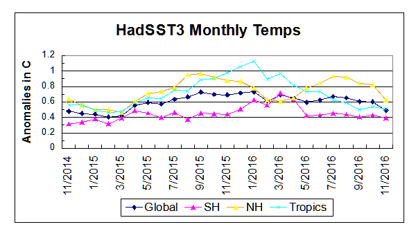
https://rclutz.wordpress.com/2016/12/29/anatomy-of-the-hottest-years-ever/
Correction: Should have said the warming was not that strong globally.
I thought that the AGW hypothesis predicts the lowest warming in the Tropics.
Correct. The data contradicts both the notion of CO2 warming mostly in the higher latitudes, and also shows an absence of warming in the SH, so not global.
Why not show the unaltered temps from 1930? Why not use the satellite measurements? Oh wait I know… Because there wouldn’t be any warming from 1930.
Satellite records only go back to about 1970.
I am curious which version of the sea surface temp’s are they using, the adjusted ones that tried to disappear the “pause” or have they come up with their own?
A quick perusal of their site indicates that they start with HadSST, then do their own interpolation.
They are the group that decided to adjust the good ARGO float data to match the bad ship based data merely because the ship based data has a longer record.
Doesn’t matter much; the recent adjustments are quite small in comparison to the warming of the last couple decades.
Even without the adjustments, we’d quite easily be hitting record temperatures.
What warming of the last couple of decades?
The only warming in the last 20 years was due to the recent El Nino and is pretty much gone by now.
Have you calculated the trend for the last 2 decades? It’s about 0.18 C/decade. That’s a long way from zero. And the El Nino years keep getting warmer and warmer, with 2016 quite a bit warmer than 1998.
That’s only true if you measure to the top of the recent El Nino.
If you measure from the top of the previous El Nino to the top of the recent one, it’s closer to 0.02C/18 years.
Actually the adjustments in GISS for example are not small relative to the trend they show. And the adjustments never seem to be final. New temperature values appear even on recent temperatures on an almost continuous basis. Nick Stokes hand waves the fact that ground level temperatures are not the same as atmospheric temperatures as measured by satellite. But when one looks at the dramatic difference in trends between the two, how does one not dredge up a bit of skepticism?
“But when one looks at the dramatic difference in trends between the two, how does one not dredge up a bit of skepticism?”
Well, try some skepticism here. below is a plot showing that dramatic diffrence in trends. But notice that the upper group includes UAH5.6, still being produced. So if surface measures are consistent, and UAH is on both sides of this “dramatic difference”, why would a skeptic prefer UAH6?
The hottest year on record has no credibility with all the adjustments that have been made.
Yeah, sure, it allowed the NCDC and GISS to have a big news conference and get headlines on left-leaning websites/newspapers, …
… But they had to achieve this by continually making up temperature adjustments and have lost all credibility with people on the skeptical side.
Give up your integrity and credibility for a few headlines???
Nobody should be using their numbers anymore and just use the satellite temps.
When Congress and Trump go about “adjusting” climate research budgets, you know what is a good idea, let’s take $1.0 billion of that and award it to John Christy and Roy Spencer and they can set-up a brand new institute that has credibility. This is probably the best idea I have seen about what to do with the climate change budgets.
No, the adjustments change the long-therm trend.
“ It’s about 0.18 C/decade.” Let’s see … that’d be 0.18±0.5 C. Be very worried, MarkW. 🙂
MarkW
Completely, horribly incorrect. You don’t measure trendlines by drawing lines between two points; you use linear regression, which uses *all* of the data in the series.
For instance, look at the temperatures from 1998 to 2014. Calculate the trendline. It’s positive. Why? Because even though the highs were about the same (1998, 2004, 2010), the lows kept getting higher. The overall temperature kept rising, and this is shown mathematically.
PatFrank:
Over the last 30 years, the trend is about 0.18C +/- 0.05C per decade. Quite a bit smaller uncertainty.
Over short time periods, though, yeah, the uncertainty is high. Which is why climate is defined over 30 years; 10 or 15 years is just too short to generally draw conclusions. Not statistically significant.
“Over the last 30 years, the trend is about 0.18C +/- 0.05C per decade.”
Yeah, and all measurement error is assumed random, all platforms assumed to have a constant and spatially uncorrelated offset bias and it all just averages away. Fat chance.
pushed up by a large El Nino event………..
.and the tail end of a strong AMO
2016 witnessed extraordinary warming in the Arctic..
….where the h3ll do they think the AMO goes?
“continued global warming”
Again, who here expects presentation of a squiggly line that suggests anything different?
Andrew
And so the temperature data set wars continue one more month.
In the next episode watch RSS make an adjustment that will increase warming.
Berkeley Earth: such a grande title they give themselves.
The name itself gives off a strong smell of grant money and eco-tard vomit.
Hey ho. Can’t wait ’til Friday.
Let the wailing begin; what’s up with that ?
When you pretentiously call your dataset B.E.S.T before it’s even released , it’s pretty clear it’s a sales pitch and not science.
BEST was supposed to be land only record, then they got into the BS “global average” game. Last time I looked at there site I could not even find the land only record any more: Total propaganda and hype now unfortunately.
Betty Muller says:
Sure the globe is warmer and real, but you don’t have any “compelling scientific evidence” it is human caused, you have a temperature dataset. The early 20th c. rise was no different from the late 20th c. rise. That is “compelling evidence” that human effect is minimal.
Greg on January 18, 2017 at 3:02 pm
Last time I looked at there site I could not even find the land only record any more…
Frenchies love to say “Au pays des aveugles, le borgne est roi”. Luckily I am one-eyed:
http://berkeleyearth.lbl.gov/auto/Regional/TAVG/Text/global-land-TAVG-Trend.txt
Ooops! Possible apologies here: all land-only datasets I was looking for end in september 2013… Hum hum hum.
I got about anything you want, message me with any questions. The newer the version is, the more features included.
http://sourceforge.net/projects/gsod-rpts/
What good timing to get this out before the coming drought, of funding that is……
2 days left.
“It would be wise to slow or halt this rise” One problem = it is not within mans purview to slow or halt the warming or cooling of our climate.
Bill, we’ve just geo-engineered the Arctic. It certainly is in our “purview”.
No, we haven’t. Pure arrogance.
I guess humans were not civilized prior to the 1850’s eh?
If anyone needs it, here ya go :-}
https://countingdownto.com/countdown/obama-out-of-office-20-january-2017-countdown-clock
Weren’t industrialized. Civilized is another matter.
Unabated? Would someone tell the AMO to stop its decline, and all other longer, natural cycles.
I stand corrected. They didn’t even consult or graph the oceans.
The AP headline says “…sizzling…”. Made me think of a Philly Cheese-steak Sandwich for lunch. What’s the carbon footprint for that, I wonder?
I do enjoy these kind of statements:
“It is certainly true that the impacts of global warming are still too subtle for most people to notice in their everyday lives.”
Who are the people that can detect climate change in their daily lives?
I think the accurate statement is;
“It is certainly true that the impacts of global warming are impossible for people to notice in their everyday lives or even their lifetimes.”
On one hand, global warming is going to kill us all.
On the other hand it’s “too subtle for most people to notice in their everyday lives.”
That’s part of the eco-religion – that humans are somehow not natural, and – combined with concepts of the ‘fragile ecosystem’, ‘stasis’, and ‘equilibrium’ – any effect at all, no matter how trivial, is by definition judged to be destructive.
It’s ironic – trying to scare us with a pseudo-phenomenon that will supposedly ‘kill us all’, yet the solution is the population control, segregation, or even eradication of the human animal – a ‘pestilence’ I believe the esteemed ‘SIR’ Attenborough, called us.
And THESE are the people that claim the moral high ground.
Why is the 98 spike not showing in their graph ? If averaging has smoothed it out should they not wait the appropriate period and smooth out 2015-16? I made this point about the GISS record in another post without backup evidence. I was challenged to provide evidence. Well here it is, in this graph.
“Why is the 98 spike not showing in their graph ”
I am pretty sure that this is caused by the use of the Karl et al 2015 which reconfigured the way aspects of the raw data was being interpreted. That paper significantly reduce the 1998 spike amongst many other changes, such as the removal of the pause from existence.
BEST are not using Karl 2015. They are using HADSST3. Not that it makes much difference to the 1998 spike.
“It is certainly true that the impacts of global warming are still too subtle for most people to notice in their unadjusted data.” 😉
For anyone who doesn’t know what the “1998 spike” is all about, take a look at this UAH satellite chart which shows how the 1998 heat spike compares to previous and subsequent years. As you can see, 1998 is the hottest year in the satellite record (1979 to present) with the exception of the year 2016, where the highest temperature was measured to be 0.1C higher than the highest point in 1998. The temperatures have subsequently fallen from that high.
Any temperature chart you see that doesn’t have the same profile as the UAH satellite chart, with 1998 being hotter than any subsequent year except 2016, is a bogus, bastardized, politicized chart that was created to promote human-caused global warming/climate change.
Here’s the UAH chart:
http://www.drroyspencer.com/wp-content/uploads/UAH_LT_1979_thru_December_2016_v6.jpg
That was my first observation – who fiddled 1998 off the data. And there we have UAH showing it properly.
Michael Carter on January 18, 2017 at 9:25 am
Why is the 98 spike not showing in their graph ?
Simply because surface temperatures do not react to ENSO signals as do those in the troposphere.
And even in the troposphere the reaction to ENSO is by far not uniform, see the difference in the UAH record between Globe and Tropics:
Don’t like the old graphs that don’t support the models ? Make up a new one.
Look at the graph at the beginning of this page — the graph is in monthly anomaly, not annual.
It’s easier to see the 1998 spike if looking at calendar annual averages. It doesn’t show up as much with monthly averages.
Thank goodness for warming and CO2 fertilisation. It’s a win-win situation.