Guest Post by Bob Tisdale
This post is similar in format to In Honor of Secretary of State John Kerry’s Global Warming Publicity-Founded Visit to Greenland… As you’ll see, like Greenland, the consensus of the climate models used by the IPCC show that the models do not simulate the surface temperatures for the contiguous United States over any timeframe from 1861 to present.
INTRODUCTION
We illustrated and discussed the wide ranges of modeled and observed absolute global surface temperatures in the November 2014 post On the Elusive Absolute Global Mean Surface Temperature – A Model-Data Comparison. Not long after came a post at RealClimate of modeled absolute global surface temperatures, authored by Gavin Schmidt, the head of the Goddard Institute of Space Studies (GISS). Gavin’s post is Absolute temperatures and relative anomalies. (Please read it in its entirety. I believe you’ll find it interesting.) Of course, Gavin Schmidt was downplaying the need for climate models to simulate Earth’s absolute surface temperatures.
In this post about the surface temperatures of the contiguous United States, we’ll present a few examples of why climate modelers need to shift their focus from surface temperature anomalies to absolute surface temperatures. Why? In addition to heat waves and cold spells, near-surface air temperatures play roles in model simulations of snow cover, drought, growing seasons, surface evaporation that contributes to rainfall, etc.
In the past, we’ve compared models and data using time-series graphs of temperature anomalies, absolute temperatures and temperature trends, and we’ll continue to provide them in this post. In this series, we’ve added a new model-data comparison graph: annual cycles based on the most-recent recent multidecadal period. Don’t worry, that last part will become clearer later in the post.
MODELS AND DATA
We’re using the model-mean of the climate models stored in the CMIP5 (Coupled Model Intercomparison Project Phase 5) archive, with historic forcings through 2005 and RCP8.5 forcings thereafter. (The individual climate model outputs and model mean are available through the KNMI Climate Explorer.) The CMIP5-archived models were used by the IPCC for their 5th Assessment Report. The RCP8.5 forcings are the worst-case future scenario.
We’re using the model-mean (the average of the climate model outputs) because the model-mean represents the consensus of the modeling groups for how surface temperatures should warm if they were warmed by the forcings that drive the models. See the post On the Use of the Multi-Model Mean for a further discussion of its use in model-data comparisons.
I’ve used the ocean-masking feature of the KNMI Climate Explorer and the coordinates of 24N-49N, 125W-66W to capture the modeled near-land surface air temperatures of the contiguous United States, roughly the same coordinates used by Berkeley Earth.
Near-surface air temperature observations for the contiguous U.S. are available from the Berkeley Earth website, specifically the contiguous United States data here. While the monthly data are presented in anomaly form (referenced to the period of 1951-1980), Berkeley Earth provides the monthly values of their climatology in absolute terms, which we then simply add to the anomalies of the respective months to determine the absolute monthly values. Most of the graphs, however, are based on annual average values to reduce the volatility of the data.
The model mean of surface temperatures at the KNMI Climate Explorer starts in 1861 and the Berkeley Earth data end in August 2013, so the annual data in this post run from 1861 to 2012.
ANNUAL NEAR-LAND SURFACE AIR TEMPERATURES – THE CONTIGUOUS UNITED STATES
Figure 1 includes a time-series graph of the modeled and observed annual near-land surface air temperature anomalies for the contiguous U.S. from 1861 to 2012. Other than slightly underestimating the long-term warming trend, at first glance, the models appear to do a reasonable job of simulating the warming (and cooling) of the surfaces of the contiguous United States. But as we’ll see later in the post, the consensus of the models misses the multidecadal warming from the early 1910s through the early 1940s.

Figure 1
Keep in mind, Figure 1 is how climate modelers prefer to present their models, in anomaly form.
Figure 2 gives you an idea of why they prefer to present anomalies. It compares the modeled and observed temperatures on an absolute basis. Not only do the models miss the multidecadal variations in the surface temperatures of the contiguous United States, the consensus of the models is running too cold. That of course would impact how well the models simulate temperature-related factors like snowfall, drought, crop yields and growing seasons, heat waves, cold spells, etc.

Figure 2
ANNUAL CYCLES
Climate is typically defined as the average conditions over a 30-year period. The top graph in Figure 3 compares the modeled and observed average annual cycles of the contiguous U.S. surface temperatures for the most recent 30-year period (1983 to 2012). Over that period, data indicate that the average surface temperatures for the contiguous U.S. varied from about +0.0 deg C (+32 deg F) in January to roughly +24.0 deg C (+75 deg F) in July. On the other hand, the consensus of the models show they are too cool by an average of about 1.4 deg C (2.5 deg F) over the course of a year.

Figure 3
You might be saying to yourself, it’s only a model-data difference of -1.4 deg C, while the annual cycle in surface temperatures for the contiguous U.S. is about 24 deg C. But let’s include the annual cycle of the observations for the first 30-year period, 1861-1890. See the light-blue curve in the bottom graph in Figure 3. The change in observed temperature from the 30-year period of 1861-1890 to the 30-year period of 1983-2012 is roughly 1.0 deg C, while the model-data difference for the period of 1983-2012 is greater than that at about 1.4 deg C.
THE MODELS ARE PRESENTLY SIMULATING AN UNKNOWN PAST TEMPERATURE-BASED CLIMATE IN THE CONTIGUOUS UNITED STATES, NOT THE CURRENT CLIMATE
Let’s add insult to injury. For the top graph in Figure 4, I’ve smoothed the data and model outputs in absolute form with 30-year running-mean filters, centered on the 15th year. Again, we’re presenting 30-year averages because climate is typically defined as 30 years of data. This will help confirm what was presented in the bottom graph of Figure 3.
The models obviously fail to properly simulate the observed surface temperatures for the contiguous United States. In fact, the modeled surface temperatures are so cool for the most recent modeled 30-year temperature-based climate that they are even below the observed surface temperatures for the period of 1861 to 1890. That is, the models are simulating surface temperatures for the contiguous U.S. over the last 30-year period that have not existed during the modeled period.

Figure 4
For the bottom graph in Figure 4, I’ve extended the model outputs out into the future, to determine when the models finally simulate the temperature-based climate for the most-recent 30-year period. The horizontal line is that average data-based temperature for the period of 1983-2012. Clearly, the future models are out of sync with reality by more than 3 decades.
Keep the failings shown in Figure 4 in mind the next time an alarmist claims some temperature-related variable in the contiguous U.S. is “just as predicted by climate models”. Nonsense, utter nonsense.
30-YEAR RUNNING TRENDS SHOW THAT THERE IS NOTHING UNUSUAL ABOUT THE MOST RECENT RATE OF WARMING FOR THE CONTIGUOUS UNITED STATES
The top graph in Figure 5 shows the modeled and observed 30-year trends (warming and cooling rates) of the surface air temperatures for the contiguous U.S. If trend graphs are new to you, I’ll explain. First, note the units of the y-axis. They’re deg C/decade, not simply deg C. The last data points show the 30-year observed and modeled warming rates from 1983 to 2012, and it’s shown at 2012 (thus the use of the word trailing in the title block). The data points immediately before it at 2011 show the trends from 1982 to 2011. Those 30-year trends continue back in time until the first data point at 1890, which captures the observed and modeled cooling rates from 1861 to 1890 (slight cooling for the data, noticeable cooling for the models). And just in case you’re having trouble visualizing what’s being shown, I’ve highlighted the end points of two 30-year periods and shown the corresponding modeled and observed trends on a time-series graph of temperature anomalies in the bottom cell of Figure 5.

Figure 5
A few things stand out in the top graph of Figure 5. First, the observed 30-year warming rates ending in the late-1930s, early-1940s are comparable to the most recent observed 30-year trends. In other words, there’s nothing unusual about the most recent 30-year warming rates of the surface air temperatures for the contiguous U.S. Nothing unusual at all.
Second, notice the disparity in the warming rates of the models and data for the 30-year period ending in 1941. According to the consensus of the models, the near-surface air of the contiguous United States should only have warmed at a rate of about 0.12 deg C/decade over that 30-year period…if the warming there was dictated by the forcings that drive the models. But the data indicate the contiguous U.S. surface air warmed at a rate that was almost 3.5 deg C/decade during the 30-year period ending in 1941…almost 3-times higher than the consensus of the models. That additional 30-year warming observed in the contiguous United States, above and beyond that shown by the consensus of the models, logically had to come from somewhere. If it wasn’t due to the forcings that drive the models, then it had to have resulted from natural variability.
Third thing to note about Figure 5: As noted earlier, the observed warming rates for the 30-year periods ending in 2012 and 1941 are comparable. But the consensus of the models show, if the warming of the near-surface air of the contiguous United States was dictated by the forcings that drive the models, the warming rate for the 30-year period ending in 2012 should have been noticeably higher than what was observed. In other words, the data show a noticeably lower warming rate than the models for the most-recent 30-year period.
Fourth: The fact that the models better simulate the warming rates observed during the later warming period is of no value. The model consensus and data indicate that the surface temperatures of the contiguous United States can warm naturally at rates that are more than 2.5 times higher than shown by the consensus of the models. This suggests that the model-based predictions of future surface warming for the contiguous U.S. are way too high.
CLOSING
Climate science is a model-based science, inasmuch as climate models are used by the climate science community to speculate about the contributions of manmade greenhouse gases to global warming and climate change and to soothsay about how Earth’s climate might be different in the future.
The climate models used by the Intergovernmental Panel on Climate Change) IPCC cannot properly simulate the surface air temperatures of the contiguous United States over any timeframe from 1861 to present. Basically, they have no value as tools for use in determining how surface temperatures have impacted temperature-related metrics (snowfall, drought, growing periods, heat waves, cold spells, etc.) or how they may be impacting them presently and may impact them in the future.
As noted a few times in On Global Warming and the Illusion of Control – Part 1, climate models are presently not fit for the purposes for which they were intended.
OTHER POSTS WITH MODEL-DATA COMPARISONS OF ANNUAL TEMPERATURE CYCLES
This is the third post of a series in which we’ve included model-data comparisons of annual cycles in surface temperatures. The others, by topic, were:
- Near-land surface air temperatures of Greenland
- Sea Surface Temperatures of the Main Development Region of Hurricanes in the North Atlantic
PS: Happy 4th of July for those who are celebrating. For the rest of the readers, Happy Monday.
The British have a joke:
Q. What do you call a warm sunny day after two cold, wet, miserable days?
A. Monday.
Canberra was actually quite cold and miserable today. Where is that global warming I’ve been promised?
We will gladly share our Independence Day with our friends, the Brits, in celebration of their own declaration of independence from the EU. Let us hope their impending war for that freedom succeeds quicker than our own.
And…climate models based on the short post-Little Ice Age cycle are not taking into account the fact that the climate varies a great deal over time and all warm cycles were warmer than today and longer than today’s warm cycle.
This begs the question about Ice Ages and why they come in a rhythm that is frightening, this pushed human evolution along at a rapid pace as humanoids struggled to survive.
Strictly BerkeleyEarth is a data-based product not data.
BerkeleyEarth is not really data-based. They filter and adjust data according to preconceived notions about temperature trends. That’s an absolute no-no; you can’t manipulate data to match preconceived trends and then use the manipulated data to find its trends.
Err No.
there were no preconceived ideas.
we adopted methods recommended by skeptics.
We do filter data: If the station has no lat and lon we dump it
if it has less than 24 months we dump it
if a month has a QC problem we dump it.
Starting with raw daily data….. after QC ( dumping data ) the Trend goes DOWN
ya thats right, QC REDUCED the trend
As for adjusting data… we dont adjust data.
Stations are score objectively according to an algorithm that measures their difference from their neighbors
Good stations get a weight of 1, stations ( like cities ) that have more warming are DOWNWEIGHTED.
So. you dont know what you are talking about.
So..
Starting with RAW
Applying QC reduces the trend
Applying weighting changes the trend by about 15% over the 1860 – 2015 time period
Why is this time period important?
Its the period used by Nic Lewis to calculate his low sensitivity numbers.
Finally if you use ONLY unadjusted data for the whole globe and and calculate sensitivity per nic Lewis
The sensitivity goes UP.
Special treat… There are 10K stations that get NO ADJUSTMENTS whatsoever..
care to guess what the answer is?
too funny
Bwahahahahaha
No, Downweighting isn’t an adjustment, it just changes the data to more our liking.
Bob,
” Not only do the models miss the multidecadal variations in the surface temperatures of the contiguous United States, the consensus of the models is running too cold.”
This is not comparing like with like. Your lat/lon block is not the same as CONUS. In fact, it has an area of 14.54 million sq km, by my calc, compared with the actual 8.08 million sq km of ConUS. So it includes a lot of sea, as well as parts of Great Lakes and Canada. This will particularly affect things involving absolute temp.
Nick Stokes: Please read the linked Berkeley Earth page.
http://berkeleyearth.lbl.gov/auto/Regional/TAVG/Text/contiguous-united-states-TAVG-Trend.txt
They list the coordinates they use as:
“The current region is characterized by:
Latitude Range: 24.53 to 49.39
Longitude Range: -124.73 to -66.95”
Aslisted in the post and on the drawings, for the models, I used the coordinates of 24N-49N, 125W-66W.
Bob, but BEST say their data is from land stations, and represents an area of 7.77 million sq km (which is about the land component of ConUS, and about 1/2 the area of that block. I note that you mention in the text that an ocean mask was used, though the diagrams don’t say so. But even so, with a 2.5° grid, that isn’t going to line up very well.
Nick Stokes says: “Bob, but BEST say their data is from land stations, and represents an area of 7.77 million sq km (which is about the land component of ConUS, and about 1/2 the area of that block.”
Obviously, Nick, based on their coordinates, Berkeley Earth is including more than the contiguous U.S. if their data include all data within those coordinates.
I see that if you request 24-49°, in the ascii data at least, KNMI return for CMIP5
# cutting out region lon= 65.000 125.000, lat= 25.000 50.000
ie rounded to the 2.5° grid (and so moved 1° North).
Nick says: “I see that if you request 24-49°, in the ascii data at least, KNMI return for CMIP5
# cutting out region lon= 65.000 125.000, lat= 25.000 50.000
ie rounded to the 2.5° grid (and so moved 1° North).”
Nick, so we’ll drop the southern border down to 22.5N, splitting the difference:
Doesn’t make much difference, Nick.
we extract data using a shapefile. the shapefile cuts out all ocean.
If you use a square grid from KNMI and dont apply an ocean mask then you’ll get the wrong answer.
Nick, one last note: There is a similar disparity (average about 1.25 deg C) in contiguous U.S. surface temperatures between the CMIP5 model mean and the GHCN-CAMS reanalysis (1 deg resolution), using the same coordinates of 25N-50N, 125W-65W for both. Unfortunately, the annual GHCN-CAMS data start in 1949, but, on the other hand, they extend to current times.
Nick Stokes: Regarding sea surface temps, if you had read the post, you would have noted that I used the ocean-masking feature of the KNMI Climate Explorer.
Same reply for Mosher.
Cheers.
read harder
‘If you use a square grid from KNMI and dont apply an ocean mask then you’ll get the wrong answer.”
Note I say nothing about what you DID.. I used a conditional for a good reason..
I cannot comment on what you SAY you did
A I dont trust KNMI to do masking properly.. I’ve never checked their work
B I dont know that you did IN FACT what you say you did. I only know what you say.
HENCE I have to say IF
however, should you decide to post the data AS USED… then I can check… did he mask it properly?
Those are just technicalities. I dont think much will turn on them. The real issue would be calculating
an actual skill score.
Or since you have grids looking at the data from a spatial perspective.
Another thing that causes issues is that you are comparing apples and oranges.
BE. is the air temperature at a specific altitude + 2meters.
GCMs typically have no terrain (last I looked ).. so they are all at 2m ASL
that might make the comparisons even worse.. so I would have to normalize our temps down to
2m ASL..
again technical details.. but as it stands the models look great..
“GCMs typically have no terrain (last I looked )”
They all have some way of dealing with terrain (they have to). Here is an account of some of the methods that are used. And here is a 2003 paper on some improvements in terrain being made to the UM model. It begins:
“The representation of orography has long been known to be crucial to the performance
of global circulation models (GCMs). Palmer et al. (1986) and McFarlane (1987)
were the first to show clearly the benefits of augmenting the resolved GCM orography
with a represention of the effects of subgrid-scale orography (SSO).”
BEST have just updated their global datasets, “Land Only” and “Land + Ocean”, up to May 2016 (link (?) : http://berkeleyearth.org/data/).
Unfortunately their “Regional” files are all dated 25/10/2013 (see their http://berkeleyearth.lbl.gov/auto/Regional/TAVG/Text/ sub-directory).
Does anyone have any “friendly” contacts at Berkeley that they can ask to run updated scripts to generate “Regional” files up to May 2016 (or December 2015, at least) ?
Mark BLR, I suspect that Zeke Hausfather or Steve Mosher may make an appearance. They’re part of the Berkeley Earth team.
Ya. Processing all of those extra files and charts got to be a huge burden. there are charts and data for
every station, every state, province etc, every country, continent, hemisphere, and cities.
We are currently updating a select few in preparation of a paper..
I can ask about updating the regional files.. maybe hemispheres and continents first, but running everything was taking days to weeks…. no more super computer time..
Hello Steven, thanks for responding.
I agree that going down to “state” level (worldwide, not just “The United …”) is excessive, let alone the CITY level.
For comparisons like those Bob did in the ATL article, the main satellite monthly figures include :
RSS : NH (“0 / 82.5”), SH (“-70 / 0”), Tropics (“-20 / 20”) and “Cont. USA” (all to 3 decimal places)
UAH : “NH”, “SH” and “TRPC” to 3dp; plus “USA48”, “USA49” and “AUST” to 2dp
My (and Bob’s ???) “shortlist” would therefore probably be :
“NH” + “SH” + “Tropics (20°N to 20°S)” + “Continental USA / USA48”.
With a bit of luck TABLES of monthly data for these areas should only take MINUTES of (super-)computer time to generate (instead of days), charts / plots would be superfluous (to me, at least).
PS : Secondary options would start with “Tropics (30°N to 30°S)” … and then MAYBE “Australia” …
So this is the evidence for demonising Co2
No Robert. There’s more that’s much worse!
Thanks for the post Bob. I am off soon to celebrate the birthday of The Wife, and then the 4th. Happy holiday to you.
I find that I just don’t believe any time series of temperatures that have been produced by government funded agencies.
I would prefer a time series of temperatures that was totally transparent and was not subject to the continuing “adjustment” of the past. I just don’t think we will see such a thing until the cAGW delusion is over. That should come after ten straight years of dramatic cooling. When will that happen? Don’t know, as my crystal ball is cloudy. (but I admit it)
Hi Mark,
Please see the top part of Bob’s Figure 5, above. There were about 35 years of global cooling from ~1940-1975, just as fossil fuel combustion accelerated strongly and atmospheric CO2 levels allegedly increased.
Then see my post re false aerosol data, just below.
If anyone believes these cooked climate models, they must also believe in the tooth fairy.
Regards, Allan
Hello Bob,
Let’s examine the upper portion of your Figure 5, and especially the cooling period from ~1940-1975. Fossil fuel combustion and atmospheric CO2 reportedly increased strongly during the period, but global temperatures fell.
How did the models, which assume CO2 primarily drives temperature, simulate this cooling period?
Some comments follow from my previous posts. I would appreciate your thoughts.
On climate model hindcasting and fabricated aerosol data:
I reject as false the climate modelers’ claims that manmade aerosols caused the global cooling that occurred from ~1940 to ~1975. This aerosol data was apparently fabricated to force the climate models to hindcast the global cooling that occurred from ~1940 to ~1975, and is used to allow a greatly inflated model input value for ECS.
Some history on this fabricated aerosol data follows:
http://wattsupwiththat.com/2009/06/27/new-paper-global-dimming-and-brightening-a-review/#comment-151040
More from Douglas Hoyt in 2006:
http://wattsupwiththat.com/2009/03/02/cooler-heads-at-noaa-coming-around-to-natural-variability/#comments
Happy July 4 to all my American friends.
Regards, Allan
Allan, there should be no doubt that much of the mid-20th Century cooling was the result of natural variability, primarily due to the naturally occurring multidecadal variations of the sea surface temperatures of the Northern Hemisphere and polar amplified cooling…not aerosols.
PS: Nice to see Leif playing devil’s advocate in a comment about yours in your first link here.
https://wattsupwiththat.com/2009/06/27/new-paper-global-dimming-and-brightening-a-review/#comment-151040
Thank you Bob,
I suggest that the global cooling from ~1940-1975, as fossil fuel combustion strongly accelerated, effectively disproves the CAGW hypo.
Model “cooking” with falsified aerosol data does not help – it just adds to the fraud.
I responded to Leif’s strange 2009 comment here:
https://wattsupwiththat.com/2009/06/27/new-paper-global-dimming-and-brightening-a-review/#comment-151098
Best, Allan
Funny, I showed these graphs to a couple of friends of mine that are climate agnostic (e.g. not 100% skeptic but definitely not convinced) and they came away with the impression that the models do much better than what they had in mind. So thanks for converting a couple of unconverted!
And keep up the good work with these type of data driven posts. Much more interesting (and relevant) than the political stuff.
Cheers,
Ben
I agree, it seems to me that the models do an EXCELLENT job.
lsvalgaard says: “I agree, it seems to me that the models do an EXCELLENT job.”
And which of the graphs provide you with that opinion, Leif? I suspect it could not be Figures 2, 4 or 5.
Good joke Leif. Happy July 4.
If models are supposed to reflect past, current, and future “trends”, then I would concur that they do this quite well. But here is the rub: If they are using a proposed algorithm for an increase in CO2 with a subsequent increase in T, and then using increasing T in the code that creates the trend, they may be mistaking cause and effect. Increasing absolute T from some other non-anthropogenic source can increase both CO2 and the trend of T. Proxies certainly seem to point to another source of increasing land temperature since they reflect pre-industrial conditions.
Absorptive storage versus immediate transfer of solar energy into things like plant growth is a conundrum that has not been fully understood, nor is the capacity of oceans to store solar energy over very long periods of time. It is unclear how the oceans serve as discharge/recharge oscillators. If our current increasing trend is due to net discharge of stored energy collected into the oceans during the past slide into a stadial temperature low, we would not know and would reasonably make the mistake of assuming current increasing T is from current sources, not from what had been stored in the oceans. This is why both camps point to solar or CO2 as the driver. With very little ocean research to back it up, it is assumed that what goes in almost immediately goes out in equal fashion. Thus folks are left with only two culprits, and cling to them. However, with all research, it is incumbent upon scientists to explore what they don’t know in order to avoid research bias, and to assume for themselves they may not know what they don’t know.
Current anthropogenic and Solar-Earth climate scientists seem too willing to charge ahead…damn the torpedoes and damn the confounding factor(s). That said, much to the frustration in both camps, the collective “we” far into the future will have to wait it out to see what we failed to question. And that is typical of research development. The real confounding factor has to slap us upside the head and knock out teeth before we are willing to let go of our pet understanding.
“If models are supposed to reflect past, current, and future “trends”, then I would concur that they do this quite well. But here is the rub: If they are using a proposed algorithm for an increase in CO2 with a subsequent increase in T, and then using increasing T in the code that creates the trend, they may be mistaking cause and effect”
go read the code.
comment less.
read more.
[you would do well to heed your own advice about commenting less. many of your comments are simply angry and unsupported hitbacks. -mod]
ya looks like an own goal
The models do GREAT
by comparison
https://www.ted.com/talks/harry_cliff_have_we_reached_the_end_of_physics/transcript?language=en
“We don’t know what dark energy is, but the best idea is that it’s the energy of empty space itself, the energy of the vacuum. Now, if you use good old quantum mechanics to work out how strong dark energy should be, you get an absolutely astonishing result. You find that dark energy should be 10 to the power of 120 times stronger than the value we observe from astronomy. That’s one with 120 zeroes after it. This is a number so mind-bogglingly huge that it’s impossible to get your head around. We often use the word “astronomical” when we’re talking about big numbers. Well, even that one won’t do here. This number is bigger than any number in astronomy. It’s a thousand trillion trillion trillion times bigger than the number of atoms in the entire universe.
So that’s a pretty bad prediction. In fact, it’s been called the worst prediction in physics, and this is more than just a theoretical curiosity. If dark energy were anywhere near this strong, then the universe would have been torn apart, stars and galaxies could not form, and we would not be here. So this is the second of those dangerous numbers, the strength of dark energy, and explaining it requires an even more fantastic level of fine-tuning than we saw for the Higgs field. But unlike the Higgs field, this number has no known explanation.
hitbacks?
Oh that is special.
Your readers are allowed to accuse me of manipulating data and your advice is to roll over?
or be polite? or to what? ask pretty pretty please?
sorry. I’ll punch back and then take crap from the mods…
Mosh, the basic T = model is well established. Down to one line of text. The area of concern for me is the use of increasing CO2 dial-ins (using whatever calculation) to increase temperature. However, increasing temperature can be caused by more (and other) than CO2. It is an a priori decision to state that CO2 is the means by which we rise out of cold periods, and not a discharge of stored heat from an over-stuffed heated ocean causing things to grow, green-up, support growing life, etc, building atmospheric CO2. Does CO2 have the capacity to hold heat to the troposphere? Yes. But so does water vapor. And a discharging warm ocean would make the atmosphere wetter with water vapor.
Some say that heated air leads to greater evaporation because CO2 is trapping heat, which leads to greater evaporation (IE runaway greenhouse). That may be true for land (though I am unconvinced regarding the runaway part) but I dare anyone to stipulate that human-sourced CO2 is causing the oceans to heat up more than they otherwise would without humans present. Besides the fact that the oceans don’t care where CO2 comes from, long-wave infrared radiation cannot warm oceans to the degree required for the runaway greenhouse scare to come about. My current opinion is that temperatures rose, thus CO2 rose. It remains to figure out what caused the temperatures to rise: The confounding factor.
http://www.john-daly.com/oceanco2/oceanco2.htm
Mosh, if you have debate material, post it. The discussion is valuable. Models are variable. Research inputs are variable. Some of the basic components without additional forcings are pretty standard. It is the tweaking of different models through the use of inputs that intrigues me. There is an a priori decision about CO2 that is the issue here. And there is still lots in the literature that says it could be the other way around. Something else may be at work here causing CO2 to increase along WITH air temperature. Well educated researchers have reasonable questions about that a priori cause and effect decision. Remember, confounding factors are likely the rule in climate science, not the exception.
“Mosh, the basic T = model is well established. Down to one line of text. The area of concern for me is the use of increasing CO2 dial-ins (using whatever calculation) to increase temperature. However, increasing temperature can be caused by more (and other) than CO2. ”
go read the code.
There IS NOT USE OF OF INCREASING DIAL INS.
The effect of C02 hasnt changed since 1998. The effect is determined SOLEY by the radiative transfer codes. Those have been tested and validated.
Further There are MORE INPUTS THAN C02 !!
again go read the code.
Its true c02 gets a focus in the policy talk.. But consider the fact that there are real debates about methane and black carbon and land use.
when the science says that there are other forcings besides c02, when the ode shows you this
when the inputs show you this
when the debates over policy reflect this
it is silly to argue that the science only says “only co2 can increase temperature” the science doesnt say that. has never said that, and will never say that.
Dear Pamela,
You are flat-out wrong in your assumptions about how the models work. I don’t really know what else to say. You don’t have to take my word for it either. Fortunately for everyone involved the code to the main climate models is publicly available, as is a huge amount of documentation. I invite you to go over it at your leisure: http://www.cesm.ucar.edu/models/cesm1.2/
The problem with the ‘skeptics’ here on this site is they very often will say pertinently untrue stuff like you said above, but when asked to put in a tiny bit of effort and actually look at the models…. all you hear is crickets. It would be really cool if you, Pamela, would actually take a look!
Cheers,
Ben
Benben, it took exactly 10 minutes to find that CO2 input changes from one model to the next, or one version of a model to the next.
http://journals.ametsoc.org/doi/full/10.1175/JCLI-D-11-00197.1
This one is really special. CO2 is not used as a control knob? Where have you been benben?????
http://eprints.uni-kiel.de/1292/1/BAMS-88-9-1383.pdf
Mosher, of course there are more model inputs than just CO2. But CO2 remains the major player, not plain old T, which I think would work much better given a model that incorporates discharge/recharge oscillations based on thermodynamics of sea water at large volume, given current solar/oceanic/atmospheric/landforms GCM components. Why do I think T works better? Both CO2 and T have a confounding factor that drives both. My premise is that it is the long, millennial scale seesaw of discharge/recharge from oceans that is the source of long term temperature and CO2 trends. Figure out that long term discharge/recharge seesaw, idealize it as a temperature increase/decrease, and put that in place of the idealized 1% yearly increasing CO2. Then run the model. More discharged and less discharged T will drive CO2 up and down, as well as drive oceanic/atmospheric processes up and down to model the stadial/interstadial oscillations.
What was before, is still, the cause. Natural variability has not been overtaken by anthropogenic forcing as the driver of the past 800,000 years or more (we run out of ice going further back and continental position would change the parameters).
eh.. you’re just looking for a couple of words that you think confirm what you believe instead of actually understanding how modelling works. Maybe it would help you if you build a basic climate model from scratch? It’s not that difficult.
Here is another one. So let’s dispense with the notion that CO2 is not a dialed in input. It is. The basic one is a 1% annual increase in CO2. But that is not the only one used. Heck, some even instantaneously double CO2 to see what would happen. Welcome to fantasy land. Arnold Schwarzenegger could advertise these model games and not detract from some of the ridiculous ways in which CO2 is tweaked in research.
http://treephys.oxfordjournals.org/content/9/1-2/101.full.pdf
Usually future CO2 levels are based on integrated assessment model scenarios. Please note that a scenario is never a prediction but always a storyline of a possible future.
However, there are literally thousands of climate models floating around so I’m sure you can google your way to more examples of whatever pet annoyance you have.
Cheers,
Ben
Here we have an article describing CMIP5 and its use in modeling current and proposed scenarios. Please look at page 8 for all the approved experimental designs (rather controlling don’t you think?). Notice how the CO2 dial is twisted this way and that as they try to find the holy grail. What is missing from the current CMIP version designs? The discharge/recharge function of ENSO processes, still not understood well enough to model long term. At best, only short term responses are examined.
http://journals.ametsoc.org/doi/pdf/10.1175/BAMS-D-11-00094.1
I don’t really understand your point. Of course the CO2 levels are the independent variable, as the whole point of the exercise is to see if you can say something about the effects of changing that variable. But you’re doing what skeptics always do: complain without thinking about a plausible alternative. Please do something more interesting and constructive and speculate about how we should treat CO2, if not as exogenous variable?
benben, I suspect your friends focused in Figure 1 and the top graph in Figure 3, without considering the impacts of the 1.4 deg C offset from reality.
Cheers.
The offset being that the models actually run cooler than reality? That wasn’t too much of a problem 😉
Bob, if I may, a request: there is quite a lot of interesting and nuanced discussion going on about how to use models and it would be really great if WUWT could provide a real contribution to that discussion. Lets be honest here: modelling isn’t meant to replicate reality exactly as it is, and to pretend that it does, and then show that it doesn’t is hardly very helpful when it comes to convincing people other than the WUWT regulars.
It would be really cool if you guys could step away from the hyperbole for a minute and take a real look at one of the models. And with real I mean actually play with the code and see what is and is not modeled and see if you can do any better. How about the community earth systems model? That is a frequently used and publicly accessible model:
http://www.cesm.ucar.edu/models/cesm1.2/
Have fun!
Cheers,
Ben
Probably also of interest to you Bob:
http://www.wcrp-climate.org/images/modelling/WGCM/CMIP/CMIP6FinalDesign_GMD_160603.pdf
A presentation on CIMP6.
benben
You write: “Lets be honest here: modelling isn’t meant to replicate reality exactly as it is, and to pretend that it does………”
You either kidding or you should change whatever you’re smoking. Try selling that line of BS to engineers at Boeing and Airbus or scientists in the bio-pharmaceutical sector and see how far you’d get.
The 777 was the first airliner the FAA allowed to be built on the basis of modelling – just imagine if the modelling hadn’t been “meant to replicate reality exactly as it is”… and the wings came off in flight because the computer model didn’t “replicate reality exactly as it is”. No doubt you would been perfectly happy to be on board for the first test flight.
Or what do you think the FDA would say about patient safety data based on e.g. pharmacokinetic or metabolic modelling of a molecule that wasn’t “meant to replicate reality exactly as it is”? No doubt you would be perfectly happy to be a clinical trial volunteer and go blue in the face in the event the modelers got it wrong.
Climate models with their man-made CO2 master variable, are the basis of the entire CAGW scare of the past 25 years – not verifiable empirical data. As long as these models cannot “replicate reality exactly as it is” in particular where the past is concerned [known in some professions as forensic analysis/,odeling] they are no more than GIGO based pseudo-scientific junk – and very dangerous junk at that, given the socio-political and economic leverage for which they’re being used.
“modelling isn’t meant to replicate reality exactly as it is……”. How far off the mark can you get and delude yourself…. ?
benben
“.. and see what is and is not modeled and see if you can do any better.”
As with any modelling exercise it all depends on what you are trying to. Models are simplification with a particular purpose on mind. If the purpose is to investigate climate phenomena not particularly sensitive to high spatial resolution processes and data limitations then the GCM mission is of interest. Typical applications would be gaining better understanding of how these phenomena evolve within idealised worlds.
It isn’t at all clear that putting effort into these models is what is rquired to better inform policy makers on the likely range of average global temperatures in 50 to 100 years’ time faced with increased concentrations of GHGs. Much simpler models will suffice, but they depend critically on better understanding of phenomena that lie outside the capability of GCMs to reproduce.
benben,
That was the problem with the O-Rings on the Challenger: they didn’t have model simulations that showed what would happen to the rings below freezing (actually below 39F) exactly. They had no hard data from the effect of exact temperatures on the rings because they didn’t bother to look. So the engineers who knew this critical component would fail had no way to prove it to NASA, and since NASA’s models didn’t show it, NASA approved the launch.
As Tetris said,
Code is not the issue. Understanding how things work, correct observational data, and the constraints, must precede coding it into a model, otherwise you’re just playing with your pud writing make-work BS, and collecting a paycheck. People have looked at the models. This blog has reported what’s not there for years. You new around here?
The models can’t model clouds, for example. One item you and your friends haven’t considered. As NASA wrote on it’s Cloud Climatology page:
Hello all, thanks for your responses.
@tetris: I don’t know whether to laugh or cry at your response. That’s just not how computational modelling is used. Modelling the laminar flow of a gas mixture over a single surface is something completely different than modelling the planet. However, HAS clearly has a better understanding.
@HAS: well, a lot of the ‘problems’ that this blog points to are artifacts of low spatial or temporal resolution, so improving that will improve the models accuracy. But of course the main reason to increase resolution is to be able to come with more specific policy recommendations (country X will have lots of flooding, country Y needs to be vigilant against desertification). There is this strange assumption here that people don’t understand the climate well enough. There is quite a good understanding of the climate. It’s just that the ‘skeptics’ here don’t like what that understanding results from that understanding. Again, please just follow a couple of courses and play around with the public, open source models, and you will see everything is working pretty well.
MRW: the models model cloud feedback loops in a pretty sophisticated fashion. That quote is from a page dedicated to justifying funding for their cloud observation program.
Cheers
Ben
MRW,
“As NASA wrote on it’s Cloud Climatology page:”
A long time ago. I don’t know exactly when; the project started in 1983. But here is a Wayback version from 2001. It may well have been true then.
benben:
Says who? And Nick Stokes:
Not according to NOAA in 2016.
The modelers don’t have the observations today to make accurate forecasts out to the year 2100 AD.
MRW: says me. Now obviously, you don’t have to take my word for it. I once again invite you to peruse the wares of the modelling community yourself: http://www.cesm.ucar.edu/models/cesm1.2/
Please do look at the cloud feedback algorithms and tell us exactly why you find them disappointing.
Cheers,
Ben
benben,
Why?
I’m not criticizing or doubting your ability to model what you’ve been handed to model. I’m saying that what you’ve been handed to model is incomplete, not fully understood by those supplying the data and the physics behind it, and in some cases, unknown. You’ve been asked to model a subset of a reality that is still unknown (through no fault of your own as well as a factor of time). Therefore, the results are speculative and their consequences unclear; the certitude is unfounded.
MRW,
“The modelers don’t have the observations today to make accurate forecasts out to the year 2100 AD.”
The sections that you quote have nothing to do with forecasts to year 2100. They are talking about the general inability to forecast individual thunderstorms, and hence where El Nino rain will fall in California in a given season.
Nick, I lived in Northern California for nearly fifty years, and there were very few thunderstorms. Almost all the rain was from fronts coming in off the Pacific, so the models being unable to predict individual thunderstorms is not relevant to Northern California.
They are talking about the general inability to forecast individual thunderstorms, and hence where El Nino rain will fall in California in a given season.
They can’t forecast individual thunderstorms but they can forecast thunderstorm herds???
Yeah, right.
Nick Stokes,
Which next you’ll be telling me has nothing to do with the climate over the next 84 years?
“Which next you’ll be telling me has nothing to do with the climate over the next 84 years?”
Indeed so. Weather is not climate. LA has a climate. NY has a climate and they are different. You can characterise and explain the difference, and it has nothing to do with whether there is a thunderstorm in LA at the moment. Nor whether you can predict individual thunderstorms in LA.
benben July 5, 2016 at 1:45 am
I imagine everyone has long gone to sleep on this, but I just note you don’t understand the point. While hose that like playing with complex models might think it a priority to try and project regional climates into the future, the policy priority is to get a more reliable and consistent view of how global temperatures are evolving. To some extent GCMs may help by aiding understanding of how the bits interact, but other forms of modelling are more likely to do the job (and in fact are being increasingly used for that purpose).
HAS, sure. People want to use other types of modelling, fine by me of course. IIRC there is quite a large variety of modelling types out there already. It’s just that they all point in the same direction (thus increasing our confidence in the hypothesis that CO2 increase is a bad thing on the long run).
The real point here is that models are used to answer the question: is increasing the CO2 content of the atmosphere possibly a bad idea, and if so, what do standard risk assessment methods say about the amount of effort we should into preventing that (taking into account stuff like uncertainty etc. etc.). The answer is that the current models are more than good enough for that specific question.
What WUWT does is NOT to judge the models on how they succeed in the design goal, but to set some pretty arbitrary goal (in this case: the models should perfectly recreate the historical temp record of north america), and then say that the models are clearly completely wrong because they don’t fully succeed in that. Most people are too smart to fall for that rhetorical trick, and rightfully ignore it. I’m here of course because I just find it very interesting to exchange views with people that truly have a different worldview than my own!
Incidentally, what types of other modelling are you talking about?
Cheers
Ben
I don’t agree, the models are written to drive temp with a ln forcing from co2, it was possibly correct, but it turns out it isn’t, so no they are not fit.
I have 15 years as a simulation expert for about a dozen different types of electronics simulators as well as building models for them.
A gcm is nothing more than an partial differential equation solver, just like spice is.
Benben
Not everyone had moved on.
The interesting question is not whether more CO2 is a bad thing (me, if I were CO2 I’d be deeply hurt by that and want to talk about all the good I do, but I’m not so I’ll let that pass). The interesting question is how much it is contributing to increased temperatures. Unfortunately there isn’t unanimity on this.
If we are generally interested in temperature increases we are also interested in the contribution of other forces including short and long period cycles in nature. From the policy perspective we rather want to know what is happening to see how we should act. Large human GHG contribution implies one set of actions; if more modest then we should be looking to the natural cycles and where they are likely heading (in fact this isn’t an either/or, we should be doing the latter because as the period since the little ice age shows nature is pretty good at increasing temperatures on it own account without our help).
Now unfortunately the current models are not good enough to do that. It is, as I noted before, intrinsic in their design that they lack the resolution to model the processes that might enable us to understand the competing contributions to warming from the various forcings. Also as has been noted here they do not reliably model absolute temperatures of the globe which is pretty critical to this stuff. So while climate sensitivity might be an emergent property from GCMs the particular answers are not independent of the assumptions.
Why this is important in any policy work is that GCMs produce an acceleration in warming due to the build up of CO2. This is a product of the sensitivity of the modeled climate to GHGs, and you can get a rough idea of this by looking at the temperature path of the RCP2.6 scenario results in comparison with the others. While not modeled in the GCMs the range of sensitivities to GHG in the current literature is wide enough to suggest that nature might deliver what we want anyway (i.e. RCP2.6 temeps), and in particular the constraints on the upper bound strongly suggests that the GCMs are producing results that are creating risks in any policy CBA on the upside.
If you haven’t so far been interested in these issues, I’d be inclined to suggest you shift some of your attention away from tinkering with the complex GCMs and look at them. Complex GCMs are in many ways a distraction both from the GHG problem and what the forces of nature are up to. Quite simple low resolution models are adequate to both investigate the past (particularly given the quality of data available) and attempt to forecast the future. And you don’t need the increasingly large computing resources that people like Palmer are looking at in an attempt to solve the resolution problem by brute force.
I found the contributions from Steve Mosher, benben and Nick Stokes very valuable. I plan to have a go with the model when I have time to figure it out. Thanks for the links and the informative content.
Thanks 🙂 HAS, I don’t have time to properly respond today, but I’ll have a go at it tomorrow!
HAS, ok I don’t have the expertise to really answer your question with authority, but the reasons I can think of to go regional are two-fold. Firstly, while many first-order effects are global, many of the feedback loops are quite local. So you need to look at the interaction between global and local to understand what is really going on. Secondly, in order to understand the actual effects of increasing CO2 levels you also need to go local. Temperature in itself is not really relevant (do I really notice a 2C increase in average temperature? Probably not), but the effect all that added energy has on the climate etc. etc. is quite pronounced but can change drastically depending on where you are.
Unfortunately, benben’s friends, likely:
1. completely unfamiliar with the twisting and churning that goes into the data product put out by “BEST;”
and
2. highly unlikely to distinguish historic nudging by climate simulators from their original, WAY-off, unskilled, forecast model output;
came to the only rational conclusion: “Hey those models are doing pretty good.”
By using BEST “data” and focusing on the historical corrections done to nudge the models to match the data, Mr. Tisdale has, for reasons known only to him, created a false impression that the climate models are fit for purpose. His pictures LOUDLY over-shout his mild, quiet, words in his text about the models doing poorly.
Certainly, for a careful reader and for any genuine scientist, Mr. Tisdale’s graphics do NOT communicate that, but, to the average voter “for climate change policy,” they do.
In itself, that Mr. Tisdale (Bob Tisdale!) used the much-criticized (by genuine scientists), twisted and churned data product put out by Berkeley Earth is appalling. I almost feel sick to my stomach. What is going on, Mr. Tisdale?? …… that is YOU, Mr. Tisdale…… isn’t it? I’d actually be happy to find out someone was using Mr. Tisdale as a sockpuppet…….
In sum, using:
1. a poor-quality (per reputable scientists) data product put out by known warmists;
side-by-side with
2. historic, corrected, model results — along with NO BIG CAVEAT AND INSTRUCTION to prevent the average voter from thinking the model output graphed was not what models projected in advance of knowing the data (or “data”);
provides strong support (de facto, though not technically — see above about non-technical readers) for AGW.
**************************************
iow, this post’s main effect will be:
!!!!!!!!!!!!!!!!!!!!!!!!!!!!!!!!!!!!
CLIMATE MODELS WORK GREAT.
(notreallybutihopeyoudon’tfigurethatout)
!!!!!!!!!!!!!!!!!!!!!!!!!!!!!!!!!!!
ehm… you want mr. Tisdale to be a sockpuppet? Would you care to elaborate?
benben
As I’ve asked Mosher, how do you propose to model the atmosphere – a highly complex, non-linear system with no fixed variables- when current models can’t even track let alone forecast temperature?
GIGO all over again -and anyone who’s ever done modelling knows that you only need just a little bit of GI to get a lot of GO.
My engineer friends – plus two engineer sons- are rolling in the aisles at your suggestion that models don’t have to exactly represent reality… Like Mosher’s idea that if you can’t write a formula for it, it doesn’t count, delusional.
“…they came away with the impression that the models do much better than what they had in mind.”
Yay! Curve fitting works!
Climate Change.
So many words and money used with no effect on any thing but our tax money and cost of living.
benben: “they came away with the impression that the models do much better than what they had in mind. So thanks for converting a couple of unconverted!”
Yeah… that was my impression, too. I can visualize the point Bob is making but that article is certainly not gonna turn a casual reader into a realist. Folks making a profession of modeling and stats would see it differently.
– However.. benben, the ‘political’ stuff is EVERYTHING. Why do you hate poor, fixed income and 3rd world people? That’s a rhetorical 8th grade proggy meme.
– and i think you meant ‘i.e.;’ not ‘e.g.’
happy 4th of July to all who celebrate today.
Happy Independence Day, but I still think the records from the 1910-1940 warming period have been “adjusted” downwards.
Umm. 1.4 degrees? The rate of evaporation gets nonlinear rapidly about 20°C. From 25°C to 30°C
The rate of evaporation follows the saturation curve.
http://www.hashemifamily.com/Kevan/Climate/Saturation_Concentration_K.gif
w = [(T−250)2/80 − x] / 40
So above 20°C the evaporation rate gets nonlinear very fast and with the 1.4°C difference there is going to be a several percent error in the evaporation rate. If they had a 1.4°C error at the equator their model would effectively be useless.
If the models don’t model the actual temperature but just try to reproduce the trend what value do they have? If the models can reproduce the trend from the wrong temperature the physics of the models has to be really messed up.
gives you an idea of why they prefer to present anomalies
====
because it’s easier to hide their adjustments to temp that way
Who knows, the models might even be right….and they have fudged the temps so bad
But as long as they are adjusting the past, present, and future….no one will ever know
Hi Bob,
In honor of 4th of July you have to use US models for US temperatures 🙂
Unfortunately Giss models doesn’t come with land masks at Knmi Climate explorer.
However, CCSM4 does, and here is the six member ensemble mean for the crude Conus mask in your post:
http://climexp.knmi.nl/data/icmip5_tas_Amon_CCSM4_rcp85_-125–66E_24-49N_n_5lan_su_mean_0_5_1860:2016_mean1_anom.png
It runs approximately between 11 and 11.5 C until 1970 when the rise begins, just like the BEST data
To compare that set of models, I think we should use another great America dataset.
Con you plot this with the total USCRN dataset?
It is the best, least adjusted data we have for the USA, for over ten years now.
the adjusted data tracks USCRN PERFECTLY… proving that adjustments work.
the adjusted data tracks USCRN PERFECTLY… proving that adjustments work.
I have looked at the CONUS data for USCRN and USHCN (raw, TOBS, adjusted) from 2005 – 2014.
During that interval there was a rather sharp cooling trend. The tend is ~-0.47C/decade for USHCN (TOBS) while only -0.270 for USCRN.
The USHCN cooling trend is exaggerated by poor siting and CRS bias during the 2005 – 2014 interval much as the warming trend from 1979 – 2008 is exaggerated.
In terms of the historical record, NOAA appears more than content to ride the greater USHCN trend up — and then ride the lesser USCRN trend down. The result is an upward bump up in the overall historical trend.
the adjusted data tracks USCRN PERFECTLY… proving that adjustments work.
bullcrap and you know it…….USCRN is only 15 years old…..adjustments cooling the past is where almost all of global warming comes from
What would that chart look like if 1936 was placed higher on the chart than 1998, and 2016?
It would look like we are in a longterm temperature downtrend, perhaps ending in 2016, and perhaps not, and it would show that the temperature cooled from the 1940’s to the 1970’s, and then warmed from the 1980’s until today, and now we are right back to where we began the downtrend in the 1940’s. Nothing unprecendented.
That’s what a legitimate chart *should* look like. Any chart that doesn’t have the 1930’s higher on the chart than 1998, is not describing reality acccurately.
If some unconvinced people looked at a chart like that, they would say “Hey, we are in a downtrend and are just now getting back to where the atmosphere was in the 1940’s.” It would be obvious.
It is not obvious with our current crop of modified charts, and of course, that is why they were modified: to fool the public into believing something that is not true, such as this is the “hottest year evah!”.
They’ve done a pretty good job of distorting the truth with these phoney charts, unfortunately.
“What would that chart look like if 1936 was placed higher on the chart than 1998, and 2016?”
what would it be like if pigs could fly?
Mosher, you could be a bit more helpful by demonstrating, or referring TA to a link, that linear trend calculations (IE ordinary least squares as an example) are less affected by outlier data points, such as those that might be at the end, middle, or end (or any place else for that matter) of a climate data series.
Steven Mosher July 4, 2016 at 1:41 pm:
TA: “What would that chart look like if 1936 was placed higher on the chart than 1998, and 2016?”
Steven: “what would it be like if pigs could fly?”
That’s your answer?
You usually go into great detail when challenging someone’s statement, but here you don’t seem to have an argument to offer, just a snide remark. Perhaps you have no other answer.
Do you deny that the 1930’s was hotter than 1998?
Surely you can explain away why the Climate Change Gurus said the 1930’s was hotter than 1998, which then required them to conspire together to modifiy the data, so they could make it look like the Earth is in a longterm warming trend, when, in fact, we are in a longterm cooling trend. The Climate Change Gurus turned the temperature chart upside down.
Alarmists seem to have a problem answering the Climategate emails claims that the 1930’s being hotter than today. And you appear to fall in that category, with your “pigs fly” comment. Change the subject, if you have no answer, is what it looks to me like what you are doing.
I understand your reluctance to engage on this subject: You have no argument to refute it, and if a true chart of temperatures were drawn, it would blow the AGW/CAGW theory out of the water by just looking at it.
Alarmists want to avoid discussions about the 1930’s like the plague.
Here’s a chart to ponder. Explain this away.
http://realclimatescience.com/wp-content/uploads/2016/05/2016-05-09054903.png
O R, congratulations. You appear to have run through the models to find one that appears to perform well at approximating the BEST contiguous US temps on an absolute basis. Why didn’t you present the NASA GFDL-CM3 model…also made in the USA…in honor of the 4th of July? Maybe it’s because it’s worse than the mean.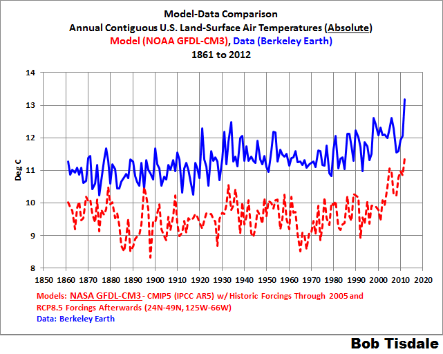
Cheers.
Sorry about the typo in the header, O R. NOAA should read NASA.
Bob Tisdale — if we look at this graph, we can see peaks in opposite direction in data versus model. Then this type of information serve any realistic purpose.
Dr. S. Jeevananda Reddy
Interestingly, it appears to the eyeball that the model output has a bit higher standard deviation than BEST.
(That’s okay, BTW. Our equipment adjustments do the same.)
A small item, but when I went to engineering school in the middle ages, absolute temperature was only expressed in degrees Kelvin. That’s still the definition in the sources I’ve just checked.
I understand what you’re saying, but using “absolute” doesn’t seem appropriate. (You’ve probably answered this comment before, but I didn’t see it.)
There is something wrong with the chart shown below: It shows both 1998, and 2016, as being hotter than the 1930’s.
Now we all know the 1930’s was hotter than 1998, from our own history, and because the Climate Change Gurus told us so in their Climategate emails. So why does this chart not show that? Berkely Earth is no more accurate than any of these other bastardized charts.
How do you have an intelligent conversation using bastardized charts?
I know that’s the best you have to work with, Bob, and don’t blame you, and you make your points even with the modified charts, but I just can’t see letting the promoters of AGW/CAGW get away with their falsehoods, without saying something about it, so that’s what I’m doing.
exactly TA…
How do you have an intelligent conversation using bastardized……constantly adjusted temperature histories
How do you have an intelligent conversation using bastardized……constantly adjusted temperature histories
Given that raw data won’t do, there really isn’t much choice. But all that means is that adjustments are a very important factor and have to be thought out very carefully. All major systematic biases must be accounted for. And currently, two are not: CRS bias and microsite. And the surface record will be a travesty until they are.
goddard again?
when is WUWT going to get back its credibility and put his stuff with the chem trails stuff.
Look. Evan and Anthony are doing good work… that should not be associated in any way with the goddarian clap trap
I can’t always catch every comment, but Goddard no longer publishes here since he couldn’t admit he made a blatant mistake about CO2 freezing out of the atmosphere in Antarctica.
Mosher, address the post, not the person or lose credit with rational thinking.
“when is WUWT going to get back its credibility and put his stuff with the chem trails stuff.”
1) The credibility of any site is not in who says what, but in the published articles. I don’t blame our host just because he allows you to spew your special kind of dross here. I think that crack about the site deserves an apology to our host.
2) Godard posts tons of stuff that is simply newspaper articles from the past, or some agencies’ chart back then compared to the same agencies’ chart now. Often these comparisons are indisputable as they are the published product of the agencies highlighted. Yet you would say don’t listen because he shows your side in a bad light. There is a Latin phrase for attacking the man himself and not the position. It is bad in rhetoric and it is bad in science. (note: that is not to say that he has not made mistakes in the past. I have, and I wager most here have also)
3) People often whine when others “are allowed to accuse me of manipulating data” and then “hit back”, but the fact is that many here do think that you are in the data manipulation business. It is not our host’s job to protect you from what people think of your work. It is only proper that we all show some restraint and not descend into screaming flame wars.
4) If “BEST” and all the other keepers of temperature time series lack credibility with people who have been watching climatology since H.H. Lamb was the leader, then I would suggest you look to see why. I could be that anyone who tries to justify continuing “adjustments” of the past vs. the present will not be seen as credible. You might consider that point. (or not, don’t really care)
but the fact is that many here do think that you are in the data manipulation business.
Sigh. So he is. So am I. That’s the business, and we are stuck with it.
As raw data won’t do (just won’t), the trick is to manipulate correctly and, no less important, sufficiently.
Even the outright dropping of “bad” stations is, arguably, a de facto form of adjustment.
I’ll agree that it might be required to build a GAT, but if you want to monitor the change in surface temperature by station you don’t need to adjust a thing.
Adjusting your data is never a good idea, better to adjust your methods instead.
Evan Jones July 6, 2016 at 4:04 am wrote:
markstoval: “but the fact is that many here do think that you are in the data manipulation business.”
Evan: “Sigh. So he is. So am I. That’s the business, and we are stuck with it.
As raw data won’t do (just won’t), the trick is to manipulate correctly and, no less important, sufficiently.”
Evan, the complaint is not that the raw data has to be manipulated to make sense, the complaint is about the dataset(s) being used.
If you are not using the dataset the Climate Change Gurus used to determine that the 1930’s was hotter than 1998, then you are manipulating the wrong data to begin with.
Steven Mosher
July 4, 2016 at 1:15 pm
goddard again?
====
You are the one that keeps bringing him up……..
I’ll agree that it might be required to build a GAT, but if you want to monitor the change in surface temperature by station you don’t need to adjust a thing.
But you do. What if a station converted equipment and there is an “unseemly jump” at the point of conversion?
You have two theoretical choices:
1.) Adjust the jump using some sort of pairwise.
2.) Drop the station entirely.
In practice, there is only one choice because nearly all of the USHCN has been converted to MMTS or ASOS (with a very small handful of other equipment) , and this occurred starting in the early 80’s. And the only decent, complete set of metadata, so essential to the process, goes back only to ~1975, even for the USHCN.
If we drop all the stations that changed equipment during the period of sufficient metadata, that would reduce the sample to the level of the meaningless. Besides, dropping a station, quite arguably, is a de facto adjustment, in and of itself.
USHCN is not USCRN. Adjustment is necessary. There is no way around that. Just is.
Adjusting your data is never a good idea, better to adjust your methods instead.
In an experiment that can start at any point, surely. In fact, NOAA put up the USHCN, a network so beautiful and uniform as to bring tears to one’s eyes. So we don’t have to adjust CONUS data anymore.
But that was now; this is then. We can’t go back and change the past. We have what we have.
And what we have is no damn good in raw form. Siting, moves, TOBS, equipment (both conversion and the CRS equipment, itself), all create potential jumps, often large, that must be accounted for.
For CONUS historical record, at least, the situation can be salvaged (at least as far back as ~1975). As for GHCN, well, that is an open question. But one thing’s for sure: raw don’t cut it.
In general most corrections are at best a guess as to its actual impact. You might make it better, or much worse. Much of the historical records were done on paper, and if they didn’t make it accurate then, there isn’t any way now.
But it’s also not required. I calculate a derivative of both min and max temp, and compare today’s rising derivative with tonight’s falling derivative. A jump will be a slight blip in one station out of many depending on the number in an area. In the US there are plenty of stations to average it out, if there are truly only a few stations either that area can be dropped, ignored, or you use it to identify areas with high uncertainty. Plus, since I operate on both min and max, you can compare the two, and there is clearly a difference in behavior that excludes jumps as the cause, as they would both have short term effects from the jumps.
I also use it to get rate of change through both the warming and cooling season where I create a linear trend line, single point jumps are invisible.
In the end, the expected signature of a gradual forcing is not there, yet the warming that everyone calls out as the effect from co2 is. And it can not be both and it can not be from co2.
https://micro6500blog.wordpress.com/2015/11/18/evidence-against-warming-from-carbon-dioxide/
https://micro6500blog.wordpress.com/2016/05/18/measuring-surface-climate-sensitivity/
Evan, the complaint is not that the raw data has to be manipulated to make sense, the complaint is about the dataset(s) being used.
That’s because no one has had the gumption to beat them at their own game. A ground game. Station by station, mano-a-mano in the mud.
Enter Team Anthony.
We’ll make our own dataset, and may the best one win — and be further improved in the process. Science!
In general most corrections are at best a guess as to its actual impact.
They are done by pairwise comparison. (Methods vary.) Not perfect. But better than a mere guess, provided always that it is done correctly.
You might make it better, or much worse.
It’s bad. We make it — a lot — better. I think. At least I can explain why and how we do it in a manner that can be examined and replicated.
NOAA makes it somewhat worse.
Much of the historical records were done on paper, and if they didn’t make it accurate then, there isn’t any way now.
The numbers themselves are probably reasonably accurate. The devil is in the essential metadata. Or lack thereof. And you don’t always know for sure if it is lacking or not. (We use the station and metadata-rich recent USHCN. BEST, being GHCN back over a century, does not have that inestimable luxury. Even some of our data had unexplained jumps, which Dr. N-G identified, and we dropped those stations.)
But it’s also not required. I calculate a derivative of both min and max temp, and compare today’s rising derivative with tonight’s falling derivative. A jump will be a slight blip in one station out of many depending on the number in an area.
Only if jumps are the exception to the rule. As it is, too many jumps, not enough stations.
In the US there are plenty of stations to average it out, if there are truly only a few stations either that area can be dropped, ignored, or you use it to identify areas with high uncertainty.
66% of USHCN from 1979 – 2008 is perturbed (moves, TOBS flips, microsite incursion). Dropped. And that’s just for starters. Of those remaining unperturbed USHCN stations, 77% are poorly sited. We are reduced to a mere 90 well sited, unperturbed stations in the USHCN. And only for the 1979 – 2008 interval, at that. Only around 30 are CRS units, throughout. And CRS, itself, has systematic trend biases
If NOAA didn’t oversample, we’d be sunk. As it is, we’re still somewhat on the thin side. (And so much the worse for GHCN.)
If you eliminate every station with a jump, you no longer have plenty of stations. And if you include them, you must adjust them.
And all the CRS units without equipment conversion need adjustment, themselves, for precisely that reason: The LiGs are attached to the box itself, which is a heat sink.
We go it as raw as we can, believe me when I say this. But there is no Full Monte. There is nothing there that does not require some sort of adjustment. NOTHING.
Plus, since I operate on both min and max, you can compare the two, and there is clearly a difference in behavior that excludes jumps as the cause, as they would both have short term effects from the jumps.
So do we. We adjust only Tmax and Tmin. Tmean is simply the average of the two.
Jumps are one-time offset shifts. But there are also the gradual trend biases resulting from Bad microsite and CRS equipment.
There is no unadjusted lunch.
I humbly ask you to go look, for 1940 on I use 79 million station days, only those with a full year for that year, because of this the null experiment is 0.0F, and it is amazing how close it actually is.
And it is a complement to what you do, but I do somethings completely different.
And it seems most don’t really understand the advantages, most can’t get past how it’s done by everyone else, and they all do the same basic thing, and get a slight variation of the same thing. I’m looking at the problem as a rate of cooling problem each night after a day of energy input, not a temperature average problem in a calendar day.
REPLY – Looks like good work. And if you can get a homogeneous net, it can be useful, even with some systematic error present. Yet I want to get a better beam on the so-called “average temperatures” and trends. For that I must needs adjust. Besides, like I say, why should NCEI have all the fun? ~ Evan
The United States, particularly east of the Mississippi, has never followed these models very well. Presumably, scientists must have tried to explain this divergence.
I’ve always figured that the Dust Bowl in the 1930s had a dramatic warming effect. Basically, the agricultural changes which lead to the Dust Bowl, also caused a significant shift in precipitation which in turn causes significant, localized warming. The period from the 1930s to the 1970s would be a recovery from this effect compounded by natural cycles and aerosol cooling from the post WWII industrial expansion.
It is important to note, many of these changes are anthropogenic, but none are greenhouse gases.
With all of that considered, the United States seems to be unique in the world. This would mean that the United States is not a very good “case study” for climate change — but also, someone should be trying to understand why. At the very least, this helps explain a natural skepticism in the United States compared to the rest of the world.
Once you dry out dirt it effectively performs like asphalt.
That was a preview of the effect of urbanization.
Okay, I was going to object to your departure from anomalies, but now I see your point. Yeah, the slope is the same, but one has to consider what is causing the offset.
It is interesting to note the offset between models and observed (though necessarily — but questionably — adjusted).
This suggests a number of interesting possibilities.
The models may simply be in error — and (insert emoticon indicating British Understatement) they can’t be perfect. But who knows? The early surface station network (consisting of CRS units) is highballed owing to equipment bias. And poor microsite, even for unmoved stations creates a systematic trend bias.
If we could simply and safely benchmark the models to a (relatively) certain past record, then the problem would be not so bad. But the surface metrics are all screwed up (though they can be greatly improved), so we can’t rightly do that — yet.
— Perhaps both the CMIP5 models and the data are wrong.
(Both, I think)
— Perhaps the models are right and the data is wrong.
(Not necessarily too farfetched. Equipment issues and poor microsite might explain that.)
— Perhaps the data is right and the models are wrong.
(They don’t correlate very well, that’s for sure.)
I think we need to do a better job on the surface record before we even can baseline the models correctly.
Simply in error?
There are a number of processes that are temperature dependent and non-linear.
The worst case is if the “real” temperature is 0.1°C. The -1.3°C model should happily produce inches of ice that don’t exist.
Further many processes like evaporation is non-linear with temperature.
The hydrodynamics of the model (I welcome a second opinion) would be significantly different than reality. If the model runs colder it should run drier which means less adiabatic (convective) heat loss.
A model that is 1.4 cooler compared the the roughly 289K real surface.that radiates around 395.6 W/m2 is 287.6K and radiates 388 W/m2 or 7.6 W/m2 less.
7.6 W/m2 is 15 times the current alleged energy imbalance causing “global warming”.
It is error, I think. Brought on by an excess of confirmation bias — I think.
I have been eyeballs deep in USHCN data, raw and adjusted. I can see what is going on and why homogenzation has bombed — when one bins for station siting, it sticks out like a fish in a tree. But you gotta know where to look. (Anthony knew where to look. NOAA et al. did not.)
But these errors are correctable. And even the homg monster can be redeemed, for that matter, by accounting for CRS bias and siting, both systematic errors in the record. The results will not (cannot) be perfect. But they will be improved.
We don’t homogenize, per se, but we use some of the building blocks (regional pairwise for equipment jumps). However, we also factor in the constant, gradual effect of CRS bias — by adjustment — and the effects of siting — by dropping the poorly sited stations (and stations perturbed by moves and TOBS, well sited or no).
That leaves us with raw data, adjusted for equipment, only.
We will soon be able to determine a microsite adjustment method. That would give us many more stations, much improved coverage.
We may also be able to do our own TOBS adjustments by means of regional pairwise with non-TOBS biased stations, giving us more stations. Moves, too, which would improve coverage even more.
At that point, the data will be fully adjusted. But it will be adjusted by us, not NOAA or anyone else. Our methods, unlike the bigwigs’ black boxes, will be completely transparent and replicable (with capabilities to add, correct, refine).
As raw data Won’t Do, it becomes incumbent on us to adjust it. But to do it right. Besides, why let NCEI have all the fun?
Evan Jones
Perfectly reasonable observations, questions and suggestions both where the models and the quality of the data are concerned.
Problem is that the “climate establishment” and their political and MSM handmaidens continue to serve up the models as gospel, the underpinnings of the “we are in a climate crisis and need to do something about it. Now.” storyline.
So what do we suggest they do? Take a time out from their fear mongering while we sort out the issues you’ve identified? Laudable but highly unrealistic since those folks are absolutely not interested in letting inconvenient facts get in the way of their political and social engineering narrative. Tough.
So what do we suggest they do? Take a time out from their fear mongering while we sort out the issues you’ve identified?
(Grin.) They won’t. We will.
Can someone explain why the models run cooler than the absolute please?
Is it that the models do not use measured temperature data, but rather forcings and feedbacks (eg solar + x – x, e.t.c.) ?
They attempt to create a formula comprised of discrete measurable parameters that are easily updated to predict the future?
If the models are consistently running cooler, what are they missing?
well the first thing to note is that the models are not TUNED to match absolute temperature.
because if they were… they would match absolute temperature.
As you note they take forcings as inputs. Then from that temperature is computed.
Try to do that with just using TSI… haha.
Go read some GCM code.
It is utterly astounding that they get within 1C of the correct answer.
Mosher
You are so right. Models compute temperatures. From forcings. Therein lies the rub: get one of those variables wrong even ever so slightly and you have GIGO. Problem variables like values for CO2 and sensitivity come to mind.
Code itself is GIGO – no better. And certainly not gospel we should go and read to somehow understand better.
And 1C from the “correct answer” is “utterly astounding”? Classic case of confusing precision and accuracy: a 200 yrd 5 round 1 inch spread in the target’s upper left hand corner is exceptional marksmanship – but seriously lousy shooting if you’re aiming for the bulls eye in the middle.
Until GCMs can accurately replicate the past -not out by 1C but spot on- their predictive value is that of GIGO junk and alarmist claptrap. So why not help figure out where the “utterly astounding” 1C delta comes from?
Steven Mosher July 4, 2016 at 1:11 pm
Thanks for your thoughts, Mosh. But … I fear that your conclusion can’t be drawn from your predicates. For example, the modelers may indeed be trying to tune to absolute temperature, and they indeed might be able to do that as you claim … but they simply can’t achieve that while still replicating the historical variations and trends.
No, it’s not. As you point out, they could get closer. I suspect the process goes like this. They are tuning like crazy to get the historical trend correct … but obviously, something in that tuning process screws with getting the overall temperature correct. Because equally obviously, if they could successfully tune for both, no doubt they would …
So they have a choice—replicate the absolute temperature (which as you point out they could do) and not be able to replicate the historical trends, OR replicate the historical trends and use anomalies.
It’s an easy choice.
Mosh, as I’m sure you know, a global 1°C error in the running temperature of the entire system is a large error in the various energy flows … why is this not a concern to you? In particular, since we have the same identical solar input to all of the models, this would indicate a difference between the models and the reality which is quite significant. It is certainly far, far larger than the ~ 0.85 W/m2 TOA radiation imbalance that Hansen and Schmidt claim can be diagnosed using their GISS model (and diagnosed to a hundredth of a watt per square metre, I note).
Best regards,
w.
PS—Please include evolutionary tuning in your mental description of the climate model creation process. People build a climate model and check it against history. Then they make some changes, and if it checks out worse against history, they undo those changes and try some other changes. Slowly, over time, and often in ways not clearly understood by the programmers, the model evolves to give better and better representations of history.
Notice that in general this evolutionary tuning process is different from a programmer tuning the model by using tunable parameters. Tunable parameters are separate from evolutionary tuning. Tunable parameters are also used in the tuning process, but in a very direct fashion, viz:
Instead of someone tweaking a parameter, the evolutionary tuning is the result of innumerable small perhaps even un-noticed choices of approaches and values made during the many years of the development of the model. As such, the evolutionary tuning is invisible, but given Darwin, inexorable …
Are neural nets ever used in weather modeling?
One possible explanation is that the empirical record is biased by a spurious upward offset tick resulting from poor siting and CRS equipment.
Eliminating the warming of the 1930’s was criminal and the damage done
can never be reversed. Accurate data should be sacred to everyone in science.
It’s heartbreaking to be where we are now in research. The 61 year solar cycle
is about to give us another cool down and they’ll have to explain it away.
Bob, that’s an outstanding post. What is most interesting to me is Figure 3. It shows that currently the monthly average temperature doesn’t go below zero in the US, but that according to the models it does go below freezing. Of course, this would make a huge difference in the real world. When you go below freezing, a whole bunch of new rules and phenomena come into play.
Well done.
w.
Willis,
Congratulation, I fully agree with your comment. That’s why I don’t like anomalies.
“Of course, this would make a huge difference in the real world.”
That is the nub. If they are not getting the absolute temperature right by such a wide margin, then their model does not reflect reality. Period. Full stop.
And, if their model does not reflect reality, then the apparent agreement with the anomaly is just a curve fitting exercise with a given set of parameters, and Von Neumann’s elephant comes rampaging through.
Willis E : your SOURCE link above, does not seem to work. Can you check ?
Link is old, I guess. The document is “Present-Day Atmospheric Simulations Using GISS ModelE: Comparison to In Situ, Satellite, and Reanalysis Data”, Gavin Schmidt et al., Journal of Climate.
w.
Overall the models look great.
One way to see this is to compare.
The goal of observational science is to explain the observations and then hopefully to predict as best one can the future.
We judge these explanations by their relative skill.
Question: can the sun explain the climate?
Simple: write equations that explain the temperature EVERYWHERE using only solar parameters.
Observation: you might curve fit something to get the global number close ( low dimensional metric)
BUT that same formula wont work to get CONUS correct.
or you could write a formula to match CET… but it would fail to get CONUS correct.
So if you built a “skeptical” model of the temperature it would be horrible.. in fact they are since no skeptical model ( Evans, Scafetta, etc ) can operate at MULTIPLE SCALES.. the global and the local.
With a GCM you can train it on GLOBAL ( 1850-1880 ) and then test it on continental scales.
Does pretty well for a complex system.
The next thing you do is compare a climate science model to the skeptical model.. well since there is no skeptical model… they lose the debate over who can explain the climate. natural variation is not an explanation… if it were you could write the formula.. and remember that formula has to work at multiple scales..and across multiple metrics ( temperature, precipitation, sea surface salinity )
The last thing you do is compare with observations..
And there the models do pretty dang well. With these side notes
A) there are short periods where some natural variation is hard to capture
B) there is constant bias offset
The offset is easy to handle. use anomalies.
Mosher
Next time do make an effort to cogitate a bit more before you write. “Natural variation is not an explanation…”? Because in your code cloistered mind, unless you can write a formula for something, it’s not real? Conveniently pretend a set of factors for which there some verifiable evidence doesn’t exist and voila, nothing to see folks – back to the models. There’s a fine line between persistence and dumb obstinacy.
In case you forgot, our atmosphere is one of the most complex, non-linear systems known to man. Massive number of variables, none of them independent. Write the general formula for that and you get a Nobel prize for sure. A real one, not the junk variety Mann and Gore are so proud of. Before you get going though, remember code is GIGO – no better.
Steven,
“And there the models do pretty dang well. With these side notes
A) there are short periods where some natural variation is hard to capture
B) there is constant bias offset
The offset is easy to handle. use anomalies.”
To me, a non-expert, it looks likely the models project a cooler past because they assume CO2 (et al ; ) is a bigger player than it really is, and there was less CO2 in the past, so they project a cooler past. That fits pretty dang well with the lack of rapid warming we’ve seen recently (twenty years or so), which the models projected.
Why exactly is that (over estimate of climate sensitity to GHGs) not a perfectly reasonable/plausible explanation to your mind , and therefor why exactly are you not at least somewhat skeptical about there being an impending climate crisis (if you’re not)? It’s the lack of apparent willingness to interpret things in a manner that challenges the CAGW hypothesis that causes me to feel there is a lack of objectivity among many “alarmists”, and it is hard for me to imagine that absent the drive for major global action in this regard, folks like you would not be expressing a more skeptical view in general.
Models are coded dynamical mathematical constructs based on cause and effect assumptions derived from correlations and plausible mechanisms. That said, confounding variables, especially in climate science, are everywhere in research that is still in its infancy. Why? Because the jump to models is done too soon before adequate research is done in, for example, atmospheric and oceanic climate parameters. Are climate researchers trying to closely examine potential confounding variables? Of course. Note the interest in clouds. Is there a ton of money to research these apparently tangential (tangential according to many media-hog type researchers) issues? Not likely.
However, given time, confounding variables leave a nasty bite in the ass. In my opinion, it will be ocean-sized.
https://explorable.com/confounding-variables
Bob,
As a retired petroleum facilities engineer turned cost engineer, I have been enjoying the discussions here for some time. Thank you for your attempts to put the models and data repositories into perspective. More discussion of real numbers vs. feelings is needed.
My question, perhaps simplistic, has to do with error bands on the data and the models. Except for some historical data on CO2 and temperatures, I rarely see any presentation of error ranges for much of the topics involved in climate science. In our company it took many years for us to convince management of the importance of probabilistic presentations of cost and schedule estimates. Eventually they caught on and FID decisions improved.
When I think back to my first exposure to climate science in the 1990s (that’s when my skepticism started), people in Australia made a big impression by talking about the validity of temperature and weather stations. Lately, Anthony is to be praised for exposing similar problems in the US. So I always go back to the basic data collection and its robustness. I see the Berkeley data questioned and wonder about the error ranges.
So, referring to the present discussion, are there error ranges for the Berkeley data? What are the error ranges for the models? What variables contribute to the error analyses? Can’t you apply error ranges to the anomaly data? Why is it always presented as having an error band of zero? Wouldn’t the errors have larger SDs as we go back before 1900? Etc.
Thanks in advance.
It seems in most published work the error band is from today’s conditions to something catastrophic, with heavy emphasis on the latter.