Yesterday, WUWT covered the sharp drop in global temperatures that followed the peak of the 2015/16 El Niño. That caught the interest of John B from Toronto, and he writes in with a graph he has rendered that illustrates correlation of many climate metrics. While it is true that “correlation is not causation” it can also be said that correlation is well worth investigating further.
He writes:
Thought you might be interested in this plot I made. I’m not a climate scientist, but I have more than 15 years experience in signal analysis.
Coding is done by me using .NET with GDI graphics.
PS. I have done this in my spare time out of curiosity and to facilitate a personal understanding of whats going on. I have no interest in fame, fortune, politics or activism.
 Click for a much larger image at 1920×1080 pixels. An even larger 3840×2160 (HD 4k) image is also available here. You really need to look at this graph in magnified form to get the details.
Note that the intensity of the red and green colors used to depict ENSO events (El Niño in red and La Niña in green) varies with the strength of the event. Note also that the Average Absolution Deviation of El Niño is +0.41 while La Niña is -0.27. This indicates warming events due to El Niño and in greater magnitude than cooling events due to La Niña, hence we have a cumulative heat growth from El Niño events during the period in the graph.
Links to data sources used in the graph:
Water Vapor: ftp://ftp.remss.com/vapor/
Temperature Lower Tropasphere: http://vortex.nsstc.uah.edu/public/msu/t2lt
ENSO: http://www.cpc.noaa.gov/products/analysis_monitoring/ensostuff/ensoyears.shtml
ENSO: http://www.cpc.noaa.gov/products/analysis_monitoring/ensostuff/detrend.nino34.ascii.txt
Solar: http://www.sidc.be/silso/datafiles
CO2: ftp://aftp.cmdl.noaa.gov/products/trends/co2/co2_mm_gl.txt
Wind: ftp://ftp.cpc.ncep.noaa.gov/wd52dg/data/indices/zwnd200
Aerosol: http://data.giss.nasa.gov/modelforce/strataer/tau.line_2012.12.txt
Global Carbon Budget: http://cdiac.ornl.gov/GCP/
CO2ppm to CO2Gtonnes https://www.skepticalscience.com/print.php?r=45
Hi John B,
Can you please explain in words what you are plotting?
I can’t magnify the graph enough to read the text.
(I have just installed a new video card 10 mins ago so the problem might be mine).
Thanks Geoff.
I can only read the white text, not the coloured text. Purple text is especially difficult to decipher. White background with black text may help; also use of a coloured line / bar / square alongside the text for each plot to identify them, as has been suggested. Excel 2013 does this by default. Also red and green may not be the best choice, as some people are red-green colour blind. At the moment, people who have little knowledge of the subject will not take the trouble to decipher it, which is a shame.
On my tablet, it is essentially a black blob. VERY thin dark colors on black background doesnt work. Maybe later I’ll find a big monitor…
To me, it shows (2 somethings) wobbling up together, with El Ninos at tops and La Ninas following at bottoms. Then some skinny squiggles…
Maybe a great graph, but lacking explanation for those of us without 30 inch monitors….
It’s cryptic…too funny
Use Ctrl + to magnify within your browser. On an Android tablet ‘triple tap’ to zoom in. Although I’m not sure this will be much help, even with a 10.1 inch screen.
Ha, ha, still using an old Sony 20″ CRT and it looks great. Looks like there’s still some use for those after all!
and Super Smash Bros. Melee 🙂
Use Photoshop to reverse the colors and a lot of the hidden stuff will be visible. You just need to remember the colors for La Niña and El Niño have been reversed.
I reversed the colours with Irfan View but some of the printing is still very faint, and it is still not clear to me (for example) what the top line graph (with points marked at each year, and ending before the final year on the x-axis) is meant to represent. I do hope that the author comes on here and gives us a step by step (or curve by curve, or line by line) explanation.
For the last 13 months the media have been spinning land temperatures as new record high for this or for that, I am curious how the media will spin a 0.5 degree C. drop in temp in the next few month? Will they simply not report it or will they invent another “Mammal Extinction” due to CO2 or perhaps they will get even more creative and proclaim Donald Trump’s airplane as the new source and leave Clinton’s gluttony completely out of the picture? Any guesses any one?
What an absolutely fascinating piece of work! I really hope that those more knowledgeable about these matters than I, think it has real validity. From an amateur perspective, it seems that the only variable that appears unconnected to the others is the CO2 concentration. Quelle horreur!! Surely some mistake??
If it’s the unadulterated data, then it is valid. Interpretations may differ …
Richard, I am on the same boat with the same conclusion. Fascinating!
err no.
understand that the effect of c02 and other GHG ( he really needs to chart all forcing )
is.
1. Lagged by up to 30 years,
2. on the order of .1c to 2c per decade.
Here is the clue. If you want to try to isolate the co2 effect from looking at data you need to pick a long enough time series
I will refer you all to the best skeptic on this: nic Lewis
If you are not building your skepticism on Nics work, then you are wasting your time.
“pick a long enough time series”
The best time series are long enough so that the authors have passed (after using all the grant money) so they don’t have to explain their prediction failures.
“If you want to try to isolate the co2 effect from looking at data you need to pick a long enough time series”*
*Just don’t use data derived from the Greenland or antarctic ice cores. They are clearly misleading.
The radiative effects of CO2 are instantaneous in the atmosphere (well understood physics), but Mr Mosher pulls the claim out of his backside that there must be a 30 year lag. Evidence provided for this claim: none.
GreenLand is not the planet
And ice cores are proxies.
Read nic lewis.
Follow his lead.
Or lose the debate.
Steven Mosher
There is the past and then there is the present, the two are completely different when it comes to CO2
If we need a longer time frame, here is a much longer one:
(Note the “Note” in the chart.)
Next, changes in CO2 do not match global warming:
http://jonova.s3.amazonaws.com/guest/de/temp-emissions-1850-web.jpg
And as usual, the alarmist crowd gets causation backward. Changes in CO2 do not cause measurable global warming. Rather, changes in temperature cause changes in CO2:
I am reliably informed that the effect of c02 and other GHG
is .
“1. Lagged by up to 30 years,
2. on the order of .1c to 2c per decade.”
–
Missing seems to be the amount of CO2 increase needed to do this.
the amount of other GHG increase.
How many decades the increase is expected to go on for.
An explanation of why if the effect is lagged for 30 years why any increase would be expected in the first 3 decades at all? [only joking].
Water Vapour Convection Cooling. Negative feedback.
You would have thought that with 15 years of signal analysis, he would have been able to produce a graph that people can read. Like, errr, a white background? And perhaps some explanation of what the lines represent (if you can see them).
This posting is a waste of time in its current format.
Why be so rude? Good manners cost nothing. For the record I have no problem understanding it at all, but then I am a genius.
What are the odds that there are two of us right here! ☺
When I click on the graph it looks fine.
Richard G June 22, 2016 at 3:10 am
When I click on the graph it looks fine.
ditto, on my lil’ ole iPad 1.
Well, why not ask rather than abusing him? Is that how you conduct all your social activity?
As a computer scientist who spends a lot of time on usabilty and information presentation the legibility of this truly interesting and intriguing graph could be dramatically improved. A version with a white background would certainly help, as would a better choice of colors for the different data sets, even on my 4K screen zoomed in I can barely read the purple legend colors… typically in a legend you make the legend text white or black and have a color square beside it… this dramatically improves readability.
This is an outstanding achievement of putting relevant data together in a very illuminating visualization. Great work!
I’m struck by the amount of cooling going on, even when viewing a thumbnail version of it.
There are purple legends? Who knew….
@ur momisugly PWL even in bright daylight with my laptop screen at not even half of the full brightness i can read this graph perfectly
if i may give one little nitpicking feedback: some more contrasting colors for the graphs would help to remember which is which more easyly apart from that: perfectly readable and very interesting piece of work
it shows very clearly that el nino and la nina is driving the climate just like Bob Tisdale explains so well
Exactly.
Btw, Joe Bastardi has been saying this repeatedly during his Saturday summaries (weatherbell.com) for over two years. He has not said that the current el Nino will create a drop equal to its rise–he’s saying wait and let’s see–but he shows that the past is exactly as this graph shows.
It works fine on my IPad, zooming in where necessary.
Thanks for a fascinating post-I look forward to comments by those that are better able to draw conclusions from it.
For many browsers using ctl+ will enlarge the object being viewed. If you are having trouble reading the graph that should help.
“For many browsers using ctl+ will enlarge the object being viewed.”
Thanks for the tip. On my browser that technique can be used repeatedly.
Or instead of using ‘+’ simply use your mouse wheel+ctrl to zoom in or out.
You can always use the poor man’s CSS (ie ^A) to highlight the graph and enhance some of the colors…
get a better video card and monitor, and while you’re at it take a Dale Carnegie course
ralfellis, I suggest you get off your butt and make your own then if this one offered in the spirit of discovery and kindness isn’t suitable to your highly refined visual palette. I for one am grateful.
There’s an important reason the background is black…so that the shades of red and green intensity for ENSO events can visually have amplitude. It would not work the in same way with white.
-Anthony
I second that emotion! I would request that this graph work be archived for easier ongoing access. I am having the same issues with the scale so will need to look at it on a different machine. Lots to look at and analyze.
Perhaps if the legend was posted next to the graph. That’s really what’s hard to make out.
@John Harmsworth,
Joe Bastardi discusses it now almost every Saturday: weatherbell.com. Has for two years, using real observed temps. Sometimes it take Joe a day to get the “Saturday” summary up. Grrrr.
I would agree with you that his choice of a black background makes reading the graph problematic.
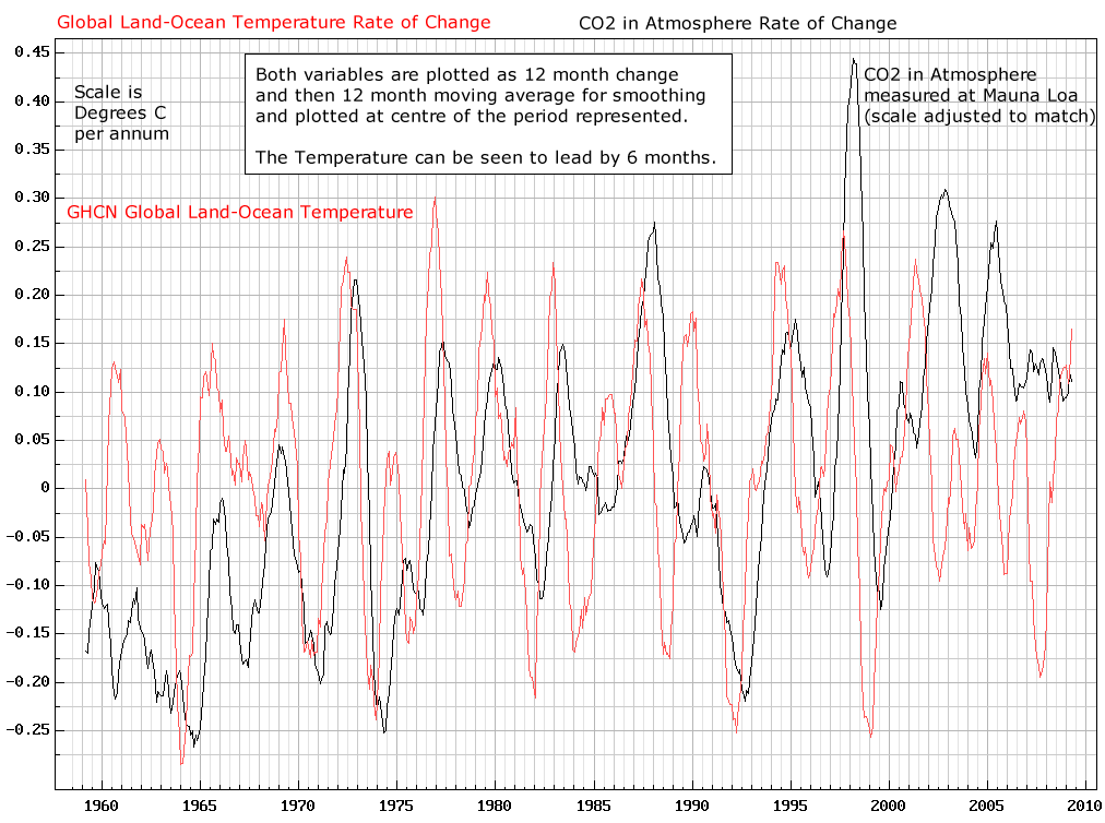
I’m struggling to understand the difference between CO2 anomaly and yearly increase CO2 anomaly, why one is a straight line and the other seems to track temperature and water vapour, and what’s the significance of this. Can anyone help me out?
Phil,
No doubt you are familiar with the more typical sawtooth pattern of CO2 rise? The overall trend is monotonically upward, but the depths and valleys of the “teeth” are highly correlated with temperature, though with a lag (in which changes in CO2 lag changes in temperature, showing CO2 to be dependent on temperature, and not the other way around, at least for many time frames). The lag is clear seen in plotting annual first differences of temperature and CO2 changes:
http://i.imgur.com/BiqjxvH.jpg
Hope this helps explain what you are seeing.
Basil
Basil,
What is your source of CO2 data?
I did a scatter plot of UAH temp and CO2 from NOAA (ftp://aftp.cmdl.noaa.gov/products/trends/co2/co2_mm_gl.txt) and found no correlation of dT and dCO2 (R2 = 0.00) with time lags of one month to 12 months or more.
It looks like there is something wrong with John B’s UAH data, If I’m reading it correctly. The graph shows a temp anomaly of 0.7 °C in 1997 and about 1.0 °C in 2016 but UAH shows about 0.75 °C and 0.85 °C, respectively. John’s graph shows 0.3 °C of warming but the UAH data show only 0.1 °C. See http://www.drroyspencer.com/latest-global-temperatures/.
I immediately spotted this as well, and the same goes for RSS. RSS 97′ peak was about +0.85 and 16′ peak at about +0.97, yet he has data showing 97′ at about +0.45 and 16′ at about +1.15. It’s almost as if this is Karlized satellite data; it looks very similar to the surface datasets.
Thomas,
Without checking, I’m pretty sure it is Mauna Lao data. I think you are trying to do something a bit different than what I’m depicting. These are seasonal differences, where the “season” is annual. For instance “dT” would be temperature in (say) May 1994 compared to May 1993, and the same for “dCO2,” CO2 in May 1994 compared to May 1993. Do note that I use the natural log of CO2, but you’ll see the same pattern without the log transformation. The log transformation is justified since CO2 seems to be changing at a fairly constant rate over time. The trend in temperature seems more arithmetic, than log natural. I’m not trying to depict specific lags, but am just plotting annual seasonal differences. But the lags are there, in the annual seasonal differences. It is the annual variations that are reflected in the “teeth” of the sawtooth pattern of CO2 rise. Variation in the seasonal variations — differences in the amplitudes of the “teeth” — from year to year are not very noticeable to the naked eye, but are there, and are highly correlated with short term temperature changes.
What is depicted in my graph is similar to what is depicted sometimes with ice core data, where CO2 changes lag temperature changes on the order of centuries. Here the lag is intraannual, on the order of months. I suspect that the lag exists on all orders of time.
Basil
Thomas – It’s T, not dT.
This realy interesting although I admit to being lost in a couple of places.
O/T but related: The BBC announced a few days ago on its mainstream news programmes that a new study of oceans currents is to be undertaken over the next few years, to gain a better understanding of how they affect the Earth, &……….drive our climate! (dots my dramatic effect!)
Is this signifying the back tracking “oh we never actually signed up to the manmade global warming hypothesis” cop out? Have othe news agencies around the world been coming out with similar articles?
You would have thought hat with the billions available since the scare started, this could have been undertaken 25 years ago!
Every week we get a new announcement of some effort being made to “better understand” some part of the science connected with climate. Every time I hear that I think two things…The first is that it is probably worth the effort to study and understand…The second is, of course, that I thought we understood all of this stuff already and the science is settled. I mean, if the science is settled, why blow all of this money on stuff we already understand?
I think number three: they have worked themselves into a corner with their ‘science is settled’ and see the gravy train leaving the station without them.
From my own observation of following published articles on climate science lately, there seems to be a back tracking afoot. To the real scientists, the science has never been settled. The concept of settled science is left to the politicians, environmentalists and other shysters to bark about.
When the scientist finishes with the proverbial “More research is needed” I’d like to hear the reporter ask “So Doctor, is your team saying President Obama is wrong when he says the science is settled or are you just looking to steal grant money from the taxpayers?
Science has a habit of overshooting the mark with false findings. This is not confined to climate science. There is a great announcement, lots of publicity, instant fame and fortune. Then slowly each new paper claws back the mistake. This may take years, or in some cases it has taken centuries.
In reality science has its own internal politics, as much as scientists pretend that it does not. There is a hierarchy, a ranking among scientists, and those at the top have a greater control of the narrative than those at the bottom, regardless of how correct their positions might be scientifically.
For in the end, the person at the top will seek to protect their position. And in large part this involves promoting what they believe to be true ahead of what those below them believe to be true. Because in large part, science is not simply based on truths, it is also based on faith. Faith that what we believe to be true is actually true.
Yet if history teaches us anything, it is that most of what we believe to be true will in the future be shown to be false. And 500 or 1000 years from now, science will look up our current events, and wonder in amazement that we could have been so foolish and backward. Just as we look upon the scientific beliefs of those people 500 and 1000 years ago.
Just like ENSO. Obvious research targets for climate evolution, but their little funding seeking hearts beat a blinding, deafening drumbeat; CO2, CO2, CO2 CO2!
Thank you, John . . good to see some forest with the trees . .
El nino means warming of a significant part of the Pacific ocean. Which is always going to push up global temperatures. So there is an element of tautology here.
The chart shows a correlation between precipitable water and atmospheric temperature over time, with the strongest increases in both occurring during El Niño. Is this not what we’d expect to see?
I am reminded of R. A. Heinlein’s ‘The Year of The Jackpot’.
15 intervals separate the first large El Nino from the second large one and 18 intervals separate the second large El Nino from the third large one. (The print is too small for me to read the actual dates). Possible pattern?
I figured out how to read the numbers. Interesting graph.
Nice visualization. Thanks.
A step change is evident. Will last years El Nino start another step change? A PDO/NAO oscillation on top of 300 years of warming in a 600 year cycle?
We have been on the road of cyclomania for so long.. sun driven? Planetary cycle driven?
Brighter minds than me..
Everyone has already said most of what I’d say except what is the software you used to do that graph?
I fail to see anything new in this graph. The correlation between ENSO, temperature increase, and humidity has been beaten to boredom. We also know that strong El Niños usually cause an increase in atmospheric CO2 probably due to oceanic out gassing. Am I leaving anything?
One thing I found interesting was the rather cold couple of years after the 1998 El Nino. I wonder if that same pattern will show up after the 2016 El Nino?
Those cold years accompanied the quite deep La Nina that followed the 1998 el Nino.
It seems the El Niño will be followed by multiple La Niñas. Possibly 3 or 4.
If the solar activity level is important with respect to the number, then maybe there will be 4 or 5.
I agree with the observation that the rise in CO2 may be outgassing from the rising warm water in the E Pacific. If so the pH of the water should be rising during the event. Any evidence?
nope…it’s buffered
And/or maybe Los Nadas?
“This indicates warming events due to El Niño and in greater magnitude than cooling events due to La Niña, hence we have a cumulative heat growth from El Niño events during the period in the graph.”
Surely La Nina charges upper ocean heat content, and El Nino depletes it.
Since relative temperature changes also change CO2 absorption in the ocean (warmer water absorbs less than cooler), the short term relative CO2 change in the atmosphere would be directly modified by any short term change in temperature. However, this would not be due to the CO2 driving the temperature, but the temperature driving the relative CO2 on a short time scale. This explains the short term CO2 variations.
Precipitable water (NCEP Reanalysis) 60N – 60S:
http://www.esrl.noaa.gov/psd/tmp/climindex.2.27.110.127.173.5.52.36.png
Excuse me.. 60N – 60S…
http://www.esrl.noaa.gov/psd/tmp/climindex.2.27.110.127.173.5.56.56.png
So there’s greater precipitable water during a warm AMO, which is negative NAO driven, and hence the wrong sign to associate with increased GHG forcing.
http://www.ipcc.ch/publications_and_data/ar4/wg1/en/ch10s10-3-5-6.html
What I gather from this from a solar forcing frame of reference, is that there is a increase in the water vapour component of the greenhouse effect resulting from a decrease in forcing of the climate. And it’s not just total precipitable water, there are altitude changes as well. Since the mid 1990’s, lower stratosphere and upper troposphere water vapour has decreased, while mid-lower troposphere WV has increased. That allows deeper penetration of solar near infrared in the atmosphere, and increases the mid-lower atmospheric greenhouse effect.
New link..
I found the “Carbon Budget” that seems to be a metric produced by models. Takes you from the past and into the future about 110 years. It does make me question whether the CO2 readings can be duplicated from other locations on earth. Is it true that all the entire GW/CAGW theories are based upon 1 island and 1 tree?
Informative graph, IMO. Shows how the volcanic eruptions seemed to delay or mediate El Nino’s effects. Looks like major El Ninos occur about every dozen years or so (unless mediated by other factors?) It also speaks volumes to me about how mighty the little CO2 molecule is to overcome such phenomena. Meanwhile, one little volcano fartz and throws the whole system out of whack for a few years and it is totally ignored by the 97% consensus, blind as bat, “scientists” of the political kind, The fixes are in. Only Brexit and Trump might be able to save us from the powers-that-wanna-be.
After taking out the effect of ENSO and eruptions, it is apparent that temperatures have been flat since the early 1990’s; indeed they have arguably been falling since.
This is significant. We are often told that the 17-year pause, with which we are all familiar, is solely dependent on cherry picking the big El Nino year of 1998 as a starting point.
What Santer’s study shows is that there has been no underlying upward trend in global temperatures for more than 20 years.
From Paul Homewood,
https://notalotofpeopleknowthat.wordpress.com/2015/04/18/no-underlying-global-temperature-increase-for-20-years/
Furthermore, since Solanki said that solar activity cannot account for warming beyond 1980 (& Lockwood & Frohlich later extended that to 1985) then we are talking about a scant 7 to 12 years of ‘unnatural’ warming which seems to take the form of a step change that coincides with the PDO shift from cooling to warming.
John of Cloverdale, WA, Australia.
June 22, 2016 at 5:11 am:
Except that it starts not then, but now, and goes back as far as it can, Tthey confabulate again.
Interesting that water vapor leads temp.
That seems to be the point of the graph: water vapor leads temperature by a few weeks to a few months.
The question that arises from this observation: what causes changes in the amount of precipitable water if it is not temperature?
Generation of water vapour would be affected by starting water temperatures among other factors. El Ninos start out as a body of warm water in the Western Pacific. Major ones seem to run about 15-18 years apart. When the trade winds reverse and push this warm water Eastward, some water must move into the Western Pacific surface as replacement. Where does this water come from and how does its temp vary year to year? I believe that is the next important question.
Looks to me like the kind of information Willis will find useful.
It’s also true that there is no global temperature, so these graphs are pretty meaningless.
You found “that the Average Absolution Deviation of El Niño is +0.41 while La Niña is -0.27”. That is probably true. I think that the deviation between El Nino and La Nina would be smaller, if the areas of the peaks are calculated. El Nino / La Nina is not a climate change phenomenon and nobody has been able to show that El Nino can increase any energy into the ocean or into the atmosphere.
IIRR, Bob Tisdale shows a net step-up in temperature after El Ninos. ( And here’s a tilde for grammar Nodzys: ~ )