Guest Post by Bob Tisdale

With the El Niño-related uptick in the February 2016 GISS Land-Ocean Temperature Index, Figure 1, alarmism has reached beyond the Spinal Tap 11 volume setting, up to 20. (For those in need of a chuckle, the YouTube video of related portion of This is Spinal Tap is here. Thanks to Rob Reiner and Christopher Guest for that very funny scene.)

Figure 1
INTRODUCTION
Here are a few examples.
The Reuters article Record surge in 2016 temperatures adds urgency to climate deal, say scientists features some notable quotes and a photo of a dead cow in South Africa—yes, a dead cow, a solitary dead cow, without explanation—as if to say, Oh look, a dead cow. It must be due to global warming. Also, I believe on-the-dole activists in the title and text would be more appropriate than scientists.
The always-entertaining Dr. Michael Mann claims on Twitter here:
NH ave temp reached ~2.5C relative to pre-industrial last month (background: http://www.huffingtonpost.com/michael-e-mann/how-close-are-we-to-dangerous-planetary-warming_b_8841534.html …) (h/t #Tamino)
Curiously, the graph Michael Mann linked from Tamino (Figure 2) doesn’t illustrate Northern Hemisphere temperature anomalies referenced to pre-industrial times. Is Mann guessing the February value was approximately 2.5 deg C when referenced to pre-industrial times? Additionally, the UN’s 2-deg C assumed-bad-things-will-happen threshold is for global temperature anomalies above pre-industrial values, not Northern Hemisphere temperatures.

Figure 2
Chris Colose on twitter with the illustration supplied with his tweet here contradicts Michael Mann. That graph does have the anomalies for the Northern Hemisphere referenced to “pre-industrial” times or as close to pre-industrial that we can come with the data at hand. See Figure 3. The February 2016 value falls short of 2.5 deg C, so we might conclude that Michael Mann had, in fact, guessed. And again, the UN’s assumed 2-deg threshold of bad things to happen relates to global temperatures, not those of the Northern Hemisphere. Yet the alarmists seem to be fixated on the North Hemisphere temperature anomalies this month.

Figure 3
Not surprisingly, in his blog post Surprise, but not shock, statistician Grant Foster (a.k.a. Tamino) used an undocumented “model” to attempt to remove the effects of El Niño and La Niña events, variations in solar radiation, and volcanic aerosols from the GISS global temperature record. Apparently his model needs some work, because after supposedly removing the effects of El Niños it still shows an uptick caused by the 2015/16 El Niño. See Figure 4. Maybe Tamino forgot to apply his “more complex model of the el Niño effect, one which matches the 1998 outburst” to the comparably sized 2015/16 El Niño, because as well see in a few moment the changes in global temperatures are also comparable.

Figure 4
We’ve also discussed and illustrated for many years that the long-term effects of strong El Niño events cannot be removed from the instrument temperature record with statistical models like Tamino’s. That is, strong El Niño events contribute to long-term global warming by releasing vast amounts of sunlight-created warm water from beneath the surface of the western tropical Pacific and relocating it to the surface. That’s the simplest explanation of how a strong El Niño contributes to long-term global warming. Some of that warm water released by the El Niño in turn releases heat to the atmosphere, primarily through evaporation. But the remaining warm waters (the leftovers) don’t magically disappear after the El Niño, as Tamino and some from the climate science community would like you to believe. See the discussions of “big jumps” in the Open Letter to the Royal Meteorological Society Regarding Dr. Trenberth’s Article “Has Global Warming Stalled?”
“RECORD SURGE”
The headline of the Reuters article reads Record surge in 2016 temperatures adds urgency to climate deal, say scientists. The phrase “record surge” suggests a never-before-seen upward change in global surface temperatures. But there’s nothing unusual about the January to February 2016 change in monthly global surface temperatures represented by the GISS Land-Ocean Temperature Index. See Figure 5.

Figure 5
Nor is there anything unusual in the most recent 13-month change in global surface temperatures, according to the GISS data. See Figure 6. In fact, the “annual” changes in response to the weak 1994/95 El Niño and the strong 1997/98 El Niño surpassed the change so far to this El Niño. With the uncertainties of the data, the changes in 1997/98 and in 2015/16 are at best comparable. Forgetting the uncertainties for a moment, the recent 13-month change has been surpassed many times previously.

Figure 6
That obviously contradicts the statement in the Reuters article that was attributed to Phil Jones:
Phil Jones, of the Climatic Research Unit at the University of East Anglia, said El Nino seemed less to blame for the current surge than the last big El Nino in 1998.
Sounds like more guesswork from the climate science community to me.
That “last big El Niño” actually took place in 1997 and 1998, not solely 1998. It evolved in 1997 and decayed in 1998.
Another way we can illustrate the similar global temperatures responses to the 1997/98 and 2015/16 El Niños is by comparing the related global temperature data from January 1997 to December 1998 and from January 2015 to present. See Figure 7. Note, for comparison purposes, that the data have been normalized to the first 3 months of their respective periods.

Figure 7
Looking solely at the plots, in 2015, global surface temperature anomalies declined at first. In other words, global surfaces during those El Niño development years initially warmed faster in 1997/98 than in 2015/16, but the values in 2015/16 recently caught up. The delayed upswing in 2015 makes the recent uptick look ominous. Additionally, that graph doesn’t consider the uncertainties of the data. As noted on Figure 7, GISS doesn’t publish uncertainties with their monthly global LOTI data. If we assume they’re comparable to the data from NOAA, the recent monthly uncertainties are about +/- 0.17 Deg C. (See the NOAA webpage here.) Realistically, contrary to the claims attributed to Phil Jones, the best we can say is that the global temperature responses to both El Niño events are comparable, given the uncertainties of the data.
WAS CHRIS COLOSE’S ILLUSTRATION ABOUT NORTHERN HEMISPHERE SURFACE TEMPERATURES CORRECT?
I get similar results when I reference the GISS LOTI data to the “pre-industrial” period of 1880-1909 for anomalies. See the top cell of Figure 8. But once again, the assumed 2-deg threshold of bad things to happen relates to global temperatures, not those of the Northern Hemisphere. So in the bottom graph, I’ve included the Southern Hemisphere GISS LOTI data. It shows warming at a much slower rate and fails to show the major uptick from January to February 2016, which gives you an idea of why Mann and Colose are concentrating on the Northern Hemisphere with its uptick.

Figure 8
The global results are shown in Figure 9. They are as one would expect from the two hemispheres.

Figure 9
Alarmists see that recent upswing and attribute it to manmade global warming, but it’s comparable to the rise in global temperatures in response to the 1997/98 El Niño. With the current decay of the 2015/16 El Niño, the possible transition to a La Niña and the dissipation of The Blob, global surface temperatures are not going to stay at that new peak value. They’re going to drop and future newcomers to the global temperature record are going to wonder what caused the odd-looking spike in 2015/16.
Notes: We discussed and illustrated the natural causes of the claimed 2014 “record high” surface temperatures in General Discussion 2 of my free ebook On Global Warming and the Illusion of Control (25 MB). And we discussed the naturally caused reasons for the record highs in 2015 in General Discussion 3.
We recently showed in the post here that global sea surface temperature anomalies and those in both hemispheres dropped from January to February 2016. That means the January to February uptick in global land+ocean surface temperatures occurred primarily in the (boreal winter) land surface air temperature anomalies. We also showed that, even though the 2015-16 response globally is less than that in 1997/98 (graph here), the sea surface temperatures surged higher in the Northern Hemisphere in late 2015 than was ever achieved in 1997/98 (graph here). It’s very possible the recent surge in Northern Hemisphere land surface air temperature is in part a delayed response to that surge in Northern Hemisphere sea surface temperatures. [End notes.]
GLOBAL WARMING VERSUS THE 2-Deg C LIMIT BASED ON LINEAR TRENDS
The climate science community when acting as scientists uses linear trends to describe global warming. Activists, on the other hand, attempt to alarm the public with every upward wiggle in global surface temperatures.
Figure 10 includes the global GISS LOTI data. For that graph, I’ve shifted the data so that the linear trend line intersects with zero at the start of the data, January 1880. Why? “Pre-industrial” refers to the time before the Industrial Revolution, which is typically said to have occurred from 1750-1850. Unfortunately, the end of pre-industrial times, 1750, is well before the January 1880 start date of the GISS data, so, given what we’ve got, I’ve zeroed the trend line at 1880.
We’ve already shown that there can be large variations in monthly and annual surface temperature anomalies. See Figures 5 and 6. Also note that there are multidecadal changes in the global surfaces temperature anomalies. This is easy to see with the data being located above the trend line for some multidecadal periods and below the trend line for others. Those monthly, annual and multidecadal variations skew our perspective of the change in global surface temperatures. A linear trend line accounts for those monthly, annual and multidecadal wiggles.

Figure 10
Relying on the linear trend line as our global warming reference, global surface temperatures since 1880 have not yet reached the halfway point of the UN’s 2-deg C assumed-something-bad-will-happen threshold for global temperature anomalies.
WHAT ABOUT THE CLIMATE MODELS?
It should come as no surprise: with all the nonsensical hubbub about the recent El Niño-related uptick in global surface temperatures, not once has anyone mentioned the continuing disparity between observed global warming rates and the global warming as simulated by the CMIP5-archived climate models, which were used by the UN’s Intergovernmental Panel on Climate Change (IPCC)—a political body, not a scientific one—for their 5th Assessment Report. I’m happy to overcome that deficit and illustrate the continuing problems with the models. For the models, we’re using the multi-model mean of the climate models stored in the CMIP5-archive, with historic and worst-case RCP8.5 forcing projections. The model mean basically represents the consensus (the groupthink) of the modeling groups for how global surface temperatures should vary if they varied solely in response to the anthropogenic forcings (manmade greenhouse gases, etc.) used to drive the models. And for the data, we’re using the GISS Land-Ocean Temperature Index, which has been the subject of this post. For more information on the use of the model mean, see the post here.
Climate is normally defined as average weather and the typical timeframe is 30-years. Figure 11 includes a model-data comparison of the 360-month (30-year) trends in global surface temperature. The 360-month trends are aligned with the last month of the respective period (thus the term “trailing” in the title block). Notice that the scale of the y-axis (vertical axis) is deg C/decade, not simply deg C. Basically, the graph illustrates the simulated and observed 30-year warming and cooling rates; that is, it shows how fast global temperatures warmed or cooled over those 360-month periods.

Figure 11
First note that the uptick in global surface temperatures in February 2016 had no real impact on the most recent 30-year trends. The tiny upswing at the tail is no greater than other variations.
Also note how, for the more recent warming, the data trend plateaus starting with the 30-year period ending in the early 1990s. The models show the 30-year warming growing faster and faster (accelerating) over the past decade or more, while the data show no acceleration since before the early 1990s. The fact that global warming over 30-year periods, according to the GISS data, has not accelerated for more than 2-decades is a problem for the modelers. If in the near future, global warming based on 30-year trends continues not to accelerate, people may start to realize there may be a maximum rate at which global surface temperatures can rise, regardless of how much CO2 is pumped into the atmosphere. That certainly would be a problem for all of the UN’s prognostications of gloom and doom.
The other big problem for the modelers is the disparity in 30-year warming rates ending about 1945. The data indicate that from about 1916 to 1945 global surfaces warmed at a rate that was slightly more than 0.15 deg C per decade (which is comparable to the recent warming rate we’ve been stuck at for the past 2 decades). On the other hand, the models indicate that if global warming was limited to the forcings used to drive the models, global warming should only have occurred at a rate that was roughly 0.05 deg C per decade. In other words, the data shows that global surface temperatures can warm 3 times faster than predicted by the models. Of course, if the models can’t simulate it, it must have occurred naturally. And that suggests two things: (1) that two-thirds of the recent warming could also have occurred naturally and (2) that the climate models have been tuned so that they are way too sensitive to manmade greenhouse gases.
CLOSING
There have been and there will continue to be lots of nonsensical comments about the recent El Niño-related upticks in global surface temperatures. We’ve addressed many of them in this post. GISS released their February data a few days ago. NOAA’s are set for release on March 17th, with the UK Met Office’s data due later in the month. I can’t foresee any other nonsensical comments from alarmists, but, then again, they’re always full of surprises. We’ll take them as they come.
Though not discussed in this post, the GISS Land-Ocean Temperature Index uses the new ERSST.v4 “pause buster” from NOAA. It has many curiosities over the term of the data, as discussed and illustrated in the posts here and here. Referenced to their standard base years of 1951-1980, the February 2016 GISS LOTI anomaly with the NOAA “pause buster” data is 1.35 deg C, with the NOAA ERSST.v3b sea surface temperature data they used before that, the February 2016 value is 1.27 deg C, and with the original combination of HADISST and Reynolds OI.v2 sea surface temperature data, the February 2016 value was 1.26 deg C. While there is a noticeable difference, the upticks from January to February 2016 (+0.21 with ERSST.v4, +0.19 for ERSST.v3b, and +0.19 deg C for the HADISST/Reynolds OI.v2) were comparable.
Note to Reuters: Please continue to show dead cows in your future global warming articles. They remind me of Gary Larson’s The Far Side cartoons. Larson seemed to enjoy including cows in those cartoons.
SOURCES
The GISS Global LOTI data are here. For the Northern Hemisphere, they’re here, and for the Southern Hemisphere, the GISS LOTI data are here. Outputs from the CMIP5-archived climate models are available from the KNMI Climate Explorer.
FOR THOSE NEW TO DISCUSSIONS OF EL NIÑO EVENTS
I discussed in detail the naturally occurring and naturally fueled processes that cause El Niño events (and their long-term aftereffects) in Chapter 3.7 of my recently published free ebook On Global Warming and the Illusion of Control (25 MB). For those wanting even more detail, see my earlier ebook Who Turned on the Heat? – The Unsuspected Global Warming Culprit: El Niño-Southern Oscillation. Who Turned on the Heat? only costs $5.00 (US).
An El Nino is only not proof of global warming if skeptics are using it—you know, like the 1998 El Nino that the skeptics always cherry pick to prove no warming or whatever. If the climate scientists need the El Nino to prove it’s catastrophically warming and we must stop burning all fossil fuels now (Please, energy producers, do this, now, immediately—it’s a great way to show people what the end result will be. Stop burning fossil fuels today and let people burn candles, walk to work, etc.) then its obviously IS proof of global warming. After all, the experts said so and who are we pions to argue with the experts?
Why are we discussing NH temperatures? CO2 is supposedly well mixed, so any difference between NH and SH warming CANNOT be due to CO2. Thus by concentrating on NH temps, Mann and Co are effectively admitting they are not talking about CO2, they are talking about natural variability.
Because that is where the land mass is and the southern hemisphere AT is not playing the “earth is boiling” game
My theory on El Nino is that it has nothing to do with the sun or CO2 but everything to do with the increased volcanic activity we are seeing.
If you look at this image you can see things heating up around the Pacific rim and the main warming is right at the equator. It’s almost as if the earth’s crust is cracking right at the equator and is heating the oceans from underneath not from above.
Look at where the East Pacific Rise is on an ocean floor topographic map and which way it runs geographically. Wrong place, wrong orientation by several thousand km. And a sprinkling of isolated sea mounts are not going to do that. The water surface area alone is a couple of Australia, not to mention volume. Volcanic release is also incompatible with why ocean water is anomalously cooler in the Western Pacific, in parallel. The apparent ocean ‘cooling’ in the Western Pacific is just as significant to this cycle as the heat release in the Eastern Pacific. Plus in La Nina it becomes very obvious colder ocean currents are moving the equatorial surface water layer away from the Americas. This is just sun energy storage and release, ocean currents, and the winds these combined create.
Unmentionable,
You’re probably right, I made this animation to show my theory I’m not sure how accurately they measure volcanic activity at the bottom of the ocean.
http://www.m4gw.com/images/2016/Animation.gif
This is where I got the image for the middle slide. http://earthquakes.volcanodiscovery.com/
2015 was a very active year for volcanoes especial around where the big red area is. Wolf volcano in the Galapagos Islands, Cotopaxi in Ecuador, Villarrica in Chile, Hunga Tonga-Hunga Ha’apai in Tonga, Mount Sinabung in Indonesia, Piton de la Fournaise on Réunion Island, Kilauea on Hawaii, Momotombo in Nicaragua, Colima in Mexico, and Calbuco in Chile.
http://www.theatlantic.com/photo/2015/12/2015-the-year-in-volcanic-activity/420756/
I was reading that we only know about 5% of what there is to know about the oceans. (http://oceanservice.noaa.gov/facts/exploration.html) That said, it would seem we need to put in a bit more time understanding how they (and what’s under that 70% of the planet) affect the climate.
Your theory, Elmer, needs to be supported by data. Do you have a link to any data that will support it? If not, all you’re presenting is conjecture.
Additionally, the coupled ocean-atmosphere processes that drive ENSO are well studied and documented, so you’ve got an uphill battle.
Find the data, and document your theory.
Cheers.
This is the graph you need to show Bob.
The one where you do not lose the recent warming due to using a 30yr running mean.
It is CMIP5 model mean and confidence intervals vs obs including forcings that actually OCCURRED
and not the values that the GCM’s ran with.
Yes, they have to estimate aerosol, TSi etc …………
http://cmip-pcmdi.llnl.gov/cmip5/forcing.html
…Did your mommy let you draw that with crayons ?
He forgot to crayon in the disclaimer where Michael Mann and Phil Jones were talking in 2005 and Phil said ”The scientific community would come down on me in no uncertain terms if I said the world cooled since 1998. Ok it has but it’s only seven years of data and it isn’t statistically significant.”
Using Toneb’s crayolas there also of course wasn’t room for him to include Jones’ Feb 2010 don’t go to jail BBC interview where he admitted there hadn’t been a single tenth warming since 95 (later corrected I think to 1998 iirc) and that in fact it had cooled a little;
and of course there wasn’t any room for the Met Office’s 3 papers they released in 2013 when they named it ”About The Recent Pause in Warming” where they went on about how ”since 1998 temperatures have been relatively flat” and how the three papers they had written about the ”pause in global warming over the past 15 years to 1998” were going to explain to everybody how everything said it was going to warm,
except that it never showed up, so they just claimed it had warmed anyway.
Everyone needs to read ”The Recent Pause In Warming” written three years after Phil Jones was demoted instead of going to jail, when he confessed he had been fabricating warming ever since it stopped, in ’98.
People believe scientists are questioning their religion using 1998 as some particular point scientists are picking.
To the contrary the men claiming to be scientists and had credentials to be scientists, admitted multiple times both between themselves, and to the public media, that they started reporting the temperatures falsely in 1998.
He was certainly telling Michael Mann willingly he knew all warming stopped in 98 and that he’d be damned if he was going to let ”the scientific community” find out.
Toneb should be named BToneDef because he’s marching to the sound of a drumbeat from a movie by Al Gore years ago when people hadn’t checked the stories of the ”smartest men in the world” who had already started falsifying temperatures long before any of their more recent publicity slips happened.
To me, an ‘ensemble mean’ seems like some statistical bunkum to hide the fact that model outputs
are generally unphysical. Having wrong models whose ‘ensemble mean’ *may* be closer to reality
seems more like coincidence to me than a fact to be celebrated. The present uncertainty all the
temperature records we have gives me very little confidence that it’s possible to see anything
significant in the data; certainly not a clear AGW signal.
Pat Frank’s piece on error propagation, and his other work on uncertainty, are good reads.
Whatever it takes, to make it look like we’re still warming.
Toneb says: “The one where you do not lose the recent warming due to using a 30yr running mean.”
Read the title block of the illustration again. It’s not a 30 year running mean.
Bob:
Come, come.
You say here….
https://bobtisdale.wordpress.com/2011/11/19/17-year-and-30-year-trends-in-sea-surface-temperature-anomalies-the-differences-between-observed-and-ipcc-ar4-climate-models/
” Figure 1 is a sample graph of the 360-month (30-year) trends for the observations, and it includes descriptions of a few of the data points. Basically, the first data point represents the linear trend of the Sea Surface Temperature anomalies for the period of January 1900 to December 1929, and the second data point shows the linear trend of the data for the period of February 1900 to January 1930, and so on, until the last data point that covers the most recent 360-month (30-year) period of September 1981 to August 2011.”
So OK a 30 yr trend then.
Same as the graph above.
Which smooths out the 30 yr (360 month) period – so masking the recent rising trend.
Toneb, the recent uptick in surface temperatures is in response to a naturally occurring, sunlight-fueled weather event called El Nino. The reported record highs in surface temperatures in 2015 are a response to the weak 2014/15 El Nino and a naturally occurring phenomenon in the Eastern extratropical North Pacific called The Blob. The Blob was also the primary cause of the reported record highs in 2014. See the links in the post. Are you considering those data-based realities in your assumptions about “the recent rising trend”?
Additionally, as I noted in the text of the post, climate is typically defined as average weather and is often expressed over a term of 30 years. Thus my use of that time period. Why are you making me repeat myself in comments? You’re acting like a troll. Then again, maybe that’s the intent of a retired UKMO metorologist, to present yourself as a troll here at WUWT. You’re not offering anything of value, Toneb. You’re wasting your time and, more importantly to me, you’re wasting mine. Don’t you have something better to do?
Cheers.
Thanks for the illustration and the link, Toneb. But I prefer to show my model-data comparisons of global surface temperature anomalies (1) since 1880, (2) referenced to the full term for anomalies so that the choice of base years doesn’t skew the results (as did the 1980-1999 cherry-picked years for anomalies in graph you linked), (3) using the model mean because the model mean reflects the consensus (see post linked later in this comment), (4) with the data and model outputs smoothed with a 5-year (61-month) running mean filter (commonly used by GISS to minimize the effects of ENSO and volcanic eruptions). Here’s an example of the result:

The graph is from my most recent global temperature update:
https://bobtisdale.wordpress.com/2016/03/12/february-2016-global-surface-landocean-and-lower-troposphere-temperature-anomaly-update/
In the text of this post, I provided a link to a post that discussed the use of the model mean. Here it is again, because you must have overlooked it:
https://bobtisdale.wordpress.com/2013/10/06/on-the-use-of-the-multi-model-mean/
PS, Toneb. A question for you, regarding the illustration you linked. It is well understood that climate models are not simulating climate as it exited in the past, exists now, or might exist in the future on our lovely planet Earth. In other words, there are no similarities between them and the data. What reason then is there to showing the model spread/confidence interval, other than to misrepresent the models, presenting the spread as though it has value?
Toneb: Thank you for confirming your identity at HotWhopper, Tony Banton. Now I understand completely why you’re acting as a troll. You are one.
You’ve wasted enough of my time.
Adios.
Hi Bob,
Your comparison is not really apples-to-apples. The observational indices consist of about 71% SST and 29% land SAT, and for a fair comparison the CMIP5 index should be similar (cf Cowtan et al 2015).
The following chart is apples-to-apples as far as possible:
http://postmyimage.com/img2/741_BESTvs_AllModels.png
The observations (BEST l/o) seem to follow the model mean relatively well, allowing some wiggle room (+/- 0.2 C) for natural variations.
We actually don’t need the updated forcings by Schmidt et al 2014.
2016 will likely be off the chart (0.4-0.5 above 1998?). A similar el Nino spike can only found back in 1878, but the observations were sparse then..
The model mean may not explain the period 1920-1945 very well, but I believe that this warming is spurious (including the WW2 peak) caused by a poor bucket to ship adjustment of SST:s
Btw, Bob. Choosing the base period 1980-1999, like in the chart Toneb is showing, is not cherry-picking. On the contrary, it is negative for for observations vs the models. 1980-1999 was a very warm period in the real world. If the real world is normalised in a warm state vs the modelled worlds, it will likely run cooler than the models in the following period..
Hence, I prefer base periods of 60 years, which normally have a fair balance of ups and downs. See:
http://www.woodfortrees.org/plot/hadcrut4gl/mean:720/plot/hadcrut4gl/mean:240/plot/esrl-co2/scale:0.0062/offset:-1.99
Thanks Bob Tisdale, one of your very best pieces.
TO BE FAIR: this is the first time in years that they have had any sort of vindication on the projected sensitivity of the climate. With the assumption that all big El Ninos are roughly equal (no, seriously…let people have their moment, unjustified though it may be) the peak to peak linear trend extrapolated from this and the previous big El Nino would equate to something like a maximum El Nino month temperature of 3.25C by 2100..which still works out to less than a 3C average anomaly by 2100. But hey…it would be warming that was close to their “most likely” projections. I do not think such a crude extrapolation is warranted, but I can completely understand them saying “see, its in line with it”. Indeed, if there is a step up in temperatures as there has been from past El Ninos, there may well be some overall warming for the first time in years.
good to see on the MET blog that they get a good kicking in the comments section,
http://blog.metoffice.gov.uk/2015/11/25/2015-likely-to-be-the-warmest-on-record/
Thanks you.
But the Climate Change Cultural Revolution has a few more years of noise and policy distortion to run yet. Soon it will be about as relevant as a Mao poster in China today.
The alarmists just cried ‘wolf’ again, because it’s already cooling.
HadSST3 Global:
2015/12 0.717
2016/01 0.732
2016/02 0.604
http://www.metoffice.gov.uk/hadobs/hadsst3/data/HadSST.3.1.1.0/diagnostics/HadSST.3.1.1.0_monthly_globe_ts.txt
http://www.ospo.noaa.gov/data/sst/anomaly/2016/anomnight.3.14.2016.gif
Equatorial Ocean Heat Content is already back to pre-2015 ENSO levels:
2014 12 0.50 0.48 0.54
2015 1 0.28 0.22 0.15
2015 2 0.54 0.65 0.83
2015 3 0.85 1.17 1.52
2015 4 1.05 1.42 1.74
2015 5 1.03 1.42 1.53
2015 6 0.87 1.27 1.51
2015 7 0.92 1.36 1.69
2015 8 0.99 1.43 1.97
2015 9 1.04 1.48 1.80
2015 10 1.04 1.51 1.91
2015 11 0.92 1.41 1.78
2015 12 0.58 1.04 1.20
2016 1 0.44 0.88 1.25
2016 2 -0.03 0.32 0.58
http://www.cpc.ncep.noaa.gov/products/analysis_monitoring/ocean/index/heat_content_index.txt
I expect the alarmist absurdity to continue along with their continued ignorance of the main influence on temps, solar variability. The sun drove temps and OHC up with the SC24 2015 TSI peak last Feb/March, the highest peak since late 2002. From http://lasp.colorado.edu/data/sorce/tsi_data/daily/sorce_tsi_L3_c24h_latest.txt,
Year 1au TSI
2015 1361.4321
2014 1361.3966
2013 1361.3587
2016 1361.3034
2012 1361.2413
2011 1361.0752
2003 1361.0292
2004 1360.9192
2010 1360.8027
2005 1360.7518
2006 1360.6735
2007 1360.5710
2009 1360.5565
2008 1360.5382
It’s not only TSI magnitude either, it’s also the duration of higher vs lower TSI, like pulse-width and amplitude modulation, that lead to higher temperatures. The reason for the Feb temp spike was the 15 straight days of sufficiently high TSI, that ended on Feb 17 – and Feb only had 7 days when TSI wasn’t high enough or declining. March may yet end up “warm” too if TSI doesn’t drop off much from now by month’s end.
I predict 2016 on the whole will be a cooling year because of the expected eventual lower TSI as the year progresses. If there is another TSI spike this year like there was in late 2015, which is entirely possible even if TSI for the year is lower, there will be another temporary uptick in temps – so be prepared for anything.
Withe the alarmists anything is possible even when it starts cooling- they have control of the data and the Media.
“The Outer Limits Intro ”
The Outer Limits Intro
“they have control of the data and the Media.” – yup
I’ve been looking at the CFSR 12-month change in global surface temperature estimates compared to the running 3-month ENSO averages and they overall seem to match fairly well for the big events for both high and low ENSO values. This years increase has lagged the ENSO a bit however. I’m not sure what to make of that. I suspect that some of the current spike in global temperatures in recent months is related to venting of heat into the Arctic, which was not near as noticeable in 1997-98. Possibly the now ended warm anomaly “blob” in the Northeast Pacific may have contributed to that venting as it disipated. Here’s the graph:


I will be updating this graph near the beginning of the month each month here:
https://oz4caster.wordpress.com/enso/
The CFSR Arctic surface temperature anomalies have spiked very high in January and February. The Arctic surface temperature anomalies show little impact from ENSO events in the past, which implies something else going on with the big Arctic spike the last couple of months:
The CFSR Antarctic surface temperature anomalies have continued to decline contrary to CAGW climate models and also show little indication of any impact from ENSO events:
The longer it goes on the more absurd their comments will become. That is what happens when you follow the lie.
Would you like to substantiate that?
When it comes down to it there are 3 options….
1. The world’s experts in their field of meteorology/climatology/oceanography/biology and many more “ologies” are incompetent.
2. The above are in a conspiracy to scam the world in order to (whatever).
3. They know more than you.
If the common sense answer does not scan … then I venture to suggest that the problem lies with you.
I’m curious…how many times in your career as a meteorologist did you revise weather observations from the past? How about the distant past?
When people of various “ologies” said a temperature reading in 1945 was 14.0 degrees C, and then people of various “ologies” throughout the years change this reading to 14.2, 14.3,14.5, etc, surely something is/was amiss, right? It’s not like reading a thermometer is rocket science. Why do all of these “ologies” keep coming-up with answers different from the “ologies” of the past? And sometimes the people of “ologies” who come up with the new numbers are the same ones that came up with the old versions!
Also, with your long career as a meteorologist, do you not have any issues with CMIP5 using the hydrostatic approximation? You presented a CMIP5-based chart, after all.
Oh, and Bob.
You said this……
“That is, as noted earlier, the 1997/98 was a stronger East Pacific El Niño than the one taking place in 2015.”
Here…..
http://wattsupwiththat.com/2016/01/12/january-2016-enso-update-it-appears-the-el-nino-has-peaked/
Yet we still get a ave Global temperature record.
Now why is that?
Were you wrong in that post?
Or is the ENSO cycle merely riding on the back of the background AGW one?
Toneb says, “Yet we still get a ave Global temperature record.”
Please clarify what that means. Also, have you read this post or did you just look at the pictures? If you had read this post, you would have noted the discussion of the uncertainties of the data in these short-term comparisons.
Toneb says, “Were you wrong in that post?”
No, I’m not wrong. The NINO region data indicate the 1997/98 El Nino was a strong East Pacific El Nino while the 2015/16 El Nino was a strong Central Pacific El Nino.
Toneb says, “Or is the ENSO cycle merely riding on the back of the background AGW one?”
You’ve just illustrated your ability to jump to a conclusion without understanding the subject matter.
You’ve got cause and effect reversed, Toneb. If you had read and understood the post I linked within the text above, you might have realized that. Here’s the link again.
https://bobtisdale.wordpress.com/2013/06/04/open-letter-to-the-royal-meteorological-society-regarding-dr-trenberths-article-has-global-warming-stalled/
I provide hyperlinks so that I don’t have to repeat myself.
Bob:
Come, come.
You say here….
https://bobtisdale.wordpress.com/2011/11/19/17-year-and-30-year-trends-in-sea-surface-temperature-anomalies-the-differences-between-observed-and-ipcc-ar4-climate-models/
” Figure 1 is a sample graph of the 360-month (30-year) trends for the observations, and it includes descriptions of a few of the data points. Basically, the first data point represents the linear trend of the Sea Surface Temperature anomalies for the period of January 1900 to December 1929, and the second data point shows the linear trend of the data for the period of February 1900 to January 1930, and so on, until the last data point that covers the most recent 360-month (30-year) period of September 1981 to August 2011.”
So OK a 30 yr (running) trend.
Same as the graph above then.
Which smooths out a 30 yr (360 mon) period – so masking the recent rising trend.
Also:
“Nor is there anything unusual in the most recent 13-month change in global surface temperatures, according to the GISS data. See Figure 6. In fact, the “annual” changes in response to the weak 1994/95 El Niño and the strong 1997/98 El Niño surpassed the change so far to this El Niño.”
Nothing unusual?
Then you cannot (if you are – as it is a theme of this website) say that an EN is a the primary driver of warming.
And your graph honestly shows the latest play in the data?
“Toneb says, “Yet we still get a ave Global temperature record.”
Please clarify what that means.”
It means the world’s average temp is at a record high (for the instrumental period – obviously).
YET the headline for your piece is….
“Alarmism Cranked Up to Absurd Level”
So on the one hand you try to play down the extreme of this EN and on the other (despite it adding to said record global ave temp) you intimate via that headline …. well, what I would expect here.
Isn’t it that the climate system (atmosphere – which is, as we know? only around 3% of the total) after a long period of a -PDO/ENSO cycle has woken up and renewed it’s long term warming trend?
Tony Banton from HotWhopper: Thank you for your continued trolling. You’re now repeating yourself after I’ve responded to the same comment, which is irritating. That type of trollish behavior is what got your friend Miriam O’Brien (a.k.a. Sou of HotWhopper) banished from WUWT. As I noted above, you’ve wasted your time here. You’re parroting dogma, and trying to spin what I’ve written in this post, in other posts and in the comments on this thread. Such is the behavior of a troll.
Maybe you should go back to HotWhopper. Miriam O’Brien’s response to this post is one of her most ridiculous ones to date. You fit in well there. I see you haven’t bothered to advise her of her most blatant blunder. Thanks for that.
Feel free to continue to waste your time here. But don’t expect me to reply. I’ve already wasted enough of my time with you on this thread.
Adios.
Explain your personal understanding of the use of fire making the sky get hot. Humanity has been using ever more energy for a hundred years and the temperature of the troposphere remains quite steady in face of prodigious increase in the gases pertinent to your religion.
There is no Athropogenic warming. You can not make the sky hot using fire. That’s all there is to it, and if you could,
then the entire infrared and optical astronomy fields globally would have been screaming about it for years. There’s not even a peep from them because to the people who measure the atmosphere’s heating through the most minuted interactions: amplified light striking magnification lenses –
there’s nothing worth mentioning.
So that leaves you and Michael Mann, who swore in court he had won a Nobel Prize, and James Homer Simpson Hansen,
still jumping up and down swearing there’s a runaway green house effect on Venus, and that Homer Hansen was having to get to work in a rowboat toward the end of his career.
“There is no Athropogenic warming. You can not make the sky hot using fire. That’s all there is to it, and if you could,”
If you say so Kenny:
“So that leaves you and Michael Mann, who swore in court he had won a Nobel Prize, and James Homer Simpson Hansen”
Try looking at the IPCC list of contributing scientists my friend.
Oh, and you may wish to widen your internet reading habit somewhat (or not).
“… entire infrared and optical astronomy fields globally would have been screaming about it for years. There’s not even a peep from them because to the people who measure the atmosphere’s heating through the most minuted interactions: amplified light striking magnification lenses – there’s nothing worth mentioning. …”
A curious mind would find that meaningful. What happened toneB? Get a blinking cursor in the internal auto-cue? Full Blue-Screen? Get fig-leaves on that mate, a bit too embarrassing to have one’s religion do a “this does not compute” routine, kack its pants, then fall over with dissonance seizures.
“A curious mind would find that meaningful. What happened toneB? Get a blinking cursor in the internal auto-cue? Full Blue-Screen? Get fig-leaves on that mate, a bit too embarrassing to have one’s religion do a “this does not compute” routine, kack its pants, then fall over with dissonance seizures.”
No, a curious mind would have searched out science and come on here and written a reasoned and intelligle piece with links to studies backing up his case.
Oh, and “religion” requires no evidence ….. that would be like Lance and you (?) then.
Here’mine (for starters)….
http://phys.org/news/2015-02-carbon-dioxide-greenhouse-effect.html
I won’t bother posting the essentially flat line graph of global T, from Dec 1998 to Jan 2016.

“… They found that CO2 was responsible for … about two-tenths of a Watt per square meter per decade. …”
0.2 watts / m2 … error?
No, not of the instrument error, which the article tries to distract with and impute great precision in measurement for the claim due to the instrument, but of the actual measurement?
“… “We measured radiation in the form of infrared energy. Then we controlled for other factors that would impact our measurements, such as a weather system moving through the area,” says Feldman. …”
Ah … so they compensated for weather. So not all that precise after all.
Well OK, though this is in no way new we’ve known this from palaeo CO2 data lagging Global T rise, and that CO2 is also a SECONDARY forcer in its own right.
The question is, what PRIMARY mechanism is it lagging, which does the actual defrosting here?
And why are people insisting the current rise is especially different to others? Is it actually?
Well note that the peak in Feb 2016’s T transient coincides with a spike in global atmospheric water content that parallels SST:
In other words, this all time record was clearly the work of H2O’s greenhouse effect, and not CO2’s!
Do you acknowledge that fact?
Not a CO2 forcing.
Just dodging it and asserting CO2 forcing is making such a huge difference to atmospheric energy, when the El Nino is powered by stored liquid H20 energy, releasing gas-phase H20, and that’s what delivered the thermal greenhouse pulse that was recorded last month.
And will you try to deny that as global atmospheric water content drops back that the global thermal forcing will fall with it?
Or are we going to just pretend CO2 forcing drove the transient, instead?
But let’s go back a bit, do you really have no reply to this, as it’s a significant fact:
“… entire infrared and optical astronomy fields globally would have been screaming about it for years. There’s not even a peep from them because to the people who measure the atmosphere’s heating through the most minuted interactions: amplified light striking magnification lenses – there’s nothing worth mentioning. …”
A curious mind is, well … curious for an actual reply.
Some further bed time commentary replies to your link topic.
http://wattsupwiththat.com/2015/02/25/almost-30-years-after-hansens-1988-alarm-on-global-warming-a-claim-of-confirmation-on-co2-forcing/
..Oh boy !! More crayon drawings of imaginary forcings…..
The louder they yowl, the harder they’ll fall.
I was just reading one expert whom I respect, said the “pause is officially over” – due to loss of Antarctica ice. The problem I have with that is that they’re just finishing up their Summer – and it’s rather to be expected. And since they had an abundance of it (it had been growing), it’s hardly cause for alarm. The article also talked about less reflection and more absorption – but I don’t see how that’s something to be concerned about since the sun will not be a factor soon – they are heading into winter. All this focus on CO2 seems to make people forget the seasonal differences.
Bob Tisdale — I am sorry to say that all your articles are using adjusted global temperature data series. What purpose it seve? It may be worth to show the unadjusted data analysis. You know very well that the number of stations changing drastically after 1990.
Dr. S. Jeevananda Reddy
Bob,
With all due respect, I must disagree this heat spike in the NH plots is due to El Nino.
1) The temperatures in the tropical Pacific are modest at best and have been there for many months…why the sudden spike now?
2) Dr. Roy Spencer showed where the heat is – there was a broad warm temperature anomaly that stretched from the east Mediterranean up through west Russia to the Arctic (Blocking High?) I’d really like to see some convincing evidence that that specific feature was a direct result of the modest equatorial warming in the Pacific.
http://www.drroyspencer.com/2016/03/uah-v6-global-temperature-update-for-feb-2016-0-83-deg-c-new-record/
Jeff
JKrob, this is a discussion of surface temperature data, not lower troposphere data.
I find all the gyrations in response to minor squiggles pretty silly.
Agreed, Jeff. Thus this post.
seth March 16, 2016 at 5:30 am
“Being merely halfway to the 2°C limit is not comforting me.”
It seems the Minoans got on OK with warmer weather [2°C warmer than today] ……until they were sorted out by a volcanic eruption and tsunami.
http://events.uwa.edu.au/event/20160311T030251Z-1680-17331@events.uwa.edu.au/whatson/publicaffairs
GregK wrote: It seems the Minoans got on OK with warmer weather [2°C warmer than today] ……until they were sorted out by a volcanic eruption and tsunami.
Regional climate change has a much smaller effect on weather systems, sea level rise, and global biodiversity than global climate change.
Re Tamino’s latest residual, Figure 4 in post, reproduced here: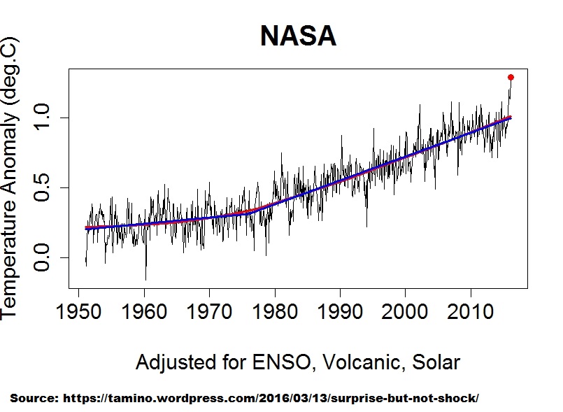
Grant Foster’s “adjusted” GISTEMP LOTI, March 2016 version
Oddly, the 2015/16 El Nino spike remains in entirety. As Bob puts it:
What is amusing is that, irrespective of the imposed trend curve (basically just 2 linear trends – look closely), the 21st century ‘hiatus’ is clearly evident from the mid-2000s onwards. All Tamino’s “adjustment” does is move the pause along in time. This would be even more clear if Foster had actually removed the 2015/16 uptick. In other words, his trend line is missing a 3rd linear trend from about 2005 onward.
Clearly, from 2010 onwards, the bulk of the data is BELOW Foster’s linear trendline.
2010 is significant here because 2010 was where the Foster & Rahmstorf (2011) residual passed through observations i.e. they “removed” very little of that spike too so the chances of Foster removing the 2015/16 spike were always going to be slim.
Foster and Rahmstorf (2011)
http://iopscience.iop.org/article/10.1088/1748-9326/6/4/044022/meta;jsessionid=EBB7865D97EA3ED94514592C4F888189.c5.iopscience.cld.iop.org
Figure 4. Adjusted data sets for all five sources, after removing the estimated influence of el Niño, volcanic eruptions and solar variations.
http://iopscience.iop.org/1748-9326/6/4/044022/downloadFigure/figure/erl408263f4
Obviously, Foster’s NEW “model” is different to the OLD F&R2011 residual in respect to GISTEMP. Note how the 2010 El Nino spike is prominent (warmest) in the OLD residual (GISTEMP, blue line) but is not a standout feature of the NEW “model”.
Even by publication date of F&R2011 it was obvious that Foster would need a NEW model because addition of the then neutral data would make his residual look silly i.e. the neutral data was flatlining and the pause/hiatus was back – embarrassing. Even a massive spike as did occur was not going to help, no, a NEW “model” was required.
So now Foster & Rahmstorf (2011) is thrown under a bus by Grant Foster himself, no less. Not much courage in his convictions.
Advanced signal analysis is rather more revealing than Foster’s inept (and therefore non-contiguous) efforts.
For example:
‘Application of the Singular Spectrum Analysis Technique to Study the Recent Hiatus on the Global Surface Temperature Record’. Diego Macias , Adolf Stips , Elisa Garcia-Gorriz. Published: September 10, 2014
DOI: 10.1371/journal.pone.0107222
Provides this:
Analysis of Global Temperature Anomalies
Compare the residual (red line, secular trend ST) to Foster’s (latest) residual above. The red Macias et al residual exhibited a negative inflexion in the 21st century that confounded the authors. Additional data, even with the 2015/16 spike, would serve to make the inflexion more pronounced i.e. the trajectory of the data is not linear as per Foster’s residual. I expect the residual to peak in the early 2020s. That means, after subtraction of the oscillatory component (MDV green line, Macias et al) from the secular trend (ST red line), continued flatlining of the reconstructed signal (ST + MDV) or close to it until the ST peak is passed i.e. flatish GMST until the early 2020s. Foster is ignorant of the oscillatory component, MDV, which will bite him from MDV-neutral 2015 onwards because MDV is in negative phase now. His residual only begins at 1950, how would he ever know?. The MDV-neutral spline in GMST is nominally (see Macias et al), in 30 year phases of the 60 year climate cycle:
MDV-neutral spline in GMST: 1865 – 1895 – 1925 – 1955 – 1985 – 2015 – 2045
It is this MDV-neutral ENSO-neutral spline that should ONLY be compared to the model mean because the models are MDV-neutral and ENSO-neutral too i.e. this is the ONLY valid apples-to-apples models-obs comparison. The model mean conforms to this spline up to 1955, after which it shoots off too warm (ignore retrospective and temporary volcanism in the model mean – why do they bother?). The IPCC admits 111 out of 114 CMIP5 simulations do not model the 21st century GMST profile. It is even worse when a valid comparison is made of the model mean to the MDV-neutral spline above.
I think it is safe to say, given solar change this century, the 2045 MDV-neutral data will be well below 2015 level.
Foster, in his ignorance, will be out of options around 2020. His blind belief that the data trajectory is his linear residual will be undone in the intervening time. Firstly by a return to ENSO-neutral conditions after the El Nino. Secondly by a very probable La Nina. Thirdly by a return to neutral after a La Nina. Fourthly by negative MDV. All of which will be BELOW his residual trendline, as was the post-2010 data BELOW his F&R2011 residual trajectory.
Foster dug himself into hole. Now he’s tying himself in knots. Schadenfreude is fun.
Grant Foster is fixated on his linear “upward” trend. It’s weird. A linear trend only represents data that is essentially linear but even he admits (below) that the GISTEMP series fluctuates.
His linear trends are externally imposed (on incomplete “data” in his adjusted series) i.e. it is extrinsic and subjective – an analyst’s assumption. A polynomial curve is also extrinsic but would represent the (raw) data better the a linear trend, and his “adjusted” series better too – but still an assumption. Signal analysis on the other hand extracts the intrinsic signals i.e. inherent internal intrinsic without analyst imposition.
Here’s Foster again at Skeptical Science in respect to GISTEMP (not his “adjusted” GISTEMP note). This time he’s truncated the series to begin 1970 (again, GISTEMP begins 1880 Grant):
If Grant Foster expects the data trajectory to continue along his red linear “trend” he’s in for a rude wake-up. Just as the data did not follow his F&R2011 “adjusted” trend post 2010, neither will post Feb 2016 GISTEMP data follow his “trend” because he has not identified the signals in the data. He hasn’t learned or progressed from F&R2011 which was cited in AR5 Detection and Attribution (i think the chapter was) i.e. he fooled himself and the IPCC.
It will be fun to track the data: El Nino back to neutral, La Nina, La Nina back to neutral, over the next few years to 2020 against Foster’s “trend”, especially given the onset of SST cooling upthread. He was wrong in 2011 and he’ll be wrong again.
I predict the post 2016 El Nino data will be BELOW Grant Foster’s “trend” out to 2020 in GISTEMP. Foster will probably still be imposing new linear “upward” trends (but slope inexorably reducing) because it’s what his belief dictates irrespective of signals and his failure to detect an inflexion in the critical signal.
Here’s a side-by-side of Tamino’s models (red curves) for the 1997/98 El Nino and the 2015/16 El Nino. I simply copied the 1997/98 blip and pasted it next to the 2015/16 blip.

As I wrote in the post:
Maybe Tamino forgot to apply his “more complex model of the el Niño effect, one which matches the 1998 outburst” to the comparably sized 2015/16 El Niño…
Of course his followers overlook his games.
Of course Tamino can’t regress away the present el Nino peak, simply because it is stronger than expected from MEI. 1997/1998 was stronger in MEI than now. Thus, there is something extra at work now, AGW, or…
Another way to deal with the issue is to look at the peak to peak trend. According to Gistemp loti the present Winter was 0.51 C warmer than 1997-1998, which corresponds to a trend of 0.28 C/ decade.
According to KNMI climate explorer the CMIP5 rcp 8.5 all- model trend for Global tas (2m) is 0.24 C/ decade for 1998-2016. However, a more fair comparison with observational indices is 71% tos (SST) + 29% land tas (2 m), which reduces the trend to 0.21 C/decade.
Hence, the present observed peak to peak increase is stronger than expected from the CMIP5:s.
The other way around, as estimated from the models, the present el Nino should peak 0.38 C higher than 1997/1998 in mixed indices, or 0.43 C in global 2m indices.. I would be interesting to compare when the whole el Nino Year is in.. ( I suggest the period September through August)
Re “Alarmism Cranked Up to Absurd Level”
Yes, following all this with interest at Richard Treadgold’s Climate Conversation Group here:
‘Hottest year ever was 2015 – But only in Ethiopia, Vietnam, Brazil …’
http://www.climateconversation.wordshine.co.nz/2016/01/hottest-year-ever-was-2015/comment-page-1/#comment-1446558
And,
‘Met Office shock forecast: warming to continue’
http://www.climateconversation.wordshine.co.nz/2016/02/met-office-shock-forecast-warming-to-continue/comment-page-1/#comment-1446559
An example in ‘Hottest year ever was 2015’ of Alarmism Cranked Up to Absurd Levels that Bob missed is this article featured in a number of news outlets (see link and downthread for sources):
This particular kind of climate emergency being inapplicable here in the Southern Hemisphere but I’m sure y’all in the Northern Hemisphere are suitably alarmed. It must be stressful.
That was posted by Peter Hannam here in Australia at the Sydney Morning Herald, with all the usual alarm and doom predictions. Also, just today, the ABC reported that Fox and Franz Joseph glaciers are shrinking so fast that only 80,000 tourists will be allowed to land and walk on them per year.
And that is amusing? Why?
There’s something you’re forgetting.
Citation in a paper is often done when correcting the previous author’s error laden waste disguised as work – like Hansen and Jones’ years of admitted falsification of official records, which they disguised as work.
If someone’s paper is cited a large number of times and they’re involved in controversial pseudo-scientific claims of
coming to work in a row boat,
and
entire regions’ heating supplies being like death trains to Auschwitz,
a large number of cites regarding them will be people CORRECTING their worthless, faulty work.
Phil Jones and James Hansen – both of whose intellectual reputations are on par with the people who created Piltdown Man – many, many of the cites regarding them are probably corrections of their kook tard ways.
You’re so naive you’ve got to be some kind of political student, or natural authority worshipper like ToneLoc.
Completely out of touch with what it means, when the state of instrumentation worldwide never utters a single word about their own instrumentation recording the warming
your leaders admitted they falsified starting in 1998.
Never a word from a single independent atmospheric sensing field.
Not one
Not ever
yet you’re both in here falling over yourselves to attach yourselves – to notoriously busted, and confessed, falsifiers of official, global records, for ten plus long years.
It sounds like someone trained you at D.A.R.E. camp to call the police on your parents, to get a ”science trophy.” A.k.a. ”a D.A.R.E. sticker.”
Nothing you say resembles anything a person of honest scientific demeanor would utter.
You’re untroubled by admitted falsification of records.
You’re untroubled by some quack saying he would be going to work in a rowboat
You’re untroubled by the same quack claiming heating supplies are death trains
You’re untroubled by any of this and the fact no other independent instrumentation field,
like say aerospace and aeronautic traffic, military, research, instrumentation,
or any of the earth based astronomy fields whose main hindrance is extreme sensitivity to rising levels of earth-frequency infrared heating of night time atmospheric air.
Those alone rule you out – as well as ruling out ToneLoc – as actual, honest readers with scientifically oriented thought processes.
So you might think you’re troubling someone by showing up praying to admitted falsifiers of data for more than a dozen years,
but the only thing you’re doing is reminding us that some people can’t be told the truth by the entire face of the earth verifying their own cult leaders’ admission that – it hadn’t been warming, they simply falsified it because if they ”said the world cooled since 1998 the scientific community would come down on them in no uncertain term.”
Oh that’s right the scientific community would come down on them because they were in the act of discussing: they’d been falsifying records for seven years by 2005.
I can’t find an email for Bob Tisdale, so I hope it will be OK just to post my comments here:
Dear Mr. Tisdale:
I’ve been reading your 2015 Ebook, “On Global Warming and the Illusion of Control — Part 1″.
Circa p. 50, I find: ” . . . the human impacts of global warming is so firmly fixed in place that it is nearly impossible to publish papers that challenge it. Scientists who question the dogma are likely to lose government funding and/or their jobs.”
Hmmm. If you get tired of global warming and still want to be cast out by publication-ruling “experts”, you might consider trying biological effects of microwaves. You can find all the controversy anyone could want in the first six pages of my “Biological Effects of Microwaves: Thermal and Nonthermal Mechanisms”, available online at http://www.scribd.com/doc/45663757/Biological-Effects-of-Microwaves-Thermal-and-Nonthermal-Mechanisms .
——————————————————————-
My own contribution to the global warming problem is online at
http://www.scribd.com/doc/36483927/Entropy-shows-that-global-warming-should-cause-increased-variability-in-the-weather . It’s actually less technical than the title would imply:
Abstract
Elementary physical reasoning seems to leave it inevitable that global warming would increase the variability of the weather. The first two terms in an approximation to the global entropy may be used to show that global warming has increased the free energy available to drive the weather, and that the variance of the weather is expected to have increased correspondingly.
“Abstract
Elementary physical reasoning seems to leave it inevitable that global warming would increase the variability of the weather. The first two terms in an approximation to the global entropy may be used to show that global warming has increased the free energy available to drive the weather, and that the variance of the weather is expected to have increased correspondingly”
I don’t follow. I would have thought that temperature and pressure differences drive weather variability. Less ‘extreme’ weather events during the cold peak of a glacial?
Occasional spike and the longer term average ?
http://www.vukcevic.talktalk.net/GISS-NOAA.gif
vukcevic, you illustrate what I was getting at upthread perfectly with that graph of 5 yr average.
Grant Foster (see upthread) thinks the data is on a linear “upward” trajectory from 1970. That NOAA 5 year average detects the 21st century inflexion that Foster misses entirely.
The inflexion is not nearly as pronounced in GISTEMP 5 yr average with only the warming half of the 2015/16 data in so far:
http://woodfortrees.org/graph/gistemp/from:1970/mean:60
But another 2 – 3 years of data will be a different profile in the 21st century part of the series. The 5 yr average neutralizes the ENSO activity. The trajectory will still be upwards (maybe) but nothing like what Foster thinks.
GISTEMP LOTI (offset -0.2) vs HadSST3 NH vs HadSST3 SH
From 1990, 5 yr mean, trends from 1995
http://woodfortrees.org/plot/hadsst3nh/mean:60/from:1990/plot/hadsst3sh/mean:60/from:1990/plot/hadsst3nh/from:1995/mean:60/trend/plot/hadsst3sh/from:1995/mean:60/trend/plot/gistemp/from:1990/mean:60/offset:-0.2/plot/gistemp/from:1995/mean:60/trend/offset:-0.2
Huge divergence in NH SST from 2000 onwards but SH essentially flat. And GISTEMP LOTI is basically just tracking NH SST.
The illusion of 21st century “global” warming is complete.
Add HadCRUT4 and HadSST3 global means to the above graph and it becomes perfectly obvious that GMST is skewed by NH Land:
http://woodfortrees.org/plot/hadsst3nh/mean:60/from:1990/plot/hadsst3sh/mean:60/from:1990/plot/hadsst3nh/from:1995/mean:60/trend/plot/hadsst3sh/from:1995/mean:60/trend/plot/gistemp/from:1990/mean:60/offset:-0.2/plot/gistemp/from:1995/mean:60/trend/offset:-0.2/plot/hadcrut4gl/from:1990/mean:60/offset:-0.07/plot/hadsst3gl/from:1990/mean:60
Fig 11:
The fact that global warming over 30-year periods, according to the GISS data, has not accelerated for more than 2-decades is a problem for the modelers.
There’s a problem period matching in this point. 20 years is less than 30. And the disparity is of an even shorter time-frame. You also don’t include the spread of forecasts. There is disparity between mean model estimates and obs, but this presentation oversells it. It’s as illegitimate, to my mind, as mapping Feb temps onto the model mean, and pointing out that it is above the mean forecast. This argument relies too heavily on short-term disparity (about 17 years) for a reference period of 30 years. It would have been better to centre the 30-year trends rather than trail them. Unfortunately, the results would not be as dramatic. Thumbs up, though, for using a reasonable time-scale (tri-decadal).
Barry, first, what you quoted has nothing to do with the recent disparity that seems to be the topic of your comment.
Second, you know as well as I do that centering the 30-year trends would only shift both curves forward in time–and not change their relationship.
Third, regarding the model spread, none of the models are simulating Earth’s climate as it exists, so a spread has no value, simply a collection of wrong models. The model mean presents the consensus of blatantly wrong models for how climate should respond to the forcings.
Fourth, regarding the short-term disparity, I noted in the post that sometime in the future people might start to realize…
Fifth, you’re welcome for the reasonable timescale. Curiously, other true-blue believers in the hypothesis of human-induced global warming on the thread above have been criticizing me because it doesn’t show the recent El Nino-related uptick. Go figure.