Guest Post by Willis Eschenbach
A WUWT commenter emailed me with a curious claim. I have described various emergent phenomena that regulate the surface temperature. These operate on time scales ranging from minutes to hours (e.g. dust devils, thunderstorms) to multi-decadal (e.g. Atlantic Multidecadal Oscillation, Pacific Decadal Oscillation). He suggested that there is also a much slower thermostatic mechanism at play over thousands of years and longer. Here’s how I understand it.
He said that when it gets warmer, the atmosphere is more moist, so there is more snow on Antarctica. This translates into more ice on the ice cap, which puts increased pressure on the ice below. Now, the ice gain at the surface and the ice loss in the calving of the Antarctic glaciers is in some kind of long-term very slow-moving steady state. Pressure at the top squeezes out the ice on all sides. So increasing the ice mass over time would lead to more calving, which in turn would cool the surrounding ocean. He said this slow process shown below functioned as a long-term factor promoting thermal stability.
Warming –> increased Antarctic snowfall –> thicker ice cap –> increased iceberg calving –> cooling
He suggested I should look into the rate at which the ice has historically accumulated at the Vostok ice core location in Antarctica. He thought that the ice accumulation rate was a function of temperature. His idea was that Vostok shows that increased temperatures lead to increased antarctic snowfall, which in turn increases the rate at which the ice accumulates on Antarctica. So I took a look.
The ice core from Vostok is a technological marvel. They drilled 3.3 kilometers (two miles) straight down into the ice, and extracted a core of undisturbed ice. Then they analyzed it one metre by one metre, along the entire length of the core. The variations in temperature calculated from the core are well-known, they show the history of the last four ice ages:
 Figure 1. Temperature record from the Vostok ice core. The zero point on the temperature scale is modern-day temperature. Temperature is calculated from the variations in the 18O oxygen isotope as recorded in the ice core. Present-day values are at the left of the graph. DATA SOURCE: NOAA Paleoclimate
Here, you can see the ice ages, interrupted by short periods of warming … well, short by geological scales at any rate. The most recent warm period, on the left, has lasted about 10,000 year (10 kya). (As an aside, for me the mystery is not what it was that slowly and gradually pushed us into each ice age with lots of fits and starts. The thing that perplexes me is what it was that abruptly yanked us out of each ice age in one extremely fast period of great warming. But I digress …)
Although I had seen that before, I’d never looked at the ice accumulation rates. Figure 2 shows the annual rate of accumulation of ice at Vostok.
 Figure 2. Ice accumulation rate record from the Vostok ice core. Since the measurements are taken every metre along the ice core, the accumulation rate is calculated as the reciprocal of the age differences from one measurement to the next. Present-day values are at the left of the graph.
Urg. That was not too appealing. Clearly, what we are seeing is the progressive compression of the ice layers as we drill deeper and deeper into the ice cap. Millions of tonnes of ice on top have progressively flattened the deeper layers. Makes it hard to see any relationship. I considered various ways to model the compression of the layers and remove it … and discarded them all.
What I did notice, though, was that as we see at the left hand end of the graphic above, new snow is fairly bulky. But it gets compressed quite rapidly at first. After that initial rapid compression of the snow into ice, however, the compression is somewhat linear from that time onwards. So I decided to omit that first part of the data, which is about five thousand years. I then plotted up the remaining ice accumulation data, and I included the temperature data on the same graph so I could compare them.
 Figure 3. Ice accumulation rate record (blue) and temperature record (red) from the Vostok ice core. Both records start a 5000 years before present. Recent values are at the left of the graph.
Dang … surprisingly, his claim was looking much, much better. So I took a first cut at modeling the ice accumulation rate from the temperature data. I’ve included the depth as a second explanatory variable. Here is the result of the estimation of the ice accumulation rate as a function of depth and temperature:
 Figure 4. Ice accumulation rate record (blue), temperature record (red), and estimated ice accumulation rate based on temperature and age (black) from the Vostok ice core. All records start at 5000 years before present. Recent values are at the left of the graph.
Now we’re getting somewhere, but there is still a problem. Because the layers are progressively flattened with depth, the response of the ice accumulation rate to temperature is also progressively flattened with depth. To allow for this, I included the product of the two variables (depth and temperature) in the analysis, giving the following result:
 Figure 5. Ice accumulation rate record (blue), temperature record (red), and estimated ice accumulation rate based on temperature, age, and age*temperature (black) from the Vostok ice core. All records start at 5000 years before present. Recent values are at the left of the graph.
Well, there you have it. Ice accumulation in Antarctica is assuredly a function of temperature. What’s not to like? His hypothesis is obviously correct. Done and dusted, right?
Well … in a word, no. I didn’t like it at all.
The problem that I had with the good fit is an odd one … the fit is too darn good. Nothing in nature fits that well, down to the tiny wiggles in the blue and black lines at the right of the graphic. Correlations that good make my nose twitch, they set off my bad number detector..
I had started with the raw data and no preconceptions. Now I knew what I was looking at and looking for, so I went off to research what might explain it. To do that, I looked at the various methods for dating an ice core. Turns out there are four of them—count the annual rings, align to known events, radioactive dating, and use a “flow model”. Problem is that the first three methods only get us back about 80,000 years into the past. Beyond that, it’s all flow models. Which is OK, and they are likely fairly accurate. The problem lies elsewhere, in the input variables to the various flow models. Here’s the list of what goes into the models:
- Temperature
- Ice thickness
- Flow patterns
- Gross accumulation rates
- Ice rheology, the study of how much ice deforms and moves in response to pressure.
I’m sure you can see the problem. In my calculations, the net accumulation rate shown in blue above is a function of the age change per metre of ice core. Makes perfect sense, that’s how you calculate it. If it takes a hundred years to add a metre of ice, the accumulation rate is equal to 1 metre / 100 years = 10 mm/year.
The problem is that in their model, the age change per metre in turn is very much a function of the temperature. And that means that we expect the net accumulation rate to be a function of the temperature. It is inherent in the calculation—accumulation is a function of age, and age is a function of temperature, so accumulation is a function of temperature.
As a result, the graphs that I have shown above have very little inherent meaning. It’s like showing that one equals one. The commenter was correct that he found a correlation … it just didn’t prove anything.
This also means we cannot use the correlation above to support the commenter’s theory that increased temperature leads to increased accumulation rates.
However, all is not lost. This analysis does point out one important thing—the best judgement of the scientists studying the question is that indeed, ice accumulation rates in Antarctica are strongly positively correlated with temperature. They say that counterintuitively, a warmer world indeed means more Antarctic ice.
So … IF the scientists are indeed right, then this analysis also allows for a couple more deductions. One is that near the surface, which is to say near the present, the depth and depth*temperature terms of the estimate are small. This means that the recent annual addition of snowfall to the icecap is about 20 mm (of ice equivalent) per year. The change in that accumulation rate per degree of warming is about 1.25 mm/year This implies that for each additional °C of warming, the accumulation rate goes up/down by about 6%.
The graph also shows that during the end of the most recent ice age, the annual accumulation rate was only about half of the current rate.
All of which would suggest that the change is large enough to support the idea of a slow restorative force opposing any change in temperature. Since at the start of an ice age the annual addition to the icecap drops rapidly to as low as 50-60% of its previous value, surely that much of a decrease in ice accumulation must result in a correspondingly reduced amount of iceberg calving at the ocean.
How much energy is involved in the change? Well, to first melt and then evaporate a cubic metre of ice takes about 90 watt-years of energy. The change in accumulation rate between ice age and interglacial is about 10 mm/year, which is about a metre per century difference.
This means that the change in energy between ice age and interglacial due to the variation in ice buildup is about 0.9 watts per square metre constant change over the surface of Antarctica. This is a fairly small effect.
However, in contemplating this situation, I realized that one oddity of this method of moving latent heat around in the form of ice is that the ice is added over two dimensions, over the surface area of Antarctica. But at the other end of the process, the ice is squeezed out in one dimension, along the coastline. Given the relative area (11.1E+6 km^2) and the coastline length (18.0E+3 km) of Antarctica, this is a concentration of about six hundred to one. This means the 0.9 W/m2 across the continent becomes about 0.9 * 618 ≈ 550 watts of heating or cooling per metre of coastline. This variation in iceberg calving rate represents a strong local change immediately adjacent to the coastline.
Next, let’s consider what this variation in ice calving rate along the Antarctic coastline does. The key underlying concept to keep in mind is that vast amounts of heat are being exported constantly from the tropics to the poles, where the heat is radiated into space. The transportation is done by both the ocean and the atmosphere, both of which move heat polewards 24/7.
As a result, the rate at which the planet can lose energy is constrained by the speed of the oceanic and atmospheric circulation. The general rule is, anything that speeds up oceanic circulation will cool the planet down, and vice versa.
The circulation around Antarctica is shown below.

Figure 6. Circulation patterns around Antarctica (right side of drawing).
Setting the details aside, the takeaway message from this graphic is that when the Antarctic coastline gets more ice input from the glaciers, the speed of the circulation increases because more cold water is sinking downwards around the continent.
And on the other hand, when there is less ice around the Antarctic coast the circulation will slow down. There will be less cold water to drive the downwelling leg of the thermal circulation.
So the entire feedback loop looks like this:
Warmer southern ocean –> wetter atmosphere –> more snow on Antarctic interior –> more glacier calving around Antarctic perimeter –> increased oceanic circulation –> increased global cooling.
Anyhow, that’s what I found out today. Of course, your conclusions from the same facts may be totally different …
Regards to everyone,
w.
My Usual Request: If you disagree with me or anyone, please quote the exact words you disagree with. I can defend my own words. I cannot defend someone else’s interpretation of some unidentified words of mine.
My Other Request: If you think that e.g. I’m using the wrong method on the wrong dataset, please educate me and others by demonstrating the proper use of the right method on the right dataset. Simply claiming I’m wrong doesn’t advance the discussion.
EDIT: Willis accidentally left figure 6 out of the body of the text, but made it the featured image for the post from the set of images he uploaded. I’ve corrected that problem – Anthony
“Clearly, what we are seeing is the progressive compression of the ice layers as we drill deeper and deeper into the ice cap.”
It certainly looks that way. And that looks plausible near the surface as trapped gases are squeezed and loose piles of snow are converted into more compact ice with some gas bubbles and presumably a lot of the gases escape. But. Water and ice are notoriously uncompressible. I’m having a little trouble envisioning layers of ice hundreds of meters below the surface flatenning to the degree suggested by your charts. They can compress a bit vertically as gases are squeezed into ever smaller space. And they will certainly try to push out horizontally. Probably with considerable success near the edges of the ice, But in the interior of the continent, the adjacent ice is presumably trying to expand into their space just as vigorously as they are trying to expand outwards.
Seems like an awful lot of flattening to be accounted for
I suppose the alternative is that the accumulation rate really is increasing over time.
The “Rate this” stars seem to be gone.
Willis
Nature fails to follow CMIP5 models! CMIP5 models get sea ice backwards – predicting a decline vs actual increasing Antarctic ice.
Wind may be one of the missing/underestimated feedbacks.
Evidence for link between modelled trends in Antarctic sea ice and underestimated westerly wind changes Ariaan Purich et al., Nature Communications 7, Article number: 10409 doi:10.1038/ncomms10409.
Willis –
“This implies that for each additional °C of warming, the accumulation rate goes up/down by about 6%.”
A 1% change in water temperature produces a 16% change in the specific humidity of the air above it; 16/2.73 = ~6. You may simply be looking at someone’s assumption that air circulation and *relative* humidity around Antarctica don’t vary with temperature.
Give thanks for “the pause” and clouds. A Limerick.
The cause for the Climate change pause:
The CO2 increase; because
there’s more clouds in the sky
make more snow, that is why
the climate is stable. Applause! lenbilen.com/2016/02/24/4697/
What would cause a large circulating mixed ocean to layer up, leaving all the warm water on top to be evaporated away? The Easterly winds would have to relax. Suddenly and for a long time.
A grand El Nino.
When this grand El Nino windless, cloudy epic period results in enough ocean energy depletion, the atmospheric/oceanic teleconnection kicks up the Easterly winds again and the other epic period begins: primarily a long period of mainly clear cloudless days (with necessary wind) which allows the Sun to extensively penetrate and build ocean stored energy. Windy mixing at the surface would keep that energy from rising to the surface and coming back out, though an occasional diminution in wind will let some evaporation occur resulting in this jagged step down in temperature.
I note that after the jagged step down, there appears to be a floor related to the oceans having absorbed all the heat they can (instead of being evaporated out to heat the Earth) and Earth’s global temperature is as cold as it can be.
At the floor, the winds rather suddenly stop, the stored energy begins to concentrate at the surface, clouds build from evaporation, and net heat loss from the oceans begins. That heat should evaporate fairly quickly leading to sudden changes in global temperatures.
During that sudden and sharp upswing in global temperature, there would likely be windless and very cloudy conditions in important ocean areas, resulting in constant ocean heat exchange to the atmosphere to the point that there is no more warm layer to evaporate away because the Sun can’t replace what is evaporated due to clouds and water vapor blocking solar irradiance. Evaporation continues till what appears to be a ceiling where oceans are depleted and Earth’s temperature has peaked.
Then the skies clear of water cycle clouds and the oceans begin to absorb solar energy once again. The wind also picks up leaving little of that energy to escape and warm the Earth through the process of cloudy greenhouse conditions. So back down we go again into freezing temperatures.
This pattern of sudden rise, jagged fall, and a ceiling and floor may be physically related to the size of the Earth and its surface area and volume of water. The epically long term solar to ocean recharge/discharge imbalance set up by the water cycle speed up then diminution supplies the drive that leads to the shape of the plus-to-minus, then minus-to-plus imbalance while top of the atmosphere solar irradiance remains stable for all intent and purposes.
One small quibble, Pamela:
From my jaundiced view of the temperature graphs, The pattern is sudden abrupt rise and a sudden abrupt drop.
From a peak temperature, there is a quick drop of 2°C with perhaps some bouncing around that drop and then a further plummet of five to seven degrees Celsius.
Remember the sheer scale of years crammed into a very small graph. Points immediately adjacent to each other are not very adjacent, time wise.
This is before one gets into discussions about temperature estimations from annular ice layers a mile deep.
A 2°C drop in temperatures is enough to seriously affect calendar length and overall depth of ice/snow cover.
Agreed Theo. The time scale is huge. That said, the kiss principle must still be our first theory before considering more exotic theories. Which makes me think of something we measure all the time, something that unusually arrives a bit sluggishly (lagged) but then spreads like a calming balm, relatively uninterrupted and stable, before it switches back to its normal state, greatly sluggish and jagged with interruptions. I am therefore reminded of the unusual, not normal, steady El Nino interspersed between the normal back and forth episodes of jagged neutral La Nada and super La Nina patterns that we see at finer scale. Now let that pattern run on a gross scale. I wonder if we need to look at anything at all beyond the imbalanced oscillation patterns that are everywhere in the oceans and land surfaces.
Shouldn’t figure 6 show the South Atlantic rather than the North? (apologies if someone else pointed this out)
Don K @ur momisugly 4;54 AM
The thinning of successive layers would be due to extrusion of the ice along the path
of least resistance.
As for trapped gasses, I believe Dr. Jaworowski has the right of it. Until I see experimental
evidence to the contrary,I do not believe gasses below a very recent level are reliable .
http://www.21stcenturysciencetech.com/Articles%202007/20_1-2_CO2_Scandal.pdf
So roughly every 100,000 years the temperature anomaly spikes up 2C+ and slowly lowers? Perhaps the 2C target meme has some fundamental failsafes instilled in it and was not picked out of thin air…..
What could possibly provide enough energy to produce that consistent spike in temperature?
The 2C target meme comes from a 1970’s paper by Economist William Nordhaus estimating (guestimating?) the economic cost of warming. Not good @2C, worse@3C etc, The 2C has been endlessly repeated because it makes catastrophe seem more immenent. Action is needed now!
Makes sense, 2015 was the warmest year on record also the most ice on record.
Willis
Very thought provoking discussion.
While looking at the Vostok Ice Core Figure 1, I imagined the graph minus all the little bits and pieces, and was left with the relatively periodic shape, which is comprised of a slow change period in basically one direction, followed by an abrupt “reset”, etc. Lots of simple physical examples come to mind…filling a bucket with a tipping point, charging a capacitor, etc. Nothing magical/original. I then imagined a process that was NOT explicitly driven by any periodic external sources (ie ignore variations in orbit, sun output, CO2, politics (:)), etc. What we have left is a large ball covered with water (and ice and air). Perhaps not too interesting…but one item in your Figure 6 (Circulation Patterns around Antarctica) triggered a thought…the ridge. Now, again ignoring any specifics, just follow the basic periodic circulation you show in Figure 6, and imagine a relatively stable period of circulation…that is resulting in the gradual cooling, then, due to the inherent physical features of the ocean/land masses gross solar insolation (ie due to the tilt of the earth), interesting ocean ridges, etc, this circulation reaches a relative tipping point, bang, big change (bucket empties ) and we start again. This kind of grossly simplistic model would then infer that all of the indicators (CO2, forest cover, atmospheric temperature, ad nauseam), we love to collect analyse and argue about are just meek followers, causing all of the little bumps and sub oscillations that appear to drive current climate analysis. This type of physically constrained mega cycle would then have a gross period, but the specific amplitudes and periodicity would be the result of chaotic behavior…which invariable become targets of our pattern seeking brains (previous subject posted thank you).
Some of my background is in root cause/accident analysis. One observation I have made in both studying hundred of accidents, and investigating a relative few, is that although specific accidents have specific chains of events, what is often lost, is that there is really nothing special about THAT specific chain of events. Take the shuttle Challenger accident. The space craft is lost because the huge energy in the propulsion system was explosively expended. The “root” cause was o ring material temperature related. The analysis then goes into detail of how, what when, etc. Everything from group think to basic design was indited. For real world events and learning, this is important. It can demonstrably result in safer high risk activities. What is lost however, is that the basic driver of this kind of event is much larger. It was comprised of huge energy sources (boosters and fuel tanks) coupled with physical constructs (the craft itself) which will always, practically speaking, have some limit whereby bad things are going to happen. We attempt to ameliorate the probability of reaching that limit by studying the system and making changes to reduce our approach to those limits. The key here is that the physical system is something we make and can significantly control. We then gravitate to sorting out large phenomena with the same mindset. My point is that we have a strong tendency to of searching for something at a scale we can comprehend, and ultimately control (an obvious evolutionary advantage).
Now, going back to my climate “model”: Many (most?) of the arguments discussed here (WUWT) are rooted in discerning external drivers, orbital, solar, man made (CO2, deforestation), etc, etc. Willis makes very compelling observations, that intrinsic physical phenomena, ie T storms, ocean circulation, etc, comprise a huge, but relatively stable thermostatic behavior. I am drawn to the simplicity of a physically constrained climate system, the overall (but still chaotic) boundaries and behavior) driven not by above mentioned cyclical or man made forcing, but just by rock, water, ice and air.
So what does this lead me to? Perhaps a climate model which builds on Willis Figure 6. I hypothesize a model which is comprised of the basic physical shape and contents of the present earth. Big features matter (huge ridges, continents, etc). Add water, salt, air. Then the big inputs (but forget any periodicity), solar, orbital effects on solar (big, not little). Spin the ball. Start by configuring the model with the basic present earth parameters and starting points. Run it at a gross time scale per Figure 1. Do you observe a phenomena similar to Figure 1? If not only change big things…and only within actually observed reality. Forget adding variables. The oft discussed inherent pitfalls of too many variables is, I think, an inherent behavior. If my above thought experiment has any validity, then the observed phenomena of Figure 1 would grossly manifest itself, and be generally immune to input and physical constraints WITHIN a reasonable period of time (ie a few million years.).
The above train of thought has a basic premise. Look for the simplest explanation involving the largest energy sources and physical shape/constraints. An often held view is that the Earth is some delicate flower, only existing in its present state (Vostok time scale state, not today or yesterday) due to an incredibly rare and unstable confluence of very specific physical and or periodic external forces. The tiniest change (CO2, parking lots, a few more less solar flares) then can result in some huge variation in the climate. I think not. I surmise these things can have chaotic effects (like changing the color of my tipping bucket), but have relatively little/no effect on the basic behavior. This last is based on an obvious observation…the earth is neither a ball of ice, nor a barren desert (ie Mars).
The simplest explanation is definitely not always the most basic explanation, but I would strongly argue that it is far more likely to match reality than most humans would like.
Thank you Willis for an interesting morning.
Ethan Brand
Has anyone tried to run a computer simulation based on this kind of model? Not to try to replicate every feature of the climate record, but to capture the periodicity?
Very interesting comment by Ethan Brand.
2015 was the warmest year on record only in the imaginations of certain bureaucrats.
Most Antarctic ice = total of recent accumulation.
This is a very complicated see on meshing processes. We might not have identified all of them. Some points to note include the near absence of liquid water on the Antarctic plateau; the conceptual difficulty of plastic flow or compression compaction to give thinner layers with depth; the reported presence of large lakes in the basement rocks; the dating resolution down hole and possible upsets in it if prior melting removed ice and created iunconformities; the less than full understanding of the gas age/ice age difference; the effects on isotopes used to derive past temperature profiles through precipitation, sublimation and surface wind scour/ mixing at the depositional surface; the distinctions between temperature at ice formation and any impressed temperature printed on deep ice from geothermal heat ….
Just when you are getting into a synthesis accompanying these, along come more aspects like the paper this year that noted that surface ice was the coldest part of the vertical profile affecting its atmosphere, so that cooling gradients resulted from higher atmospheric CO2.
The effort to collect quality ice cores is commendable. The difficulty seems to stop confirmation exercises like drilling and cross matching of several holes close to each other to show conformity of layers for ageing. The cost is very high, so points of diminishing return from further holes set in early.
There are lessons from older attempts to gather stratigraphic info from sedimentary rocks. At least you sometimes crack a pleasant location for your collar for rock work.
Geoff.
Geoff: Thank you for questioning and being curious about impacts.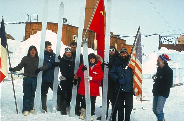
Some pictures I dredged up this morning looking for more information regarding Antarctic ice cores.
http://www.montana.edu/priscu/images/presentations/AAASFeb01/Vostok%20Ice%20Core%20Schematic.JPG
What are they drilling with?
http://weather.thisconnect.com/wp-content/uploads/2010/06/drillinguk_505.png
Antarctica ice core sites
http://cdn.antarcticglaciers.org/wp-content/uploads/2013/10/fig6.jpg
Antarctica altitude
http://cdiac.esd.ornl.gov/trends/co2/graphics/antartica_ice_core_stations.jpg
Drilling at Antarctica, Vostok I believe.
http://icecores.org/graphics/drilling_4inch-drill-01_joseph-souney.jpg
Ice drilling at Shallow Dome C.
http://icedrill.org/7th-international-workshop-on-ice-drilling-technology/graphics/drill_BAS-shallow-Dome-C_BAS-Robert-Mulvaney_350px.jpg
More ice drilling at Camp Plateau.
http://paleoglaciology.org/userfiles/image/caucasus/Ice%20Core%20Drilling/camp-plateau-and-Shtavler.gif
FIRN density at Law Dome C.
http://i90.photobucket.com/albums/k247/dhm1353/DE08_Geo_1969.png
Vostok team taking extreme care with ice cores. “French, Russian, and American scientists in the Vostok team photo with unprocessed ice cores.”
A paleo time reference chart so we can visualize just how much geological history we’re discussing with 460,000 years of ice cores.
http://img.docstoccdn.com/thumb/orig/12900337.png
There are several physical changes that occur to ice cores. A key transition is the change from ice crystals to solidified ice.
A second change is laminar ice flow away from ice buildup to areas where ice is less. When ice is no longer compressible, than pressure from above causes ice to flow.
Flow where from where? Pointing towards a pole and stating that the glaciers came from that direction is not the same as standing on top of several miles of ice and wondering how much ice has flowed in which directions. It is easy to take a straight flow of a glacier, point to how laminar ice flows over and around obstacles, but where is the testing for how ice flows when pressure is nearly equal from many directions?
Above, Willis has strengthened our current perception that
What I didn’t see in the data Willis used were any information about how droughts would be represented in ice layers. Or what impact does sublimation have on remaining ice?
I was curious about how many years were attributed to/by depth for the data Willis used. As Willis notes above, my BS meter is buzzing.
ATheoK
Thank you for this informative comment.
Willis,
Looking at the red Ice core chart… My first thought is, why does ANYBODY believe that this interglacial period that was caused by global warming, is man made, and therefore very different that the first 4 interglacial periods that were obviously caused by global warming that could not have possible been man made?
One problem with this theory as recent decadal observations show it not getting any warmer in Antarctica and its surrounding ocean, so increasing sea ice has not been caused by any warming.
http://i772.photobucket.com/albums/yy8/SciMattG/UAH_AntarcticTemps1978_zpsd4yjaujj.png
http://i772.photobucket.com/albums/yy8/SciMattG/UAH_AntarcticOceanTemps_zpsyk6tsbmm.png
Whereas the Arctic has been warming so sea ice has decreased mainly due to strengthening of the AMOC with positive AMO.
http://i772.photobucket.com/albums/yy8/SciMattG/UAH_ArcticTemps1979_zpstf88xnmu.png
Removing the AMO just shows how much a huge influence it has on global and Arctic temperatures.
http://i772.photobucket.com/albums/yy8/SciMattG/RSS%20Global_v_RemovedAMO2_zpsssrgab0r.png
The main reason for the difference between Arctic and Antartica / northern hemisphere and southern hemisphere is down to the AMOC with no equivalent in the latter. If a periodic warmer ocean current was able to penetrate the Antarctic land mass then there would be warming here too.
Matt G – As I understand it, the warming that leads to more precipitation over the Antarctic can occur in oceans that are remote from Antarctica. The water vapour then travels through the troposphere, arrives over Antarctica, then descends in the Katabatic wind and dumps as snow. So the correlation of ice accumulation rate with temperature shouldn’t use Antarctic temperature but global ocean temperature (or a subset). In your example, that’s RSS not RSS-AMO.
The ERA-40 shows decline in precipitation and moisture from the 1950’s to early 2000’s between 50-60S, but an increase between 60-90S. Between 80-90S there is only a very slight increase. Therefore it is doubtful the more remote ocean between 50-60S provided more water vapor over the Antarctic when this band declined itself.
http://onlinelibrary.wiley.com/doi/10.1002/joc.1684/epdf
Anyway this is less relevant to the topic in question because this deals with ice cores on the Antarctic land mass, so the temperatures trends in Antarctic and surrounding ocean implies more so here.
And, as far as I know at present, there is no observational evidence that the atmosphere is becoming more moist at present.
The warmists say that sea surface temps are higher and air temps are higher. That necessarily means higher absolute humidity in the atmosphere. I believe agw theory predicts slight increases in precipitation but I don’t know if that has been observed. There is certainly evidence of higher snowfall in Antarctica.
Willis – Thanks for yet another interesting and thought-provoking post. You say “the first three methods only get us back about 80,000 years into the past”. Well, to my mind, 80,000 years is still quite a decent slice of time. So, how about showing a larger-scale graph from -5,000 to -80,000? I’m assuming that the first three dating methods (count the annual rings, align to known events, radioactive dating) dominate in the latest 80,000 years, so this graph would not suffer from the built-in temperature expectations..
I think that Joe Bastardi pointed out that during cool phased PDOs (more la ninas) the SST around Antarctica should be warmer. If we had another 30 year long cool PDO like the 1945 to 1975 period temps should warm slightly around Antarctica.
The OZ east coast has warmer SST during a la nina, more evap and thus more rain and those warmer SSt eventually move much further south as well. Especially over say a 30 year period that produces more la ninas. What do others think, because I’m very much an uneducated layman lurker most of the time.
Another feedback for you to consider Willis, that has been previously discussed at WUWT, ocean fertilization from icebergs.
http://wattsupwiththat.com/2016/01/11/inconvenient-iceberg-calving-helps-carbon-sequestration-and-is-helping-to-slow-global-warming/
Don K
February 26, 2016 at 4:54 am
“Clearly, what we are seeing is the progressive compression of the ice layers as we drill deeper and deeper into the ice cap.”
Don, the “flattening” is not from the compressibility of ice, but rather a measure of how much ice has flowed away from that locality. Indeed, one could take the the difference and calculate how much ice has been squeezed coastward. The difference is indeed the volume of ice that has been squeezed out and melted in the ocean over hundreds of thousands of years.
Willis, this, too, would be an additional interesting calculation of the sustained cooling of the antarctic waters over 400,000 years attributable to the ice that was squeezed outward and into the ocean as icebergs.
Thanks, Gary and Don.
I referred earlier to the calculation that the area of Antarctic (in sq. km.) is about 600 times the coastline length. Better numbers put it nearer 700 times the coastline. Assume equal squeezing of the ice in all directions (not true, but work with me, this is a first cut). This means that the addition of one additional metre of ice on the surface (well, to be more precise, one metre after squeezing snow into ice) leads to the extrusion of 700 cubic metres of ice for each metre along the coastline. In practice, of course, this would mean something like a 100-metre-thick glacial tongue moving outward at about 7 metres per year.
In any case, here’s an oddity. It appears that the Vostok site is drier than average for Antarctica. It puts annual accumulation of ice at 20 mm per year.
However, the total volume of antarctic iceberg calving each year is on the order of 1000 – 2000 cubic km. To generate this much ice, the continent must be getting about 150 – 300 mm of ice accumulation per year …
w.
Thanks Gary. Actually I understood that flow was assumed. And the the pressure of a column of ice a couple of km thick is very large — 10^6 kg/m^2/km roughly, right? But the pressure differential at any given depth at/near Vostok between the ice you are looking at and the adjacent ice is going to be very small. A few grams/meter^2? If there is any friction at all in the system, is ice going to flow? Well … OK … maybe. What do I know about the behavior of ice under a couple of hundred atmospheres of pressure?
Also I forgot that Vostok is at 3400 meters elevation, so gravity is presumably helping things along.
Beyond my pay grade.
ancient maps show antarctica ice free, try reading Immanual Velikofsky’s books.
“Warmer southern ocean –> wetter atmosphere –> more snow on Antarctic interior –> more glacier calving around Antarctic perimeter –> increased oceanic circulation –> increased global cooling.”
It seems to me that the greater global cooling would not necessarily mean greater loss of heat to space because of calving, but rather simply an enthalpy change from melting the glaciers. The heat loss to space has already occurred at the time the atmospheric water became snow and fell to the glacier.
Willis,
Dating ice core deposition times by radioactive dating is not necessarily truncated near 80 kyr. That is about the oldest age that carbon-14 can date. However, occasional volcanic eruptions deposit ash on the snow-ice surface. This often can be dated by potassium-argon methods, which has no upper limit for ice cores. I don’t know if any Vostok ice was so dated.
Thanks, Willis, and thanks, commentators.
Now that I’m getting gray I can’t raise hell the way I used to on Friday nights, and life would be dull, (and perhaps killingly so), if there was nothing to interest me. Posts like this one remind me that life can still be interesting. Now, when I get arrested, it is my attention. Thanks again.
No-one has mentioned sea level.
If it were true that a warmer climate system means more, not less snow, then ice ages with the least snow accumulation should have the highest sea levels. Vice versa for interglacials.
So we would expect for instance in our current interglacial for extreme low sea level to mean dry land between Britain and France. An English channel a couple of hundred meters deep, plus a North Sea, would be expected only during glacial maxima.
Except that, like most climate modelling, this is nonsense. Last time I drove from France to England, there was this big sea in the way and we crossed by ferry.
Myopic focus on failed models stops people seeing the bigger picture. The earth is gradually cooling over a timescale of tend of millions of years. It began 30-50 million years ago. A major cause is tectonics and changing continental configuration. In particular as has been elegantly explained many times here by Bill Illis, it is the isolation of Antarctica and the formation of the Southern ocean with its circum polar current that is responsible. Also other continental changes like the cut off of the Pacific from the Atlantic.
Glaciation continues to deepen. The gradual cooling reached the level 3 million years ago where the glacial-interglacial cycle started. First with shallow glaciations and frequent interglacials with 41 kyr obliquity Milankovich pacing. Glaciation gradually deepened till the Mid Pleistocene Revolution (MPR) one million years ago when both the depth and length of glaciations abruptly increased. After the MPR interglacial pacing changed (increased) to 100 kyrs corresponding with the eccentricity Milankovich cycle.
Such deep glaciations occur periodically (but not regularly) in earth’s history. There was the Huronian glaciation 2.1 billion years ago. Then the Cryogenian and Marinoan glaciations between 750 and 600 million years ago – setting the stage for the Cambrian explosion of multicellular life. More recently the Saharan-Andean glaciation beginning at the end Ordovician.
Now, it appears, we are sliding down into another similar major glaciation tens to hundreds of million years in duration, which may approach global or near-global “snowball earth” proportions for a while.
Note that these large earlier glaciations tool place with atmospheric CO2 levels of thousands to hubdres of thousands of ppm. What makes people imagine that a few tens of extra ppm of CO2 this time will change the Earth’s glaciation behaviour as seem over billions of years? Some pathology of arrogance, confusion and wishful thinking.
belousov February 26, 2016 at 10:41 pm
An interesting thought, belousov. However, let me add a few points.
First, all we’ve been talking about to date is what happens in Antarctica, not the globe.
Next, the ice cap over Antarctica is in somewhat of a steady state, where more additions are matched by more calving. There’s no indication that during the ice ages Antarctica added two miles of ice like say Chicago did.
Next, the decrease in global sea levels was not (as I understand it) from changes of a millimetre per year in Antarctic ice accumulation rates. Instead, the sea level fall was from the creation of massive Northern Hemisphere glaciers covering huge areas of Eurasia and North America.
Finally, the mechanism of creation of these Northern Hemisphere glaciers is generally thought to be the result, not of an increase in winter snow, but of a decrease in summer melting due to reduced northern hemisphere summer insolation. It was this decreased summer melting, and the resulting increase in albedo, that allowed the growth of the glaciers—not a difference in snowfall.
So the fall in sea level was related to a different, and much stronger mechanism than the one discussed here regarding the Antarctic ice cap.
Regards,
w.
Thank you for a very interesting article, Willis.
I think you have isolated at least part of what makes the 100,000 year periodicity. If you take the ±15 mm/year which is roughly the accumulation rate you have calculated for the last glacial period and apply it to the northern hemisphere ice sheets, which (I’ve read somewhere and I think it’s based on the drop in sea level, but I can’t find it now that I need it, of course) averaged about 1200 metres thick, it would take about 80,000 years for those ice sheets to fully accumulate. We know that it took about 10,000 years to melt the NH ice sheets (deglaciation is fairly well documented), and that’s probably as quick as it could be – there’s an awful lot of latent heat used up in melting all that ice.
You can sort of visualize that when the NH ice sheet reached its maximum, it set off something (change in ocean circulation? – not my original idea, it’s been batted around quite a bit) that caused global temperature to rise and set off the melting phase. Melting phase is followed by an interglacial, but we know from the same ice cores that a slow cooling has taken place throughout the present interglacial (with the 1,000-year cycle and the 60-year cycle superimposed), and sooner or later that will trigger the start of another cold phase.
There’s your 100,000 year cycle. It takes 80,000 years for the NH ice sheets to reach their maximum and trigger a warm phase, 10,000 years for those sheets to melt and then another cooling phase starts but it takes 10,000 years before there’s any serious ice accumulation. This crude analysis would suggest that it’s not so much a cyclic phenomenon as a bimodal situation – it’s either cooling or warming, and the duration of those periods is determined by the time it takes for the northern hemisphere ice sheets to form and to melt. Again (and it’s all speculative, but it FEELS right) the interglacials are just a sort of 10,000-year grace period at the beginning of a cooling phase before it starts to get really cold.
May be all speculation, but it explains that saw-tooth temperature pattern.
belousov…well said, I must agree. Ice Age = Sick Earth. Ice does nothing and no one any good with the possible exception of re-mineralization as ice sheets/glaciers grind rocks to powder. Could be done as well with technology.
ralfellis, you know I cannot resist an interesting idea. Here’s what I find:

No question that it is interesting. What it means is another question.
w.
Interesting indeed. So you get a dust bowl at glacial maxima. But I don’t think that makes the dust bowl causative, per se, of glacial termination – although it might be a factor in megafauna extinctions especially at the Wisconsin glaciation maximum.
The Vostok dust concentration is largley a response to combined sealevel and wind-strength change. Low sea level extends the land area on the continental shelf to the east of Argentina. Change in the strength and position of the Southern Westerly wind belt then causes regularly arid conditions to the east of the axial montain chain down southern Sth America, This periodically kills off vast areas of pampas vegetation due to mega droughts and has a huge impact on the dust content of the Southern Hemispheric atmosphere. The dust is transported as far as central Antarctica. Its origin has been fingerprinted by geochemical testing.