Guest essay by Jeff Patterson
Temperature versus CO2
Greenhouse gas theory predicts a linear relationship between the logarithm of CO2 atmospheric concentration and the resultant temperature anomaly. Figure 1 is a scattergram comparing the Hadcrut4 temperature record to historical CO2 concentrations.

UPDATE: Thanks to an alert commenter, this graph has now been updated with post 2013 data to present:

At first glance Figure 1a appears to confirm the theoretical log-linear relationship. However if Gaussian filtering is applied to the temperature data to remove the unrelated high frequency variability a different picture emerges.
Figure 1b contradicts the assertion of a direct relationship between CO2 and global temperature. Three regions are apparent where temperatures are flat to falling while CO2 concentrations are rising substantially. Also, a near step-change in temperature occurred while CO2 remained nearly constant at about 310 ppm. The recent global warming hiatus is clearly evident in the flattening of the curve above 380 ppm. These regions of anti-correlation were pointed to by Professor Judith Curry in her recent testimony before the Senate Subcommittee on Space, Science and Competitiveness:[6]
If the warming since 1950 was caused by humans, what caused the warming during the period 1910 –1945? The period 1910-1945 comprises over 40% of the warming since 1900, but is associated with only 10% of the carbon dioxide increase since 1900. Clearly, human emissions of greenhouse gases played little role in causing this early warming. The mid-century period of slight cooling from 1945 to 1975 – referred to as the ‘grand hiatus’, also has not been satisfactorily explained.
A much better correlation exists between atmospheric CO2 concentration and the variation in total solar irradiance (TSI). Figure 2 shows the TSI reconstruction due to Krivova[2] .

When the TSI time series is exponentially smoothed and lagged by 37 years, a near-perfect fit is exhibited (Figure 3).

Note that while in general correlation does not imply causation here there is no ambiguity as to cause and effect. Clearly the atmospheric concentration of CO2 cannot affect the sun spot number from which the TSI record is reconstructed.
This apparent relationship between TSI and CO2 concentration can be represented schematically by the system shown in Figure 4. As used here, a system is a black box that transforms some input driving function into some output we can measure. The mathematical equation that describes the input to output transformation is called the system transfer function. The transfer function of the system in Figure 4 is a low-pass filter whose output is delayed by the lag td1 . The driving input u(t) is the demeaned TSI reconstruction shown in Figure 2b. The output v(t) is the time series shown in Figure 3a (blue curve) which closely approximates the measured CO2 concentration (Figure 3a, yellow curve).

In Figure 4, the block labeled 1/s is the Laplacian representation of a pure integration. Along with the dissipation feedback factor a1 it forms what system engineers call a “leaky integrator”. It is mathematically equivalent to the exponential smoothing function often used in time series analysis. The block labeled td1 is the time lag and G is a scaling factor to handle the unit conversion.
In a plausible physical interpretation of the system, the dissipative integrator models the ocean heat content which accumulates variations in TSI; warming when it rises above some equilibrium value and cooling when it falls below. As the ocean warms it becomes less soluble to CO2 resulting in out-gassing of CO2 to the atmosphere.
The fidelity with which this model replicates the observed atmospheric CO2 concentration has significant implications for attributing the source of the rise in CO2 (and by inference the rise in global temperature) observed since 1880. There is no statistically significant signal of an anthropogenic contribution to the residual plotted Figure 3c. Thus the entirety of the observed post-industrial rise in atmospheric CO2 concentration can be directly attributed to the variation in TSI, the only forcing applied to the system whose output accounts for 99.5% ( r2=.995) of the observational record.
How then, does this naturally occurring CO2 impact global temperature? To explore this we will develop a system model which when combined with the CO2 generating system of Figure 4 can replicate the decadal scale global temperature record with impressive accuracy.
Researchers have long noted the relationship between TSI and global mean temperature.[5] We hypothesize that this too is due to the lagged accumulation of oceanic heat content, the delay being perhaps the transit time of the thermohaline circulation. A system model that implements this hypothesis is shown in Figure 5.

As before, the model parameters are the dissipation factor a2 that determines the energy discharge rate; input offset constant Ci representing the equilibrium TSI value; scaling constants G1, G2 which convert their inputs to a contributive DT, and time lag td2. The output offset Co represents the unknown initial system state and is set to center the modeled output on the arbitrarily chosen zero point of the Hadcrut4 temperature anomaly. It has no impact on the residual variance which is assumed zero mean.
The driving function u(t) is again the variation in solar irradiance (Figure 2b). The second input function v(t) is the output of the model of Figure 4 which was shown to closely approximate the logarithmic CO2 concentration. Thus the combined system has a single input u(t) and a single output- the predicted temperature anomaly Ta(t). Once the two systems are combined the CO2 concentration becomes an internal node of the composite system.
Y(t) represents other internal and external contributors to the global temperature anomaly, i.e. the natural variability of the climate system. The goal is to find the system parameter values which minimizes variance of Y(t) on a decadal time scale.
Natural Variability
Natural variability is a catch-all phrase encompassing variations in the observed temperature record which cannot be explained and therefore cannot be modeled. It includes components on many different time scales. Some are due to the complex internal dynamics of the climate system and random variations and some to the effects of feedbacks and other forcing agents (clouds, aerosols, water vapor etc.) about which there is great uncertainty.
When creating a system model it is important to avoid the temptation to sweep too much under the rug of natural variation. On the other hand, in order to accurately estimate the system parameters affecting the longer term temperature trends it is helpful to remove as much of the short-term noise-like components as practicable, especially since these unrelated short-term variations are of the same order of magnitude as the effect we are trying to analyze. The removal of these short-term spurious components is referred to as data denoising. Denoising must be carried out with the time scale of interest in mind in order to ensure that significant contributors are not discarded. Many techniques are available for this purpose but most assume the underlying process that produced the observed data exhibits stochastic stationarity, in essence a requirement that the process parameters remain constant over the observation interval. As we show in the next section, the climate system is not even weak sense stationary but rather cyclostationary.
Autocorrelation
Autocorrelation is a measure of how similar a lagged version of a time series resembles the unlagged data. In a memoryless system, correlation falls abruptly to zero with increasing lag. In systems with memory, the correlation will decrease gradually. Figure 6a shows the autocorrelation function (ACF) of the linearly de-trended unfiltered Hadcrut4 global temperature record. Instead of the correlation gradually decreasing, we see that the correlation cycles up and down in a quasi-periodic fashion. A system that exhibits this characteristic is said to be cyclostationary. Despite the nomenclature, a cyclostationary process is not stationary, even in the weak sense.

With linear detrending, significant correlation is exhibited at two lags, 70 years and 140 years. However the position of the correlation peaks is highly dependent on the order of the detrending polynomial.
Power spectral density (spectrum) is the discrete Fourier transform of the ACF and is plotted in Figure 6b. It shows significant periodicity at 71 and 169 years but again the extracted period will vary depending on the order of the detrending polynomial (linear, parabolic, cubic etc.) and also slightly on the data endpoints selected.
Denoising the Data
From the above it is apparent that we cannot assume a particular trend shape to reliably isolate the “main” decadal scale climatic features we hope to model. Nor can we assume the period of the oscillatory component(s) remains fixed over the entire record. This makes denoising a challenge. However, a technique [1] has been developed for denoising data which makes no assumptions regarding the stationarity of the time record which combines wavelet analysis with principal component analysis to isolate quasi-periodic components. A single parameter (wavelet order) determines the time scale of the retained data. The implementation used here is the wden function in Matlab™. The denoised data using a level 4 wavelet as described in [1] is plotted as the yellow curve in Figure 7.

The resulting denoised temperature profile is nearly identical to that derived by other means (Singular Spectrum Analysis, Harmonic Decomposition, Principal Component Analysis, Loess Filtering, Windowed Regression etc.)
Figure 8a compares the autocorrelation of the denoised data (red) to that of the raw data (blue). We see that the denoising process has not materially affected the stochastic properties over the time scales of interest. The narrowness of the central lobe of the residual ACF (Figure 8b) shows that we have not removed any temperature component related to the climate system memory.

The denoised data (Figure 7) shows a long-term trend and a quasi-periodic oscillatory component. Taking the first difference of the denoised data (Figure 9) shows how the trend (i.e. the instantaneous slope) has evolved over time.

There are several interesting things of note in Figure 8. The period is relatively stable while the amplitude of the oscillation is growing slightly. The trend maxed out at .23 ⁰C /decade circa 1994 and has been decreasing since. It currently stands at .036 ⁰C /decade. Note also that the mean slope is non-zero (.05 ⁰C /decade) and the trend itself trends upward with time. This implies the presence of a system integration as otherwise the differentiation would remove the trend of the trend.
A time series trend does not necessarily foretell how things will evolve in the future. The trend estimated from Figure 9 in 1892 would predict cooling at a rate of .6 degrees-per-century while just 35 years later predict 1.5 degrees-per-century of warming. Both projections would have been wildly off base. Nor is there justification in assuming the long-term trend to be some regression on the slope. Without knowledge of the underlying system, one has no basis on which to decide the proper form of the regression. Is the long term trend of the trend linear? Perhaps, but it might just as plausibly be a section of a low frequency sine wave or a complimentary exponential or perhaps it is just integrated noise giving the illusion of a trend. To sort things out we need to approximate the system which produced the data. For this purpose we will use the model shown in Figure 5 above.
Model Parametrization
As noted, the composite system is comprised of two sub-systems. The first (Figure 4) replicates the atmospheric CO2 whose effect on temperature is assumed linear with scaling factor G1. The parameters of the first system were set to give a best-fit match to the observational CO2 record (see Figure 3).
The remaining parameters were optimized using a three-step process. First the dissipation factor a2 and time delay td2 were optimized to minimize the least-squares error (LSE) of the model output ACF as compared to the ACF of the denoised data (Figure 10, lower left), using a numerical method [7] guaranteed to find the global minimum. In this step the output and target ACFs are both calculated from the demeaned rather than detrended data. This eliminates the dependence on the regression slope and, since the ACF is independent of the scaling and offset, allows the routine to optimize to these parameters independently. In the second step, the scaling factors G1, G2 are found by minimizing the residual LSE using the parameters found in step one. Finally the input offset Ci is found by solving the boundary condition to eliminate the non-physical temperature discontinuity. The best-fit parameters are shown in Table 1. The results (figure 10) correlate well with observational time series (r = .984).

Figure 10- Modeled results versus observation
| Dissipation Factor | a1 | .006 |
| Dissipation Factor | a2 | .051 |
| Scaling Parameter | G1 | .0176 |
| Scaling Parameter | G2 | .0549 |
| CO2 Lag (years) | td1 | 37 |
| TSI Lag (years) | td2 | 84 |
| Input Offset (W/m2) | C0 | -.045 |
| Output Offset (K) | C1 | .545 |
Table 1- Best fit model parameters
The error residual (upper right) remains within the specified data uncertainty (± .1⁰C) over virtually all of the 165 year observation interval. The model output replicates most of the oscillatory component that heretofore has been attributed to the so-called Atlantic Multi-decadal Oscillation (AMO). As shown in the detailed plots of Figure 11, the model output aligns closely in time with all of the major breakpoints in the slope of the observational data, and replicates the decadal scaled trends of the record (the exception being a 10 year period beginning in 1965), including the recent hiatus and the so-called ‘grand hiatus’ of 1945-1975.

Figure 12 plots the scaled, second difference of the denoised data against the model residual. The high degree of correlation infers an internal feedback sensitive to the second derivative of temperature. That such an internal dynamic can be derived from the modeled output provides further evidence of the model’s validity. Further investigation of an enhanced model that includes this dynamic will be undertaken.

Climate Sensitivity to CO2
The transient climate sensitivity to CO2 atmospheric concentration can be obtained from the model by running the simulation with G2 set to zero, giving the contribution to the temperature anomaly from CO2 alone (Figure 13a).

A linear regression on the modeled temperature anomaly (with G2 = 0) versus the logarithmic CO2 concentration (Figure 13b) shows a best fit slope of 1.85 yielding an estimated transient climate sensitivity to doubled CO2 of 1.28 ⁰C. Note however that assuming the model is relevant, the issue of climate sensitivity is moot unless and until an anthropogenic contribution to the CO2 concentration becomes detectable.
Discussion
These results are in line with the general GHG theory which postulates CO2 as a significant contributor to the post-industrial warming but are in direct contradiction to the notion that human emissions have thus far contributed significantly to the observed concentration. In addition, the derived TCR implies a mechanism that reduces the climate sensitivity to CO2 to a value below the theoretical non-feedback forcing, i.e. the feedback appears to be negative. Other inferences are that the observed cyclostationarity is inherent in the TSI variation and not a climate system dynamic (because a single-pole response cannot produce an oscillatory component) and that at least over the short instrumental time period, the climate system as a whole can be modeled as a linear, time-invariant system, albeit with significant time lag.
In a broader context, these results may contain clues to the underlying climate dynamics that those with expertise in these systems should find valuable if they are willing to set aside preconceived notions as to the underlying cause. This model, like all models, is nothing more than an executable hypothesis and as Professor Feynman points out, all scientific hypotheses start with a guess. The execution of a hypothesis, either by solving the equations in closed form or by running a computer simulation is never to be confused with an experiment. Rather a simulation provides the predicted ramifications of the hypothesis which falsify the hypothesis if the predictions do not match empirical observations.
An estimate of the future TSI is required in order for this model to predict how global temperature will evolve. There are some models of this in development by others and I hope to provide a detailed projection in a future article. In the meantime, due to the inherent system lag, we can get a rough idea over the short term. TSI peaked in the early 80s so we should expect the CO2 concentrations to peak some 37 years later, i.e. in a few years from now. Near the start of the next decade, CO2 forcing will dominate and thus we would expect temperatures to flatten and begin to fall as this forcing decrease. Between now and then we should expect a modest increase. This no doubt will be heralded as proof that AGW is back and that drastic measures are required to stave off the looming catastrophe.
Comment on Model Parametrization
It is important to understand the difference between curve fitting and model parametrization. The output of a model is the convolution of its input and the model’s impulse response which means that the output at any given point in time depends on all prior inputs, each of which is shaped the same way by the model parameter under consideration. This is illustrated in Figure 14. The input u(t) has been decomposed in to individual pulses and the system response to each pulse plotted individually. Each input pulse causes a step response that decays at a rate determined by the dissipation rate, set to .05 on the left and .005 on the right. The output at any point is the sum of each of these curves, shown in the lower panels. The gain factor G simply scales the result and does not affect the correlation with the target function. Thus, unlike polynomial regression, it is not possible to fit an arbitrary output curve given specified forcing function, u(t). In the models of Figures 4 and 5 it is only the dissipation factor (and to a small extent in the early output, the input constant) which determine the functional “shape” of the output. The scaling, offset and delay do not effect correlation and so are not degrees of freedom in the classical sense.

References:
1) Aminghafari, M.; Cheze, N.; Poggi, J-M. (2006), “Multivariate de-noising using wavelets and principal component analysis,” Computational Statistics & Data Analysis, 50, pp. 2381–2398.
2) N.A. Krivova, L.E.A. Vieira, S.K. Solanki (2010).Journal of Geophysical Research: Space Physics, Volume 115, Issue A12, CiteID A12112. DOI:10.1029/2010JA015431
3) Ball, W. T.; Unruh, Y. C.; Krivova, N. A.; Solanki, S.; Wenzler, T.; Mortlock, D. J.; Jaffe, A. H. (2012) Astronomy & Astrophysics, 541, id.A27. DOI:10.1051/0004-6361/201118702
4) K. L. Yeo, N. A. Krivova, S. K. Solanki, and K. H. Glassmeier (2014) Astronomy & Astrophysics, 570, A85, DOI: 10.1051/0004-6361/201423628
5) For a summary of many of the correlations between TSI and climate that have been investigated see The Solar Evidence (http://appinsys.com/globalwarming/gw_part6_solarevidence.htm)
6) STATEMENT TO THE SUBCOMMITTEE ON SPACE, SCIENCEAND COMPETITIVENESS OF THE UNITED STATES SENATE; Hearing on “Data or Dogma? Promoting Open Inquiry in the Debate Over the Magnitude of Human Impact on Climate Change”; Judith A. Curry, Georgia Institute of Technology
7) See Numerical Optimization from Wolfram. In particular, the NMinimize function using the “”NelderMead” method.
8) See wden from MathWorks Matlab™ documentation.
Data:
Hadcrut4 global temperature series:
Available at https://climexp.knmi.nl/data/ihadcrut4_ns_avg _ 00_ 1850:2015.dat
Krivova TSI reconstruction:
Available at http://lasp.colorado.edu/home/sorce/files/2011/09/TSI_TIM_Reconstruction.txt
CO2 data
Available at http://climexp.knmi.nl/data/ico2_log.dat
Leif’s Law: Relative Sunspot Number=Delta East Component=SQRT Solar EUV=SQRT F10.7 flux.
Water is well known to respond to EUV and Microwaves. Not so much to visible light:
The correlation between CO2
The EUV is on the RIGHT side of the read graph and can be seen to vanish as the number of waves go up. The energy in the microwaves is completely negligible. The total accumulated energy of all the radio waves observed by all our instruments and telescopes since the beginning of radio astronomy in the 1930s is less than the kinetic energy of a single snowflake falling to the ground.
Gosh, that’s way less than a turkey!
The calculation goes back to Francis Drake in the 1980s. Perhaps we are now up to two or three snowflakes 🙂
The turkeys were for the solar wind particles, not the F10.7 waves.
Seriously, thank you.
Right on Dr. S. We have a veritable avalanche of radio noise. Do solar Physicists wear hard hats in the lab to protect against injury from incoming radio photons ??
G
I guess coefficient of absorption in sea water, doesn’t have any units. cm^-1 doesn’t work. Maybe it’s m^-1.
Also Radiant Intensity is W/sr, so graph is NOT “Surface Solar Intensity”.
Also the units they give are units of ” spectral irradiance “; not units of irradiance, or intensity. And they are bastard units to boot, since they give mW/m^2/nm (wavelength) rather than mW/m^2/wavenumber. If they want to use /nm of wavelength for the spectral increment, they should use wavelength for the horizontal axis, and NOT wave number.
That sea water absorption peak at 3 microns wavelength gives a 1/e penetration depth of less than 1.2 microns (water depth).
Otherwise water absorption graph not too bad. Solar spectrum all garbled. Not a lot of nm of spectrum out there in the UV.
and TSI follows from the time derivative per Murry Salby. It explains nothing more than ocean outgassing per Henry’s law and whatever increment of biological respiration.
The logarithmic diminution is approximate and pertains to a wide variety of transition intensity. Much depends on how far we have already progressed in the overall logarithmic curve.
You tell me…
Thanx Gymno for that CO2 rattlechart. Completely wonderful, although I am going to have to read up on what all exactly all that racket consists of.
Never seen that picture before . Not much music from symmetric stretch
G
Gymnosperm:
TSI follows from the time derivative per Murry Salby. It explains nothing more than ocean outgassing per Henry’s law and whatever increment of biological respiration.
???
As far as I remember, Dr. Salby integrated temperature to calculate the increase in CO2. But a temperature step increase, per Henry’s law, does only increase CO2 asymptotically to a new value, the integral is not against an arbitrary baseline, it is towards a new level at about 16 ppmv/°C, the increase rate is decreasing over time…
Thanks Ferdinand, I was thinking TSI in that context could be the driver of the ocean warming that causes the well known time dependency of CO2 in the ice and benthic cores.
Leif has kindly pointed out that the EUV and radio fluxes are “snowflakes” and my own graphic shows the otherwise very poor correspondence between the surface solar spectrum intensity and the absorptive properties of liquid water. Likely my idea is wrong.
My general sense that physical basis Murry Salby’s CO2 rate of change work is the same as the ice core temperature dependency…
Very enjoyable reading. Thanks to everyone.
Jeff, here’s a precis of the problem that I have with the Krilova TSI reconstruction. They use an entirely simulation-based method for estimating the long-term change in TSI, what they call the “background component” which is responsible for their claimed increase in TSI over time. The problem is that people seem to be unaware of the bolded part:
Ibid.
In other words, the authors clearly state that their claimed “background component”, meaning the trend in the reconstruction, is only “speculative”, and they say it might actually be zero.
Apart from that, what they are measuring is a residual accumulation in modeled flow, what they call “a small accumulation of total magnetic flux”. This is trouble. Of all parts of a model, the residual accumulations are the least trustworthy—they can easily result from some tiny overlooked factor. This is particularly true since the net change in TSI is only 0.04% … which would mean that their model would have to be accurate to a few parts in ten thousand. Doubtful.
As a result, I place little to no weight on their claimed TSI reconstruction. Hey, I might be wrong, or Leif might not agree, but that’s how I read the tea leaves.
Regards, and again, thanks for all of your work on the question.
w.
Furthermore, the assumed background is just proportional to the 11-year running mean of the sunspot number so if there is no long-term upward trend in sunspots, there will be no upward trend in the background, regardless of their speculation.
“the issue of climate sensitivity is mute unless” should be “the issue of climate sensitivity is MOOT unless”
Fixed.
w.
Jeff: Interesting analysis. However, there is one big problem. The units on the vertical axis of Figures 1 and 2 our are not arbitrary – they can’t be multiplied by a “scaling” factor. Climate is a physics problem – conservation of energy – not signal processing.
For TSI, the units are W/m2 – an energy flux. For GHGs, your units are the logarithm of the change in CO2. Calculations based absorption coefficients measured in the laboratory and applied to the atmosphere indicate that each doubling of CO2 is equivalent to a inward flux increase of about 3.7 W/m2. Furthermore, that downward flux increase is applied to the the entire surface of the planet (4*Pi*r^2), whereas the earth intercepts only Pi*r^2 of TSI. So, when changes in TSI are converted into global forcing, they must be divided by 4.
You show a 2 W/m2 change in TSI since the Dalton minimum, which is a forcing of +0.5 W/m2. We’ve seen a rise in CO2 equivalent to 2.3 W/m2; more than 3 W/m2 for all GHGs, but offset to some extent by aerosols. Conservation of energy demands that W/m2 of increased inward SWR from the sun and W/m2 of reduced from outward LWR be treated equivalently. In that case, the warming effect from changes in GHGs far dominates the warming effect from the change in TSI, especially in the second half of the 20th century.
If the planet behaved like a blackbody, heat capacity (traditionally W/K, here W/m2/K) is the final conversation factor needed to calculate warming for forcing (energy fluxes). Heat capacity depends on how deep heat is convected into the ocean. Seasonal warming and cooling penetrate roughly the top 50 meters, making temperature respond over months as there were a simple 30 m mixed layer present. For longer periods, there is no simple way to account for heat transfer deeper into the ocean. That is why AOGCMs are needed.
Since feedbacks exists, one needs ab additional factor, climate sensitivity. However, feedbacks arise from physics, they don’t have arbitrary values either.
The Pause and other fluctuations require no explanation, because GMST is subject to deterministic chaos or internal/unforced variability. Chaotic fluctuations in ocean currents that exchange heat between the ocean surface and the cooler deep ocean produce changes in GMST without forcing from the outside. ENSO is one of these fluctuations. See a short clear article by Lorenz: “Chaos, Spontaneous Climatic Variation, and Detection of the Greenhouse Effect.”
http://www.sciencedirect.com/science/article/pii/B9780444883513500350
Frank – I agree that changes in the direct energy flux from TSI are outweighed by the direct energy flux from GHGs. But direct energy flux is not necessarily the whole equation. To arrive at their very much higher ECS (Equilibrium Climate Sensitivity) than can be explained by GHG energy flux, the IPCC et al tap into some rather spurious “feedbacks”, IOW indirect effects. But the possibility of solar indirect effects (other than from the energy flux itself) were too nonchalantly dismissed. I think that there is a lot more solar influence yet to emerge from the woodwork (or from wherever).
I suspect that the small variation in UV, which creates an order of magnitude change in depth of the ionosphere, can result in other changes. Despite the tenuous nature of the ionosphere, it can’t be penetrated by a photon without a collision.
W/m^2 is a power density unit, not an energy flux unit.
@frank – Thanks for the post. Way back in college I learned that power density integrated over surface area integrated over time (by accumulation in the ocean ) gives Joules. It’s a big area over a long time so small increments add up. If that energy is transported to cooler climes and re-coupled to the surface it seems plausible that it could have the small effect in temperature we’re talking about.
The model/observation match, the alignment of breakpoints and slopes, the nearly identical ACF all seem compelling. As a systems guy, Figure 12 is most startling (and yet no one has commented on it). How can it be accidental that the residual just happens to match the second derivative of the raw data? It is very curious and if it were me, I’d want to know the whys and hows. Likewise the lags involved. It is amazing how quickly the correlation falls apart as the lag is moved from the optimum value. Likewise the dissipation factor. I’ve explored the optimization surface and its smooth as a bowl unlike problems I’ve worked on where many local minima can fool you.
I’ll certainly defer to the experts here on climate dynamics as it’s not my area of expertise. It seems to me though that ignoring the cumulative effect when looking at TSI sensitivity is straining gnats and swallowing camels.
Cheers,
JP
Jeff Patterson – “How can it be accidental that the residual just happens to match the second derivative of the raw data? The answer is as given by Mike [a different Mike!] in comment http://wattsupwiththat.com/2016/02/08/a-tsi-driven-solar-climate-model/#comment-2140359 : “The ‘wiggle’ is on top of a steady rate of change which could arguably be anthropogenic“. The CO2 rate of change is steady enough over multi-year periods that it doesn’t show up in the second derivative. Believe me, I have done a fair amount of work on this since seeing Frank Lansner’s first graph, and although it may seem counter-intuitive, the very obvious effect at an annual level really does have little impact at a multi-year level.
Formatting stuffed up, end italics after “raw data?”, start again before “The ‘Wiggle'”.
george e. smith – point taken but it doesn’t alter the argument.
@Mike Jonas “The CO2 rate of change is steady enough over multi-year periods that it doesn’t show up in the second derivative. ”
You have it backwards. The second derivative _does_ show up (and to a scaling constant matches the residual). That’s the point.
Sorry, I meant first derivative (or just the data for that matter). Obviously it has to actually be there, in order to be seen in the second derivative, but much larger stuff is removed as you go from first to second, making the wiggles nicely visible. I suggest you test it, to see if it makes sense. Here’s the graph for CO2, and again the graph for delta CO2 – it isn’t at all easy to see in the CO2 what is easily seen in the delta CO2:
http://members.iinet.net.au/~jonas1@westnet.com.au/CO2AtVariousStations.jpg
http://members.iinet.net.au/~jonas1@westnet.com.au/deltaCO2vsTemp.jpg
@Mike Jonas – You’re still not following me. Figure 12 _predicts_ the following modification to the model would almost cancel the residual shown in figure 10. ?w=680
I’ve been a bit more explicit in the model used, showing the common gain block G that converts forcing to temperature. The s^2 block in the feedback path is the Laplacian form of the second derivative operation.
Adding this block and adjusting K would reduce the residual error to the difference between the two plots of figure 12. When a completely empirical model reveals clues like this about the internal dynamics of the system its usually a very good sign that you’re on the right track.
The real test would be to run the model with a totally bogus TSI and show that there is no correlation. So do so.
The Greenhouse Theory predicts junk! One look at areas of high humidity against comparable areas with low humidity should have seen off this pseudo science decades ago. Observation of the planet Venus or the moon Titan should also have relegated climatologists to the Astrology level of respect!
Talking of Astrology, they also have plenty of charts and wonderful levels of detail and calculations to explain why you have a mile on your left nipple. Which is how I view all of this post and the discussion in the comments following it.
“Why you have a mole” not “mile”. Horrible when auto spell ruins your sarcasm!
Wow, almost new! How much mileage on the other one?
“The Greenhouse Theory predicts junk! One look at areas of high humidity against comparable areas with low humidity should have seen off this pseudo science decades ago. ”
I suggest you study the hydrological cycle …. and basic meteorology would help too.
Since I’ve been working on essentially the same ideas presented here, and constructed a working solar supersensitivity accumulation model, named for David Stockwell’s basic ideas, all the issues here are very familiar. As a climate empiricist and an electronics system designer, I can appreciate Jeff’s formal systems approach, and most definitely agree with his explanation for what happened with modern warming being solar driven through heat accumulation in the ocean.
Reality check. What caused last year’s high temps? You say El Nino, I say TSI (they are connected). TSI peaked a year ago, and was the highest last year since the peak of solar cycle #23, which predated the SORCE TSI data, http://lasp.colorado.edu/data/sorce/tsi_data/daily/sorce_tsi_L3_c24h_latest.txt
Year TSI
2015 1361.4321
2014 1361.3966
2013 1361.3587
2016 1361.2829
2012 1361.2413
2011 1361.0752
2003 1361.0292
2004 1360.9192
2010 1360.8027
2005 1360.7518
2006 1360.6735
2007 1360.5710
2009 1360.5565
2008 1360.5382
Using Leif’s TSI equation from above, the calculated TSI values differ considerably more than I consider acceptable from the actual yearly TSI shown above. At the highest actual TSI values, the calculated TSI results are off by -30% to +20% of the total TSI variation between the min and max values of the above list. For last year, Leif’s model was off -30%.
20-30% is far too much error when considering an accumulation model, where errors are cumulative! That model is too simple IMHO.
Another thing, if we use http://www.sidc.be/silso/DATA/SN_y_tot_V2.0.txt, the annual sunspot number for last year was far less than it was in 2014, 69.7 to 113.3, but TSI was higher in 2015! Go figure.
2003 1361.0291 99.3
2004 1360.9192 65.3
2005 1360.7518 45.8
2006 1360.6734 24.7
2007 1360.5709 12.6
2008 1360.5382 4.2
2009 1360.5564 4.8
2010 1360.8026 24.9
2011 1361.0752 80.8
2012 1361.2413 84.5
2013 1361.3587 94
2014 1361.3966 113.3
2015 1361.4320 69.7
I’m also not so sure TSI was as high during the late 1940’s and late 1950’s as either the Kopp or Svalgaard reconstructions indicate, unless there’s solar IMF and/or terrestrial GMF data that support it.
The reason for this question stems from the very clear SORCE TSI vs F10.7cm flux relationship since Feb 2003, where all days with F10.7cm observed flux above 165 sfu averaged TSI of 1361.1000 or less, and there were no TSI days with values over 1361.100 on F10.7cm flux days over 185 sfu, with progressively higher values of F10.7cm flux correlating to ever lower TSI.
During 1947-49 and 1956-1960 were eight years of high F10.7cm near or above those very levels, which if correlated to post-2003 SORCE TSI, would be as low as 1359.5 for all values of F10.7 above 205 sfu.
Did we have eight years of really low TSI or really high TSI during these years with high average F10.7?
ftp://ftp.geolab.nrcan.gc.ca/data/solar_flux/monthly_averages/solflux_monthly_average.txt
Year F10.7cm
1947 215
1948 174
1949 177
1956 183
1957 232
1958 232
1959 210
1960 162
If there is any solar or geomagnetic data that shows those years were in fact years with higher MF, IMF, or GMF levels than anytime during 2003-2015, then I’d say high TSI. And if not? Low TSI. Next stop, geomagnetic data.
The entire reason the Kitt Peak Solar Observatory was built was to finally get regular, sun-specific data focused on sun spot activity. So before the 1960’s, sun spot observation was spotty. This is why we can’t do cause and effect studies that are perfect due to this lack of direct observation and then, before the proper satellites were set in motion, we couldn’t see the sun at all during nights, of course so sun spot numbers depended on other observatories being alert on the other side of the planet during nights at Kitt Peak.
Kitt Peak does not count or measure sunspots
emsnews, please listen to what Leif (lsvalgaard) has to say. Like your Kitt Peak claim, many of your claims about sunspots are simply incorrect. As Leif pointed out elsewhere in this thread, sun spots are studied today with the same type, and in some cases the very same instruments used nearly two centuries ago, specifically so that the counts can be compared.
w.
PS—lsvalgaard is Leif Svalgaard. He is one of the few participants here to have a scientific effect named after him, in his case regarding the sun’s effect on the earth. Just sayin’ … he knows his stuff, has over 250 research papers, I’ve learned heaps from him, and the opportunity is there for you to do the same.
TSI in solar cycle 24 is indeed anomalous. This is something we are actively investigating at the moment. Here is the evidence for that:
http://www.leif.org/research/TSI-Divergence.png
We compare five TSI series (ACRIM3 SORCE, PMOD, RMIB, TCTE),adjusted to match SORCE up through 2008 [necessary because there are small systematic differences between them] with five solar indices (new sunspot number SN, Sunspot areas SA, Group Number GN, Magnesium II UV MGII, F10.7 flux) scaled to the SN scale and matched to their cycle 23 values. As you can see, everything matches in SC23, but the TSIs are too high in SC24. We believe this is correct, and not just problems with the data. The Sun may be telling us that we are entering a new regime.
For me, this is the focus of my interest. Global climate will do what it will do, being far less predictive and dare I say, understood, than the Sun. TSI has me sitting on the edge of my seat with hot popcorn at the ready.
So if the “hottest years on record” (not counting 2015) are 2014, 2010, 2013, 2005 and 2009 then certainly it is not TSI or SSN who done it.
Well, weather is not climate…
If TSI diverged to the upside of SN in a scant 24-year period, then we must conclude that SN cannot always be an accurate historic proxy for TSI all of the time. Or to put it another way, it would be foolish to assume we were fortunate enough to live in the only period where the two diverged. Is it not also, logical to conclude that the TSI could possibly diverge to the downside of SN?
Does this not at the very least, open the door to the possibility that “it’s the Sun stupid” crowd may be on to something; inasmuch as we now know TSI has diverged in an era when superior instrumentation was available. Of course, owing to the uncertainties of reconstructions, would you not also agree that even your improved pre 19th century reconstructions are likely to be less accurate that contemporary observations?
Therefore, owing to the uncertainties of historic reconstructions coupled with the contemporary diversion, we cannot rule out the possibility that MWP and MIA were caused by shifts in TSI that cannot be gauged with historic reconstructions.
Indeed, but we can only go with the data we have.
One could also speculate the during the little ice age [Maunder Minimum] TSI was much higher than today since there were no darker spots to drag it down.
The reason we believe the reconstruction is good [at least back to the 1740s] is that the EUV shows that it is.
lsvalgaard February 9, 2016 at 9:35 am
“Well, weather is not climate…”
Understood but isn’t that the point? The 20 years covered by the graph show TSI doing what it does within a very small range yet in that time frame and variance you either have the hottest years or the pause, which ever side of the fence one sits on. It doesn’t appear that either position is affected by TSI.
And yet this post claims that it does. C.f. its title “A TSI-Driven (solar) Climate Model”
Fascinating, Leif, thanks for posting that. Shows both how much and how little we know, at the same time.
Regards,
w.
Dr. S, 2 questions:
TSI as graphed refers to Total Solar Irradiance?
Do you have data that show Total Spectral Irradiance and any variation there of?
3 for the price of 2: Does it matter?
The Spectral Irradiance is much harder to get and there is still a lot of debate [most of it useless] about whose observations are the ‘best’ or even close to the truth. The EUV back to 1740s shows that the EUV just follows the sunspot Group Number, and it would then be a stretch to claim that the spectral outside of EUV behave otherwise. But if one is grasping for straws, perhaps there are some straws [or even a straw man] to be had here.
A system that exhibits this characteristic is said to be cyclostationary. Despite the nomenclature, a cyclostationary process is not stationary, even in the weak sense.
Whenever I have seen the term cyclostationary used, it has been used to indicate a system whose statistical properties are not constant (as in stationary) but which vary cyclically with time. A stationary noise process modulated by a sinusoid is a simple example.
auto-correlation is a statistical property.
Long term climate natural variability can be judged against number of proxies.
CET is the longest reasonable quality temperature record. Some may argue that the CET is only a regional set of data. In my view that is a far better starting point, than either too short and questionable so called ‘global data’ or any quasi-data obtained from various much longer periods of unreliable proxies.
http://www.vukcevic.talktalk.net/TwoGraphs.gif
From the above two graphs (by those who are genuinely interested in causes of natural variability) number of valued observations can be made, there is no need for my biased views to attempt sway you in any direction.
I have finally decided to write a long due article with all information regarding N. Atlantic tectonics, so it can be fully scrutinised.
Great news Vuk’. Can I just suggest that you get a decent LP filter if you are still using running averages. They can invert peak and troughs and will likely decorrelate any correlation that is there.
https://climategrog.wordpress.com/2013/12/08/gaussian-low-pass-script/
If you are not already aware of the problem I suggest you have a look here:
https://climategrog.wordpress.com/2013/05/19/triple-running-mean-filters/
Look at what the classic 13mo RM used by SIDC does to the timing of peaks in the current cycle:
http://climategrog.files.wordpress.com/2013/11/ssn_filters.png
Hi Mike
I got a good LPF and HPF filters, modified so you can drive to the last data point if you wish (I know about the data ends limitations)
http://www.vukcevic.talktalk.net/SC24lpf.gif
CET is LP filter out. Tectonics is not filtered for simple reason that good coincidence with sunspot max values during the last few decades is lost.
Nice ! I mentioned that because a while ago you were posting stuff with RM filters. Glad you took the hint.
” good coincidence with sunspot max values during the last few decades is lost.”
Probably the end-fill algo. You cannot infill the future, sometimes that kind of thing guesses right, sometimes not. The problem is, you never know until the future, so what it shows is not much help. I don’t see much point in that kind of trick.
BTW if you only use it when you like the result, you may be introducing a form of selection bias.
https://reality348.wordpress.com 😉
Looks interesting but that’s this evening gone already !
It is clear that the CET does not follow solar activity nor your dubious ‘tectonics’
None of the data in the graphs are perfect. I would say that the ‘tectonics’ is less dubious than the others.
Although the Althing had no real power since 1600 (your lot took it away), it still functioned and it was well aware and recorded what was going on in their small island.
http://www.vukcevic.talktalk.net/T-CET.gif
Since 1900 the CET has gradually increasing delay, likely caused by slowing down of the Subpolar gyre (possibly) causing N. Atlantic SST warming. Applying appropriate correction the CET is brought back into line with the tectonics.
Applying appropriate correction the CET is brought back into line with the tectonics.
Torture the data until it confesses…
Not to mention the Sunspot numbers re-adjustments
Some adjustments are good when not driven by agenda and wishful thinking, trying to make things fit…
Agree, both of us are pushing personal agenda, the agenda to show that sun is the same in 18, 19 and 20th centuries, hence climate change nothing to do with it. In my case agenda is more basic, look at data and show what might be hiding in there.
Nothing odd about ocean currents speeding-up or slowing down, number of researchers have noted both oscillations and slow down in the subpolar gyre
( see link )
The North Atlantic’s Subpolar gyre is the engine of the heat transport across the North Atlantic Ocean. This is a region of the intense ocean – atmosphere interaction. Cold winds remove the surface heat at rates of several hundred watts per square meter, resulting in deep water convection. These changes in turn affect the strength and character of the Atlantic thermohaline circulation (THC) and the horizontal flow of the upper ocean, thereby altering the oceanic poleward heat transport and the distribution of sea surface temperature (SST).
This post brings us back to this again:
http://joannenova.com.au/2015/01/is-the-sun-driving-ozone-and-changing-the-climate/
Where changes in TSI (very small) serve as a proxy for the real culprit (much larger) which is the change in the mix of wavelengths and particles from the sun affecting the balance of the ozone creation / destruction process differently at different heights and latitudes and thereby altering the gradient of tropopause height between equator and poles which drives changes in global cloudiness.
Good point Stephen, however, volcanoes have had a much stronger effect on stratospheric ozone in the last 50y. Unfortunately the last two major events were close in timing with the solar cycles and were about ten years apart. This is an open door to mis-attribution if based on simplistic and defective multivariate regression ( or arbitrarily tweaking model “parameters” ).
TLS give us the clue as to the real cause.
http://climategrog.files.wordpress.com/2014/04/uah_tls_365d.png
https://climategrog.wordpress.com/uah_tls_365d/
The bottom of that line of investigation is that changes to the chemical composition of the stratosphere due to major volcanoes was the cause of the late 20th c. warming got everyone crapping themselves.
But before the IPCC accept that the long term effect of major volcanoes is warming and not cooling, there will be snowflakes settling in the underworld.
I should have emphasised that TLS tends to be the opposite of tropo temperature, note the initial warming of TLS at each event.
Inverting TLS and comparing to SST:
http://climategrog.files.wordpress.com/2014/07/tls_icoads_70s-20s.png
Mike, I accept the short term effects of volcanos. My hypothesis deals with the longer term climate shifts such as from MWP to LIA and LIA to date.
I discuss the various levels in the atmosphere here:
http://www.newclimatemodel.com/must-read-co2-or-sun-which-one-really-controls-earths-surface-temperatures/
and mention volcanic effects in the process.
One advantage of my approach is that it sidesteps all Leif’s objections about TSI by placing the ‘blame’ with the much larger solar wavelength / particle variations and operating via chemical interactions creating or destroying ozone rather than involving the energy of the relevant wavelengths and particles.
There is no long-term evidence for a changing ‘mix’ of solar output.
Stephen, right at the top of that article you say: ” They do not appear to affect the background trend.”
This is typical of the kind of false conclusions that one comes to when drawing straight lines through everything. This is probably the biggest problem in climatology. Everything is a “trend”.
Far from “not affecting the trend” they ARE the trend, if you insist on fitting one. That is made clear by my TLS graph above. That’s the same data you are using but with a low-pass filter. The effect of the volcanoes becomes apparent: a 0.5K drop after each event. There is no “trend”. As you note it is flat after 1995.
This mindset pervades climatology and is nothing more or less than an a priori ASSUMPTION that there is a dominant linear “trend” due to AGW plus “noise” which will average out. ie they are only looking for what they “know” be the answer before they start looking. The biased method leads to bias confirmation.
Even that is mistaken since if there is a random element to climate ‘forcings’ it will be a radiative term of which T(t) is the integral. The integral of while noise is a random walk and trends in a random walk are meaningless.
After 30y of intense effort they have not even got the basics right.
I would suggest you remove the straight line from your graph and look at the data. If you onto the ozone connection you’re ahead of the field but drop the talk of “trends” and stop misleading your own eyes by drawing lines on the data. They are a mental trap, reflecting unstated assumptions which impose interpretations on the observer. Look at the data first.
stephen
Yes, the ocean basically rule the troposphere, not so for TLS. However, you cannot meaningfully add the two. Temperatures are not additive quantities for different media. Especially global oceans an rarefied stratosphere. That’s a definite no-no.
http://climategrog.wordpress.com/land-sea-ddt/
That graph says it all, since 1980 the stratosphere is 1 Deg. K cooler today, which implies more solar energy is entering the troposphere and or the surface today than before those eruptions. Until that energy imbalance is accounted for there can be no meaningful analysis of climate metrics associated with solar forcing’s at the troposphere all the way down to the surface.
Mike,
The effects of volcanoes don’t give rise to the observed 1000 to 1500 year climate cycling such as Roman Warm Period, Dark Ages, MWP, LIA and current warm period so far as I can see. That periodicity is much better correlated to solar variations as per Jeff’s head post.
Thus there is a solar induced background trend (albeit irregular) underlying volcanic influences.
As regards the Temperature of the Lower Stratosphere (TLS) and the temperature of the Troposphere I did make it clear that they appear to vary in opposite sign. I have not ‘added the two’.
Climate change on all time scales is primarily the global air circulation response to top down solar effects above the poles and bottom up oceanic effects at the equator.
Volcanoes just disrupt the pattern temporarily.
Which is why you should never extrapolate way out side the data ! The recent effects may even be due to volcanoes flushing out anthropogenic pollution and increasing the transparency of the stratosphere.
I only regard that as being relevant to the late 20th c. when it happened. But since that it what everyone is getting excited about, it’s the most relevant to the discussion.
I’m afraid you did: fig 3. ” temperature of the troposphere and stratosphere”
Single line : you added them, one way or another.
I didn’t add the two. The changes are of equal and opposite sign so they were subtracted to leave a zero net change.
The extrapolation beyond the data that you object to is reasonable if the temperatures in the stratosphere are solar induced via ozone reactions.
Essentially, an active sun reduces ozone above 45km and towards the poles and a quiet sun increases it which is contrary to current climatology.
I only have a problem if it turns out that ozone above 45km is NOT increasing at a time of active sun. The data shows that it did increase from 2004 to 2007 whilst the sun was quiet. I have not yet seen any updated data.
If they were equal and opposite they will cancel when you add not when you subtract, but hey, add subtract it’s the same thing. Tropo is regulated by the oceans , stratos is rarefied gas. Adding subtracting , averaging, whatever: no way Jose.
Would you try to ‘average’ two data records: one if deg F the other in deg C?
If you did not read it above, I suggest you do so:
The average of an apple and an orange is a fruit salad !
https://climategrog.wordpress.com/land-sea-ddt/
Thanks Stephen. Fascinating stuff (and its nice to see someone think about what it is instead of what it isn’t 🙂
JP
Great job Jeff, wish I’d done it! A few thoughts:
1. You might care to compare your residuals to some (?delayed, integrated?) function of El Nino, which I believe dominates temperature anomalies on shorter timescales than your 4-Wavelet average, at frequencies below pure noise.
2. I’m guessing, but I suspect your wavelet analysis will give a different smoothed curve [over all time] as a function of the end point. It would be fantastic if your derived physical parameters (TCS, CO2 evolution function) had been stable over time. Consider for example, a chart which shows what these parameters would have been if you had done the calculation in, say, every year for which you have at least 100 years worth of prior data. So maybe a series from 1951, 52, etc. This would give some grounds to believe that the answers might be the same when you calculate them next year, and also give some error bars on what next years answers might be.
3. If the Wavelet function is in any way predictive, and you use a Sunspot/TSI model, might you get into the temperature forecasting business?
4. I’m nervous on the ‘No Anthropogenic Contribution to CO2’. The long term average (say 30 year) average growth in CO2 is a stubborn match for about half the similarly long term CO2 emissions. I don’t know how you square this with what you’ve done.
Again, well done and good luck with getting this peer reviewed :-)!
R.
A blind man goes shopping.
He wants to buy a bottle of sparkling (carbonated) water.
On the shelf in the shop are bottles of still water right next to bottles of carbonated water.
He knows to pick up the one he wants because it feels warmer than the one he doesn’t want.
right?
Wow ! a real climatologist, welcome to WUWT !
😉
I love the blind man analogy for climatologists. They buy the bottle closest to the window, whose light they cannot see.
HAHAHA. And in the land of the blind, the one eyed man is king.
No. If the bottles have been on the shelf for an extended period of time they are in thermal equilibrium with the immediate surroundings – since they share surroundings they are the same temperature.
I assume you’re being ironic – but there are many irony deprived here.
There’s no need for the hit against the readership, nor really a need for your pedantry.
No? No what?
The incident radiation is part of their environment and will contribute to their equilibrium temperature. There are more physics-deprived than irony-deprived at times. It usually starts with a reference to thermodynamics.
Jeff Patterson – I am having a little difficulty understanding your article, because it uses a whole heap of complicated stuff. Maybe because I learned my maths back in the 1950s and 60s I feel very uncomfortable if something that should be simple needs a complicated explanation. Anyway, the bit I’m most concerned about is this : “When the TSI time series is exponentially smoothed and lagged by 37 years, a near-perfect fit is exhibited (Figure 3) [to the logarithmic CO2 concentration].”.
Now to my mind – correct me if I’m completely misunderstanding you – the TSI time series exponentially smoothed is a form of TSI integral which you are interpreting as delivering a temperature change which in turn delivers a change in CO2. In Figure 3b, you show a direct linear relationship between TSI variation and ΔCO2 (that’s delta CO2 if the ‘delta’ doesn’t display properly). Now because you’ve got a lot of complicated stuff, I can’t be sure about this, but it seems that you are really arriving at a strong relationship between temperature and ΔCO2, from which you infer that it is TSI which is in fact driving CO2.
It was Frank Lansner I think who first alerted WUWT, a loong time ago, to the relationship between temperature and ΔCO2, which is easily seen here:
http://members.iinet.net.au/~jonas1@westnet.com.au/deltaCO2vsTemp.jpg
I suspect that it is this relationship that you have found.
But it does not mean that temperature drives CO2. It only means that temperature drives a bit of wiggle in the CO2. Basically, what I think you have done is to do some very complicated model fitting and removed first order data to reveal second order data, and then mistakenly taken the second order data as first order. In other words, your ‘proof’ that TSI drives CO2 is incorrect.
As always, I’m happy to be proved wrong, but if you do prove me wrong please can you keep it simple.
I think you are correct. The ‘wiggle’ is on top of a steady rate of change which could arguably be anthropogenic.
http://climategrog.files.wordpress.com/2013/05/ddt_co2_sst.png
https://climategrog.wordpress.com/ddt_co2_sst/
As with most relaxation mechanisms where there is a linear negative returning “force” or feedback, the magnitude of the effect reduces with increasing period. See discussion here
https://climategrog.wordpress.com/d2dt2_co2_ddt_sst-2/
this can all be characterised as the kind of exponential convolution that is being called exponential ‘lag’ here. It is one way of calculating the feedback inclusive response of such a system to any input ‘forcing’.
This may make it clearer how that works, it’s just weighted mean:
https://climategrog.wordpress.com/2013/03/03/scripts/
It is helpful to see how the orthogonal ( rate of change ) relationship dominates the H.F reaction and how this slowly slides to being in phase at very long periods.
https://climategrog.wordpress.com/lin_feedback_coeffs/
That is reflected in the halving of the ratios found for inter-annaul d/dt(CO2) when going to inter-decadal. The question is what is it at the centennial scale.
I share your misgivings. It looks to me like an exercise in curve fitting.
The author supplies the elephant and the python code that generated it.
The system I’ve shown is a simple low pass filter. The parameter of import is the dissipation constant which sets the cut-off frequency of its one and only pole. The offset and scaling parameters do not effect the ACF. So if we drive the composite system with the actual CO2 data (instead of the approximation from system 1), there are two parameters a, and td which can effect the ACF match seen in the lower left panel of figure 10.
“It only means that temperature drives a bit of wiggle in the CO2.”
Wiggles are relative (to the time scales involved. The plot shows wiggles that are apparent on a 12 month scale (the interval over which he averaged). If small changes in temperature can cause wiggles over a short period of time then a trend in temperature over a long period of time can cause drive a trend in DCo2.
lsvalgaard February 8, 2016 at 7:27 pm
“It is now more and more accepted that the climate [e.g. circulation] has a large influence on the 10Be record from a given site, as large or larger than the solar influence.”
There is a good correlation between 10Be and solar data up to about 1880 but afterwards it completely fails.
http://wattsupwiththat.com/2016/02/08/a-tsi-driven-solar-climate-model/comment-page-1/#comment-2140301
There could be number of reasons:
– onset of industrialisation in the N. Hemisphere driven too much particles into the Arctic area, affecting precipitation and 10Be nucleation.
-10Be and solar (either or both) adjusted (bidirectional feedback by the data adjusters of both variables) so correlation looks good.
“too many”
I don’t see “totally fails” : the early correlation was not that tight either but it looks like the may be something to it.
The ‘failure’ is due to having more ice cores which don’t agree….
lsvalgaard said:
“There is no long-term evidence for a changing ‘mix’ of solar output.”
There is evidence of large changes (up to 20%) in the UV/EUV and the particles change too. We have no long term evidence of the changing mix but we do have observations over the past 60 years showing poleward zonal jets when the sun is active and wavy meridional jets when the sun is inactive.
The only means to achieve that is to alter the gradient of tropopause height from equator to poles and tropopause height is ozone related.
The ozone creation / destruction process is sensitive to wavelengths and particles from the sun.
There is evidence of large changes (up to 20%) in the UV/EUV and the particles change too.
No, there is no such evidence. See e.g. http://www.leif.org/research/Reconstruction-of-Solar-EUV-Flux-1740-2015.pdf Figure 17
http://www.swsc-journal.org/articles/swsc/pdf/2014/01/swsc130040.pdf
http://www.hindawi.com/journals/jas/2013/368380/
There is more.
So what? if the UV has no long-term trend.
Thanks for that admirable historical survey.
This is from 2008, so might be outdated, but its NRL authors, perhaps colleagues of your acquaintance, find such evidence, while also listing questions requiring further inquiry.
http://solar.physics.montana.edu/SVECSE2008/pdf/floyd_svecse.pdf
They write:
Solar UV and Earth’s Climate
Climate and weather data shows connections to solar activity,
e.g. QBO, NAO, and SST.
Models show possible solar UV connections to dynamical
changes descending from the stratosphere to the troposphere.
Cosmogenic isotopes show correlations to climate over the
past two millennia, independent of Milankovich (orbital and
terrestrial attitude) changes.
Solar causal connections to climate are poorly understood.
Solar UV variation is a leading candidate.
Except that the UV has not varied in a way to explain the observed climate.
I don’t limit my hypothesis to UV alone hence the reference to the entire mix of particles and wavelengths.
It has been observed that the solar effect on ozone (however caused) amounts is reversed above 45km and air from that height descends into the stratosphere above the poles in the polar vortices.
That is sufficient to alter tropopause heights above the poles and thus alter the gradient of tropopause height between equator and poles so as to produce the observed shifts in the jets and climate zones.
The observed shift in the last 15 years is the opposite to that predicted by the CO2 theory.
I don’t limit my hypothesis to UV alone hence the reference to the entire mix of particles and wavelengths.
The data shows that that mix has not changed at least back to 1845.
So what?
The mix has caused warming since 1845 but looks to be in process of reversing currently.
What ‘mix’? nothing has changed since 1845, and the UV has not changed since 1740.
lsvalgaard
February 9, 2016 at 9:05 am
I think it has. UV varies a lot more than does TSI in general, with demonstrable effects both on the upper atmosphere and sea surface.
We know how UV has varied the past 250 years.
To say that UV ‘varies a lot more’ is to say that Bill Gates’s loose change in his pockets vary a lot more than his total worth. Completely irrelevant.
Dr. S,
IMO the variance is highly relevant, because the climatic effects of more UV relative to visible and IR light are pronounced. The higher energy radiation, for instance, affects ozone levels, while the longer wavelengths don’t.
None of that matters as we have shown that the long-term variation of UV is just like that of TSI, i.e. no upwards trend since 1700. Furthermore, the topic here is the “TSI-driven climate model, not the UV straw man.
True that the topic is TSI, and I can´t evaluate the validity or lack thereof of the post. But IMO, UV isn’t a straw man. Whether long-term UV varies to the same extent as observed since SORC would be nice to know, but what is known is that it has varied a lot recently and that demonstrable climatic effects follow from that fact.
No, that is not known. The UV varies over a solar cycle, so any putative effect would mean that there would be a solar cycle variation of climate. Climate is defined as weather over 30 years which washes out an 11-yr variation, so the only thing of interest is whether there is a long-term variation of UV. We know from observations that there has not been any such variation since the 1740s.
But even during the few solar cycles for which UV variance has been directly observed, there are differences. Thus, should it be that three or more solar cycles in a row produced higher than average UV flux, climate would be affected.
http://ntrs.nasa.gov/archive/nasa/casi.ntrs.nasa.gov/20110023422.pdf
Abstract.
Characterization of temporal and spectral variations in solar ultraviolet irradiance over a solar cycle is essential for understanding the forcing of Earth’s atmosphere and climate. Satellite measurements of solar UV variability for solar cycles 21, 22, and 23 show consistent solar cycle irradiance changes at key wavelengths (e.g. 205 nm, 250 nm) within instrumental uncertainties. All historical data sets also show the same relative spectral dependence for both short-term (rotational) and long-term (solar cycle) variations. Empirical solar irradiance models also produce long-term solar UV variations that agree well with observational data. Recent UV irradiance data from the…SORCE, …SIM and…SOLSTICE instruments covering the declining phase of Cycle 23 present a different picture of long-term solar variations from previous results. (Cont.)
But even during the few solar cycles for which UV variance has been directly observed, there are differences. Thus, should it be that three or more solar cycles in a row produced higher than average UV flux, climate would be affected.
Here is the UV flux for 16 cycles in a row:
http://www.leif.org/research/EUV-back-to-1840.png
Nothing special, just following the sunspot cycle.
Here is the peer-reviewed paper on which the above curve is based.
We use direct measurements of the EUV taken with a very large and sensitive instrument: the Earth itself.
http://www.leif.org/research/Reconstruction-of-Solar-EUV-Flux-1740-2015.pdf
As I said before, good work, which I enjoyed reading. But IMO, besides the question of what happens at Grand Minima, is the issue of how reliable a reconstruction for AD 1740-1830 can be, which interval includes the Dalton Minimum, or indeed for the period after 1830 until the late 20th century. I’d like to see error bars on that the 18th and early 19th century reconstruction.
The early data match the sunspot Group Number [here: http://www.leif.org/research/Reconstruction-of-Group-Number-1610-2015.pdf ]. Figure 33 shows the error bars on that reconstruction. There is an important thing about error bars: When activity is high errors are high, when activity is low, errors are low, because observers don’t disagree about things that are not there. So the errors during the Grand Minima are low.
Anyway, you don’t know how the mix has changed since 1845. Your work does not cover the entire range of particle and wavelength variations as they effect the ozone creation / destruction balance differentially at different heights and latitudes over time.
Nor does mine but what I do have is clear observational evidence that latitudinal jet stream and climate zone shifting does correlate with variations in solar activity subject to variable lags related to the interplay between the internal oscillations in each ocean basin.
Something is changing the gradient of tropopause height between equator and poles so as to allow such latitudinal shifting and since ozone creates the tropopause by reversing the lapse rate slope it is clear that whatever it is operates via the ozone creation / destruction process.
Anyway, you don’t know how the mix has changed since 1845. Your work does not cover the entire range of particle and wavelength variations
We know how the solar wind speed, magnetic field, and density have varied. We know how F10.7, EUV, and UV have varied. If there is some magic sauce we don’t know about, tell me.
“our findings raise the possibility that the effects of solar variability on temperature throughout the atmosphere may be contrary to current expectations”
http://www.nature.com/nature/journal/v467/n7316/full/nature09426.html
You don’t seem to know how any of those variations affect the balance of the ozone creation / destruction process at different heights and latitudes.
Hadley CRUT is worse than worthless. The so-called “Grand Hiatus” of c. 1945-75 was in fact a Great Cooling. The station “data” gatekeepers have made the extent of this cooling disappear, but using global temperature observations as reported by NCAR back in the late ’70s, the big chill was pronounced. In fact, to such a degree that scientists then worried that the next Big Ice Age was looming over the northern horizons.
CAGW thus is easily falsified, indeed it was born falsified, since the response of Planet Earth to rapidly rising CO2 for the first 32 postwar years was to grow pronouncedly colder. Then, from 1978 to c. 1996, natural warming happened to coincide with still rising CO2 levels, but since then global average T, in so far as it can be measured, has stayed flat to cooled, despite still monotonously increasing CO2 levels. The current El Nino might temporarily change the slope of the past 20 years from slightly down to slightly up, but still nowhere near the warming predicted by GIGO computer models.
I agree with
Gloateus Maximus on February 9, 2016 at 5:25 am
http://wattsupwiththat.com/2016/01/27/wind-farm-study-finally-recognizes-that-all-is-not-well-with-wind-power/comment-page-1/#comment-2131348
[excerpt]
To be precise, the threat alleged by the global warming alarmists is from catastrophic manmade global WARMING (“CAGW”) and that hypothesis was effectively falsified by the natural global cooling that occurred from ~1940 to ~1975, at the same time that atmospheric CO2 strongly increased.
Fossil fuel combustion increased strongly after about 1940, and since then there was global cooling from ~1940 to ~1975, global warming from ~1975 to ~1996, and relatively flat global temperatures since then (with a few El Nino and La Nina upward and downward spikes). This so-called “Pause”.is now almost 20 years in duration, almost as long as the previous warming period. The correlation of global temperature with increasing atmospheric CO2 has been negative, positive and near-zero, each for periods of ~20 to ~30 years.
This so-called climate sensitivity to CO2 (“ECS”) has been greatly exaggerated by the warmists in their climate computer models – in fact, if ECS exists in the practical sense, it is so small as to be insignificant – less than 1C and probably much less. That means that the alleged global warming crisis is a fiction – in reality, it does not exist.
The warmists have responded by “adjusting” the temperature data record to exaggerate global warming. Here is one USA dataset, before and after adjustments:
http://realclimatescience.com/wp-content/uploads/2015/12/2015-12-18-12-36-03.png
[end of excerpt]
*************
A few more points:
http://wattsupwiththat.com/2015/06/13/presentation-of-evidence-suggesting-temperature-drives-atmospheric-co2-more-than-co2-drives-temperature/
Observations and Conclusions:
1. Temperature, among other factors, drives atmospheric CO2 much more than CO2 drives temperature. The rate of change dCO2/dt is closely correlated with temperature and thus atmospheric CO2 LAGS temperature by ~9 months in the modern data record
2. CO2 also lags temperature by ~~800 years in the ice core record, on a longer time scale.
3. Atmospheric CO2 lags temperature at all measured time scales.
4. CO2 is the feedstock for carbon-based life on Earth, and Earth’s atmosphere and oceans are clearly CO2-deficient. CO2 abatement and sequestration schemes are nonsense.
5. Based on the evidence, Earth’s climate is insensitive to increased atmospheric CO2 – there is no global warming crisis.
6. Recent global warming was natural and irregularly cyclical – the next climate phase following the ~20 year pause will probably be global cooling, starting by ~2020 or sooner.
7. Adaptation is clearly the best approach to deal with the moderate global warming and cooling experienced in recent centuries.
8. Cool and cold weather kills many more people than warm or hot weather, even in warm climates. There are about 100,000 Excess Winter Deaths every year in the USA and about 10,000 in Canada.
9. Green energy schemes have needlessly driven up energy costs, reduced electrical grid reliability and contributed to increased winter mortality, which especially targets the elderly and the poor.
10. Cheap, abundant, reliable energy is the lifeblood of modern society. When politicians fool with energy systems, real people suffer and die. That is the tragic legacy of false global warming alarmism.
Allan MacRae, Calgary, June 12, 2015
People are smart and well-informed when they agree with you.
IMO there are such things as GHGs, and CO2 is a distant second among them to H2O. I’m also of the opinion that much of the allegedly observed increase in CO2 since c. AD 1850 is real and man-made, although also has occurred “naturally” thanks to the warming since the end of the LIA. My WAG is around 70-100 ppm from human activity and 20-50 ppm from natural warming of the oceans.
But in the real world of climate, the GHE from rising CO2 is clearly swamped by prompt and longer-term negative feedbacks from other effects, for an ECS possibly even lower than the approximately one degree C experimentally derived without feedbacks, positive or negative. CO2 is thus more an effect than a cause of warming.
Good to have your comment Allan.
The 9mo lag you showed is a quarter cycle of the dominant short-term periodicity of about 3 years. The orthogonal response to surface warming, ie outgassing. This is sat on top of about 1.5ppmv /year steady rise.
That can be estimated as 8ppm/year/kelvin for inter-annual variation.
https://climategrog.wordpress.com/d2dt2_co2_ddt_sst-2/
2.8 / 0.7 from the long term averages gives about 4 ppm/year/kelvin , as the inter-decadal ratio. About half yearly value, that will include out-gassing and residual anthropogenic emissions not absorbed by the biosphere.
I’d don’t think we have enough accurate data to go back beyond that.
800y delay is probably more to do with deep ocean over turn and equilibration by diffusions than the temp / CO2 relationship itself.
Mike: I would venture to say in light of the greening of the planet and more recent discovery that plankton, too, are increasing contrary to the opposite belief of the faithful, that the uptake by biologic activities will increase the sequestration of CO2 at least modestly exponentially. Green fringe around the Sahel will promote an inner concentric green fringe, etc.
Re plankton, the White Cliffs of Dover is a thick deposit over an extensive area and other such deposits around the world of these creatures’ shells, formed during the Cretaceous when the ocean was warmer than now and CO2 about four times what it is today (so much for acidification).
This old earth will lap up all the CO2 you can make – fossil fuel CO2 growth will still be below the Cretaceous level a thousand years from now – indeed, even longer because fossil fuel will be exhausted before that time. Why isn’t this more common knowledge?
Thank you Mike,
I suggest that the seasonal impact of photosynthesis/degradation on the larger Northern Hemisphere landmass is probably a more significant driver of atmospheric CO2 annual variation than ocean solution/exsolution – the annual amplitude of atmospheric CO2 is about 16ppm at Barrow, Alaska and near-zero at the South Pole.
Best, Allan
http://wattsupwiththat.com/2015/10/24/water-vapour-the-big-wet-elephant-in-the-room/#comment-2057587
[excerpt]
It is interesting to note, however, that the natural seasonal variation in atmospheric CO2 ranges up to ~16ppm in the far North, whereas the annual increase in atmospheric CO2 is only ~2ppm. This reality tends to weaken the “material balance argument”, imo. This seasonal ‘sawtooth” of CO2 is primarily driven by the Northern Hemisphere landmass, which is much greater in area than that of the Southern Hemisphere. CO2 falls during the NH summer due primarily to land-based photosynthesis, and rises in the late fall, winter and early spring as biomass degrades.
There is also likely to be significant CO2 solution and exsolution from the oceans.
See the excellent animation at http://svs.gsfc.nasa.gov/vis/a000000/a003500/a003562/carbonDioxideSequence2002_2008_at15fps.mp4
Thank you Gary,
You may find this discussion of interest:
http://wattsupwiththat.com/2016/01/30/carbon-and-carbonate/comment-page-1/#comment-2133597
“THE BIG WHIMPER”
Damned coccolithophores – they’ll be the death of us all.
I posted the following musings, starting on 30Jan2009.
My question: Am I correct is saying the following, and if so, approximately when will it happen?
“During an Ice Age, atmospheric CO2 concentrations drop to very low levels due to solution in cold oceans, etc. Below a certain atmospheric CO2 concentration, terrestrial photosynthesis slows and shuts down. I suppose life in the oceans can carry on but terrestrial life is done.
So when will this happen – in the next Ice Age a few thousand years hence, or the one after that ~100,000 years later, or the one after that?
In geologic time, we are talking the blink of an eye before terrestrial life on Earth ceases due to CO2 starvation.”
Regards, Allan
[excerpt]
I wrote the following on this subject on 18Dec2014, posted on Icecap.us:
On Climate Science, Global Cooling, Ice Ages and Geo-Engineering:
[excerpt]
Furthermore, increased atmospheric CO2 from whatever cause is clearly beneficial to humanity and the environment. Earth’s atmosphere is clearly CO2 deficient and continues to decline over geological time. In fact, atmospheric CO2 at this time is too low, dangerously low for the longer term survival of carbon-based life on Earth.
More Ice Ages, which are inevitable unless geo-engineering can prevent them, will cause atmospheric CO2 concentrations on Earth to decline to the point where photosynthesis slows and ultimately ceases. This would devastate the descendants of most current [terrestrial] life on Earth, which is carbon-based and to which, I suggest, we have a significant moral obligation.
Atmospheric and dissolved oceanic CO2 is the feedstock for all carbon-based life on Earth. More CO2 is better. Within reasonable limits, a lot more CO2 is a lot better.
As a devoted fan of carbon-based life on Earth, I feel it is my duty to advocate on our behalf. To be clear, I am not prejudiced against non-carbon-based life forms, but I really do not know any of them well enough to form an opinion. They could be very nice. 🙂
Best, Allan
http://wattsupwiththat.com/2009/01/30/co2-temperatures-and-ice-ages/#comment-79524
[excerpts from my post of 2009]
Questions and meanderings:
A. According to para.1 above:
During Ice ages, does almost all plant life die out as a result of some combination of lower temperatures and CO2 levels that fell below 200ppm (para. 2 above)? If not, why not? [updated revision – perhaps 150ppm not 200ppm?]
When all life on Earth comes to an end, will it be because CO2 permanently falls below 200ppm as it is permanently sequestered in carbonate rocks, hydrocarbons, coals, etc.?
Since life on Earth is likely to end due to a lack of CO2, should we be paying energy companies to burn fossil fuels to increase atmospheric CO2, instead of fining them due to the false belief that they cause global warming?
Could T.S. Eliot have been thinking about CO2 starvation when he wrote:
“This is the way the world ends
Not with a bang but a whimper.”
Regards, Allan 🙂
Earl happ has plentyvto say about ozone effects on circulation at his reality blog site. https://reality348.wordpress.
Also some cool planetary graphics at earth.nullschool.net.
At the earth.nullschool, just click on the word earth to choose your parameters, and move the globe around just like googleearth maps
https://reality348.wordpress.com 😉
Looks interesting but that’s this evening gone already !
First, let me express my appreciation for another informative solar post. Any time that lsvalgaard is engaged means everyone benefits.
And to Jeff, thank you for your efforts in making this an excellent post. I hope you knew about the gauntlet you were going to face. This is a tough but astute crowd.
“There are several interesting things of note in Figure 8. The period is relatively stable while the amplitude of the oscillation is growing slightly. The trend maxed out at .23 ⁰C /decade circa 1994 and has been decreasing since. It currently stands at .036 ⁰C /decade. Note also that the mean slope is non-zero (.05 ⁰C /decade) and the trend itself trends upward with time. This implies the presence of a system integration as otherwise the differentiation would remove the trend of the trend.”
Thanks Jeff, nice to read an engineer’s analysis – the rigor shows. Engineers always have to deliver in the real world and can’t hand wave away problems or they might kill somebody! You can see you came to the right site to publish, too. The best in the world pop in here to criticize, offer advice and data. Peer review here has no peers!
I see you have already had some advice on how the temperature record has been fiddled by the CAGW grant seekers. I think this factor may be responsible for ‘amplitude of the oscillation growing slightly’. It was changed systematically to cool the past and warm the future to make the trend more congruent with CO2 growth. It would be most instructive to see the analysis repeated using the raw data. Indeed, your analysis and some others I’ve seen on other aspects of climate may be useful in forensic analysis of what has been done to the climate series.
I don’t see any a priori reason for the circa 60y periodicity to be of constant amplitude, though it is interesting that Jevrejeva’s sea level rise has it’s amplitude *decreasing* so you may be right about data “corrections”.
In any case this should not be done on a land+sea average which is meaningless as a calorimeter for incoming radiation. That is the biggest con.
the world is warming and land temps are more volatile due to less heat capacity, so averaging the two will inflate the warming. The usual 30/70% geographical area weighting implicitly assumes equal heat capacity and is not valid in this context.
“Greenhouse gas theory predicts a linear relationship between the logarithm of CO2 atmospheric concentration and the resultant temperature anomaly”
No it doesn’t!!
Wrong on the first line.
Wrong on your part.
Look at GCMs. They all predict such a linear relationship, since the models assume such and are programmed into them.
Gloateus Maximus.
But the model runs themselves never produce a straight line in the temperature anomaly, do they? The curve looks quite ratty at the best of times.
If they do, then please post a link to the evidence.
So you are wrong.
They look pretty darn linear to me, so IMO you are wrong: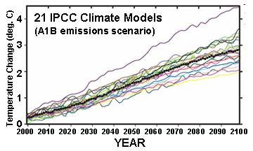
Linearity however is not just in the eye of the beholder. Any statistical analysis you care to apply the model average or any one of them would find them linear functions.
dbstealey.
“The difference is that Harry Twinotter isn’t pretending.”
Oh look, one of Anfony’s pet attack dogs has come out for a sniff. Woof!
“These regions of anti-correlation were pointed to by Professor Judith Curry in her recent testimony before the Senate Subcommittee on Space, Science and Competitiveness:”
Dr Curry knows full well the likely explanations. Why she pretends to be ignorant is anyone’s guess.
The simple answer is internal variability of the climate system. A more complicated answer is varying amounts of heat subducted into the deep ocean, aerosols due to pollution and volcanos etc.
Dr Curry pointed out in here testimony that there was an equal rise in temperature at the beginning of the 20th c. and that there was no explanation for this.
If you have one let’s hear it. I’ll have word with Judith and see whether we can get you a place at the next Senate hearing !
HT says:
Dr Curry knows full well the likely explanations. Why she pretends to be ignorant is anyone’s guess.
The difference is that Harry Twinotter isn’t pretending.
Mike.
“Dr Curry pointed out in here testimony that there was an equal rise in temperature at the beginning of the 20th c. and that there was no explanation for this.”
Equal rise? Reference please.
” The execution of a hypothesis, either by solving the equations in closed form or by running a computer simulation is never to be confused with an experiment. ”
This is wrong too. A computer simulation can be a perfectly good experiment. This is a better definition of an experiment:
“An experiment is a procedure carried out to verify, refute, or validate a hypothesis”.
so if you have a hypothesis about the behaviour of the model you can test it by messing around with the model. Don’t confuse this with an experiment in the real world. That is the usual meaning of the word.
But yes you can do an experiment to study what a MODEL does and see whether it matches observational evidence.
Tell me, what contingency does pressing run on a computer simulation resolve? Hint: for a given input the output is predetermined.
Jeff Patterson.
“Hint: for a given input the output is predetermined.”
No, it isn’t. It is clear you do not understand stochastic computer models.
Mike.
“That is the usual meaning of the word.”
No, it is not.
“No, it isn’t. It is clear you do not understand stochastic computer models.”
A computer is a finite state machine. If you claim such a device can produce information you need a refresher on basic information theory.
37 years is too long a lag time for a process with a 10 year periodicity. Did you mean 37 months? I found 36 months when I did this exercise several years ago.
The periodicity of the solar variation has not bearing on the possible time constants and lags in the earth system. They are generally a function of the system itself, not the forcing.
Jeff,
The precision of the instruments that measure CO2 concentration reports 2 sig figs with error +/- 0.01ppb. I presume.
I am skeptical that the anomaly in the temp data set has such a low error band as a percentage of the anomaly.
If my skepticism is the case, wouldn’t the first graph be a solid rectangle of blue, indicating no relationship, showing the uncertainty of the data set?
X-Y plots, log or otherwise, should show the error band?
Is the anomaly, actually known to the degree of precision indicated by the height of the dot?
Sorry, I can’t parse this. What figure are you referencing?
The first 2 images Jeff.
What is the error band on the Y axis? To what precision is this anomaly known?
Congratulations on presenting your work in a mathematically coherent manner. It’s very refreshing. (Or in what at least largely is a mathematically coherent manner; I would have to do some digging before I could determine whether the de-noising stuff hangs together.)
On the conceptual level, I have one big-picture problem: the optimization based on measure CO2 concentration. The overall model that results from combining Figs. 4 and 5 obtains a scalar response (temperature) from a scalar stimulus (total solar insolation); there are no other variables. I don’t have a sense of the computational cost, but, if that wasn’t a factor, it isn’t clear why you didn’t just base the optimization of all parameters on only the resultant relationship between those scalars, rather than use measured CO2 concentration for some of them.
That would seem to be a mathematical question that deserves an answer on its own.
In one sense, though, that’s not just a mathematical question; I’m also wondering if it doesn’t also point to a conceptual inconsistency. The model treats temperature as dependent only on insolation: to the extent that CO2 is a factor, that factor is only the component of CO2 that is dictated by insolation, i.e., that is independent of man’s activity. Yet, unless you are denying that there is any significant anthropogenic component, i.e., are dismissing the various compelling arguments made at this site by Ferdinand Engelbeen, you are also using the anthropogenic component to arrive at optimal parameter values. That seems logically inconsistent.
Whatever the case may be, I again congratulate you on your post’s mathematical clarity. I don’t see a lot of that.
I like the model and the approach to deriving it. I hope you submit it to a peer-reviewed journal and are successful in getting it published. I look forward to future comparisons of the model to conditional model results, that is conditional on the observed TSI data, but with parameters unchanged in the mean time.
I think this is disingenuous: Thus, unlike polynomial regression, it is not possible to fit an arbitrary output curve given specified forcing function, u(t). In the models of Figures 4 and 5 it is only the dissipation factor (and to a small extent in the early output, the input constant) which determine the functional “shape” of the output. The scaling, offset and delay do not effect correlation and so are not degrees of freedom in the classical sense.
All of the constants in the model, as well as the functions chosen for the modeling, are dependent on the studies of the data and model that are already available, and have been chosen to provide a good fit of the model to those extant data. They ought to be regarded as “degrees of freedom”, even though not in the “classical sense”. The only difference between these and the classical degrees of freedom is that these can not be counted.