Guest Post by Bob Tisdale
This post provides an update of the values for the three primary suppliers of global land+ocean surface temperature reconstructions—GISS through September 2015 and HADCRUT4 and NCEI (formerly NCDC) through August 2015—and of the two suppliers of satellite-based lower troposphere temperature composites (RSS and UAH) through September 2015. It also includes a model-data comparison.
INITIAL NOTES (BOILERPLATE):
The NOAA NCEI product is the new global land+ocean surface reconstruction with the manufactured warming presented in Karl et al. (2015).
Even though the changes to the ERSST reconstruction since 1998 cannot be justified by the night marine air temperature product that was used as a reference for bias adjustments (See comparison graph here), GISS also switched to the new “pause-buster” NCEI ERSST.v4 sea surface temperature reconstruction with their August 2015 update.
The UKMO also recently made adjustments to their HadCRUT4 product, but they are minor compared to the GISS and NCEI adjustments.
We’re using the UAH lower troposphere temperature anomalies Release 6.0 for this post even though it’s in beta form. And for those who wish to whine about my portrayals of the changes to the UAH and to the GISS and NCEI products, see the post here.
The GISS LOTI surface temperature reconstruction, and the two lower troposphere temperature composites are for the most recent month. The HADCRUT4 and NCEI products lag one month.
Much of the following text is boilerplate…updated for all products. The boilerplate is intended for those new to the presentation of global surface temperature anomalies.
Most of the update graphs start in 1979. That’s a commonly used start year for global temperature products because many of the satellite-based temperature composites start then.
We discussed why the three suppliers of surface temperature products use different base years for anomalies in the post Why Aren’t Global Surface Temperature Data Produced in Absolute Form?
Since the August 2015 update, we’re using the UKMO’s HadCRUT4 reconstruction for the model-data comparisons.
GISS LAND OCEAN TEMPERATURE INDEX (LOTI)
Introduction: The GISS Land Ocean Temperature Index (LOTI) reconstruction is a product of the Goddard Institute for Space Studies. Starting with the June 2015 update, GISS LOTI uses the new NOAA Extended Reconstructed Sea Surface Temperature version 4 (ERSST.v4), the pause-buster reconstruction, which also infills grids without temperature samples. For land surfaces, GISS adjusts GHCN and other land surface temperature products via a number of methods and infills areas without temperature samples using 1200km smoothing. Refer to the GISS description here. Unlike the UK Met Office and NCEI products, GISS masks sea surface temperature data at the poles, anywhere seasonal sea ice has existed, and they extend land surface temperature data out over the oceans in those locations, regardless of whether or not sea surface temperature observations for the polar oceans are available that month. Refer to the discussions here and here. GISS uses the base years of 1951-1980 as the reference period for anomalies. The values for the GISS product are found here. (I archived the former version here at the WaybackMachine.
Update: The September 2015 GISS global temperature anomaly is +0.81 deg C. It’s unchanged since August 2015.

Figure 1 – GISS Land-Ocean Temperature Index
NCEI GLOBAL SURFACE TEMPERATURE ANOMALIES (LAGS ONE MONTH)
NOTE: The NCEI produces only the product with the manufactured-warming adjustments presented in the paper Karl et al. (2015). As far as I know, the former version of the reconstruction is no longer available online. For more information on those curious adjustments, see the posts:
- NOAA/NCDC’s new ‘pause-buster’ paper: a laughable attempt to create warming by adjusting past data
- More Curiosities about NOAA’s New “Pause Busting” Sea Surface Temperature Dataset
- Open Letter to Tom Karl of NOAA/NCEI Regarding “Hiatus Busting” Paper
- NOAA Releases New Pause-Buster Global Surface Temperature Data and Immediately Claims Record-High Temps for June 2015 – What a Surprise!
Introduction: The NOAA Global (Land and Ocean) Surface Temperature Anomaly reconstruction is the product of the National Centers for Environmental Information (NCEI), which was formerly known as the National Climatic Data Center (NCDC). NCEI merges their new Extended Reconstructed Sea Surface Temperature version 4 (ERSST.v4) with the new Global Historical Climatology Network-Monthly (GHCN-M) version 3.3.0 for land surface air temperatures. The ERSST.v4 sea surface temperature reconstruction infills grids without temperature samples in a given month. NCEI also infills land surface grids using statistical methods, but they do not infill over the polar oceans when sea ice exists. When sea ice exists, NCEI leave a polar ocean grid blank.
The source of the NCEI values is through their Global Surface Temperature Anomalies webpage. Click on the link to Anomalies and Index Data.)
Update (Lags One Month): The August 2015 NCEI global land plus sea surface temperature anomaly was +0.88 deg C. See Figure 2. It rose (an increase of +0.08 deg C) since July 2015 (based on the new reconstruction).
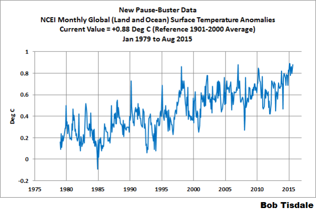
Figure 2 – NCEI Global (Land and Ocean) Surface Temperature Anomalies
UK MET OFFICE HADCRUT4 (LAGS ONE MONTH)
Introduction: The UK Met Office HADCRUT4 reconstruction merges CRUTEM4 land-surface air temperature product and the HadSST3 sea-surface temperature (SST) reconstruction. CRUTEM4 is the product of the combined efforts of the Met Office Hadley Centre and the Climatic Research Unit at the University of East Anglia. And HadSST3 is a product of the Hadley Centre. Unlike the GISS and NCEI reconstructions, grids without temperature samples for a given month are not infilled in the HADCRUT4 product. That is, if a 5-deg latitude by 5-deg longitude grid does not have a temperature anomaly value in a given month, it is left blank. Blank grids are indirectly assigned the average values for their respective hemispheres before the hemispheric values are merged. The HADCRUT4 reconstruction is described in the Morice et al (2012) paper here. The CRUTEM4 product is described in Jones et al (2012) here. And the HadSST3 reconstruction is presented in the 2-part Kennedy et al (2012) paper here and here. The UKMO uses the base years of 1961-1990 for anomalies. The monthly values of the HADCRUT4 product can be found here.
Update (Lags One Month): The August 2015 HADCRUT4 global temperature anomaly is +0.75 deg C. See Figure 3. It increased (about +0.04 deg C) since July 2015.
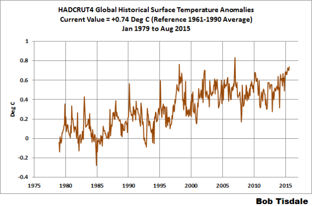
Figure 3 – HADCRUT4
UAH LOWER TROPOSPHERE TEMPERATURE ANOMALY COMPOSITE (UAH TLT)
Special sensors (microwave sounding units) aboard satellites have orbited the Earth since the late 1970s, allowing scientists to calculate the temperatures of the atmosphere at various heights above sea level (lower troposphere, mid troposphere, tropopause and lower stratosphere). The atmospheric temperature values are calculated from a series of satellites with overlapping operation periods, not from a single satellite. Because the atmospheric temperature products rely on numerous satellites, they are known as composites. The level nearest to the surface of the Earth is the lower troposphere. The lower troposphere temperature composite include the altitudes of zero to about 12,500 meters, but are most heavily weighted to the altitudes of less than 3000 meters. See the left-hand cell of the illustration here.
The monthly UAH lower troposphere temperature composite is the product of the Earth System Science Center of the University of Alabama in Huntsville (UAH). UAH provides the lower troposphere temperature anomalies broken down into numerous subsets. See the webpage here. The UAH lower troposphere temperature composite are supported by Christy et al. (2000) MSU Tropospheric Temperatures: Dataset Construction and Radiosonde Comparisons. Additionally, Dr. Roy Spencer of UAH presents at his blog the monthly UAH TLT anomaly updates a few days before the release at the UAH website. Those posts are also regularly cross posted at WattsUpWithThat. UAH uses the base years of 1981-2010 for anomalies. The UAH lower troposphere temperature product is for the latitudes of 85S to 85N, which represent more than 99% of the surface of the globe.
UAH recently released a beta version of Release 6.0 of their atmospheric temperature product. Those enhancements lowered the warming rates of their lower troposphere temperature anomalies. See Dr. Roy Spencer’s blog post Version 6.0 of the UAH Temperature Dataset Released: New LT Trend = +0.11 C/decade and my blog post New UAH Lower Troposphere Temperature Data Show No Global Warming for More Than 18 Years. It is now at beta version 6.3. The UAH lower troposphere anomalies Release 6.3 beta through September 2015 are here.
Update: The September 2015 UAH (Release 6.3 beta) lower troposphere temperature anomaly is +0.28 deg C. It dropped (a decrease of about -0.03 deg C) since August 2015.
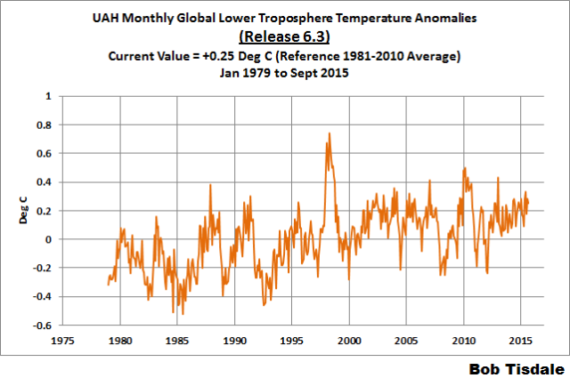
Figure 4 – UAH Lower Troposphere Temperature (TLT) Anomaly Composite – Release 6.3 Beta
RSS LOWER TROPOSPHERE TEMPERATURE ANOMALY COMPOSITE (RSS TLT)
Like the UAH lower troposphere temperature product, Remote Sensing Systems (RSS) calculates lower troposphere temperature anomalies from microwave sounding units aboard a series of NOAA satellites. RSS describes their product at the Upper Air Temperature webpage. The RSS product is supported by Mears and Wentz (2009) Construction of the Remote Sensing Systems V3.2 Atmospheric Temperature Records from the MSU and AMSU Microwave Sounders. RSS also presents their lower troposphere temperature composite in various subsets. The land+ocean TLT values are here. Curiously, on that webpage, RSS lists the composite as extending from 82.5S to 82.5N, while on their Upper Air Temperature webpage linked above, they state:
We do not provide monthly means poleward of 82.5 degrees (or south of 70S for TLT) due to difficulties in merging measurements in these regions.
Also see the RSS MSU & AMSU Time Series Trend Browse Tool. RSS uses the base years of 1979 to 1998 for anomalies.
Update: The September 2015 RSS lower troposphere temperature anomaly is +0.39 deg C. It dropped (a decrease of about -0.03 deg C) since August 2015.
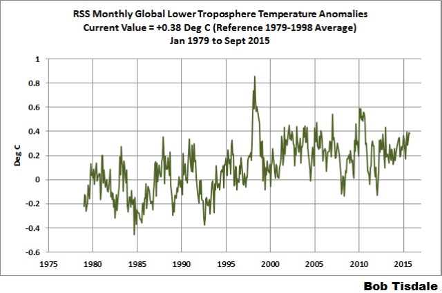
Figure 5 – RSS Lower Troposphere Temperature (TLT) Anomalies
COMPARISONS
The GISS, HADCRUT4 and NCEI global surface temperature anomalies and the RSS and UAH lower troposphere temperature anomalies are compared in the next three time-series graphs. Figure 6 compares the five global temperature anomaly products starting in 1979. Again, due to the timing of this post, the HADCRUT4 and NCEI updates lag the UAH, RSS and GISS products by a month. For those wanting a closer look at the more recent wiggles and trends, Figure 7 starts in 1998, which was the start year used by von Storch et al (2013) Can climate models explain the recent stagnation in global warming? They, of course, found that the CMIP3 (IPCC AR4) and CMIP5 (IPCC AR5) models could NOT explain the recent slowdown in warming, but that was before NOAA manufactured warming with their new ERSST.v4 reconstruction.
Figure 8 starts in 2001, which was the year Kevin Trenberth chose for the start of the warming slowdown in his RMS article Has Global Warming Stalled?
Because the suppliers all use different base years for calculating anomalies, I’ve referenced them to a common 30-year period: 1981 to 2010. Referring to their discussion under FAQ 9 here, according to NOAA:
This period is used in order to comply with a recommended World Meteorological Organization (WMO) Policy, which suggests using the latest decade for the 30-year average.
The impacts of the unjustifiable adjustments to the ERSST.v4 reconstruction are visible in the two shorter-term comparisons, Figures 7 and 8. That is, the short-term warming rates of the new NCEI and GISS reconstructions are noticeably higher during “the hiatus”, as are the trends of the newly revised HADCRUT product. See the June update for the trends before the adjustments. But the trends of the revised reconstructions still fall short of the modeled warming rates.
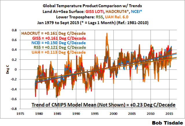
Figure 6 – Comparison Starting in 1979
#####
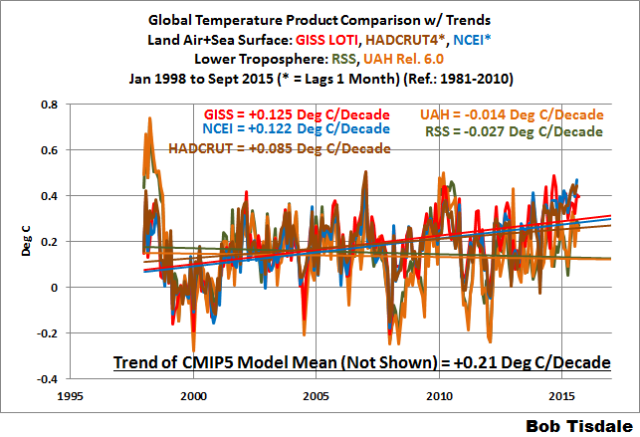
Figure 7 – Comparison Starting in 1998
#####
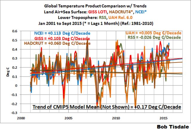
Figure 8 – Comparison Starting in 2001
Note also that the graphs list the trends of the CMIP5 multi-model mean (historic and RCP8.5 forcings), which are the climate models used by the IPCC for their 5th Assessment Report.
AVERAGES
Figure 9 presents the average of the GISS, HADCRUT and NCEI land plus sea surface temperature anomaly reconstructions and the average of the RSS and UAH lower troposphere temperature composites. Again because the HADCRUT4 and NCEI products lag one month in this update, the most current average only includes the GISS product.

Figure 9 – Averages Surface Temperature Products Versus Average of Lower Troposphere Temperature Products
MODEL-DATA COMPARISON & DIFFERENCE
Note: The HADCRUT4 reconstruction is now used in this section. [End note.]
Considering the uptick in surface temperatures in 2014 (see the posts here and here), government agencies that supply global surface temperature products have been touting record high combined global land and ocean surface temperatures. Alarmists happily ignore the fact that it is easy to have record high global temperatures in the midst of a hiatus or slowdown in global warming, and they have been using the recent record highs to draw attention away from the growing difference between observed global surface temperatures and the IPCC climate model-based projections of them.
There are a number of ways to present how poorly climate models simulate global surface temperatures. Normally they are compared in a time-series graph. See the example in Figure 10. In that example, the UKMO HadCRUT4 land+ocean surface temperature reconstruction is compared to the multi-model mean of the climate models stored in the CMIP5 archive, which was used by the IPCC for their 5th Assessment Report. The reconstruction and model outputs have been smoothed with 61-month filters to reduce the monthly variations. Also, the anomalies for the reconstruction and model outputs have been referenced to the period of 1880 to 2013 so not to bias the results.
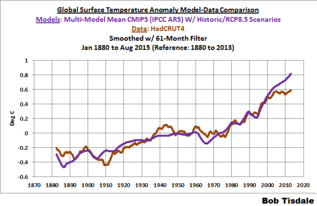
Figure 10
It’s very hard to overlook the fact that, over the past decade, climate models are simulating way too much warming and are diverging rapidly from reality.
Another way to show how poorly climate models perform is to subtract the observations-based reconstruction from the average of the model outputs (model mean). We first presented and discussed this method using global surface temperatures in absolute form. (See the post On the Elusive Absolute Global Mean Surface Temperature – A Model-Data Comparison.) The graph below shows a model-data difference using anomalies, where the data are represented by the UKMO HadCRUT4 land+ocean surface temperature product and the model simulations of global surface temperature are represented by the multi-model mean of the models stored in the CMIP5 archive. Like Figure 10, to assure that the base years used for anomalies did not bias the graph, the full term of the graph (1880 to 2013) was used as the reference period.
In this example, we’re illustrating the model-data differences in the monthly surface temperature anomalies. Also included in red is the difference smoothed with a 61-month running mean filter.

Figure 11
The greatest difference between models and reconstruction occurs now.
There was also a major difference, but of the opposite sign, in the late 1880s. That difference decreases drastically from the 1880s and switches signs by the 1910s. The reason: the models do not properly simulate the observed cooling that takes place at that time. Because the models failed to properly simulate the cooling from the 1880s to the 1910s, they also failed to properly simulate the warming that took place from the 1910s until 1940. That explains the long-term decrease in the difference during that period and the switching of signs in the difference once again. The difference cycles back and forth, nearing a zero difference in the 1980s and 90s, indicating the models are tracking observations better (relatively) during that period. And from the 1990s to present, because of the slowdown in warming, the difference has increased to greatest value ever…where the difference indicates the models are showing too much warming.
It’s very easy to see the recent record-high global surface temperatures have had a tiny impact on the difference between models and observations.
See the post On the Use of the Multi-Model Mean for a discussion of its use in model-data comparisons.
MONTHLY SEA SURFACE TEMPERATURE UPDATE
The most recent sea surface temperature update can be found here. The satellite-enhanced sea surface temperature composite (Reynolds OI.2) are presented in global, hemispheric and ocean-basin bases. We discussed the recent record-high global sea surface temperatures in 2014 and the reasons for them in the post On The Recent Record-High Global Sea Surface Temperatures – The Wheres and Whys.
Thanks Bob. This is always nice work and I appreciate the effort it entails for you to produce it.
If you’re wondering about the Featured Image…
…it’s from the Introduction of my new book, which I will be publishing next month. I’m just about done. I believe most of you will enjoy it. The true-blue believers, mmmm, not so much.
And a method used.

The primary mechanism they use for this data tampering, is to simply fabricate data. Fake data is marked with an ‘E’ like this data for Baudette, MN. It means they have no underlying data for that station during that month.
Almost half of their reported data is now fake.
Almost half of their reported data is now fake.
https://stevengoddard.wordpress.com/2015/10/13/all-us-warming-and-almost-half-of-the-data-is-fake/
So easy a caveman can do it.
The clearest illustration of what is happening is given by the RSS temperature data in association with the neutron count.
http://3.bp.blogspot.com/-gH99A8_0c6k/VexLL1zC7AI/AAAAAAAAAaQ/T50D6jG3sdw/s1600/trendrss815.png
The temperature peak at about 2003.6 is related, with a 12 year delay. to the solar activity peak (neutron count low) at about 1991
http://3.bp.blogspot.com/-QoRTLG14Siw/VdOUiiFaI5I/AAAAAAAAAYM/NxQVb2LMefk/s1600/oulu20158.gif
The 2003 peak is a peak in the natural solar millennial activity cycle and also happens to be close to a peak in the 60 year cycle.
For a comprehensive discussion see
http://climatesense-norpag.blogspot.com/2014/07/climate-forecasting-methods-and-cooling.html
Clearly highlights the adjustments between GISS and satellite data. Regular small ones implemented to try and hide the long term trend and too gradual to be anything other than fabricated.
http://i772.photobucket.com/albums/yy8/SciMattG/GlobalvDifference1997-98ElNino_zps8wmpmvfy.png
Thanks Bob.
I appreciate the great work Mr. Tisdale is doing, however although is noting specifically wrong with the Fig.10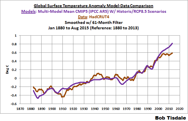 ?w=720
it gives completely misleading impression.
From the graph one could conclude that the models did pretty good job for 120 years of the last 135 or about 90% of the time. In any engineering modelling that would be for starters, pretty good.
But we all know that most of that period if not all is the back-casting, and if the back-casting wasn’t any good, the model is rubbish.
So if CMIP5 was for e.g. introduced in 2000, in my mind it is misleading to show it prior 2000 as if it is doing good job before 2000, and that we could expect some time in the near future that the real temperatures and the model will merge again.
The model line prior to its introduction could be shown as a dotted line, so we know how models have actually done since their introduction.
“But we all know that most of that period if not all is the back-casting, and if the back-casting wasn’t any good, the model is rubbish.”
The further back we go, the less there is AGW and the more natural variation. Even a very good fit only tells us, we have a model which is good in back-casting mostly natural variation. But we can not say if the model is good in projecting AGW since we don´t know which part of the variation was due to AGW and which to natural variation in different points of the time scale.
back-casting is nothing more than curve fitting via tune-able parameters. the models show no skill going forward. the IPCC and the modelers all know this, which is why the model results are called “projections” not “predictions”.
The Climate Science community knows these is not a single climate model able to PREDICT future climate any better than a dart board or a pair of dice.
in a very real sense, climate models are no different than a witch doctor casting the bones to predict the future. in point of fact, the bones are likely to be more accurate, because they would not be consistently high as compared to observation.
Its even worse than you indicate because no one knows what CAUSES the natural variations !!!
Back casting is merely fiddling with those variables that are ASSUMED to cause climate variations so as to produce a good fit to the historical record. It is quite possible – and probably very likely – that many variables that do affect “natural” climate variations are either not known or ignored (because the modelers have no clue how they interact in affecting the climate).
The entire AGW thesis will one day be shown to be the biggest scientific (for lack of a better word) fraud in the history of the world.
Antti Naali:
There are several assumptions expressed in your overall comment that may, in fact, be accurate descriptions but which still raise logical issues for many of us.
A central one is if back-casting of natural variation works well in the models, then why does it work so poorly going forward in time? Is it due to a poor understanding of recent AGW or an unwarranted faith in our understanding of the natural variation itself? No doubt it is a combination of several factors but if the source and degree of the uncertainty cannot be identified, why are we supposed to accept model projections as policy guides?
The model back casting even didn’t take the AMO or PDO and their complex variability in account; You clearly se the “weight og CO2” in it as they underestimated the warming of the early 1900’s and the cooling after 1950 till 1970.
that proves one thing: CO2 may have an impact, but the impact is ways smaller then they pretend.
(meanwhile belgium filed a record cold oktober 13th. the coldest ever with snow in south belgium. temperature is actually the last 3 days 10°C below normal….
It should further be noted that the models are a mean of many different models. Only the simplest curve-fitting with a few training parameters is necessary for a very basic back-casting shape to appear. The rest could be a mean of some pretty random stuff. Therefore there is nothing really to explain , as to why the backward looking is better than the ‘projections’.
For CMIP5 the hindcasting was from 2005 backward and projections are from that year forward.
A more complete look at the models’ projections is here:
https://rclutz.wordpress.com/2015/03/24/temperatures-according-to-climate-models/
Vuc,
Excellent point. Dotted line with the notation “hind-casting”. Or perhaps it should say “hind-kissing”? In any event we definitely use the other team’s rules too much.
Note to all ‘settled science’ (solar, climate or any other) advocates
In private email exchanges, after Vukcevic published his formula, NASA’s principal solar scientist Dr. D.H. was informed about consequences if the Vukcevic formula proves to be correct.
Dr. D.H. responded that is not possible .
Since then, as anyone can see Vukcevic’s formula proved that is possible !
Models can produce a perfect match, but to have any meaning we need to know its constituent components and how they relate to the natural, anthropogenic or whatever factors the author/s think may be relevant.
It would be nice if we knew, at least for one reasonably good model (even if only for the hind-casting) what parameters were used and to what proportion. In such case I would (and possibly many others) appreciate honesty, and if the model fails so be it.
Some 12 years ago, in the mid 2003 I worked out formula (or you can call it a model) for the sun’s polar field oscillations, based on the sunspot data. When I occasionally put it on the WUWT, it always has date of publication (8th Jan. 2004) clearly marked, so anyone can see, how the ‘model’ or forecast is doing
http://www.vukcevic.talktalk.net/PFo.gif
Not perfect, but up to now it is OK. It is very easy at this point in time to say ‘ oh well, it’s obvious, is it not, which way it was going to go’.
However, at the time it was a very different scenario envisaged, the NASA’s main solar scientist Dr. K said ‘not possible’ , the SC24 is going to be strongest ever solar cycle. Our own Dr.S. said ‘you could be right but for wrong reason’, the ‘wrong reason’ being the three fixed parameters which are well known astronomic parameters (‘natural variability’). The other two: pi/3 and 1941.5 are simply numbers used to set phase match, or if you wish, for the curve fitting purpose. One or two other commentators said ‘ it is no good, it is auto-correlation’. If it was so, than they should have told to NASA that the sun is driven by auto-correlation, so they would not have made one of, if not the worst ever predictions .
Not perfect, but up to now it is OK
But fails spectacularly when hindcasting:
http://www.leif.org/research/Vuk-Failing-28.png
Of course, to make things work, you have to stop hindcasting as soon as it begins to fail…
Or add another layer (convolving with yet another formulae) and when that fails add yet another, etc.
Comparison of newly created data file and theoretical model of solar activity.
Caveats for data file
– there are no polar field instrumental data before 1960, thus it is necessary to resort assumed relationship between the polar field and far less reliable subjectively estimated sunspot number as manifested since.
– based numbers created from subjective estimates of individually visible and estimated size of sunspots.
– sunspot count is available only to 50% of the possible data since spots are seen only on the visible side of the solar disk.
– records were revised number of times.
– only recently a conversion of metric from spot to group count has taken place.
Caveats for theoretical model devised by Vukcevic
– two parameters based on astronomical constants, one parameter based on the polar field/ sunspot relationship, two parameters for phase adjustments.
Analysis is based on a diagram provided by Dr. Svalgaard, one of the authors and the director of the latest data modification, introducing the new metric of the ‘group numbers’ replacing the better known and previously used standard the SSN.
Svalgaard’s graph elements:
– dark blue – Vukcevic formula to give it with full name.
– magenta – abs value of the Vukcevic formula
– yellow – Svalgaard’s estimate of 50% of visibly counted Sunspot numbers.
Comparison of the latest data revision of the solar data with Vukcevic theoretical model shows:
1800 – 2015 – this 215 year period has seen many advances in science, so although match between two is not perfect, it is by all means, having in mind above mention caveats, good agreement. Note some overestimates in the Svalgaard’s group numbers or model under estimates around for two cycles in the early 1900s. Revisionists of data may consider going back to re-valuation of the drifting (between 0.4 and 0.7) correction coefficients.
1750 (SC1) -1800 – In this much shorter period of only 50 years, considering state of science and expertise of the casual observers of the time, it is not possible to tell with sufficient degree of certainty, what group number might have been. It is highly unlikely that the sun was doing one thing between 1750 and 1800, in order to suddenly change its mode of operation during following 215 years.
Having high uncertainty above caveats it was correct for Vukcevic not to include period prior to 1800 in final version for the sunspot numbers.
1700 – 1750 – for this again highly uncertain period, Svalgaard has extrapolated Vukcevic formula and found that the match between the early data and the model again falls into place again.
Richard Feynman suggested: if theory doesn’t match data change the theory.
Dr. Feynman never had in mind number of times modified data, and than conversion from one method of counting to a another.
Dr. Feynman never had in mind situation were (despite modifications of data included) there is a good agreement between theory and data for 265 out of 315 years, except for one 50 year period in the late 1700’s
Richard Feynman suggested: if theory doesn’t match data change the theory.
Yes, that is what you need to do, or abandon theory, which is easier and more honest…
p.s. It is likely that Dr. Feynman would say ‘go back, check available written records for late 1700’s, are they as reliable as one in more recent decades provided by better trained professional observers, check the methods of data modification, check the metrics conversions. Alternatively, update theoretical model to cover this period if all above mentioned shortcomings are satisfactorily resolved.
And finally, it is forthcoming decades that will verify models viability rather than the low certainty data from 250 years ago.
Credit to Dr, Svalgaard for providing graphics for the analysis.
The sign of the solar dipole [north-minus-south] was negative at the minimum in 2009. As a result the polarity of the leading sunspots in the northern hemisphere in cycle 24 is also negative. Your plot shows that the sign of the dipole at the next minimum [in,say 2019] will be positive, hence the polarity of leading sunspots in the northern hemisphere will also be positive. The sign of the dipole at the next minimum [say, 2030] is still positive according to your plot and formula and thus the polarity of leading sunspots in the northern hemisphere will also be positive, thus there will be no change of sunspot polarities as required by Hale’s law. This is a strong prediction of your formula and amenable to verification. Similar conditions prevailed around 1900 and 1800. For the 1900s we know from the geomagnetic field variations that Hale’s law was obeyed, so there is a clear falsification of your formula.
. It is likely that Dr. Feynman would say ‘go back, check available written records for late 1700’s, are they as reliable as one in more recent decades provided by better trained professional observers, check the methods of data modification, check the metrics conversions.
This is precisely what we have done in reconstructing the new Sunspot Series. There is no doubt now that activity was high back then, c.f. Section 10 of http://www.leif.org/research/Reconstruction-of-Solar-EUV-Flux-1740-2015.pdf
@ Lief,
When you say “Yes, that is what you need to do, or abandon theory, which is easier and more honest…”
=======
Was that in any way saying vukcevic was being dishonest ?
‘honest’ to the scientific principles means that one does not cling to a theory that has been falsified.
Svalgaard says : “ ‘honest’ to the scientific principles means that one does not cling to a theory that has been falsified.”
It would be rather convenient if Vukcevic abandon his pet hypothesis, which currently is doing fine, thank you very much. Unfortunately this stubborn man is not going to abandon it until future events prove him wrong!
‘honest’ to the scientific principles means that one should not be forced to abandon hypothesis that has been only apparently falsified by short section of the 250 year old data which have been subjected to multiplicity of manipulations .
‘honest’ to the scientific principles means to provide error bars on the questionable section of the 250 year old data, this has not been done in the above Svalgaard’s produced graph.
The reason is, I suspect is that error bars have not been made available for this short 250 years old section of data, is that they would need to be + & – 100% for each data point, due to scarcity of data, casual observations, subjective estimates of a sunspot size, and mostly the data manipulations from time of the first data archives to the latest.
Only few months ago newly created data file is published, where individual sections of the sunspot numbers were multiplied by factors between 0.4 and 0.7. In order to cover up whole shambles a new metric is introduced, so now it is not any more Sunspot Number but a Group Number. Got it ?
Thus, there is no surprise that the latest scientific artistry in the data manipulation has no error bars, and if it did one would be ‘nuts’ to take them for granted.
Climate data ‘adjusters’ are simply amateurs, they change their data by fraction of degree K, here and there. Solar scientists in the past were more adventures and use to alter data by 20% here and there.
But that pales into insignificance compared to the latest invasive accomplishments. They were not just minor botox injections, more like plastic surgeries removing unsightly and large silicon implants inflating the data between 40% and 70% here, there and everywhere.
And what is purpose of this all? not sure, but the idea that ‘it isn’t sun stu…’ might something to do with it.
It is less of an irony but more a joke, now that the global warming has stalled, and the CAGW’s are hurriedly turning to the natural variability as major factor, and yes the solar activity may have been their only hope, but Svalgaard et al have shut the escape gate, or they thought so.
I am looking forward to yet another ‘solar data reassessment’, requiring major corrective surgery in the near future, in order to accommodate for the new acquired taste for natural less bio-degradable variability.
Thus, there is no surprise that the latest scientific artistry in the data manipulation has no error bars
http://www.leif.org/research/GN-Since-1600.png
The trends seen in the 18th century 10 Be flux data in the Dye 3 and NGRIP ice cores correlate well with the group number values assigned by Leif and co.
http://4.bp.blogspot.com/-cmUdPuT0jhc/U9ACp-RIuSI/AAAAAAAAAT8/kBTHWwpf6Bg/s1600/Berggren2009.png
And with 14C production:
http://www.leif.org/research/Comparison-GSN-14C-Modulation.png
Vuk is just squirming and thrashing around. Rather pathetic.
It would be nice if Dr. Svalgaard would stick to what is well known about the C14 nucleation deposition, i.e. it is poor proxy for solar activity. Changes in the strength of Earth’s magnetic field are by far strongest modulator of cosmic rays (about two orders of magnitude).
As you can see here:
http://www.vukcevic.talktalk.net/GMF-C14.gif
C14 rate of deposition is mostly due to, not the sunspot cycles but changes in the geomagnetic field. Graph shows the gmf’s changes over period of 11 years.
Dr. Svalgaard needs to think about the more important science problems, rather than using discredited proxy of C14.
– why gmf changes are more or less concurrent with solar activity, but are two orders of magnitude stronger than the heliospheric magnetic field at the Earth’s orbit ?
– are these changes induced by solar activity ?
– is there a common cause i.e. magnetic feedback and resonances within the solar system ?
– is the fact that Earth traverses helio-gas giants magnetic field flux tubes every 14 months reason for the above shown changes in the geomagnetic field.
– Is the solar periodicity result of magnetic feedback due to the existence of these magnetic flux tubes, as numerically demonstrated here ?
http://www.vukcevic.talktalk.net/PFo.gif
Dr. Svalgaard further more, calls on Vukcevic to abandon his hypothesis, implying lack of honesty for not doing so. That is language of the climate alarmists, and should not come from a respected scientist.
No Vukcevic is not giving up, as long as nature from time we have data on the Solar Polar Magnetic Field and that is 1965 authenticates his hypothesis created 12 years ago.
Back-casting to uncertainties of 250 years using uncertain or discredited proxies is just nonsense to divert attention from good agreement during the period of available data .
Vukcevic has since proven the NASA’s top solar scientist wrong, so ain’t ready yet to give in to pressure from Dr. Svalgaard.
Note to Dr. Page: C14 could be only about 25% or less accurate proxy for solar activity (rough estimate 50% gmf, 25% solar, 25% rain and snow precipitations)
The cosmic ray modulation calculated from 14C is fully corrected for the variation of the geomagnetic field, which BTW did not vary as you depict, see http://pages.jh.edu/~polson1/pdfs/ChangesinEarthsDipole.pdf
The steady galactic cosmic ray flux is not lethal and we don’t need to ‘protect’ against that. We need to protect against solar cosmic rays derived from solar activity.
What happened to your rant about error bars?
The problem with your formula is (apart from it lacking a viable mechanism and being only curve fitting) is that it does not have the phase right outside of the fitting interval:
http://www.leif.org/research/Vuk-Failing-29.png
Going forward the phase is already off. As polar fields maximize at solar minimum, your formula predicts solar minimum to be in 2016, which is not in the cards.
Vukcevic has since proven the NASA’s top solar scientist wrong
Apart from you having not done this in any way [Mother Nature did] the difference between a real scientist like Hathaway and a pseudo-scientist like you is that the real scientist admits his error when falsified, while you do not.
here it is again: Note to all ‘settled science’ (solar, climate or any other) advocates
In private email exchanges, after Vukcevic published his formula, NASA’s principal solar scientist Dr. D.H. was informed about consequences if the Vukcevic formula proves to be correct.
Dr. D.H. responded that is not possible .
Since then, as anyone can see Vukcevic’s formula proved that is possible !
You should stop posting misleading comments.
My graph and equation shown above displays correlation with data for variation of the sun’s polar magnetic dipole since 1967 to the last 24 September 2015
THERE ARE NO DATA BEFORE 1967 ! !
You are assuming to know what polar dipole was 250 years ago
but YOU HAVE NO DATA for it. Full stop !
There is a very tight relationship between the solar polar field and the sunspot cycles.
And we can measure the polarity of the solar polar fields from the 22-yr variation of geomagnetic data, so we have a good handle on those fields. Nothing misleading there.
And the polar fields have been measured since 1952
Dr. Svalgaard
A scientist of your reputation should be able to back up his claim by source of data for the sun’s polar magnetic field, not for this, that or another, but for the sun’s polar magnetic field.
Buck up your claim not by assumptions, not what you think or believe to be the case, but direct source of data.
Where is your data before mid 1960s?
Does your data go back 250 years to 1750?
Back up your claim !
Data, data, and data only ?
No answer from Dr. Svalgaard
He Has No Data that He Can Quote to Support His Claim !
No data to support the claim, falsifies his claim in any scientists’ book. Good enough for me.
As I pointed out, the close connection with the sunspot number and the continued polarity change around 1900 are all we need to falsify your claim.
From http://solarscience.msfc.nasa.gov/papers/hathadh/2014UptonHathaway.pdf :
“The Sun’s polar magnetic fields are directly related to solar cycle variability. The strength of the polar fields
at the start (minimum) of a cycle determine the subsequent amplitude of that cycle.”
The Babcocks have measured the polar field since 1952:
http://www.leif.org/EOS/Babcock1955.pdf
Lots of data.
Leif I just got through reading your excellent Sept 2015 Climate Change summary.
I am at a loss to understand how you can say:
“A surprising outcome of the work was the realization that there has been no long-term trend in solar activity since 1700 AD, Figure #17:
The absence of the Modern Grand Maximum in the revised series suggests that rising global temperatures since the industrial revolution cannot be attributed mainly to increased solar activity or to processes that vary with solar activity such as the flux of Galactic Cosmic Rays, which often are claimed to modulate or control the amount of cloudiness and hence the amount of sunlight reflected back to space.”
The Dye 3 10Be flux data (see above 8:14 pm) shows very clearly the low in solar activity associated with the Maunder minimum at about 1700 and the climb to the long term (probably millennial – not particularly Grand) peak in solar activity in the late 20th century.
This would fit the Hoyt and Schatten ( Fig 16) interpretation and the temperature data nicely.
Why fight the obvious? I’m sure with some further consideration you could re-massage your adjustments to build a coherent narrative. I would call it using the weight of all the evidence to build a working hypothesis and say don’t look a gift horse in the mouth.
You view is no doubt different.
I am at a loss to understand how you can say:
“A surprising outcome of the work was the realization that there has been no long-term trend in solar activity since 1700 AD, Figure #1
Because that is what the direct observations show. Backed up by the 14C record.
Dr. Page
I hope Dr. S. is back soon.
Despite of my determination to resist his pressure when he is wrong, I see and can accept his view that solar activity variability may not be the direct cause of the major climate changes.
There are other variables moving in step with it, i.g. the Earth’s magnetic field, which may have some small effect via GCR, but most convincing for me is the North American tectonic plate oscillation, with two main spectral components 22 years (sun) and 60 years (AMO).
You are wasting your time with the Dye 3 10Be flux data, it has been discredited by number of studies, and it is mainly result of the earth’s field and precipitations (similarly to C14 flux).
file://localhost/G:/MAGNET/Aa-FILES/10Be-CET.gif
I live in UK and our weather is controlled by jet-stream which is diverted our way by Icelandic Low pressure system, located in the N. Atlantic SW of tip of Greenland. When it snows in Greenland it is cold in UK.
If you email me (via moderator), I will email you McCracken 10Be data (which are not otherwise easily obtained) so you can do a bit of your own research. Alternatively you cam ask Dr. S. if he has data file.
Paper is indeed excellent summary
http://www.leif.org/research/Climate-Change-My-View.pdf
How Earth’s field is taken out of 10Be modulation look for Steinhibler’s paper 9k of solar variability. Unfortunately he used Kunsden’s data which removed all decadal and centenary dipole variability, if he used data by M. Korte his results would be far superior.
Dr. Page
My comment got held up, I hope only temporarily, but you never know.
I misquoted link for 10Be it should be
http://www.vukcevic.talktalk.net/10Be-CET.gif
lsvalgaard October 16, 2015 at 4:10 pm
“Lots of data.”
No there is not!
Your links are not to data.
I have data (actual numbers) to support my claim.
You have no data (actual numbers) to support your claim.
Case closed.
Case closed, indeed. Explained what I meant by honesty [or lack thereof in this case].
Yep, honesty, indeed.
I based my claim on available instrumental data, in long term I could be right or could be wrong, I have no idea how is going to turn out, until then I stick with the data.
You have NO data, your manufactured your claim based on your opinions or belief, or even worse protecting your position of the ‘status quo and science is settled’.
When you failed to produce data you resorted to ad hominem.
That doesn’t bother me in the slightest, but it perhaps should bother you, and followers of this discussion, but that is none of my business.
I have no requirement for such methods as ad hominems, I like to think that everyone is honest, not because of others, but because of duty to themselves.
Data is the weapon of my argument. .
You got your data from me…
Extending the data back in time is based on generally accepted relations between polar field and solar activity.
Honesty has to do with dropping an opinion not supported by the extended data.
No doing so, indeed closes the case.
Yes, initially I got data from you some years ago, and as you may recall I was surprised at the results, since equation was already in existence for some years.
So the hypothesis was created (published Jan 2004), then it was found 5 years later that it had high correlation to the polar fields.
Jan 21, 2009 at 9:47 AM, vukcevic wrote to Dr. Svalgaard
Thanks again for emailing the Mount Wilson SO chart for the Solar polar Mag. Fields,
but I found now I have a bit of a problem with it. I hate to be a nuisance,
I would appreciate if you could send me a link for numerical
values for the diagram, if they are available on the web.
Svalgaard:
What is your problem?
Attached are the values
Vukcevic:
Dr. S
Thanks.
The equation for 1970-2005 has much better visual fit with the polar field
diagram than with the last 3 SCs (solar cycles).
I isolated one set of polarity data, done a scatter and correlation to see how close it is.
(had to shift phase 3.3 years back).
The ‘problem’ is that it is closer than the SC (solar cycles) waveform (correlation = > 0.9187).
I am here in large part for what I learned from these prolonged discussions over the last 5 or 6 years, but that doesn’t mean I have to accept your views ad hock.
I still have a great deal of respect for some of your science, but do not take everything for granted.
Many people would be upset by implications of your ‘honesty’ comments, as I say it doesn’t bother me, but since I think it may you cause a bit of embarrassment when you consider it in the clear light of day, I will conclude my comments, you are welcome to have the last word.
It is good you realize it is time to cut your losses.
I agree, we need to highlight the hindcast.
It wold help, since back casting is regularly updated therefore making any forward prognostications “appear” more reliable, to date the last back casting shown when it is applicable.
What’s more they are tuning their models to a temperature trend prior to 2000 which itself is a fabrication, I’m thinking particularly of the period ~1940 — 1979.
vukcevic,
I agree. Climate models are tested by the accuracy not of their hindcasts, but of their predictions (match of CO2 forecast with input of an accurate emissions scenario, the latter eliminating many of the lines on their spaghetti graphs).
Hence the importance of calling for the climate science agencies to test the models. Run the models used in the first three assessment reports, input with actual emissions since publication. That would give us the multi-decadal forecasts we’re told are the only way to evaluate them (25 years since FAR).
Oddly, this has been done only on a rough (approximate) way or long ago (10 years for FAR, only lightly documented). It should be done as a matter of common sense before spending trillions — perhaps even restructuring the world economy.
Until we do so both sides will throw pebbles at one another, while the world’s elites feast at Conferences in hot spots such as Paris. The resulting political gridlock prevents us from even sensible measures, such as preparing for the return of past extreme weather.
For details see http://wattsupwiththat.com/2015/09/24/climate-scientists-can-restart-the-climate-change-debate-win-test-the-models/
I think it must have taken a serious amount of “bias adjustment” to get the fit between the model output and the data. I think this is best illustrated by IPCC´s own golden nugget:
“When initialized with states close to the observations, models ‘drift’ towards their imperfect climatology (an estimate of the mean climate), leading to biases in the simulations that depend on the forecast time. The time scale of the drift in the atmosphere and upper ocean is, in most cases, a few years. Biases can be largely removed using empirical techniques a posteriori.”
(Ref. Contribution from working group I to the fifth assessment report by IPCC; On the physical science basis; 11.2.3.1 Decadal Prediction Experiments)
Therefore, I think that also a stippled line before 2000 would be grossly misleading, as also a stippled line would indicate capabilities which the models clearly don’t have. There wouldn’t be a fit without using “empirical techniques a posteriori” or to put the language straight – the only reason the model output seems to fit the data is that the model has been adjusted so that the output fits the data.
An interesting attack on the IPPC models would be to actually initialize them with data up to 2015, and watch
the predictions. I’ve a strong mathematical feeling the models will be “forced” to actually show a cooler future,
killing any debate left.
GISS epitomises the famous 1984 concept of: “The past is forever changing, only the future is certain.”
However, what scare me now is that it looks like we are about to experience a very strong El Nino, which means sometime over the next couple of months we should witness a short, but sharp, rise in global temperatures. If the past El Ninos are anything to go by, this rise should occur after the Paris-ites meeting later this year. If it doesn’t, then us sceptics are in for a torrent of “I told you so” bleatings from the Klimate faithful.
The future is certain. When there is a strong El Nino, we will experience a torrent of bleats leading up to the climate conference of the moment. Paris will not end without declaring the need for the next Clima-Con.
I an with Vukcevic on this. It is a small point, but it might be nice to put in a thick black vertical line on the graph to clearly delineate the forecast part from the hindcast part. Then the difference gets dramatic.
Technical Oops.
Aug was +0.28, Sept is +0.25, or did it get updated?
Nice work, though, I like the monthly updates.
Agree totally with Vul. That graph feeds the AGW trolls. Lord Monckton ect are all guilty of same (although I support the man 1000%) LOL The only really valid graphs (that bring the message home) are those posted by Goddard.et al, Homewood ect
When should we expect the El nino to show up in the satellite records?
thanks Bob, great work and excellent presentation.
I am wondering why/when the USCRN data will get more exposure, after all it is supposed to be a pristine data set. I realize it is only 10 years of US data, but important 10 years due to the “pause” or lack thereof.
I hope I am not misunderstanding anything here, but where the word ‘data’ appears it would always be wise–where relevant–to ensure that the word ‘adjusted’ accompanies it. A footnote at the same time explaining that the adjustments are not transparent nor justified, would keep hammering home the point. Don’t give these Bas….ds an inch.
NOAA: National Organization of Atmospheric Adjustments
may i borrow that 🙂
OK, maybe this is a dumb question, but what influence has their been from the extraordinary growth of cities around the world in the last 50 years and the urban heat island effect? (on the various measurements).
I would expect that satellite infrared measurements would be relatively immune to the effect, or … since the ‘heat islands’ (urban areas) are at well known geophysical coördinates, perhaps their contribution could be quantified?
Just saying – perhaps it has fallen out of favor to discuss, but the UHI seemed a few years ago to be real, and really important to adjust out of the measurements.
GoatGuy
NOAA is too big to fail.
Ha ha
The adjustments to the GISS T that resulted from Karl, et. al. have an unexpected effect on sea level rise projections that come from Rahmstorf’s semi-empirical model. When the unadjusted GISS temperature (which Rahmstorf used) are replaced with the adjusted GISS temperature, then his sea level rise projections go DOWN. This is probably a disappointment to Rahmstorf, and he probably will not tell you of this result. But I just did. See…
https://climatesanity.wordpress.com/2015/09/25/uh-oh-karl-et-al-is-bad-news-for-stefan-rahmstorfs-sea-level-rise-rate/
Bob Tisdale,
Thank you for your periodic updates on GS & LT dataset products and the model mismatches.
John
So COB21 will be a celebration of the IPPC’s success at ending global warning! Party time.
Bob
First: thank you for the definitions and explanations. I get lost with all these acronyms.
Second: thank you for proving what I have long suspected.
Third: Can I use two or three charts from your article for my own presentation?
TCE, you’re more than welcome to use the graphs, as long as you cite the source.
Cheers
Bob, thanks for your monthly updates. It would be nice to also see surface global temperature anomaly estimates based on Climate Forecast System Reanalysis (CFSR) output for comparison as part of your update. Below are monthly CFSR estimates from the University of Maine Climate Change Institute (UM-CCI) and WxBell compared to NCEI surface and UAH lower tropospheric estimates.

In October there has been a big upward spike in the daily estimates.
“Alarmists happily ignore the fact that it is easy to have record high global temperatures in the midst of a hiatus or slowdown in global warming”
And when’s the last time we had a record low year?
Define “record low”.
Ice core records go back quite a way. We’re very lucky to be in the current warm interglacial:
http://www.climate4you.com/images/VostokTemp0-420000%20BP.gif
So our last record low was 25000 years ago, at least in that core location.
So if 2014 was a record, 2015 is most probably a new record, and, if El Niño history is a guide, 2016 will be a new record, what is the chance of having three records in a row? Hmmm.
traffy,
Are you still in high school?
Our last record low wasn’t “25000 years ago”, and your comments are just rambling nonsense that amounts to “but what if…?”
You don’t like the fact that I posted evidence of many lower temperatures. But you asked for it when you thought you had a “gotcha”, when you asked when’s the last time we had a record low year?
Even during the current Holocene, there have been colder years:
http://i.snag.gy/BztF1.jpg
[Snip. Sockpuppetry. ~mod]
Jones,
Still fixated on me, eh? Like a chihuahua snapping at an elephant’s ankle. ☺
[Snip. Sockpuppetry. ~mod.]
Earth to Jones: as usual you have it upside down and backward: the claim was about the supposed lack of colder temperatures, not about record warm temps (“our last record low was 25000 years ago”).
But it’s fun watching you get so emotionally spun up over things that are easy to refute. No wonder you can never win an argument.
Hey, chihuahua boy! You’re fixated on the Big Dog again.
Your GISP chart is still bogus. ?w=640&h=427
..
That little red circle is invalid.
..
You need to add the years from 1855 until the present to the chart.
..
The area you have circled in red should look more like this.
..
…
Not talking about the record cold, I’m taking about your bogus chart.
Ah, so the MWP was warmer than now. Glad to see you admit it.
[Snip. Sockpuppetry. ~mod.]
Chihuahua Jones,
You haven’t posted any charts. Have you?
The Greenland ice cores are well worth considering when one considers what is the problem with a couple or so degrees of warming.
Our ancient ancestors first used stone tools about 1.5 to 2.8 million years ago, so we have been around for a long long time. But during that time the planet was in an ice age. it was only after the deep lows of ice age were interrupted by the present inter glacial that we as a species rapidly developed.
Man’s main and significant development have all been in the past 12,000 years and most of it in since the time of the Holocene Optimum.
I frequently post comments about the development of civilisation and the learning of skills, and how one an see that the onset of this is temperature related. . For example, the Egyptians. Minoans, Greeks, Romans, Mid Europeans and then Northern Europeans. The Rise of civilisations clearly demonstrates that warmth is better. If there was a great Northern civilisation then it was the Vikings, and no coincident that this was during the Viking Warm Period (the Medieval Warm Period).
The same can be seen in the change from bronze age to iron age.
Stonehenge was a wonderous building and achievement, but it pales in comparison to the pyramids. Whilst man living in the Southern parts of the UK could only muster Stonehenge, the Egyptians could build the Pyramids. It is all to do with temperature. In the UK, man was struggling to survive. Had no spare time to advance language skills, to learn to write, to educate sons etc. Quite simply, the only skill required were survival skills. But in Egypt due to the warmth living was not a daily struggle for survival so there was time to learn other skills and pass these on.
Everything we know about civilisation (and indeed life in general) suggests that a warmer world would be a far better world for all those that inhabit the globe.
Personally, I consider that the observational data suggests that the Climate Sensitivity is so low that it cannot be detected by our best measuring devices; the signal (if any) cannot be weaned out from the noise of natural variability. If the true error bounds of our best measuring equipment is large, then there is the potential that Climate Sensitivity is equally large, but if the error bounds are small (as claimed) then Climate Sensitivity must likewise be small (if any at all). But if by some miracle CO2 does lead to warming then that would be a God send for all those living creatures (including mankind) on this water world of planet Earth.
trafamadore, thanks for quoting me out of context. Are you taking lessons from Sou at HotWhopper?
Bobby Tisdale: “trafamadore, thanks for quoting me out of context.”
what I quoted: “Alarmists happily ignore the fact that it is easy to have record high global temperatures in the midst of a hiatus or slowdown in global warming”
Out of context? Here is the full:
Alarmists happily ignore the fact that it is easy to have record high global temperatures in the midst of a hiatus or slowdown in global warming, and they have been using the recent record highs to draw attention away from the growing difference between observed global surface temperatures and the IPCC climate model-based projections of them.
So now, I ask again:
And when’s the last time we had a record low year?
Here’s a good one.
USHCN Station at Cortland, NY, has raw data until 2001. We had naturally assumed it had been dropped from the USHCN2 dataset. But turns out it hadn’t.
(Insert wavy lines) Back in the pre-Fall et al. days of early 2009, I obtained the location of the station, the town’s newspaper (The Standard) building. So Anthony sent me off in hot pursuit, armed and dangerous (with camera). The editor-in-chief and longtime curator took me to the station (went to a lot of trouble to do so) and presently I found myself lying on my back on a sloping ice-covered roof within 10 feet from the edge of a sheer 40′ drop and no wall whatever, not even a little one, happily snapping pictures. Anthony did a WUWT special on that station with all my funky map images and photos. (Turns out it was a terribly sited station, but with a low trend, nonetheless.)
Among those photos was the reading equipment, all very old, all in working order. I had run back to the building and wanted to snap the recording equipment. So he happily climbed up another 3 flights of stairs (I think he did 10 in all) and I obtained my prize. So it was a wildly successful mission; I got it all. He meticulously collected his data, and the only curator I’d put up for competition on that score is “Old Griz” Huth up in Mohonk Lake, NY.
Thing is, when I was doing the station cut for “the paper” on surface stations, converting to USHCN2, I was quite surprised to see Cortland included in the set. I then zeroed in on the data and noticed that there was raw data only until 2001, and the entire record from that point onward was infilled.
I think maybe I’ll buzz the Standard and give them a heads up to send their data off to NOAA. All that work the curator put in needs to be honored.
Nice story.
I’ve heard that if you level an optical scope it will be measuring 0.03 inches high at 300 feet due to the curvature of the earth.
Then, just to make things more difficult you need to take into account the vector that gravity has between the points being measured.
Where does it end ?, do you just over engineer it by 20 % and sleep well at night ?
Or do a burn when close to the ideal orbit.
“…the difference indicates the models are showing too much warming.”
Those indecent models! We can only hope that the recently announced changes at Play Boy will encourage models to be a little more modest in what they show.
Re: earlier comments about model/’data’ differences in the hind casting – while it is true that tunable parameters make for a somewhat reasonable fit, note the period in the 30’s where divergence is greatest, I suspect that if less than 61 month smoothing was used, that the difference would be even greater, since even extreme tuning can’t fix the (lack of) warming in a CO2 driven model vs. real natural warming driven by factors the model knows nothing about. If the models can’t get the 30’s warming right, they have no skill to really show either 90’s warming or the 21st century hiatus. Whoever tried to do this with these models was crazy, and the warmist community is stuck with the results…
El Nino is doing its work warming the temps. October is a hot one so far.
Estimated temps so far for October…
Data Aug Sep Oct
Hadcrut 0.74 0.75 0.92
GISS 0.93 0.80 1.11
RSS 0.38 0.38 0.53
UAH 0.28 0.25 0.39
So, the consensus is a jump of 0.19 deg coming up when Oct numbers are released. We are only half way done with the month but brace yourself for the onslaught of “Warmest Month Ever” reports.
In Figure 10, the models show reasonable, if not excellent, correlation to observed data. But the models were fit to that data. Only the recent data is independent “out of sample” forecasts. And it fails terribly.
Why does everyone give the models credit for knowing the past? Many of the postings I see of model success shows them correctly simulating the 1993 Pinatubo cooling. But they can only do that as a hindcast.
I develop forecast models for a living. I don’t get to go back and add in volcanoes. I am stuck with the future in the real world.
The only way to really assess the models is to look at what they forecast AT THE TIME and how they have done since then. Hansen made the his famous forecasts in 1988. His Scenario A had ~1.1 deg of warming by now. Actual warming, has been 0.41 deg (WTI index)
What I have been presenting is a climate forecast going forward based on low average value solar parameters being met ,which have much merit due to the historical climatic data which shows with out exception each and every time the sun enters an extended prolonged minimum period of activity the global temperature trend overall is down.
This time will be no different and before this decade is out the global temperature trend will be down.
I look at this as a test to see if the CO2 theory is correct or solar theory is correct. The data up to the end of this decade and beyond will go a very long way in answering that question.
Everyone can talk as much as they want and say as much as they want but the ONLY thing that matters is what the global temperatures do going forward and if the reason given is present while that global temperature trend takes place.
If the prolonged solar minimum conditions persist and the global temperatures trend down then my theory and other similar to mine are going to get much more consideration while AGW theory will be under increasing scrutiny .
That for sure will happen if it turns out they way I just stated.
Another test is to see just how high or not high the global temperature response will be with this El Nino in regards to past ones and how the global drop in global temperatures proceed following this El Nino.
Satellite data being the only data which will tell the true story which is not being manipulated like other data sources.
It’s not an “either or” scenario. Scafetta (Duke Univ) has a model that combines MOS adjusted climate models with solar parameters to make a forecast that includes both CO2 forcing and solar forcing.
Mary , I do not see it that way.
The GHG effect is in response to the climate and not the cause and if global temperatures go down while the prolonged minimum solar condition is present I and others saying it is solar win.
This is what the past data has shown and if it happens again this will only further prove that point.
One can not have it both ways it is either /or.
More on the Scafetta Harmonic Model below. From 2011 to 2015, it has certainly been correct. It forecasts cooling from 2015 to 2020.
http://wattsupwiththat.com/2012/01/09/scaffeta-on-his-latest-paper-harmonic-climate-model-versus-the-ipcc-general-circulation-climate-models/
For 2010 it is a distinct failure.
Scafetta’s model was developed for a 4 year running mean of temp. It did not catch the 2007 spike up or 2008 spike down or the 2010-11 spike up. It does not forecast on that fine of a time scale. But the 4 year centered running mean was lower in 2010 than it was in 2005 and it captured that. The 4 year mean centered 2015 is likely to be higher than 2010 and it has that. So, going forward, the model has the 4 year mean will falling from 2015 to 2020
I find it hard to see that the 4-yr mean in the red box with its maximum in 2010 agrees with the predicted minimum [black line] in 2010 [but as always the beauty seems to be in the eye of the beholder – or believer in your case]:
http://www.leif.org/research/Scafetta-Failure-2010.png
Here is a clear and fair comparison… scaled to the starting point…with Scafetta vs Wood For Trees.
http://postimg.org/image/8qgrv5ebn/
WTI is a 4 year centered running mean which is how Scafetta designed it.
I’m not a “believer”. I’m a forecaster. And a scientist. And a data cruncher. I think the Scafetta model has a better chance of success in the next 25 years than the others I’ve seen.
I also change my mind as new data comes in. I first got interested in this issue in ’98 when global temps were soaring. I was completely on board with CAGW. That’s when I was first exposed to “skeptics” and I thought their argument was weak. But since then, the CAGW case just gets weaker and weaker. As for solar forecasts, I’m uncertain. My background is atmospheric science but I’m an astronomical idiot … LOL. Not in the magnitude, but scientific knowledge.
The Figure shows the failure in 2010 very clearly.
If you want to consider a ~.08 deg error on a model with a 50 year time frame a “failure”. No model is going to be perfect. If the temp cools from 2015 to 2020, then I’ll be quite impressed. Considering we are riding a hot el nino, I’d say that is very possible.
Also consider that this data is WTI so it includes some of the “pause buster” data. If you compare the model to RSS or UAH, it looks better.
Verification on trends……..
The model has considerable warming from 1996-2005… check
Cooling from 2005-2011 …. temp was flat to slightly cooler but didn’t dip as much as forecast
Warming 2011 to 2015 … check
Not what I would consider a “failure” but it has hardly passed a significant test, either.
Ask me again in 2020.
The point is that the variation has been so slight that it cannot be taken as support for Scafetta’s specific hypothesis. The variation also fits a model that says that apart from small random changes there is no solar influence or no CO2 influence or any number of similar things.
I’ll agree with that. If temps cool from 2015 to 2020, I’ll be impressed. If they then reverse and warm again to 2025, I’ll be near-convinced. At the present time, I consider myself merely an interested spectator.
http://www.leif.org/research/Scafetta-Failure-2010-WFT.png
So do I and others forecast cooling.
As I said we will see what happens and my forecast is for cooling until the prolonged minimum solar cycle ends which could be out to 2040.
Salvatore Del Prete says…
//////////////////////
“The GHG effect is in response to the climate and not the cause and if global temperatures go down while the prolonged minimum solar condition is present I and others saying it is solar win.
…
One can not have it both ways it is either /or.”
////////////////////
That’s your opinion. Others say the solar is negligble. I don’t have the expertise to know who is right. But as a forecaster, I see plausible skill in the data with both CO2 and solar harmonics as drivers. Could be coincidence since the sample size is too small.
So as a statistical forecast modeller, my money is on a little of both with an element of chance thrown in.
What if the temp is flat to 2040? Could be both the solar and CO2 are significant forcings.
Time will tell, but I think we both agree that a 3.0 deg C warming by 2100 due to CO2 forcing is a forecast on very thin scientific footing.
I have put my money where my mouth is and time will prove if I am right or wrong. I do not have some wishy washy theory with all kinds of outs and excuses.
As for the “either or” … I disagree. It can easily be both and that’s what the Scafetta model attempts to quantify. Scafetta concludes that the GHG forcing is only about 35% of what climate modellers claim. So he then uses 35% of their forecast over-laid on top of harmonic solar model. IMHO, the combined approach is the most robust and most likely to be successful going forward. Statistically, I find it implausible to completely discount all GHG warming. I also find it impossible to justify IPCC climate sensitivity values (around 3.0).
I could be wrong. Scafetta could be wrong. The IPCC could be wrong. Scafetta gets a great fit to past data and is working so far on out of sample data. We will see how it does going forward.
That is his opinion. Time will tell.
I am in a wait and see mode.
No, you are in a personal opinion carpet-bombing mode that nobody needs.
Thanks, Bob Tisdale, for a clear and wide look at the data.
Please keep on doing your excellent work!
Bob, I read your cited piece on the calculation of anomalies. If I understand it correctly, it seems that anomalies are being calculated incorrectly. If the point is to normalize the temperature changes to remove the effects of elevation of the stations, then it seems to me that anomalies should be calculated for every station and then the anomalies should be averaged for a regional or hemispheric average anomaly. Alternatively, if the lapse rate is known for every day at every station, then temperatures could be adjusted to a constant elevation. As it is, it seems to me that all that is being done is to do a 30-day smoothing on the daily readings (high and low elevations) and then calculate a monthly anomaly for stations at different elevations with different lapse rates. Did I miss something?
Why is Dr. Svalgaard (solar scientist from the Stanford University) promoting bad science ?consequence of which could be death of the astronauts which may travel to Mars.
NASA is currently actively planning the manned visit to Mars.
One of the major obstacles is protecting astronauts from deadly cosmic rays not only during travel but also while on the Mars, which has only weak magnetic field.
Here on the Earth we are protected from this deadly radiation by the Earth’s magnetic field.
In his comment HERE Dr. Svalgaard is suggesting that the main and sole protection from the cosmic rays, outside the earth’s atmosphere, is the solar activity, better known as sunspot cycles, result of which is the modulation of the C14 deposition.
On number of occasions I have reminded Dr. Svalgaard, and yet again most recently HERE that it is the Earth’s magnetic field, the strongest modulator of cosmic rays, as well as the principal protector from deadly GCR’s effects on the living organisms.
It is the time that DR. Svalgaard recognises he accepts he is wrong, but if he knows he is wrong, to restrain from publishing misleading information.
The steady galactic cosmic ray flux is not lethal [ask the Inuits living in the Arctic not screened from those]. What we need to protect against is solar cosmic rays caused by transient [and difficult to predict] solar activity.
Astronauts on future deep-space missions farther away from Earth — to Mars or the asteroid belt, for example — face peril from this space radiation. “Galactic cosmic rays don’t reach the surface of the Earth because the planet’s magnetosphere protects us,” Limoli (Charles Limoli, a radiation biologist and neuroscientist at the University of California) said. “It’s one reason why we have life on Earth.”
Astronauts aboard the International Space Station are safe from galactic cosmic rays because they are still protected by the Earth’s magnetosphere, which reaches about 35,000 miles (56,000 kilometers) above Earth’s surface on the day side. (www.space.com)
At high latitudes the galactic cosmic rays are not screened by the geomagnetic field.
What high latitude?
Number, please.
Dr. S.
“At high latitudes the galactic cosmic rays are not screened by the geomagnetic field.”
“ask the Inuits living in the Arctic not screened from those”
Is this high altitude well below average hight of an Inuit ?
What high latitude? Number, please.
A good number for the latitude is 50 degrees.
Everybody who knows anything about this knows that, for the rest you can educate yourself by reading http://www.issibern.ch/PDF-Files/Spatium_11.pdf and look at Figure 8:
“At high latitudes the cosmic ray flux levels off, since the shielding effect of the Earth’s atmosphere becomes larger than the cosmic ray cut-off by the magnetic field”
I apologise to both the GCR impacted Inuits and Dr.S.
I read and wrote the comment without my glasses, and misread latitude for altitude, at least I had good laugh.
Still Dr. S is to very, very large extent wrong; very, very few GCR.s hit poor Inuit, most are absorbed by Oxygen and Nitrogen molecules at high altitudes producing some electrons, gamma rays and of course neutrons, hence neutron count as a proxy for GCR’s.
http://www.americaspace.com/wp-content/uploads/2014/11/cascade-360×408.gif
http://www.americaspace.com/?p=71721
As you can see, only an Inuit taller than 14 km might be exposed to the blast of cosmic rays, that the Earth’s magnetic field was unable to stop.
oops! wrong image. I think this one is good
http://solarphysics.livingreviews.org/Articles/lrsp-2013-1/LR_cascade.png
Many more Here
None of those show the screening by the magnetic field, only by the air in the atmosphere.
Good grief man!
This is from the online library of one Dr. L. Svalgaard
http://www.leif.org/research/CosmicRays-GeoDipole.jpg
Title of the link is CosmicRays-GeoDipole
I have saved it in case you remove it.
Shows very nicely the effect of the geomagnetic field which , of course, is removed when the solar modulation is computed.
lsvalgaard
“At high latitudes the galactic cosmic rays are not screened by the geomagnetic field.”
“the geomagnetic field which , of course, is removed when the solar modulation is computed.”
C14 data comes from Greenland and Antarctica, places at high latitudes
Effect of magnetic field is removed first to extract C14 data
Astronauts are not at travelling to Mars at high latitudes, last time I looked at Mars orbit is just outside the Earth’s equatorial plane.
I’ll say again : good grief man.
Some less informed reader may believe to your statements and impeccable contradictions.
CASE CLOSED.
C14 data comes from Greenland and Antarctica, places at high latitudes
Yeah, from all the trees that grow there…
“Yeah, from all the trees that grow there…”
Being snarky doesn’t contribute to understanding the claims and counter-claims. There is plenty of en-trained air in glacial ice, not to mention dust and soot. When I was in the army I was stationed at the Cold Regions Research and Engineering Laboratory. I supervised a survey crew doing a closure survey on a tunnel driven into the snout of the Greenland glacier. We were frequently interrupted by Danish pilots doing ‘Blue Bird flights’; they would show up with stewardesses and chip clean ice out of the walls of the tunnel to use to make mixed drinks later at cocktail parties. They did so because they thought that the fizzing ice was quite a novelty.
Does not change the fact that the 14C cosmic ray proxy is constructed from trees grown elsewhere.
… and ice cores for 10Be deposits, which is a bit more but not much reliable cosmic rays proxy.
remember we are discussing Cosmic Rays, not C14 alone.
As Slide 6 [bottom panel] of http://www.leif.org/research/The%20long-term%20variation%20of%20solar%20activity.pdf shows, 10Be and 14C proxies agree very well.
10Be From the ice cores of the tree-less high latitudes
Changes in the cosmic ray…McCracken (2007)
“This paper first presents the inter-calibrated cosmic ray record for 1428–2005, as determined record in Fig. 1 was calculated using the Climax neutron monitor record 1951–2005: the ground level and high altitude ionization chamber record, 1933–1954; and the 10Be concentrations observed in central Greenland, 1428–1932. by McCracken and Beer (2007).
The data have been adjusted to remove the effects due to the long-term change in the
geomagnetic dipole.
9,400 years of cosmic radiation ….Steinhilber et al (2012)
We combined a new 10Be record from Dronning Maud Land, Antarctica, comprising more than 1,800 data points with several other already existing radionuclide records (10Be analyzed in polar ice cores of Greenland and Antarctica) covering the Holocene.
“Note that the variation on the millennial time-scale of F depends on the geomagnetic field.
First, we reconstructed the solar modulation potential, which is a measure of the solar modulation of the cosmic ray particles by removing the effect of the geomagnetic field based on paleomagnetic data reconstructed in Knudsen MF, et al. (2008)”
Do you still hold (grossely distorted) view that
“At high latitudes the galactic cosmic rays are not screened by the geomagnetic field.” ?
the 10Be found at high latitudes is not generated there, but over the much larger area low and mid-latitude regions [where the cosmic rays are screened] and brought up to the polar regions by atmospheric circulation.
The dependence on the geomagnetic field is characterized by the so-called cut-off energy which is the energy determining which cosmic rays are screened by the magnetic field. At low latitudes that energy is of the order of 10 GeV, decreasing to 0 GeV [i.e. no screening] at high latitudes. E.g. at Thule as McCracken reminds us in “Fig. 4. The observed cosmic ray ionization versus atmospheric depth at Thule, Greenland, where all cosmic rays gain access down to the height dependent atmospheric cutof”
http://ftp.issibern.ch/teams/Variable/Referencepapers/McCrackenetalASR2004.pdf
This is well-known [has been for almost a century] by people who know what they are talking about.
Here is an early graph showing this ‘latitude effect’
http://www.leif.org/research/GCR-Latitude-Effect.png
As you can see, above about 50 degrees there is no significant ‘screening’. I pointed that out to you earlier, but you [as we all know] are a self-professed slow learner.
http://www.onafarawayday.com/Radiogenic/Ch14/Ch14-3_files/image006.jpg
Ah, it seems that you have learned something, after all. The screening is largest at the equator and falls to zero at the poles thus the maximum cosmic rays per unit area is at the poles, but the area is largest at the equator and dwindles to zero at the poles. The combined effect is that somewhere in between the concentration will be largest as your plot shows. Congratulations for having understood something.
A better picture is this one from the textbook Cosmogenic Radionuclides by Beer, McCracken, and von Steiger Figure 13.4-2 on page 218:
http://www.leif.org/research/10Be-Production-Deposition.png
The black curve is the production rate. Note that the geomagnetic screening only becomes effective below latitude 60 degress. The red curve is the deposition rate.
The authors note [page 222] that
“changes in solar activity cause much larger production variations than near the equator, while changes in the geomagnetic field result in large production changes at low latitudes, and no effect whatsoever in the polar regions.
From this it would appear that an archive in the tropics would be ideal to study the history of the geomagnetic fields, and one near the poles to study solar activity in the past. However, examination of the transport processes has provided a completely different picture. The atmosphere is a highly dynamic system consisting of a thermally driven troposphere with three large convection systems in both hemispheres with residence [of 10Be] times ranging from a few days to several weeks, and a rather stratified stratosphere with residence times of a few years. […] As a consequence of these dynamic processes, there is substantial mixing of the atmosphere with the result that the flux of 10Be into a polar archive is rather well mixed, and the production signal imprinted on 10Be by the sun and the geomagnetic field is close to the global average. […] In addition, for long time scales […], climate change may affect the atmospheric circulation. As a result, the local deposition fluxes may change without any changes in the production rate.”.
So, as you can perhaps see, the situation is complex, but is also well-understood.
…larger production variations in the polar regions than…
Thus we have to conclude this is wrong because doesn’t take into account decadal changes in the Earth’s magnetic field (at equator or elsewhere)
http://www.leif.org/research/Comparison-GSN-14C-Modulation.png
And this shows that correct decadal changes in the Earth’s magnetic field should be accounted for
http://www.vukcevic.talktalk.net/GMF-C14.gif
When you come back with an answer to one or more of the following:
– why gmf changes are more or less concurrent with solar activity, but are two orders of magnitude stronger than the heliospheric magnetic field at the Earth’s orbit ?
– are these changes induced by solar activity ?
– is there a common cause ?
as stated at the beginning of this dialog, I would be interested to hear.
The obfuscations and diversions (including ad hominem) from fundamental questions are of no interest to me, perhaps are to the other readers so you are welcome to continue..
Bye
1) The plot is not wrong. In calculating the modulation potential, the changes in the geomagnetic dipole has been fully accounted for.
2) Your curve does not show the change in the dipole moment, so your question is moot.
http://www.leif.org/research/Earth-Dipole-Moment.png
The surface is not of interest as the geomagnetic field is generated in the core [where it is much stronger] and cannot be influenced by the solar wind.
And scientific dishonesty is to remove the part of the curve that shows failure as you did here
http://www.vukcevic.talktalk.net/MV-DrS.gif
Shame on you.
My plot shows exactly what it says.
Knudsen and some other dipole data use excessive filtering or smoothing.
Try using Korte’s CALS3k.4 dipole data, then calculate 22 year delta
Ah.., yes magnetic field generated at core and having 22 year quasi-periodic oscillations you hate to be reminded of.
http://www.vukcevic.talktalk.net/SSN-GMFc.gif
Alternatively you can use IGRF geo-polar data, no less inconvenient than one shown above.
http://www.vukcevic.talktalk.net/GT-GMF1.gif
There is no escape, solar activity, geomagnetic field and climate change are linked together directly or indirectly by a common cause, and as a scientist you could take a sceptical position, but denying the existence of the link is a dogmatic stance, and as such the good science doesn’t tolerate it.
It is not bad science to say we don’t know, but it is bad science to say “it is impossible”.
There are laws of physics that determine what is possible. And here is the actual variation of the dipole:
http://www.leif.org/research/Earth-Dipole-Moment.png
http://www.leif.org/research/Earth-Dipole-Moment-No-Trend.png
based on actual measurements (data, you know) without smoothing and manipulation.
what is that? what are your units? As John McEnroe said: “You must be joking, man”
NOAA’s IGRF (N+S) data are shown in my graph above (blue line) .
The dipole is around 30 uT [or 30,000 nT], not the 125 uT that you use.
But the unit for the dipole moment is Ampere/m^2 as shown on my plots. The lower plot is just the detrended down version of the upper right plot [simply tilted]. Note that for 1830 the value is the same as for 2000.
Here is reminder how to calculate geomagnetic dipole
Geomagnetic poles are not same as the geographic or magnetic poles
These two images give locations (marked by blue lines)
http://www.geomag.bgs.ac.uk/images/polesfig1.jpg
http://www.geomag.bgs.ac.uk/images/polesfig2.jpg
While magnetic poles have travelled some distance in the last 100 years, geomagnetic poles moved very little. For simplicity of calculation you can use mid-location, but if more adventures there are tables showing accurate coordinates.
Now, you estimated (or calculated) latitude and longitude for each location
Go to NOAA’s geomagnetic calculator
http://www.ngdc.noaa.gov/geomag-web/#igrfwmm
– enter your coordinates
– select IGRF,
– enter period of interest (I use 0 km, since that is most relevant to the climate events, since oceans happen to be on the earth’s surface not up in the exo-sphere)
– select CSV (the Excel –ready) and hey presto
– column 5 gives values for total intensity for each geomagnetic pole.
As with any other magnetic entity, the dipole strength is sum of intensity at each pole, and since ours happen to be geomagnetic poles calculated sum represent geomagnetic dipole.
Now you can show result of your calculations not as a ‘shaggy dog’ but a proper graph so the readers see what is actually happen with geomagnetic dipole.
To compare to global temperature y scale needs to be inverted.
Result:
http://www.vukcevic.talktalk.net/GT-GMF1.gif
That might take you some time, so I am off elsewhere for a while.
That is not how the dipole is calculated [and is not how you did it with CALS3k.4] The correct way is use the g01 component of the spherical harmonics that describe the main field. Done right, you would get:
http://www.leif.org/research/Earth-Dipole-Variation-Korte.png
which blows your spurious correlations out of the water.
p.s. For next project (will leave it for tomorrow) I will post again a simple guide how to reproduce this:
http://www.vukcevic.talktalk.net/SSN-GMFc.gif
Try using Korte’s CALS3k.4 dipole data, then calculate 22 year delta Ah.., yes magnetic field generated at core and having 22 year quasi-periodic oscillations
Korte’s CALS3k.4 data has a time-resolution of 10 years, so is not suitable for detecting 22-yr oscillations [and BTW does not have them].
“which blows your spurious correlations out of the water.”
No it does not, my geomagnetic dipole calculation shows good agreement with Calsk3k.4 and Calsk 7k.2
http://www.vukcevic.talktalk.net/GMF-Ds.gif
Now be brave, invert your de-trended dipole shift to the right by a decade, de-trend CruTem4 and compare !
No it does not, my geomagnetic dipole calculation shows good agreement with Calsk3k.4 and Calsk 7k.2
No it does not:
http://www.leif.org/research/Vuk-Failing-30.png
Complete failure.
I already showed you the detrended variation and will you gloat over how well it fits. Especially about the temperature in the early 19th century:
http://www.leif.org/research/Earth-Dipole-Variation-Korte.png
A sure sign of a spurious correlation is that it fails outside of the interval on which it was claimed, like here:
http://www.leif.org/research/Vuk-Failing-31.png
Big failure before 1850
“Korte’s CALS3k.4 data has a time-resolution of 10 years”
GUFM1 and NOAA do, use Greenland for Greenland ice cores.
The higher resolution comes from interpolation and is not real data. And you did claim you used Korte, so you just lied and hoped that nobody would notice…
I plotted the main dipole component g01. One gets a sharper definition by calculating the magnitude of an eccentric, non-centered dipole including the higher harmonics g11 and h11: SQRT(g01^2+g11^2+h11^2).
This is shown by the cyan curve. The variation from the linear mean is almost the same [brown symbols] as that from the simpler g01 variation [yellow symbols]. So the higher harmonics don’t change the conclusion.
Now, this is the surface field. The core fields look rather different and it is somewhat meaningless to assume the surface variation is the same as the core variation.
And you did claim you used Korte, so you just lied and hoped that nobody would notice
NO I DID NOT
What I said is here
http://wattsupwiththat.com/2015/10/14/september-2015-global-surface-landocean-and-lower-troposphere-temperature-anomaly-model-data-difference-update/#comment-2051727
as clear as daylight:
“Knudsen and some other dipole data use excessive filtering or smoothing.
Try using Korte’s CALS3k.4 dipole data, then calculate 22 year delta”
Since you didn’t trust my data I suggested to use widely accepted Korte’s data.
I doubt that you would apologise or withdraw your comment, but that is something you should worry about, resorting to that kind of discussion is more akin to AGW alarmists, when loosing argument, only insults left in your armoury.
Data is the only weapon of my argument
Wiggle, wriggle, nonsense, and nasty ad hominem
I shown 7k.2 geopolar dipole from Korte’s 7k.2 data, good match
Korte’s 3k.4 data has different values and when those used then geopolar dipole matches Korte’s 3k.4 dipole
Now you have confirmed by yourself that geomagnetic dipole, as calculated by yourself , is confirming my findings, that geomagnetic dipole and global temperatures are highly correlated (Svalgaard – yellow line)
http://www.vukcevic.talktalk.net/MV-DrS.gif
(failure before 1850 is not much concern to anyone, since we have no global temperature data) I am going regularly promote your graph, so get your dictionary of unpleasant insults on the ready.
vukcevic October 19, 2015 at 1:11 am
And you did claim you used Korte…
NO I DID NOT
Your wording strongly suggests that you did. Now you are trying to wiggle out of that, but credibility once lost is hard to regain.
I shown 7k.2 geopolar dipole from Korte’s 7k.2 data, good match
Not at all. Dismal failure as I showed. Now, the dipole is by far the strongest component, so even your crude [and basically wrong] method will give a rough indication of the dipole, but it should be calculated correctly as I did.
(failure before 1850 is not much concern to anyone, since we have no global temperature data)
Not so. Your ‘correlation’ ‘predicts’ a temperature during the Dalton minimum [with its ‘year without a summer’] to be as high as the latest years which are the warmest ‘ever’. There are lots of data for the Dalton minimum, e.g. CET, and Loehle, Moberg, and BEST. All showing the colossal failure of your correlation:
http://www.leif.org/research/Temps-1800-1850.png
As I said: scientific honesty is not to cling to something that has been roundly falsified.
No one is certain either of magnetic field data (Gauss invented magnetometer/graph in 1833, there are no even reasonable temperature data before 1850. No one cares much of what happen before 1850, since there is hardly any agreement post 1850.
What I wrote and what your impressions are are two different things. In such case some people would apologise but I don’t ask or expect it from you, you stepped over the line too many times.
No one cares much of what happen before 1850
Especially not the one whose pet hypothesis is falsified by what happened before 1850.
Both the magnetic data and the temperature data are well constrained at least back to 1800 as I showed.
What is disturbing and telling is that you removed the part of the curve that didn’t fit your correlation:
http://www.leif.org/research/Vuk-Failing-32.png
Scientific dishonesty.
Scientific dis-honesty, or really? What next?
It suits your argument to use period of dodgy proxies of the pre-instrumental data.
It suits my argument to use only the period of instrumental data.
What is disturbing is that you as a scientist in the field assume that there are any accurate measurements of magnetic field intensity before magnetometer was invented in 1833. It might have taken a decade or two before it was in a wider use at least in half a dozen locations around 360 degrees of N. Hemisphere’s longitude from Europe, Russia, Chine and Japan to the west and east coast of America.
If you think that there are any good global temperatures data before 1850, I’d say ‘do keep believing’.
165 years of correlation with instrumental data is what matters !
I’ll repeat: Svalgaard of Stanford University (accidentally) confirmed Vukcevic’s finding that since 1850 (wider availability of instrumental records) global temperatures are correlated to the changes in the Earth’s magnetic field.
Now he is at some pain to deny importance of his confirmation (unfortunately too late) by calling onto the dodgy proxies for both magnetic field and in particular double-dodgy proxies for the global temperatures before 1850.
It is satisfactory state of affairs when the most bitter opponent of the hypotheses unintentionally confirms it, while he/she is trying to invalidate it.
any accurate measurements of magnetic field intensity before magnetometer was invented in 1833.
Gauss did not need to rely on any such measurements so your assertion is baseless. Here is his original publication [in translation]:
http://www.leif.org/EOS/GaussMagnetic2.pdf
He used the total intensity map produced by Sabine from observations all over the globe in the 1820s. At the time intensity was measured in Humboldt Units determined by measuring the number of swings of a magnetic in 5 minutes [the stronger the field, then fewer swings]. Was Gauss managed to do was to determine the what the Humboldt unit was in absolute terms [meter-kilogram-second units].
Your removal of the data before 1850 is typical of your scientific dishonesty. What more needs to be said?
I order to affirm your scientific honesty , you should not be ignoring but bringing to the readers attention, that your own average of sunspot group numbers from 1820 to 1850 was commensurate with those 1950 and 2000
http://www.leif.org/research/Comparison-GSN-14C-Modulation.png
Most of us think or even know, and you are at pains to deny, that the global temperature change is controlled by the sun, but the earth’s and solar magnetic field (as Vukcevic has shown) are in strong contra-correlation. We just don’t know why is this.
Go on, affirm your scientific honesty, sir
I think that the Figure shows just that which contradicts your claim that the sun is a major driver of climate, c.f. http://www.iau.org/news/pressreleases/detail/iau1508/
Most of us think or even know
“It is not what you ‘know’ that gets you in trouble, but what you know that ain’t so”
‘know’ is not science, but belief.
Svalgaard is wrong !
Only weapons in his armoury left are insults
His insensate rattling on about failure before 1850 has become more than tedious, but he failed to realise that Vukcevic is ‘good’ for another 200 years, all the way back to 1650.
Vukcevic kept this for his final parting shot
http://www.vukcevic.talktalk.net/LLa.gif
Good doc has embarrassed himself far too many times.
First you claim that both the magnetic field and the temperatures are junk before 1850. Now you claim they prove you right. This is not science, but rhetoric.
And your delta Bz is junk. You claim the dipole is the driver. So here is the 20-yr changes of the dipole:
http://www.leif.org/research/Change-Dipole-20-yrs.png
Does not correlate with temperature. Your claim is no good. But you keep throwing mud, hoping some will stick. Unfortunately none of it does.
It is amusing, actually, to watch your antics.
ps. Svalgaard is misleading readers, although there are some measurements in the N. Hemisphere, to calculate the dipole an equal amount of measurements from S. Hemisphere is required, but they do not exist!
Nevertheless, you use that non-existing data for your curve.
But the dipole does not need such measurements to be determined. Measurements at only one place are needed.
The formula for a dipole field B over a sphere is B = M sqrt(1+3cos^2(q))/r^3
where M is the dipole moment, r the distance from the center, and q the colatitude. Measure B at a place with colatitude q and the dipole moment M is known. If the dipole is not centered, you need only three measurements at three different places not necessarily in opposite hemispheres.
I am in very strong agreement with you vuk on that point.
http://www.express.co.uk/news/weather/612369/SHOCK-CLAIM-World-is-on-brink-of-50-year-ICE-AGE-and-BRITAIN-will-bear-the-brunt
My thinking to one degree or another. As I said it is a wait and see mode and see how it all plays out.
Say, I’m a climate modeller. Nothing I have forecast
or hindcast in the past has eventuated and everything
I have projected and extrapolated and published in pal-
reviewed journals has been falsified by real-world data.
But trust me and send more grant money – for I am a
climate modeller.