Guest Post by Willis Eschenbach
One of the best parts of writing for the web is the outstanding advice and guidance I get from folks with lots of experience. I recently had the good fortune to have Robert Brown of Duke University recommend a study by Demetris Koutsoyiannis entitled The Hurst phenomenon and fractional Gaussian noise made easy. It is indeed “made easy”, I recommend it strongly. In addition, Leif Svalgaard recommended another much earlier study of a similar question (using very different terminology) in a section entitled “Random series, and series with conservation” of a book entitled “Geomagnetism“. See p.584, and Equation 91. While it is not “made hard”, it is not “made easy” either.
Between these two excellent references, I’ve come to a much better understanding of the Hurst phenomenon and of fractional gaussian noise. In addition, I think I’ve come up with a way to calculate the equivalent number of independent data points in an autocorrelated dataset.
So as I did in my last post on this subject, let me start with a question. Here is the recording of the Nile River levels made at the “Roda Nilometer” on the Nile River. It is one of the longest continuous climate-related records on the planet, extending from the year 622 to the year 1284, an unbroken stretch of 633 years. There’s a good description of the nilometer here, and the nilometer dataset is available here.
 Figure 1. The annual minimum river levels in Cairo, Egypt as measured by the nilometer on Roda Island.
So without further ado, here’s the question:
Is there a significant trend in the Nile River over that half-millennium plus from 622 to 1284?
Well, it sure looks like there is a trend. And a standard statistical analysis says it is definitely significant, viz:
Coefficients:

                 Estimate Std.      Error t value P-value less than

(Intercept)          1.108e+03  6.672e+00 166.128  < 2e-16 ***

seq_along(nilometer) 1.197e-01  1.741e-02   6.876 1.42e-11 ***

---

Signif. codes:  0 ‘***’ 0.001 ‘**’ 0.01 ‘*’ 0.05 ‘.’ 0.1 ‘ ' 1

Residual standard error: 85.8 on 661 degrees of freedom

Multiple R-squared:  0.06676, Adjusted R-squared:  0.06535

F-statistic: 47.29 on 1 and 661 DF,  p-value: 1.423e-11
That says that the odds of finding such a trend by random chance are one in 142 TRILLION (p-value less than 1.42e-11).
Now, due to modern computer speeds, we don’t have to take the statisticians’ word for it. We can actually run the experiment ourselves. It’s called the “Monte Carlo” method. To use the Monte Carlo method, we generate say a thousand sets (instances) of 663 random numbers. Then we measure the trends in each of the thousand instances, and we see how the Nilometer trend compares to the trends in the pseudodata. Figure 2 shows the result:
 Figure 2. Histogram showing the distribution of the linear trends in 1000 instances of random normal pseudodata of length 633. The mean and standard deviation of the pseudodata have been set to the mean and standard deviation of the nilometer data.
As you can see, our Monte Carlo simulation of the situation agrees completely with the statistical analysis—such a trend is extremely unlikely to have occurred by random chance.
So what’s wrong with this picture? Let me show you another picture to explain what’s wrong. Here are twenty of the one thousand instances of random normal pseudodata … with one of them replaced by the nilometer data. See if you can spot which one is nilometer data just by the shapes:
 Figure 3. Twenty random normal sets of pseudodata, with one of them replaced by the nilometer data.
If you said “Series 7 is nilometer data”, you win the Kewpie doll. It’s obvious that it is very different from the random normal datasets. As Koutsoyiannis explains in his paper, this is because the nilometer data exhibits what is called the “Hurst phenomenon”. It shows autocorrelation, where one data point is partially dependent on previous data points, on both long and short time scales. Koutsoyiannis shows that the nilometer dataset can be modeled as an example of what is called “fractional Gaussian noise”.
This means that instead of using random normal pseudodata, what I should have been using is random fractional Gaussian pseudodata. So I did that. Here is another comparison of the nilometer data, this time with 19 instances of fractional Gaussian pseudodata. Again, see if you can spot the nilometer data.
 Figure 4. Twenty random fractional Gaussian sets of pseudodata, with one of them replaced by the nilometer data.
Not so easy this time, is it, they all look quite similar … the answer is Series 20. And you can see how much more “trendy” this kind of data is.
Now, an internally correlated dataset like the nilometer data is characterized by something called the “Hurst Exponent”, which varies from 0.0 to 1.0. For perfectly random normal data the Hurst Exponent is 0.5. If the Hurst Exponent is larger than that, then the dataset is positively correlated with itself internally. If the Hurst Exponent is less than 0.5, then the dataset is negatively correlated with itself. The nilometer data, for example, has a Hurst Exponent of 0.85, indicating that the Hurst phenomenon is strong in this one …
So what do we find when we look at the trends of the fractional Gaussian pseudodata shown in Figure 4? Figure 5 shows an overlay of the random normal trend results from Figure 2, displayed on top of the fractional Gaussian trend results from the data exemplified in Figure 4.
 Figure 5. Two histograms. The blue histogram shows the distribution of the linear trends in 1000 instances of random fractional Gaussian pseudodata of length 633. The average Hurst Exponent of the pseudodata is 0.82 That blue histogram is overlaid with a histogram in red showing the distribution of the linear trends in 1000 instances of random normal pseudodata of length 633 as shown in Figure 2. The mean and standard deviation of the pseudodata have been set to the mean and standard deviation of the nilometer data.
I must admit, I was quite surprised when I saw Figure 5. I was expecting a difference in the distribution of the trends of the two sets of pseudodata, but nothing like that … as you can see, while standard statistics says that the nilometer trend is highly unusual, in fact, it is not unusual at all. About 15% of the pseudodata instances have trends larger than that of the nilometer.
So we now have the answer to the question I posed above. I asked whether there was a significant rise in the Nile from the year 622 to the year 1284 (see Figure 1). Despite standard statistics saying most definitely yes, amazingly, the answer seems to be … most definitely we don’t know. The trend is not statistically significant. That amount of trend in a six-century-plus dataset is not enough to say that it is more than just a 663-year random fluctuation of the Nile. The problem is simple—these kinds of trends are common in fractional Gaussian data.
Now, one way to understand this apparent conundrum is that because the nilometer dataset is internally correlated on both the short and long term, it is as though there were fewer data points than the nominal 633. The important concept is that since the data points are NOT independent of each other, a large number of inter-dependent data points acts statistically like a smaller number of truly independent data points. This is the basis of the idea of the “effective n”, which is how such autocorrelation issues are often handled. In an autocorrelated dataset, the “effective n”, which is the number of effective independent data points, is always smaller than the true n, which is the count of the actual data.
But just how much smaller is the effective n than the actual n? Well, there we run into a problem. We have heuristic methods to estimate it, but they are just estimations based on experience, without theoretical underpinnings. I’ve often used the method of Nychka, which estimates the effective n from the lag-1 auto-correlation (Details below in Notes). The Nychka method estimates the effective n of the nilometer data as 182 effective independent data points … but is that correct? I think that now I can answer that question, but there will of course be a digression.
I learned two new and most interesting things from the two papers recommended to me by Drs. Brown and Svalgaard. The first was that we can estimate the number of effective independent data points from the rate at which the standard error of the mean decreases with increasing sample size. Here’s the relevant quote from the book recommended by Dr. Svalgaard:
 Figure 6. See the paper for derivation and details. The variable “m” is the standard deviation of the full dataset. The function “m(h)” is the standard deviation of the means of the full dataset taken h data points at a time.
Now, you’ve got to translate the old-school terminology, but the math doesn’t change. This passage points to a method, albeit a very complex method, of relating what he calls the “degree of conservation” to the number of degrees of freedom, which he calls the “effective number of random ordinates”. I’d never thought of determining the effective n in the manner he describes.
This new way of looking at the calculation of neff was soon complemented by what I learned from the Koutsoyiannis paper recommended by Dr. Brown. I found out that there is an alternative formulation of the Hurst Exponent. Rather than relating the Hurst Exponent to the range divided by the standard deviation, he shows that the Hurst Exponent can be calculated as a function of the slope of the decline of the standard deviation with increasing n (the number of data points). Here is the novel part of the Koutsoyiannis paper for me:
 Figure 7. The left-hand side of the equation is the standard deviation of the means of all subsets of length “n”, that is to say, the standard error of the mean for that data. On the right side, sigma ( σ ), the standard deviation of the means, is divided by “n”, the number of data points, to the power of (1-H), where H is the Hurst Exponent. See the paper for derivation and details.
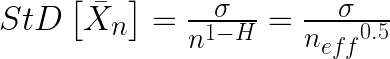
In the statistics of normally distributed data, the standard error of the mean (SEM) is sigma (the standard deviation of the data) divided by the square root of N, the number of data points. However, as Koutsoyiannis shows, this is a specific example of a more general rule. Rather than varying as a function of 1 over the square root of n (n^0.5), the SEM varies as 1 over n^(1-H), where H is the Hurst exponent. For a normal dataset, H = 0.5, so the equation reduces to the usual form.
SO … combining what I learned from the two papers, I realized that I could use the Koutsoyiannis equation shown just above to estimate the effective n. You see, all we have to do is relate the SEM shown above, 

where the left-hand term is the standard error of the mean, and the two right-hand expressions are different equivalent ways of calculating that same standard error of the mean.
By inverting the fractions, canceling out the sigmas, and squaring both sides we get
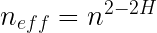
Egads, what a lovely result! Equation 1 calculates the number of effective independent data points using only n, the number of datapoints in the dataset, and H, the Hurst Exponent.
As you can imagine, I was quite interested in this discovery. However, I soon ran into the next oddity. You may recall from above that using the method of Nychka for estimating the effective n, we got an effective n (neff) of 182 independent data points in the nilometer data. But the Hurst Exponent for the nilometer data is 0.85. Using Equation 1, this gives us an effective n of 663^(2-2* 0.85) equals seven measly independent data points. And for the fractional Gaussian pseudodata, with an average Hurst Exponent of 0.82, this gives only about eleven independent data points.
So which one is right—the Nychka estimate of 182 effective independent datapoints, or the much smaller value of 11 calculated with Equation 1? Fortunately, we can use the Monte Carlo method again. Instead of using 663 random normal data points stretching from the year 622 to 1284, we can use a smaller number like 182 datapoints, or even a much smaller number like 11 datapoints covering the same time period. Here are those results:
 Figure 8. Four histograms. The solid blue filled histogram shows the distribution of the linear trends in 1000 instances of random fractional gaussian pseudodata of length 633. The average Hurst Exponent of the pseudodata is 0.82 That blue histogram is overlaid with a histogram in red showing the distribution of the linear trends in 1000 instances of random normal pseudodata of length 633. These two are exactly as shown in Figure 2. In addition, the histograms of the trends of 1000 instances of random normal pseudodata of length n=182 and n=11 are shown in blue and black. Mean and standard deviation of the pseudodata has been set to the mean and standard deviation of the nilometer data.
I see this as a strong confirmation of this method of calculating the number of equivalent independent data points. The distribution of the trends with 11 points of random normal pseudodata is very similar to the distribution of the trends with 663 points of fractional Gaussian pseudodata with a Hurst Exponent of 0.82, exactly as Equation 1 predicts.
However, this all raises some unsettling questions. The main issue is that the nilometer data is by no means the only dataset out there that exhibits the Hurst Phenomena. As Koutsoyiannis observes:
The Hurst or scaling behaviour has been found to be omnipresent in several long time series from hydrological, geophysical, technological and socio-economic processes. Thus, it seems that in real world processes this behaviour is the rule rather than the exception. The omnipresence can be explained based either on dynamical systems with changing parameters (Koutsoyiannis, 2005b) or on the principle of maximum entropy applied to stochastic processes at all time scales simultaneously (Koutsoyiannis, 2005a).
As one example among many, the HadCRUT4 global average surface temperature data has an even higher Hurst Exponent than the nilometer data, at 0.94. This makes sense because the global temperature data is heavily averaged over both space and time. As a consequence the Hurst Exponent is high. And with such a high Hurst Exponent, despite there being 1,977 months of data in the dataset, the relationship shown above indicates that the effective n is tiny—there are only the equivalent of about four independent datapoints in the whole of the HadCRUT4 global average temperature dataset. Four.
SO … does this mean that we have been chasing a chimera? Are the trends that we have believed to be so significant simply the typical meanderings of high Hurst Exponent systems? Or have I made some foolish mistake?
I’m up for any suggestions on this one …
Best regards to all, it’s ten to one in the morning, full moon is tomorrow, I’m going outside for some moon viewing …
w.
UPDATE: Demetris Koutsoyiannis was kind enough to comment below. In particular, he said that my analysis was correct. He also pointed out in a most gracious manner that he was the original describer of the relationship between H and effective N, back in 2007. My thanks to him.
Demetris Koutsoyiannis July 1, 2015 at 2:04 pm
Willis, thank you very much for the excellent post and your reference to my work. I confirm your result on the effective sample size — see also equation (6) in
http://www.itia.ntua.gr/en/docinfo/781/
As You Might Have Heard: If you disagree with someone, please have the courtesy to quote the exact words you disagree with so we can all understand just exactly what you are objecting to.
The Data Notes Say:
### Nile river minima
###
## Yearly minimal water levels of the Nile river for the years 622
## to 1281, measured at the Roda gauge near Cairo (Tousson, 1925,
## p. 366-385). The data are listed in chronological sequence by row.
## The original Nile river data supplied by Beran only contained only
## 500 observations (622 to 1121). However, the book claimed to have
## 660 observations (622 to 1281). I added the remaining observations
## from the book, by hand, and still came up short with only 653
## observations (622 to 1264).
### — now have 663 observations : years 622–1284 (as in orig. source)
The Method Of Nychka: He calculates the effective n as follows:

where “r” is the lag-1 autocorrelation.
Willis: “Best regards to all, it’s ten to one in the morning, full moon is tomorrow, I’m going outside for some moon viewing …”
Tonight get there at dusk and see a bright Venus very close to Jupiter. 😉
Damn. W., you have made me think, and by surprise… Very well done.
I’m now wondering what the implications are for Neff when data points are homogenized… That MUST increase the degree of auto-corelation and that MUST make any trends more bogus.
GAK! I need more coffee…
😉
How large is the error of r (the lag-1 autocorrelation) in the method of Nychka to calculate neff ?
I looked at the graph presented by Mr. Eschenbach and the results of his linear least squares analysis.
First, I would like to agree with the comments made by Owen bin GA, July 1, 5:49 am and by harrydhuffman, July 1, at 6:55 am in their responses to the presentation by Mr. Eschenbach.
Second, I offer my reaction as follows:
1. Looking at the graph and removing the red line, I see no visual clear trend. We have “augmented” Y axis to make us maybe think so that there may be a trend, but in 600 years the increase is 10%. So I would not even think of linear regression when observing the huge variation.
2. I looked at the linear regression results. High P value. Fine, so it is “statistically significant”
3. I looked at the R squared (R2) value obtained and listed in the results with the P value. Something that Mr. Eschenbach did not consider. This value is 0.066. Now, R2 values will vary between 0 and 1 (some authors will use 0 and 100% instead of 0 and 1, fine, obviously the closer to 1 or 100% the better). Why ignore this value? There is no “accepted” value for how low R2 must be before we dismiss the linear regression analysis as important (as will be explained in the Minitab blog below) but 0.066 is so low, I would simply dismiss any important linear regression for this data set.
4. To have a statistically significant P value and an extremely low R2 value is nothing new.
5. To understand what this mean and how this can happen, I am attaching perfect examples from a very competent statistician at Minitab. This is a very widely used statistical analysis software and the explanation of what P and R2 measure is perfect. You cannot take P only and ignore R2.
6. The examples he gives, two separate graphs, with explanations given are simply classic and what to do with a high P value and extremely low R2 value before accepting that any trend is IMPORTANT and can PREDICT anything, or that linear regression can EVEN be used.
7. After looking at the presentation, if you have time, start reading the blog. You will see a question by Mira Ad. She is having some problem with a time series of temperature anomalies! Interesting.
Minitab blog Regression Analysis
http://blog.minitab.com/blog/adventures-in-statistics/how-to-interpret-a-regression-model-with-low-r-squared-and-low-p-values
If you download the data into Excel, adding a linear trendline will give the same equation that Willis posts above. However, if you choose a polynomial of order 4, you get a much better fit. Statistics only summarize thing. They do not add any new information. Chances are that if what you claim to be there is not obvious it is an artifact of the statistical analysis. What Willis shows in his excellent analysis is that in the case of autocorrelation, the number of degrees of freedom is substantially reduced. The normal confidence limits you assume from a normal distribution do not apply. Recall, that t test and F test apply to small samples. When you have a large number of samples you effectively are using a normal distribution.
Yes, any software using linear least squares regression analysis will produce the same results presented by Willis. The problem is that he ignored the R2 value in drawing the conclusion. If the 95% prediction interval (not confidence interval) is plotted this interval would be huge because the R2 value is so low.This is what the statistician from Minitab is demonstrating with the two graphs he presented.
If you remove the red line from the graph and you visually inspect the data, what you see is 3 “waves” with a minimum at 800, a minimum at 1000 and one at 1200. So indeed your polynomial of order 4 will yield a much better description of the data.
Willis, thank you very much for the excellent post and your reference to my work. I confirm your result on the effective sample size — see also equation (6) in http://www.itia.ntua.gr/en/docinfo/781/
I also thank all discussers for their kind comments and Marcel Crok for notifying me about the post. I wish I had time to comment on the several issues/questions put. But you may understand that here in Greece the political/economic situation is quite critical and thus we cannot concentrate right now on important scientific issues like this. Currently we have to struggle to keep our functions alive; you may perhaps imagine (or not?) how difficult it is. So, sorry for not participating more actively… I can only provide some additional references which may shed some light to issues discussed here:
http://www.itia.ntua.gr/en/docinfo/537/
http://www.itia.ntua.gr/en/docinfo/1001/
http://www.itia.ntua.gr/en/docinfo/1351/
(my collection related to Hurst-Kolmogorov is in http://www.itia.ntua.gr/en/documents/?authors=koutsoyiannis&tags=Hurst )
I also confirm that H < 0.5 (antipersistence) results in higher effective length; you may understand the reasons thinking of a trivial example of a simple harmonic as indicated in Fig. 8 in http://www.itia.ntua.gr/en/docinfo/1297/
Thanks for your contribution here on this question generally.
I’ve been following the last 6mth of “negotiations” closely. I wish your country all the best in shaking off the mantle of perpetual economic bondage and externally enforced asset stripping of the nation’s wealth. Clearly a large amount of what is laughably described as ‘aid’ has not gone to help the greek economy but to bail out private banks and investors in rest of Europe leaving Greece saddled with a level of debt from which it could never recover. That debt must be restructured. Something that is only just beginning to be accepted by the international loan sharks.
It’s going to be difficult whatever way it goes. I wish you all, the courage and imagination to create a viable future for your country and people.
Ah, so my suggestion previously of 1-abs(2H-1) to produce symmetry about 0.5 is quite wrong. Thank you for the clarification. Please accept my best wishes and hopes for you and yours in the terrible situation in Greece. When government battle, non-combatant civilians always seem to be the first to suffer.
I greatly appreciate your taking the time to respond to Mr. Eschenbach’s inquiry.
The use of statistics to determine cause of variance in a chaotic random walk system is a problem that on the face of it screams impossibility. At least to me. Yet several have made the attempt and here is the one often sited.
http://go.owu.edu/~chjackso/Climate/papers/Crowley_2000_Causes%20of%20Climate%20Change%20Over%20the%20Past%201000%20Years.pdf
I have all kinds of issues with this kind of study. But the most egregious error is the use of models as the definitive “sieve”. At any point in time along the 2000 year time line, a random trend could have appeared in the “data” that in reality, was wholly unrelated to the perceived cause, and the models themselves were forced to “trend”, ergo the conclusions.
This kind of study drives me nuts!
Thank you for commenting, Dr. Koutsoyiannis. If you have time, I’d like to hear more about your situation there.
Hopefully I have got this wrong, because otherwise is a shame that Mann M. never thought of this way of reasoning and method of argument, as he could easily have proved to any one that he was always right when claimed and implied that there has not been any natural climate change in the last 3K years, or any climate change at all till man started to ride cars instead of donkeys..
Seems not very hard to prove that in this particular way……but maybe I just missed the main point of Willis generalism……….sorry if that the case.
cheers
While the estimation framework developed by Kolmogoroff in the 1930s and subsequently popularized by Hurst is a step in the right direction, it’s entirely restricted to diffusion-like “red noise” processes with monotonically decaying acfs and power spectra. It fails to characterize far-more-distinctly oscillatory processes encountered in geophysics, such as temperature, whose power densities have strong peaks and valleys. The upshot is that the confidence intervals for ostensible “trends” in records of a century or less are far wider than anything shown here. Until climate science comes to grips with the spectral structure of geophysical signals, it will continue to flounder in antiquated delusions about what constitutes a secular trend.
Thank you, 1sky1. Your comment has the ring of truth explains a lot of what others here (me included) have been puzzling over.
H is defined from 1-2H being the frequency dependence of the data. ie white ( or gaussian ) noise that has a flat frequency spectrum has 1-2H=0 or h=0.5. Integrate that and you have red noise which a 1/f frequency spectrum. 1-2H=-1 or H=1. “Fractional” noise lies somewhere in between.
So data with H close to 1 represent processes where it is the rate of change that is random, not the time series itself.
Then, how should we interpret the time series data presented by Mr. Eschenbach. There is a statistically significant increase? Or maybe there is nothing to conclude about a trend being present?
You start with a question; I will start with a question: why would anybody ask if there is a linear trend to the Nile data? Apart from an example of what not to do of course. Continuing on that line, what does it say that the Nile flow would be n thousand years in the future? Something absurd, nobody can believe that Nile flow is a linear function of time with some randomness added, so why bother calculating it? The variations are far more interesting and more useful for explanation. There is a lot of short term change, yet there is also a lot of longer term stability. So maybe something happened to the weather and climate in that watershed, and maybe correlations could be found with other variables that might tell us something useful. Other factors besides time. Those factors appear here as autocorrelations, but that’s not so useful.
Great discussion.
Can this be explained by dominoes? As H goes to 1 N goes to 1. That would be like setting up one of these domino endeavors you can witness on U-tube. There are thousands of Dominoes but they are all arranged to be auto-correlated. If the first one falls all of them will fall in succession so there is no randomness in the process… thousands of data points but none of them independent. Pushing the fist one over is very similar to pushing all of them over. That would be an effective N of 1.
That is what is needed. A simple way to explain the extremes. A coin flip is an excellent way to explain completely independent data of size N. And dominoes may be a simple way to explain the opposite end of the spectrum… and effective N of 1 no matter how big the data set.
Scott, my interpretation of N=1, was taking an average on a single value (this does imply I’m even in the right universe ). With Neff=2 enough to draw a line.
“..not enough to say that it is more than just a 663-year random fluctuation of the Nile”.
Isn’t that still a trend?
Thank you Anthony for creating a forum like this!!
Demetris Koutsoyiannis July 1, 2015 at 2:04 pm
Demetris, thank you for your kind comments. I am not surprised at all that your Equation (6) is the same as my Equation (1) above, and that you had plowed this ground before I arrived. You’re the man in this arena. I’m always happy to find out that things I came up with on my own have been anticipated by others—it proves that I’m on the right track and that I do understand the issues.
My friend, I can’t tell you how much I’ve learned in the last decade or so from your work. I have recommended it many times here on WUWT. Whether you contribute here on this thread or not, your contributions to my understanding are and continue to be great. As little or as much as you wish to add to my poor efforts is much appreciated.
As to Greece and your struggles, I’m sure that I speak for many here when I say that I wish you well in what are very difficult conditions.
You’ll likely enjoy what will likely be my next post, regarding an easy way to calculate the statistical significance of trends in situations with a small number of effectively independent data points.
Stay well, I wish you safety in parlous times …
In friendship,
w.
At a guess, this may be a non-normality issue. Is Hadcrut actually compatible with a fractional gaussian process? It is only gaussian processes where means and covariances tell you everything about the probabilities. It is not true for other random processes and the Hurst exponent seems unlikely to have an interpretation in terms of independence in that case. This general point is often illustrated by showing that any Hurst exponent can (more or less) be reproduced by a suitable Markov process (actually diffusion). Markov processes only remember the immediate past, while large values of H for a fractional Gaussian process are associated with long memory/persistence. In other words, once the assumed random dynamics does not apply, the associated interpretation of H does not apply.
Hi Willis,
I’m enormously glad that you enjoyed the paper(s) of Koutsoyiannis. This is the most ignored work in climate science, and it transforms the perpetual computation of short time linear trends into the utter statistical bullshit that it is.
The problem is that even your estimate of 11 independent samples in 700 odd years may be excessive. We won’t know until we have data that is even longer, because the number of independent samples depends on the longest — not the shortest the longest — timescales on which secular or random variation occurs. We cannot detect the longest timescales with only a dataset on the same order of number of samples any more than a fourier transform can pick up long period fourier components from a short time series. Indeed, if we discussed Laplace transforms instead of FTs, we’d actually be discussing the same phenomenon. It’s all a matter of convolution.
rgb
The bad news is that the best we can hope for in mainstream climate science is bullshit. The good news is that there’s plenty of it and it’s peer-reviewed. .
Hurst’s work has been well-known to investment analysts for many years. Mandelbrot explained how he first came across this power law in 1963 while he was teaching at Harvard. There is an interesting chapter in his book “The (Mis)Behaviour of Markets” devoted to Hurst. In it he mentions Edgar E Peters who reported on the Hurst exponents that he found in the performance of leading shares in 1991. Independently a Scottish actuary, Robert Clarkson, used the Hurst exponent in several papers and seminars in the 1980s and 1990s to rubbish the then fashionable and now discredited “modern portfolio theory”.
Willis,
Perhaps I missed this, but have you tried creating an artificial data set, such as a straight line plus Gaussian noise, and computing n_eff to see if you get the correct value? My concern is that a pattern in the data, such as a trend or a sign wave, will introduce correlation, which will reduce n_ff.
I will try it myself, once I figure out just how to do the calculations.
Willis,
I have tentatively come to the conclusion that your method of analysis is fundamentally mistaken. I created a series of random numbers and analyzed them using the method of Koutsoyiannis. I got a Hurst exponent close to 0.5; so far so good. Then I added linear trends of increasing magnitude. Once the trend was large enough to be visible in a scatter plot, two things started to happen: the log-log plot of sigma vs. n started to curve and the fit value of the exponent started to increase towards unity. But clearly, from the way the data were constructed, we MUST have n_eff = n (of course, numerical analysis of a finite data set might give a bit of variation).
A little reflection reveals the cause of the problem. Plots as in Figure 5 of Koutsoyiannis are testing whether the variance of the data is behaving as uncorrelated random (white) noise, with exponents near 0.5 indicating uncorrelated noise and larger values indicating something else. But the variance in my test comes from two sources: the noise and the linear trend. So once the trend is significant, the variance no longer behaves as uncorrelated random noise. But that does not mean that the noise is correlated, only that there are correlations in the data.
The same thing will happen with any data containing a signal: whether linear, exponential, sinusoidal, etc. And you can’t detrend the data unless you know just what type of signal must first be removed.
Cohn and Lins may not have been pessimistic. At best, what you might be able to do is to use this method to test residuals for uncorrelated random behavior.
Hi Mike M.
I think Willis has done this work, as reported in the head-post, using fractional gaussian pseudo data. But obviously, Willis’s response would be more credible and informative than anything I can provide.
But on another note, while the low N-eff for climate data is clearly interesting, the real impact is the extent that this finding significantly increases the probabilistically determined uncertainty of global temperature data series extracted from the measurement record … and possibly the resulting contrast with those uncertainty bounds calculated and forecast by the climate models. This could lead to another quantitative and informative constrast between data and model.
I read the Mann paper referenced early on in the comment above; he seemed to report credible work but with dismissive conclusion. I was surprised no on commented on this … I wonder how Willis reacted.
So Willis, we await your next edition. . . wherever it takes you, and us!
Thanks
Dan
Dan,
I think the pseudo-data had no actual trend, only spurious trends generated by random chance.
I think that the real impact can not be decided until we know just what this can tell us. That is probably much less than most people (me included) would have guessed.
I can tell you why I have not commented on the Mann paper: Haven’t got around to it.
Hi Mike –
I really can’t comment about fractional gaussian pseudo data and associated trends and their impact, because I really don’t know what process(es) or code Willis used. I also acknowledge that my interest in the outcome of the results of the “Hurst Phenomenon” is biased by my disbelief that climatic global temperature uncertainty is inversely proportional to n^ (-0.5).
Yet, on the other hand, I struggle about what the Hurst Phenomenon means and how the associated representation of the past bears on our ability to predict the future. Yes, it yields an attractive perspective for uncertainty calculation for the past … and maybe the future. But how do we know?
Maybe if an honest broker(s) of climate modeling could truly understand, represent and implement the climatic shocks (associated with PDO, AMO, El-Nino, volcanic eruptions, solar irradiance etc.) in a series of stochastic predictions, the climate science community (on both sides) could more deeply differentiate between natural variation, measurement error, and exogenous influences such as aerosols, the sun, and GHGs. Maybe then we could begin to parse the key drivers of climate change (natural, anthropogenic, and erroneous) and then begin to understand what (if anything) is important for future policy.
OH, shake me, oh wake me up …. I’m dreaming non-sense … or maybe I’m still just dreaming!!
Best to all … I actually wonder about this stuff …. please help me to understand better …. that all I ask!!
Thanks
Dan
Mike writes ” But clearly, from the way the data were constructed, we MUST have n_eff = n ”
n_eff = 2 describes a linear trend.
This post gets my nomination for one of the ” Posts of 2015 ” here at ” SUP ” – whatS UP with that . There is so much to learn and then consider and also so many on topic responses that further dive into the subject, rather than the degeneration into an endless back and forth between two or three posters – going on ad nausea m .
Thanks for a great post ! Perhaps I should get busy and try to compile a master table of all Climate data sets, by name, and add information as to N, calculated by who, when and ” notes ” ? The ” notes ” field could be a ref to a set of equations showing ” how ” N was derived by that author.
Willis,
I’ve seen many charts where lines have been added arbitrarily to plot various temperature trends.
Would it be possible to automatically locate the approximate location of each “effective n” point? And it’s value? And then automatically draw the trend lines?
Being a software developer, but not a mathematician I thought: could you iterate your “effective N” calculation using an increasing start date, or decreasing ending date, and note when the “effective N “changes? I have no idea how sharp the change would be in this circumstance, but it might be interesting.
I very much enjoyed your article, very understandable. Thank you.
Looking to R as you would expect there is a package to estimate the Hurst exponents. In the praam package the hurstexp function. I ran the time series of the nile levels from the source in the article and got the following output.
Simple R/S Hurst estimation: 0.7374908
Corrected R over S Hurst exponent: 0.8877882
Empirical Hurst exponent: 0.7302425
Corrected empirical Hurst exponent: 0.733243
Theoretical Hurst exponent: 0.5300408
Warning message:
In matrix(x, n, m) :
data length [620] is not a sub-multiple or multiple of the number of rows [311]
Some variation in the exponent. I would have to read a lot more before knowing what they mean and the warning message may mean something was not correct in my dataset copying or some other issue.
make that the pracma package, auto correct strikes
Willis,
A truly superb post, thanks to you and the replies that follow, I believe I now have a much better understanding of autocorrelation.
In particular your equation n_eff = n^(2-2H) is very instructive. When H = 0.5 (no correlation) the equation reduces to n_eff = n (because n^1 = n) while in the case of complete correlation, when H = 1, the equation reduces to n_eff = 1 (because n^0 = 1)
So in the extreme case of H = 1, where the data series is totally correlated, it follows that with one known data point the value for all data in the series can be predicted. Similarly with H = 0.5 (no correlation) it is impossible to predict the next value (or any other value) in a time series of data points. This then leads me to wonder about scale invariance. With values of H close to 0.5 is it correct to assume that the autocorrelation distance is small? Data further away in the time series has a value that is independent of distant past data points. While for values of H that approach 1 the degree of scale invariant self-similarity (i.e. the fractal nature of the data) increases?
Just asking.
The Sahara was wet and now it’s not; that is real climate change. The drying out period might overlap somewhat with the Nile dataset.
http://www.pnas.org/content/early/2015/06/23/1417655112
Instead of looking for linear trends, it may be more useful to look for trend change points. With this approach, long term autocorrelation is not constant.
Another link about the same paper:
http://www.sciencedaily.com/releases/2015/06/150629162542.htm
“Largest freshwater lake on Earth was reduced to desert dunes in just a few hundred years”
I thank Willis for an intriguing and important post. ?dl=0. Only about 5% of my simulations yield a trend of 1.52 or more, so the actual Nilometer trend of 1.197 is not unusual.
Verification:
I have independently verified some of Willis’ results. Although Willis say “About 15% of the pseudodata instances have trends larger than that of the nilometer” my computations put the figure closer to 9.8%. Nevertheless, his histogram (Figure 5) compares well to my own, which you may find here:
Transparency:
True science requires enough transparency to allow examination/replication by others. My verification above is in a Mathematica notebook file here: https://www.dropbox.com/s/60dwtv5ekbsbhpw/Nilometer%20for%20WUWT.nb?dl=0.
Hypothesis:
Willis notes “you can see how much more “trendy” this kind of data is.” I have a vague suggestion why. I suggest that the “climate” is a collection of (perhaps loosely) coupled chaotic parts. Each part behaves “consistently” for a while, then “suddenly” switches to a different “consistent” behavior (i.e., change of attractor). Such a change in one part will act as a “forcing” on some other parts, which may (a) thereby trend in some direction for a while seeking a new “rough equilibrium” or (b) also change their attractor. Looking at any such chaotic part will be trendy-but-random, just what we often see in high-Hurst data.
Question:
What page in Geomagnetism does Willis’ Figure 6 come from?
Interesting:
The Koutsoyiannis paper notes “the assertion of the National Research Council (1991) that climate ‘changes irregularly, for unknown reasons, on all timescales’”.
Another Resource:
I found Ian L. Kaplan’s “Estimating the Hurst Exponent” enlightening: http://www.bearcave.com/misl/misl_tech/wavelets/hurst/.
Thanks, Needlefactory. I greatly appreciate folks who run the numbers themselves, it’s how I’ve gotten as far as I have. Until I can actually do to the math myself , I don’t feel like I understand what is going on.
Further notes:
The Figure 6 comes from p. 584, as I mentioned at the start of the head post.
Thanks also for the Mathematica notebook file and the Kaplan paper, I’ll take a look as soon as I get time.
I’ve used the wavelet method, but I prefer the new method that Koutsoyiannis proposes, the log/log analysis of the rate of decline of the standard error of the mean. I like it in particular because it provides the connection between the Hurst Exponent and the number of degrees of freedom. This does not exist with e.g the wavelet analysis method.
w.
I found a typo (662 for 622) in my Mathematica Notebook. This caused simulations to be 40 years too short, with mild changes to some statistics:
(1) Probability of a trend ≥ nilometer trend is ~8.22% (Willis computes ~15%).
(2) 5% of my simulations result in a trend of more than 1.414 cm/decade.
Differences between Willis and me likely result from different codes for fractional Gaussian noise.
Nevertheless, the main conclusion is unchanged: the historic trend is neither unusual nor significant.
The revised Notebook has been uploaded; the link remains the same as above. Those without Mathematica may review the document (both code and output) with the free CDF player at https://www.wolfram.com/cdf-player/
Its a bit like saying a square peg doesn’t fit a round hole because it has four corners. It is obvious from the HadCrut4 data that it fits a function like asin60/y.t + ct much better than a linear trend. I suspect that taking the first term from the data leaves you with something where H is close to 0.5.
The real question is how certain can you be that something changed after 1950 (after the question of whether HadCRUT4 is worth analysing is addressed) as temperatures around the globe are likely to have warmed since the LIA. Does a larger value of c fit the data better after 1950? Is it significantly larger? Does the data fit the hypothesis that a ten-fold increase in use of fossil fuels warmed the globe (fits better if the second term is t^2).
The problem is that one can fit the data perfectly well with a lovely function that works excellently and still have the fit mean nothing at all! You really do need to the link(s) and read at least the first hydrodynamics paper I referenced. It contains a figure that makes the point better than I can ever make it with words, but I’ll try.
If, in complete ignorance, you fit the temperature outside your front door from midnight to 6 am (when the temperature outside falls by maybe 10 C) to an assumed linear trend, you might be tempted to conclude that the entire planet will “catastrophically” reach 0 degrees absolute in less than a month. If you fit the temperature from midnight to noon (let’s imagine a warming of 5 C) and assume a linear trend, you might conclude that the Earth will become Venus in a matter of months. Only if you look at the temperature from midnight to midnight, and average over many days, can you discern from the temperature data only a systematic diurnal trend and infer, without ever seeing it, “the sun”.
If you now take advantage of your knowledge of a diurnal variation to average over it and plot the temperatures day to day, if you start in January and run to June or August, you will be tempted to conclude (again) the Earth is warming dangerously and unless immediate action is taken heat will kill everybody on the planet in at most a few years. If you started in July and ran to December, you’d conclude the opposite. Only when you analyze data over many years can you clearly resolve a systematic annual trend on top of the diurnal trend in the data and deduce (without seeing it) the inclination of the planet and/or eccentricity in its orbit or some unknown cause with an appropriate period.
OK so you know about the seasons. But when you plot the average temperature (however you define it) for a year and compare year to year, you will find (again) many periods where if you only look at 4 or 5 years, there is a strong linear trend going up or down. If you look at decadal trends, they can still be going up, going down, or in between. If you look at century scale trends, some centuries it appears to warm, some it cools. If you look at thousand year timescales, you find that the thousand year mean temperatures vary substantially and appear to “trend” for many thousands of years at a time. If you look at million year timescales, you see patterns within patterns within patterns, and some — most — of the patterns you see cannot be reliably predicted or hindcast. Sometimes we can propose the moral equivalent of the sun and rotating earth or the revolving tipped earth to explain some part of some of those patterns, but in general these proposed patterns are no longer consistent and systematic — they appear and seem to hold for a few cycles and then disappear, and maybe reappear later, only a bit different. In particular, they don’t appear to be pure Fourier components indicating a truly periodic “cause”, and in most cases we cannot point to something as simple as the sun and the Earth’s rotation and say “this is the cause”.
How can you identify a change in the pattern due to a single variation in some underlying variable under these conditions? You cannot predict what the pattern should be without the variation. How can you predict it with it? You might see a linear trend, but how can you tell if the linear trend is random noise (which sometimes will generate a linear trend over at least some intervals) or the rising part of a sinusoid associated with a day, or the rising part of a sinusoid of sinusoids associated with “spring”, or with some other sinusoid such as the possible 67 year variation in global temperature — “possible” because maybe not, maybe it is just an accident, maybe it is part of some long time scale noise or a quasi-stable pattern that is just about to break up and reform in some entirely different way?
The answer is that you can’t, not without the ability to independently see the sun and the earth’s rotation, not without an independent theory of radiation and heat transfer to explain the correlation in the data in a way consistent with physical causality. And in sufficiently complex or chaotic systems, it may well be that you just plain can’t. Not everything is reducible to simple patterns.
I will conclude by restating something I’ve said many times on this list. There is some point in fitting a physically motivated model to data. There is much less of a point in fitting arbitrary functions to data (almost no point, but I will refrain from saying no point at all absolutely, as one often has to bootstrap an understanding from little more than this). A linear model is pretty much arbitrary, and in the case of climate data where we know we have secular variations on multiple timescales, fitting linear functions on a tiny chord of temporal data (compared to the longer known scales) is a waste of time. It is as silly as fitting morning time temperatures and extrapolating the rise six months into the future.
rgb
Using your analogy. If someone shows you that the temperature today went up 10 deg today from 6am to noon and screamed Armageddon because we lit a fire, then even with only 24 h worth of data you can point out that it could just be cyclic. Then if they say that its warmer today than yesterday, you can ask where is the evidence that something suddenly changed when the fire was lit.
Cyclic, cubic, polynomial in any function of order greater than three, or an apparently cyclic bit of noise on a curve whose true shape is — anything at all. Mickey Mouse ears. Exponential growth. Exponential decay. A meaningless squiggle.
The problem is precisely with the word “evidence”. In order to statistically interpret the data, one has to first state your priors, the assumptions you are making that justify the use of axiomatic statistics (generally Bayes theorem, the central limit theorem, etc) in some particular way. If you assume “the data are (approximately) periodic with period 24 h” with a single 24 h sample when in fact, the data are approximately periodic with period 24 h nobody can argue with the consistency of your assumption, but at the same time the data constitute almost zero evidence in favor of your prior assumption. To use a simpler case, if you pull a black marble out of a hat full of marbles, and then assume “all the marbles in this hat are black” nobody is going to be able to disprove your assertion, but the one black marble is only evidence for the existence of a single black marble in the entire hidden statistical universe inside of the hat and one learns nothing beyond the consistency of your assertion from the single black marble, especially with the assertion being made a posteriori (with the marble already in hand) and with no “theory of marbles in hats” that e.g. specifies the number of colors of marbles that could be in the hat, that specifies how many marbles might be in the hat, that specifies whether or not you put the black marble back and give the hat a shake before you draw out the next marble, that specifies whether or not the hat contains a malicious gnome who puts only certain marbles into your hand according to some hidden rule even though the hat contains a lot more marbles of a lot more kinds than you think.
One gets an entirely different progression of successive “best estimate” probabilities for drawing a black marble from the hat on the basis of a succession of “experiments” of drawing additional marbles from the hat, with or without replacement for all of the different prior assumptions. In the long run, one accumulates enough evidence to eliminate, in the specific sense of reducing their posterior probabilities to zero or close(r) to zero, most of these prior assumptions (except for the malicious gnome or invisible fairies who are hidden and who hide “reality” from your experiments, who can literally never be eliminated in any theory and who thereby allow a hypothesis for the existence of god(s), demons, and pink unicorns to be added to any set of priors that you like without any possibility of refutation via evidence).
This is “probability theory as the logic of science”, and it is well worth your time, if you want your worldview to be rocked, to invest in E. T. Jaynes book of this name and read it. In it he actually defines “evidence” in a sensible way, and shows how evidence can and should shift an entire coupled set of joint and conditional probabilities around as one accumulates it, lifting up the ones that remain consistent with the evidence and dropping down those that are not. Or (better yet, and) read Richard Cox’s monograph: “The Algebra of Probable Inference”. Or work through Shannon’s theorem, although it is harder going to make the connection to probability theory than it is to take Cox’s (slightly prior) result and obtain Shannon’s.
This is by no means trivial stuff. In physics, we have (so far) observed three generations of both quarks and leptons. This has led many theorists to hypothesize that that’s all that there are. This makes the number “three” special, in some sense, in our physical universe — why not one, or two, or seven — and hence seems odd. But this is reasoning a posteriori, and hence has almost no force in and of itself, because the basis for that belief is that so far, pulling marbles out of the hat, one almost always obtains red marbles, rarely obtains green marbles, and only if one shakes the hat just right and holds it at a special angle can one sometimes pull out a blue marble. We’ve seen all three colors, so duh, the hat contains at least three colors of marble.
But the day somebody pulls out an octarine marble (the color of magic, for Terry Pratchett fans) the “three color” theory of marbles in the hat has to be thrown out and the four color of marble theorists, who up to now have languished, unheralded and prone to excessive drinking, suddenly become world famous and the three color theorists add a color or take up basket weaving or work as Wal Mart greeters instead. And don’t forget the five color theorists, or the pesky infinite color theorists who can’t see any particularly good reason to limit the number of marble colors and who want to count marbles with polka dots and stripes as well.
To conclude, the problem as posed constitutes almost no evidence at all for anything. Some days the temperature hardly varies at all and does NOT follow the diurnal cycle. If one happens to make one’s observations on that one day, one might be tempted to assume “temperature is a constant”, and of course the single day’s worth of data you have is consistent with that assumption. But what of the brave soul who sees that constant data and says, “no, temperature is a sinusoid with a period of one day”? Or one hour. Or two weeks. Or one whole year. Indeed, there is an infinite number of possible periods, and the very long periods are going to look nearly flat on the scale of a single day and then there is an absolutely unknown possibility of aperiodic variation that can be superimposed on any of these assumptions or all of them together.
How can the data substantially favor one of these assumptions over any of the others, given only the one observation, no supporting theory with independent evidence (which can strengthen your priors substantially and make it much more difficult for them to be moved in the computation of posterior probabilities) and the fact that you are making your assumption a posteriori and not using it to make predictions that are subsequently either validated or refuted?
rgb
Since I resemble this, let me see if I’m wasting my time.


I started looking at the actual data because while taking astro pictures it became obvious how quickly it cools after sunset.
So my goal was to see if the rate of cooling had changed over time. While looking at night time cooling, a) it wasn’t clear how to select only clear nights, b) the selection process was so ambiguous any results would be labeled “cherry picking”.
So I started to include all days, comparing yesterday’s warming to last night’s cooling.
I also realize that out of the tropics the length of day to night changes through out the year, and you can use the day of the year it changes from warming to cooling as one measure of energy balance.
So, I wanted to compare daily warming to the the following nights cooling, and the day of the year it went from warming to cooling.
From input from others for daily cooling I realized that because of the effect of orbital tilt I had to include only daily records from a station if it was a full year, any missing days would bias the results, that still left me with over 69 million daily records for 1940 to 2013 that I can directly compare. If Co2 was reducing night time cooling, there should be a trend. I found two surprising things, when you average all 69 million records, its cooling, and I couldn’t figure out how it could be cooling when in general the temperature has gone up, and on an annual basis some years show more warming other years more cooling.
First, the cooling years seem to align well with warmer years, that makes sense, and the warming years match the cooler years, that passed my smell test, but I still couldn’t get why over all it showed some cooling, and then I realized that warm moist air is transported from the tropical waters to the land, where it cools and rains out excess moisture.
The next thing I did was to use the same day to day difference in temp, which on a daily basis shows warming (NH) in the spring, and cooling in the fall, if Co2 was reducing the earths ability to cool, that day it turns to cooling should be moving later in the year, as it would require a longer night to release that excess energy to space, the transition day moved around some, but there wasn’t a clear trend. I then thought that as well as the day moving, the slope of the day to day change should be changing, it is, but it’s more curve than straight line (or wiggly line, I avoid doing a lot of smoothing, but provide the data so if someone wants to smooth it, they can).
Now this could all be orbital changes, and I carry far too many significant digits (again really to allow for others to decide where they should be stopped), if you round to the same single digit as the source data the difference is 0.0F +/-0.1F on 69 million samples from around the world, to me it looks like there’s no impact to cooling from Co2. Beyond this, there are many thing that I could do, most I don’t really know how (I do include a lot more data when I do my processing, as it’s easy to add things like average dew point, min and max temp, I’m adding solar forcing now, but most of it was investigating the day to day change over time.
Ah, but did you remember to adjust your data? If you don’t adjust it to show warming, it can’t possibly be valid. That’s why we employ so many professional data adjusters worldwide in climate science.
As was pointed out to the US congress (who unfortunately didn’t understand what was being said), if you want cherry pie, you have to pick cherries.
rgb
I like cherry pie !
I think the way I do my calculations you can’t just change min or max, it would be really hard to make a warming trend where one didn’t exist.