*Based on the Linear Trend
Guest Post by Bob Tisdale
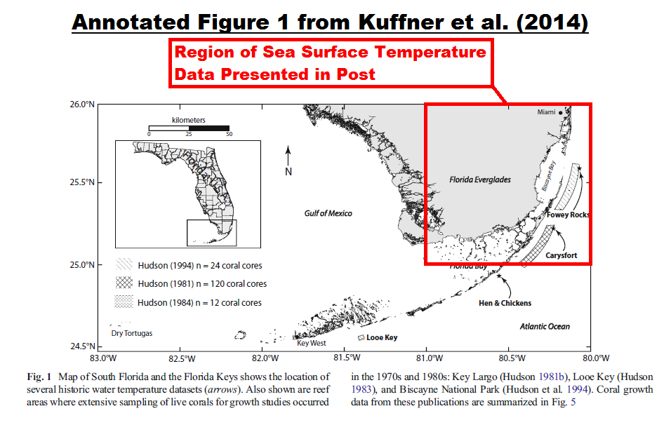
A new study funded by the US Geological Survey (USGS) was introduced with the USGS press release Ocean Warming Affecting Florida Reefs – Increased Temperatures Spell Trouble for Corals. The press release was included in yesterday’s post Claim: Ocean Warming Affecting Florida Reefs at WattsUpWithThat. The study compares sea surface temperatures from a century ago to recent values, see Figure 1, as measured at lighthouses in the Florida Keys, but it fails to illustrate or discuss that temperatures reached similar levels during the mid-20th Century…or the fact that sea surface temperatures for that part of the Florida Keys show no warming in 80+ years.
The paper being discussed is Kuffner et al. (2014) A Century of Ocean Warming on Florida Keys Coral Reefs: Historic In Situ Observations. My Figure 1 is their Figure 2. It shows the sea surface temperatures measured at two lighthouses in the Florida Keys during two periods: recent multidecadal periods and multidecadal periods about a century ago. There’s obviously some missing data…a lot of missing data.
Hmmm. That’s odd. Why would they fail to illustrate most of the data? Could they simply have cherry-picked two time periods—per lighthouse—so they could make alarmist claims about coral reefs? Notice how there are different periods shown for the two lighthouses. Odd.

Figure 1
The warming period in the early 20th Century is missing…and so is the mid-20th Century cooling period…and so is much of the warming period in the late 20th Century.
To confirm our suspicions, let’s see what the sea surface temperature data from one of the normal sources have to say.
As we can see in the map here (Figure 1 from Kuffner et al. (2014)), those two lighthouses in the Florida Keys aren’t too far apart. NOAA’s ERSST.v3b data and the UKMO’s HADSST3 data are presented in 5-degree longitude by 5-degree latitude grids. Those are way too large for our purposes. That leaves us with the UKMO HADISST data, which are presented in 1-degree longitude by 1-degree latitude grids. In the map linked above, I’ve highlighted the coordinates of 25N-26N, 81W-80W. That’s the teeny-tiny region we’re looking at in this post. And we’ll call that teeny-tiny region the Northeast Florida Keys.
Feel free to choose one of the other sea surface temperature datasets and/or expand the grid size. The results are not going to be too different from what follows.
Let’s start with anomalies. Figure 2 illustrates the HADISST-based sea surface temperature anomalies for the Northeast Florida Keys (25N-26N, 81W-80W). There appears to be a multidecadal signal in the data. The sea surface temperatures there appear to have cooled from the 1880s to the early 20th Century, then warmed until the 1940s. Thereafter, they cooled until about 1980 and then warmed to early 2000s. In recent years, there were a number of very cool months in the Northeast Florida Keys.

Figure 2
I’ve smoothed the data with a 121-month running-mean filter (centered) in Figure 3 to help confirm those multidecadal variations. Oddly, Kuffner et al. (2014) didn’t bother to mention that it seems as though the sea surface temperatures of the Northeast Florida Keys may have already begun another multidecadal cooling period.

Figure 3
Let’s see how many decades we can go back in time and still not show any warming there. Based on the linear trend, the data for the Northeast Florida Keys reveal the sea surface temperature anomalies show no long-term warming or cooling in more than 8 decades. See Figure 4.

Figure 4
Yet, somehow, we’re supposed to believe manmade greenhouse gases are causing harm to the coral in recent years.
Further to this, Kuffner et al. (2014) focused on August, which is the warmest month of the annual cycle in sea surface temperatures for the Northeast Florida Keys. And they listed sea surface temperatures (thresholds) that were stressful (29 deg C) and very stressful (30 deg C) to the corals. Curiously, the Kuffner et al. (2014) Figure 2 (my Figure 1) shows that sea surface temperatures are above the 29 deg C stress threshold nearly every year, even back in the late 1800s. It even showed that there were occasional excursions above the 30 deg C very-stressful threshold in the early data.
My Figure 5 presents the HADISST-based August sea surface temperatures for the Northeast Florida Keys. It confirms that coral have had to deal with sea surface temperatures that are said to be stressful almost each and every year, and that sea surface temperatures regularly reached and exceeded levels that are said to be very stressful in the 1940s, 50s and 60s…and, if the early data are believable, on occasion, they were above very stressful levels in the late 1800s and early 1900s.

Figure 5
Why do I have the funny feeling that, in the not too distant future, Secretary of State Kerry and President Obama will be claiming manmade global warming hurts baby corals in the Florida Keys?
SOURCE
Data presented in this post are available through the KNMI Climate Explorer.
I’m not sure the average temperature is very important to the denizens of the area if non-averaged variations in temperature last longer that the life cycle of said denizen. Three seasons of unusual warming or cooling is several lifetimes for a lot of critters. It would be more accurate to show that any variations, natural or otherwise were not likely to cause harm to the prevailing lifeforms over the last 80 years. Looking at the graph I’m not now convinced that can be shown.
Don’t know what Bob did to get his data but this is what I get from the same source for the coordinates he indicated.
[Graph removed at Greg’s request. He used the wrong coordinates.]
There is a change of about 0.6 degrees. Whether this contradics the paper’s result which was from spot temperatures at single sites , presumably in rather shallow water, would need further examination.
However, it would appear that Bob’s conclusions and his “no warming in 80 years” claim is spurious and may be due to an error downloading the data.
That takes the wind of most of the kneejerk smart comments posted above.
Maybe in this case a bit of “peer review” of Bob’s work would have been in order.
Greg
Bob uses a centred filter not a running one. So it keeps information without adding phase. Do you do the same?
mickyhcorbett75, nope. I presented a 121-month running-mean filter, that’s centered in the 61st month.
Micky, yes my filter is simply three running means run one after the other. Centred to the nearest month, as Bob’s is.
Running mean indicates the mean is shifted alone one data point each time and it not a true mean which would reduce the number of points.
Economists, for reasons best known to themselves, like introduce a phase shift into their data by logging results as the last date used, instead of taking the mean x coordinate to go with the mean y value.
Ah that kind of centred. Okay fair enough.
Bob mentions 25n to 26n in his text, but his graphs say 24n to 25n.
So in the end, Greg clearly shows SSTs rising on a larger (global) scale. Bob, a genius in cherry-picking data, smoothing, and drawing flat regression lines, claims to refute the USGS study by analysing a different data set and in a different way than the original authors did. In Bob’s data, I see both more extreme highs and lows, which would also pose a threat to coral.
===============================================
[Question: So which is it, “Ben92”? Are you Ben92? Or Barlum? Or Benson? Or Ben M? Or Barry? Please pick one screen name and use it exclusively, per site Policy. ~mod.]
BBBen whoever, have you apologized yet?
Oh, Ben92, refer to Greg Goodman’s commet September 11, 2014 at 9:58 am.
What’s that egg or bird shyte all over your trolling face? Mmm, not egg!
Ben92 says, “So in the end, Greg clearly shows SSTs rising on a larger (global) scale. Bob, a genius in cherry-picking data, smoothing, and drawing flat regression lines, claims to refute the USGS study by analysing a different data set and in a different way than the original authors did…”
Welcome, troll.
Apparently you have trouble even understanding the error that Greg made, He didn’t present global data, He presented the sea surface temperatures for a 1 deg latitude strip (25N-26N) that ran eastward from the western North Atlantic at 81W and halfway across the Indian Ocean to 80E. That’s far from “global”, as you say, Ben92.
I didn’t cherry-pick the location or the time. The authors of the paper selected the region. And, as noted in the post, I simply worked back in time to find how far back we can go with the data showing no warming in the region studied. Additionally, I don’t draw the flat regression lines. That was EXCEL after it determined there was no warming trend.
And, finally, I used a second dataset to spot check the data presented by the original authors, and showed the flaw in the original authors method of analysis. I’m not sure why you have such difficulty fathoming that, Ben 92!
Have a good day.
Blooper was mine, confusion arose because KNMI uses hyphen to indicate “to” as well a negative lat/long in file names. My bad.
Here’s what it should look like. Not too different from Bob’s except for the less distorting 121mo filter.
http://climategrog.files.wordpress.com/2014/09/floridakeys1.png?w=800
http://climategrog.wordpress.com/?attachment_id=1009
In fact SST was very stable ( as is typical for the tropics ) and was not detectably higher around 2000 than it was is 1880. So I think Bob could extend his “no warming” right back to the beginning of the record.
Greg Goodman says: “Blooper was mine…”
Thank you. Disregard my additional replies to you appearing after this one.
And here’s the direct output of the sea surface temperature data (not anomalies) with a 12-month running-mean filter direct from KNMI:
http://climexp.knmi.nl/ps2pdf.cgi?file=data/ihadisst1_-81–80E_25-26N_n_0p_12month_low-pass_box_0.eps.gz
Have a good day.
That doesn’t look warm enough for Florida Keys.
Pending evidence to the contrary, I simply do not believe that Ye Olde Random Lighthouse was equipped with laboratory grade calibrated thermometers capable of accurately recording to 0.01C from the late 1800’s.
This is my primary argument against all of the climate work. The data is so unreliable that if any of them did honest error analysis, the error bars would prevent making any conclusions pro or con.
If the difference was the other way this would have been “homogenised” out.
simple bias confirmation in action here IMO. We “know” temperatures are rising so why would anyone question any difference in the broken segments of the records.
Greg, I presented a 121-month running mean on anomalies, which is just about the same as a 120-month running mean, direct from the KNMI Climate Explorer:
http://climexp.knmi.nl/ps2pdf.cgi?file=data/ihadisst1_-81–80E_25-26N_n_0p_120month_low-pass_box_0.eps.gz
Regards.
Yes my bad, see above.
Could you remove the incorrect graphs linked from my posts to stop the error propagating.
I’ve deleted them on my WP blog but WP never forgets. It says you can delete a file but it does not remove it !
Next thing this now anonymous, broken graph will be turning up in google image results and get used by warmists !!
Having personally made many temperature readings in the Keys, I can certify that atmospheric radiation (clouds) does not warm the ocean surface.
Anyone or any organization claiming that Atmosopheric radiation (CO2 or H2O) warms the ocean is either lying or completely ignorant.
Did the US Geological Survey (USGS) and their reviewers make the same mistake Greg did ?
How could they have. They were using two individual lighthouse records, not KNMI.
Their mistake was bias confirmation. They used two separate records from each site well spread in time without questioning whether they were compatible instruments.
Most data with breaks in it gets homogenised to hell….. unless it shows “unprecedented” warming.
I believe coral may be a little tougher and these worries are idiotic.
From http://www.bikiniatoll.com/BIKINICORALS.pdf
The results of our nuclear war on coral. A total of 183 scleractinian coral species was recorded, compared to 126 species recorded in the pre-bomb study.
There are more species now than then.
And from http://www.co2science.org/articles/V15/N7/EDIT.php
An unofficial spokesman for the Allied Coral Species Association is thought to have stated – We have survived nuclear war, climate temperature changes of over 10 degrees, planetary magnetic shifts and plate tectonics for over 400 million years. We are personally more worried about you.
DD, I think that almost every species living now is very tough (specially the very old ones), but there is a way thinking about nature that is opposite; they see fragility and tipping points everywhere.
By the way, I think I’ve seen the corals mulling about this at night, when the polyps come out to feed. We seem to be so frantic in their sensors.
Greg, one last graph. Here we have the data with a 120-month 1st order LOESS filter:
http://climexp.knmi.nl/ps2pdf.cgi?file=data/ihadisst1_-81–80E_25-26N_n_0p_120month_low-pass_loess1_019812010a.eps.gz
Thanks Bob, I’ll mark that as an example of why never to trust a filter that does not have a defined response. Just look at what it does with the beginning of the data , complete BS. Where did that rise come from. No hint of it in the data.
Give that to a warmist and he’ll use it prove the area has been warming
I’ve always mistrusted Lowess data mangling but that is a a clear demonstration of my worst fears. In fact “it’s worse than we thought” TM.
I doubt those lighthouses could measure less than 1C until recently, putting all those fluctuations down in the noise…
Well done Bob, must be worth a letter for publication in the journal, if you’re that way inclined.
I graduated from high school in 1962 and prompt fizzled in college in 62-63. After trying to figure out if I really was that stupid, I was drafted, spent 2 years in the Army and decided to try college again in 1968. I took the same course that I flubbed in 62-3 – entry courses for the tech college I was going to – and found that the high school text books my high school science teacher had given me when I graduated – they were samples that the school wasn’t’ going to use – were better sources of information than the college texts that I had to buy for my classes. That was a 6 year span, and college had “degraded” to the level of my high school classes that hadn’t prepared me for the rigorous curriculum that was offered in my first try at college. Education has, as we all know, gotten far worse since then.
All this for the singular purpose of saying that today, you don’t have to be concerned about Joe Public understanding whether or not you cherry picked data or made it up with a “model” that you created because he has nothing to base judgment on. He has the basic belief that scientists work for the good of humanity, thus has implicit trust in what is fed him by them, relying on the media to really point up the stuff that is wrong. Thus Joe Public automatically is expected to accept whatever “peer reviewed BS” is placed in the public domain, and since he relies on the media to yeah or nay it, when they only attack those that point out the flaws in the reports, understandably, Joe Public becomes more entrenched in believing that the reports are honest.
Yes, Joe Public IS starting to wonder since he is seeing his quality of life going in the toilet and the expenses of living going up. but he blames it on Russia and Iran and anyplace else that the media points their finger at, not at the fact that he is being fed horse manure and its being vouched for by the press. If enough of the coal generators are shut down and the weather is bad enough come winter, he will wonder what in hell is going on, and by then the press will be saying that the Russians have turned off the gas and it will never be explained to Joe Public that the Europeans are hurt by that, and that is not the reason we don’t have electricity, so Joe Public will still believe since he knows that the Russians are bad and that extreme weather of all types are caused by “global warming,” including record -50 degree temperatures and 8 feet of snow.
I once said to myself, if I was going to invest millions of dollars in building an industrial facility, where would I build it? Would I build it here in America where the workforce may not have the educational background needed to run a sophisticated operation, or would I go to a foreign country where the people are educated? I think most companies would go overseas.
Here in Ontario, Canada, there was a bit of a kerfluffle when it was discovered our third graders were falling behind in math.
Turns out that most of the third grade teachers aren’t qualified to actually teach math, rooted as they are in the liberal arts…
Excellent analysis, Bob!
A bit off topic, but in the heartland states of South Dakota, Wyoming, and Montana, it is snowing today. Rapid City South Dakota today had the earliest seasonal snowfall since 1888. The Black Hills received 8 inches of snow.
http://www.argusleader.com/story/news/crime/2014/09/11/inches-possible-black-hills/15434275/
Nice to have the gov. that is pushing this climate change fraud has our tax money showing U.S. all the real deal.
http://www.webcambiglook.com/nationalparks.shtml
So much snow so early. Looks like Mt. Rushmore too.
http://www.webcambiglook.com/nationalparks.shtml
tste
This study shows the Florida Keys light house stations had cooling sea surface temperatures up to 2005.
http://marine.rutgers.edu/dmcs/ms606/2009-spring/Shearman_Lentz_JPO_2010.pdf
There you go again, letting facts get in the way of a good AGW story.
Thanks for the link, Bill Illis.
This was/is most valuable. Greg and Bob had a difference and it looks like Bob was correct. We should, as sceptics, be proud of what happened here and not dump on “the Loser.” How many of us are mistake-free? This, thanks to AW, was a very good day and we should encourage scepticism rather than any vestige of man-bites-dog.
I agree. In fact, if Greg had found a legitimate problem with Bob’s data, I am very glad he would have taken the time and effort to bring to his attention. That’s how science works. Bravo.
Geoff, yes, exactly. Seeing scientific investigation in action with disagreements and working through to prove the data and demand accuracy is a joy. Bravo to these two men and to Anthony who makes this forum possible.
Bob, Greg, mayhaps you two should work together?
I actually thought their back and forth was a textbook case of how science ought to be done.
Otter (ClimateOtter on Twitter), thanks, but no thanks. I wasted over an hour showing Greg he was wrong. He made a basic error with the tool.
Good part is, now we know what a graph looks like (the one Greg presented) of the sea surface temperatures for a strip of two oceans, stretching eastward from 81W in the western extratropical North Atlantic all the way across a sliver of the Arabian Sea. I’m not sure what we’ll do with that knowledge, but at least we know what it looks like.
I would like to thank both Bob Tisdale and Greg Goodman.
The old Greek philosophers presented their arguments to an audience of other philosophers. After the presentation it was the job of the audience to try to disprove the arguments made. The presenters were closely questioned.and competing ideas presented. That was the origins of “peer review”
Glad to see true peer review has made a comeback.
.
Bob asks the question:
“Why do I have the funny feeling that, in the not too distant future, Secretary of State Kerry and President Obama will be claiming manmade global warming hurts baby corals in the Florida Keys?”
For this hunter/gatherer, the question is, does baby coral taste good?
(ooh, I am so bad)
To the parrot fish?
They do love the stuff don’t they. Like cows in an alfalfa field.
Thanks to both Bob Tisdale for the original post and Greg Goodman who did follow-up analysis. This is exactly the scientific exploration should happen: Person A makes a “discovery” and does a write-up for review, Person B does a rebuttal, and the debate ensues. Finally either Person A or B fesses up to an agreed-upon Summary and each person states the Summary in public. … and… all of us observers learn something. Excellent to both of you for both aspects: the Science and the Process.
ChipMonk, I believe you missed the fact that Greg Goodman’s rebuttals were unwarranted and based his errors.
Hi Bob, I got that (based on Greg Goodman September 11, 2014 at 9:58 am). The key takeaway for me is: analysis was done by a gentleman named Bob, but another person started using explosive personal commentary and a bunch of trolls jumped into the same trap. A better method for all involved would be to use “egoless review” processes whereby everyone speaks to the topics, therefore leaving out all personal references. I do high-level program/project managements for a living, whenever egos are enflamed the entire “discovery of truth” process becomes the victim. Thanks again for very interesting discoveries, keep up the good work.
The 121 month or ten year moving mean in figure 2 amplified all the anomalies by a factor 2.
I like the plot figure 1 better since it displays the natural variation – I don’t need a “guiding light”.
And when I do, I prefer to superimpose it on the plot of the “raw” data.
Also, if you’re calculating the mean deviation with a fraudulent mean. i.e., if you’re calculating an “anomaly”, then you should state which fraudulent mean was used – or the so-called base period.
Otherwise, you do great work Bob – I look forward to reading your posts.
Yes, the sharp peaks and troughs are artefacts of the running mean, the “soother” that does not smooth.
That is because the running mean leaks certain frequencies and worse, inverts that part of the signal.
https://climategrog.wordpress.com/2013/05/19/triple-running-mean-filters/
This can simply be remedied by doing three successive RM filters, as explaining in that article.The result looks a lot different and has somewhat less variation,
http://climategrog.files.wordpress.com/2014/09/floridakeys1.png?w=800
That shows the actual temps ( not anomalies ) with a 12mo filter to remove the annual cycle and 121 mo filter to remove anything faster than 10y variability. That is done with 121, 90 and 68 mo running means.
We can see that highest year in the record was 1997 and there was a very steep drop between 2007 and the end of 2008 that does not seem to be present in the lighthouse data.
The main problem with the paper in question is that they are comparing manual thermometer readings to later automatic thermograph ( thermistor ? ) readings.
The modern readings are an average of hourly data whereas nothing is known of what the earlier readings were or what time of day they were taken.
So there is no control for the effects of bucket cooling, different depths of measurement and differences in time of day of readings.
The latter conclusion is what is shown in Bob’s and my graph. So the authors conclusion that the warming was all from the post 1970 period which is based on the absense of data for the intermediate period, is without foundation.
In fact the hadISST data clearly shows the opposite: that the warming happened before 1940 and has remained essentially the same since.
Despite being aware of this the Kuffner et al go ahead and publish spurious conclusions based on the absense of data for the intervening period
Their conclusion that the warming was restricted to the period rising CO2 is totally without foundation and is the exact opposite of what is shown by more complete data that they refer to in the body of the paper.
Does that constitute scientific fraud?
Nice one, Bob. It is important that You and others keep bringing the critical facts to the public, so attempts of left-handed science is disputed and debunked, before reaching policy makers. Somehow these polici makers seem to cherry-pick bad science anyhow as a basis for ‘You say You’re green because you are too yellow to admit You are red’ failed policies.
In the latest years claims of ‘ocean acidification’ (a contradiction in terms), sea level rise (mostly, if observed, a result of land decline) and rising ocean temperature (barely observable, and if so only local) have been used as an excuse to tell us that the earth’s oceans and it’s flora an fauna is dying, when, in most cases, the oposite is true. In reality,most changes are slow over the past century, the biggest changes are before 1940, and there is no reason to believe that man made greenhouse gases are the cause of any of these small, natural variations. Furthermore sea life is more recilient than what these politically driven ‘science’ reports tell us.
Thank You, mr. Tisdale. I love Your work. Keep it up, please, the world needs it.
This post should be sent to the publishers for comment.
Abstract:
Yes the magnitude is similar, however the “other SST” data shows the exact opposite of the unfounded conclusion they are publishing: that this is “accounted for” by warming in recent decades.
Fully aware that more complete data shows the warming happened before the rise in CO2, they they knowingly draw this false conclusion and try to give the equally false impression that other data backs up their study.
See my fuller discussion above:
http://wattsupwiththat.com/2014/09/11/data-reveal-florida-keys-sea-surface-temperatures-havent-warmed-in-80-years/#comment-1734526
This paper should be retracted and the authors investigated for possible scientific fraud.