 NOTE: significant updates have been made, see below.
After years of waiting, NOAA has finally made a monthly dataset on the U.S. Climate Reference Network available in a user friendly way via their recent web page upgrades. This data is from state-of-the-art ultra-reliable triple redundant weather stations placed on pristine environments. As a result, these temperature data need none of the adjustments that plague the older surface temperature networks, such as USHCN and GHCN, which have been heavily adjusted to attempt corrections for a wide variety of biases. Using NOAA’s own USCRN data, which eliminates all of the squabbles over the accuracy of and the adjustment of temperature data, we can get a clear plot of pristine surface data. It could be argued that a decade is too short and that the data is way too volatile for a reasonable trend analysis, but let’s see if the new state-of-the-art USCRN data shows warming.
A series of graphs from NOAA follow, plotting Average, Maximum, and Minimum surface temperature follow, along with trend analysis and original source data to allow interested parties to replicate it.
First, some background on this new temperature monitoring network, from the network home page:

The U.S. Climate Reference Network (USCRN)consists of 114 stations developed, deployed, managed, and maintained by the National Oceanic and Atmospheric Administration (NOAA) in the continental United States for the express purpose of detecting the national signal of climate change. The vision of the USCRN program is to maintain a sustainable high-quality climate observation network that 50 years from now can with the highest degree of confidence answer the question: How has the climate of the nation changed over the past 50 years? These stations were designed with climate science in mind.
Source: http://www.ncdc.noaa.gov/crn/
As you can see from the map below, the USCRN is well distributed, with good spatial resolution, providing an excellent representivity of the CONUS, Alaska, and Hawaii.

From the Site Description page of the USCRN:
==========================================================
Every USCRN observing site is equipped with a standard set of sensors, a data logger and a satellite communications transmitter, and at least one weighing rain gauge encircled by a wind shield. Off-the-shelf commercial equipment and sensors are selected based on performance, durability, and cost.
Highly accurate measurements and reliable reporting are critical. Deployment includes calibrating the installed sensors and maintenance will include routine replacement of aging sensors. The performance of the network is monitored on a daily basis and problems are addressed as quickly as possible, usually within days.
…
Many criteria are considered when selecting a location and establishing a USCRN site:
- Regional and spatial representation: Major nodes of regional climate variability are captured while taking into account large-scale regional topographic factors.
- Sensitivity to the measurement of climate variability and trends: Locations should be representative of the climate of the region, and not heavily influenced by unique local topographic features and mesoscale or microscale factors.
- Long term site stability: Consideration is given to whether the area surrounding the site is likely to experience major change within 50 to 100 years. The risk of man made encroachments over time and the chance the site will close due to the sale of the land or other factors are evaluated. Federal, state, and local government land and granted or deeded land with use restrictions (such as that found at colleges) often provide a high stability factor. Population growth patterns are also considered.
- Naturally occurring risks and variability:
- Flood plains and locations in the vicinity of orographically induced winds like the Santa Ana and the Chinook are avoided.
- Locations with above average tornado frequency or having persistent periods of extreme snow depths are avoided.
- Enclosed locations that may trap air and create unusually high incidents of fog or cold air drainage are avoided.
- Complex meteorological zones, such as those adjacent to an ocean or to other large bodies of water are avoided.
- Proximity:
- Locations near existing or former observing sites with long records of daily precipitation and maximum and minimum temperature are desirable.
- Locations near similar observing systems operated and maintained by personnel with an understanding of the purpose of climate observing systems are desirable.
- Endangered species habitats and sensitive historical locations are avoided.
- A nearby source of power is required. AC power is desirable, but, in some cases, solar panels may be an alternative.
- Access: Relatively easy year round access by vehicle for installation and periodic maintenance is desirable.
Source: http://www.ncdc.noaa.gov/crn/sitedescription.html
==========================================================
As you can see, every issue and contingency has been thought out and dealt with. Essentially, the U.S. Climate Reference Network is the best climate monitoring network in the world, and without peer. Besides being in pristine environments away from man-made influences such as urbanization and resultant UHI issues, it is also routinely calibrated and maintained, something that cannot be said for the U.S. Historical Climate Network (USHCN), which is a mishmash of varying equipment (alcohol thermometers in wooden boxes, electronic thermometers on posts, airport ASOS stations placed for aviation), compromised locations, and a near complete lack of regular thermometer testing and calibration.
Having established its equipment homogenity, state of the art triple redundant instrumentation, lack of environmental bias, long term accuracy, calibration, and lack of need for any adjustments, let us examine the data produced for the last decade by the U.S. Climate Reference Network.
First, from NOAA’s own plotter at the National Climatic Data Center in Asheville, NC, this plot they make available to the public showing average temperature for the Contiguous United States by month:

Source: NCDC National Temperature Index time series plotter
To eliminate any claims of “cherry picking” the time period, I selected the range to be from 2004 through 2014, and as you can see, no data exists prior to January 2005. NOAA/NCDC does not make any data from the USCRN available prior to 2005, because there were not enough stations in place yet to be representative of the Contiguous United States. What you see is the USCRN data record in its entirety, with no adjustments, no start and end date selections, and no truncation. The only thing that has been done to the monthly average data is gridding the USCRN stations, so that the plot is representative of the Contiguous United States.
Helpfully, the data for that plot is also made available on the same web page. Here is a comma separated value (CSV) Excel workbook file for that plot above from NOAA:
USCRN_Avg_Temp_time-series (Excel Data File)
Because NOAA/NCDC offers no trend line generation in their user interface, from that NOAA provided data file, I have plotted the data, and provided a linear trend line using a least-squares curve fitting procedure which is a function in the DPlot program that I use.
Not only is there a pause in the posited temperature rise from man-made global warming, but a clearly evident slight cooling trend in the U.S. Average Temperature over nearly the last decade:

We’ve had a couple of heat waves and we’ve had some cool spells too. In other words, weather.
The NCDC National Temperature Index time series plotter also makes maximum and minimum temperature data plots available. I have downloaded their plots and data, supplemented with my own plots to show the trend line. Read on.
NOAA/NCDC plot of maximum temperature:
 Source of the plot here.
Data from the plot: USCRN_Max_Temp_time-series (Excel Data File)*
My plot with trend line:

As seen by the trend line, there is a slight cooling in maximum temperatures in the Contiguous United States, suggesting that heat wave events (seen in 2006 and 2012) were isolated weather incidents, and not part of the near decadal trend.
NOAA/NCDC plot of minimum temperature:

Source of the plot here.
USCRN_Min_Temp_time-series (Excel Data File)*
The cold winter of 2013 and 2014 is clearly evident in the plot above, with Feb 2013 being -3.04°F nationally.
My plot with trend line:

*I should note that NOAA/NCDC’s links to XML, CSV, and JSON files on their plotter page only provide the average temperature data set, and not the maximum and minimum temperature data sets, which may be a web page bug. However, the correct data appears in the HTML table on display below the plot, and I imported that into Excel and saved it as a data file in workbook format.
The trend line illustrates a cooling trend in the minimum temperatures across the Contiguous United States for nearly a decade. There is some endpoint sensitivity in the plots going on, which is to be expected and can’t be helped, but the fact that all three temperature sets, average, max, and min show a cooling trend is notable.
It is clear there has been no rise in U.S. surface air temperature in the past decade. In fact, a slight cooling is demonstrated, though given the short time frame for the dataset, about all we can do is note it, and watch it to see if it persists.
Likewise, there does not seem to have been any statistically significant warming in the contiguous U.S. since start of the new USCRN data, using the average, maximum or minimum temperature data.
I asked three people who are well versed in data plotting and analysis to review this post before I published it, one, Willis Eschenbach, added his own graph as part of the review feedback, a trend analysis with error bars, shown below.

While we can’t say there has been a statistically significant cooling trend, even though the slope of the trend is downward, we also can’t say there’s been a statistically significant warming trend either.
What we can say, is that this is just one more dataset that indicates a pause in the posited rise of temperature in the Contiguous United States for nearly a decade, as measured by the best surface temperature monitoring network in the world. It is unfortunate that we don’t have similar systems distributed worldwide.
UPDATE:
Something has been puzzling me and I don’t have a good answer for the reason behind it, yet.
As Zeke pointed out in comments and also over at Lucia’s, USCRN and USHCN data align nearly perfectly, as seen in this graph. That seems almost too perfect to me. Networks with such huge differences in inhomogeneity, equipment, siting, station continuity, etc. rarely match that well.
![Screen-Shot-2014-06-05-at-1.25.23-PM[1]](https://wattsupwiththat.files.wordpress.com/2014/06/screen-shot-2014-06-05-at-1-25-23-pm1.png?quality=75)
Note that there is an important disclosure missing from that NOAA graph, read on.
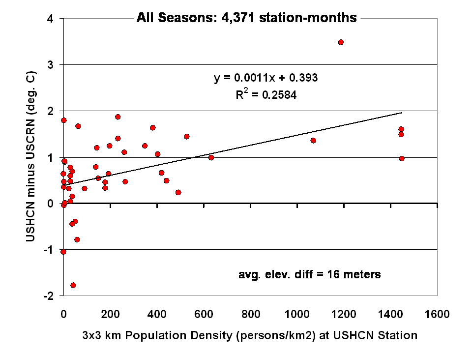
Dr Roy Spencer shows in this post the difference from USHCN to USCRN:
Spurious Warmth in NOAA’s USHCN from Comparison to USCRN
The results for all seasons combined shows that the USHCN stations are definitely warmer than their “platinum standard” counterparts:
 Spencer doesn’t get a match between USHCN and USCRN, so why does the NOAA/NCDC plotter page?
And our research indicates that USHCN as a whole runs warmer that the most pristine stations within it.
In research with our surfacestations metadata, we find that there is quite a separation between the most pristine stations (Class 1/2) and the NOAA final adjusted data for USHCN. This is examining 30 year data from 1979 to 2008 and also 1979 to present. We can’t really go back further because metadata on siting is almost non-existent. Of course, it all exists in the B44 forms and site drawings held in the vaults of NCDC but is not in electronic form, and getting access is about as easy as getting access to the sealed Vatican archives.
By all indications of what we know about siting, the Class 1/2 USHCN stations should be very close, trend wise, to USCRN stations, yet the ENTIRE USHCN dataset, including the hundreds of really bad stations, with poor siting and trends that don’t come close to the most pristine Class 1/2 stations are said to be matching USCRN. But from our own examination of all USHCN data and nearly all stations for siting, we know that is not true.
So, I suppose I should put out a caveat here. I wrote this above:
“What you see is the USCRN data record in its entirety, with no adjustments, no start and end date selections, and no truncation. The only thing that has been done to the monthly average data is gridding the USCRN stations, so that the plot is representative of the Contiguous United States.”
I don’t know that for a fact to be totally true, as I’m going on what has been said about the intents of NCDC in the way they treat and display the USCRN data. They have no code or methodology reference on their plotter web page, so I can’t say with 100% certainty that the output of that web page plotter is 100% adjustment free. The code is hidden in a web engine black box, and all we know are the requesting parameters. We also don’t know what their gridding process is. All I know is the stated intent that there will be no adjustments like we see in USHCN.
And some important information is missing that should be plainly listed. NCDC is doing an anomaly calculation on USCRN data, but as we know, there is only 9 years and 4 months of data. So, what period are they using for their baseline data to calculate the anomaly? Unlike other NOAA graphs like this one below, they don’t show the baseline period or baseline temperature on the graph Zeke plotted above.
This one is the entire COOP network, with all its warts, has the baseline info, and it shows a cooling trend as well, albeit greater than USCRN:

Source: http://www.ncdc.noaa.gov/cag/time-series/us
Every climate dataset out there that does anomaly calculations shows the baseline information, because without it, you really don’t know what your are looking at. I find it odd that in the graph Zeke got from NOAA, they don’t list this basic information, yet in another part of their website, shown above, they do.
Are they using the baseline from another dataset, such as USHCN, or the entire COOP network to calculate an anomaly for USCRN? It seems to me that would be a no-no if in fact they are doing that. For example, I’m pretty sure I’d get flamed here if I used the GISS baseline to show anomalies for USCRN.
So until we get a full disclosure as to what NCDC is actually doing, and we can see the process from start to finish, I can’t say with 100% certainty that their anomaly output is without any adjustments, all I can say with certainty is that I know that is their intent.
Given that there are some sloppy things on this new NCDC plotter page, like the misspelling of the word Contiguous. They spell it Continguous, in the plotted output graph title and in the actual data file they produce: USCRN_Avg_Temp_time-series (Excel Data file). Then there’s the missing baseline information on the anomaly calc, and the missing outputs of data files for the max and min temperature data sets (I had to manually extract them from the HTML as noted by asterisk above).
All of this makes me wonder if the NCDC plotter output is really true, and if in the process of doing gridding, and anomaly calcs, if the USCRN data is truly adjustment free. I read in the USCRN documentation that one of the goals was to use that data to “dial in” the adjustments for USHCN, at least that is how I interpret this:
The USCRN’s primary goal is to provide future long-term homogeneous temperature and precipitation observations that can be coupled to long-term historical observations for the detection and attribution of present and future climate change. Data from the USCRN is used in operational climate monitoring activities and for placing current climate anomalies into an historical perspective. http://www.ncdc.noaa.gov/crn/programoverview.html
So if that is true, and USCRN is being used to “dial in” the messy USHCN adjustments for the final data set, it would explain why USCHN and USCRN match so near perfectly for those 9+ years. I don’t believe it is a simple coincidence that two entirely dissimilar networks, one perfect, the other a heterogeneous train wreck requiring multiple adjustments would match perfectly, unless there was an effort to use the pristine USCRN to “calibrate” the messy USHCN.
Given what we’ve learned from Climategate, I’ll borrow words from Reagan and say: Trust, but verify
That’s not some conspiracy theory thinking like we see from “Steve Goddard”, but a simple need for the right to know, replicate and verify, otherwise known as science. Given his stated viewpoint about such things, I’m sure Mosher will back me up on getting full disclosure of method, code, and output engine for the USCRN anomaly data for the CONUS so that we can do that,and to also determine if USHCN adjustments are being “dialed in” to fit USCRN data.
# # #
UPDATE 2 (Second-party update okayed by Anthony): I believe the magnitude of the variations and their correlation (0.995) are hiding the differences. They can be seen by subtracting the USHCN data from the USCRN data:

Cheers
Bob Tisdale
Note that Steve Goddard has not provided a single quote or citation to back up his claims about what Zeke and Mosher “think”,
Why would he need to? They repeat it almost every day over here.
Look at the reaction to Steve’s ultra-simple raw temperature average comparisons to public. This just takes all the temperatures, averages them together, then compares to what’s being reported officially to find the adjustments. And guess what, the adjustments add warming to the trend. And guess what, they’ve been adding more and more warming over time.
No one trusts them to make these adjustments fairly. And after ClimateGate, no one should.
Are the adjustments plausible? Sure. But it is entirely possible to build a set of plausible arguments that will add cooling, or warming, or provide a reasonable doubt that OJ Simpson killed his wife. Science demands extreme suspicion when these adjustments align perfectly with the confirmation bias of those performing them.
Steven Mosher says: June 8, 2014 at 9:08 am
None of those links work, so this is dumb as well as petty.
Mosher IS NOT a scientist !!!
There’s no licensing for scientists. Anyone who applies the scientific method is performing science and is therefore being a scientist. Some are better at it than others. Many of those who are paid to do it are much worse than many volunteers (yes, despite the magic of peer review). Mosher’s often not the clearest thinker, but I don’t think you can call him “not a scientist.”
There was no formal peer review in Einstein’s era.
Peer-reviewed studies have found most peer-reviewed studies are wrong. At any rate, Einstein turned out to be wrong on any number of subjects. That’s why “science by burning of heretics” is such a petty and stupid waste of time. Science doesn’t care if you spent the last 50 years promoting the safety of tobacco, the efficacy of homeopathy, and the overall harm done by vaccines — a theory lives or dies by its predictions.
As near as I can tell, both Zeke and Mosh are scientists and intelligent, honest men.
—
Zeke Hausfather says:
June 7, 2014 at 10:16 pm
Its worth pointing out that the same site that plots USCRN data also contradicts Monckton’s frequent claims in posts here that USHCN and USCRN show different warming rates:
—
I believe the magnitude of the variations and their correlation (0.995) are hiding the differences. They can be seen by subtracting the USHCN data from the USCRN data:
Case in point. The workings of the universe don’t care how intelligent or honest you are; intelligence is merely a tool for concocting elaborate rationalizations and honesty doesn’t change your wrong assumptions or false prejudices.
On June 8, 2014 at 3:42 pm
(1) I wrote “. . . Yet, there is no way . . . that even 114 “pristine” . . . (e.g., USCRN) . . . temperature stations can reliably yield anything approaching the true mean US temperature” .
(2) Mr. Mosher wrote at June 8, 2014 at 6:16 pm: “Wrong”; and I responded by asking him what was wrong and why.
(3) Now I get home from work to find a lengthy response from Mr. Mosher (June 8, 2014 at 10:09 pm) and it’s clear that he has misrepresented my initial comment (1 – above) but also inserts me into a fictional dialog.. . . actually a farce in which ironically, he is Falstaff!
As much as I want to respond otherwise, Mr. Mosher is not worthy of a lengthy comment except to say:
(a) My reference to “true mean” was intended to reference the statistical quantity often described as the Greek symbol “mu” in statistics texts, which often is called the “true mean” or “population mean”. According to “frequentist statisticians” the true mean resides within the +/- P% confidence limits of the sample mean (obviously at some stated confidence level, P). I’m a Bayesian so I understand alternative interpretations. I NEVER said I wanted the “truth”!!
And so when I said “temperature stations can’t reliably yield (sic, predict) anything approaching the true mean US temperature. . . I’m saying that my opinion is that the true (full population) data mean likely falls well outside current USHCN and USCRN mean error bounds (say at 95 % confidence). Why do I say this; because all the data infilling, pair-wise comparison adjustment, multi-dimensional site homogenization corrections, and unsubstantiated TOBS corrections. . . any and all of these lead to bias, error, and worse. So to refute Mr Mosher’s false characterization of my thought, I’m tempted to. . . but refuse to descend to his level.
So what do I really think: (1) worldwide temperature measurement is a highly flawed endeavor that fails on many technical dimensions ; and (2) more pragmatically the transition, of a “weather station’s” original purpose to inform citizenry, farmers, and fisherman to new policy wonk’s agenda to aid political forces is an attempt to propel a progressive policy agenda.
And finally and simply….. Mr. Mosher. . . I like to explore alternative ideas, technical approaches, and engage is respectful conversation. . . so what exactly is your problem . . . !!!
Enough. . . enough (I failed my own admonition at the head) . . . but I’m whistling in the graveyard no doubt. .. this blog is likely dying. . . thanks for reading!
Again. . . too long. . . but I am kinda distraught.
It appears a new trend is developing in “science” to announce conclusions about the meaning of observed data but withhold the data itself to assure those conclusions will be shielded from any independent scrutiny.
Steven Mosher says:
June 8, 2014 at 10:09 pm
In your pool example you explained that by increasing the density of measurements by adding thermometers the average temperature will change less and less for every thermometer you add.
That is understandable to me, as the standard uncertainty of the average value is estimated as the standard deviation of all your measurements divided by the square root of the number of measurements. ( Ref. the open available ISO standard: Guide to the expression of Uncertainty in Measurements). I think that it will be much easier to explain the effect of increasing the number of measurements by just referring to this expression.
Further, I consider the average of a number of temperature measurements performed at a defined number of identified locations as a well defined measurand. I also think that a sufficiently low standard uncertainty for average temperature can be achieved with quite few locations.
Let us say that you have 1000 temperature measurement stations. which are read 2 times each day, 365 days each year. You will then have 730 000 samples each year.
If we for this example assume that 2 standard deviation for the 730 000 samples is 20 K.
(This means that 95 % of the samples are within a temperature range of 40 K.)
An estimate for the standard uncertainty for the average value of all samples will then be:
Standard uncertainty for the average value = Standard deviation for all measurements / (Square root of number of measurements)
20 K / (square root(730 000)) = 20 K / 854 = 0.02 K.
However, I would object that to “construct a field» does not seem similar to add thermometers to increase the density of measurements. When you construct a field I believe that you do not add any measurements, I also believe that you must perform interpolation between measurements, hence you cannot reduce the standard uncertainty of your average value. Rather, the uncertainty will increase by your operations. Also I think that you will risk loosing the traceability to your measurements by such operations.
Just wondering some of the charts show zero Celsius and zero Fahrenheit on same line am I reading it wrong
That’s quite a big intercept you have there. Looks like all your predicted anomalies are well above the reference range. Seems that the last ten years really have been the hottest on record.
Dougmanxx says:
June 9, 2014 at 6:26 am
Nice to see Mosher not doing a usual drive by.
“I know I’ll get some flak for this from the usual suspects, but it needs to be asked: What was the “average temperature” for each of these years? I would like to know, instead of some easily fiddled with “anomaly”, what was the actual average temperature? You see, I’m pretty sure it changes, as the “adjustments” change. ”
Fully agree.
In a weather forecast I think it is ok to estimate temperatures where temperatures has not been measured. It is ok for me to know what clothing I should bring when going to to a certain location.
In a temperature record it is not ok to fiddle with measurements.
I regard the average of measurements made at certain times at defined locations is a well defined measurand. Hence I do not expect different data set to produce the same average temperature, that is ok. But is anomaly well defined? If so, what is the definition of the measurand called anomaly?
While I welcome this establishment of a serious set of well thought out (apparently) stations that can be kept pristine, and well calibrated for many decades, I’m still highly suspicious of the whole notion.
First off, I have no mental image of what “gridding” means in this context.
Secondly, I’m quite unhappy with the whole usage of “anomalies”, although I think I have some notion as to why they think it is a good idea.
But here’s why I think it is a bad idea.
Suppose such a network has been established for long enough, to have established a baseline average Temperature for each station. As I understand anomalies, each station is measured against ONLY its own personal baseline average Temperature. Today’s reading, minus the local baseline mean, is THE anomaly. Please correct me if this is incorrect, because if so, then it is even worse than I thought.
But charging along; assuming, I have it about right, suppose our system enters some nice dull boring stable “climate” for some reason.
Presumably, the reported anomaly at each station, would tend towards zero, and also I would have a boring zero, everywhere in the network. So different stations perhaps widely separated, could both be reporting about the same zero anomalies.
I would have a stagnant anomalously flat map of my network, with little or no differences between any points.
This describes a system with no lateral energy flows between near or distant points, like we know for sure, actually occurs on this real planet.
Different station locations could have vastly different diurnal and seasonal temperature ranges, but all are equal, once anomolated.
The validity of this arrangement presumes that weather / climate changes are quite linear with anomaly, so that any location is as good as any other.
Well I don’t think that is true. Eliminating the lateral energy flows, that must happen, with a slope level anomolated map, just seems quite phony to me.
I would tend to believe that information would be more meaningful, and useful, if anomalies are eliminated, and each station reports only its accurate Temperature, that now are all properly calibrated to the same and universal standards of Temperature.
I don’t think computer Teramodels will ever track reality, so long as we persist with anomalies, instead of absolute Temperatures.
“Can anyone offer a refutation?”
Here you go –
http://www.drroyspencer.com/2013/06/still-epic-fail-73-climate-models-vs-measurements-running-5-year-means/
Models don’t just fail over 10 years. They fail over 30 years.
Cudos to Steven Mosher for recognizing that science is a search for the truth and that skepticism is what drives science forward. In my experience it’s much better to see where the data takes you rather than expecting a specific result. Sometimes it’s the result you didn’t expect that leads to the breakthrough. I’ve seen bang on correlations that lasted for years, only to disappear one day and never return. I saved a career once when I caught a mistake in a paper, a misplaced decimal point, which skewed the data. The poor author of the paper had to apologize about the delay and eventually finished the paper. Ok, I confess, it was my paper. That little dot gave me one big headache. Now that I’m long retired and at the ripe old age of 84, i look back at the skinny kid sending up balloons and plotting isobars and isotherms by hand for the USAF and wonder if it was all worth it.
My brother was right. I should have gone into dentistry.
I suspect the same cooling trend will be observed over most regions/continents. The anomalous warming seems to be taking place over the Arctic Ocean and surrounding land masses. I bet a plot of the total Earth´s surface temperature minus the sector from Lat 70 North to Lat 90 North yields a much stronger cooling trend than many suspect.
If I were a climatologist I would recommend gathering a lot more data in that warming Arctic sector, then try to understand in detail what´s happening, and model future regional trends. I have a little experience in the Far North, and it seems to me unmanned drones instrumented to gather information are an ideal solution. They could have drones fly different missions, some would fly close to the ice/ocean surface, others could fly higher to get better atmospheric pressure, temperature, humidity and other data….
You know, I´m starting to wonder, is it possible this is being done? it´s such a no brainer….
DHF says: June 9, 2014 at 3:20 pm
That is understandable to me, as the standard uncertainty of the average value is estimated as the standard deviation of all your measurements divided by the square root of the number of measurements. ( Ref. the open available ISO standard: Guide to the expression of Uncertainty in Measurements). I think that it will be much easier to explain the effect of increasing the number of measurements by just referring to this expression..
There are some issues here. Temperature is a strange thing to measure, especially when you pick min & max as data to average. Standard Deviation & Variance assumptions typically apply to replicated RANDOM samples, drawn from the SAME population of finite size in which the distribution takes the form of a normal curve. NONE of these assumptions are met by these samples. No replicates, no random sampling. Each site has its own population that does not necessarily equate to any other population. The population size for each day/site is unknown but can be characterized as having 1/number of observations probability of being outside the existing population, eg 100 year flood comes 1/100 probability each year. Weather equals black swan events (new records). Temperature regimes do not actually form normal distributions, but I suppose we can call them that if we squint.
At any rate, whether adding more replicated randomly distributed stations would decrease variability remains to be seen, since I doubt anyone has ever done it. Anything is possible – convince me. Let’s see the data first please !! Never mind the absurd temporal discontinuities (missing data), arbitrary adjustments, blah blah blah.
BioBob says:
June 10, 2014 at 1:36 am
“There are some issues here. Temperature is a strange thing to measure, especially when you pick min & max as data to average. Standard Deviation & Variance assumptions typically apply to replicated RANDOM samples, drawn from the SAME population of finite size in which the distribution takes the form of a normal curve.”
Are you sure about the constraints you put on the use of standard deviations?
This is what Wikipedia has to say about standard deviations:
“In statistics and probability theory, the standard deviation (SD) (represented by the Greek letter sigma, σ) measures the amount of variation or dispersion from the average.[1] A low standard deviation indicates that the data points tend to be very close to the mean (also called expected value); a high standard deviation indicates that the data points are spread out over a large range of values. The standard deviation of a random variable, statistical population, data set, or probability distribution is the square root of its variance.”
Not sure that min & max data are the ones that should be averaged. Even though that should work to, if you define the measurand to be min or max and measure the same thing at all locations.
Wow- OLS regression on an autocorrelated time series- what a remarkably sophisticated mathematical analysis! Let’s assume that this is an appropriate method to analyze the data (it’s not), and let’s assume for a second that the SEs have been calculated appropriately (they haven’t). Can you say anything useful about the trend? The regression coefficient is calculated as -0.6 +/- 0.68 F/decade so about -0.6+/- 6.8 per century. Taking 95% confidence intervals that’s about -0.6 +/- 13.3 per century. So I guess we’re going to roast! No wait- we’re going to freeze!
Thanks for the immensely informative (and incorrect) analysis. How bout you put some SEs on the intercept? It might show you that the last 10 years has been significantly hotter than the reference (point estimate 0.76 degrees hotter according to you). Guess this last decade’s been pretty hot historically then. And I think you need to learn how to draw 95% CI regions around lines of best fit (they’re meant to be curvy- not straight like in your graph). I’d suggest a package like R rather than Excel. Might make people take you a bit more seriously too.
Love and kisses
The Husky
REPLY: Then go do it, post it, defend it. Otherwise kindly refrain from your juvenile taunts from behind a fake persona for the sole purpose of denigration. – Anthony
In such graphs the deviations are so strong, that the mean and the slope of the straight line is not as certain as you think. Any correct data analysis has to show the standard deviations of the coefficients and the confidence interval for the correlation.
In doing this analysis You will see, that this time intervall is way to short to find any arguments against or pro climate change. All climatologists agree that climate is the mean of a very long weather observation. It should be at least 30 years long, not only 10 as in the graph is shown.
An other argument is that the United States are only a small part of the earth surface. Other areas of the globe are heating up much faster than the US. Have you ever read that a ship could go to the North Pole before 1980? Now it is possible, because the ice cap is melting every year more and is not regenerated in the winter to the former thickness and surface area. In Canada and northern parts of Russia the permafrost is melting. This is an integration of long time heat input, which is bigger than any cooling by other effects. The oceans are rising and they are getting sour. Ask the fishermen in Oregon and Washington about the development of their oysters. The small ones are not able to build their shells, because of the small pH-Value.
You should focus on such long term integrating effects, not on the weather to see if anything is happening. The weather gets more volatile and so it seem that heat waves, droughts and strong rainfall cancel out each other. Their is no smooth line without any deviation in weather observation. And you should widen your horizont to the whole earth to see if climate is changing.
There will be some regions which get colder, but others can get warmer. How can we calculate the appopriate mean value?
For long term observations only the radiation balance of the earth is important. If the earth gets constantly more energy from the sun, than it can radiate to the univers, the energy content of oceans, atmosphere and soil will raise. All this can influence each other and power the weather to have more and heavier storms and on the other hand more severe long lasting droughts and heat waves. Look for the NCA3_Full_Report_02_Our_Changing_Climate_LowRes.pdf
Turn_Down_the_heat_Why_a_4_degree_centrigrade_warmer_world_must_be_avoided.pdf
NCA3_Climate_Change_Impacts_in_the_United States_HighRes.pdf
But perhaps this 841 long report is to tedious for you to read.
Ask the insurance companies how the weather changed in the last 50 years. They have a long record of observations and can tell You about the increase of heavy storms worldwide, not only in the USA.
[snip – I’m sick and tired of this argument – take it elsewhere – Anthony]
[snip – I’m sick and tired of this argument – take it elsewhere – Anthony]
I see that Mosher’s background is going to be hidden, not a good idea as I do not like hidden information.
REPLY: You don’t like hidden information? Then put your “hidden” name to your own words like Mosher does. – Anthony
I’ll take my argument to the entire Internet.
REPLY: Go right ahead, but I won’t continue to have you disrupt threads here with this repetitive arguments of yours.
You don’t like Mosher, we get it. You don’t think Mosher is qualified to talk about climate science, we get it. We’ve “got it” for months from you. Time to end.
But, for all his faults, Mosher does one thing of integrity that you refuse to do: use your own name.
If you have something on topic, say it. Otherwise all future comments of yours on this argument will go directly to the bit bucket. I’m not going to tolerate your off-topic thread disruptions any more every time Mosher makes a comment. – Anthony
I’d recommend using an exponentially weighted moving average (EWMA) to spot the trends in this time series, and others similar to it. Details of how to construct one are found here:-
http://en.wikipedia.org/wiki/EWMA_chart
I’d use lambda = 1/12 = 0.08333, so you get approximately a 12 point moving average, giving the ‘yearly’ trend.
This gives far greater information than a simple linear regression over a set time period. Using a 12pt EWMA, you can see a cooling to Jan 2009, a stationary period until Feb 2010, a gentle rise/fall until June 2011, a sharp rise until July 2012, then a sharp fall until now. Overall the EWMA has fallen by 1.6 C from the start to the end of the time series.
I use this method as a primary diagnostic in checking trends in industrial process data, which can be even noiser that the weather. It’s very sensitive!
🙂
Mosher’s credentials (or lack there of) are fair game considering Willis is falsely claiming he is a scientist and I was responding to someone who claimed that Dr. Tol was not a scientist.
REPLY: your credential and lack thereof and lack of a name are also fair game.
But you don’t see me over at your place hollering about it constantly. You’ve worn out your welcome on this topic. Stop this thread disruption over your dislike of Mosher or take a hike, permanently – your choice. My house, and my choice to enforce this on you or any guest. – Anthony