 NOTE: significant updates have been made, see below.
After years of waiting, NOAA has finally made a monthly dataset on the U.S. Climate Reference Network available in a user friendly way via their recent web page upgrades. This data is from state-of-the-art ultra-reliable triple redundant weather stations placed on pristine environments. As a result, these temperature data need none of the adjustments that plague the older surface temperature networks, such as USHCN and GHCN, which have been heavily adjusted to attempt corrections for a wide variety of biases. Using NOAA’s own USCRN data, which eliminates all of the squabbles over the accuracy of and the adjustment of temperature data, we can get a clear plot of pristine surface data. It could be argued that a decade is too short and that the data is way too volatile for a reasonable trend analysis, but let’s see if the new state-of-the-art USCRN data shows warming.
A series of graphs from NOAA follow, plotting Average, Maximum, and Minimum surface temperature follow, along with trend analysis and original source data to allow interested parties to replicate it.
First, some background on this new temperature monitoring network, from the network home page:

The U.S. Climate Reference Network (USCRN)consists of 114 stations developed, deployed, managed, and maintained by the National Oceanic and Atmospheric Administration (NOAA) in the continental United States for the express purpose of detecting the national signal of climate change. The vision of the USCRN program is to maintain a sustainable high-quality climate observation network that 50 years from now can with the highest degree of confidence answer the question: How has the climate of the nation changed over the past 50 years? These stations were designed with climate science in mind.
Source: http://www.ncdc.noaa.gov/crn/
As you can see from the map below, the USCRN is well distributed, with good spatial resolution, providing an excellent representivity of the CONUS, Alaska, and Hawaii.

From the Site Description page of the USCRN:
==========================================================
Every USCRN observing site is equipped with a standard set of sensors, a data logger and a satellite communications transmitter, and at least one weighing rain gauge encircled by a wind shield. Off-the-shelf commercial equipment and sensors are selected based on performance, durability, and cost.
Highly accurate measurements and reliable reporting are critical. Deployment includes calibrating the installed sensors and maintenance will include routine replacement of aging sensors. The performance of the network is monitored on a daily basis and problems are addressed as quickly as possible, usually within days.
…
Many criteria are considered when selecting a location and establishing a USCRN site:
- Regional and spatial representation: Major nodes of regional climate variability are captured while taking into account large-scale regional topographic factors.
- Sensitivity to the measurement of climate variability and trends: Locations should be representative of the climate of the region, and not heavily influenced by unique local topographic features and mesoscale or microscale factors.
- Long term site stability: Consideration is given to whether the area surrounding the site is likely to experience major change within 50 to 100 years. The risk of man made encroachments over time and the chance the site will close due to the sale of the land or other factors are evaluated. Federal, state, and local government land and granted or deeded land with use restrictions (such as that found at colleges) often provide a high stability factor. Population growth patterns are also considered.
- Naturally occurring risks and variability:
- Flood plains and locations in the vicinity of orographically induced winds like the Santa Ana and the Chinook are avoided.
- Locations with above average tornado frequency or having persistent periods of extreme snow depths are avoided.
- Enclosed locations that may trap air and create unusually high incidents of fog or cold air drainage are avoided.
- Complex meteorological zones, such as those adjacent to an ocean or to other large bodies of water are avoided.
- Proximity:
- Locations near existing or former observing sites with long records of daily precipitation and maximum and minimum temperature are desirable.
- Locations near similar observing systems operated and maintained by personnel with an understanding of the purpose of climate observing systems are desirable.
- Endangered species habitats and sensitive historical locations are avoided.
- A nearby source of power is required. AC power is desirable, but, in some cases, solar panels may be an alternative.
- Access: Relatively easy year round access by vehicle for installation and periodic maintenance is desirable.
Source: http://www.ncdc.noaa.gov/crn/sitedescription.html
==========================================================
As you can see, every issue and contingency has been thought out and dealt with. Essentially, the U.S. Climate Reference Network is the best climate monitoring network in the world, and without peer. Besides being in pristine environments away from man-made influences such as urbanization and resultant UHI issues, it is also routinely calibrated and maintained, something that cannot be said for the U.S. Historical Climate Network (USHCN), which is a mishmash of varying equipment (alcohol thermometers in wooden boxes, electronic thermometers on posts, airport ASOS stations placed for aviation), compromised locations, and a near complete lack of regular thermometer testing and calibration.
Having established its equipment homogenity, state of the art triple redundant instrumentation, lack of environmental bias, long term accuracy, calibration, and lack of need for any adjustments, let us examine the data produced for the last decade by the U.S. Climate Reference Network.
First, from NOAA’s own plotter at the National Climatic Data Center in Asheville, NC, this plot they make available to the public showing average temperature for the Contiguous United States by month:

Source: NCDC National Temperature Index time series plotter
To eliminate any claims of “cherry picking” the time period, I selected the range to be from 2004 through 2014, and as you can see, no data exists prior to January 2005. NOAA/NCDC does not make any data from the USCRN available prior to 2005, because there were not enough stations in place yet to be representative of the Contiguous United States. What you see is the USCRN data record in its entirety, with no adjustments, no start and end date selections, and no truncation. The only thing that has been done to the monthly average data is gridding the USCRN stations, so that the plot is representative of the Contiguous United States.
Helpfully, the data for that plot is also made available on the same web page. Here is a comma separated value (CSV) Excel workbook file for that plot above from NOAA:
USCRN_Avg_Temp_time-series (Excel Data File)
Because NOAA/NCDC offers no trend line generation in their user interface, from that NOAA provided data file, I have plotted the data, and provided a linear trend line using a least-squares curve fitting procedure which is a function in the DPlot program that I use.
Not only is there a pause in the posited temperature rise from man-made global warming, but a clearly evident slight cooling trend in the U.S. Average Temperature over nearly the last decade:

We’ve had a couple of heat waves and we’ve had some cool spells too. In other words, weather.
The NCDC National Temperature Index time series plotter also makes maximum and minimum temperature data plots available. I have downloaded their plots and data, supplemented with my own plots to show the trend line. Read on.
NOAA/NCDC plot of maximum temperature:
 Source of the plot here.
Data from the plot: USCRN_Max_Temp_time-series (Excel Data File)*
My plot with trend line:

As seen by the trend line, there is a slight cooling in maximum temperatures in the Contiguous United States, suggesting that heat wave events (seen in 2006 and 2012) were isolated weather incidents, and not part of the near decadal trend.
NOAA/NCDC plot of minimum temperature:

Source of the plot here.
USCRN_Min_Temp_time-series (Excel Data File)*
The cold winter of 2013 and 2014 is clearly evident in the plot above, with Feb 2013 being -3.04°F nationally.
My plot with trend line:

*I should note that NOAA/NCDC’s links to XML, CSV, and JSON files on their plotter page only provide the average temperature data set, and not the maximum and minimum temperature data sets, which may be a web page bug. However, the correct data appears in the HTML table on display below the plot, and I imported that into Excel and saved it as a data file in workbook format.
The trend line illustrates a cooling trend in the minimum temperatures across the Contiguous United States for nearly a decade. There is some endpoint sensitivity in the plots going on, which is to be expected and can’t be helped, but the fact that all three temperature sets, average, max, and min show a cooling trend is notable.
It is clear there has been no rise in U.S. surface air temperature in the past decade. In fact, a slight cooling is demonstrated, though given the short time frame for the dataset, about all we can do is note it, and watch it to see if it persists.
Likewise, there does not seem to have been any statistically significant warming in the contiguous U.S. since start of the new USCRN data, using the average, maximum or minimum temperature data.
I asked three people who are well versed in data plotting and analysis to review this post before I published it, one, Willis Eschenbach, added his own graph as part of the review feedback, a trend analysis with error bars, shown below.

While we can’t say there has been a statistically significant cooling trend, even though the slope of the trend is downward, we also can’t say there’s been a statistically significant warming trend either.
What we can say, is that this is just one more dataset that indicates a pause in the posited rise of temperature in the Contiguous United States for nearly a decade, as measured by the best surface temperature monitoring network in the world. It is unfortunate that we don’t have similar systems distributed worldwide.
UPDATE:
Something has been puzzling me and I don’t have a good answer for the reason behind it, yet.
As Zeke pointed out in comments and also over at Lucia’s, USCRN and USHCN data align nearly perfectly, as seen in this graph. That seems almost too perfect to me. Networks with such huge differences in inhomogeneity, equipment, siting, station continuity, etc. rarely match that well.
![Screen-Shot-2014-06-05-at-1.25.23-PM[1]](https://wattsupwiththat.files.wordpress.com/2014/06/screen-shot-2014-06-05-at-1-25-23-pm1.png?quality=75)
Note that there is an important disclosure missing from that NOAA graph, read on.
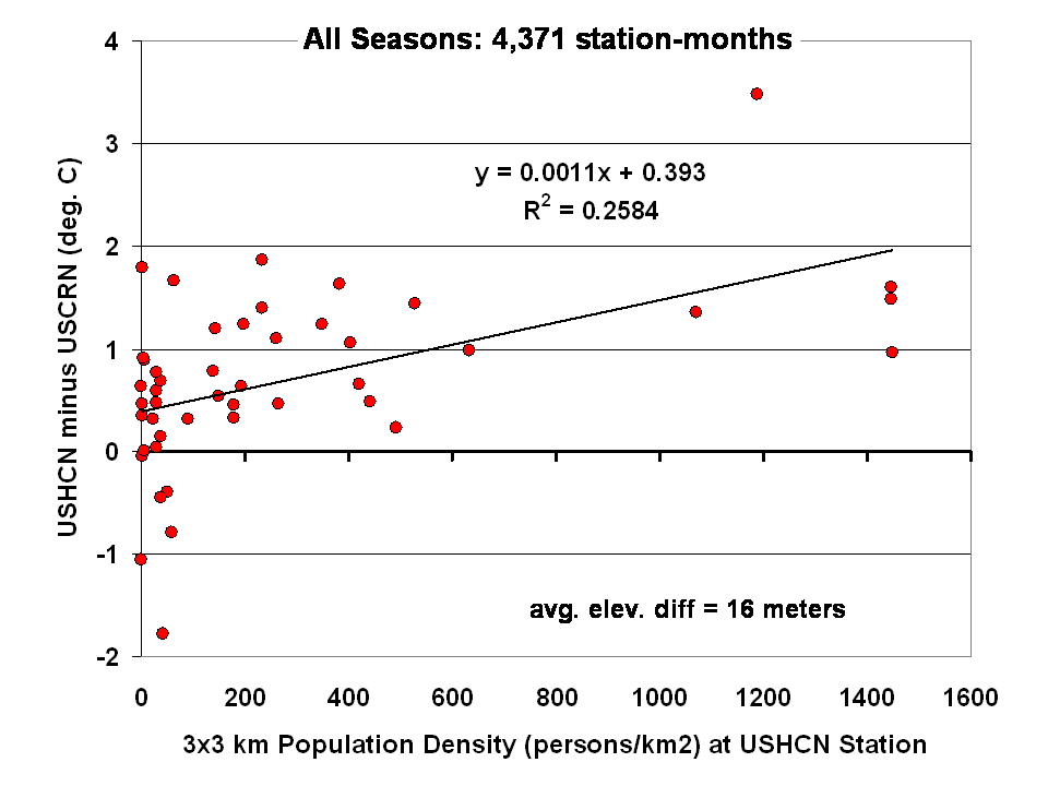
Dr Roy Spencer shows in this post the difference from USHCN to USCRN:
Spurious Warmth in NOAA’s USHCN from Comparison to USCRN
The results for all seasons combined shows that the USHCN stations are definitely warmer than their “platinum standard” counterparts:
 Spencer doesn’t get a match between USHCN and USCRN, so why does the NOAA/NCDC plotter page?
And our research indicates that USHCN as a whole runs warmer that the most pristine stations within it.
In research with our surfacestations metadata, we find that there is quite a separation between the most pristine stations (Class 1/2) and the NOAA final adjusted data for USHCN. This is examining 30 year data from 1979 to 2008 and also 1979 to present. We can’t really go back further because metadata on siting is almost non-existent. Of course, it all exists in the B44 forms and site drawings held in the vaults of NCDC but is not in electronic form, and getting access is about as easy as getting access to the sealed Vatican archives.
By all indications of what we know about siting, the Class 1/2 USHCN stations should be very close, trend wise, to USCRN stations, yet the ENTIRE USHCN dataset, including the hundreds of really bad stations, with poor siting and trends that don’t come close to the most pristine Class 1/2 stations are said to be matching USCRN. But from our own examination of all USHCN data and nearly all stations for siting, we know that is not true.
So, I suppose I should put out a caveat here. I wrote this above:
“What you see is the USCRN data record in its entirety, with no adjustments, no start and end date selections, and no truncation. The only thing that has been done to the monthly average data is gridding the USCRN stations, so that the plot is representative of the Contiguous United States.”
I don’t know that for a fact to be totally true, as I’m going on what has been said about the intents of NCDC in the way they treat and display the USCRN data. They have no code or methodology reference on their plotter web page, so I can’t say with 100% certainty that the output of that web page plotter is 100% adjustment free. The code is hidden in a web engine black box, and all we know are the requesting parameters. We also don’t know what their gridding process is. All I know is the stated intent that there will be no adjustments like we see in USHCN.
And some important information is missing that should be plainly listed. NCDC is doing an anomaly calculation on USCRN data, but as we know, there is only 9 years and 4 months of data. So, what period are they using for their baseline data to calculate the anomaly? Unlike other NOAA graphs like this one below, they don’t show the baseline period or baseline temperature on the graph Zeke plotted above.
This one is the entire COOP network, with all its warts, has the baseline info, and it shows a cooling trend as well, albeit greater than USCRN:

Source: http://www.ncdc.noaa.gov/cag/time-series/us
Every climate dataset out there that does anomaly calculations shows the baseline information, because without it, you really don’t know what your are looking at. I find it odd that in the graph Zeke got from NOAA, they don’t list this basic information, yet in another part of their website, shown above, they do.
Are they using the baseline from another dataset, such as USHCN, or the entire COOP network to calculate an anomaly for USCRN? It seems to me that would be a no-no if in fact they are doing that. For example, I’m pretty sure I’d get flamed here if I used the GISS baseline to show anomalies for USCRN.
So until we get a full disclosure as to what NCDC is actually doing, and we can see the process from start to finish, I can’t say with 100% certainty that their anomaly output is without any adjustments, all I can say with certainty is that I know that is their intent.
Given that there are some sloppy things on this new NCDC plotter page, like the misspelling of the word Contiguous. They spell it Continguous, in the plotted output graph title and in the actual data file they produce: USCRN_Avg_Temp_time-series (Excel Data file). Then there’s the missing baseline information on the anomaly calc, and the missing outputs of data files for the max and min temperature data sets (I had to manually extract them from the HTML as noted by asterisk above).
All of this makes me wonder if the NCDC plotter output is really true, and if in the process of doing gridding, and anomaly calcs, if the USCRN data is truly adjustment free. I read in the USCRN documentation that one of the goals was to use that data to “dial in” the adjustments for USHCN, at least that is how I interpret this:
The USCRN’s primary goal is to provide future long-term homogeneous temperature and precipitation observations that can be coupled to long-term historical observations for the detection and attribution of present and future climate change. Data from the USCRN is used in operational climate monitoring activities and for placing current climate anomalies into an historical perspective. http://www.ncdc.noaa.gov/crn/programoverview.html
So if that is true, and USCRN is being used to “dial in” the messy USHCN adjustments for the final data set, it would explain why USCHN and USCRN match so near perfectly for those 9+ years. I don’t believe it is a simple coincidence that two entirely dissimilar networks, one perfect, the other a heterogeneous train wreck requiring multiple adjustments would match perfectly, unless there was an effort to use the pristine USCRN to “calibrate” the messy USHCN.
Given what we’ve learned from Climategate, I’ll borrow words from Reagan and say: Trust, but verify
That’s not some conspiracy theory thinking like we see from “Steve Goddard”, but a simple need for the right to know, replicate and verify, otherwise known as science. Given his stated viewpoint about such things, I’m sure Mosher will back me up on getting full disclosure of method, code, and output engine for the USCRN anomaly data for the CONUS so that we can do that,and to also determine if USHCN adjustments are being “dialed in” to fit USCRN data.
# # #
UPDATE 2 (Second-party update okayed by Anthony): I believe the magnitude of the variations and their correlation (0.995) are hiding the differences. They can be seen by subtracting the USHCN data from the USCRN data:

Cheers
Bob Tisdale
Greg Goodman says: June 8, 2014 at 7:01 pm
Thanks Greg for your explanation and I do understand anomalies and the supposed logic; but the USCRN network temperatures (over some time period) are (will be) used to calculate a baseline average temperature which is/will be then used to compute anomalies (whether monthly or yearly).
So where does the complementary clean USCRN-like data come from to confirm the “anomaly” assumption, or compute elevation effects, UHI effects, homogenization methods etc. such that these 114 pristine stations (and their anomalies) can be confirmed as truly representative of the US? What am I missing?
Thanks
Dan
Using the manufactured ‘data’ from before 1979 is meaningless. There is essentially no coverage of the 70% of the planet that is oceans (occasional readings by passing ships in shipping lanes), almost nothing in the southern hemisphere land areas other than Australia, and we know the US sites are mostly corrupted by local effects. Those of other countries are unlikely to be any better.
That leaves 35 years of satellite data starting in the 1970s, a decade so cold there was concern about a global re-glaciation. I am certainly glad that it warmed up a bit since then, but the warming stopped about halfway through that era.
There’s no direct evidence that the warming from 1979 to 1998 was caused by CO2. Such warming would mainly affect low temperatures, but looking at the USCRN plots we see that the low temperatures are actually decreasing faster than the highs. There’s something else going on and it’s not from CO2.
“GRACE” are two satellites that detect mass changes by measuring the pull of Earth gravity and how it changes over time. It can measure ice build up and ice mass declines.
Yellow represents mountain glaciers and ice caps
Blue represents areas losing ice mass
Red represents areas gaining ice mass
Can anyone explain how global ice mass is declining while global temperatures are presumably steady over 17 years?
dan
first you have to understand that there is no such thing as a “true mean” for us air temperatures. although when we talk about it it loosely and casually we refer to it as a “mean”.
Instead when you look at the math and methods you see that what people are doing is the following.
they are creating a prediction of what the temperature is at un observed locations.
Let me explain with a simple example using a swimming pool. suppose I have a swimming pool and I put one thermometer at the shallow end. it reads 76.
I now assert that the average temp of the entire pool is 76. What does this mean? It means that Given the information I have 76 is the best estimate for the temperature at those locations where I didnt measure the temperature. it means if you say 77, that my estimate will beat your estimate.
We can test this by then going to measure arbitary locations. as many as you like.
Now suppose i have two thermometers. One at the shallow end and one at the deep end. Shallow reads 76 and deep reads 74. I average them and I say the average temp is 75. Whats this mean? it doesnt mean that the average temp of every molecule is 75. it means that 75 is the best estimate ( minimizes the error) for the temperature at un observed locations. if you guess 76, my estimate will beat yours.
Again we can test this by going out and making observations at other places in the pool. my 75 estimate will beat yours. why? because I use the available data I have to make the estimate.
Then we start to get smarter about making this estimate. We take into account the physics of the pool and how temperature changes across the surface… we increase the density of measurements.. As we do we notice something.. we notice that as we add thermometers the answer changes less and less.
So we report this ‘average’ 74.3777890. Wow, all that precision.. whats it mean? are we measuring that well? nope. What it means is that we will minimize the error when we assert that 74.3777890 is the
‘average’ That is, when we go out and observe more. 74.3777890 will have a smaller error than 74.4
With the air temps we can do something similar. Starting with CRN we can construct a field. The field
is expressed as a series of equations that express temperature as a function of latitude, altitude, and season. this is the climate in a geophysical sense. This field is then subtracted from observations
to give a residual. the weather at the same time we estimate the seasonality as a function of space and time
So, temp = C + W + S
where C = climate, W = weather S=Seasonality
C is deterministic ( a strict function of unchanging physical parameters) and S is as well.
W is random. We then krigg W
The end product is a set of equations that predict the temperature at any x,y,z,t. This estimate is the best linear unbiased estimate of the temperature at arbitarily choosen x,y,z,t.
So, we can build these fields using 10 stations, or 50 or 114 or 20000. If you have good latitude representation and good altitude representation the estimate at say 114 stations wont change much
if you add 500 more stations.. or 1000 more.. or 10000 more or 20000 more. Of course the devil is in the details of how much it changes. But all the data is there for folks who are interested to build an average with 10 stations, 20, 30, 40, etc and watch how the answer changes as a function of N. You’d be shocked.
You can also work the problem the other way. Start by doing the estimate with 20K stations, then decimate the stations. start with 20K and drop 1000, 2000, etc.
First time I did this i was really floored.
Now Siberia is a horse of a different color. But in the US a 100 or so stations will give you a very good estimate .. maybe 300 or so if you want really tight trend estimations..Again, just download all the data create averages and then decimate the stations and plot the change in parameter versus N.
A long time ago nick stokes and other guys did the whole world with 60 stations. Thats the theoretical
minimum for optimally placed stations. Of course a lot of this depends on your method.
So what do you gain by doing more stations. you gain spatial resolution. At the lowest resolution
( the whole country) 100 or so well placed stations will give you an excellent estimate.. if you want to estimate trends.. hmm last time I looked at it you needed more to get your trend errors down to smallish numbers.
First off then. The first mistake people make is assuming that the concept ‘true mean temperature’ has an ordinary meaning. While people USE averaging to create the metric the metric is not really an ‘average’ temperature. ( see arguments about intensive variables to understand) The better thing to call it is the US air temperature Index. Why is this index important ( think about CPI ) does it really represent the average temp of every molecule. Nope. its the best prediction, the prediction that minimizes error.
So when somebody says the Average temp for texas is 18C what they really mean is this.
Pick any day you like, pick any place you like in texas. Guess something different than 18.
The estimate of 18C will beat your guess. You can do this estimate with one station, 2 4, 17, 34
1000.. you’ll see how the estimate changes as a function of N. Thats a good excercise.
Hmm you see the same thing with canada. CRU has something like 200 stations. Env canada like 7000.
for the pan canada average.. 7000 stations wont change the answer much. it just gives you better resolution.
so.. the wrong part of your thinking is thinking that there is a thing called the true average. Doesnt exist.
all there are are estimates. you can make the estimate with one thermometer ( big error) 2 thermometers, 6, 114, 20000. as you increase N you can chart the change in the metric. the average will go like 18.5, 18.3, 18. 25, 18.21, 18.215, 18.213, 18.213, 18,2133, etc etc. and you see “hey, adding more stations doesnt change the answer” And you can do the same thing with trends.
What this forces you to do is to make a decision. How much accuracy do I need? Well depends what you
want to do.
Steve: I used 100 stations and the average for conus was 62.5. i used 1000 and it was 62.48. I used
10000 and it was 62.45. and 20000 stations was 62.46.
Dan; whats the true average?
Steve: No such thing, averages are not physical things.
Dan: well 100 is too few it could be wrong.
Steve; 100 is wrong, 1000 is wrong, 20000000 is wrong. There is no special number that will give you the “true” average because that thing doesnt exist. we just have degrees of wrongness. What do you want to do with the estimate? plant crops? choose wearing apparell? tell me what you want to do and we can figure out how accurate your estimate needs to be? how much wrongness can you tolerate?
Dan; I want the truth.. the true temperature average.
Steve: i want unicorns. Not happening. you will get the best estimate given the data. That will always have error regardless of what you do. There is no true, there is only less wrong. The question is how much error is important to YOU given your practical purpose. Hint the hunt for “true averages’ is an illusion. stop doing that. what is your purpose?
Dan. I want the truth
Steve. Ok, the truth is “mean’ and “averages” dont exist. They are mathematical entities created when we perform operations on data. I stick a thermometer in your butt and it reads 98.4. I say your bodies average temperature is normal. I do it 4 more times its always 98.4, I average them.There is no thing I can point to in the world called your average temperature. What exists are 4 pieces of data. I perform math on them. I create a non physical thing called an average. This mathematical entity has a purpose. I use it to tell whether you are sick or not. But in reality there is no “average” . averaging is a tool. it is not true or false, it is a tool. A tool is useful or not useful. Period. So tell me what you want to do and we can figure out how much error you can tolerate. cause there is no truth, there is an estimate and an error term.
katatetorihanzo says:
June 8, 2014 at 6:45 pm
Are you saying Ben Santer is wrong about his “17 years” is the minimum to be significant? Are you saying that the steep warming trend between the late 1970s and late 1990s is also too short to take seriously?
If you use http://www.woodfortrees.org/ you may find the same data (unlikely with GISS’ previous release, but some sources don’t change backfilled data every month). Also, you can post a link that we can see the graph or build on it.
I agree – 15 years is half the PDO or AMO’s period. If you want to suppress those oscillations, you should use 30 years (one cycle) or multiple cycles. However, then you can’t say anything about the effect of an increase in CO2 emissions over a shorter term.
I look at some of these exercises as play. Santer said 17 years, well, by golly, we have trends longer than 17 years now! You say 30 years is barely long enough, so then shorter term warming should be smeared into an adjacent term of stagnant temperatures. Some people want to see how ENSO behaves, time scales of months have to be used to resolve some of those fluctuations.
It’s all deliciously complex. Thanks for standing in for Ben Santer, he never comes over here. We wish he would.
Oh, and back when people were exclaming “last year was the hottest on record,” where were you in 1998 to remind people that there was a big El Niño in play? Perhaps you can let people know each year how the previous 30 years compared to the 30 years before that, or maybe just the 30 years ending one year before.
My post is intended to suggest that there is no pause in the mean surface air temperature for the temperature contribution due to greenhouse gas emissions.
I think the 30-year rule-of-thumb for discerning climate trends is based on the expectation that short-term stochastic natural variations would largely cancel out and revealing the trend governed by deterministic forcings controlling climate. This attached video suggests persuasively that the natural variations during the 1980-2013 timeframe is largely known and should be separated out;
Some of that natural variation in the last 17 years that had a cooling effect include three La Nina periods that were not completely offset by the El Nino’s. While this short-term effect may give the impression of a ‘hiatus’, no such ‘hiatus’ is observed in other direct and indirect measures of global heat content including oceans, satellite, and reduced ice mass. https://www.youtube.com/watch?feature=player_detailpage&v=-wbzK4v7GsM
Can anyone offer a refutation?
“Steven Mosher says:
June 8, 2014 at 10:09 pm
Now suppose i have two thermometers. One at the shallow end and one at the deep end. Shallow reads 76 and deep reads 74. I average them and I say the average temp is 75.”
Or to use another analogy, if I put my feet in a fridge at 0c and my head in an over at 200c, my average body temperature is 100c. Got it!
Steven Mosher says:
June 8, 2014 at 10:09 pm
*****************************************************************************************************
Thank you for your considered and detailed responses this evening. Pleasure to read your thinking.
@ur momisugly Steven Mosher says: June 8, 2014 at 10:09 pm
—————————-
Not really. Science ALREADY has methods for performing the operations you mangle in your comment. These methods are called RANDOM SAMPLING WITH ADEQUATE REPLICATES REQUIRED TO ESTIMATE VARIANCE. Until temperature data is collected in this manner, all you are doing is generated anecdotal data for which the degree of uncertainty is ultimately unknown. PERIOD.
3 automated & consistent samples from calibrated equipment in the same non-random grab sample is possibly better than one sample from uncalibrated equipment collected whenever. But not all that much better and how would you know ? Converting the data to delta anomaly does NOT improve the certainty or variance of the original data. There are serious issues in employing such data in stats typically used and the purported degree of precision typically employed is absurd. “Gridding” the data corrupts your supposed improvement of comparability employing delta anomaly.
Shame that your analysis is totally flawed http://tamino.wordpress.com/2014/06/09/a-very-informative-post-but-not-the-way-they-think-it-is/ but then that’s par for the course I suppose
scarletmacaw says: “… the low temperatures are actually decreasing faster than the highs. There’s something else going on and it’s not from CO2.”
Indeed, it has often been noted that the warming period was predominantly a warming of Tmin, it seems the opposite is starting to manifest. CO2 still rising around 2ppm/annum.
Steven Mosher says:
June 8, 2014 at 10:09 pm
Very nicely, thoroughly and patiently explained. I think I’ll mark that for future reference.
Could you explain on a similar level how the uncertainty of each CONUS “mean temp” relates to the individual measurement uncertainty?
For example, one day’s noon temperature from each station creating a CONUS mean noon temp for that day. Thanks.
Uh oh….somebody is in ‘denial’.
Somebody who’s trade name begins with T and ends with O.
The tone is shrill verging on hysterical…
I quote
“And that, ladies and gentlemen, is the truly informative aspect of Watts’ post. His analysis is useless but he still touts is as a clear demonstration of “… ‘the pause’ in the U.S. surface temperature record over nearly a decade.” I’d say it is very informative indeed — not about climate (!) but about about Anthony Watts’ blog — that he (and most of his readers to boot) regards a useless trend estimate as actual evidence of “the pause” they dream of so much.”
That ladies and gentlemen is the sound of cognitive dissonance!
Anthony,
Is it feasible to extract suspect sites sequentially from the U.S. Historical Climate Network (USHCN) dataset and see if the statisticians can create a result which correlates closely with this new U.S. Climate Reference Network (USCRN) data which seems to be gold standard stuff from a technical standpoint.
If a methodology could be developed to bridge this gap, it might then be feasible to extrapolate backwards for some years to cover an Ocean cycle or two, and give us all something to get our teeth into which hangs together logically.
Steven Mosher says:
June 8, 2014 at 10:09 pm
That was clear, detailed and useful. I would nominate you for Sainthood if you could get even 10% of mainstream media talking heads to understand that.
I have already used this to good effect. Gave the cdcn.noaa.gov URL to my climatenaut relative, but she said it was probably fake. So I told her it did show an approximately .4 degree F change over a decade, and she perked right up. After she lectured to me me that .4 degree per decade was significant warming and had to be taken seriously, I mentioned that I said “change” not “increase”, and that it was in fact a decrease. She was briefly flustered, and then started lecturing to me about how .4 degrees per decade is statisically insignificant!
Nice to see Mosher not doing a usual drive by.
I know I’ll get some flak for this from the usual suspects, but it needs to be asked: What was the “average temperature” for each of these years? I would like to know, instead of some easily fiddled with “anomaly”, what was the actual average temperature? You see, I’m pretty sure it changes, as the “adjustments” change. This way, I can keep track of what it was now. And compare that with what is claimed 20 years form now. So… 20 years from now I can go: “Oh look. That ‘average temperature’ in 2014 was actually wrong, because it’s now 3 degrees cooler than when it was measured. Global Warming really is a terrible thing!” So. Anyone want to answer my question? What were the average temperatures for each of these years?
“Spencer doesn’t get a match between USHCN and USCRN, so why does the NOAA/NCDC plotter page?”
They are somewhat different situations. Spencer is calculating the absolute difference between stations (in pairs) that he considers close (30 km and not more than 100 m altitude). NCDC is showing the difference between anomalies..
Bob, your difference graph looks odd. It appears that there was random difference prior to 2012. The change after does not look random to me and has a positive lean at the “knee”. I wonder why.
Mosher: “you see the same thing with canada. CRU has something like 200 stations. Env canada like 7000.”
About 1100 with current data. And for the most part, Canada is cooling.
Ooops. The reference for “Canada is cooling”.
http://sunshinehours.wordpress.com/2014/02/16/canada-is-cooling-at-0-13c-per-decade-since-1998/
And of those 1100, Environment Canada calculates anomalies for 224 of them.
I was wondering. Is there a USHCN simulator? You know, randomly remove 10-15% of all monthly records (and over 50% in some states for some years) and see what trends you get?
I wish there was a 5 minute edit option.
Anyway, after removing the random 10-50% of the monthly data, use the exact algorithm USHCN uses for estimating all the data and see what happens. I bet it would be interesting. And it would show a warming a trend where there isn’t one.
***
Steven Mosher says:
June 8, 2014 at 10:09 pm
But in the US a 100 or so stations will give you a very good estimate .. maybe 300 or so if you want really tight trend estimations..Again, just download all the data create averages and then decimate the stations and plot the change in parameter versus N.
***
OK. How does BEST’s results for the US since 2005 compare with the above USCRN results since 2005?
Is that Gaia’s heart beat? 🙂
That’s not some conspiracy theory thinking like we see from “Steve Goddard”
If GM is a conspiracy to sell cars, climate science is a conspiracy to sell global warming.