 NOTE: significant updates have been made, see below.
After years of waiting, NOAA has finally made a monthly dataset on the U.S. Climate Reference Network available in a user friendly way via their recent web page upgrades. This data is from state-of-the-art ultra-reliable triple redundant weather stations placed on pristine environments. As a result, these temperature data need none of the adjustments that plague the older surface temperature networks, such as USHCN and GHCN, which have been heavily adjusted to attempt corrections for a wide variety of biases. Using NOAA’s own USCRN data, which eliminates all of the squabbles over the accuracy of and the adjustment of temperature data, we can get a clear plot of pristine surface data. It could be argued that a decade is too short and that the data is way too volatile for a reasonable trend analysis, but let’s see if the new state-of-the-art USCRN data shows warming.
A series of graphs from NOAA follow, plotting Average, Maximum, and Minimum surface temperature follow, along with trend analysis and original source data to allow interested parties to replicate it.
First, some background on this new temperature monitoring network, from the network home page:

The U.S. Climate Reference Network (USCRN)consists of 114 stations developed, deployed, managed, and maintained by the National Oceanic and Atmospheric Administration (NOAA) in the continental United States for the express purpose of detecting the national signal of climate change. The vision of the USCRN program is to maintain a sustainable high-quality climate observation network that 50 years from now can with the highest degree of confidence answer the question: How has the climate of the nation changed over the past 50 years? These stations were designed with climate science in mind.
Source: http://www.ncdc.noaa.gov/crn/
As you can see from the map below, the USCRN is well distributed, with good spatial resolution, providing an excellent representivity of the CONUS, Alaska, and Hawaii.

From the Site Description page of the USCRN:
==========================================================
Every USCRN observing site is equipped with a standard set of sensors, a data logger and a satellite communications transmitter, and at least one weighing rain gauge encircled by a wind shield. Off-the-shelf commercial equipment and sensors are selected based on performance, durability, and cost.
Highly accurate measurements and reliable reporting are critical. Deployment includes calibrating the installed sensors and maintenance will include routine replacement of aging sensors. The performance of the network is monitored on a daily basis and problems are addressed as quickly as possible, usually within days.
…
Many criteria are considered when selecting a location and establishing a USCRN site:
- Regional and spatial representation: Major nodes of regional climate variability are captured while taking into account large-scale regional topographic factors.
- Sensitivity to the measurement of climate variability and trends: Locations should be representative of the climate of the region, and not heavily influenced by unique local topographic features and mesoscale or microscale factors.
- Long term site stability: Consideration is given to whether the area surrounding the site is likely to experience major change within 50 to 100 years. The risk of man made encroachments over time and the chance the site will close due to the sale of the land or other factors are evaluated. Federal, state, and local government land and granted or deeded land with use restrictions (such as that found at colleges) often provide a high stability factor. Population growth patterns are also considered.
- Naturally occurring risks and variability:
- Flood plains and locations in the vicinity of orographically induced winds like the Santa Ana and the Chinook are avoided.
- Locations with above average tornado frequency or having persistent periods of extreme snow depths are avoided.
- Enclosed locations that may trap air and create unusually high incidents of fog or cold air drainage are avoided.
- Complex meteorological zones, such as those adjacent to an ocean or to other large bodies of water are avoided.
- Proximity:
- Locations near existing or former observing sites with long records of daily precipitation and maximum and minimum temperature are desirable.
- Locations near similar observing systems operated and maintained by personnel with an understanding of the purpose of climate observing systems are desirable.
- Endangered species habitats and sensitive historical locations are avoided.
- A nearby source of power is required. AC power is desirable, but, in some cases, solar panels may be an alternative.
- Access: Relatively easy year round access by vehicle for installation and periodic maintenance is desirable.
Source: http://www.ncdc.noaa.gov/crn/sitedescription.html
==========================================================
As you can see, every issue and contingency has been thought out and dealt with. Essentially, the U.S. Climate Reference Network is the best climate monitoring network in the world, and without peer. Besides being in pristine environments away from man-made influences such as urbanization and resultant UHI issues, it is also routinely calibrated and maintained, something that cannot be said for the U.S. Historical Climate Network (USHCN), which is a mishmash of varying equipment (alcohol thermometers in wooden boxes, electronic thermometers on posts, airport ASOS stations placed for aviation), compromised locations, and a near complete lack of regular thermometer testing and calibration.
Having established its equipment homogenity, state of the art triple redundant instrumentation, lack of environmental bias, long term accuracy, calibration, and lack of need for any adjustments, let us examine the data produced for the last decade by the U.S. Climate Reference Network.
First, from NOAA’s own plotter at the National Climatic Data Center in Asheville, NC, this plot they make available to the public showing average temperature for the Contiguous United States by month:

Source: NCDC National Temperature Index time series plotter
To eliminate any claims of “cherry picking” the time period, I selected the range to be from 2004 through 2014, and as you can see, no data exists prior to January 2005. NOAA/NCDC does not make any data from the USCRN available prior to 2005, because there were not enough stations in place yet to be representative of the Contiguous United States. What you see is the USCRN data record in its entirety, with no adjustments, no start and end date selections, and no truncation. The only thing that has been done to the monthly average data is gridding the USCRN stations, so that the plot is representative of the Contiguous United States.
Helpfully, the data for that plot is also made available on the same web page. Here is a comma separated value (CSV) Excel workbook file for that plot above from NOAA:
USCRN_Avg_Temp_time-series (Excel Data File)
Because NOAA/NCDC offers no trend line generation in their user interface, from that NOAA provided data file, I have plotted the data, and provided a linear trend line using a least-squares curve fitting procedure which is a function in the DPlot program that I use.
Not only is there a pause in the posited temperature rise from man-made global warming, but a clearly evident slight cooling trend in the U.S. Average Temperature over nearly the last decade:

We’ve had a couple of heat waves and we’ve had some cool spells too. In other words, weather.
The NCDC National Temperature Index time series plotter also makes maximum and minimum temperature data plots available. I have downloaded their plots and data, supplemented with my own plots to show the trend line. Read on.
NOAA/NCDC plot of maximum temperature:
 Source of the plot here.
Data from the plot: USCRN_Max_Temp_time-series (Excel Data File)*
My plot with trend line:

As seen by the trend line, there is a slight cooling in maximum temperatures in the Contiguous United States, suggesting that heat wave events (seen in 2006 and 2012) were isolated weather incidents, and not part of the near decadal trend.
NOAA/NCDC plot of minimum temperature:

Source of the plot here.
USCRN_Min_Temp_time-series (Excel Data File)*
The cold winter of 2013 and 2014 is clearly evident in the plot above, with Feb 2013 being -3.04°F nationally.
My plot with trend line:

*I should note that NOAA/NCDC’s links to XML, CSV, and JSON files on their plotter page only provide the average temperature data set, and not the maximum and minimum temperature data sets, which may be a web page bug. However, the correct data appears in the HTML table on display below the plot, and I imported that into Excel and saved it as a data file in workbook format.
The trend line illustrates a cooling trend in the minimum temperatures across the Contiguous United States for nearly a decade. There is some endpoint sensitivity in the plots going on, which is to be expected and can’t be helped, but the fact that all three temperature sets, average, max, and min show a cooling trend is notable.
It is clear there has been no rise in U.S. surface air temperature in the past decade. In fact, a slight cooling is demonstrated, though given the short time frame for the dataset, about all we can do is note it, and watch it to see if it persists.
Likewise, there does not seem to have been any statistically significant warming in the contiguous U.S. since start of the new USCRN data, using the average, maximum or minimum temperature data.
I asked three people who are well versed in data plotting and analysis to review this post before I published it, one, Willis Eschenbach, added his own graph as part of the review feedback, a trend analysis with error bars, shown below.

While we can’t say there has been a statistically significant cooling trend, even though the slope of the trend is downward, we also can’t say there’s been a statistically significant warming trend either.
What we can say, is that this is just one more dataset that indicates a pause in the posited rise of temperature in the Contiguous United States for nearly a decade, as measured by the best surface temperature monitoring network in the world. It is unfortunate that we don’t have similar systems distributed worldwide.
UPDATE:
Something has been puzzling me and I don’t have a good answer for the reason behind it, yet.
As Zeke pointed out in comments and also over at Lucia’s, USCRN and USHCN data align nearly perfectly, as seen in this graph. That seems almost too perfect to me. Networks with such huge differences in inhomogeneity, equipment, siting, station continuity, etc. rarely match that well.
![Screen-Shot-2014-06-05-at-1.25.23-PM[1]](https://wattsupwiththat.files.wordpress.com/2014/06/screen-shot-2014-06-05-at-1-25-23-pm1.png?quality=75)
Note that there is an important disclosure missing from that NOAA graph, read on.
Dr Roy Spencer shows in this post the difference from USHCN to USCRN:
Spurious Warmth in NOAA’s USHCN from Comparison to USCRN
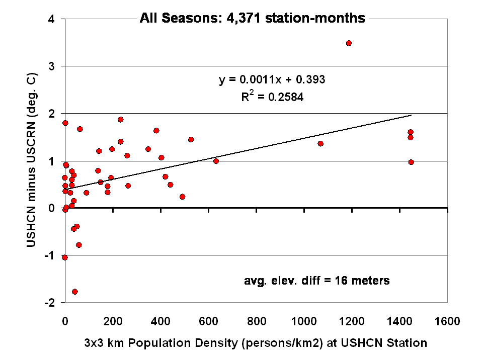
The results for all seasons combined shows that the USHCN stations are definitely warmer than their “platinum standard” counterparts:
 Spencer doesn’t get a match between USHCN and USCRN, so why does the NOAA/NCDC plotter page?
And our research indicates that USHCN as a whole runs warmer that the most pristine stations within it.
In research with our surfacestations metadata, we find that there is quite a separation between the most pristine stations (Class 1/2) and the NOAA final adjusted data for USHCN. This is examining 30 year data from 1979 to 2008 and also 1979 to present. We can’t really go back further because metadata on siting is almost non-existent. Of course, it all exists in the B44 forms and site drawings held in the vaults of NCDC but is not in electronic form, and getting access is about as easy as getting access to the sealed Vatican archives.
By all indications of what we know about siting, the Class 1/2 USHCN stations should be very close, trend wise, to USCRN stations, yet the ENTIRE USHCN dataset, including the hundreds of really bad stations, with poor siting and trends that don’t come close to the most pristine Class 1/2 stations are said to be matching USCRN. But from our own examination of all USHCN data and nearly all stations for siting, we know that is not true.
So, I suppose I should put out a caveat here. I wrote this above:
“What you see is the USCRN data record in its entirety, with no adjustments, no start and end date selections, and no truncation. The only thing that has been done to the monthly average data is gridding the USCRN stations, so that the plot is representative of the Contiguous United States.”
I don’t know that for a fact to be totally true, as I’m going on what has been said about the intents of NCDC in the way they treat and display the USCRN data. They have no code or methodology reference on their plotter web page, so I can’t say with 100% certainty that the output of that web page plotter is 100% adjustment free. The code is hidden in a web engine black box, and all we know are the requesting parameters. We also don’t know what their gridding process is. All I know is the stated intent that there will be no adjustments like we see in USHCN.
And some important information is missing that should be plainly listed. NCDC is doing an anomaly calculation on USCRN data, but as we know, there is only 9 years and 4 months of data. So, what period are they using for their baseline data to calculate the anomaly? Unlike other NOAA graphs like this one below, they don’t show the baseline period or baseline temperature on the graph Zeke plotted above.
This one is the entire COOP network, with all its warts, has the baseline info, and it shows a cooling trend as well, albeit greater than USCRN:

Source: http://www.ncdc.noaa.gov/cag/time-series/us
Every climate dataset out there that does anomaly calculations shows the baseline information, because without it, you really don’t know what your are looking at. I find it odd that in the graph Zeke got from NOAA, they don’t list this basic information, yet in another part of their website, shown above, they do.
Are they using the baseline from another dataset, such as USHCN, or the entire COOP network to calculate an anomaly for USCRN? It seems to me that would be a no-no if in fact they are doing that. For example, I’m pretty sure I’d get flamed here if I used the GISS baseline to show anomalies for USCRN.
So until we get a full disclosure as to what NCDC is actually doing, and we can see the process from start to finish, I can’t say with 100% certainty that their anomaly output is without any adjustments, all I can say with certainty is that I know that is their intent.
Given that there are some sloppy things on this new NCDC plotter page, like the misspelling of the word Contiguous. They spell it Continguous, in the plotted output graph title and in the actual data file they produce: USCRN_Avg_Temp_time-series (Excel Data file). Then there’s the missing baseline information on the anomaly calc, and the missing outputs of data files for the max and min temperature data sets (I had to manually extract them from the HTML as noted by asterisk above).
All of this makes me wonder if the NCDC plotter output is really true, and if in the process of doing gridding, and anomaly calcs, if the USCRN data is truly adjustment free. I read in the USCRN documentation that one of the goals was to use that data to “dial in” the adjustments for USHCN, at least that is how I interpret this:
The USCRN’s primary goal is to provide future long-term homogeneous temperature and precipitation observations that can be coupled to long-term historical observations for the detection and attribution of present and future climate change. Data from the USCRN is used in operational climate monitoring activities and for placing current climate anomalies into an historical perspective. http://www.ncdc.noaa.gov/crn/programoverview.html
So if that is true, and USCRN is being used to “dial in” the messy USHCN adjustments for the final data set, it would explain why USCHN and USCRN match so near perfectly for those 9+ years. I don’t believe it is a simple coincidence that two entirely dissimilar networks, one perfect, the other a heterogeneous train wreck requiring multiple adjustments would match perfectly, unless there was an effort to use the pristine USCRN to “calibrate” the messy USHCN.
Given what we’ve learned from Climategate, I’ll borrow words from Reagan and say: Trust, but verify
That’s not some conspiracy theory thinking like we see from “Steve Goddard”, but a simple need for the right to know, replicate and verify, otherwise known as science. Given his stated viewpoint about such things, I’m sure Mosher will back me up on getting full disclosure of method, code, and output engine for the USCRN anomaly data for the CONUS so that we can do that,and to also determine if USHCN adjustments are being “dialed in” to fit USCRN data.
# # #
UPDATE 2 (Second-party update okayed by Anthony): I believe the magnitude of the variations and their correlation (0.995) are hiding the differences. They can be seen by subtracting the USHCN data from the USCRN data:

Cheers
Bob Tisdale
DHF,
The U.S. has approximately half the world’s temperature stations. The U.S. doesn’t have half the world’s land area. Simply averaging anomalies without gridding would not be a particularly good way to estimate U.S. temperatures.
Similarly, some areas of the U.S. (e.g. the East Coast) have a lot more temperature stations, especially in the earlier part of the record, than in the midwest. Averaging wouldn’t necessarily give you a representative picture.
Some networks (USHCN and USCRN, for example) are built to purposefully be well-distributed. When working with these, gridding isn’t really necessary.
They used to call it the canary in the coalmine of global warming. I don’t hear it so much now. It did have a heatwave this January caused by an influx of warm air apparently.
http://www.climate.gov/news-features/event-tracker/alaska-unseasonably-warm-january-2014
“Temperature Changes in Alaska”
http://climate.gi.alaska.edu/ClimTrends/Change/TempChange.html
Anthony:
Thanks much for the explanation.
Can I assume, then, that only the 82 stations that were reporting in 2005 are being used for the anomaly ‘visualizations’?
REPLY: Yes
Andrew says:
June 8, 2014 at 7:04 am
If we’re playing the “he’s not a scientist” game then Einstein was a patent clerk. And Relativity wasn’t peer reviewed.
There was no formal peer review in Einstein’s era. The reviewing process was far more vicious than peer / pal. Science was fought over between the different camps ie Newtonian and Einsteinian and Einsteinian and Bohr and quantum mechanics. The elder statesmen of science tended to resist the younger puppies which ensured that no-one brought forward a theory without it being torn to shreds. Those theories that survived are with us today.
Alan Robertson,
For the last 50 years at least (since 1960), Berkeley has been warming slightly slower than USHCN for the CONUS region. The two results are very similar, however: http://rankexploits.com/musings/wp-content/uploads/2013/01/USHCN-adjusted-raw-berkeley.png
NikFromNYC says:
June 8, 2014 at 11:32 am
====
This is why he banned you…….after he had repeatedly asked to you stop for over a week
“In my quest for Truth, it usually comes from the places I don’t want to look. Mr. Mosher, if this is indeed you, thank you.”
yes that’s me.
my principles are pretty straight forward: supply your data as used and your code as run.
if you dont then I have no rational obligation to believe your claims, or even check your claims or answer your questions or explain why you get it wrong. you havent done science. period.
This pisses off people on all sides of the debate. sorry.
My allegiance is to open code, open data and come what may. When Jones refused willis’s request for data, when others refused mcintyres request for code.. i joined their effort. Not because I’m a skeptic.
but because I think openness will lead to a better understanding. that all ended with climategate.
Since I FOIAd Jones, people assume Im a skeptic. Bad assumption. I’m for freedom of information.. period. I dont even like copyright ( yup I built one of the first Mp3 players.. and fought against hollywood)
This is my first phone. we wanted to free your phone as well.
http://en.wikipedia.org/wiki/Neo_FreeRunner
So happy william gibson liked it.
On climategate I was merely lucky to be in the right place. As charles the moderator said I was one of the few people who could read all the mails and determine if they were real. Anthony needed to know, so I didnt sleep.I read.
Any way I know that some people have a hard time figuring out how a believer in AGW could write a book about climategate.
Hmm. when you apply principles consistently you confuse people.
Anthony says:
A bunch [of USRCRN stations] in the four corners area are being shut down See: http://www.ncdc.noaa.gov/crn/usrcrn/
So we are stopping one of the few programs using state-of-the-art instrumentation to measure real temperatures. No doubt we are continuing to support every one of the 45 models that have been failing so dependably for so many years.
Makes sense–this way, if temperatures begin to fall, we won’t know it. CAGW forever!
Lance Wallace,
The budget for the USRCRN was cut in the last budget. I’d suggest writing your congress critter to get more funding for climate observations.
sigh, I am so crushing on Mosher right now..is that so wrong?!? 😉
Anthony,
Congratulations for reporting so thoroughly on the NOAA temperature record and explaining so well on the state of the art system. As an Engineer, I am always suspicious about data that has been adjusted, show me the raw data and let me interpret how any adjustments apply and how they impact the conclusion.
One question I have is if the “pause” continues, how long before adjustments are “needed” to justify the agenda. We know that the message today from our government totally ignores all data in a number of venues but especially global warming and climate change. I once trusted the US government to be reasonably honest; however, that trust has been broken recently since it seems that everything is either spun, distorted, or hidden as it comes out of the government. Even the FOIA as well as congressional oversight is impeded from getting the facts on just about everything.
Again thanks for you diligent effort, I have forwarded it to network which is read by numerous engineers.
Not so fast in claiming success with the USCRN temperature network:
(1) Yes, better weather station siting is a plus (as A. Watts et. al, have shown); and USCRN improvements with multiple sensors and more considered siting are a further advance.
(2) Yet, there is no way (with consideration of Monte Carlo integration) that even 114 “pristine” temperature stations can reliably yield anything approaching the true mean US temperature.
(3) Yes, you may say: but the resulting USCRN data is collected from enlightened, well distributed locations. Yet the truth of this expectation can not be confirmed or proved for obvious reasons. . . the full data doesn’t exist.
(4) Now the actual elephant in the room: None of the above even really matters. . . because it’s unclear what “US land surface temperature” even means. In a forest, does it mean the land temperature at the bed of the forest. . . or does it reference the temperature at the tips of the trees, etc and etc.
I could go onto other examples of indefinite definitions (and associated measurement protocols). . . but enough is enough . . . or maybe even too much! Likely I’m on a fool’s errand!
Dan
Regarding a number of the previous comments: I was involved in the selection, survey, approval and licensing of most of the CRN stations in the Conus, Alaska and Hawaii. The installation process started in 2000 with approx 1/3rd of the stations becoming operational in 2005 or later. The majority of Alaska installs occurred after 2008. Although the network map shows only 8 locations in Alaska with admittedly most of those near/along the coastline, there are currently 16 stations in Alaska, 5 of which were installed in the last few years with a few in the interior, Tok in the Tetlin NWR, and Glennallen in the southeast part of the state. Apparently 3 new stations were installed last month (Deadhorse along the north coast, a site in the Nowitna NWR east of Ruby in the west central interior and another at the Invotuk Airstrip in northcentral AK north of the Brooks Range. Data are not available from these 3 while the engineers ensure transmission quality.
The reason for the delay in locating stations in the Alaskan interior was to ensure that technology was available to remotely power the stations during the cold dark winter months since most stations would have no access to AC power. Tok was the first station to use both solar panels which operated more efficiently during low solar angles and a methanol fuel cell.
One item that has not been mentioned was the deployment, in cooperation with the NWS, of a much denser network of Regional CRN stations to monitor the nation’s regional climate variability, following the completion of the CRN station deployments in 2008. Approx 15 stations were deployed in Alabama as a test bed for the engineers operating out of Oak Ridge TN and an additional 72 in the 4-state region of AZ, NM, CO and UT. However expansion of this network stopped a few years ago. These stations followed the same siting guidelines as CRN with fewer sensors and a smaller station footprint, though temperature still employed 3 sensors. These stations basically replaced the HCN network in these states, though the HCN stations were not discontinued. For some reason the NWS ceased supporting these stations effective June 1, and they no longer report on the CRN Observation website. The Alabama sites were “donated” to NCDC following installation and were not subject to the NWS shutdown. Apparently the NWS expects states to pick up support for the majority of these Regional CRN stations, though John Christy the Alabama State Climatologist is providing maintenance support for his 15 stations for the next year, and their data is still available through the CRN website.
Steven Mosher says:
June 8, 2014 at 9:08 am
> Here is Anth*ny on Goddard..
This was sharable?
Quote:
Really? That’s very annoying. I’ve defended WUWT against alarmist’s claims that posters at WUWT are pseudonyms and said only a very few posts were done under a pseudonym and those were cases where exposing the person’s real name would cause a lot of trouble for him. Very annoying….
I was one of the principals in that discussion, err, debate, err diatribe. I thought we had things under control, but when someone found a Web post from Argonne National Labs saying CO2 frost existed, I hunted down his Email, explained why he was wrong, and he got it fixed in a couple days.
Steve managed to keep that debate going on his blog for a while longer. If anyone is interested in that period, start at http://wattsupwiththat.com/2009/06/13/results-lab-experiment-regarding-co2-snow-in-antarctica-at-113%C2%B0f-80-5%C2%B0c-not-possible/ and work earlier.
Things are much better now that Steve has his own blog. He does some worthwhile stuff, but I keep my distance so I don’t get tempted to correct an error.
Ric Werme says:
June 8, 2014 at 5:53 pm
Steven Mosher says:
June 8, 2014 at 9:08 am
> Here is Anth*ny on Goddard..
This was sharable?
#######################
yes it is on Lucia’s.
“(2) Yet, there is no way (with consideration of Monte Carlo integration) that even 114 “pristine” temperature stations can reliably yield anything approaching the true mean US temperature.”
wrong.
This link concisely refutes the claim that there is a pause in the greenhouse gas contribution to the surface air temperature trend:
[ http://www.youtube.com/watch?v=W705cOtOHJ4&feature=youtube_gdata_player ]
Everyone thinks they are right and seek audiences that agree.
This has been true in all economic, religious and scientific debates since the dawn of time. It is our nature to do this.
The problem here is, looking for data, for information, for certainty is frought with dangers. Most information is inexact and theories can go for centuries unchallenged due to inexact or insufficient data.
When we first got a glimpse of the universe via orbital observatories, the first thing that sprang up was, nearly all the galaxies we saw are, for some reason totally contrary to present beliefs, not spinning away from each other but rather sliding into each other, crashing into each other, whole sectors of space falling towards gigantic ‘attractors’.
We still have no theology in cosmology to explain this and it negates the ‘universe is flying away super fast’ belief system!
So…we debate ‘weather’ which is just as difficult as cosmology. And the one thing we must never, ever forget is: we are in an ice age cycle and this is unique to this era because there wasn’t such a cycle previous to the last several million years.
As a chemist who has monitored noisy yield data to determine the effects of manufacturing process changes, I was mindful that linear trends are very sensitive to the starting or endpoints. Short term trends (<30 years) in climate data can mislead.
For example, to additionally convince myself, I plotted the SAT (surface-air-temps) over the last century using Excel. Excel also plots a linear trend and calculates the slope and correlation coefficient (R^2) readily. All of the data is easily available from NASA.
http://data.giss.nasa.gov/gistemp/graphs_v3/
If the trend is "true", the %change in the trendline slope should not change significantly from year to year.
When I plotted the annual SAT averages for 1960 to 2013 (53 year period), I saw the usual unambiguous upward warming trend and the trendline slope and R^2 did not significantly vary depending on my starting year.
53-year trend start year to 2013
1960: slope = 0.0144, R^2 = 0.85 (0%) Reference
1961: slope = 0.0146, R^2 = 0.85 (+1.4%) Up Trend (1.4% swing)
1962: slope = 0.0150, R^2 = 0.85 (+4.2%) Up Trend (2.8% swing)
In contrast, the shorter 1997 to 2013 (15 year period), revealed a slight upward trend, but the trendline slope and R^2 varied significantly depending on my starting year. If you cherry pick you can "dial in" what ever trend you want.
15-year trend start year to 2013
1997: slope= 0.007, R^2 =0.2 (0 %) Reference
1998: slope= 0.006, R^2 =0.14 (-14%) Down trend (14% swing)
1999: slope= 0.009, R^2 =0.24 (+29%) Up Trend (43% swing)
Monckton's selection also covered 1998, which was an anomalously hot year (due to El Niño weather). I hope I've demonstrated simply that linear trends are very sensitive to the starting or endpoints. Short term trends (<30 years) in climate data can mislead.
While I greatly appreciate the contribution the CRN will make to the subject of climate changing, on a different level, this work and data will never make it to the general public – it continues, and will continue to be “business” as usual here in Western WA and the state as a whole.
The three CRN sites, WA – Darrington, WA – Quinault and WA – Spokane ( Turnbull ) have absolutely NO introduction to the general public, no mention in any media, and no daily reference on local TV / Radio forecasts with regard to “todays high was” or ” our high today, compared to the average”.
In the greater Seattle market, its all about and only about the temp at Sea Tac International airport and that’s the way things will remain. Whether or not the forcast readers have any abilities in the field of meterology, makes no difference – Just a pretty/ handsome face and the temp at Sea Tac.
Great advancement and depressing reality !
Steven Mosher says: (June 8, 2014 at 6:16 pm) “Wrong.”
Thanks for your comment but please explain how/why you are so convinced that 114 temperature stations can accurately and reliably track the average temperature of the contiguous US states. Or simply please tell me why my comment was wrong; it would be much more helpful.
Thanks
Dan
“….anything approaching the true mean US temperature.”
Actually, it’s the land, near-surface air temperature that is being measured. What is derived is “temperature anomalies”, with the idea being not to calculate an average of the actual temperature but the an average deviation in temperature.
The implicit assumption being that changes in a mountain location can be averaged with changes in a low altitude location, more than actual temperatures can be averaged.
It’s a metric of whether the surface air temps are rising.
Lance Wallace says:
And while there’s not enough money to fund USCRN “to ensure the creation of an unimpeachable record of changes in surface climate over the United States for decades to come,” the 2014 budget includes up to $10 million for the IPCC/UNFCCC, $234.5 million for the World Bank’s Climate Investment Funds, and $176.5 million for the EPA’s climate change program.
It appears that USHCN is cooling quicker than USCRN. Similar difference plots for Tmin, Tmax may also be informative.
That would be no surprise. Bad microsite exaggerates trend — in either direction. (Our stats support that, both ways.)
katatetorihanzo,
Complete nonsense.
Even NASA/GISS admits that global warming has stopped. Six data sets show the same thing.
Run along now back to SS, where all the swivel-eyed head nodders hang out. The adults are here. True Religious Believers like you, with your baseless assertions, just don’t fit in.