 NOTE: significant updates have been made, see below.
After years of waiting, NOAA has finally made a monthly dataset on the U.S. Climate Reference Network available in a user friendly way via their recent web page upgrades. This data is from state-of-the-art ultra-reliable triple redundant weather stations placed on pristine environments. As a result, these temperature data need none of the adjustments that plague the older surface temperature networks, such as USHCN and GHCN, which have been heavily adjusted to attempt corrections for a wide variety of biases. Using NOAA’s own USCRN data, which eliminates all of the squabbles over the accuracy of and the adjustment of temperature data, we can get a clear plot of pristine surface data. It could be argued that a decade is too short and that the data is way too volatile for a reasonable trend analysis, but let’s see if the new state-of-the-art USCRN data shows warming.
A series of graphs from NOAA follow, plotting Average, Maximum, and Minimum surface temperature follow, along with trend analysis and original source data to allow interested parties to replicate it.
First, some background on this new temperature monitoring network, from the network home page:

The U.S. Climate Reference Network (USCRN)consists of 114 stations developed, deployed, managed, and maintained by the National Oceanic and Atmospheric Administration (NOAA) in the continental United States for the express purpose of detecting the national signal of climate change. The vision of the USCRN program is to maintain a sustainable high-quality climate observation network that 50 years from now can with the highest degree of confidence answer the question: How has the climate of the nation changed over the past 50 years? These stations were designed with climate science in mind.
Source: http://www.ncdc.noaa.gov/crn/
As you can see from the map below, the USCRN is well distributed, with good spatial resolution, providing an excellent representivity of the CONUS, Alaska, and Hawaii.

From the Site Description page of the USCRN:
==========================================================
Every USCRN observing site is equipped with a standard set of sensors, a data logger and a satellite communications transmitter, and at least one weighing rain gauge encircled by a wind shield. Off-the-shelf commercial equipment and sensors are selected based on performance, durability, and cost.
Highly accurate measurements and reliable reporting are critical. Deployment includes calibrating the installed sensors and maintenance will include routine replacement of aging sensors. The performance of the network is monitored on a daily basis and problems are addressed as quickly as possible, usually within days.
…
Many criteria are considered when selecting a location and establishing a USCRN site:
- Regional and spatial representation: Major nodes of regional climate variability are captured while taking into account large-scale regional topographic factors.
- Sensitivity to the measurement of climate variability and trends: Locations should be representative of the climate of the region, and not heavily influenced by unique local topographic features and mesoscale or microscale factors.
- Long term site stability: Consideration is given to whether the area surrounding the site is likely to experience major change within 50 to 100 years. The risk of man made encroachments over time and the chance the site will close due to the sale of the land or other factors are evaluated. Federal, state, and local government land and granted or deeded land with use restrictions (such as that found at colleges) often provide a high stability factor. Population growth patterns are also considered.
- Naturally occurring risks and variability:
- Flood plains and locations in the vicinity of orographically induced winds like the Santa Ana and the Chinook are avoided.
- Locations with above average tornado frequency or having persistent periods of extreme snow depths are avoided.
- Enclosed locations that may trap air and create unusually high incidents of fog or cold air drainage are avoided.
- Complex meteorological zones, such as those adjacent to an ocean or to other large bodies of water are avoided.
- Proximity:
- Locations near existing or former observing sites with long records of daily precipitation and maximum and minimum temperature are desirable.
- Locations near similar observing systems operated and maintained by personnel with an understanding of the purpose of climate observing systems are desirable.
- Endangered species habitats and sensitive historical locations are avoided.
- A nearby source of power is required. AC power is desirable, but, in some cases, solar panels may be an alternative.
- Access: Relatively easy year round access by vehicle for installation and periodic maintenance is desirable.
Source: http://www.ncdc.noaa.gov/crn/sitedescription.html
==========================================================
As you can see, every issue and contingency has been thought out and dealt with. Essentially, the U.S. Climate Reference Network is the best climate monitoring network in the world, and without peer. Besides being in pristine environments away from man-made influences such as urbanization and resultant UHI issues, it is also routinely calibrated and maintained, something that cannot be said for the U.S. Historical Climate Network (USHCN), which is a mishmash of varying equipment (alcohol thermometers in wooden boxes, electronic thermometers on posts, airport ASOS stations placed for aviation), compromised locations, and a near complete lack of regular thermometer testing and calibration.
Having established its equipment homogenity, state of the art triple redundant instrumentation, lack of environmental bias, long term accuracy, calibration, and lack of need for any adjustments, let us examine the data produced for the last decade by the U.S. Climate Reference Network.
First, from NOAA’s own plotter at the National Climatic Data Center in Asheville, NC, this plot they make available to the public showing average temperature for the Contiguous United States by month:

Source: NCDC National Temperature Index time series plotter
To eliminate any claims of “cherry picking” the time period, I selected the range to be from 2004 through 2014, and as you can see, no data exists prior to January 2005. NOAA/NCDC does not make any data from the USCRN available prior to 2005, because there were not enough stations in place yet to be representative of the Contiguous United States. What you see is the USCRN data record in its entirety, with no adjustments, no start and end date selections, and no truncation. The only thing that has been done to the monthly average data is gridding the USCRN stations, so that the plot is representative of the Contiguous United States.
Helpfully, the data for that plot is also made available on the same web page. Here is a comma separated value (CSV) Excel workbook file for that plot above from NOAA:
USCRN_Avg_Temp_time-series (Excel Data File)
Because NOAA/NCDC offers no trend line generation in their user interface, from that NOAA provided data file, I have plotted the data, and provided a linear trend line using a least-squares curve fitting procedure which is a function in the DPlot program that I use.
Not only is there a pause in the posited temperature rise from man-made global warming, but a clearly evident slight cooling trend in the U.S. Average Temperature over nearly the last decade:

We’ve had a couple of heat waves and we’ve had some cool spells too. In other words, weather.
The NCDC National Temperature Index time series plotter also makes maximum and minimum temperature data plots available. I have downloaded their plots and data, supplemented with my own plots to show the trend line. Read on.
NOAA/NCDC plot of maximum temperature:
 Source of the plot here.
Data from the plot: USCRN_Max_Temp_time-series (Excel Data File)*
My plot with trend line:

As seen by the trend line, there is a slight cooling in maximum temperatures in the Contiguous United States, suggesting that heat wave events (seen in 2006 and 2012) were isolated weather incidents, and not part of the near decadal trend.
NOAA/NCDC plot of minimum temperature:

Source of the plot here.
USCRN_Min_Temp_time-series (Excel Data File)*
The cold winter of 2013 and 2014 is clearly evident in the plot above, with Feb 2013 being -3.04°F nationally.
My plot with trend line:

*I should note that NOAA/NCDC’s links to XML, CSV, and JSON files on their plotter page only provide the average temperature data set, and not the maximum and minimum temperature data sets, which may be a web page bug. However, the correct data appears in the HTML table on display below the plot, and I imported that into Excel and saved it as a data file in workbook format.
The trend line illustrates a cooling trend in the minimum temperatures across the Contiguous United States for nearly a decade. There is some endpoint sensitivity in the plots going on, which is to be expected and can’t be helped, but the fact that all three temperature sets, average, max, and min show a cooling trend is notable.
It is clear there has been no rise in U.S. surface air temperature in the past decade. In fact, a slight cooling is demonstrated, though given the short time frame for the dataset, about all we can do is note it, and watch it to see if it persists.
Likewise, there does not seem to have been any statistically significant warming in the contiguous U.S. since start of the new USCRN data, using the average, maximum or minimum temperature data.
I asked three people who are well versed in data plotting and analysis to review this post before I published it, one, Willis Eschenbach, added his own graph as part of the review feedback, a trend analysis with error bars, shown below.

While we can’t say there has been a statistically significant cooling trend, even though the slope of the trend is downward, we also can’t say there’s been a statistically significant warming trend either.
What we can say, is that this is just one more dataset that indicates a pause in the posited rise of temperature in the Contiguous United States for nearly a decade, as measured by the best surface temperature monitoring network in the world. It is unfortunate that we don’t have similar systems distributed worldwide.
UPDATE:
Something has been puzzling me and I don’t have a good answer for the reason behind it, yet.
As Zeke pointed out in comments and also over at Lucia’s, USCRN and USHCN data align nearly perfectly, as seen in this graph. That seems almost too perfect to me. Networks with such huge differences in inhomogeneity, equipment, siting, station continuity, etc. rarely match that well.
![Screen-Shot-2014-06-05-at-1.25.23-PM[1]](https://wattsupwiththat.files.wordpress.com/2014/06/screen-shot-2014-06-05-at-1-25-23-pm1.png?quality=75)
Note that there is an important disclosure missing from that NOAA graph, read on.
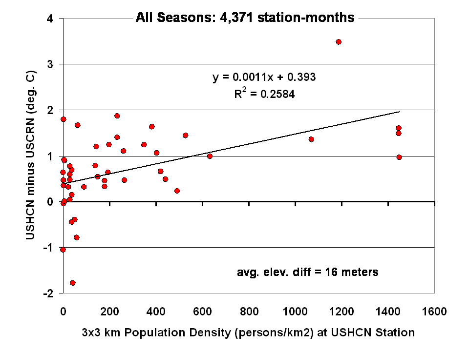
Dr Roy Spencer shows in this post the difference from USHCN to USCRN:
Spurious Warmth in NOAA’s USHCN from Comparison to USCRN
The results for all seasons combined shows that the USHCN stations are definitely warmer than their “platinum standard” counterparts:
 Spencer doesn’t get a match between USHCN and USCRN, so why does the NOAA/NCDC plotter page?
And our research indicates that USHCN as a whole runs warmer that the most pristine stations within it.
In research with our surfacestations metadata, we find that there is quite a separation between the most pristine stations (Class 1/2) and the NOAA final adjusted data for USHCN. This is examining 30 year data from 1979 to 2008 and also 1979 to present. We can’t really go back further because metadata on siting is almost non-existent. Of course, it all exists in the B44 forms and site drawings held in the vaults of NCDC but is not in electronic form, and getting access is about as easy as getting access to the sealed Vatican archives.
By all indications of what we know about siting, the Class 1/2 USHCN stations should be very close, trend wise, to USCRN stations, yet the ENTIRE USHCN dataset, including the hundreds of really bad stations, with poor siting and trends that don’t come close to the most pristine Class 1/2 stations are said to be matching USCRN. But from our own examination of all USHCN data and nearly all stations for siting, we know that is not true.
So, I suppose I should put out a caveat here. I wrote this above:
“What you see is the USCRN data record in its entirety, with no adjustments, no start and end date selections, and no truncation. The only thing that has been done to the monthly average data is gridding the USCRN stations, so that the plot is representative of the Contiguous United States.”
I don’t know that for a fact to be totally true, as I’m going on what has been said about the intents of NCDC in the way they treat and display the USCRN data. They have no code or methodology reference on their plotter web page, so I can’t say with 100% certainty that the output of that web page plotter is 100% adjustment free. The code is hidden in a web engine black box, and all we know are the requesting parameters. We also don’t know what their gridding process is. All I know is the stated intent that there will be no adjustments like we see in USHCN.
And some important information is missing that should be plainly listed. NCDC is doing an anomaly calculation on USCRN data, but as we know, there is only 9 years and 4 months of data. So, what period are they using for their baseline data to calculate the anomaly? Unlike other NOAA graphs like this one below, they don’t show the baseline period or baseline temperature on the graph Zeke plotted above.
This one is the entire COOP network, with all its warts, has the baseline info, and it shows a cooling trend as well, albeit greater than USCRN:

Source: http://www.ncdc.noaa.gov/cag/time-series/us
Every climate dataset out there that does anomaly calculations shows the baseline information, because without it, you really don’t know what your are looking at. I find it odd that in the graph Zeke got from NOAA, they don’t list this basic information, yet in another part of their website, shown above, they do.
Are they using the baseline from another dataset, such as USHCN, or the entire COOP network to calculate an anomaly for USCRN? It seems to me that would be a no-no if in fact they are doing that. For example, I’m pretty sure I’d get flamed here if I used the GISS baseline to show anomalies for USCRN.
So until we get a full disclosure as to what NCDC is actually doing, and we can see the process from start to finish, I can’t say with 100% certainty that their anomaly output is without any adjustments, all I can say with certainty is that I know that is their intent.
Given that there are some sloppy things on this new NCDC plotter page, like the misspelling of the word Contiguous. They spell it Continguous, in the plotted output graph title and in the actual data file they produce: USCRN_Avg_Temp_time-series (Excel Data file). Then there’s the missing baseline information on the anomaly calc, and the missing outputs of data files for the max and min temperature data sets (I had to manually extract them from the HTML as noted by asterisk above).
All of this makes me wonder if the NCDC plotter output is really true, and if in the process of doing gridding, and anomaly calcs, if the USCRN data is truly adjustment free. I read in the USCRN documentation that one of the goals was to use that data to “dial in” the adjustments for USHCN, at least that is how I interpret this:
The USCRN’s primary goal is to provide future long-term homogeneous temperature and precipitation observations that can be coupled to long-term historical observations for the detection and attribution of present and future climate change. Data from the USCRN is used in operational climate monitoring activities and for placing current climate anomalies into an historical perspective. http://www.ncdc.noaa.gov/crn/programoverview.html
So if that is true, and USCRN is being used to “dial in” the messy USHCN adjustments for the final data set, it would explain why USCHN and USCRN match so near perfectly for those 9+ years. I don’t believe it is a simple coincidence that two entirely dissimilar networks, one perfect, the other a heterogeneous train wreck requiring multiple adjustments would match perfectly, unless there was an effort to use the pristine USCRN to “calibrate” the messy USHCN.
Given what we’ve learned from Climategate, I’ll borrow words from Reagan and say: Trust, but verify
That’s not some conspiracy theory thinking like we see from “Steve Goddard”, but a simple need for the right to know, replicate and verify, otherwise known as science. Given his stated viewpoint about such things, I’m sure Mosher will back me up on getting full disclosure of method, code, and output engine for the USCRN anomaly data for the CONUS so that we can do that,and to also determine if USHCN adjustments are being “dialed in” to fit USCRN data.
# # #
UPDATE 2 (Second-party update okayed by Anthony): I believe the magnitude of the variations and their correlation (0.995) are hiding the differences. They can be seen by subtracting the USHCN data from the USCRN data:

Cheers
Bob Tisdale
As I show in this post, you don’t ned a lot of Estimated data to change a trend.
http://sunshinehours.wordpress.com/2014/06/05/ushcn-2-5-estimated-data-is-warming-data-arizona/
However, to the stats:
Using USHCN Monthly v2.5.0.20140509
This is the percentage of monthly records with the E flag (the data has been estimated from neighboring stations) for 2013.
Year / Month / Estimated Records / Non-Estimated / Pct
2013 Jan 162 802 17
2013 Feb 157 807 16
2013 Mar 178 786 18
2013 Apr 186 778 19
2013 May 177 787 18
2013 Jun 194 770 20
2013 Jul 186 778 19
2013 Aug 205 759 21
2013 Sep 208 756 22
2013 Oct 222 742 23
2013 Nov 211 753 22
2013 Dec 218 746 23
Same data by state showing the ones over 35%.
2013 Jun AR 5 9 36
2013 Jul AR 5 9 36
2013 Sep AZ 5 8 38
2013 Oct AZ 5 8 38
2013 Nov AZ 5 8 38
2013 Mar CA 15 28 35
2013 Jun CA 15 28 35
2013 Jul CA 15 28 35
2013 Aug CA 17 26 40
2013 Sep CA 16 27 37
2013 Oct CA 21 22 49
2013 Nov CA 19 24 44
2013 Dec CA 18 25 42
2013 Feb CT 2 2 50
2013 Mar CT 2 2 50
2013 Apr CT 2 2 50
2013 Jun CT 2 2 50
2013 Jul CT 2 2 50
2013 Apr DE 1 1 50
2013 Jan FL 7 13 35
2013 Feb FL 7 13 35
2013 Mar FL 8 12 40
2013 Apr FL 8 12 40
2013 Jul FL 7 13 35
2013 Aug FL 7 13 35
2013 Sep FL 8 12 40
2013 Oct FL 8 12 40
2013 Nov FL 8 12 40
2013 Dec FL 8 12 40
2013 Aug GA 7 11 39
2013 Sep GA 7 11 39
2013 Oct GA 8 10 44
2013 Nov GA 9 9 50
2013 Dec GA 9 9 50
2013 Dec KY 3 5 38
2013 Jun LA 6 9 40
2013 Dec LA 6 9 40
2013 Oct MD 3 4 43
2013 Mar MS 11 18 38
2013 Jun MS 11 18 38
2013 Jul MS 12 17 41
2013 Aug MS 11 18 38
2013 Sep MS 13 16 45
2013 Oct MS 12 17 41
2013 Nov MS 11 18 38
2013 Dec MS 17 12 59
2013 Jan ND 6 11 35
2013 Feb ND 6 11 35
2013 Jun ND 7 10 41
2013 Aug NH 2 3 40
2013 Oct NH 2 3 40
2013 Oct NM 8 13 38
2013 Jul OR 12 21 36
2013 Jun TX 15 24 38
2013 Aug TX 16 23 41
2013 Sep TX 14 25 36
2013 Nov TX 15 24 38
2013 Dec TX 15 24 38
2013 Dec VT 3 4 43
Anthony,
Its pretty unlikely that USHCN is “calibrated” to match USCRN. The USHCN code is all available on their FTP site, and their adjustments are all automated with little room for manual tweaking that would treat one time period (pre-2004) different from another (post-2004).
The more likely explanation is that there are relatively few new biases in the network post-2004. There were relatively few station instrument changes (CRS to MMTS) over the last decade, and few time of obs changes. Thats why, unless you pull a Goddard, you find that adjustments have been pretty flat over that period: http://wattsupwiththat.files.wordpress.com/2014/05/ushcn-adjustments-by-method-12m-smooth3.png
@Zeke point taken. There’s also a bunch of really crappy USHCN stations with a warm bias that were removed post 2007 thanks to the work of the surfacestations volunteers and the best sunlight available: embarrassment for NOAA not doing their job of maintenance and sanity checking.
Zeke, try not to confuse people. The data I am posting is from Final USHCN Monthly. The number of Estimated records is quite large and does have a serious effect on the trend in individual states …. and I am not even considering the difference between Raw and Final.
You can see the effect of Estimated data on Arizona.
http://sunshinehours.wordpress.com/2014/06/05/ushcn-2-5-estimated-data-is-warming-data-arizona/
According to this: http://co2now.org/Know-CO2/CO2-Monitoring/co2-measuring-stations.html
there is one CO2 monitoring station in the continental US, at Trinidad Head, California.
It shows CO2 has increased between 2004 and 2014.
http://www.esrl.noaa.gov/gmd/dv/iadv/graph.php?code=THD&program=ccgg&type=ts
I guess there are two questions.
1. Is the USHCN data from (say) 2004-2011 the same now as it was when presented in 2011? Or was it changed recently, perhaps to better agree with USCRN? I don’t remember ever seeing a NOAA press release mentioning cooling from 2004.
2. I take it you disagree with the claim that 40% of station data is ‘estimated.’ Do you disagree with the 40% (e.g. you think it’s only 22%) or do you disagree that ANY station data used is ‘estimated?’ Which stations shown as ‘estimated’ in Sunshinehours1 ‘s 3rd link are not in fact ‘estimated?’ If the answer is that no station data is estimated, what mistake is Goddard making?
A good predictive model of Steven Mosher’s comments is that of insider opportunism with the assumption that skepticism is not yet profitable or status worthy but building a new hockey stick while bashing the original hockey stick team is very profitable indeed, as previously obscure but now media darling Berkeley physicist Richard Muller has smilingly led the way for, Mosher’s new boss. The resulting data slicing and dicing collaboration now stands as the biggest outlier temperature plot of all, vastly outpacing the warming of other products in the US record:
http://berkeleyearth.lbl.gov/auto/Regional/TAVG/Figures/united-states-TAVG-Trend.pdf
Commenter Carrick demonstrates that Mosher’s highly parameterized black box shows over a thousand percent more US warming than even up-up-re-adjusted NASA GISS made by highly biased Jim “Coal Death Trains” Hansen:
“Here are the trends (°C/decade) for 1900-2010, for the US SouthEast region (longitude 82.5-100W, latitude 30-35N):
berkeley 0.045
giss (1200km) 0.004
giss (250km) -0.013
hadcrut4 -0.016
ncdc -0.007
Berkeley looks to be a real outlier.”
http://rankexploits.com/musings/2014/how-not-to-calculate-temperature/#comment-130088
I note a number of comments about station elevation choices. While it is completely true that stations at a higher elevation will have a different reading than one at low elevation, the idea is to get a solid base of diverse readings that are consistant, replicable, of duration, and accuracy. From this base the temperature anomallies may be calculated.
There is still no global temperature, and there never will be, but there is a comparison of the delta T’s over time. With electronic instrumentation you also have the option of sampling more often, say every ten minutes, as opposed to three times a day. Just like using Anthony’s sensor and driving across the city, or through a orchard, or any one of thousands of other possible experiments, you get a far better view of the daily weather. Over time, you get a better picture of the climate.
Arno: “The spike in January 2007 of USCRN, in particular, happens to coincide with a spike that exists in the three other mv data sets referred to. To me, this ties the data set to the others carrying spikes, with all that that implies.”
All this stuff is “anomalies”: deviation from some hypothetical “climatology” average year. Anything different from a US std month of Jan sticks out like a huge spike.
If there’s a spike in other datasets at the same time it probably was a warm month.
To visualise longer term variation it’s better to filter out the annual cycle. But with such a short dataset as this you’d not have much left in the middle.
Trends are also pretty awful since there is nothing linear in the data so fitting linear models ( which is what a “trend” is ) is not appropriate.
Having said that, the alarmists have trained everyone to respond to “trends” so I suppose you now have to point out that the upward trends are history and we are now facing downward trends.
No seriously , is this the best data format they could come up with?
Date,USCRN
200501,1.75
200502,2.50
200503,-0.88
Comma (not) separated variables.
So everyone who wants the data has to start by parsing 4char+2char or screwing around with integer arithmetic? OH, I know, I’ll write a FORTRAN program , then I can use a field specifier to read in a four char int, a two char int, skip a comma and ….. WTF?
I mean why not bang it all into one string while you’re about it?
I suppose actually separating the year variable using a comma would have been too big a jump of the imagination for someone wondering how to write out a file in comma separated variable format.
Shakes head….
Steven Goddard’s blog has enabled the continued and highly successful slanderous stereotyping of skepticism in general, by becoming an extremist bubble of both crackpottery in comments, and a cheerleading house for Quixotic indulgences, as he regularly posts conspiracy theories along with Holocaust imagery that implies that US liberals intend to gather conservatives into death trains, and that school shootings are government mind control missions to promote preliminary gun control. This helps alienate the few remaining demographics of still open minded people such as widely liberal young working scientists and the bulk of urban professionals who lean liberal. Each week, of his dozen or so regular commenters on what is the *second* highest traffic skeptical blog, several are outspoken crackpots. Pointing out this PR disaster to Steve has resulted in my having various log in options banned there, now completely. Perhaps it was this week’s exposure of his regular poster Harry D. Huffman as I also repeatedly pointed out that his No.1 commenter, Oliver K. Manuel, an original Sky Dragon book coauthor (now removed), is a convicted and registered son/daughter sodomite? Just before being banned altogether, Net legend Jim who runs a shrill ultra right wing forum regularly used to stereotype conservatives, repeatedly accused me of being mentally deranged for asking for more data plots because I was a vegetarian (which I am very much not). So for amusement factor, I copy here my Cliff Notes version of Harry’s self-published books after he claimed he would be immortal in Steve’s blog, as an example of the overall character of Steve’s blog:
“Harry is referring to the immortality of his having made the greatest scientific discovery of all time, that fractal coastlines can be pattern-matched with visible constellations in the sky. I quote his “scientific” claims that were so unfairly rejected by colleagues:”
(A) “Pyramids, the Sphinx, the Holy Grail, and many other fabulous ancient mysteries deemed forever unanswerable by science and religion alike, are here explained by the great design, encompassing not only the Earth but the whole solar system.”
(B) “The Earth, indeed the entire solar system, was re-formed wholesale, in the millennia prior to the beginning of known human history; c. 15,000 BC marked the decisive event, when the Earth first began to orbit the Sun as it does today.”
(C) “Generations of earth scientists have utterly failed to note an anciently famous, mathematically precise and altogether simple symmetry of the landmasses on the Earth that precludes chance continental “drift” and any undirected physical process such as “plate tectonics.””
(D) “[The Design Behind The Mysteries] is an article that was submitted to the Journal of the British Interplanetary Society (upon the recommendation of an astrophysicist at Fermilab). It was rejected by the editor without consideration, with the excuse that its subject did not fit the theme of the journal, “the engineering of spaceflight.” But what better place to tell of the deliberate re-formation of the solar system?”
(E) “Consensus scientists, including Sears et al., will insist that the precise tessellation of the Earth’s landmasses does not prove intentional design by some past superpower. Actually, such scientists as I have tried to inform of the design have not responded, or not confronted the idea and the overwhelming evidence for it. I first came uponthe mantleplumes.org site, and the article by Sears et al. mentioned in the above text, in March 2005 (either March 19th or 20th, as I have a record of e-mailing the site on March 20th, after a quick reading of some of the material on the site). I attempted to communicate to three different e-mail addresses at this time. First, I e-mailed Dr. Sears, informing him of my prior finding ofdesign and trying to explain why in fact his findings indicated a deliberate design rather than an undirected [i.e., not intelligently directed] breakup event.”
(F) “I wrote, in part: … Even further, the universal ancient testimony of mankind was that the world was deliberately designed, according to precise and sacred number and geometry–and the ancient mathematical tradition passed down by the Pythagoreans particularly claimed the Earth was made to a dodecahedron design, which has the same symmetry as the icosahedral tessellation you have recognized. In short, yours is but the latest revelation in precisely the same tradition as the ancient mystery traditions. / That the continental breakup was due to deliberate design is not in fact even an arguable point, from my perspective, for I have already shown that the surface of the Earth was deliberately re-formed, less than 20,000 years ago (according to both ancient records and to the design itself, which tells a coherent ancient story, or history, and can be proved to have given rise to many of the world’s myths about the “gods” of old–and indeed, to have initiated all of the once-sacred ancient traditions that I have yet studied.”
(F) “So Sears et al. have found essentially the same dodecahedral pattern I found, the pattern that is observable and verifiable today. The deliberate design of the Earth I found has been confirmed by scientists who had no idea of my discoveries, and who do not even interpret their finding as evidence of design. The design is thus an objective fact, independent of the observer and of any supposed personal prejudice or subjective agenda.”
(G) “I am not claiming that the Earth’s surface was deliberately reformed, and continents broken up, moved, and reshaped by design, on the sole basis of the above–although I do insist, strongly, that the uniformly upright orientation of the creature-like images on the Earth does in fact prove that they were designed, not randomly formed. But even I did not come to that conclusion by simply observing those images. I first found a symmetric pattern among the stars surrounding the ecliptic north pole (which is in fact the approximate axis of the entire solar system, and can reasonably be taken to be that axis). I found that that pattern was of central, religious importance to the civilization of ancient Egypt, and that it was but the central element of a wider pattern that was the keystone in the most ancient traditions of peoples the world over. I found, in other words, the original sacred images of mankind, in the sky and on the Earth, the common source of all the so-called ‘ancient mysteries’.”
(H) Illustration of ancient gods turning Earth in to a canvas:
http://oi61.tinypic.com/am3b6f.jpg
“These re-formations also left the landmasses with an abundance of creature-like shapes, almost all upright on the globe and hence clearly the work of design. These creature images can be identified with the best known of mythological characters, worldwide (as treated in some detail in The End of the Mystery).”
For only $75 you can buy that big book.
(I) “The designers broke apart, moved, and re-formed whole continents into their present locations and shapes, in order to enable various constellation forms to be matched to various landforms, in a series of mappings of “heaven onto earth” that, together with the myths and other ancient traditions of mankind, tell the story the “gods” wanted to leave behind for man to find, when he had grown enough in understanding to see it. These mappings were undoubtedly the objective origin of the ancient religious tradition, and prime hermetic dictum, of “as above, so below”, or “on earth as it is in heaven.”
(J) “One must dispassionately conclude that the solar system was intentionally re-formed and re-oriented. Such intentional design can and does explain other well-known, improbable observations, such as that the size of the Moon in the sky is so nearly exactly the same size as the Sun (the former averages 0.527 degrees apparent diameter, the latter 0.533 degrees). The intended meaning of this situation — deemed merely a “cosmic coincidence” by modern science thus far — is explained in The End of the Mystery.”
Greg, despite the burst to emergency level funding in climate “science,” all the good programmers are working in Silicon Valley (CA) and Silicon Alley (NY), not to mention Wall Street.
I tried begging Steve Goddard for more graphs when I myself tried wandering into the climate data pool minus R programing skills. He said his code was available, so shut up. Then he banned me when I claimed his latest claim (zombie stations) was on just as shaky ground as the last debunked one (data drop off artifacts due to late station reporting).
Your multi-paragraph diatribe against Harry D. Huffman (whoever he is) has exactly WHAT relation to this topic?
NikFromNYC says:
Greg, despite the burst to emergency level funding in climate “science,” all the good programmers are working in Silicon Valley (CA) and Silicon Alley (NY), not to mention Wall Street.
Thanks Nik, I imagine you are correct, but I would expect a better result from a high school student’s first day in computer programming learning to use a for-loop to print out the numbers one to twelve on a straight line.
We’re not talking about four dimensional numeric integrals here. Just print three numbers on a line without mixing them up.
BTW, the mean of monthly means is not zero so they are being referenced to some other data set’s average. I’d guess USHCN 30 year average. Which implies that is where the climatology is coming from (not from the high quality data).
Reblogged this on gottadobetterthanthis and commented:
Very important. The absolutely best information available, says not only is there no warming over the last ten years, but it is probably cooling. The government folks responsible are not releasing all the data nor how they are showing some of it, which tells me it is probably even worse for alarmism than what they are showing. The fact is now obvious that the urban heat island effects and the forced adjustments to the data made things look worse than reality.
I think a light filter makes it a bit clearer how it’s varying: dropping to 2010, generally flat since.
http://climategrog.wordpress.com/?attachment_id=960
scarletmacaw protested: “…has exactly WHAT relation to this topic?”
(A) The blog owner here, Anthony Watts, wrote: “That’s not some conspiracy theory thinking like we see from “Steve Goddard”….”
(B) As a regular reader of Goddard’s blog I posted a typical example of both conspiracy theorizing there and of related delusions the infest the highly public culture there.
It’s a simple fact that (B) thus has exact and relevant relation to the topic (A) as posted.
Do you see no relevancy to the fact that the second most popular skeptical blog, the one responsible for “Goddard” being mentioned 35 times in this thread before I posted, happens to be a raving conspiracy theory blog full of notorious Net crackpots as he *main* comment pool? I think that quite objectively it’s the most relevant and notable big elephant in the room of discussions about fringe versus mainstream skepticism because it’s a real social signal instead of just obscure noise.
NikFromNYC,
Berkeley is not an outlier for CONUS as a whole; it does get some different regional patterns due to the smoothing during Kriging, particularly in the Southeast.
Here are Berkeley, USHCN, and USCRN through September 2013 (when Berkeley last reported): http://i81.photobucket.com/albums/j237/hausfath/USHCNAdjBerkeleyUSCRN_zps6c4cf766.png
USCRN “consists of 114 stations?”
From 2004, here’s the number of stations during each year for which there is data:
2004: 72
2005: 82
2006: 97
2007: 121
2008: 137
2009: 155
2010: 201
2011: 219
2012: 222
2013: 222
Currently there are 220 stations. (Guntersville, AL, and Tsaile, AZ, stopped reporting in 2013.)
Are only the 82 stations reporting since 2005 being used for plotting?
REPLY: I think your are confusing USCRN stations with regional USRCRN stations – Anthony
Gridding???????
If the data is intended to produce traceable and reliable results it is not wise to perform any gridding.
The only thing that has to be done is to provide the undistorted measured data. Just not add or remove any locations. A reliable and traceable trend can then be produced by taking the average. The average can be reproduced by anyone who can use a spreadsheet.
You cannot possible add any information, or add any precision, by performing gridding. The only thing you can do is to add uncertainty and loose traceability to the high quality measurements.
The temperature will depend on geography, height, longitude and latitude. Without knowing what gridding really is, I expect that it is supposed to estimate temperature where temperature has not been measured. This must mean complex interpolation. Why would anybody try to perform gridding? It must be incredibly complex and also adding uncertainty.
Why make something that is so incredibly easy so incredible difficult?
NikFromNYC, whether you like it or not, USHCN has a lot of infilled data. I think it was great of Goddard to point it out. It appears there are people who feel slighted by him and are using this thread for revenge.
But there is infilling. A lot of it. And it isn’t just because they are slow getting to 2014 and 2013.
12-14% of Final data from 1998 is Estimated (infilled).
Year / Month / Estimated Records / Non-Estimated / Pct
1998 Jan 161 1023 14
1998 Feb 152 1032 13
1998 Mar 140 1044 12
1998 Apr 146 1038 12
1998 May 170 1014 14
1998 Jun 169 1015 14
1998 Jul 170 1014 14
1998 Aug 171 1013 14
1998 Sep 158 1026 13
1998 Oct 162 1022 14
1998 Nov 145 1039 12
1998 Dec 145 1039 12
Anthony:
I don’t think so. Look here:
http://www1.ncdc.noaa.gov/pub/data/uscrn/products/monthly01/
There are data files for 223 stations, 220 of which are still reporting. Only 82 have data for 2005.
REPLY: Yes I am quite familiar with that list. It contains both USCRN and USRCN stations. Look at all the ones in Arizona for example, where they first setup the USRCN for testing.
A bunch in the four corners area are being shut down See: http://www.ncdc.noaa.gov/crn/usrcrn/
map here showing the USCRN and USRCRN stations in the area:
http://www.ncdc.noaa.gov/crn/usrcrn/usrcrn-map.html
There is a difference between the stations, even though they show up in the same folder. I have a master spreadsheet on this, flagging which are USCRN and USRCRN stations. Trust me, you are confusing the two station types.
-Anthony
Enter your comment here…The January spike certainly did occur here in Saskatchewan with an average temperature of -6.4 degrees C compared to the 1971-2000 average of -16.2 C.
http://climate.weather.gc.ca/climateData/dailydata_e.html?StationID=2925&timeframe=2&Year=2006&Month=1&cmdB1=Go#
http://climate.weather.gc.ca/climate_normals/results_e.html?stnID=2925&lang=e&dCode=1&StationName=INDIANHEAD&SearchType=Contains&province=ALL&provBut=&month1=0&month2=12
Correction: 3 stations stopped reporting in 2013, with St.George, UT, being the third.
Zeke Hausfather says:
June 8, 2014 at 12:46 pm
“Berkeley is not an outlier for CONUS as a whole…”
_________________________
That’s a stretch.