 NOTE: significant updates have been made, see below.
After years of waiting, NOAA has finally made a monthly dataset on the U.S. Climate Reference Network available in a user friendly way via their recent web page upgrades. This data is from state-of-the-art ultra-reliable triple redundant weather stations placed on pristine environments. As a result, these temperature data need none of the adjustments that plague the older surface temperature networks, such as USHCN and GHCN, which have been heavily adjusted to attempt corrections for a wide variety of biases. Using NOAA’s own USCRN data, which eliminates all of the squabbles over the accuracy of and the adjustment of temperature data, we can get a clear plot of pristine surface data. It could be argued that a decade is too short and that the data is way too volatile for a reasonable trend analysis, but let’s see if the new state-of-the-art USCRN data shows warming.
A series of graphs from NOAA follow, plotting Average, Maximum, and Minimum surface temperature follow, along with trend analysis and original source data to allow interested parties to replicate it.
First, some background on this new temperature monitoring network, from the network home page:

The U.S. Climate Reference Network (USCRN)consists of 114 stations developed, deployed, managed, and maintained by the National Oceanic and Atmospheric Administration (NOAA) in the continental United States for the express purpose of detecting the national signal of climate change. The vision of the USCRN program is to maintain a sustainable high-quality climate observation network that 50 years from now can with the highest degree of confidence answer the question: How has the climate of the nation changed over the past 50 years? These stations were designed with climate science in mind.
Source: http://www.ncdc.noaa.gov/crn/
As you can see from the map below, the USCRN is well distributed, with good spatial resolution, providing an excellent representivity of the CONUS, Alaska, and Hawaii.

From the Site Description page of the USCRN:
==========================================================
Every USCRN observing site is equipped with a standard set of sensors, a data logger and a satellite communications transmitter, and at least one weighing rain gauge encircled by a wind shield. Off-the-shelf commercial equipment and sensors are selected based on performance, durability, and cost.
Highly accurate measurements and reliable reporting are critical. Deployment includes calibrating the installed sensors and maintenance will include routine replacement of aging sensors. The performance of the network is monitored on a daily basis and problems are addressed as quickly as possible, usually within days.
…
Many criteria are considered when selecting a location and establishing a USCRN site:
- Regional and spatial representation: Major nodes of regional climate variability are captured while taking into account large-scale regional topographic factors.
- Sensitivity to the measurement of climate variability and trends: Locations should be representative of the climate of the region, and not heavily influenced by unique local topographic features and mesoscale or microscale factors.
- Long term site stability: Consideration is given to whether the area surrounding the site is likely to experience major change within 50 to 100 years. The risk of man made encroachments over time and the chance the site will close due to the sale of the land or other factors are evaluated. Federal, state, and local government land and granted or deeded land with use restrictions (such as that found at colleges) often provide a high stability factor. Population growth patterns are also considered.
- Naturally occurring risks and variability:
- Flood plains and locations in the vicinity of orographically induced winds like the Santa Ana and the Chinook are avoided.
- Locations with above average tornado frequency or having persistent periods of extreme snow depths are avoided.
- Enclosed locations that may trap air and create unusually high incidents of fog or cold air drainage are avoided.
- Complex meteorological zones, such as those adjacent to an ocean or to other large bodies of water are avoided.
- Proximity:
- Locations near existing or former observing sites with long records of daily precipitation and maximum and minimum temperature are desirable.
- Locations near similar observing systems operated and maintained by personnel with an understanding of the purpose of climate observing systems are desirable.
- Endangered species habitats and sensitive historical locations are avoided.
- A nearby source of power is required. AC power is desirable, but, in some cases, solar panels may be an alternative.
- Access: Relatively easy year round access by vehicle for installation and periodic maintenance is desirable.
Source: http://www.ncdc.noaa.gov/crn/sitedescription.html
==========================================================
As you can see, every issue and contingency has been thought out and dealt with. Essentially, the U.S. Climate Reference Network is the best climate monitoring network in the world, and without peer. Besides being in pristine environments away from man-made influences such as urbanization and resultant UHI issues, it is also routinely calibrated and maintained, something that cannot be said for the U.S. Historical Climate Network (USHCN), which is a mishmash of varying equipment (alcohol thermometers in wooden boxes, electronic thermometers on posts, airport ASOS stations placed for aviation), compromised locations, and a near complete lack of regular thermometer testing and calibration.
Having established its equipment homogenity, state of the art triple redundant instrumentation, lack of environmental bias, long term accuracy, calibration, and lack of need for any adjustments, let us examine the data produced for the last decade by the U.S. Climate Reference Network.
First, from NOAA’s own plotter at the National Climatic Data Center in Asheville, NC, this plot they make available to the public showing average temperature for the Contiguous United States by month:

Source: NCDC National Temperature Index time series plotter
To eliminate any claims of “cherry picking” the time period, I selected the range to be from 2004 through 2014, and as you can see, no data exists prior to January 2005. NOAA/NCDC does not make any data from the USCRN available prior to 2005, because there were not enough stations in place yet to be representative of the Contiguous United States. What you see is the USCRN data record in its entirety, with no adjustments, no start and end date selections, and no truncation. The only thing that has been done to the monthly average data is gridding the USCRN stations, so that the plot is representative of the Contiguous United States.
Helpfully, the data for that plot is also made available on the same web page. Here is a comma separated value (CSV) Excel workbook file for that plot above from NOAA:
USCRN_Avg_Temp_time-series (Excel Data File)
Because NOAA/NCDC offers no trend line generation in their user interface, from that NOAA provided data file, I have plotted the data, and provided a linear trend line using a least-squares curve fitting procedure which is a function in the DPlot program that I use.
Not only is there a pause in the posited temperature rise from man-made global warming, but a clearly evident slight cooling trend in the U.S. Average Temperature over nearly the last decade:

We’ve had a couple of heat waves and we’ve had some cool spells too. In other words, weather.
The NCDC National Temperature Index time series plotter also makes maximum and minimum temperature data plots available. I have downloaded their plots and data, supplemented with my own plots to show the trend line. Read on.
NOAA/NCDC plot of maximum temperature:
 Source of the plot here.
Data from the plot: USCRN_Max_Temp_time-series (Excel Data File)*
My plot with trend line:

As seen by the trend line, there is a slight cooling in maximum temperatures in the Contiguous United States, suggesting that heat wave events (seen in 2006 and 2012) were isolated weather incidents, and not part of the near decadal trend.
NOAA/NCDC plot of minimum temperature:

Source of the plot here.
USCRN_Min_Temp_time-series (Excel Data File)*
The cold winter of 2013 and 2014 is clearly evident in the plot above, with Feb 2013 being -3.04°F nationally.
My plot with trend line:

*I should note that NOAA/NCDC’s links to XML, CSV, and JSON files on their plotter page only provide the average temperature data set, and not the maximum and minimum temperature data sets, which may be a web page bug. However, the correct data appears in the HTML table on display below the plot, and I imported that into Excel and saved it as a data file in workbook format.
The trend line illustrates a cooling trend in the minimum temperatures across the Contiguous United States for nearly a decade. There is some endpoint sensitivity in the plots going on, which is to be expected and can’t be helped, but the fact that all three temperature sets, average, max, and min show a cooling trend is notable.
It is clear there has been no rise in U.S. surface air temperature in the past decade. In fact, a slight cooling is demonstrated, though given the short time frame for the dataset, about all we can do is note it, and watch it to see if it persists.
Likewise, there does not seem to have been any statistically significant warming in the contiguous U.S. since start of the new USCRN data, using the average, maximum or minimum temperature data.
I asked three people who are well versed in data plotting and analysis to review this post before I published it, one, Willis Eschenbach, added his own graph as part of the review feedback, a trend analysis with error bars, shown below.

While we can’t say there has been a statistically significant cooling trend, even though the slope of the trend is downward, we also can’t say there’s been a statistically significant warming trend either.
What we can say, is that this is just one more dataset that indicates a pause in the posited rise of temperature in the Contiguous United States for nearly a decade, as measured by the best surface temperature monitoring network in the world. It is unfortunate that we don’t have similar systems distributed worldwide.
UPDATE:
Something has been puzzling me and I don’t have a good answer for the reason behind it, yet.
As Zeke pointed out in comments and also over at Lucia’s, USCRN and USHCN data align nearly perfectly, as seen in this graph. That seems almost too perfect to me. Networks with such huge differences in inhomogeneity, equipment, siting, station continuity, etc. rarely match that well.
![Screen-Shot-2014-06-05-at-1.25.23-PM[1]](https://wattsupwiththat.files.wordpress.com/2014/06/screen-shot-2014-06-05-at-1-25-23-pm1.png?quality=75)
Note that there is an important disclosure missing from that NOAA graph, read on.
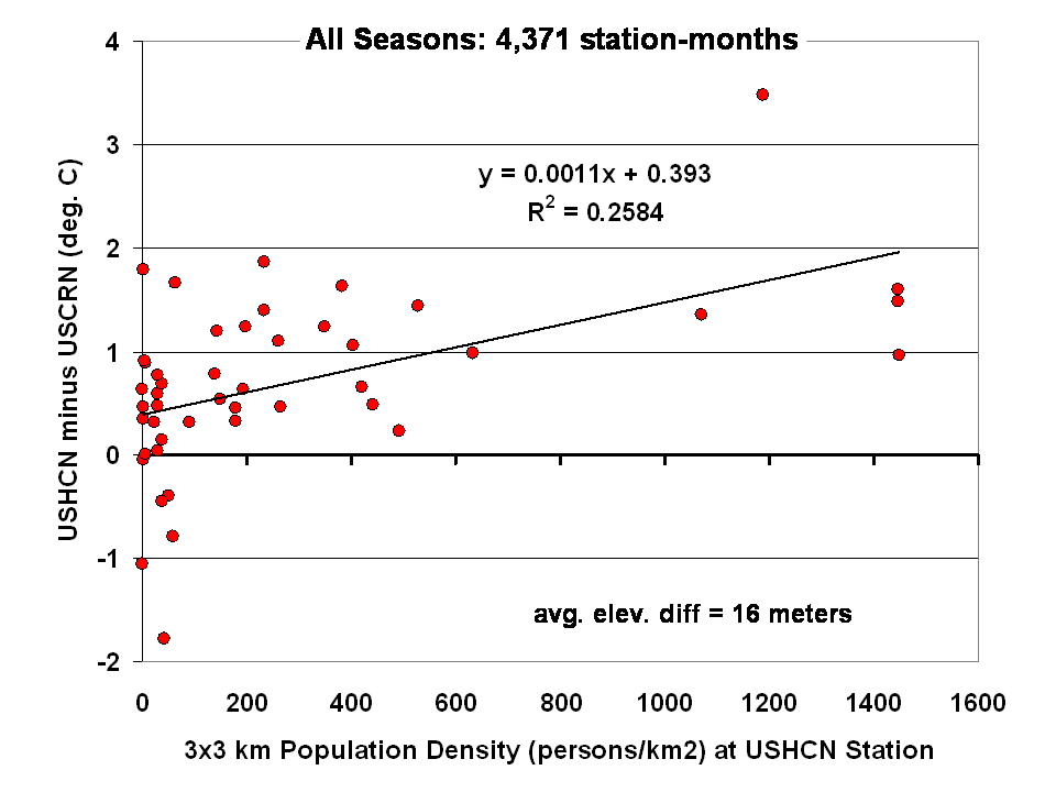
Dr Roy Spencer shows in this post the difference from USHCN to USCRN:
Spurious Warmth in NOAA’s USHCN from Comparison to USCRN
The results for all seasons combined shows that the USHCN stations are definitely warmer than their “platinum standard” counterparts:
 Spencer doesn’t get a match between USHCN and USCRN, so why does the NOAA/NCDC plotter page?
And our research indicates that USHCN as a whole runs warmer that the most pristine stations within it.
In research with our surfacestations metadata, we find that there is quite a separation between the most pristine stations (Class 1/2) and the NOAA final adjusted data for USHCN. This is examining 30 year data from 1979 to 2008 and also 1979 to present. We can’t really go back further because metadata on siting is almost non-existent. Of course, it all exists in the B44 forms and site drawings held in the vaults of NCDC but is not in electronic form, and getting access is about as easy as getting access to the sealed Vatican archives.
By all indications of what we know about siting, the Class 1/2 USHCN stations should be very close, trend wise, to USCRN stations, yet the ENTIRE USHCN dataset, including the hundreds of really bad stations, with poor siting and trends that don’t come close to the most pristine Class 1/2 stations are said to be matching USCRN. But from our own examination of all USHCN data and nearly all stations for siting, we know that is not true.
So, I suppose I should put out a caveat here. I wrote this above:
“What you see is the USCRN data record in its entirety, with no adjustments, no start and end date selections, and no truncation. The only thing that has been done to the monthly average data is gridding the USCRN stations, so that the plot is representative of the Contiguous United States.”
I don’t know that for a fact to be totally true, as I’m going on what has been said about the intents of NCDC in the way they treat and display the USCRN data. They have no code or methodology reference on their plotter web page, so I can’t say with 100% certainty that the output of that web page plotter is 100% adjustment free. The code is hidden in a web engine black box, and all we know are the requesting parameters. We also don’t know what their gridding process is. All I know is the stated intent that there will be no adjustments like we see in USHCN.
And some important information is missing that should be plainly listed. NCDC is doing an anomaly calculation on USCRN data, but as we know, there is only 9 years and 4 months of data. So, what period are they using for their baseline data to calculate the anomaly? Unlike other NOAA graphs like this one below, they don’t show the baseline period or baseline temperature on the graph Zeke plotted above.
This one is the entire COOP network, with all its warts, has the baseline info, and it shows a cooling trend as well, albeit greater than USCRN:

Source: http://www.ncdc.noaa.gov/cag/time-series/us
Every climate dataset out there that does anomaly calculations shows the baseline information, because without it, you really don’t know what your are looking at. I find it odd that in the graph Zeke got from NOAA, they don’t list this basic information, yet in another part of their website, shown above, they do.
Are they using the baseline from another dataset, such as USHCN, or the entire COOP network to calculate an anomaly for USCRN? It seems to me that would be a no-no if in fact they are doing that. For example, I’m pretty sure I’d get flamed here if I used the GISS baseline to show anomalies for USCRN.
So until we get a full disclosure as to what NCDC is actually doing, and we can see the process from start to finish, I can’t say with 100% certainty that their anomaly output is without any adjustments, all I can say with certainty is that I know that is their intent.
Given that there are some sloppy things on this new NCDC plotter page, like the misspelling of the word Contiguous. They spell it Continguous, in the plotted output graph title and in the actual data file they produce: USCRN_Avg_Temp_time-series (Excel Data file). Then there’s the missing baseline information on the anomaly calc, and the missing outputs of data files for the max and min temperature data sets (I had to manually extract them from the HTML as noted by asterisk above).
All of this makes me wonder if the NCDC plotter output is really true, and if in the process of doing gridding, and anomaly calcs, if the USCRN data is truly adjustment free. I read in the USCRN documentation that one of the goals was to use that data to “dial in” the adjustments for USHCN, at least that is how I interpret this:
The USCRN’s primary goal is to provide future long-term homogeneous temperature and precipitation observations that can be coupled to long-term historical observations for the detection and attribution of present and future climate change. Data from the USCRN is used in operational climate monitoring activities and for placing current climate anomalies into an historical perspective. http://www.ncdc.noaa.gov/crn/programoverview.html
So if that is true, and USCRN is being used to “dial in” the messy USHCN adjustments for the final data set, it would explain why USCHN and USCRN match so near perfectly for those 9+ years. I don’t believe it is a simple coincidence that two entirely dissimilar networks, one perfect, the other a heterogeneous train wreck requiring multiple adjustments would match perfectly, unless there was an effort to use the pristine USCRN to “calibrate” the messy USHCN.
Given what we’ve learned from Climategate, I’ll borrow words from Reagan and say: Trust, but verify
That’s not some conspiracy theory thinking like we see from “Steve Goddard”, but a simple need for the right to know, replicate and verify, otherwise known as science. Given his stated viewpoint about such things, I’m sure Mosher will back me up on getting full disclosure of method, code, and output engine for the USCRN anomaly data for the CONUS so that we can do that,and to also determine if USHCN adjustments are being “dialed in” to fit USCRN data.
# # #
UPDATE 2 (Second-party update okayed by Anthony): I believe the magnitude of the variations and their correlation (0.995) are hiding the differences. They can be seen by subtracting the USHCN data from the USCRN data:

Cheers
Bob Tisdale
Mike T says:
June 8, 2014 at 4:18 am: One aspect of electronic probes is that they read a tad higher than mercurial max thermometers due to, I suspect, to lag in the mercury. Mercurial max thermometers also read a tad lower the next day due to contraction in the mercury column overnight.
Liquid in glass thermometers do indeed display a distinct and larger hysteresis than PT100s.
This is demonstrated in college experiments every year.
However, unless your time of observation is such that you ‘catch’ the reading before it has reached either max or min, then the ‘lag’ will be just that, a lag of minutes.
If calibrated correctly, it will indicate the same temperature as a PT100.
steverichards1984 says:
June 8, 2014 at 8:09 am
“Liquid in glass thermometers do indeed display a distinct and larger hysteresis than PT100s.
This is demonstrated in college experiments every year.
However, unless your time of observation is such that you ‘catch’ the reading before it has reached either max or min, then the ‘lag’ will be just that, a lag of minutes.
If calibrated correctly, it will indicate the same temperature as a PT100.”
Steve, my point was that in the days prior to the adoption of electronic temperature probes, TMax was read from a mercurial maximum thermometer, which appear to give a slightly lower TMax than probes. The the bulk of records are from mercurial thermometers, and older records appear to be adjusted downwards, opposite to what would be logical given the difference in measurement technique. Probes give a TMax consistently higher (0.1 to 0.3 degrees C) than mercurial max thermometers, and mercurial thermometers “freeze” their highest reading until reset the next day just like a clinical thermometer is reset by shaking (immediately after the reading, naturally, for re-use). As I suggested originally, if the max therm isn’t read on a given day, but done so the next day before resetting, the mercury column may have retracted another 0.1C (at say, a station that does only one obs per day, at 0900 in Australia). At that time max and min are entered, the min for that day, the max for previous day.
EMSNEWS
The annual linear temperature departure trend for the Canadian provinces directly north of the US NORTHEAST states is also positive as the NCDC indicated for the US NORTHEAST. The positive trend in the CANADIAN ATLANTIC coast was mostly due to warm years for the region in the years like 1999, 2006, 2010 and 2012.. Otherwise the pattern is quite flat with average anomalies of about 1 degree C. So it would appear that the warmer Atlantic Ocean did have a moderating effect. The winter anomaly is also flat although the 2014 winter was the 17 th coldest in the last 70 years . AMO going negative since January may have contributed to this as well as did the ARCTIC vortex dip further south. If AMO stays negative for an extended period like it did in the past , expect colder annual temperatures for the NORTHEAST in the future . This pattern once established could last for 20 years.
steverichards1984
I would like to add that pt100 sensors are generally not ‘naked’. So there is a possibility of ‘lag’ anyway.
I know this story is about the USCRN, but this might have some relevance considering the global temperature ‘product’ with the greatest trend is always the one swung around by alarmists. A couple of years ago, out of interest, I tracked the weather stations used by GISS in England throughout the instrumental record via their website, looking up the station locations and noting their contribution to the GISS record over time. I wrote the results down, lost them and have forgotten the details, but they might be worth looking into again for someone with more scientific ability and better organisational skills than me. What I found is an exponential culling of records through time, from multiple dozens in the 1940’s to a mere handful (around 9) in the present day. There was no evidence to assume the lost stations had stopped reporting – just that GISS stopped using them at selected times. Furthermore, this cull was invariably of rural and airfield (grassy) sites in favour of airports and big RAF airbases, to the point where every single site from 2000 onwards is an airport, presumably designed to measure temperatures over runway tarmac, which would be biased towards warmth (and impacted by other factors like jet exhaust). I could not see any reason why GISS would do this beyond the artificial creation of a warming trend for England. It would be interesting to know if this pattern is repeated in other parts of the world, particularly the US.
As I said, rigorous scientific analysis is beyond my ability, and NASA GISS might have good reasons for their selection (I’d like to know what they are), but might be of interest for someone with better analytical skills than me, particularly in quantifying the effect a biased and bottlenecked-over-time selection of stations might have on a reported trend..
So in a mere 100 years or so we will have some indication of the weather trends of that past period.
Lovely the way the improved sites parody the officially adjusted data.
Mosher,
Your cryptic drive by BS, is sufficiently annoying to put you in the Climate Ace class.
As in don’t bother to read past your name.
You have great access and support on this blog, why do you not make your case in a coherent manner?
English writing skills are supposedly part of your skill set.
Or is this drive by threadjacking, the B.E.S.T you can do?
JJB MKI says:
June 8, 2014 at 8:20 am
Its not a conspiracy. Its just a higher up in the food chain, with an agenda, issuing a well worded edict (pc correct of course). People do what they have to do to keep their jobs.
See update #2 by Bob Tisdale above. Presentation is everything.
re Bob Tisdale’s updata #2
It appears that USHCN is cooling quicker than USCRN. Similar difference plots for Tmin, Tmax may also be informative.
Looking to find data from individual stations in AZ, I find that stations near Tucson have data from Sep 2002, but stations near Yuma and Williams only have data from Mar 2008 and Jun 2008. Looking further afield, a significant number of stations don’t have data until 2006-2008. So, how do we get an accurate average from 2005?
Lance Wallace asks What about “Alaska?”
Although the USCRN Alaska data only begins in 2009, it has undergone a cooling trend since 2000.
Alaska was one of the most rapidly warming places on the globe during the 80s and 90s due to the positive Pacific Decadal Oscillation. Still the record for warmth in stations like Barrow and Fairbanks was 1926. When the PDO reversed Alaska became one of the most rapidly cooling regions. Climate scientists reported
“The mean cooling of the average of all stations was 1.3°C for the decade, a large value for a decade.”
Read Wendler et al., The First Decade of the New Century: A Cooling Trend for Most of Alaska, The Open Atmospheric Science Journal, 2012, 6, 111-116
I occasionally look at Steve Goddard’s site and am concerned about his postings and a lack of objective evaluation of his findings by others. I mean OBJECTIVE. I noticed ”
sunshinehours1 says:
June 8, 2014 at 7:44 am
Zeke, something like 40% of the USHCN Final monthly data is “Estimated” from nearby stations.
Fairy tales.” I looked at the links and it would appear that Steve Goddard is right in claiming a large number of estimates and these add the actual warming. I am bothered that nobody would care to investigate this coolly and objectively. A real job for esteemed Willis Eschenbach, for whom I have a high regard. There can be no doubt that Steve Goddard’s haul of old articles showing that “it was worse than we thought” in the past are appropriate to the debate of endless “unprecedented” current weather events the alarmists haul out at regular intervals to claim extreme weather caused by CO2.
Please could we have a post calmly evaluating the sum of Steve Goddard’s assertions that estimated stations have been added. They are numerous and create the actual warming compared with pre satellite times. I am sure that a lot os visitors to WUWT would appreciate such a fact based discussion.
RE
cryptic remark.
Here is Anthony on Goddard..
Quote:
“I took Goddard to task over this as well in a private email, saying he was very wrong and needed to do better. I also pointed out to him that his initial claim was wronger than wrong, as he was claiming that 40% of USCHN STATIONS were missing.
Predictably, he swept that under the rug, and then proceeded to tell me in email that I don’t know what I’m talking about. Fortunately I saved screen caps from his original post and the edit he made afterwards.
See:
Before: http://wattsupwiththat.files.w…..before.png
After: http://wattsupwiththat.files.w….._after.png
Note the change in wording in the highlighted last sentence.
In case you didn’t know, “Steve Goddard” is a made up name. Supposedly at Heartland ICCC9 he’s going to “out” himself and start using his real name. That should be interesting to watch, I won’t be anywhere near that moment of his.
This, combined with his inability to openly admit to and correct mistakes, is why I booted him from WUWT some years ago, after he refused to admit that his claim about CO2 freezing on the surface of Antarctica couldn’t be possible due to partial pressure of CO2.
http://wattsupwiththat.com/200…..a-at-113f/
And then when we had an experiment done, he still wouldn’t admit to it.
http://wattsupwiththat.com/200…..-possible/
And when I pointed out his recent stubborness over the USHCN issues was just like that…he posts this:
http://stevengoddard.wordpress.com
He’s hopelessly stubborn, worse than Mann at being able to admit mistakes IMHO.
So, I’m off on vacation for a couple of weeks starting today, posting at WUWT will be light. Maybe I’ll pick up this story again when I return.”
Willis,
Thanks for the kind words.
.
Anthony,
The presentation of monthly values with a large scale (-4 F to +6 F) does tend to obscure the differences. They stand out a bit more if you look at annual values:
http://www.ncdc.noaa.gov/temp-and-precip/national-temperature-index/time-series?datasets%5B%5D=uscrn&datasets%5B%5D=cmbushcn¶meter=anom-tavg&time_scale=12mo&begyear=2005&endyear=2014&month=4
However, the differences are pretty small, the USCRN is actually warming faster (er, cooling less slowly) than USHCN. I get similar results when I download the station data for USHCN and USCRN from NCDC’s website: http://i81.photobucket.com/albums/j237/hausfath/USHCNAdjRawUSCRN_zps609ba6ac.png
Unfortunately the period of USCRN coverage is too short to tell us much about the validity of homogenization, since there are relatively few adjustments in USHCN after 2004 (unless you believe Goddard ;-p ). But as I’ve mentioned elsewhere, it will provide a good test going forward.
Data are stubborn things. 2014 looks to be yet another cool year!
Some posters have pointed out the different elevation of the sensors. As the atmosphere is three-dimensional how have the locations been chosen in respect of differing elevations? Surely, a set of temp readings at 1,000′ above sea level would be totally different to a set taken at 3,000′, no? And a set of measurements taken at various elevations would be … anomolous?
There’s an interesting anomaly showing currently at the Canadian Egbert station.
The 8:40 DST readings for the three sensors are 17.0, 17.0, and 17.1. The “calculated” temperature shown is 16.98. I don’t know whether the sensors read to more decimals than shown nor the rounding convention used but it does seem odd at first glance. Is the “calculation” more than just simple averaging?
Averaging 16.95, 16.95, and 17.05 does get one to16.98. This suggests that more significant digits are used than displayed.
NOAA probably explains this somewhere.
I have always found making grand statements about the global temperature average disturbing, If you only look a the macro and not the micro you are bound to error, if you look at the non pristine record you have some sites going up while other going down, if alway looked to me that the so called scientist tokl the low road, instead of going through the entire record and do a complete study as to why there was a divergence they just ignored it and they just put all the number in to their wonderful temperature blender and than made grand announcement about it. Never guarded never qualified no they stated this just the way it is, no question allowed. There should have know better we had the same problem in the food industry people were not careful in grinding meat and some fecal mater slipped in and guess what it containated the whole works. I feel data it like food all the grinding of data only distributes the s%&t throughout it does not get rid of it. No one needs to separate out all the number study why the difference are occurring and than carefully blend it back together and than make careful qualified statement about what the number tell us, in climate science that has not happened. I can only hope the new network is properly maintained and the record data is preserved in a pristine state and that were will be careful enough to not make grand statement as why and how the is changing. I would suggest that you do not hold your breath if becomes clear to some people that this system is not giving them the number they want they will work to destroy it.
It pretty good that this is finally available. However, I did rather lose interest once I realised it was blackbox mojo gridded and monthly anomaly data. And we’re still stuck with clunky, unscientific calendar monthly averages.
At least even hourly data is available, albeit not in a particularly useful form for further processing. That’s more than can be said for most european national weather services who are mostly still playing hide and seek with data and/or trying to charge ridiculous “extraction fees” for anything better than monthly averaged data.
Maybe there will be some additions now they have it all on-line.
The “gridding” process requires a full description (preferable with code) that is precise enough to produce the same results from the source data.
When can we tell our climate alarmist friends that this last decade is cooler than the last? When will they accept that data?
I get USHCN and GHCNM data from NOAA’s (very good !) FTP site rather than their web-pages (though I don’t know how long that will last after posting the link at WUWT …).
In “ftp://ftp.ncdc.noaa.gov/pub/data/” there is a “./uscrn/” sub-directory containing A LOT of files.
In particular, the “./uscrn/products/monthly01/” sub-directory contains (what appears to be) individual station records (.txt files from 2 to 19 KB in size), and “./uscrn/products/daily01/ contains yearly sub-directories from “/2000/” (2 station records, both in “NC_Ashville” … NC = “North Carolina” ?) to “/2014/” (~190 to 200 station records).
Note that a complete year’s worth of DAILY data appears to result in a 78 KB (.txt) file …
I don’t have the statistical background to analyse ALL of the data files, but maybe some other readers here do (?).
Q1 : when it’s true.
Q2 : hell freezing over be an indication of weird weather, caused by anthropogenic emissions from fossil fuels. Any “myths” claiming otherwise will be “debunked”. EPA will be mandating “low carbon” fuels be used in hell to torment sinners ( especially D-niers who will of course be present in legion ).
Thanks, Anth*ny, for contributing to the creation of this network. It’s the only surface station network that I trust.
Wonder what the correlation between it and the UAH/RSS satellites and USHCN over the same period would look like?
I presume this is the same Steven Mosher that some are criticizing?
James Delingpole on Moser:
“Few outside the climate skeptic circle have ever heard of Steven Mosher. An open-source software developer, statistical data analyst, and thought of as the spokesperson of the lukewarmer set, Mosher hasn’t made any of the mainstream media outlets covering the story of Climategate. But make no mistake about it – when it comes to dissemination of the story, Steven Mosher is to Climategate what Woodward and Bernstein were to Watergate. He was just the right person, with just the right influence, and just the right expertise to be at the heart of the promulgation of the files.” http://blogs.telegraph.co.uk/news/jamesdelingpole/100022057/steven-mosher-the-real-hero-of-climategate/
In my quest for Truth, it usually comes from the places I don’t want to look. Mr. Mosher, if this is indeed you, thank you.
@Tom Moran
Yes that’s him.
have no information on siting but I do have suspicions that the high spikes in the data are not real. Specifically, I suspect that the 5 degree Celsius jump in January 2006 is phony and does not exist. The other two spikws, in January 2007 and January 2012 are also suspicious. I have come to that conclusion from an examination of temperature records from NOAA, GISTEMP, and HadCRUT on 0the interval from 1979 to 2012. They all show upward spikes like that at the beginnings of most years on that time interval. These spikes are in exactly the same locations in all three, supposedly independent data sets from two sides of the ocean. I have definitely identified more than ten such spurious spikes on this temperature interval and regard them as an unanticipated consequence from computer processing that somehow got screwed up and left its traces in these data collections. The spike in January 2007 of USCRN, in particular, happens to coincide with a spike that exists in the three other mv data sets referred to. To me, this ties the data set to the others carrying spikes, with all that that implies.
Great post Anthony, et al.
Now I’ll go upstream to read the comments 🙂