 NOTE: significant updates have been made, see below.
After years of waiting, NOAA has finally made a monthly dataset on the U.S. Climate Reference Network available in a user friendly way via their recent web page upgrades. This data is from state-of-the-art ultra-reliable triple redundant weather stations placed on pristine environments. As a result, these temperature data need none of the adjustments that plague the older surface temperature networks, such as USHCN and GHCN, which have been heavily adjusted to attempt corrections for a wide variety of biases. Using NOAA’s own USCRN data, which eliminates all of the squabbles over the accuracy of and the adjustment of temperature data, we can get a clear plot of pristine surface data. It could be argued that a decade is too short and that the data is way too volatile for a reasonable trend analysis, but let’s see if the new state-of-the-art USCRN data shows warming.
A series of graphs from NOAA follow, plotting Average, Maximum, and Minimum surface temperature follow, along with trend analysis and original source data to allow interested parties to replicate it.
First, some background on this new temperature monitoring network, from the network home page:

The U.S. Climate Reference Network (USCRN)consists of 114 stations developed, deployed, managed, and maintained by the National Oceanic and Atmospheric Administration (NOAA) in the continental United States for the express purpose of detecting the national signal of climate change. The vision of the USCRN program is to maintain a sustainable high-quality climate observation network that 50 years from now can with the highest degree of confidence answer the question: How has the climate of the nation changed over the past 50 years? These stations were designed with climate science in mind.
Source: http://www.ncdc.noaa.gov/crn/
As you can see from the map below, the USCRN is well distributed, with good spatial resolution, providing an excellent representivity of the CONUS, Alaska, and Hawaii.

From the Site Description page of the USCRN:
==========================================================
Every USCRN observing site is equipped with a standard set of sensors, a data logger and a satellite communications transmitter, and at least one weighing rain gauge encircled by a wind shield. Off-the-shelf commercial equipment and sensors are selected based on performance, durability, and cost.
Highly accurate measurements and reliable reporting are critical. Deployment includes calibrating the installed sensors and maintenance will include routine replacement of aging sensors. The performance of the network is monitored on a daily basis and problems are addressed as quickly as possible, usually within days.
…
Many criteria are considered when selecting a location and establishing a USCRN site:
- Regional and spatial representation: Major nodes of regional climate variability are captured while taking into account large-scale regional topographic factors.
- Sensitivity to the measurement of climate variability and trends: Locations should be representative of the climate of the region, and not heavily influenced by unique local topographic features and mesoscale or microscale factors.
- Long term site stability: Consideration is given to whether the area surrounding the site is likely to experience major change within 50 to 100 years. The risk of man made encroachments over time and the chance the site will close due to the sale of the land or other factors are evaluated. Federal, state, and local government land and granted or deeded land with use restrictions (such as that found at colleges) often provide a high stability factor. Population growth patterns are also considered.
- Naturally occurring risks and variability:
- Flood plains and locations in the vicinity of orographically induced winds like the Santa Ana and the Chinook are avoided.
- Locations with above average tornado frequency or having persistent periods of extreme snow depths are avoided.
- Enclosed locations that may trap air and create unusually high incidents of fog or cold air drainage are avoided.
- Complex meteorological zones, such as those adjacent to an ocean or to other large bodies of water are avoided.
- Proximity:
- Locations near existing or former observing sites with long records of daily precipitation and maximum and minimum temperature are desirable.
- Locations near similar observing systems operated and maintained by personnel with an understanding of the purpose of climate observing systems are desirable.
- Endangered species habitats and sensitive historical locations are avoided.
- A nearby source of power is required. AC power is desirable, but, in some cases, solar panels may be an alternative.
- Access: Relatively easy year round access by vehicle for installation and periodic maintenance is desirable.
Source: http://www.ncdc.noaa.gov/crn/sitedescription.html
==========================================================
As you can see, every issue and contingency has been thought out and dealt with. Essentially, the U.S. Climate Reference Network is the best climate monitoring network in the world, and without peer. Besides being in pristine environments away from man-made influences such as urbanization and resultant UHI issues, it is also routinely calibrated and maintained, something that cannot be said for the U.S. Historical Climate Network (USHCN), which is a mishmash of varying equipment (alcohol thermometers in wooden boxes, electronic thermometers on posts, airport ASOS stations placed for aviation), compromised locations, and a near complete lack of regular thermometer testing and calibration.
Having established its equipment homogenity, state of the art triple redundant instrumentation, lack of environmental bias, long term accuracy, calibration, and lack of need for any adjustments, let us examine the data produced for the last decade by the U.S. Climate Reference Network.
First, from NOAA’s own plotter at the National Climatic Data Center in Asheville, NC, this plot they make available to the public showing average temperature for the Contiguous United States by month:

Source: NCDC National Temperature Index time series plotter
To eliminate any claims of “cherry picking” the time period, I selected the range to be from 2004 through 2014, and as you can see, no data exists prior to January 2005. NOAA/NCDC does not make any data from the USCRN available prior to 2005, because there were not enough stations in place yet to be representative of the Contiguous United States. What you see is the USCRN data record in its entirety, with no adjustments, no start and end date selections, and no truncation. The only thing that has been done to the monthly average data is gridding the USCRN stations, so that the plot is representative of the Contiguous United States.
Helpfully, the data for that plot is also made available on the same web page. Here is a comma separated value (CSV) Excel workbook file for that plot above from NOAA:
USCRN_Avg_Temp_time-series (Excel Data File)
Because NOAA/NCDC offers no trend line generation in their user interface, from that NOAA provided data file, I have plotted the data, and provided a linear trend line using a least-squares curve fitting procedure which is a function in the DPlot program that I use.
Not only is there a pause in the posited temperature rise from man-made global warming, but a clearly evident slight cooling trend in the U.S. Average Temperature over nearly the last decade:

We’ve had a couple of heat waves and we’ve had some cool spells too. In other words, weather.
The NCDC National Temperature Index time series plotter also makes maximum and minimum temperature data plots available. I have downloaded their plots and data, supplemented with my own plots to show the trend line. Read on.
NOAA/NCDC plot of maximum temperature:
 Source of the plot here.
Data from the plot: USCRN_Max_Temp_time-series (Excel Data File)*
My plot with trend line:

As seen by the trend line, there is a slight cooling in maximum temperatures in the Contiguous United States, suggesting that heat wave events (seen in 2006 and 2012) were isolated weather incidents, and not part of the near decadal trend.
NOAA/NCDC plot of minimum temperature:

Source of the plot here.
USCRN_Min_Temp_time-series (Excel Data File)*
The cold winter of 2013 and 2014 is clearly evident in the plot above, with Feb 2013 being -3.04°F nationally.
My plot with trend line:

*I should note that NOAA/NCDC’s links to XML, CSV, and JSON files on their plotter page only provide the average temperature data set, and not the maximum and minimum temperature data sets, which may be a web page bug. However, the correct data appears in the HTML table on display below the plot, and I imported that into Excel and saved it as a data file in workbook format.
The trend line illustrates a cooling trend in the minimum temperatures across the Contiguous United States for nearly a decade. There is some endpoint sensitivity in the plots going on, which is to be expected and can’t be helped, but the fact that all three temperature sets, average, max, and min show a cooling trend is notable.
It is clear there has been no rise in U.S. surface air temperature in the past decade. In fact, a slight cooling is demonstrated, though given the short time frame for the dataset, about all we can do is note it, and watch it to see if it persists.
Likewise, there does not seem to have been any statistically significant warming in the contiguous U.S. since start of the new USCRN data, using the average, maximum or minimum temperature data.
I asked three people who are well versed in data plotting and analysis to review this post before I published it, one, Willis Eschenbach, added his own graph as part of the review feedback, a trend analysis with error bars, shown below.

While we can’t say there has been a statistically significant cooling trend, even though the slope of the trend is downward, we also can’t say there’s been a statistically significant warming trend either.
What we can say, is that this is just one more dataset that indicates a pause in the posited rise of temperature in the Contiguous United States for nearly a decade, as measured by the best surface temperature monitoring network in the world. It is unfortunate that we don’t have similar systems distributed worldwide.
UPDATE:
Something has been puzzling me and I don’t have a good answer for the reason behind it, yet.
As Zeke pointed out in comments and also over at Lucia’s, USCRN and USHCN data align nearly perfectly, as seen in this graph. That seems almost too perfect to me. Networks with such huge differences in inhomogeneity, equipment, siting, station continuity, etc. rarely match that well.
![Screen-Shot-2014-06-05-at-1.25.23-PM[1]](https://wattsupwiththat.files.wordpress.com/2014/06/screen-shot-2014-06-05-at-1-25-23-pm1.png?quality=75)
Note that there is an important disclosure missing from that NOAA graph, read on.
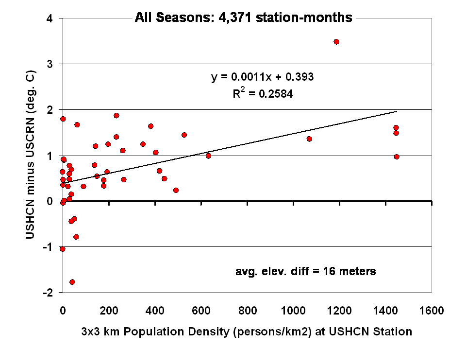
Dr Roy Spencer shows in this post the difference from USHCN to USCRN:
Spurious Warmth in NOAA’s USHCN from Comparison to USCRN
The results for all seasons combined shows that the USHCN stations are definitely warmer than their “platinum standard” counterparts:
 Spencer doesn’t get a match between USHCN and USCRN, so why does the NOAA/NCDC plotter page?
And our research indicates that USHCN as a whole runs warmer that the most pristine stations within it.
In research with our surfacestations metadata, we find that there is quite a separation between the most pristine stations (Class 1/2) and the NOAA final adjusted data for USHCN. This is examining 30 year data from 1979 to 2008 and also 1979 to present. We can’t really go back further because metadata on siting is almost non-existent. Of course, it all exists in the B44 forms and site drawings held in the vaults of NCDC but is not in electronic form, and getting access is about as easy as getting access to the sealed Vatican archives.
By all indications of what we know about siting, the Class 1/2 USHCN stations should be very close, trend wise, to USCRN stations, yet the ENTIRE USHCN dataset, including the hundreds of really bad stations, with poor siting and trends that don’t come close to the most pristine Class 1/2 stations are said to be matching USCRN. But from our own examination of all USHCN data and nearly all stations for siting, we know that is not true.
So, I suppose I should put out a caveat here. I wrote this above:
“What you see is the USCRN data record in its entirety, with no adjustments, no start and end date selections, and no truncation. The only thing that has been done to the monthly average data is gridding the USCRN stations, so that the plot is representative of the Contiguous United States.”
I don’t know that for a fact to be totally true, as I’m going on what has been said about the intents of NCDC in the way they treat and display the USCRN data. They have no code or methodology reference on their plotter web page, so I can’t say with 100% certainty that the output of that web page plotter is 100% adjustment free. The code is hidden in a web engine black box, and all we know are the requesting parameters. We also don’t know what their gridding process is. All I know is the stated intent that there will be no adjustments like we see in USHCN.
And some important information is missing that should be plainly listed. NCDC is doing an anomaly calculation on USCRN data, but as we know, there is only 9 years and 4 months of data. So, what period are they using for their baseline data to calculate the anomaly? Unlike other NOAA graphs like this one below, they don’t show the baseline period or baseline temperature on the graph Zeke plotted above.
This one is the entire COOP network, with all its warts, has the baseline info, and it shows a cooling trend as well, albeit greater than USCRN:

Source: http://www.ncdc.noaa.gov/cag/time-series/us
Every climate dataset out there that does anomaly calculations shows the baseline information, because without it, you really don’t know what your are looking at. I find it odd that in the graph Zeke got from NOAA, they don’t list this basic information, yet in another part of their website, shown above, they do.
Are they using the baseline from another dataset, such as USHCN, or the entire COOP network to calculate an anomaly for USCRN? It seems to me that would be a no-no if in fact they are doing that. For example, I’m pretty sure I’d get flamed here if I used the GISS baseline to show anomalies for USCRN.
So until we get a full disclosure as to what NCDC is actually doing, and we can see the process from start to finish, I can’t say with 100% certainty that their anomaly output is without any adjustments, all I can say with certainty is that I know that is their intent.
Given that there are some sloppy things on this new NCDC plotter page, like the misspelling of the word Contiguous. They spell it Continguous, in the plotted output graph title and in the actual data file they produce: USCRN_Avg_Temp_time-series (Excel Data file). Then there’s the missing baseline information on the anomaly calc, and the missing outputs of data files for the max and min temperature data sets (I had to manually extract them from the HTML as noted by asterisk above).
All of this makes me wonder if the NCDC plotter output is really true, and if in the process of doing gridding, and anomaly calcs, if the USCRN data is truly adjustment free. I read in the USCRN documentation that one of the goals was to use that data to “dial in” the adjustments for USHCN, at least that is how I interpret this:
The USCRN’s primary goal is to provide future long-term homogeneous temperature and precipitation observations that can be coupled to long-term historical observations for the detection and attribution of present and future climate change. Data from the USCRN is used in operational climate monitoring activities and for placing current climate anomalies into an historical perspective. http://www.ncdc.noaa.gov/crn/programoverview.html
So if that is true, and USCRN is being used to “dial in” the messy USHCN adjustments for the final data set, it would explain why USCHN and USCRN match so near perfectly for those 9+ years. I don’t believe it is a simple coincidence that two entirely dissimilar networks, one perfect, the other a heterogeneous train wreck requiring multiple adjustments would match perfectly, unless there was an effort to use the pristine USCRN to “calibrate” the messy USHCN.
Given what we’ve learned from Climategate, I’ll borrow words from Reagan and say: Trust, but verify
That’s not some conspiracy theory thinking like we see from “Steve Goddard”, but a simple need for the right to know, replicate and verify, otherwise known as science. Given his stated viewpoint about such things, I’m sure Mosher will back me up on getting full disclosure of method, code, and output engine for the USCRN anomaly data for the CONUS so that we can do that,and to also determine if USHCN adjustments are being “dialed in” to fit USCRN data.
# # #
UPDATE 2 (Second-party update okayed by Anthony): I believe the magnitude of the variations and their correlation (0.995) are hiding the differences. They can be seen by subtracting the USHCN data from the USCRN data:

Cheers
Bob Tisdale
Unless it’s warming.
Across the pond in another very small part of the world temps have been heading south at an alarming rate. If this continues it will soon match its recent alarming rise.
I vaguely recall that co2 is now (was?) the main driver of climate, swamping natural climate drivers – a new kind of control knob. If the surface temperature standstill continues, it will be interesting to look back into the archives. It will a very important historical lesson for students off Climastrology.
Jimbo says:
June 8, 2014 at 4:00 am
but they started adjusting up when the temps appeared to be going down. They were forced to introduce HadCru 4 to rectify their problem. As we all know, their chief scientist can still see ‘AGW’ in the weather the UK is having or had recently.
Can this data [or even should this data] be compared to the satellite data?
It is bad and unacceptable science to go back to original data and modify it without very good, proven scientific reasons. That means that you should be able to justify your algorythm completely, no fudge, no doubt.
I note in the old thread posted above:
http://wattsupwiththat.com/2011/05/23/little-ice-age-thermometers-%E2%80%93-history-and-reliability-2/
talk of “icebergs at the the walls of Byzantium” which is, well, unlikely given its location, at the eastern end of the Mediterranean Sea. Other aspects of thermometer accuracy were interesting, especially the calculation of “daily average temperature” from observations spread throughout the day and night. That would appear to have huge problems! Australian practice has been for many years to add the max and min and divide by two, which is also not perfect (some locations, especially coastal can have a “spike” in the max or min due to wind changes) but far better than any other method which involves “spot” temperatures.
One aspect of electronic probes is that they read a tad higher than mercurial max thermometers due to, I suspect, to lag in the mercury. Mercurial max thermometers also read a tad lower the next day due to contraction in the mercury column overnight. All this means is that older, pre-electronic max temperatures, that have been adjusted to make them colder, should in fact perhaps be adjusted upwards to account for the difference between the two measurement systems.
So let me get this straight: the trend in average contiguous NA temps shown here is -0.6 deg F per decade, or -3.3 deg C per century. If this turned out to be a global trend, at this rate, by 2100 we’d project a fall of around 2.9 deg C. Now a rise of more than 2 deg C is expected to be catastrophic. But a drop of >2 deg C could be much, much worse.
And it’s clearly an anthropogenic signal. For the sake of the grandchildren, surely the precautionary principle suggests we should immediately abandon the irresponsible and reprehensible adoption of so-called renewable energy sources, establish some form of intergovernmental panel under UN authority, have a review done by a prominent UK Lord in order to establish an uncontested spending policy,…
Sorry, went a bit mad there.
Willis Eschenbach says:
June 8, 2014 at 3:21 am
“So while I may and do disagree at times with both Zeke and Mosh, and although Mosh’s sparse posting style often drives me spare,”
I think this is the main issue with Mosher. His style projects an arrogance and contempt that provokes an agry reaction. It is useless to say that “As near as I can tell, both Zeke and Mosh are scientists and intelligent, honest men” when the perception of their personnas is clearly not that at all.
Mark Twain said ” perception is the truth”
Also, you can hardly critisize Goddard’s comments about them when you fail to back up your own, in this comment, to the same level you demand of Goddard.
Goddard has receive some communications from both of them whether directly or indirectly and has made up his mind based on those. This is something we all inadvertently and for sure I have done so here.
Lastly, Goddard does provide links to some of his data retrieval points and a fair and reasoned criticism from you would be welcomed by me. There seems to be this war breaking out between the skeptic blogs in recent times. It is not beneficial or intelligent.
I do not agree with everything that Goddard writes and similarly with everything that Anthony writes but I am able to agree with everything SteveMc writes. He is VERY precise with his phraseology but few of us are thus gifted.
When we talk of UHI we often think of concrete, metal, AC vents etc. WUWT covered the Armagh Observatory in 2010 and here is a quote.
The US state of the art climate system needs to go global ASAP.
Steven Mosher’s Education
UCLA
Ph.D. Program, English
1981 – 1985
University of California, Los Angeles
English
1981 – 1985
Northwestern University
B.A, Philosophy and English
1977 – 1981
Mosher IS NOT a scientist !!!
he’s a note-taker.
REPLY: Look, enough of this, you assume people can’t learn, grow, and publish. Mosher has done all that. Plus I don’t particularly like your style of throwing denigration from behind a fake name, which is no better than some of the alarmist acolytes do. Don’t post this irrelevant stuff again. – Anthony
A rather contemptuous dismissal of a bloke’s academic achievements. Despite the lack of a scientific background, I’d be happy to have half this bloke’s academic achievements.
Mike T BA (but works in science)
The take away for me from this pristine data set is +/- 3 deg C variation over very short (a few years) time periods is the norm. While 10 years isn’t long enough to see the “global warming” signal, it is quite possible that over a half century of data would be required to break out of the natural variation.
is the pinch of salt taken from water retrieved from the deep oceans ? If so could it be used as a proxy for the hiding heat ?
Lower minimums = crop failures.
Any scientist reporting empirical results is a scientist. Any scientist extrapolating on her/his empiricism might still be a scientist – and might not. Any scientist expressing non-empirical conclusions in support of an action is clearly not.
Jimbo,
“The US state of the art climate system needs to go global ASAP.” I second that motion.
However, the argument will likely be made that it is too late for that. After all, the science is already “settled” and future warming is already “baked in”, but is currently in hiding.
Fortunately, Gaia is blessed with a group of modern day, much improved embodiments of Rumpelstiltskin, able not only to spin straw (bad data) into gold (good data), but also able to spin nothing (missing data) into gold (good data). (sarc off)
It is difficult to comprehend an area of science so focused on temperature and temperature change, yet so casual about its collection of temperature data.
Charles Darwin was NOT a scientist either. Should we have rejected his claims?
http://www.bbc.co.uk/history/historic_figures/darwin_charles.shtml
As much as I find Mosher irritating, and find your claim technically correct, you are barking up the wrong tree. It does not matter whether he is a scientist, what matters is whether he is right. Some Warmists scream that such and such a person is not a ‘climate scientist’. I charge back that Dr. James Hansen et. al. are not climate scientists either.
I desperately do not want to start a scrap between skeptical blogs but I do want some guidance and reference from the folks I trust at WUWT with regard to Steven Goddard…who appears to be regularly posting examples of officially altered data as well as newspaper reports and photographs of climate extremes and catastrophes from times when the Global Temp was much lower than at present.
Now Mosher and Zeke are attacking Goddard on this site…so why don’t we clear the air?
It’s a pretty simple question, and surely a man like Willis (who can confidently make calculations on the basis of a 0.2C Global Sea Surface temperature measured circa 1870) – should be able to answer it quite categorically.
Is Steven Goddard is playing fast and loose with the facts?
Has the past been cooled?
It is important that we skeptics do not find ourselves out on a limb arguing from invalid positions. One of the best aspects of WUWT is its sidebars filled with independent, authoritative data sources. As the Warmist models collapse now is surely the time for confidence and unity.
◾Complex meteorological zones, such as those adjacent to an ocean or to other large bodies of water are avoided.
Why are the Alaskan CRN thermometers all around the coast. Only one is posed in the interier.
Jimbo
“I charge back that Dr. James Hansen et. al. are not climate scientists either.”
Whilst I’m 97% certain that Anthony does not want this thread to develop into a slag fest, Astronomy is a science, english isn’t. Climate is not a science, IMHO. It is much more a mathematical exercise at one level and a somewhat physical science on another level. It seems to me that climate science is an aggregation of several disciplines. This leads to the “apparent lack of honesty”. As you and willis have said these people are probably not liars and cheats but they may just not know what they don’t know. Jacks of trades Masters of none. Climate related studies IMHO, should all be produced by a team of mixed specialist and yes there is a place for an English PhD as well as a good statatistion, a physicist and an IT bod.
Now, I do not believe that a uni qualification is the sole requirement for intelligent analysis but a science based study will provide a better foundation for technical analyses than english. It will provide you with the appropriate tools and method to not make the errors to which some scientific studies have become prone.
I have met geography grads with a better penchant for anaylysis that a science grad. So, if mosh et al make their comments more detailed maybe we could be more confident that they actually are doing science and not english.
Willis: Note that Steve Goddard has not provided a single quote or citation to back up his claims about what Zeke and Mosher “think”, or what they comprehend, or what their “approach” is. It’s all just mud-slinging
====
Willis, not in that one “cherry picked” post…..but he has, many times in other posts
Steve has a rapid way of posting…you have to read them all
Correction to the posting above.
It’s a pretty simple question, and surely a man like Willis (who can confidently make calculations on the basis of a 0.2C Global Sea Surface temperature ‘anomaly’ measured circa 1870) – should be able to answer it quite categorically.
Those are NOT ‘well placed’ thermometers!!!
Two next to Tucson Arizona, one in hot as hell Yuma and only one way up by the Grand Canyon when half of the state is cooler due to elevation???
And NY/Vermont has half as many thermometers than say, similar size areas in the Midwest???
Upstate NY and all of mountainous Vermont has NO thermometers!!! It is considerably colder up here than say, south end of Hudson valley.
I find it is disgraceful that the UN body IPCC, who believe we are heading into catastrophe, could not establish an equivalent global thermometer network. If we are all going to die, wouldn’t funding exist for such a network?! Where are the billions of funding already wasted?
Could it be, that the international powers really don’t want to know, what is really happening to GMT?? It is only the political objectives of forced social change that interest them in this fast approaching… Brave New World!
I pity us all. GK
“Why are the Alaskan CRN thermometers all around the coast. Only one is posed in the interier.”
One thought could be that the interior of Alaska is pristine wilderness, very few roads and a lot of locations can only be reached by plane. I don’t think that type of terrain lends itself to building, powering, and maintaining a state of the art monitoring station. I would think it would be prohibitively expensive.
“Access: Relatively easy year round access by vehicle for installation and periodic maintenance is desirable.”
It is very good that we now have an well-designed station network.
I had to check to see if the numbers were relatively similar to the currently reported USHCN V2 temperatures and they are. I guess there is a good reference to compare to now. But that does not mean the USCRN network database cannot be adjusted. In the future, NCDC is going to do whatever it wants to in the database.
A comparison of USCRN and USHCN V2 (current) and then what the USHCN reported temperature was in October 2009. (I’ve been saving the numbers since this time). I’ve also recalculated the October 2009 USHCN temperature anomalies using the current 1981-2010 base period and surprise, 2004 to 2009 use to be warmer.
http://s2.postimg.org/ftpx3y9ah/Conus_CRN_USHCN_Apr14.png
I also have an earlier version of USHCN from 2002. The average temperatures from 1895 to about 2000 use to be about 0.8F higher than they are reported to be now. Between 2000 and 2002, the difference rises to about 0.2F. This has increased the temperature trend by about 33% compared to what it use to be 2002.
http://s29.postimg.org/473ylf2c7/Conus_USHCN_vs_2002_Version_Apr14.png
The adjustments don’t matter (to some). Maybe the 2004 onward temps will no longer need to be adjusted but that does not mean that pre-2004 temperatures are not going to change downward.
Anyone who thinks Dr Doom’s dead hand is no longer part of NOAA outlook needs to remember that the chances of him not being involved in who was picked has his replacement are as likley has Mann being humble and admitting his mistakes.