…or Introductions to the Impacts of El Niños on Global Weather Patterns and to the Long-Term Effects of Strong El Niño Events on Global Surface Temperatures
Since the first of the year, there have been hundreds, possibly thousands, of news stories about the growing possibility of a strong El Niño evolving this year. Your local weather forecaster has probably mentioned it a couple of times over the past few months. Joe Bastardi of WeatherBELL Analytics has made regular visits to the cross posts of this series at WattsUpWithThat. Also in that time, the blogosphere has been alight about the possible El Niño…with many of the posts by climate alarmists providing more misinformation than facts. We discussed one of those alarmist posts in The 2014/15 El Niño – Part 2 – The Alarmist Misinformation (BS) Begins.
Because El Niño events are typically tied to the seasonal cycle, this El Niño, if it continues to develop and it likely will, would peak in November 2014 to January 2015. So you may be wondering why there’s all the interest in some slow-developing weather event that may happen to grow throughout the rest of the year.
In short, El Niño events cause massive changes in “normal” weather patterns around the globe and El Niño events can cause long-term changes in global surface temperatures. A more detailed answer…
THERE ARE NO OTHER WEATHER-RELATED EVENTS ON EARTH THAT COMPARE IN MAGNITUDE TO AN EL NIÑO
El Niño events are by far the largest of any weather-related phenomenon taking place on the planet, and they impact weather around the globe. If you think tropical cyclones (hurricanes) are big, sometimes it takes two cyclones straddling the equator in the western Pacific just to kick start the initial processes that might cause an El Niño to form. Only catastrophic explosive volcanic eruptions like El Chichon in 1982 and Mount Pinatubo in 1991 can counteract the global effects of an El Niño.
We’ve all seen animations of hurricanes forming over the eastern tropical North Atlantic, just west of Africa, and we’ve watched the satellite images of those hurricanes spiraling as they march their way westward toward the Americas. (Those of us living along the Atlantic or Gulf coasts watch a little more closely.) As an El Niño develops thousands of miles west in the tropical Pacific, that developing El Niño suppresses the formation of hurricanes by chopping off their tops…through a phenomenon called wind shear. That’s why forecasters reduce the number of possible hurricanes during an El Niño-development year. The impact of El Niños on hurricanes was first reported by longtime hurricane forecaster Dr. William Gray, Professor of Atmospheric Science at Colorado State University. See Gray (1984) Atlantic Seasonal Hurricane Frequency. Part I: El Niño and 30 mb Quasi-Biennial Oscillation Influencesand Atlantic Seasonal Hurricane Frequency. Part II: Forecasting its Variability.
Parts of the U.S., Australia and other regions around the globe have been plagued recently by drought. The persons living through them understand that the lack of precipitation has been influenced, to some extent, by the recent dominance of La Niña events (or the non-Niño 2013/14 season). La Niña events, though the processes behind them are not the opposite of El Niño events, can have effects on regional weather that tend to be the opposite of El Niños—with tend being the operative word in that sentence. So droughts might be lessened in some parts of the globe if an El Niño forms this year.
Correction: I’ve crossed out Australia in the above paragraph. As I was reminded in comments, in Australia, droughts are associated with El Niño. And that agrees with my later description of precipitation migrating eastward during an El Niño, accompanying the warm water. (Thanks, Nick and Angech.)
On the GRID-Arendal webpage Climate impacts of El Niño Phenomenon in Latin America and the Caribbean, they provide a map (Figure 1) which shows the impacts of the 1997/98 El Niño on those regions. Note the graph that presents the impact of that El Niño on the fishing industry. Fisherman there would not be looking forward to a strong El Niño.

Figure 1
The Royal Netherlands Meteorological Institute (KNMI) webpage Effects of El Niño on world weather illustrates the typical impacts of El Niño events on precipitation, temperature and tropical cyclones around the globe, on seasonal (quarterly) bases. Lots of detail.
Because El Niño events can have strong impacts on Australia’s weather, their Bureau of Meteorology (BOM) has numerous El Niño-related webpages, including, for example:
- ENSO Wrap-Up – Current state of the Pacific and Indian Ocean
- Risk Management and El Niño and La Niña
- Australian rainfall patterns during El Niño events
NOAA has a multitude of webpages about the impacts of El Niño events, including:
- El Niño Impacts
- El Niño-Southern Oscillation (ENSO) Diagnostic Discussion, which includes their Weekly ENSO Update (pdf)
- Weather Impacts of ENSO
The UK Met Office (UKMO) has a similar webpage titled ENSO Impacts, where ENSO stands for El Niño-Southern Oscillation. El Niño in that commonly used term represents the ocean component and the Southern Oscillation represents the atmospheric side. Figure 2 shows the maps prepared by the UKMO for El Niños, with precipitation on the left and temperature on the right.

Figure 2 (Click to enlarge.)
The UKMO includes the following note of caution (their boldface):
Each ENSO event is different, and occurs in conjunction with other climatic events. Not all impacts occur in all events, and impacts may not be confined to the regions indicated. Thus these maps should not be regarded as forecasts for a current event, but rather as an indication of areas where impacts are likely, based on historical evidence.
Japan Meteorological Agency (JMA) also has El Niño Monitoring and Outlook discussions.
Researchers at the Japan Agency for Marine-Earth Science and Technology (JAMSTEC) have been studying the differences in the impacts on weather of Central Pacific El Niño events (El Niño Modoki) and East Pacific El Niño events. Yes, El Niños come in different flavors depending on which part of the equatorial Pacific they directly influence. As their names imply, some El Niños are focused more toward the central part of the equatorial Pacific, while others, the stronger ones, also extend into the eastern portion. See Ashok et al. (2007) El Niño Modoki and Its Possible Teleconnection.
Now you may be wondering how a weather-related event in the central and eastern equatorial Pacific causes all of those changes in weather patterns around the globe.
It’s a matter of scale.
WEATHER PATTERNS AROUND THE GLOBE DEPEND ON THE STATE OF THE TROPICAL PACIFIC
I’m going to borrow parts of a couple of illustrations from my book Who Turned on the Heat? for this portion of the discussion. But first, I want to try to impress on you the size of the tropical Pacific.
There are lots of stats about the monstrous scale of the Pacific. The Pacific Ocean covers about 33% of the surface of the globe, more than the continental land masses combined. El Niño events take place along the equator in the Pacific, and the equatorial Pacific stretches almost halfway around the globe as shown in Figure 3.

Figure 3
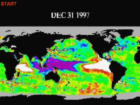
The 1997/98 El Niño had caused warm water from the western equatorial Pacific to shift eastward about one-quarter of the way around the globe, Figure 4, temporarily raising the sea surface temperatures west of the Galapagos Islands 5 to 6 deg C (9 to 11 deg F). (See the discussion of Animation 1 and Figures 7 through 9 in the post here.)

Figure 4
Figure 5 is a cartoon-like image of the Pacific Ocean during “normal” conditions (aka ENSO-neutral conditions). The trade winds blow across the surface of the tropical Pacific and the sunlight-warmed water accumulates in an area of the western tropical Pacific known as the West Pacific Warm Pool. In effect, it’s “stacking up” against the land masses there. As a result of that trade-wind-blown process, the West Pacific Warm Pool contains some of the warmest ocean water on the planet. With the warm water comes lots of evaporation. As the warm moist air rises, it cools and condenses, forming clouds and eventually falling as rain. Rainfall in that part of the world is also extremely high.

Figure 5
(Note: For a detailed cartoon-based introduction to El Niño and La Niña events see the post here. Where most introductions to ENSO include 3 cartoons—one each for El Niño, ENSO-neutral, and La Niña conditions—that post includes 29 illustrations.)
Back to scale and the enormity of the Pacific: the West Pacific Warm Pool can grow to be the size of Russia or about twice the size of the United States, and that pool of warm water can be 300 meters deep in places.
Because West Pacific Warm Pool is so large, and because the water is naturally so warm, it is one of the primary sources of moisture for the atmosphere globally, and because of its enormity and warmth and because of its impact on atmospheric circulation, the West Pacific Warm Pool helps to direct the locations of the jet streams in both hemispheres. So “normal” weather on the planet is, in effect, partly governed by the location of all of that warm water in the western tropical Pacific.
During an El Niño, that warm water floods eastward. See Figure 6.

Figure 6
The convection, the clouds, and the precipitation accompany the warm water, so they too head to the east during an El Nino. The jet streams in both hemispheres shift as well, impacting regional weather around the globe. (See the brief introductory discussion of the impacts of El Niños on the jet streams at the NOAA webpage here.) Some places are warmer than normal during an El Nino, others are cooler, but because the areas that warm and the amount they warm (as a result of those El Niño-caused changes in atmospheric circulation) are greater than the regions that cool, global surface temperatures around the globe rise in response to the El Nino…and they do it without a direct exchange of heat from the tropical Pacific. (See Trenberth et al (2002) for a detailed scientific discussion of how, where and why portions of the globe warm during an El Niño without a direct exchange of heat with the tropical Pacific.) The shifts in the locations of the jet streams in both hemispheres also alter precipitation patterns globally. In some parts of the globe, precipitation increases, and if it escalates enough, there’s flooding. In other regions, precipitation decreases, and if rainfall and snowfall decline enough, there’s drought. Globally, drought is more likely that flooding during an El Nino, because precipitation on land decreases during an El Niño and increases over the oceans. This can be seen in the comparison graph of global precipitation for land and oceans, Figure 7, which I borrowed from an earlier post here. The large upward spike in ocean-based precipitation in the late 1990s is the response to the 1997/98 El Niño, as is the massive dip and rebound in land-based precipitation. Most of the other spikes in ocean precipitation are also responses to El Niños, as are most of the dips in land precipitation. (The significant dip in land precipitation in the early 1990s appears to be a response to the eruption of Mount Pinatubo.)

Figure 7
Much of the increase in precipitation over the oceans during an El Niño occurs in the tropical Pacific. As the warm water from the West Pacific Warm Pool spreads east across the tropical Pacific during an El Niño (centered along the equator), more of the tropical Pacific is covered by warm water. With the warm water covering a greater surface area of the tropical Pacific, there’s much more evaporation, cloud cover and precipitation there. (Evaporation is the primary way that an El Niño releases heat from the tropical Pacific to the atmosphere.) El Niño events cause global sea levels to rise, because precipitation increases over the oceans and decreases on land. This relationship can be seen if we detrend global satellite-based sea level data and compare it to a commonly used index for the strength, frequency and duration of El Niño and La Niña events (the Multivariate ENSO Index). See Figure 8. (See the post here for a further discussion.)

Figure 8
Back in the late 1990s, in response to the very strong 1997/98 El Niño, almost every weather event on the planet was blamed on El Niño. Cartoons about El Niño effects became commonplace. There used to be a collection of them at the Florida State University (FSU) Center for Ocean-Atmospheric Prediction Studies (COAPS) website. Sadly, it appears FSU has removed them. Some were quite funny. Of course, there’s still a portion of the Saturday Night Live El Niño skit with Chris Farley on YouTube.
To sum up this section, El Niño events can cause drastic changes in “normal” weather patterns. Some of the changes may be good for some parts of the globe, and in others, the changes caused by a strong El Niño may be catastrophic. One thing for sure: there will be people blaming any weather catastrophe on hypothetical human-induced global warming.
WHY PROPONENTS OF HUMAN-INDUCED GLOBAL WARMING ARE HOPING FOR A STRONG EL NIÑO
It has been well known for decades that global surface temperatures warm in response to El Niño events and cool in response to La Niñas. (But they don’t cool proportionally during La Niñas, and we’ll expand on this later in this section.) Figure 9 presents the global surface temperature anomalies based on the average of the three suppliers: GISS, NCDC and UKMO. Also shown are the average of the global lower troposphere temperature anomalies based on the RSS and UAH datasets. Both averages have been smoothed with 12-month filters to reduce the seasonal components and weather noise. I’ve highlighted the spikey responses of global surface temperatures to the stronger El Niño events. La Niña events are responsible for most of the dips. The exception to that is the large dip caused by the eruption of Mount Pinatubo in 1991.

Figure 9
It should be obvious from Figure 9 why global warming alarmists are looking forward to a strong El Niño for the 2014/15 ENSO season. It’s possible 2014 would be the warmest on record. But because the global effects of an El Niño peak a few months after the event tops out in the tropical Pacific around December, it’s likely that 2015 would be the warmest on record if there was a strong El Niño in 2014/15, bringing a quick end to the hiatus in global warming. Well, that’s what they’re hoping for.
As I noted on Figure 10, proponents of human-induced global warming believe, and would like you to believe, that the manmade greenhouse gases are responsible for the warming over that time period, while El Niño and La Niña events only create noise in the temperature record. Their hypothesis of human-induced global warming depends on that relationship.

Figure 10
We can see evidence of this in the way that alarmists portray the instrument temperature record. Refer to the SkepticalScience animation on their recent ENSO Temperature Trends webpage. There they write in explanation of the first frame of their animation:
First Frame: The Cowtan & Way (2013) global surface temperature data show a clear increasing trend, but it is “noisy” because multiple influences are present in the data (AGW, ENSO, volcanoes, solar cycle).
Of course, any portrayal of El Niño and La Niña events as noise is intended to mislead or misdirect. It’s nothing more than nonsense based on their misunderstandings or misrepresentations of El Niño and La Niña processes. There are a number of other examples being used by the global warming enthusiasts.
But last year one of the former lead authors of two IPCC assessment reports and a well-known expert on El Niño presented a different view of how global warming occurred: in steps, in “big jumps”, not continuously. Apparently proponents of manmade global warming failed to understand the significance of that simple presentation. The graph is presented as Figure 11. It is the only illustration in the Royal Meteorological Society article “Has Global Warming Stalled”, written by NCAR’s Kevin Trenberth. (Note: The dashed horizontal blue lines are not explained in the article. They are period-average temperatures, not trends.)

Figure 11
Dr. Trenberth failed to discuss the causes of the “big jumps” in his RMS article. In the blog post Open Letter to the Royal Meteorological Society Regarding Dr. Trenberth’s Article “Has Global Warming Stalled?” (WattsUpWithThat cross post is here.), however, I illustrated and discussed the reasons for them. They were the Pacific Climate Shift of 1976, the 1986/87/88 El Niño and the 1997/98 El Niño. See Figure 12. In that blog post, I provided a short introduction to the processes through which those two strong El Niño events caused upward shifts in the sea surface temperatures of the global oceans. I also provided a link to my well-illustrated essay “The Manmade Global Warming Challenge” (42MB), which is a more detailed introductory discussion of the processes through which strong El Niño events cause the upward shifts in sea surface temperatures, and in turn global surface temperatures.

Figure 12
We have been illustrating and discussing the long-term effects of El Niño and La Niña events for more than 5-years. My first presentations of those effects were in the two-part January 2009 blog series “Can El Niño Events Explain All of the Global Warming since 1976?” Part 1 is here and Part 2 is here, with the cross posts at WattsUpWithThat hereand here. Since that time, we have confirmed in numerous blog posts and in numerous ways that an El Niño is the discharge phase of a recharge-discharge-redistribute process that is chaotic, naturally occurring and sunlight fueled. (Thanks to all of you, here at ClimateObservations and at WattsUpWithThat, who contributed to our understanding of ENSO.) The instrument temperature records (NODC ocean heat content data and Reynolds OI.v2 satellite-enhanced sea surface temperature data) indicate the oceans warmed as a result of naturally occurring processes, not in response to manmade greenhouse gases. Again, if this topic is new to you, please refer to the essay “The Manmade Global Warming Challenge” (42MB).
In later interviews and articles, Dr. Trenberth has confirmed that El Niño events do cause the upward steps in global surface temperatures. See Trenberth’sAugust 2013 interview on NPR . His mention of 1998 is, of course, a reference to the response of global surface temperatures to the 1997/98 El Nino. Trenberth stated (my boldface):
The oceans can at times soak up a lot of heat. Some goes into the deep oceans where it can stay for centuries. But heat absorbed closer to the surface can easily flow back into the air. That happened in 1998, which made it one of the hottest years on record.
Trenberth says since then, the ocean has mostly been back in one of its soaking-up modes.
“They probably can’t go on much for much longer than maybe 20 years, and what happens at the end of these hiatus periods, is suddenly there’s a big jump [in temperature] up to a whole new level and you never go back to that previous level again,” he says.
You can think of it like a staircase. Temperature is flat when a natural cool spell cancels out the gradual temperature increase caused by human activity. But when there’s a natural warm spell on top of the long-term warming trend, the story is dramatically different.
In summary of this section: At the beginning of it, I noted it has been well known for decades that global surface temperatures warm in response to El Niño events and cool in response to La Niñas. But only a few portions of the surface of the global oceans respond, warming and cooling, proportionally to El Niño and La Niña events. And that’s important. The eastern Pacific Ocean from pole to pole and from the dateline to Panama is one of them. The East Pacific (90S-90N, 180-80W) covers about 33% of the surface of the global oceans (about 24% of the surface of the globe), so it’s not a small area. While it responds proportionally to El Niño and La Niña events, the surface of the East Pacific shows little to no warming over the past 32+ years, which is the satellite era of sea surface temperature data. Refer to the graph here from the March 2014 Sea Surface Temperature (SST) Update. And the sea surface temperature anomalies of the East Pacific serve as a reasonable indicator of the timing, magnitude and duration of El Niño and La Niña events. So I’ve compared the sea surface temperature anomalies of the East Pacific to those of the rest of the world (Atlantic-Indian-West Pacific, also from pole to pole) in Figure 13. Note the step-like response of the sea surface temperatures of the Atlantic, Indian and West Pacific Oceans in response to the 1986/87/88 and 1997/98 El Niño events. Those are what cause Trenberth’s “big jumps” in global surface temperatures. It’s blatantly obvious that the sea surface temperatures of the Atlantic, Indian and West Pacific Oceans are not cooling proportionally to the La Niña events that follow the 1986/87/88 and 1997/98 El Niños. Refer also to the color-coded graph of the sea surface temperature anomalies of the Atlantic, Indian and West Pacific Oceans here from the March 2014 Sea Surface Temperature (SST) Update.

Figure 13
And if you haven’t yet read the post and essay linked earlier in this section, here’s a relatively brief explanation of what causes those step-like shifts in the sea surface temperatures of the Atlantic, Indian and West Pacific Oceans. An El Niño releases a vast amount of warm water from below the surface of the West Pacific Warm Pool. (Important thing to consider: When the warm water was below the surface of the west Pacific Warm Pool it was not included in the surface temperature record. During and after the El Niño, the warm water is included. The result: A quick, naturally caused rise in global surface temperatures.) That warm water floods into the East Pacific, where it temporarily raises the sea surface temperatures. See the spike in 1997/98 in Figure 13 in response to the 1997/98 El Nino. After the El Niño, the trade winds push all of the left over warm surface water back to the western tropical Pacific, where it is distributed poleward and into the eastern Indian Ocean. There is also a phenomenon called a slow-moving Rossby wave that returns warm subsurface water (left over from the El Niño) back to the western extratropical Pacific. (The slow-moving Rossby wave is visible in the animation here, at about 10N in the tropical Pacific, after the 1997/98 El Niño.) That subsurface warm water left over from the El Niño is redistributed around the globe, where it eventually rises to the surface, and it is also fed back to the equatorial Pacific to serve as fuel for secondary weaker central Pacific El Niños, like those that occurred in 2002/03, 2004/05, and possibly 2006/07. The leftover warm water accumulates in regions of the western extratropical Pacific, areas known as the Kuroshio-Oyashio Extension (KOE) and the South Pacific Convergence Zone (SPCZ), where sea surface temperatures rise drastically during the La Niñas that trail the strong El Niños. Those leftover warm waters counteract the La Niña taking place in the tropical Pacific and prevent surface temperatures around the globe from responding fully to the La Niña.
CLOSING
There is much more to El Niño event than a simple warming of the eastern tropical Pacific. They have strong impacts on weather around the globe. A strong El Niño event can also cause an upward shift in the temperatures of two-thirds of the surface of the global oceans, while having no apparent long-term effect on the other one-third. Those upward shifts in surface temperatures give the appearance of a relatively steady rise in global surface temperatures when the data are looked at globally. As a result, the rise in global surface temperatures have been incorrectly attributed to human-induced global warming. That means the climate science community is no closer to finding evidence of the human fingerprint in global warming than they were in the early 1990s, the early years of the IPCC. The IPCC has no one to blame for that than themselves, with their focus on carbon dioxide.
EARLIER POSTS IN THIS SERIES
- The 2014/15 El Niño – Part 1 – The Initial Processes of the El Niño.
- The 2014/15 El Niño – Part 2 – The Alarmist Misinformation (BS) Begins
- The 2014/15 El Niño – Part 3 – Early Evolution – Comparison with 1982/83 & 1997/98 El Niño Events
- The 2014/15 El Niño – Part 4 – Early Evolution – Comparison with Other Satellite-Era El Niños
- The 2014/15 El Niño – Part 5 – The Relationship Between the PDO and ENSO
FURTHER READING
My ebook Who Turned on the Heat?goes into a tremendous amount of detail to explain El Niño and La Niña processes and the long-term aftereffects of strong El Niño events. Who Turned on the Heat? weighs in at a whopping 550+ pages, about 110,000+ words. It contains somewhere in the neighborhood of 380 color illustrations. In pdf form, it’s about 23MB. It includes links to more than a dozen animations, which allow the reader to view ENSO processes and the interactions between variables.
I’ve lowered the price of Who Turned on the Heat? from U.S.$8.00 to U.S.$5.00. A free preview in pdf format is here. The preview includes the Table of Contents, the Introduction, the first half of section 1 (which was provided complete in the post here), a discussion of the cover, and the Closing. Take a run through the Table of Contents. It is a very-detailed and well-illustrated book—using data from the real world, not models of a virtual world. Who Turned on the Heat? is only available in pdf format…and will only be available in that format. Click here to purchase a copy. Thanks.
“My cross section Figure 6 is not anomalies. It is presented as “warm waters in red” and “cool waters in blue”. Your cross section animation is presented as anomalies.”
OK. So if these “warmer waters” are spreading from the normally warmer WP warm pool at the surface, why do they not show up as positive anomalies on the normally not so warm regions?
Why does the data show this packet of warm water moving at depths of between 150 and 200m when the orthodox account has surface waters flowing back?
Greg says: “There was a really good 3D animation of the thermocline depth (from TAO array from memory) but I can’t find it in my bookmarks , nor directly.”
This one, at about 1:50?
Dr Norman Page says: “Bob the SOI is rising rapidly and currently is currently at +7.3 approaching the La Nina value of +8. Doesn’t this cast doubt on the suggested El Nino development later in the year.”
The SOI is impacted by off-equatorial weather, which is why researchers in the 1990s looked for a sea surface temperature based index from the equatorial Pacific.
NOAA has also prepared an “Equatorial SOI”, which I will probably include in the next update. It’s been neutral for the past few months:
http://www.cpc.ncep.noaa.gov/products/analysis_monitoring/bulletin_tmp/figt2.shtml
Data here:
http://www.cpc.ncep.noaa.gov/data/indices/reqsoi.for
Thanks Bob. I don’t think that is the one I recalled since it is surface height not thermocline depth. TC is just shown in equatorial section, not 3D. I’d also seen that one but in much higher quality.
However, this is interesting for your comparisons to 1997/8. You can see that did seem to be all the way to surface contrary to what we are currently seeing.
Greg says: “Well that’s the whole point, you can’t make excuses for El Chi , then not account for background variability during Mt P. The later was ‘helped’. You see in graph the “strong El Nino” was at an end before the eruption, so much of the drop could be expected to have a happened any way.”
Helped? Mount Pinatubo erupted in June 1991, just as the 1991/92 El Nino was starting to develop, so you’re not seeing much, if any, of the effects of the 1991/92 El Nino in the global temperature record. Mount Pinatubo was obviously strong enough to overcome the effects of the lesser 1991/92 El Nino, while the lesser El Chichon only counteracted the effects of the much stronger 1982/83 El Nino.
Greg says: “OK. So if these “warmer waters” are spreading from the normally warmer WP warm pool at the surface, why do they not show up as positive anomalies on the normally not so warm regions?”
Are we discussing what has happened in the tropical Pacific up to this point, this year? That is, are we talking about this animation?
http://bobtisdale.files.wordpress.com/2014/04/animation-2-godas-equatorial-cross-section.gif
The Kelvin wave has only shifted and pushed down on the subsurface waters up to this point; thus the reason it’s called a downwelling Kelvin wave. It pushes down on the thermocline. (There’s a NOAA webpage that, when discussing a Kelvin wave, asks you to imagine floating in the ocean. Each wave only shifts you a few feet.) Much of the warming we’re seeing at the surface of the central and eastern equatorial Pacific is due to upwelling of the warmer water that’s shifted east. Keep in mind, the El Niño hasn’t developed yet. The El Niño starts to get cooking with positive feedback after the trade winds slow in the western tropical Pacific and then reverse, in response to the initial warming in the east caused by the Kelvin wave. With the reversal of the trade winds, then a lot of warm water starts to flow from west to east. Give it time.
Gotta go. Be back this evening.
I think Bob presents data only from the current warm period. I don’t believe that these “steps” are caused by ENSO at all. The results of the southern Pacific of temp spikes and slow reduction of heat thereafter, until the next el nino, is the sole effect of ENSO. The reason the temps rise is because of the AMO. The ENSO dominates short term (2 to 6 years) temperature/climate, but not long term. The el nino just represents the spike in temperature. Thus, it appears as if the el ninos cause the steps themselves. If el ninos caused the steps, those steps would rise forever. With the AMO now flatline, the “steps” disappear and we talk about a “pause.” Now it appears the AMO will decline and, with that, you’ll end up with a collapse in temperatures.
You don’t see temperature “steps” moving down in temp records. What you do see are several years of free fall in temperatures corresponding with the fall of the AMO. You see this last between 1945 to 1952 or so. Then a slow decline thereafter until 1976. You see another collapse in temperatures in mid 1880s as well.
That’s what I think we’ll see at the other end of this el nino. We’ll see several years where the temperatures collapse, until they stabilize and decline modestly until the next climate shift in the 2030s.
” Mount Pinatubo erupted in June 1991, just as the 1991/92 El Nino was starting to develop,”
so what were you aiming to show in fig 9, which you used to illustrate when the El Nino’s happened. What you label as El Nino was already about the widest in the record and the dip was not that much lower the dip between it and the previous El Nino .
This is the point that Willis made quite effectively with his ‘spot the volcano’ game: the dips are barely distinguishable from the usual variability in the rest of the record.
I don’t think the effect is non-existent ( from other work I’ve done ) but it is a lot less that it appears to be if you don’t account for the fact there would have been roughly coincident dips anyway.
“Are we discussing what has happened in the tropical Pacific up to this point, this year? That is, are we talking about this animation?”
Yes. That seems fundamentally different from animations I’ve seen of 1997/8. Are you saying there was a similar sub surface pre-cursor in 1997 ?
Bob Tisdale says:
May 1, 2014 at 11:05 am
Gotta go. Be back this evening.
=
Catch you later. thanks for the replies.
“Those upward shifts in surface temperatures give the appearance of a relatively steady rise in global surface temperatures when the data are looked at globally. As a result, the rise in global surface temperatures have been incorrectly attributed to human-induced global warming.”
Those upward shifts in ocean shore levels give the appearance of a relatively steady rise in the shore levels when the data are looked at shorally. As a result, the rise in shore levels have been incorrectly attributed to the tide coming in. I, instead, offer the opinion that the tide is due to the action of the waves, each one being a bit higher that the one before.
There, you heard it first here.
Greg says: “Yes. That seems fundamentally different from animations I’ve seen of 1997/8. Are you saying there was a similar sub surface pre-cursor in 1997 ?”
There were, in fact, two downwelling Kelvin waves that preceded the 1997/98 El Nino. One started around Christmas of 1996. The second, in early in March:
http://bobtisdale.files.wordpress.com/2012/06/animation-4-2.gif
The first one doesn’t show up in the ECMWF cross sections, but the second one does:
http://bobtisdale.files.wordpress.com/2012/06/animation-4-1-full.gif
Regards
Mike Fayette: I suspect you have not read and fully appreciated the essay I linked to the post:
http://bobtisdale.files.wordpress.com/2013/01/the-manmade-global-warming-challenge.pdf
I believe it will answer your concerns.
Regards
Interesting May Day picture:-
http://www.bom.gov.au/cgi-bin/oceanography/wrap_ocean_analysis.pl?id=IDYOC007&year=2014&month=05
I wonder about strength and depth
Surface current anomalies in the months of April, 2014. Blue is anomaly to the west and Red is anomaly to the east. Fairly typical of an El Nino.
http://www.cpc.ncep.noaa.gov/products/GODAS/mnth_gif/xy/mnth.anom.xy.u15m.2014.04.gif
A cross-section of the Current anomalies. Again Blue is anomaly to the west. Red East.
This one is a little unusual in that the central Pacific, the water at depth was anomaly to the west (actully this means the central Pacific was more-or-less at a stand-still at 150 metres depth but moving west at its close to normal speed at the surface). And the eastern part, was all moving strongly to the east down to 150 metres. Not typical in the central Pacific in this case but certainly in the eastern side.
http://www.cpc.ncep.noaa.gov/products/GODAS/mnth_gif/xz/mnth.anom.xz.u.0n.2014.04.gif
This is a very long very large animation of the equatorial cross-section for every month going back to 1979. It is only for those that have 5 mins to waste and might be interested in this. The super-El Ninos and the large La Ninas is the topic of interest with the animation but it is super-boring and a waste-of-time for anyone that it is not really into the ENSO.
http://www.cpc.ncep.noaa.gov/products/GODAS/mnth_gif/xz/movie.temp.0n.mon.gif
Heh, a small hot potato.
===========
Bob Tisdale says:
May 1, 2014 at 2:44 pm
and
Bill Illis says:
May 1, 2014 at 5:52 pm
give us more useful information. These “downwelling Kelvin waves” occur a couple of times most years, although the present one may be a bit warmer than most.
The big question is whether the westerly winds will drop/reverse to allow much more warming in the eastern Pacific ocean. With only 3 El Nino events (86/87, 97/98, and 2009/2010) have the west winds and the PDO been simultaneously involved to give big El Ninos.
http://bobtisdale.files.wordpress.com/2014/04/figure-29.png
These same 3 El Ninos had effect on the rest of the world ocean temperatures (albeit with a delay of 8 to 12 months), so were world wide events.
http://bobtisdale.files.wordpress.com/2014/04/figure-132.png
I will wait to see if the current Kelvin wave starts an El Nino.
http://bobtisdale.files.wordpress.com/2014/04/figure-29.png
Interesting how closely PDO follows Nino34 _since_ the pause started. Also interesting to see how Mt.P had no visible effect on Nino34 but did on the non tropical PDO.
I think it’s funny, Greg, that I can almost convince myself I see Pinatubo’s effect persisting for around three years in Bill Illis’s link(last one at 5:52PM) to equatorial anomalies. It’s deep, heh, where I expected it.
===============
By the way, Bill, ‘super-boring’ and ‘waste-of-time’ is just bait. But you know that.
===============
5-day Godas ocean model/observations have been updated.
http://www.cpc.ncep.noaa.gov/products/GODAS/pent_gif/xz/movie.temp.0n.gif
http://www.cpc.ncep.noaa.gov/products/GODAS/pent_gif/xy/movie.h300.gif
http://www.cpc.ncep.noaa.gov/products/analysis_monitoring/enso_update/heat-last-year.gif
One issue with the ENSO is that it normally, eventually couples with or is reinforced by the atmosphere. In this case, not too much is coupling up.
Trade winds, Atmospheric Angular Momentum, and the recent OLR/cloud patterns are boring and a waste-of-time (OLR/clouds have been more-or-less consistent until recently but not anymore).
http://www.cpc.ncep.noaa.gov/products/analysis_monitoring/enso_update/ua850_c.gif
http://www.esrl.noaa.gov/psd/map/images/reanalysis/aam_total/glaam.sig.90day.png
http://cawcr.gov.au/staff/mwheeler/maproom/OLR/m.lw.html
Jeff: Sorry about the delay in replying.
I can understand your belief in the AMO, but I don’t agree with it.
First, the sea surface temperature data of the North Pacific also have multidecadal variations that can be comparable in magnitude to the AMO, but the two run in and out of synch. Between the sea surface temperatures of the North Pacific and North Atlantic, the North Pacific sea surface temperatures would be more likely to influence the multidecadal variations of ENSO because they share an ocean basin.
http://bobtisdale.files.wordpress.com/2013/05/figure-24.png
That graph is from this post:
http://bobtisdale.wordpress.com/2013/05/14/multidecadal-variations-and-sea-surface-temperature-reconstructions/
Second: a couple of graphs from an upcoming post. The following is a comparison of the sea surface temperature data for the following subsets:
• East Pacific (90S-90N, 180-80W)
• North Atlantic Plus (0-90N, 80W-40E)
• South Atlantic-Indian-West Pacific (Weighted Average = ((0-90N,40E-180)*0.279)+((90S-0, 80W-180)*0.721))
http://bobtisdale.files.wordpress.com/2014/05/ssta-comparison-e-pac-and-n-atl-and-s-atl-ind-w-pac.png
There’s no doubt that the surface of the North Atlantic has the highest warming rate. As a result, the sea surface temperatures of the North Atlantic strongly impact the adjoining continental land masses and cause additional warming of the land surfaces in the Northern Hemisphere.
But the North Atlantic is the smallest of those subsets. It’s less than half the size of the East Pacific and less than one-third the size of the South Atlantic-Indian-West Pacific subset. In light of that, when the data are weighted by their surface area, the contribution of the South Atlantic-Indian-West Pacific to the warming of the global sea surfaces is much greater than the North Atlantic.
http://bobtisdale.files.wordpress.com/2014/05/area-weighted-ssta-comparison.png
And it’s the South Atlantic-Indian-West Pacific data that show the clear upward shifts in response to the El Niño events of 1986/87/88 and 1997/98. So the ENSO-related warming of the surfaces of the South Atlantic-Indian-West Pacific provides the greatest contribution to the warming of global sea surfaces, not the AMO.
Last, regarding the hiatus, if we start the comparison of those three subsets in 1997 (without the area weighting), the East Pacific shows a slight cooling. The North Atlantic data and the data for the South Atlantic-Indian-West Pacific both show considerable slowdowns in the rates of warming, but they still show a little warming.
http://bobtisdale.files.wordpress.com/2014/05/hiatus-ssta-comparison-e-pac-and-n-atl-and-s-atl-ind-w-pac.png
It’s only the last decade or so that the North Atlantic sea surfaces have really flattened.
Regards
Bill Illis: Thank you for all of the links to the animations.
Greg says: “Interesting how closely PDO follows Nino34 _since_ the pause started. Also interesting to see how Mt.P had no visible effect on Nino34 but did on the non tropical PDO.”
Interesting indeed, especially if it turns out that another reason for the differences between the PDO and ENSO is the impact of volcanic aerosols.