
Image Credit: Jo Nova – David Lappi – GISP2
Your help is needed in building the new WUWT Paleoclimate Reference Page. Below I’ve posted all of the credible 3rd party paleoclimate graphs I’ve compiled thus far, but I am sure there are lots more. As such, please post links to any credible paleoclimate data sources below or in comments of the WUWT Paleoclimate Reference Page and we will review them for inclusion. Also, your thoughts on the provenance of the graphs included thus far, links to the papers they are based upon, and appropriate titles for each graph would be most appreciated.
In terms of additional graphs for potential inclusion, I struggled with shorter term reconstructions, as many of them are still a matter of controversy. As such, please post any pertinent information, including any credible graphs illustrating the last few millennia and the Medieval Warming Period. For reference, there are an array of less than ideal options available on the bottom of this NOAA NCDC page. From a cursory review, I found the summary for Overpeck et. al 1997 to be enlightening, e.g.;
“Together, they indicate that the Arctic has warmed up to 1.5°C since 1850 – the coolest interval of the Arctic “Little Ice Age.” Much of the recent Arctic warming took place between 1850 and 1920, most likely due to natural processes”
However, after Overpeck the “Team” went to work, i.e. Briffa et al., 1998, Jones et al., 1998, Mann et al., 1998, Pollack et al., 1998, Jones et al., 1998, Mann et al., 1999, Mann et al., 2000, Briffa et al., 2001, Esper et al., 2002 and Jones and Mann 2004, and paleoclimatology became a quite a sordid science. The IPCC’s 2007 contribution in AR4 section 6.6.1.1, brought things to a new low when they appear to have pasted a thick black HadCRUT2 line onto some kindergartner’s art project…:

Anyway, it is also interesting to note that the NOAA NCDC site doesn’t seem to include any reconstructions after 2006, while there has been much valuable paleoclimate research conducted since then, e.g.:
Ljungqvist, F. C., Krusic, P. J., Brattström, G., and Sundqvist, H. S (2012).: Northern Hemisphere temperature patterns in the last 12 centuries, Clim. Past, 8, 227-249, doi:10.5194/cp-8-227-2012, 2012. See JoNova, CO2Science and Abstract at Clim-Past.
Christiansen, B. and Ljungqvist F. C. (2012). The extra-tropical Northern Hemisphere temperature in the last two millennia: reconstructions of low-frequency variability. Climate of the Past JoNova 1, JoNova 2, Abstract at Clim-Past
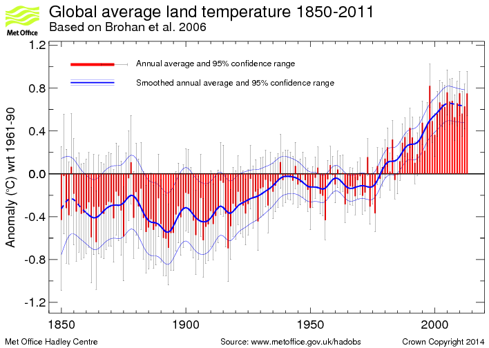
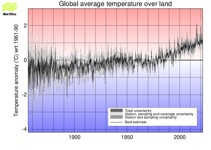
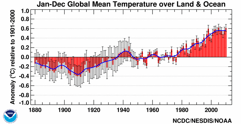
JoNova has a good article on some of these more recent reconstructions. Also, in addition to reconstructions, we have temperature records from the Met Office 1 and 2, as well as NOAA, but these surface temperature records are burdened with issues of questionable siting, changes in siting, changes in equipment, changes in the number of measurement locations, modeling to fill in gaps in measurement locations, corrections to account for missing, erroneous or biased measurements, and the urban heat island effect.
With that for background, the following are the graphs currently included in the WUWT Paleoclimate Reference Page:
600 Years Arctic Temperature

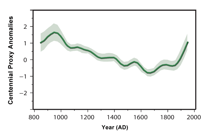
1,100 Years Ljungqvist et al

1,100 Years Ljungqvist et al

1,100 Years Kirkby 2007

2,000 Years – J. Esper et al.

2,000 Years Christiansen

2,000 Years Christiansen

10,000 Years GISP2 Ice Core
11,000 years GISP2 Temperature Since 10700 BP with CO2 from EPICA DomeC

120,000 Years

140,000 Years Antarctic/Vostok

150,000 years Taylor Dome -Ross, Antarctica E. J. Steig, et al 1999:

400,000 Years Antarctica/Vostok

450,000 Years Temperature Anomaly

750,000 Years Rate of Change of Ice Volume and June 65N Insolation

800,000 Years Orbital and Millennial Antarctic Climate Variability

800,000 Years Orbital and Millennial Antarctic Climate Variability

1,000,000 Years

5,500,000 Years Antarctica/Vostok Temperature

5,500,000 Years Antarctica/Vostok Temperature – Reversed

[Which version of the above two graphs do you prefer?}
65,000,000 Years

540,000,000 Years

543,000,000 Years Area of Continents Flooded, Concentration of CO2 and Temperature Fluctuations

600,000,000 Years – C. R. Scotese and R. A. Berner

(Please note that WUWT cannot vouch for the accuracy of the data/graphics within this article, nor influence the format or form of any of the graphics, as they are all linked from third party sources and WUWT is simply an aggregator. You can view each graphic at its source by simply clicking on it.)
Please post your thoughts, recommendations, graphs, links, research, suggested graph titles, etc., for the WUWT Paleoclimate Reference Page in comments. Thanks JTF
D.B. Stealey says:
February 24, 2013 at 6:53 pm
Philip Bradley,
The value of the CET temperature record is in showing the long term warming trend since the LIA. It corresponds well with other locations, which also show the natural recovery trend since the LIA.
The CET is a composite of 5 or 6 locations over 100 km apart. Any blending of data from multiple sources always raises suspicions for me.
Armagh OTOH is a single location and no movements have been more than 100 meters or so. Unfortunately, it’s downwind of Armagh town (aerosol changes), but still the best UK series IMO.
John Hounslow (JohnH) says:
February 24, 2013 at 2:05 pm
Comparison with the CO2 behaviour at previous intergalacials at the same scale might confirm or otherwise that the behaviour really is different.
There is a lag of 800 +/- 600 years during warming up periods from glacial to interglacial periods. That extends to several thousands of years when temperatures are cooling down again. That is not different in the last glacial-interglacial transition (in high resolution samples of the Epica Dome C core):
http://www.ferdinand-engelbeen.be/klimaat/klim_img/epica5.gif
The increase in CO2 (and CH4) over the Holocene (the past 10,000 years) is quite modest, some 10-20 ppmv, compared to previous interglacials for the same temperature. That is proof for some reserachers for the increasing growth of crops by humans… Until some 160 years ago, then we have a CO2 hockeystick blade (a real one this time), visible in all medium to high resolution ice cores, here over the past 10,000 years:
http://www.ferdinand-engelbeen.be/klimaat/klim_img/antarctic_cores_010kyr.jpg
Over the past 1000 years:
http://www.ferdinand-engelbeen.be/klimaat/klim_img/antarctic_cores_001kyr_large.jpg
The disputed graphs that fail to show the MWP are disputed because the vast perponderance of research, both before and after the hockey stick reconstructions, supports a MWP. Jut label them as “Minority studies that deny the MWP.” Factual, and quite a play on theCAGW enthusiast constant clamour to label sceptics as minority deniers.
Justthefacts, the reason 1950 is used as the baseline in dating is based on C14 dating. Subsequent to that date the concentration of C14 in the atmosphere more than doubled due to nuclear testing so the earlier date was used as a reference. This is conventionally referred to in the field as ‘before present’. The first datapoint of the GISP2 core is dated ~95 years before then, 168 years ago.
Re questions of why do this – I’d have thought the purpose of the exercise was to encourage people to explore what caused global (and hemispherical and regional) changes to climates of the past, so as to better understand what is happening today.
Particularly fascinating is how scientists are able to figure out temperatures of the past, and the nature of the work involved (drilling ice cores, collecting rock samples, fossils and all sorts of biological and geological material etc, at times working in extreme conditions and doing things even many extreme sport enthusiasts would baulk at).
Looking at a chart, then going to the data, then reading about how it was collected and why and what it tells us – it’s like an adventure story. Wonderful stuff. It is a constant wonder how, in such a short space of time, we have been able to learn so much about early earth going back hundreds of millions of years ago – despite humans only emerging a couple of hundred thousand years ago, civilisation only starting 10,000 years ago and most of the knowledge accumulated only over the past few decades.
Philip Bradley,
No dispute with what you’re saying. But the value of the CET record is still in its recording of the long term temperature trend. It matters not if the CET is one thermometer or several. It still shows that the long term temperature trend has been rising at about the same rate [±0.35ºC/century] since the LIA, regardless of the CO2 level.
That tells us that CO2 makes no measurable difference re: global warming, and it deconstructs the AGW conjecture.
David says “The disputed graphs that fail to show the MWP are disputed because the vast [preponderance] of research, both before and after the hockey stick reconstructions, supports a MWP. Jut label them as “Minority studies that deny the MWP.” Factual, and quite a play on theCAGW enthusiast constant clamour to label sceptics as minority deniers.”
Question: If a graph doesn’t show the MWP, should it be rejected?
Answer: No, that’s confirmation bias. If there is a genuine temperature study, conducted properly, using trusted methods, presented properly, that does not show the MWP, then it should be included. But if, for example, the study uses suspect proxies (eg. bristlecones, or any tree-rings for that matter), or uses biased techniques (eg. selecting samples that match some other temperature record), or misrepresents, or manipulates, or cherry-picks, etc, then it should be rejected. And, of course, the same rules apply to graphs that do show the MWP.
But there could be a lot of work involved in the decision-making process.
This is great work. Worthy of publication in a peer reviewed journal as a survey of the literature. I encourage Watts et al to submit this to an academic journal for publication. Actually, you are writing what should be a chapter in the next IPPC report.
This open process is ideal for surveys. Too bad the IPPC does not do it. “The Team” will not like this. Hard to control the results.
If a graph doesn’t show the MWP, should it be rejected?
Nope, just isolated as the extreme minority it is, conflicting (with out comment on attempting to overturn that extensive MWP history) with decades of research pre amd now post the hockey stick. A simple paragraph describing the conflict as you have presented would be fine.
Loehle and McCulloch (2008), corrected; 2,000 year global temperature reconstruction.
http://www.econ.ohio-state.edu/jhm/AGW/Loehle/
Bilal Haq and A. M. Al-Qahtani 2005, Jurassic-Neogene Arabian Platform Cycle Chart (Phanerozoic Cycles of Sea-Level Change on the Arabian Platform.
It has a fine sea level curve beginning Late Triassic and going all the way to the Holocene. It matches stratigraphy, sea level, major tectonic events, and Paleoceanographic and climatic events. I have a PDF of the large chart I can send if you like. A smaller version of that graph that goes back even further (to pre-Cambrian) can be seen at:
http://www.searchanddiscovery.com/documents/2010/40594snedden/ndx_snedden.pdf
I’m not sure why the MWP is considered so important relative to any other climate fluctuation over time around the world. However a comment FWIW regarding the MWP and people wanting to identify ‘disputed’ charts, it would be essential to show the time of what is meant by the ‘MWP’ to get some consistency before ‘disputing’ a particular piece of research on the grounds that it didn’t show what you want it to show (for whatever reason).
Going to this page that was referred to above:
http://pages.science-skeptical.de/MWP/MedievalWarmPeriod1024x768.html
It has lots of temperature series all around the world, some have warming pre-900, some around 1000, some closer to 1400 AD and some no particular warming at all. If you line them up time-wise, many places are cooling when other locations are warming. There is no consistent period of time when every chart everywhere shows warmer. In fact if you overlaid them all (all sites with charts) you’d probably be hard-pressed to see a single period of warming.
It’s easier to see consistency at the regional (if you divide the globe into regions), with parts of Europe / parts of the Arctic obviously having a warm period at around the same time (which I suspect is what people here are referring to) – but it doesn’t look global going by the website above.
So if people want to dispute charts, they will need to identify which period is their preferred ‘MWP’ at least to the level of century if they can’t do it at the decadel level. (Eg Greenland and parts of Europe vs the rest of the world).
Phil. says: February 25, 2013 at 2:30 am
Justthefacts, the reason 1950 is used as the baseline in dating is based on C14 dating. Subsequent to that date the concentration of C14 in the atmosphere more than doubled due to nuclear testing so the earlier date was used as a reference. This is conventionally referred to in the field as ‘before present’. The first datapoint of the GISP2 core is dated ~95 years before then, 168 years ago.
Hmmm, that makes that chart reasonably misleading… Do you have confidence in any of the GISP2 reconstructions that extend the record closer to present e.g. Kobashi et al. 2011 4000-Year Ar-N2 Isotope Temperature Reconstruction;
ftp://ftp.ncdc.noaa.gov/pub/data/paleo/icecore/greenland/summit/gisp2/isotopes/gisp2-temperature2011.txt
which extended the GISP2 record through 1993 using temperature data based on borehole temperature modeling?
A. Crowe says: February 25, 2013 at 7:23 pm
I’m not sure why the MWP is considered so important relative to any other climate fluctuation over time around the world. However a comment FWIW regarding the MWP and people wanting to identify ‘disputed’ charts, it would be essential to show the time of what is meant by the ‘MWP’ to get some consistency before ‘disputing’ a particular piece of research on the grounds that it didn’t show what you want it to show (for whatever reason).
Going to this page that was referred to above:
http://pages.science-skeptical.de/MWP/MedievalWarmPeriod1024x768.html
It has lots of temperature series all around the world, some have warming pre-900, some around 1000, some closer to 1400 AD and some no particular warming at all. If you line them up time-wise, many places are cooling when other locations are warming. There is no consistent period of time when every chart everywhere shows warmer. In fact if you overlaid them all (all sites with charts) you’d probably be hard-pressed to see a single period of warming.
It’s easier to see consistency at the regional (if you divide the globe into regions), with parts of Europe / parts of the Arctic obviously having a warm period at around the same time (which I suspect is what people here are referring to) – but it doesn’t look global going by the website above.
So if people want to dispute charts, they will need to identify which period is their preferred ‘MWP’ at least to the level of century if they can’t do it at the decadel level. (Eg Greenland and parts of Europe vs the rest of the world).
I agree,we cannot exclude graphs solely because they do not show what we might or might not expect to see. Rather, in order for a graph to be considered disputed, someone must have demonstrated that there is something wrong with the data used, the corrections applied, the methods used, the data/axis/chart labels, etc. Furthermore, for a graph to be deemed Questionable, the dispute must be credible and to be of sufficient gravity, whereby a warning label is not sufficient to address it. Lastly, for a graph to achieve a Falsified classification there must be a sufficiently deep body of evidence in support of the dispute, as to allow a fair and logical determination based upon a preponderance of the evidence.
A. Crowe says – “I’m not sure why the MWP is considered so important relative to any other climate fluctuation over time around the world. […] There is no consistent period of time when every chart everywhere shows warmer.“.
The MWP was considered important enough by the Climategate people that they wanted to get rid of it. I think its importance is that it wasn’t very long ago and the models can’t explain it.
It is irrelevant whether every chart everywhere shows warmer. The “global warming” that everyone is getting so excited about today doesn’t occur everywhere either. For starters, we all know that Antarctica (“East” Antarctica, that is) hasn’t warmed. And for good measure, I took a punt and had a look at central Tasmania – well away from the towns and cities. The longest-running station there is Bushy Park #095003, from 1931 to 2011. Data source is bom.gov.au
http://members.westnet.com.au/jonas1/BushyParkTAS095003Temps.JPG
Surprise, surprise, no warming trend there either.
Mean Monthly Max trend 0.00756 (per annum)
Mean Monthly Min trend -0.00815
Average of the two -0.00030
Curiously, “Monthly mean maximum and minimum temperatures for over 50% (10%) of the Northern (Southern) Hemisphere landmass, accounting for 37% of the global landmass, indicate that the rise of the minimum temperature has occurred at a rate three times that of the maximum temperature during the period 1951-90 (0.84 C versus 0.28 C).“.
http://www.ncdc.noaa.gov/oa/climate/mxmntr/mxmntr.html
So the max/min relationship is inconsistent too.
“The MWP was considered important enough by the Climategate people that they wanted to get rid of it.”
I don’t follow. If you’re talking about CRU scientists (rather than the people who ‘interpreted’ their emails), it’s a curious statement, given that their reconstructions of northern hemisphere temperature show it. (It doesn’t show up in most global temperature reconstructions because of SH data series showing it was most like regional not global as also indicated in that great website showing lots of reconstructions all around the world.) In fact, if not for scientific efforts to collect and collate temperature proxy data around the globe, no-one would know the extent of it at all. If not for scientific data from more sources in more places, we’d probably only know about warming in southern Greenland and a bit of Europe because that’s about all that history alone tells us.
Justthefacts: With all of the charts, studies, and information provided on this crowd-sourced request I wanted to reiterate the surprising conclusion by the Johannes Gutenberg Universitat Mainz study above. I have not seen any other studies specifically conclude a -0.3C per millenium cooling though others have suggested a slight cooling. That is significant.
“In addition to the cold and warm phases, the new climate curve also exhibits a phenomenon that was not expected in this form. For the first time, researchers have now been able to use the data derived from tree-rings to precisely calculate a much longer-term cooling trend that has been playing out over the past 2,000 years. Their findings demonstrate that this trend involves a cooling of -0.3°C per millennium due to gradual changes to the position of the sun and an increase in the distance between the Earth and the sun.
“This figure we calculated may not seem particularly significant,” says Esper. “However, it is also not negligible when compared to global warming, which up to now has been less than 1°C. Our results suggest that the large-scale climate reconstruction shown by the Intergovernmental Panel on Climate Change (IPCC) likely underestimate this long-term cooling trend over the past few millennia.” “
Bill Illis says:
February 24, 2013 at 12:33 pm
“Borehole science is crap.
Important to clear away garbage in the search for the past climate. I first had my doubts about boreholes when I saw a borehole paper where they found several recent measurements which suggested a trend of warming in the last century or two, and then EXTRAPOLATED the curve back in time to reach asymptotic climate stasis at all times before about 500 years ago. What can you say?
One brief observation – there’s a lot of comment about the MWP. However there would be no MWP with out the LIA. My impression is that the LIA is the more concrete phenomenon, the MWP was kind of like the last bit of normality before the LIA struck. There are many great data sources in the above post and in many posted comments. One paper in particular by Mayewski posted by Normal Page, contains a wealth of palaeo data that – from quick eyeballing – seem to confirm the LIA as a significant excursion of instability. This is shown in timelines of sea wind (Na+ ions), Siberian high, Iceland low, glaciation, precipitation (e.g. Ecuador lake sediment, Chile pollen), Antarctic CO2.
To me this suggests the LIA has deep significance, as possibly an unstable wobble indicative of an impending (on a timescale of centuries) end of the Holocene.
Phil. says: February 25, 2013 at 2:30 am
Justthefacts, the reason 1950 is used as the baseline in dating is based on C14 dating. Subsequent to that date the concentration of C14 in the atmosphere more than doubled due to nuclear testing so the earlier date was used as a reference. This is conventionally referred to in the field as ‘before present’. The first datapoint of the GISP2 core is dated ~95 years before then, 168 years ago.
I’ve added the following warming note to Lappi’s graph, i.e.:
Disputed Graph – The x axis label, “Years Before Present (2000 AD)”, should read Years Before Present (1950 AD)