
Image Credit: Jo Nova – David Lappi – GISP2
Your help is needed in building the new WUWT Paleoclimate Reference Page. Below I’ve posted all of the credible 3rd party paleoclimate graphs I’ve compiled thus far, but I am sure there are lots more. As such, please post links to any credible paleoclimate data sources below or in comments of the WUWT Paleoclimate Reference Page and we will review them for inclusion. Also, your thoughts on the provenance of the graphs included thus far, links to the papers they are based upon, and appropriate titles for each graph would be most appreciated.
In terms of additional graphs for potential inclusion, I struggled with shorter term reconstructions, as many of them are still a matter of controversy. As such, please post any pertinent information, including any credible graphs illustrating the last few millennia and the Medieval Warming Period. For reference, there are an array of less than ideal options available on the bottom of this NOAA NCDC page. From a cursory review, I found the summary for Overpeck et. al 1997 to be enlightening, e.g.;
“Together, they indicate that the Arctic has warmed up to 1.5°C since 1850 – the coolest interval of the Arctic “Little Ice Age.” Much of the recent Arctic warming took place between 1850 and 1920, most likely due to natural processes”
However, after Overpeck the “Team” went to work, i.e. Briffa et al., 1998, Jones et al., 1998, Mann et al., 1998, Pollack et al., 1998, Jones et al., 1998, Mann et al., 1999, Mann et al., 2000, Briffa et al., 2001, Esper et al., 2002 and Jones and Mann 2004, and paleoclimatology became a quite a sordid science. The IPCC’s 2007 contribution in AR4 section 6.6.1.1, brought things to a new low when they appear to have pasted a thick black HadCRUT2 line onto some kindergartner’s art project…:

Anyway, it is also interesting to note that the NOAA NCDC site doesn’t seem to include any reconstructions after 2006, while there has been much valuable paleoclimate research conducted since then, e.g.:
Ljungqvist, F. C., Krusic, P. J., Brattström, G., and Sundqvist, H. S (2012).: Northern Hemisphere temperature patterns in the last 12 centuries, Clim. Past, 8, 227-249, doi:10.5194/cp-8-227-2012, 2012. See JoNova, CO2Science and Abstract at Clim-Past.
Christiansen, B. and Ljungqvist F. C. (2012). The extra-tropical Northern Hemisphere temperature in the last two millennia: reconstructions of low-frequency variability. Climate of the Past JoNova 1, JoNova 2, Abstract at Clim-Past
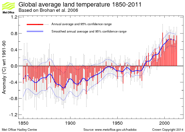
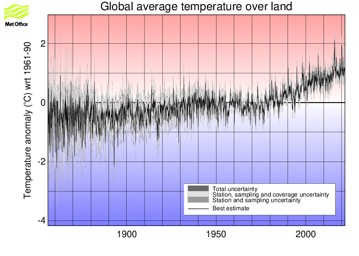
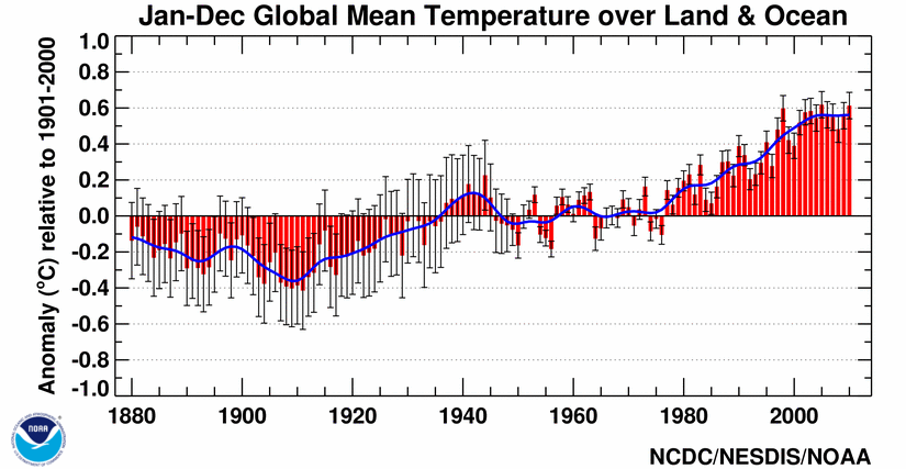
JoNova has a good article on some of these more recent reconstructions. Also, in addition to reconstructions, we have temperature records from the Met Office 1 and 2, as well as NOAA, but these surface temperature records are burdened with issues of questionable siting, changes in siting, changes in equipment, changes in the number of measurement locations, modeling to fill in gaps in measurement locations, corrections to account for missing, erroneous or biased measurements, and the urban heat island effect.
With that for background, the following are the graphs currently included in the WUWT Paleoclimate Reference Page:
600 Years Arctic Temperature

1,100 Years Ljungqvist et al

1,100 Years Ljungqvist et al

1,100 Years Kirkby 2007

2,000 Years – J. Esper et al.

2,000 Years Christiansen

2,000 Years Christiansen

10,000 Years GISP2 Ice Core
11,000 years GISP2 Temperature Since 10700 BP with CO2 from EPICA DomeC

120,000 Years

140,000 Years Antarctic/Vostok

150,000 years Taylor Dome -Ross, Antarctica E. J. Steig, et al 1999:

400,000 Years Antarctica/Vostok

450,000 Years Temperature Anomaly

750,000 Years Rate of Change of Ice Volume and June 65N Insolation

800,000 Years Orbital and Millennial Antarctic Climate Variability

800,000 Years Orbital and Millennial Antarctic Climate Variability

1,000,000 Years

5,500,000 Years Antarctica/Vostok Temperature

5,500,000 Years Antarctica/Vostok Temperature – Reversed

[Which version of the above two graphs do you prefer?}
65,000,000 Years

540,000,000 Years

543,000,000 Years Area of Continents Flooded, Concentration of CO2 and Temperature Fluctuations

600,000,000 Years – C. R. Scotese and R. A. Berner

(Please note that WUWT cannot vouch for the accuracy of the data/graphics within this article, nor influence the format or form of any of the graphics, as they are all linked from third party sources and WUWT is simply an aggregator. You can view each graphic at its source by simply clicking on it.)
Please post your thoughts, recommendations, graphs, links, research, suggested graph titles, etc., for the WUWT Paleoclimate Reference Page in comments. Thanks JTF
richard verney says:
February 24, 2013 at 6:14 am
Further to:
climatereason says:
February 24, 2013 at 12:48 am
//////////////////////////////////////////////////////////////
It is not easy to see why CET should be a proxy for global temperatures. Surely, it is an artefact of the temperature of the North Atlantic (presuming that the UK receives predominantly Westerlies), or to a lesser extent, the North Sea.
Personally, I would have thought that it is a fairly good proxy for the Gulf Stream in and around the UK. Whether the Gulf Stream is a good proxy for global conditions more generally, I would have thought to be more moot.
The gulf stream appears to be a good proxy for the AMO, as shown in this posting showing close correllation of the AMO with Barents Sea temperatures
And the AMO is not a bad proxy for at least NH temperatures.
I went to the R Alley publication, “The Younger Dryas cold interval as viewed from central Greenland,” the one which is said in the graphic to be the source of the extremely interesting graphic above, “10,000 Years GISP2 Ice Core.” However, this publication only appears to discuss the years surrounding the Younger Dryas, e.g., from roughly 10,000 to 16,000 years before present.
Could someone please send the correct source for the “10,000 Years GISP2 Ice Core” graphic”
I’m not sure if I’ve sptted something in the 450,000 Years Temperature Anomaly graph. In the glacials are 2 peaks and then a little peak. With each glacial the first 2 peaks have gotten smaller whilst the last peak has grown and spead out more. Is there anyway of confirming this signal?
Perhaps the first 2 have gotten bigger too. No sure why I said that but the last is definitely growing.
– – – – – – – –
justthefactswuwt,
I admire your effort in putting this together.
I would suggest to include all graphs including ones created and/or endorsed by proponents of the IPCC’s assessment of alarming / dangerous AGW.
Show no favor as to inclusion of formally published graphs.
If you do that then i think it would be necessary to indicate which of the WUWT reference page graphs the IPCC used to support their alarming / dangerous assessments.
If the above approach is taken then there could be no case made that you/WUWT aren’t being balanced in an open objective way.
Take care.
John
Great Idea!
tobias says:
February 23, 2013 at 10:33 pm
Very appropriate questions; let me only address your question about the plates and tectonic drift. I will let others address solar intensities over very long periods of time.
By 65 MYA (million years ago) about the time that the Gulf of Mexico was hit by the meteor which killed off dinosaurs worldwide, the western and southern continents (South America, North America, Africa) were already well separated. India was already over towards Asia – colliding to build the Himalaya mountains. But common dinosaur fossils and sedimentary rock unite Africa and South America, and common dinosaur fossils unite all three – so we know they had previously been grouped together. All were near the equator when together. The “split” is believed to be exactly what is happening now in east Africa at the rift zones, and would look like the Gulf of Aquiba, or Red Sea, or Gulf of California once opened up: a very long but narrow sea. Not too easy for animals to cross, easy for birds to get over, and – depending on winds or pollen or birds-dropping-seeds, may or may not be “crossed” by new plants. Old plants on both sides and old animals would just keep getting carried further away from each other: again, like southern California and Mexico – not too much difference, but slow changes over time would begin.
It is believed that the Isthmus of Panama began “closing” as islands built up about 15 MYA, but water flow was continued (but slowing in total mass but with increased speed as channels got narrower and narrower – look at the currents in the Straits of Magellan now north of Antarctica, or across Gibraltar) until 3 million years ago. It is an open question about changes in climate worldwide between 15 MYA and 3 MYA – look at these graphs to see any pattern, but AFTER 3 MYA, the Atlantic Ocean was definitely a separate north and south entity from the Pacific, and today’s “modern” climate patterns were in place, though probably not complete with north sea ice and the southern continental ice masses as they are now.
So mentally, keep everything after 3 MYA in one “climate pocket” – one with a unique Atlantic Ocean circulation and continents pretty much as we see them now – and everything before 160 MYA in a very different “climate pocket” of a single warm continent near the equator surrounded by a single sea. (Kind of like Genesis there, ya know.) Climate patterns between the two are very, very different than today, and cannot be compared to today’s world in any real manner.
Antarctica was a separate continent from Africa and India – though only divided by very narrow seas – by 130 MYA, though it was not yet centered on the south pole until much later.
Justthefacts Alley used 1950 as ‘present’ in his 2000 paper, you are confusing the date of the paper with the date of the data! As I said before the Lappi graph is mislabeled. The data is freely available so why not plot it yourself with the correct axis label?
So, the dance card still requires a fast dance on the head of a even smaller pin and graphs of a time unknown by all.
It is not about the temperature.
It is not about clouds.
It is not about ice.
It is not about the sun.
It is and will remain about redistribution of wealth.
Play this game for pleasure.
Get in the real game for that is the human event question.
Please check out the graph under the heading of:
“Global Temperature and Atmospheric CO2 over Geologic Time ”
on http://www.geocraft.com/WVFossils/Carboniferous_climate.html to see if it is worthy of inclusion.
Thanks,
justthefactswuwt
Re “Does anyone know of a comparable compilation of reconstructions we can use that gets the last couple mellennia right?”
The full range of data is graphed over multiple expanding time scales by:
Markonis, Y., and D. Koutsoyiannis, Climatic variability over time scales spanning nine orders of magnitude: Connecting Milankovitch cycles with Hurst–Kolmogorov dynamics, Surveys in Geophysics, doi:10.1007/s10712-012-9208-9, 2012.
http://itia.ntua.gr/en/docinfo/1297/
See figs itemized in the post above. More descriptive labels could be added by an enterprising grapher and the full graphs uploaded and linked. Suggest someone working with Koutsoyiannis’ team to prepare these.
More misc. climate charts, including many from Vostok & Greenland:
http://1.bp.blogspot.com/_cHhMa7ARDDg/SsVwqCgB-LI/AAAAAAAABKo/U92CnYMmeSU/s1600-h/Vostok-400Kd.jpg
http://mclean.ch/climate/figures_2/GISP_to_11Kybp.gif
http://cdiac.ornl.gov/trends/temp/domec/epica2d.jpg
http://4.bp.blogspot.com/_cHhMa7ARDDg/SsZbFvC5SJI/AAAAAAAABLY/uZxh6g17bmE/s1600-h/GISP2_10Ke.jpg
http://oi31.tinypic.com/2149sg0.jpg
http://jonova.s3.amazonaws.com/graphs/stations/great-dying-of-thermometers.gif
http://www.geo.arizona.edu/BGDL/images/Vostok_CO2_airt.gif
http://3.bp.blogspot.com/_cHhMa7ARDDg/SmDoZBIkB3I/AAAAAAAABAc/KkUzrz2abwI/s1600-h/Vostok-140Kc.jpg
http://zapruder.nl/images/uploads/screenhunter3qk7.gif [Hansen, blink gif]
http://oi44.tinypic.com/295sp37.jpg
http://wattsupwiththat.files.wordpress.com/2008/08/mauna_loa_0803-0804_blink.gif [MLO blink]
http://oi44.tinypic.com/23vjjug.jpg [Station loss]
http://www.appinsys.com/globalwarming/GW_Part1_PreHistoricalRecord_files/image023.gif
http://2.bp.blogspot.com/_cHhMa7ARDDg/SsVwd55PJ8I/AAAAAAAABKY/52SrhXN4C3c/s1600-h/Vostok-10Kd.jpg
http://mclean.ch/climate/figures_2/Vostok_to_10Kybp.gif
http://wattsupwiththat.files.wordpress.com/2008/12/nansen_sea_ice_extent2-520.gif?w=520&h=390
http://www.daviesand.com/Choices/Precautionary_Planning/New_Data/IceCores1.gif [T leads CO2]
http://essayweb.net/geology/quicknotes/images/450%20thousand.jpg [NH/SH correlation]
http://oi43.tinypic.com/1zoanbc.jpg
http://c3headlines.typepad.com/.a/6a010536b58035970c0134840e51fd970c-pi
http://i90.photobucket.com/albums/k247/dhm1353/Climate%20Change/HolHad.png
http://i90.photobucket.com/albums/k247/dhm1353/Climate%20Change/Subatlantic_Had.png
http://c3headlines.typepad.com/.a/6a010536b58035970c0120a6927337970c-pi
http://wattsupwiththat.files.wordpress.com/2009/12/noaa_gisp2_icecore_anim_hi-def3.gif
http://jonova.s3.amazonaws.com/graphs/lappi/vostok-last-12000-years-web.gif
http://www.brighton73.freeserve.co.uk/gw/paleo/400000yearslarge.gif [T leads CO2]
http://img827.imageshack.us/img827/4488/gisp2temperature.png
http://img802.imageshack.us/img802/7913/gisp2temperaturexaxispr.png
http://wattsupwiththat.files.wordpress.com/2011/01/easterbrook_fig5.jpg
http://www.greenworldtrust.org.uk/Science/Images/Main/Warm_periods.jpg
http://theinconvenientskeptic.com/wp-content/uploads/2010/09/Vostok-CO2.png
http://www.gisp2.sr.unh.edu/IMAGESGISP2/Bender-NSF.GIF [NH/SH overlay]
http://www.globalwarmingart.com/images/8/8f/Ice_Age_Temperature_Rev.png [NH/SH]
http://www.ncdc.noaa.gov/paleo/abrupt/images/data4-climate-changes-lg.gif
http://i90.photobucket.com/albums/k247/dhm1353/Climate%20Change/GISP2_Ljung_HadCRUT_10kya.png
http://www.robertb.darkhorizons.org/TempGr/Vostok.JPG [click to embiggen]
http://upload.wikimedia.org/wikipedia/commons/thumb/6/66/Ice-core-isotope.png/800px-Ice-core-isotope.png
http://oi53.tinypic.com/sg2wav.jpg
http://www.plusaf.com/pix/2000-years-of-global-temperatures.jpg
http://www.econ.ohio-state.edu/jhm/AGW/Loehle/Fig2color.gif
http://earthobservatory.nasa.gov/Features/ArcticIce/Images/arctic_temp_trends_rt.gif
http://theinconvenientskeptic.com/wp-content/uploads/2010/11/LI-Holocene.png
http://members.shaw.ca/sch25/FOS/SvensmarkTempComicRay550MillionYrsSmall.jpg
http://bp1.blogger.com/_4ify7vDXrDs/SFvKsbaDcAI/AAAAAAAAC00/rXH2TzvwcZA/s1600-h/_0_0_a_mi_GlobalRelativeHumidity300_700mb.jpg
http://www.climate4you.com/images/NOAA%20ESRL%20AtmospericSpecificHumidity%20GlobalMonthlyTempSince1948%20With37monthRunningAverage.gif
http://s19.postimage.org/pk8wtzxqr/WV_IPCC_AR5_Forecast_2100.png
http://wattsupwiththat.files.wordpress.com/2009/01/ap-index-1932-2008.png
I can’t find that anyone has posted the ice core record from Wikipedia derived by Petit et Al. This ice-core was drilled to a depth of over 3km and provides a scientific record of temperature variations over the past 400,000 years.
http://commons.wikimedia.org/wiki/File:Vostok-ice-core-petit.png
I like this graph for several reasons
Firstly, it shows that the ice ages (more correctly maximum glaciation periods) come and go in a regular cycle, with a period of about every 100,000 years. There are theories of what causes this but, whatever it is, it is clearly not due to the behaviour of human kind. We probably hadn’t discovered fire back then, never mind fossil fuels. So we have evidence of a repeating pattern of cooling and warming which can only be due to ‘natural’ causes. We are in one of the warming phases (called interglacials) now, Not surprisingly therefore, the world has been warming (right on cue). Our present interglacial is called the Holocene.
Secondly, it also shows the corresponding CO2 concentration determined from the same ice-core. Here we see clearly that the temperature swings move in ‘lock-step’ with CO2 concentration – as Al Gore put it (but we now know, from a more precise study of the ice-core, that the temperature variations came first and then the CO2 followed.
Thirdly, we see that the temperatures reached in all the previous interglacials is actually slightly higher than it is in our Holocene (even though CO2 levels are a lot higher now). We certainly know that in the previous interglacial, about 120,000 years ago, which is called the Eemian that, according to the IPPC
and that
Please add big “YOU ARE HERE” arrows with the associated 100 year teeny time bar for folks on Slashdot, Reddit, and the MSM.
Paper by Oppo and Wood Hole Institute published in Nature shows that the temperature of Indo-Pacific Warm Pool during the Medieval Warm Period were equivalent to present day. http://www.whoi.edu/main/news-releases/2009?tid=3622&cid=59106 This suggests that the MWP was global and not regional as has been proposed by some. Also includes graph, though they have slapped Mann’s curve on the graph which contravenes the findings.
Here are some links with excellent figures. See Mayewski et al Figs 1 2,3,and 4 on pp 244-248 at
http://yly-mac.gps.caltech.edu/AGU/AGU_2008/Zz_Others/Li_agu08/Mayewski2004.pdf
( Note the important Fig labels are sepated from the Figs)
Also Fig 2and esp 3 from Steinhilber et al
http://www.pnas.org/content/109/16/5967.full
This is a great project Anthony – Thanks Norman
D.B. Stealey says: February 23, 2013 at 8:10 pm Nasif Nahle 2009 – BioCab.orr – Click the pic to view at source[/caption]
 climate4you.com – Ole Humlum – Professor, University of Oslo Department of Geosciences – Click the pic to view at source[/caption]
 climate4you.com – Ole Humlum – Professor, University of Oslo Department of Geosciences – Click the pic to view at source[/caption]

 C. R. Scotese and R. A. Berner – Geocraft.com – Click the pic to view at source[/caption]
It goes without saying, but that is nothing short of an amazing list of links. I will have to work through it in pieces.
http://www.biocab.org/SL_and_CO2.jpg
Yep, 543,000,000 Years Area of Continents Flooded, Concentration of CO2 and Temperature Fluctuations;
[caption id="" align="alignnone" width="578"]
added at the bottom of both the article and page.
http://www.climate4you.com/images/GISS%20GlobalMonthlyTempSince1958%20AndCO2.gif
http://www.climate4you.com/images/HadCRUT3%20GlobalMonthlyTempSince1940%20AndCO2.gif
While too short a time period for the Paleo page, these graphs might offer inspiration for Werner’s Stalled series;
http://wattsupwiththat.com/2013/02/10/has-global-warming-stalled/
As such, Werner, do you think you can create a graph similar to the two below;
[caption id="" align="alignnone" width="578"]
[caption id="" align="alignnone" width="578"]
using WFT, with several of the longer data sets incorporated? This type of graph might serve as a supplement and offer perspective on the shorter term graph overlaying temps and CO2 that you use already;
http://www.geocraft.com/WVFossils/PageMill_Images/image277.gif
Yep, added 600,000,000 Years – C. R. Scotese and R. A. Berner
[caption id="" align="alignnone" width="578"]
to the article and page. More to come.
this is great collection; my non expert conclusion is that “enjoying the interglacial while it lasts” has merit… If only those who lobbied in favor of manipulating the already bogus ETS system (“…Shell, General Electric, Kingfisher, Unilever and EDF … among more than 30 large companies…”) could profit from a new ice age, I am sure we would be buying extra sweaters.
The quoted company names are from h++p://www.greenwisebusiness.co.uk/news/big-firms-sign-up-to-call-to-revive-flagging-eu-emissions-trading-scheme-3802.aspx The Green lobby is becoming obvious at least in Europe.
How about including other climate related data like estimated sea levels and the limits of certain types of plants and animals that may correlate with, if not indicate, climate. I guess that’s ‘paleoenvironment’. I tried a quick google search and found very little in the way of charts. But that’s also interesting, because a lot of what is available seems to be AGW junk. There are many journals some of us might be able to explore. These are just the ones published by Springer.
http://www.springer.com/environment/paleoenvironmental+sciences?SGWID=0-40617-12-451307-0
I think it would be a good idea to begin some effort in this area to show how nature deals with authentic climate change. On Earth, change occurs constantly. That’s what a dynamic system is. Living systems demonstrate this principle quite well, although self-appointed environmentalists seem to fail to understand that point.
Nick Stokes says: February 24, 2013 at 12:53 am Imageshack – Click the pic to view at source[/caption]
I think Phil’s interpretation is right. Here is the actual numerical data. First temperature entry 0.0951409 before present. Units are 1000 year. And what is “present”? Paleo convention is 1950. And in Alley’s paper he makes one explicit reference that confirms that is his usage. On p 214, Sec 2, he says:
“and those summarized by Alley et al. (1997b), indicate an age close to 11,500 yr before 1950 (11.5 kabp), or perhaps older by up to a century or so.”
Note the definition of kabp here.
Julian in Wales says: February 24, 2013 at 2:17 am
In my earlier comment I had not understood that the title graph (GISP2) ends 95 years ago, presumably to do with the way the sampling is done(?). Does that mean that it would be reasonable to add about .7 to account for estimated warming over the last 100 years?
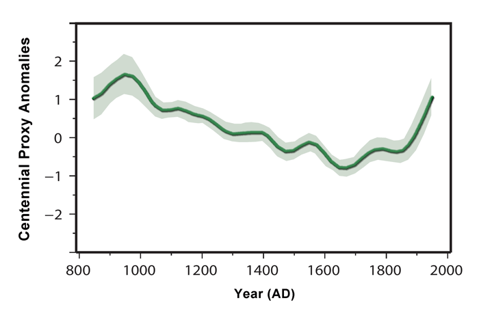
For me this is the most graphic and simple to understand image, it is the one I would use to discuss climate variability with my non scientific friends who have little grasp on the details of how complex the science is and are the sort of people who would be won over by the hockey stick junk science.
A. Crowe says: February 24, 2013 at 4:35 am
As an example of misleading, the chart at the top of the page has a green line through it (second order polynomial – why?). Even a polynomial, which is not the right tool, would be quite a different shape if the time horizon was expanded by 1000 years (or by 4000 years, which would include the Younger Dryas cold event). More so if it included the full 50,000 years of available data it was based on. (I assume the green line was meant for ‘entertainment purposes only’ in the style of Spencer – but it should be removed).
I assume the recent 10,000 years was picked to show up the change in Central Greenland since human civilisation. And because the relatively small fluctuations over this more recent time period wouldn’t show up well if the prior 40,000 years was included (because it was markedly colder at that site and subject to much greater fluctuations). So that’s fair enough and the full 50,000 years can be shown in a separate chart. However the green line is still very misleading and should go.
This example highlights the importance of not including a chart unless you can also link to the sources of data. Here’s the data for the chart in question:
ftp://ftp.ncdc.noaa.gov/pub/data/paleo/icecore/greenland/summit/gisp2/isotopes/gisp2_temp_accum_alley2000.txt
A. Crowe says: February 24, 2013 at 6:11 am
It actually ends in 1855, 95 years before 1950 (see posts by RattusN and Nick Stokes and others). It was mis-labelled.
It’s not a global temperature series. You’d have to go to Central Greenland temperature records to add/splice temperature for the intervening years since 1855 (with calibration to this series) – and indicate it’s from a different source. Not sure whether you’d get all years over that whole period.
I am on the fence on this. On one hand the Alley data does appear to begin 0.0951409 (thousand years before present);
ftp://ftp.ncdc.noaa.gov/pub/data/paleo/icecore/greenland/summit/gisp2/isotopes/gisp2_temp_accum_alley2000.txt
and from Alley’s paper;
http://www.sciencedirect.com/science/article/pii/S0277379199000621
Figure 1 clearly shows “Present” as being 1950;
[caption id="" align="alignnone" width="542"]
which would support the criticism that the last century and a half of warming is excluded from this graph. On the other hand, as I noted here;
http://wattsupwiththat.com/2013/02/23/crowdsourcing-the-wuwt-paleoclimate-reference-page/#comment-1231479
the Alley chart here;
http://www.ncdc.noaa.gov/paleo/pubs/alley2000/alley2000.html
also seems to infer that present is 2000. Regardless, short of further clarification, I am inclined to add a notation to this graph indicating that its end date is disputed and possibly a link to this comment. Thoughts? Can anyone present any further evidence indicating the end point of the Alley data and the Lappi graph?
Which one represents the temperatures measured in the 4000 foot hole, done by the Norweigen group, using micro-thermometers up and down the hole? A purely “mechanical” measurement which represents steady state CONDUCTION through the 4000′ of ice, goes back about 100K years. MOST ACCURATE TEMPERATURE SCALE I believe!
Olav says:
“Though I doubt The BBC is correct in saying (in «the Earth’s amazing journey») that the next «Ice Age» will not occur during the next 60 000 years”
It’s easy to point out from the 1 million year chart that the BBC is wrong. It shows 41 cycles of the Obliquity. In every single one of the 41 cycles, between one peak and the next peak there is always shown a significant drop (at least 25% to 33% of max temp peak to trough range) in the temperature, even in the middle of glacial cycles. Furthermore, there are no instances where the largest drop in that 41K year period was just a respite within an interglacial. So while the glacial cycles may show the frequency of the Eccentricity cycles, serious temperature drops show the frequency of the Obliquity cycle, That doesn’t mean it won’t take several thousand more years or longer, but certainly not the 60,000 the BBC posited. Doing some admittedly poor comparisons of prior period from that 1 million year chart, my guess is we have no more than 2000 to 3000 more years max (and probably less) before we see some serious end-of-interglacial type cooling.
A question I have is what sort of a lag may exist between actual temperature declines and the proxies represented by those longer time scale temperature/glaciation charts. Is a serious drop in the chart really later than when the serious temperature drops occurred or is it already adjusted for within whatever the timescale error factor is? If those large drops are realy lagging the true temperature drop, then that 2000 to 3000 year guesstimate becomes a lot smaller.
The above is of course, extremly rough because it was based on copying the graphic into a tool that allowed me to place horizontal and vertical gridlines on it at a fine scale so it is no more accurate than whatever the accuracy of the 1 million year chart is.
The more alarming chart is the one the article opened with. If that downward curve and the graph behind it are scaled correctly, then i would expect that within our lifetimes we could see a true return to the little ice age temperatures, and lower in our grandchildren’sor great-granchildren’s lifetimes without eben getting to the big end of interglacial drop above.
One need to make a distinction between borehole temperatures and isotope temperatures:
– Borehole temperature is a direct measurement of the local temperature at the sidewall of the borehole where the ice (or rock) was removed. That gives an impression of the local temperature at the place of snow deposition (or the top of the rock) over time, but with a lot of calculation: over time there was conduction from/to above and below, so temperatures were smoothed out, more and more back in time. Therefore the borehole temperature reconstruction from the top of the Greenland ice sheet only shows the temperature on top of the Greenland ice sheet (which in variability in general is opposite to the variability of Western Europe temperatures, due to the NAO).
– The isotope ratio’s (dD and d18O) of the ice in ice cores depends on mainly two temperatures: the temperature of the oceans where the vapours did originate and the temperature where the vapours condensate to waterdrops or snow/ice. With some scaling, the temperature at the origin of the snow deposited in the ice core can be retrieved, which in the case of Greenland ice cores is most of the North-Atlantic bassin and for far inland Antarctic ice cores most of the SH hemisphere.
Thus the Greenland borehole temperature and the Greenland ice core temperature are quite different items; the first is purely local, the second is from a large area and may give different, even sometimes opposite, results…
Modern instrumental temperature record should not be stuck onto paleoclimate reconstruction, modern bias, and untrustworthy sources that have been exposed should not blemish the excellent science being done. Please use individual traceable scientific data sources, don’t use ready made mix and matches.
All the best 🙂
The borehole temperature calibration of the dO18 isotopes is faulty and should be discarded, especially the Greenland ones as Alley 2000.
Huang 1997 says that one can get any of the following temperature curves from land boreholes depending on the assumptions used.
http://2.bp.blogspot.com/_Lxqre8hMG3M/S504c-JzB8I/AAAAAAAABHA/G7Ws8krIN3A/s400/weatherBoreholeTemperatureOld.jpg
And that comes from the actual borehole logging temperatures of this. A typical borehole profile on land.
http://www2.sunysuffolk.edu/mandias/global_warming/images/borehole_reconstruction.jpg
But if we look at ALL the boreholes in the Northern Hemisphere versus the profile expected, it is this.
http://www.seafriends.org.nz/issues/global/borehole_harris_chapman2005.jpg
And even wierder is how one can take the borehole temperatures from the Greenland Ice-Sheet here:
http://s12.postimage.org/d9wzihmil/Greenland_Ice_Sheet_Temps.png
And somehow, this translates into -25C of temperature decline at Greenland during the Last Glacial Maximum. (global was -5.0C, Tropics -3.5C and Antarctica -10.0C : How can Greenland be -25.0C : Greenland’s dO18 isotopes only say -8.0C)
http://farm4.staticflickr.com/3140/3117078756_d086e3c07a.jpg
Borehole science is crap.
It is based on the biased assumptions of the scientists about how energy moves through land and ice (and then tuned to get the curve they want).
The concept orignated in Johnsen 1995 and Cuffey 1994 and 1995.
They then used this temperature reconstruction to “recalibrate” the dO18 isotopes and we ended up with Richard Alley 2000.
This set-back Greenland ice core science by 20 years and it is only now starting to be corrected.
http://courses.washington.edu/pcc589/2009/readings/Dahl_Jensen.pdf
http://courses.washington.edu/proxies/CuffeyScience1995.pdf
http://www.tellusb.net/index.php/tellusb/article/view/16077
ftp://ftp.ncdc.noaa.gov/pub/data/paleo/icecore/greenland/summit/grip/physical/griptemp.txt
http://www.ncbi.nlm.nih.gov/pmc/articles/PMC34297/