
Image Credit: Jo Nova – David Lappi – GISP2
Your help is needed in building the new WUWT Paleoclimate Reference Page. Below I’ve posted all of the credible 3rd party paleoclimate graphs I’ve compiled thus far, but I am sure there are lots more. As such, please post links to any credible paleoclimate data sources below or in comments of the WUWT Paleoclimate Reference Page and we will review them for inclusion. Also, your thoughts on the provenance of the graphs included thus far, links to the papers they are based upon, and appropriate titles for each graph would be most appreciated.
In terms of additional graphs for potential inclusion, I struggled with shorter term reconstructions, as many of them are still a matter of controversy. As such, please post any pertinent information, including any credible graphs illustrating the last few millennia and the Medieval Warming Period. For reference, there are an array of less than ideal options available on the bottom of this NOAA NCDC page. From a cursory review, I found the summary for Overpeck et. al 1997 to be enlightening, e.g.;
“Together, they indicate that the Arctic has warmed up to 1.5°C since 1850 – the coolest interval of the Arctic “Little Ice Age.” Much of the recent Arctic warming took place between 1850 and 1920, most likely due to natural processes”
However, after Overpeck the “Team” went to work, i.e. Briffa et al., 1998, Jones et al., 1998, Mann et al., 1998, Pollack et al., 1998, Jones et al., 1998, Mann et al., 1999, Mann et al., 2000, Briffa et al., 2001, Esper et al., 2002 and Jones and Mann 2004, and paleoclimatology became a quite a sordid science. The IPCC’s 2007 contribution in AR4 section 6.6.1.1, brought things to a new low when they appear to have pasted a thick black HadCRUT2 line onto some kindergartner’s art project…:

Anyway, it is also interesting to note that the NOAA NCDC site doesn’t seem to include any reconstructions after 2006, while there has been much valuable paleoclimate research conducted since then, e.g.:
Ljungqvist, F. C., Krusic, P. J., Brattström, G., and Sundqvist, H. S (2012).: Northern Hemisphere temperature patterns in the last 12 centuries, Clim. Past, 8, 227-249, doi:10.5194/cp-8-227-2012, 2012. See JoNova, CO2Science and Abstract at Clim-Past.
Christiansen, B. and Ljungqvist F. C. (2012). The extra-tropical Northern Hemisphere temperature in the last two millennia: reconstructions of low-frequency variability. Climate of the Past JoNova 1, JoNova 2, Abstract at Clim-Past
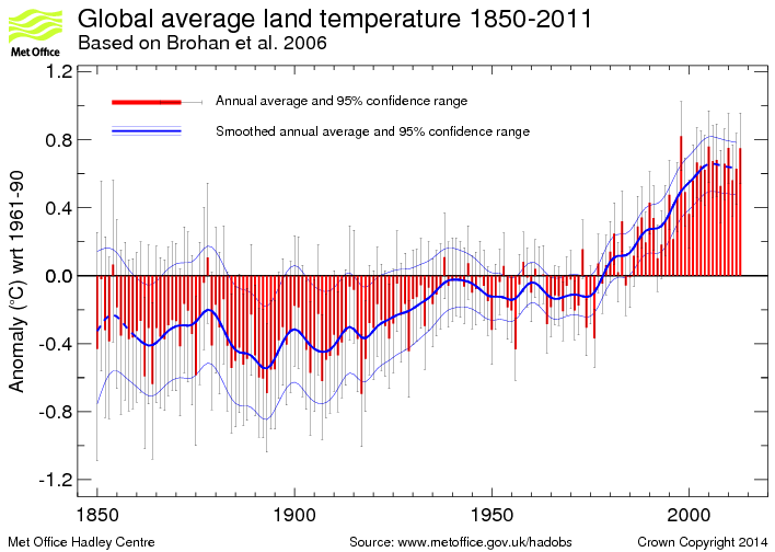
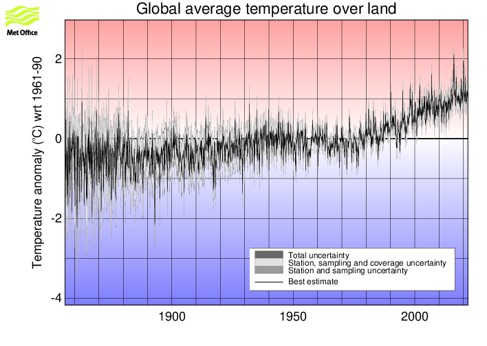
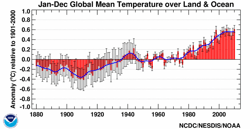
JoNova has a good article on some of these more recent reconstructions. Also, in addition to reconstructions, we have temperature records from the Met Office 1 and 2, as well as NOAA, but these surface temperature records are burdened with issues of questionable siting, changes in siting, changes in equipment, changes in the number of measurement locations, modeling to fill in gaps in measurement locations, corrections to account for missing, erroneous or biased measurements, and the urban heat island effect.
With that for background, the following are the graphs currently included in the WUWT Paleoclimate Reference Page:
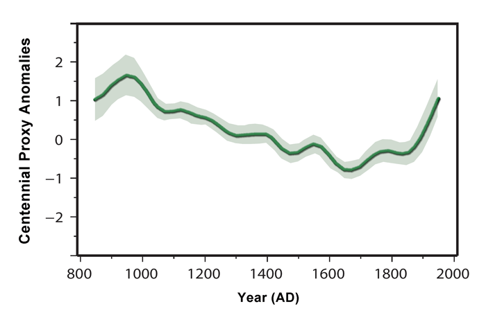
600 Years Arctic Temperature

1,100 Years Ljungqvist et al

1,100 Years Ljungqvist et al

1,100 Years Kirkby 2007

2,000 Years – J. Esper et al.

2,000 Years Christiansen

2,000 Years Christiansen

10,000 Years GISP2 Ice Core
11,000 years GISP2 Temperature Since 10700 BP with CO2 from EPICA DomeC

120,000 Years

140,000 Years Antarctic/Vostok

150,000 years Taylor Dome -Ross, Antarctica E. J. Steig, et al 1999:

400,000 Years Antarctica/Vostok

450,000 Years Temperature Anomaly

750,000 Years Rate of Change of Ice Volume and June 65N Insolation

800,000 Years Orbital and Millennial Antarctic Climate Variability

800,000 Years Orbital and Millennial Antarctic Climate Variability

1,000,000 Years

5,500,000 Years Antarctica/Vostok Temperature

5,500,000 Years Antarctica/Vostok Temperature – Reversed

[Which version of the above two graphs do you prefer?}
65,000,000 Years

540,000,000 Years

543,000,000 Years Area of Continents Flooded, Concentration of CO2 and Temperature Fluctuations

600,000,000 Years – C. R. Scotese and R. A. Berner

(Please note that WUWT cannot vouch for the accuracy of the data/graphics within this article, nor influence the format or form of any of the graphics, as they are all linked from third party sources and WUWT is simply an aggregator. You can view each graphic at its source by simply clicking on it.)
Please post your thoughts, recommendations, graphs, links, research, suggested graph titles, etc., for the WUWT Paleoclimate Reference Page in comments. Thanks JTF
“justthefactswuwt says: February 23, 2013 at 5:12 pm
Phil. says: February 23, 2013 at 3:58 pm
The GISP2 graphs are incorrectly labelled, they actually end at 95 years before present (1950).
I liked Werner’s math better than yours, but there does seem some basis for this, in that this 1992 paper indicates that the GISP2 data ended in 1950;”
I think Phil’s interpretation is right. Here is the actual numerical data. First temperature entry 0.0951409 before present. Units are 1000 year. And what is “present”? Paleo convention is 1950. And in Alley’s paper he makes one explicit reference that confirms that is his usage. On p 214, Sec 2, he says:
“and those summarized by Alley et al. (1997b), indicate an age close to 11,500 yr before 1950 (11.5 kabp), or perhaps older by up to a century or so.”
Note the definition of kabp here.
Here is a site with numerous historical charts.
http://www.c3headlines.com/temperature-charts-historical-proxies.html
Can I reiterate the comments a couple of people have made especially with regards to the longer lived graphs, and that is in many cases- but not all- “BP” means 1950 not today i.e 2013. Therefore if using these the undoubtedly warming climate since then needs to be taken into account.
Also bear in mind that polar ice core data comes from places where temperatures seem to be considerably amplified. A good example at present is the warm arctic which is at variance with much of the rest of the globe, so an ice core taken in the future from this era would show a warming there that wasnt happening elsewhere.
tonyb
I was having a think about the Greek “Dark Ages”, Mycenean collapse etc and came across this guy’s research. May be interesting. Something sure started going wrong for humans in the Late Bronze. Maybe a cold Mediterranean with less rainfall? A lot of speculation, much to untangle, but it’s interesting. That’s a hell of a cooling in the Ionian.
Sorry, forgot the link. It was Tony Abbott fault.
http://www.bleedrake.com/page4/page11/index.html
JTF – re your two questions. The first one is difficult. No matter what you do (leave them out, stick them at the bottom, put the criticism next to them, post them without comment, etc, etc), you can be criticised. I would certainly try to be unbiased so that graphs are judged only on quality, not on whether the story they tell tallies with “sceptic” thinking. Perhaps I would deal with them in three ways:
1. If it seems to be genuine, post it, even if it conflicts with other graphs. Let’s face it, most of the paleo graphs are from a single location so of course there will be discrepancies between the graphs. Perhaps an explanatory note to that effect at the start of the page would help.
2. If you feel it is really low quality or has been manipulated, leave it out. But unlike those who adjust temperature records in secret, document it. eg, provide a separate (linked) page with links to rejected graphs plus reasons.
3. If you just can’t decide between 1 and 2, put it in with a comment and/or a link to criticism.
My suspicion is that as you get into the swing of it, there won’t be much in category 3.
re the second question: I would put a fairly prominent standard statement near each R-to-L graph, eg. “Time in this graph runs Right to Left”.
But those are just my suggestions. it’s your page.
Couple of problems, but please don’t downplay the importance of what you are doing.
1. Calibration. If temperature, calibration against instrumental record, which record was used?
2. If oxygen isotopes, give ref to paper containing calibration equation or at least a general ref like http://www.earthobservatory.nasa.gov/Features/Paleoclimatology_OxygenBalance/
or Jouzel, J., R. D. Koster, R. J. Suozzo, G. L. Russell. 1994. Stable water isotope behavior during the last glacial maximum: A general circulation model analysis. Journal of Geophysical Research, 99: 25791-25802.
3. Error terms. This is a mess. The stats of standard deviations etc on an Excel graph regression don’t include specifics on bias in a process and often (as noted above) are more like cartoons than scientific calculations. I find it hard to place credibility on graphs with silly error envelopes and this undermines trust in the project.
4. Data provenance. It’s desirable to include info on whether the graph shows a tiny study area or is global or somewhere in between.
I realise that the first step is to gather the data in a form as original as possible. The generation of a lovely set of matched graphs presents no problems: it merely takes time. But calibration and error are two topics that are quite vital and hopefully will be refined as the project progresses.
Do you have future plans to quote non-graph data such as this email portion –
From: Edward Cook
To: “Michael E. Mann”
Subject: Re: hockey stick
Date: Wed, 2 May 2001 15:25:41 -0400
0988831541.txt in part –
I do think that the Medieval Warm Period was a far more significant event
than has been recognized previously, as much because the high-resolution data to evaluate it had not been available before. That is much less so the
case now. It is even showing up strongly now in long SH tree-ring series.
So, at this stage I would argue that the Medieval Warm Period was probably
a global extra-tropical event, at the very least, with warmth that was
persistent and probably comparable to much of what we have experienced in
the 20th century. However, I would not claim (and nor would Jan) that it
exceeded the warmth of the late 20th century. We simply do not have the
precision or the proxy replication to say that yet. This being said, I do
find the dismissal of the Medieval Warm Period as a meaningful global
event to be grossly premature and probably wrong.
justthefactswuwt says:
February 23, 2013 at 4:07 pm
Gary Pearse says: February 23, 2013 at 3:42 pm
I think we should also have written historical and archeological data, and art (kids playing on the frozen Thames), etc.
I am open to that, perhaps we can include a section of historical supporting materials after the graphs. Materials on the Medival Warming Period and Little Ice Age might be especially helpful in demonstrating the normal and natural changes that occur in Earth’s climate system.
If you do this you will be heading for a book. Now, that’s not a complaint. I think a book on this single, well defined subjet would be as useful as the work you have started here.
Thanks for all your effort.
In my earlier comment I had not understood that the title graph (GISP2) ends 95 years ago, presumably to do with the way the sampling is done(?). Does that mean that it would be reasonable to add about .7 to account for estimated warming over the last 100 years?
For me this is the most graphic and simple to understand image, it is the one I would use to discuss climate variability with my non scientific friends who have little grasp on the details of how complex the science is and are the sort of people who would be won over by the hockey stick junk science
A. Crowe says:
February 23, 2013 at 8:19 pm
It would be helpful to emphasise the distinction between global paleo temperature reconstructions and local paleo temperature reconstructions. I think some people are confusing local sets with global sets.
I agree that it is important to do that, but some of the “local” sets are representative for larger area’s that sometimes expected. The GRIP ice cores e.g. collect precipitation from evaporation of most of the North Atlantic, thus represent the ocean (and N.W. Europe) temperatures over the measured period. The coastal Antarctic ice cores represent the nearby coastal waters, but the high altitude inland ice cores represent most of the SH oceans…
Maybe some additional information for each graph can help to indicate the area that is captured by the proxy or reconstruction?
Further a few links to graphs:
https://www.dmr.nd.gov/ndgs/Newsletter/NL99W/PDF/globlwrmw99.pdf
10,000 years of lake sediments in Sweden/Finland + 7,500 years of tree ring temperature reconstruction of Northern Scandinavia + peat bogs over 1,500 years and other interesting items:
http://www.pages.unibe.ch/products/newsletters/nl2003_2.pdf
The first chart of the page (temp from -10000 to know) seemed very astonishing to me. I looked for the given reference and the article was about temp between 16000 and 10000, with no sign of any chart of this sort ! So were does this chart come from ?
As an example of misleading, the chart at the top of the page has a green line through it (second order polynomial – why?). Even a polynomial, which is not the right tool, would be quite a different shape if the time horizon was expanded by 1000 years (or by 4000 years, which would include the Younger Dryas cold event). More so if it included the full 50,000 years of available data it was based on. (I assume the green line was meant for ‘entertainment purposes only’ in the style of Spencer – but it should be removed).
I assume the recent 10,000 years was picked to show up the change in Central Greenland since human civilisation. And because the relatively small fluctuations over this more recent time period wouldn’t show up well if the prior 40,000 years was included (because it was markedly colder at that site and subject to much greater fluctuations). So that’s fair enough and the full 50,000 years can be shown in a separate chart. However the green line is still very misleading and should go.
This example highlights the importance of not including a chart unless you can also link to the sources of data. Here’s the data for the chart in question:
ftp://ftp.ncdc.noaa.gov/pub/data/paleo/icecore/greenland/summit/gisp2/isotopes/gisp2_temp_accum_alley2000.txt
Have a look at http://klimaatgek.nl/wordpress/opwarming/ for more paleoclimatological graphs. Other pages at the site may contain more graphs. For a Google translation from Dutch to English use the sidebar.
Geoff Sherrington says:
February 24, 2013 at 1:31 am
Do you have future plans to quote non-graph data such as this email portion –
From: Edward Cook
To: “Michael E. Mann”
Subject: Re: hockey stick
Date: Wed, 2 May 2001 15:25:41 -0400
0988831541.txt in part –
___________________________
Good idea, Jeff. It couldn’t hurt, but hasn’t made a difference so far.
I could get really snarky and mention recent speeches by POTUS, for instance…
Several other articles reconstructing the last 10K years in Sweden are found in the journal Holocene http://hol.sagepub.com/content/22/2/165.abstract. They confirm the high latitude climate variability shown elsewhere.
A 3600 year reconstruction is found in the journal Geografiska Annaler: Series A, Physical Geography. http://hol.sagepub.com/content/22/2/165.abstract.
The abstracts are free but you may be able to obtain the full text through local library resources. Charts are not included in the abstract.
For shorter term reconstructions showing the medieval warm period, has Cook, Esper and D’Arrigo, 2004, Extra-tropical Northern Hemisphere land temperature variability over the past 1000 years, Quat. Sci. Rev 23, 2063–-2074, been considered? Paper available at http://www.ldeo.columbia.edu/res/fac/trl/downloads/Publications/%20cook2004.pdf. Figure 3 is perhaps the most relevant graph. This was cited, for instance, in Hegerl et al’s 2006 Nature paleoclimate climate sensitivity study (Fig.1).
Interesting. I note the “double” interglacial ~420kya.
There’s a chart on this link that has temp,volcanos plotted on a basic graph.It’s from people that get payed to forecast the weather.
http://www.longrangeweather.com/global_temperatures.htm
You could probably use the 800,000 year Epica Dome C ice core from Antarctica (there doesn’t seem to be a good chart on the net which just has the temperature record, so here is a chart that could be used – this is Antarctica temperatures changes at the Dome C summit – global would be about half of this change given the polar amplification of Antarctica).
http://s7.postimage.org/jmmpbkai3/Antarctica_Temps_800_000_years.png
Data source.
ftp://ftp.ncdc.noaa.gov/pub/data/paleo/icecore/antarctica/epica_domec/edc3deuttemp2007.txt
And the new NEEM ice core from Greenland which extends the Greenland temperatures farther back into the Eemian at 128,000 years ago (versus the previous NGRIP-extended and Antarctic ice core temperatures).
http://s18.postimage.org/4awjdwew9/New_Neem_Temps_vs_NGRIP_Antarctica.png
Paper and data source for NEEM.
http://www.nature.com/nature/journal/v493/n7433/full/nature11789.html
I’ve got temperatures over the last 750 million years here (my own work so probably not useful but it is the same basic methodology used by GlobalWarmingArt, Royer,Berner2004, Shaviv,Viezer2003; I’ve just amped up the resolution and gone back a little farther with the isotopes).
http://s4.postimage.org/5nwu2ppdp/Temp_CO2_750_Mya.png
This has nothing to do with paleoclimate but if you have any traction with what goes into the WUWT reference pages I would like to have ready access to this Ryan Maue graphic, perhaps in the Atmosphere page, and on several different scales. It shows dynamic tropopause potential temperatures which should be related to surface temperatures, and I’d like to know more about how they are related (they seem always higher than surface temperatures). It would be great do have RM do a guest posting. Thanks for anything you can do.
http://climaterealists.com/attachments/ftp/Tweet%20Feed%20442.jpg
Julian in Wales says:
February 24, 2013 at 2:17 am
“In my earlier comment I had not understood that the title graph (GISP2) ends 95 years ago, presumably to do with the way the sampling is done(?). Does that mean that it would be reasonable to add about .7 to account for estimated warming over the last 100 years? ”
It actually ends in 1855, 95 years before 1950 (see posts by RattusN and Nick Stokes and others). It was mis-labelled.
It’s not a global temperature series. You’d have to go to Central Greenland temperature records to add/splice temperature for the intervening years since 1855 (with calibration to this series) – and indicate it’s from a different source. Not sure whether you’d get all years over that whole period.
Further to:
climatereason says:
February 24, 2013 at 12:48 am
//////////////////////////////////////////////////////////////
It is not easy to see why CET should be a proxy for global temperatures. Surely, it is an artefact of the temperature of the North Atlantic (presuming that the UK receives predominantly Westerlies), or to a lesser extent, the North Sea.
Personally, I would have thought that it is a fairly good proxy for the Gulf Stream in and around the UK. Whether the Gulf Stream is a good proxy for global conditions more generally, I would have thought to be more moot.
tobias says:
February 23, 2013 at 10:33 pm
/////////////////////////////////////////////////
Past temperatures that long ago cannot be considered in isolation without detailed knowledge and consideration of plate tectonics and the then oceans and the then prevailing oceanic currents.
anarchist hate machine says:
February 23, 2013 at 11:50 pm
@tobias
tectonic plates moved very little (relatively) from 50-60 million years ago to today. That would put the earth in the neogene-eocene epoch. A quick look at a map of the earth during the eocene on wikipedia shows a very similar continental pattern to today, albeit with much higher sea level.
http://www.scotese.com/newpage9.htm
//////////////////////////////////////////////////////
AHM, the map you attach shows a very different world some 50 million years ago (Australia just breaking away from Antartica, India about to collide with Asia, very different in and around the Med, North & South America not joined, Europe not joined with Russia etc) with significantly different oceans and ocean currents. The then prevailing ocean currents is probably the most material factor since these are the heat pump of the planet and distribute warmth from the tropical regions to the poles.
.
In the Caenozoic Quaternay period, plate tectonics may not be a factor. However, when going back to the early Neogene and certainly when going as far back as the Palaeogen, plate tectonics becomes an issue if one is wishing to compare like with like. .
The BBC are reporting a project by the Marine Institute in Plymouth, UK, to ask ships to take plankton depth samples for more data on plankton abundance:
http://www.bbc.co.uk/news/education-21547272
One the face of it this could be a useful scientific project. However the inevitable, baleful agenda behind this is that apparently plankton is “changing” and that this is inevitably disastrous, and all our fault. They dig up the horribly flawed research showing a supposed 40% fall in plankton abundance since the 1950’s. (Willis Esschenbach demolished this study in a posting last year.)
This infantile rubbish makes the BBC look stupid, twisted and dishonest at the same time, and will label them as such for all time. In view of palaeo-climate data, how is it possible for a non mentally retarded “scientist” to propose that a rise in temperature globally of a fraction of a degree can wipe out half the ocean’s phytoplankton? When for hundreds of million years in the past the global temperature was at least 10 degrees (C) warmer than today, with marine plankton apparently alive and well?
Each and every one of the disaster scenarios of CAGW is uttery rubbished and destroyed by the palaeo climate record. When AGW was formulated, palaeo climate data was entirely absent from the minds of those who cooked up this scam. Some of them continue to pretend that the world only came into existence in 1850. Others belatedly are trying to concoct a rather pathetic AGW “palaeo-apologetics”, which follows the strategy of fundamentalist literal 6-day creationists in undermining the credibility of any palaeo data.
That is why this post with crowd-sourced palaeo data is very important and valuable. These data need to be communicated to the general public so that they can see for themselves the impossibility of the CAGW scare story. As George Orwell wrote in “1984”, “He who controls the past controls the future. He who controls the present controls the past.”
Defend the past from being edited and controlled, and thus defend our future.
A good start would be to copy the post by D.B. Stealey with a list of palaeoclimate links.