
Image Credit: Jo Nova – David Lappi – GISP2
Your help is needed in building the new WUWT Paleoclimate Reference Page. Below I’ve posted all of the credible 3rd party paleoclimate graphs I’ve compiled thus far, but I am sure there are lots more. As such, please post links to any credible paleoclimate data sources below or in comments of the WUWT Paleoclimate Reference Page and we will review them for inclusion. Also, your thoughts on the provenance of the graphs included thus far, links to the papers they are based upon, and appropriate titles for each graph would be most appreciated.
In terms of additional graphs for potential inclusion, I struggled with shorter term reconstructions, as many of them are still a matter of controversy. As such, please post any pertinent information, including any credible graphs illustrating the last few millennia and the Medieval Warming Period. For reference, there are an array of less than ideal options available on the bottom of this NOAA NCDC page. From a cursory review, I found the summary for Overpeck et. al 1997 to be enlightening, e.g.;
“Together, they indicate that the Arctic has warmed up to 1.5°C since 1850 – the coolest interval of the Arctic “Little Ice Age.” Much of the recent Arctic warming took place between 1850 and 1920, most likely due to natural processes”
However, after Overpeck the “Team” went to work, i.e. Briffa et al., 1998, Jones et al., 1998, Mann et al., 1998, Pollack et al., 1998, Jones et al., 1998, Mann et al., 1999, Mann et al., 2000, Briffa et al., 2001, Esper et al., 2002 and Jones and Mann 2004, and paleoclimatology became a quite a sordid science. The IPCC’s 2007 contribution in AR4 section 6.6.1.1, brought things to a new low when they appear to have pasted a thick black HadCRUT2 line onto some kindergartner’s art project…:

Anyway, it is also interesting to note that the NOAA NCDC site doesn’t seem to include any reconstructions after 2006, while there has been much valuable paleoclimate research conducted since then, e.g.:
Ljungqvist, F. C., Krusic, P. J., Brattström, G., and Sundqvist, H. S (2012).: Northern Hemisphere temperature patterns in the last 12 centuries, Clim. Past, 8, 227-249, doi:10.5194/cp-8-227-2012, 2012. See JoNova, CO2Science and Abstract at Clim-Past.
Christiansen, B. and Ljungqvist F. C. (2012). The extra-tropical Northern Hemisphere temperature in the last two millennia: reconstructions of low-frequency variability. Climate of the Past JoNova 1, JoNova 2, Abstract at Clim-Past
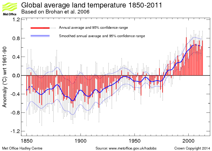
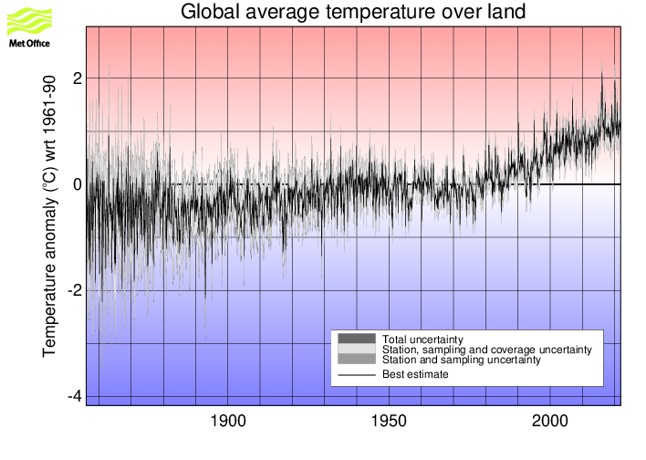
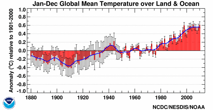
JoNova has a good article on some of these more recent reconstructions. Also, in addition to reconstructions, we have temperature records from the Met Office 1 and 2, as well as NOAA, but these surface temperature records are burdened with issues of questionable siting, changes in siting, changes in equipment, changes in the number of measurement locations, modeling to fill in gaps in measurement locations, corrections to account for missing, erroneous or biased measurements, and the urban heat island effect.
With that for background, the following are the graphs currently included in the WUWT Paleoclimate Reference Page:
600 Years Arctic Temperature

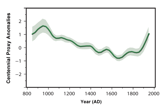
1,100 Years Ljungqvist et al

1,100 Years Ljungqvist et al

1,100 Years Kirkby 2007

2,000 Years – J. Esper et al.

2,000 Years Christiansen

2,000 Years Christiansen

10,000 Years GISP2 Ice Core
11,000 years GISP2 Temperature Since 10700 BP with CO2 from EPICA DomeC

120,000 Years

140,000 Years Antarctic/Vostok

150,000 years Taylor Dome -Ross, Antarctica E. J. Steig, et al 1999:

400,000 Years Antarctica/Vostok

450,000 Years Temperature Anomaly

750,000 Years Rate of Change of Ice Volume and June 65N Insolation

800,000 Years Orbital and Millennial Antarctic Climate Variability

800,000 Years Orbital and Millennial Antarctic Climate Variability

1,000,000 Years

5,500,000 Years Antarctica/Vostok Temperature

5,500,000 Years Antarctica/Vostok Temperature – Reversed

[Which version of the above two graphs do you prefer?}
65,000,000 Years

540,000,000 Years

543,000,000 Years Area of Continents Flooded, Concentration of CO2 and Temperature Fluctuations

600,000,000 Years – C. R. Scotese and R. A. Berner

(Please note that WUWT cannot vouch for the accuracy of the data/graphics within this article, nor influence the format or form of any of the graphics, as they are all linked from third party sources and WUWT is simply an aggregator. You can view each graphic at its source by simply clicking on it.)
Please post your thoughts, recommendations, graphs, links, research, suggested graph titles, etc., for the WUWT Paleoclimate Reference Page in comments. Thanks JTF
Discover more from Watts Up With That?
Subscribe to get the latest posts sent to your email.
Eric Simpson, looks like the higher levels of CO2 were eaten into a lot when photosynthesis started happening on a massive scale (from cellular organisms in the oceans) and oxygen rose, followed by the evolution of life on land (supported by the rise in O2). So various factors would have prevented a ‘runaway’ warming.
Something like: weathering -> drop in CO2, photosynthesis from ocean microorgs ->drop in CO2, rise in O2 (see also SPICE reference below) then terrestrial life and modern atmosphere. Bearing in mind geological time scale is vastly different to human timescale. A ‘rapid change’ in geological terms could be a couple of million years, with ‘instantaneous’ being maybe 20,000 years! Some of the data on geo atmospheric composition are resolved to 30 million years (eg Berner) so don’t show short(er) blips.
The sun was fainter 500,000,000 years ago so higher levels of CO2 did not warm earth as much back then (because there wasn’t as much energy coming from the sun).
This article is about the SPICE event plus talks about paleo changes:
http://researchnews.osu.edu/archive/oxypulse.htm
http://www.globalwarmingart.com/
and
http://climate4you.com/
Are a couple excellent sources …
@justthefactswuwt
May I also urge consideration be given to creating a short youtube clip to present this paleo information for those that best absorb visual and spoken data as opposed to written data.
I know from my experience from being in business or business accounting for the last 50 years and as a member of the ‘WUWT limited partnership of concerned human beings from around the world that have contributed to WUWT’ would love to have a short video to be able to send to some of my friends and family.
I would suggest that Willis Eschenbach, if he has the time, would be able to put together a great script and provide some great nature fill in shots.
As a presenter I would suggest http://joannenova.com.au/2013/02/tophers-new-video-the-forbidden-history-of-terrible-taxes/
You would need to search youtube for his previous video’s and I believe he could make a valuable contribution.
Kind Regards
Philip Bradley says: February 23, 2013 at 4:40 pm E. J. Steig, et al – University of Washington Click the pic to view at source[/caption]
I’d like graphs from the Taylor Dome (Antarctica) included, as they are Greenland like, and show different timing of events like the YD to other Antarctic cores like Vostok.
The page below shows the Taylor O18 record, but unfortunately the link to the graph doesn’t work. I’ll try and find a direct link.
No worries on the link, from a Windows machine, right click on the image and select “View Image”, this will take you to the image link:
http://depts.washington.edu/isolab/images/tdicecore.gif
I thus added 150,000 years Taylor Dome -Ross, Antarctica E. J. Steig, et al 1999;
[caption id="" align="alignnone" width="578"]
to this article and the Paleoclimate page. Thank you
“….these surface temperature records are burdened with issues of questionable sighting, changes in siting, ….
Typo, questionable siting
{Fixed, thank you. Mod]
I is interesting to note that the data ends in 1855. Just a wee bit before today. (the chart here is labeled before present (BP) the P in this is 1950. So the last data point is at 95 years before present, 1855.
Some of these may have already been posted:
http://www.biocab.org/SL_and_CO2.jpg
http://www.biokurs.de/treibhaus/180CO2/bayreuth/bayreuth1e.htm [interactive chart]
http://members.shaw.ca/sch25/FOS/Beck%20CO2.gif
http://cdiac.esd.ornl.gov/trends/co2/graphics/South_Pole_CO2.jpg
http://wattsupwiththat.files.wordpress.com/2009/02/eia_co2_contributions_table3.png
http://www.john-daly.com/co2-2000.gif
http://oi26.tinypic.com/311s08x.jpg [click to embiggen]
http://jennifermarohasy.com//wp-content/uploads/2009/10/Lance_Experience-Curve-CO2-and-SST-with-21-moving-average-12May092.jpg
http://www.climate4you.com/images/GISS%20GlobalMonthlyTempSince1958%20AndCO2.gif
http://www.climate4you.com/images/HadCRUT3%20GlobalMonthlyTempSince1940%20AndCO2.gif
http://www.geocraft.com/WVFossils/last_400k_yrs.html
http://www.geocraft.com/WVFossils/PageMill_Images/image277.gif
http://icecap.us/images/uploads/MSUCRUCO2.jpg
http://cadenzapress.co.uk/download/beck_mencken_hadley.jpg
http://c3headlines.typepad.com/.a/6a010536b58035970c013480b4810c970c-pi
http://img7.imageshack.us/img7/2127/last3iceages.png
http://img260.imageshack.us/img260/8371/transitioniceageco2.png
http://img339.imageshack.us/img339/879/co2lagkz2.png
http://c3headlines.typepad.com/.a/6a010536b58035970c011572416077970b-pi
http://icecap.us/images/uploads/8YearTemps.jpg
http://jennifermarohasy.com//wp-content/uploads/2009/09/Tim-Curtin-_temp-and-co2-chart-ver-2.jpg
http://wattsupwiththat.files.wordpress.com/2007/11/co2-h2o_solubility.png
http://c3headlines.typepad.com/.a/6a010536b58035970c011570a85da7970c-pi
http://www.biocab.org/GWMA-002_op_987x740.jpg
http://climatesanity.files.wordpress.com/2010/02/correlation-coefficents-sorted-by-t.gif
http://climatesanity.files.wordpress.com/2010/02/correlation-coefficents-sorted-by-co2.gif
http://www.biocab.org/Geological_Timescale.jpg
http://img708.imageshack.us/img708/4313/co2fossilsoilsar4.png
http://jennifermarohasy.com//wp-content/uploads/2009/07/Fieldings-chart.gif
http://c3headlines.typepad.com/.a/6a010536b58035970c0120a5e507c9970c-pi
http://icecap.us/images/uploads/Correlation_of_Carbon_Dioxide_with_Temperatures_Negative_Again.pdf
http://c3headlines.typepad.com/.a/6a010536b58035970c0120a5f34862970b-pi
http://3.bp.blogspot.com/_cHhMa7ARDDg/SNW-4aiO9PI/AAAAAAAAAd8/5wuDuVDjYqI/s1600/Geocarb%2BIII-Mine-02.jpg
http://www.john-daly.com/artifact.htm
http://www-das.uwyo.edu/~geerts/cwx/notes/chap01/Image17.gif
http://www.biomind.de/realCO2/bilder/CO2%20MBL1826-2008-2n-SST-2k.jpg
http://c3headlines.typepad.com/.a/6a010536b58035970c0115707ce438970b-pi
http://wattsupwiththat.files.wordpress.com/2010/03/heating_effect_of_co2.png
http://s90.beta.photobucket.com/user/dhm1353/media/Climate%20Change/PhanerozoicCO2vTemp.png.html
http://www.daviesand.com/Choices/Precautionary_Planning/New_Data/IceCores1.gif
http://c3headlines.typepad.com/.a/6a010536b58035970c0120a60a2a5c970b-800wi
http://img254.imageshack.us/img254/2626/tempobsrvvsco2ct4.png
http://icecap.us/images/uploads/MSUCRUCO2June09.jpg
http://www.brighton73.freeserve.co.uk/gw/paleo/400000yearslarge.gif
http://icecap.us/images/uploads/USHCNvsCO2.jpg
http://www.edgeblog.net/wp-content/uploads/2009/10/Global-CO2.PNG
http://img172.imageshack.us/img172/2464/tempvsco267m.png
http://icecap.us/images/uploads/TEMPSvsCO2.jpg
http://img823.imageshack.us/img823/9508/tempco2570mlefttoright.png
http://joannenova.com.au/global-warming-2/ice-core-graph/
http://www.worldclimatereport.com/wp-images/national_emissions.JPG
http://2.bp.blogspot.com/_cHhMa7ARDDg/SoxiDu0taDI/AAAAAAAABFI/Z2yuZCWtzvc/s1600/Geocarb%2BIII-Mine-03.jpg
http://www.woodfortrees.org/plot/rss/from:1995/plot/rss/from:1996.83/trend/plot/esrl-co2/from:1996.83/normalise
http://members.shaw.ca/sch25/FOS/GlobalTroposphereTemperaturesAverage.jpg
http://wattsupwiththat.files.wordpress.com/2012/07/mauna-loa-co2-vs-uah.jpg
http://www.woodfortrees.org/plot/esrl-co2/isolate:60/mean:12/scale:0.26/plot/hadcrut3vgl/isolate:60/mean:12/from:1958 [T leads CO2]
http://www.co2web.info/C-atm-vs-human.jpg
http://theresilientearth.com/files/images/hansen_forecast_1988-2.jpg
http://icecap.us/images/uploads/ALL_SINCE_2002.jpg
http://justdata.files.wordpress.com/2009/12/raw_temp_1990-20091.jpg
http://justdata.files.wordpress.com/2009/12/raw_temp1.jpg
http://www.ianschumacher.com/img/TempsvsIPCCModelsWM.jpg
http://carbon-sense.com/wp-content/uploads/2009/10/18-20-temps.png
http://butnowyouknow.files.wordpress.com/2009/07/globa-mean-temp.gif?w=469&h=427
http://www.worldclimatereport.com/wp-images/US_temps_fig1.gif
http://jonova.s3.amazonaws.com/graphs/hadley/Hadley-global-temps-1850-2010-web.jpg
http://www.globalwarmingskeptics.info/thread-188-post-3130.html
http://img856.imageshack.us/img856/2403/dailyuahtempsmar92010.png
http://wattsupwiththat.files.wordpress.com/2011/03/record2bhigh2btemperature2bchart1.jpg
http://oi49.tinypic.com/rc93fa.jpg
http://img576.imageshack.us/img576/2681/temperaturewithrealbase.gif
http://oi56.tinypic.com/2reh021.jpg
http://www.middlebury.net/op-ed/hope-it-lasts.jpg
http://curryja.files.wordpress.com/2011/12/14.jpg [tonyb chart]
http://oi35.tinypic.com/2db1d89.jpg
http://jonova.s3.amazonaws.com/graphs/giss/hansen-giss-1940-1980.gif
http://wattsupwiththat.files.wordpress.com/2011/08/alternativeinterpretationofgmtfig2.png?w=640&h=429
http://www.thetruthaboutclimatechange.org/tempsworld.html
http://icecap.us/images/uploads/ALL_SINCE_2002.jpg
http://www.friendsofscience.org/assets/documents/FOS%20Essay/HadCrut3Global.jpg
http://wattsupwiththat.files.wordpress.com/2011/10/article-2055191-0e974b4300000578-216_468x4731.jpg
http://stevengoddard.files.wordpress.com/2012/12/screenhunter_320-dec-01-11-30.jpg?w=640&h=484&h=484
ftp://ftp.ssmi.com/msu/graphics/tls/plots/rss_ts_channel_tls_global_land_and_sea_v03_3.png
Got more, but these crowdsourced links should do for now.
A couple of suggestions (might have been made already, have only skimmed the comments.)
It would be helpful to emphasise the distinction between global paleo temperature reconstructions and local paleo temperature reconstructions. I think some people are confusing local sets with global sets.
For example the top chart is for the ice core site in Greenland only and doesn’t apply globally, and this could be made more clear.
With the ice cores from Greenland and Antarctica, different indicators of temperature are used for local (site specific) than for global (world-wide) and IMO it’s important to distinguish the two.
Other global reconstructions (recent times) are derived from proxies all around the world, with some reconstructions using more data from more sites and others drawing on less proxies from fewer sites. It would be useful to indicate how many different proxy sets were used in each and how large the spread of sites around the world. Individual reconstructions are of less value where data is from limited latitudes or a very small number of localities or are ‘weighted’ in a way that is less representative of the globe. Having said that, looks as if there isn’t a huge difference between the reconstructions to date though some would have larger error bars than others.
Older paleo (hundreds of millions of years) is based on geological data etc and of much coarser resolution.
justthefactswuwt says:
February 23, 2013 at 7:41 pm
I thus added 150,000 years Taylor Dome -Ross, Antarctica E. J. Steig, et al 1999;et al 1999;
E. J. Steig, et al – University of Washington Click the pic to view at source
to this article and the Paleoclimate page.
If graphs are joined as in the example it is absolutely essential (in my opinion) that this be made crystal clear to even a very casual observer. Best way could be a wiggly vertical line clearly separating the two data sets and also highlighting the changed x-axis scale if this has been altered as well.
I much prefer data presented with the current date at the right of x-axis.
This is going to be a great resource…well done for tackling it…I must admit I get the chills when I see all these graphs pointing in the same worrying direction! Maybe nuclear power in the future and domes over cities could keep us warm…but not the crops!
I have found this to be a good paleo-climate site: http://www.scotese.com/
It has geological changes too.
Another suggestion is that each graph has an About link that explains the graph and its significance, plus any issues there may be with it. These could be easily crowd sourced. I’d be happy to write some.
Not sure if it is possible but to the extent it is possible, it would be good if we could also access original data , in an excel spreadsheet or some sort of ascii format. This would facilitate comparing these various datasets which could lead to a lot of interesting analysis by anyone who cared to get into the data. Alternatively, these various plots could be digitized & re-sampled to facilitate this as well. Software is available to do such digitization.
Rattus Norvegicus says: February 23, 2013 at 7:54 pm
I is interesting to note that the data ends in 1855. Just a wee bit before today. (the chart here is labeled before present (BP) the P in this is 1950. So the last data point is at 95 years before present, 1855.
Which data, in which chart?
This looks a good project. My only worry is that alarmists will mis-use it to support their CAGW argument. (eg by tacking on the temperatures of the last hundred years or so.)
justthefactswuwt;
What if I create a section of graphs at the bottom under a header like Disputed Graphs, Suspect Graphs, etc.?
>>>>>>>>>>>>>>>>>>
If you put it at the bottom, you’ll just get accused of trying to hide it. I suggest putting it at the top with a big bold “what they tell you” title (or similar) followed by “what they don’t tell you” (or similar) sectgion.
That would allow you to go so far as to put a few words about where to look to raise questions about entries in the first one. For example, put the graph from Briffa’s hockey stick paper in the top section, and the graph from his most recent paper in the bottom section.
Oh…. and don’t forget, Clams can Talk!
http://wattsupwiththat.com/2010/03/10/paleo-clamatology/
justthefactswuwt;
“What if I create a section of graphs at the bottom under a header like Disputed Graphs, Suspect Graphs, etc.?”
If you put a separate section you’d have to say who disputes them and on what grounds.
It would leave you wide open to criticism if, for example, you said a graph constructed by X using Y’s data was good, but Y’s own construction/interpretation was ‘suspect’ unless you gave a very good reason.
This is especially the case given that virtually all the base data is from climate scientists, even though a number of the charts above look to have been re-interpreted by different skeptics. For example, older data being up-dated/replaced after new findings would be a valid reason; or refutations/rebuttals that have been shown to stand up in the literature (with no counter-rebuttals).
Just saying it was disputed on a skeptic blog somewhere would have less validity in the eyes of the general public. (Though you might get away with it here I suppose.)
I guess it depends on why you are collecting the material in the first place.
I cant find the source of the particular graph of Keigwin’s Sargasso Sea reconstruction that I use but I tracked a version down here which includes the graph from his paper and a post 1996-commentary
http://www.skepticalscience.com/print.php?n=1457
@ur momisugly David L Hagen
Thanks a million for that link to the presentation by Demetris Koutsoyiannis. That is easily the best summary of his thought I have found anywhere. Invaluable, and essential reading for anyone who really wants to understand climate.
phlogiston says: February 23, 2013 at 5:52 pm
BTW figure numbers would have been helpful 🙂
Philip Bradley says: February 23, 2013 at 8:40 pm
Another suggestion is that each graph has an About link that explains the graph and its significance, plus any issues there may be with it. These could be easily crowd sourced. I’d be happy to write some.
Jeff L. says: February 23, 2013 at 8:40 pm
Not sure if it is possible but to the extent it is possible, it would be good if we could also access original data , in an excel spreadsheet or some sort of ascii format.
Adding better graph titles, background and explanations is definitely a worthy endeavor, I’ve been adding details as I come across them, but help on this front would be most appreciated. The About summaries should have a reasonably standard format, e.g.:
Common Name – Data Source Location – Link to Paper – Publication Date – Figure Number – Link to Paper/Abstract – Link to Excel or ascii Data Source – Links to Criticisms of the Graph – Brief explanation of graph
and I’d prefer that they be succinct enough to fit in between the graphs of the Paleoclimate page. Please let me know if you have any suggested changes/additions to the draft About summary elements/order.
In terms of help to pulling together the About summaries, anyone who would like to help is most welcome, Even if only help out on one o two and we can only identify some of the About summary elements for each graph, it will still be a significant accomplishment.
Thanks again D. B. for the great trove of links. I wanted to report back the charts etc that I found the most helpful, but I’m still going through them. Your comment alone would be worthy of linking to in our comments elsewhere.
http://wattsupwiththat.com/2013/02/23/crowdsourcing-the-wuwt-paleoclimate-reference-page/#comment-1231508
Took one look at the graphs and decided I should have put water in with the scotch, But I have a question (I am an absolute nimcomepoop regarding the research all of you do so well) Some of you (SA Mr, Dnes) mention evidence that tropical climate existed in Northern latitudes 50-60 million years ago (northern Spain and middle of the USA, according to Mr. Dnes) But where is the tectonic plate movement EVER mentioned? If plates move at today’s rates (up to 2.5 cm/year) so where the heck were they 50 million years ago? In perhaps a tropical zone at the time? And the plates just maybe carried the evidence with them? (just like a tire carries Georgia mud to NY?) What was the inclination of the planet? The magnetic field? How much closer (or further) to the sun were we and how much hotter (colder) was the sun at that time , just say’n 🙂 apologize for the construction of the sentences good scotch.
justthefactswuwt says:
February 23, 2013 at 6:50 pm
“Richard Alley used “2000″ as present on his graph;”
To follow up further – I went to your linked source for the Alley Younger Dryas paper (2000) which has a link to data (presumably the source for the chart on that same page). The source temperature data for Central Greenland starts 95 years (0.095k years) ‘before present’.
ftp://ftp.ncdc.noaa.gov/pub/data/paleo/icecore/greenland/summit/gisp2/isotopes/gisp2_temp_accum_alley2000.txt
You might be confusing the year of publication with the data in the chart?
@tobias
tectonic plates moved very little (relatively) from 50-60 million years ago to today. That would put the earth in the neogene-eocene epoch. A quick look at a map of the earth during the eocene on wikipedia shows a very similar continental pattern to today, albeit with much higher sea level.
http://www.scotese.com/newpage9.htm
Julian in Wales says:
February 23, 2013 at 4:22 pm
The Greenland ice core data make the last 1-2000 years look very cold. Were the Roman and Minoan warming periods so much warmer than the MWP? And the CO2 levels seem to have little relationship to the changing temperatures in Greenland!……..”
///////////////////////////////////////////////////////////////////////////////////////////////////
I am of the view that the Greeenland temps for the MWP are under-assessed since they suggest that Greenland was only about 1 to 1.5degC warmer today.
Since Viking Settlements are still being revealed as the glacier retreats, and more significantly with the primative tools, feeds, crops, farming technology etc available, there is no way the Vikings could have farmed Greenland for a couple of hundred years if it was only about 1 to 1.5degC warmer than today.
Given the primative farming technology and knowledge, Greenland needed to probably be at least 3 degC warmer than today. Crops must have been bountiful in Viking times if not, had farming and life been on such a subsistence level one bad winter would have killed off a settlement.
It is inevitable that even had the climate been warmer than today there would have been periods when there were 2 or more consecutive bad winters and poor summer growing conditions, and this suggests that more generally the temperature must have been significantly warmer than today so that food could be grown in surplus and stored to meet the demands of 2 or more bad consecutive winter/growing seasons.
It would be interesting to have the views of an agricultural expert on what farming conditions were required to grow food and animal husbandry given Viking technology and knowledge for the Vikings to have maintained settlements at the high Northern latitudes for several hundred years..
Can I contribute my reconstruction of CET to 1538?
http://judithcurry.com/2011/12/01/the-long-slow-thaw/
In the study I compared the reconstructions of Lamb and Mann and researched numerous historical and scientific references in order to push CET back from 1660 to 1538. There are a variety of graphs including comparisons with BEST Giss and Hadley data..
Its significance is that CET is seen by many scientists as a proxy (not perfect but useful) of global temperatures. I am currently working on Part 2 whereby I am trying to identify the transition from the MWP to LIA
I subsequently carried out a separate study into the BEST global data to 1750 here.
http://wattsupwiththat.com/2012/08/14/little-ice-age-thermometers-historic-variations-in-temperatures-part-3-best-confirms-extended-period-of-warming/
It can be seen there is a reasonably good correlation with CET
tonyb