The press release is out, and the usual serial bloviators are rushing to trumpet the news. July 2012 was the hottest ever on record! “Yikes! We’re gonna roast! Global Warming!” they wail on Twitter and blogs. The driver of this is AP’s Seth Borenstein, who never met a hot story he didn’t like. Here’s a quote from that story Ouch July in US was hottest ever in history books:
The average temperature last month was 77.6 degrees. That breaks the old record from July 1936 by 0.2 degree, according to the National Oceanic and Atmospheric Administration. Records go back to 1895.
…
Three of the nation’s five hottest months on record have been recent Julys: This year, 2011 and 2006. Julys in 1936 and 1934 round out the top five.
Of course the first thing I do when I see these sorts of things is go look at the data. It tells a far more interesting and credible story. Here’s some graphs NCDC and Seth won’t ever put in a press release or AP story:
From NCDC’s Climate at a glance page:

Now let’s compare to July 1936:

A few things stand out right away.
1. Due to regional weather pattern variability, one state in 1936 had below normal temperatures, Texas. Take the 1936 Texas below normal temperature out of the mix and there goes your 0.2F record making difference with July 2012.
2. Many states had warmer temperatures in 1936 than 2012. Here’s a table, all numbers in degrees Fahrenheit:
| State | 1936 | 2012 | ||
| Montana | 74.7 | 71.4 | ||
| N. Dakota | 79.7 | 73.8 | ||
| S. Dakota | 83.8 | 78.8 | ||
| Minnesota | 76.2 | 74.4 | ||
| Wisconsin | 74.8 | 74.7 | ||
| Nebraska | 83.1 | 80.0 | ||
| Iowa | 82.7 | 79.4 | ||
| Kansas | 85.1 | 84.3 | ||
| Oklahoma | 85.8 | 85.5 | ||
| Missouri | 84.9 | 83.7 | ||
| Illinois | 83.1 | 81.7 | ||
| Indiana | 80.9 | 80.2 | ||
| Mississippi | 82.0 | 81.8 | ||
| California | 76.3 | 75.0 |
Now compare that to the same map of 1934, and we also see many warmer states than in 2012.

What’s interesting is that that if AGW had overcome natural variability, and many claim this, we wouldn’t see any statewide temperatures in 2012 lower than in 1936 or 1934.
And with all the adjustments that have been going on, which 1930’s are we really talking about? The real one or the adjusted one? NASA GISS uses NCDC adjusted data, which according to this graph from Steve Goddard, suggests there’s been a whole lot of adjusting going on.
The graph below shows the almost two degree US upwards adjustment trend being applied by USHCN between the raw thermometer data and the published monthly data.

The adjustments they are making are greater than the claimed trend, meaning that all man made US warming is occurring inside ORNL and GISS computers.
Speaking of adjustments, I recalled the GISS Y2K debacle in 2007 where McIntyre discovered a mistake in GISTEMP. I’ve recovered the graphs from Hansen’s 1999 press release. This was originally part of “Lights Out Upstairs”a guest post by Steve McIntyre on my old original blog. Just look at how much warmer 1934 was in 1999 than it is now. Much of this can be attributed to NCDC’s USHCNv2 adjustments.
=============================================================
Steve McIntyre wrote then:
In the NASA press release in 1999 , Hansen was very strongly for 1934. He said then:
The U.S. has warmed during the past century, but the warming hardly exceeds year-to-year variability.Indeed, in the U.S. the warmest decade was the 1930s and the warmest year was 1934.
This was illustrated with the following depiction of US temperature history, showing that 1934 was almost 0.6 deg C warmer than 1998.
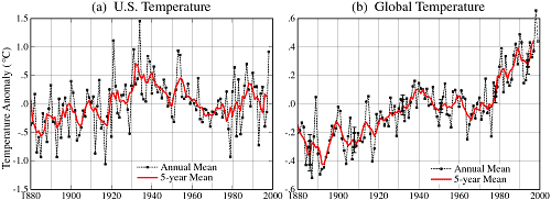
From a Hansen 1999 News Release: http://www.giss.nasa.gov/research/briefs/hansen_07/fig1x.gif
However within only two years, this relationship had changed dramatically. In Hansen et al 2001 (referred to in the Lights On letter), 1934 and 1998 were in a virtual dead heat with 1934 in a slight lead. Hansen et al 2001 said
The U.S. annual (January-December) mean temperature is slightly warmer in 1934 than in 1998 in the GISS analysis (Plate 6)… the difference between 1934 and 1998 mean temperatures is a few hundredths of a degree.
From Hansen et al 2001 Plate 2. Note the change in relationship between 1934 and 1998.
Between 2001 and 2007, for some reason, as noted above, the ranks changed slightly with 1998 creeping into a slight lead.
The main reason for the changes were the incorporation of an additional layer of USHCN adjustments by Karl et al overlaying the time-of-observation adjustments already incorporated into Hansen et al 1999. Indeed, the validity and statistical justification of these USHCN adjustments is an important outstanding issue.
============================================================
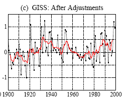
I’ve prepared a before and after graph using the CONUS values from GISS in 1999 and in 2011 (today).

GISS writes now of the bottom figure:
Annual Mean Temperature Change in the United States
Annual and five-year running mean surface air temperature in the contiguous 48 United States (1.6% of the Earth’s surface) relative to the 1951-1980 mean. [This is an update of Figure 6 in Hansen et al. (1999).]
Also available as PDF, or Postscript. Also available are tabular data.
So clearly, the two graphs are linked, and 1998 and 1934 have swapped positions for the “warmest year”. 1934 went down by about 0.3°C while 1998 went up by about 0.4°C for a total of about 0.7°C.
And they wonder why we don’t trust the surface temperature data.
In fairness, most of this is the fault of NCDC’s Karl, Menne, and Peterson, who have applied new adjustments in the form of USHCN2 (for US data) and GHCN3 (to global data). These adjustments are the primary source of this revisionism. As Steve McIntyre often says: “You have to watch the pea under the thimble with these guys”.
So the real question is: which 1934 and 1936 is NCDC and Seth Borenstein comparing to? It looks to me like we might not be comparing real temperatures to real temperatures, but rather adjusted ones to highly adjusted ones.
Finally, remember this statement from the AP July 2012 “hottest ever” story:
The average temperature last month was 77.6 degrees.
I have a way to apply a sanity check to this. but I’ll need some crowd-sourcing help. Stay tuned.
==========================================
UPDATE: Dr. Roy Spencer makes an interesting plot, which I’ve annotated to show a color key and years 1934, 1936, and 2012.
He writes in: July 2012 Hottest Ever in the U.S.? Hmmm….I Doubt It
Using NCDC’s own data (USHCN, Version 2), and computing area averages for the last 100 years of Julys over the 48 contiguous states, here’s what I get for the daily High temps, Low temps, and daily Averages (click for large version):

As far as daily HIGH temperatures go, 1936 was the clear winner. But because daily LOW temperatures have risen so much, the daily AVERAGE July temperature in 2012 barely edged out 1936.
…
So, all things considered (including unresolved issues about urban heat island effects and other large corrections made to the USHCN data), I would say July was unusually warm. But the long-term integrity of the USHCN dataset depends upon so many uncertain factors, I would say it’s a stretch to to call July 2012 a “record”.
I note that a smart young intern in the Pleasant Hill Missouri office of the NWS has an article showing that this summer is not as hot as 1980. She never even mentioned the 30s, and here, anyway, 1934 and 1936 were 4 degrees warmer than 1980 (for the whole summer).
If you want to see (local) manmade climate change in action, 1934 and 1936 are great examples. Back then, we didn’t know anything (or at least do anything) about good agricultural techniques like crop rotation or cover crops. As soon as a decent drought hit, we got the Dust Bowl, which drove temperatures through the roof. The two strongest years of the Dust Bowl were 1934 and 1936.
We caused those record high temperatures that we’re comparing today’s record against. Seems like a moot point.
“The adjustments they are making are greater than the claimed trend, meaning that all man made US warming is occurring inside ORNL and GISS computers.”
Does not follow. FAIL!
What bugs me more than the data manipulation is the total lack of respect for two old measuring concepts:
1) Calibration between instruments and measurements. There is no way the thermometers used in the 1930’s could be calibrated to the same degree (unintentional pun, but hah!) as modern instruments. They *might* be close, but someone somewhere should know that delta and be compensating. I’m not convinced that this is happening.
2) Significant digits. You can only compare fine measurements based on the accuracy of the least. I don’t know how accurate a 1930’s thermometer was, but betting that modern sensors are much better. Comparing this years temperature to 1936 seems no better than homeopathy.
0.2 delta? Pffft, that’s just noise . . .
The fact the lower 48 may be one of the hottest while the global temperature is barely positive argues that this has nothing to do with CO2. You’d expect every place to be a little warmer. Not so. However, if you think about it as weather and changes in the jet stream it makes perfect sense.
Remember when the alarmists dismissed Steve McIntyre’s analysis that showed 1934 was the hottest year and that the 1930’s was the hottest decade? They said it only covered 2% of the Earth’s surface, and therefore wasn’t significant. A whole year and a whole decade are not significant when it goes against their agenda, but a single month is, when it supports it. Honest people have been and are noticing things such as this. It is why the alarmists are losing converts.
I love the OTT panic driven headlines of ‘Warmest in US history’. Even if it were actually true i’d still say who cares? The USA is only 236 years old, most states only have reliable recorded weather data for about half that having started in the late 1800s. And yet we are supposed to get excited about a dodgy 0.2 of a degree in a nation where UHI brings into question decades of data? This of course on top of the cooling of the 1930s to further an already pointless and largely disproved computer driven hypothesis.
Just a curiosity, but how much below 300ppm was the CO2 level in 1934? From what i’ve read it wasn’t much above pre-industrial levels through the entire decade. So I guess the 1930s Dustbowl era was simply a weather phenomenon, and this one month is warming. Ahem.
The media needs a history lesson on top of the usual science lesson. An ethics lesson should wouldn’t go amiss either.
“Here’s some graphs NCDC and Seth”
Typo.
I have always greatly admired both Anthony and Steve McIntyre, for being so patient. This morning I compared them to a starfish, who applies pressure, and slowly opens an oyster without damaging their shell. I myself am more of a hammer.
Today is the fifth anniversary of a great day, August 8, 2007. If you look at the archives of this site, you’ll see it started in November, 2006, and as late as July 24, 2007 Anthony could post interesting and important stuff, and there would only be a single comment. However on August 8 there were 143.
August 8 was the date of this great post by Steve McIntyre: http://climateaudit.org/2007/08/08/a-new-leaderboard-at-the-us-open/
Rush Limbaugh got wind of it, and once he blabbed about the website, the Climate Audit website was overwhelmed. However the public now knew about Hansen’s “adjustments,” “readjustments,” and “Re-readjustments.”
The cat was out of the bag. All Hanson has done since is retreat, and be amidst a decline you can’t hide. It is pitiful.
I advise people to go back and read the comments from August 8, 2007. It is very clear people were already on to Hansen’s game. People have been very patient, putting up with Hansen’s antics for five -snipping- years now.
However, as you study that history, I’d like to say it was the study of history that made me suspect Hansen, and I hammered him (and was at times snipped on other sites,) long before August 8, 2007.
One thing Hanson does that resembles the study of history more than science is that he has various “versions” of the truth. (If you don’t think history has “versions”, ask both sides of a divorce for the “history” of what led to their divorce.) However he made a big mistake true historians never make. He fooled around with the raw data. Changing temperatures was like changing the place and date of an actual battle. (Even when historical versions vary, they agree about dates and places.)
A second mistake he made was to take sides. A true historian may be aware of the passions involved in the two, three, four or more sides of an event, but he stands back like Colombo and tries his best to see “Just the facts, Mamn, just the facts.” (With passion being a fact.)
Unfortunately true historians have been replaced by pseudo-historians, who deem a single side “politically correct.”
If you think a single side’s single view is best, and a so-called “consensus” is a good thing, try dribbling and shooting a basketball with one eye closed. It turns out depth perception is a handy thing to have, and it requires two eyes. A Cyclops lacks. A thesis requires an antithesis to achieve a synthesis. A two-party-system achieves wonderful things, but a one-party-system eventually crumbles like Zimbabwe.
Hansen’s focus on “versions” demonstrated he was more of a historian than a scientist, and his stressing of, “the ‘politically correct’ version, approved by a ‘consensus’ and denied by ‘deniers,'” told me all I needed to know. I sensed a scallywag ,without needing to know any Math, or understand computers.
However I knew I had shortcomings, concerning Math and Computers, and Hansen liked to become haughty and say I couldn’t possibly comprehend him, due to my shortcomings.
Therefore I was sure glad to become aware there were men who were good at Math and Computers who suspected Hansen. And the day I became aware there were others August 8, 2007. Before that I knew nothing of Climate Audit and WUWT, and let me tell you, there were times I felt horribly alone.
Long live the Truth! And long live those good men who demand Truth be our Guide!
MW: ” As soon as a decent drought hit, we got the Dust Bowl, which drove temperatures through the roof.”
You’re confusing things here. When a drought hits there is less humidity in the air, and so a lower specific heat capacity, and so warmer atmospheric temperatures. Ceteris Paribus anyways. This is the same reason deserts tend to be high temp record holders. Death Valley famously as well as the less well known Lut desert in Iran.
But the Dust Bowl itself was marked by dust storms. Or large quantities of airborne particulates. Which, again as ceteris paribus, will increase albedo and reduce the amount of radiation received on average. Which will lower temperatures.
All things equal can you imagine how much hotter it would have been on average over time without the dust storms keeping things cooler than the drought itself allowed?
Climate is always changing.
So is it fair to compare a 1934 above/below “normal” to a 2012 above/below “normal?
Is the same “normal” being used for both?
Once you’ve established that DF (DeltaFunding) is directly proportional to WTWTP (Worse Than We Thought Possible) it all becomes clear that DF=CFF x WTWTP where CFF=Consensus Fudge Factor (CFF is a really big dimensionless number – ref Oreskes, the 97% thunderbolt and, most importantly, ‘The Science is settled’ theorem by the Nobel prize-winner , Al Gore – best known for the seminal ‘Gosh, if you think it’s hot in Texas, try sticking a thermometer inside Momma Earth and see what happens to it!’
Note that the units on the LHS of the equation are measured in $Billion per annum while WTWTP, notwithstanding provenance, illlogic or scientific relevance, utilises Post-Normal Transmutational Algebra to create equivalence and balances the equation dimensionally while maximizing the product!
Please note that these are both valid SI units where SI is ‘Smugness Index’ in general and ‘Snail Iconography’, if you’re using the current president of The Royal Academy, as an excellent example of a typical specimen.
http://bishophill.squarespace.com/blog/2012/8/8/a-voice-from-the-ivory-tower.html
may add a wee bit of light to that last claim!
There seems to be a renewed push by The Team and their MSM ‘manmade global warming’ acolytes at the moment. I figure it must be the death throes of a failing religion or some such.
BTW, wasn’t that latest broadside from old James “Handcuffs” Hansen truly nauseating? The way he was gurning into the camera was obscene. “Mmmm, lovely well-fudged data!”
}:o(
Windy says:
August 8, 2012 at 3:45 pm
“… yep, take out bits of the data that don’t conform to your ideology, and the data conforms better to your ideology. You think that tells us anything about the real world?”
The whole study is about taking out parts of the globe. It’s not the “real world” from the get-go. It’s the “real lower 48 states of the US”, and but for a few freak events of history, Texas would be no part of it and Canada would.
GlynnMhor says
“If US temperatures are so alarmingly distorted, and the US records are reputedly among the best kept in the world, how much worse is it going to be for other worldwide data?”
* * *
Excellent point. I’ve long remained sceptical of temeperature records everywhere. As Michael Crichton brilliantly put it : “How do we know these ‘old records’ are up to date? What if the reader was sick for a week, or went on a vacation?”
There’s also the problem of throwing so much faith in barely 100 years of temeprature records on a planet that’s only 5 billion years old. Sheesh.
@Caleb
Would you happen to have a link for the talk on Steve Mcintyre that Rush Limbaugh gave? Mr. Limbaugh is one of my idols, and an excellent force on debunking AGW. I never knew he was aware of Mcintyre’s great work. I’ve done a google search for it, but google is not being kind right now. TIA.
@Alfred Ledner hartley: “I would say the the 2012 does indeed confirm AGW, the best ANY state did was normal, with the bulk of them above average.”
This hardly confirms AGW. All it says is that we had an unusually warm July. We already know that the climate has warmed over the past ~150 years. The question is: were man-made emissions the primary cause?
Vis-a-vis July’s heat wave, we need to answer the question: Is the magnitude of the heat wave too large to be consistent with natural causes? Those trumpeting last month’s “record” heat have not established this (or even tried to, as far as I can tell).
i am a peripheral observer of the GM debate. The above articla seems to posit that the near record (or record) heat is just a variant of normal. Can someone explain (in layman’s terms) why we did not see glacial and sea ice retreat in the 30’s like we have seen in the last 30 years? Thanks for any replies.
I meant GW debate LOL.
I just heard a CNN reporter state that July was 3 degrees warmer than the previous record. Makes you wonder—-well, no, not any more.
I notice “1936….Some of the following data is preliminary and not quality controlled”. Some of those old data are really tough and take a lot of cooking.
Gerald Wilhite: “Mr. Watts, if I was a fudging climate scientisto crook, …”
Anthony’s REPLY: I don’t know that they are crooks,
Sorry, Anthony but I have to go with Gerald on this one. When Climatologists have been presented with ample evidence of fraudulent AGW data, work, and claims; and the Climatologists continue to take advantage of AGW funding at Taxpayers’ expense – they are stealing from us. Those tax dollars could be used for helping to pay down our national debt, providing our Veterans with better medical services, improving our education system (obviously faltering in Science).
Has anyone read a valid/credible reason/statement by USHCN for: “the almost two degree US upwards adjustment trend being applied by USHCN between the raw thermometer data and the published monthly data”?
Maus: “… will increase albedo and reduce the amount of radiation received on average. Which will lower temperatures.”
I would have figured the heat trapping effect would be greater than the increase in albedo, making a net increase in temperatures. Can’t find concrete data either way though, except Saharan dust in the upper atmosphere making oceans cooler, but I’m not sure if that’s apples to apples.
Anthony
Interesting comparison you might like to perform. Compare the yearly adjustments Steve Goddard shows with the results from Schaal et al 1977.
They looked at Time Of Observation (TOBs) biases in the US record as a result of observers in the 5000 COOP weatherr stations progressively switching recording times from the afternoon to the morning. In 1910 around 10% of observations where recorded in the morning. By 1975 it was 55% and presumably has kept changing since then (that is until we factor in the cooling bias dues to the switch to MMTS since then)
Schaal et al reported a cooling bias due to this of between 1 – 1.5 C between 1910 & 1975 across different parts of the US. Steve seems to have, perhaps unwittingly, captured this in his graph.
Thats why TOBs adjustment is so important. Otherwise we might be fooled into thinking there was no warming, just because the station keepers started to prefer taking readings in the morning.
REPLY: Noooo, they didn’t “prefer” they were ordered to, and if you’ve talked to as many observers as I have, you’d know what I know…they didn’t always get and/or follow orders. the TOBS adjustment is a mess. I’ll explain why in a future post. Until then stay comfortable in that thought cocoon of “climate science always does everything perfect and people always do what they are told”. – Anthony
Sleeper said
Quote
Can someone explain (in layman’s terms) why we did not see glacial and sea ice retreat in the 30′s like we have seen in the last 30 years? Thanks for any replies.
Unquote
1. Ice reports at the time, well covered on this site, contrary to your statement, cconfirm low ice then
2. Recent picture evidence that shows Greenland Ice extent much less then than now. (Nte less than now)