Guest Post by Willis Eschenbach
Anthony Watts, Lucia Liljegren , and Michael Tobis have all done a good job blogging about Jeff Masters’ egregious math error. His error was that he claimed that a run of high US temperatures had only a chance of 1 in 1.6 million of being a natural occurrence. Here’s his claim:
U.S. heat over the past 13 months: a one in 1.6 million event
Each of the 13 months from June 2011 through June 2012 ranked among the warmest third of their historical distribution for the first time in the 1895 – present record. According to NCDC, the odds of this occurring randomly during any particular month are 1 in 1,594,323. Thus, we should only see one more 13-month period so warm between now and 124,652 AD–assuming the climate is staying the same as it did during the past 118 years. These are ridiculously long odds, and it is highly unlikely that the extremity of the heat during the past 13 months could have occurred without a warming climate.
All of the other commenters pointed out reasons why he was wrong … but they didn’t get to what is right.
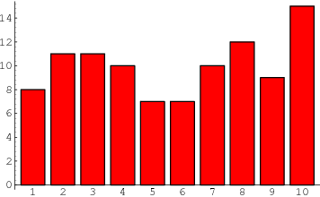
Let me propose a different way of analyzing the situation … the old-fashioned way, by actually looking at the observations themselves. There are a couple of oddities to be found there. To analyze this, I calculated, for each year of the record, how many of the months from June to June inclusive were in the top third of the historical record. Figure 1 shows the histogram of that data, that is to say, it shows how many June-to-June periods had one month in the top third, two months in the top third, and so on.
 Figure 1. Histogram of the number of June-to-June months with temperatures in the top third (tercile) of the historical record, for each of the past 116 years. Red line shows the expected number if they have a Poisson distribution with lambda = 5.206, and N (number of 13-month intervals) = 116. The value of lambda has been fit to give the best results. Photo Source.
The first thing I noticed when I plotted the histogram is that it looked like a Poisson distribution. This is a very common distribution for data which represents discrete occurrences, as in this case. Poisson distributions cover things like how many people you’ll find in line in a bank at any given instant, for example. So I overlaid the data with a Poisson distribution, and I got a good match
Now, looking at that histogram, the finding of one period in which all thirteen were in the warmest third doesn’t seem so unusual. In fact, with the number of years that we are investigating, the Poisson distribution gives an expected value of 0.2 occurrences. In this case, we find one occurrence where all thirteen were in the warmest third, so that’s not unusual at all.
Once I did that analysis, though, I thought “Wait a minute. Why June to June? Why not August to August, or April to April?” I realized I wasn’t looking at the full universe from which we were selecting the 13-month periods. I needed to look at all of the 13 month periods, from January-to-January to December-to-December.
So I took a second look, and this time I looked at all of the possible contiguous 13-month periods in the historical data. Figure 2 shows a histogram of all of the results, along with the corresponding Poisson distribution.
 Figure 2. Histogram of the number of months with temperatures in the top third (tercile) of the historical record for all possible contiguous 13-month periods. Red line shows the expected number if they have a Poisson distribution with lambda = 5.213, and N (number of 13-month intervals) = 1374. Once again, the value of lambda has been fit to give the best results. Photo Source
Note that the total number of periods is much larger (1374 instead of 116) because we are looking, not just at June-to-June, but at all possible 13-month periods. Note also that the fit to the theoretical Poisson distribution is better, with Figure 2 showing only about 2/3 of the RMS error of the first dataset.
The most interesting thing to me is that in both cases, I used an iterative fit (Excel solver) to calculate the value for lambda. And despite there being 12 times as much data in the second analysis, the values of the two lambdas agreed to two decimal places. I see this as strong confirmation that indeed we are looking at a Poisson distribution.
Finally, the sting in the end of the tale. With 1374 contiguous 13-month periods and a Poisson distribution, the number of periods with 13 winners that we would expect to find is 2.6 … so in fact, far from Jeff Masters claim that finding 13 in the top third is a one in a million chance, my results show finding only one case with all thirteen in the top third is actually below the number that we would expect given the size and the nature of the dataset …
w.
Data Source, NOAA US Temperatures, thanks to Lucia for the link.
This analysis seems useful, but needs to be improved. Presumably the data include temperatures from the last 50 years, which should show a signal from increasing global warming. It seems to me the appropriate analysis would be to fit the Poisson distribution to an unbiased sample, early in the 20th century, and use that fit to predict how often you would expect a 13 month consecutive warm period. I would imagine the odds would be small.
BTW Willis according to Mathworld the bar charts look a lot like yours too, oh yeah and they are plotted both vertically and horizontally.
http://mathworld.wolfram.com/BarChart.html
REPLY: And their histograms look like Willis’ too: http://mathworld.wolfram.com/Histogram.html
The grouping of data into bins (spaced apart by the so-called class interval) plotting the number of members in each bin versus the bin number. The above histogram shows the number of variates in bins with class interval 1 for a sample of 100 real variates with a uniform distribution from 0 and 10. Therefore, bin 1 gives the number of variates in the range 0-1, bin 2 gives the number of variates in the range 1-2, etc. Histograms are implemented in Mathematica as Histogram[data].
See also: Frequency curve http://mathworld.wolfram.com/FrequencyCurve.html
A smooth curve which corresponds to the limiting case of a histogram computed for a frequency distribution of a continuous distribution as the number of data points becomes very large.
Care to continue making of fool of yourself? – Anthony
Thomas
I think we’re both arguing the same point.
Standard stats and probabilities – derived therefrom – are often carried out on time series with little regard given to the degree of stationarity, drift and/or periodicity. To suggest that an event is somehow more probable in one part of the series than another would suggest that it is not second order stationary (pdf changes along time). But this can only be ascertained if one has enough data in order to identify drift or periodicity. We don’t, so these types of stats aren’t really appropriate because we can’t really workout the frequency of the events. Willis has given this a go and it does look as if one could question the whole argument.
“However, it seems to me that your discovery that the mean of your distribution (5.213) remains the same when you oversample the same dataset is unsurprising. And it doesn’t really endorse the choice of Poisson as a distribution.”
A poisson is close enough for the task, and oversampling is fine for the task. The task is rhetorical: to illustrate that when you shop through a dozen possible 13-month spans, there will be one of the 13 that happens to stray in the direction of your pet theory, as well as a few that stray in the opposite direction. You pick the one of 12 that best fits your pet theory, then run with it. If the news report had come out with calendar years, Dec-Dec, and said the Dec-Dec years were trending toward global warming most of us would accept a Dec-Dec span as not-eyebrow-raising.
June-June sounds OK because we are thinking “summer.”
If the analysis had said “Nov-Nov,” it would be a bit more odd, and we would be thinking, “why examine a Nov-Nov year? Why not Dec-Dec, which is nearly the same span just more natural-sounding, or why not Jan-Jan?”
when you go the extra mental step and think, “what is the justification for Jun-Jun,” then it should occur in your mind that, among other reasons for selecting Jun-Jun, it might be cherry-picking.
Then, to test this “cherry-picking” hypothesis, all you have to do is take one of two alternate analyses, and see whether the data remain similar, or stray away from the pet theory.
You can then either calculate all other or a few oher 13-month spans, or run all 13-month spans.
Either way serves the purpose of seeing whether Jun-Jun is the most favorable 13-month, out of the 12 avaiable, to select in order to cherry-pick, or whether the Jun-Jun finding happens to be robust.
So, the RMSEA could be calculated for all possible 13-month spans, and compared to the Jun-Jun.
Also, it would be nice to see the Poisson parameters and RMSEA for each of the 12 13-month spans. And, to x2 test for significant differencs between a few match-ups.
For the purposes of testing whether there is a warming trend, either way is sufficient to test Jun-Jun as either a fluke on the high end or as actualyl representative. Choice of Poisson is also not mission-critical for this.
The truth is that there may be distributions that fit the data better, and even theroetically match better, such as having an upper bound. But the reality is that nature follows her own course, and is not bound by the limits of any of our mathematical models. We will always have an error of approximation when developign a model to maximally account for distributions of data from nature. We bring our models in to help proxy nature. Nature does not “follow” our models, as much as we might get seduced into believing this. Not even fractals.
The Eastern US makes up about 1% of earth’s surface, and about 3% of earth’s land surface.. The real problem to be tackled was, What is the probability that an arbitrary area making up
3% of earth’s land surface will have a period of 13 months ( why not 12 months or 17 months?) with all temperatures in the top 1/3 (not 1/6 or 2/5) of temperatures for that month over the period 1895 to 2012 ( why not 1860 to 2012?). Jeff Master’s computation was total data snooping.
As I sadly learned many years ago, when I was single and had money to blow on horse racing, it’s easy to get estimated probabilites of 1 in 10,000 or one in a million by looking for all imaginable correlations of PAST data- the calculations are futile unless they can reliably predict FUTURE data.
Thanks Anthony
Yip that’s right, that was a response to WIllis citing of the Mathworld. So tell me did you get your stats training from a website as well.
Here’s a few:
http://en.wikipedia.org/wiki/Histogram
Tell me, because they don’t look like Willis’ is Willis wrong?
Your other sets of graphs are histograms, you’re curve is a probability distribution function, which is computed from the standard deviation and the mean – go look it up and you don’t need a histogram to plot it. But what is plotted above is not a histogram, try using the histogram in excel and see what the plot looks like – not like the ones above.
Otherwise don’t take my word for it ask another statistician.
REPLY: Well I think you are being pedantic. Some comic relief might help:
Replying to Nigel Harris:
Also, lambda in the Poisson distribution is the expected value of the mean of the data. So if you fit a Poisson distribution, you are determining that the mean number of months falling in their top third in a 13-month period is 5.213. (Note: the fact that you arrive at 5.213 seems odd to me, as I’d expect only 4.333 months out of every 13 on average to be in the top third. Am I missing something here?)
Willis has this whole thing upside down. He’s fitting lambda to the data, rather than comparing the data to the known lambda (lambda is simply the probability of success times the number of events, and thus has by definition to be 13/3). That means his conclusion is exactly backwards.
Reasoning correctly, we know that if there is no autocorrelation between hot months, then we should get a Poisson distribution with lambda = 4.3333. We don’t, instead we have a significant excess of hot streaks. All this proves that it’s a non-Poisson process, i.e. that there is some autocorrelation, and the temperature in a given month is not independent of the temperature of the surrounding months! Having thus proved it’s non-Poisson, you can’t then draw further conclusions using the Poisson distribution.
It doesn’t prove anything about global warming one way or the other.
Put another way, if he does the same for cold streaks, he’ll find the same thing – an apparent lambda > 4.333, indicating autocorrelation in the data set. And that won’t say anything about global warming either.
If, on the other hand, he were to do some further analysis – say take the dates of all cold streaks >9 months and all hot streaks > 10 months, and see if there’s a consistent trend towards more hot streaks of cold streaks, that would be an actual result.
Willis,
I’m still puzzled why your distribution has such a high mean value. You haven’t provided a link to your data but the first chart is easy enough to parse: there was one 13-month period with no top-tercile months, six with one month in the top tercile, nine with two top-tercile months and so on. By my calculations, you show a total of 597 months in the top tercile. And that’s out of 116 13-month period = 1508 months in total. But this implies that 39.6% of months were in the top tercile, which surely cannot be so.
Nigel
We should remember we are dealing with the “Adjusted” data here.
The adjustments have moved the 1930s temperatures down by about 0.49C in the most recent analysis of how this varies over time.
So here is what the Raw and Adjusted US temperatures look like over time (using an 11 month moving average given how variable the monthly records are)
http://img692.imageshack.us/img692/6251/usmonadjcjune2012i.png
And then the Adjusted version of monthly and 11 month moving average. The monthly temperature anomaly for the US can be +/- 4.0C. June 2012 was only +1.03C so much less than the historic level of variability.
[But it was warm over the last year, although the Raw temperatures were just as warm in 1934, close in 1921, 1931, 1953 and 1998].
http://img535.imageshack.us/img535/8739/usmoncjune2012.png
“What Willis missed is that Jeff sold his website to the weather channel for some beaucoup buxes and he needs to deliver this sort of bs in a technical fashion so they can feel they are getting a good deal. Model that in your Poisson distribution. big guy!”
🙂 Alas, some things even Willis can’t calculate!
Willis,
Ah, I see my error: every June is counted twice. So if 94 out of 116 June months were all in the top tercile, then that would explain how you could have 597 top-tercile months.
But that seems to imply that you have analysed a slightly different issue to the one the ridiculous Jeff Masters quote was about.
What Jeff Masters actually said was: *Each* of the 13 months from June 2011 through June 2012 ranked among the warmest third of *their* historical distribution for the first time in the 1895 – present record.
In other words, June 2011 was in the top tercile of all Junes, July 2011 was in the top tercile of all Julys and so on.
You seem to have looked at the probability of finding a 13-month period in which all 13 months are in the top tercile of all historical monthly temperatures (which most Junes will be), rather than each month being in the top tercile of its own monthly history.
I don’t need the data to say what the result would be. If we define the problem as finding the probability of a 13-month period with all 13 months in their respective top terciles, then the best fit Poisson distribution will (by definition) have lambda of 13/3 or 4.333, which means the expected number of 13-month periods with N=116 is not 0.2 but 0.05. And with N=1374 it is 0.55.
Although the Poisson distribution is clearly not a “correct” model, as it allows for logically impossible results such as 14 top-tercile months out of 13, it does describe the data pretty well as far as it goes. (The cumulative probability of all the logically impossible outcomes happens to be very small indeed).
But in the end, all this analysis says is that an event which happens to have occurred just once in this particular historical dataset is statistically expected to have occurred about once, based on the characteristics of this particular historical dataset.
Lucia on the other hand, has attempted to answer the correct question, and although she seems to have gotten into something of a muddle, she seems to now be of the opinion that the likelihood of 13 top-tercile months in a row (each in the top tercile of their own distributions, that is), in a dataset with the same general characteristics as the US lower 48 temperature record, but in the *absence of a forced trend*, is perhaps around 1 in 134,000. So Masters was indeed ludicrously wrong, but not perhaps by nearly as much as you suggest.
This is a keeper. Please add this to the Climate Fail List in the main menu.
Okay on second thought…
In this analysis, each “record” month is added to 13 different consecutive intervals. For instance, if there is an isolated streak of three consecutive record months, it will add to the statistic:
– two 13-month intervals with 1 record month
– two 13-month intervals with 2 record months
– ten 13-month intervals with 3 record months
Each streak is therefore added to the statistic with all of its “heads” and “tails” which definitely affects the shape of the resulting histogram. This does not mean your approach is wrong but I definitely think that it deserves a solid mathematical proof that poisson distribution is appropriate here.
In my personal opinion, the analysis should concentrate on streaks of “record” months and evaluate their relative frequency, i.e. “if there is N streaks of M consecutive record months then we can expect X streaks of (M+1) consecutive record months. And of course it would still deserve solid mathematical proof for whatever function is used for the approximation.
Next step should probably be to evaluate evolution of these proportions over increasing length of the record. But that may actually lead you to conclusions you don’t want to see – such as that the chance to see a 13-month streak early on the record is in fact much higher than to see the same streak late in the record. Or, we can say, the chance to see a 13-month streak late on the record is way lower than the chance to see it anywhere on the record.
And I won’t even mention the hell you could get to if you tried to perform the same analysis with record lows and compared these distributions and evolutions with each other.
Returning to the original claim, I think the problem lies in the statement “assuming the climate is staying the same as it did during the past 118 years”. What does it mean “staying the same”? Does it mean temperature will continue to rise at the same speed? Or does it mean it will stay within the same boundaries? Depending on which interpretation of this confusing statement you use you can get to very similar or very different results.
Steve R says:
Bart: The point is that the claimed 1 in 2.6 million chance that this June to June “event” is BS. and regardless of whether there has been warming or not, this “event” is indistinguishable from random
Whatever that means, that is not what Willis has shown.
To demonstrate that this event is indistinguishable from randomness about a non-warming trend, one would have to demonstrate that such an event is likely, given a random dataset with zero trend. The question then arises as to what version of a random dataset is appropriate to use to estimate the “random” likelihood from. Masters used white noise with zero trend. Lucia initialy favored something redder, with a high degree of autocorrelation, still with zero trend. These lead to very different estimates of the probability of such an event being the result of randomness about a zero trend. Lucia has since decided that a more pinkish hue is probably more in tune with the assumptions of the problem, leading to an estimate that is closer to Master’s original.
Apart from their quibble over how much autocorrelation to use, both of those analyses are incorrect formulations of the question. They both compare the probability of the current event against the assumption of zero change in climate, none whatsoever, over the last 118 years. The only people that claim that there has be no change whatsoever in global temp over 118 years live in the vivid imaginations of the alarmist profiteers. Zero change is not on the table, so drawing comparison to the probability of an event from a zero change model is … well … pointless. Unless your point is to make alarmist propaganda aimed at people who dont understand statistics. In that case it is effective, just grossly dishonest.
That was what Masters was doing. In an attempt to win a minor battle over geeky stats territory, Lucia’s acceptance of Master’s comparison to an absolutely unchanging climate ceded him victory in the propaganda war. Turns out, she mostly lost the geeky stats battle, too. The better choice would have been to demonstrate the pointless nature of his assumptions, rather than accepting them for the sake of a losing argument. But at least her approach was to pick a model of randomness associated with a cliam about how climate works, and calc the odds of that particular randomness producing the observed result. That is how “distinguishing observed events from randomness” is properly done.
Masters got that part right, too. His fault is that he modeled a claim that no one is making – zero climate change whatsoever. The claim he modeled holds that there is no trend in surface temp, nor even any non-random variation in temp (like a cycle), for the last 118 years. It is a strawman claim. He then proceeds to compound his offense by pretending that:
1. “has warmed in the past” means “is warming now” and
2. ruling out “no climate change wahtsoever” means “catastrophic man made global warming we are all going to die if we dont follow what Glorious Leader wants us to do”.
Whereas Lucia addressed Master’s argument ineffectively, Willis simply ignores it altogether. He didn’t analyze a model of a claim about how climate works, to determine if the observed event was consistent with that claim. He just fit a curve to the observed events, and found that one of the the observed events is near to the curve that he fit to the observed events. Doesn’t say anything whatsoever about the validity of Master’s claim.
w.-
Have you seen http://dotearth.blogs.nytimes.com/2012/07/10/cool-pacific-pattern-shaped-2011-weather-extremes-heat-dominates-u-s-in-2012/ which contains these quotes from the National Climate Extremes Committee’s latest report?
” La Niña-related heat waves, like that experienced in Texas in 2011, are now 20 times more likely to occur during La Niña years today than La Niña years fifty years ago.
– The UK experienced a very warm November 2011 and a very cold December 2010. In analyzing these two very different events, UK scientists uncovered interesting changes in the odds. Cold Decembers are now half as likely to occur now versus fifty years ago, whereas warm Novembers are now 62 times more likely.”
This sets off my BS alarm — clanging! I don’t think it is even statistically possible to develop a method to arrive at such conclusions, certainly not ‘predictive odds’.
Can you comment? clarify?
After reading this, I can not get over the idea that Jeff Masters is the Maxwell Smart of Climate Science…
Another nice job by Willis, but I am not sure saying he is smarter than a climate scientist is high praise. 🙂
One man’s meat is another man’s Poisson.
A poisson distribution is likely only if the occurrences are near to random. Random is not a thing that the “consensus” would entertain for warming periods
Without having much of a stats background, but some measure of common sense, I give 4 stars (out of 5) to Nigel’s 3:42 am post for explaining the obvious problem with calling the distribution a Poisson distribution, and 5 stars to pjie2’s post at 6:21 am for his confirmation of Nigel’s post and his further elaboration of the consequences.
With but limited stats knowledge, clearly if you assign a 1/3 probability to Outcome A and test the event 13 times, you will get 1/3 x 13 = 4.33 occurrences of Outcome A on average over time. That is, on average, every three events will yield one Outcome A. Nigel made the point that the data therefore does not fit a Poisson distribution, and he also pointed out the problem with the endpoints.
pjie2 clarified Nigel’s point about it not being a Poisson distribution and then went on to explain the implication, i.e., that there must be autocorrelation between the months, since (I presume from his explanation) if there were not, the distribution would indeed show a better fit to a Poisson distribution if the data were in fact random. That is, the mean would approximate the expected 4.333.
As for the original analysis by NCDC, that I do understand. Assuming randomness, there’s a 1/3 chance of a month falling in the top third of all events, by definition, and the chance of 13 consecutive positive outcomes (defined here as a Success) is 1/3 to the 13th power, or .0000006272. This is 6.272 Successes in 10 million, or 10,000,000 divided by 6.272 = 1 Success in 1,594,400 attempts. (NCDC’s calculator obviously goes to more decimal places than mine.)
Since another attempt is made each month, there are 12 attempts per year and one Success will be expected to occur every 132,833 years, assuming randomness. So Jeff Masters’ 124,652 AD should be 134,845 AD, and he was being conservative (because he divided by 13 instead of 12 to reach his result, but there are only 12 new datapoints per additional year.)
That said, if, per pjie2, it’s not a random distribution, all bets are off and we’re playing with a loaded die. Furthermore, since we skeptics have (most of us anyway) always been willing to concede that warming has occurred, and even that it is to some extent likely to be manmade, why would we expect the die to be anything but loaded when performing such an analysis?
If the earth now begins to cool, we will not have to wait thousands of years before we get 13 consecutive months in the coolest third either, I’d wager. Given the relatively short time span of 116 years (or 118?) in this situation, it might easily occur in the first or second decade of a significant cooling if monthly temps drop fairly rapidly and end up running consistently below the 116-year average.
Willis is a ‘conversational skill’?
Who woulda thunk it … (Perhaps you meant “I can see your conversational skills …” yes, I know pedantic, particularly when it comes to your and you’re [literally: “you are”])
.
Lucia’s update:
“Update Wow! I didn’t realize the US temperatures had such low serial auto-correlation! I obtained data for the lower 48 states here:
http://www7.ncdc.noaa.gov/CDO/CDODivisionalSelect.jsp
Based on this, the lag 1 autocorrelation is R=.150, which is much lower than R=0.936. So ‘white noise’ isn’t such a bad model. I am getting a probability less than 1 in 100,000. I have to run the script longer to get the correct value! ”
Eschenbach’s method doesn’t appear to differentiate what we would expect without warming from what we would expect with warming. It might be slightly more meaningful if he did similar calculations for the first and second halves of the record and then compared the two. But it’s still a weird way to look at the issue. Lucia’s makes more sense.
Clearly 1/3^13 is incorrect because a month being in the top 1/3 warmest is not an independent event – it is much more likely to occur if the entire year in question is a warm year for instance.
What would be more meaningful, but I lack the maths to be able to do it, it to look at how likely a run of 13 months in the top 1/3 is using conditional probability – ie how likely is it that a month is in the top 1/3 given that the previous month was also in the top 1/3? And then extrapolate this to 13 in a row.
The NY Times just published an article in their science section linked on their main page:
http://www.nytimes.com/2012/07/11/science/earth/global-warming-makes-heat-waves-more-likely-study-finds.html?hpw
Some of the weather extremes bedeviling people around the world have become far more likely because of human-induced global warming, researchers reported on Tuesday. Yet they ruled it out as a cause of last year’s devastating floods in Thailand, one of the most striking weather events of recent years.
A new study found that global warming made the severe heat wave that afflicted Texas last year 20 times as likely as it would have been in the 1960s. The extremely warm temperatures in Britain last November were 62 times as likely because of global warming, it said.
The findings, especially the specific numbers attached to some extreme events, represent an increased effort by scientists to respond to a public clamor for information about what is happening to the earth’s climate. Studies seeking to discern any human influence on weather extremes have usually taken years, but in this case, researchers around the world managed to study six events from 2011 and publish the results in six months.
Some of the researchers acknowledged that given the haste of the work, the conclusions must be regarded as tentative.
“This is hot new science,” said Philip W. Mote, director of the Climate Change Research Institute at Oregon State University, who led the research on the Texas heat wave and drought. “It’s controversial. People are trying different methods of figuring out how much the odds may have shifted because of what we have put into the atmosphere.”
The general conclusion of the new research is that many of the extremes being witnessed worldwide are consistent with what scientists expect on a warming planet. Heat waves, in particular, are probably being worsened by global warming, the scientists said. They also cited an intensification of the water cycle, reflected in an increase in both droughts and heavy downpours.
The study on extreme weather was released along with a broader report on the state of the world’s climate. Both are to be published soon in the Bulletin of the American Meteorological Society. The broad report found no surcease of the climate trends that have led to widespread concern about the future.
The Arctic continued to warm more rapidly than the planet as a whole in 2011, scientists reported, and sea ice in the Arctic was at its second-lowest level in the historical record. In 2010, rains were so heavy that the sea level actually dropped as storms moved billions of gallons of water onto land, they said, but by late 2011 the water had returned to the sea, which resumed a relentless long-term rise.
So far this year in the United States, fewer weather disasters seem to be unfolding than in 2011. But it is still turning out to be a remarkable year, with wildfires, floods, storms that knocked out electrical power for millions and sizzling heat waves in March and June.
Globally, the new research makes clear that some of the recent weather damage resulted not from an increased likelihood of extremes, but from changes in human exposure and vulnerability. The 2011 floods in Thailand are a prime example.
An analysis by Dutch and British scientists found that the amount of rain falling in Thailand last year, while heavy, was not particularly unusual by historical standards, and that “climate change cannot be shown to have played any role in this event.”
More important, the researchers said, was rapid development in parts of Thailand. Farm fields have given way to factories in the floodplains of major rivers, helping to set the stage for the disaster.
In the new report, researchers in Oregon and Britain found that natural climate variability played a big role in setting the stage for the heat wave in Texas. The weather in 2011 was heavily influenced by a weather pattern called La Niña, which has effects worldwide, including making drought in the American Southwest more likely.
But even taking that into account, the researchers found, the overall warming of the planet since the 1960s made it about 20 times as likely that such a heat wave would occur in Texas in a La Niña year.
Martin P. Hoerling, a meteorologist with the National Oceanic and Atmospheric Administration who was not involved in the new study but is conducting his own research on the Texas disaster, agreed that human-induced global warming had probably made the odds of record-setting heat somewhat more likely. But he said his research showed that the rainfall deficits were unrelated to global warming.
He said he was skeptical about several aspects of the new paper, including the claim of a 20-fold increase in likelihood.
More broadly, he said he was worried that the newly published studies had been done so hastily that the conclusions may not stand the test of time. “We need to think carefully about what kind of questions we can credibly pursue with this sort of rapid turnaround,” Dr. Hoerling said.