A couple of days ago I sent this email to Jeff Id of the Air vent, as he quite familiar with Antarctic surface temperature analysis, having outed the many problems with the Steig et al “Antarctica is Warming” paper, demonstrating poor statistical techniques used by Steig, with help from Michael Mann.
On Fri, Dec 11, 2009 at 3:11 PM, Anthony Watts wrote:
Subject: can you replicate this?
http://savecapitalism.wordpress.com/2009/12/11/ghcn-antarctica-careful-selection-of-data/
Best regards,Anthony Watts
Jeff replied yesterday with:
I can replicate it. The story behind this one is in the detail, which I’ve wasted a whole Saturday on.
Indeed the Devil is in the details, the details that few people, apparently including the scientists, bother to look at.
Jeff posted an excellent essay on the subject:
GHCN Antarctic, 8X Actual Trend – Uses Single Warmest Station
Excerpt:
The red circle is surrounding Rothera Point station.

So as we can see, of all the stations available in the antarctic, GHCN has chosen to use a single station on the Antarctic Peninsula to represent an entire continent of the earth for the past 17 years (red circle). But it’s not just any station, it’s a special one. Rothera Point has the single highest trend of any of the adjusted station data.
Notice that the station is on the Antarctic peninsula, I’ve always said that using stations here to represent trends on the main body of the Antarctic continent is plain wrong, becuase the peninsula is in a different climate zone. See my discussion here and Jeff Id’s proof of it here.
I’ve also said time and again that most manned stations in Antarctica would be “urban” compared to the surrounding area. There’s no small towns, farms, pastureland, woods, etc to compare to. Just millions of square miles of snow an ice. The research stations are the metropolises of Antarctica, each a warm pocket of humanity due to land use change and energy expended to keep warm.
For example, this picture on a postage stamp from Australia’s Mawson Station, celebrating the Australian Antarctic Territory in 1997, may help you visualize the issue. Note the Stevenson Screen near the “living pod” on the right.

Here is the larger photo of the first day of issue card, the Stevenson Screen is also just visible above the snowbank in the lower right. Rather close to human habitation I’d say. Looks like its near a small AHI (Antarctic Heat Island). More here

Click for larger image
I suspected similar problems might exist at Rothera, so I started looking around to understand what the measurement envirionment is like down there. First stop, Google Earth:

Looks cold, obviously taken in winter. But I also noticed something peculiar, that “tongue” that sticks out at the top of the photo. I showed my wife the photo without saying a word about it saying only “What does this look like to you?” Her one word answer: “airport”.
Yep and obviously not a naturally occurring one either. You can see that there has been infill between the point and Adelaide Island. I wondered what it looked like years ago? I found this photo in Google Earth’s Panoramio, circa 1976:

Looks rather sparse, few buildings, with no indication of a runway. Compare that to another Panoramio photo from a similar vantage point taken in 2007:

Obviously the photo above was taken in summer. Looks like there has been some growth and land use change since 1976, inlcuding adding the runway with locally available materials. Given the dark albedo, and the mostly volcanic history of the Antarctic peninsula, it seems likely that the “local materials” would be volcanic rock.
Here’s closer view of that rock, from “Claire of the Antarctic”

Here’s another photo from Panoramio, a large panorama, which shows the entire Rothera station and the full length of the runway from sometime in 2008 or early 2009, based on the upload date listed. I’ve corrected the extreme fisheye effect in the original image and cropped a closer view for better presentation here.

Here’s a link to the full sized lens corrected panoramic image. Warning quite large at 5463 × 709 and 0.6MB
So from the aerial and ground photos we can determine that:
- Rothera has seen land use change due to the infill for the runway and service areas.
- The albedo around the station has changed, due to the infill with that darker local materials.
- Rothera has seen growth in buildings, and presumably population since 1976.
- Rothera’s aviation fuel tanks seen above and here plus the new hanger indicate an increase in aviation traffic has likely been seen since 1976.
- There’s apparently pressure from the tourist trade also, enough that BAS has made the: Rothera Station_visitor_guidelines. How many ships and planes that now visit have anything to do with primary research? How much extra infrastructure was created to handle tourist traffic?
As an indication of an increasing tourist trade, there sure seems to be plenty of “tourist” type photos of Rothera Station on the web like this one:

According to a BBC reporter who visited Rothera Station, they even have a coffee house. Maybe a Starbucks even?

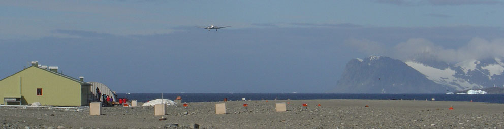
Here’s a DC-3 coming in for landing in January 2004. Research or tourists or both?

From the Wikipedia page where the improvements over time (and dates) to Rothera station have been listed) we find when the new runway was built:
With the commissioning of the gravel runway and hangar in 1991-92 air operations became more reliable and access to Rothera was greatly improved through a direct airlink from the Falkland Islands.
Just like airports wordwide, where many GHCN stations have been located, we see growth at the airport. Growth translates into UHI or in this case, AHI, since the next closest patch of humanity with a weather station is Base San Martin 75 kilometers away.
Here’s another take on the growth:
History: Built in 1975 on Adelaide Island, Rothera occupies a small rocky peninsula. A 3000′ (900m) crushed rock airstrip and hangar were added in 1990-91, making Rothera a peninsula region logistics center for British Antarctic Survey Operations.
Information: Rothera can accommodate 124 people and boasts one of the few aquariums in the Antarctic. The Bonner laboratory complex, completed in 1997, includes a recompression chamber, a wet lab and a terrestrial biology lab. A large new sleeping quarters building , which can house 88 people, is being constructed and should be completed by 2002.
So it is with little surprise, given the land use changes, the increased infrastructure, the new gravel runway, and an increased tourist trade that we see this sort of temperature plot from GISS:

Prior to 1985, it looks like recording temperature there wasn’t so important, as there is significant missing data. But with aviation growth comes a need for accurate weather information, and thus we don’t see any missing data since then.
Where do they actually measure the temperature at Rothera? That I don’t know yet, but given that the BAS puts hourly automated temperature reports on their website,and has a webcam it seems there is probably an automated weather station rather than a Stevenson Screen.

I’m guessing they have a readout for temperature in the comfort of the control tower:

For all I know the thermometer could be on the roof or side of the control tower. Not unheard of.
Regarding the GISS temperature plot. There’s a clear upwards trend. The question is: how much of it is caused by localized human influences and land use change?
Clearly, Rothera Station is no longer a “pristine” place to do science, it’s just another destination, a pocket of humanity with an airport, a coffee shop and the only heat for 75 kilometers.
Is Rothera a good place to measure a long term temperature trend to use for adjusting other Antarctic GHCN stations? Perhaps not.

Did a new base get built at the South Pole by the USA? I believe the previous base is now buried under mountains of snow.
According to Robert Webster there are 5 automated weather stations scattered across the penninsula. So, why use the data from the one most obviously subject to man-made heat…??
Oh yeah, they need to show man-made warming!! Doh!
And rarely do we ever hear the news that overall the Antarctic continent has been GROWING about 4% since the satellite record began (1978). And it holds 90% of the ice on Earth.
I have learned an awful lot by reading this site about how these temperture measurements are taken and what proxies are. In the field of dendrochronology, any old countryboy can tell you that a lot of things can influence the growth of a tree. I transplanted a Live Oak some 10 years ago, when it was about five feet tall. Forunately for the tree, it was planted near a sewage system drain field. It is now the largest of nearly 30 oaks planted at the same time, now almost 20 feet in height and thicker than the other trees planted at the same time. Also, we planted two pecan trees at the same time, but buried my beloved pet dog under one so as to make the tree a memorial of sorts. It is now twice the height of the other tree.
Anyway, my real question is this; if the whole global warming scare begins to “blow over” in the next few years, what exactly is the “exit” strategy for all of the scientists who have supported it? How do they distance themselves from it? One guess would be a very slow, methodical retreat, over a period of about five years, with statements like “we may have had some of the science wrong..”, or “…of course, not every scientist believed in AGW…”, and my favorite, “…it was science at it’s best…self correcting you know…scientists were, after all, the ones who finally blew the whistle…”
It’s a bit like using the average temp of Weipa, which is on the West coast of the QLD peninsular in the Gulf of Carpentaria, for the entire continent of Australia.
….. Considering that Weipa is tropical, it would make Melbournians blink twice.
Concerning these Antarcticia temp stations, has the human factor been considered? I mean, how are these things read? Inside via a computer (my guess) or outside via a body and a clipboard?
Clarence (20:20:00) :
This is a major issue IMO. The ones leading the AGW science research and write the papers that end up in the IPCC reports. The IPCC reports end up exaggerating the trends which in turn get whipped up another order of magnitude by advocacy groups and politicans.
By virtue of the fact that there are a couple degrees of separation and so many “contributors” to the IPCC shenanigans, there are plenty of degrees of separation so that no one remains solely culpable. Where would you point the finger? Sure there may be the odd fall guy like Phil Jones (maybe), but I doubt too many scientists will get too much egg on their faces.
Likewise we will have the same level of plausible deniability from politicians as the ole WMD argument that got us into Iraq. Politicans will simply end up saying that they were acting in the world’s best interest based upon the best science available to them at the time. They are not climate experts after all.
You see? There is no downside for any of the AGW players. In the meanwhile the scientists get to sup at the trough of research funding provided by the world’s governments and politicans cruise around on junkets to save the planet. They never go to undesirable locations, of course, always Bali, Vienna, Rio, etc …
It’s interesting to see that the ethics of the Tobacco Institute live on
How are these stations gridded? Is there a list of spatial component of the “global average” each station represents in each of the three datasets? It would seem if the “Team” was going to get creative with adjustments they would have done so where they got the most value — when a crooked shopkeeper is going to put his thumb on the scale he does it for the fish, not the potatoes. Might make a nice map to start working this data back.
Ed (17:29:07) :
More automated station photos:
http://www.robertwebster.org/blog/11jan08/rob_site_8.jpg
That’s a good one, with an airplane in the background.
There may be more than one instrument in the area that measures temperature.
I’d say likely, since there is an airport. How would we know which station is used and by whom?
Opening the shelter door is a butterfly’s wing compared to the vehicle and generator exhaust that will be present when people are working. Those engines are left running for long periods of time, I am also certain that the original siting of the station was due in part to its “mild” weather conditions.
I can’t take much more of this crap that’s going on. One station? Where the eff is the ‘objective’ media on this?
J.Hansford wrote :
“It’s a bit like using the average temp of Weipa, which is on the West coast of the QLD peninsular for the entire continent of Australia. Considering that Weipa is tropical, it would make Melbournians blink twice.”
I was thinking along the same lines.
Except I was thinking of using tropical Darwin’s Airport ‘smoking gun’ to ‘warm up’ Hobart.
Chck Chck Boom.
I would just like to point out that you do not forget to close the door in Antarctica. I believe they vote you off the island for that. 😉
This graph by NASA GISS appears to give a more varied picture for 1955 -> 2005 annual mean temperatures, and, if I’m not mistaken, says that the southern most part of Antarctica has been cooling.
http://data.giss.nasa.gov/gistemp/2005/2005cal_fig3.gif
http://climateaudit.org/2009/02/01/west-antarctic-stations/
A bit more depth…
I’m assuming the email pertains to mmts, since it says they “continued to transmit” when buried?
@ur momisuglyCaleb (19:50:40) :
I think you made a good point. Referring to the Barrow, AK paper, the authors found that 25% of the time the wind speed was less than 7 knots, which would mean for Barrow that the UHI magnitude would be between about 1.8 and 3.2 degrees C.
@ur momisugly Clarence (20:30:12) :
http://www.antarctica.ac.uk/living_and_working/diaries/rothera/2008/07/images/6.rob_checking_the_met_instruments.jpg
Looking at the siting of the Stevenson screen, it appears to be on a hill and also on top of volcanic rocks, while the undisturbed surroundings appear to have snow cover all year round. Given that, one would have to wonder just how different the exposed volcanic rock would be from asphalt. Assuming that they would be similar, would it not be appropriate to classify Rothera as being sited on top of an “artifical heating source,” as classified in the link to NOAA’s Climate Reference Network Site Handbook at http://www.surfacestations.org/ ? If so and given the siting on top of a hill and being on top of an artificial heating source (at least in the summer), then wouldn’t Rothera be classified as a CRN 5 station with an error greater than or equal to 5 degrees C?
The Wikipedia page for Rothera says that Bransfield House is where meteorological work is done. That refers to this building, which has the Operations tower at one end. The tower is obvious in the Panorimo photo. There is a New Bransfield House, built closer to the water and to the left of the other buildings shown in the Panorimo shot (images here and Gigapan view toward water).
However, the meteorology group at this base processes data from several weather stations and is described as performing research. So the location of this staff is less likely to be near the equipment because this is more than a weather shack level of operation. Also, as this is a year-round air operations base and has a lot of equipment, the instruments could have been placed anywhere. They would have to be close enough to be maintained during the winter, but there are a lot of buildings from which staff could exit to reach the instruments. For aircraft needs, they’re probably not on a mountain but are probably near the rock runway or the skiway.
George Turner (16:48:33) :
Isn’t this like estimating the temperature of North America from a single weather station in Miami?
REPLY: Bingo!
and Tenuc (14:52:18)
Sort of, but not as accurate……
Land area of the United States 3,719 million square miles
Land area of Antarctica 5,405 million square miles
DJ Meredith (19:32:30) :
“Can volcanos effect local temps? I mean, it just seems that if you superimpose a map of the known volcanos on top of the GHCN stations things get kinda busy….
http://vulcan.wr.usgs.gov/Imgs/Gif/Antarctica/Maps/map_antarctica_volcanoes.gif”
Reply: Thanks for the link. He he 🙂 Made me smile to see that one of the volcanoes close to the station is called… Deception 1. How appropriate.
Slide 10 of this PPT shows a Rothera AWS installed near the skiway in the 2006-2007 summer. An earlier AWS was shut down in 1998 – “altitude 15 meters” provides a contour line when searching pre-1998 photos.
that is a rather significant scandal.
the antarctic covers about 3% of the earth’s surface.
if the temperature increase has been overstated by 1 degree, the global temperature record would be 0.03 deg to high, if it was overstated by 3 deg, that amouts to almost 0.1 deg !
I start to take into consideration that 1934 was the hottest year globally in recent history.
Clarence,
I don’t think you can call volcanic rock an ‘artificial’ heating source most especially that it is in~situ.
I do not know what the albedo of the Rothera volcanic rock is, but given the dark coloured nature of most basaltic rock, it’s most likely to be in the same range as tarmac.
In keeping with this, I dare say, that the crushed rock airstrip is of far greater significance.
Respectfully.
Aqua Fyre
Ed (17:21:26) : “Here is a beautiful photo of the Rothera Point Stevens Screen: http://www.robertwebster.org/blog/14jul08/met_tower.jpg”
What’s that tall cylinder beside the tower? It seem not to be shown in the 2007 photo. Snowfall collector? Incinerator? BBQ?
SABR Matt (15:27:25) : “…Those human settle pods you point out are designed to keep in as much heat as possible…I would wager that no significant heat is leaking from them.
Looking at the interior view of the pod porthole shown on Rob Webster’s blog leads me to believe the insulation thickness is minuscule, at least for the one shown here:
http://www.robertwebster.org/blog/december2008/riet%20cooking.jpg
AnonyMoose (22:27:34) :
“The Wikipedia page for Rothera says that Bransfield House is where meteorological work is done. That refers to this building,”
“This is the main building where we eat drink and live called Bransfield House… ”
This is taken about 11am in the morning in Midwinter with Nacreous clouds above the building. These clouds are only seen in winter and are ones high up in the atmosphere… not sure of the complete science of why they glow but I am sure someone is looking into it.”
I’m thinking a very large light bulb.