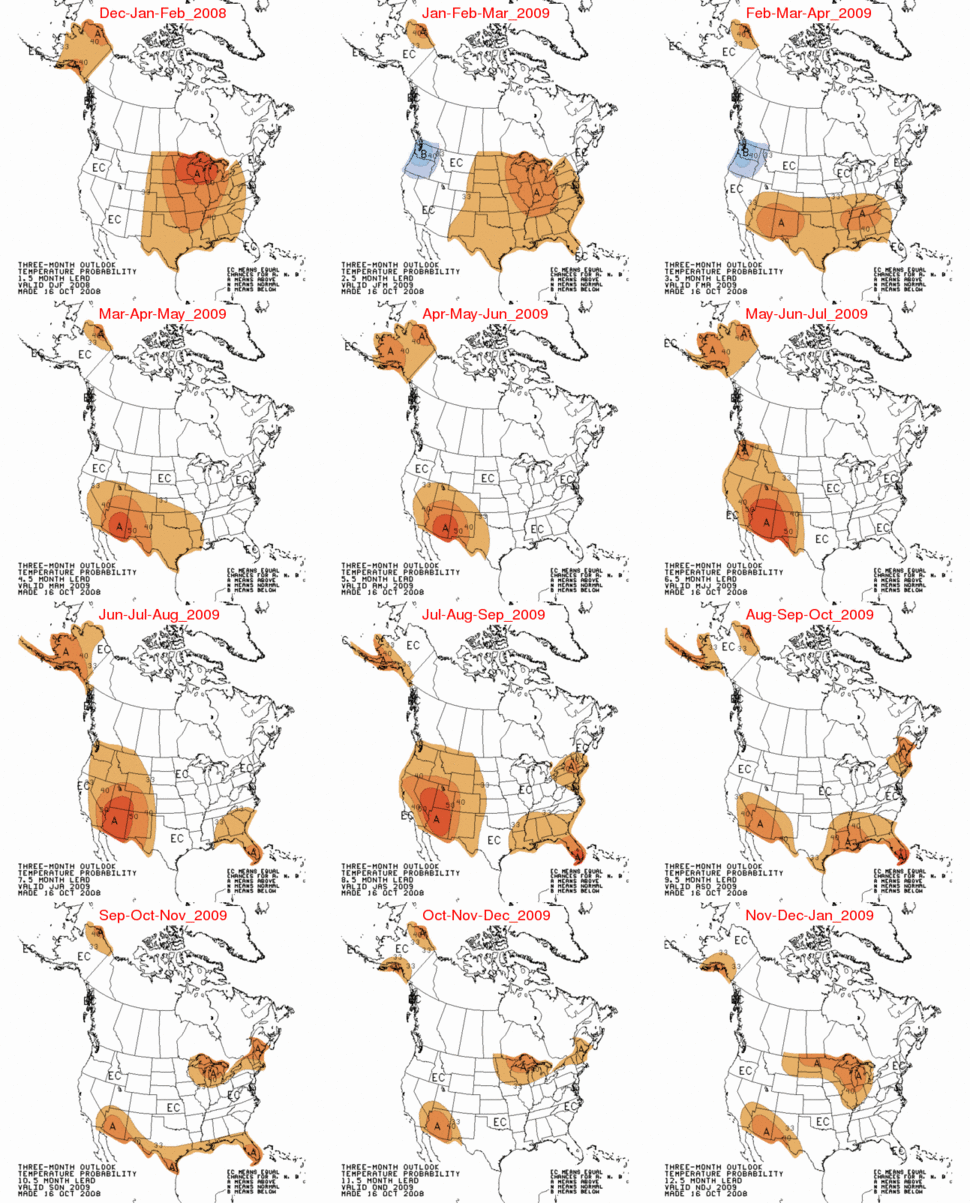
We are almost at the half way point for the meteorological winter (December through February) and it is a good time to evaluate how the NOAA CPC (Climate Prediction Center) and UK Met Office winter forecasts are doing so far. As seen below, CPC forecast the highest probability of warmth for Alaska and the upper midwest.

Trend of mild winters continues
25 September 2008
The Met Office forecast for the coming winter suggests it is, once again, likely to be milder than average.
Their scorecard is doing equally well, with the UK having it’s coldest winter in decades, as reported by the BBC.
last month proved to be the coldest December in more than 30 years, with the average temperature at 1.7C (35F), compared with the long-term average of 4.7C (40F) for the first part of the month.
On December 12, they issued this press release:
The Met Office seasonal forecast predicted the cold start to the winter season with milder conditions expected during January
Yet the Met Office appeared undaunted by yet another incorrect seasonal forecast, as reported by the always faithful Guardian earlier this week.
In the midst of a cold snap – a hot weather warning
As temperatures stay stubbornly well below freezing, it may feel like the last issue on anyone’s mind, but the government has been warned it may need to start thinking about introducing emergency hot weather payments to help poorer households keep cool.
The cold spell caused significant problems in many areas of the country. The Government’s bill for Cold Weather Payments is expected to rise to more than £100 million
How we did
The Met Office correctly forecast the spell of cold weather and kept the public informed via our various forecasts.
sigh….I never equated the dice directly to climate. It was a simple example, as I also stated. Remember “hellishly complex”?
While its hard to predict individual chaotic events, like weather, its easier to predict a series of chaotic individual events as a likely outcome.
We can’t define both the position and the momentum of a single electron, but we can predict that sufficient electrons can power a computer, and transmit sufficient electrons, so that a coherent message is possible.
I can’t predict the weather 4 months ahead of time, but, using historical records and experience, I can predict that western Africa will quite probably experience lots of rain in 5 months. What will the weather in Lagos be, around May 15? I have no idea. It could be hot and sunny, or cool and raining. I can say that around May 15, plus or minus 5 days, it will probably rain.
My point, again, is that long term climate may be easier to predict than short term weather. I make no claims as to the accuracy of such predictions, only that they should be more accurate than long term weather predictions.
les,
And you confuse chaos with randomness. Probably the simplest example:
The logistic difference equation is given by
x(n+1) = rx(n)(1-x(n))
where r is the so-called driving parameter. The equation is used in the following manner. Start with a fixed value of the driving parameter, r, and an initial value of x0. One then runs the equation recursively, obtaining x1, x2, . . .xn. For low values of r [eg 2], xn (as n goes to infinity) eventually converges to a single number. Repeat with a different value of r gives strkingly different results [eg 3.57 does not converge].
If you actually try this (using a calculator or spreadsheet) you will see successive values x1, x2, … jump around such that they might look to be random. But if you repeat it you get the same values, so they are not random.
This is a better analogy for weather (each x depends on the previous one and behaviour is sometimes erratic, sometimes not) but of course far too simple. Note that if you can’t specify x2 well, you can’t x3 and so on … it gets worse, not better. So there is no hope of predicting long term behaviour unless you can predict short term behaviour.
WUWT is leading in the Weblog Awards in the science category. Real Climate is currently running at #6 out of 10. I believe that this is as it should be since Anthony strives to make the science understandable to many, while maintaining integrity and decorum.
Don’t forget to keep voting!
John Finn (16:46:41) :
John Finn (14:02:03) :
But is it a cold winter?
E.M.Smith (15:04:13) :
Yes.
Any data to support this? (not newspaper reports).
Note that both satellite records (RSS & UAH) for December are ~0.2 deg above normal globally and ~0.4 deg above normal in the NH.
Demonstrate to me that averaging a random collection of different things means anything. Prove that one single number can adequately describe the planet and climate.
Averages hide more than they reveal…
IMHO, we are now in what I would call a ‘battleground’ if it were a stock chart. (There are remarkable similarities in stock prediction and climate prediction that I will not go into). At inflection points in trends, there are forces pulling both up and down. Volatility rises.
Averaging in the high highs over the (still warm) oceans with the low lows over the newly (very cold) land says “nothing happened”. This is wrong. One needs to look at the progression of the highs and the progression of the lows. (In fact, for stocks, you track the lows on the way up and the highs on the way down. They each tend to bounce off of the moving average lines)
What we have seen is a ‘failure to progress’ to the upside over the last couple of years (see the other threads on this site.) Along with that, we have spectacular new lows over land, especially at the polar extremes of both hemispheres. This is called ‘lower lows’ in stock trading. Failure to progress to the upside along with lower lows to the downside is an inflection. (There are also numerous references on this site to lower lows. I don’t know if anyone has collected them into a peer reviewed data set to your liking.)
So, take a look at the cold places. They are really cold. That is a colder winter. And go ahead, take a look at Florida, Gulf of Mexico, and even New York up until recently when the warm gulf water was keeping them hot. They even had very high temperatures. That is a battle ground. Now watch all that cold air mass swamp that warm in the last week or so (and getting colder every day); that is the battleground resolving to the downside. Same thing happened in Europe.
All of this is hidden by a single magic number average.
I’m more willing to trust the giant snowfall reported at the (world wide!) ski resorts and the rising wheat prices due to (expected) crop reductions from the measured cold over the growing areas (as reported on Bloomberg by Gartman). And frankly, even the Der Spiegel photo spread of a frozen Europe (including snow in Marseille and Milan and frozen ocean on the south shore of England) along with the reports of 1 in a 100 year snow in Baghadad and snow in Jerusalem. (And snow in southern Brazil, and Australia and…) than a funky average single number.
But if you want a data set, go knock yourself out. Then you can average it all together and explain what that means.
Les:
This statement would be true if you replaced “chaotic” with “random”. But weather is not random, it’s chaotic. As such, it is hard to predict both short and long term.
That is a logical argument I have been using for some time now. If you accept the hypothesis that there is a steady (or even an unsteady warming trend).
Once that set of assumptions is stipulated, then, what would happen if that set of assumptions is true?
If true, the record high temps and record low temps of a weather reporting station should take on a trend as well. You would expect that over time the number of new record highs would begin to out number the new record lows in the case of global warming.
If the climate was steady and uniform over time, a long mature temperature record would gradually reach a point where new high and new low temperature records became very rare, and they would be just as likely to be a new high record as a new low record.
If there was a persistent trend to the climate, you would have more new records on the side that is moving with the trend and fewer new records on the side that was counter to the trend.
In the case of global warming, eventually you would find that the average age of the record low temps were very old and the average age of record high temperatures would gradually get shorter and shorter as they dominate the data.
We don’t see this (at least in casual observation), we frequently see statements like, this is the lowest temperature since 1973, but unreported by the media, is that the same temp has been reached before 3 times, in 1886, 1913, 1973. That sounds to me like a stable lower limit for that date.
The next question for the statistical wizards here, is how would you determine a statistically significant bias in the number or age of the high records vs the low records?
Could you say you have a genuine trend if the new high temperature records out numbered the new low records by x percent over a span of y years?
How old would the station record need to be (with nearly uniform local conditions such as no parking lots added recently) for there to be a long enough basis of comparison?
Larry
I agree, George, the fundamentals are good, and the story makes sense; but it’ll be a lot easier to sell once the low goes below A.D. 2000.
Les Johnson (13:24:21) :
“I know it will sound odd coming from me, but we can probably predict with better accuracy on climate, then weather.”
I understand your point but … there are chaotic elements of BOTH weather and climate. It’s highly unlikely that GHGs will have much of an impact on daily weather. In the same vein, an individual cold front won’t have much impact on climate.
The point is the chaotic elements of weather and climate are two different animals and I don’t think either lends itself to easy predictions. I’m not even sure we’re smart enough to name all the components of climate let alone model it.
While I agree weather is probably more difficult to model we’ve had the advantage of validating the results for around 50 years (and look at how good that is going). If we consider a decade in climate may be equivalent to a day in weather that means we have a long, long way to go in climate to get where we are today in weather even if it is simpler.
PS. I’m an AP living in Las Vegas and I understood your analogy. However, I think weighted dice is probably a better analogy where we have almost no idea how they are weighted 😉
I notice a small spot of below normal temperature in SE Arizona, near where a 6-8° hot spot appears in the previous story. Any possible co-incidence there?
Mike F
“This statement would be true if you replaced “chaotic” with “random”. But weather is not random, it’s chaotic.”
True, and the Law of Large Numbers does not apply (so more is not better). Nor do standard statistical procedures which assume random samples from a population, but I’m not aware of any robust alternatives right now. A whole new field waiting to be developed? Or are the methods based on serial correlations enough? Maybe yes (lucia/Blackboard has done good work on these), but if so just.
hotrod (21:50:02) :
If true, the record high temps and record low temps of a weather reporting station should take on a trend as well. You would expect that over time the number of new record highs would begin to out number the new record lows in the case of global warming.
We’re saying two slightly different, though related, things here. I’m talking about the progression of the highs for each time period for each place, while you are talking about the record highs for a place.
The failure to progress of the current sequence of highs tells you that the current trend is breaking (confirmed by the occurance of new lows lower than the recent lows trend line). The record lows / highs tells you the very long term behaviour. Is something growing, or oscillating in a bounded state? Given that clarification, I agree with a lot of what you are saying.
A bounded oscillating system ought to have ever fewer records (in both directions). A growing system with oscillations ought to have ever fewer records in the direction being abandoned and ever more in the direction of growth.
The next question for the statistical wizards here, is how would you determine a statistically significant bias in the number or age of the high records vs the low records?
The problem, I think, is that for record highs / lows to be meaningful, you must have a record the spans all the ‘typical’ oscillations. For stocks this is about 10 years (the business cycle).
A company that is stagnant will have a 10 year biz / economic oscillation, and an annual weather or reporting oscillation, and quarterly reporting / options expiration oscillation, and weekly Monday-humpday-Friday oscillation (most day traders go home ‘flat’ on Friday – i.e. sell out or cover shorts), and daily news cycle, and even intraday market mechanics cycles (ring up/down at open to ‘run the stops’, resolve to a direction based on demand/supply, move opposite that trend at about 1pm Eastern time to cover shorts to high demand or sell longs bought from panic sellers, oscillate once more then resolve at 3pm to a final end.)
Until you’ve got a decade data, the intraday and even annual movements look like records, but they are nothing compared to the bear market lows (as everyone has just seen…)
The problem is that there is a known 1500 year climate cycle (Bond Events in the Holocene and Dansgaard-Oeschger events in the glaciations). And these are on top of a 100,000 year glaciation cycle.
http://en.wikipedia.org/wiki/1500-year_climate_cycle
http://en.wikipedia.org/wiki/Dansgaard-Oeschger_event
So we know that we don’t really have any real record highs or lows. The best that you can do is try to work one of the smaller cycles and assure yourself that you are not near an inflection point in one of the larger cycles. And that, IMHO, is where you run into trouble…
We’ve got a few hundred years data from a few places and a few dozen years data from almost enough places. By definition, we will be getting record highs and record lows for at least 1500 years as we work through the Bond cycle (and we are likely to get records from the 200 year Suess and maybe even the 88 year Gleisberg cycle for some places.)
http://en.wikipedia.org/wiki/Solar_variation
And who knows what other cycles there are that we just haven’t identified yet.
So you can look at local inflections in the current series fairly easily with moving averages and ‘failure to progress’ / ‘new lows relative to trend’ (or ‘failure to progress to the downside’ / new highs relative to trend). But for the new records to be useful, you need to know where you are in the longer cycles and make sure you are not being fooled by them.
Could you say you have a genuine trend if the new high temperature records out numbered the new low records by x percent over a span of y years?
I would assert that this is true, but the trend you identify may be only that of a longer term cycle. Or one could say: but you need to know what trend you are addressing and what cycles are confounding. The satellite data may give a new high for a spot of ocean with a 20 year history. Not so new. Cycles of >20 years can confound your ‘trend’. A land site with 200 years of data? Now you have reason to say that only cycles longer than 200 years are confounders. Unfortunately, there are several of these…
How old would the station record need to be (with nearly uniform local conditions such as no parking lots added recently) for there to be a long enough basis of comparison?
What cycles are you willing to exclude / adjust for as confounders? My present paranoid moment worry is: Bond Event 1 started in about 450 AD, add 1470 years = 1920 C.E. it is possible our present sunspot slumber could be the start of the Hansen Pessimum
http://en.wikipedia.org/wiki/Migration_Period_Pessimum
IFF you are SURE that we are not headed that way, then trend spotting with the present data for long duration sites is probably OK. Then again, if you are looking at a short term hot end of the cycle just before the inflection point, you are fooling yourself into a warming trend just before the waterfall…
In short: about 1500 years data would be good, but 100,000 would be better, otherwise you need to be really really careful and adjust for known or probable inflections / slopes from longer term cycles; and that’s hard.
For stocks, my solution is to pick a time period I care about, mask the shorter cycles with a moving average, and ignore the very long term cycle for most of the time. That is, I use a 50 trading day moving average as my baseline (or trend line) for daily price data on a 1 year chart. Now I’m focused on movements shorter than a year, but longer than a week (roughly) with a baseline that looks at a couple of months (20 ish trading days in a month) and anything shorter than one day completely gone via the daily data. I watch for tradable trends in that ‘few days’ to ‘few months’ range.
If the short (less than 1 yr) cycles are not making sense, I back out to the 10 year chart to make sure I’m not at a longer term top / bottom / inflection. I look at a 10 year chart of weekly prices every month or two to make sure I’m not near a longer term inflection, but otherwise ignore it.
Something similar can be done with temperatures, but the risk is that you end up looking at that moving average and seeing a trend that you project infinitely into the future (ala Hansen) and don’t realize it’s just a segment on a 10 year bull cycle about to fall off into a bear market cliff (Al Gore Cold Period)… Now AT that inflection point, if all you have for ‘record highs’ is from that small segment, you will see failure to make new record highs. But it will take the length of your record period to retrace back to where you are making new ‘record lows’ all over the place. (Though before that, any single data point could be ‘way low’ as that place / date is several sigma’s from the mean for whatever reason.)
I hope this makes sense. Translating graphs into words is, er, messy. You can go here:
http://bigcharts.marketwatch.com/advchart/frames/frames.asp?symb=spy&time=&freq=
and see what a chart looks like. Fill in SMA 50 under the moving averages drop down if it isn’t already plotting the moving average and make it a 1 year daily chart (that ought to be the default, I think).
Change it to a 10 year weekly with a SMA 40 (40 weeks is 200 days in market time – a good longer cycle moving average) and I’ll just bet you can clearly see when the bull / bear markets start / end…
The difference between those two perspectives is what you would like with a temperature graph, you only have the data for the short term graph from thermometers. The long term is from proxies. Proxies don’t do record high / low very well.
So exactly would one expect? That the AGW idiots would come out and say, “Sorry I got you to completely ruin your economies for nothing. Mea Culpa.”
I don’t think that is ever going to happen.
This story should fit nicely with the forcasts.
http://news.yahoo.com/s/nm/us_dutch_weather_ice
MikeP
John Finn, You are assuming that you know what “normal” is. That’s the kind of misleading misuse of words that we all complain about. The anomaly is against a chosen baseline. Who knows if that’s normal or not! IMHO it’s wrong to characterize any arbitrary choice of time frame with connotative words until a better understanding of the climate exists.
I know the anomaly is against a “chosen baseline”. With respect to the satellite readings the baseline is 1979-1997. According to the surface
temperature record the satellite baseline is actually rather warm compared to similar periods in the past 100 years. So the fact that our NH winter is, so far at least, warm relative to a ‘warm period’ suggests that the anecdotal evidence presented by a number of posters on this blog is not representative of what’s happening in reality.
I don’t accept your argument regarding the ambiguity of what’s ‘normal’. Most posters who are claiming exteme cold are making comparisons from their own experiences. However, in the context of the last 30, 50 or 100 years the NH winter is warm.
But if you want a data set, go knock yourself out. Then you can average it all together and explain what that means.
But if I condense your post down all you seem to be saying is that some places have been cold – and you only want to focus on those places. If the average temperature is higher than normal that means some places have also been warm. You cite news reports. The media are happy to hype up fairly mundane events – it helps sell papers. Some place, some where at some time will always be the hottest, coldest, driest, wettest it’s been in 10, 20 30 or 100 years.
You mention England or the UK, as a number of others, have done. Much has been made of our ‘cold’ December. In fact, December 2008 was the coldest December since …. wait for it ….. 2001. Not the coldest on record – or the coldest in 50 years – or even 30 years – but the coldest for 7 years. Since just before the new year we’ve had a fairly cold spell which has affected the south of the country (i.e. London) a bit more than usual. In a few locations, overnight temperatures dropped as low as -10 deg C (14 deg F) – cold but nowhere near a record. The 10+ day cold spell is now coming to an end. It’s already ended in the Northern part of the country where temperatures are now around 10 deg C (50 deg F). What will happen during the rest of the month – who knows?
The point is a lot of media attention has been focused on what was, at one time, a fairly routine winter event. Too many on the “sceptic” side are seizing on these reports and suggesting the events reported are a significant pointer to long term cooling. They’re not. There is no evidence that “global cooling” is underway. Despite the solar minimum and despite the negative PDO and despite the developing La Nina, global temperatures are still higher than during 1999-2000.
December 2008 UAH NH anomaly is +0.4 (relative to 1979-1997). While temperature averages are not perfect we don’t have anything better.
Speaking of the CPC they still haven’t updated their Historical ONI page. An enquiring public wants to know!
John Finn:
Wrong, John. There is plenty of evidence:
To claim that there is ‘no evidence’ of cooling misrepresents the temperature record.
Smokey (04:53:54) :
John Finn:
There is no evidence that “global cooling” is underway.
Wrong, John. There is plenty of evidence:
http://4.bp.blogspot.com/__VkzVMn3cHA/SQkAxK2k6CI/AAAAAAAAADs/F4NlhqTzFgM/s1600-h/U+11+Year+Temp+Data.bmp
It means nothing. Use a starting point of one year earlier – or one year later and you get a warming trend. The trends are not signigficant anyway so no cooling!
http://www.nationalpost.com/893554.bin
This looks to be a fraud. The polynomial trend is smoothed so should not extend up to the end of the data. Note most temperatures between ~1982 and ~1988 are well below the ZERO anomaly line but the trend is just below the 2008 end point. Look at the data ~1984. The plot is rubbish.
http://icecap.us/images/uploads/ALL_SINCE_2002.jpg
So now we’ve got cooling since 2002 – just about. 2002/03 were El Nino years – 2008 was a La NIna year. This is desperation. As I have always maintained the 2008 dip was due to La Nina. There has been a clear recovery in temperatures since ~late summer. Another La Nina may hold back temperatures again – just as happened in 1998-2001 but this says nothing about the long term trend.
http://icecap.us/images/uploads/CRU_AND_MSU_vs_CO2.jpg
This is irrelevant as to whether or not cooling is taking place.
The final link is the Monckton piece which I’nm not prepared to wade through now.
A couple of clarifications. The most anomalous UK cold has been in January. December was cold, but January has been much colder. We are at the mid-point of the meteorological winter this week. The Met Office did predict the cold weather in their short term forecasts. This article is pointing out that their predictions more than about 10 days out have not been correct, and that they have seemingly not acknowledged that publicly.
Interesting article in Pravda.
The earth is now on the brink of entering another Ice Age
http://english.pravda.ru/science/earth/106922-earth_ice_age-0
From the original Met Office winter forecast :
The forecast of another mild winter across the UK has been welcomed by Help the Aged, who work with other agencies to support older people.
http://www.metoffice.gov.uk/corporate/pressoffice/2008/pr20080925.html
Today’s Guardian reports:
This winter’s death rates could well be the worst since the turn of the century, as freezing temperatures and virulent flu take their toll on tens of thousands of Britain’s frail and elderly.
http://www.guardian.co.uk/society/2009/jan/11/elderly-death-rates-winter
John Finn
“December 2008 UAH NH anomaly is +0.4 (relative to 1979-1997). ”
The global UAH is DOWN -.18. So Please stop telling us it’s getting warmer. Nice trick.
John Finn,
I would consider the word “normal” to mean within the bounds of what has happened historically. If you are saying above average, which is more of a statistical statement and closer I think to what you were actually trying to say, then you always need to specify what time period and what data set that you’re referring to. As I’m sure you’re aware, you get different answers if you use the past 30 years, the past 50 years, the past 100 years, or our best knowledge of the past 1000 years. You also get different answers with different reference data sets. You refer to the past hundred years, in which we’ve been coming out of the LIA. If you are handwaving, like many, that the LIA does not represent what happened globally, please supply enough legitimate records to show that this is true. I do not think it is sufficient to simply dismiss out of hand the 600 + records from around the globe that seem to show the LIA did have a global effect. I do not think it is sufficient to claim that there is not enough global information, therefore it is impossible to show that the LIA was global, therefore we are right in saying it wasn’t.
I have seen many times in my life when published papers have reached a conclusion that contradicts what was previously known. In every case that I know of, many people made hay out of the new numbers, only to eventually find that the historical values were close to right. One example is the rate of energy loss from the earth-moon system due to tides. A paper came out concluding that the energy loss was much higher than historical estimates from eclipses. Many people wrote proposals about where the “missing” energy was going. Eventually, after about ten years, the number settled about 10% higher than the original calculation and all the people who wrote those proposals quietly went on to something else.
So I believe that anyone who comes up with “novel” results needs to provide supporting evidence. Supporting evidence that I’ve never seen from the hockey stick people.
Mike P
The global UAH is DOWN -.18. So Please stop telling us it’s getting warmer. Nice trick.
The UAH global anomaly for December is +0.18 which is warmer than last December and the 11th warmest in the satellite record. La Nina conditions and the solar minimum (the temp difference between solar max and min is ~0.1 deg) account for the fact that it’s not as warm as some recent years.
The NH global anomaly for December is +0.42 which makes it about the 4th or 5th warmest December in the satellite record – and despite all the hype about lots of snow and record low temperatures suggests that the first part of NH has actually been on the warm side.
A correction to my previous post [John Finn (08:57:57]
The second paragraph begins “The NH global anomaly ” whereas it should read “The NH anomaly”.
Regarding Kum Dollison (14:44:12) : and Mike Rankin (18:16:41) :
If the Mauna Loa data is not “corrected,” and CO2 levels remain stable, it is big news. Usually the data shows CO2 levels jump up in the November-December time period. The idea is that northern trees shed leaves, and stop gobbling up the CO2, just as everyone in the north starts heating their homes, and consequently producing more CO2.
Mauna Loa data shows a yearly dip in CO2 levels in the summer, when all the plants are active in the north. However a dip this time of year, or even a flat-line, would be “unprecedented.” You can see why they might be very careful about releasing this sort of data.
If you check out the chart at
http://www.esrl.noaa.gov/gmd/ccgg/trends/
then you will note that, while the “trend line” shows a dramatic drop, the actual data hasn’t been posted yet.
I wouldn’t be surprised if it was “corrected.”
Perhaps a slow-down and even down-turn of world-wide CO2 levels would reflect the slow-down and down-turn of the economy. Also it might reflect the briefly very-high gasoline prices, which resulted in a steep drop in consumption. Or perhaps it might indicate the cooler sea surfaces are out-gassing less and absorbing more.
In either case, it would make mincemeat of Hansen’s dire predictions. Therefore the people releasing such data would be very wary, and perhaps even frightened, about releasing this sort of news.