reposted from ICECAP
By Dr. Richard Keen, University of Colorado
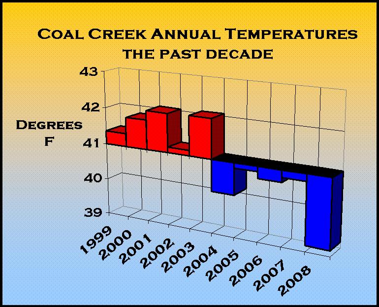
I’m the NOAA co-op observer for Coal Creek Canyon, Colorado, elevation 8950 feet, in the foothills NW of Denver. Here is a graph of average temperatures for the past ten years. 2008 is by far the coldest year in the past decade, with an average of 39F.

See larger image here.
That’s full 3 degrees F colder than 2003. Each of the past five years is colder than any of the previous five years.
This is only one station of the thousands in the NOAA co-op network, but I thought I’d show you the data before it’s adjusted and homogenized by the usual suspects.
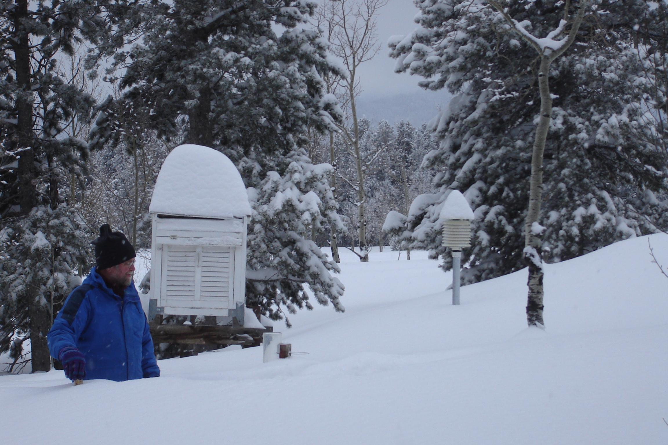
Here’s a photo of the station in January 2007, in the midst of a record round of snow storms in Colorado.

See larger photo here.
Discover more from Watts Up With That?
Subscribe to get the latest posts sent to your email.
“” Rod Smith (16:11:57) :
Sunspotter (09:08:38) : A conundrum has been puzzling me lately. All these “surface stations” are elevated, and so, are in fact measuring atmospheric temp. If we really want to know what’s going on with the Earth, shouldn’t we also be measuring the temp. in the surface? At, say, a depth of 2-1/2 to 3cm? Just a thought.
The simple answer is that “surface temperature” is defined as the temperature at (as I remember) 60 inches above ground level.
Some synoptic stations report soil temperatures (or at least used to) which I always assumed are used for forecasting agricultural conditions. “”
Rod, I have always thought that to be strange myself.
During sunlit hours, it seems to me, that the very surface whether land or ocean, is most likely to be the hottest point in the solar path. On land it is essentially the terminus of the solar radiation, and in the ocean it is mostly deposited some metres deep but with a cooling temperature gradient below the surface.
During dark hours, the surface probably cools below the air in the bottom few feet (well that’s my guess). But the main heat sink would seem to be the very surface.
So the surface should stop the lion’s share of the incoming, and should be the highest thermal capacity source for the outgoing IR. The lower atmosphere can certainly radiate thermally, but the surface would seem to be the original source for the outgoing IR. Radiation from the atmosphere would cool the atmosphere because of its low heat capacity, and the surface would continuously resupply heat to the atmosphere as the surface cools at night.
So I find it difficult to comtemplate a thermal model of that part of the planet, without starting at the surface.
Maybe climatologists understand why they don’t do that; but I sure don’t.
Sunspotter (09:08:38) : A conundrum has been puzzling me lately. All these “surface stations” are elevated, and so, are in fact measuring atmospheric temp. If we really want to know what’s going on with the Earth, shouldn’t we also be measuring the temp. in the surface? At, say, a depth of 2-1/2 to 3cm? Just a thought.
Yes the agricultural extension agents use soil temperature data to tell farmers when to plant crops, that data is available.
Soil “earth temps” also rise other data integrity issues, the thermal behavior of the soil would be highly dependent on things like soil type (sandy, loam, saturated, dry) etc. so standardization of recording would be a night mare, especially in areas that are geothermally active, like just about every community in the Rockymountains which have the name xxxxsprings. Many are so named due to local hot springs.
A possible work around (not that it likely any time this century) would be to establish a “standard” earth surrogate like a 2 meter diameter concrete ball with the temperature int he center. That would filter out a great deal of the daily noise due to its thermal inertia.
Perhaps a better option would be to use a different metric than the raw temperature. Have any of the statistical folks here tried plotting a long term series of degree day numbers for long running stations? In the home heating and fuels industries degree day totals track very nicely with home heating energy usage and might give a different view of a long term trend. It would be reasonable to assume that if there was in fact a long term warming signal it would show up in a universal drift upwards in all stations cooling degree day numbers and a drop in heating degree day numbers.
Larry
I just checked with one of the COOP observers around here, and they are told not to remove the snow on top of the MMTS unit… So the snow on top is correct… tiny…
The McFarland event is still on schedule for next week for the US.
We have to thank the .au gov for some honesty so I am not going to brickbat.
Most sites look sensible. This one though… at least begs questions.
http://www.bom.gov.au/climate/change/map/stations/037051.shtml
GISS (RAW) shows a broken dataset and not to current, so I reckon there are in reality at least 3 sets.
crosspatch (14:30:51) :
““The IPCC projections tell us that this is happening now, is continuing and will be catastrophic.”
Uhm, no. None of the IPCC projections have come true and not a single thing they have projected have come to pass. Not one thing.””
I am agreeing with that but I’m suggesting that people take seriously local temperature records to make up their own minds. The IPCC says that’s wrong, that you can’t conclude anything about a global temperature from your own local experience. One reason for them saying that is that it allows them to “control” the reported global temperature, not just by adjustments but with the weighting factors that need to be used to aggregate the local measurements into a global value (I don’t know how they do this, but it doesn’t make sense to just add the local temperatures and divide by the number of sites). What I’m saying is that if the IPCC are taken at face value, and “warming is global” then that claim is testable by an observation of a trend at any position on the globe, such as where you live. Of course, the IPCC says that what an individual observes is (global warming)+(local variation) and that their average is needed to cancel out all the unknown local variation. But if eveyone made their own observations and reached a collective opinion (say, by posting here, or by voting) then the local variations could be dealt with without the help of the IPCC algorithms.
George, here in Melbourne Australia at 1325 in the afternoon its 18C. Last week it snowed in the mainland southern mountains and in Tasmania.
mind you yesterday the top temperature in Melbourne was 18C while in the Gascoigne in northern Western Australia it was around 46C.
Australia’s mainland is roughly the same size as the lower 48.
There was a Australian Newscom report a couple of days ago that trumpeted Australia was in the grip of a heatwave. This was widely picked up in the world wide media. The truth was a lot different. Distortions and cheery picked temperature reports were used in that press release. All part of the Australian MSM daily dose of alarmism. The report was hammered in the local blogs.
Tamino is currently running a thread where he depicts fictitious data analysts cherry picking start/end points against a visually observable temperature trend and coming out with the wrong trendline. With this he hopes to discredit all who are skeptical of AGW. I pointed out that his fictitious data analysts may have been clever enough to note that the data points at the beginning of the series were not the same as the data points at the end of the series, that 2/3rds were no longer being collected and that they were predominantly from the side of the graph that would oppose the “visually observable” trend. Hence his data collectors would have been correct to point out that any trend from the data is unsafe, and if sensible corrections were made, the trend could indeed be the opposite of the poorly chosen data.
Needless to say, this bastion of the supposed scientific method deleted the post.
Perhaps it could be nominated as the best religion blog, since it seems it can’t brook any dissent, even when that dissent is based upon sensible scientific argument.
“The IPCC says that’s wrong, that you can’t conclude anything about a global temperature from your own local experience”
While I would generally agree with that, there are a few other things to consider. I wouldn’t say one cold winter would mean much. But what that graph is showing is an annual average. Even one cold year wouldn’t mean all that much by itself, but here we have several consecutive years. If CO2 were driving climate warming at the rate supposed by Hansen et al, this would be an absolute impossibility. And while you could have warm year followed by a less warm year, to see *global* temperatures go *below* the long term average as we did earlier this year would be an absolute impossibility.
The point is that the climate response to CO2 is grossly overstated by IPCC’s projections and GISS’s models. CO2 is not causing any dangerous warming.
If we are going to spend billions of dollars in carbon mitigation, the onus is on the IPCC and GISS to show that there is even a reason for doing that. First they need to show that the climate is warming. Only their *models* say that it *should*. Direct observation shows that it isn’t. This means the model is incorrect and can not be used as a basis for spending even a penny. Climate were warming we could get into causes but it isn’t so there really is no need to even go there.
The onus isn’t on us to prove something isn’t happening. The onus is on IPCC to show that something *is* happening. So far we know that current temperatures are not unprecedented in this interglacial. We also know that the rate of temperature rise in the 20th century wasn’t unprecedented either. The 18th century saw much faster and greater climate change as we began the recover from the Little Ice Age than the 20th century saw as that recovery completed. We also know that the greatest amount of climate change in the 20th century was not in the second half of the century, but in the first half. The majority of years in the second half of the century saw cooling, not warming temperatures, globally.
Here is an important thing to consider. The chairman if the IPCC speaks two different messages depending on to whom he is speaking. When he speaks to the world he says global warming is horrible and the developed countries need to cut emissions. When he speaks to India, he says that warming will not be an issue. When developed countries mention that countries like India are the fastest growing source of CO2, he says that any mitigation efforts in India must be paid for by developed countries and any decrease in efficiency must be offset by payments made by the developed countries.
Basically they are using “global warming” as a mechanism for redistribution of wealth. Developed countries must put the breaks on economic growth while India, China and Brazil are allowed unbridled growth. Note that GDP is directly proportional to energy consumption with some wiggle room for changes in efficiency. Each increase in real GDP results in an increase in energy consumption. One can not produce something without consuming energy. Even if you are picking walnuts, you expend more energy when you pick more walnuts, use more fuel to transport them, etc. So if you can throttle energy consumption you can throttle economic growth.
The mechanism works like this. First you oppose nuclear power development in developed countries with all available resources at your disposal. This forces everyone into fossil fuel. Now you limit emissions from fossil fuel. CO2 and water vapor are the product of complete combustion of hydrocarbon. If you limit CO2 emissions, you are actually limiting economic growth. At the same time you offer no barriers to nuclear power deployment in China, India, and Brazil and you exempt them from CO2 emissions requirements. In other words, you put the brakes on developed economies and allow developing economies to ramp up full-tilt.
You make this more palatable to many in the developed countries by pretending such things as wind and solar are actually viable alternatives. The reality is that money poured into these “alternatives” actually add inefficiency and result in a more expensive and intermittent source of power that actually acts to further hamstring the economies of those who adopt them. These technolgies DO have their niche. They make sense in such places as remote areas where the grid does not reach or for small power purposes but as base load generation, they act as a rat hole into which more and more money is poured creating even more inefficiency. You end up with less power generated at higher cost and the supply is unreliable further hamstringing economic expansion in developed countries.
It is all about “spreading the wealth” in a very clever way.
I’m pretty sure that the cooling that was happening in 1998 was being masked, and it was also hiding. I guess that whatever mask it had on is now being borrowed by the heat, and obviously that heat is now hiding wherever the cooling was hiding in 1998.
Or… maybe the earth just gets warmer and cooler… Nahhhhhh
Dismissing the importance of looking at the quality of the individual stations is a big mistake. The USHCN network was long referred to as the “gold standard” for temperature records. Now with 60% surveyed a significant majority are in category 4 and 5 which means they have a likely bias larger than the entire warming signal claimed for the last century +
While the project is not done,what the results so far strongly suggest is we may not even be able to elimanate the null hypothesis on temperature change. In other words we may not even be able to say with certainty that the observed waming of the 20th century isn’t entirely due to these various errors in the placement and maintenance of the various stations.
In addition the large number of sights that are changed in position, instumentation or just dropped off the list makes any talk of a trend less certain. I now understand what he meant when Richard Balling referred to it as perhaps a “figment of the data”.
Is anyone else as amused as I am by the comments regarding snow on top of a screen causing site bias? Do these folks make similar comments about A/C exhausts, airport tarmacs and BBQ grills? Just askin’. 🙂
OA
Crosspatch said
“The IPCC says that’s wrong, that you can’t conclude anything about a global temperature from your own local experience”
Can I remind WUWT bloggers that I am collecting links to national and regional temperature records-the longer the better.
Whilst observations from one country on a single day are merely interesting those from lots of different places over many years has considerable signficance. Links please
We already have;
Hadley CET to 1660
Armagh
Central Europe
Switzerland to 1860
44 stations in Germany
Finland
Russia
Holland
Denmark Faroe Greenland.
I will post these up as a general resource in due course.
This is in reaction to the oft quoted ‘global temperatures since 1850’ which are continually changing in location/equipment/methodology and started off in 1850 with 100 stations, many of them described as ‘unreliable’ Callendar based his 1938 seminal co2 document on observations from 200 stations.
This composite ‘1850’ data set is therefore best viewed as an interesting historical curio rather than a scientific data set on which the future of the worlds economy should be based.
I have lots of my own disjointed information on ‘1850’ but if anyone has any links to a existing succinct explanation of the number of stations in each year, their location, changes etc etc I would be pleased to include it.
TonyB
Yet they take a bunch of local temperatures and claim “global” warming.
JFrom the NOAA report above:
The Central and Southern regions experienced below-average temperatures, while above-average temperatures were felt in the West, Southwest and Northeast. This resulted in a near average annual temperature for the contiguous U.S. and the coolest annual temperature since 1997.
For 2008, the average temperature of 53.0 degrees F was 0.2 degree above the 20th Century average.
The nation’s January-December average temperature has increased at a rate of 0.12 degree F per decade since 1895, and at a faster rate of 0.41 degree F per decade during the last 50 years.
Lots of great headlines there. Pick the one that furthers your agenda.
For example:
Global Warming to impact Northeast U.S. the most, climate scientist said today………
My favorite:
Increasing precipitation combined with stable temperatures will lead to enormous increases in US crop production in the 21st century, says a discredited Kansas agronomist……
Tim Clark: “…my favorite:Increasing precipitation combined with stable temperatures will lead to enormous increases in US crop production in the 21st century, says a discredited Kansas agronomist”
Carole King prophetic “Tapestry”:
“In times of deepest darkness, I’ve seen him (Al Gore?) dressed in black
Now my tapestry’s unravelling; he’s come to take me back
He’s came to take me back”
crosspatch (19:52:55) :
“Even one cold year wouldn’t mean all that much by itself, but here we have several consecutive years. If CO2 were driving climate warming at the rate supposed by Hansen et al, this would be an absolute impossibility.”
Expressing things in terms of CO2 is an alternative to my point, but maybe better. Local variations in CO2 do occur but from what I’ve seen these are much less than the overall increase. So it’s a reasonable approximation to say that the change in CO2 with time is pretty much the same everywhere (certainly the IPCC assumes that, so if we want to test their predictions we can take on their assumptions; if they say this is seriously wrong, then it follows that their predictions [projections] are seriously wrong). So if we take a local observation to be made up of (anthropogenic global warming [CO2])+(local variation [not CO2]) then whenever we see a decrease in local temperature we know that LV dominates AGW (because AGW, if it’s there, relentlessly goes up). This would mean very little over short time intervals but this is easy to understand locally (eg cooler at night but then warms up the next day; cooler as a cloud blocks the sun but warmer again when it passes). But over a period like 10 years there is no possibility of confusing the overall trend with this kind of transient event.
On your other points, I agree as far as they go but I think there’s more. There are many agendas here. Big Green, of course, but also the media. Yes, Fear is good for business but only up to a point. When nothing actually happens don’t they start to look ridiculous? (Which is bad for business, no?)
Please take a moment to cast your vote for this great site: click
Many thanks!
Pharyngula is approaching!
TonyB (01:59:11) :
That looks like a good project. I’ve looked at Armagh as a good site for getting a handle on a fairly wide area. As I understand it the temperature there is largely determined by the Gulf Stream so if there were significant variations in conditions along the length of the Gulf Stream they should show up in Armagh. Another place like that is the coast of Namibia which gets a cold current from the Antarctic. A modest collection of sites like that could give a much better picture than the IPCC global average. Assuming that calculating the temperature anomaly cancels out local variations a statistical model could be deltaT(i) = deltaG + e(i) taken as individual observations (i) to test the hypothesis deltaG = 0 etc. Maybe worth doing a power calculation to see how many sites are needed.
I’ve been hearing from several people that local temps are far below what the national climate data aggregators are claiming for their local areas. There’s also some observably false data in a number of temperature maps. For instance, CA spotted a major ocean anomaly around the Georgia islands in the south atlantic showing a 20C higher temps than actual satellite data is showing.
Apparently when weather stations stop reporting data, or their equipment is down, or, say, INSIDE A HEATED BUILDING BEING REPAIRED, the data is still being collected and the AGW folks are taking the peaks as the standard. Since we know Mann’s hockey stick is based upon amplifying the peaks rather than centering as any self respecting scientist would, its clear that the usual suspects are intentionally accepting the high outliers as the ‘correct’ data.
“Can I remind WUWT bloggers that I am collecting links to national and regional temperature records-the longer the better.”
Here’s one for the Southeastern US that goes back into the 19th century for many stations. Select the state, select the station, and on the left frame are lots of things to choose from. “Monthly Temperature Listings” will get you averages back to the start for that station.
davidc
Interesting post-it would be great to get some African data sets- particularly a place like Namibia in order to get the effects of the current.
Also thanks to Crosspatch.
Any more from anyone? I am also still looking for a definitive aricle that has dissected the realities of ‘global temperatures since 1850’ Someone must have done a thorough study of this subject-it is absolutely key to ‘proving’ AGW
TonyB
ak (05:31:09) :
@Anthony, i came here looking for good counterpoints to my own belief – that humans are affecting our environment, and one consequence of that will be warming of the earth. i believe that good arguments can be made.
ak, there have been a number of responses to various aspects of your post, but none seem to have pointed out the one bit I have most concern about.
You say that you have a ‘belief’ that humans are warming the earth, and that ‘good arguments can be made’ for this. ( I assume you are talking about Global Warming – everybody agrees that Urban Heat Islands are a good example of anthropic effects on the small scale)
This blog, and its compatriot Climate Audit, are NOT about beliefs, and finding good arguments to support them. They are about doing science properly. Steve McIntyre, for example, has always said that he holds NO position about AGW, in spite of what you might think. And I am sure that Anthony, similarly, will be happy to accept that the planet is undergoing unusual warming if the unbiased data shows this.
What is happening here is Popperian falsifiability. We are looking critically at the AGW data to confirm that it is correct and make it stronger. But, unfortunately, it is failing many of the tests. Steve and Anthony have a lot of things they might prefer to be doing with their lives, but both of them think that getting the science right is the most useful thing they can do for humanity just now.
and i may post snark when i feel it’s warranted. 🙂
I am sure none of us minds ‘snark’ being posted (unlike RC!), but please make it useful. Tell us WHY some of the odd ‘adjustments’ are justified. Point out the stats that indicate that there will be 5% of stations like Cold Creek even with a strong warming trend. But don’t look for arguments to support a belief. That’s not science, it’s religion…
TonyB,
This book might also interest you:
Surface Temperature Reconstructions for the Last 2,000 Years
I have only skimmed through it (one can read the whole thing online if you wish). There is actually a statistician who was a member of the committee as well as people with credentials in meteorology and geology.