It has been 10 years since the super El Niño of 1998 helped to spike global temperatures dramatically. Now since it appears we are in the opposite phase, I thought it would be interesting to look at the 10 year trend from January 1998 to January 2008.
Here’s a link to a 2-minute video called “The El Niño Factor”. Bob Tisdale points out to me this interesting graph: (slightly modified the key placement to fit the image in this blog)

Here’s the link to the Webpage that’s the source of the data for the above graph.
Now let me be clear that a 10 year trend period is not typical for climate analysis. Typically a 30 year period is used to establish a climate baseline. For example, NOAA publishes climate summaries for cities in the USA based on 30 year periods. I’m not trying to do anything to compare to the last 30 or even the last 100 years. I’m simply curious about what the trend looks like since the last big El Niño event in 1998 now that we are in a La Niña. Of course this may upset some folks, and I’ll probably get the usual invective hurled at me and furious scribblings on other blogs refuting this as “He’s doing it wrong”, but I think looking at what has happened globally between a large a large El Niño and La Niña is both interesting and useful.
To do this, I used the same global temperature anomaly datasets that I’ve used for the last few posts I made on the subject of global temperature anomalies. I created a new file, using all four global metrics, with only the last 10 years of data, which you can inspect here: 4metrics_temp_anomalies_1998-20081.txt
Here are the four charts of global temperature anomalies, note that there are links to each original organizations data source below each graph. Click each image to get a full sized one.
University of Alabama, Huntsville (UAH) Dr. John Christy:

Reference: UAH lower troposphere data
UAH shows a slightly positive anomaly trend of 0.028°C for the last ten years.
Remote Sensing Systems of Santa Rosa, CA (RSS):

Reference: RSS data here (RSS Data Version 3.1)
RSS shows a slight negative anomaly trend of -0.01°C for the 10 year period. This may have to do with the fact that RSS reported an anomaly for January 2008 that was twice the size than what UAH reported (-0.08 for RSS, -0.044 for UAH) owing to a different methodology of the satellite data preparation.
UK’s Hadley Climate Research Unit Temperature anomaly (HadCRUT) Dr. Phil Jones:

Reference: above data is HadCRUT3 column 2 which can be found here
description of the HadCRUT3 data file columns is here
The HadCRUT land-ocean global anomaly data shows a slight trend of 0.017°C for the last ten years. Surprisingly, it is lower than the trend of 0.028°C for the UAH satellite data.
NASA Goddard Institute for Space Studies (GISS) Dr. James Hansen:

Reference: GISS dataset temperature index data
And finally we have the NASA GISS land-ocean anomaly data showing a ten year trend of 0.151°C, which is about 5 times larger than the largest of the three metrics above, which is UAH at 0.028°C /ten years.
Given some of the recent issues Steve McIntyre has brought up with missing data at NASA GISS, it also makes me wonder if the GISS dataset is as globally representative as the other three.
UPDATE: The answer as to why the GISS data diverges so much may be found in the 2005 summary on the GISTEMP website, (h/t Barry H.) Here is a relevant excerpt:
Our analysis differs from others by including estimated temperatures up to 1200 km from the nearest measurement station (7). The resulting spatial extrapolations and interpolations are accurate for temperature anomalies at seasonal and longer time scales at middle and high latitudes, where the spatial scale of anomalies is set by Rossby waves (7). Thus we believe that the remarkable Arctic warmth of 2005 is real, and the inclusion of estimated arctic temperatures is the primary reason for our rank of 2005 as the warmest year.
I’m not sure the “remarkable Arctic warmth” is real, especially since the disappearance of arctic sea ice during that time has been linked not to warmer temperatures, but to wind patterns by other researchers at NASA. The sea ice “melt” as proxy for increased arctic temperatures doesn’t seem to be connected. Further, a NASA satellite AVHRR image shows the high latitudes near the south pole getting colder, except in areas where volcanic activity is known to exist.
A recent comment from Carl Smith came with an animated graphic showing how that 1200 km spatial extrapolation looks when compared to a 250 km block, which is also used in GISS analysis. Carl writes “Bear in mind that the data in a 250km ‘block’ is in many cases from a single station, especially in remote areas, so is really just a minuscule dot on the map. Note how little real polar region data there is in the 250 km map, whereas in the 1200 km map the polar regions appear to be well covered.”
As a creator and purveyor of meteorological measurement technology I have never been a fan of “extrapolated” data. It is not a confidence builder to know that data for something so important has been either extrapolated or estimated, especially when there are so few stations in the high latitudes, as evidenced by the Historical Station Distribution study by John Goetz.
By treating the NASA GISS data as being an outlier due to that data confidence difference, and by taking a “3 out of 4 approach” in looking at the plotted trends, one could conclude that there has not been much of a trend in global temperature anomalies in the past ten years.
the anomaly period does not change the trendline. Anomaly just shifts curves up and down in Y axis.
On the artic: when discrepencies between GISS and Hadcru are raised, there are
Several defenses that warmers raise.
1. Make sure you correct the series to the same base period. Essentially
HADcru is about .1C shifted down in Y
2. Hadcru do not estimate the polar region, but include a term in their error
calculation for error to to station coverage.
#2. I repeat their defense. I do not endorse it. have not checked it. I’m just giving you the story. Obviously, it seems a bit odd on its face, but truth
can be stranger than friction.
There are other differences I noted as well. Since Hadcru publish a month by month mean with error bands, it would be instructive to see if GISS falls in this ban.
Nevertheless, GISS and Hadcru are not “independent” measures in the strict
sense of the term. in some places they use the same stations, in other places they differ.
I don’t see a good reason why a polar orbiting satellite could not extract LT data from the poles. I’m looking forward to hearing what Christy has to say about it.
FWIW, I’ve read that it has something to do with ice cover screwing up the microwave readings.
Do the same analysis for the last 11 years and 9 years. Report the results. You might find it interesting.
The point is that if you use 1998 to 2008 you get a peak-of-El Niño to depth-of-La Niña measure, thus including a high and a low.
Using a 9 or 11 year measure would yield a misleading result, seeing as how temps climed hugely right before 1998 and then dropped hugely right after 1998.
Peak-to-trough is the informative measure. (And we don’t even know if we have hit the bottom of the trough yet.
In defense of GISS, one can argue that a 1951-1980 zero-anomaly measure is not too unreasonable, seeing as how it (roughly) covers a peak-to-trough span of the last cooling phase of the Pacific Decadal Oscillation.
Of course it might be best to measure the trend from 2001 to 2006 and cut out both sides of the up-downs. but that leaves a very short stretch.
For a zero-anomoly, the peak-to-trough works, but it will cause a more downward trend.
Evan, examining “peak-to-trough” differences makes sense for a wave or cycle, but not when the peak and trough are created by a mix of random and non-random forces that operate on different time scales. Based on your comment above, you’re thinking that summer 1998 to winter 2007-8 temp difference shows half of an ENSO cycle?
I don’t think Anthony was making claims that the trend had deep seated meaning, merely that it was there and it was interesting. Moreover the original post said something to the effect that the GISS data seemed to be an outlier. I read this as a “hey, now isn’t this interesting” blog post.
I reckon Lee is making a moutain out of 0.5% of a molehill, and for what purpose, it’s hard to tell. I’m one of the people who read this site and I’m probably pretty typical; I’m confused neither by the graphs nor what was written.
UPDATE: A question posed to Dr. John Christy about why a polar orbiting satellite does not have data for the poles has been answered:
So that’s why a polar orbiting satellite can’t get polar data. Truth is indeed stranger than fiction.
So the data sets of UAH, RSS, and HadCRUT don’t have any data for the poles. GISS does, but according to Lee and others, it is interpolated. IMHO that is just one more reason to think of GISS data as an outlier due to this interpolated polar data and the many other issues that have been raised about the GISS dataset recently, not the least of which is missng data from easily obtainable stations.
As Dr. Christy says:
Interpolated data is not a confidence builder. Looking at the lack of polar or near polar stations in this study by John Goetz, one has to wonder what they are using as a starting point for interpolation in the first place.
Lee, in the GISS data, the “extreme” high occurred in 2007. To do a peak to trough study on GISS, you need to start with 2007, not 1998. That gives you a year’s worth of data to work with. Or, you could pick the previous “extreme” high but it also occurred after 1998, according to GISS.
It is appropriate in a post-peak study to start with a peak, which is what Anthony is doing. The other three data sets clearly show that the “extreme” high occurred in 1998.
I find it difficult to believe that 0.5% of the earth’s surface (the arctic) would account for the bulk of the difference between RSS and GISS over that 10-year period. Maybe I’m not giving GISS enough credit for their ability to interpolate temperatures in an area with practically no SSTs.
You still get a (slight) positive trend because the ENSO is the ‘noise’ in the trend, not the trend maker. The PDO is the trend maker (possibly by regulating ENSO events). Over the last 100 years, the global temperature trend has been perfectly synched with the phase of the PDO. Over the next 10 years we will still see the ups and downs of El Nino/La Nina oscillations in the global temperature record, but the overall trend will be down if the PDO is truly sliding into its multidecadal cool phase.
The warming effect of increasing CO2 did not overide the cooling effect of the PDO in the mid-20th Century and there is no reason to think it will overide it this time. Add in the forecast for a quieter sun and there is just no way those little CO2 molecules can trap enough heat to compensate! Cooling is imminent!
Lee,
I have an idea!! why don’t you and I go survey some weather stations!!!
Anthony, I have enjoyed this post in its entirety. I am not sure that I understand all that Lee has tried to post. I do not care for his attitude but will over look it to try to understand his post. I have heard that the ice cover does cause problems with the microwave sounder but the years prior to 2007 should not have been a problem with the published shortage of ice in the arctic regions.
Keep up the good work Anthony. Keep presenting the data in a way that I a non-scientist can understand.
Lee this is a serious blog and Anthony tries to follow all the posts. Please present your graphs and data to make your point. I am sure that Anthony would be most appreciative of your efforts.
bill
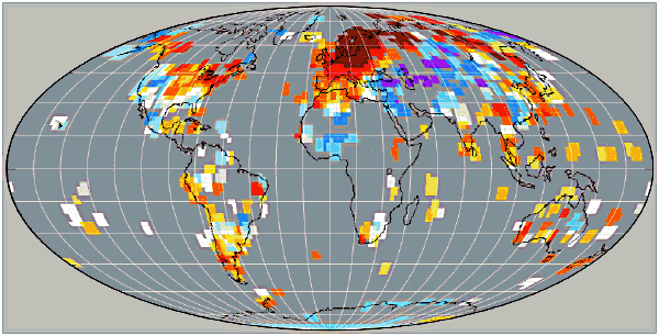
An idea of the GISS interpolation effect can be conveyed graphically using GISS images.
The link below is to two NASA GISS global grid temperature images of the Jan 2008 anomly data that have been made into a simple GIF animation, the first is with 250km smoothing, the second with 1200 km smoothing. Bear in mind that the data in a 250km ‘block’ is in many cases from a single station, especially in remote areas, so is really just a miniscule dot on the map.
http://plasmaresources.com/ozwx/climate/globaltemp/images/gisstemp250kmMollweide-sm.gif
The GISS images have been reprojected from Equirectangular to Mollweide to reduce the polar exaggeration that happens in a square grid and to instead show areas as equal on the map. Note how little real polar region data there is in the 250 km map, wheras in the 1200 km map the polar regions appear to be well covered.
REPLY: Thank you Carl, this is one of those “picture is worth a thousand words” moments.
If the error in the anomalies for UAH and RSS are +/_ 0.05 Deg C (I read somewhere), do trends of less than this have any meaning at all? (re Wm Briggs). Are the error ranges even known for HADCRUT and GISS?
Lee said:
Actually, these statistical methods all depend on having an accurate model for the underlying data. I would really be interested in seeing a Power Spectral Density plot of the data which would reveal exactly what frequency components are evident. With such data, one could go beyond mere linear trending to constructing a Kalman Filter/Smoother which would provide a much more robust estimate of any actual trend.
The Daily Telegraph (London) has picked up this story and give Anthony a mention, although there’s a misattribution about who found the Y2K error at NASA – I thought that was Steve Mc.
REPLY: It was Steve McIntyre who found the error, I simply started the ball rolling with posting a station survey of Detroit Lakes, MN from volunteer Don Kostuch and pointing out an anomaly (spike) that initially appeared to be connected to the thermometer placement near air conditioner systems, but turned out to be NASA’s data error.
Many of us average Joe’s out here are watching the discussions. We may not be eminent climatologists, but we have in-depth scientific training in our respective areas. And thus we can at least view the critical discussions with some understanding.
It seems to me that the gist here is that the GISS data has to contain a lot more value than the other data sets for the Warming Enthusiasts to base their claims. And then I see a picture like that presented by Carl Smith where there are obviously two different and widely variant interpolations on the GISS data. Taking that in to account along with many recent reports of SST microsite and other data gathering problems, healthy skepticism seems entirely reasonable. Does the GISS data really contain that much extra value? Not a rhetorical, but an honest question. It seems unlikely.
Lastly everyone will judge long term climate catastrophe based on the politics of crisis. It seems to me that the Warmers have vastly overplayed their hand. Dire predictions widely trumpeted in the media won’t be visible at all to the average person in any human time frame. As another ten to twenty years roll by without visible catastrophe, massive economic intervention will be harder and harder to sell.
Trends.. Warming… Cooling… Good…. Bad…? As Bob Carter says in this video….. It “Depends”…
It’s a good video. There’s four of them… I don’t think I’ve linked ’em here before.
Re; the GISS differences versus the other 3 data sets…
> Our analysis differs from others by including estimated
> temperatures up to 1200 km from the nearest measurement station.
Is that called a “GISStimate” ?
Bart says:
Actually, these statistical methods all depend on having an accurate model for the underlying data.
Thank you. About time somebody pointed that out. Fitting a trend line is only meaningful if there is a physical basis for it, and then you can talk about uncertainties and error bars. But the weather itself is whats real. The recorded highs and lows are an approximation of that, and an inferred trend line is a just mathematical abstraction that always pops out if you stick numbers in. Nothing more.
RandomEngineer is dead on mark, picking fights over imprecise language is a misdirection.
If the underlying phenomena were identified, as it digital data transmission, and the trendline could actually be decomposed into causative factors (or a digital signal); talk of noise, error estimation, confidence intervals and the like are meaningful. But here there is no definable population that we are sampling.
This phenomena, ‘global temperature’, is chaotic. Measuring the temperature in a quasi-closed system, like a furnace at constant temp, one finds it is a fractal function. Changing the scale of measurement yields the same vaguely sinoid signal. There is no true trend to be pursued.
That statistics is not our focus is perfectly in order, nearly everyone who comes here to read has had some statistics. How about multivariate, differential and vector calculus, shall we require these? They’re more important to the study of the underlying phenomena.
I found this site/blog having followed up the report in the Daily Telegraph. Having spent nearly 50 years analysing ‘noise’ from sources such as plasma physics and gas jets, I am fascinated by your graphs and would like to use my own collection of analytical techniques on the original numerical data. Where can I find that original data in a form that I could download into XLS.
REPLY: The links to raw data are directly below each graph
So it looks like GISS interpolates polar data. UAH and RSS could interpolate polar data but choose not to because the interpolation cannot be trusted. HadCRU is a mystery pudding and cannot be trusted.
Hansen has argued that trend errors in US surface measurements didn’t matter because the US represented a small fraction of the global surface area. Assuming a polar angle of 82.5N as being the highest latitude with trustworthy satellite MSU data, I calculate the surface area (land and sea) being missed at about 0.4%, the same as Patrick Hadley in an earlier post. Why bother to interpolate when this is a factor of ten smaller than the surface area dismissed by Hansen? Is this where Waldo is hiding?
Anthony: Thanks for posting the link to my video “The El Nino Factor”. Using Youtube was the fastest way for me to post the coincidence/correlation I had stumbled on. It amazed me at first.
I tweaked the data, and it created a “running average” curve that was almost as interesting. The coincidence with Global Temperature shifted.
I cranked out another quick video to illustrate the original coincidence may have been just that, a coincidence; to explain my intent with using a running total; and to show a few other correlations/coincidences.
Comments from your readers would appreciated.
If anyone has a link to raw Nino3.4 data–raw meaning no standardization, etc–from the mid-to-late 1800s to Present, it would be appreciated as well.
Thanks again.
paminator — (So it looks like GISS interpolates polar data.)
Yes, and I question the utility of this given that the polar data extremes seem to be driven by ocean currents and wind patterns.
From what I’m given to understand is that the northwest passage has been open many times in the past (e.g. the 30’s) so it seems disingenuous at best to include these effects NOW and not account for them in the interpolated data in past reconstructions.
By not including the past polar data — i.e. at least a WAG based on anecdotal NW passage evidence plus the known cycle times (e.g. PDO) and sun activity etc. then where it concerns present day arctic warming, it artifically makes the avg modern temp seem much higher.
As a result it seems like Anthony’s instinct to treat the GISS data as an outlier is correct in that what we’re wanting to see is apples compared to apples and the GISS data set is undeniably an orange.
An important global temperature chart to monitor is this one:
http://davidsmith1.files.wordpress.com/2008/03/0310084.jpg
This shows the sea surface temperature anomaly of the “Indo-Pacific Warm Pool” (“IPWP”).
This is the large body of very warm tropical water that stretches from Africa to the eastern side of Australia, and northwards to The Philippines. It is sort of like Earth’s basement boiler, which supplies heat to the rest of the globe.
Since about 2000 it has been easing slowly downwards, as has the global temperature (once the ENSO variation is removed).
An important question is, does the global air temperature drive the tropical sea surface temperature (the IPWP), or is it the other way ’round? My bet is that the driver is the sea and the global atmosphere is the passenger.
If that is correct, then the next important question is, “What causes the variation in the IPWP?”
REPLY: Gee David, that graph looks awfully familiar…now where have we seen a graph like that before? 😉